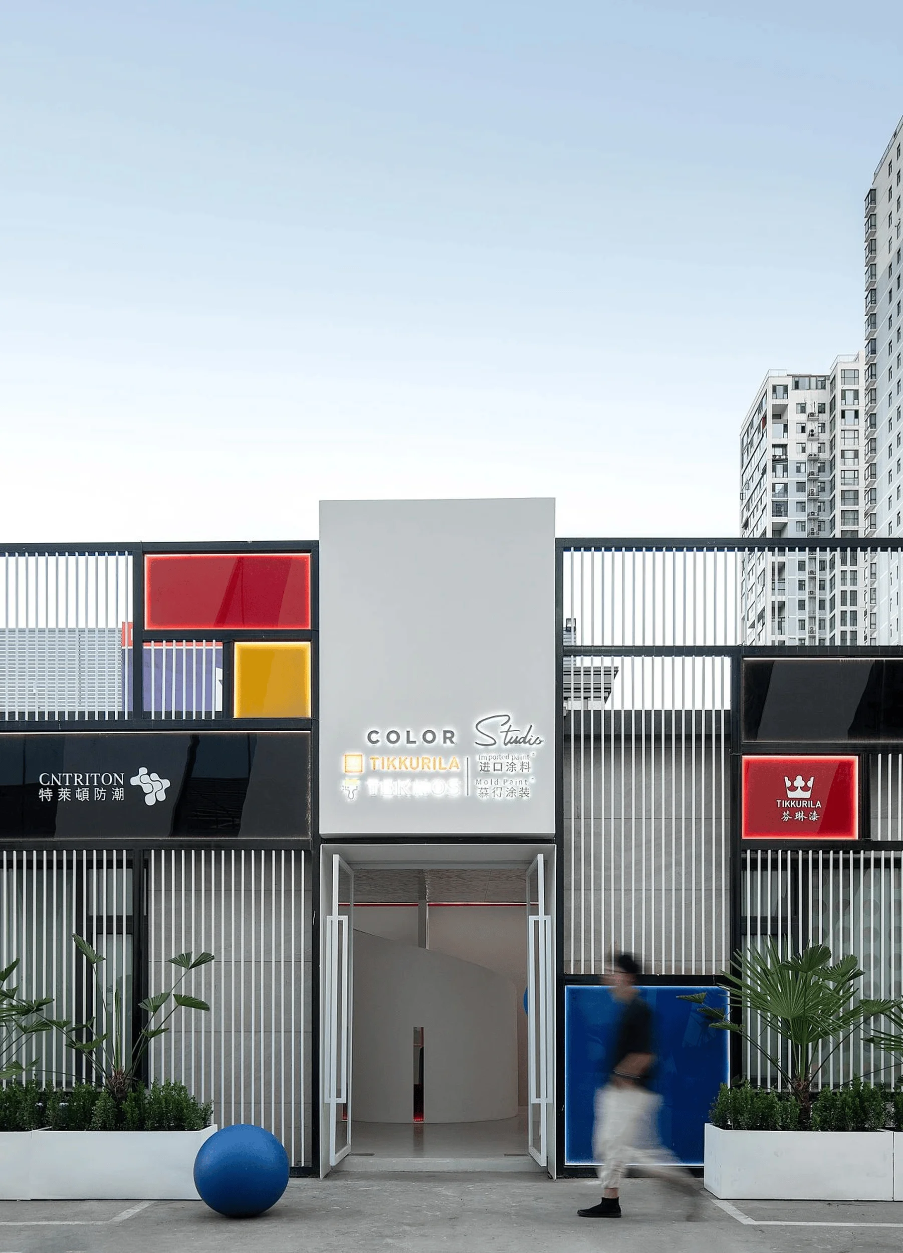
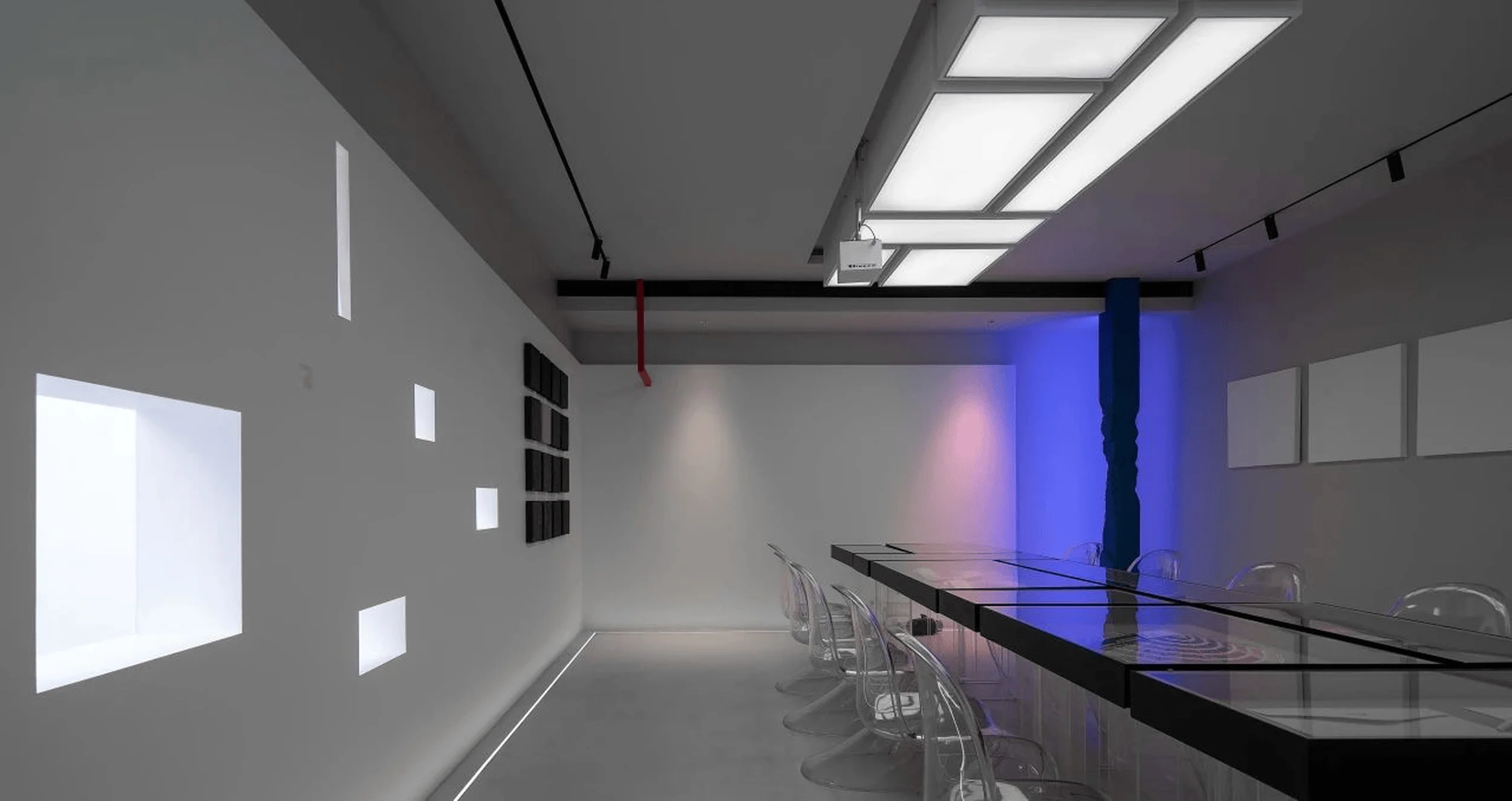
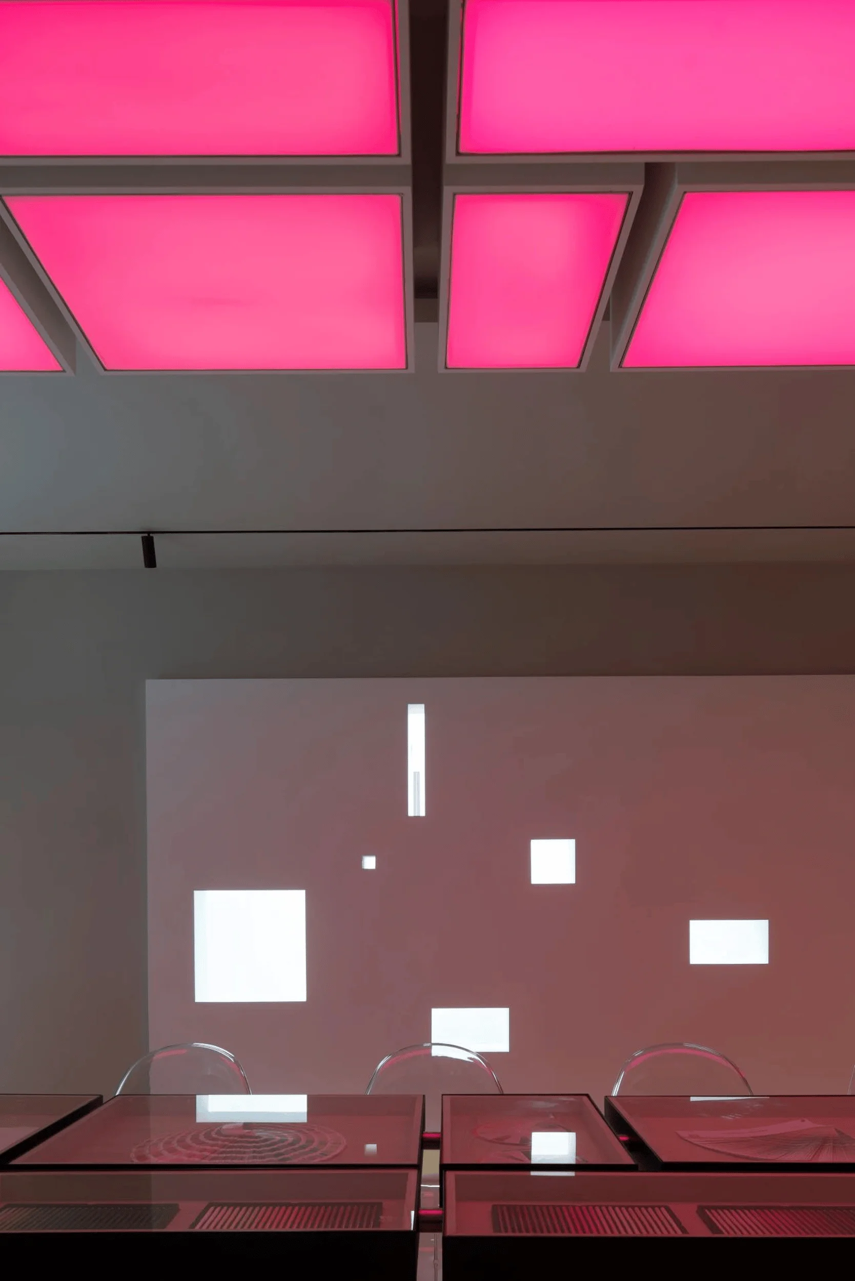
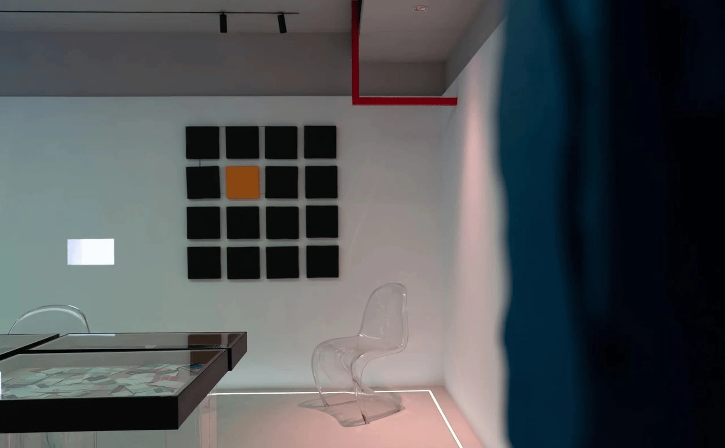
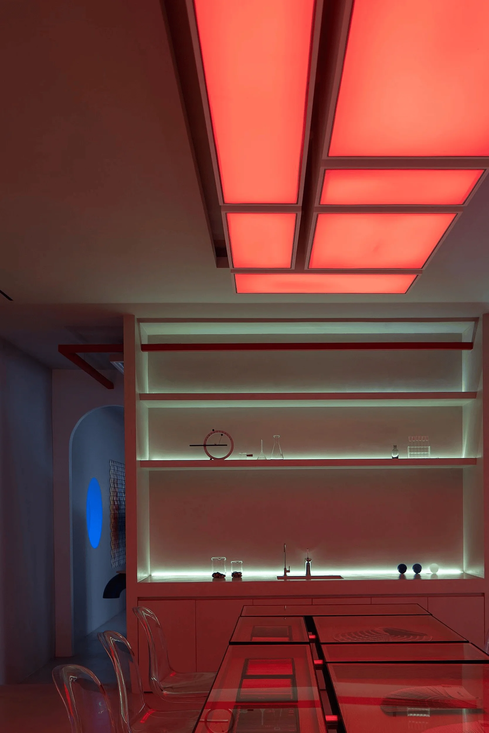
TIKKURILA Color Lab designed by Yujian Interior Design Studio in China, playfully explores color and materiality in a dynamic spatial experience.
Contents
Project Background and Challenges
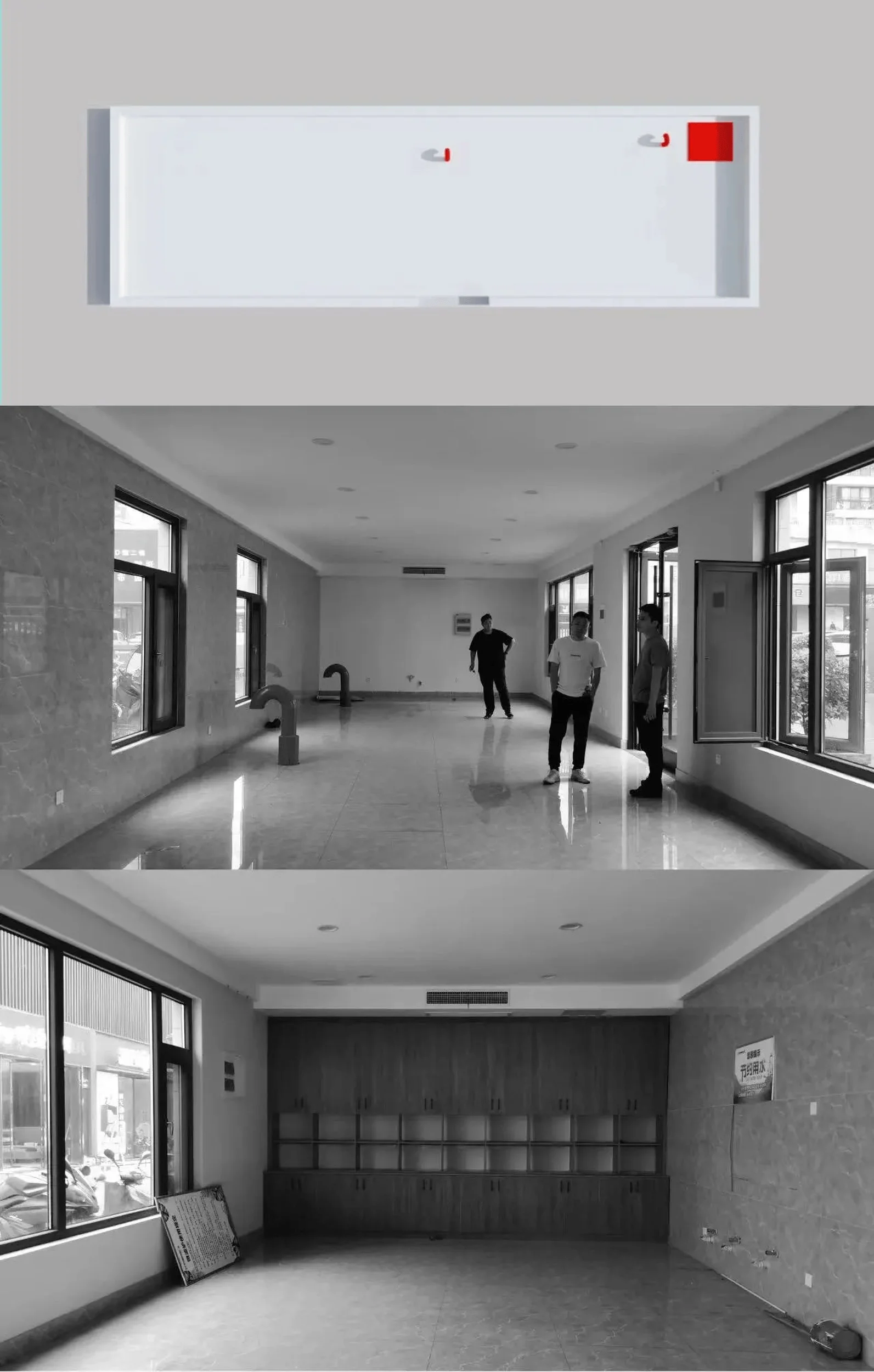
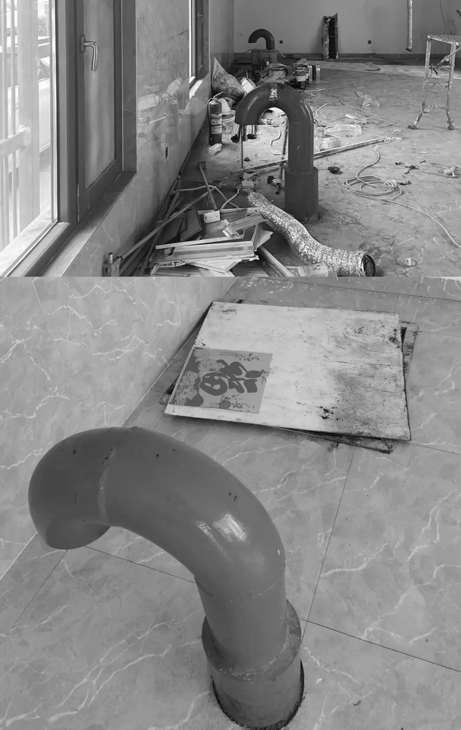
TIKKURILA, a renowned international paint brand, sought to establish a unique showroom that transcended the conventional display of paint products. Located in the Mingyou Building Materials City in Luoyang, China, the project presented several challenges. The original space, initially intended for a restaurant, was a rectangular box with limited construction options due to its location within the market. The exterior could not be significantly altered, and existing structures like a power distribution room and sliding door equipment had to be integrated seamlessly. Moreover, the budget for the project was relatively modest. The designers at Yujian Interior Design Studio embraced these constraints as opportunities to create a captivating and experiential space that would effectively communicate the brand’s values and engage visitors on a deeper level. interior design studio, color and texture in interior design, architectural design, spatial experience
Design Inspiration and Concept
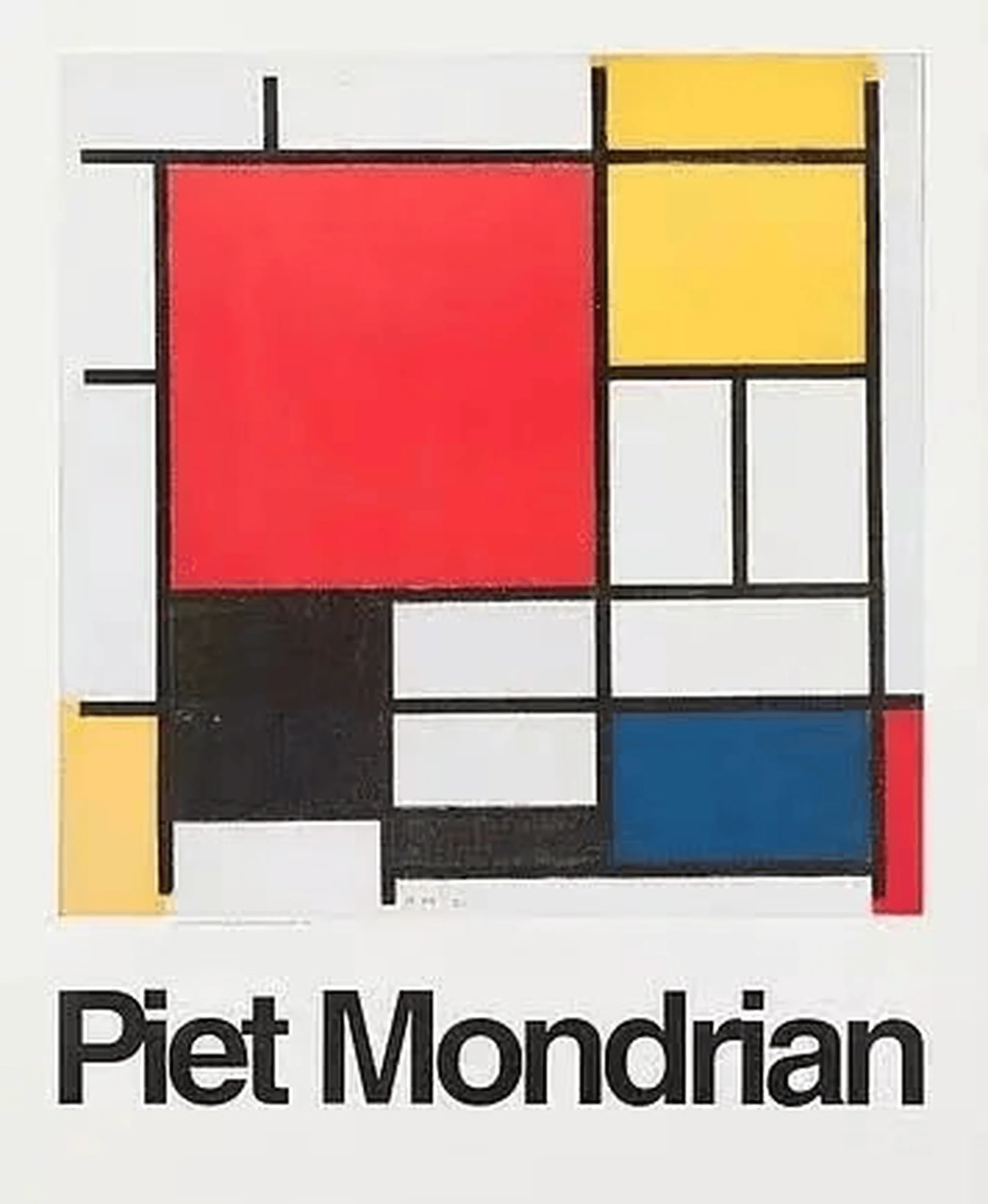
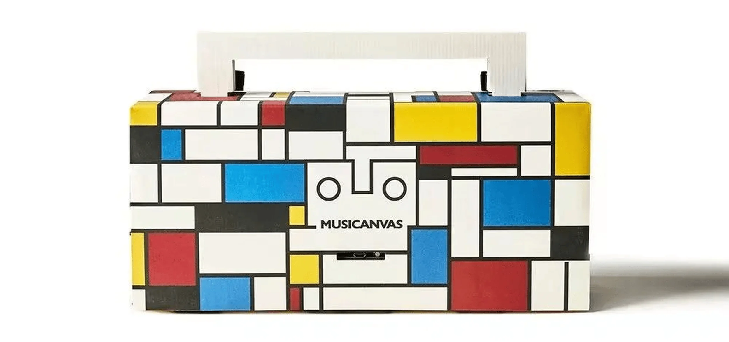
Inspired by the principles of Dutch De Stijl movement, particularly the work of Piet Mondrian, the designers conceived the space as a “Color Lab.” The use of primary colors (red, yellow, and blue) and the interplay of geometric forms became central to the design language. The exterior facade was transformed into a Mondrian-esque composition, with bold color blocks framed by a minimalist grid. This striking design not only attracted attention but also effectively communicated the brand’s identity as a purveyor of vibrant and high-quality paints. The interior design continued the exploration of color and texture, aiming to create a multi-sensory experience that transcended the visual. The concept of a “color bar” was introduced, integrating social interaction and knowledge sharing into the space. This approach sought to deepen visitor engagement and differentiate the TIKKURILA brand from its competitors. interior design studio, color and texture in interior design, architectural design, spatial experience
Spatial Organization and Circulation
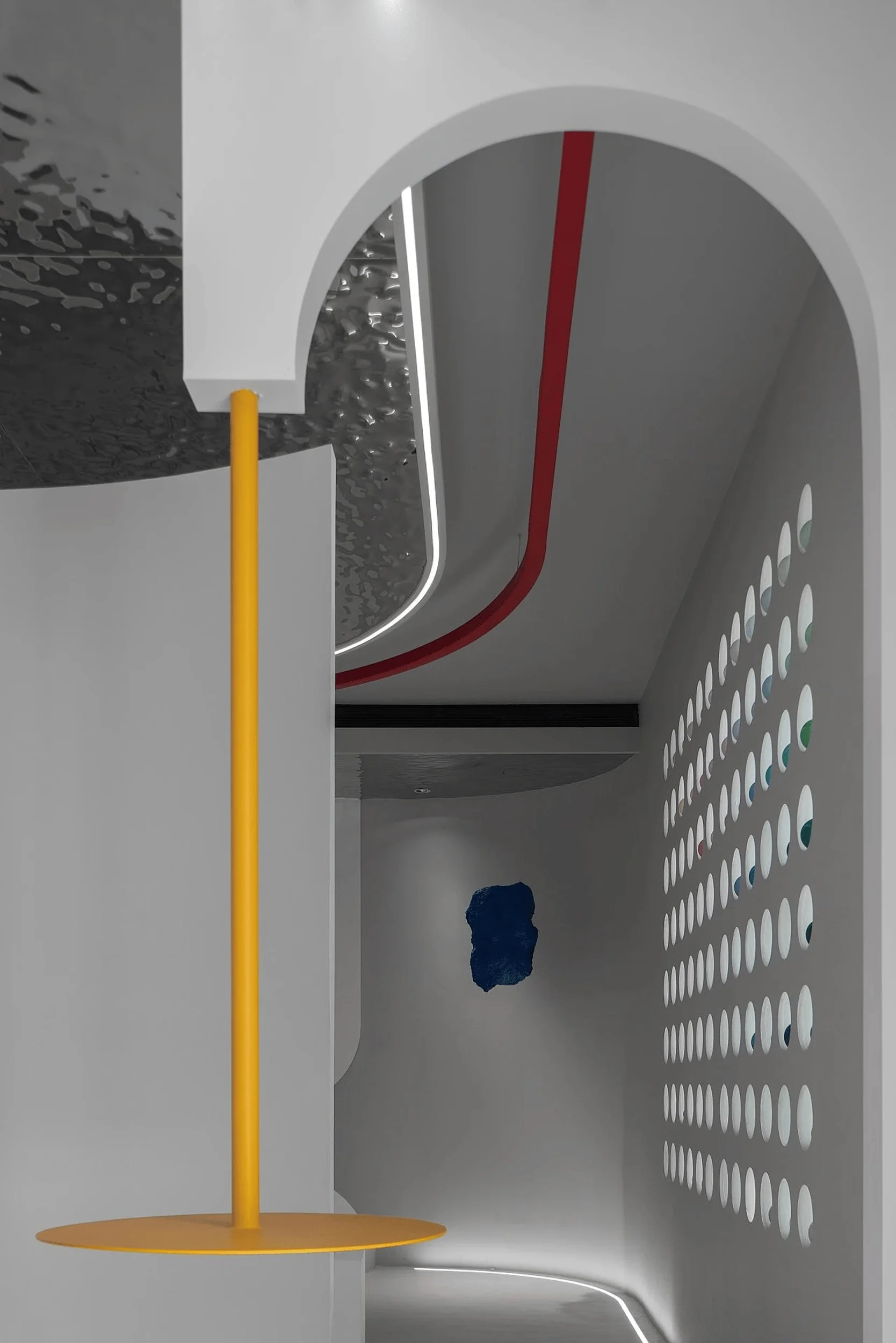
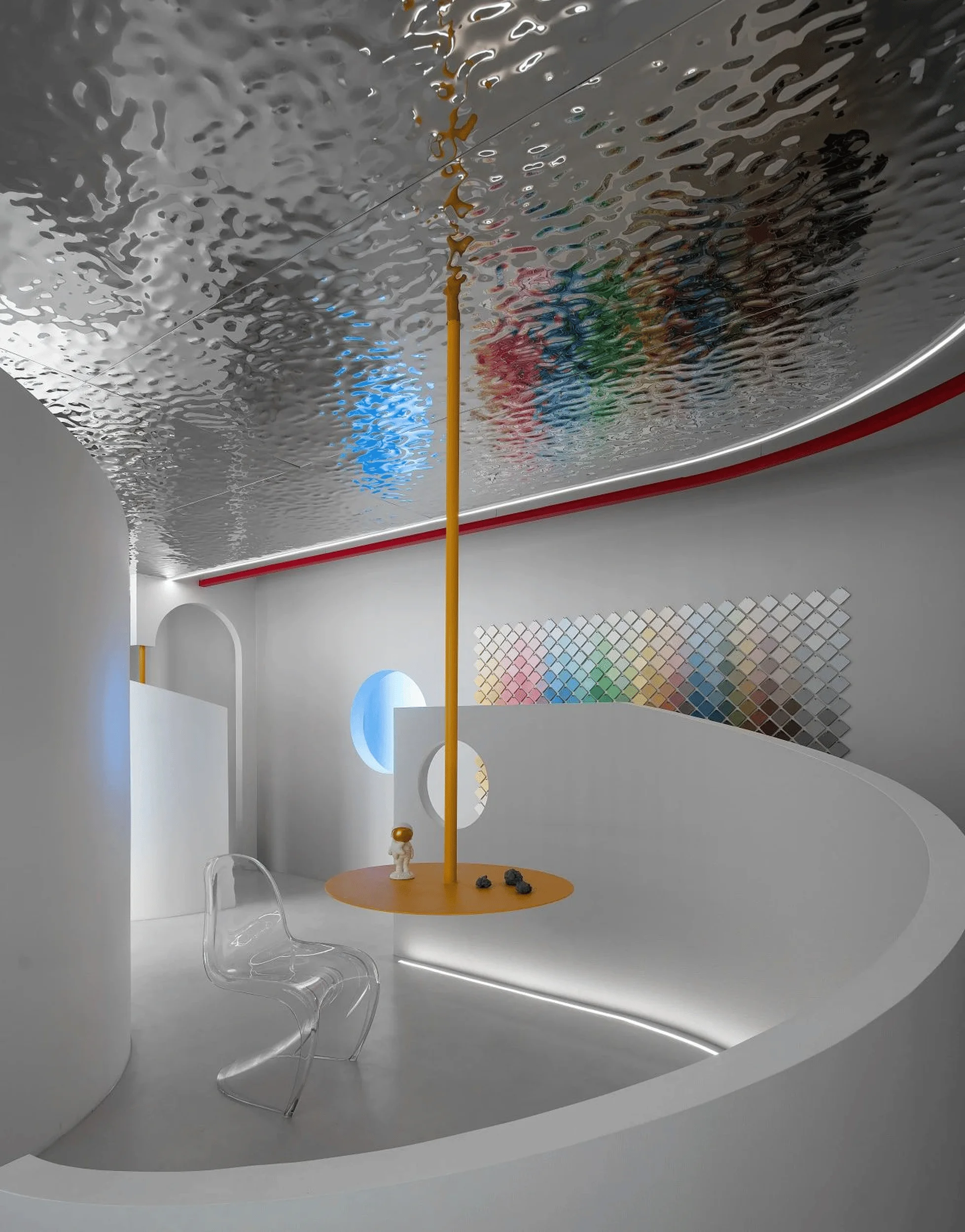
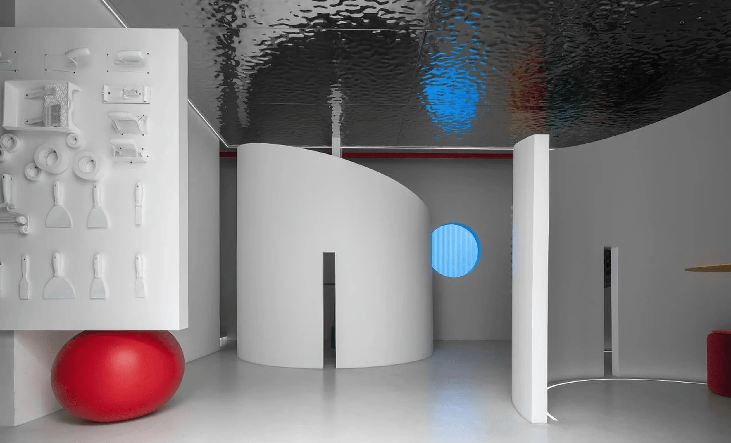
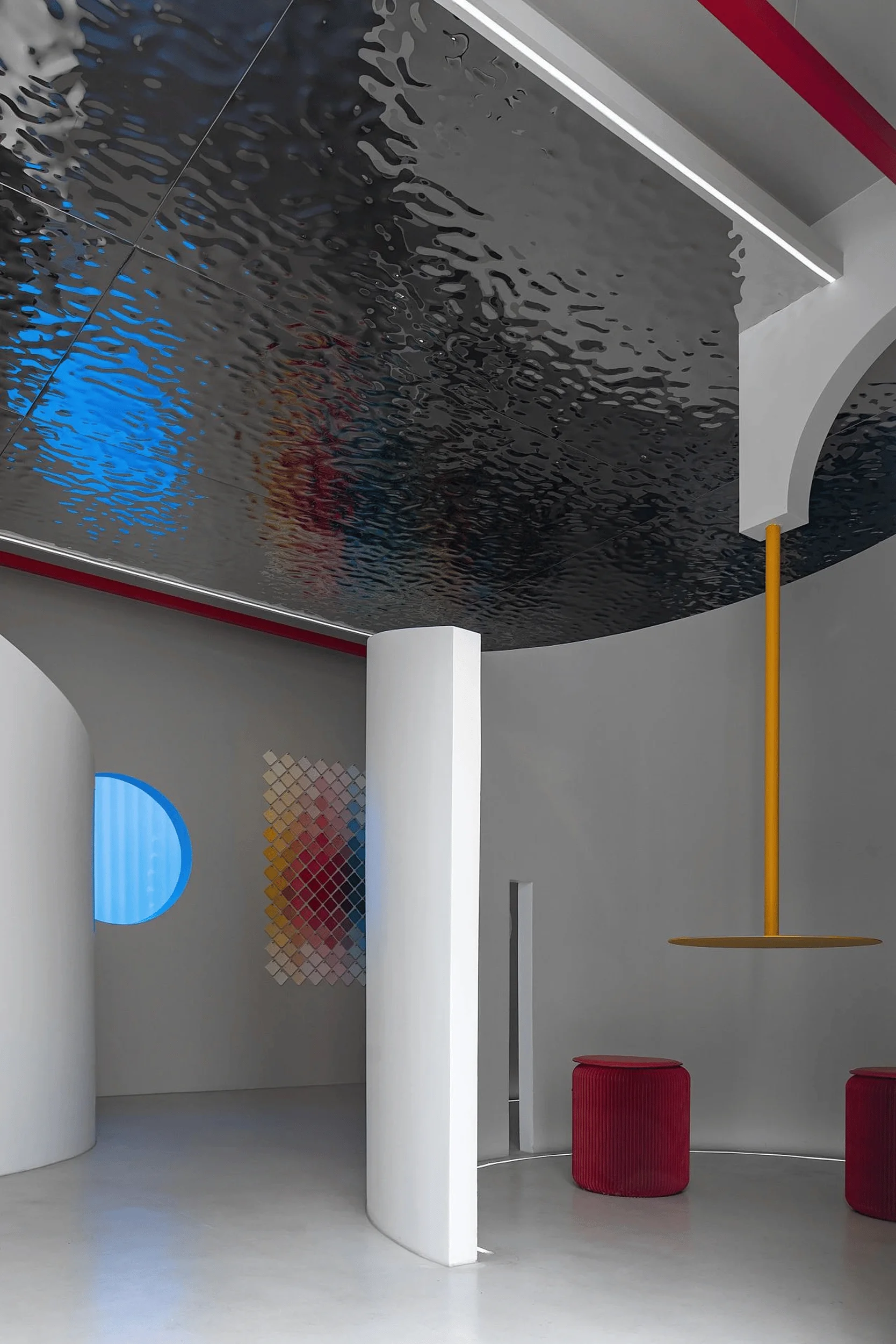
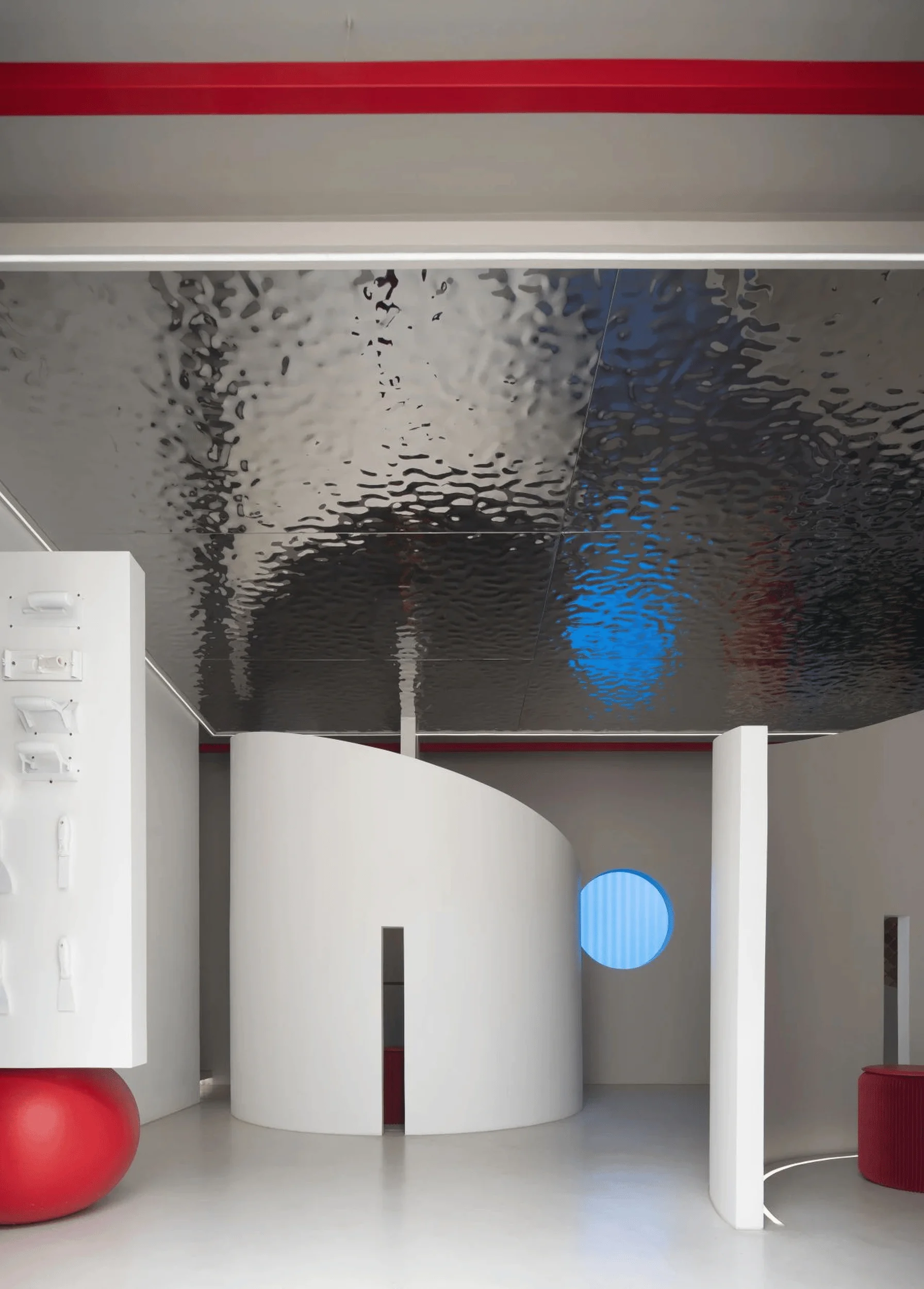
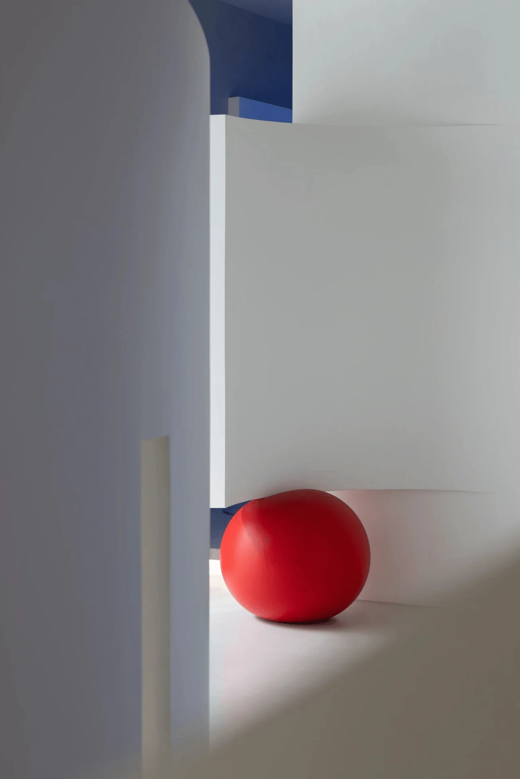
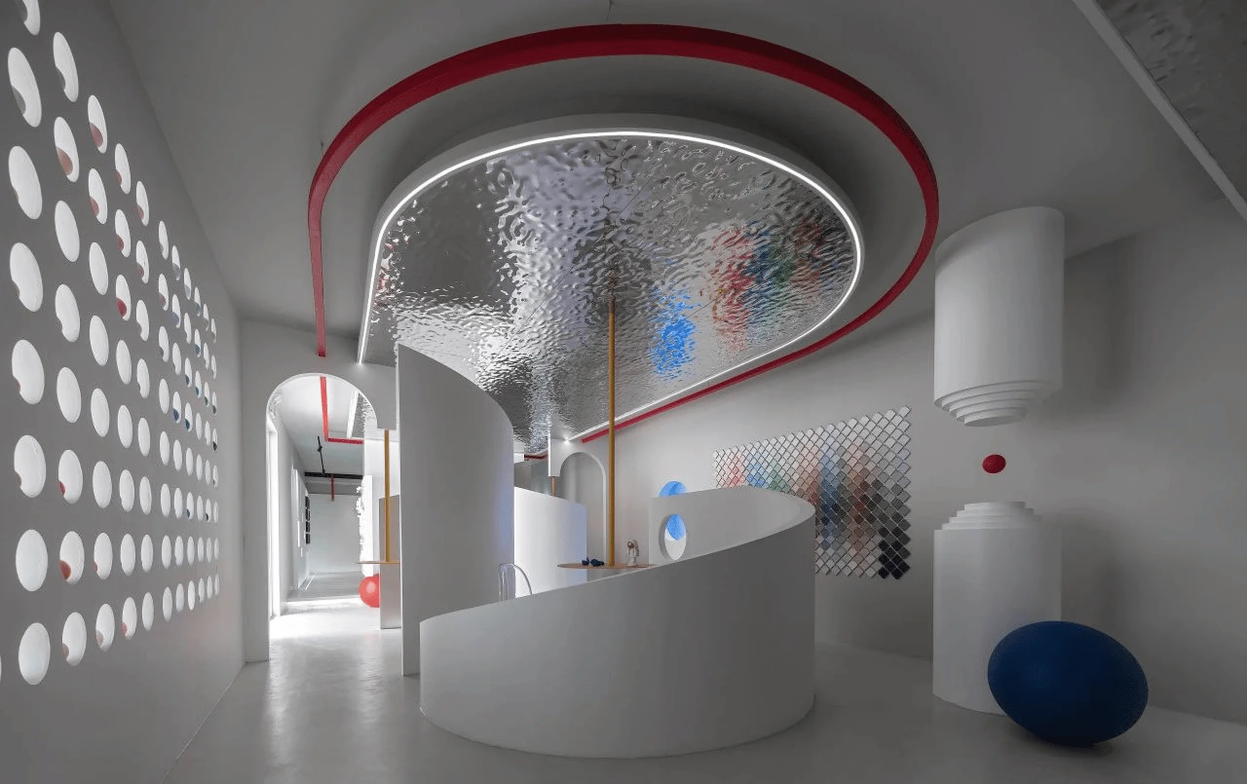
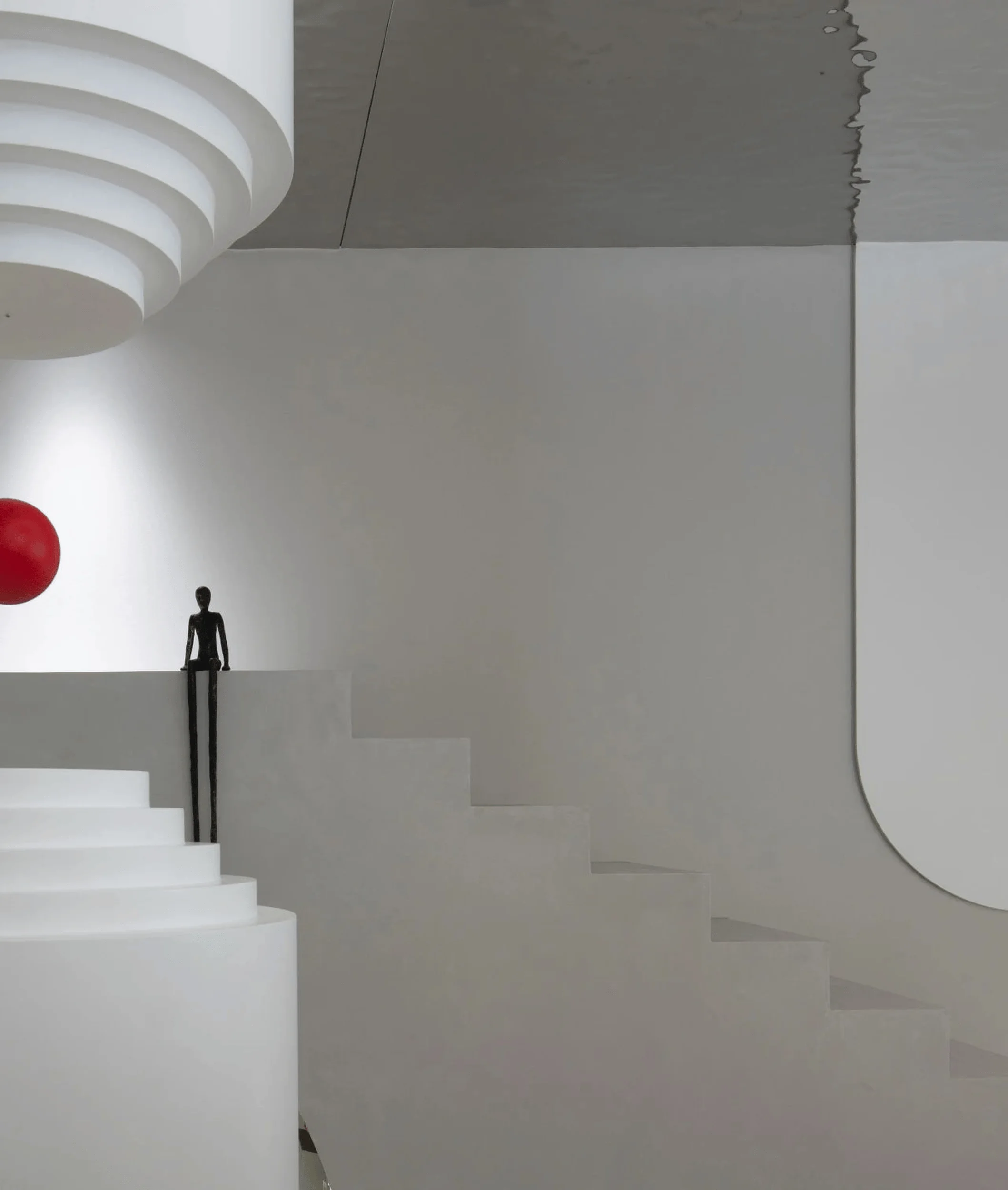
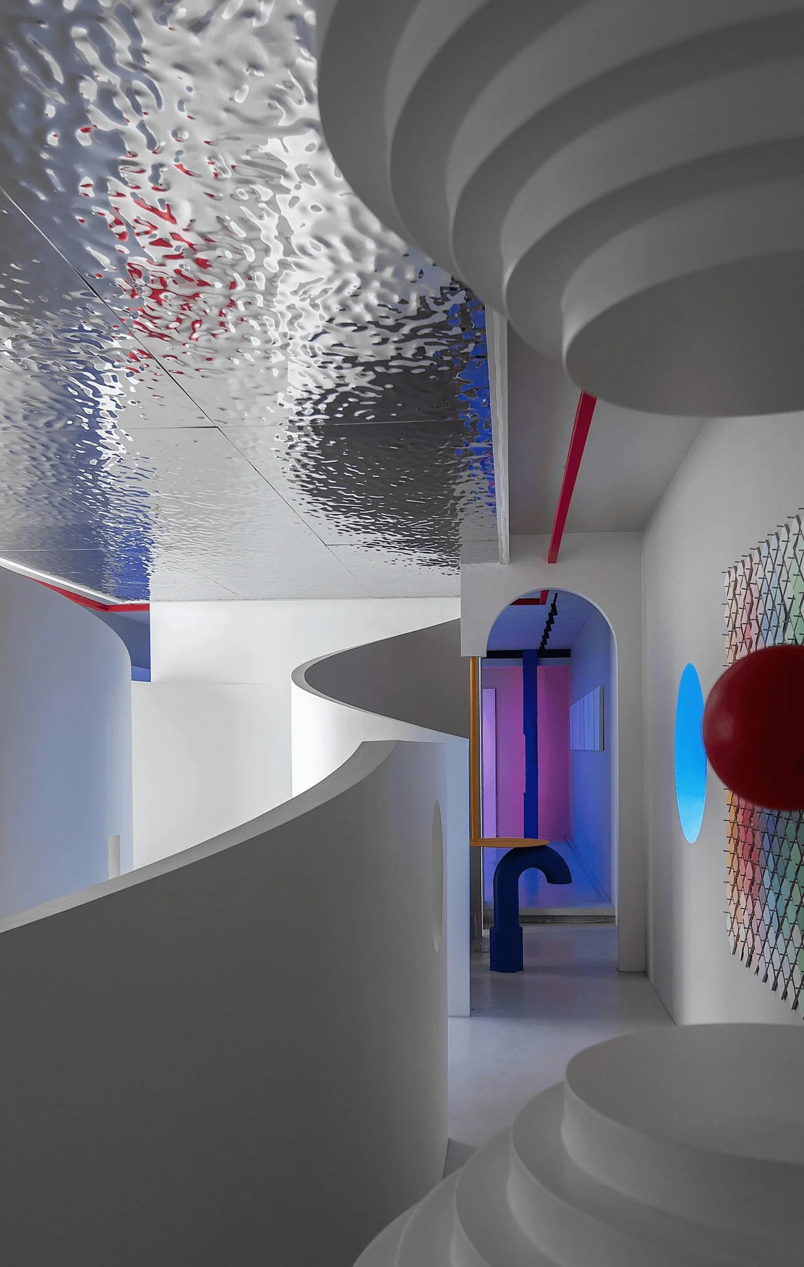
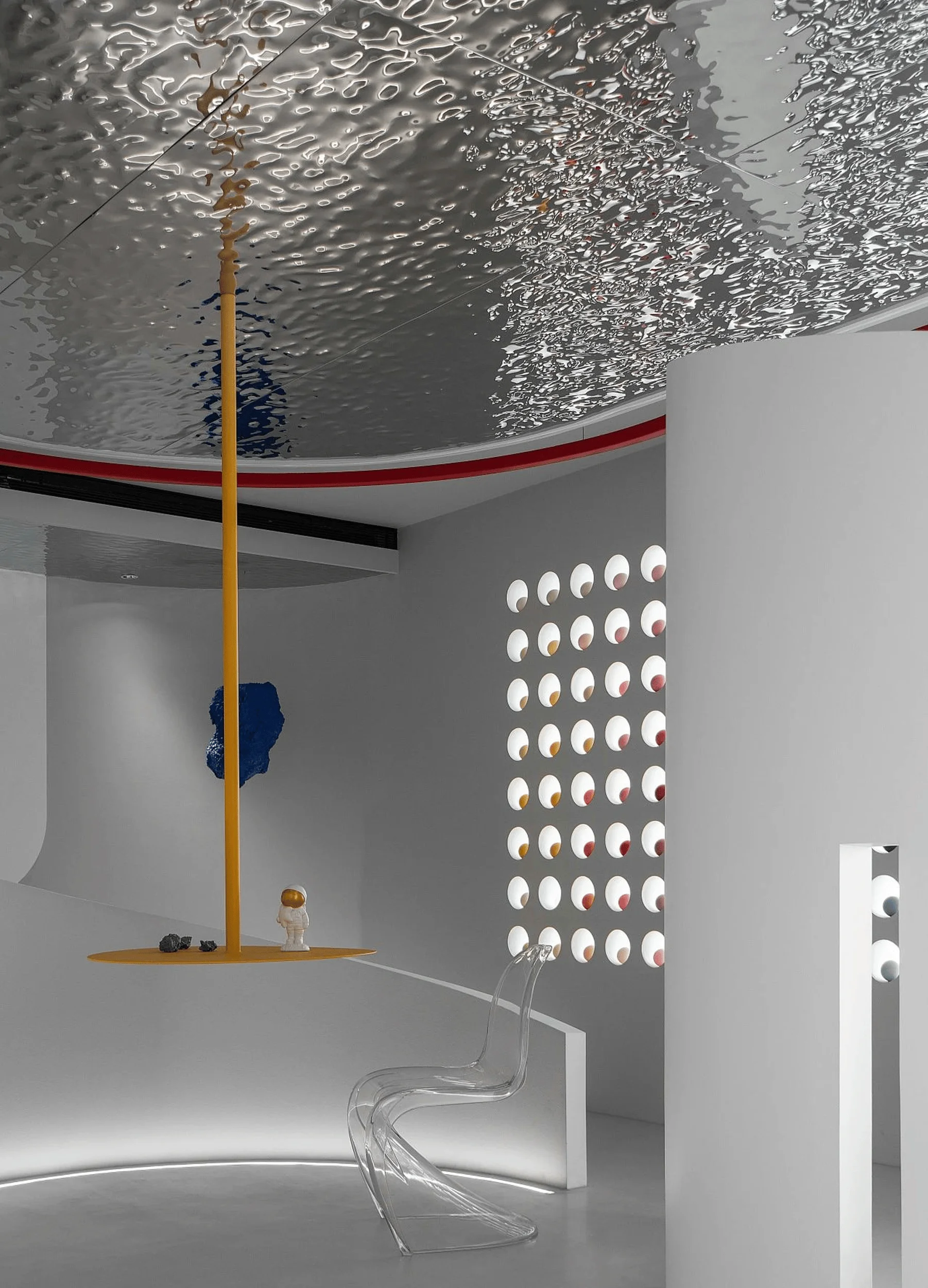
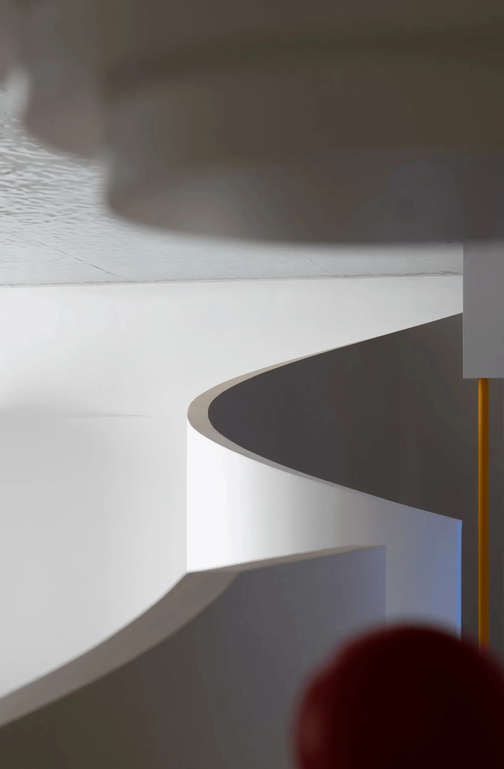
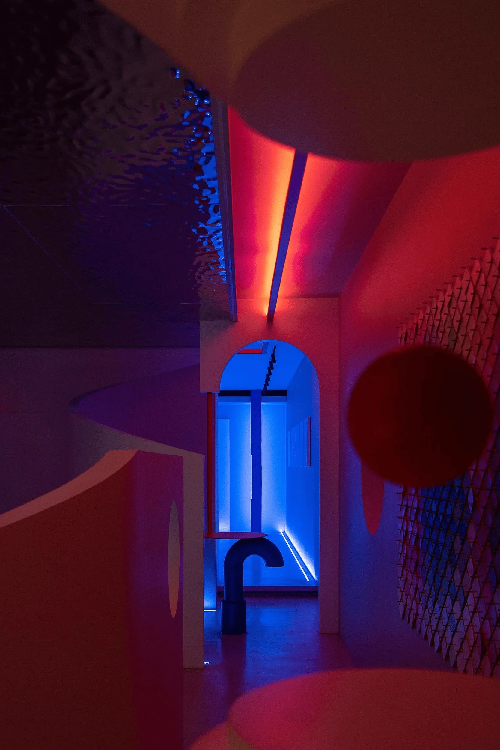
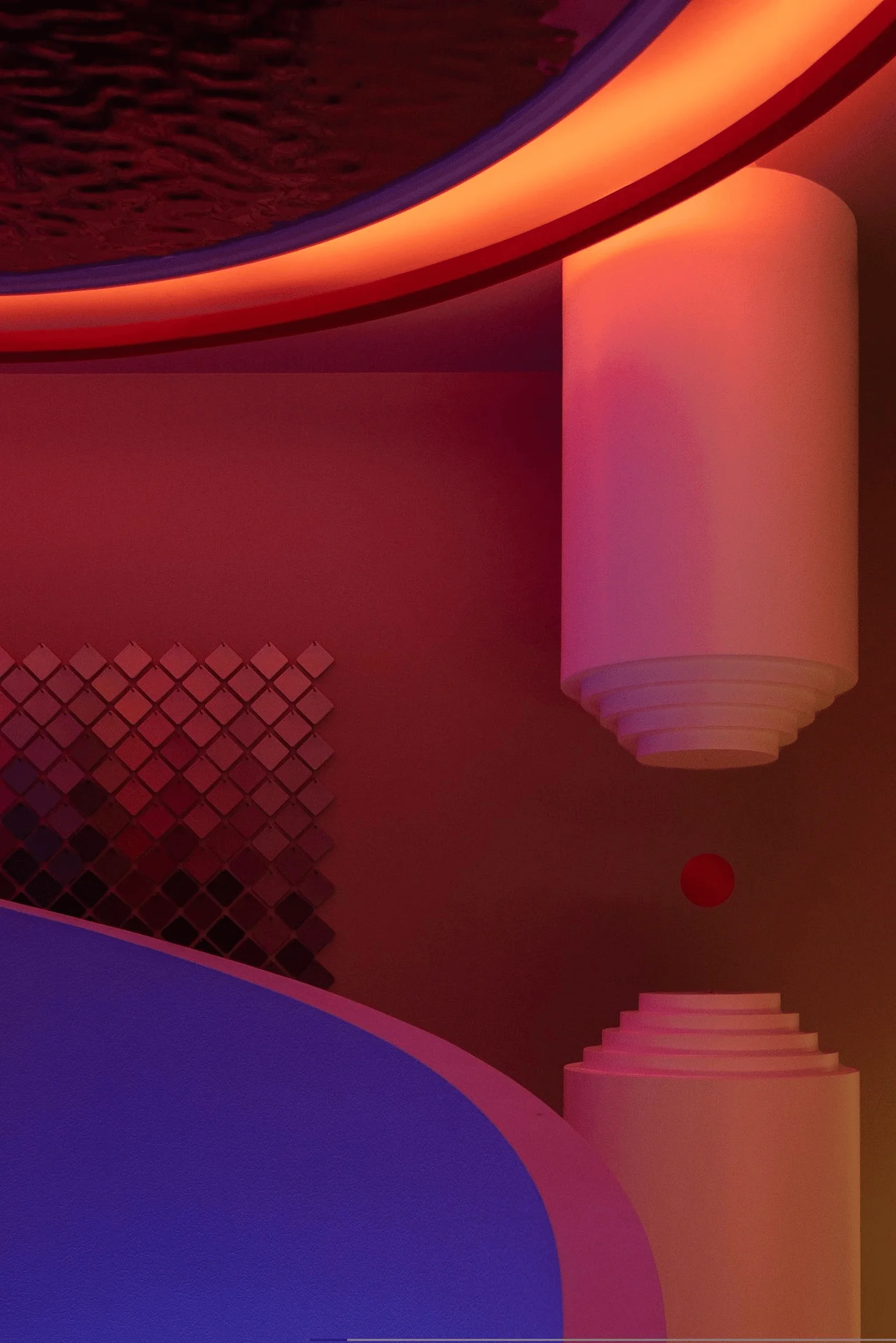
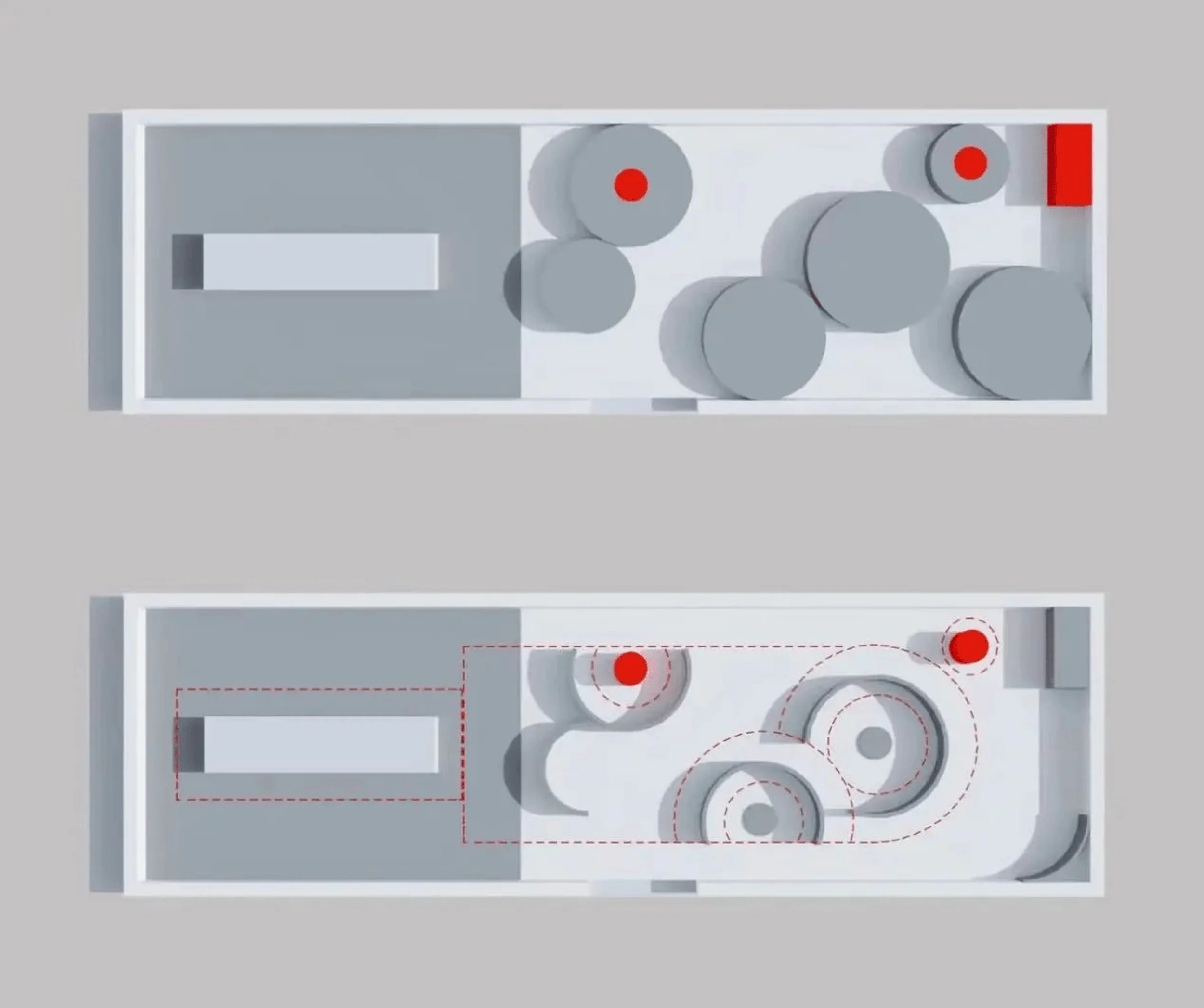
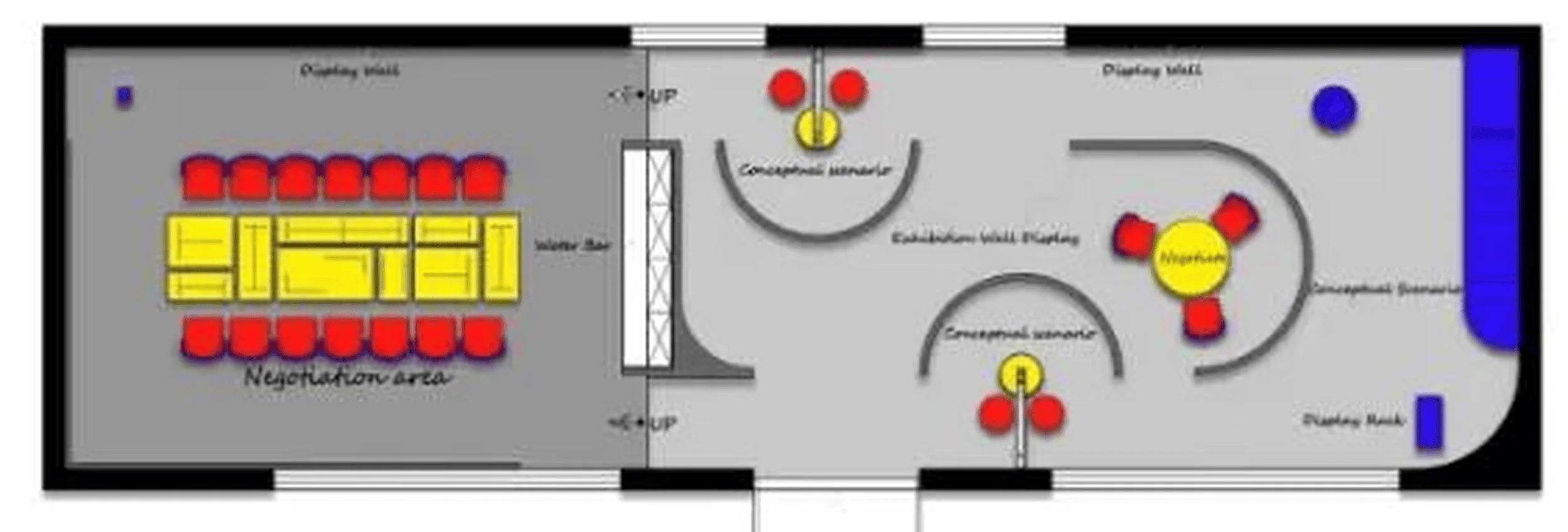
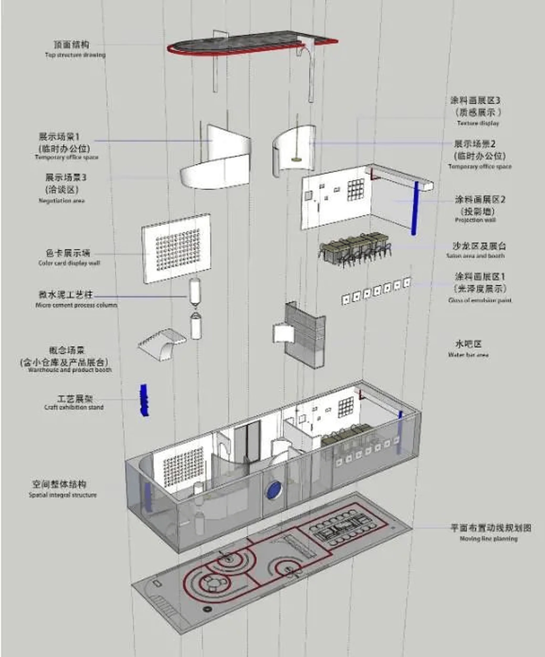
The interior layout was carefully organized to overcome the constraints of the existing space and enhance the visitor experience. The designers devised the concept of “arrayed paint cans”—a series of interconnected circular and semi-circular volumes that defined different zones within the showroom. This arrangement not only addressed the presence of fire-fighting equipment and a maintenance access point but also created a dynamic and engaging circulation path. The “paint can” volumes housed various functions, including product displays, consultation areas, and a salon space for events and workshops. The interplay of open and enclosed spaces, combined with the use of curved walls and strategically placed openings, fostered a sense of discovery and visual intrigue. interior design studio, color and texture in interior design, architectural design, spatial experience
Materiality and Lighting
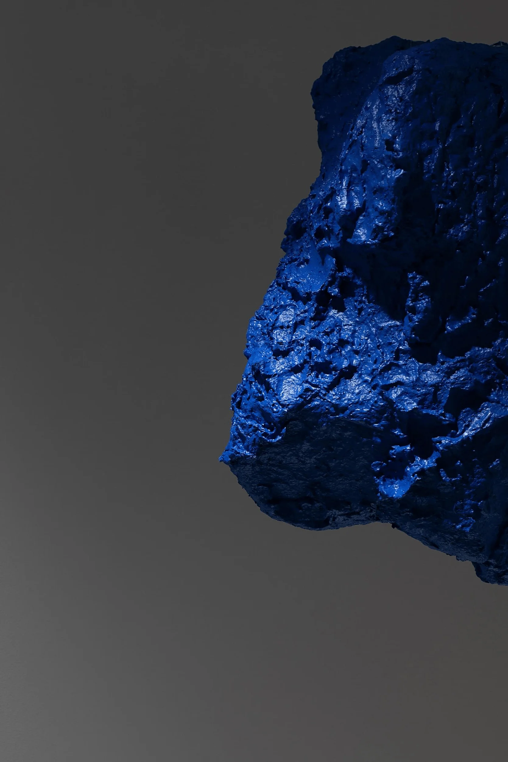
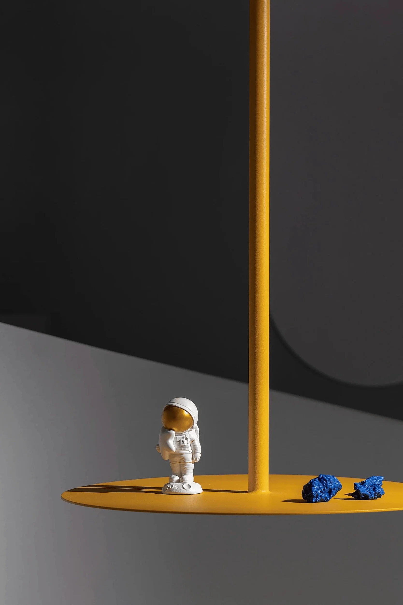
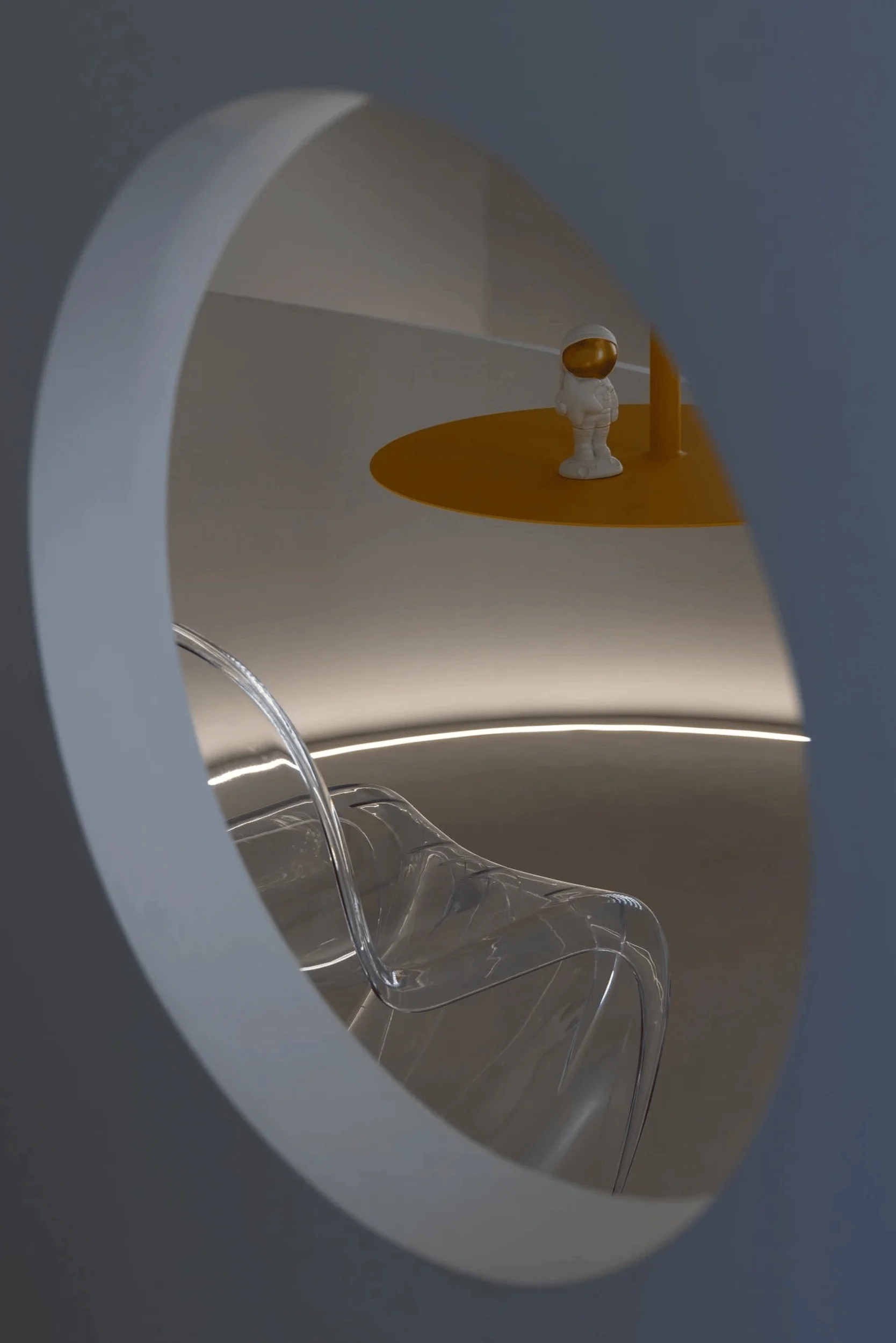
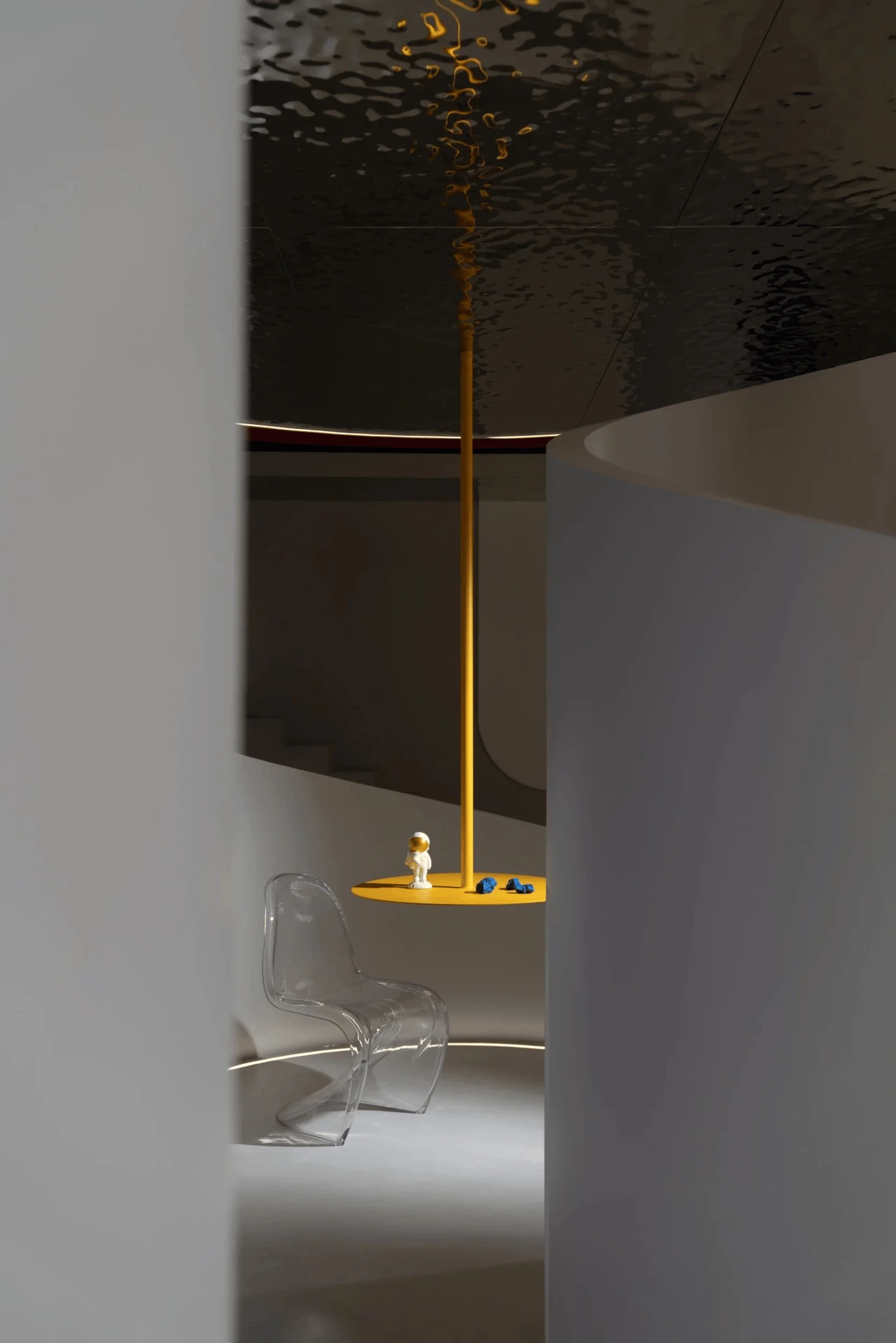
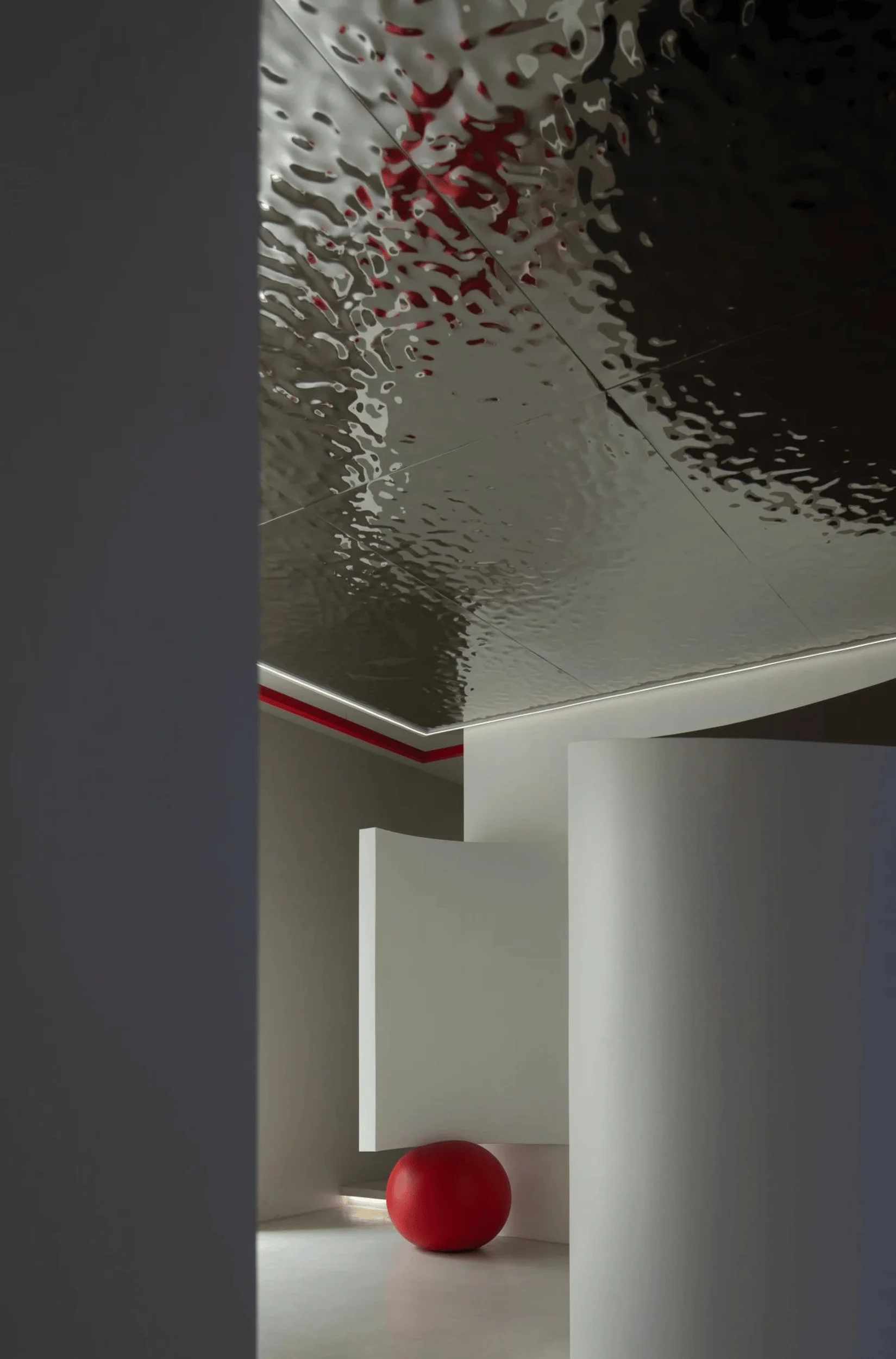
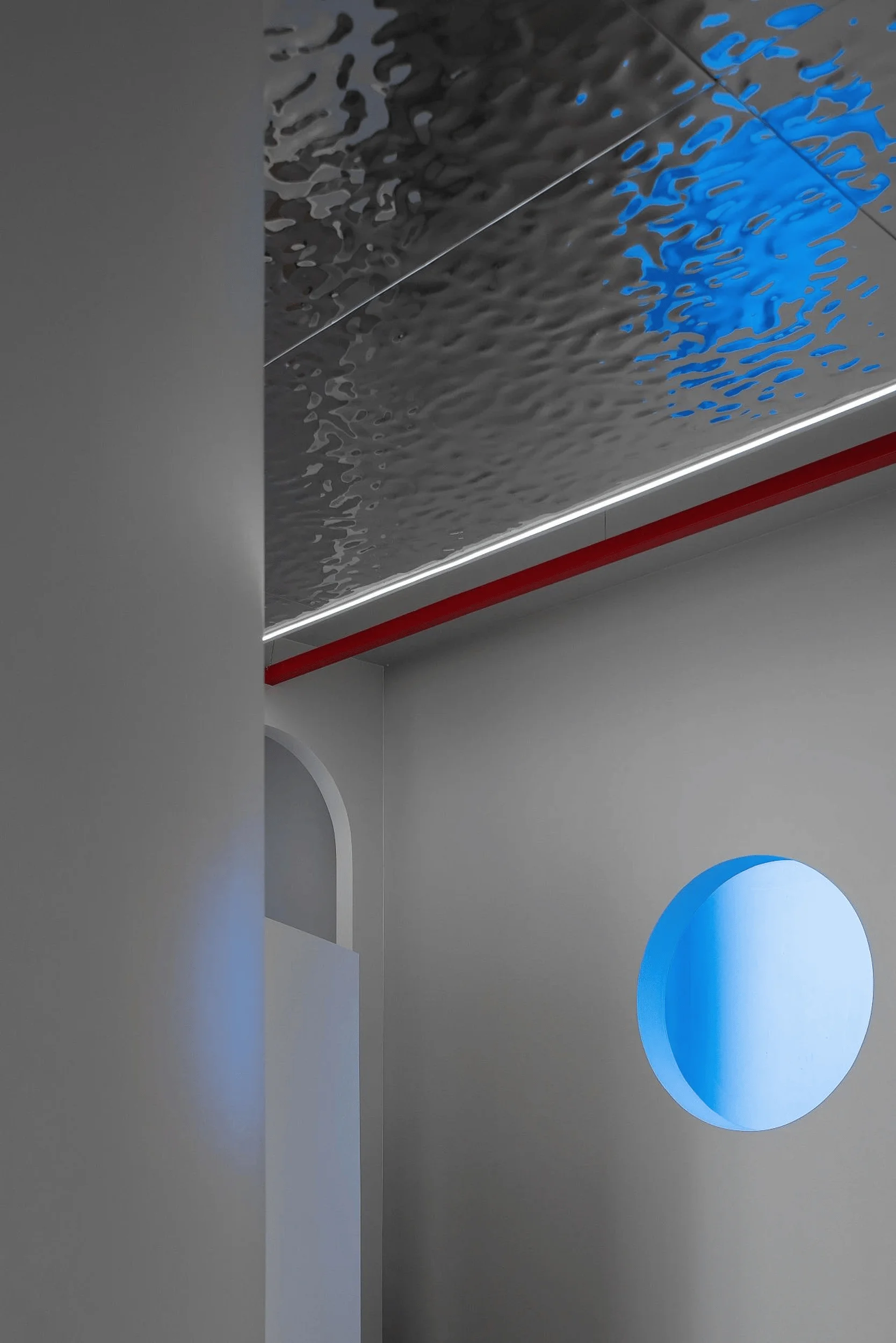
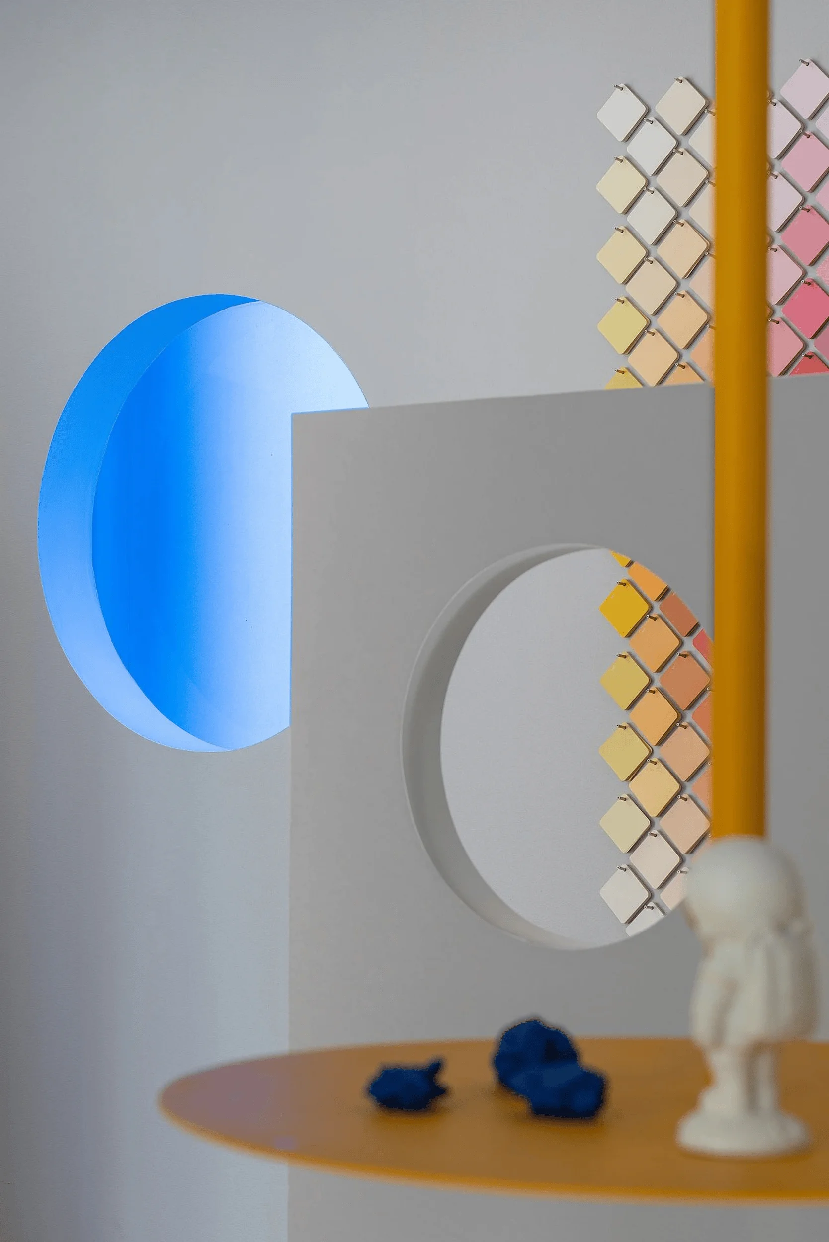
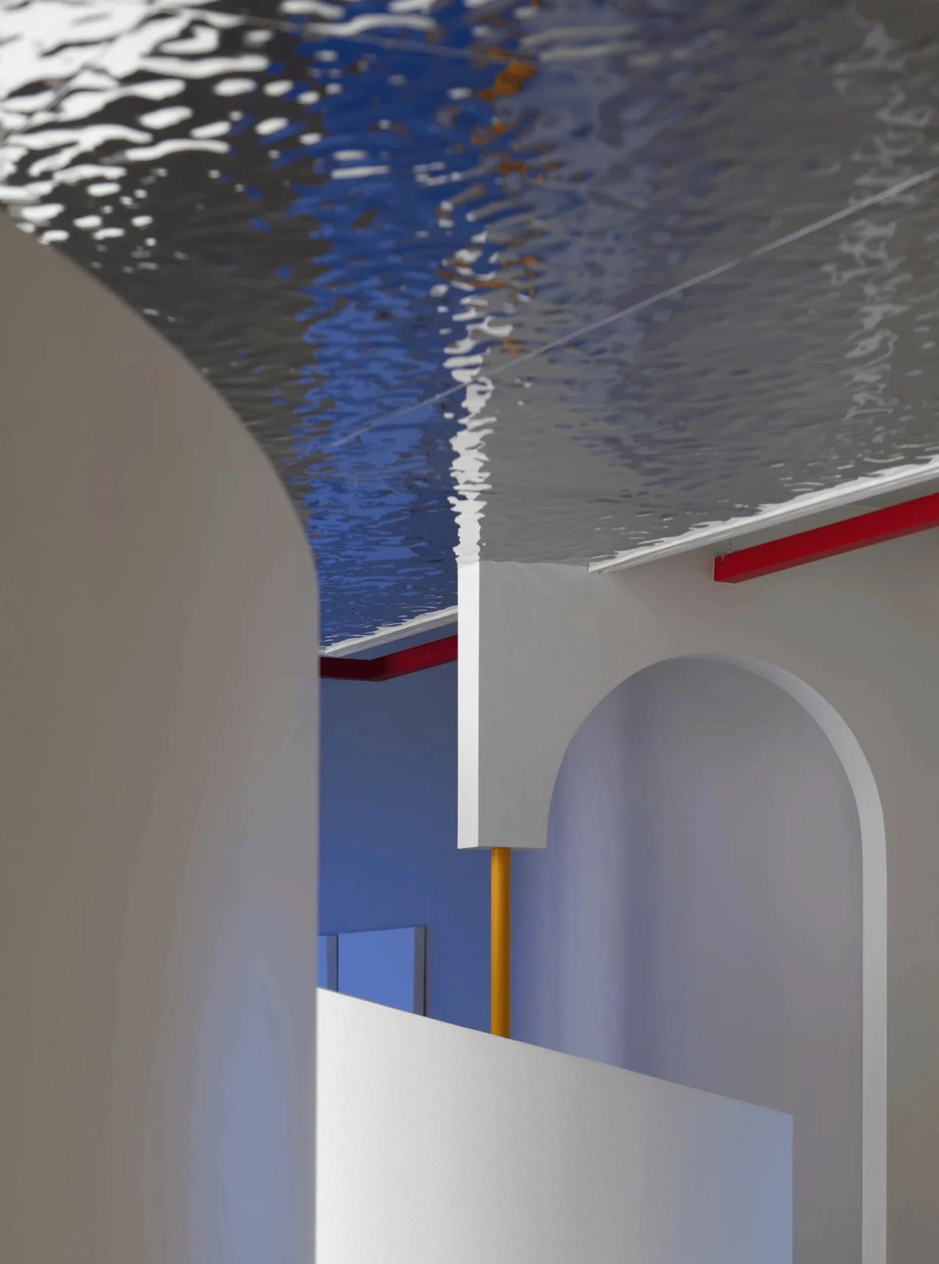
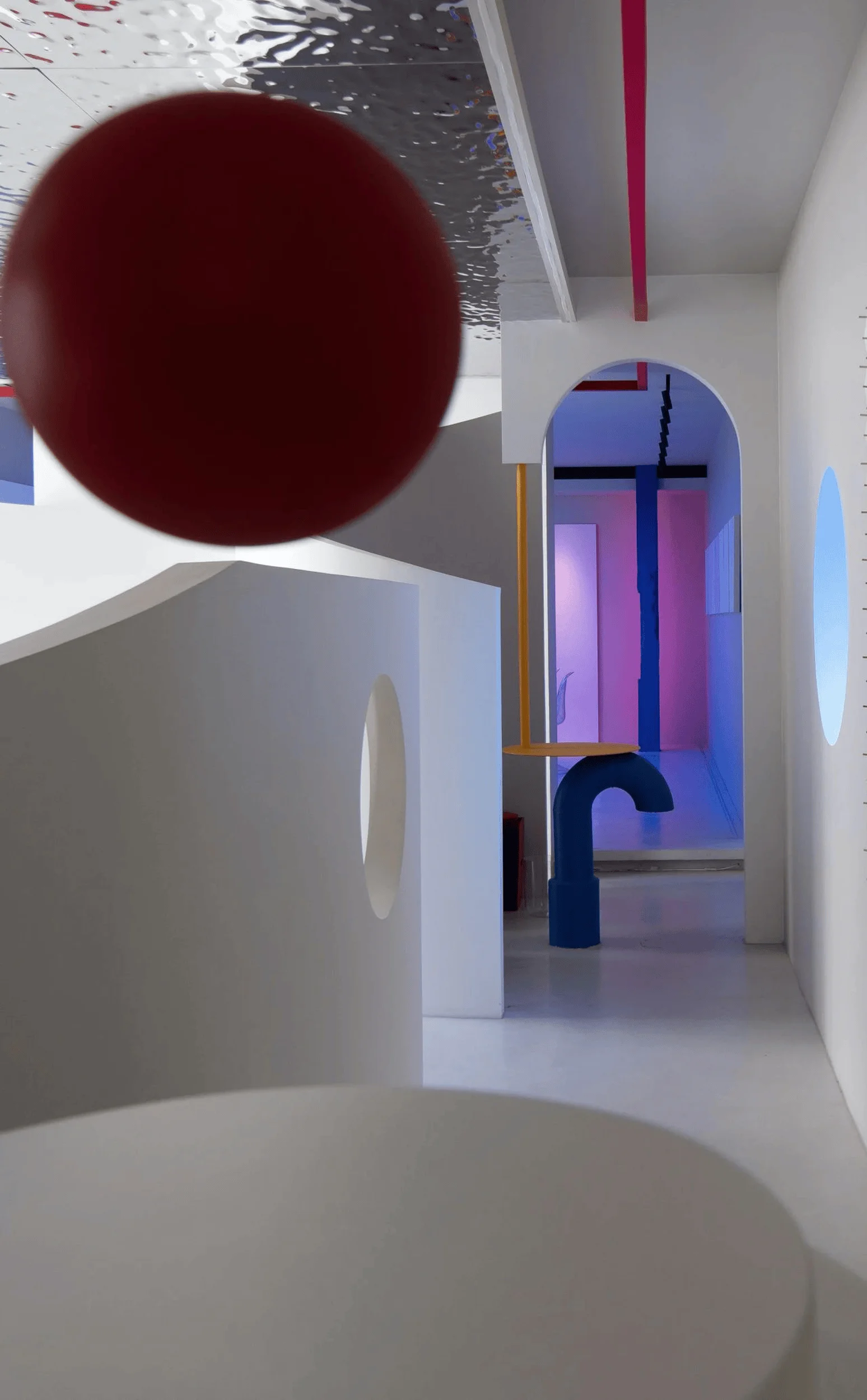
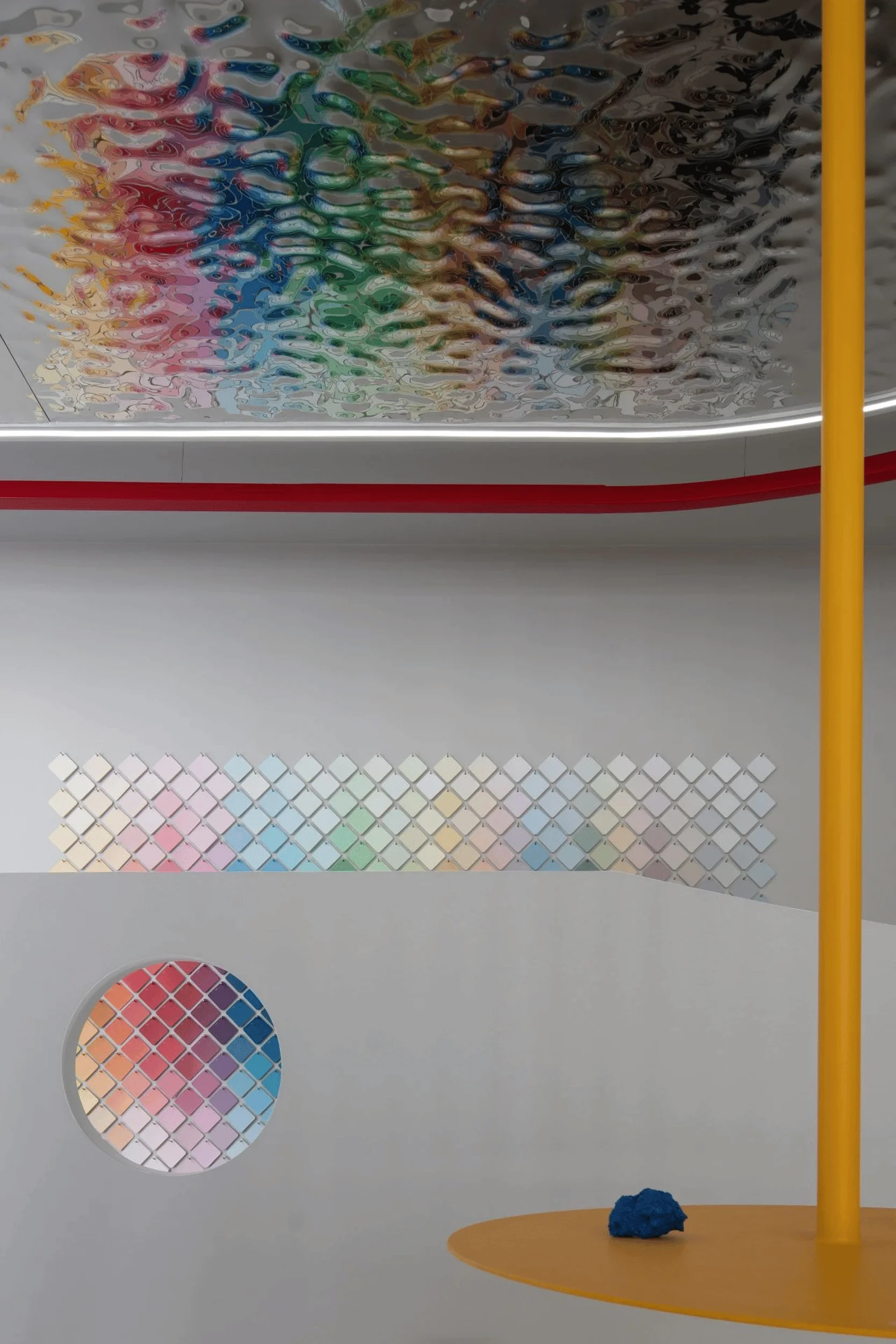
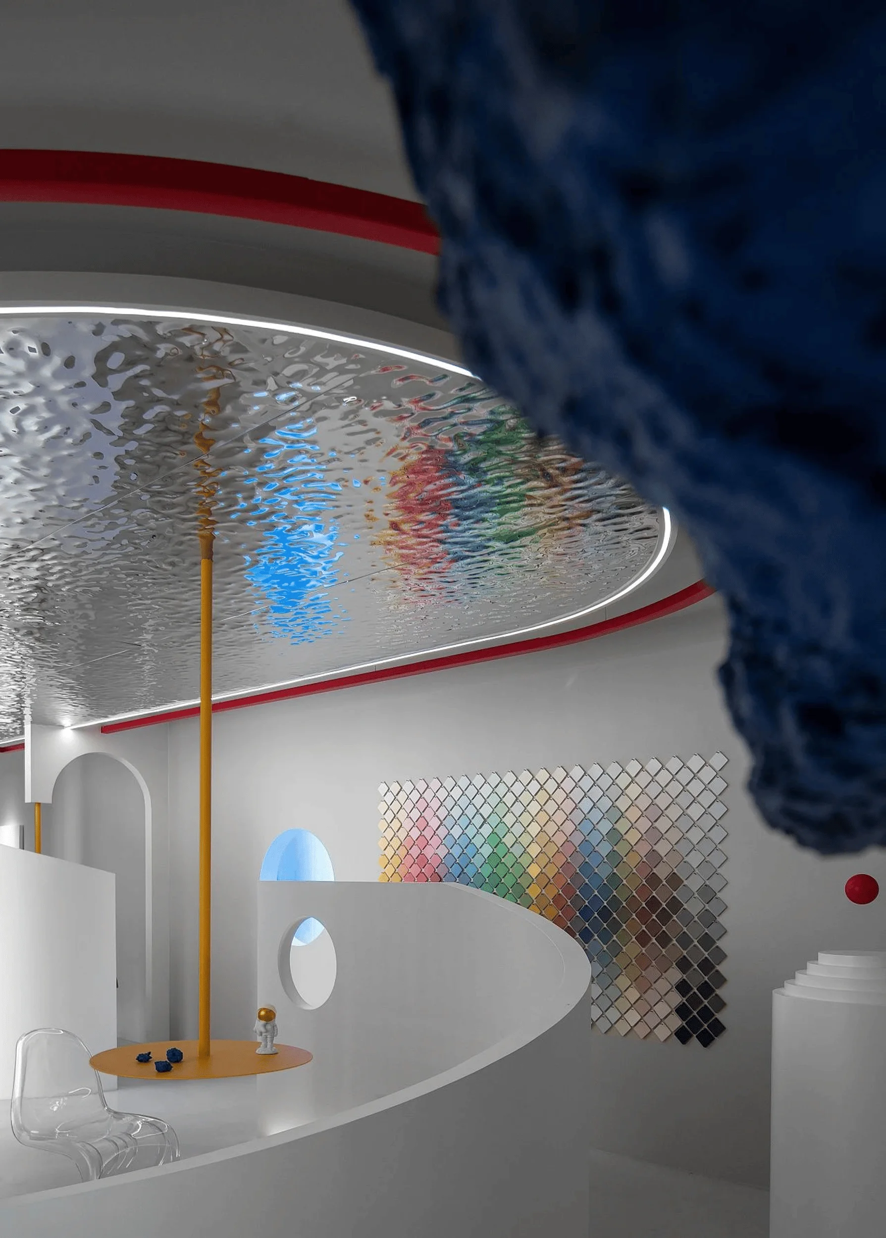
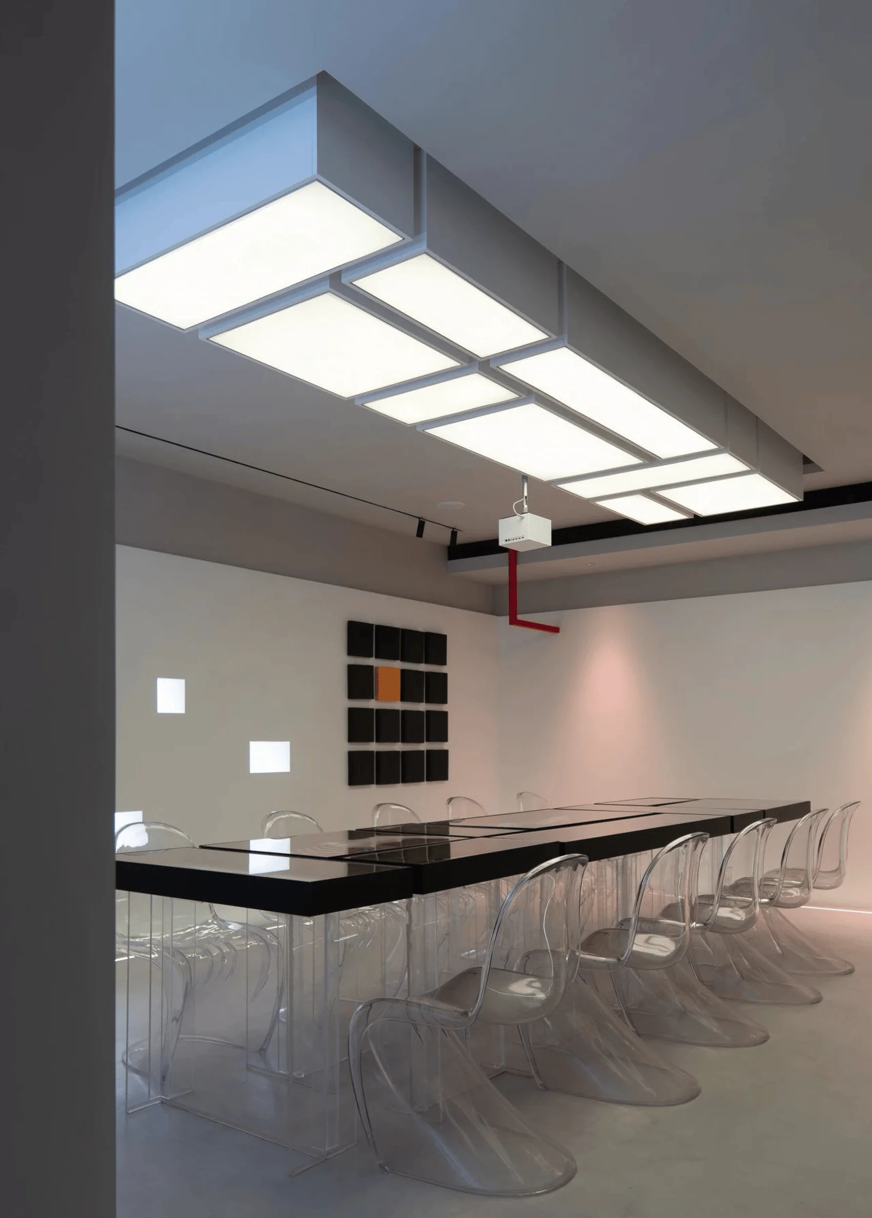
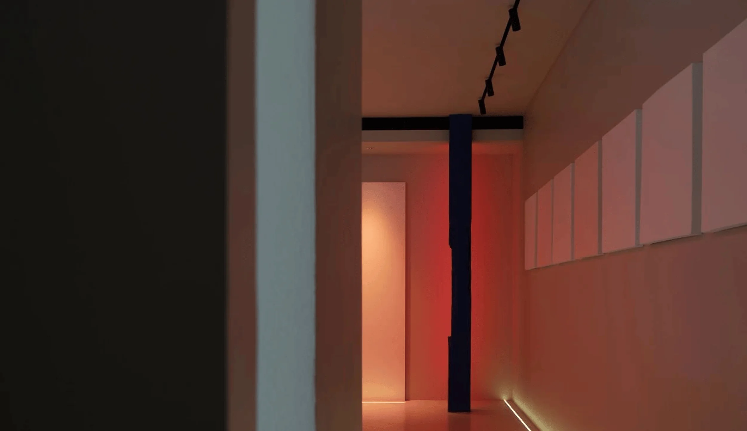
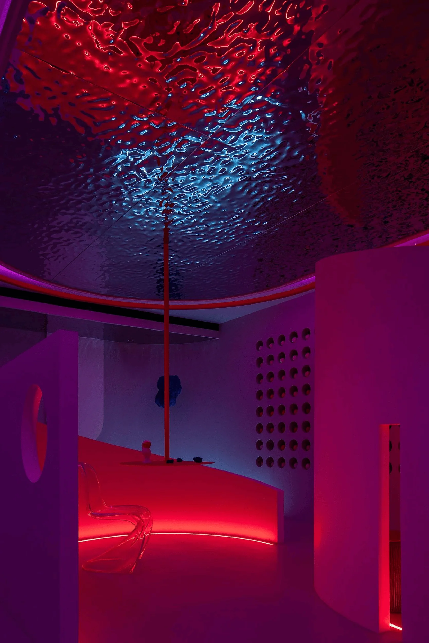
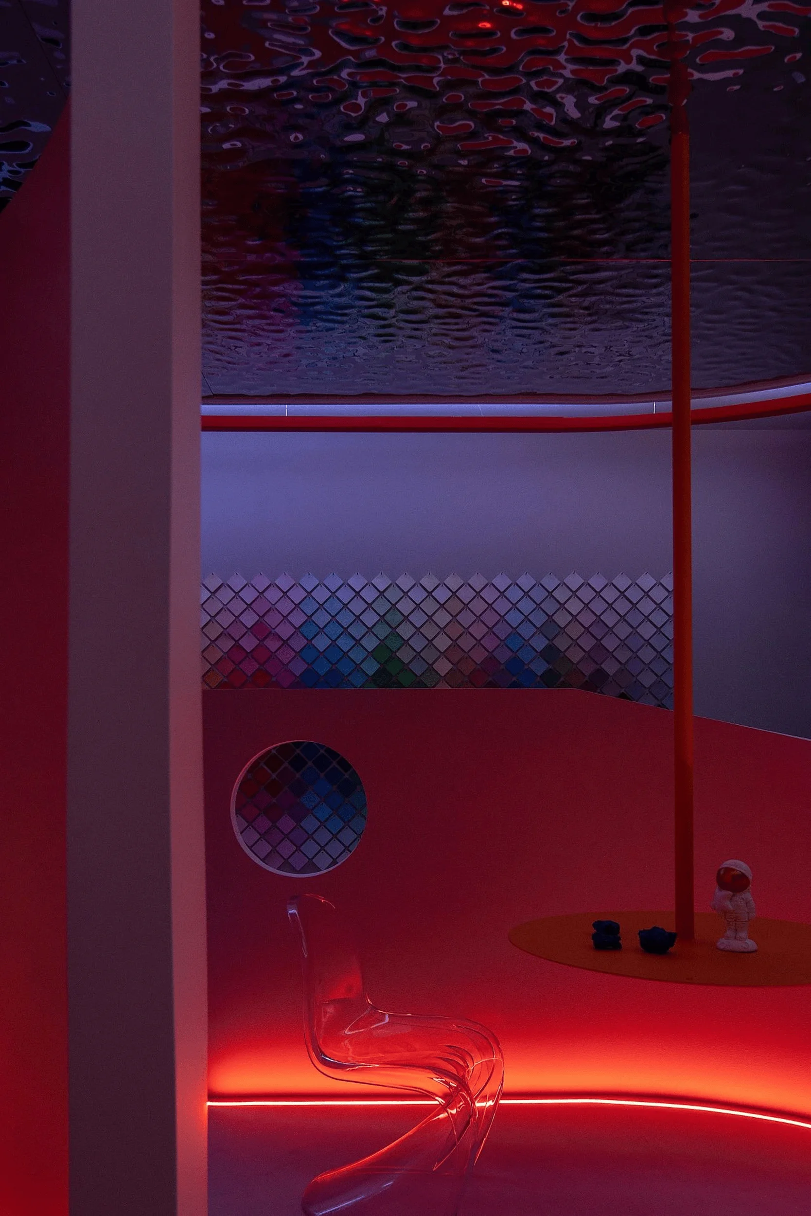
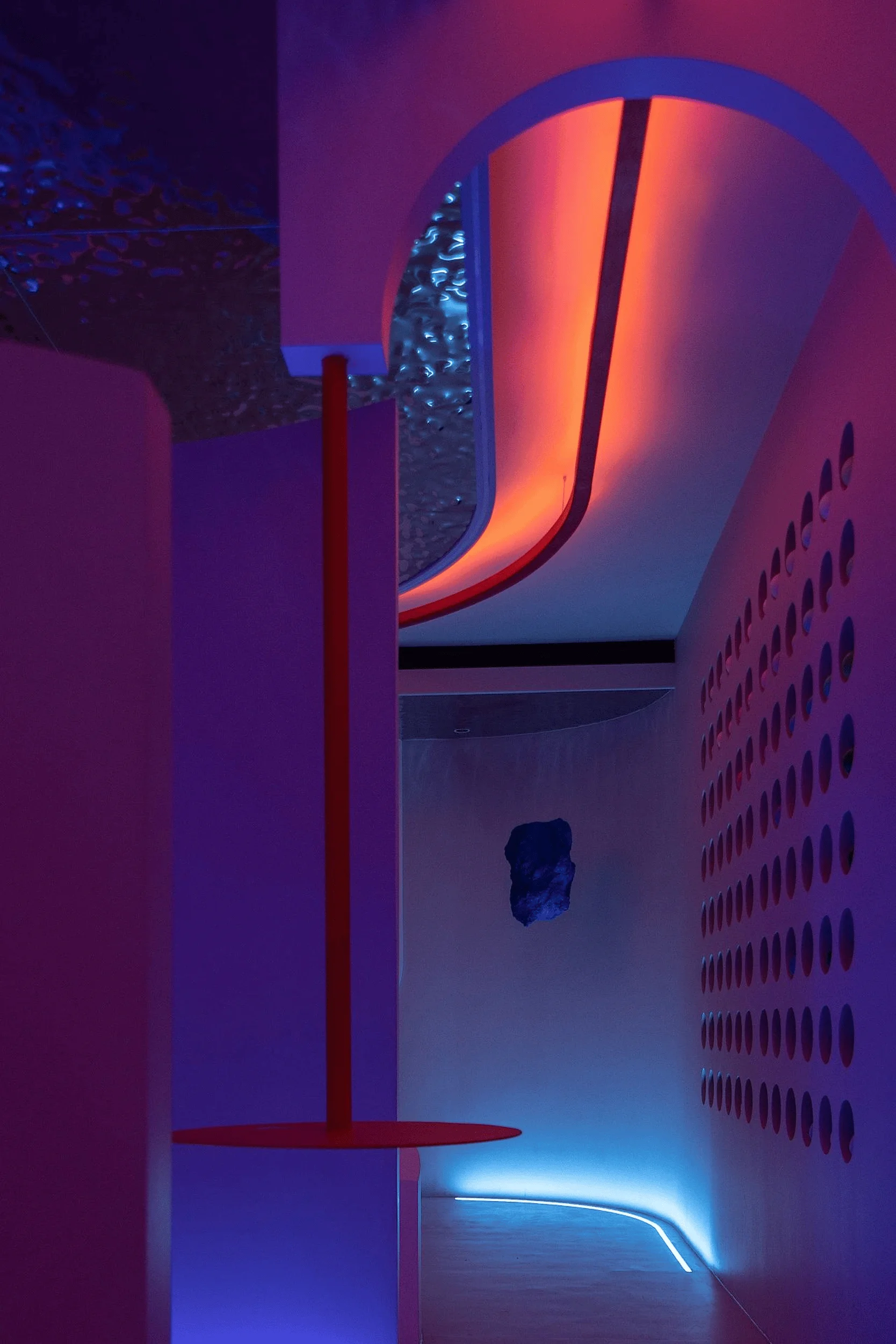
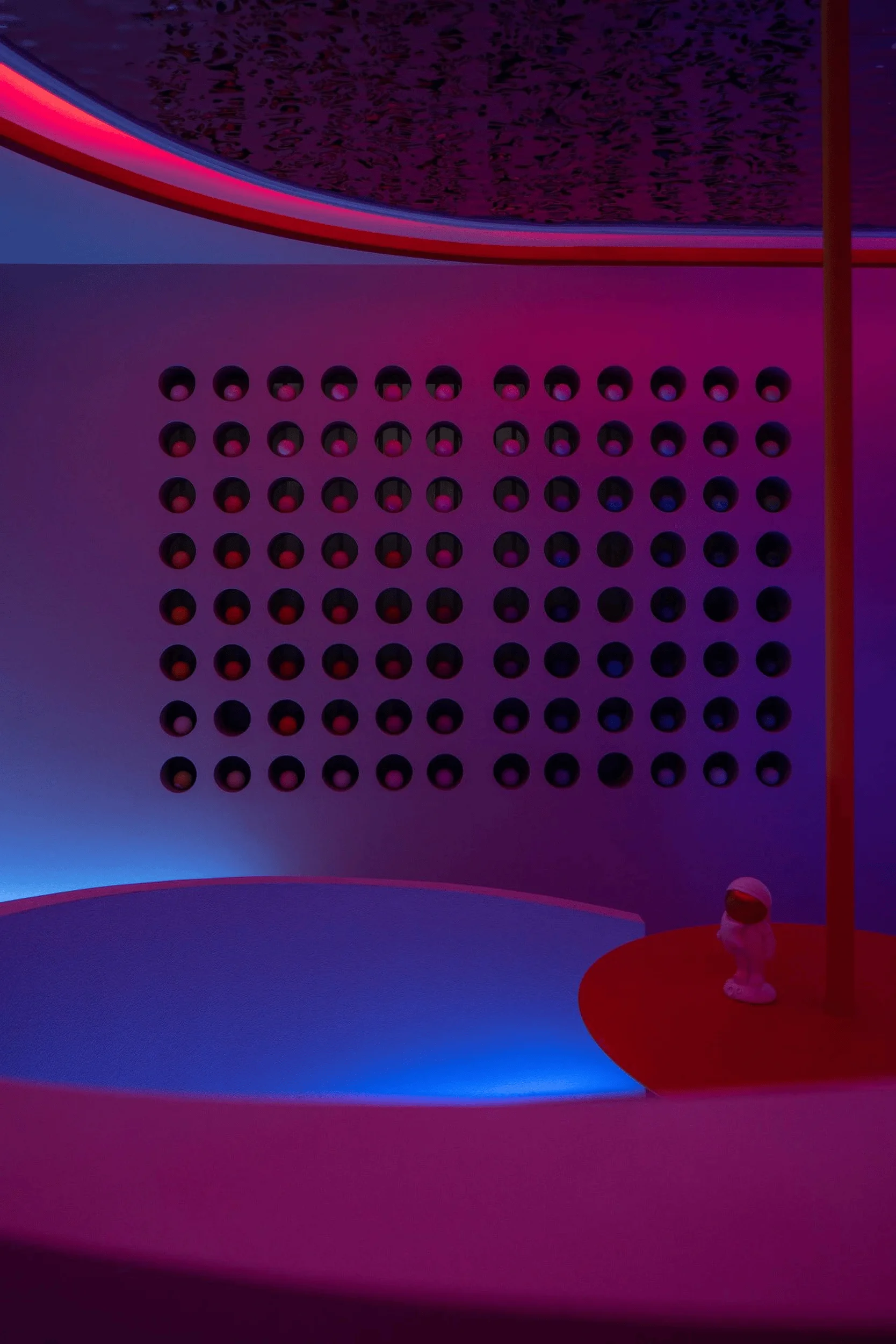
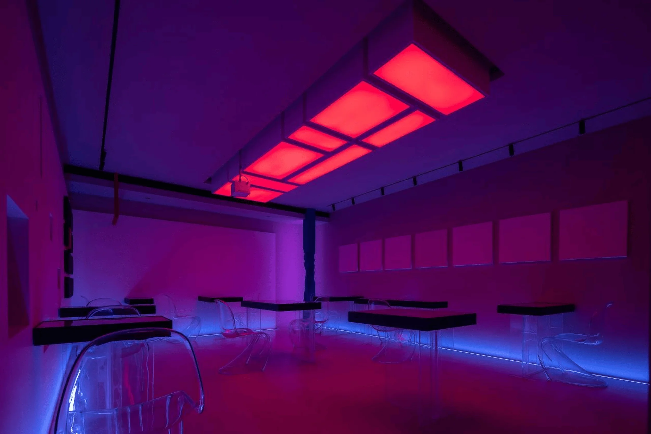
The selection of materials and lighting played a crucial role in enhancing the overall spatial experience. The metallic ceiling with a rippled texture reflected light in a captivating manner, adding a sense of depth and dynamism to the space. The use of translucent acrylic furniture created a sense of lightness and transparency, allowing light to permeate the space freely. The color palette was carefully chosen to complement the bold primary colors used in the exterior and highlight the diverse range of TIKKURILA paint products. Lighting was strategically employed to enhance the interplay of color and texture, creating a vibrant and engaging atmosphere. The use of blue light in the entrance area evoked the image of paint pigment waiting to be mixed, further reinforcing the “Color Lab” concept. Natural light was carefully controlled and directed to showcase the true texture and depth of the paint finishes on display. interior design studio, color and texture in interior design, architectural design, spatial experience
Interactive and Immersive Experience
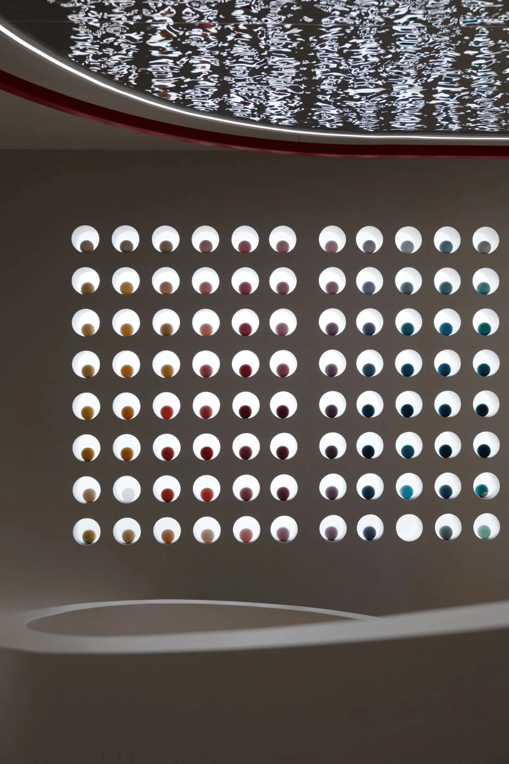
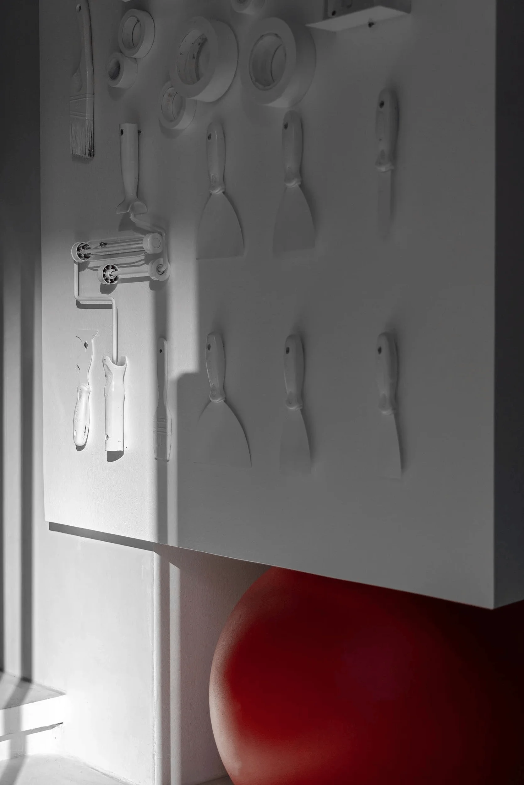
The designers sought to create an interactive and immersive experience that went beyond passive product display. The showroom encouraged visitors to engage with the space and the products in a multi-sensory way. The “color bar” area fostered social interaction and provided a platform for designers and clients to discuss color palettes and design concepts. The salon space hosted workshops and events, further enhancing the brand’s engagement with the design community. The exhibition area showcased paint finishes and textures in a creative and engaging manner. The use of circular cutouts in the walls, reminiscent of paint color samples, allowed visitors to peek into different zones and discover hidden details. The overall effect was a playful and stimulating environment that encouraged exploration and fostered a deeper understanding of the TIKKURILA brand and its products. interior design studio, color and texture in interior design, architectural design, spatial experience
Project Information:
Project Type: Showroom
Architect: Yujian Interior Design Studio
Area: 88㎡
Project Year: 2023
Country: China
Photographer: REMEX


