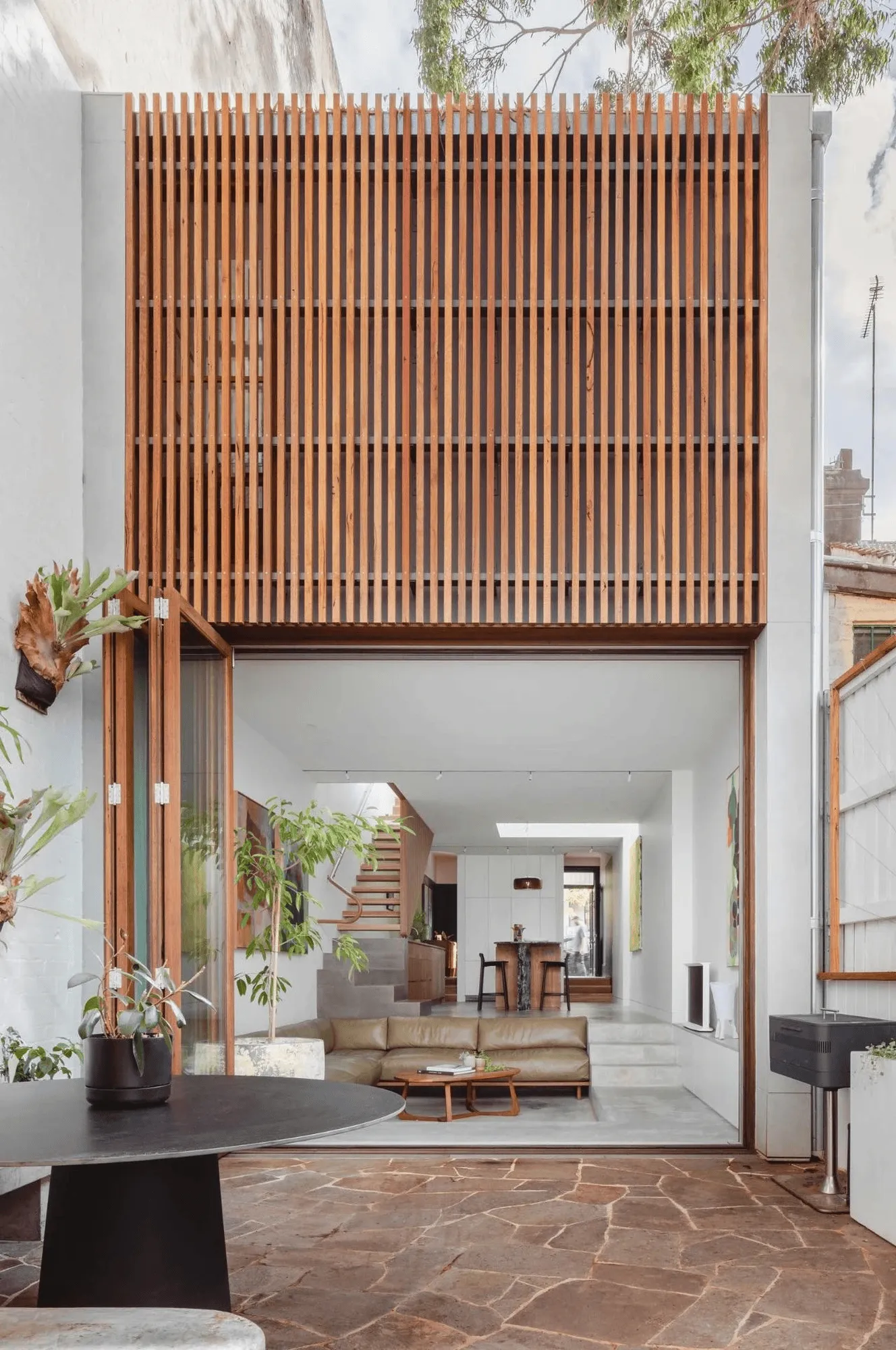
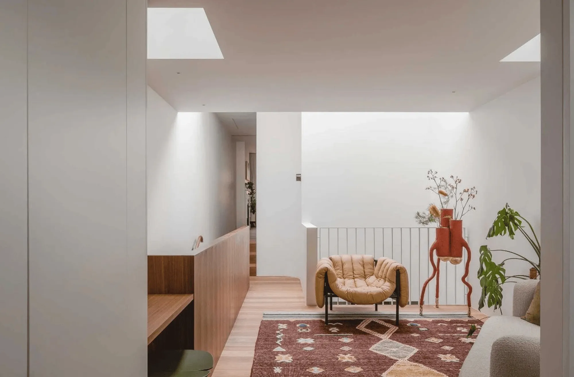
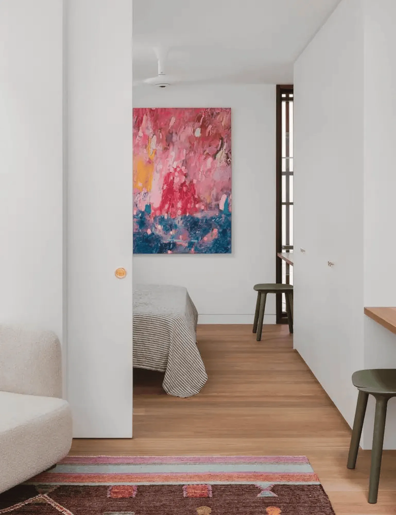
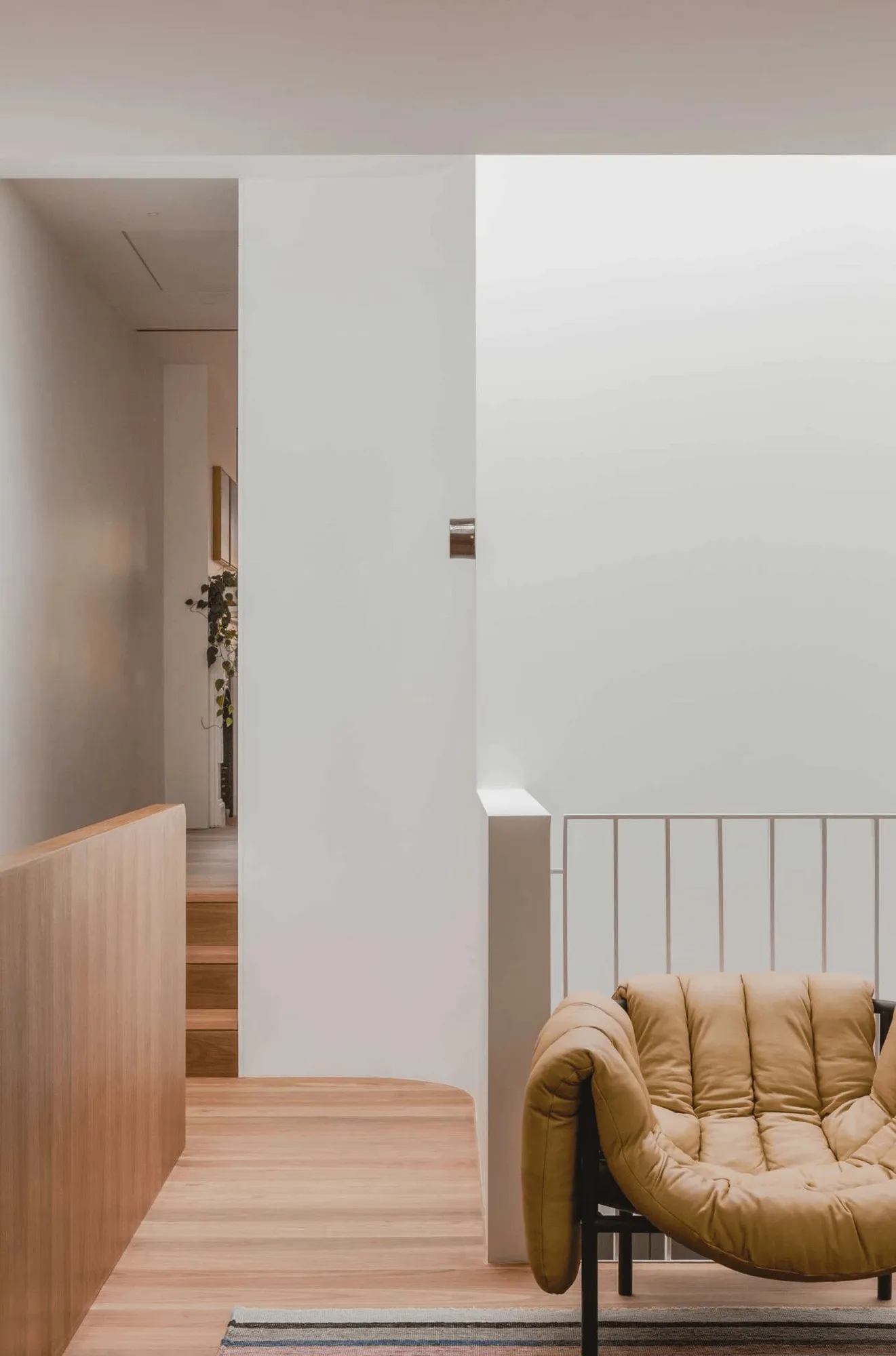
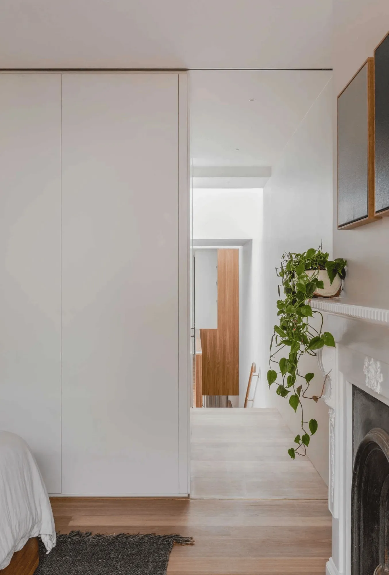
Up Down House in Surry Hills showcases clever spatial design, enhancing a heritage terrace with contemporary aesthetics.
Contents
Embracing History and Modern Living in Surry Hills
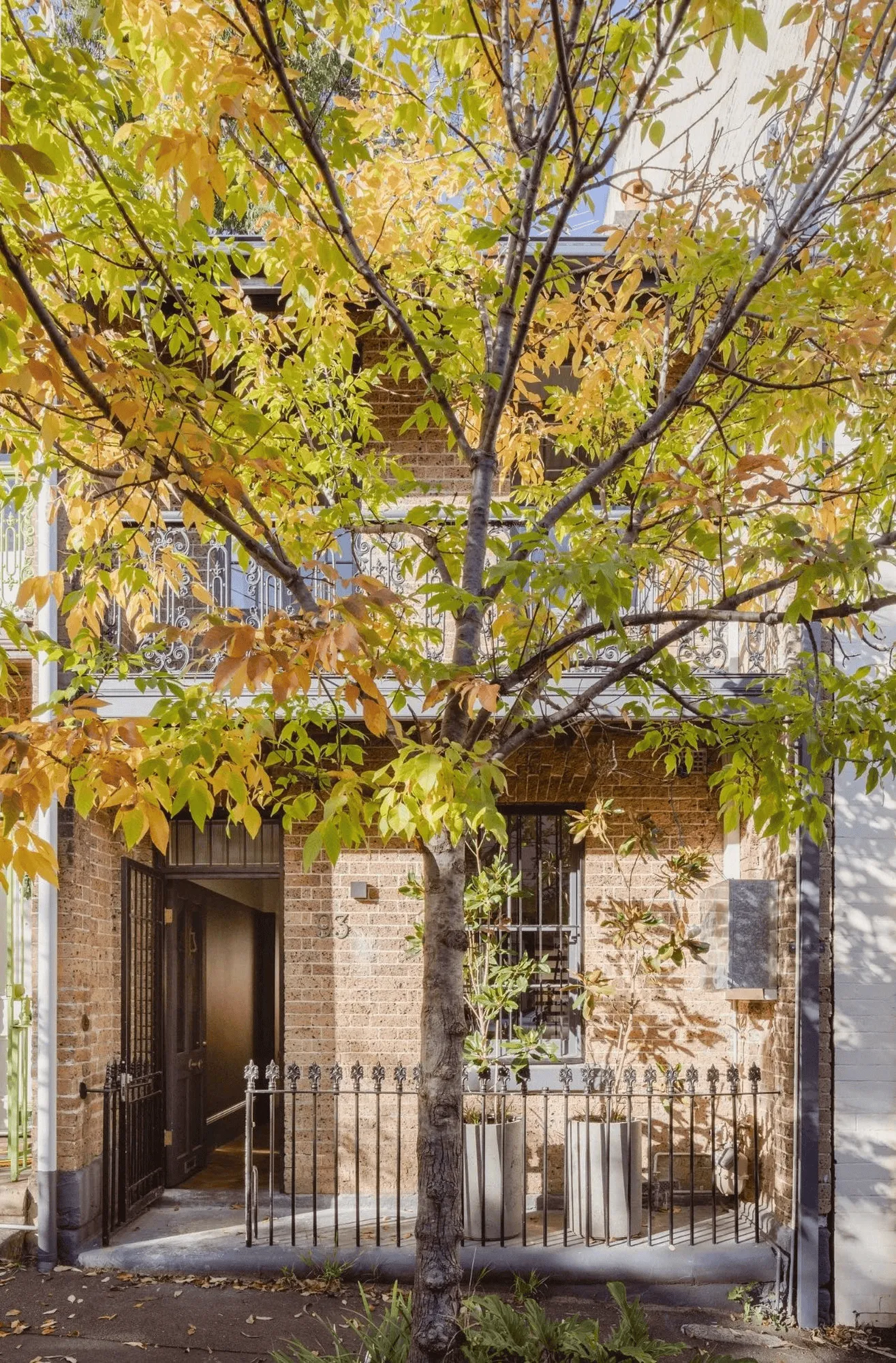
Nestled in the vibrant neighborhood of Surry Hills, the Up Down House stands as a testament to the power of thoughtful design in revitalizing heritage architecture. Brad Swartz Architects took on the challenge of transforming a traditionally dark and narrow terrace house into a bright and airy contemporary dwelling that seamlessly blends the old with the new. The project prioritizes the integration of natural light, enhancing the sense of space within the confines of the existing structure. It respects the historical context of the residence while catering to the demands of a modern lifestyle, creating a serene and immersive experience amidst the bustling urban landscape.
A Clever Play of Light and Space
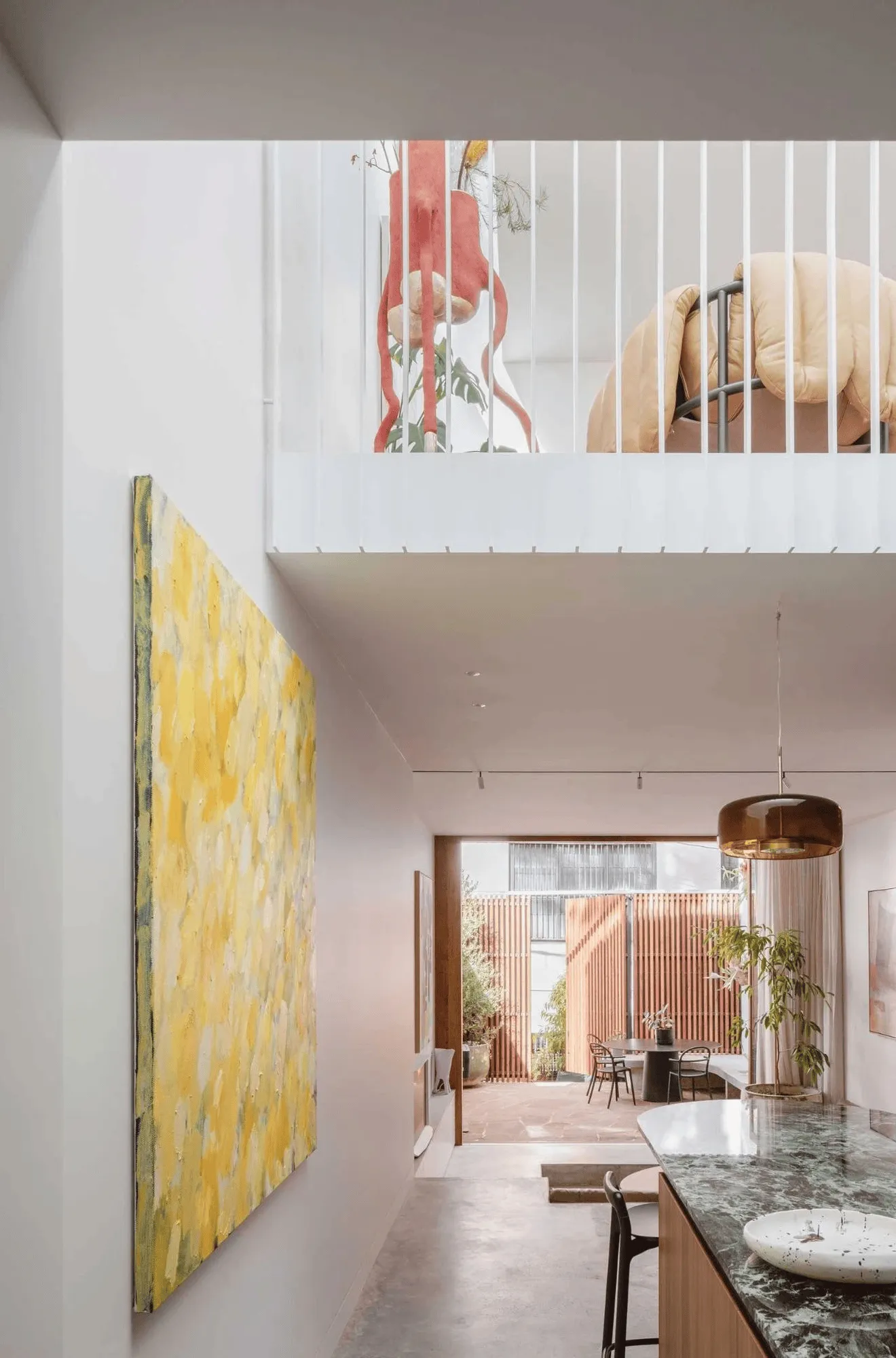
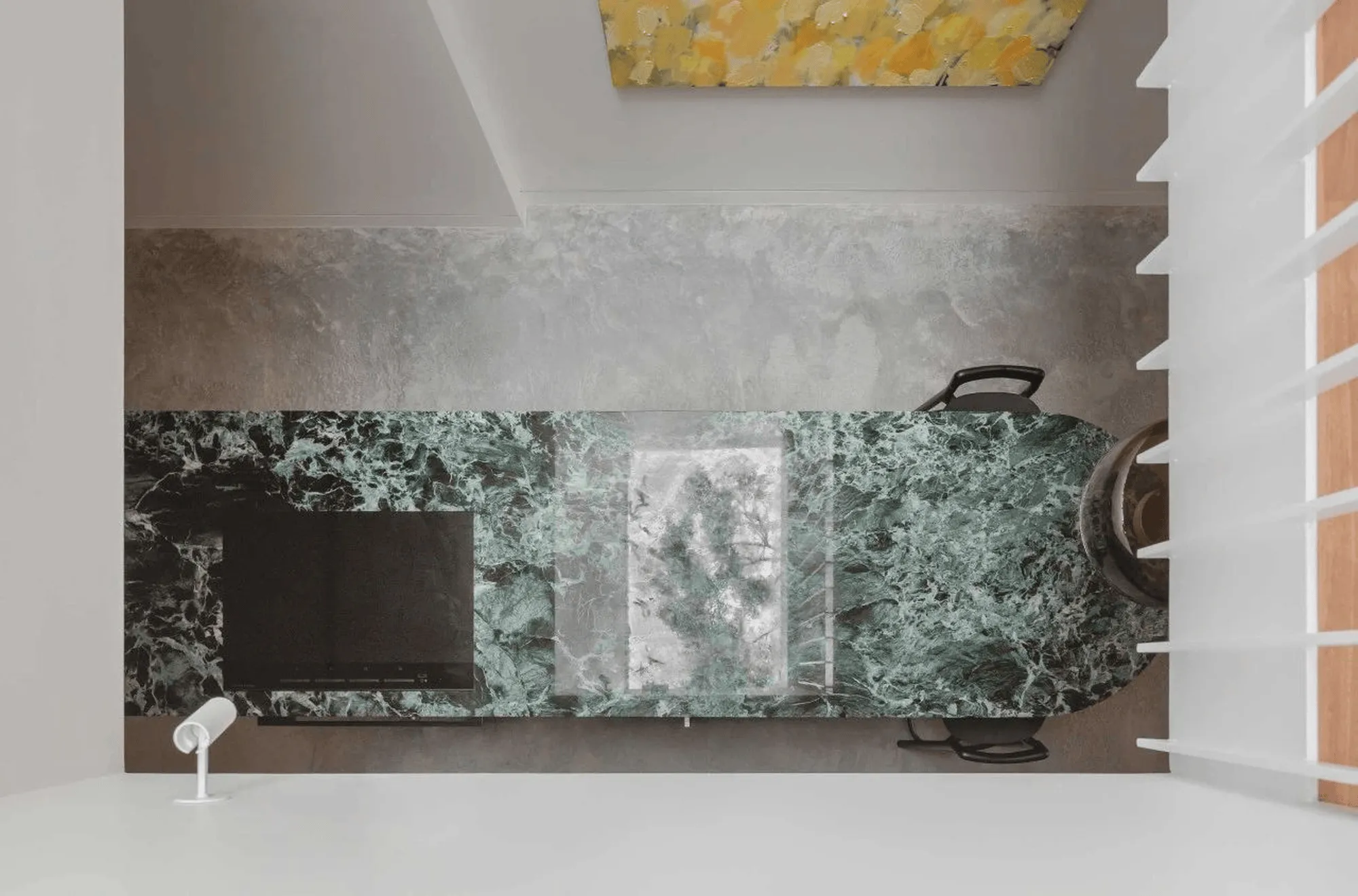
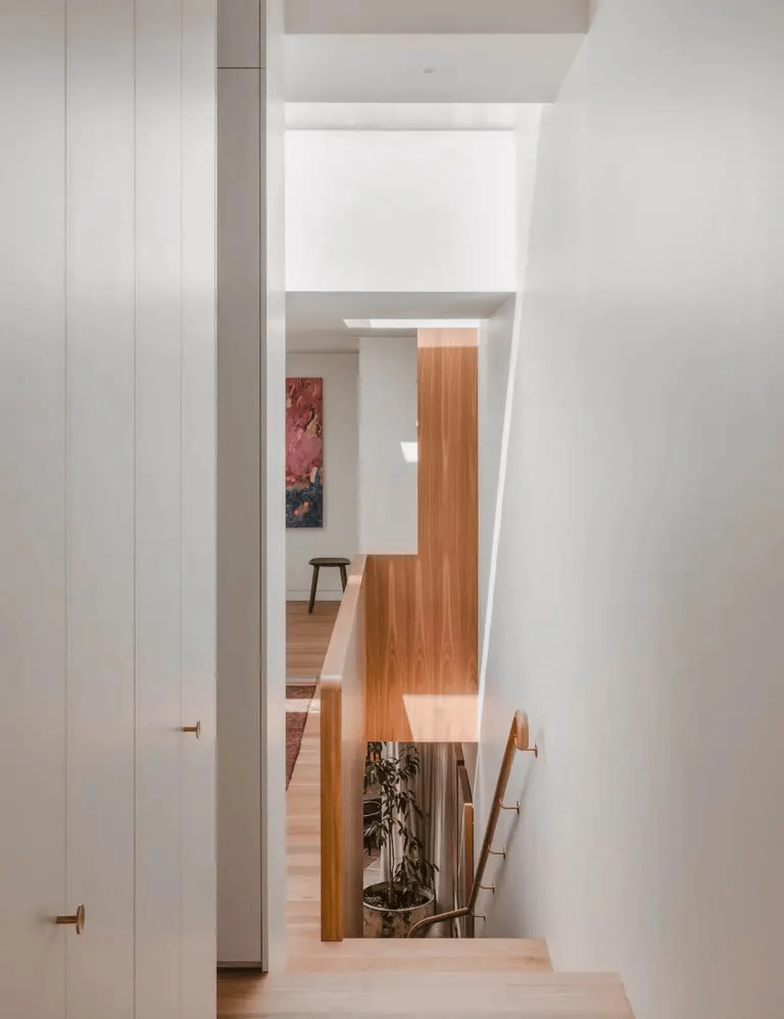
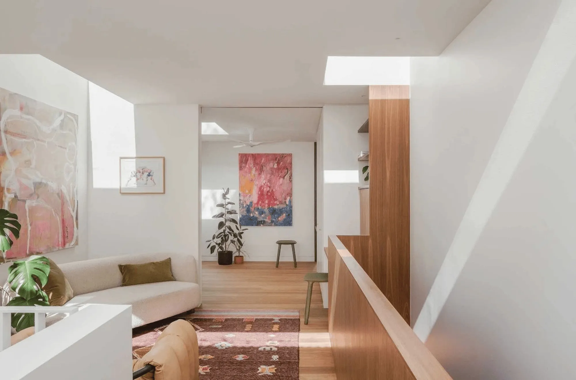
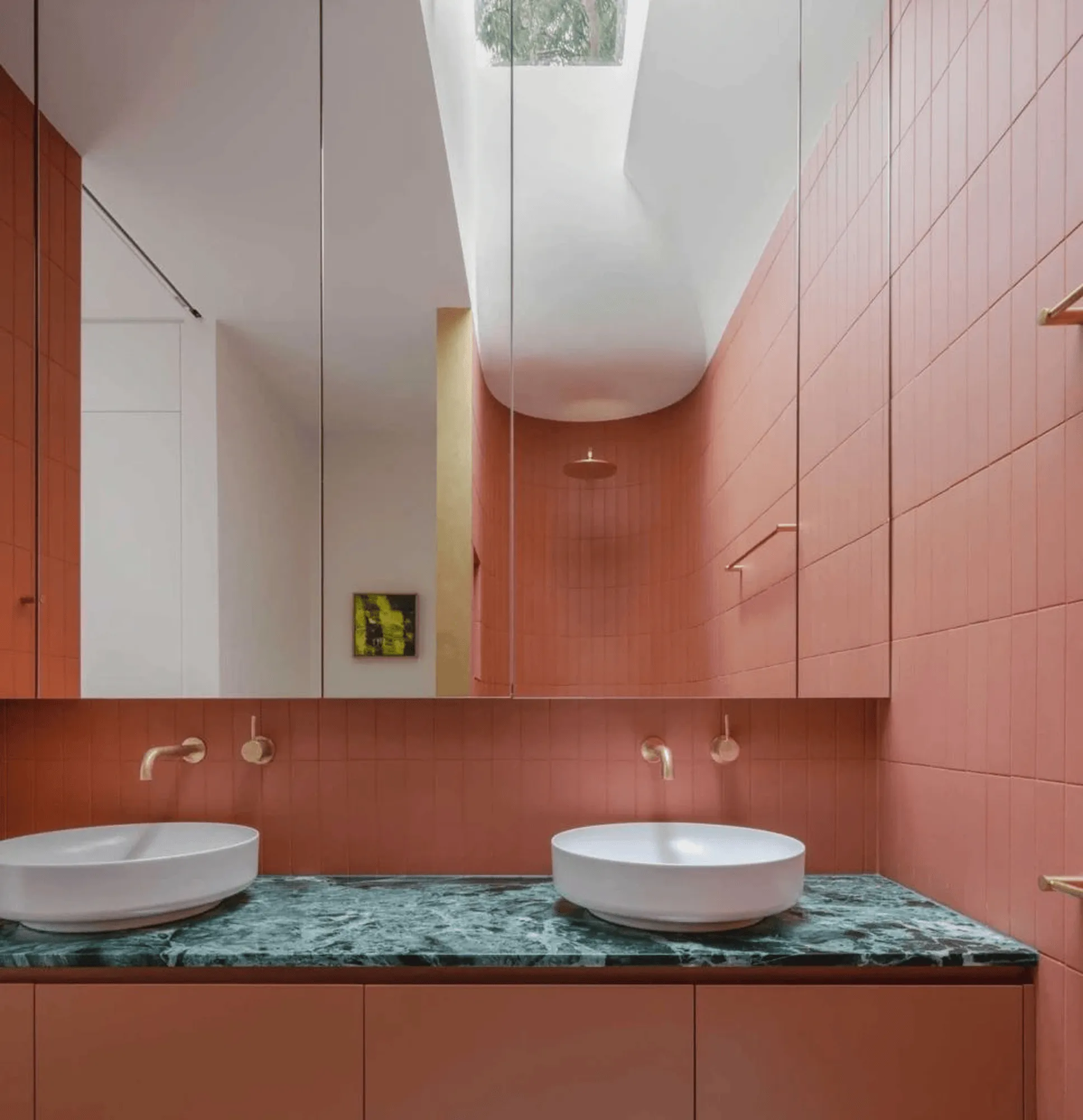
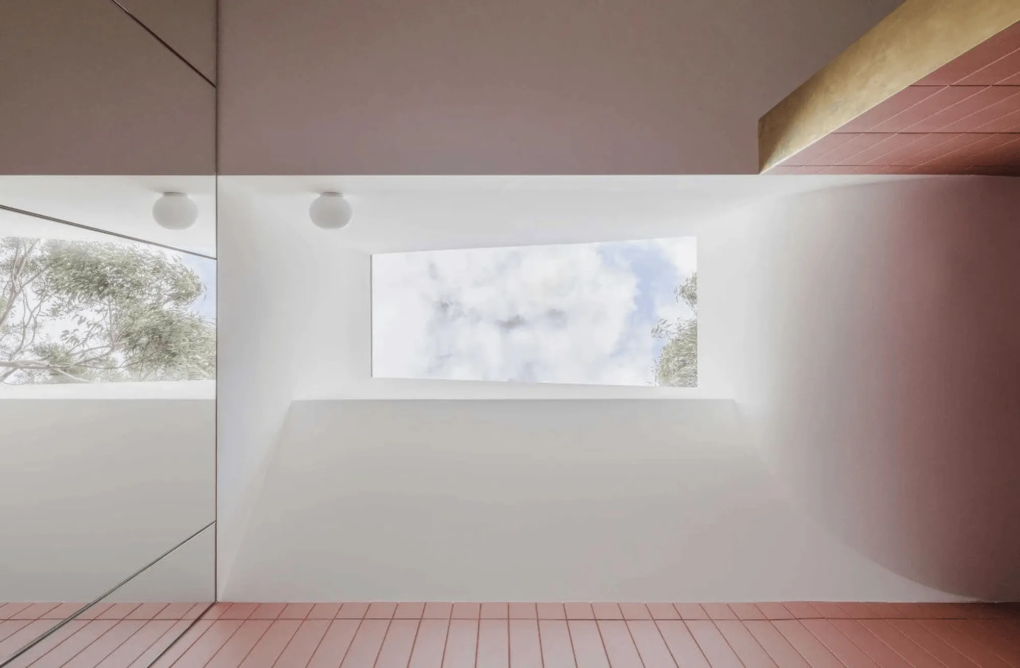
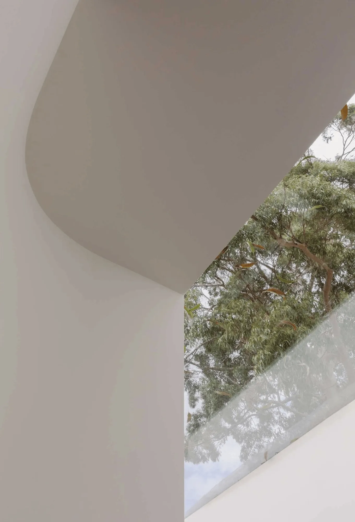
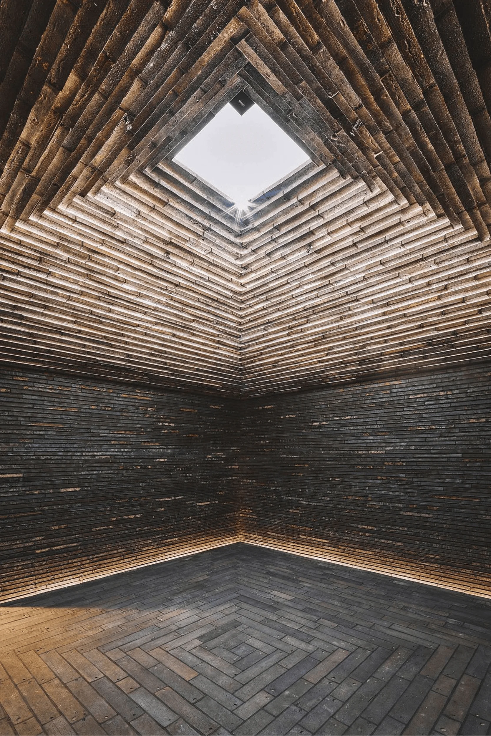
Brad Swartz Architects addressed the constraints of the narrow terrace by implementing a strategic spatial design that maximizes natural light and creates a sense of openness. Skylights and voids were strategically incorporated throughout the house, allowing for free-flowing ventilation and drawing the eye upwards towards the sky. A particularly striking feature is the roof skylight that spans the width of the house and sits atop a double-height void above the kitchen. This design element not only floods the space with natural light but also connects the floors visually and offers a glimpse of the tree canopy above, blurring the lines between indoor and outdoor spaces.
Creating Flow and Connection
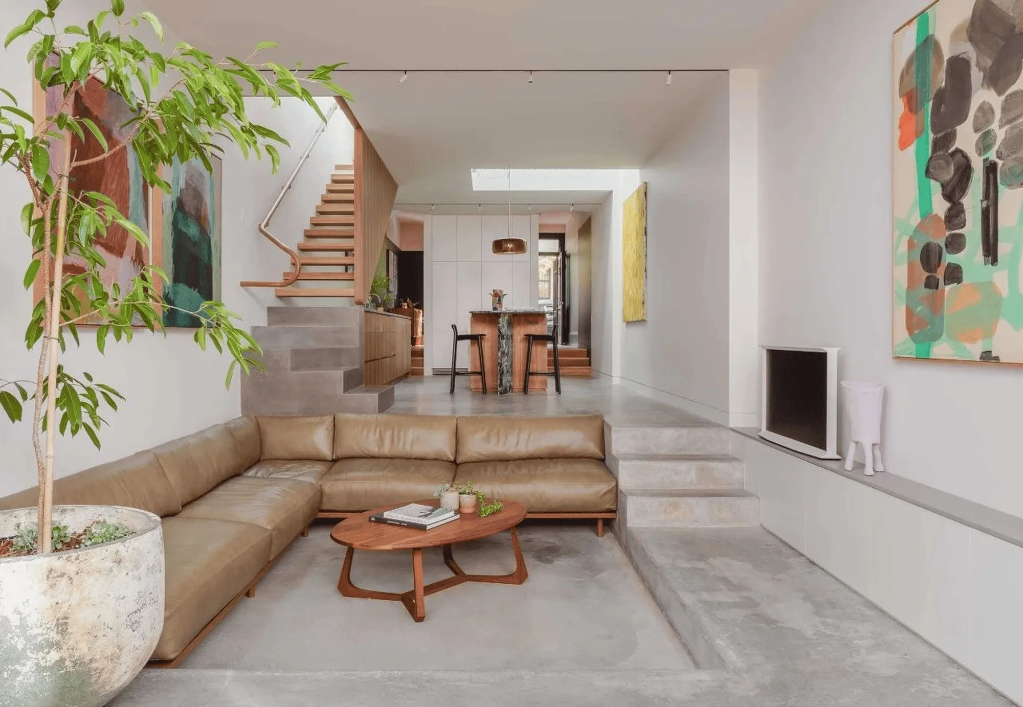
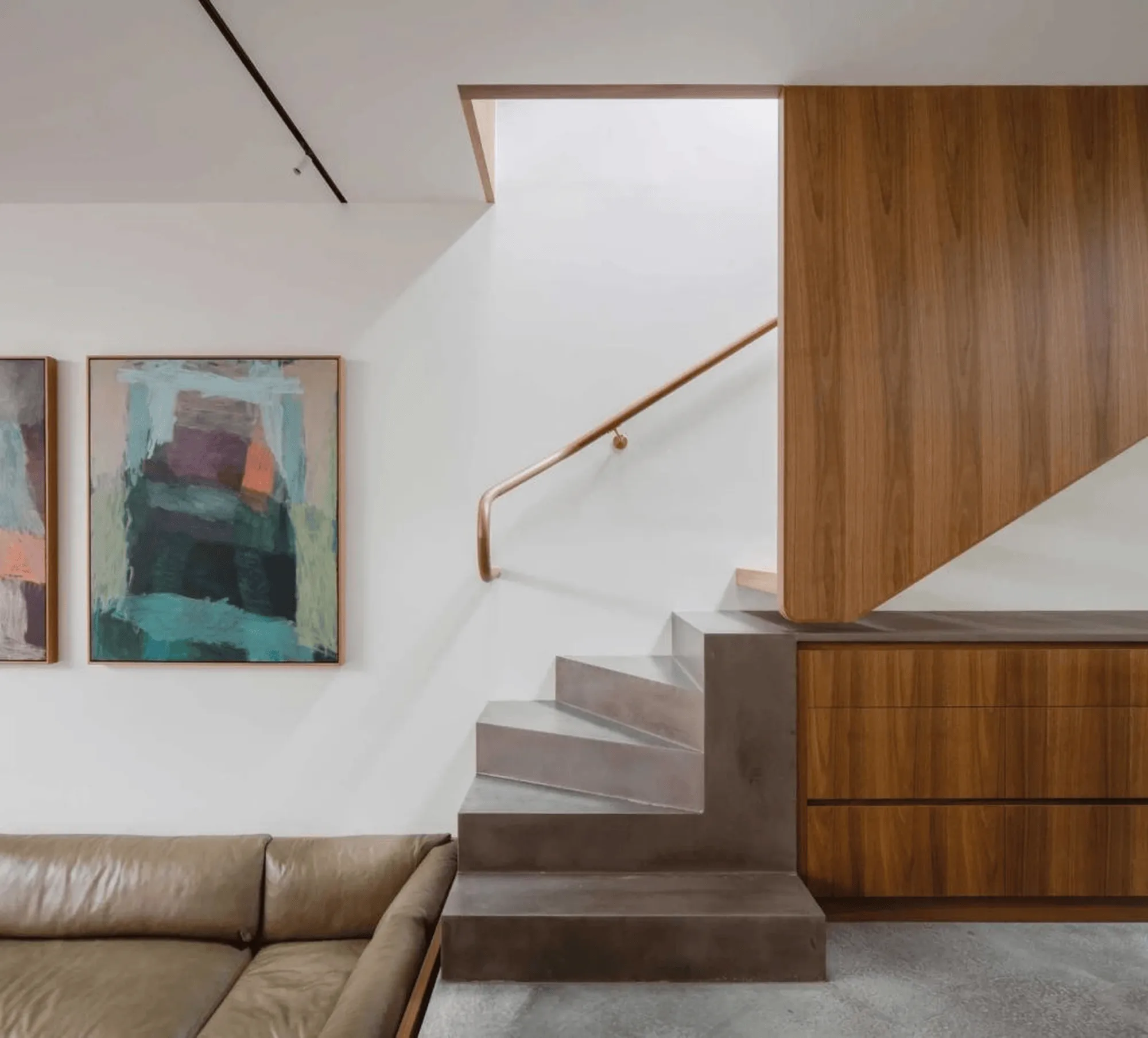
The floor plan of Up Down House is designed to enhance the perceived scale of the house and foster a sense of connection between different areas. The ground floor features a monochromatic palette with textured timber, creating a flexible and adaptable space. The concrete floor seamlessly connects the kitchen and the sunken lounge, which is intentionally designed as the most spacious area in the house, occupying the full width of the site. This connection extends to the outdoors through large, retractable hardwood doors that open up to the courtyard, effectively expanding the living space and creating a fluid transition between inside and outside.
Celebrating Transitions and Defining Zones
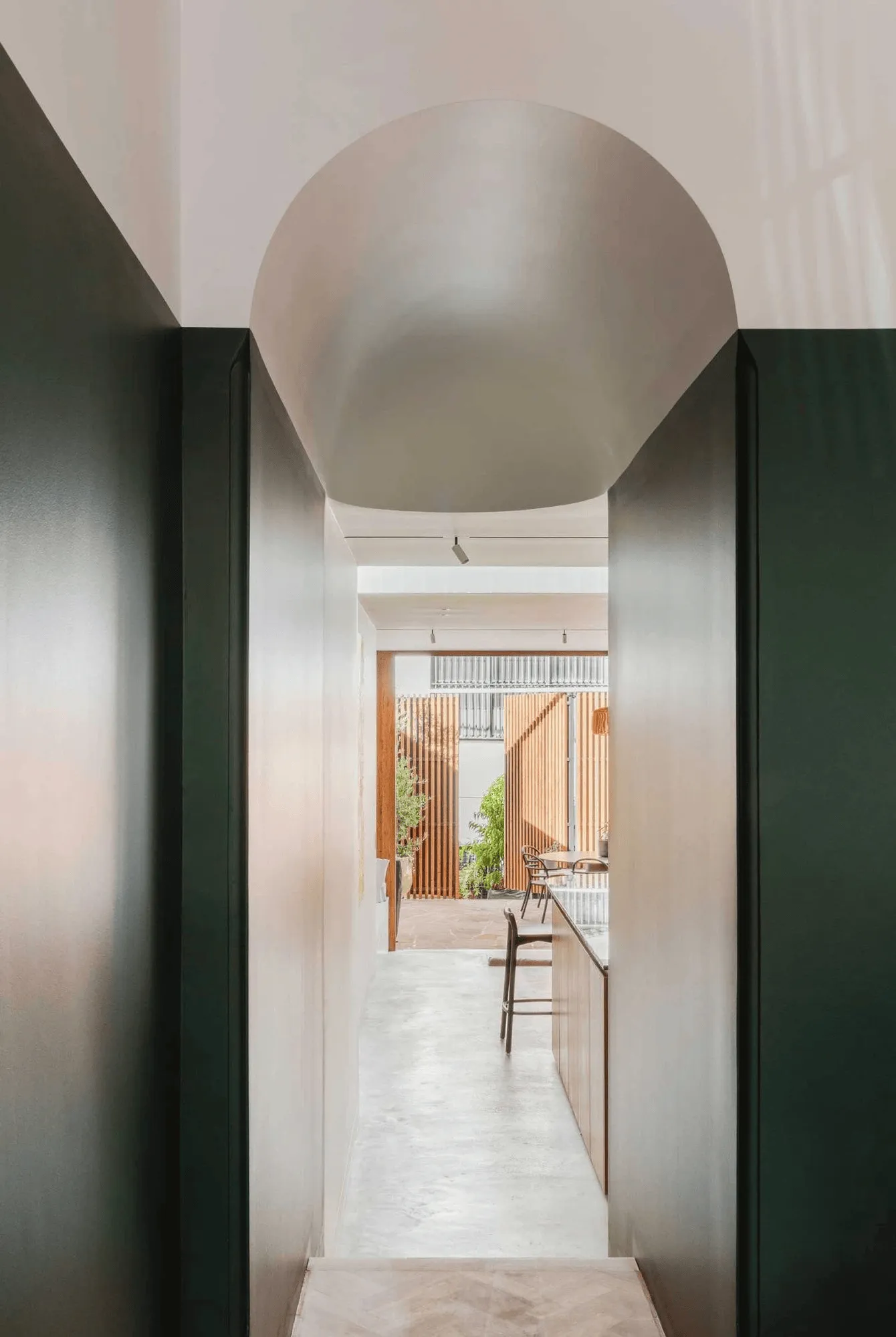
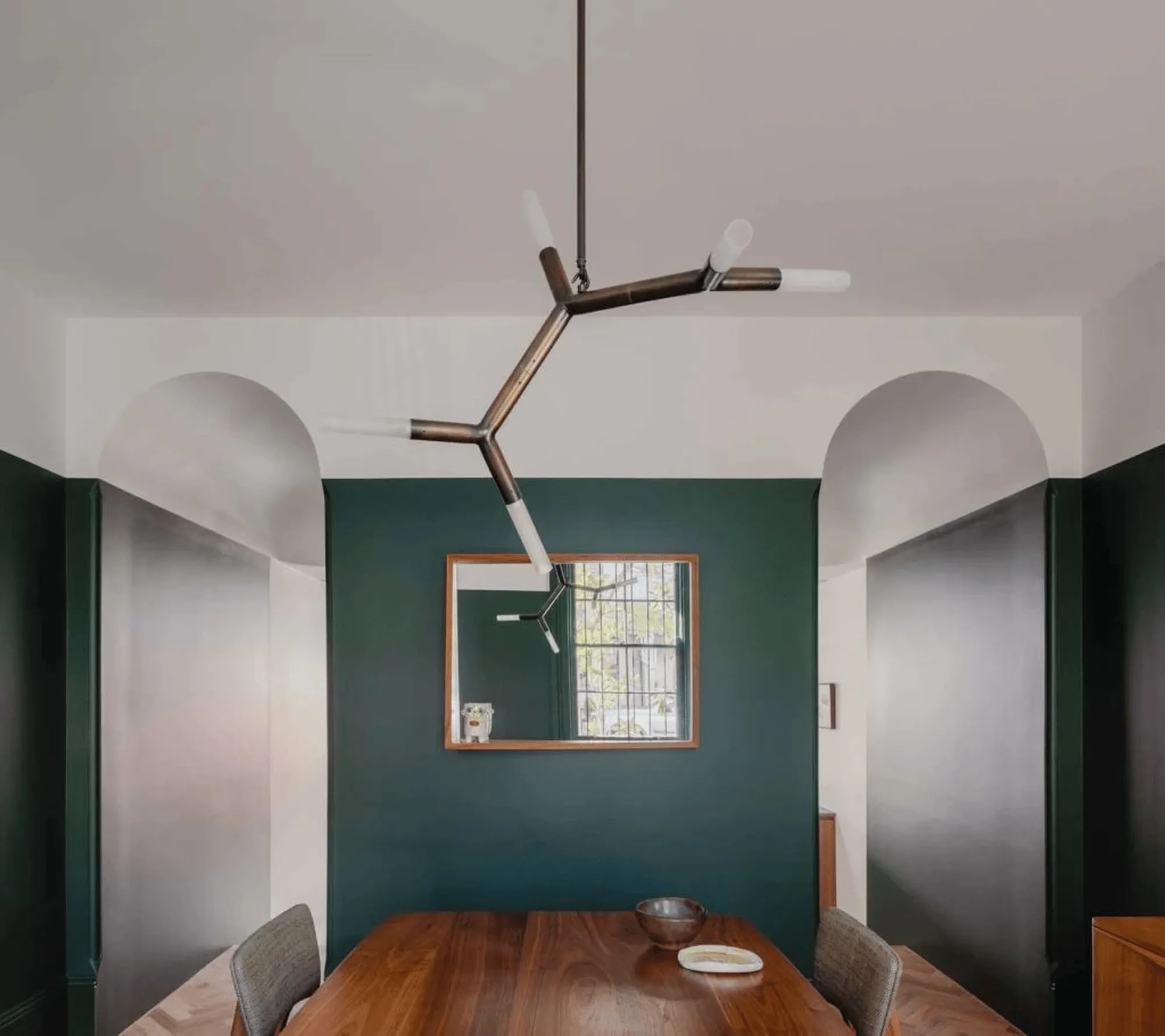
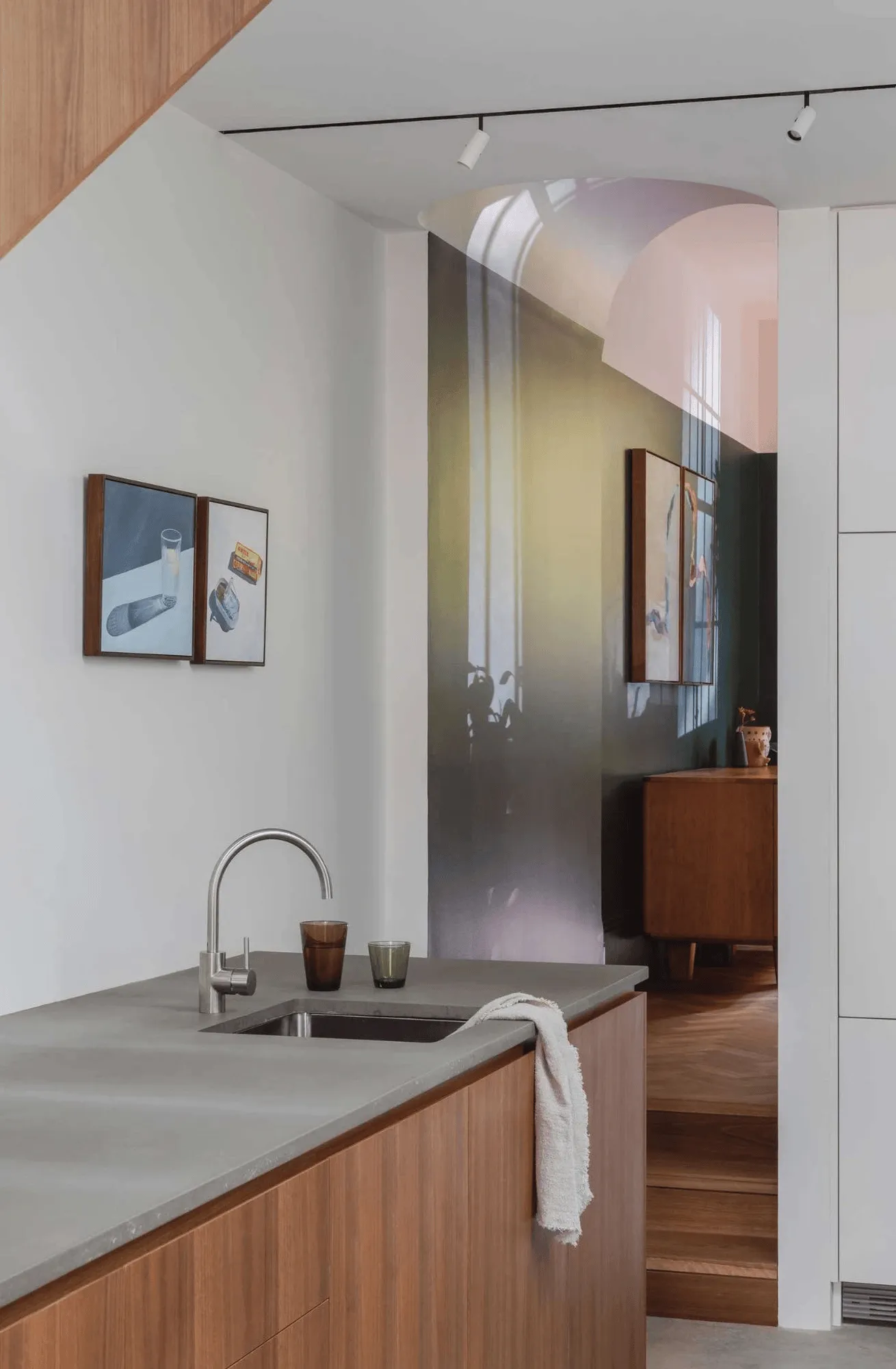
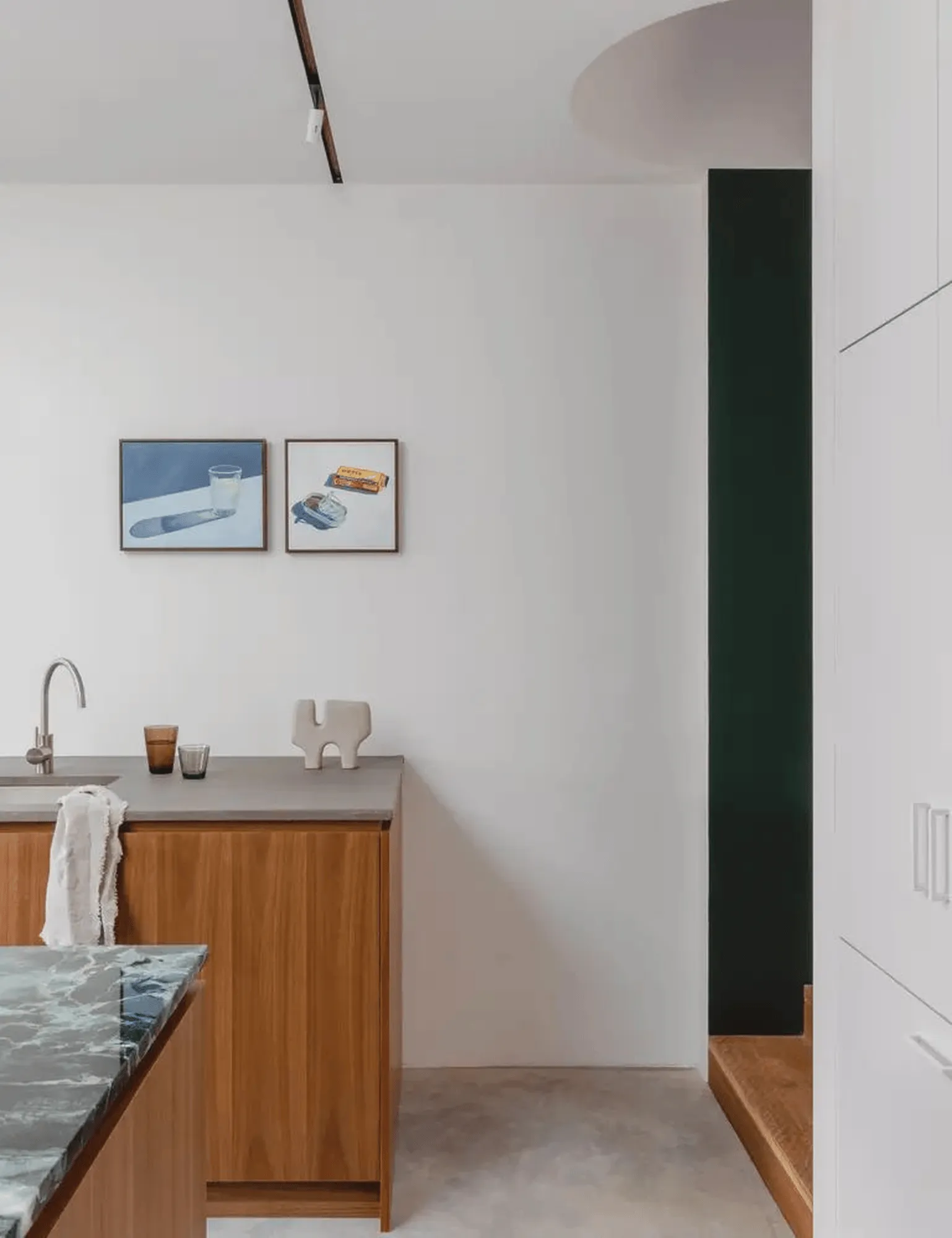
Inspired by the original Victorian structure, the design emphasizes the transitions between different areas within the home. Changes in ceiling height and room size delineate public and private zones. The dining room, as the first room encountered by guests, is the most public space and is painted in a vibrant green, reminiscent of local cafes, to enhance its visibility and create a welcoming atmosphere. The central pod, housing joinery, a refrigerator, and a powder room, acts as a strategic divider between the dining area and the kitchen and lounge, maintaining a visual connection while separating the social zones. The staircase, divided into four distinct locations, contributes to the feeling of a natural terrain, grounding the occupants and facilitating a seamless flow between levels.
A Canvas for Art and Personal Expression
A soft and timeless color palette unites the historical and contemporary elements throughout the house. The neutral backdrop serves as an ideal canvas for the owner’s curated art collection, allowing each piece to stand out. Colorful and sculptural details, such as the green dining room and strategically placed artworks by artists like Sophie Sachs, Bonnie Porter Greene, Imbi Davidson, and Marie Carmen, inject personality and vibrancy into the space. These elements, with their inherent transience, will enable the house to adapt to evolving personal aesthetics over time.
Integrating the Outdoors
The design extends the sense of spaciousness to the outdoor areas. The courtyard, accessible through the retractable doors of the lounge, features an integrated concrete bench that serves as both seating and a planter box, cleverly concealing the air conditioning condenser below. The rear fence incorporates large wooden doors that can be opened to the laneway behind the property, providing valuable extra space for gatherings and events, further demonstrating the architects’ ingenuity in maximizing the potential of the site.
Project Information:
Architect/Interior Design: Brad Swartz Architects
Builder: Connery Constructions
Landscape: Green Co Landscapes
Project Year: N/A
Project Location: Surry Hills, Australia
Area: N/A
Photography: Katherine Lu
Project type: Residential renovation
Main Materials: Concrete, Timber, Green Paint


