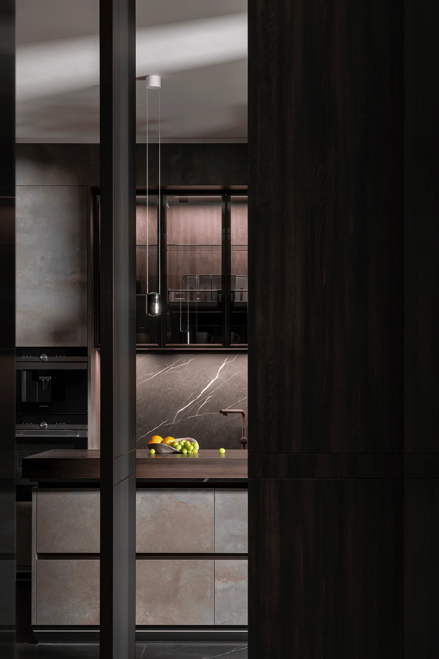
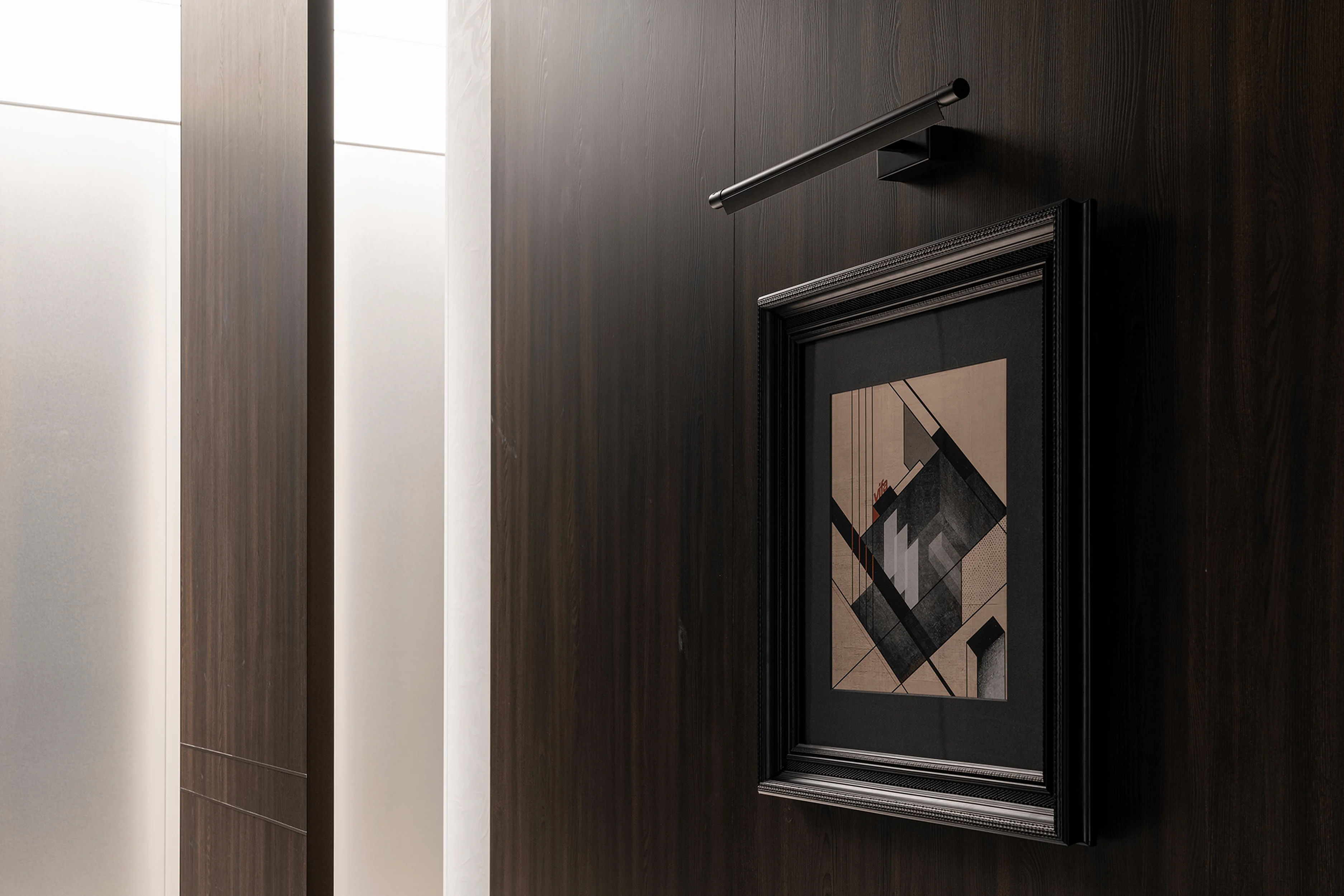
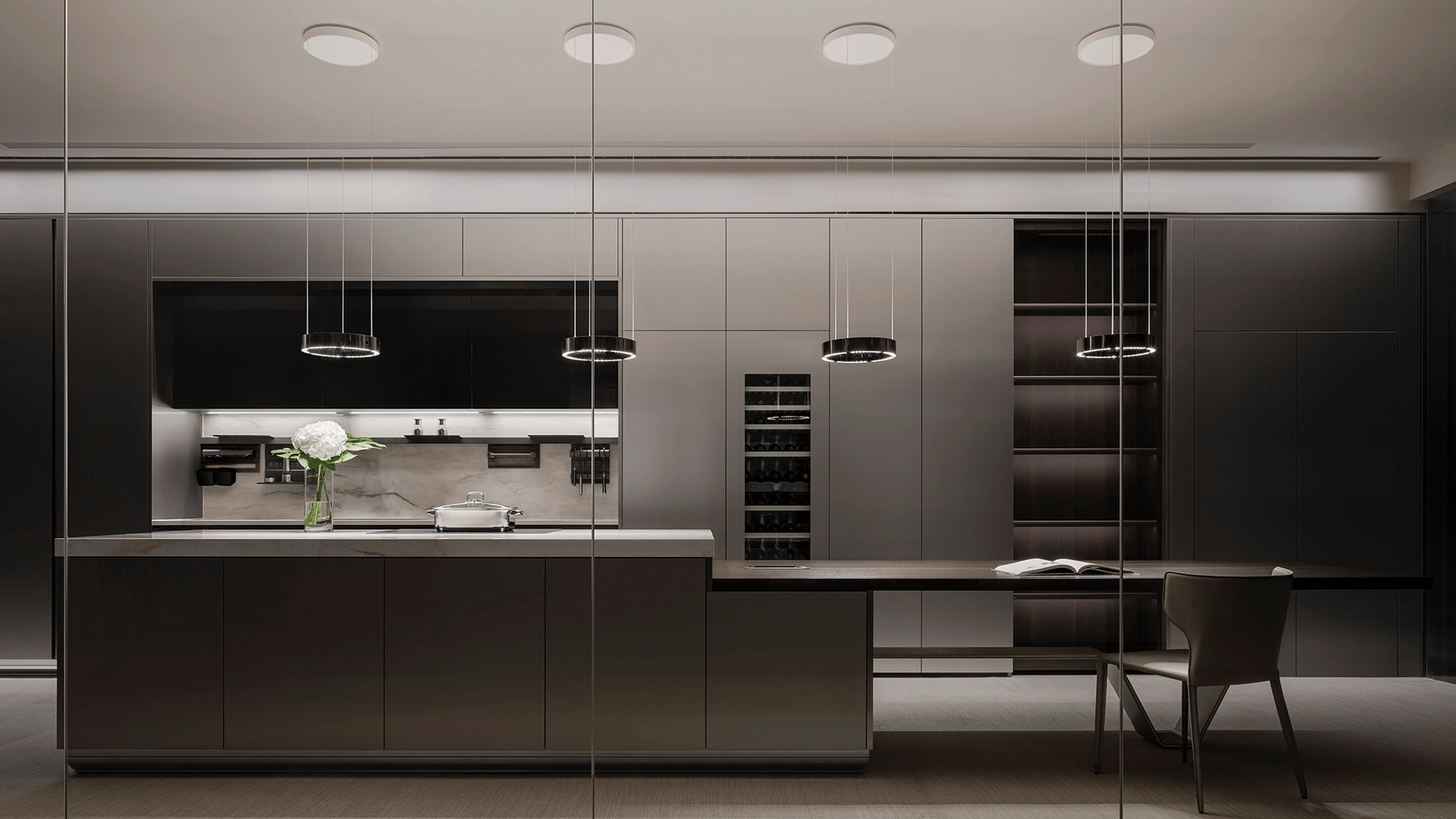
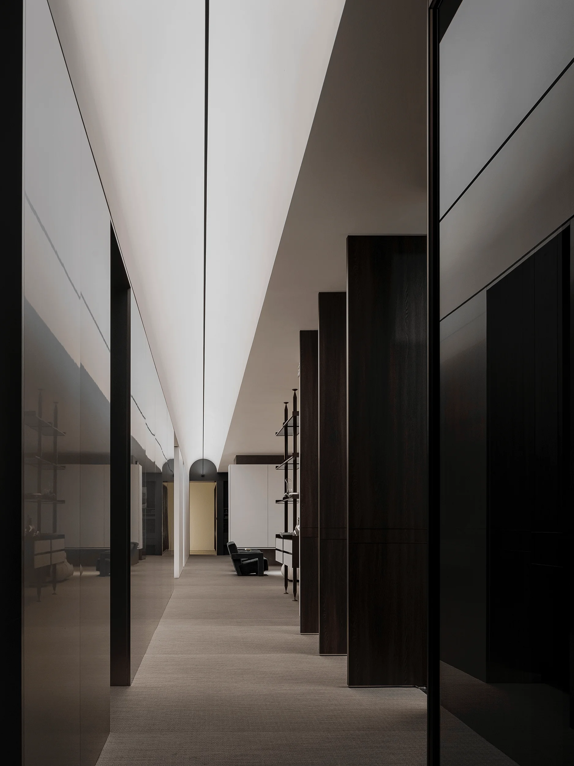
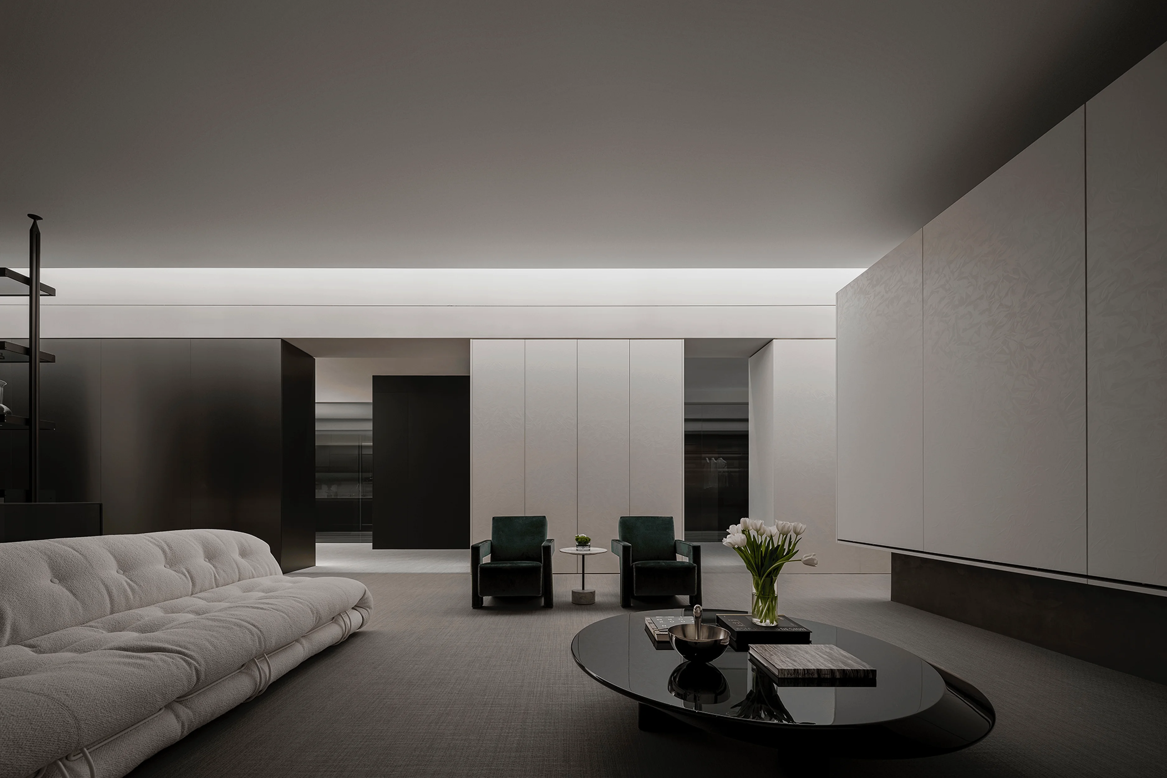
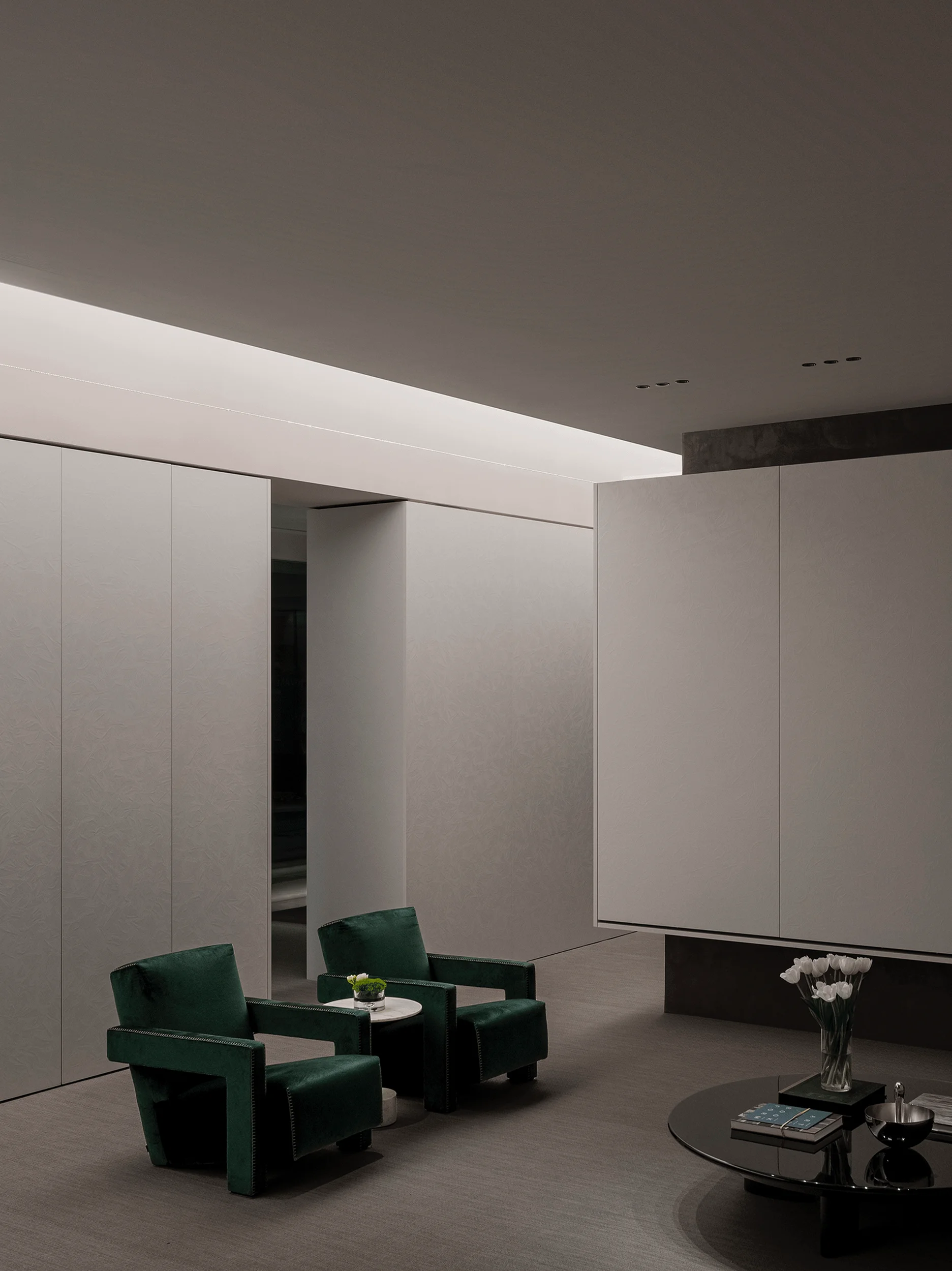
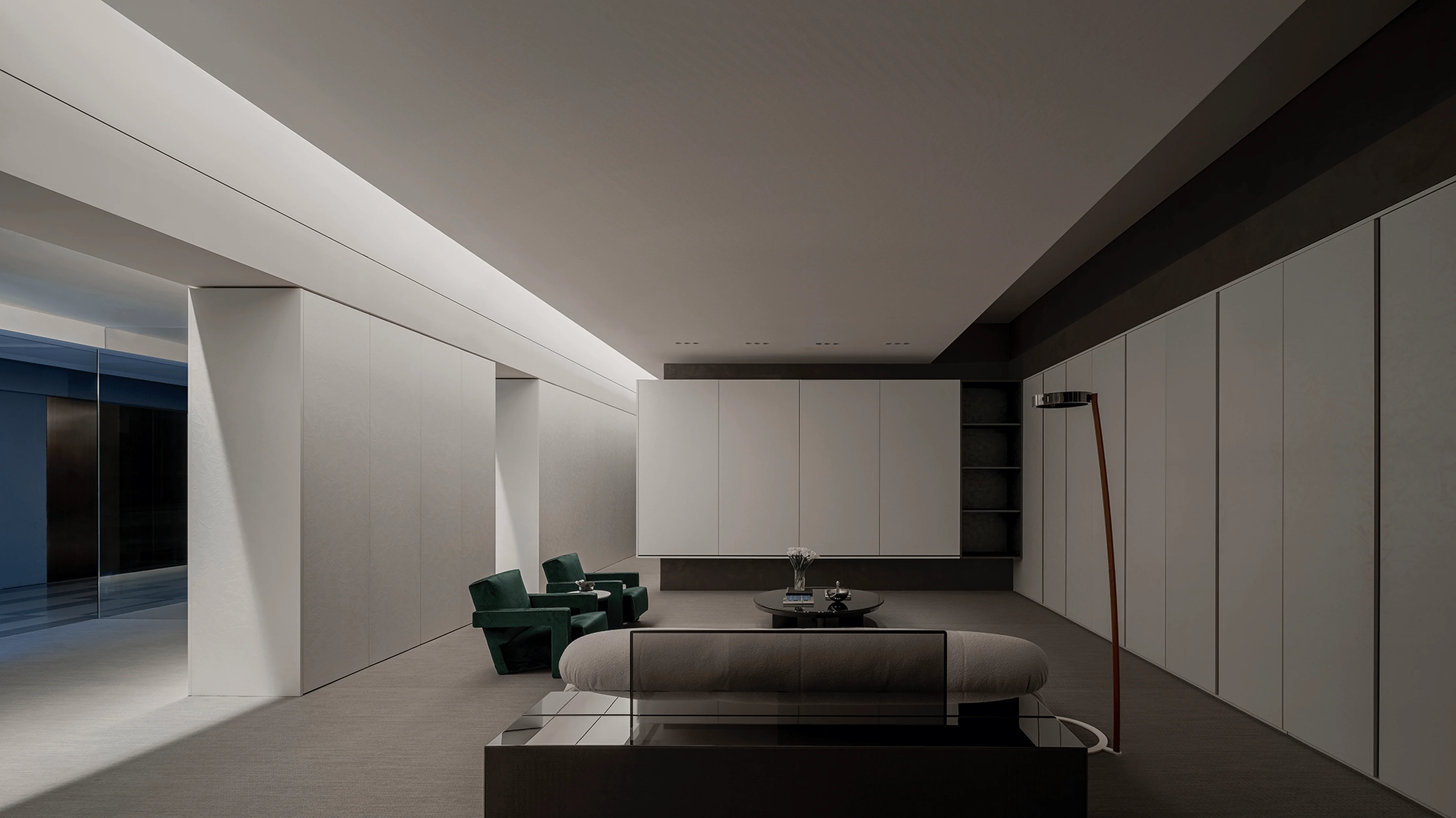
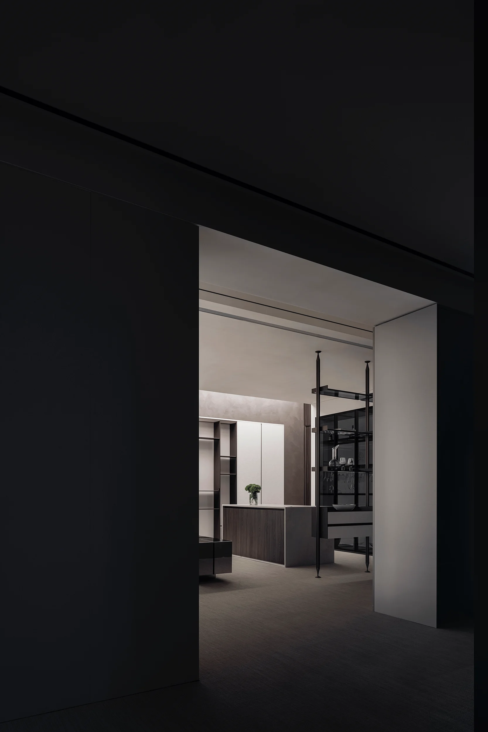
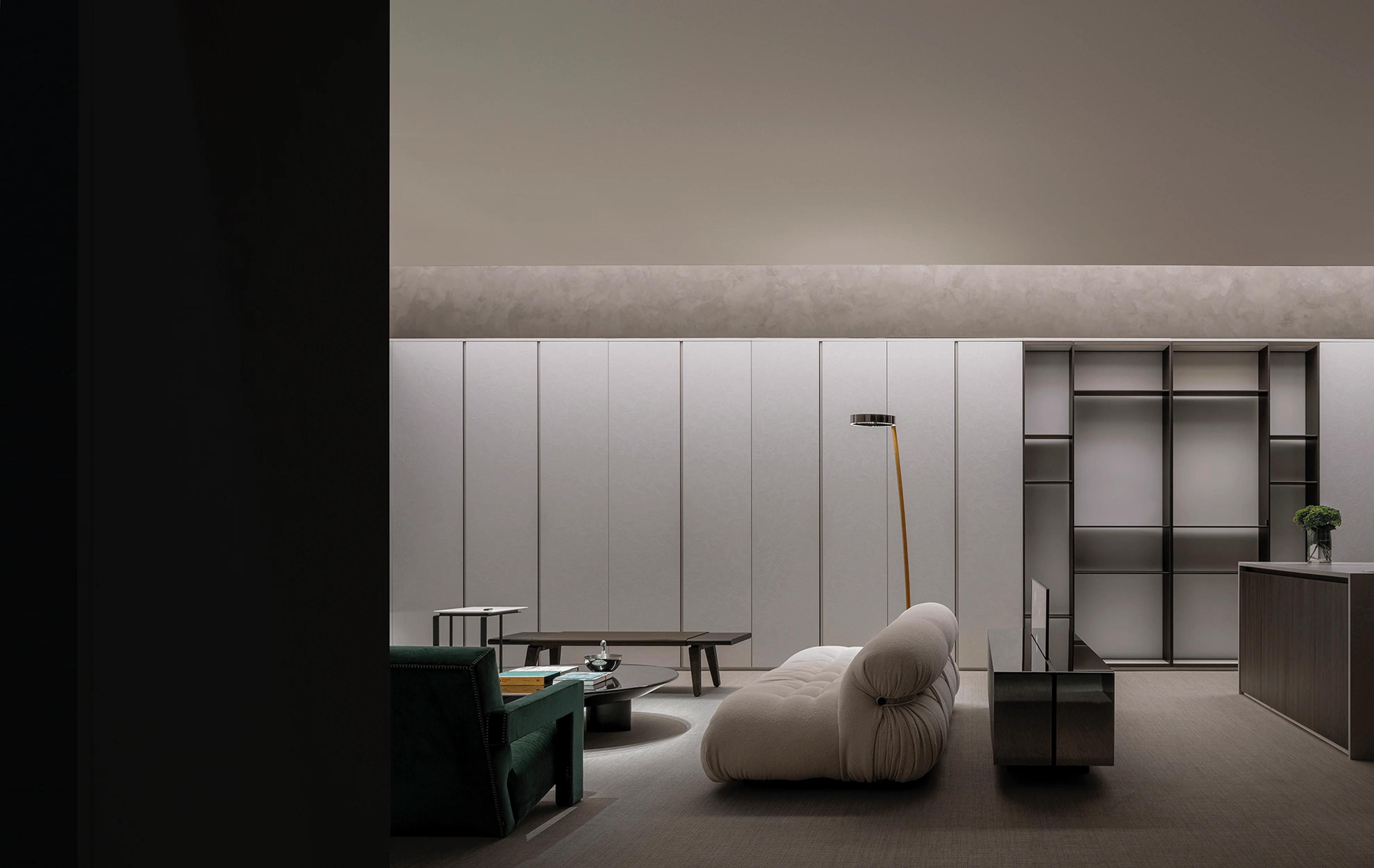
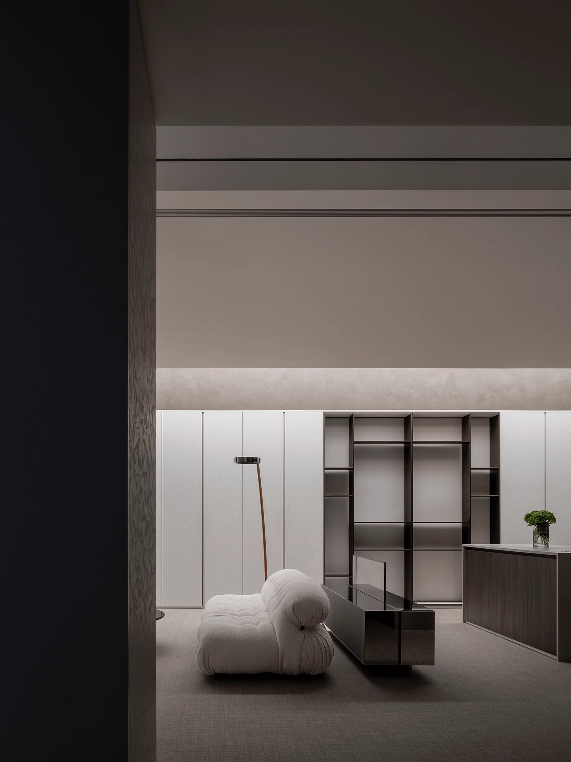
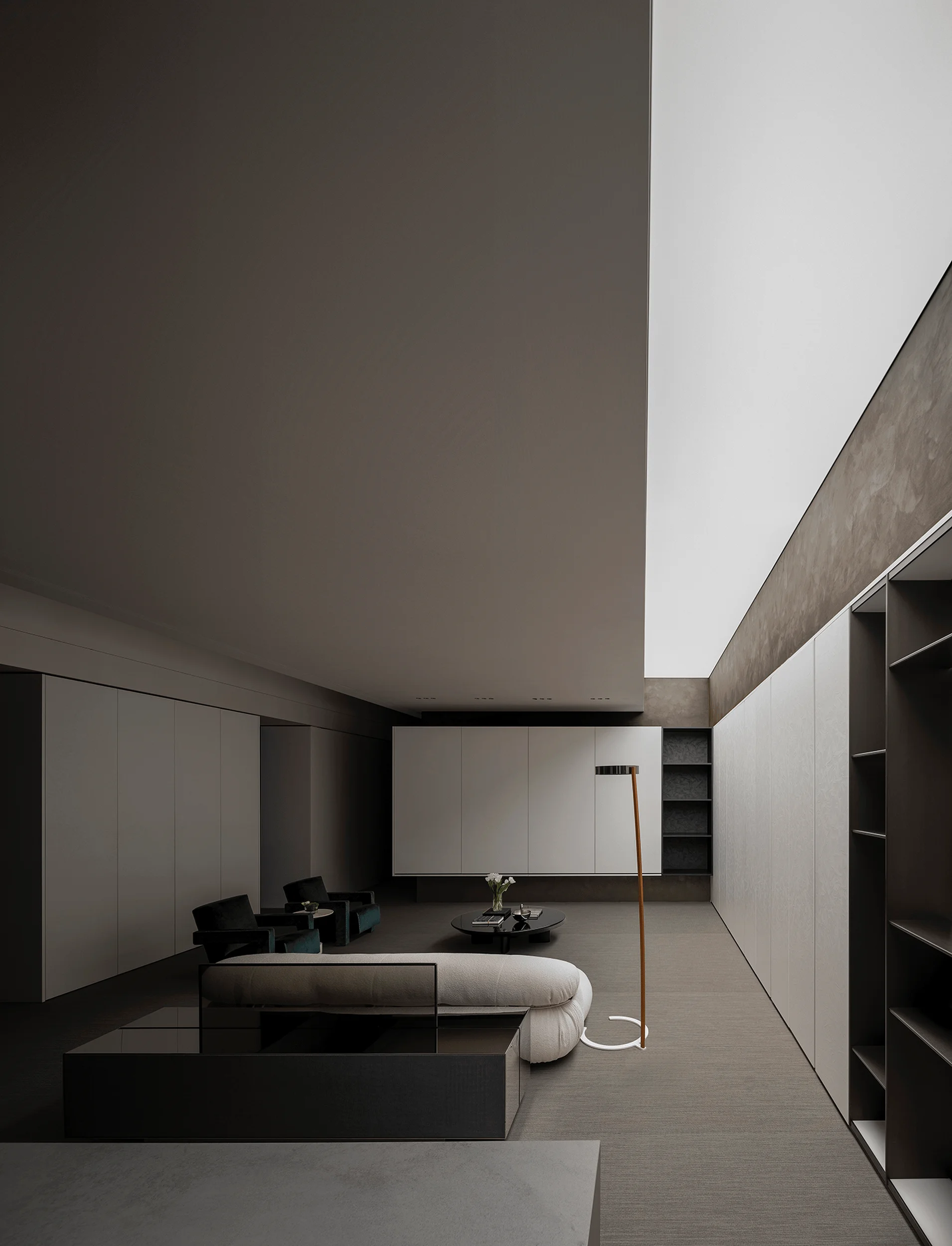
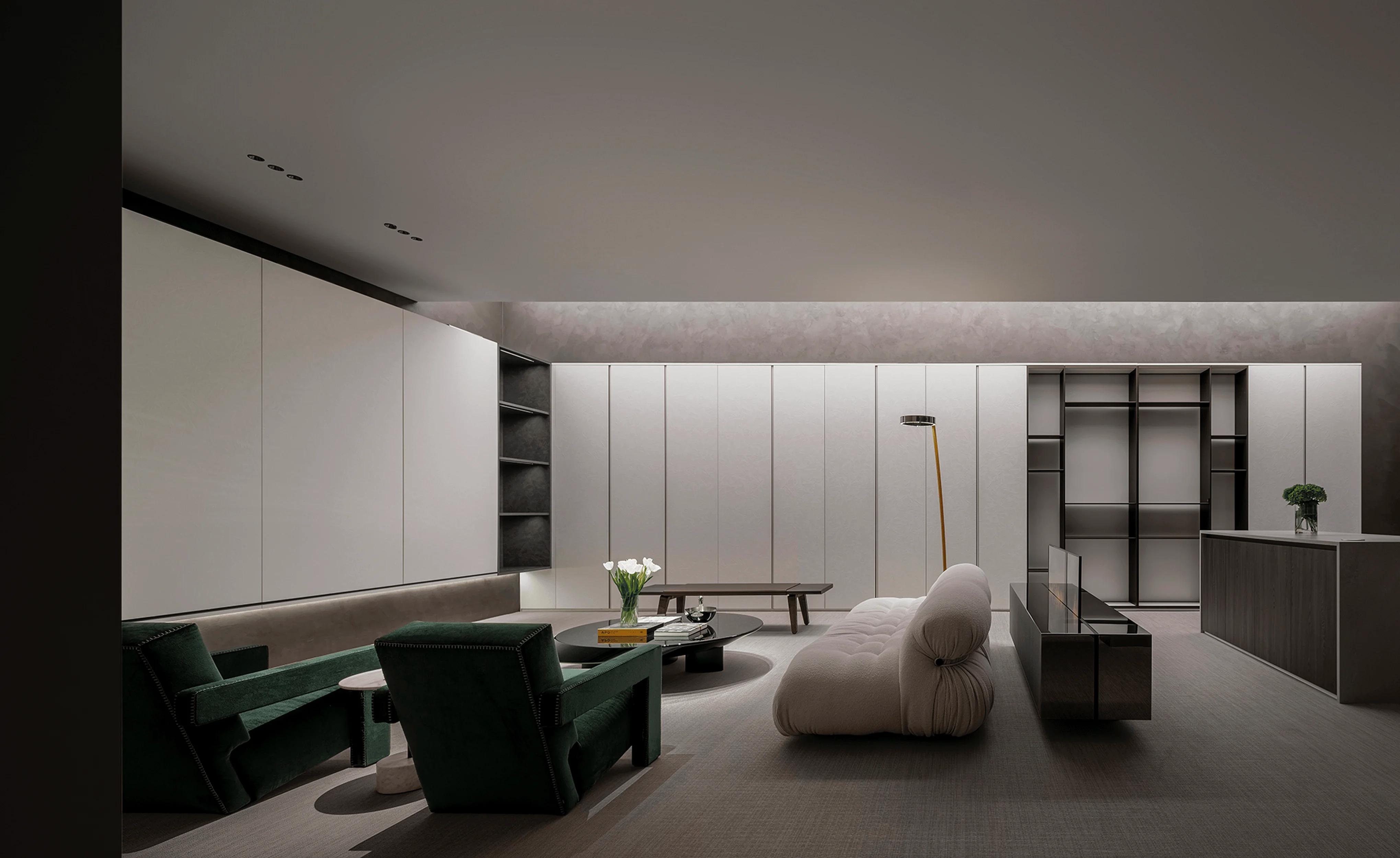
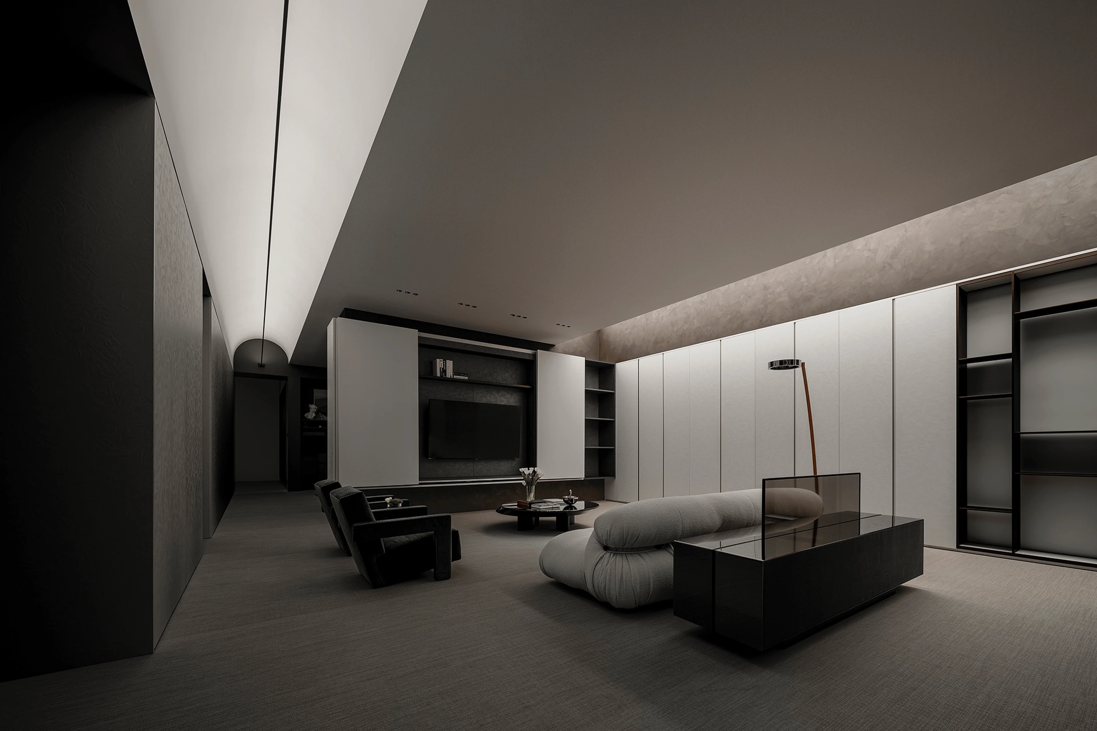
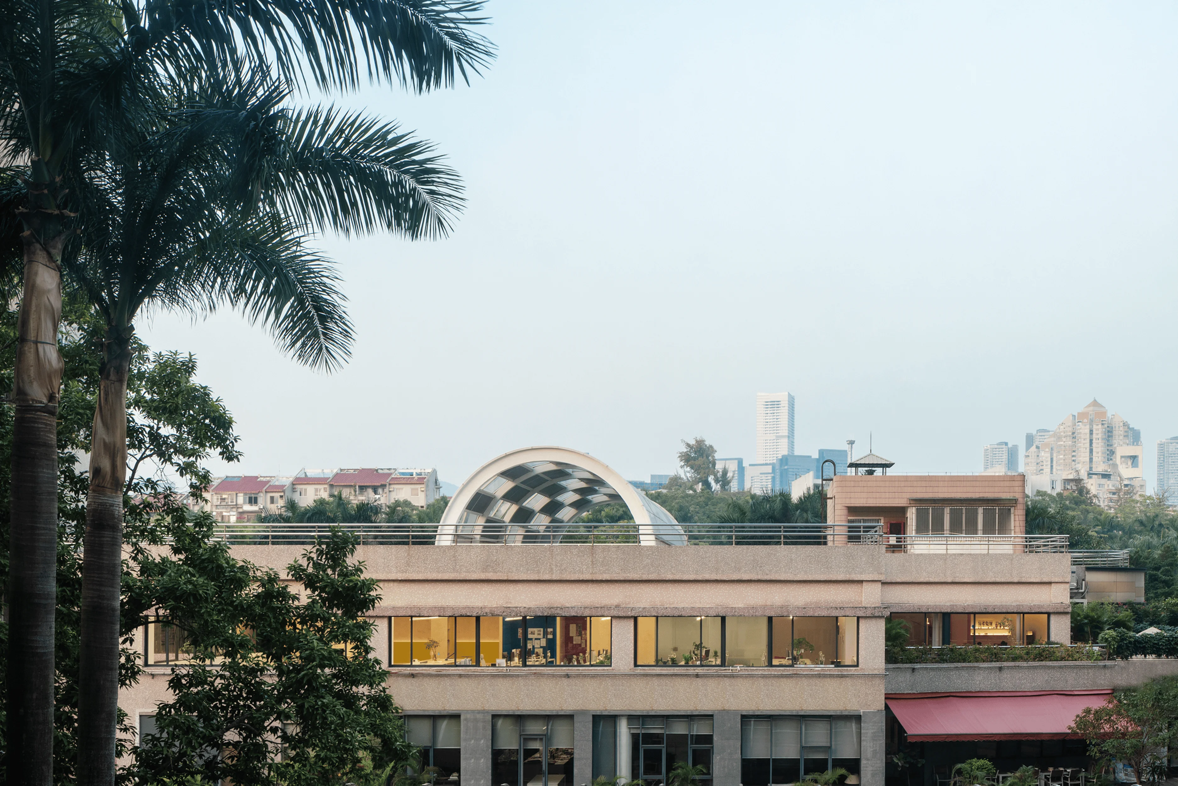
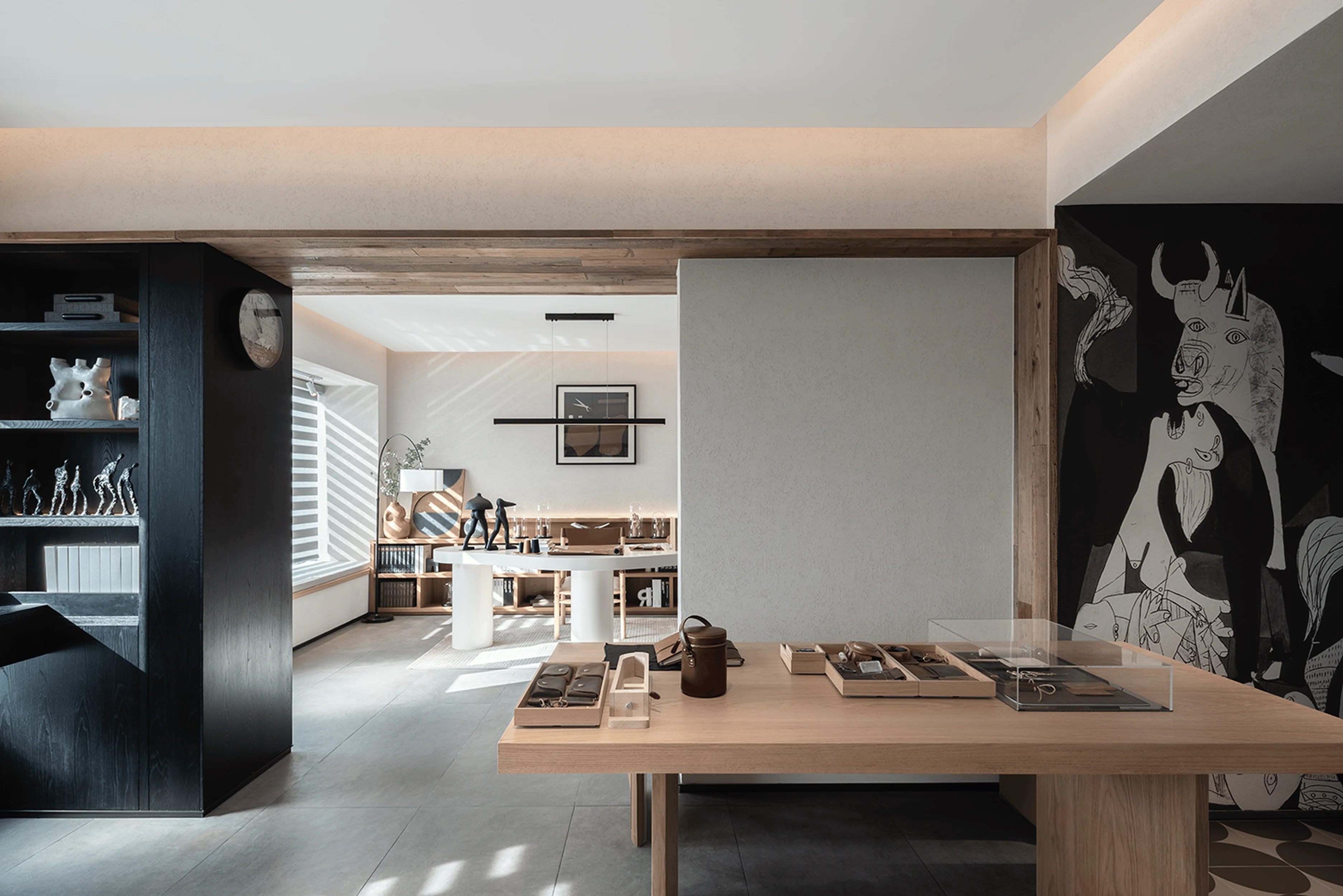
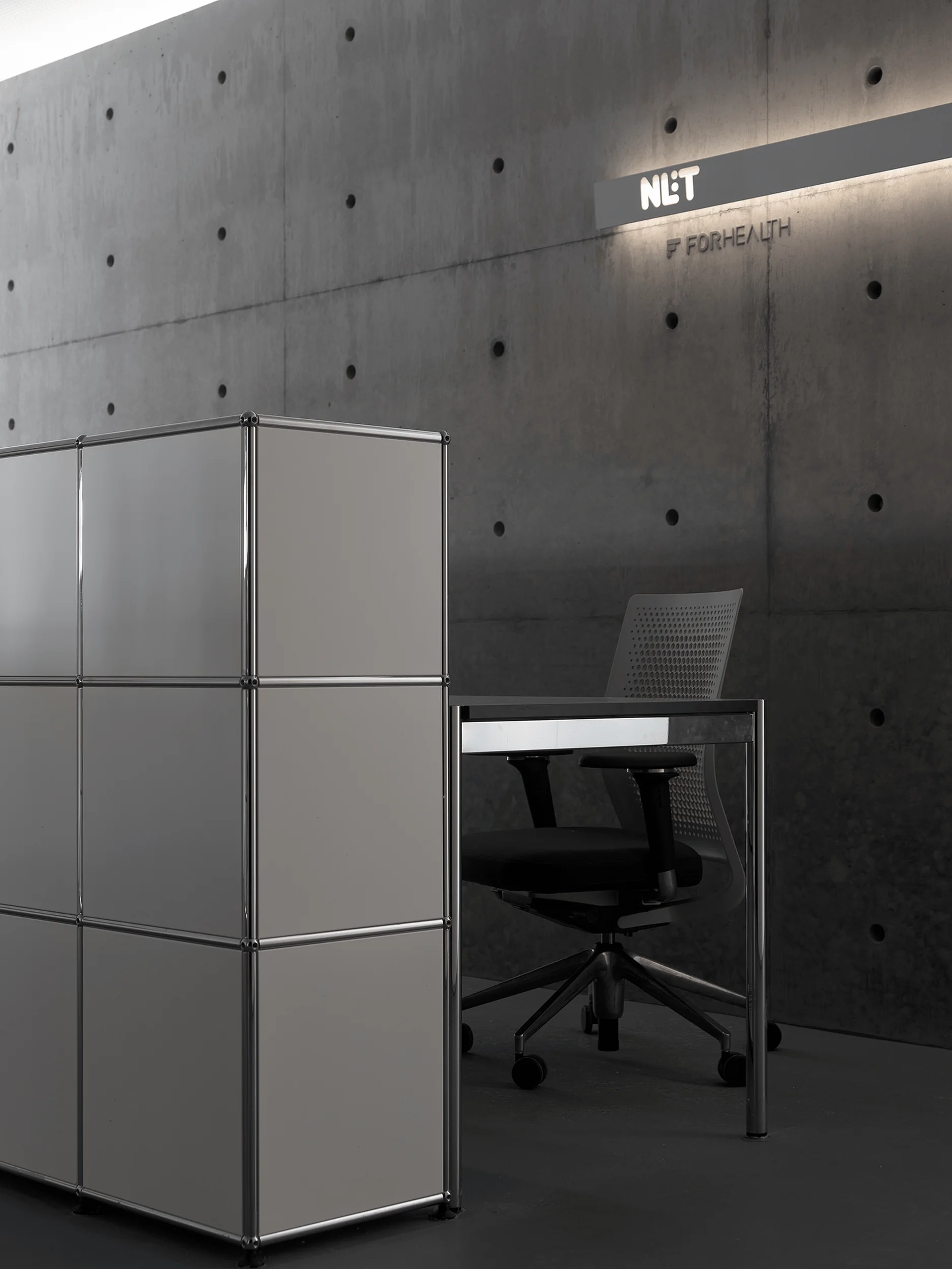
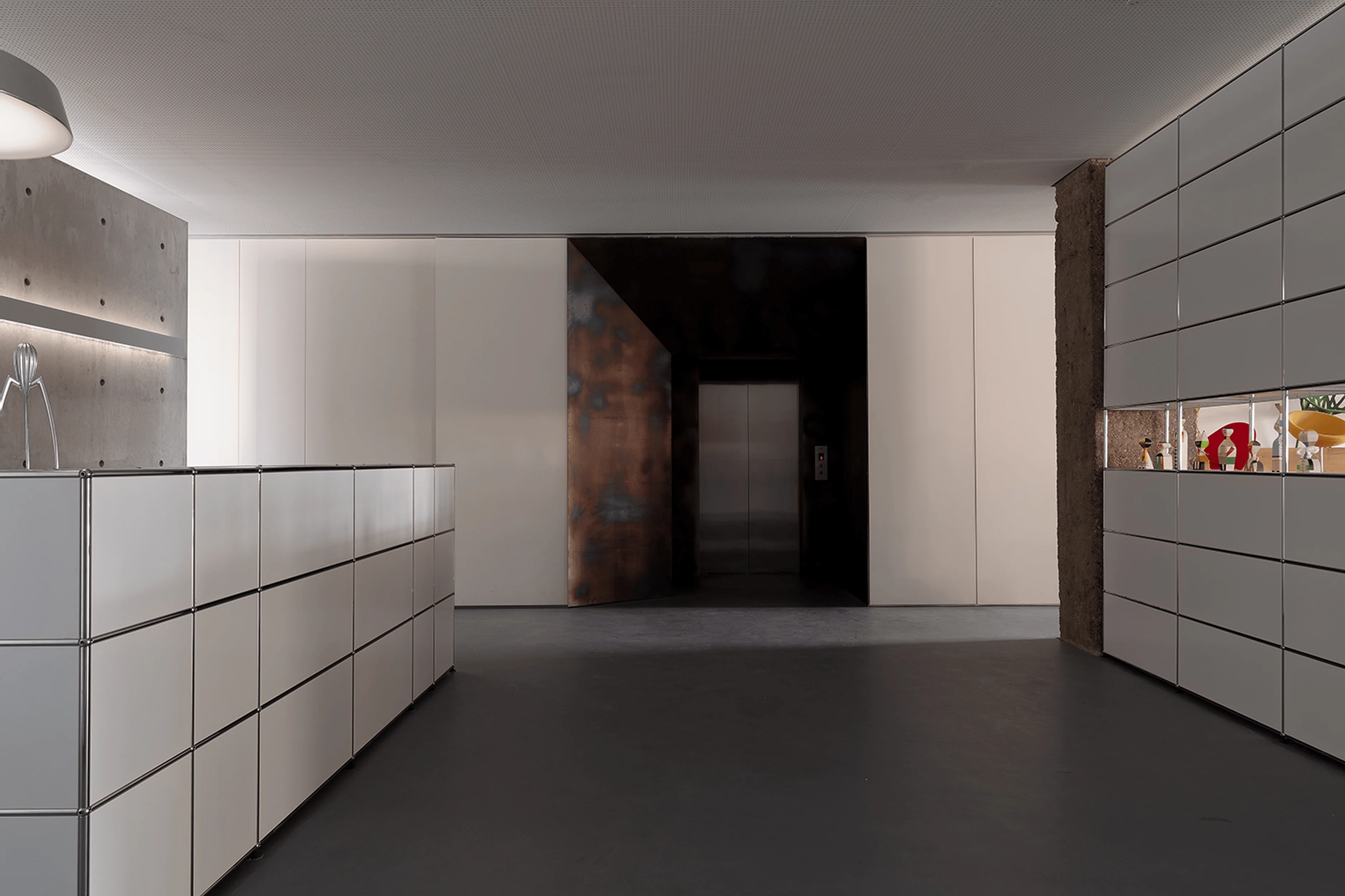
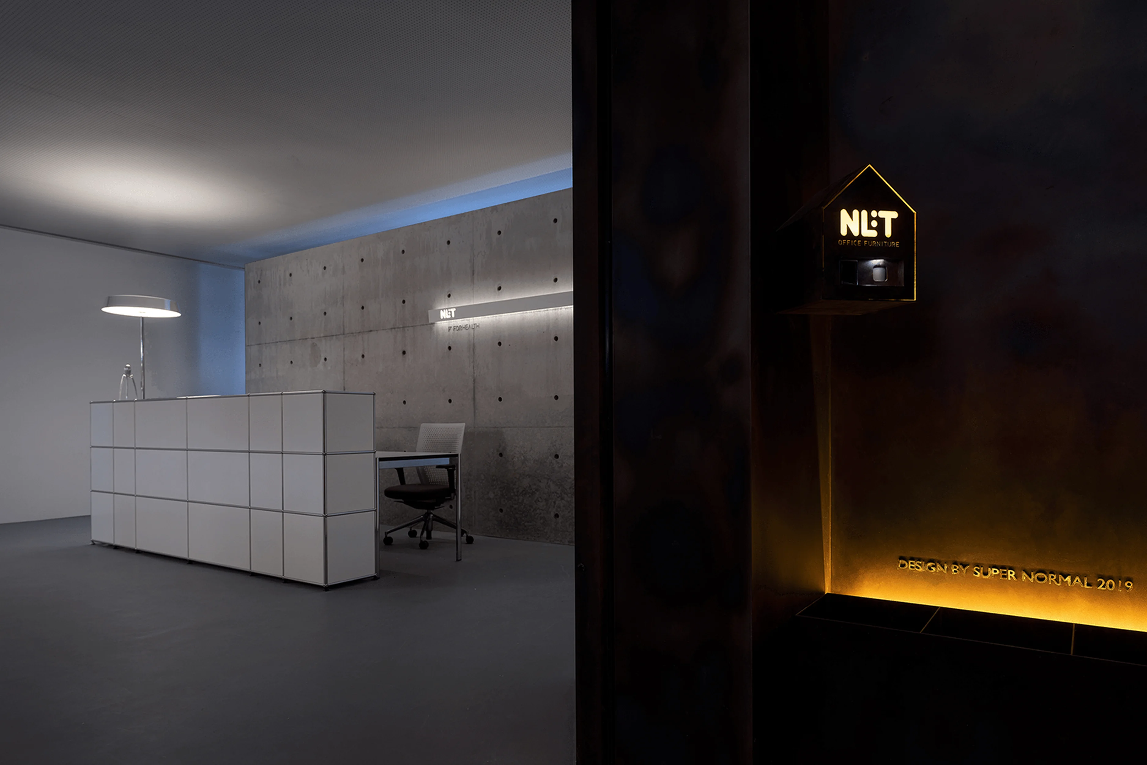
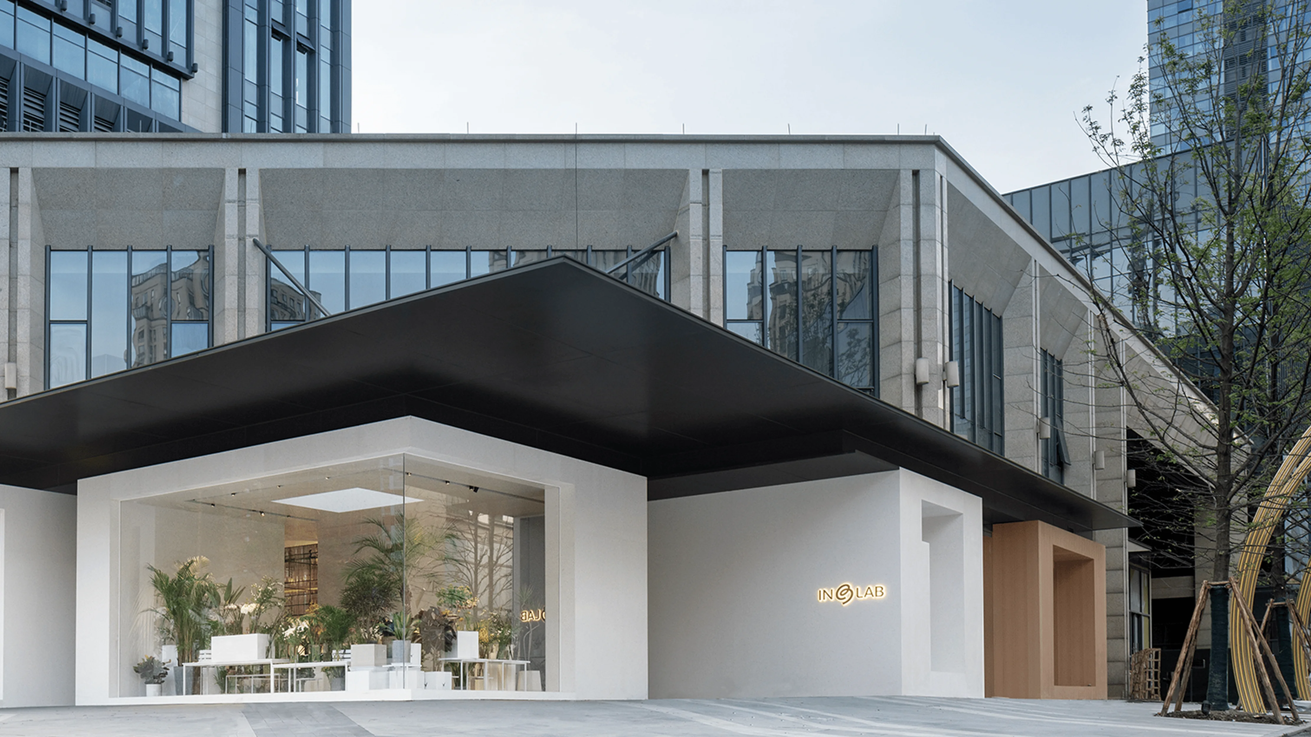
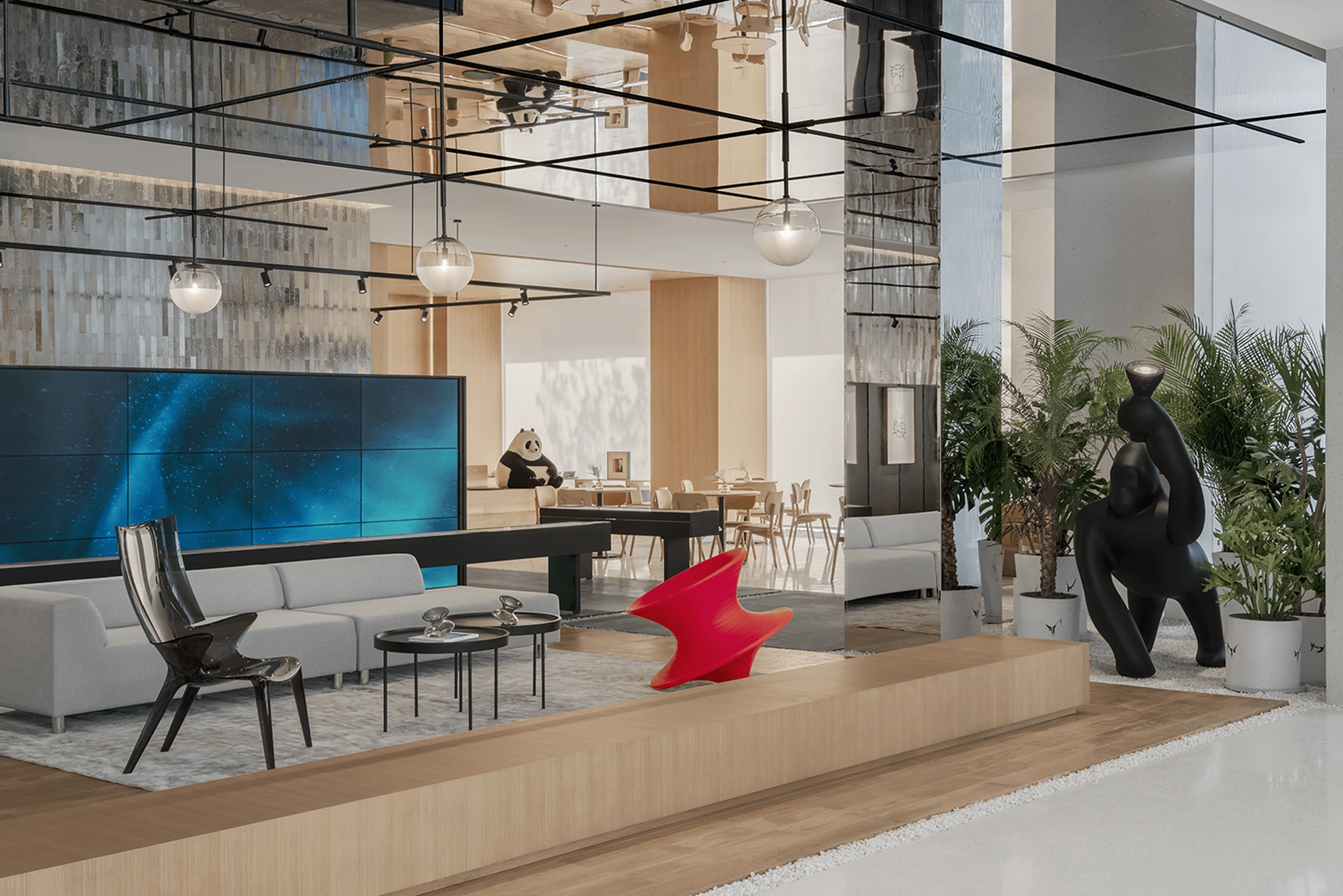
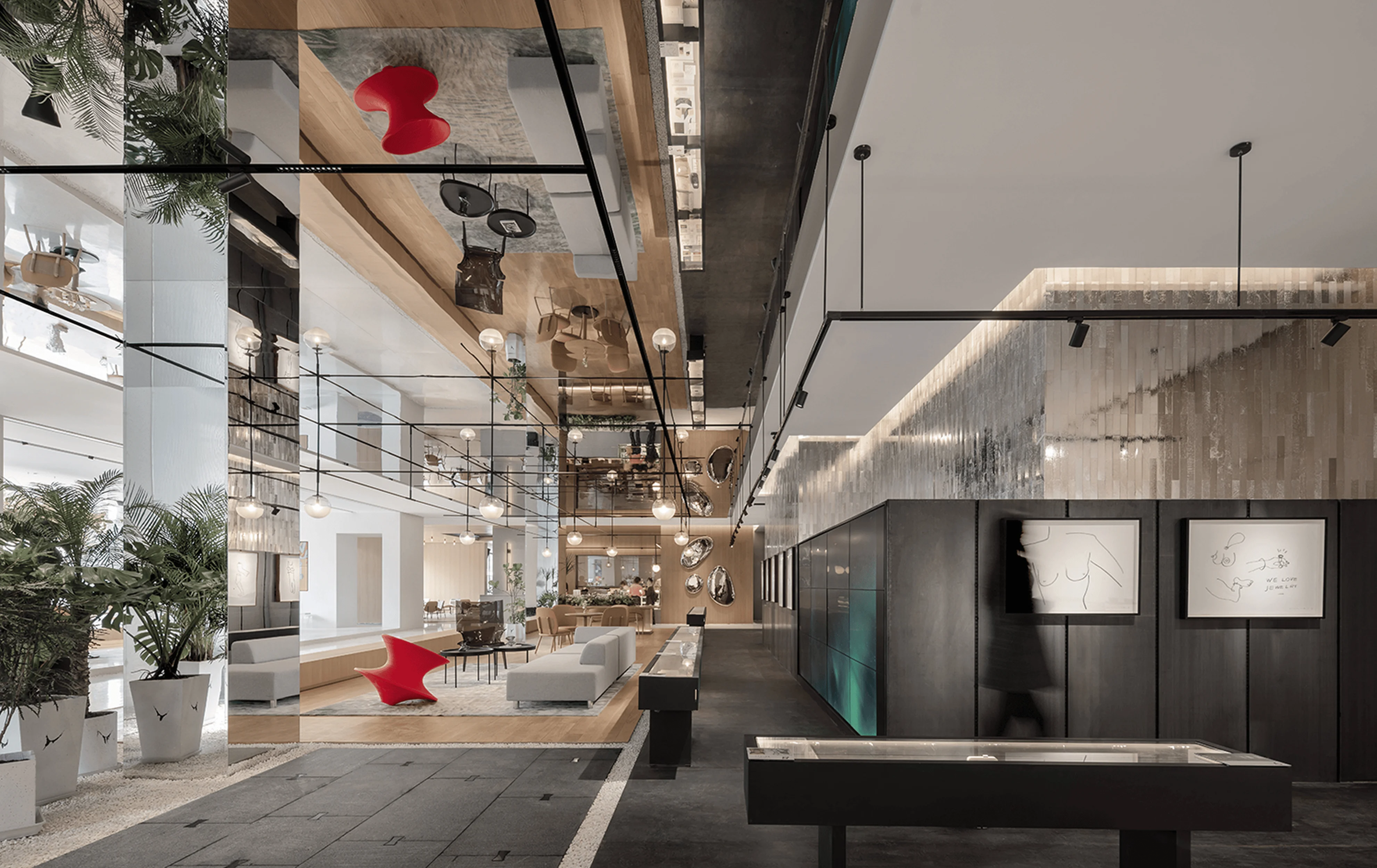
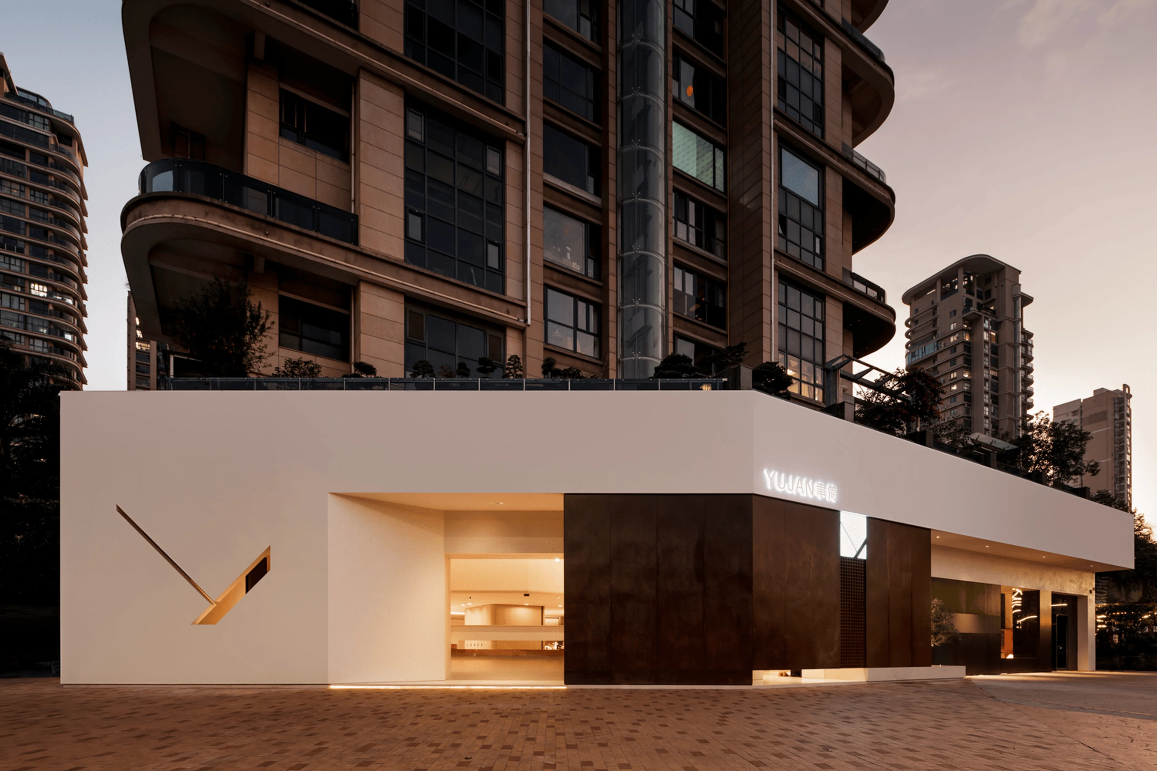
VIFA showroom design in Shenzhen, China by Super Normal, uses “less is more” concept.
Contents
Project Background: Redefining Custom Home Furnishings
As consumers increasingly demand personalized, high-quality, and intelligent products, the whole-house customization market has presented new opportunities and innovations, driven by advancements in manufacturing technology. VIFA, with its high-quality products, innovative designs, complete after-sales service, and excellent brand reputation, quickly secured a leading position in the whole-house customization market. By providing one-stop solutions and in-depth insights into national consumption trends and styles, while adhering to a high-quality product line, VIFA has become a leader in China’s home furnishing customization industry.
#custom homes design #interior design showroom #VIFA showroom design #Shenzhen showroom #super normal design #minimalist interior design
Brand Origins: Evolving from Product-Centric to Solution-Driven
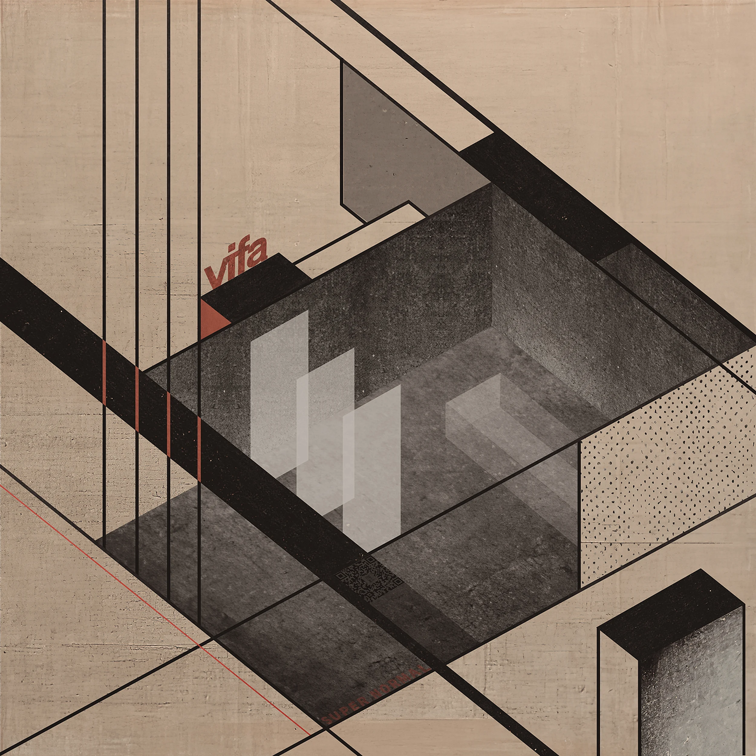
Established in 2008, VIFA adheres to the design principle of “form follows function”, inheriting the Bauhaus ‘less is more’ philosophy. VIFA provides whole-house customization system solutions for Chinese families. The evolution of design thinking from a product-centric to a solution-driven approach has enabled the company to imbue spaces with enhanced possibilities and creativity. The brand emphasizes user needs, creating flexible and functional living spaces that adapt to diverse lifestyles.
#custom homes design #interior design showroom #VIFA showroom design #Shenzhen showroom #super normal design #minimalist interior design
Strategic Upgrade: Streamlined Display and Focused Business
Super Normal’s design approach, LESS IS MORE, BUT MORE, drives the transformation of the showroom, with the primary aim of enhancing the brand’s commercial potential and achieving brand elevation. The design team conducted extensive market research, analyzing all VIFA offline stores across China and comparing them with 30 similar whole-house high-end custom showrooms, prioritizing commercial conversion. The showroom serves as a critical touchpoint between VIFA’s offerings and customers, creating a direct and impactful marketing experience that optimizes the user journey. The reimagined showroom successfully conveys a shift in brand perception from traditional cabinetry to the broader scope of VIFA’s whole-house customization services.
#custom homes design #interior design showroom #VIFA showroom design #Shenzhen showroom #super normal design #minimalist interior design
Space Transformation: Fostering a Sense of Flow and Interaction
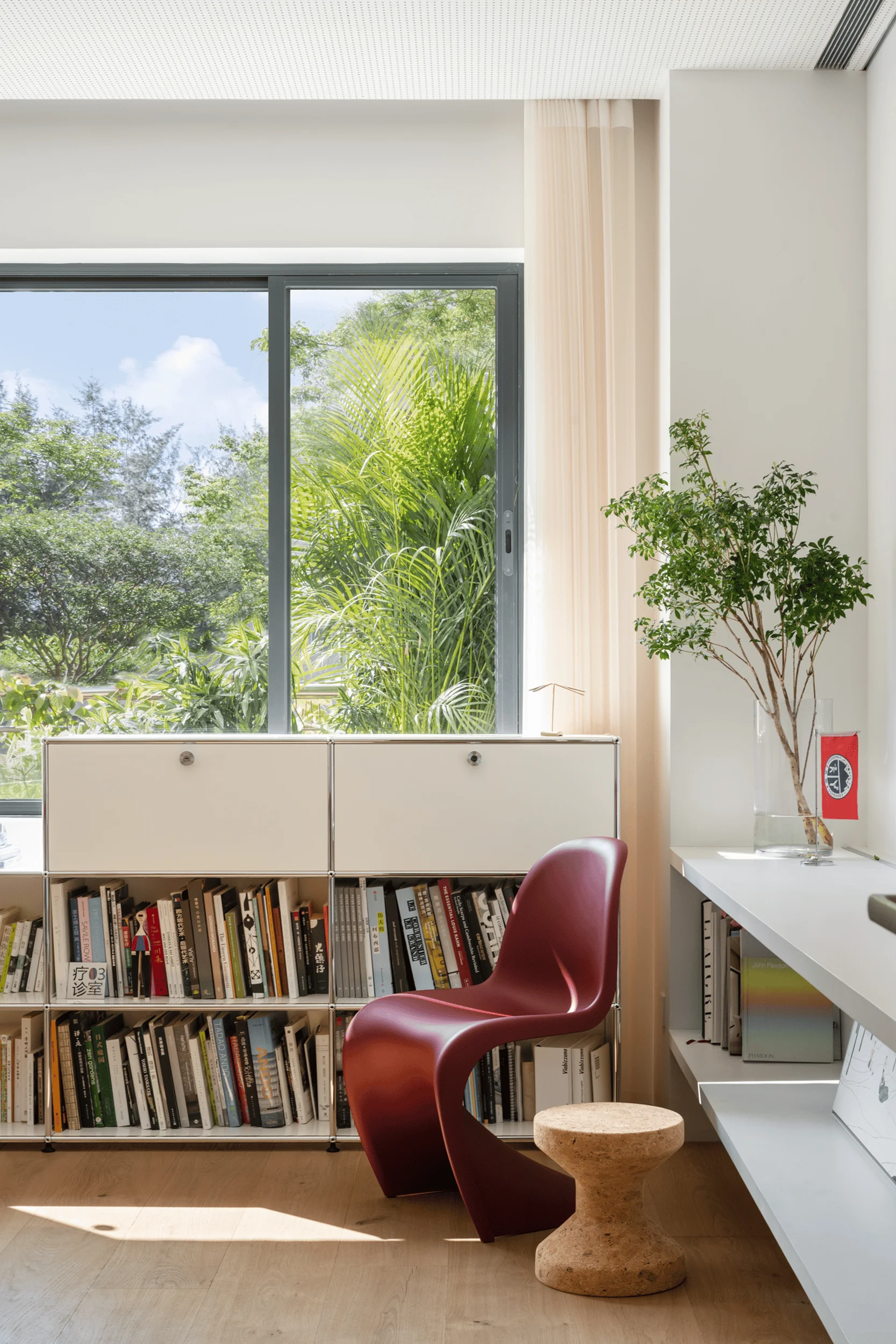
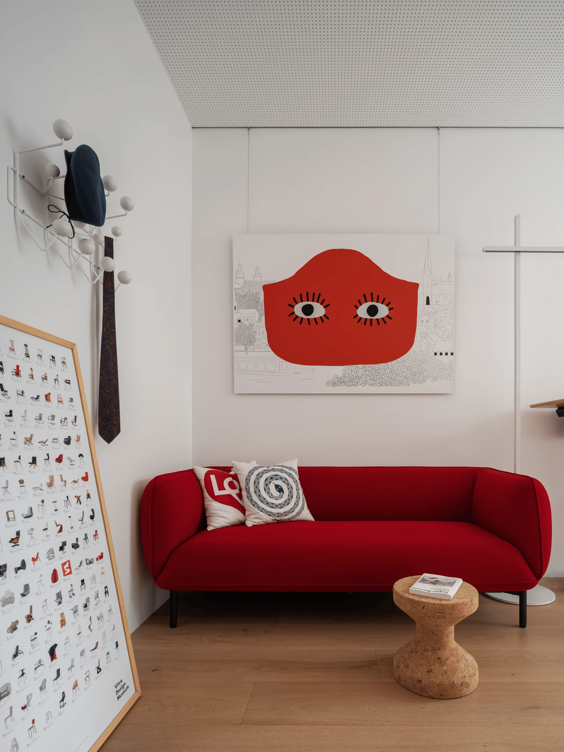
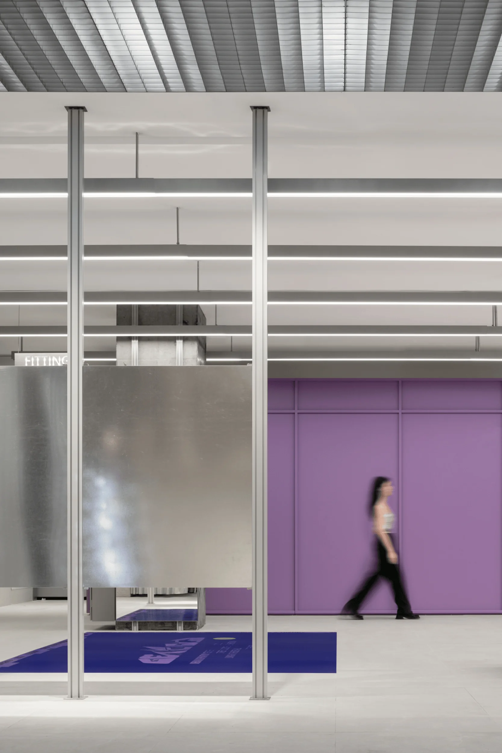
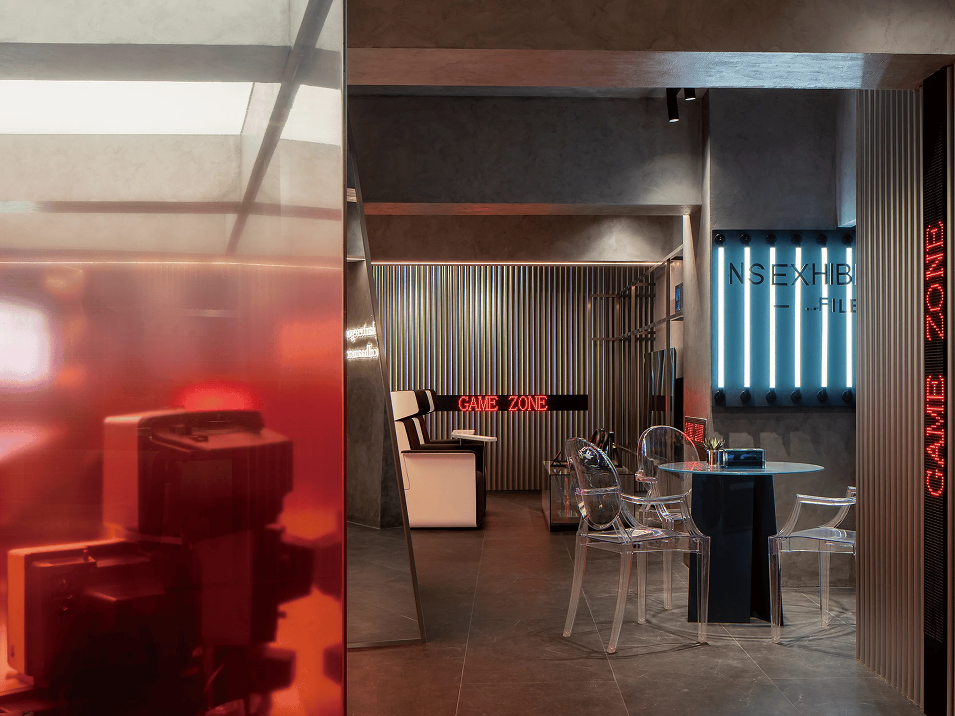
The design seamlessly integrates VIFA’s Bauhaus-inspired modernism with the ‘less is more’ ethos. Within a minimalist space, the design team has partitioned and deepened scenes, adapting to various design preferences by showcasing different home environments in diversified ways. By optimizing spatial flow, the design creates an open, transparent, and dynamic indoor environment. The design cleverly uses light, sound, and color to amplify the customer experience and engagement. By seamlessly blending intelligence with art, emotion with logic, the designers encourage interaction, perception, movement, and exploration within the space. This approach subtly conveys the product philosophy of “form follows function”, emphasizing quality in the details and conveying authentic experiences through simplicity.
#custom homes design #interior design showroom #VIFA showroom design #Shenzhen showroom #super normal design #minimalist interior design
Scene Engagement: Highlighting Core Products and User Interaction
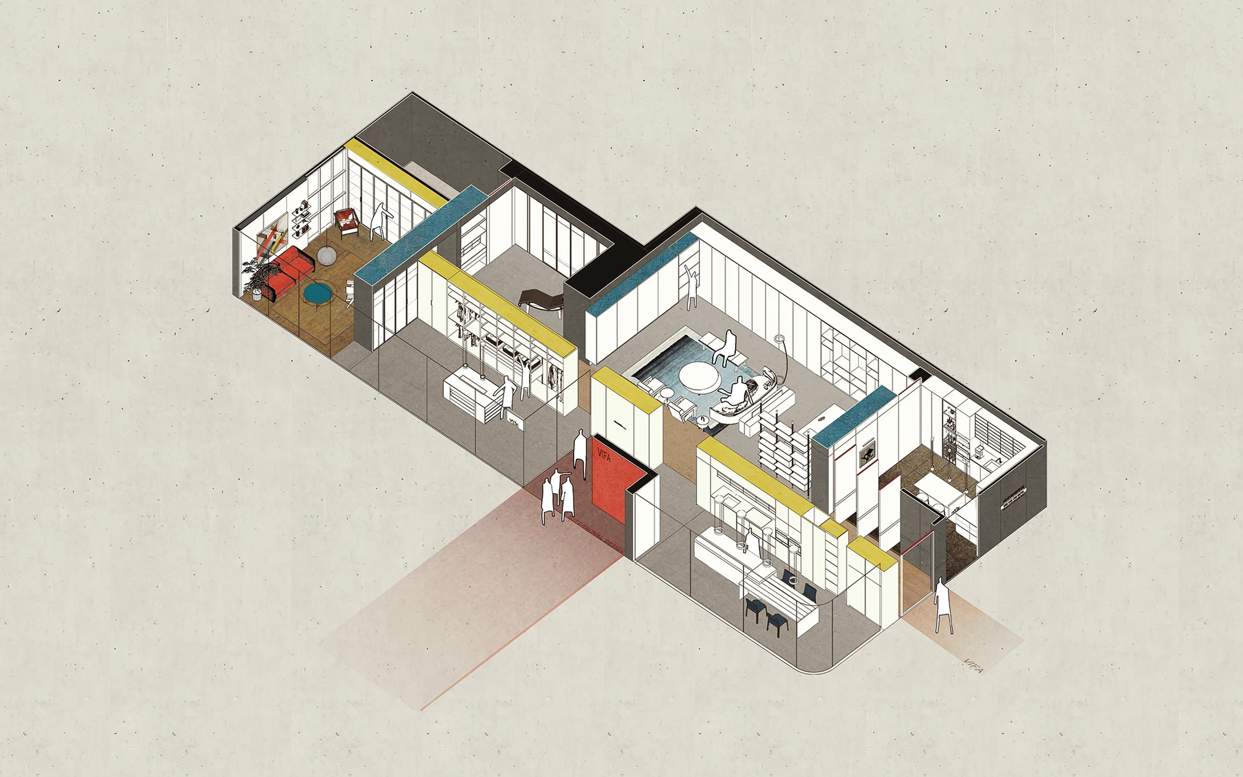
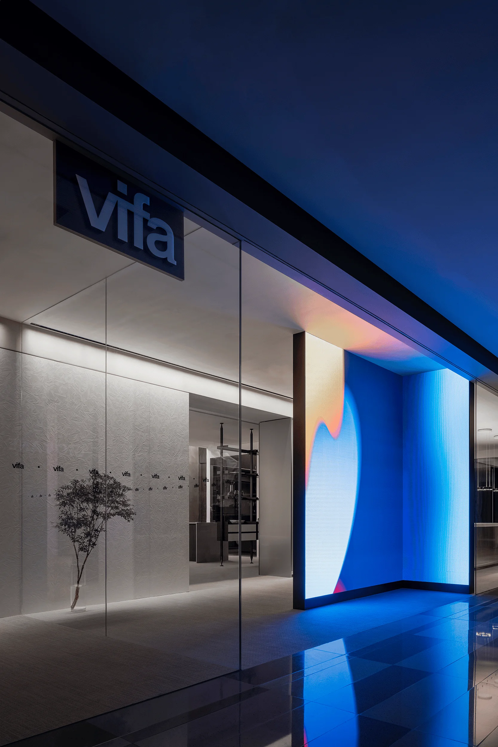
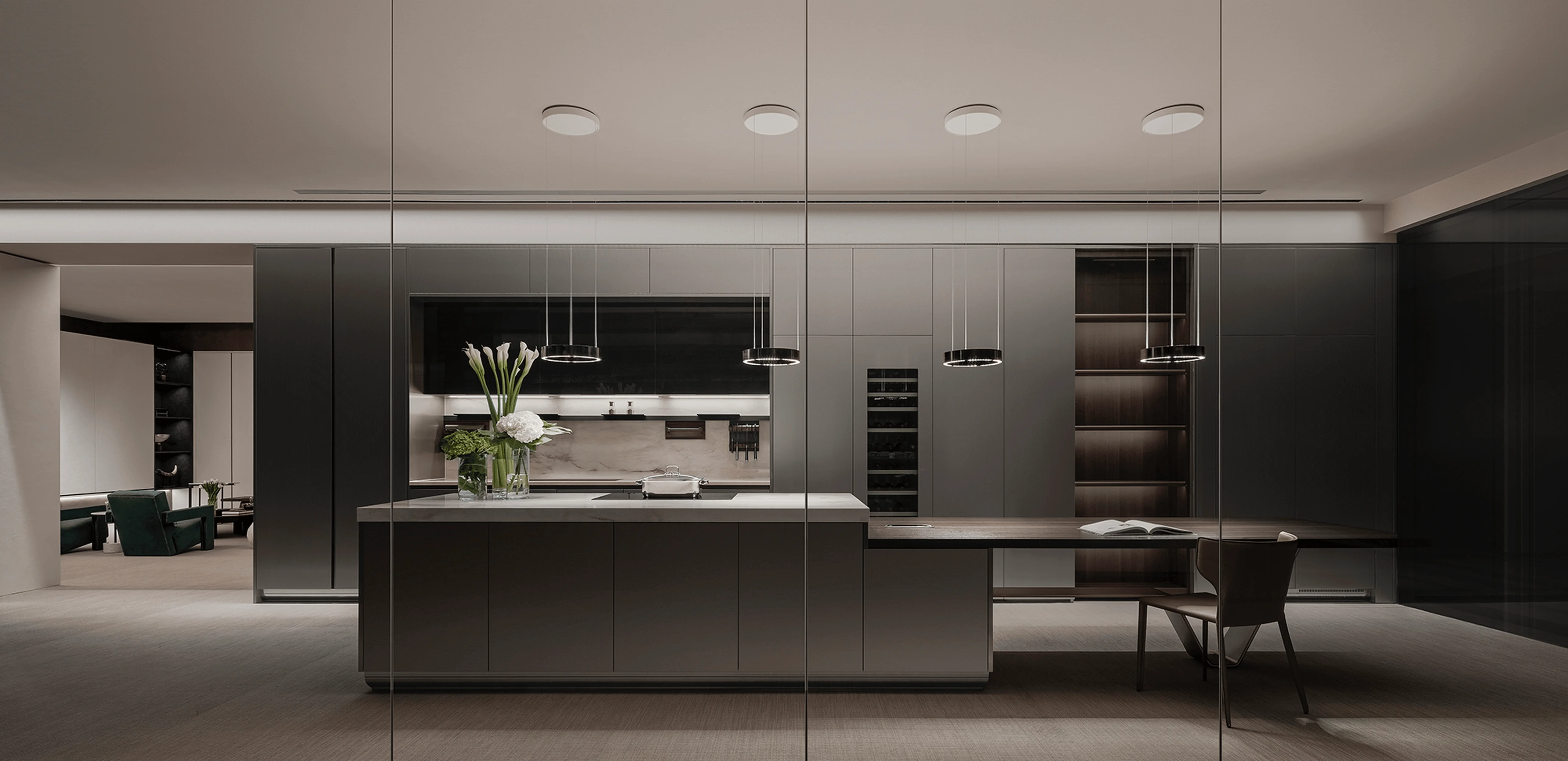
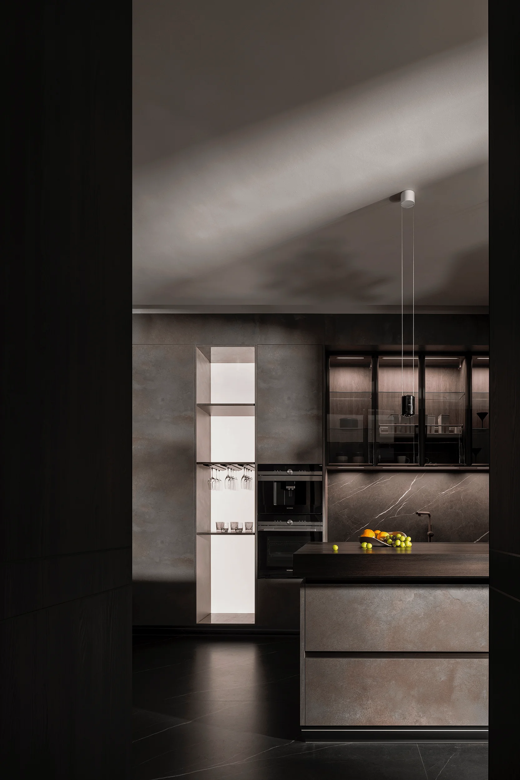
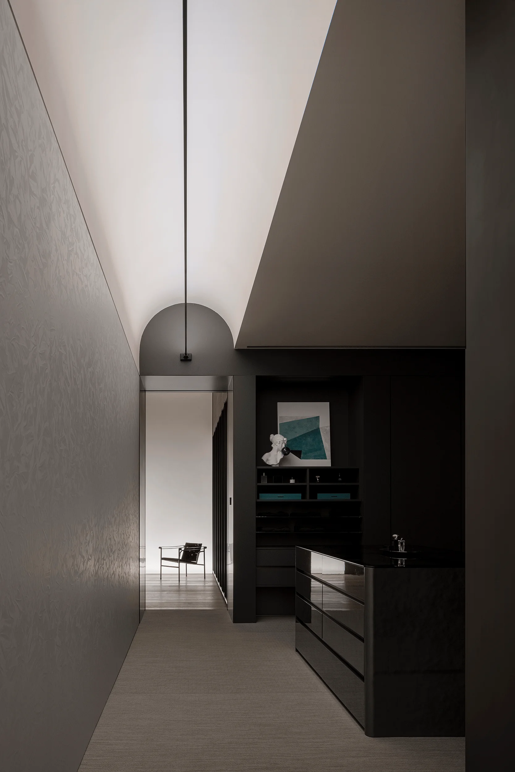
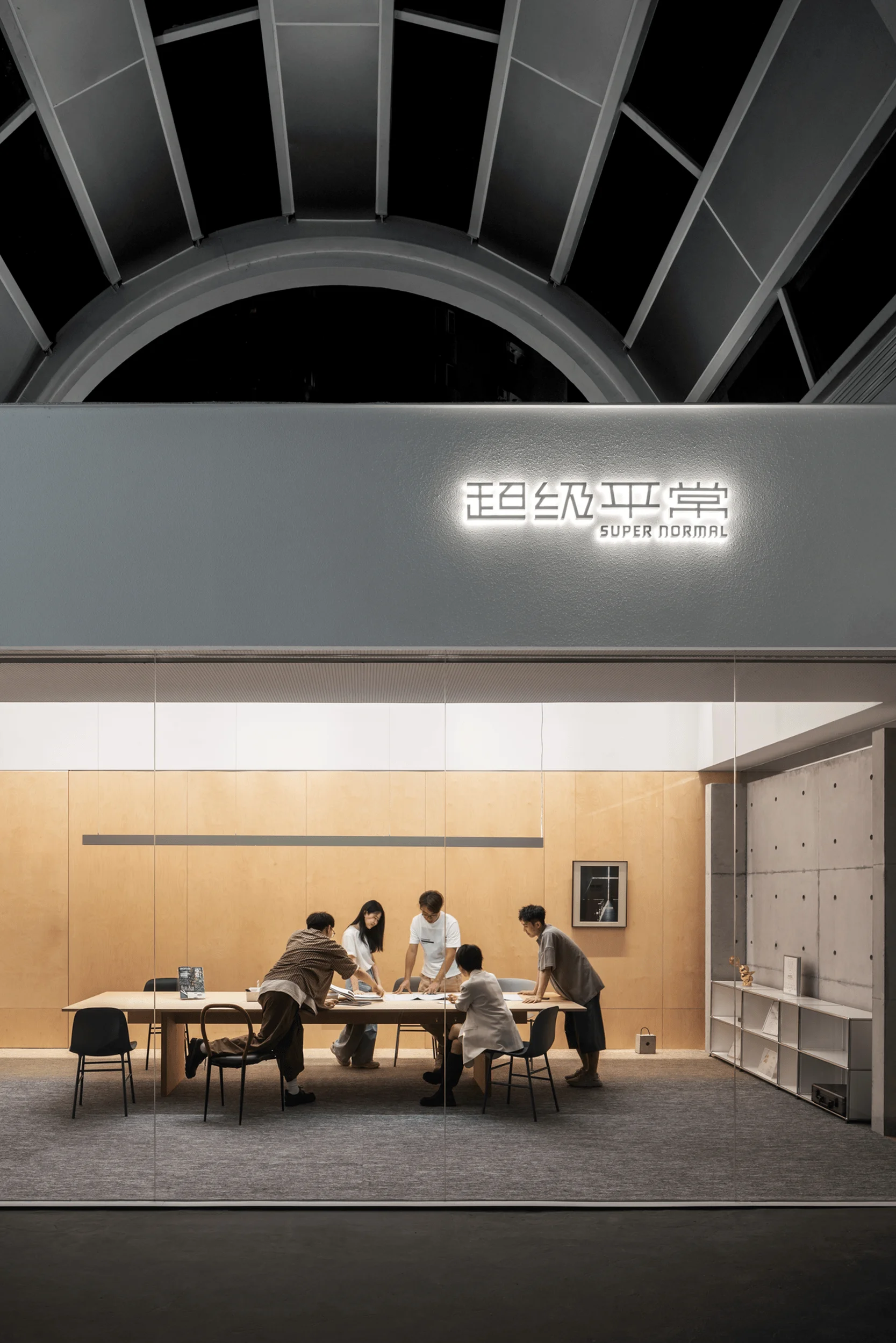
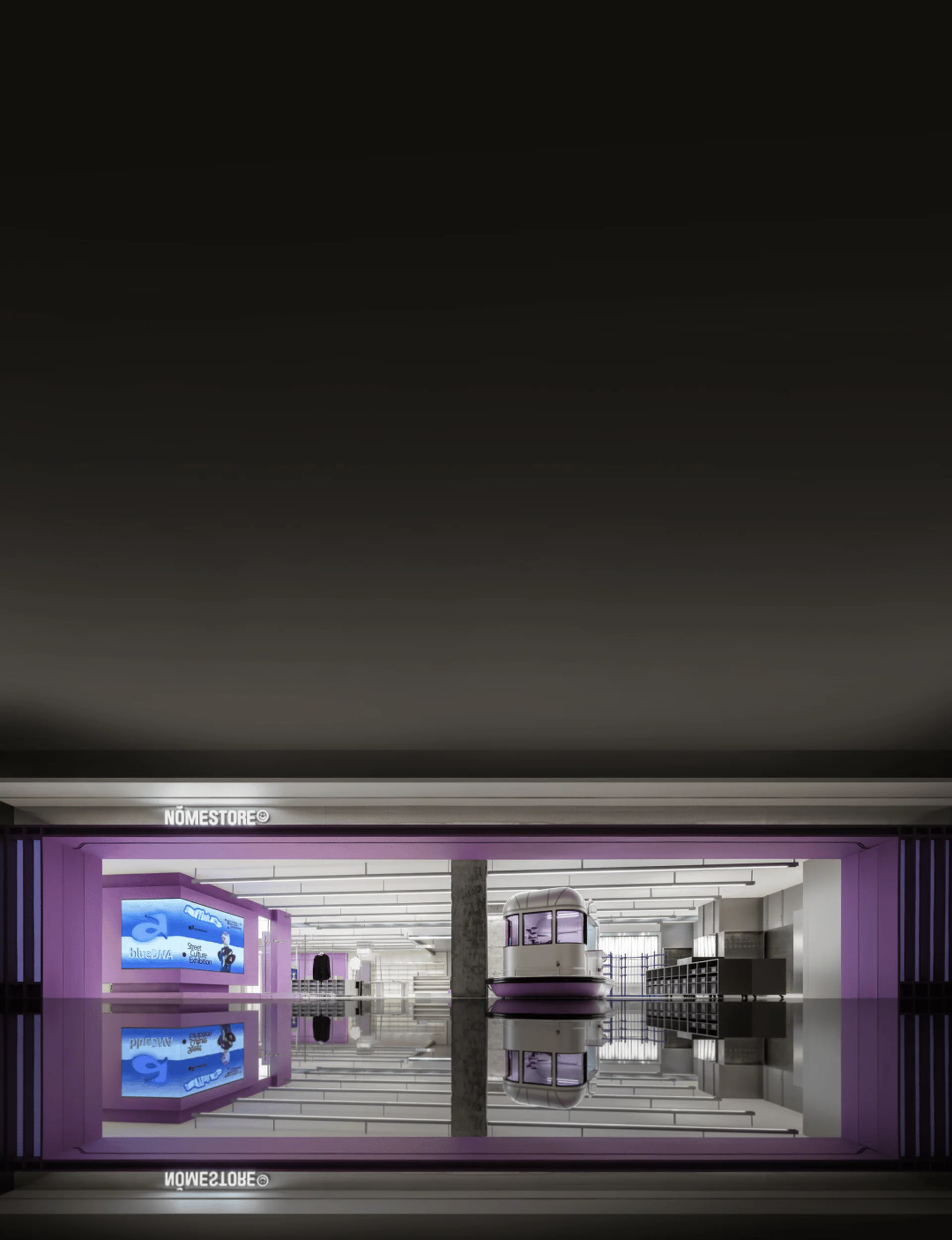
The designers sought to create a highly engaging showroom environment that showcases core products while maximizing the available space. Drawing from VIFA’s historical sales data from its retail stores, the team curated product categories with high transaction rates and representative value. This approach ensures that customers quickly gain an understanding of the core products in a relatively small space. The showroom is designed with two distinct visitor paths along the front and sides, enhancing customer experience and maximizing their time on-site. This configuration promotes free exploration and fosters increased product-user interaction. The entrance incorporates a western kitchen and cloakroom as prominent displays. The design creates a smooth flow for visitor experience by separating functional spaces while mitigating the feeling of confinement often found in other spaces. The external facade uses glass to promote transparency and openness, showcasing the interior spaces and experiences, creating a seamless connection between the Western Kitchen, study, and cloakroom. This design approach emphasizes human interaction as the core of the space, generating diverse levels of experience and creating an immediate and intuitive sense of living space and maximizing the space’s exposure.
#custom homes design #interior design showroom #VIFA showroom design #Shenzhen showroom #super normal design #minimalist interior design
Spatial Flow: Blurring Boundaries and Fostering Exploration
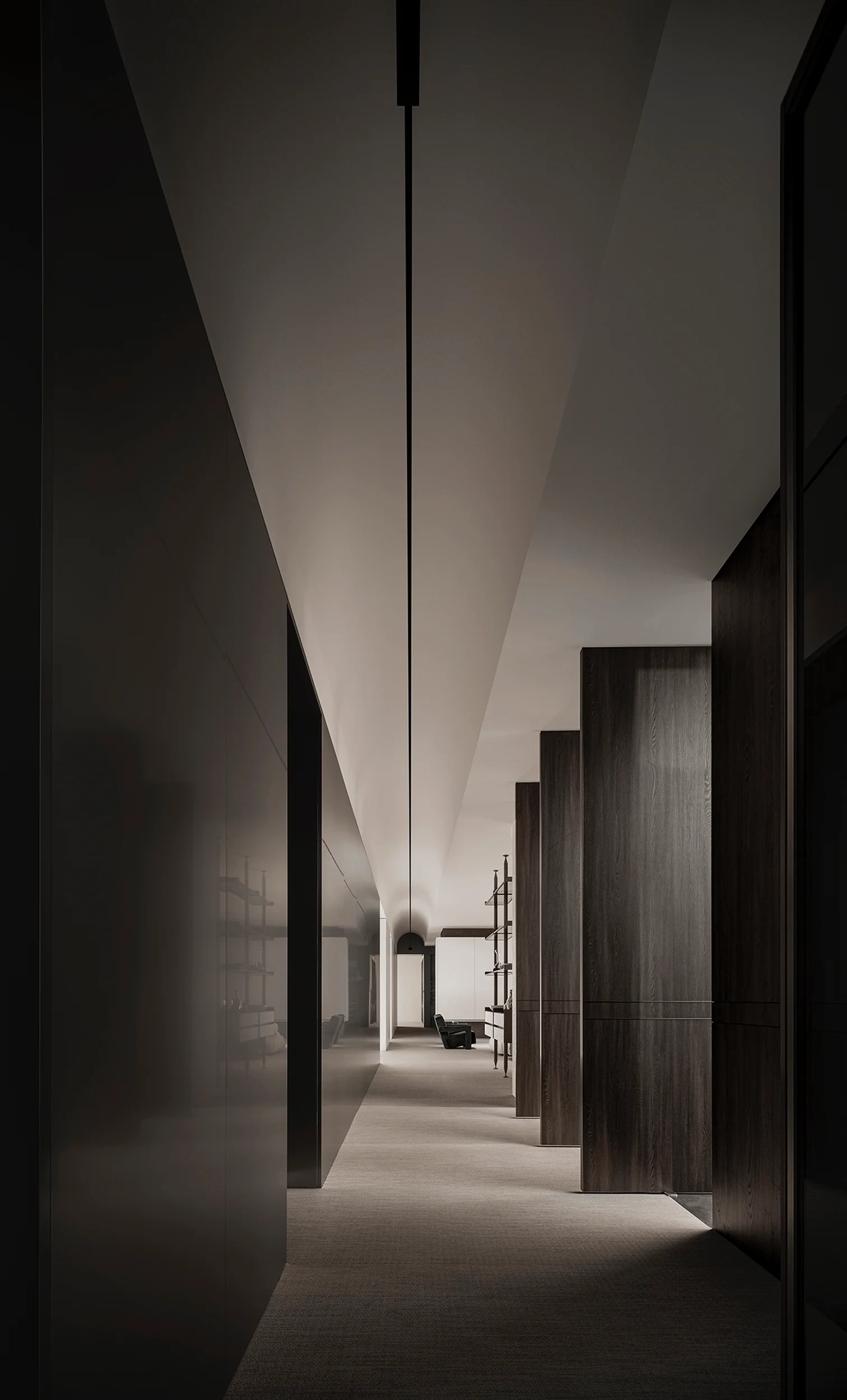
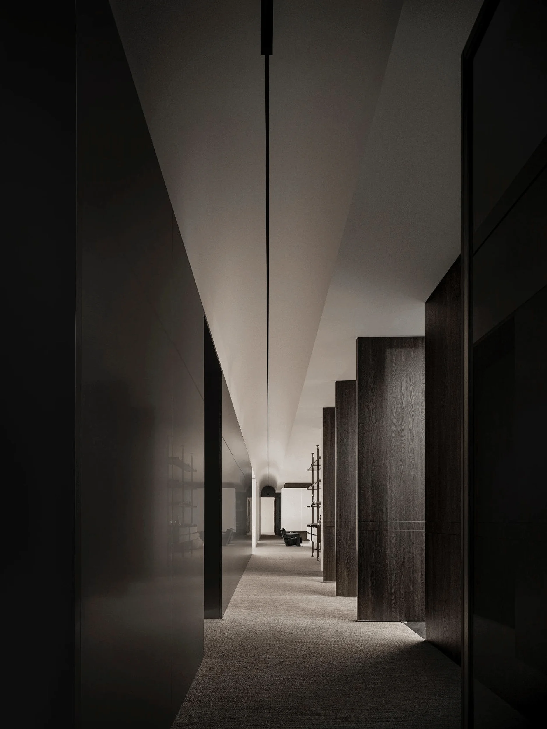
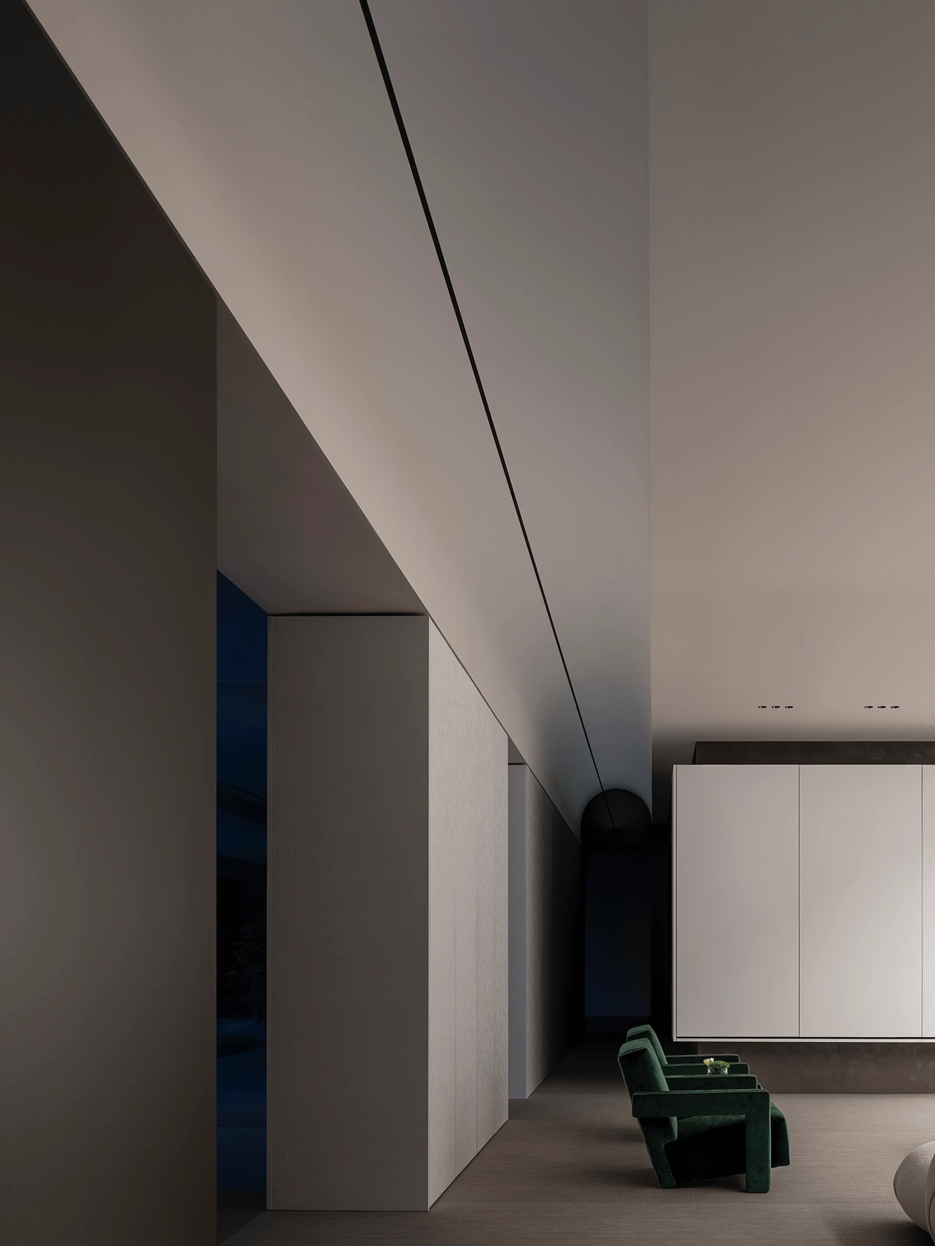
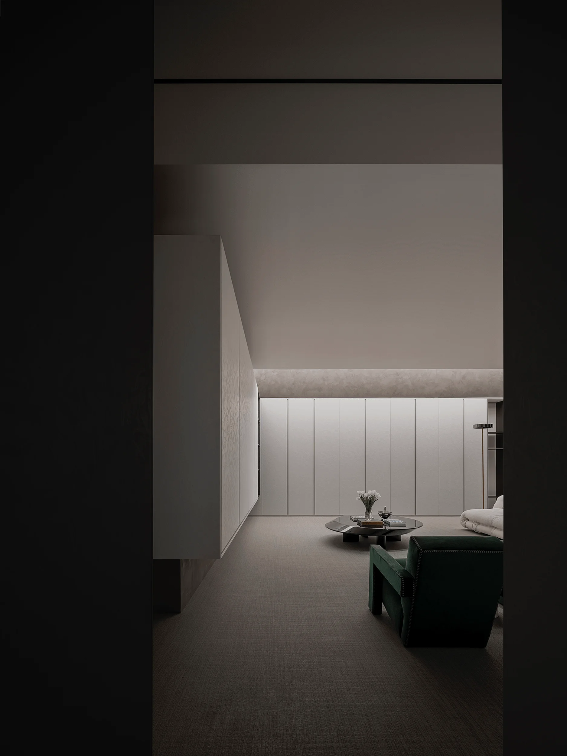
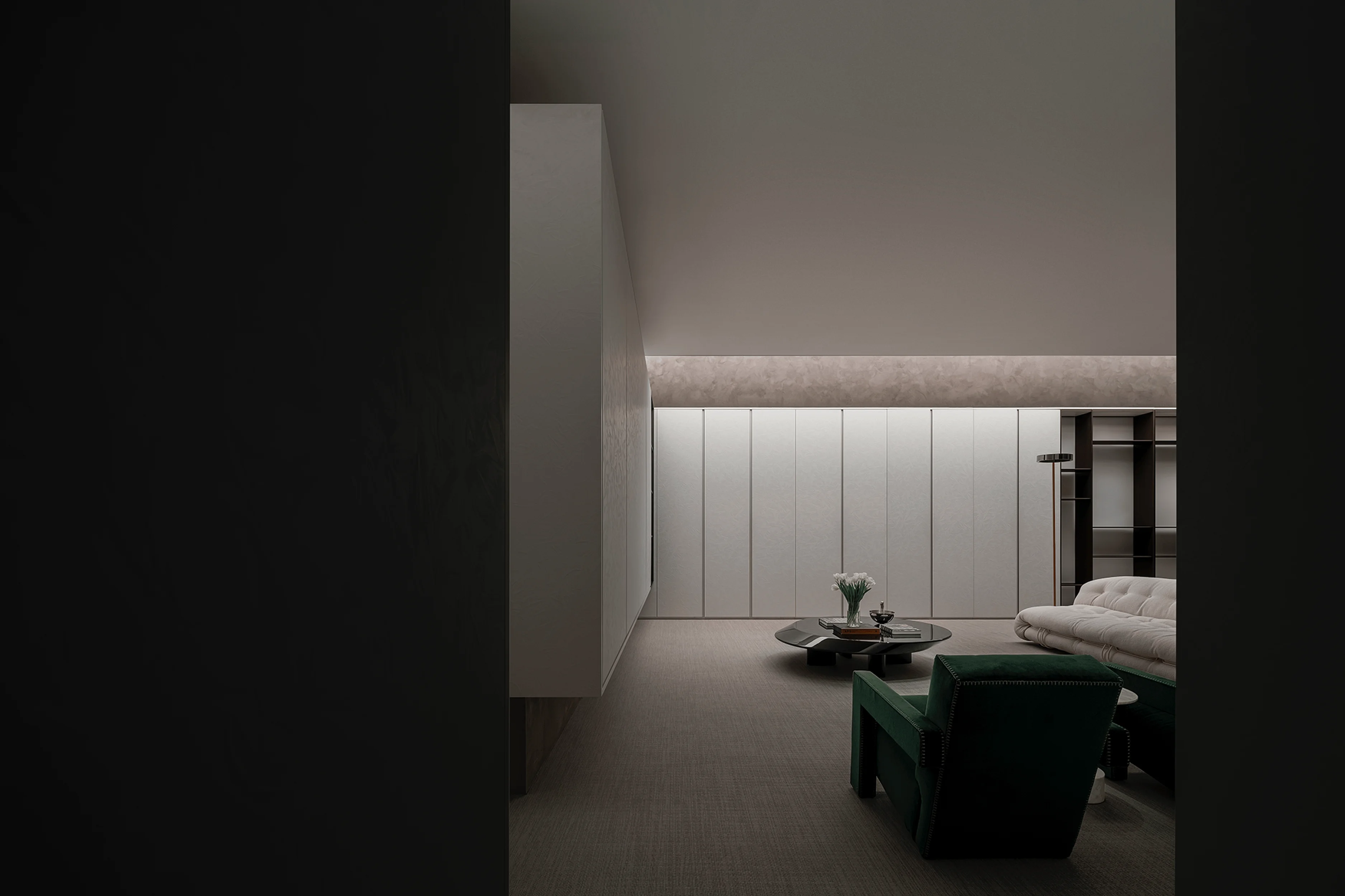
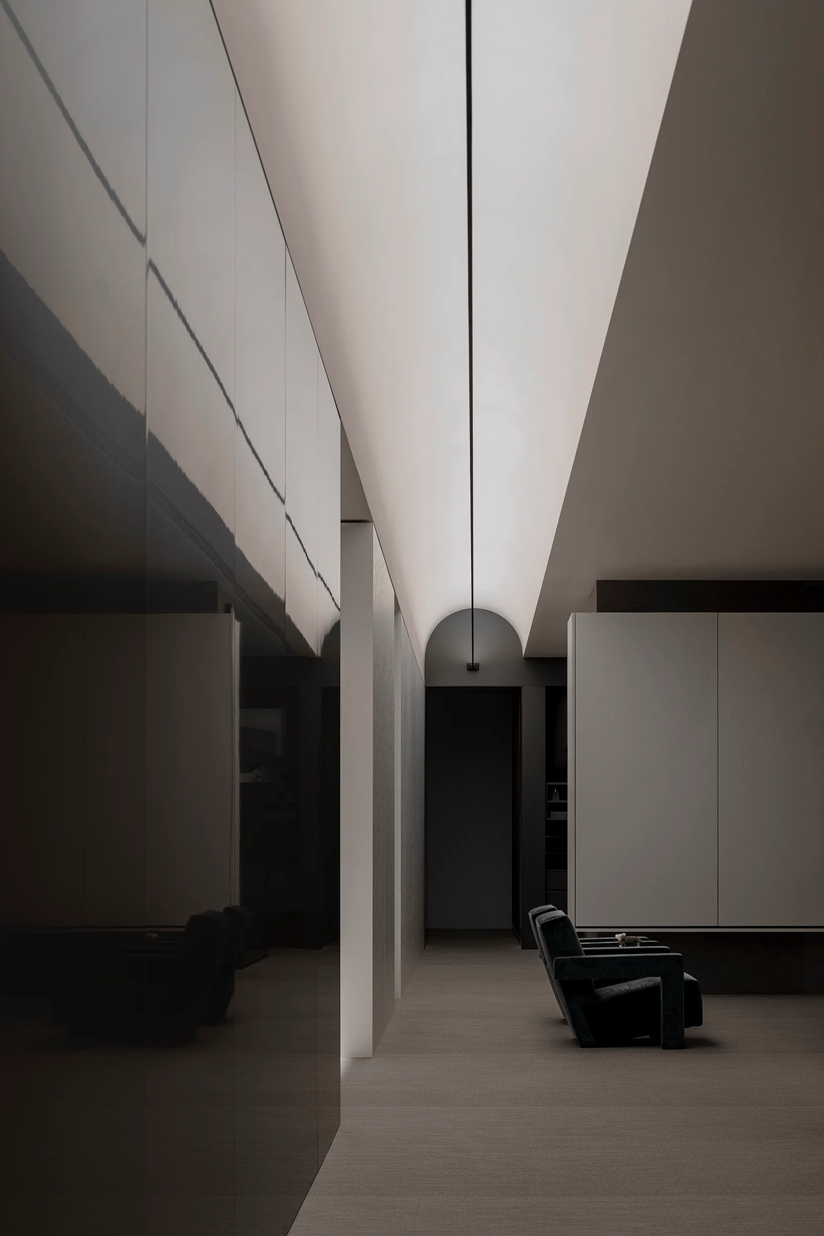
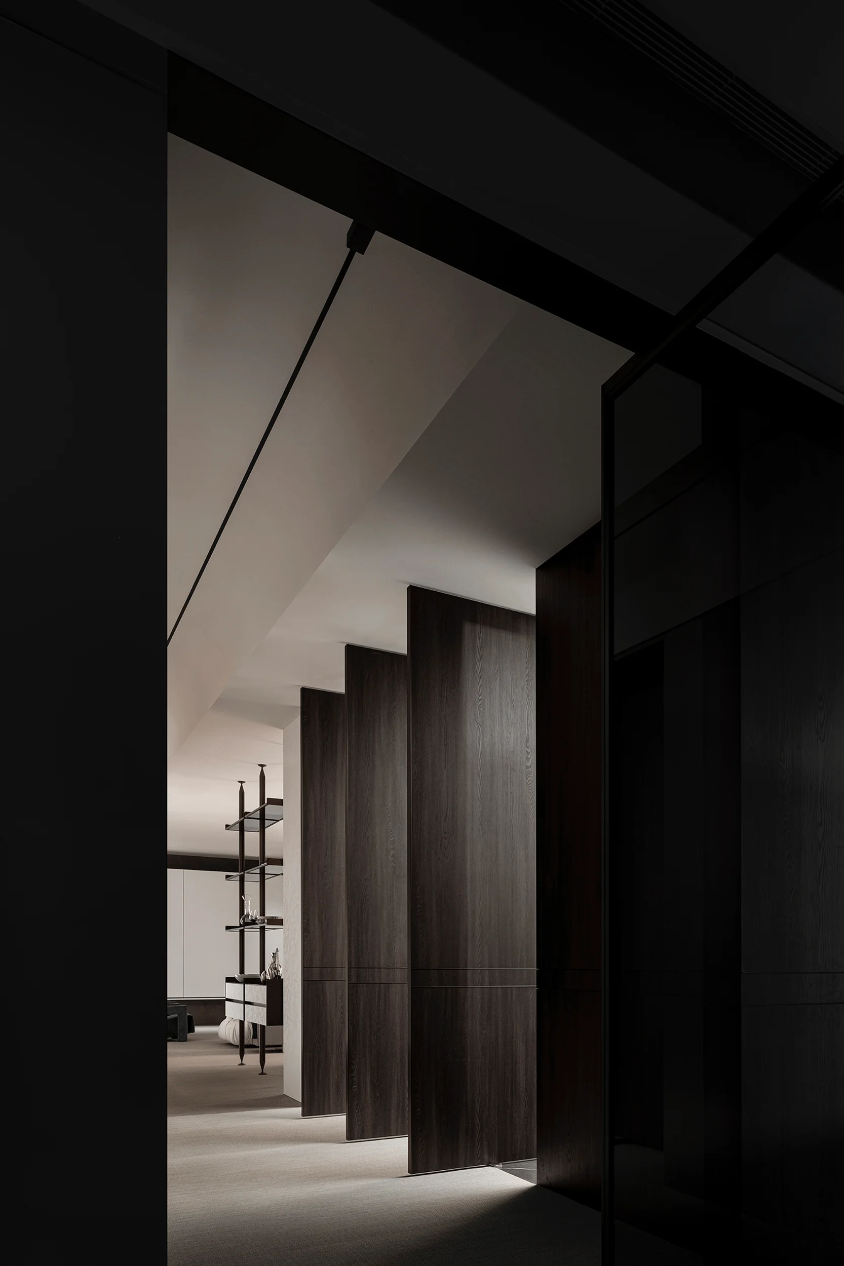
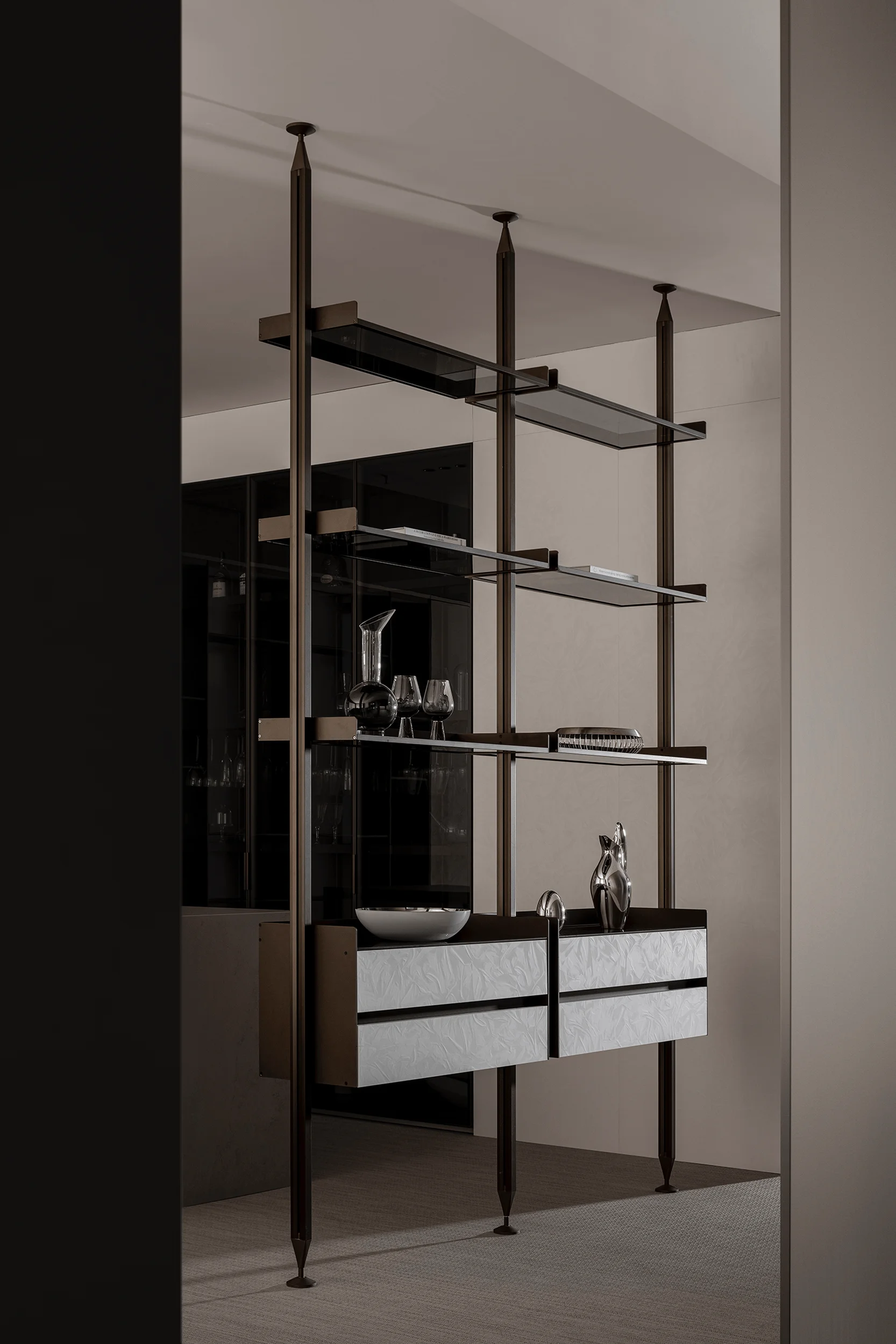
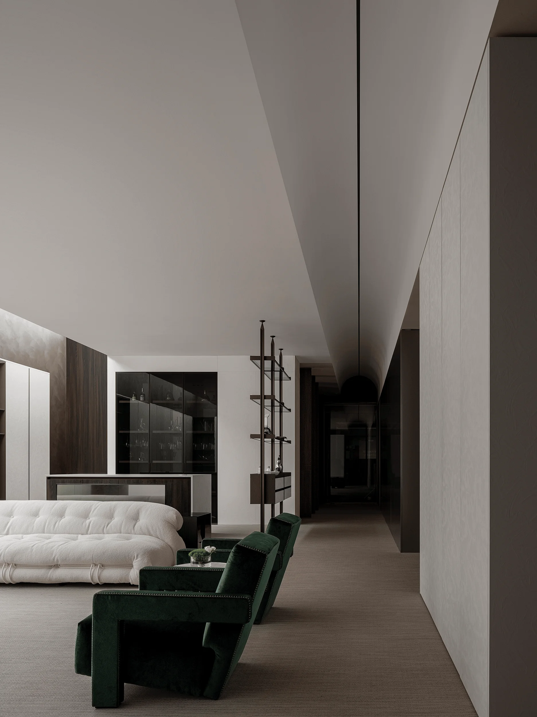
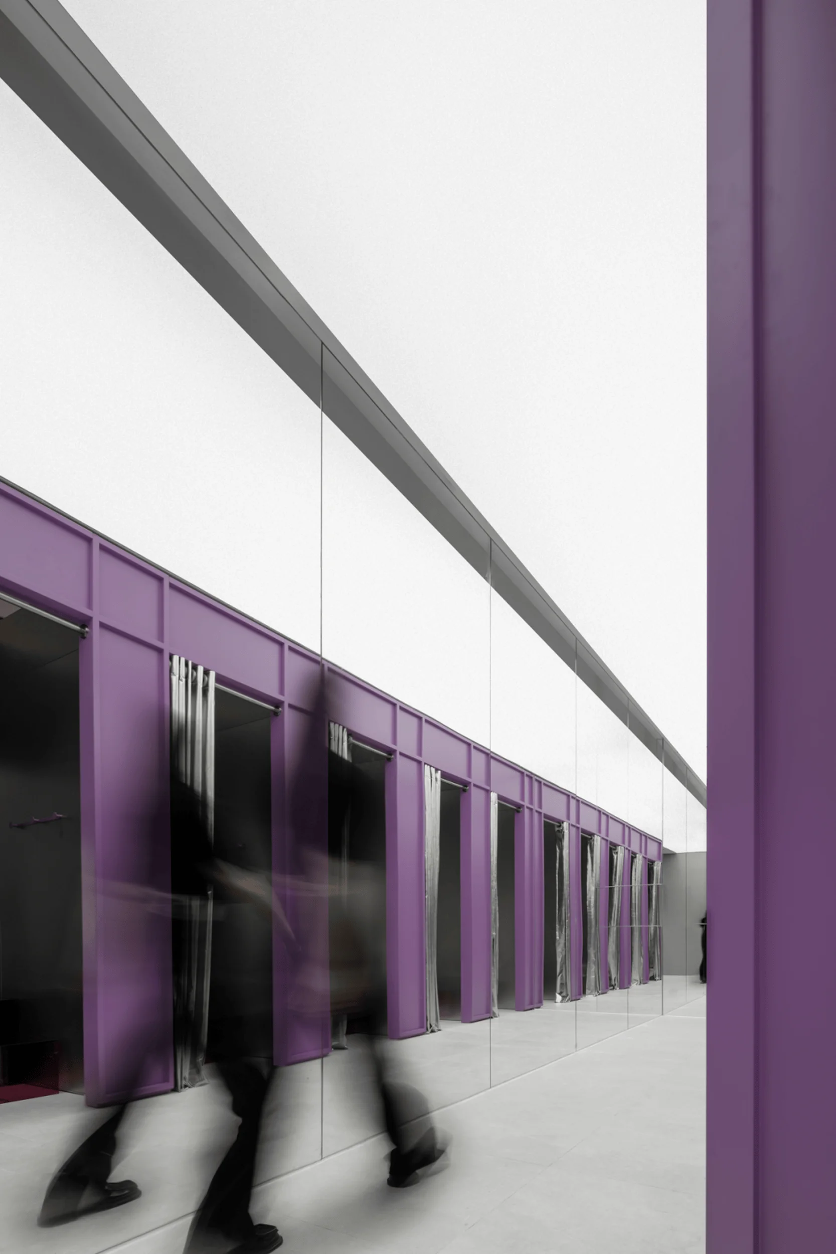
The left-hand entrance provides a linear visitor flow, separating the display spaces and creating a contrast between openness and privacy. The use of movable pivot doors introduces a sense of displacement, interweaving and distancing, while blurring the boundaries of the space. This design element creates a feeling of freedom and movement within the space and encourages exploration of the space’s many features and functions. The vaulted ceiling design in the living area’s interior mirrors the exterior flow, enhancing the visual depth of the space and subtly guiding guests forward. The design maximizes the visual impact of the products and achieves a balance between visual flow and functionality. The spatial design and product arrangement, using products to separate spaces that still feel connected, create a flow that encourages visitor engagement. The design incorporates light and shadow within the open-air doors on both sides, which contributes to an enriching and dynamic experience that extends the visitor journey and maximizes spatial utilization while fostering exploration.
#custom homes design #interior design showroom #VIFA showroom design #Shenzhen showroom #super normal design #minimalist interior design
A Tribute to Light: Enhancing Immersion and Product Focus
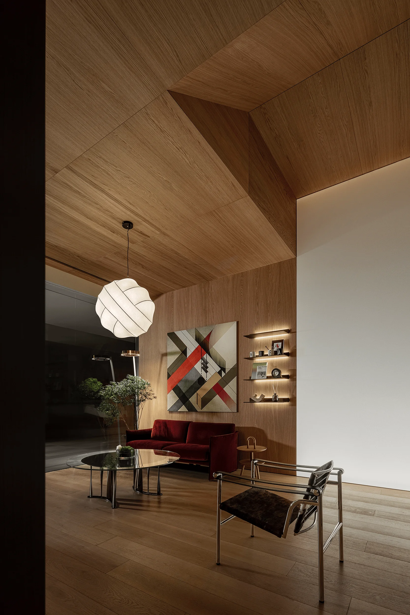
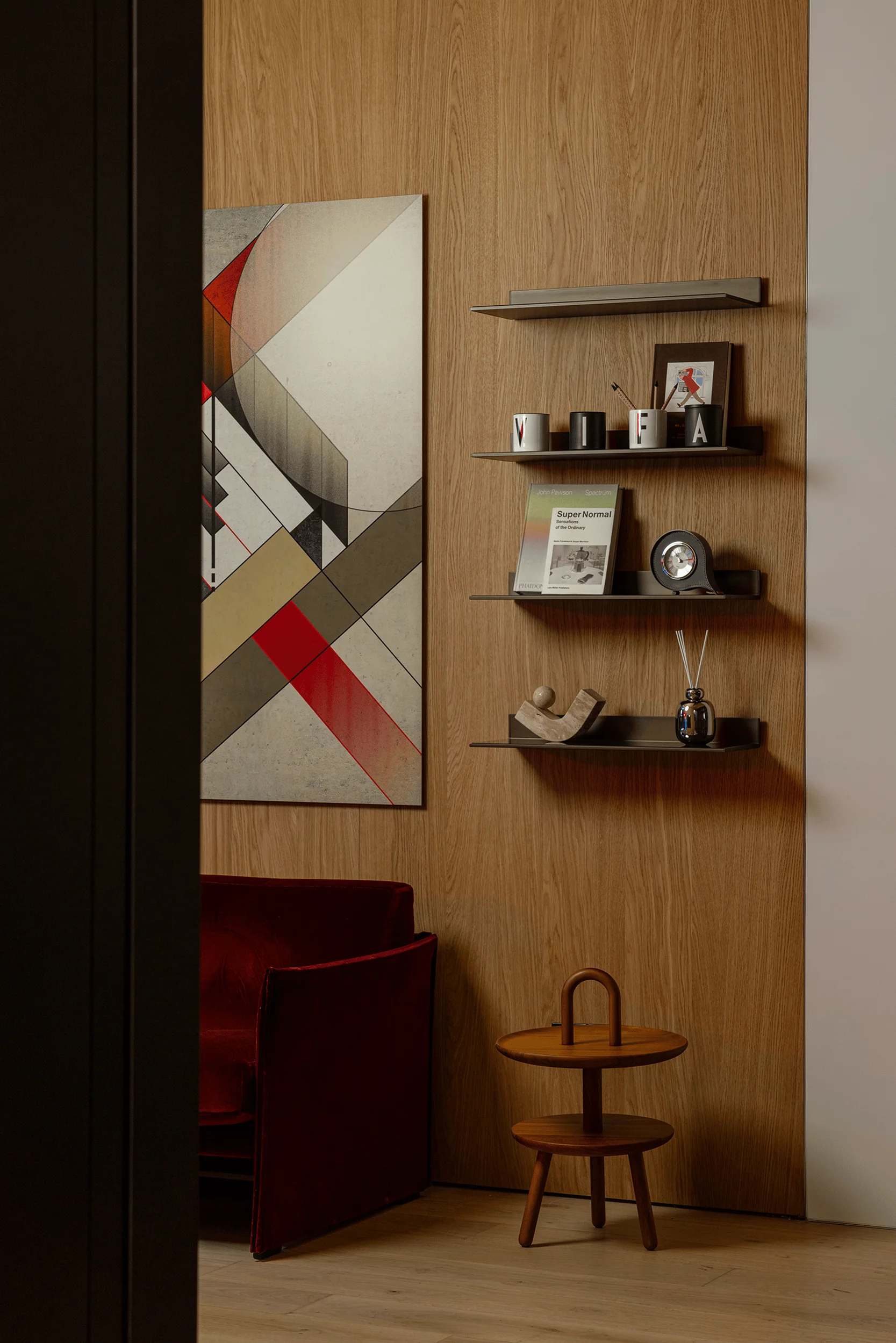
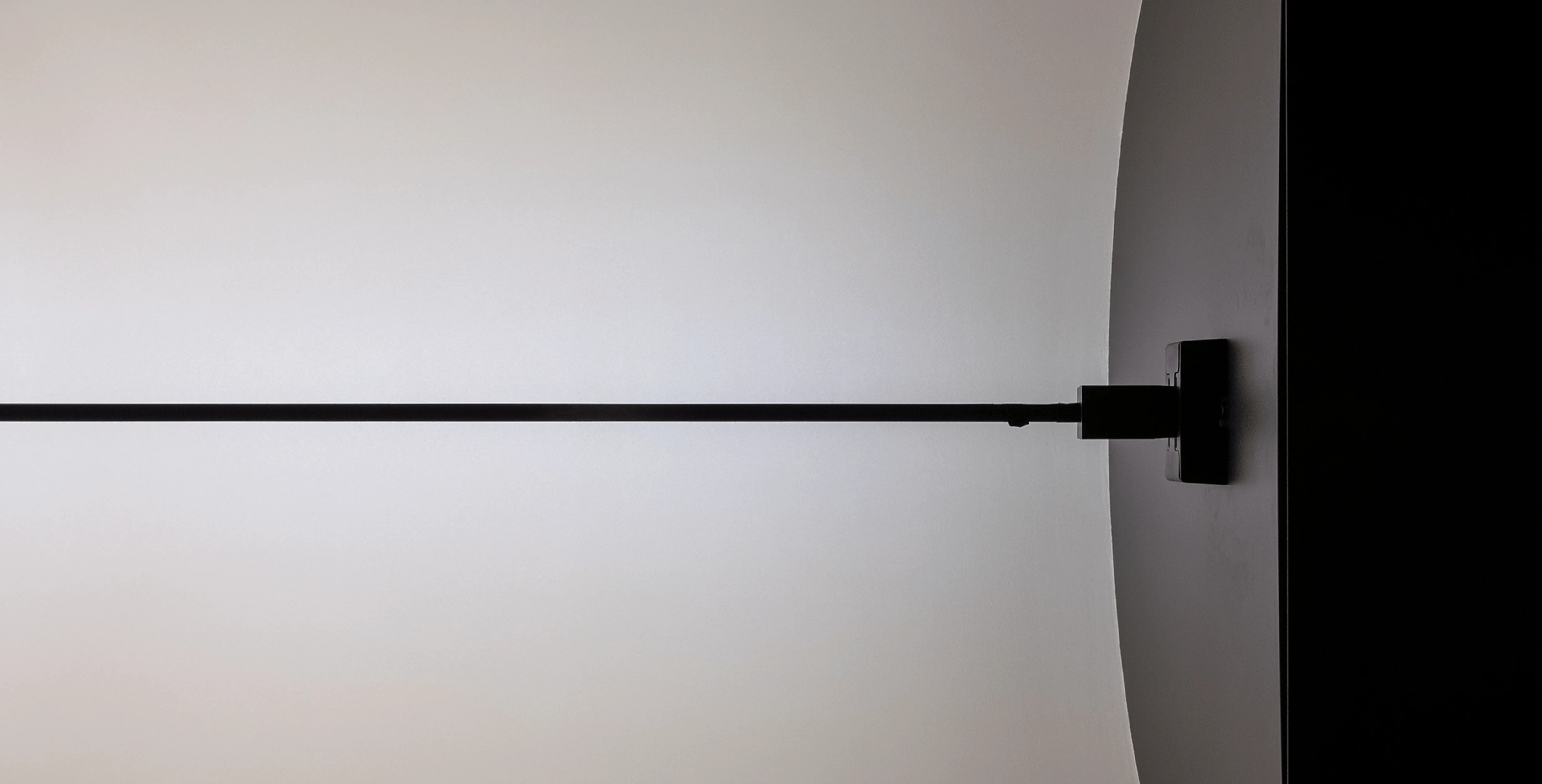
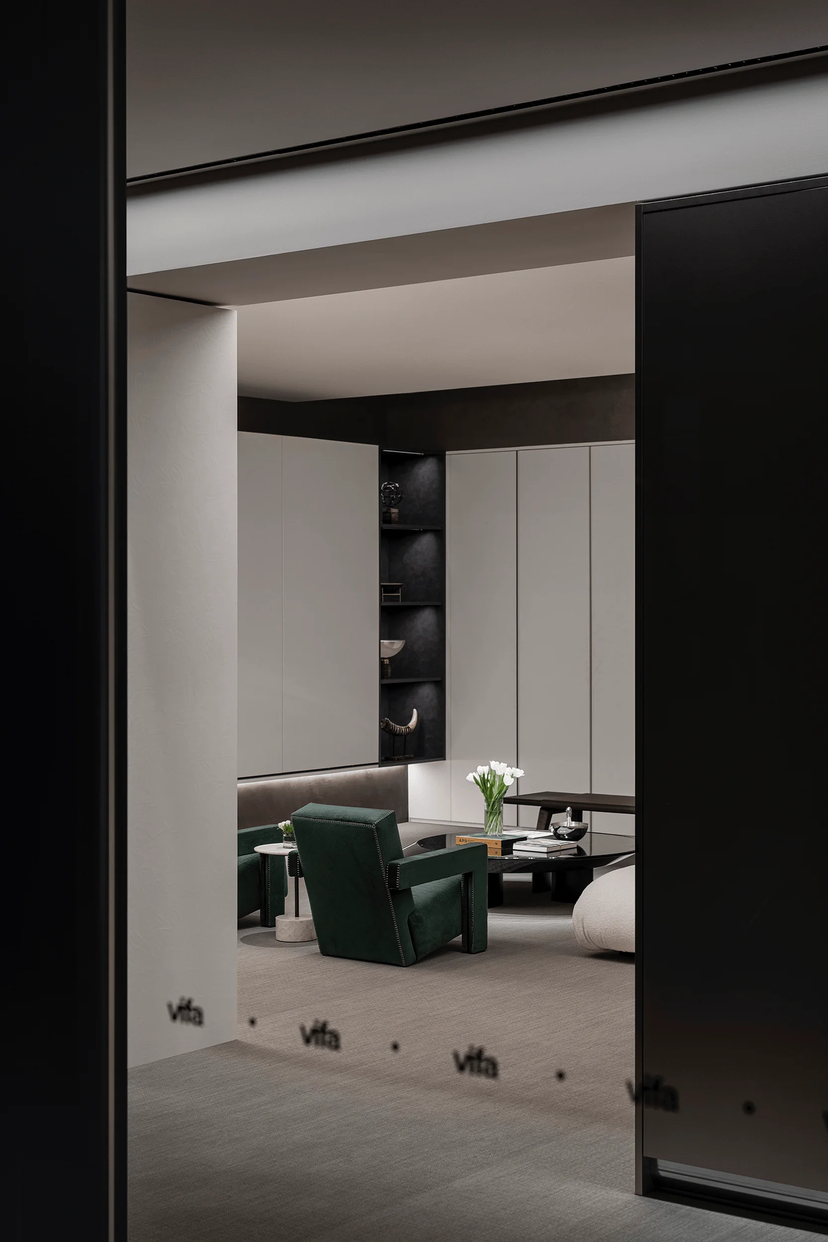
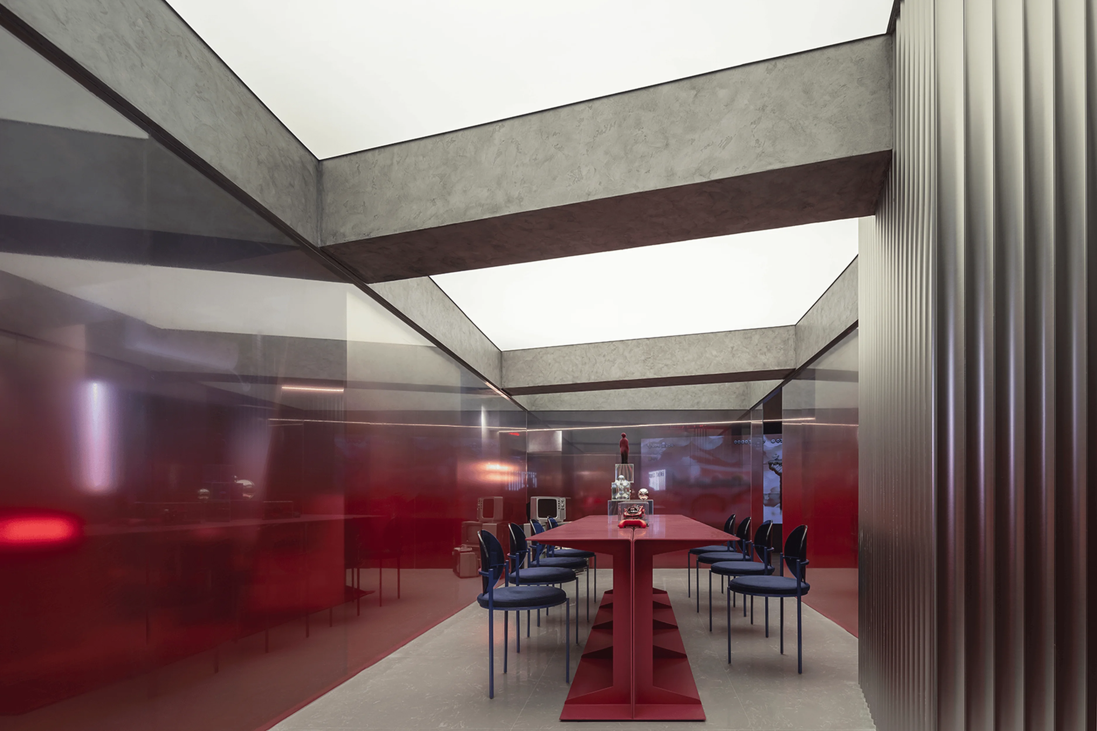
The vaulted ceiling, combined with the interplay of light and shadow, creates a visual impression of upward expansion. This design element enhances the artistic expression of the space and softens the harshness of the product forms and the space’s right angles. The environment created is calming and promotes a greater focus on the products, creating an immersive experience. The design integrates independent living scenes, using the product’s unique structure to foster a cohesive sense of order. The minimalist aesthetic perfectly complements the simple and straightforward VIFA brand philosophy. The design prioritizes functionality and product presentation.
#custom homes design #interior design showroom #VIFA showroom design #Shenzhen showroom #super normal design #minimalist interior design
Project Information:
Project Type: Showroom
Architect: Super Normal
Area: 248 ㎡
Year: 2019
Country: China
Photographer: Qin Zhaoliang
#custom homes design #interior design showroom #VIFA showroom design #Shenzhen showroom #super normal design #minimalist interior design


