YEARLY PLAN flagship store designed by dongqi Design in China, a minimalist retail architecture masterpiece.
Contents
Context and Background of YEARLY PLAN Flagship Store
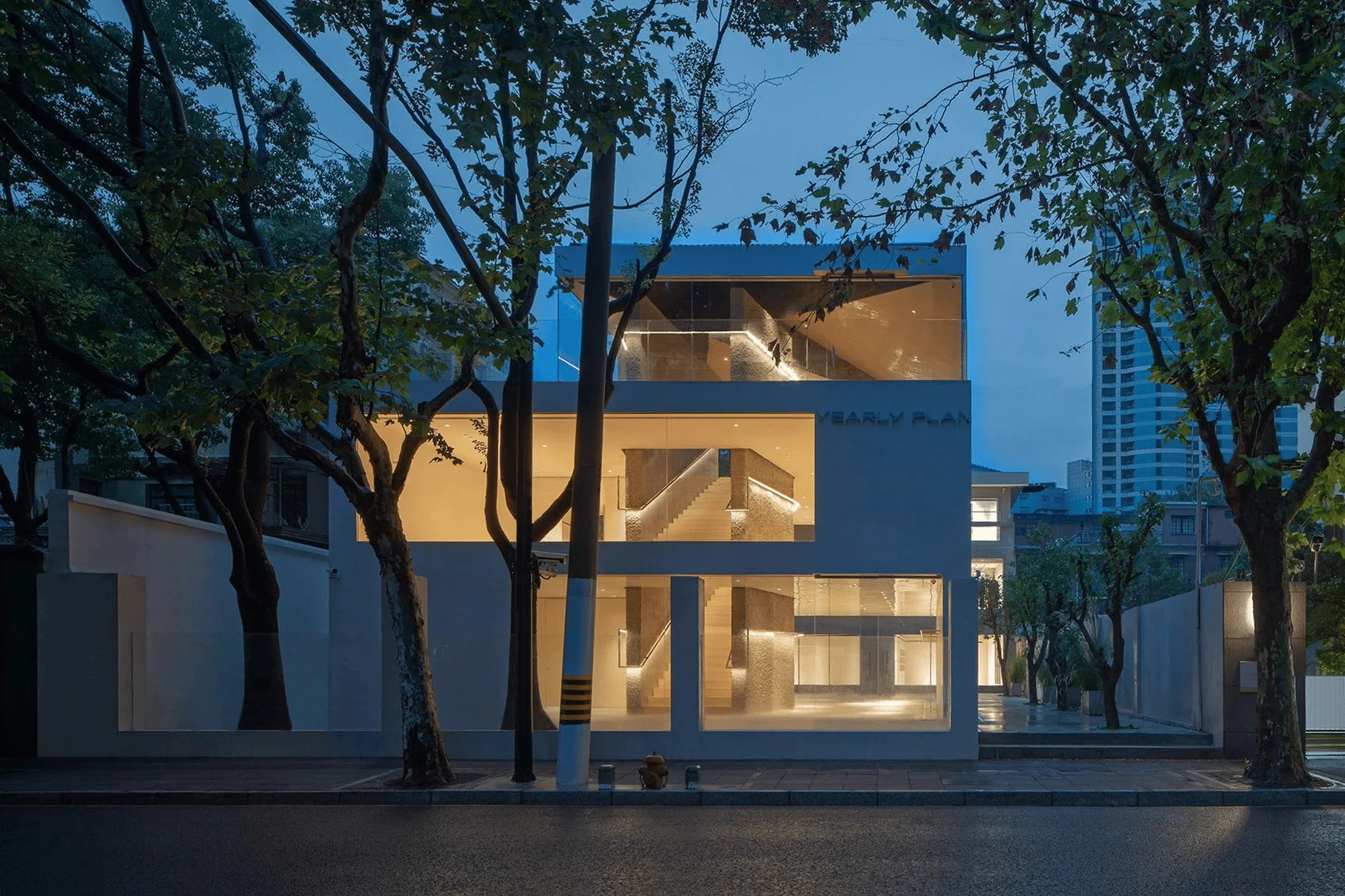
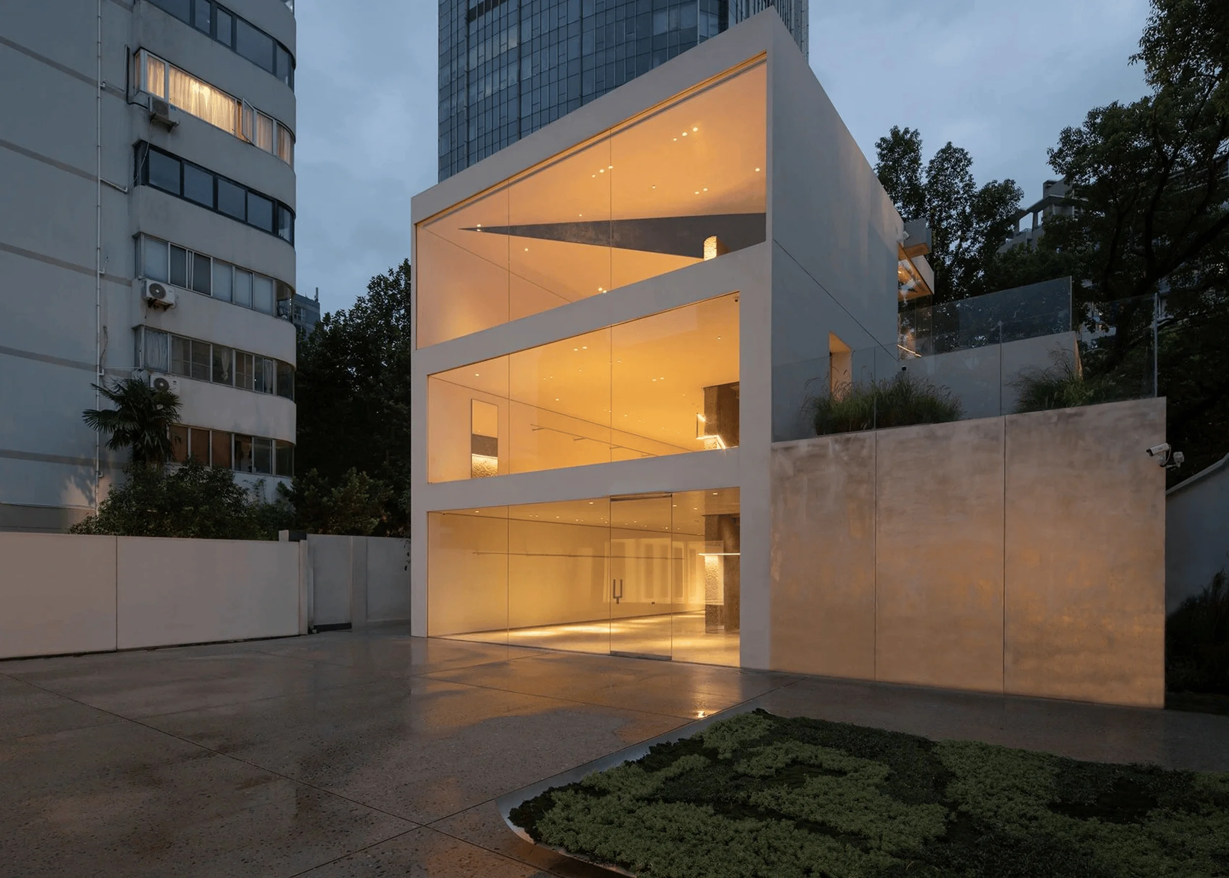
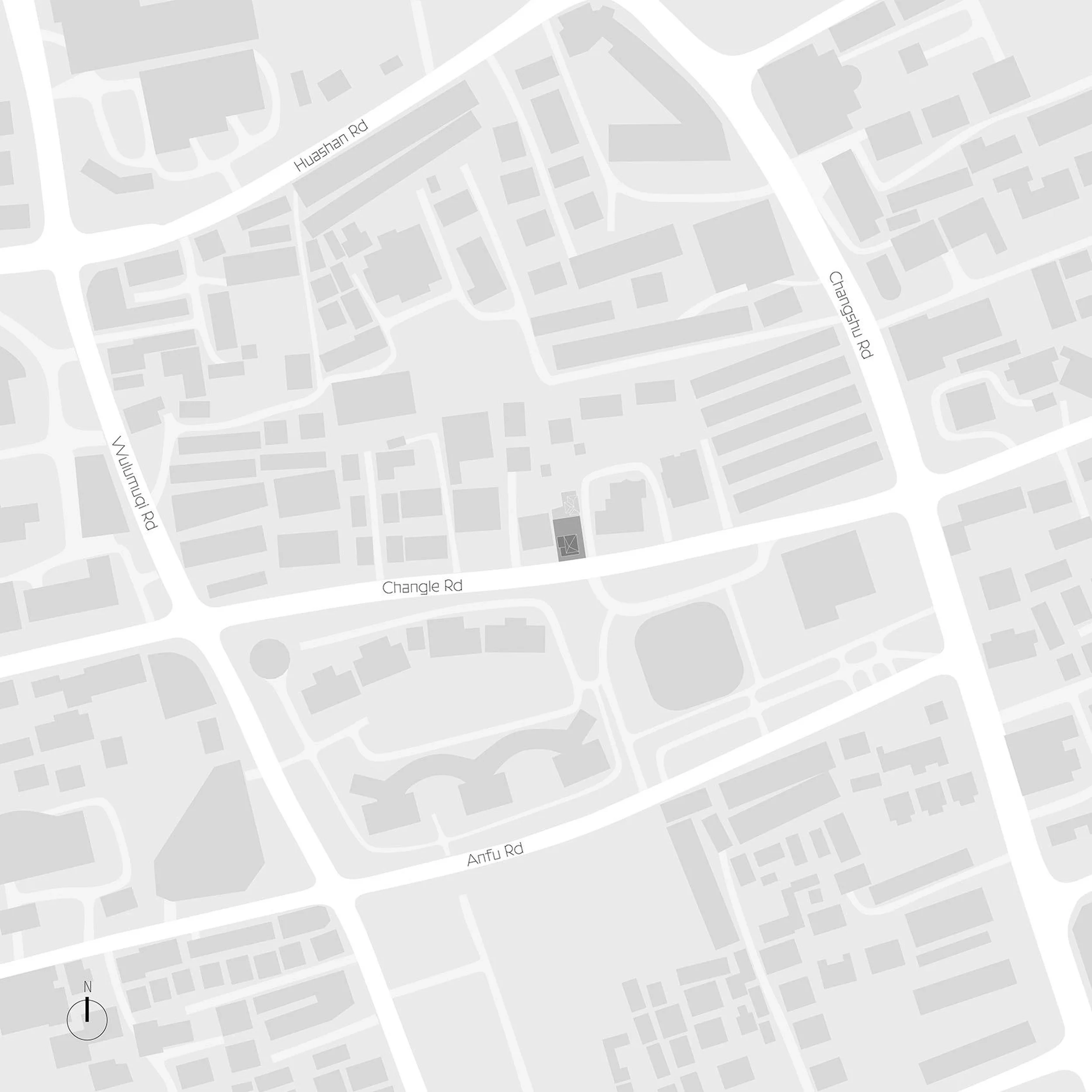
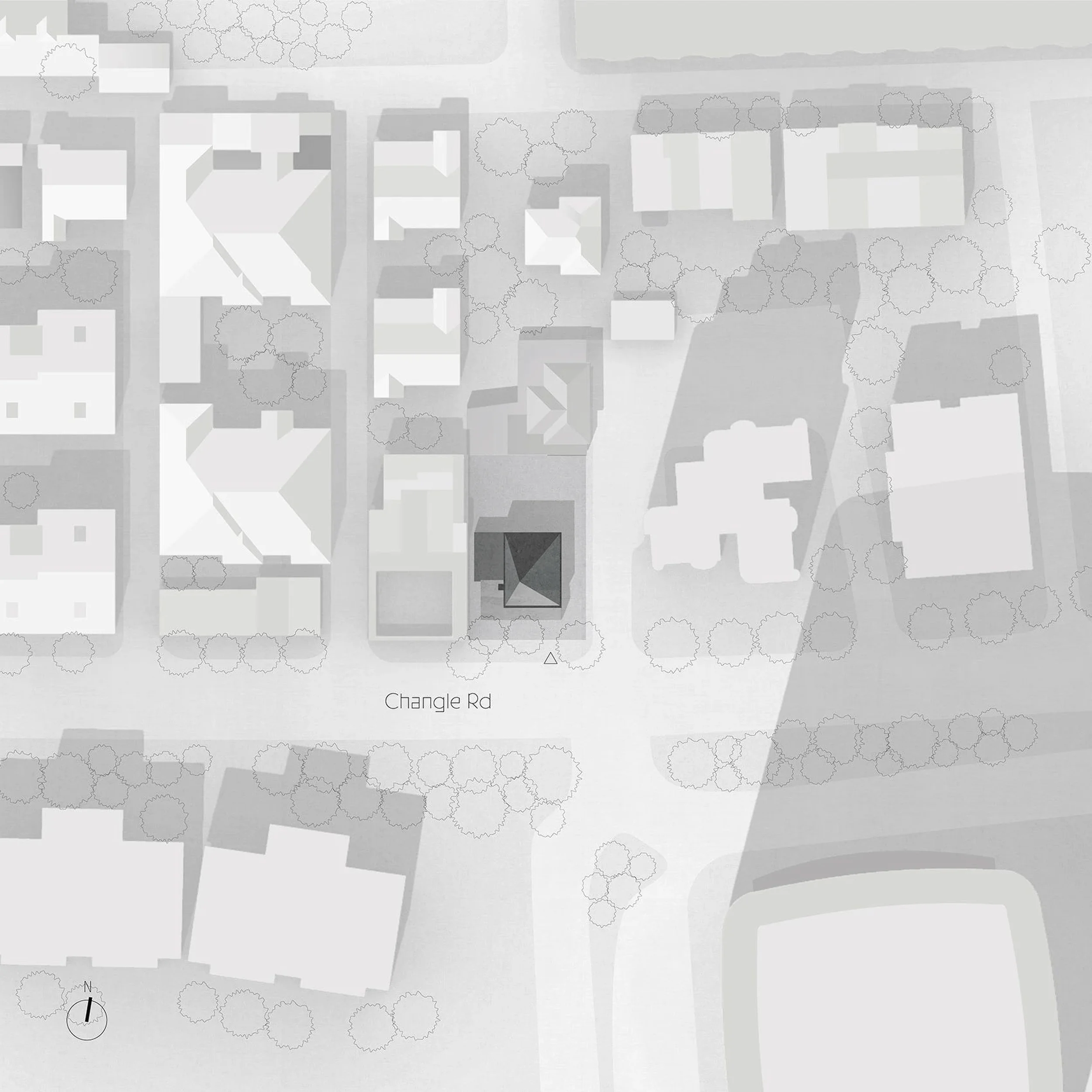
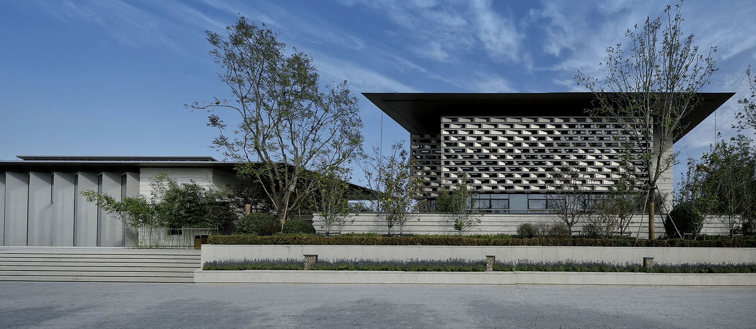
The YEARLY PLAN flagship store, designed by dongqi Design, is located on Changle Road in Shanghai, China. The architects sought to create a space that would blend seamlessly with the existing urban fabric while fulfilling the brand’s functional needs. The minimalist retail architecture style was chosen to complement the brand’s philosophy, while the innovative use of concrete and glass creates a unique aesthetic that sets the store apart from its surroundings. The flagship store represents a successful intervention in the urban landscape, enhancing its context while providing a striking example of contemporary retail design. minimalist retail architecture design principles guided the architects to minimize unnecessary embellishments, allowing the natural beauty of the materials and the play of light and shadow to take center stage.
Design Concept and Objectives
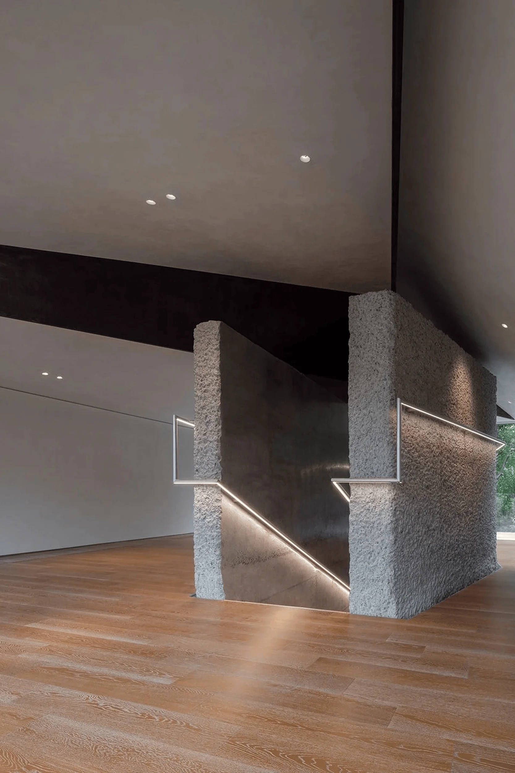
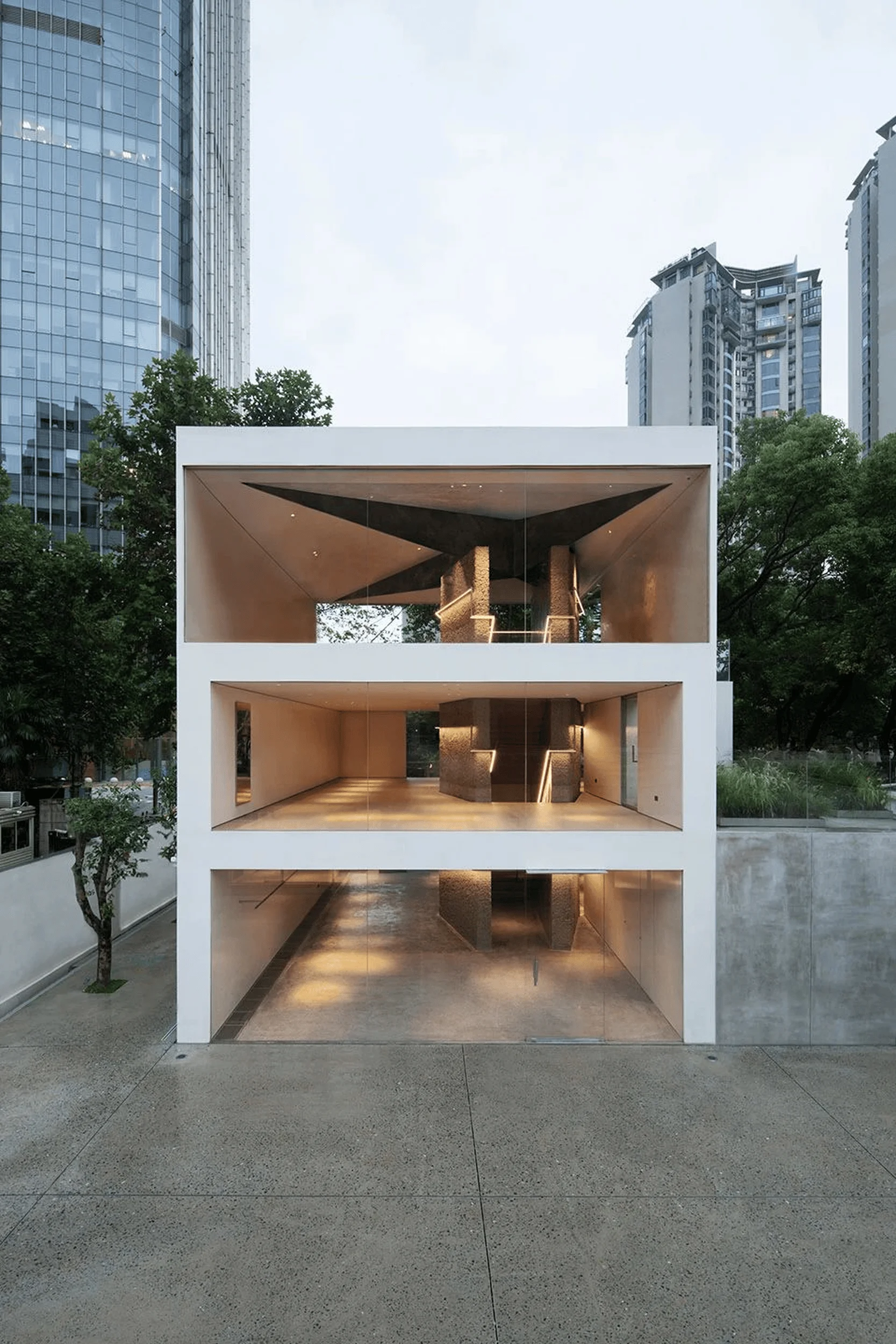
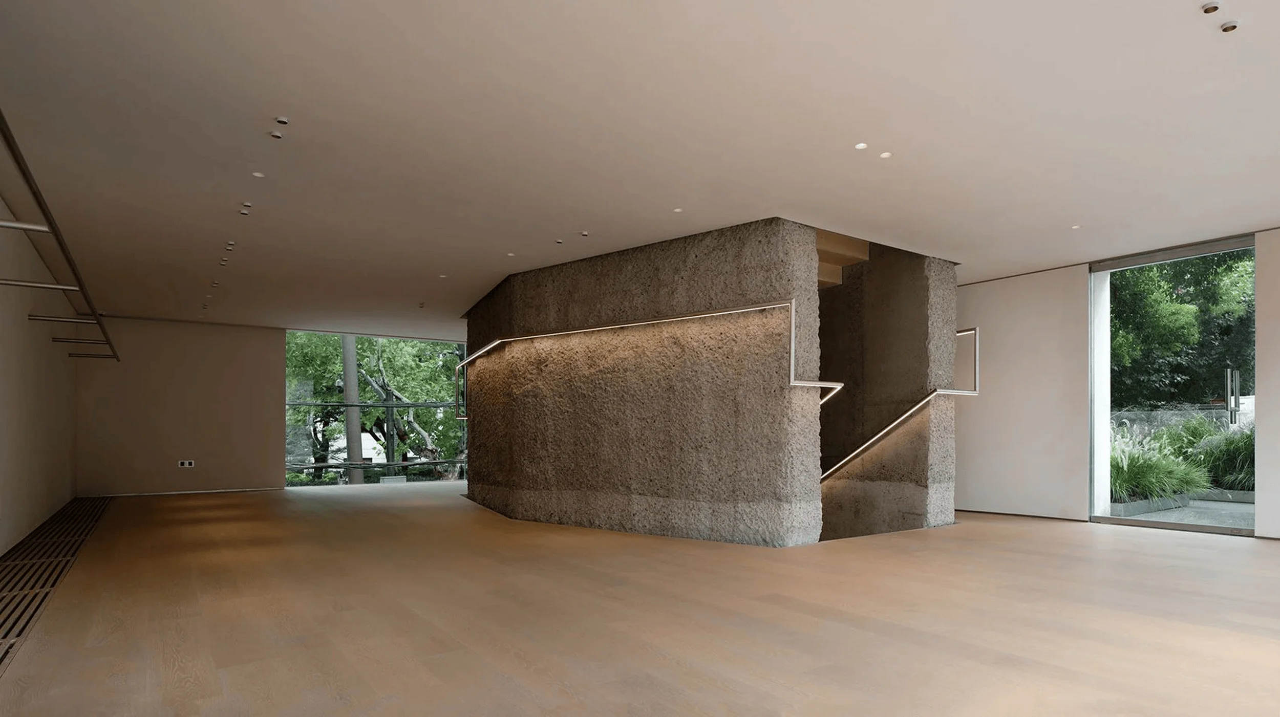
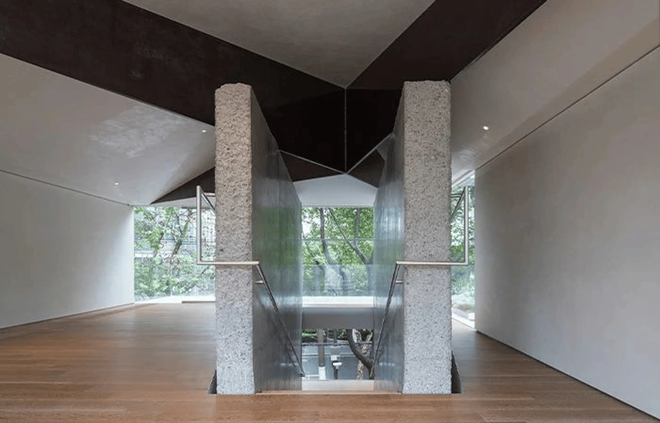
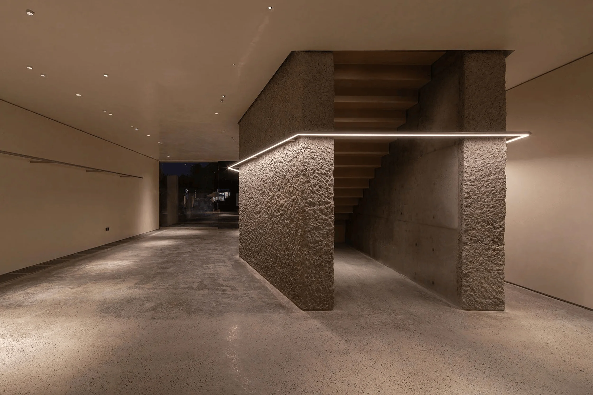
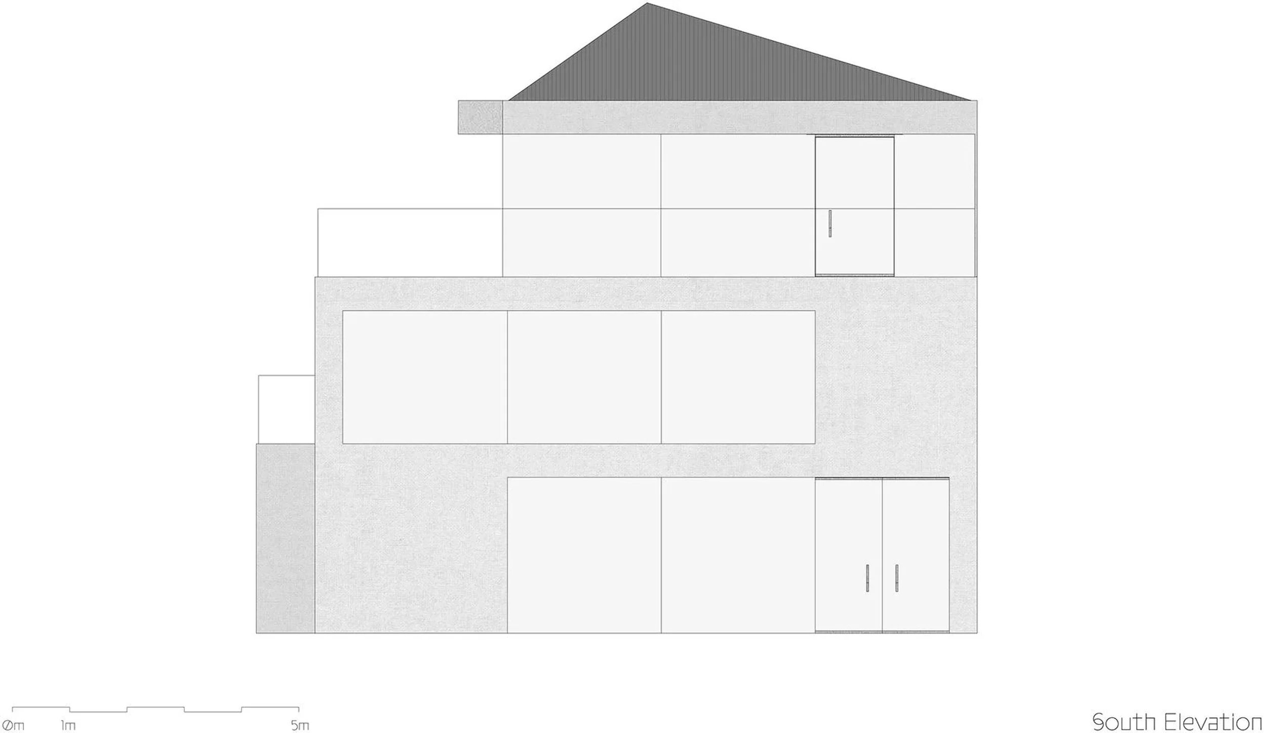
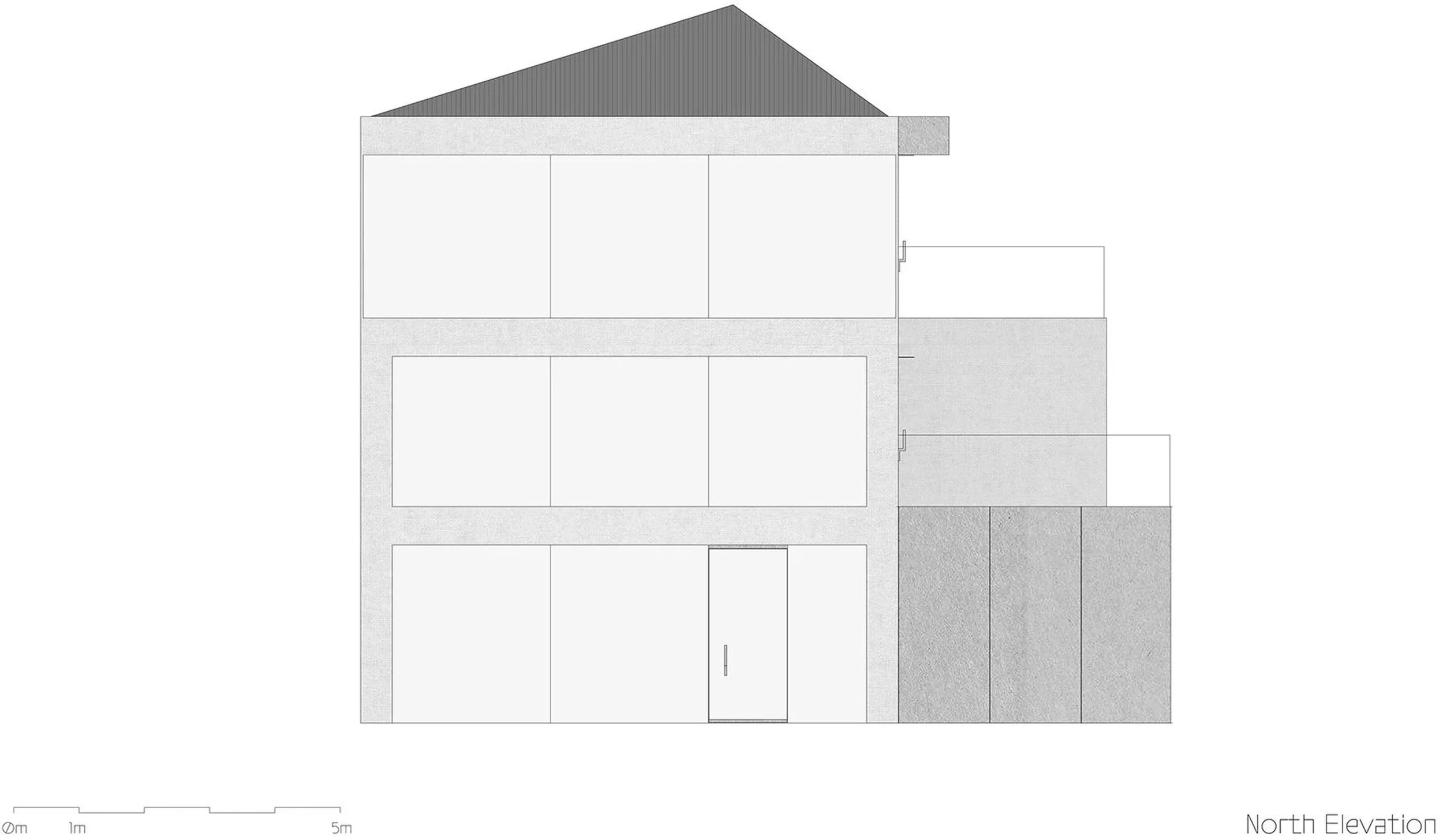
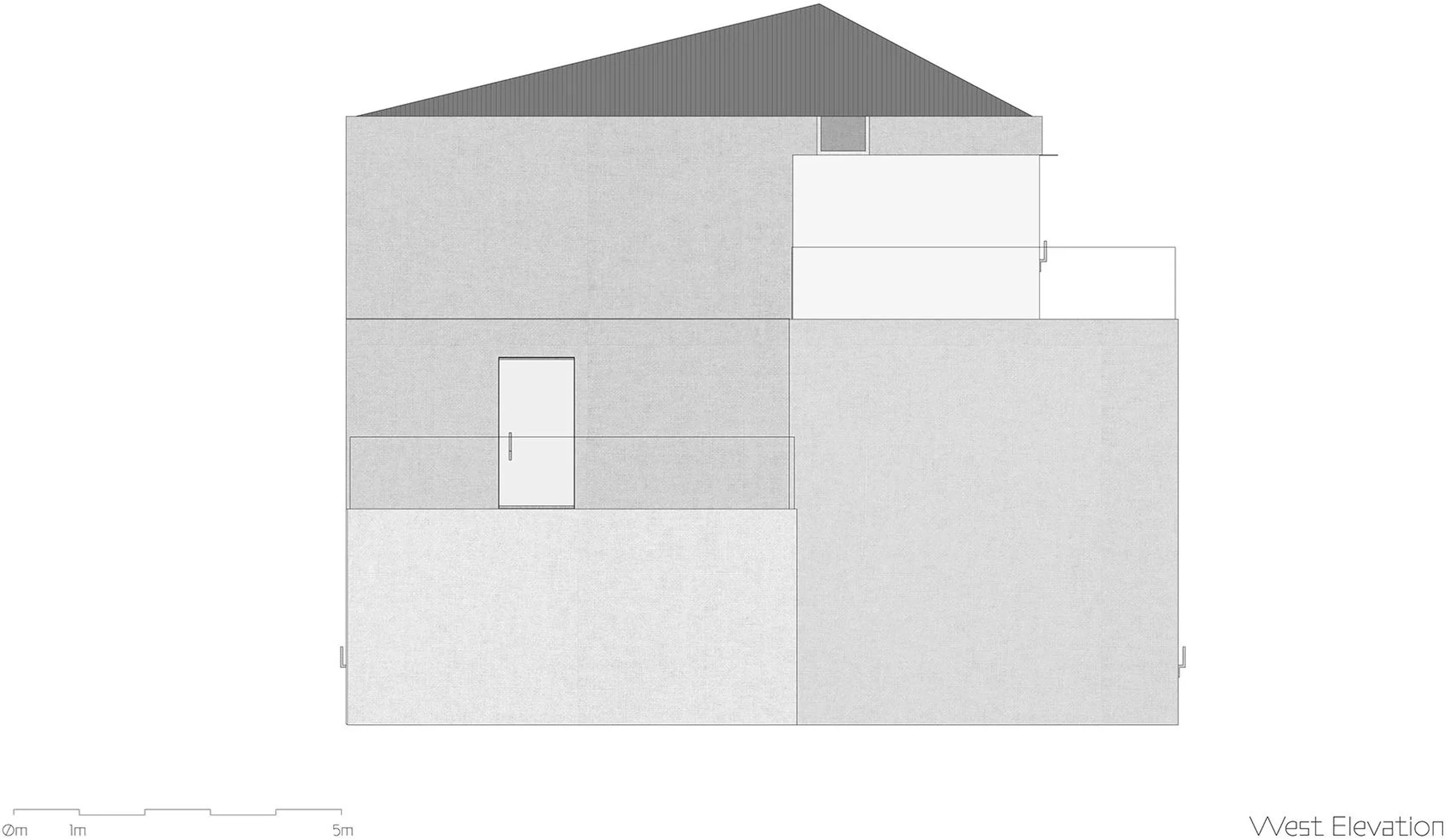
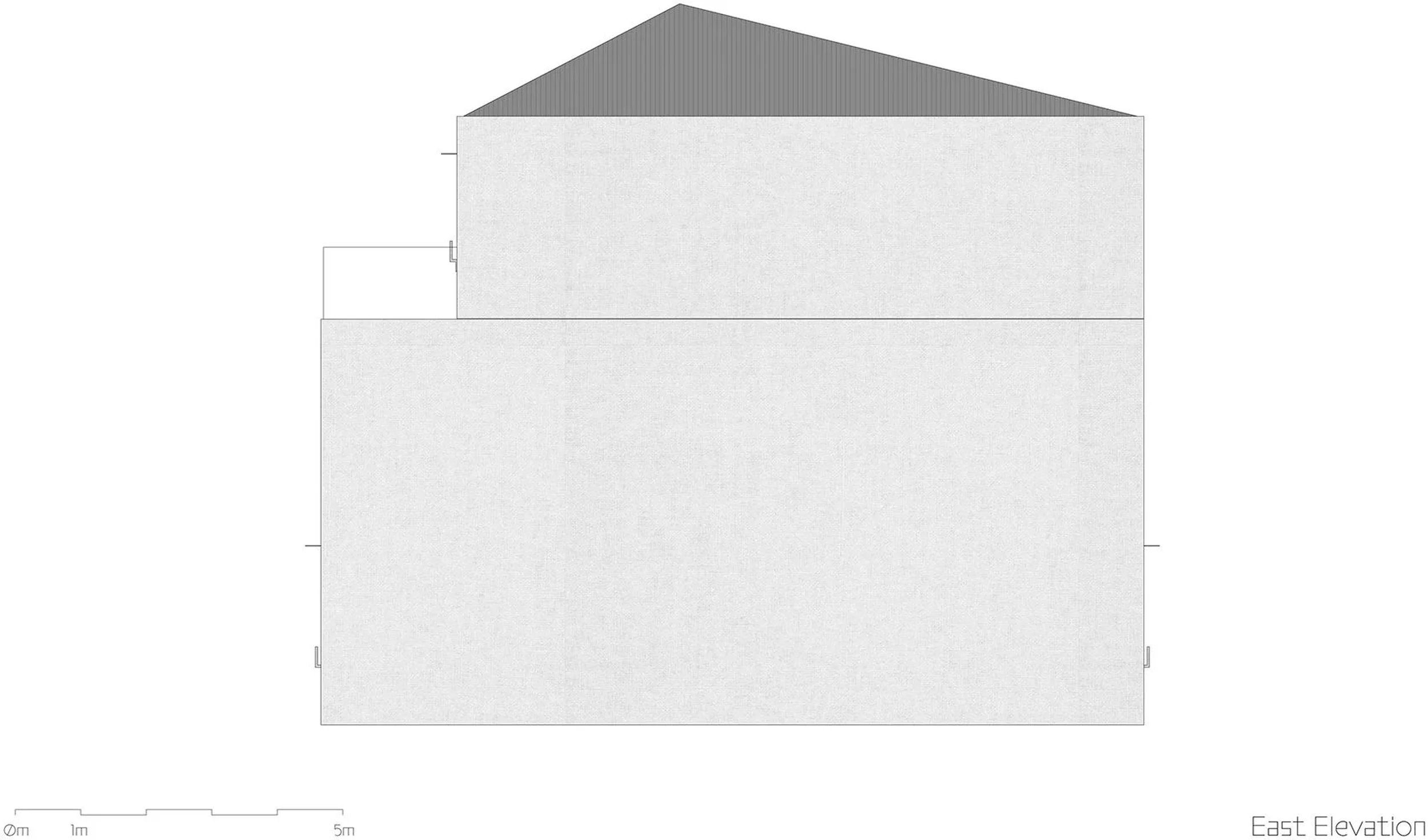
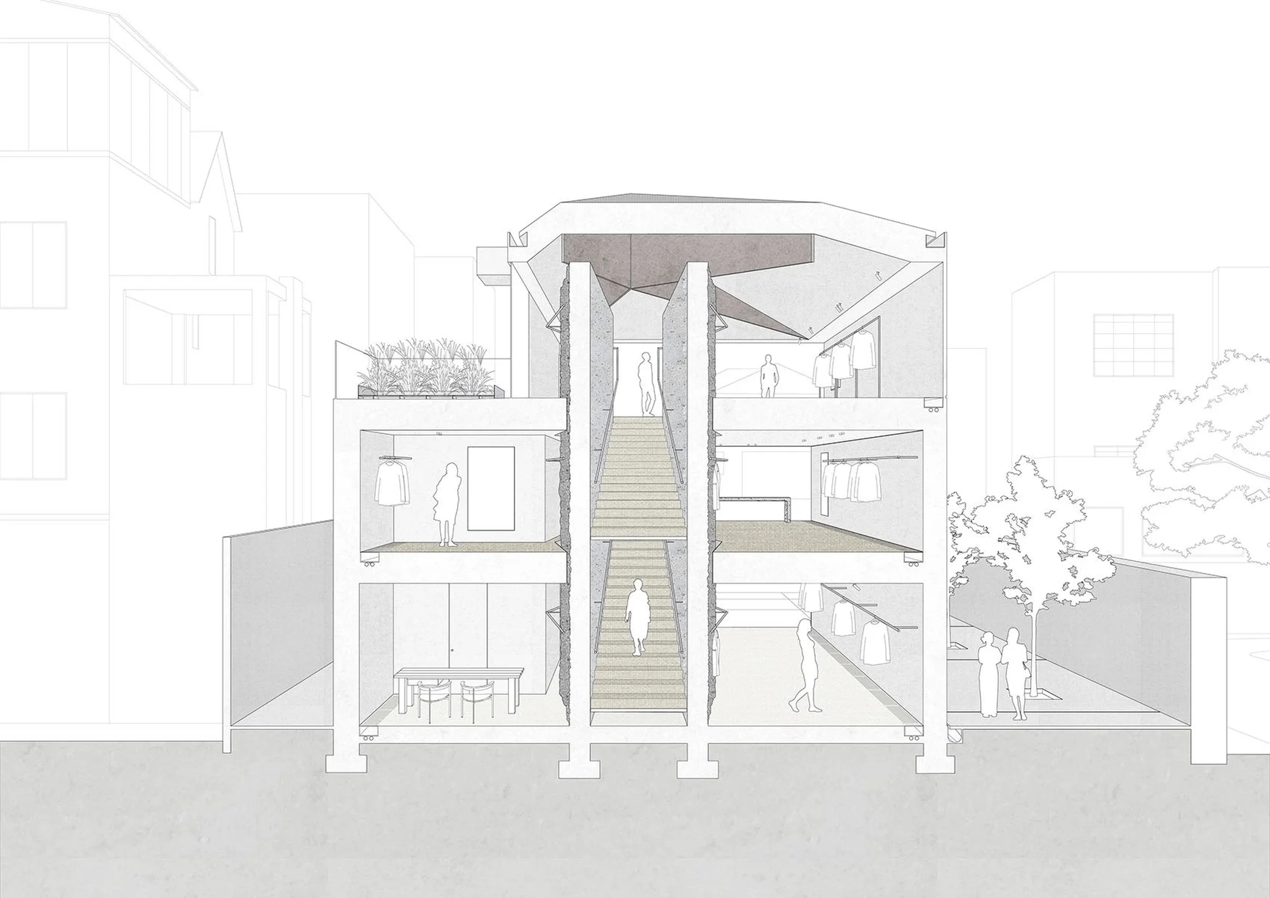
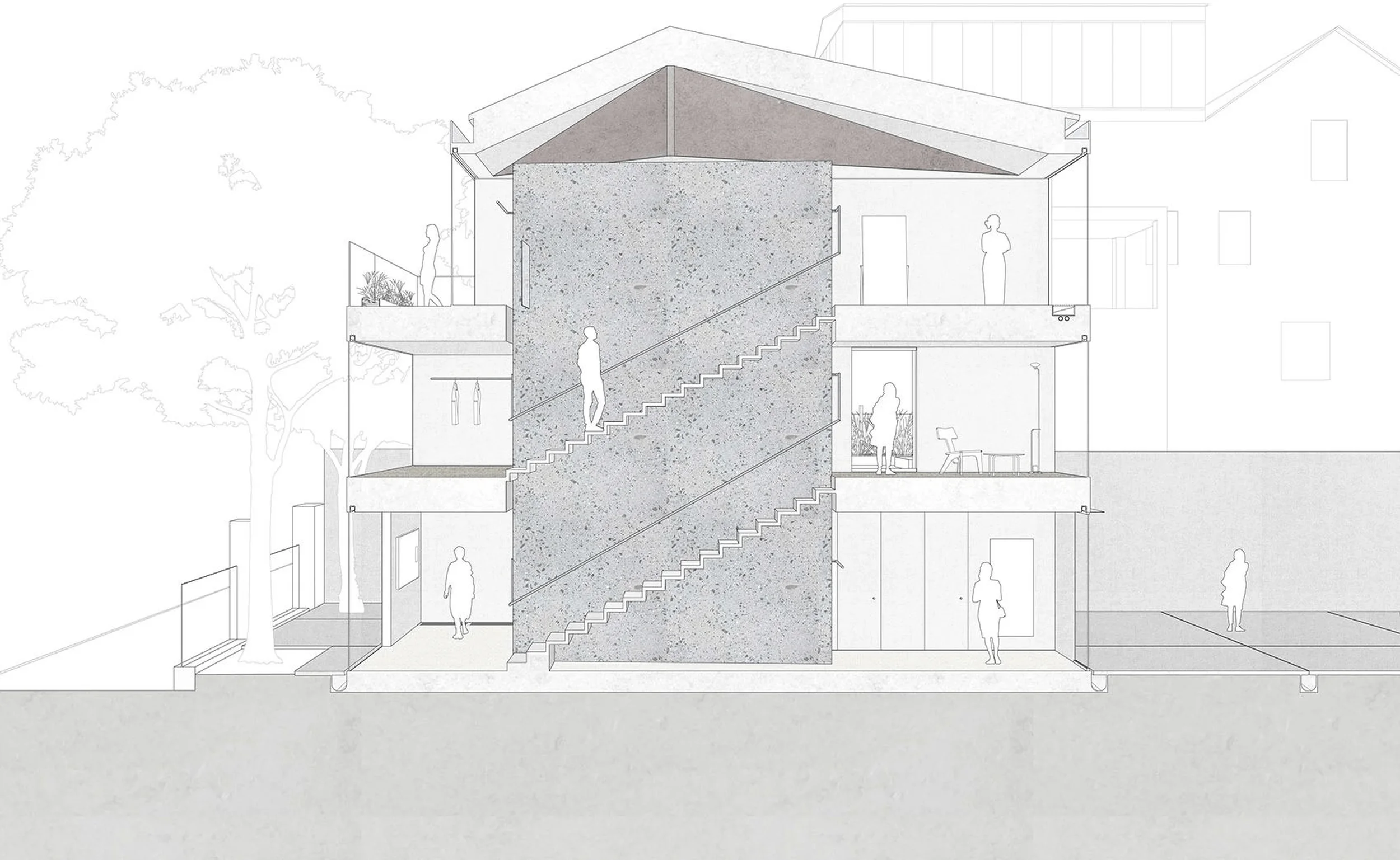
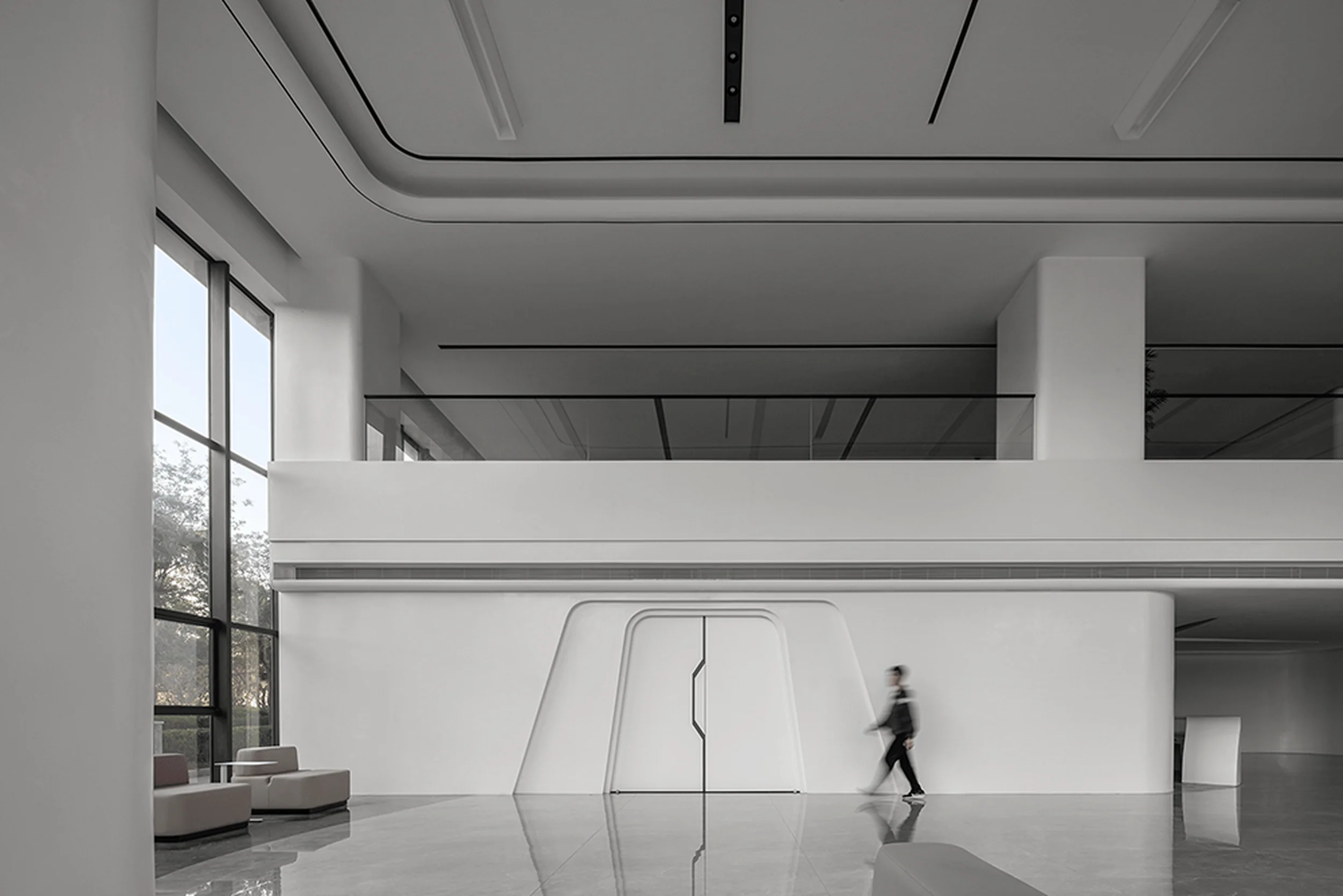
The design concept for the YEARLY PLAN flagship store revolves around the minimalist retail architecture approach, focusing on the interplay between natural materials, light, and space. The architects sought to create a refined and sophisticated atmosphere that showcases the brand’s clothing collections. The building is conceived as a series of stacked volumes, each with large expanses of glass that provide views both into and out of the store. The interior space is characterized by its openness and clarity, with the central concrete staircase element serving as a focal point. The minimal intervention ensures that the space remains adaptable and can be easily reconfigured to accommodate different displays and events. The design’s minimalist retail architecture aesthetic allows the focus to remain on the products being showcased.
Functional Layout and Spatial Planning
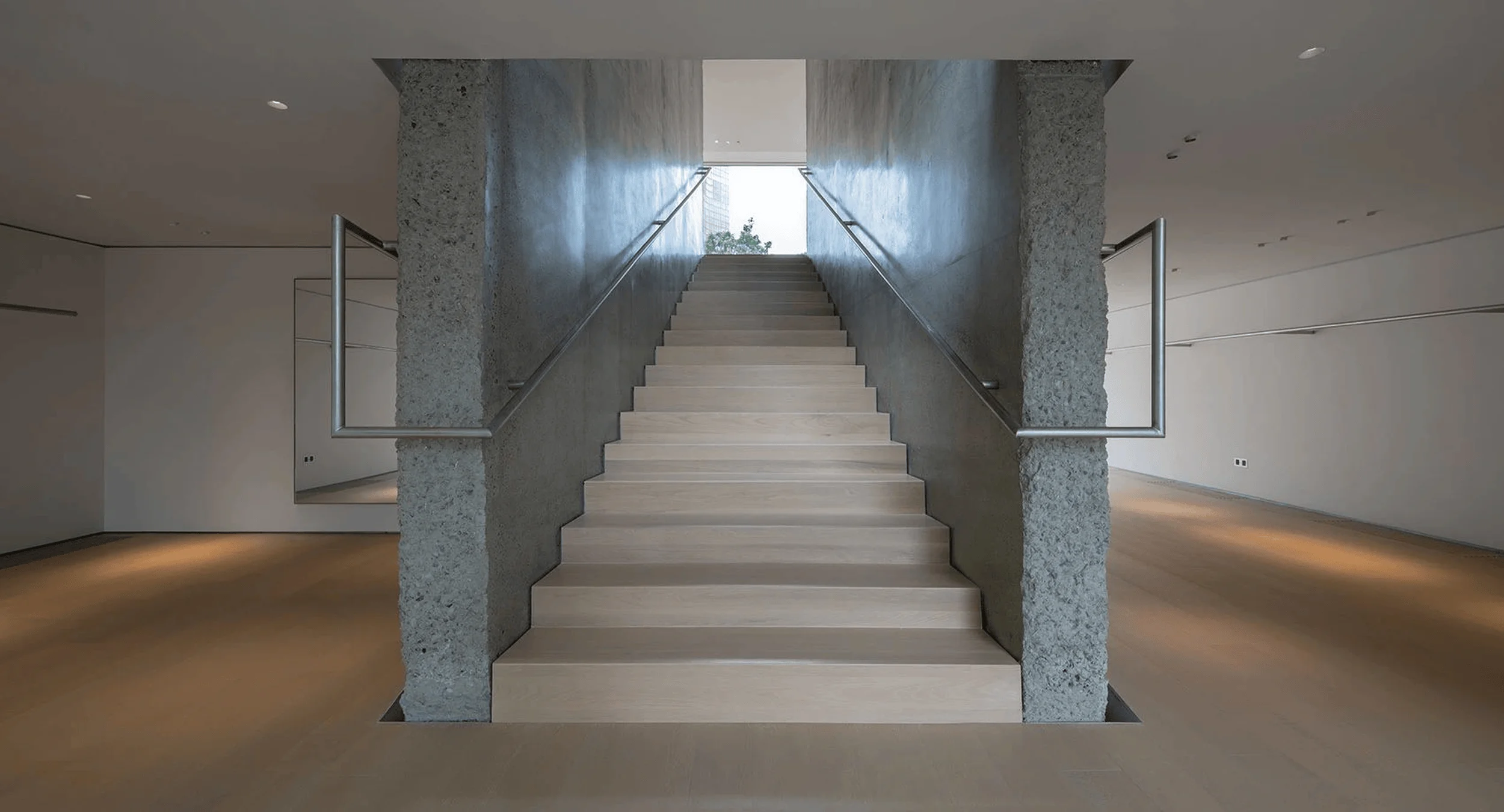
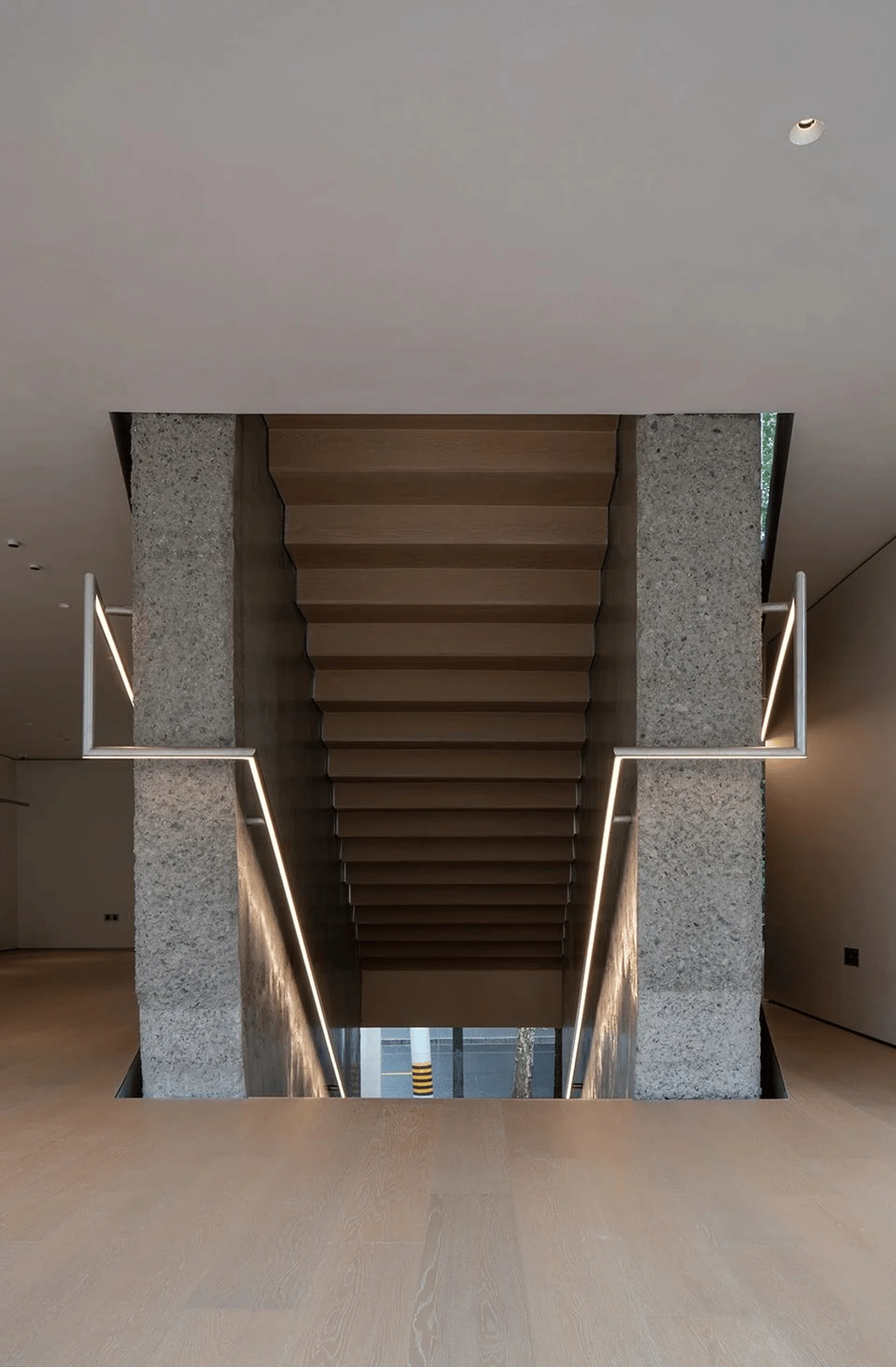
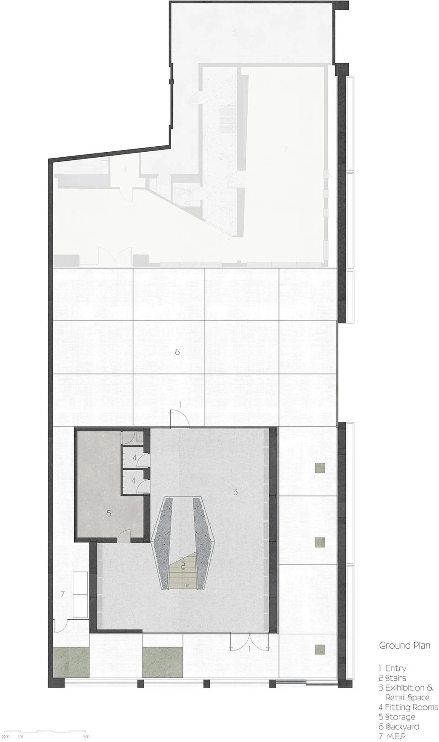
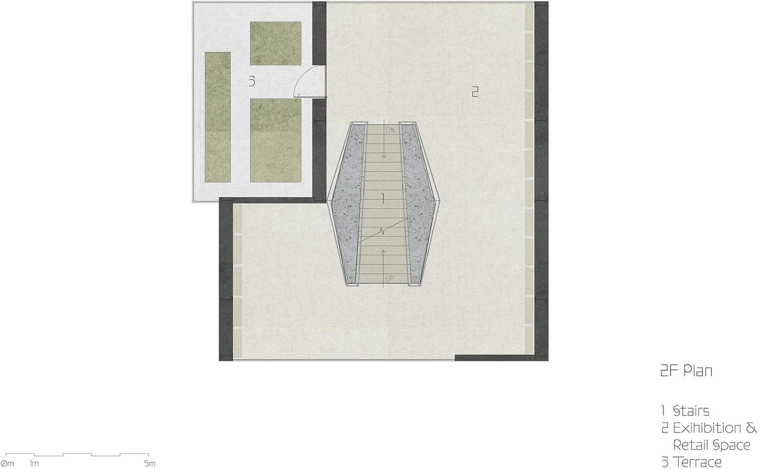
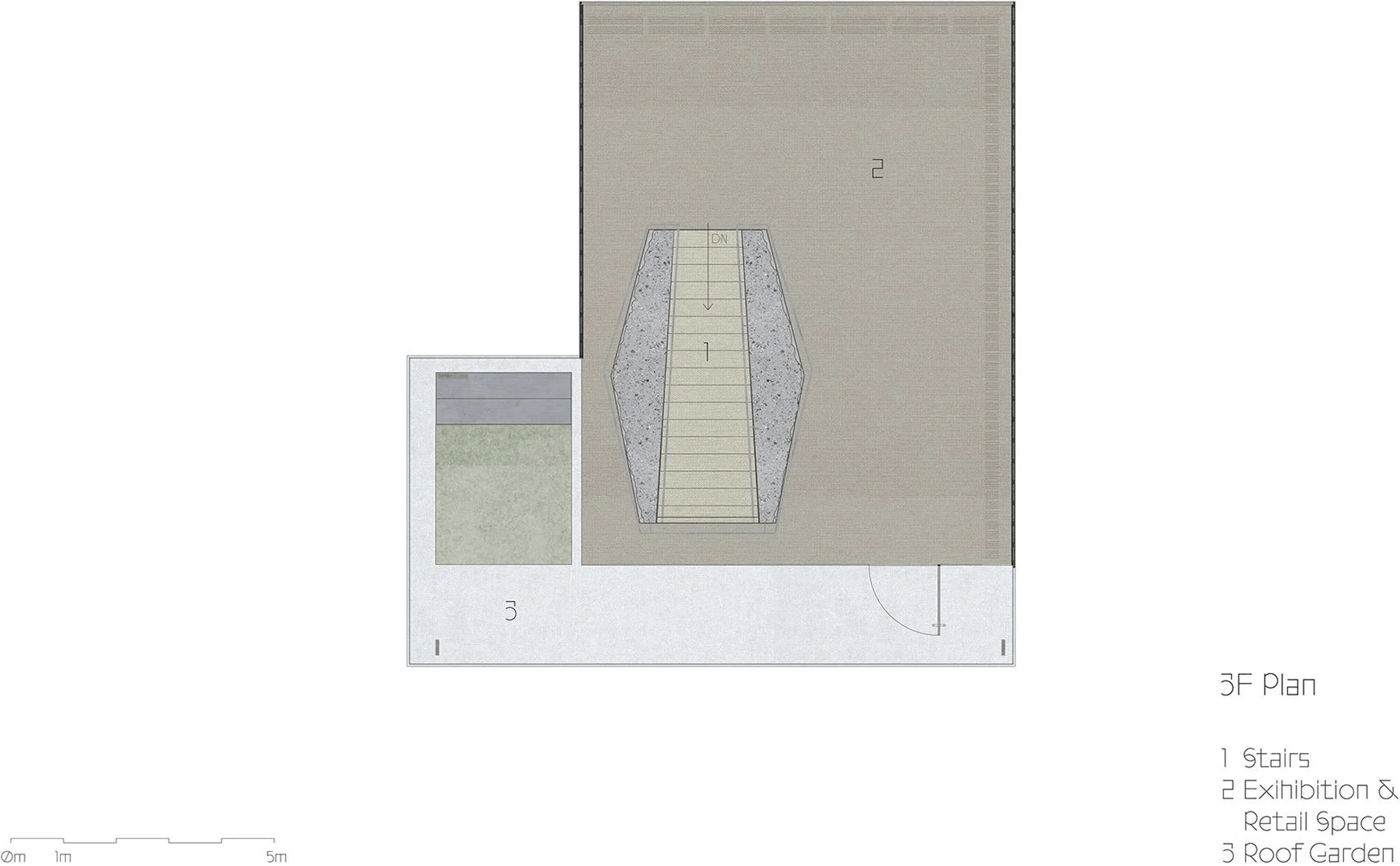
The flagship store is organized over three levels, with each floor dedicated to a specific function. The ground floor serves as the main entry and exhibition space, welcoming customers into the store’s minimalist retail architecture embrace. The central staircase, crafted from concrete, leads to the upper levels, where fitting rooms and additional exhibition areas are located. The building’s unique structural system, featuring a central concrete core and non-load-bearing exterior walls on the third floor, allows for large, open spaces that can be easily adapted to different retail needs. The layout prioritizes a clear and intuitive flow, ensuring a seamless and enjoyable shopping experience for visitors. The minimalist retail architecture approach is evident in the open layout, allowing for flexible displays and movement within the store.
Exterior Design and Aesthetics
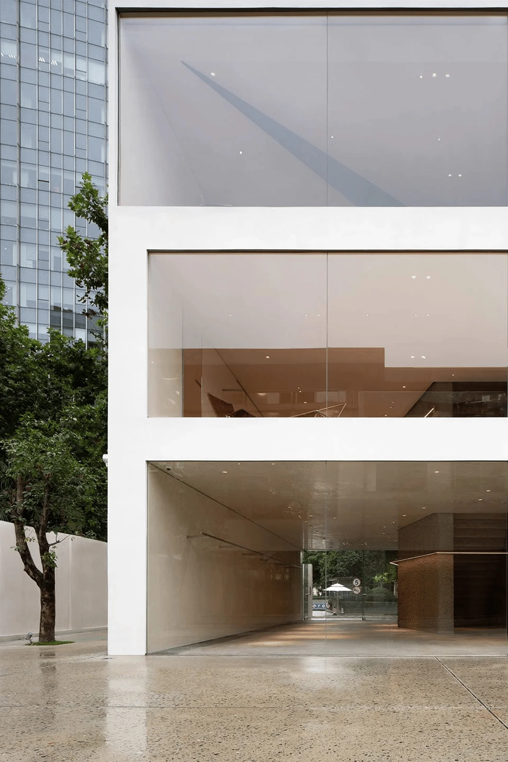
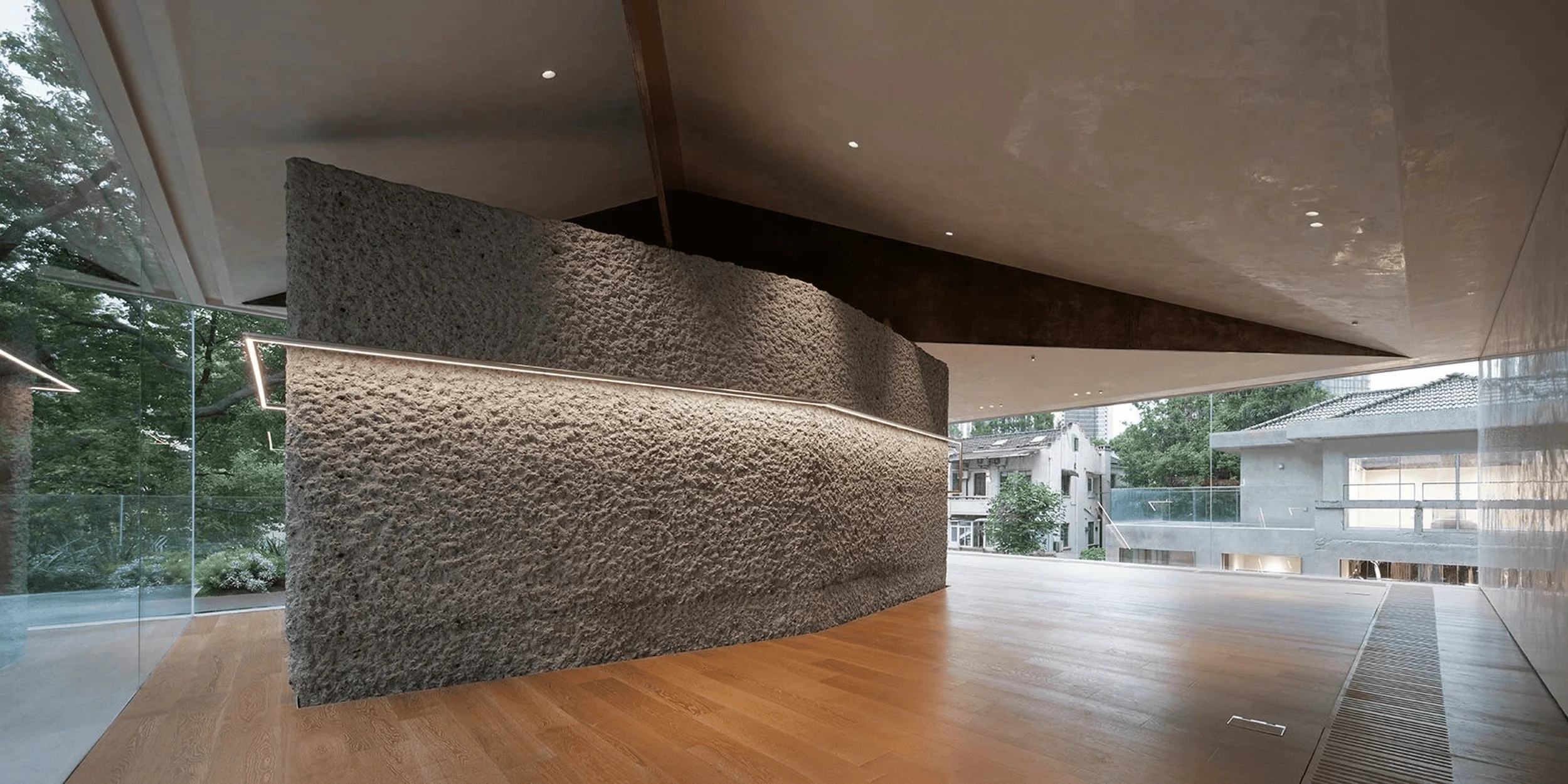
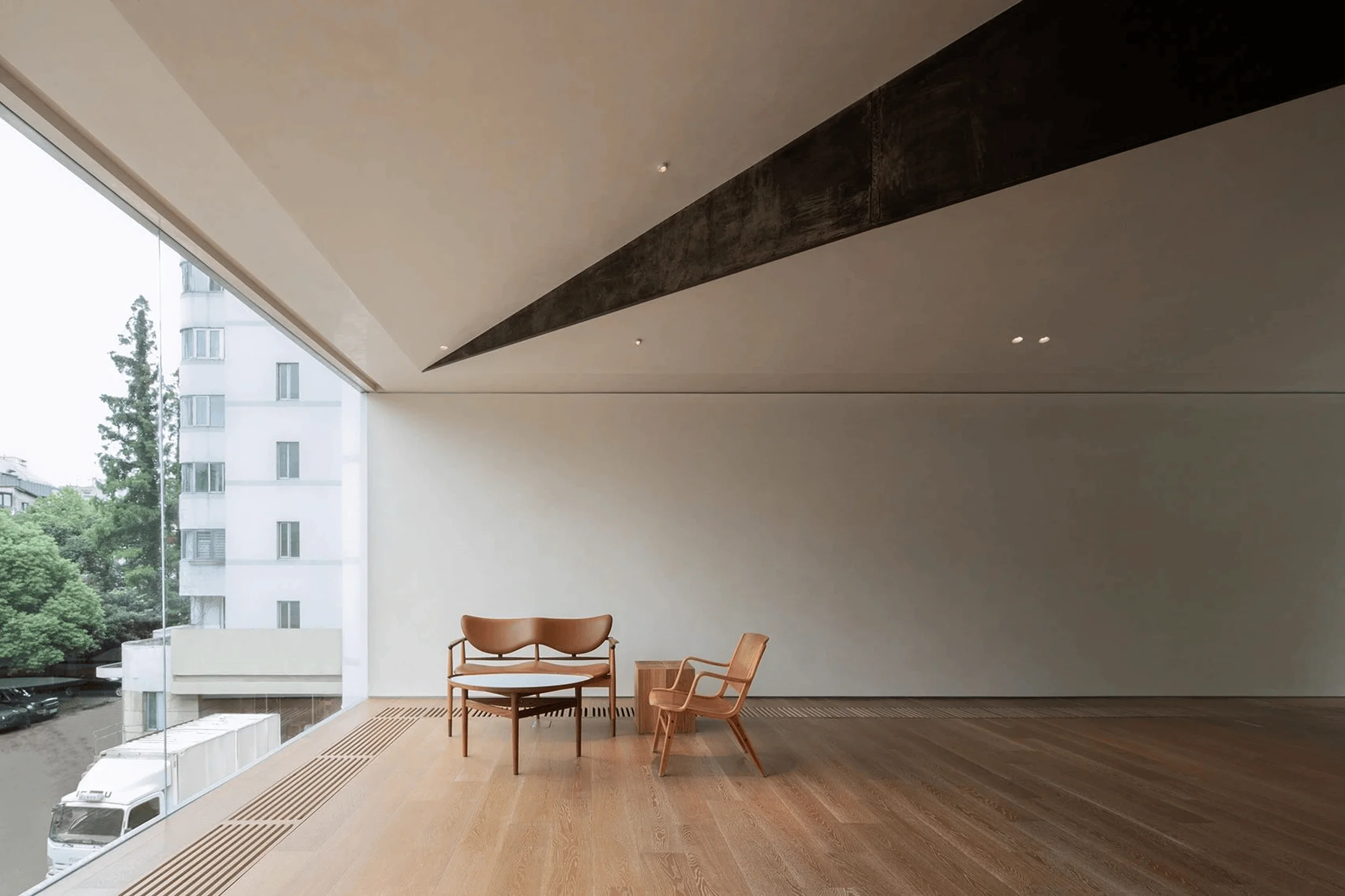
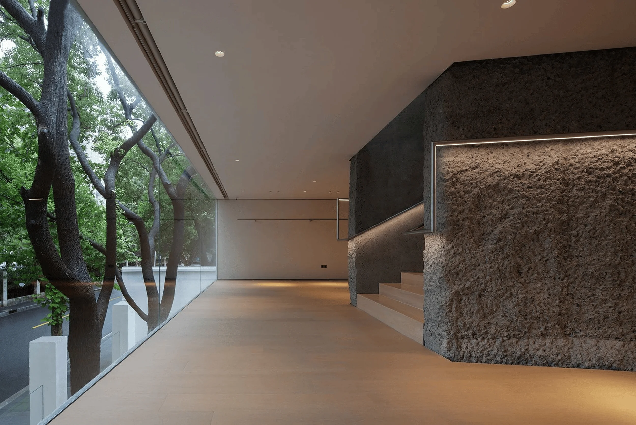
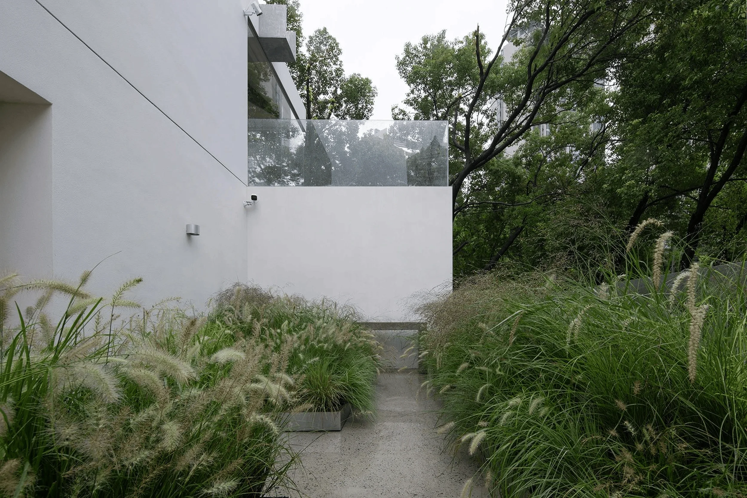
The exterior of the YEARLY PLAN flagship store is defined by its minimalist retail architecture sensibility, showcasing a harmonious blend of concrete and glass. Large expanses of frameless glass windows provide transparency, allowing passersby to glimpse the interior and creating a visual connection between the store and the street. The roof, supported by four angled steel plates, appears to float above the concrete core, adding a touch of lightness to the overall structure. This interplay between heavy and light materials contributes to the building’s dynamic and engaging façade. The exterior’s clean lines and uncluttered surfaces create a sense of elegance and sophistication, further highlighting the minimalist retail architecture principles at play.
Materials and Construction Techniques
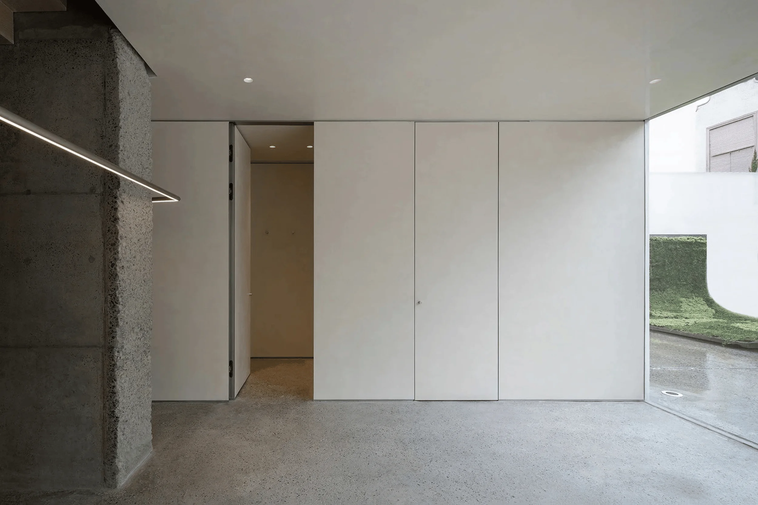
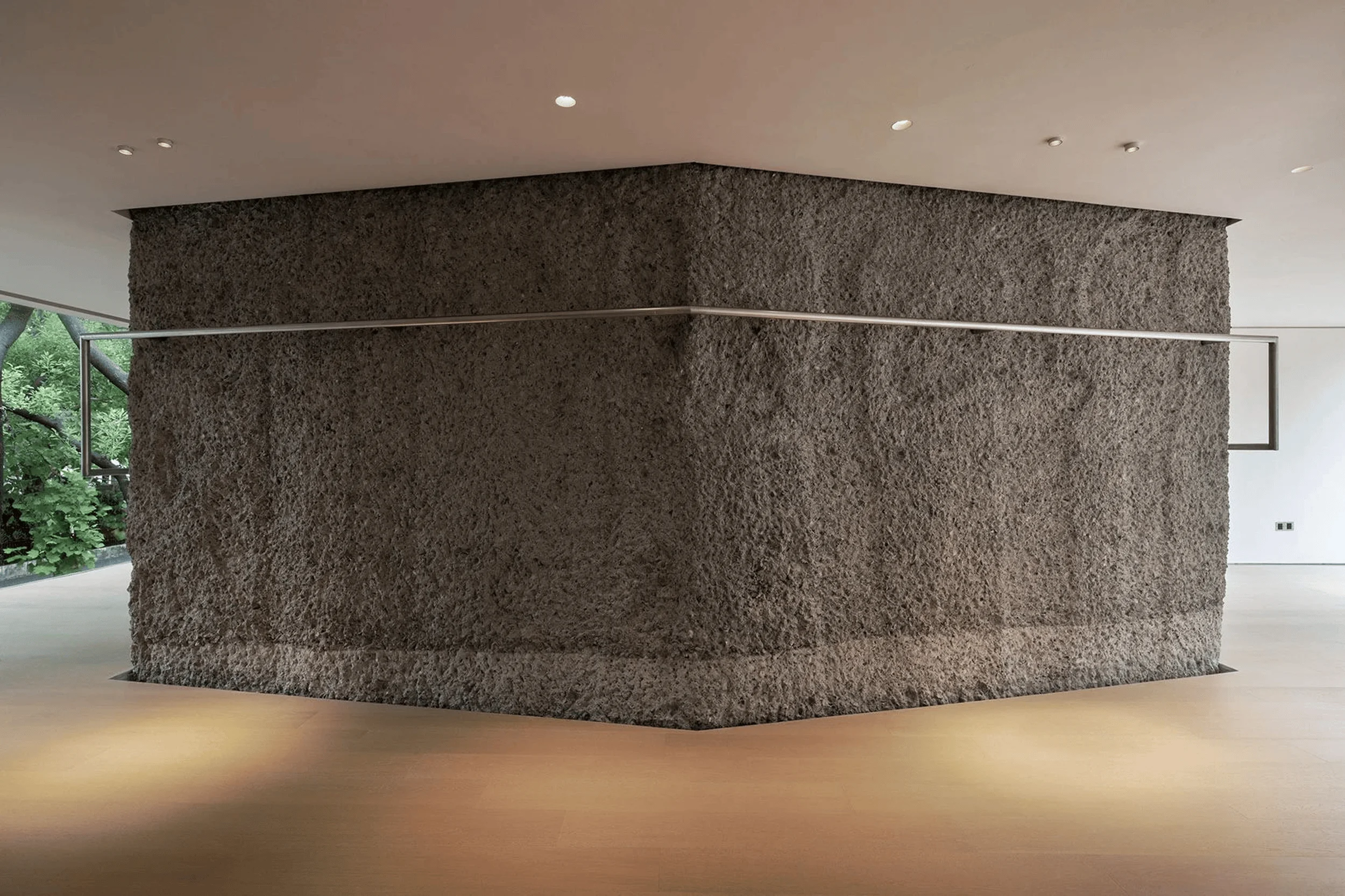
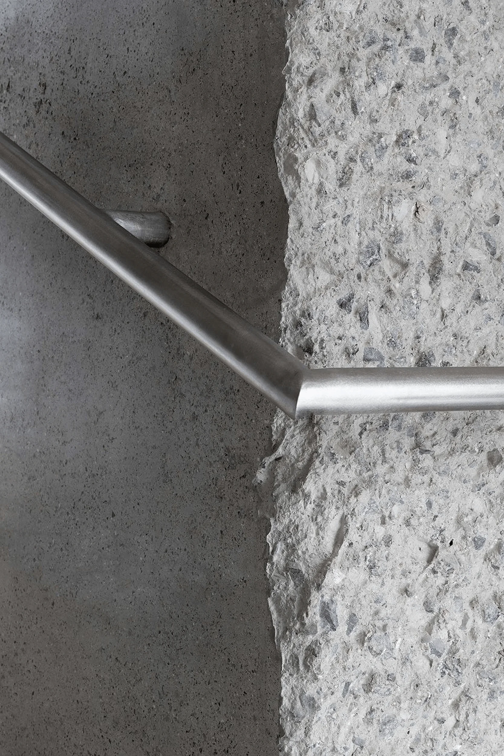
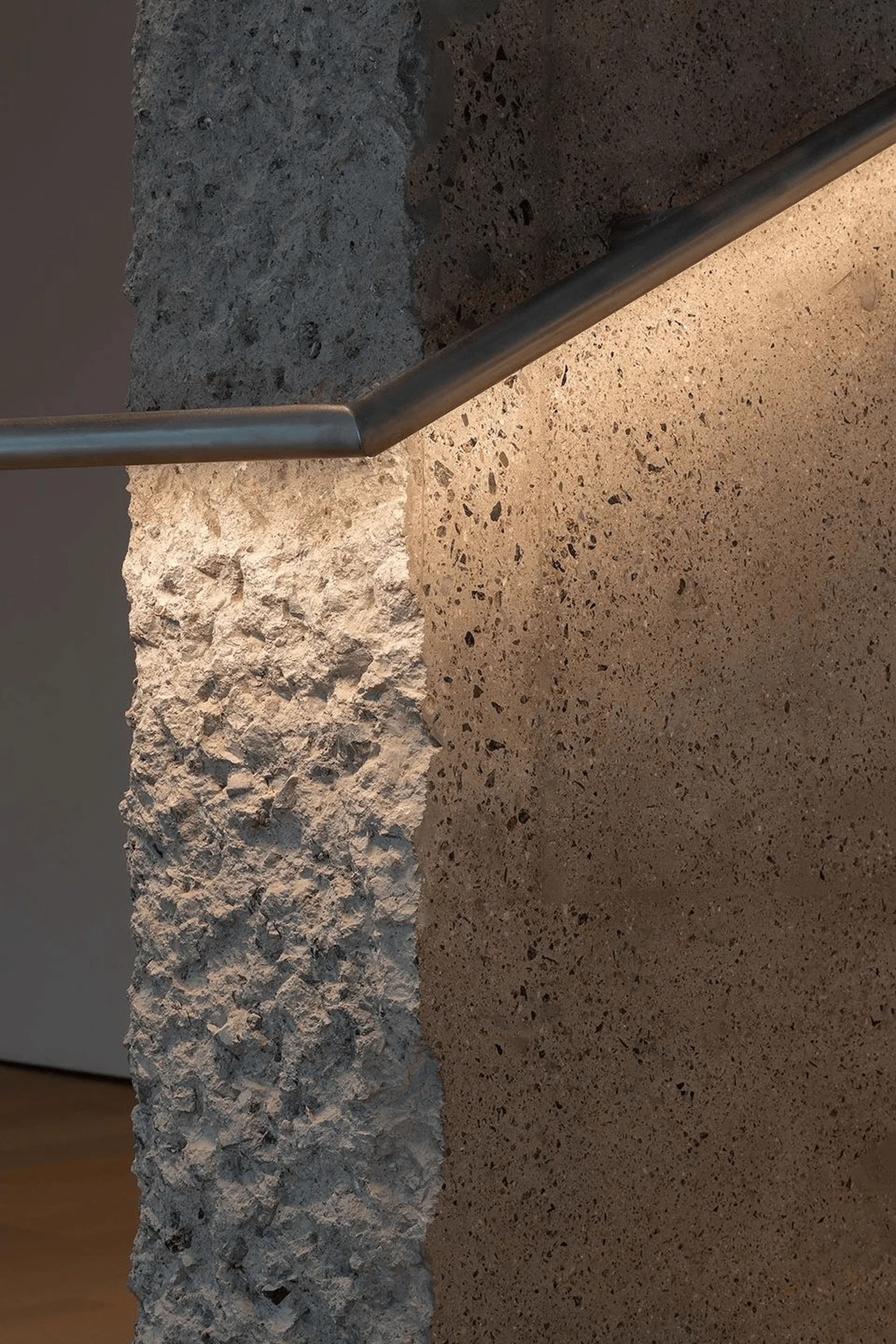
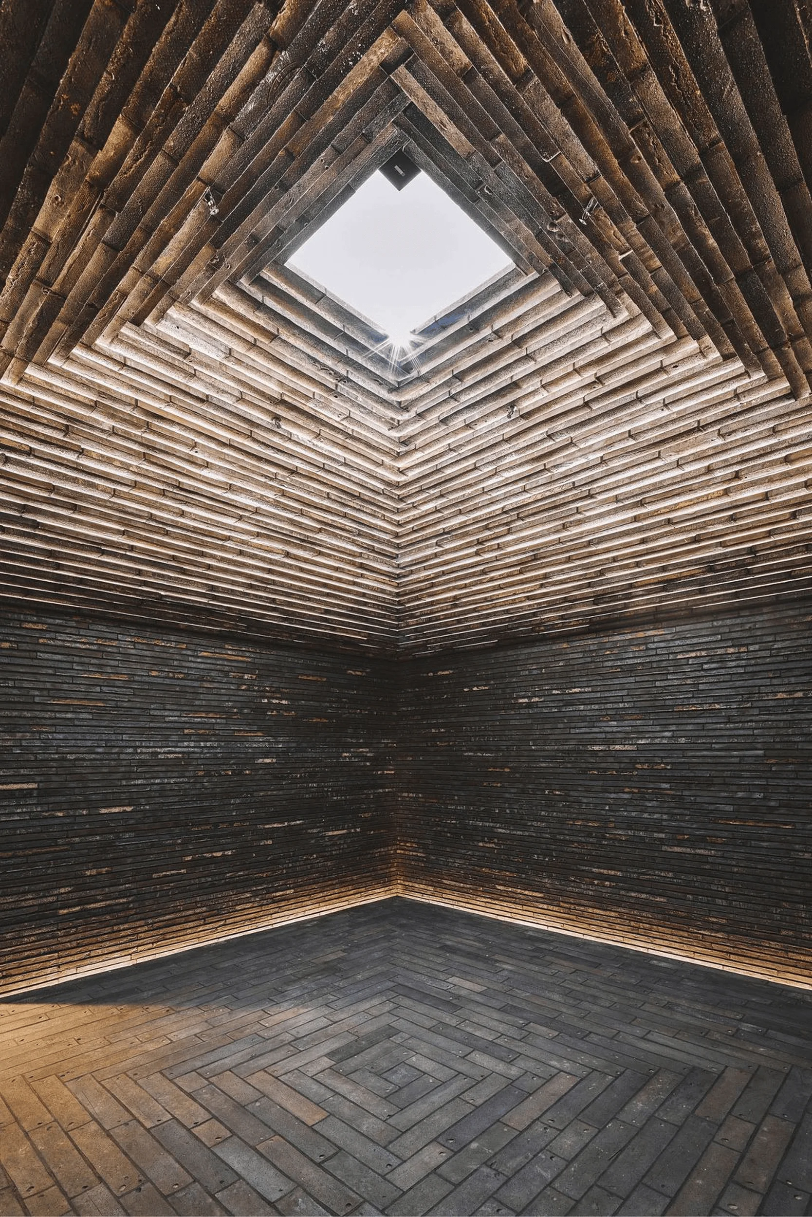
The YEARLY PLAN flagship store’s design showcases a variety of surface treatments and craftsmanship that elevates the minimalist retail architecture experience. The exterior concrete surfaces are hand-chiseled, providing a tactile and textured finish. In contrast, the interior surfaces of the staircase are meticulously polished, highlighting the versatility of concrete as a material. The polished concrete flooring on the first floor extends to the exterior, blurring the lines between inside and outside. Different white finishes are applied to the interior walls and ceilings on each floor, creating subtle variations in texture and reflectivity. The minimalist retail architecture philosophy is further expressed through the use of high-quality, natural materials, including wood flooring on the upper levels, which add warmth and richness to the interior.
Integration of Lighting and HVAC Systems
The integration of lighting and HVAC systems is seamlessly achieved within the building’s fabric. The air conditioning and ventilation systems are concealed within the floor slabs, maximizing the ceiling height and maintaining the clean lines of the minimalist retail architecture. Custom-designed air vents are integrated into the flooring, with stainless steel covers on the first floor and wood covers on the second and third floors, maintaining material consistency within each level. The lighting scheme primarily features frameless fixtures embedded in the ceiling, highlighting specific areas and enhancing the overall minimalist aesthetic. The careful integration of these systems contributes to the store’s comfortable and visually uncluttered environment, a hallmark of minimalist retail architecture.
Custom Details and Interior Features
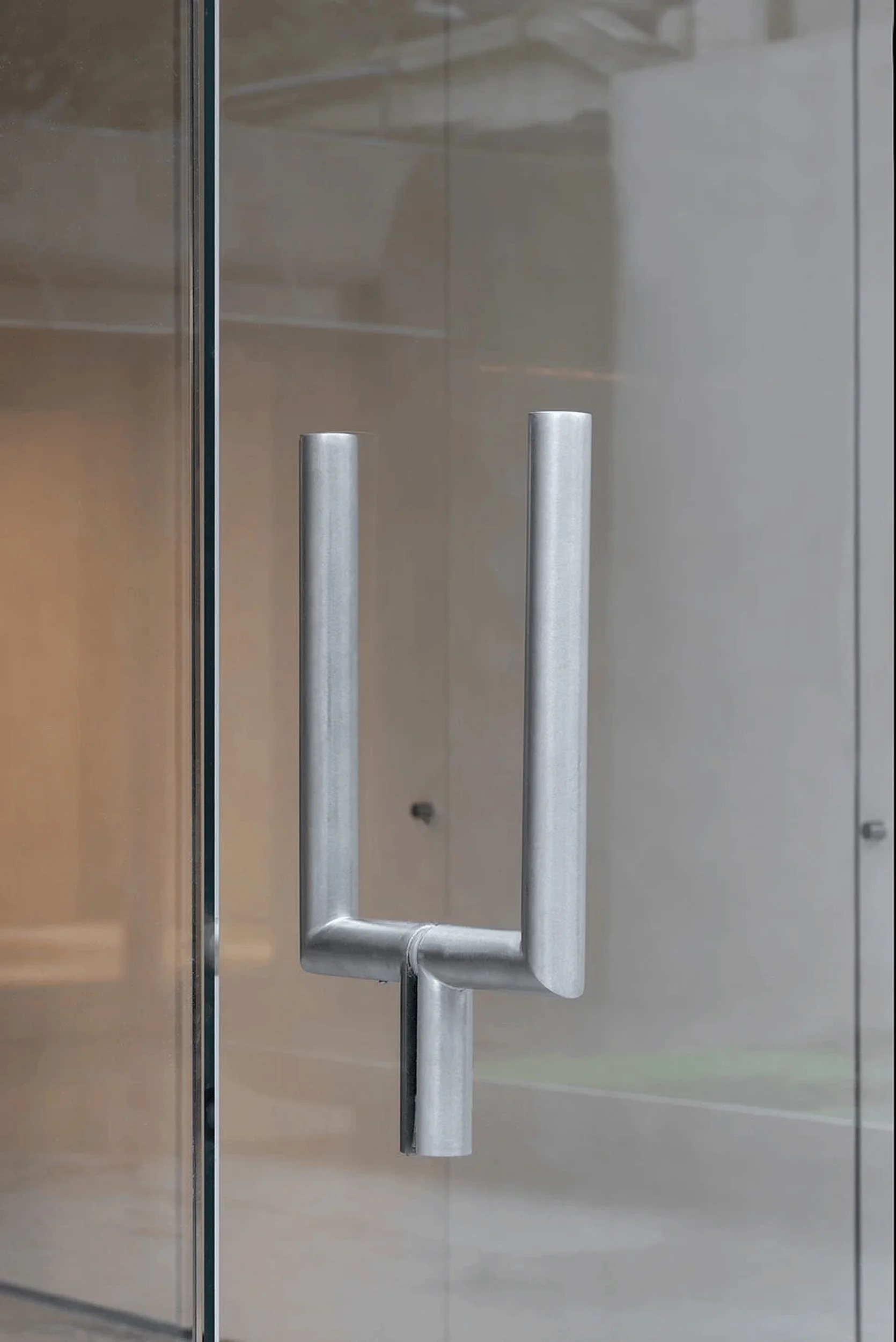
The interior of the YEARLY PLAN flagship store is characterized by its attention to detail and the integration of custom-designed elements that complement the minimalist retail architecture theme. The stainless steel handrail that runs along the staircase also serves as a clothing rack in the exhibition space and incorporates lighting, demonstrating a clever combination of functionality and aesthetics. The Y-shaped door handles, custom-made floor-length mirrors, and clothing racks are all fabricated from the same stainless steel tubing, creating a cohesive design language throughout the store. The display tables are constructed using the same polished concrete as the staircase, while the long tables combine wood and stainless steel, adding warmth and a touch of industrial chic to the minimalist retail architecture environment.
Project Information:
Project Type: Flagship Store
Architect: dongqi Design
Area: 430 sqm
Project Year: 2023
Country: China
Main Materials: Concrete, glass, steel, wood
Photographer: Yasu Kojima


