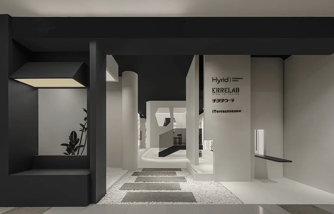
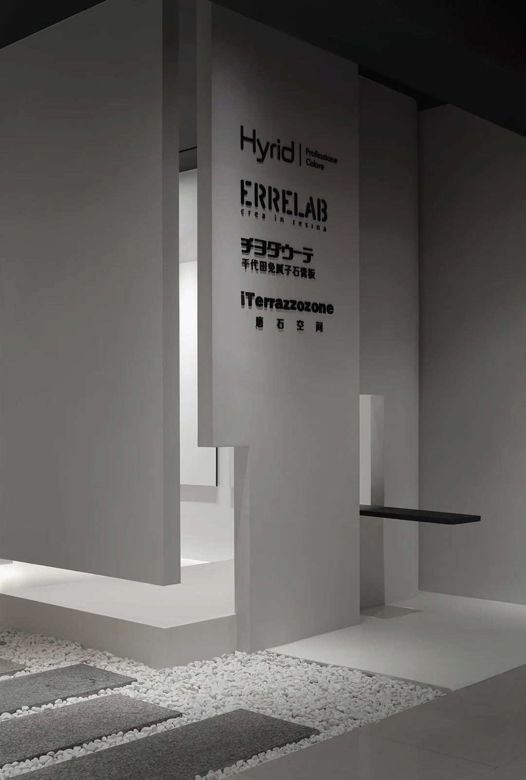
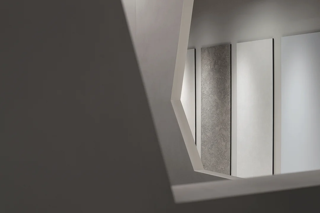
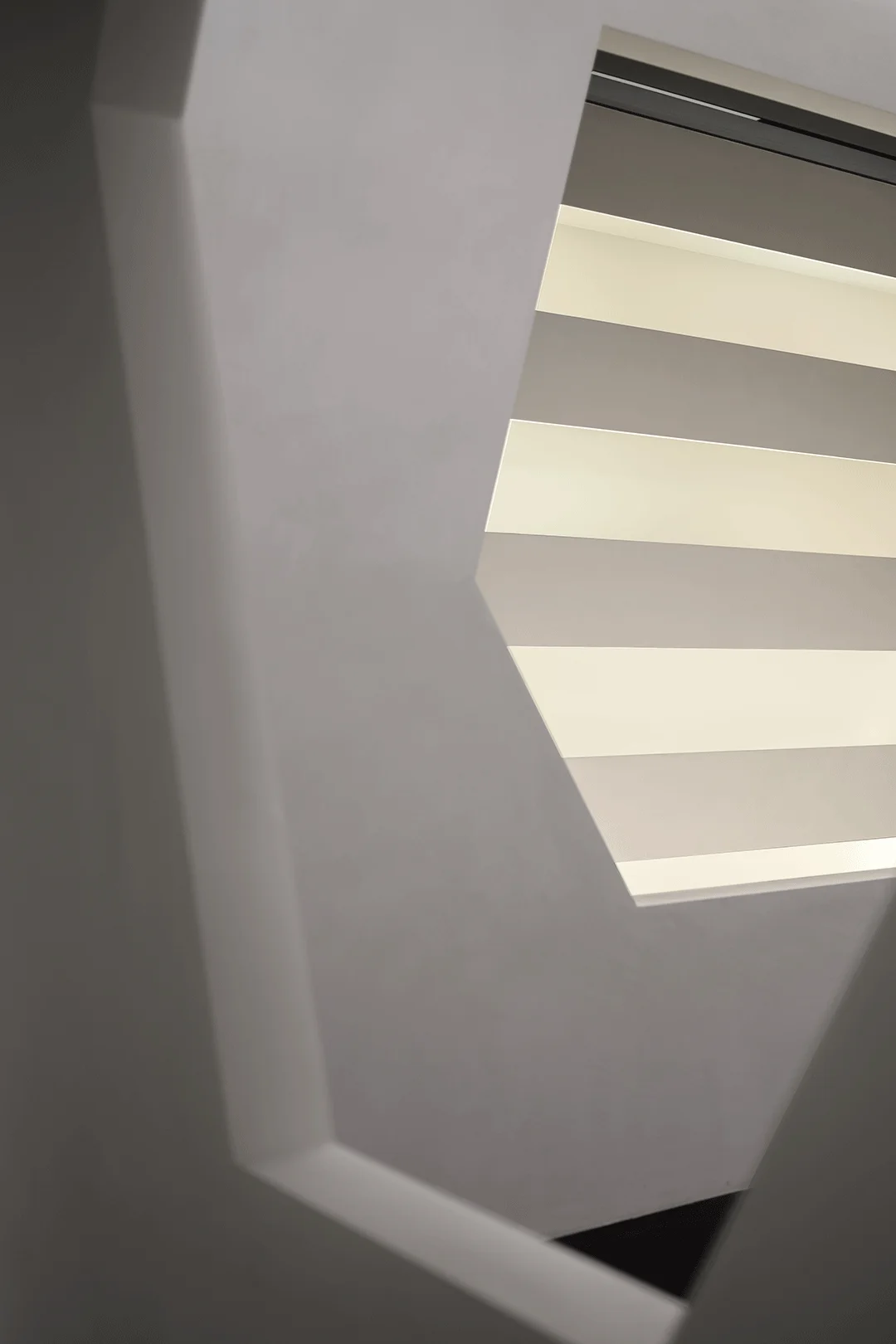
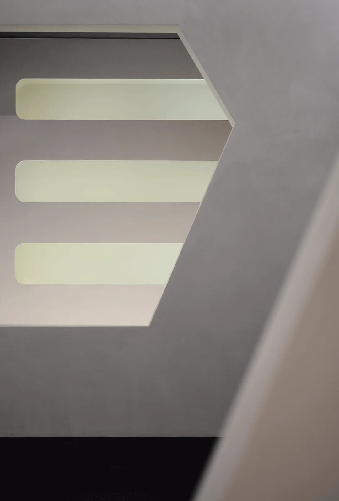
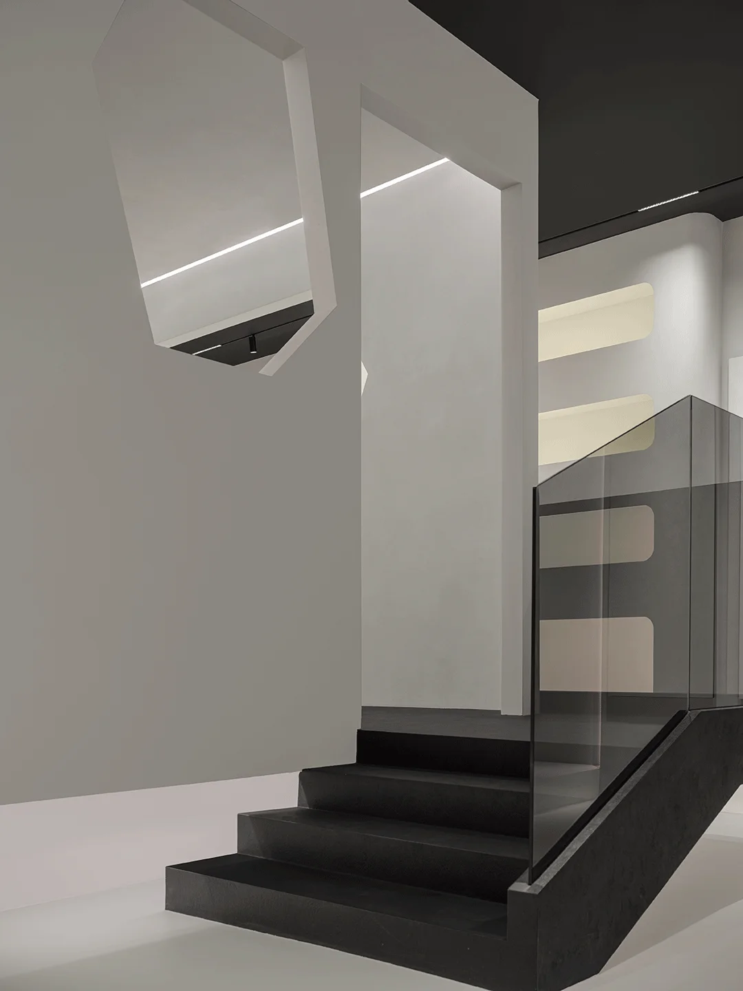
Minimalist interior design in China featuring material display and serene ambiance.
Contents
Project Background: A Minimalist Material Showroom
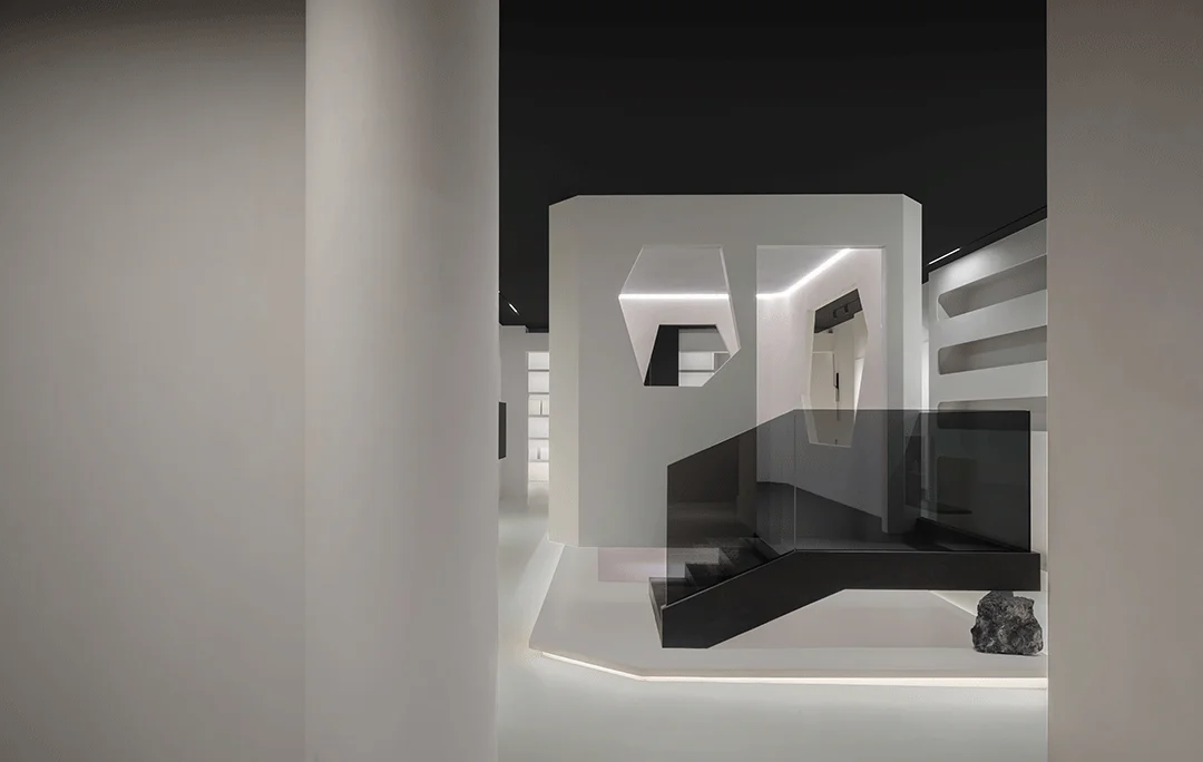
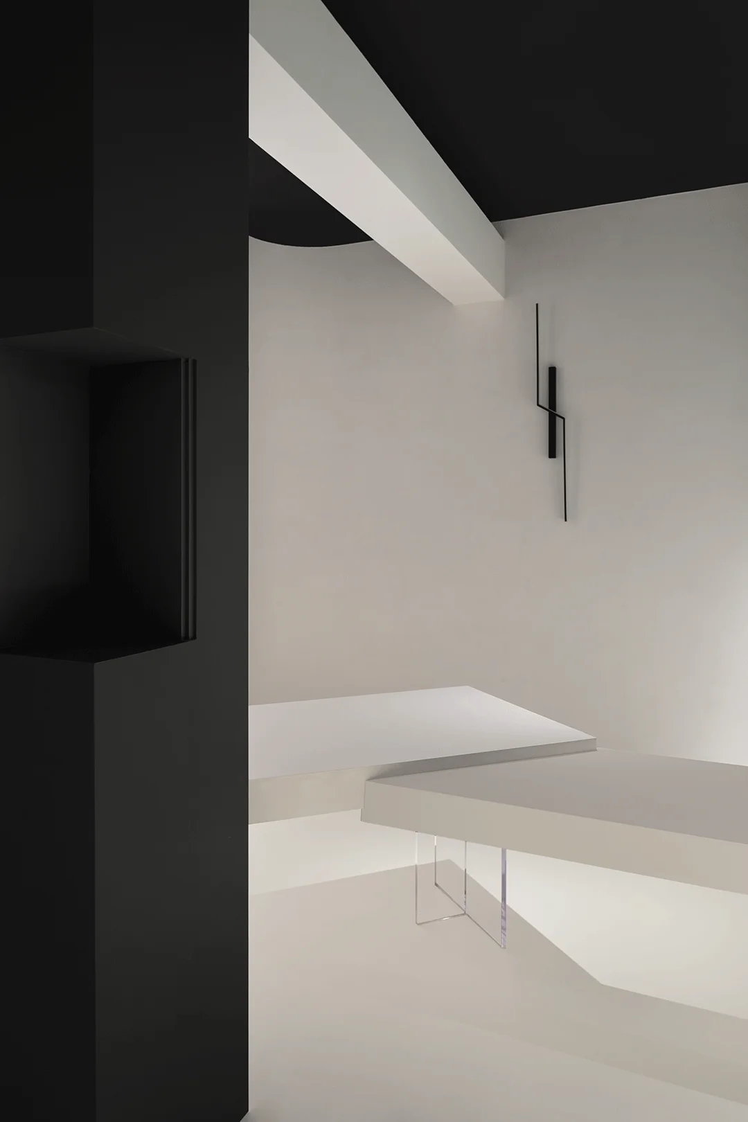
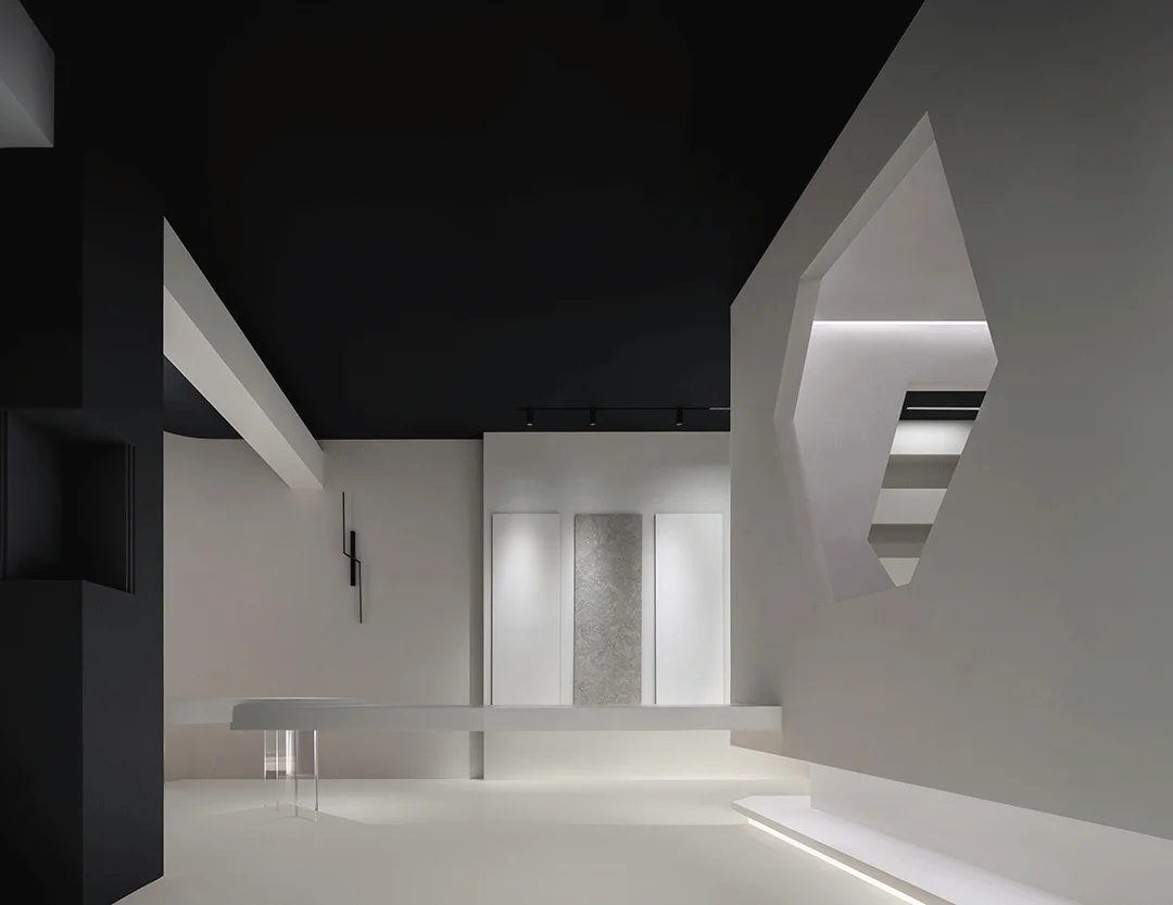
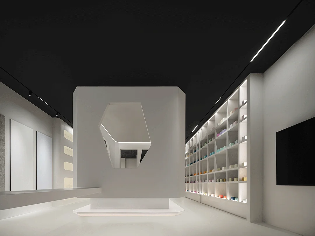
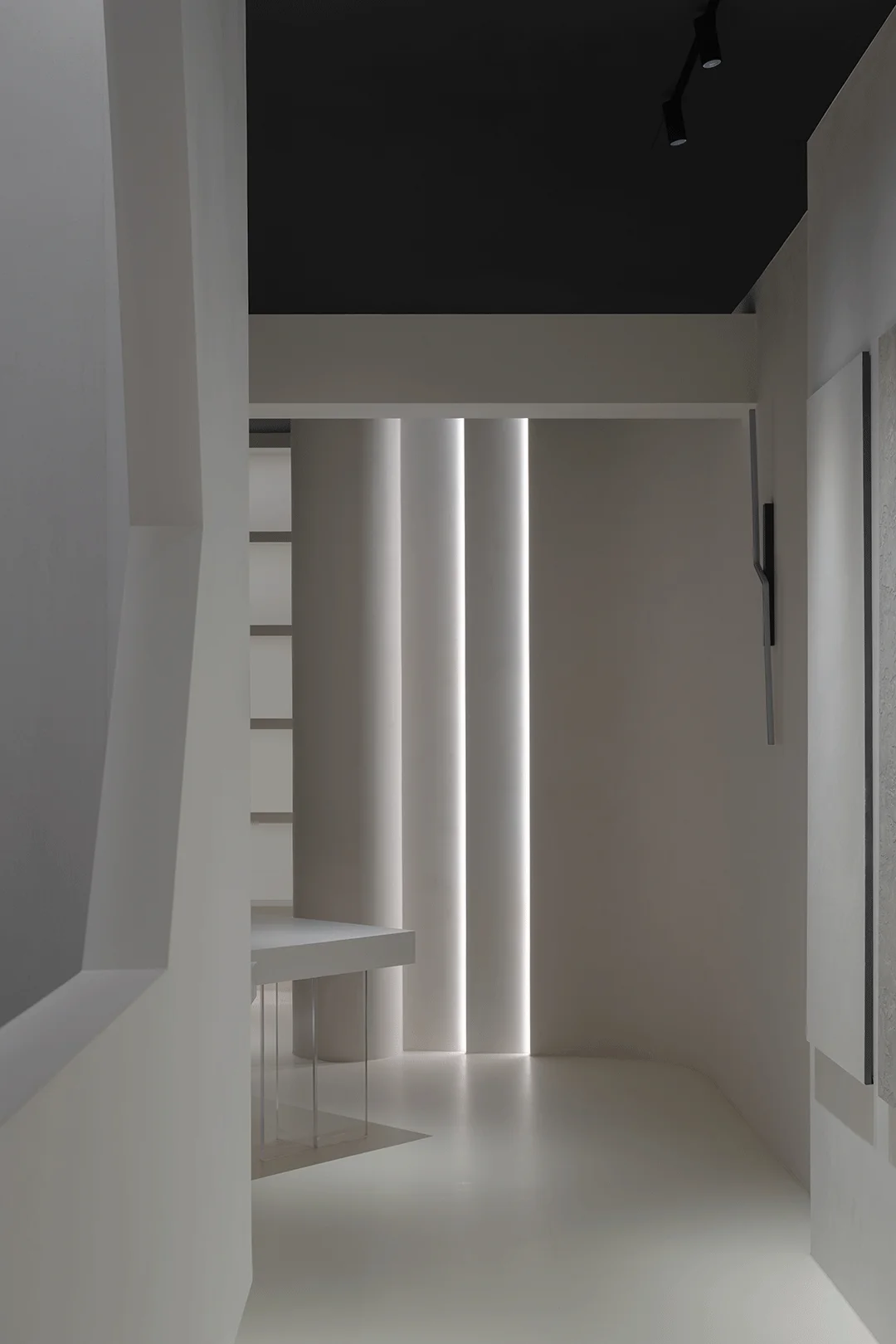
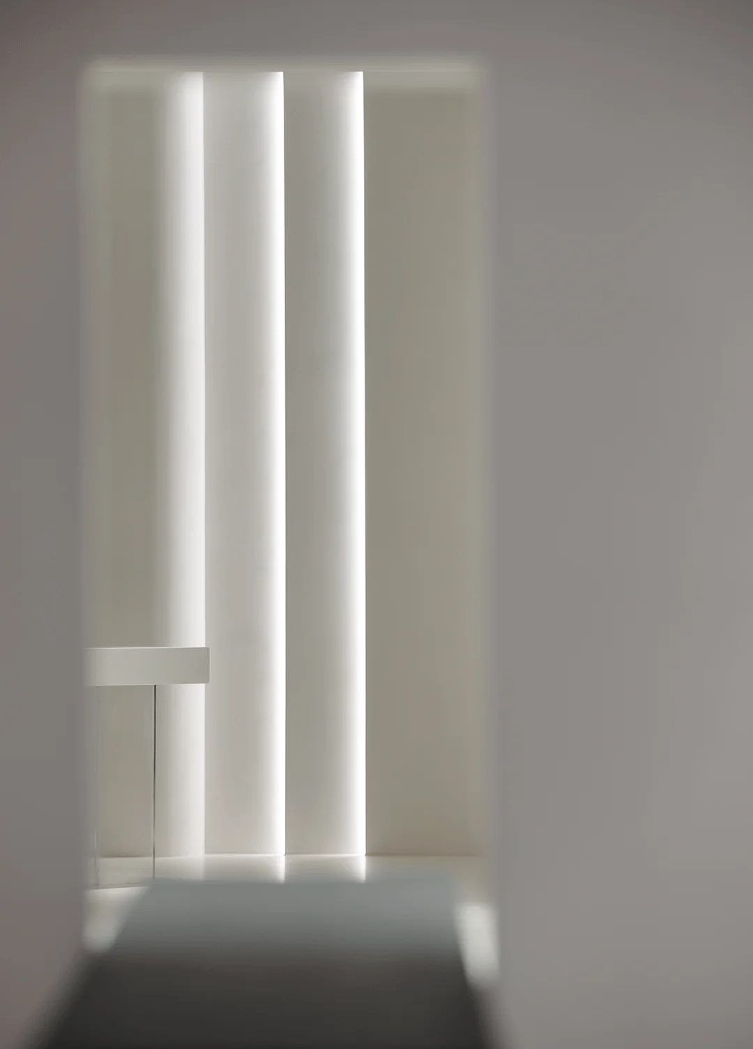
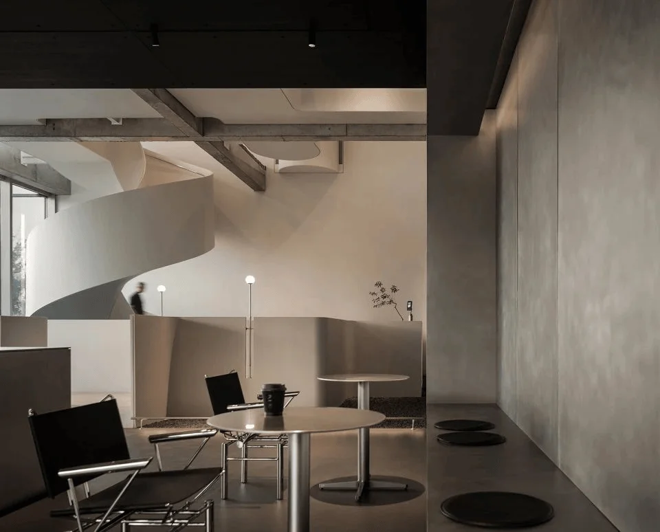
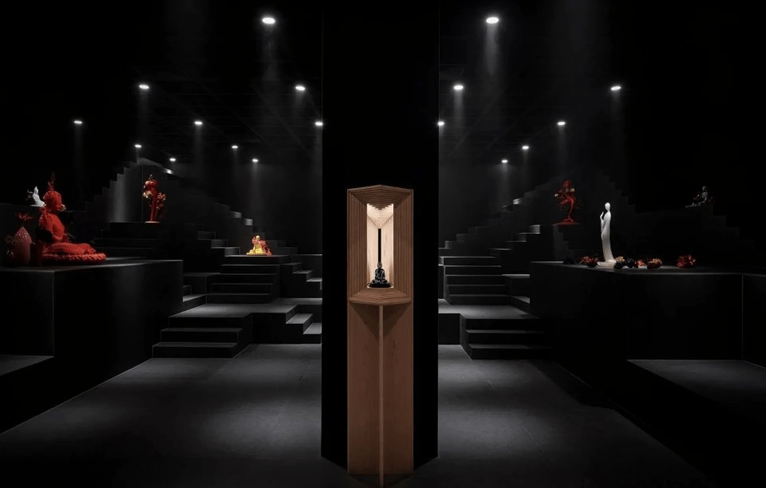
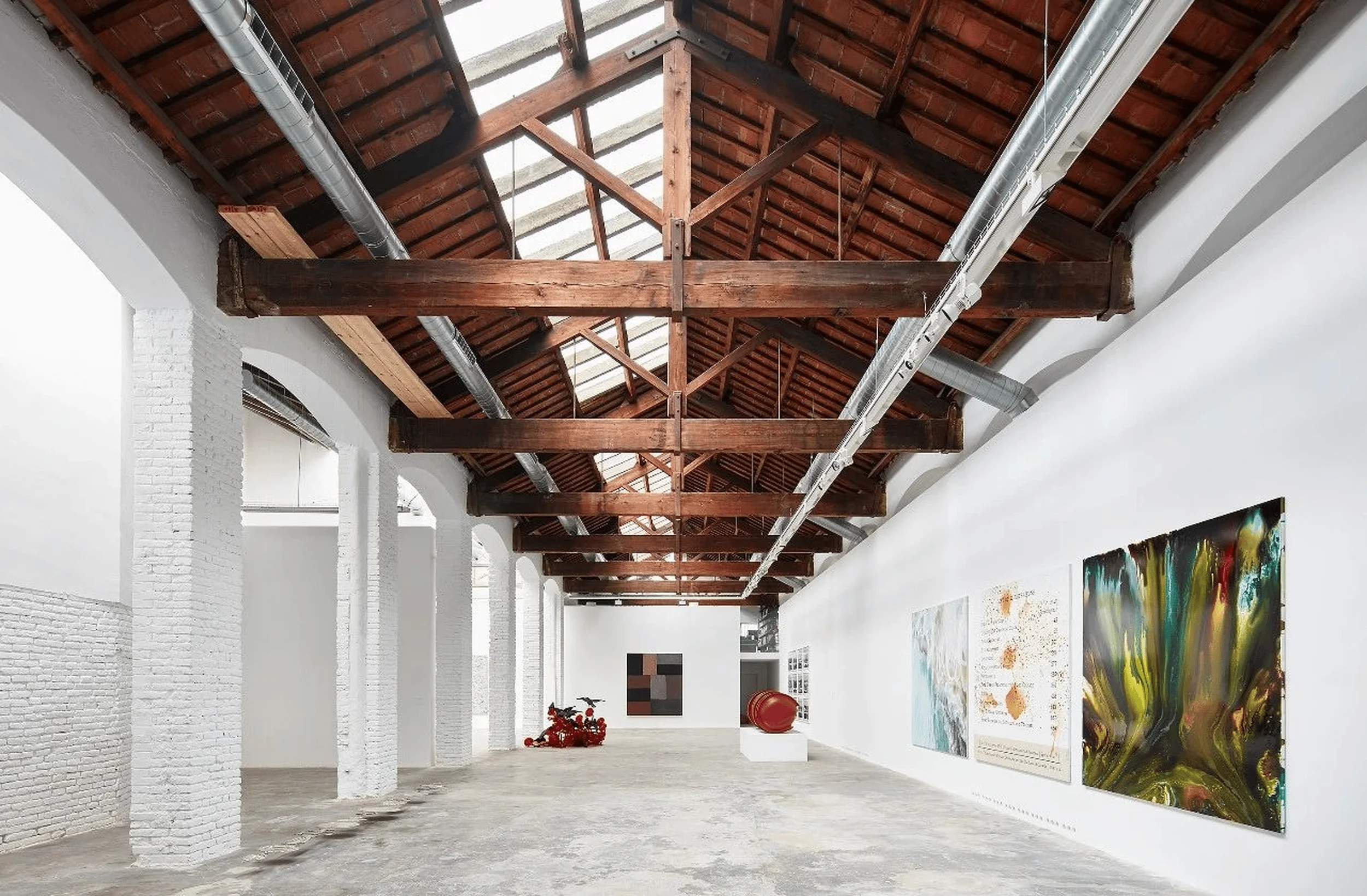
The Yi Wu Material Showroom, located in China, is a 100-square-meter space designed for material display and client interaction. The project was conceived to serve a dual purpose: provide a comfortable setting for clients to view and select materials, and create a welcoming space for meetings and receptions. This minimalist interior design project highlights the importance of material selection in architecture and design, creating a space that is both functional and aesthetically pleasing. The design utilizes a minimalist aesthetic with a strong focus on natural materials and finishes, creating a calm and peaceful atmosphere that is conducive to relaxation and contemplation. This minimalist design approach aligns perfectly with the needs of the project’s target audience, providing a sophisticated and modern experience that is both welcoming and informative. This project is an example of a minimalist interior design that is both sophisticated and functional, ideal for showcasing materials in a visually appealing and accessible way.
tag: minimalist interior design, material showroom, interior space design, art paint, Chinese interior design
Design Concept and Goals: A Harmonious Blend of Nature and Structure
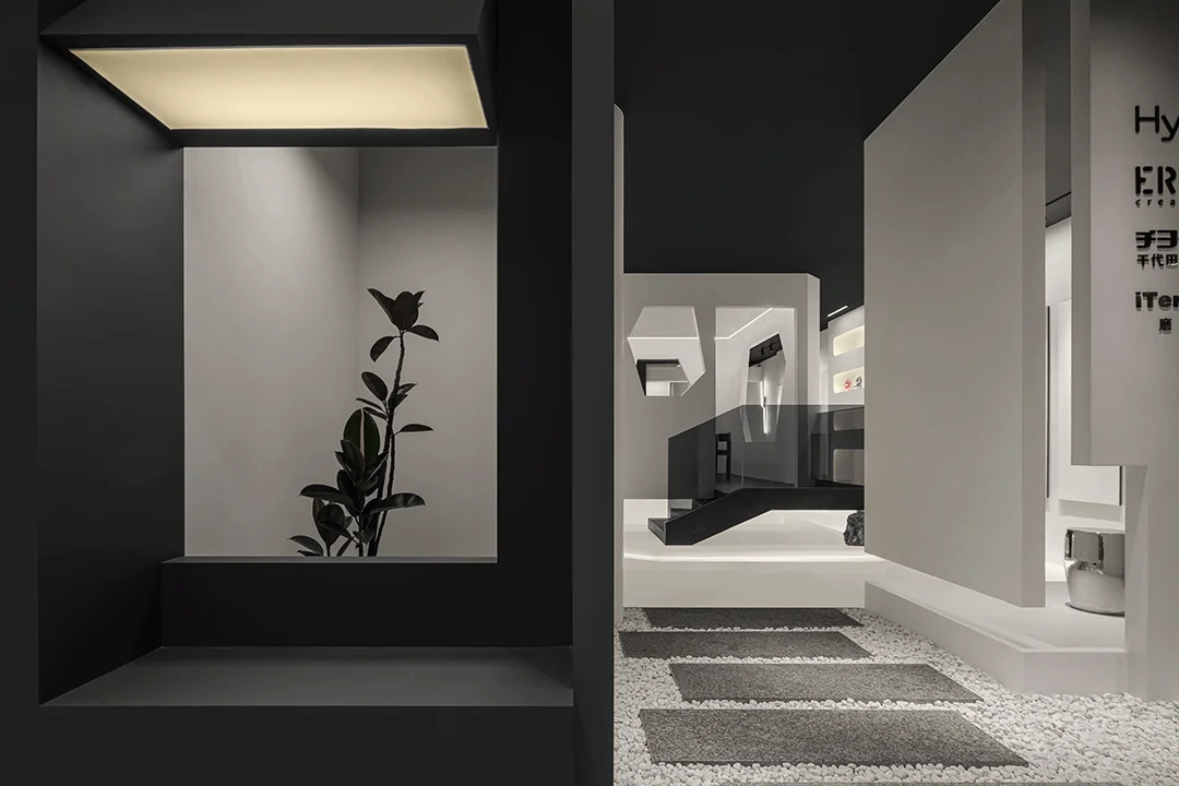
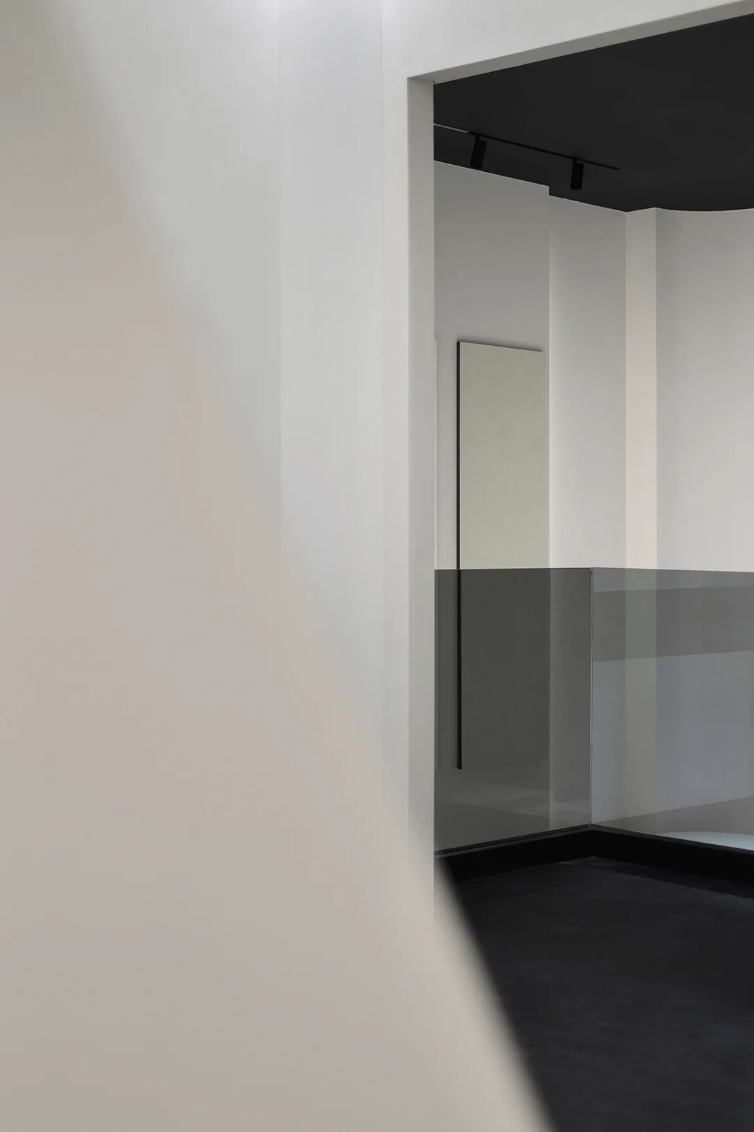
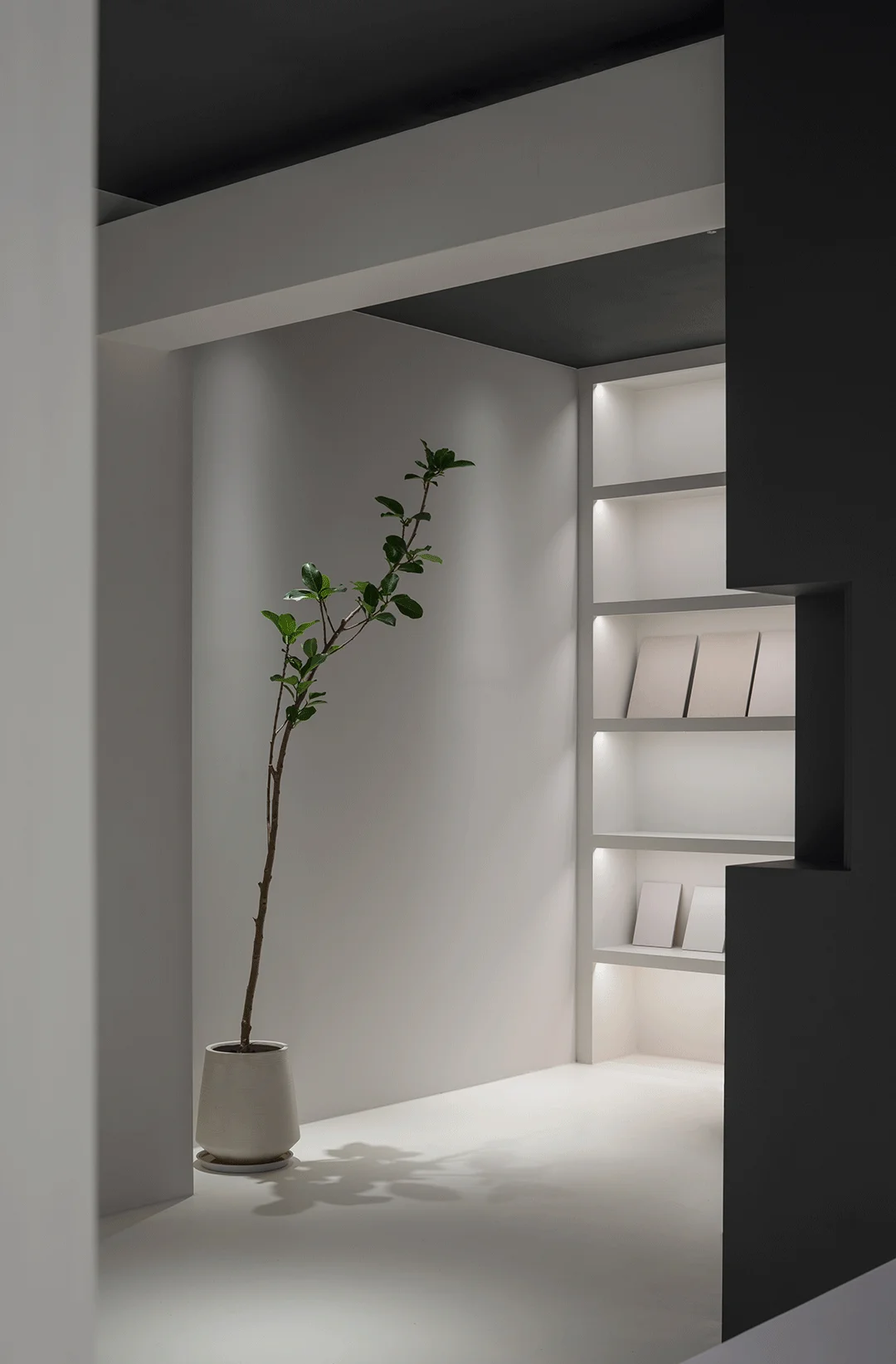
The design team aimed to create a space that felt relaxed, tranquil, and inviting. The minimalist design concept was brought to life by incorporating elements of nature. The entrance features a green landscape, softening the overall feel and providing a counterpoint to the structural elements of the space. The interplay between natural and structural features is a key aspect of this minimalist design, making the space feel less formal and less severe. The choice of minimalist design is intentional, fostering a sense of calm and inviting the user to explore and appreciate the materials on display. This design concept extends beyond the aesthetic realm into the realm of functionality. The minimalist design creates an uncluttered and unfussy environment where visitors can focus on the displayed materials. It’s a perfect example of how minimalist interior design principles can be applied to a functional space, achieving both aesthetic and practical goals. This minimalist material showroom project is an excellent case study in how to achieve a balance between form and function.
tag: minimalist design concept, minimalist aesthetic, natural elements, material display, simple interior design
Functional Layout and Space Planning: Optimizing Functionality and Flow
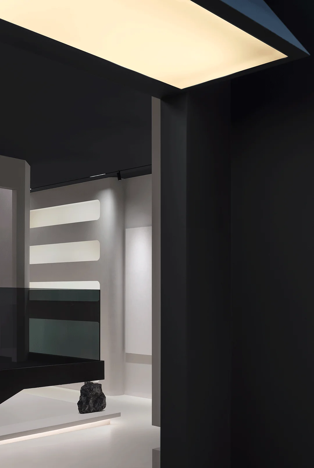
The functional layout of the showroom is straightforward and efficient, catering to the dual purposes of display and client interaction. The public areas are designed for material display and selection, making it easy for visitors to explore and select materials. This simple functionality is a hallmark of minimalist interior design. In addition to the public areas, a dedicated space is provided for private meetings and client receptions. The minimalist design approach creates a calm and focused atmosphere, ideal for productive conversations and relationship-building. The design’s focus on the functional flow throughout the space is a notable feature of this minimalist interior design. The pathways are clear and intuitive, seamlessly guiding visitors through the different zones of the showroom. A minimalist design focus on function encourages a straightforward and efficient space for material display and interaction. This creates a seamless, user-friendly environment.
tag: functional layout, material display, efficient spatial design, minimalist design elements, meeting space
Exterior Design and Aesthetics: Creating a Welcoming Entrance
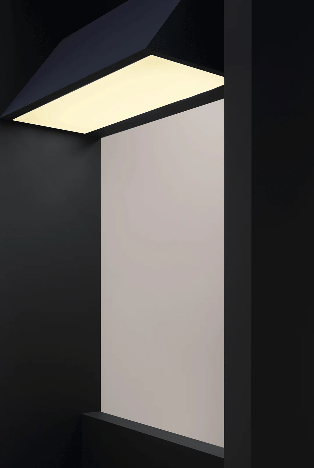
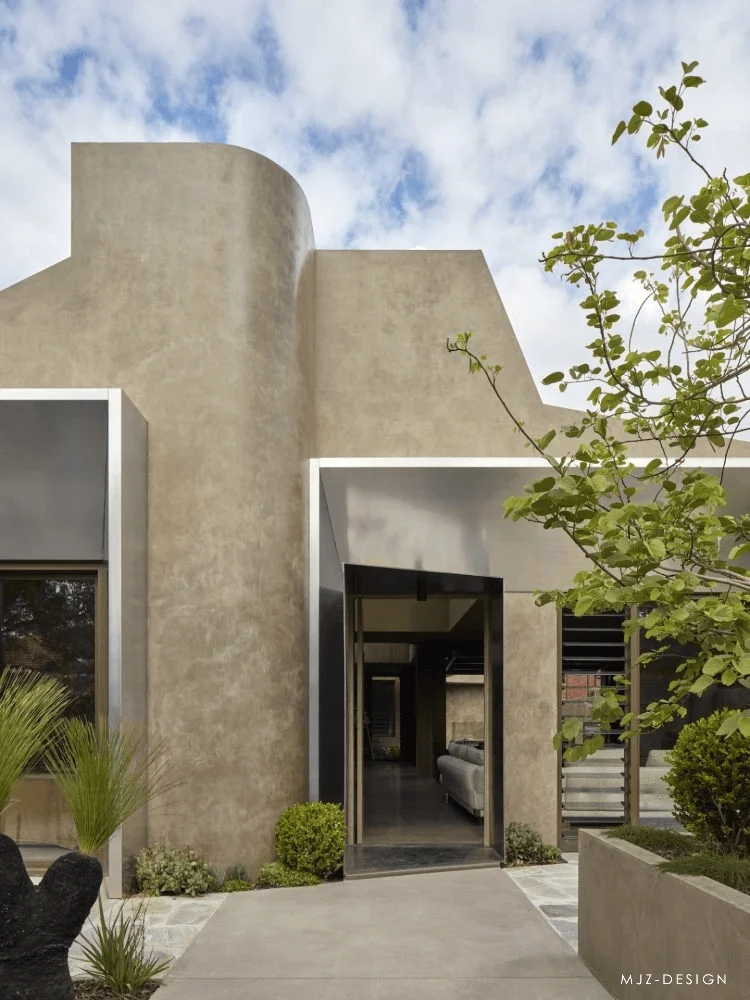
The external facade of the showroom is designed to create a sense of familiarity and welcome. The minimalist design of the entrance is expressed through a distinctive illuminated awning. This creates a visual focal point that is both minimalist and inviting. Viewed from a distance, the awning resembles a home entrance, and when lit at night, it evokes a sense of warmth and shelter. The minimalist style is highlighted through the large window openings that provide a glimpse of the interior landscaping, blurring the lines between indoors and outdoors. The minimalist aesthetic of the facade is further reinforced through the material palette, which is limited to a few carefully chosen materials. These design details are strategically applied to achieve a balanced, minimalist aesthetic, seamlessly blending the building with its surroundings.
tag: minimalist aesthetic, exterior design, storefront design, entryway design, minimalist building materials
Technical Details and Sustainability: Material Selection & Application
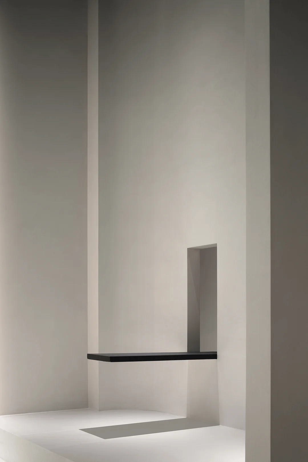
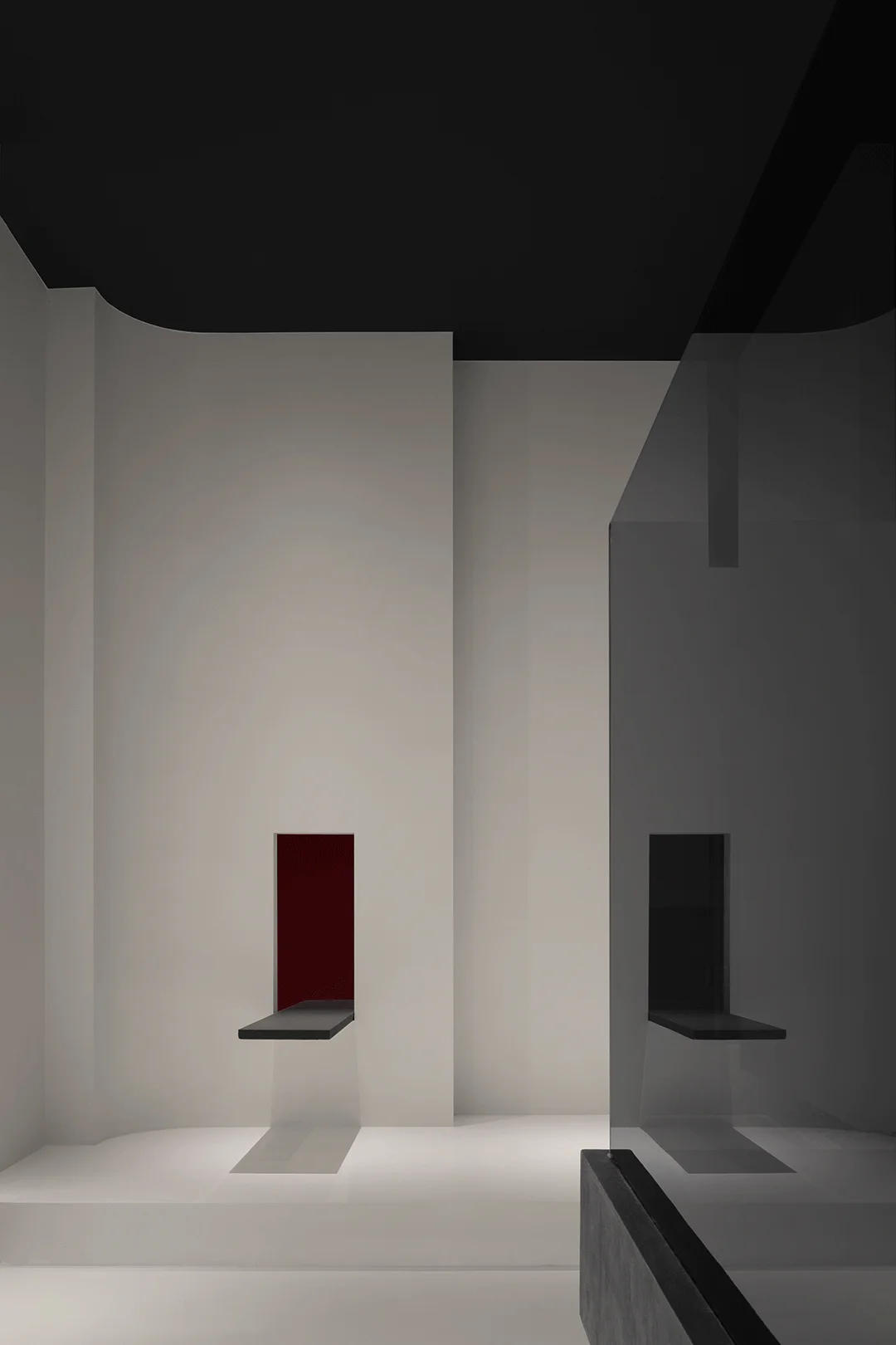
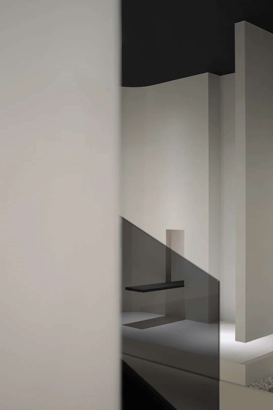
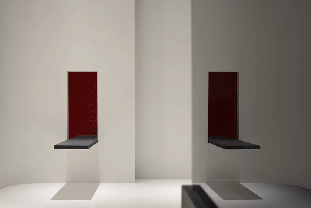
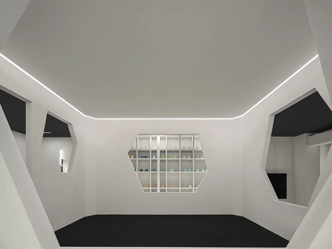
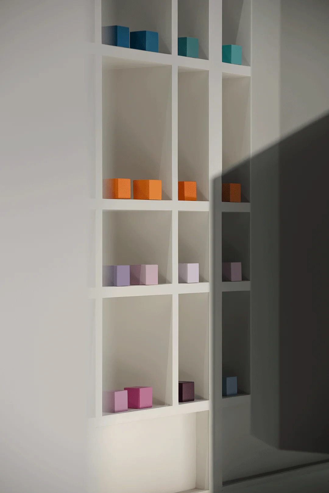
The interior design of the Yi Wu Material Showroom exemplifies the application of materials in achieving a desired aesthetic and functional result. Wall niches are incorporated to showcase the materials and enhance spatial interest. These niches seamlessly integrate into the minimalist design, without disrupting the overall visual harmony. The use of wall paint in the reception area creates a sense of warmth and homeliness. The textures and colors of these materials are deliberately chosen to reinforce the minimalist design concept. This design feature highlights the versatility and applicability of the materials. Furthermore, it suggests that sustainable practices were considered in the selection and usage of materials. Sustainable architecture and design are increasingly important factors in the modern building landscape. Minimalist interior design encourages the thoughtful use of materials, which contribute to a sustainable outcome for the project.
tag: sustainable material selection, wall texture, minimalist design details, material application, wall niche
Conclusion: Embracing Minimalism for a Serene Space
The Yi Wu Material Showroom serves as a powerful example of how minimalist interior design can create a space that is both functional and aesthetically pleasing. By balancing functionality and aesthetic sensibility, the designers were able to create a welcoming atmosphere where visitors can comfortably explore materials and interact with the design team. The tranquil and inviting atmosphere creates a positive experience that underscores the importance of material selection in architecture and interior design. Minimalist design principles are applied throughout the space to create a sense of calm and order, making the most of the available space. The careful integration of natural elements into the minimalist design enhances the overall sense of well-being. Ultimately, the project demonstrates that minimalist interior design and architectural spaces can be both highly functional and aesthetically engaging.
tag: minimalist design, interior design concepts, tranquil space, material selection, Chinese design
Project Information:
Project Type: Material Showroom
Architect: Gu Wei
Area: 110 sqm
Year: 2023
Country: China
Main Materials: Art Paint
Photographer: Zhang Jun


