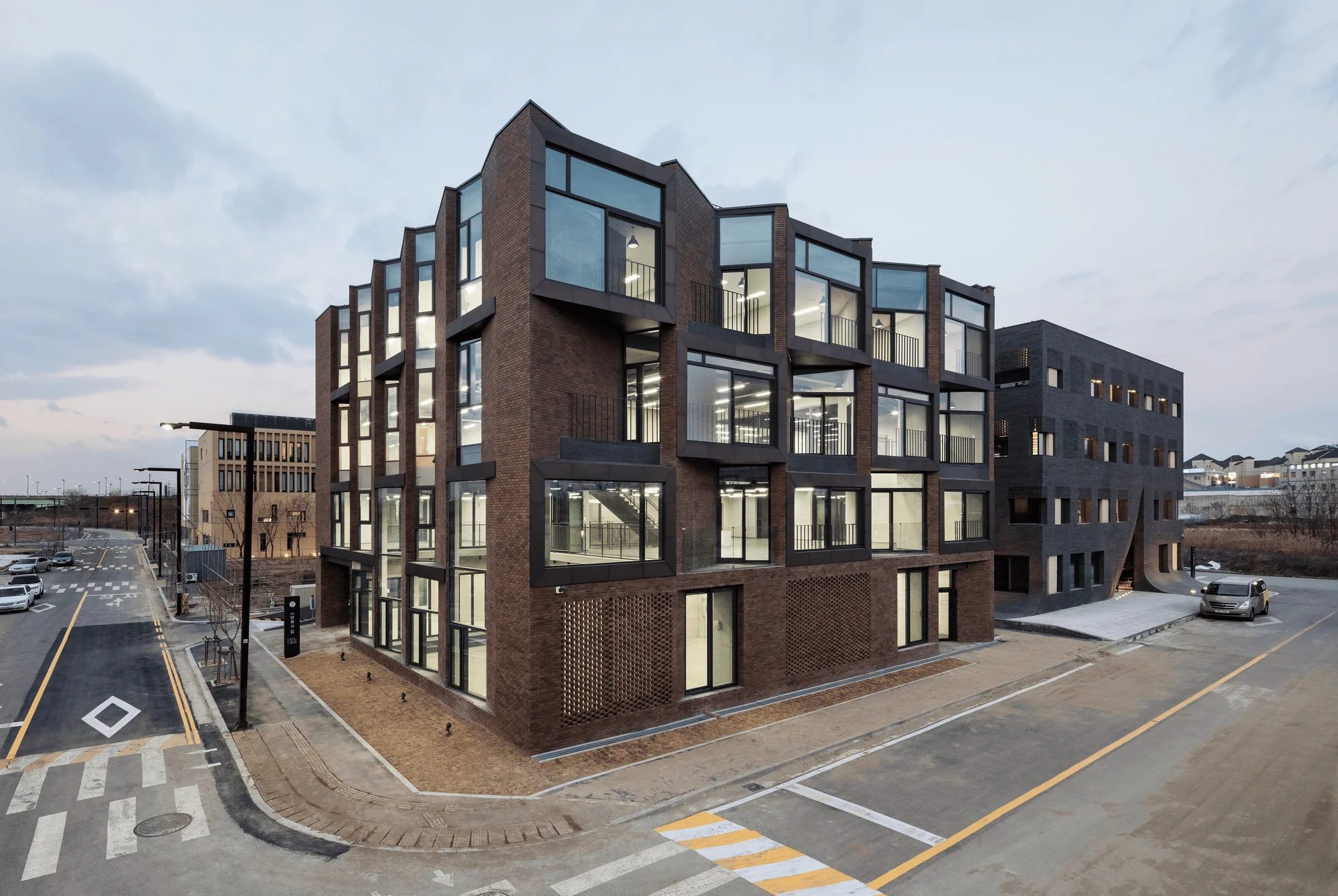
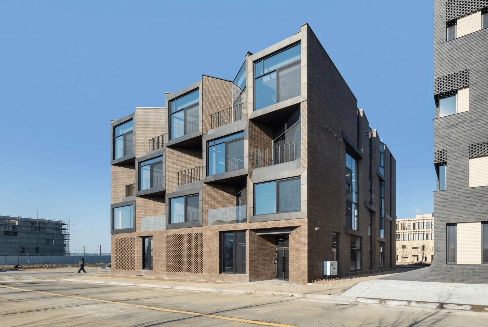
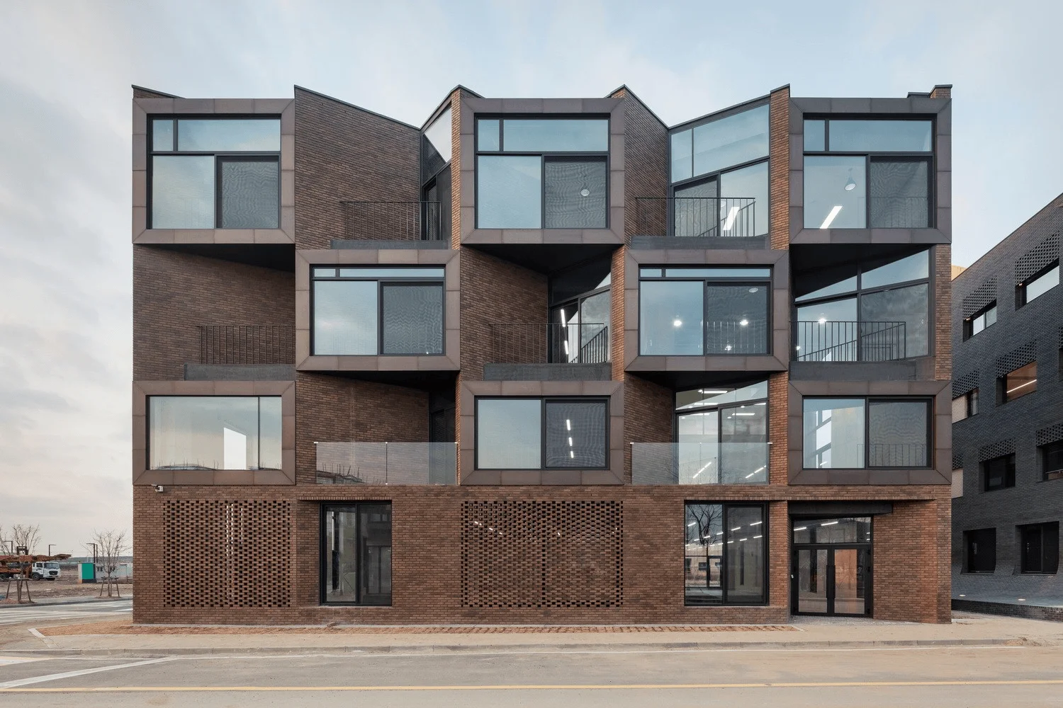
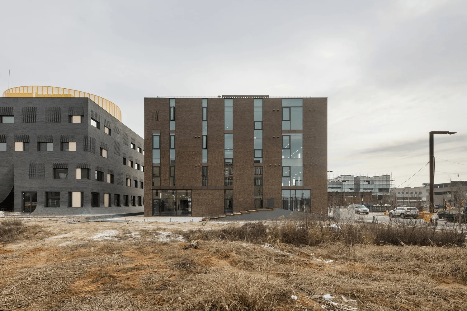
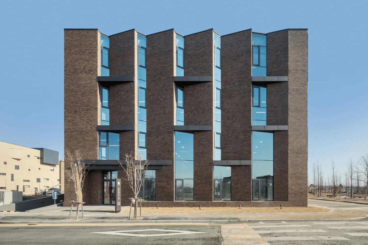
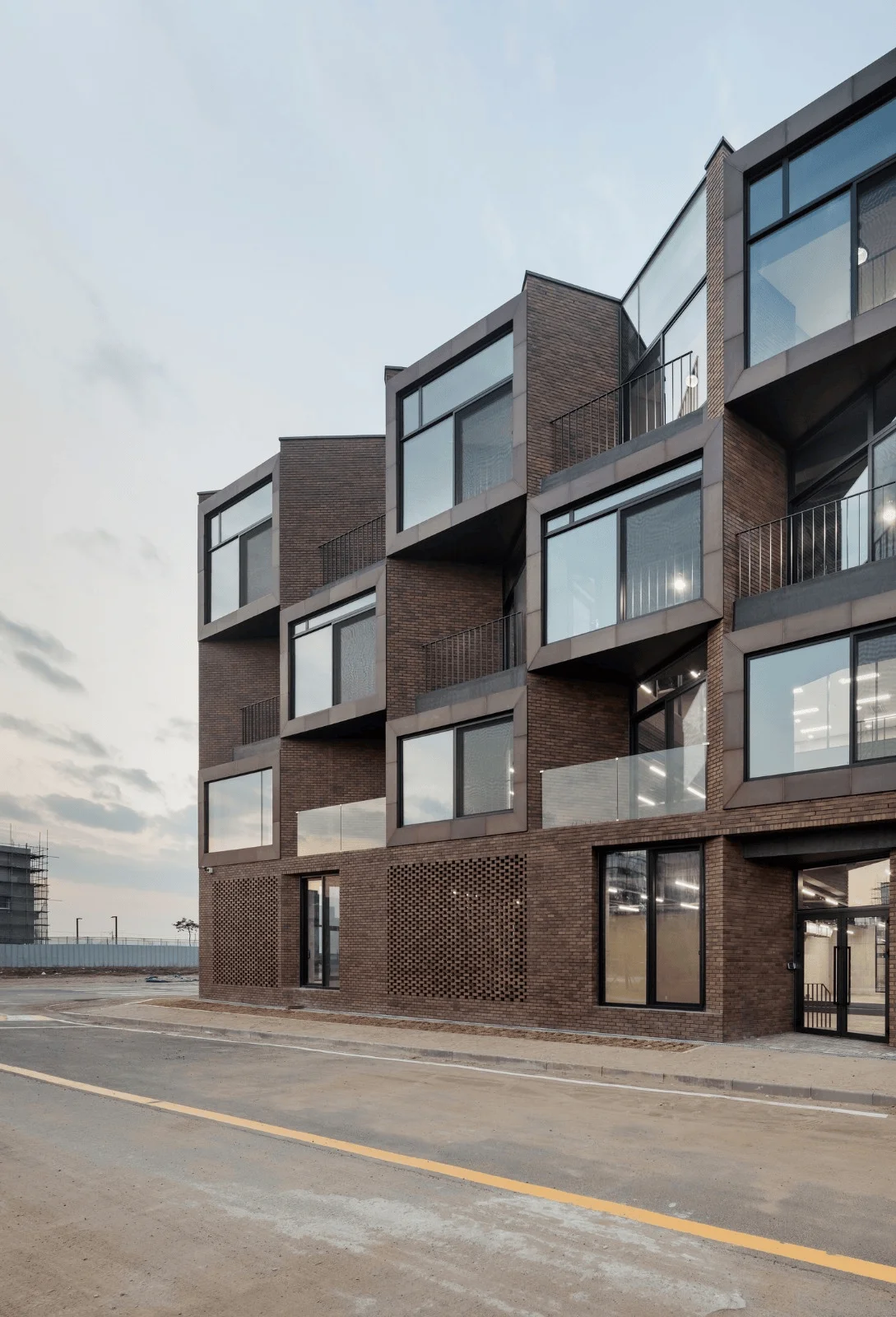
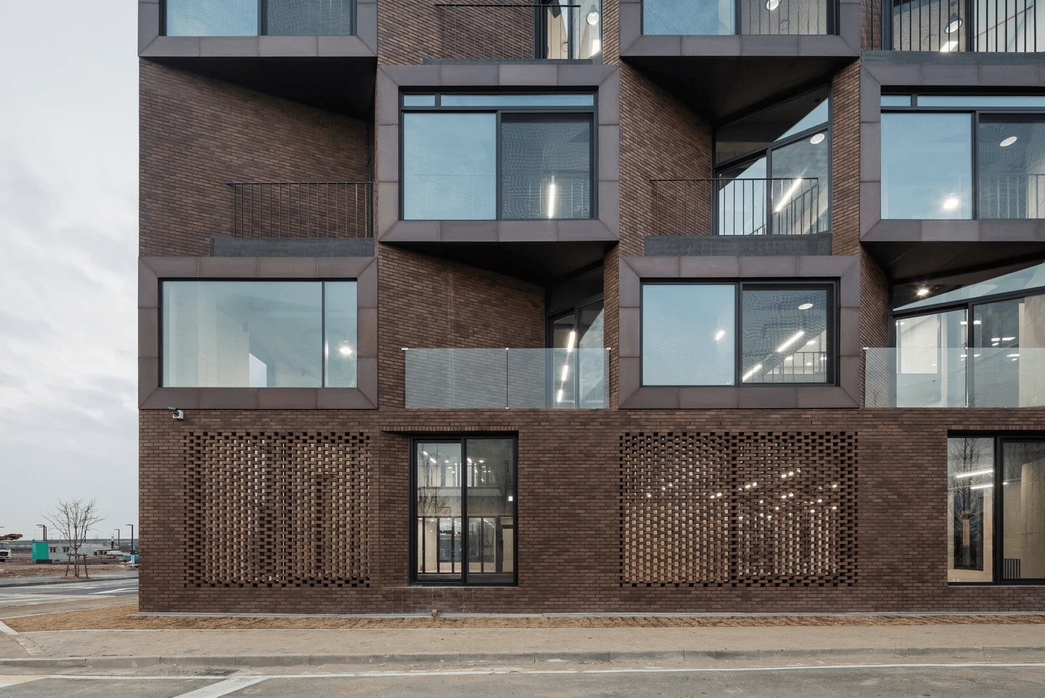
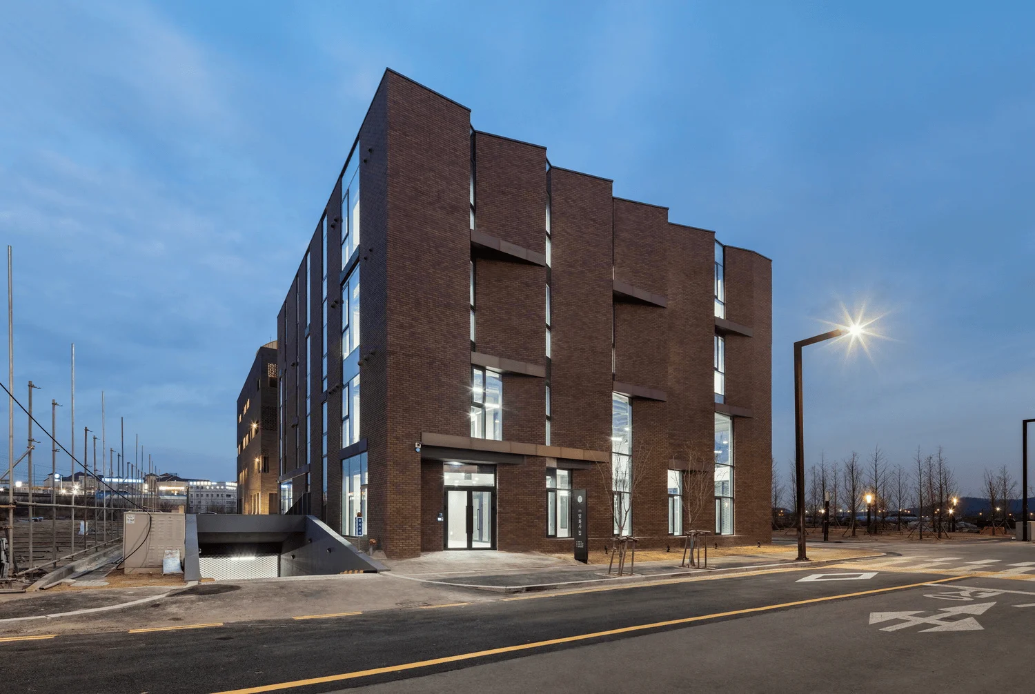
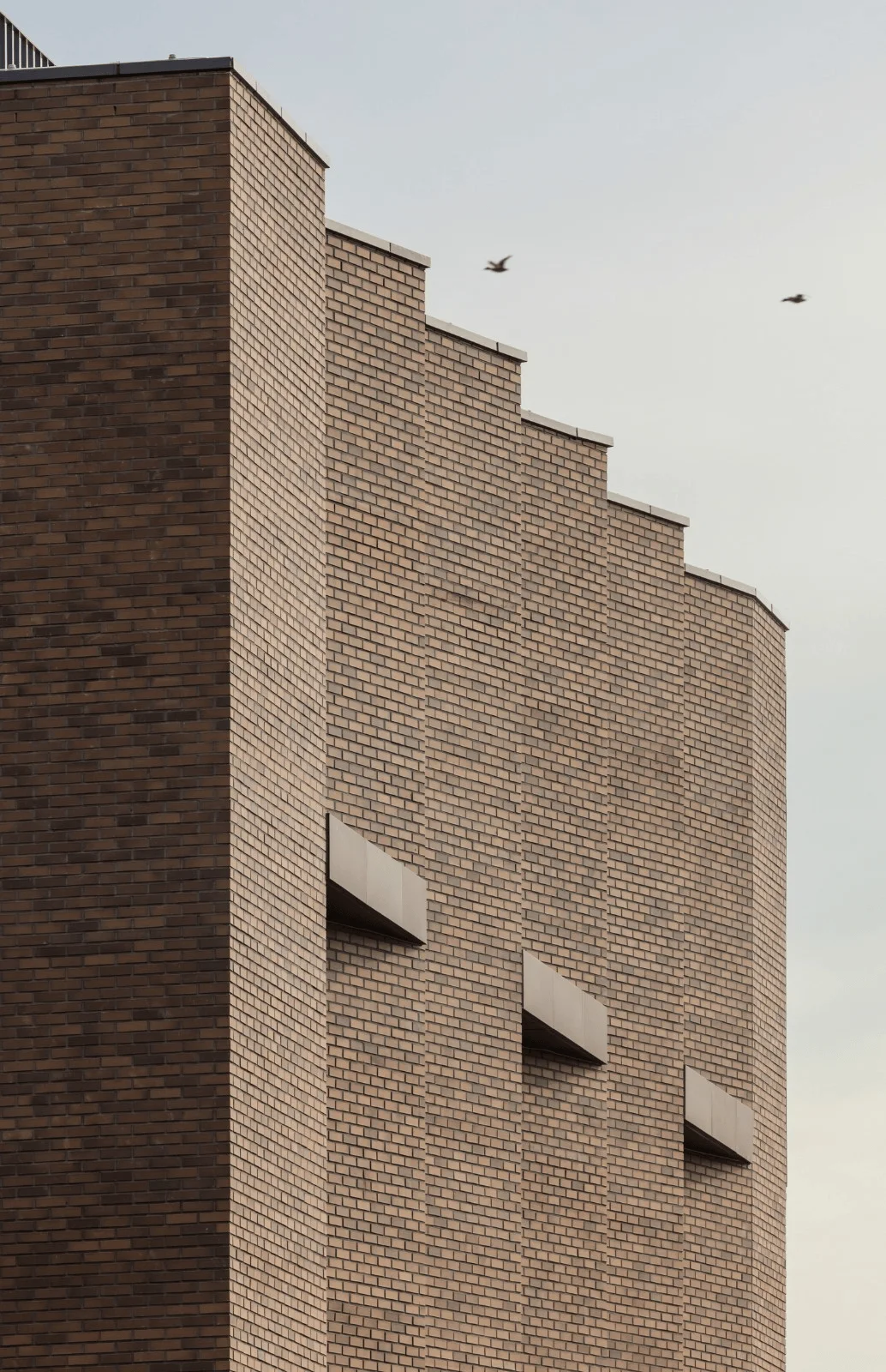
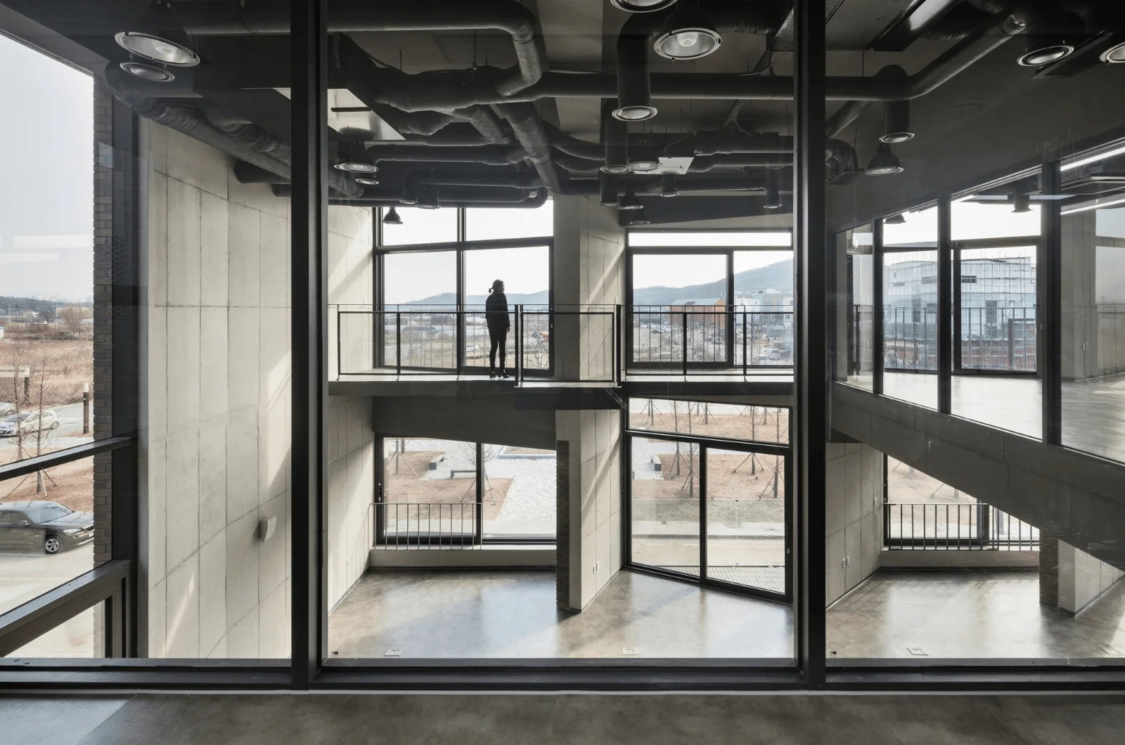
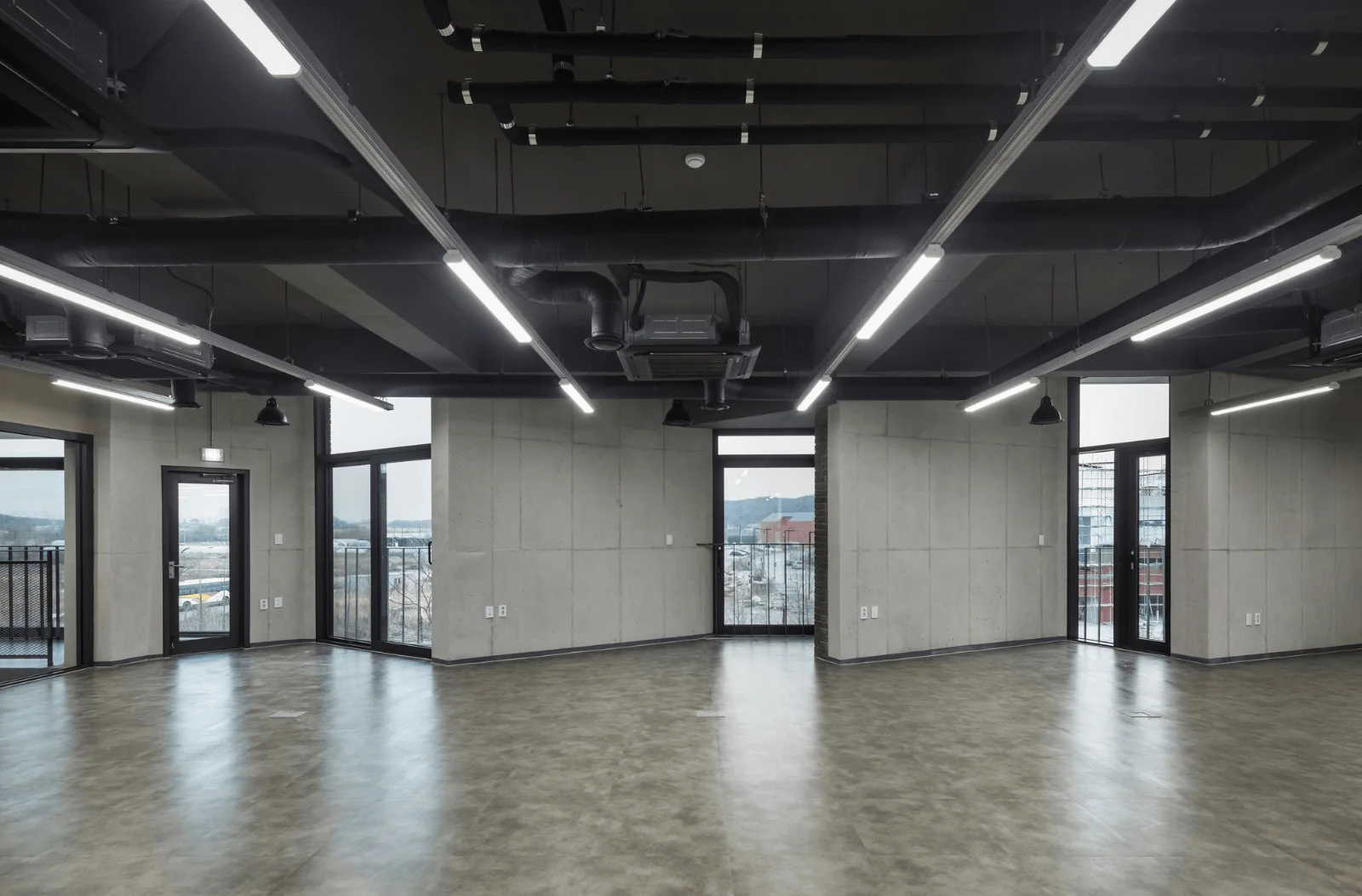
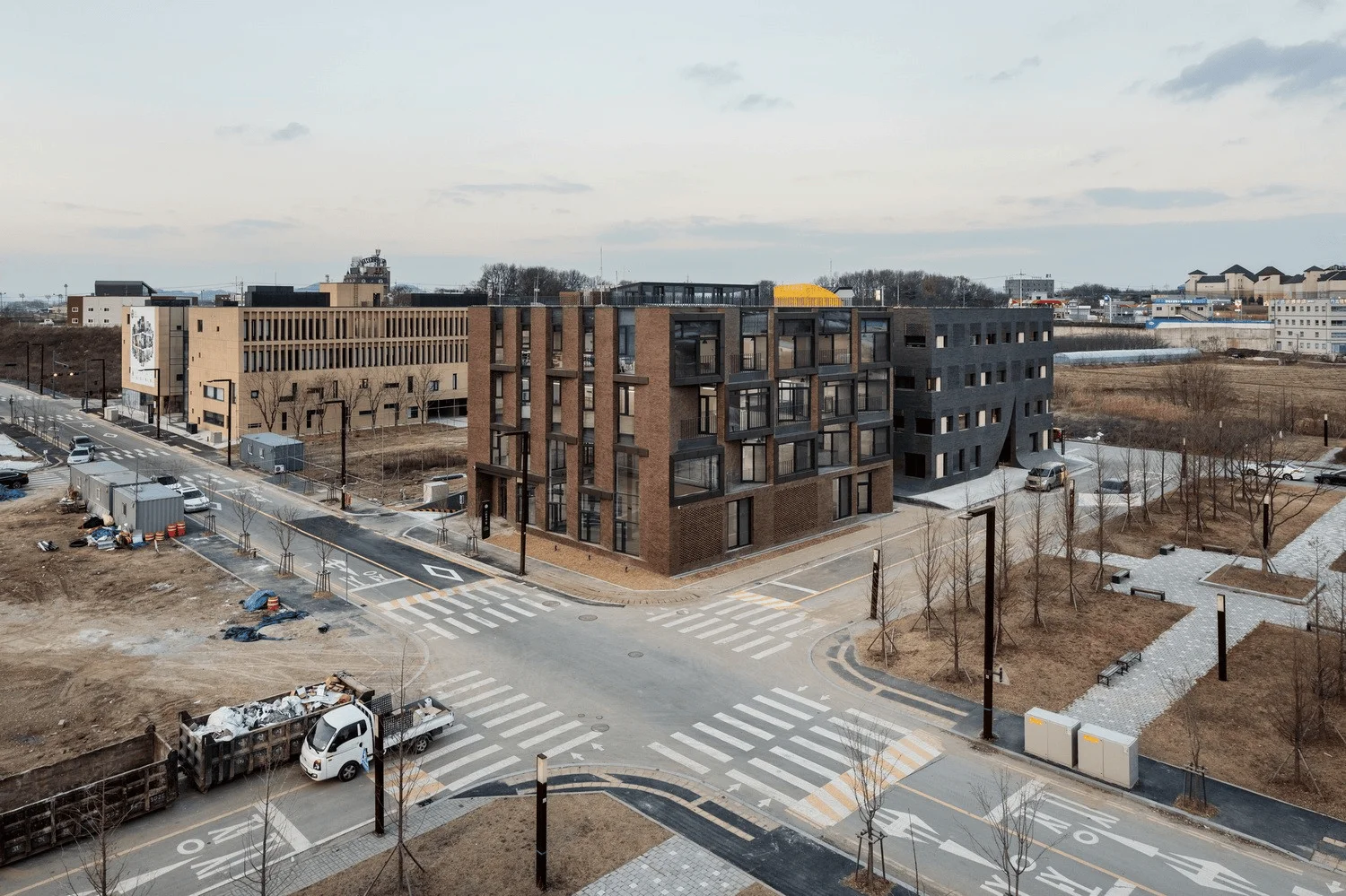
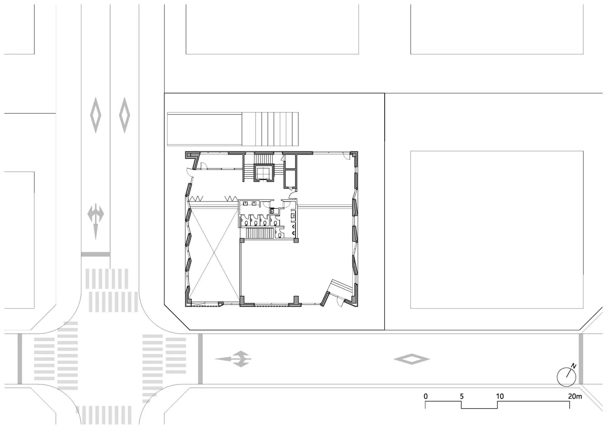
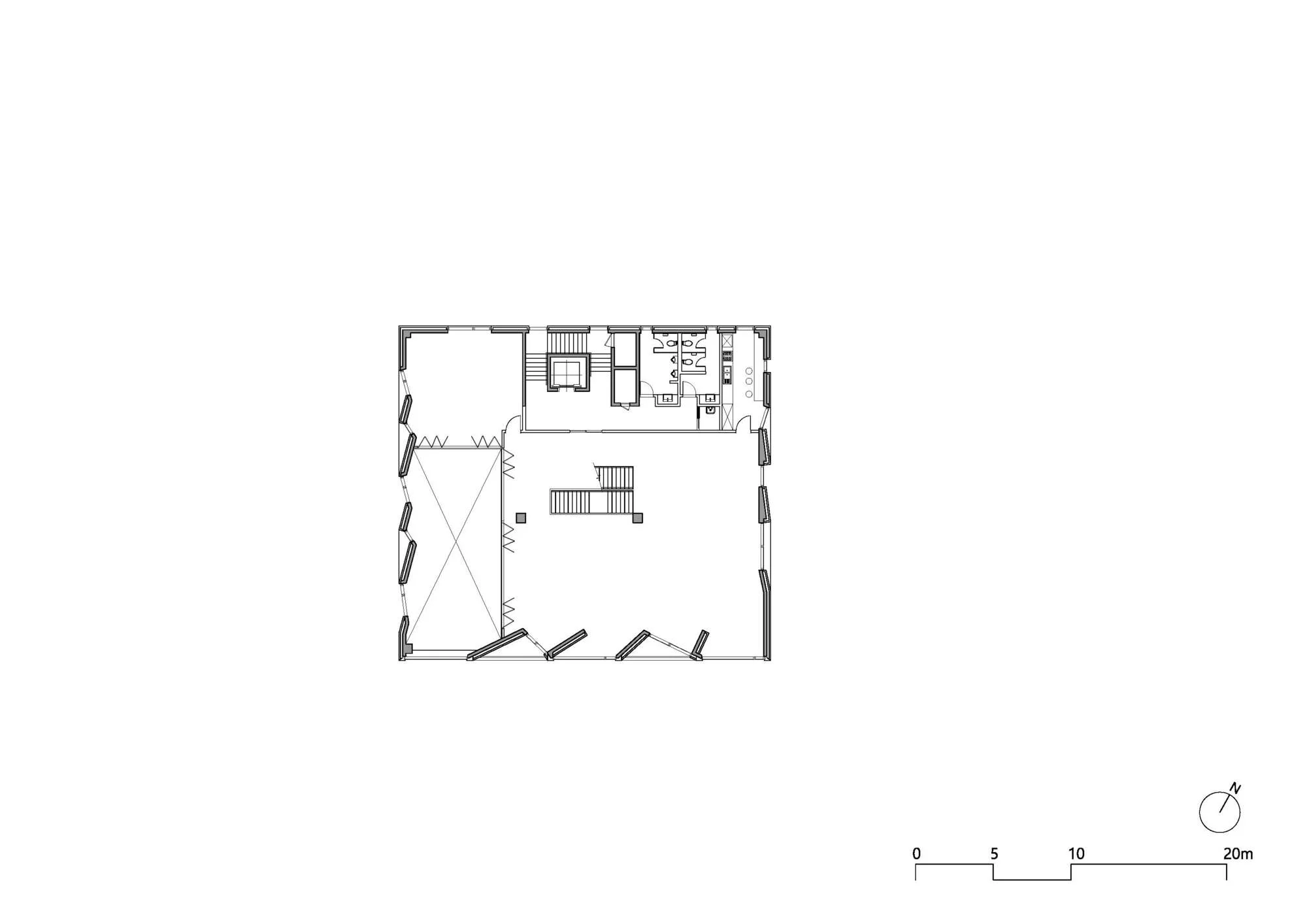
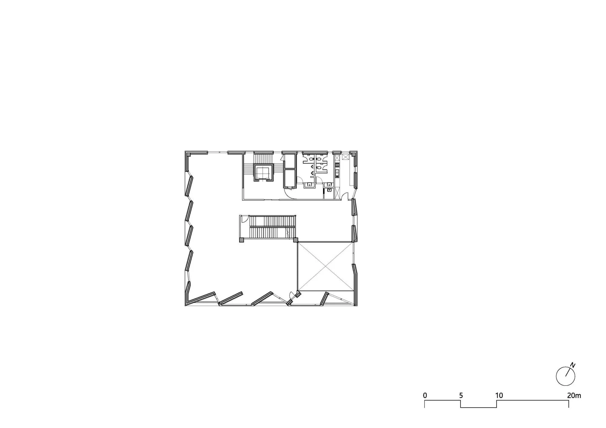
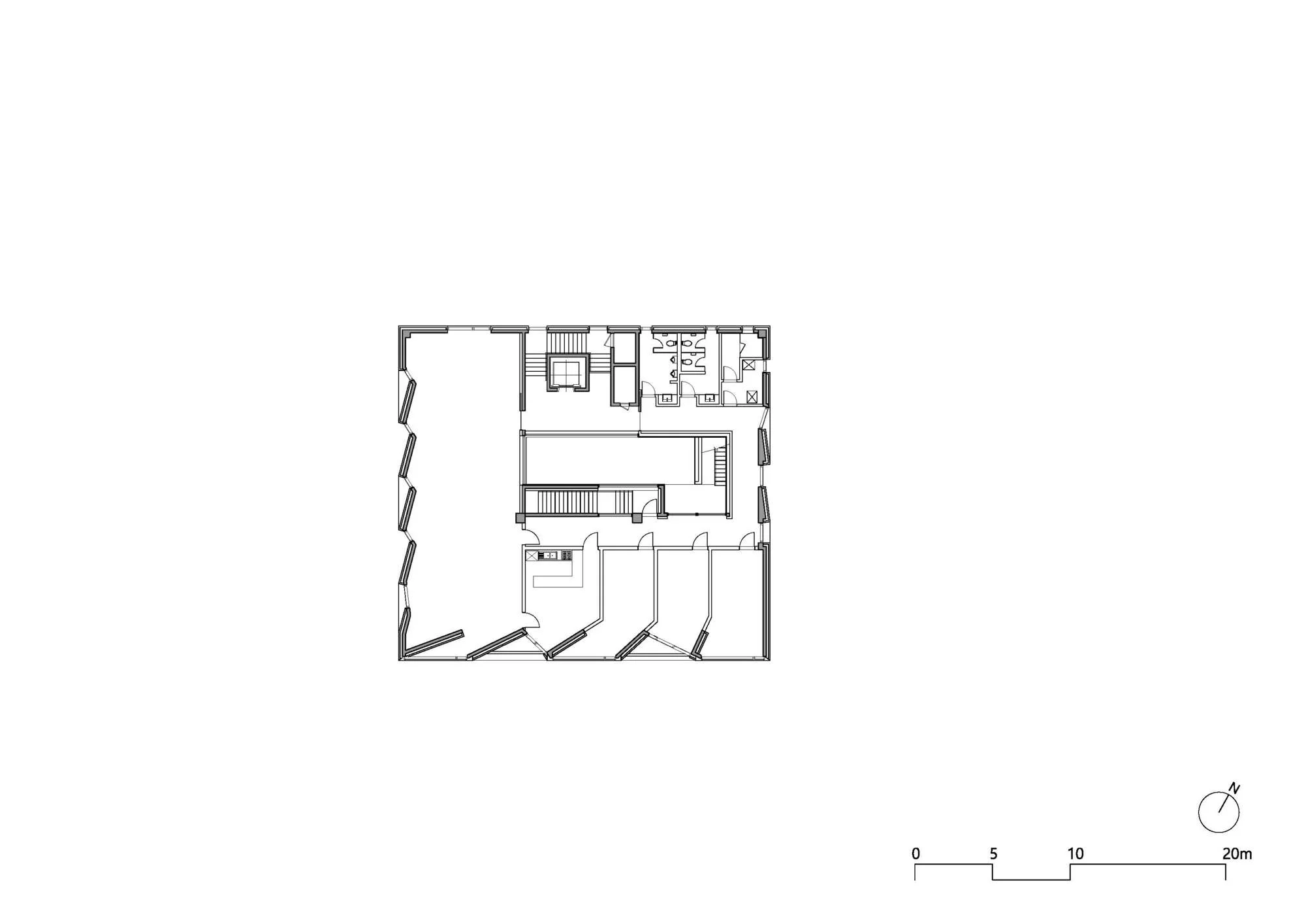
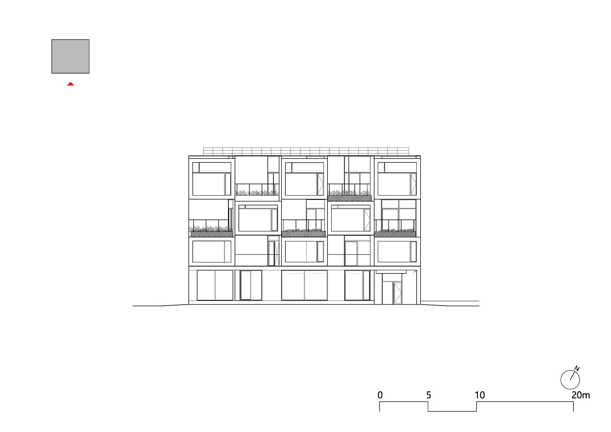
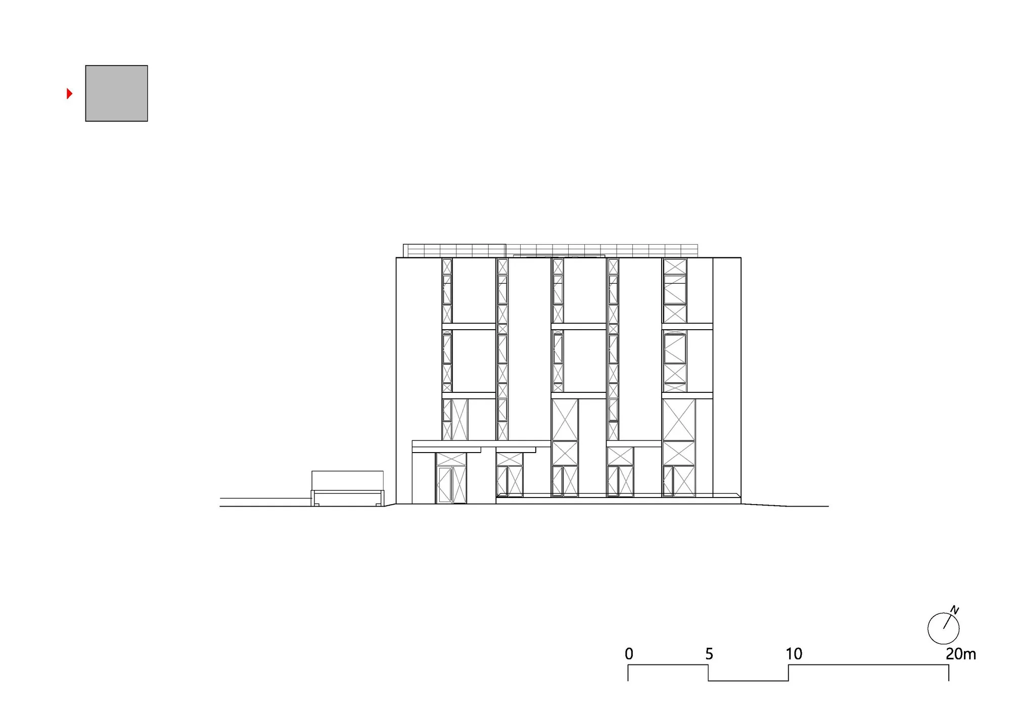
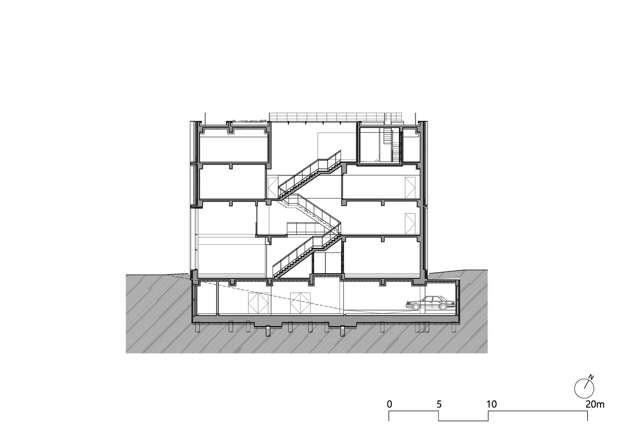
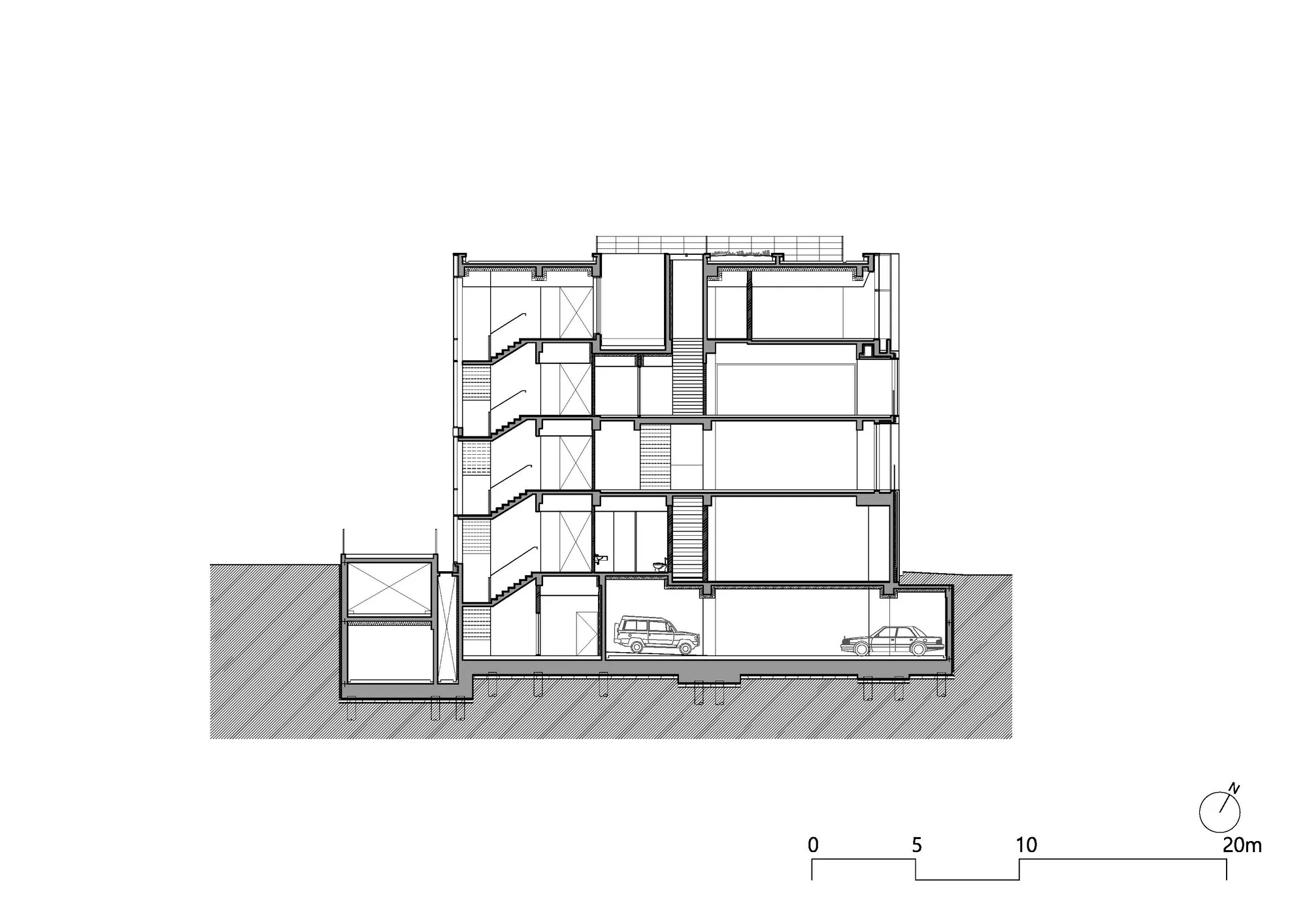
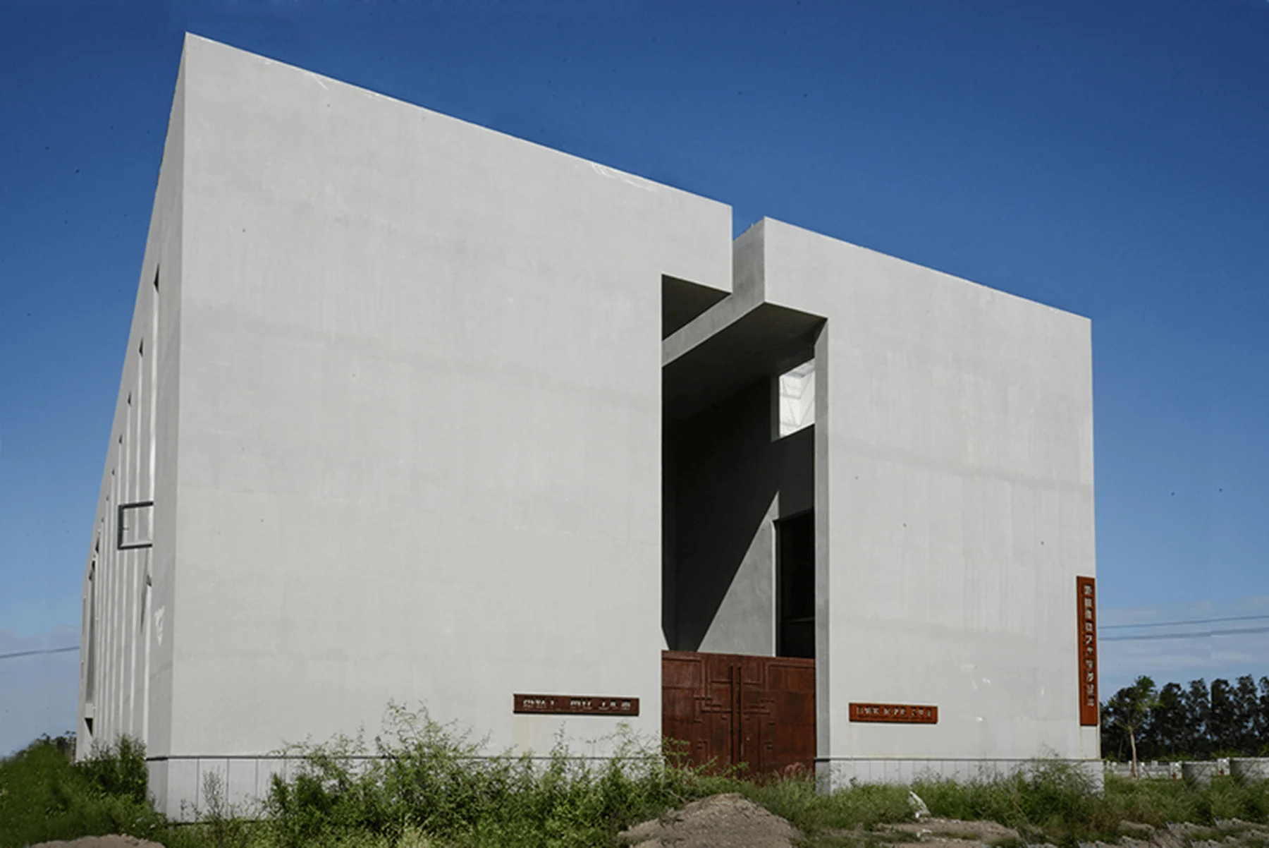
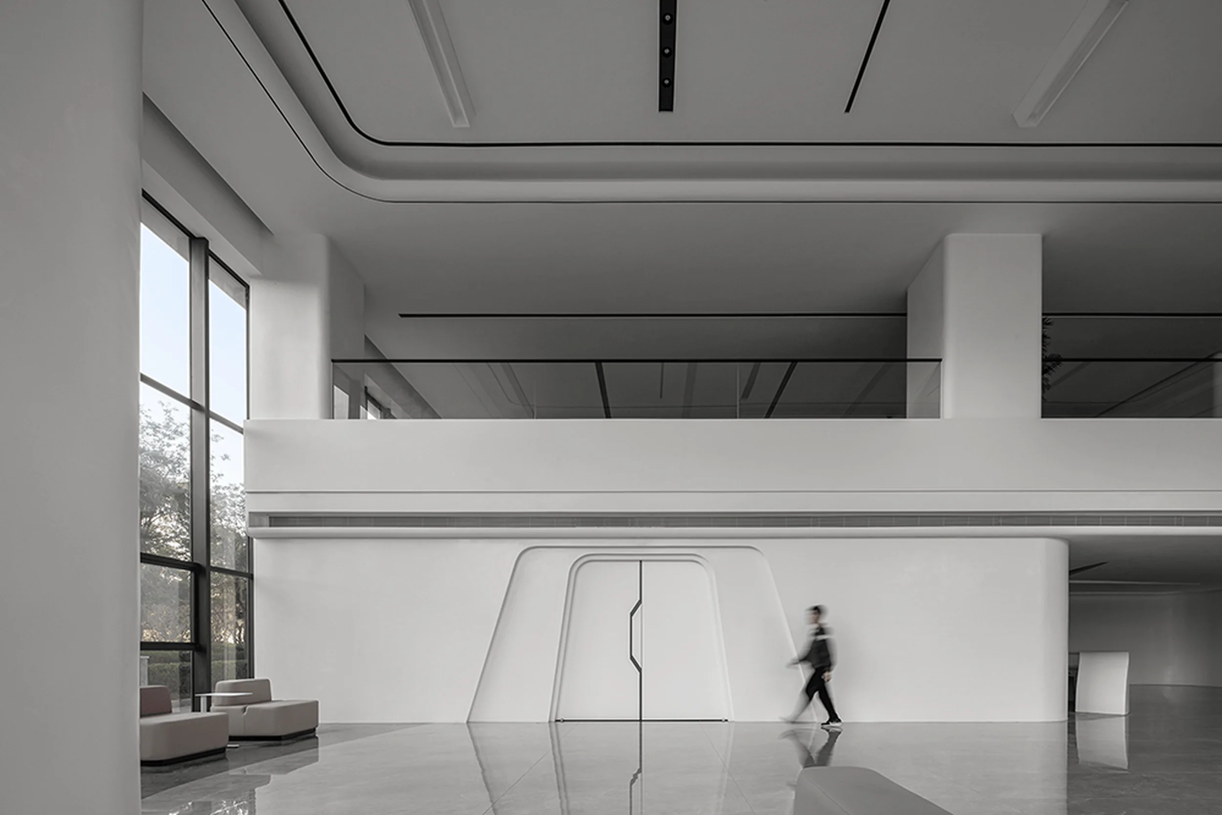
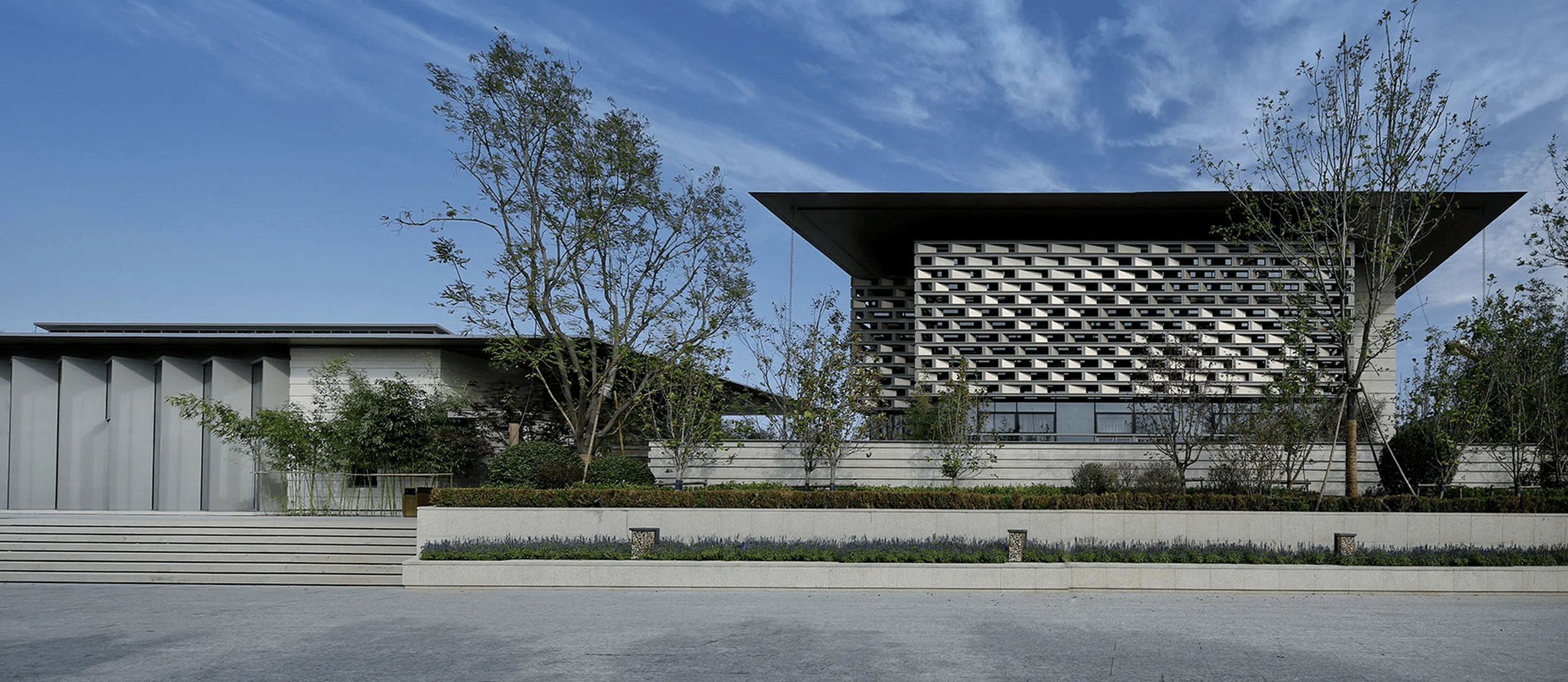
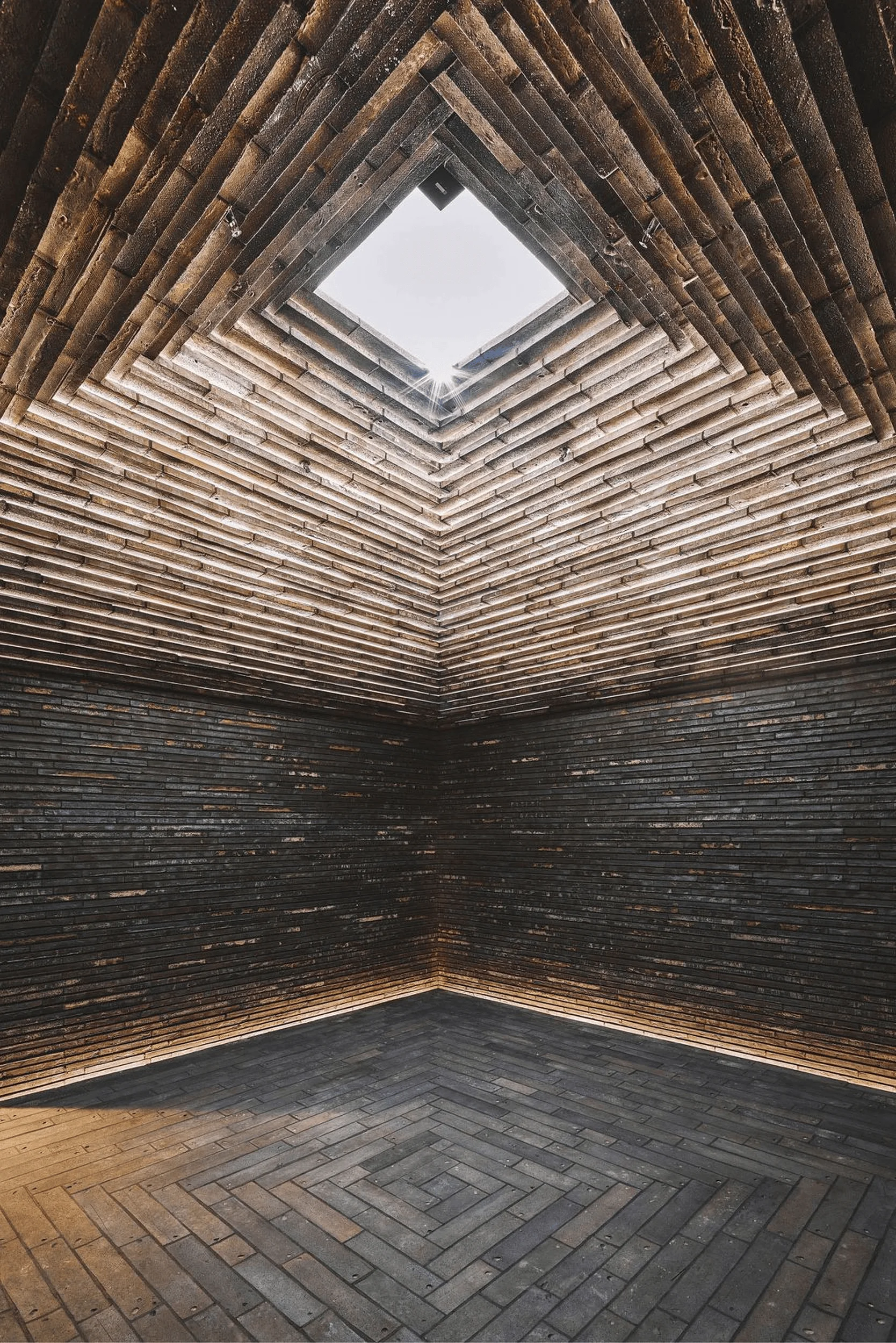
Zip Cinema, a leading film studio in South Korea renowned for blockbuster films like JeonWoochi: The Taoist Wizard (2019), Cold Eyes (2013), and The Priests (2015), has embarked on the construction of a new headquarters. The architects, poly.m.ur, shared a common goal with the owners: to create a space that embodies the essence of “zip,” the name of the studio, which also translates to “house” in Korean. This mutual understanding fostered a collaborative and harmonious atmosphere from the very first meeting. Despite the studio’s established reputation with a decade of experience producing 10 films, their decision to collaborate with poly.m.ur, a relatively young architecture firm, might seem surprising. The move from the bustling business district of Gangnam in Seoul to Paju, Gyeonggi-do, marks a bold step for a rising film studio. The film industry has cultivated strong ties with the business world, particularly the financial sector, as capital and distribution are vital for its success. Most studios choose to maintain their headquarters in Gangnam, despite the high rents, limited parking spaces, and uninspired office layouts. This strategic positioning allows for easy access to business and promotional partners. Zip Cinema’s CEO, Eugene Lee, defied conventional wisdom by seeking a new location at the Paju Publishing Complex outside of Seoul. Recognizing the risks of establishing a career in a male-dominated field, she wanted to create an environment that nurtures and inspires creativity, acknowledging and rewarding her team’s dedication. Beyond these broader considerations, the practical needs of a film studio were carefully considered during the design process. One of the primary operational areas involved meetings, often for script discussions and brainstorming sessions. Naturally, another key function was film production and distribution. To accommodate these diverse needs, two distinct multipurpose halls were strategically positioned on opposite sides of the building. A spacious double-height lobby creates a refreshing sense of openness when not in use, but transforms into an ideal backdrop for premieres, promotional events, and actor interviews. This flexibility is essential for a business that requires constant media interaction. Moreover, the studio’s desire for open and spacious areas, unconstrained by floor area ratio requirements, was another factor in their decision to leave the densely populated Seoul. The ZipCinema headquarters in Paju is designed as a four-story building, reaching a height of 15 meters, the maximum allowed by regulations. A café and a multipurpose hall welcome visitors on the first floor. The café is designed as a sunken space, half a meter below ground level, serving as a transition point between the main corridor and the lower level. This sunken space lowers the line of sight, creating a sense of comfort and security when studio staff meet with writers or other guests. The increased ceiling height contributes to a welcoming ambience. Adjacent to the café, the multipurpose hall hosts a wide range of events, including premieres and interviews related to film distribution. The floors above the ground level are dedicated to studio personnel, including staff and writers. The multipurpose hall on the east wing, located on the second floor, is a double-height space that provides a sanctuary for employees to relax or stretch. Its openness also makes it an ideal location for the studio’s weekly meetings. The layout and orientation of the office spaces are designed for maximum efficiency and functionality. For instance, offices facing west utilize high, narrow walls to cover more than half of the facade, effectively blocking the afternoon sun. These walls, resembling louvers, are angled to control the amount of sunlight entering the interior space. Offices facing north and south adhere to the overall design philosophy of the building, maintaining a consistent and soothing aesthetic. The south facade embodies a key spatial element that symbolizes ZipCinema. Humans have an inherent preference for spaces of a comfortable scale. This explains why we gravitate towards corners and intimate spaces rather than expansive ballrooms. Similarly, “water cooler conversations” at the office pantry or stair landings are an integral part of corporate life. With this in mind, the south facade incorporates the concept of “micro” spaces. Unlike rooms defined by walls, architectural spaces are created by merging exterior balconies with interior corners. These comfortable and relaxed spaces encourage employees to step away from the pressures of their work environment during breaks, allowing them to enjoy a coffee or engage in friendly conversations. A portion of the fourth floor is dedicated to writers, featuring a shower, kitchen, and dormitory. This encourages a “live and work” ethos within the headquarters. For moments of respite or to enjoy fresh air, writers can easily access the rooftop, which offers a designated rest area. The project drawings highlight the layout of each floor, showcasing the spatial relationships and functionality of the building. The plans reveal the thoughtful design decisions made to create a stimulating and collaborative environment for the ZipCinema team.
Project Information:


