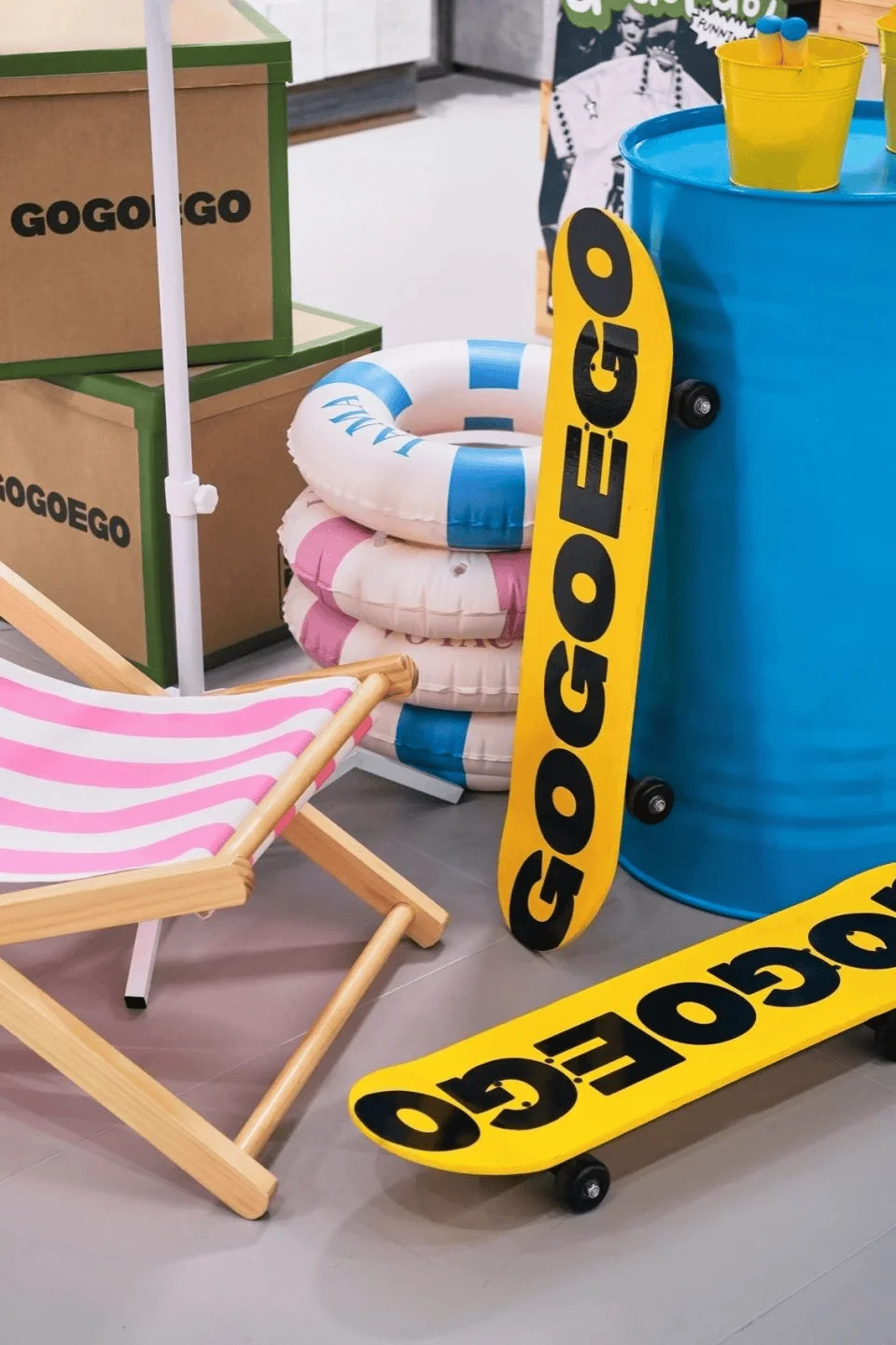
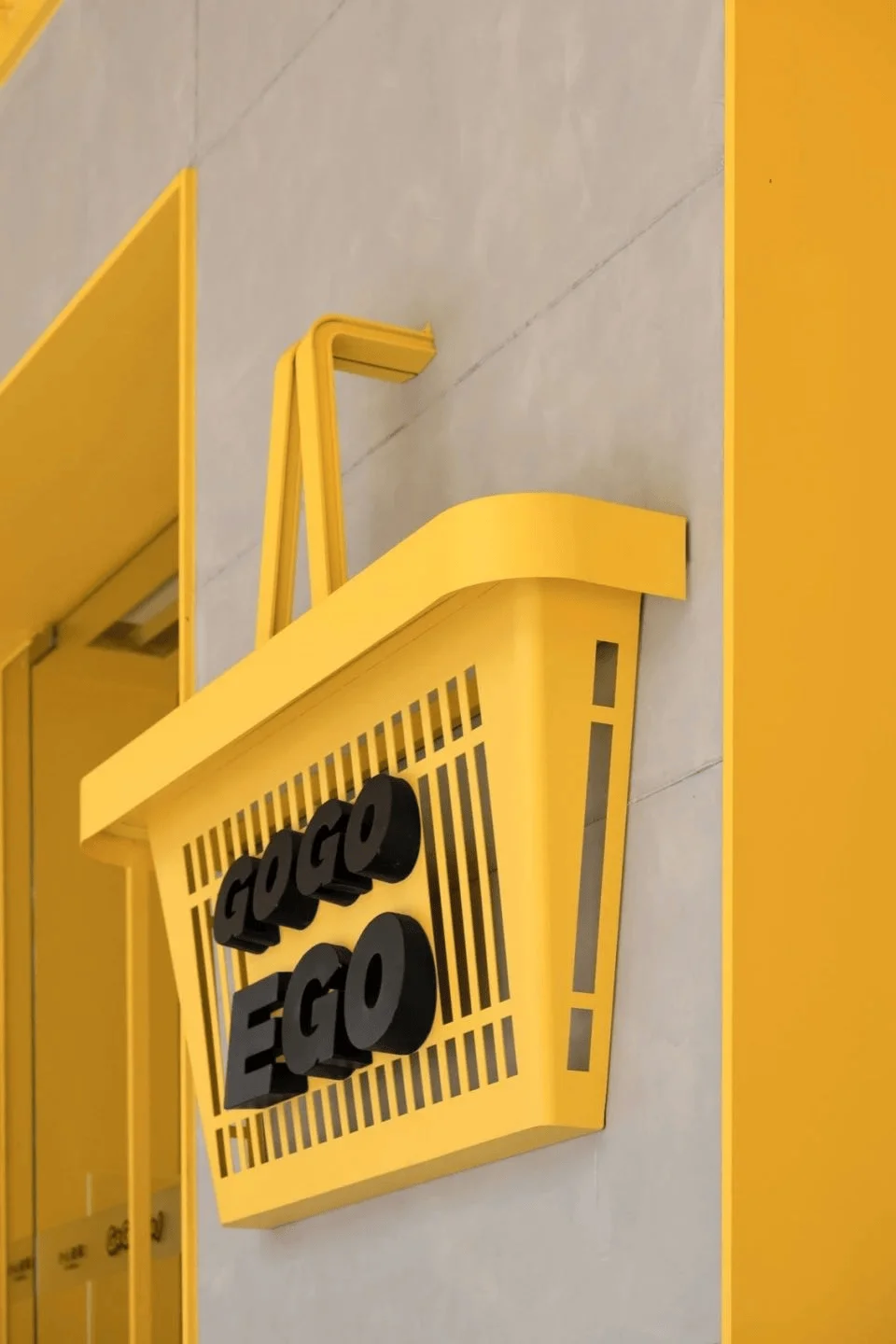
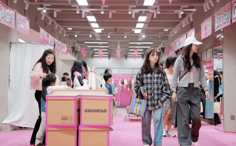
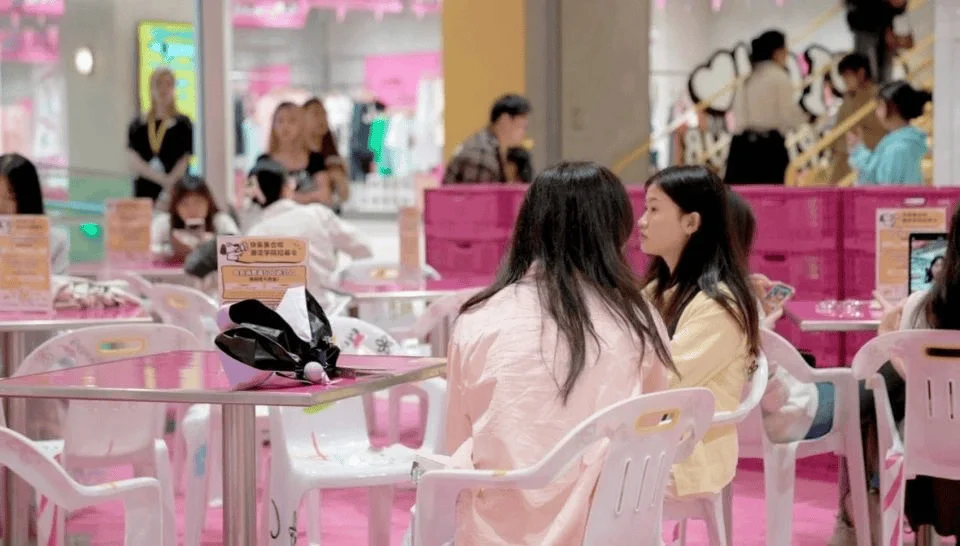
GOGOEGO Trendy Supermarket in China, revitalized by Wing Design, offers a trendy shopping experience for Gen Z.
Contents
Project Background and Transformation
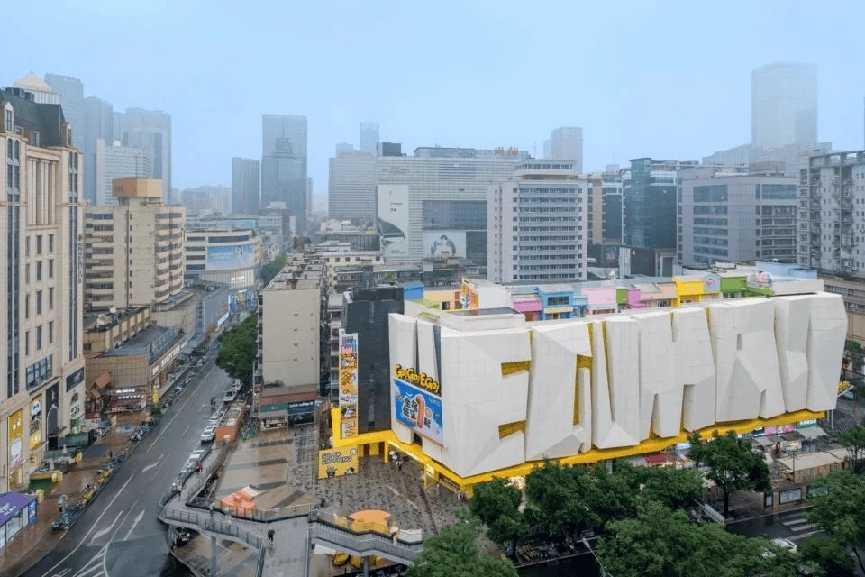
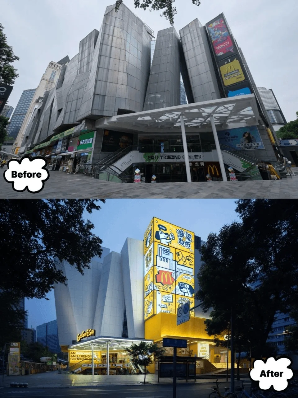
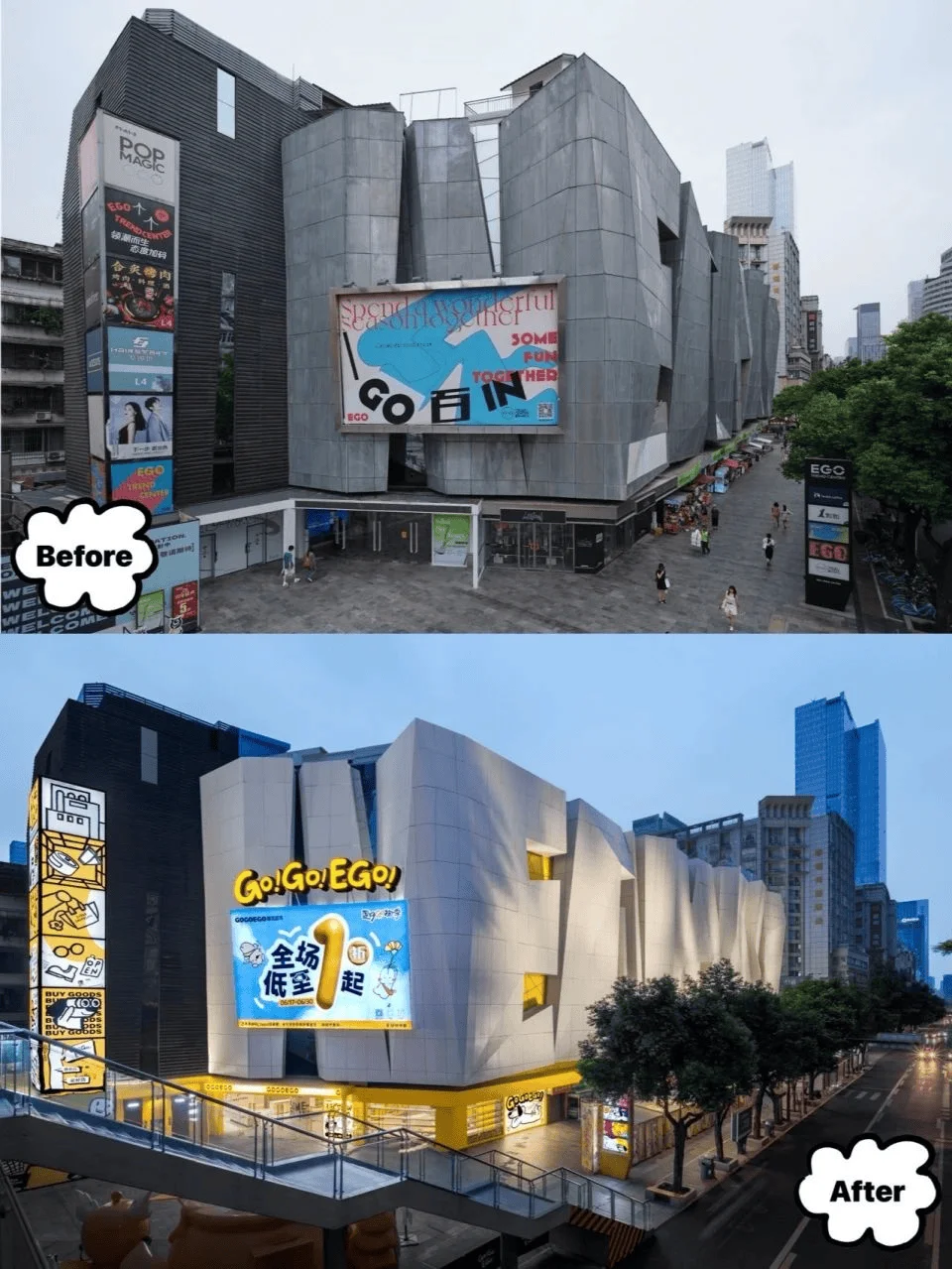
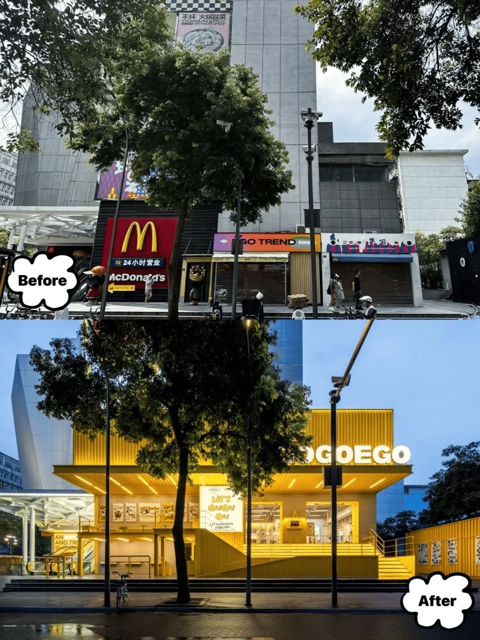
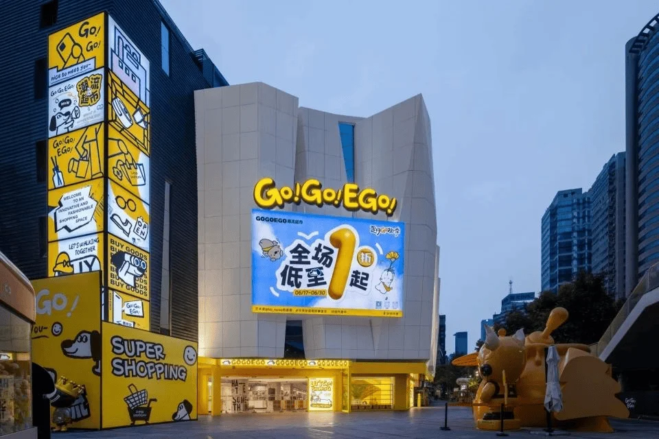
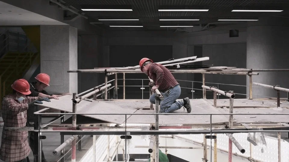
The GOGOEGO Trendy Supermarket, located in Chengdu, China, is a revitalization project that transformed the former EGO (YiGou Fashion Plaza) shopping mall. Established in 2009, the EGO mall had faced challenges in recent years due to evolving consumer preferences and the rise of e-commerce. This led to a decline in foot traffic and revenue, prompting the owner to seek a major overhaul. Wing Design, which had previously collaborated on successful projects like Chengdu COSMO, took on the challenge of rejuvenating the space. The goal was to redefine the mall as a “trendy supermarket” – a retail space catering to the Gen Z demographic and offering a more immersive shopping experience. This revitalization project demonstrates the importance of adapting to evolving market conditions and consumer demands.
tags: trendy supermarket design, gen z shopping experience, retail space renovation, chengdu retail, commercial design, china retail
Brand Identity and Visual Language
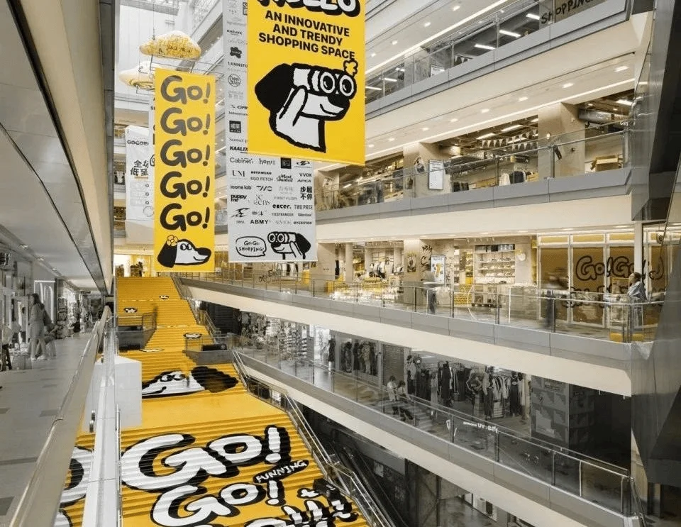
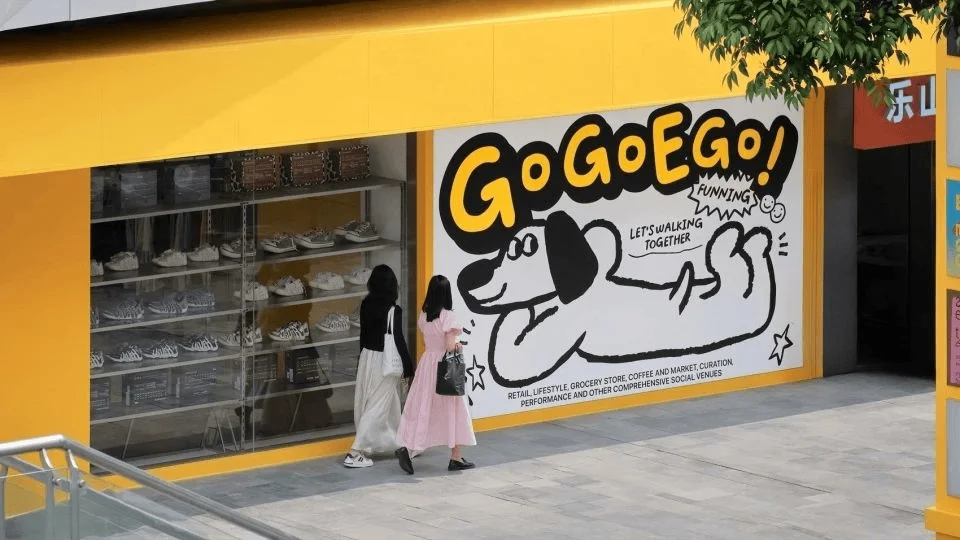
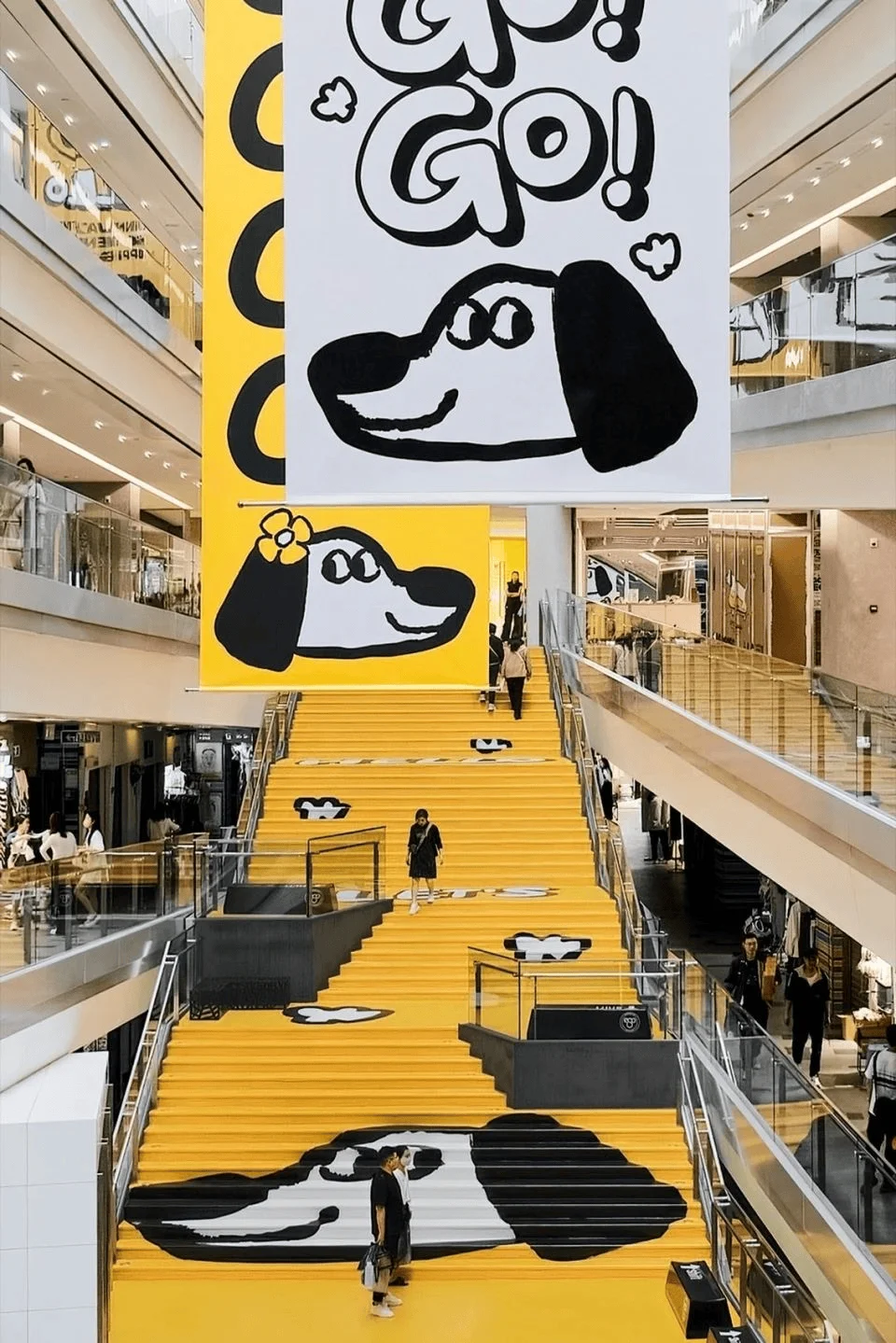
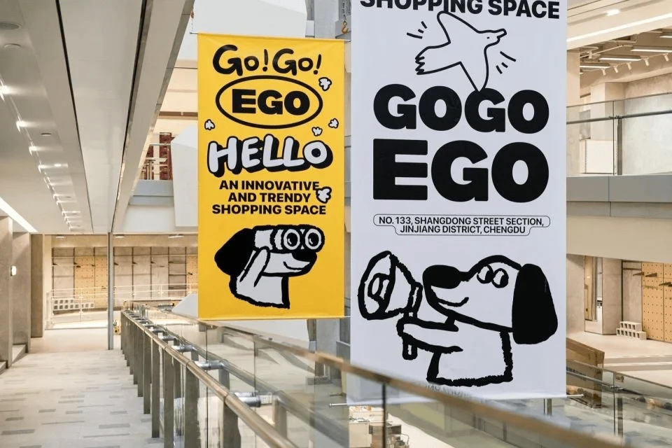
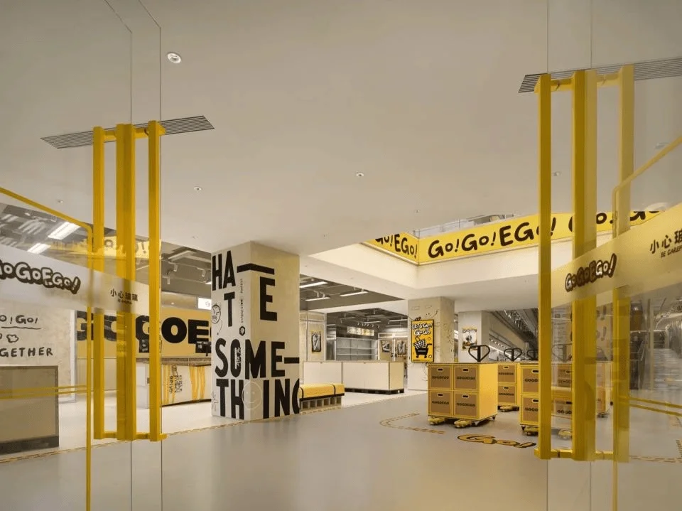
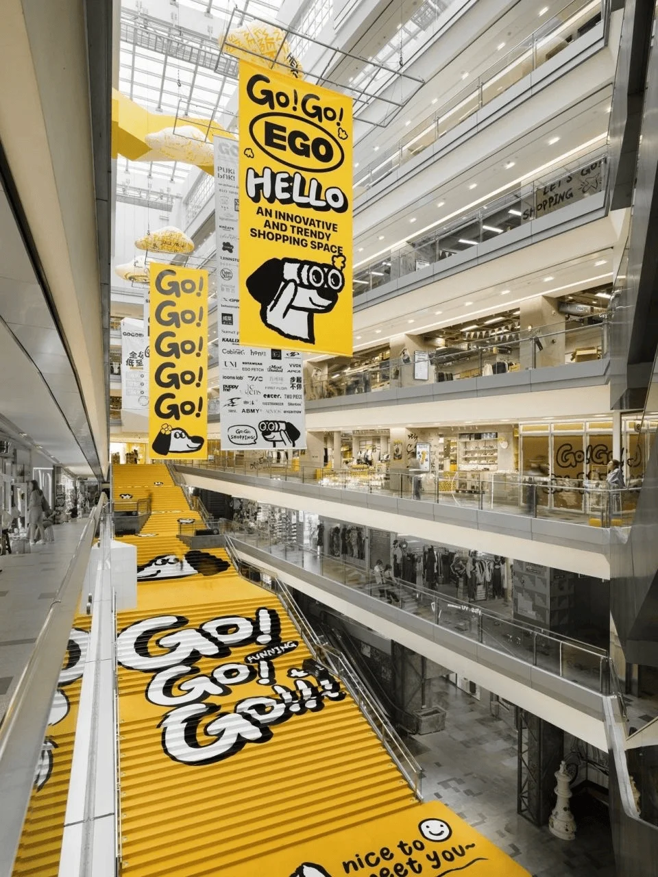
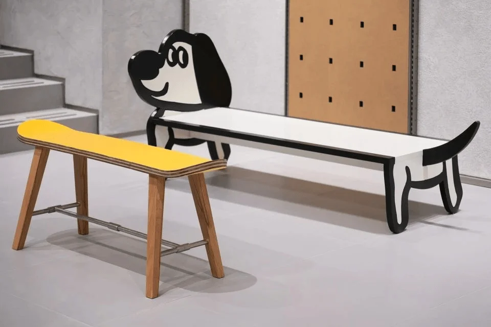
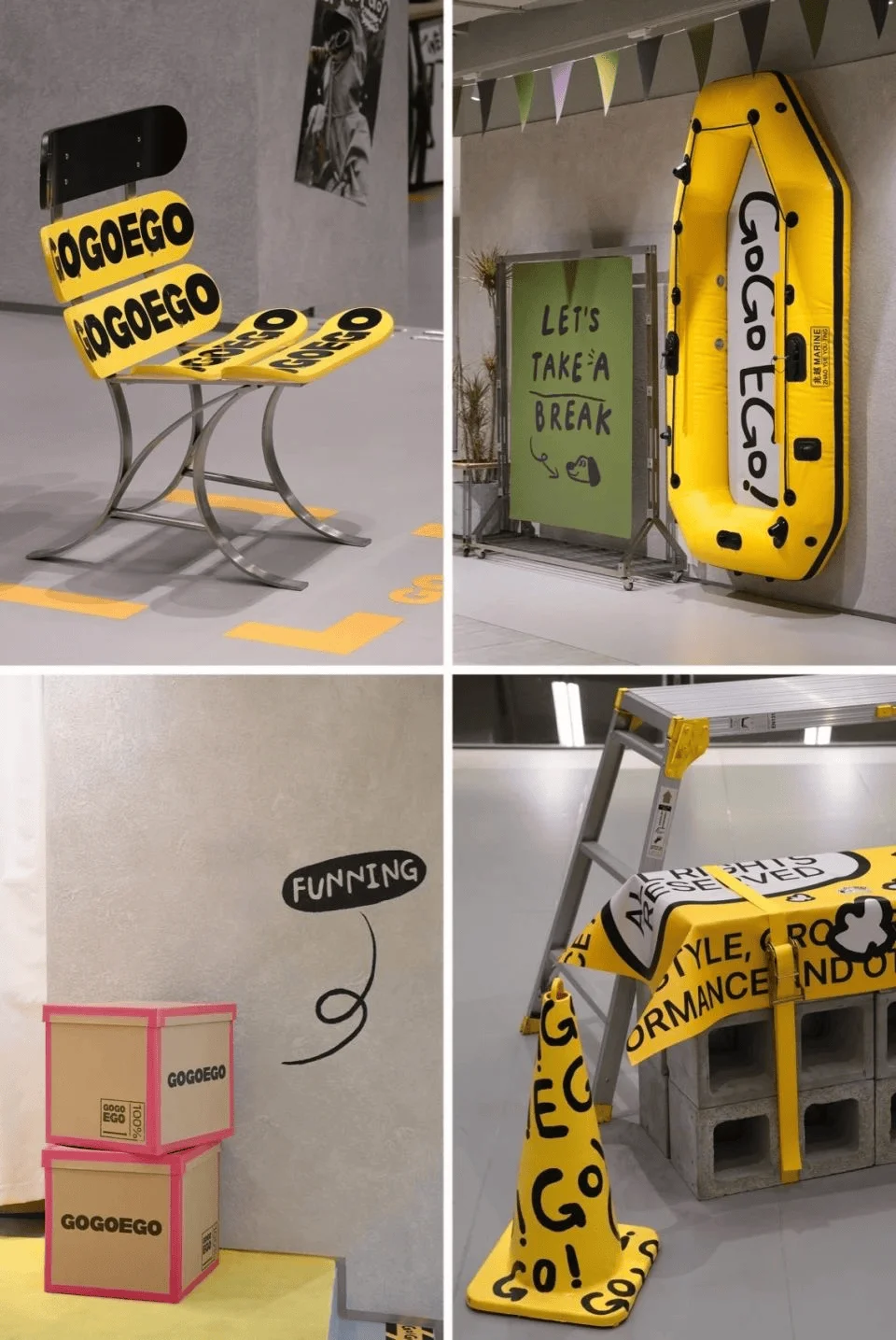
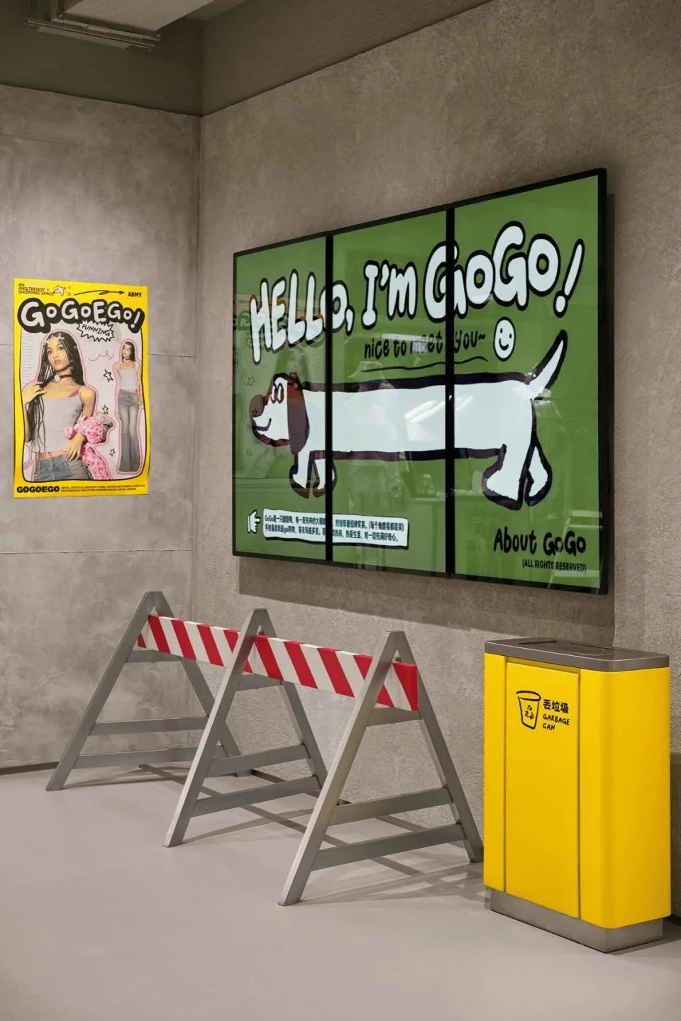
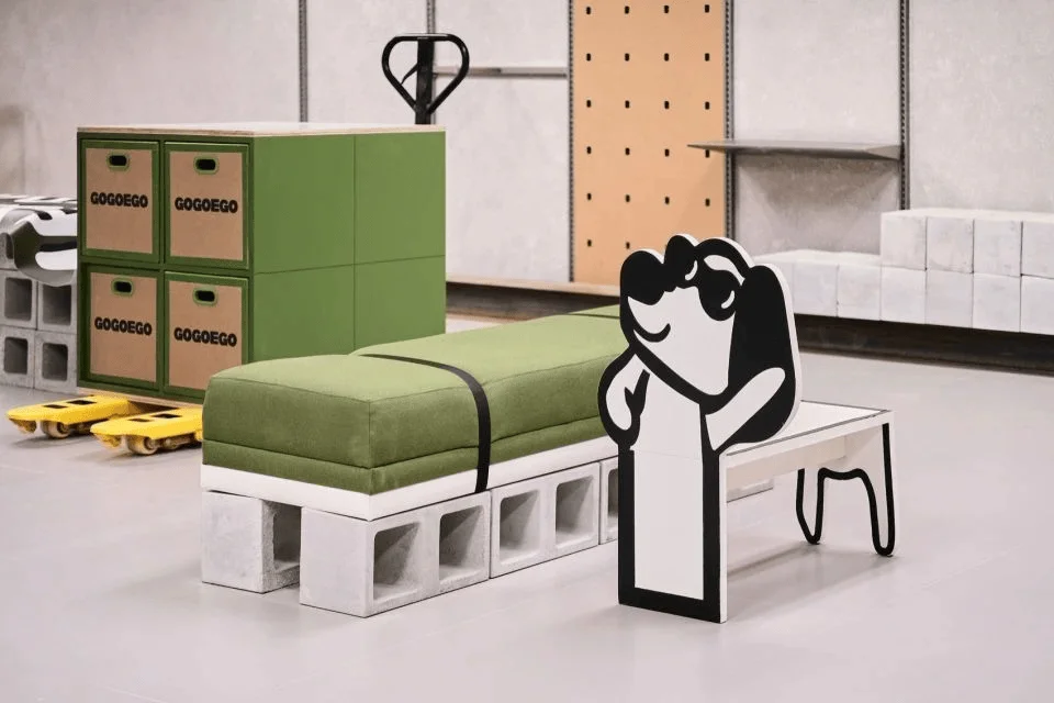
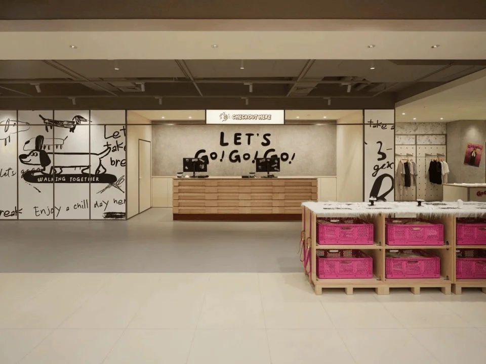
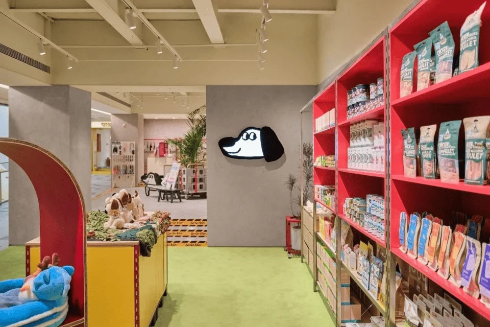
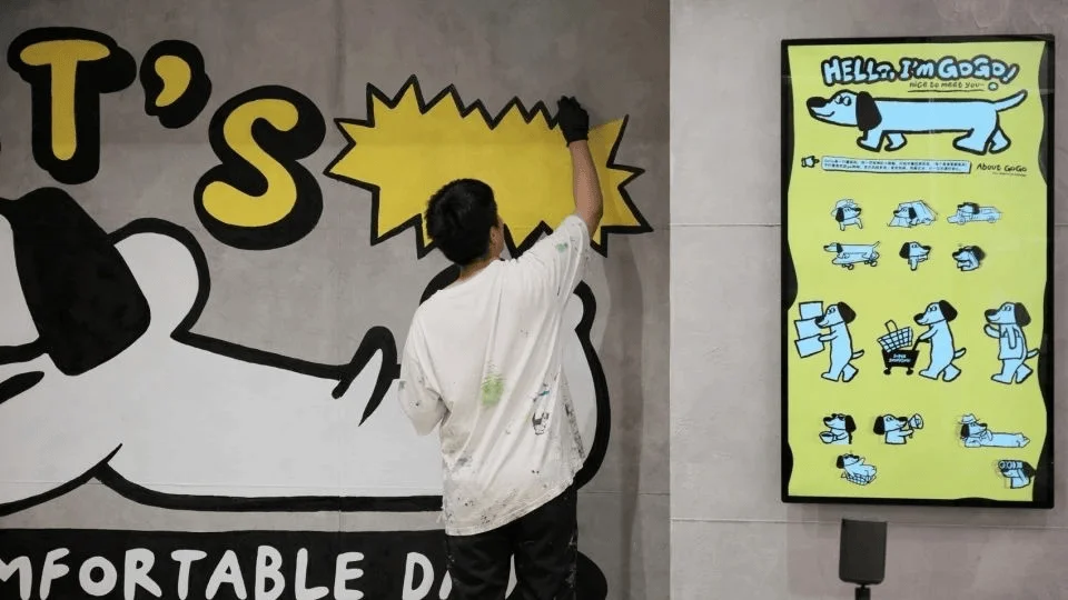
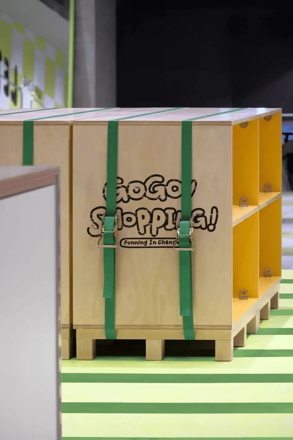
To establish a strong connection with Gen Z, Wing Design incorporated a playful brand identity that resonates with their aesthetic preferences. A dachshund dog mascot was chosen as a core element of the brand image. This decision served several purposes. First, the dachshund dog provided a unifying and easily recognizable logo for the mall, appearing on signage, wayfinding systems, and promotional materials. This visual consistency helped solidify GOGOEGO’s brand identity, enabling the project to stand out in a competitive market. Secondly, the mascot helped foster an emotional connection with the target audience, creating a friendly and accessible atmosphere. This strategy underscores the effectiveness of using emotionally engaging visuals to build brand affinity, especially among younger consumers.
tags: gen z brand identity, brand mascot design, visual identity system, retail branding, chengdu shopping mall design, china retail design
Space Optimization and Circulation
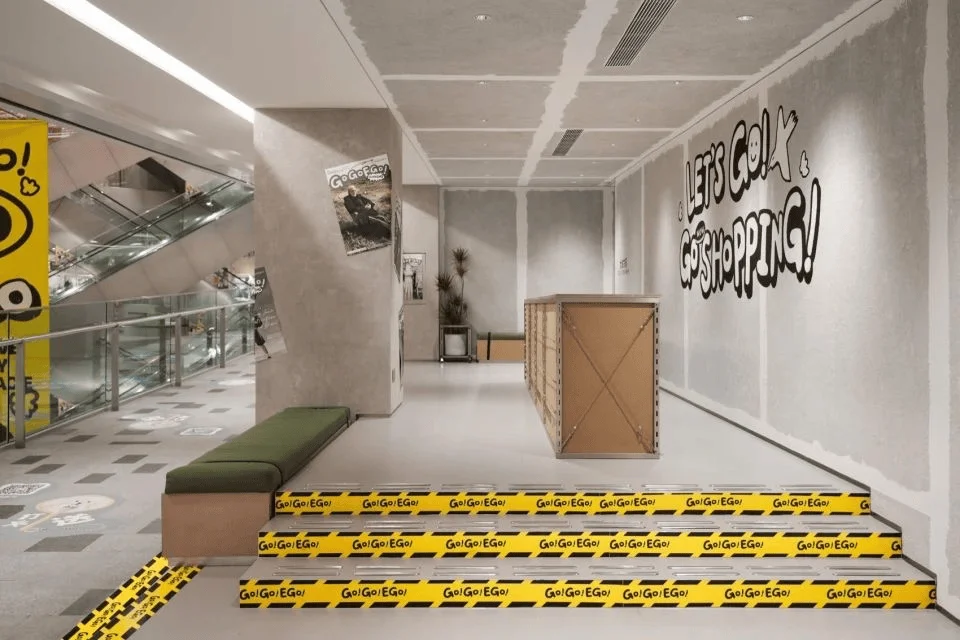
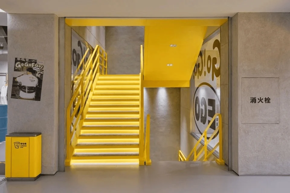
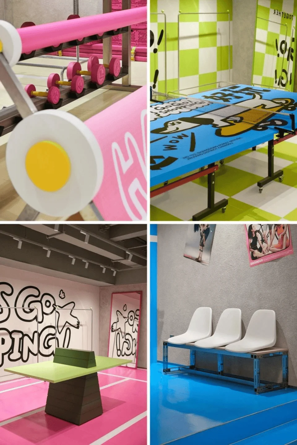
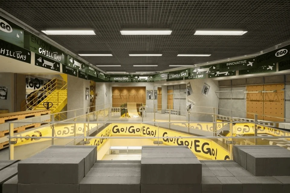
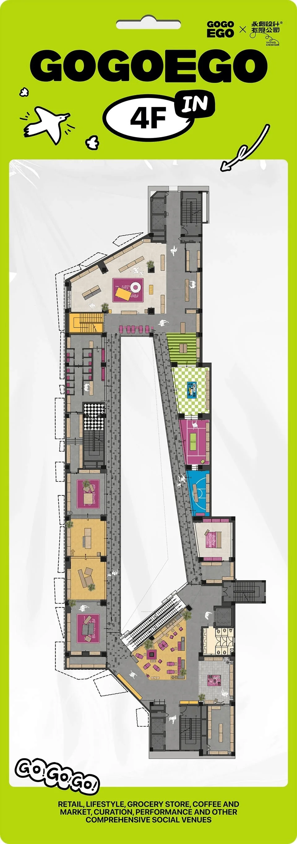
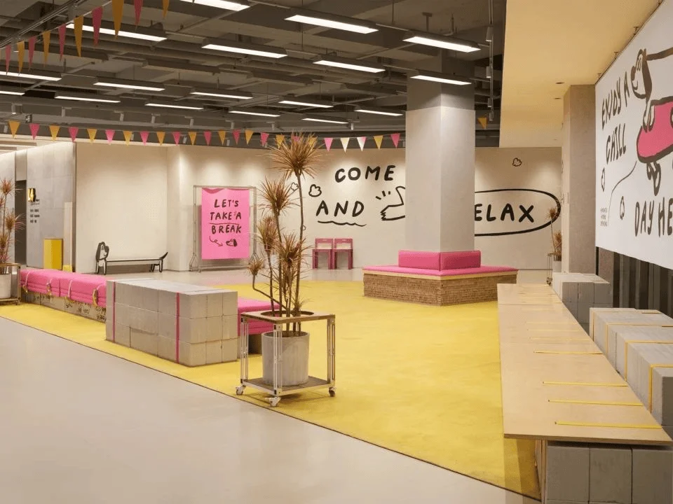
The original EGO mall featured a compact, spiral staircase structure, resulting in a cluttered layout with narrow passages and a dense arrangement of small stores. This presented challenges in terms of visual appeal and spatial flow. Wing Design addressed these issues by strategically optimizing the shopping pathways. They aimed to relieve spatial congestion while transforming the existing spiral staircase into a unique design element. Through vertical design revisions, the firm created a more intuitive and streamlined path for shoppers. By incorporating rest stops and photo opportunities along the pathways, they transitioned the traditional corridor layout into a “street-like” pedestrian path. This not only enhances the shopping experience but also fosters a more engaging and interactive environment that aligns with Gen Z’s social tendencies.
tags: retail space optimization, shopping mall circulation design, pedestrian experience, retail pathway design, shopping mall layout, china shopping center design
Space Zoning and Design Themes
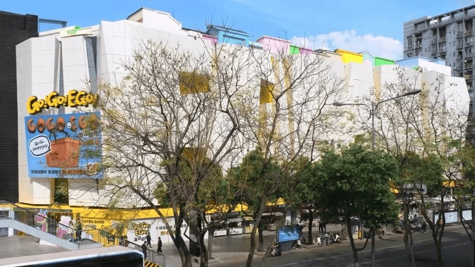
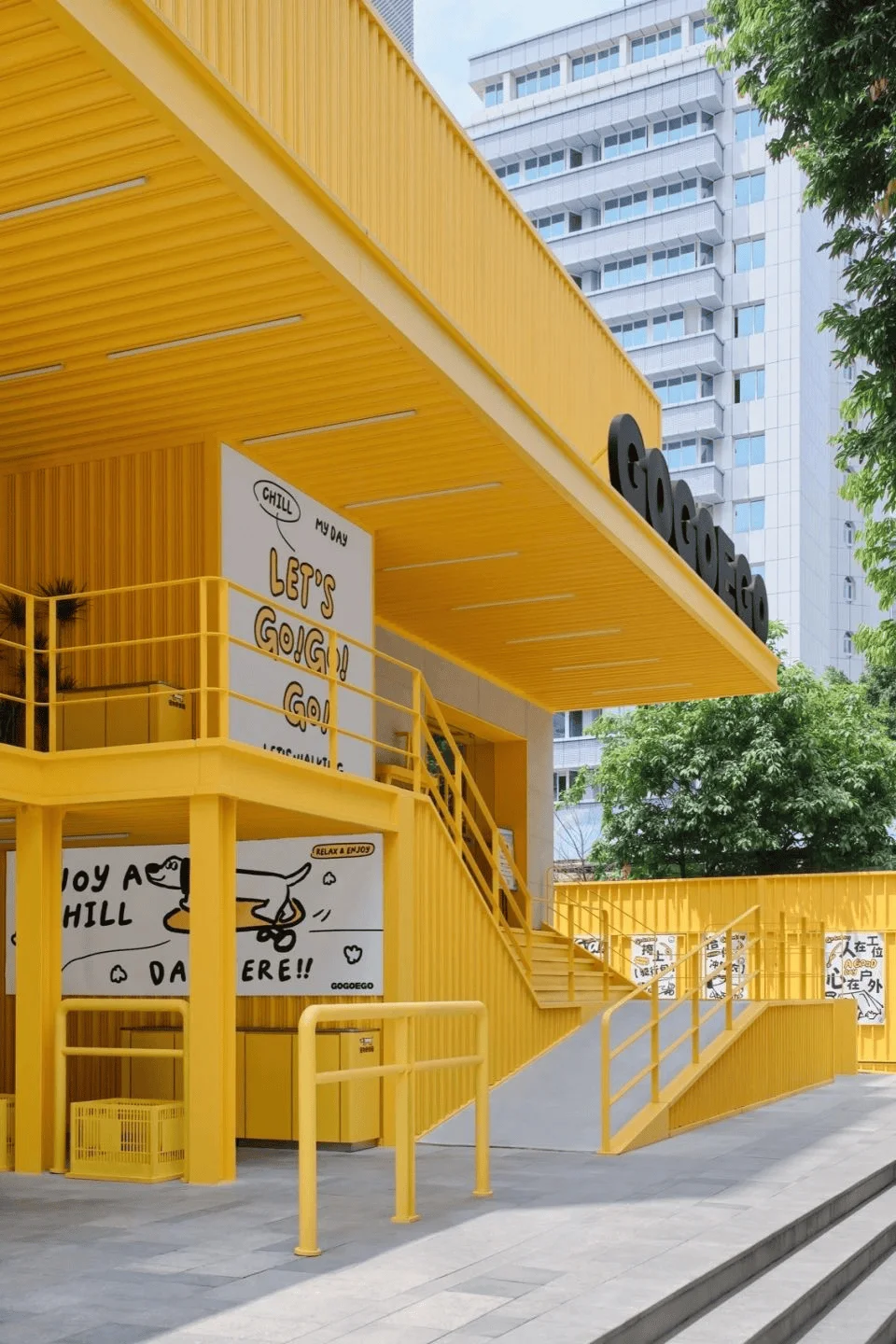
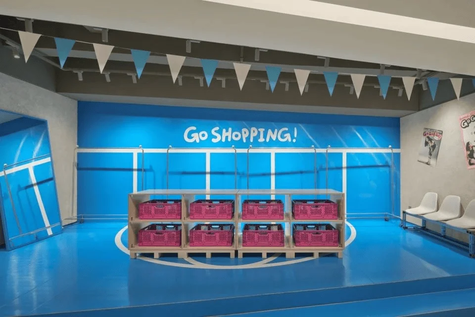
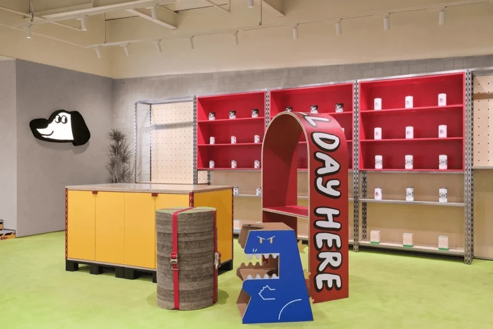
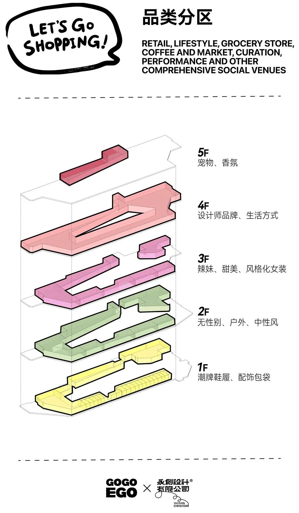
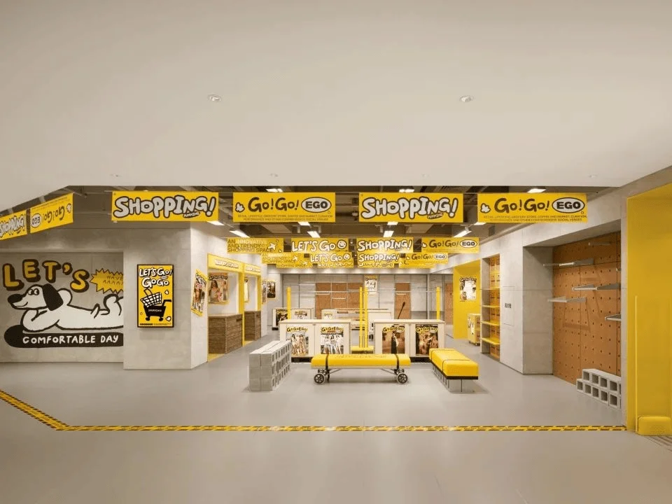
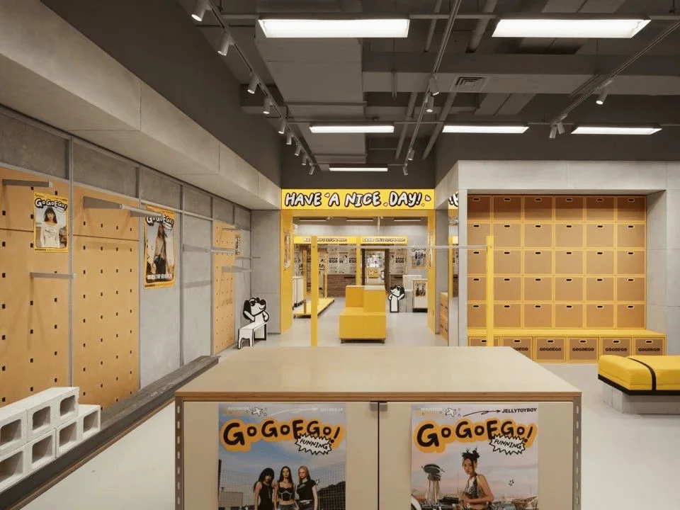
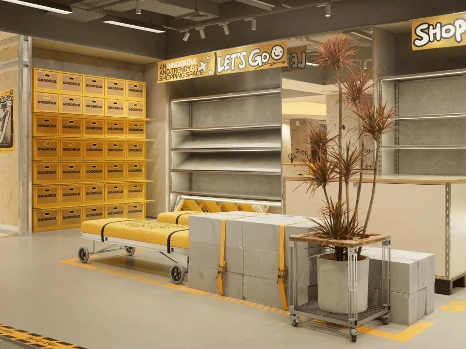
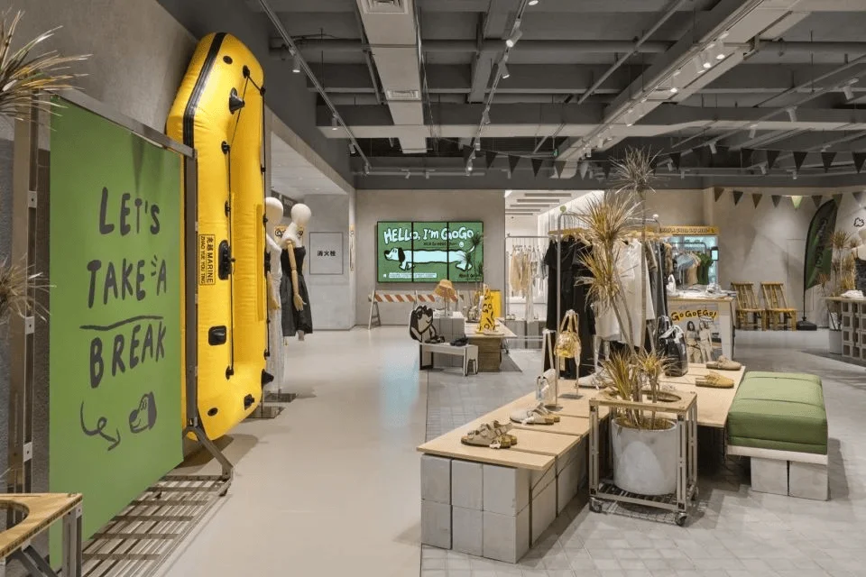
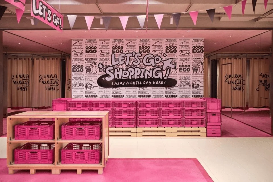
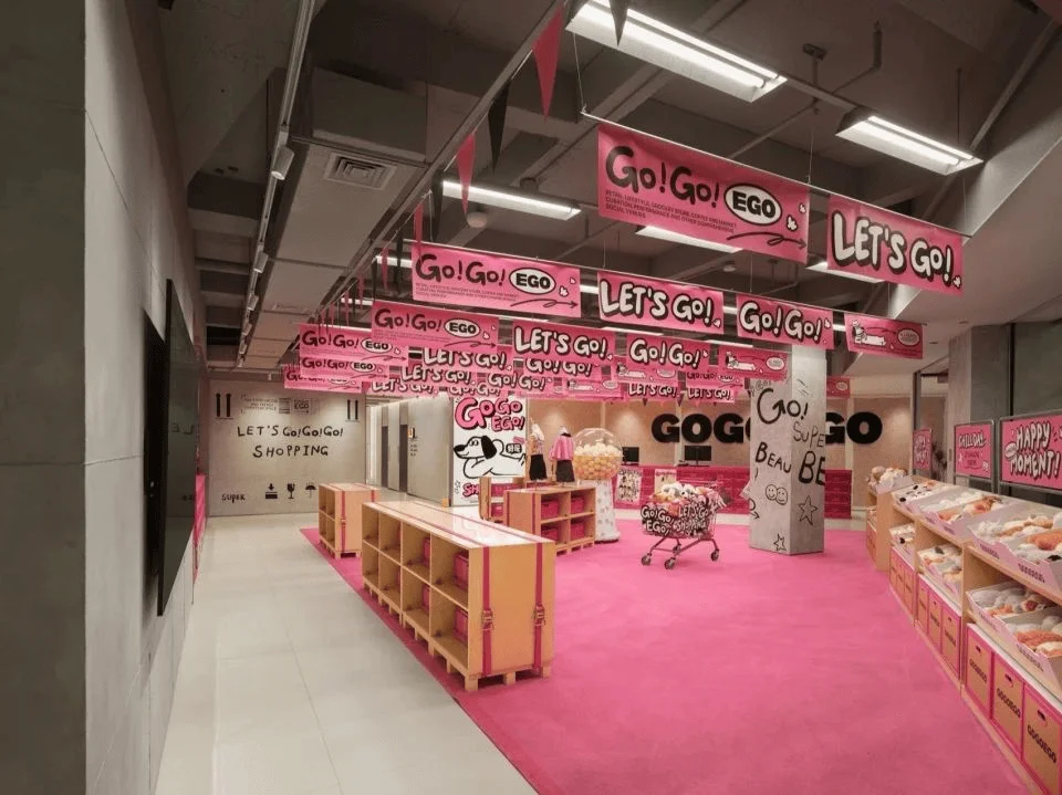
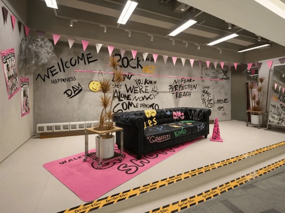
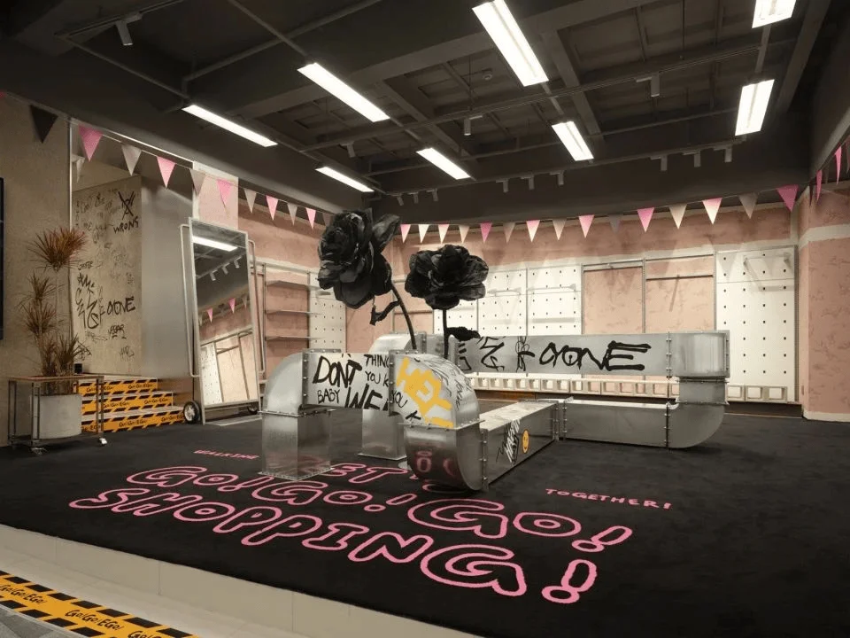
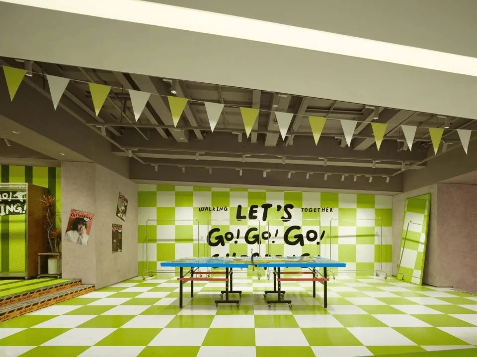
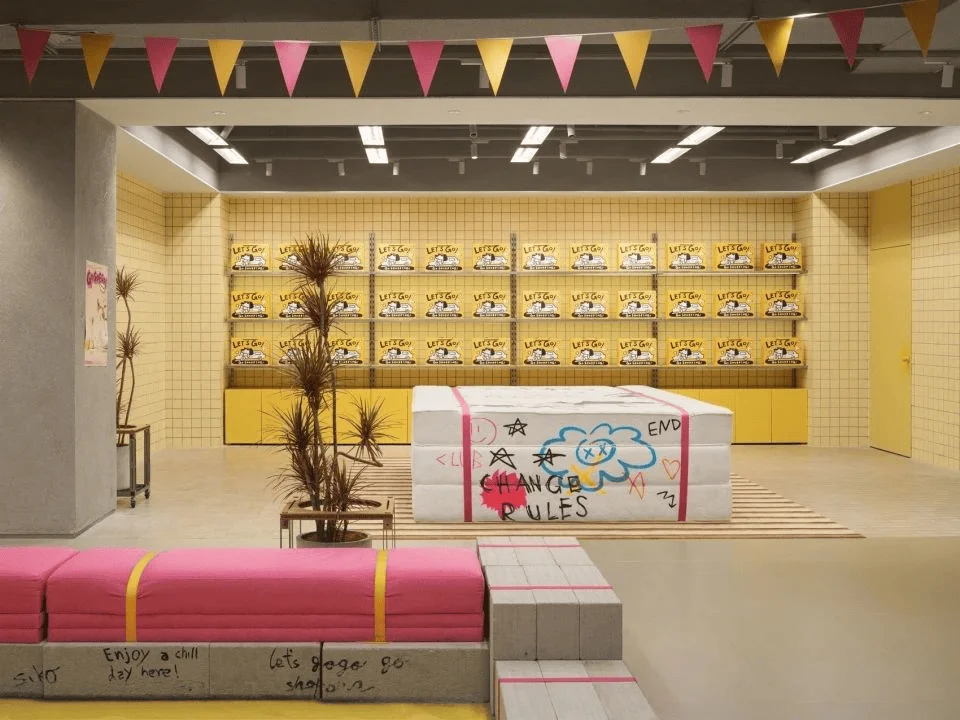
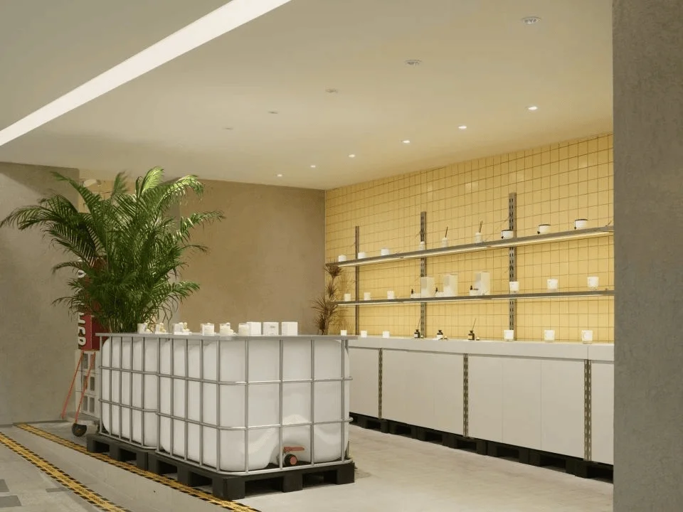
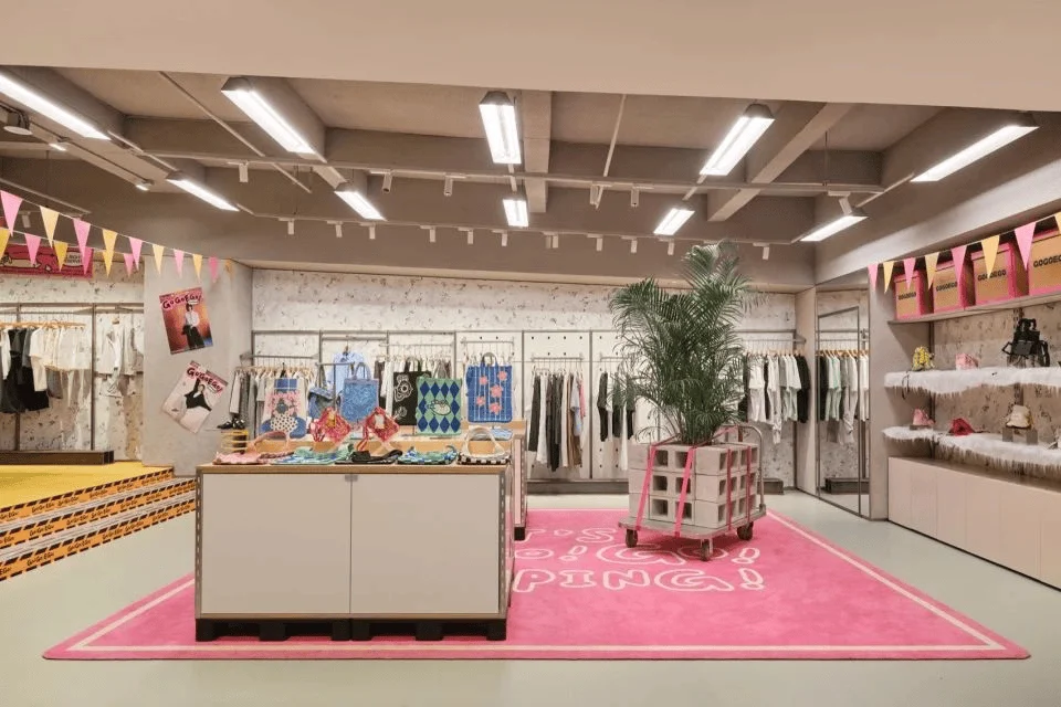
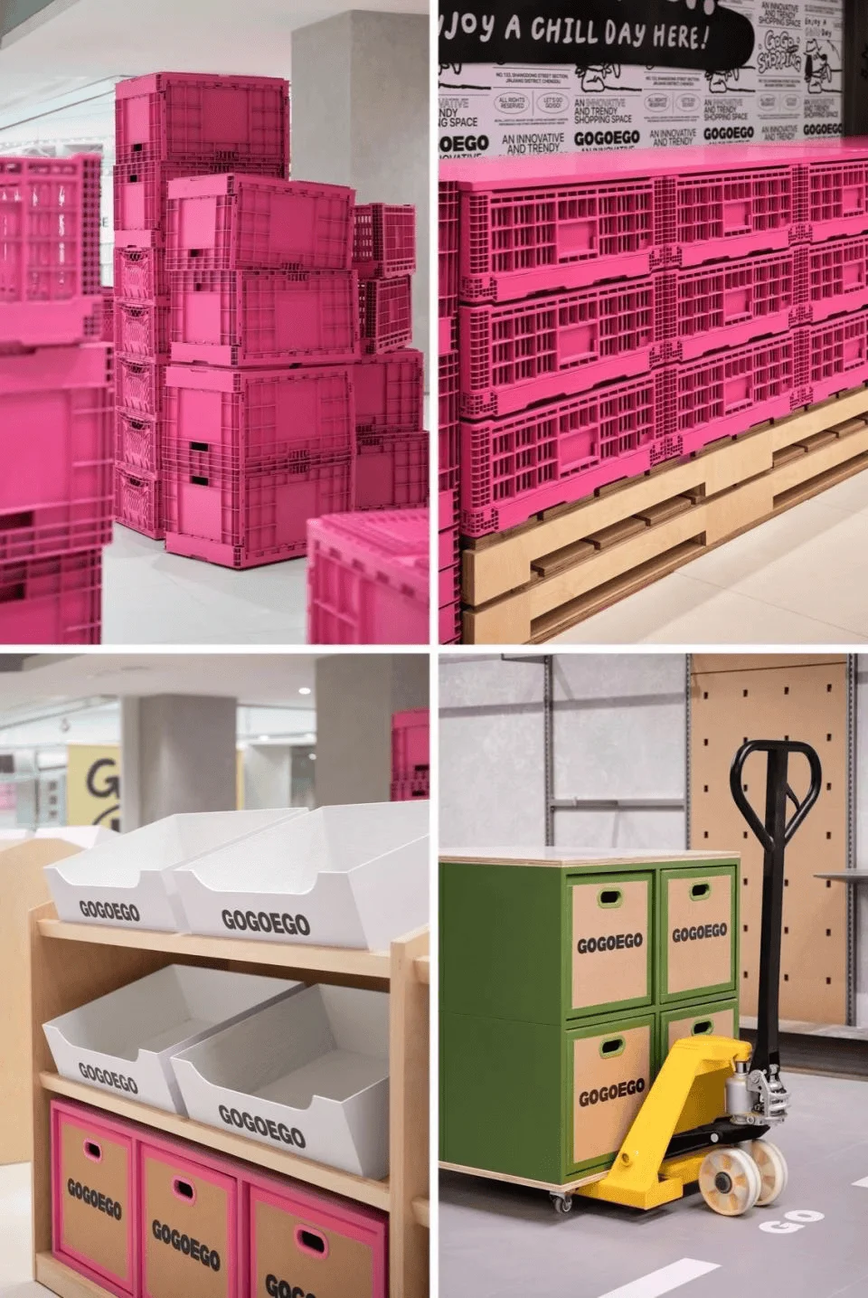
GOGOEGO’s revitalization addressed the lack of visual cohesion and brand identity prevalent in the original EGO mall. It integrated a variety of retail spaces and themes into the existing corridor structure. The design team thoughtfully planned five distinct thematic zones, each with a characteristic color palette to enhance brand recognition. The mall houses over 200 brands, encompassing categories such as footwear, apparel, accessories, fragrances, and pet supplies, positioning it as a “trendy supermarket.” This design approach effectively blends the dachshund dog mascot and the street-style corridor layout with the diverse brand offerings within the shopping center. The ground floor adopts a bright yellow tone, the core color of the brand’s visual identity, to symbolize fashion and trendiness. Subsequent floors cater to a variety of Gen Z style preferences. For example, the second floor features a refreshing green color scheme focused on unisex and outdoor styles, while the third floor utilizes a feminine pink hue, showcasing trendy and sweet styles. Each floor provides a distinct aesthetic experience that draws in Gen Z consumers who are drawn to variety and uniqueness.
tags: retail space zoning, shopping mall design themes, brand colors, retail interior design, shopping mall space planning, retail design china
Materials and Sustainable Design
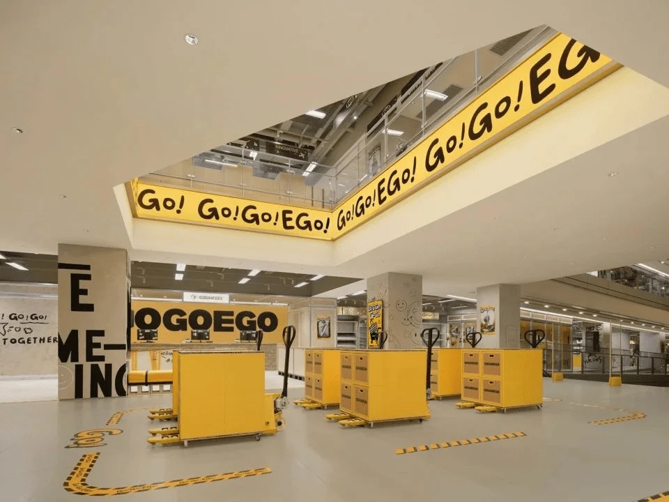
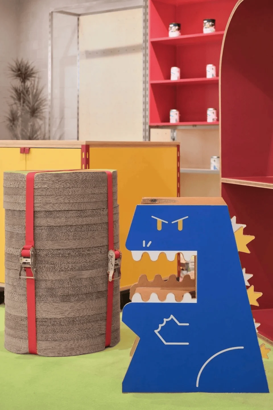
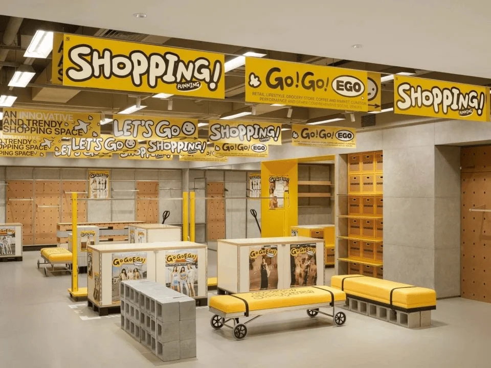
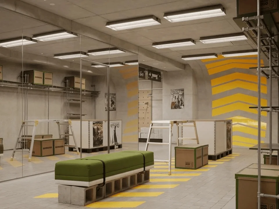
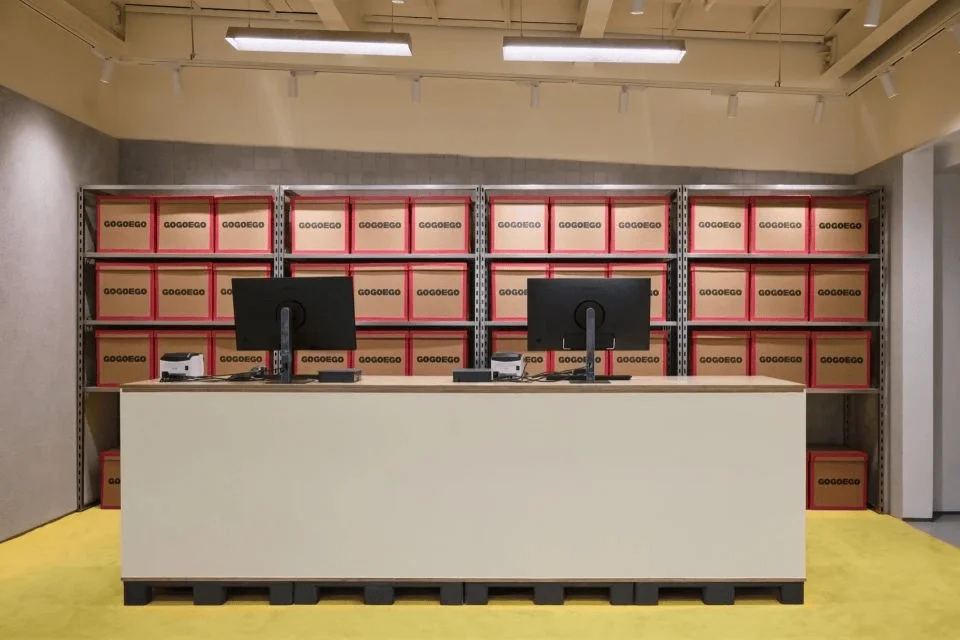
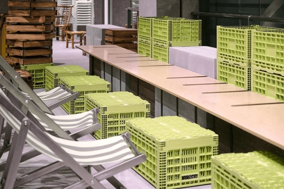
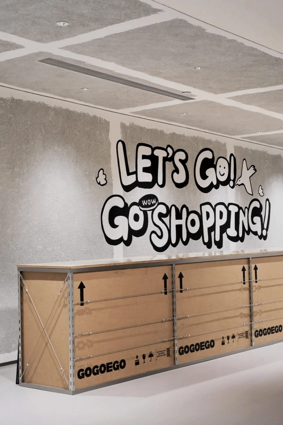
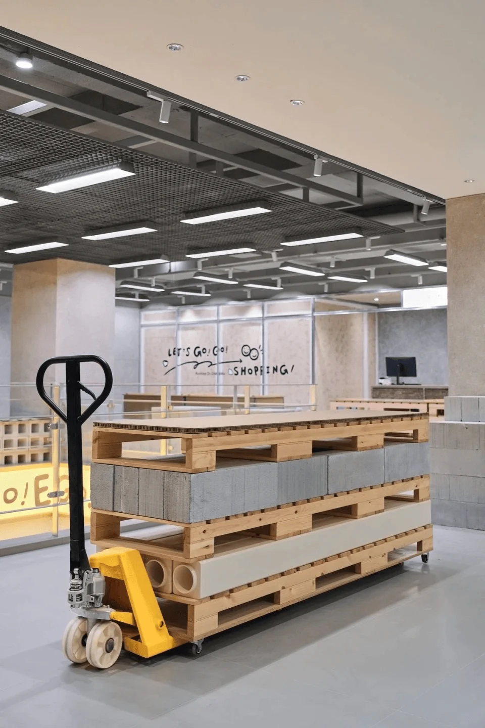
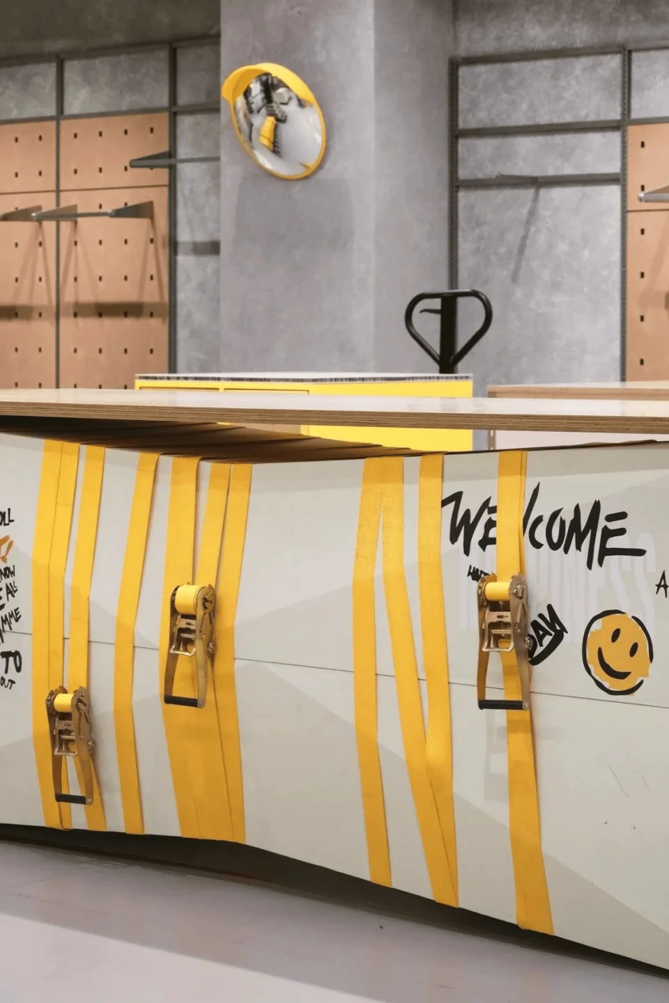
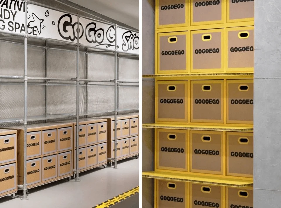
Recognizing the need to manage costs and minimize disruption during the renovation, Wing Design adopted a strategy of using lightweight materials. This included materials like corrugated cardboard, kraft paper, and recycled elements. These choices helped to expedite construction and control costs while also creating a unique visual contrast between old and new. The project demonstrates a commitment to sustainability and cost-effectiveness, which is valuable for both the developer and the community. In addition, the design implemented a system of lightweight and mobile furniture and display elements. This approach promotes efficient storage and customization of space, allowing for quick adaptations to various needs and scenarios. The mall can quickly change the layout and brands to keep the shopper experience fresh. It is a smart way to help create a sense of excitement and engagement with the customers.
tags: sustainable retail design, material selection, lightweight design, flexible retail fixtures, adaptive reuse, china commercial design
Social Impact and Community Engagement
The revitalized GOGOEGO mall quickly gained popularity among Gen Z, becoming a trending topic and a popular destination on social media platforms like Xiaohongshu. For Gen Z, GOGOEGO isn’t just a retail space; it symbolizes a sense of identity and belonging. It represents a break from tradition, a desire for individuality, a pursuit of a relaxed and enjoyable atmosphere, and access to quality products at affordable prices. This success underscores the importance of designing spaces that cater to the specific needs and aspirations of target audiences. By blending shopping with recreational elements, creative markets, cultural exhibitions, and a pet-friendly environment, the space has become a comprehensive social hub. GOGOEGO has successfully created a vibrant social scene where young people feel comfortable and engaged. This is a model that other retail spaces could learn from.
tags: gen z shopping culture, social media engagement, community interaction, retail experience design, china retail design trends, experiential retail
Conclusion and Future Implications
The GOGOEGO Trendy Supermarket exemplifies how a thoughtful design approach can successfully revitalize an aging shopping mall and attract a younger demographic. It highlights the significance of adapting to changing consumer preferences, incorporating playful branding and visual elements, and optimizing spaces for a more enjoyable experience. This project showcases the power of design in crafting spaces that are not only functional but also resonate with the specific needs and aspirations of the community. By retaining and enhancing the mall’s unique features, integrating diverse functions and experiences, and promoting social interaction, the GOGOEGO project has set a new benchmark for retail space rejuvenation in China and around the world.
tags: shopping mall design future trends, retail design best practices, shopping mall revitalization, gen z retail strategy, chengdu architectural design, china architectural design
Project Information:
Project Type: Commercial Buildings
Architect: Wing Design
Area: 6000m2
Year: 2024
Country: China
Photographer: Ray, Yan Yu Na Xin


