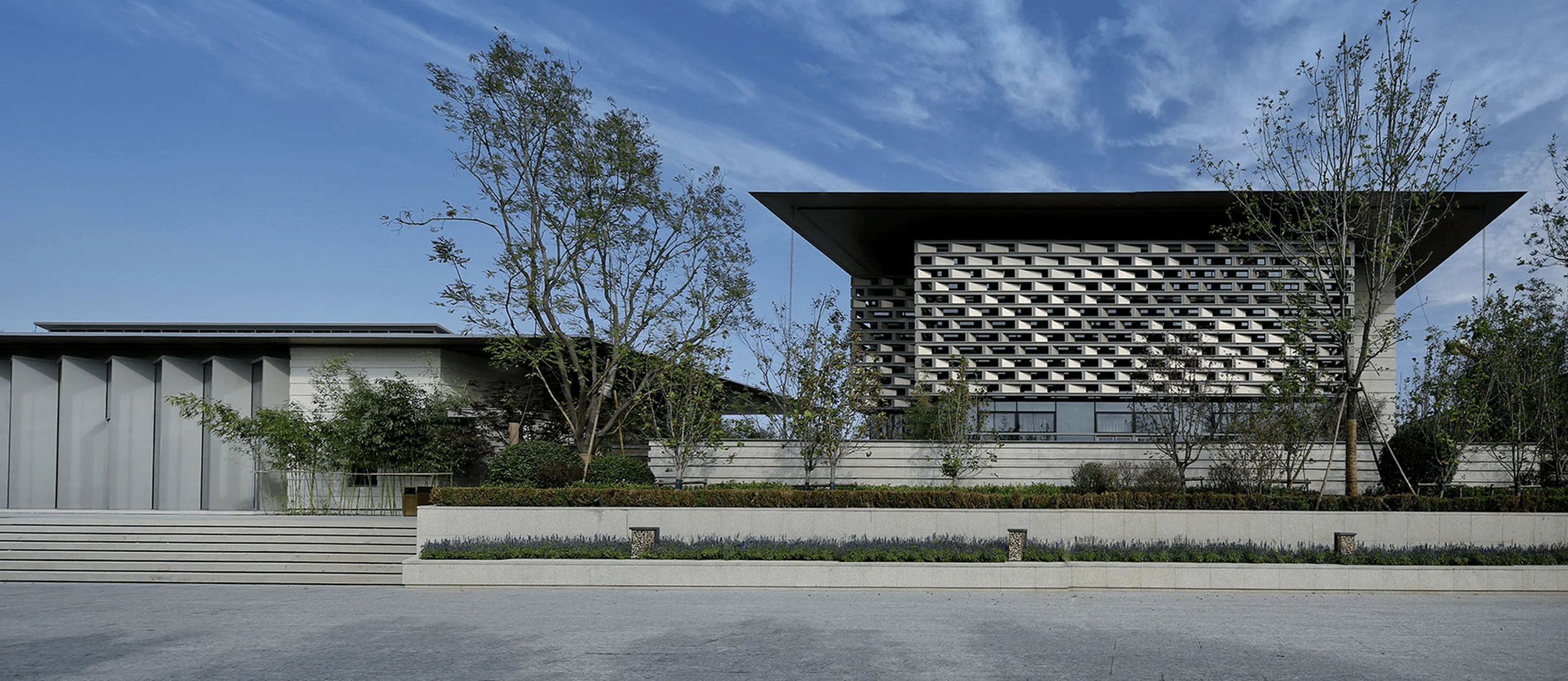
TIME TO GATHER designs AVVENN’s flagship store in Shanghai, embodying Pioneer Harmonism through commercial architecture design.
Contents
Embracing Pioneer Harmonism in Commercial Architecture Design
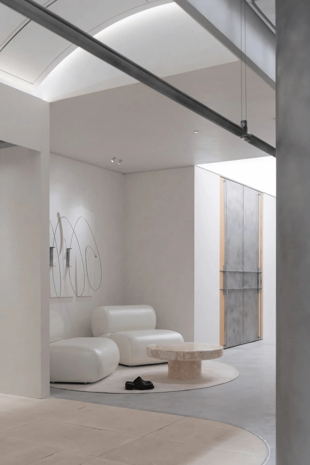
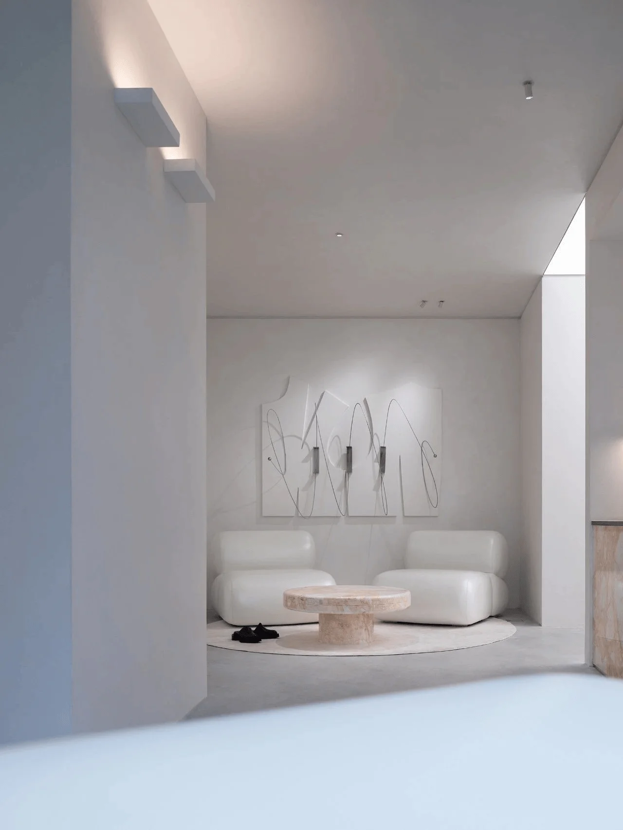
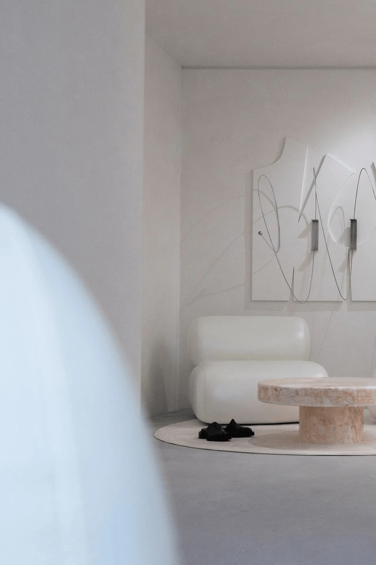
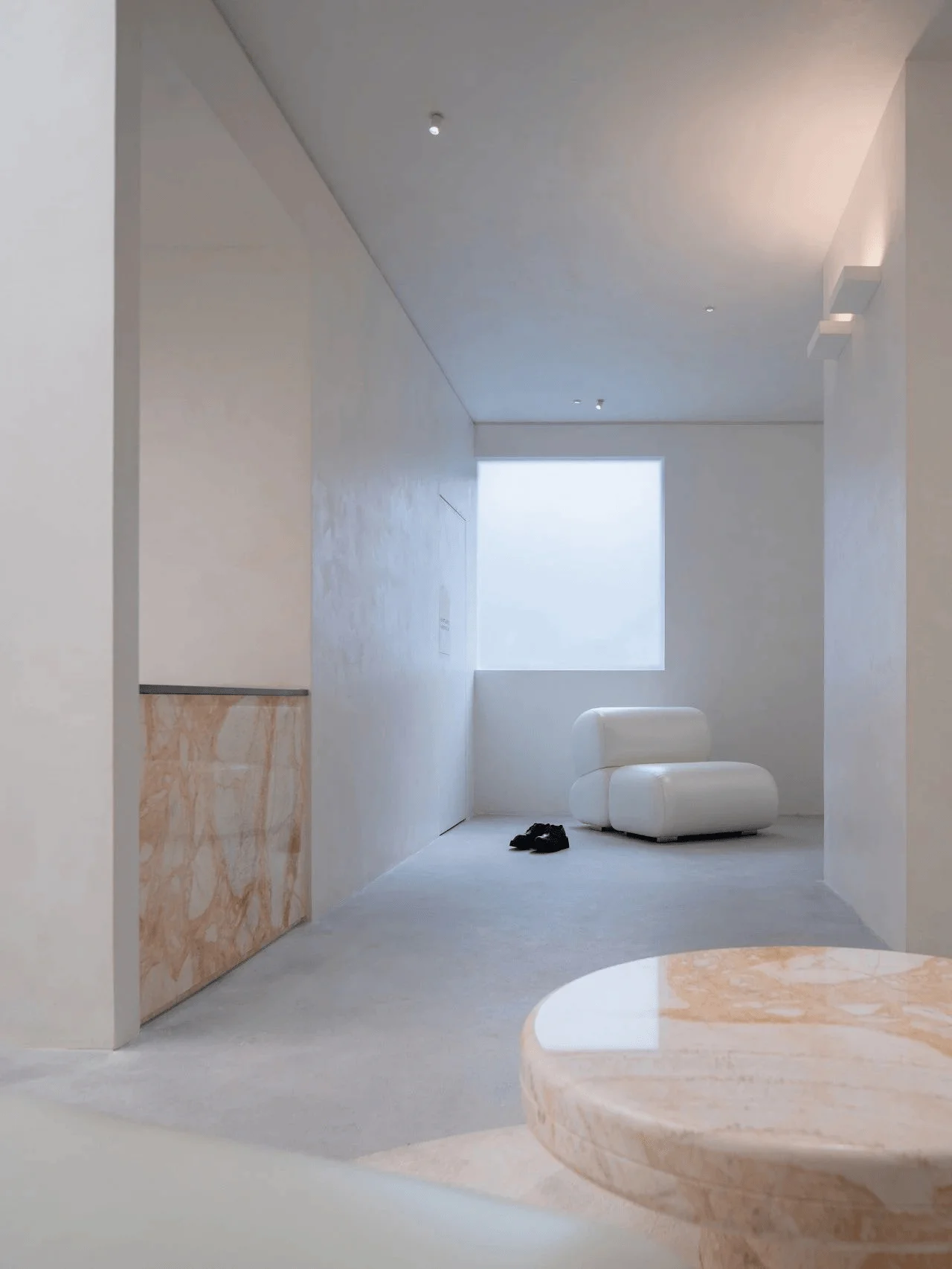
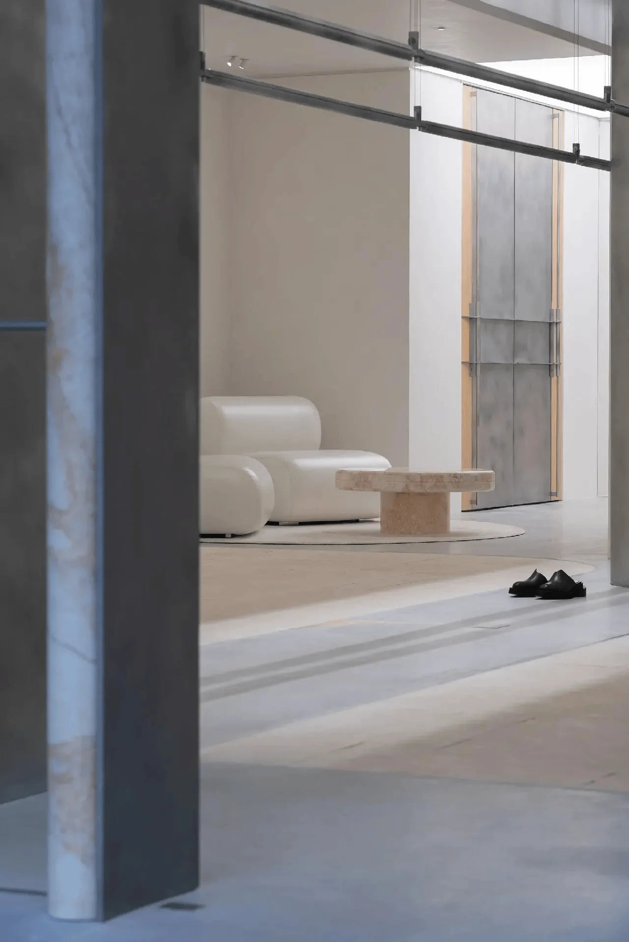
AVVENN, a Shanghai-based designer brand established in 2021, blends artistic aesthetics and avant-garde consciousness in its clothing designs. Their new flagship store, designed by TIME TO GATHER, serves as a physical embodiment of the brand’s ‘Pioneer Harmonism’ philosophy. This design approach is evident throughout the store’s architecture, interior design, and intricate details, demonstrating the brand’s unique approach to commercial architecture design. The store’s design cleverly balances contradictions, merging sharp lines with a relaxed atmosphere and showcasing the brand’s commitment to innovation and individuality within the commercial landscape.
The Facade: A Unique Expression of Commercial Architecture Design
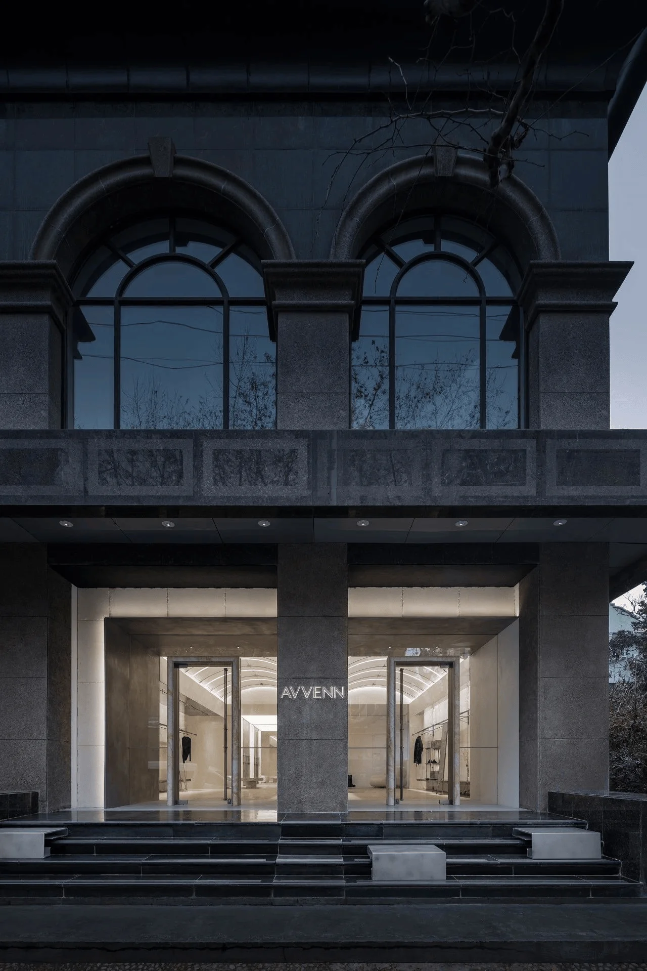
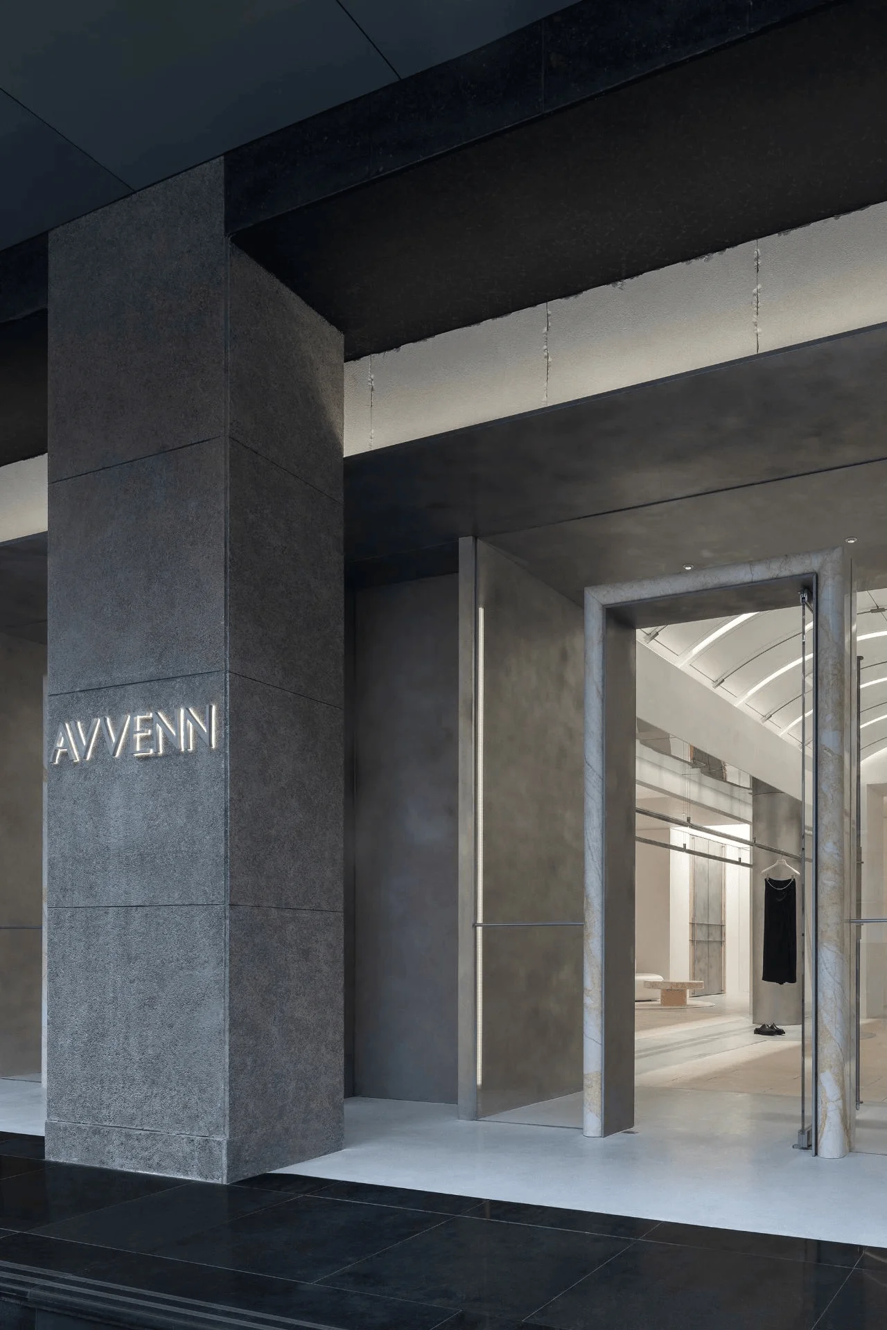
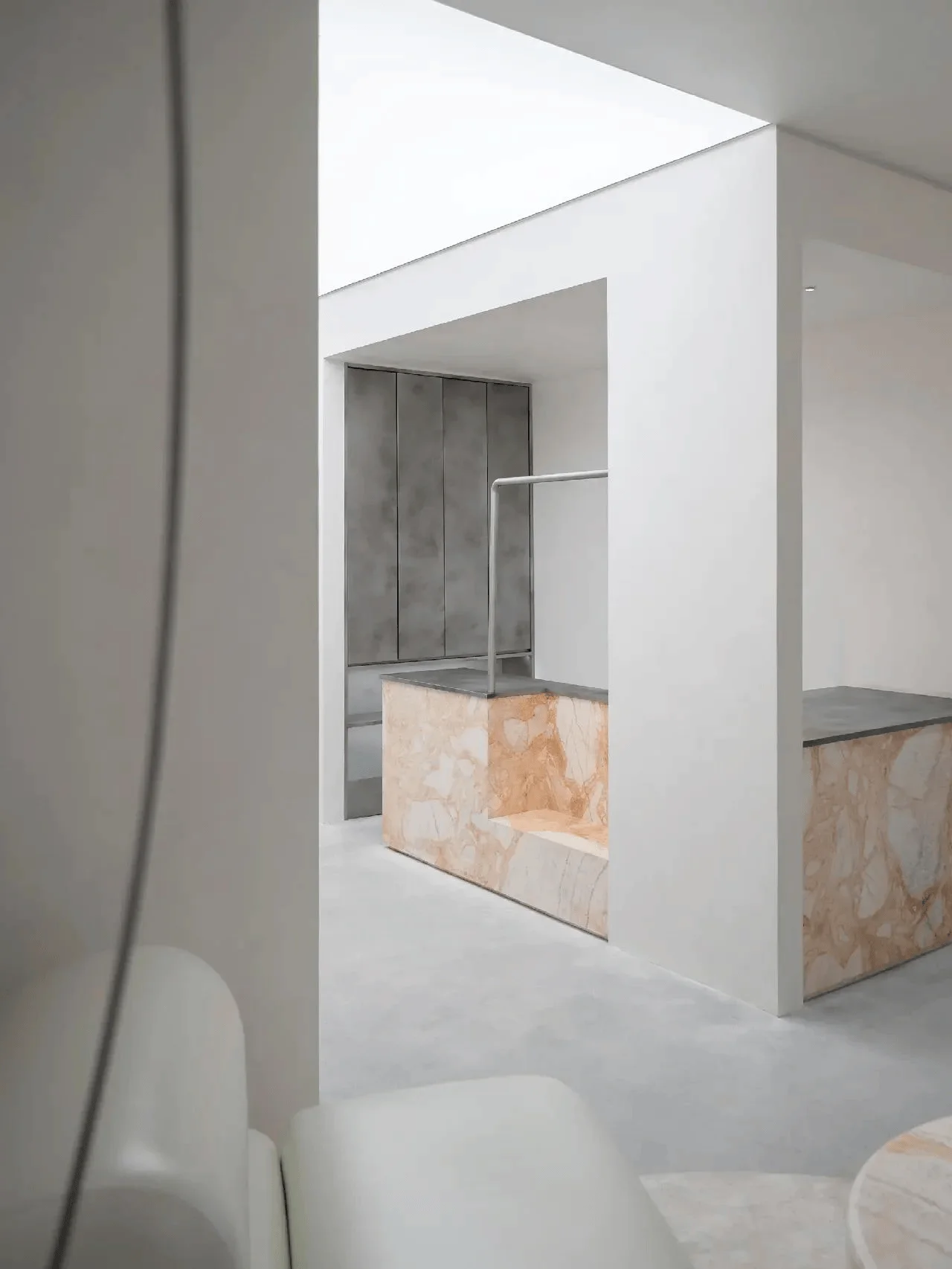
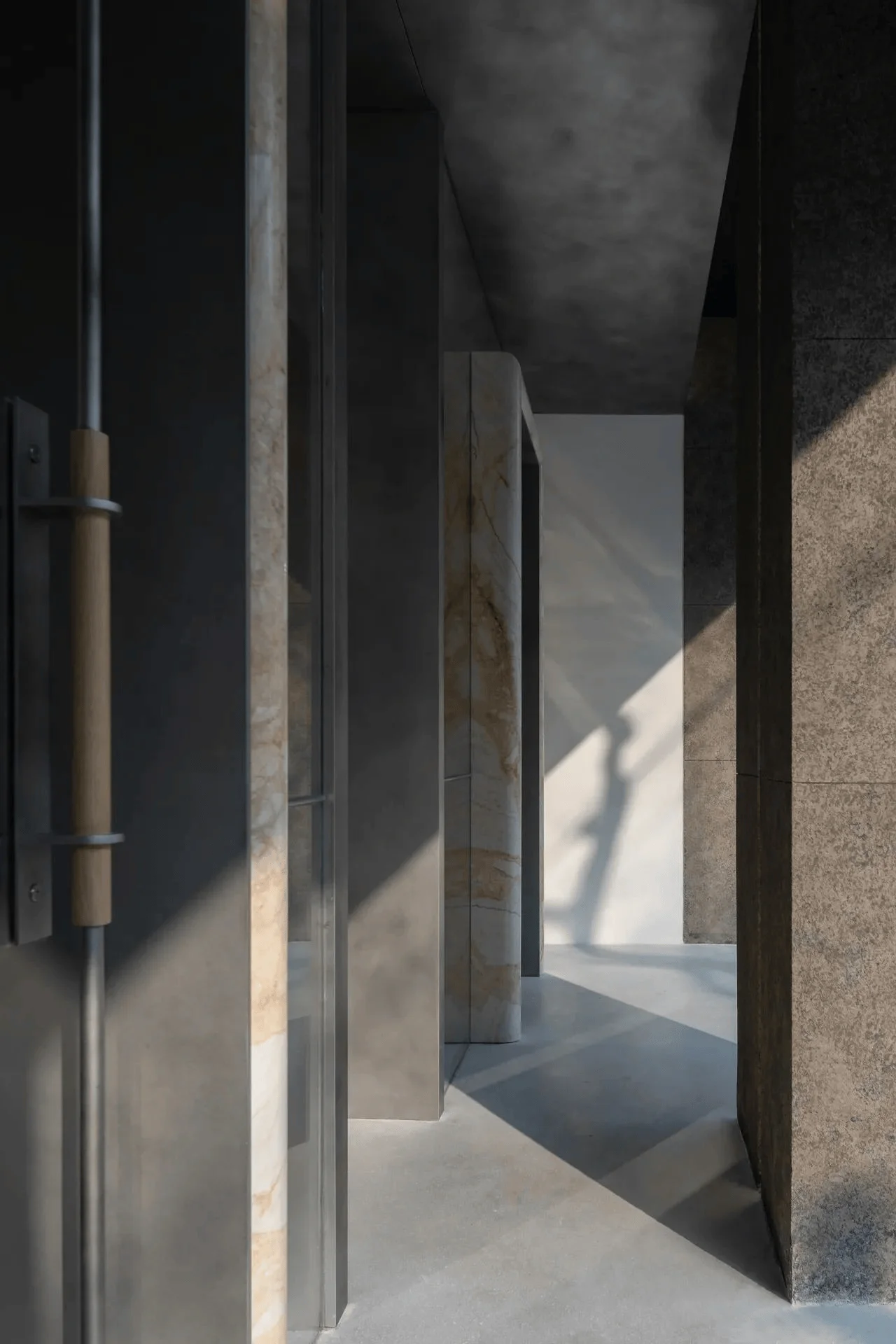
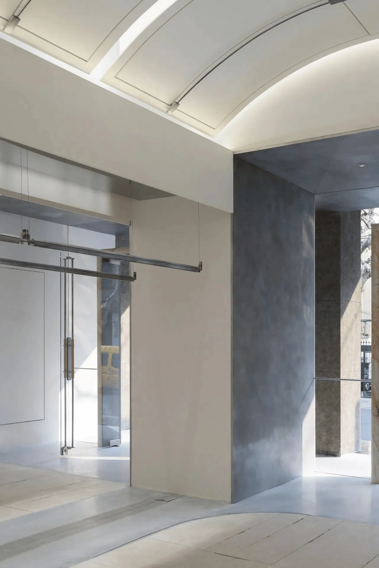
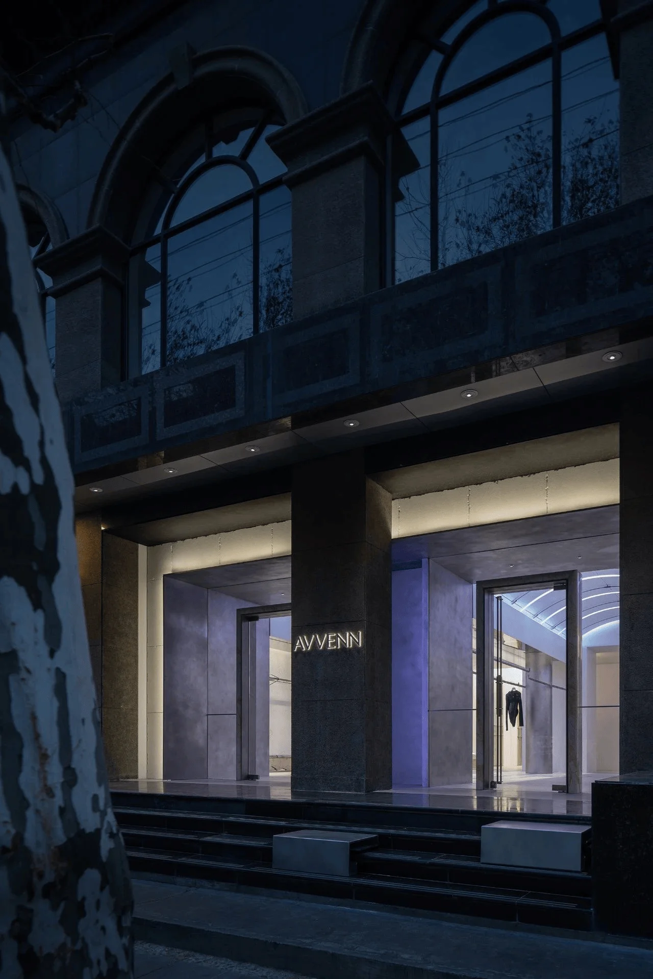
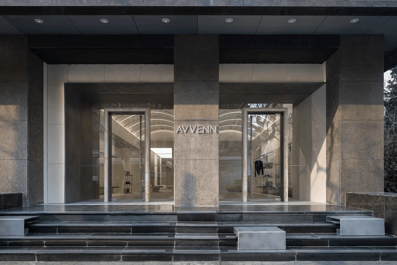
The store’s facade exemplifies its unique approach to commercial architecture design. Natural stone, a primary material for the embedded structure, creates a distinctive exterior. Metal blocks, interwoven from the outside to the inside, visually enhance the passageway, guiding foot traffic and creating a sense of ceremony upon entry. This interplay of materials softens the facade’s rigidity and evokes a sense of warmth and history. The L-shaped structure breaks from traditional forms, featuring symmetrical entrances on either side, boldly expressing the brand’s Pioneer Harmonism philosophy. This unconventional approach showcases the brand’s forward-thinking vision within the realm of commercial architecture design.
Interior Design: Reflecting the Brand’s Philosophy
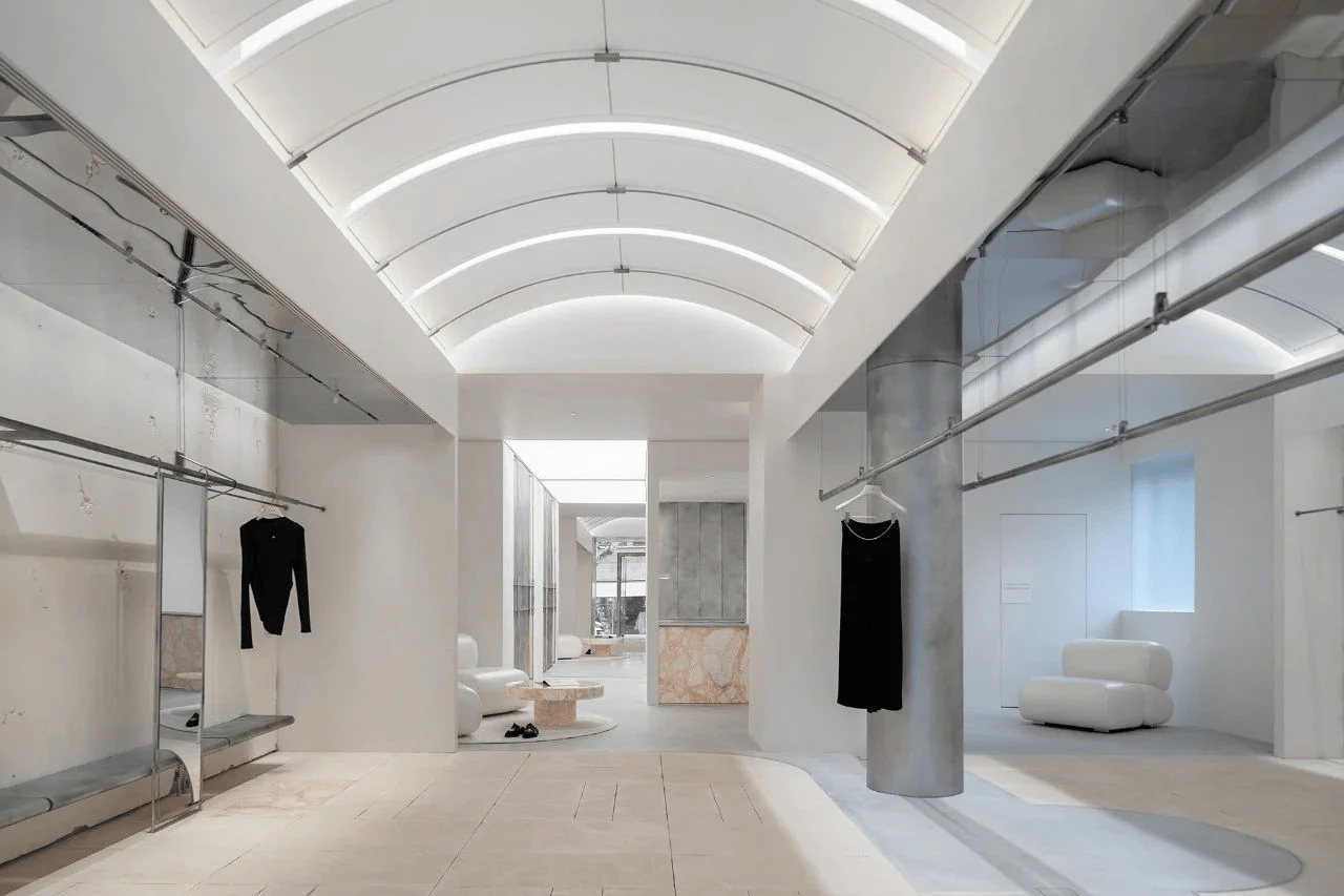
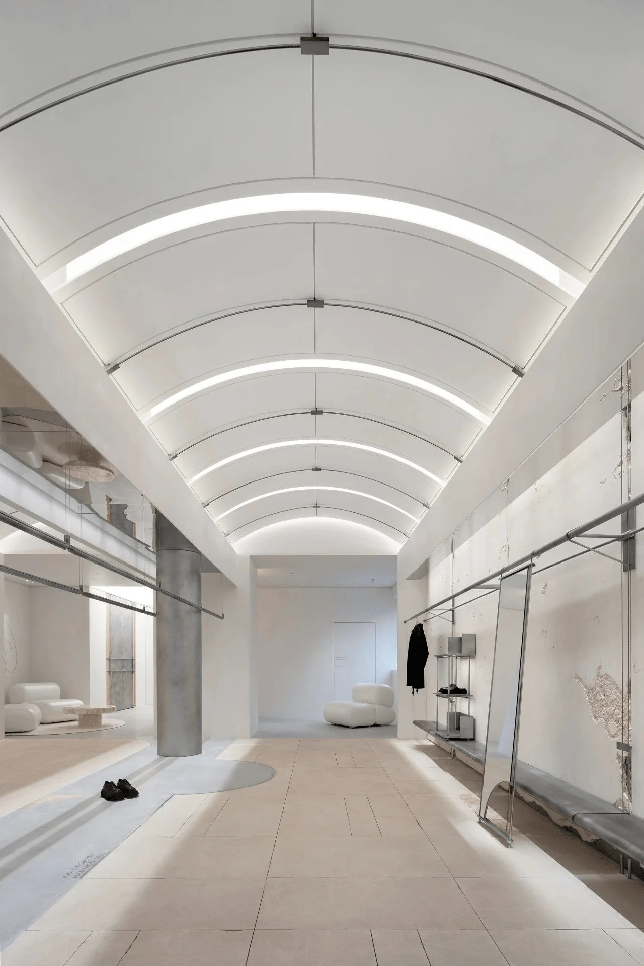
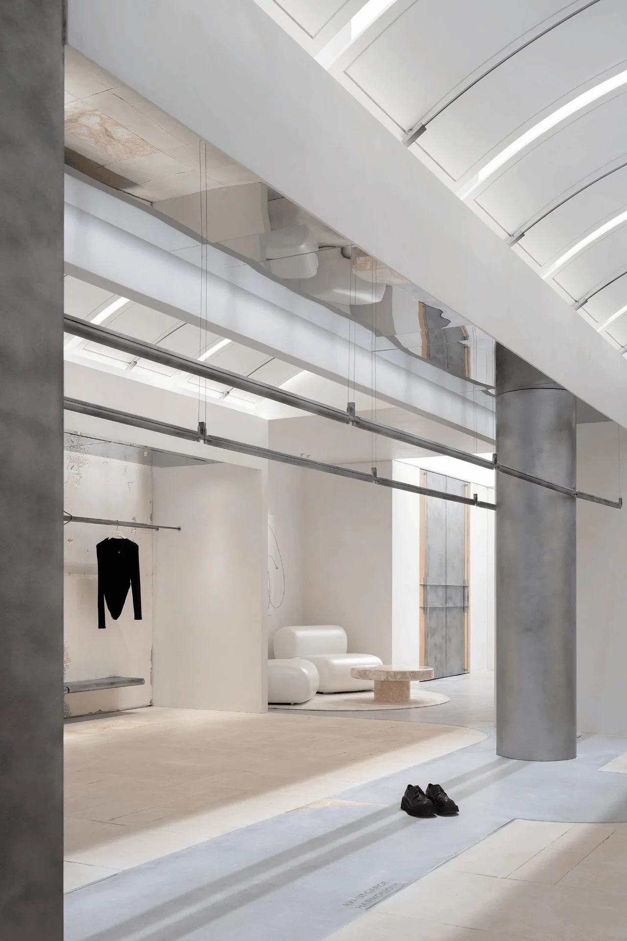
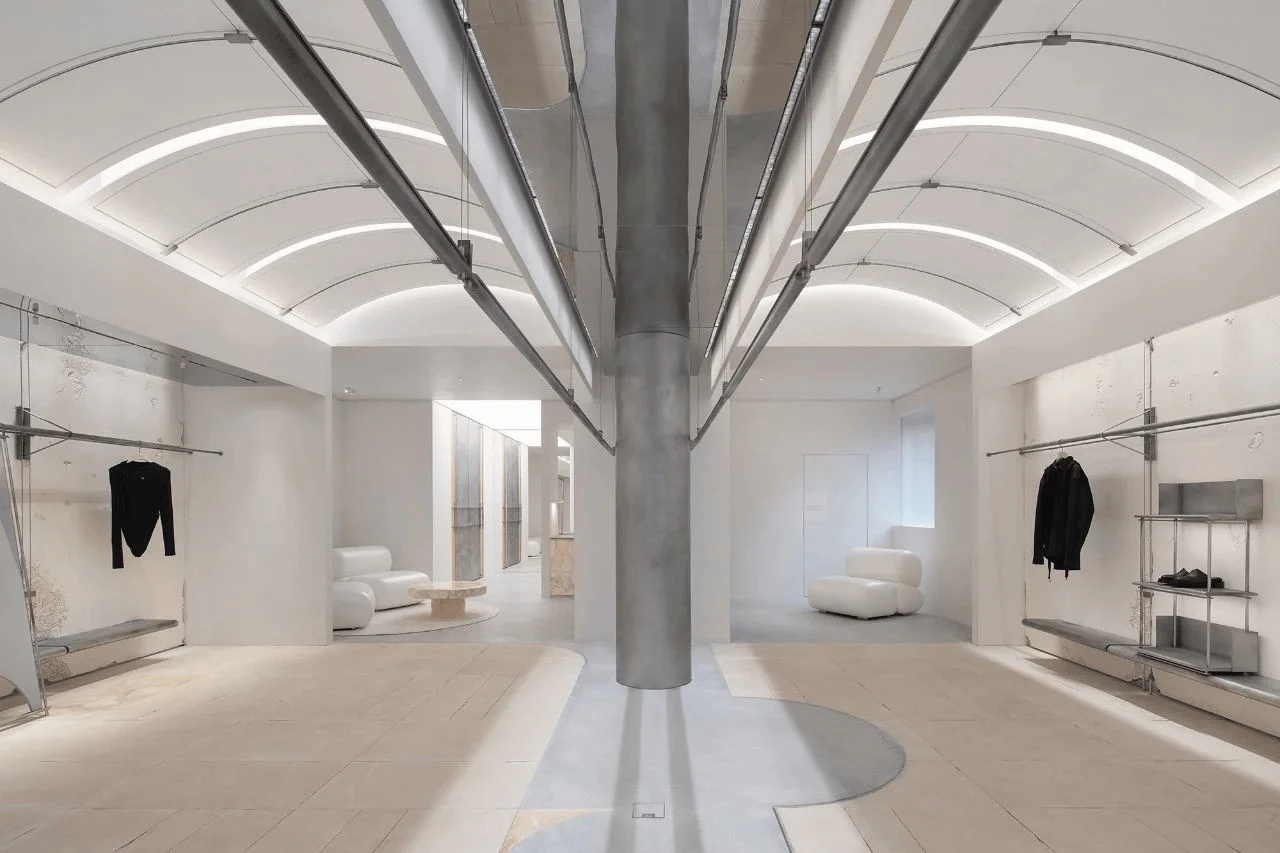
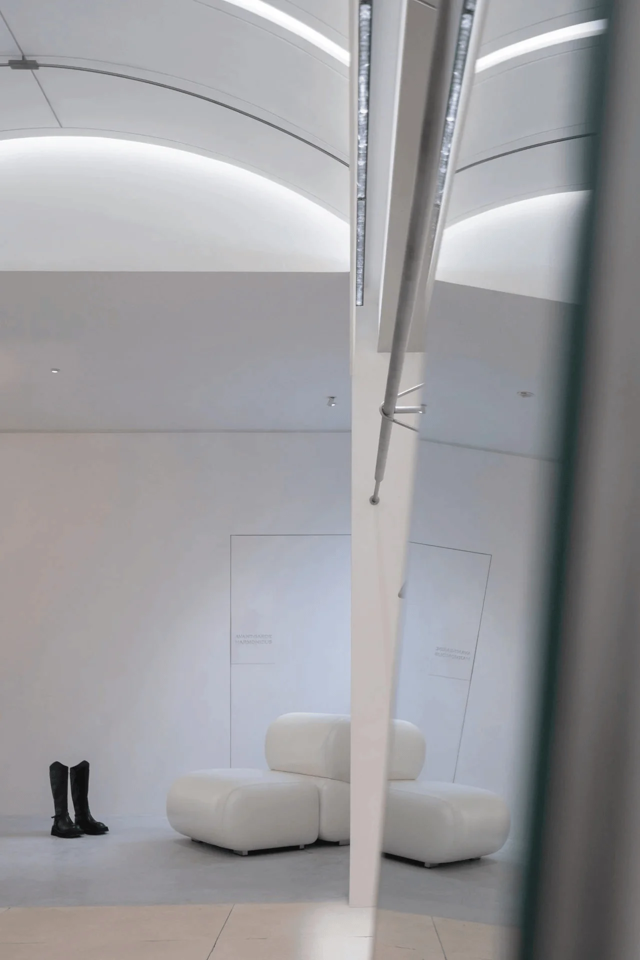
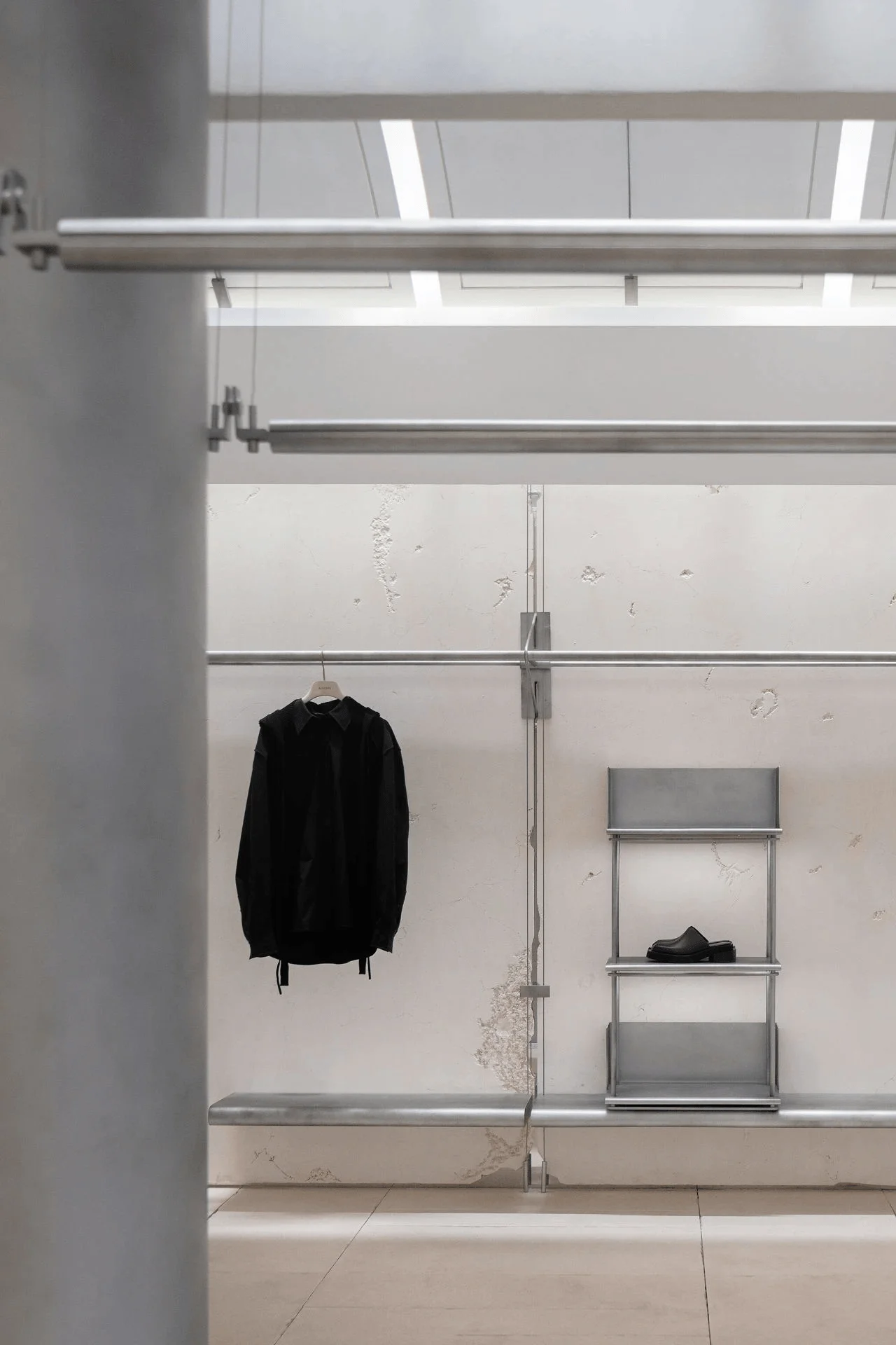
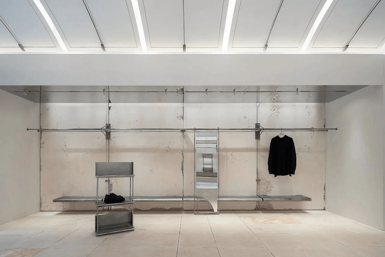
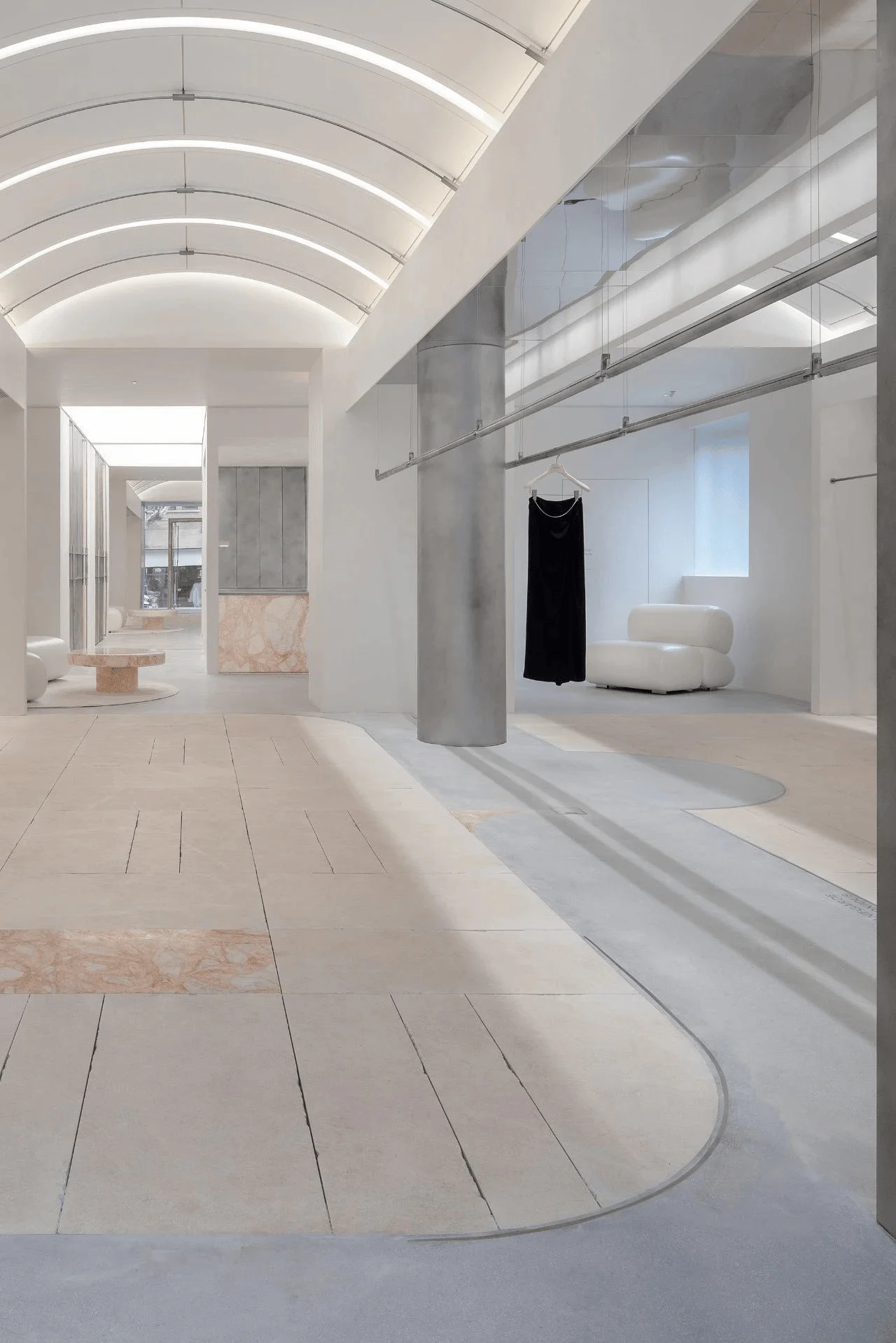
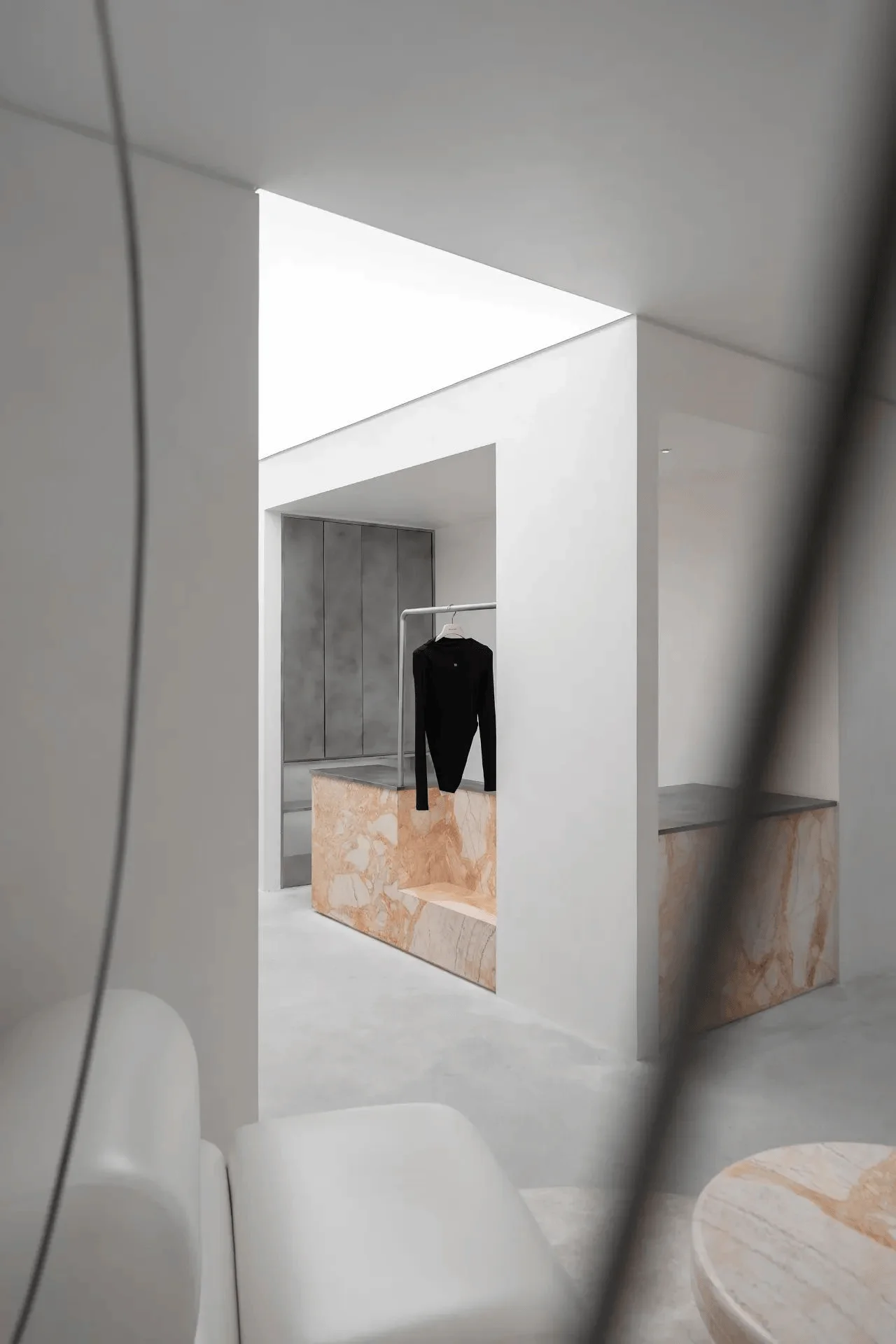
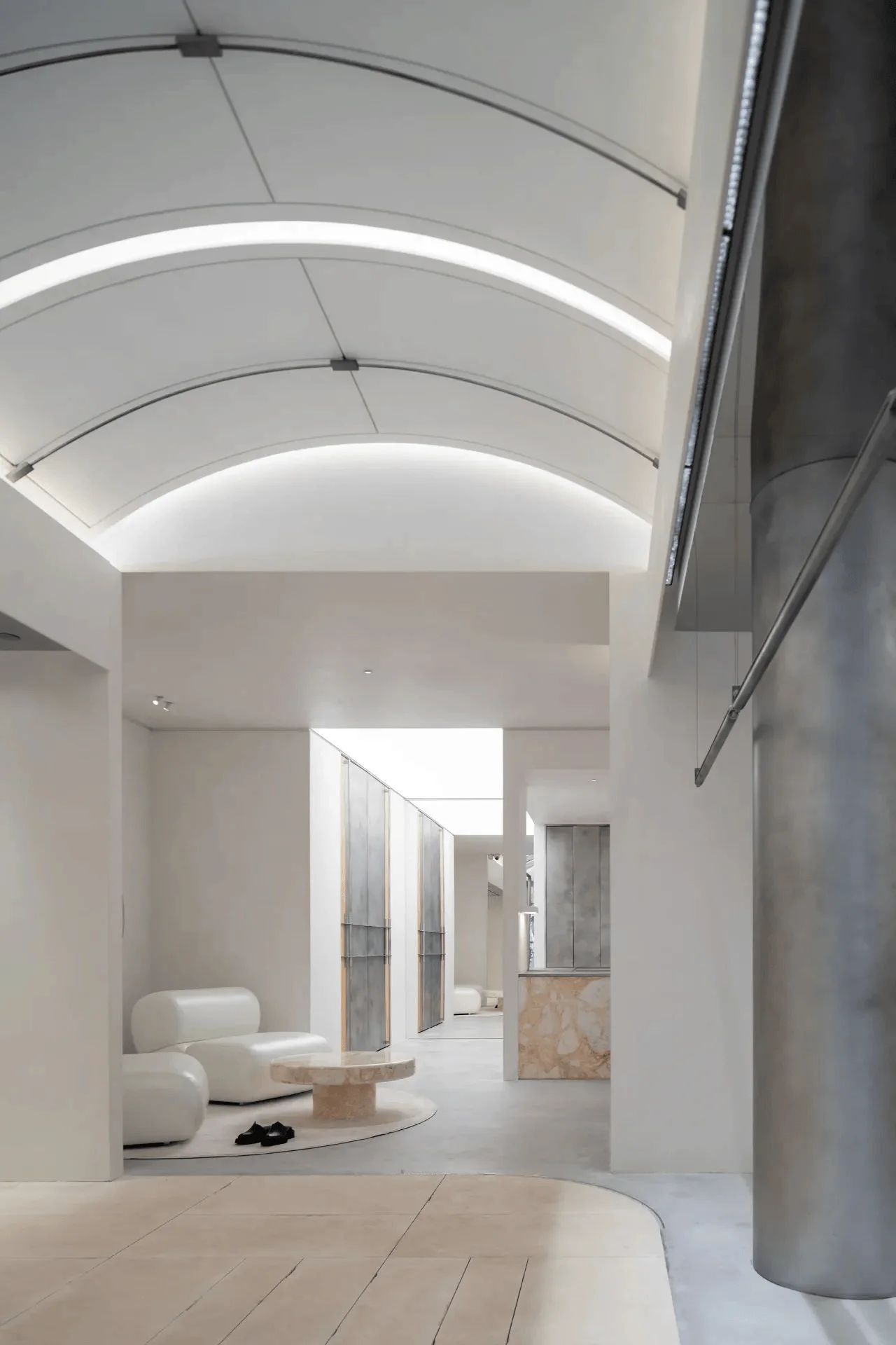
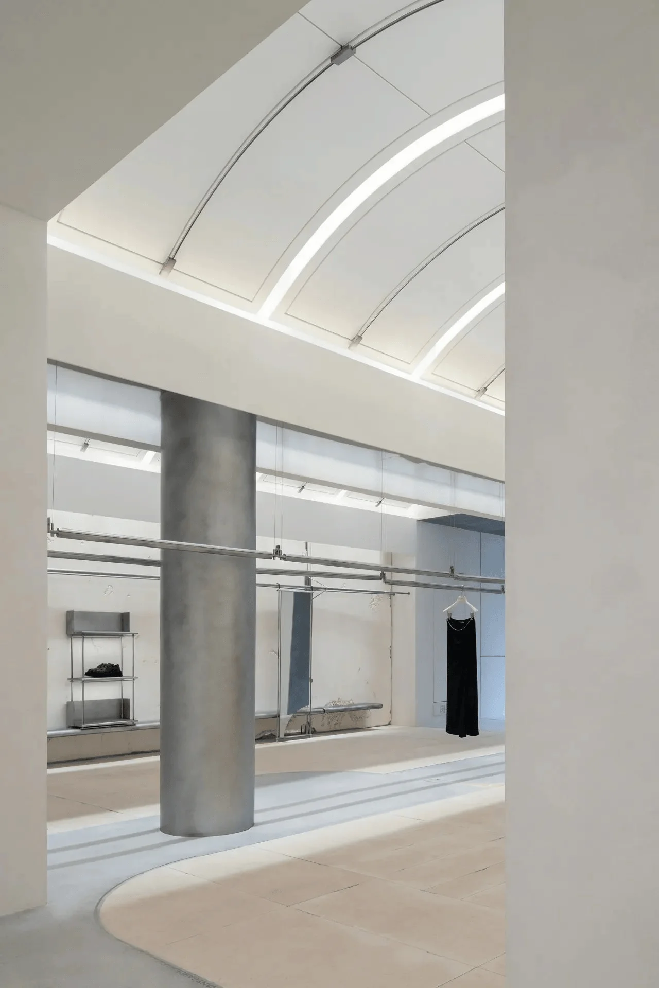
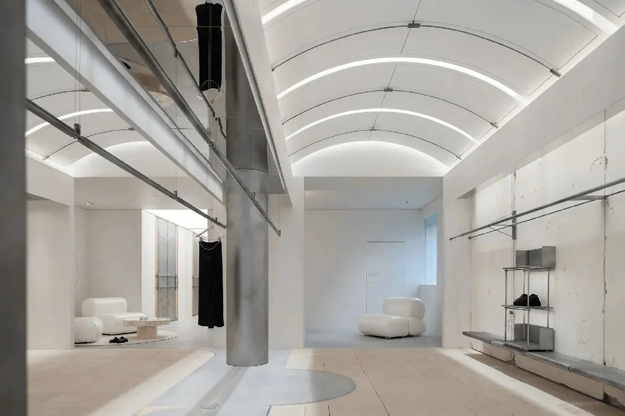
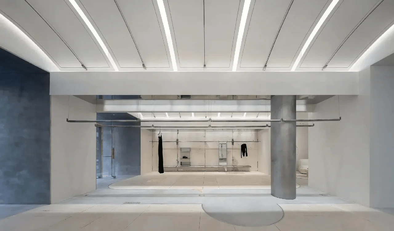
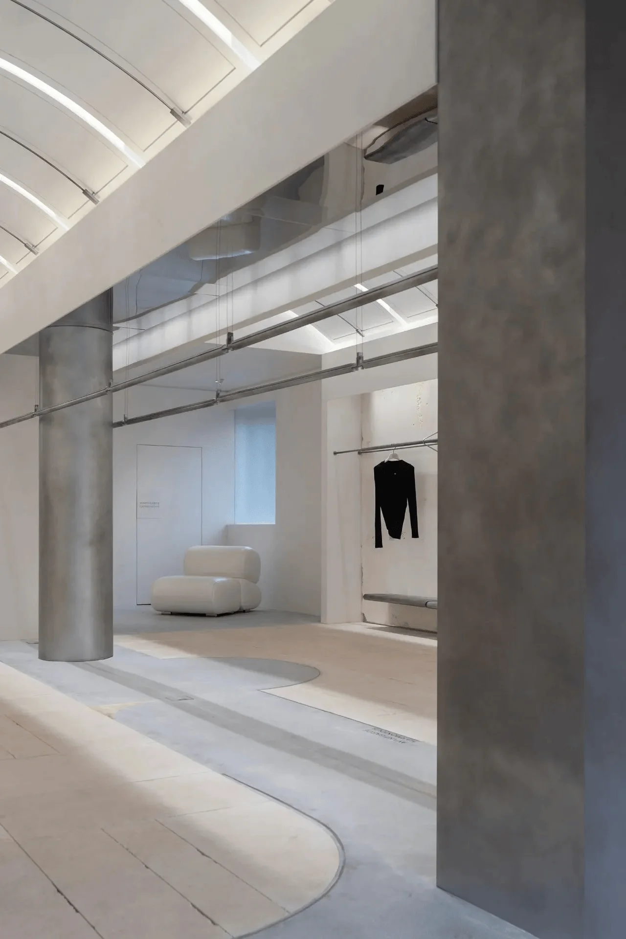
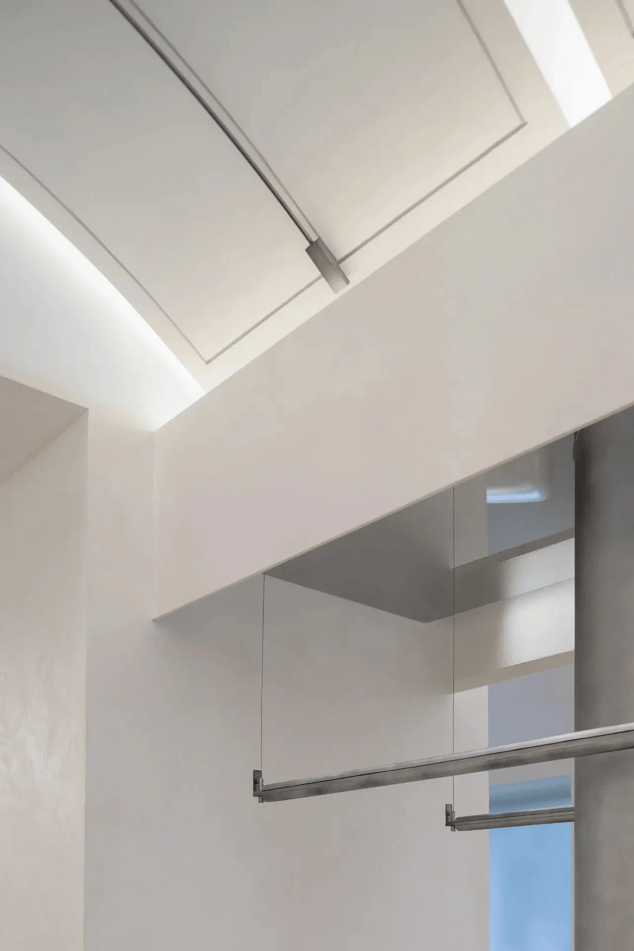
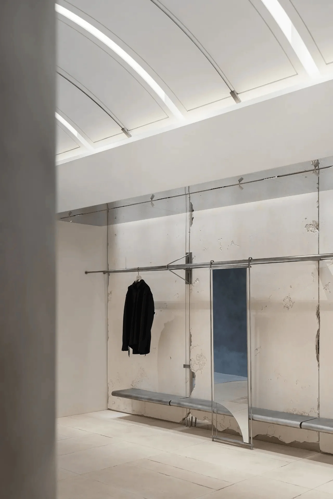
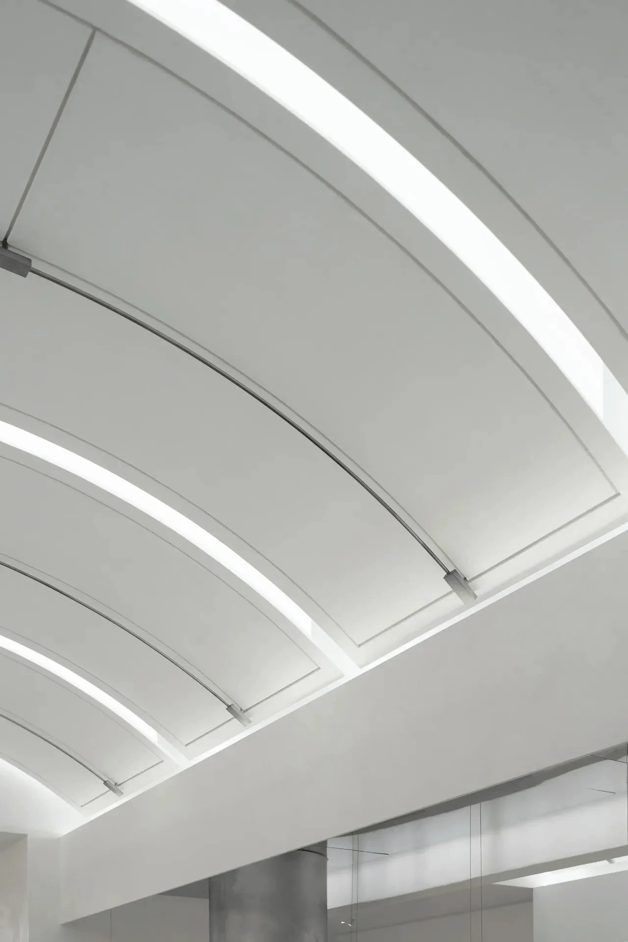
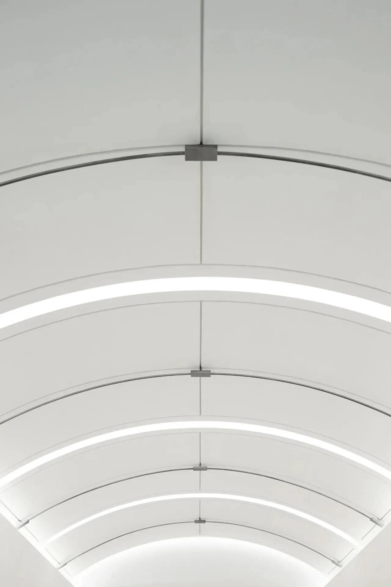
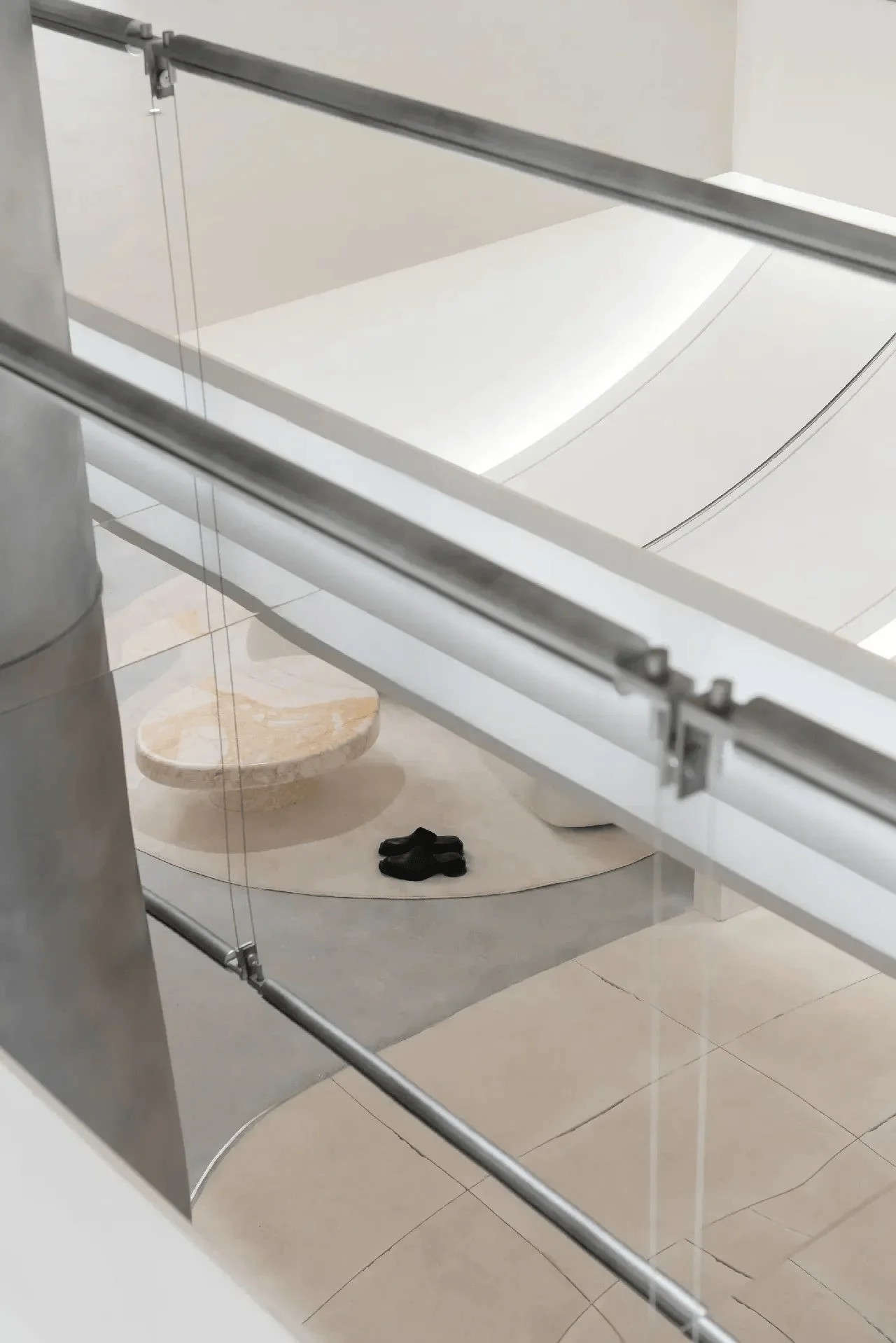
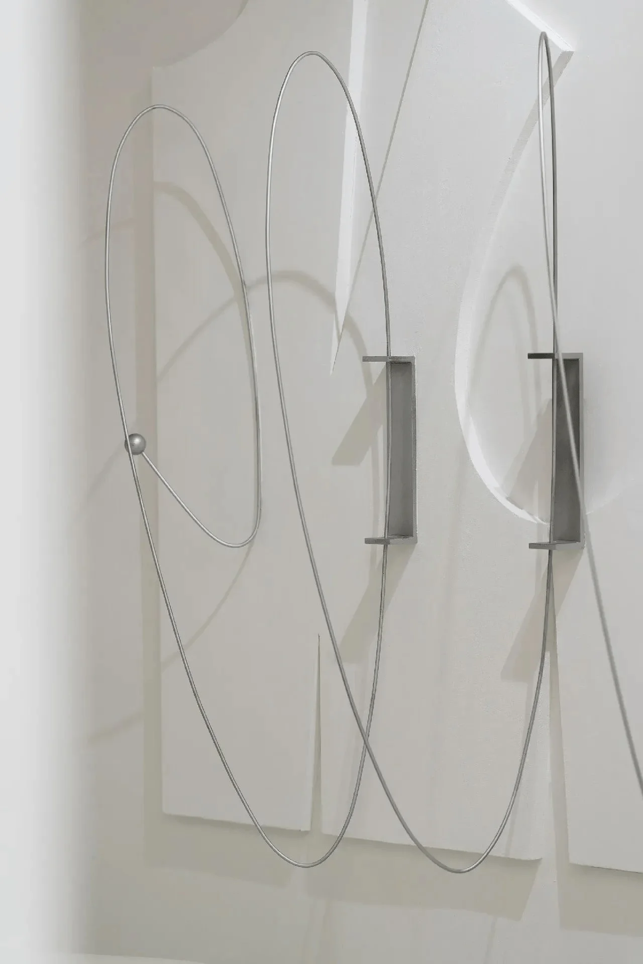
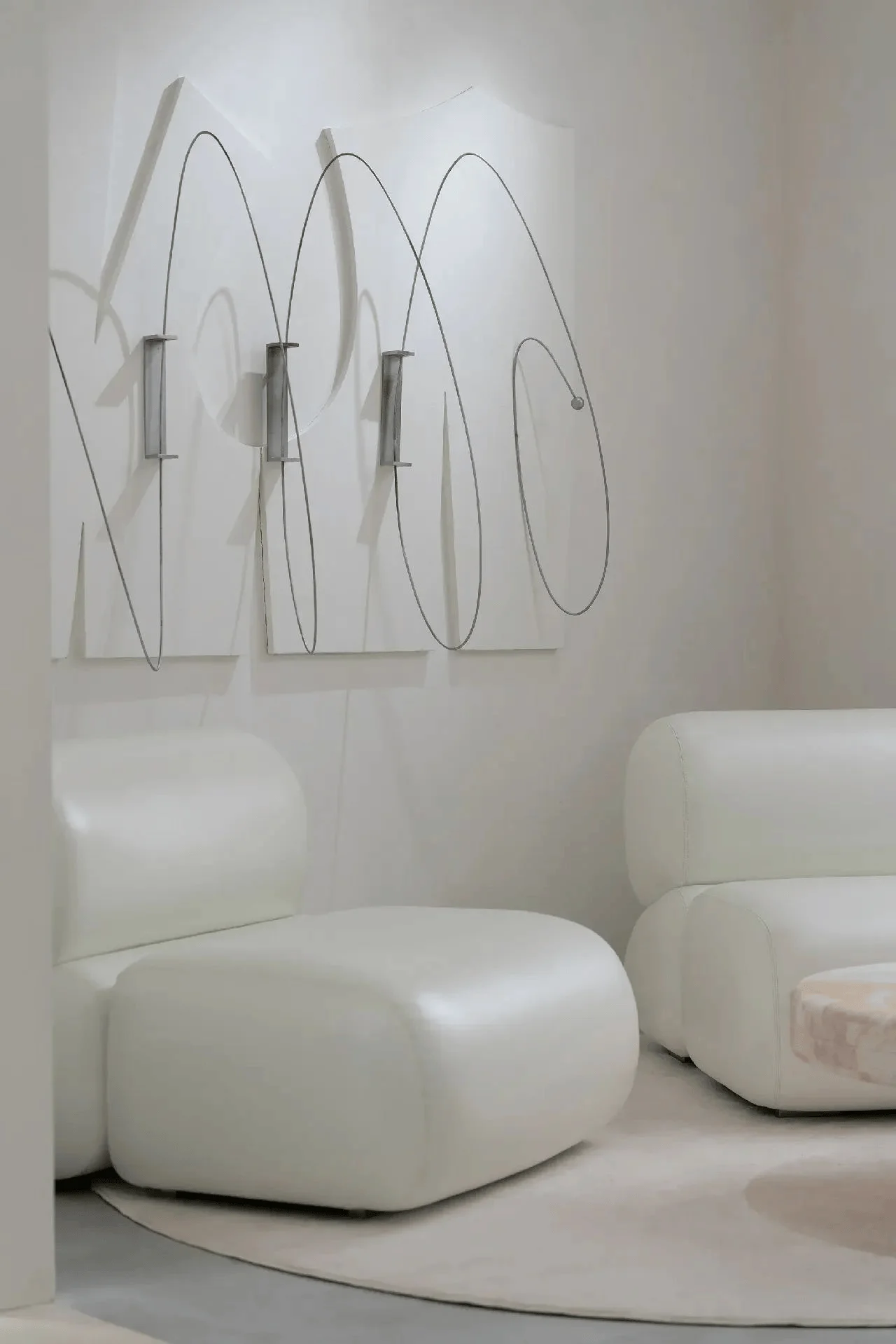
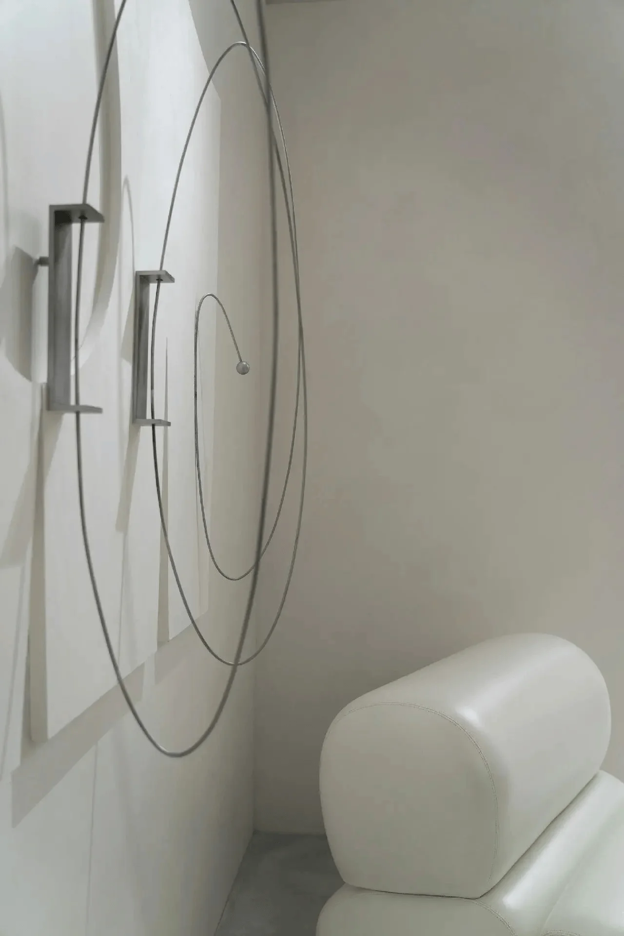
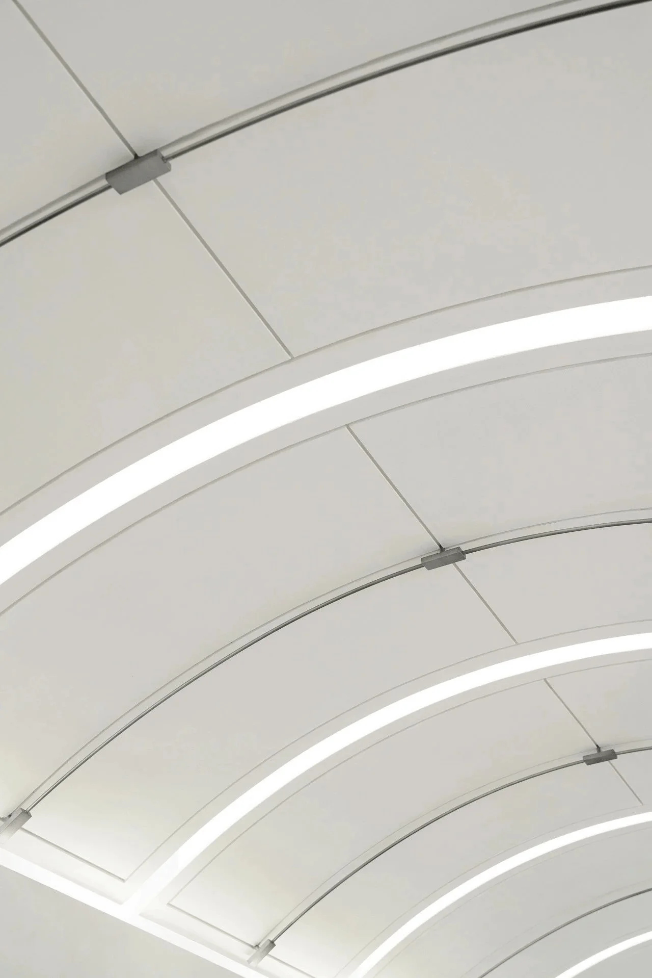
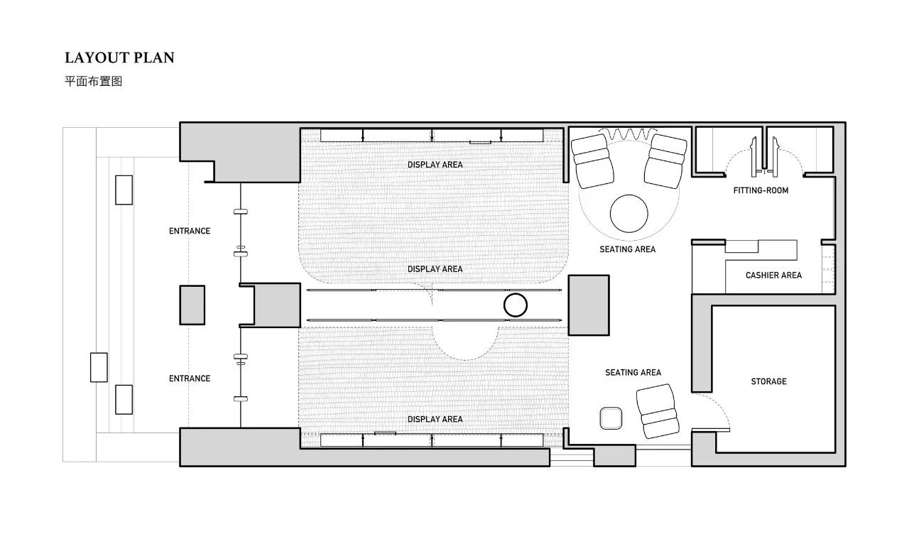
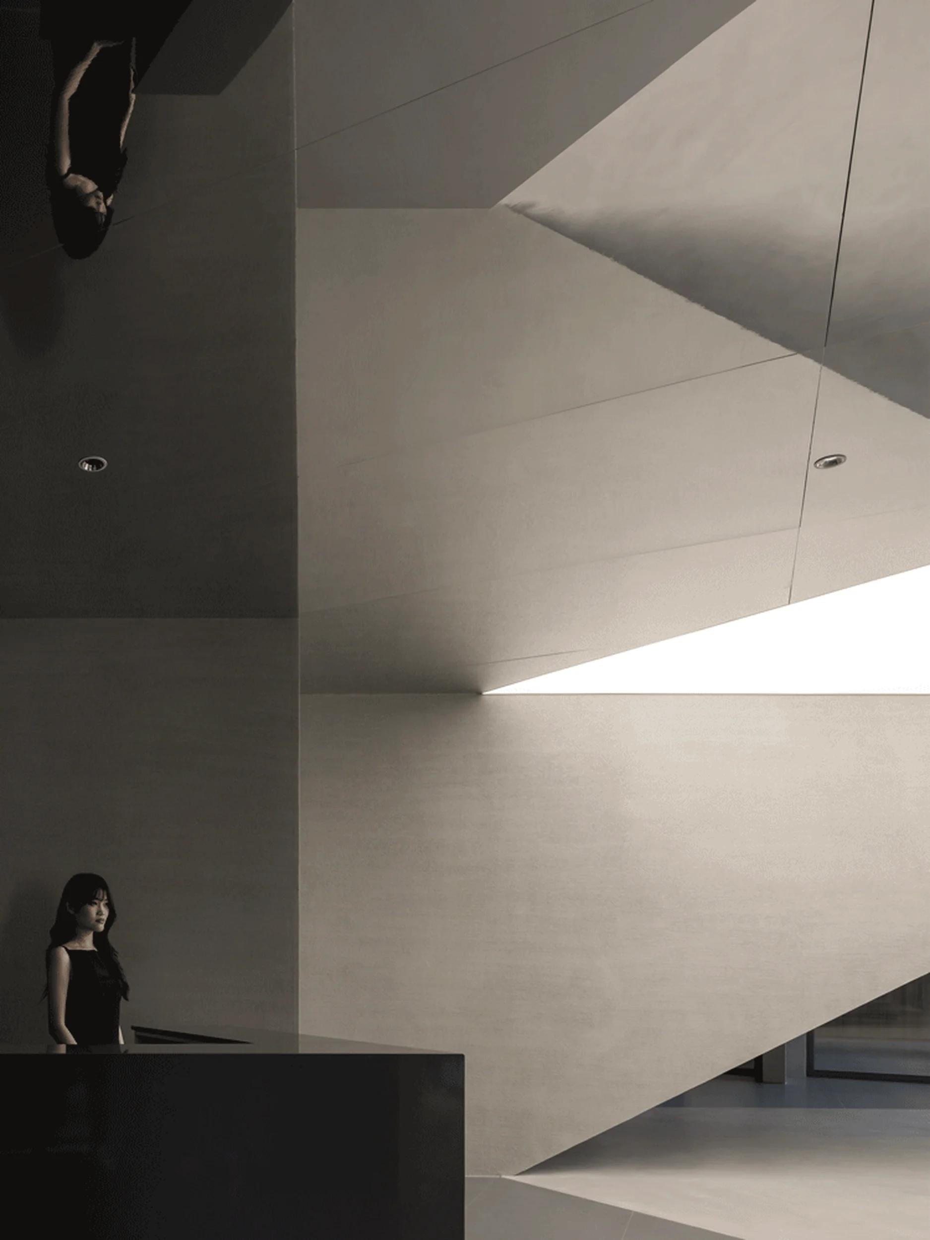
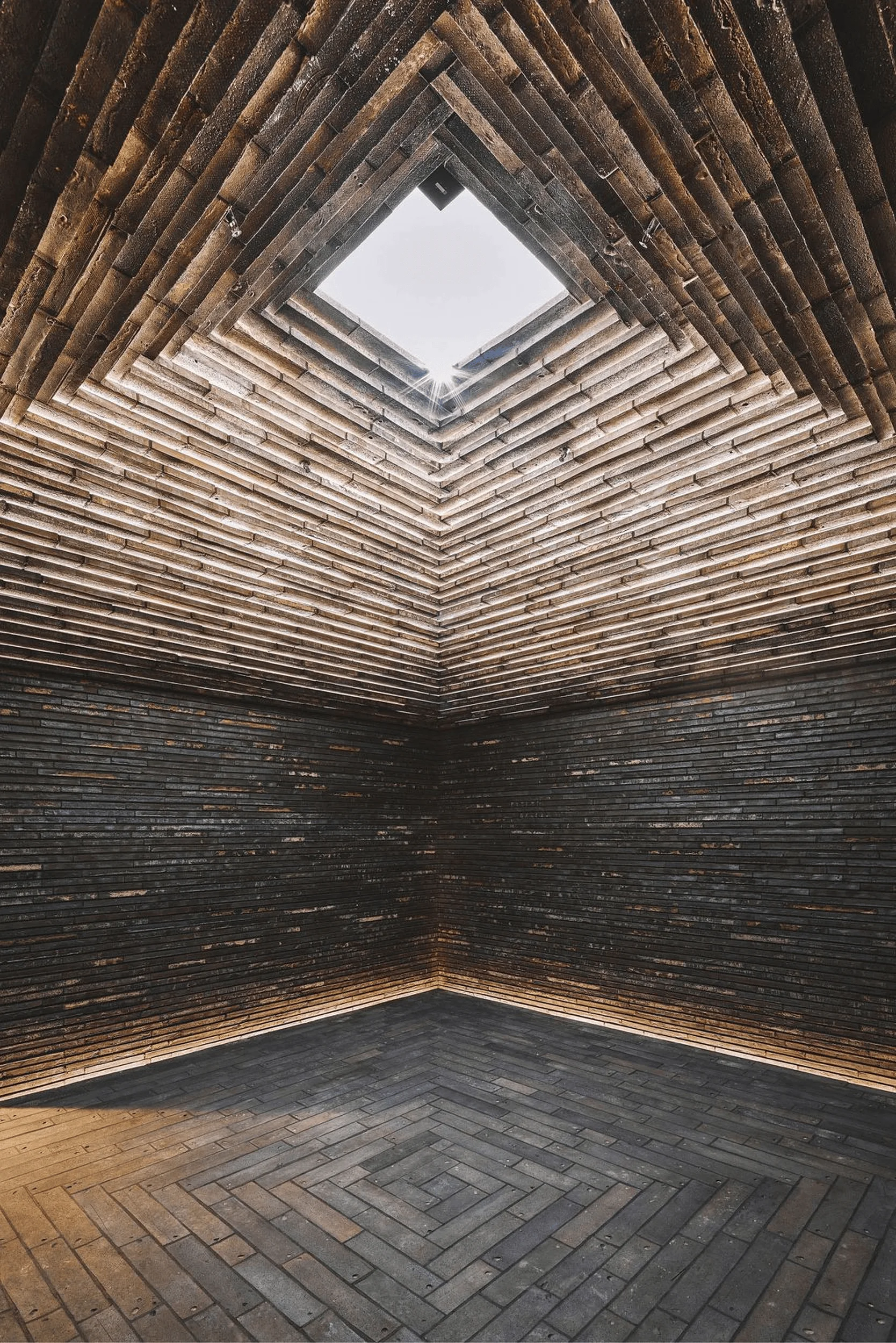
Inside, the store’s interior design continues the Pioneer Harmonism narrative. The symmetrical layout features an arched ceiling with an orderly slab structure, evoking the freedom of pattern cutting and the lightness of pattern paper, a central concept in the design. The 10mm wide grooves surrounding the metal structure mimic garment-making techniques, while smooth lines recall the precision of a craftsman’s hand. Light filtering through these gaps emphasizes the forms, highlighting the pattern paper concept and adding another layer to the store’s commercial architecture design.
Details and Symbolism in Commercial Architecture Design
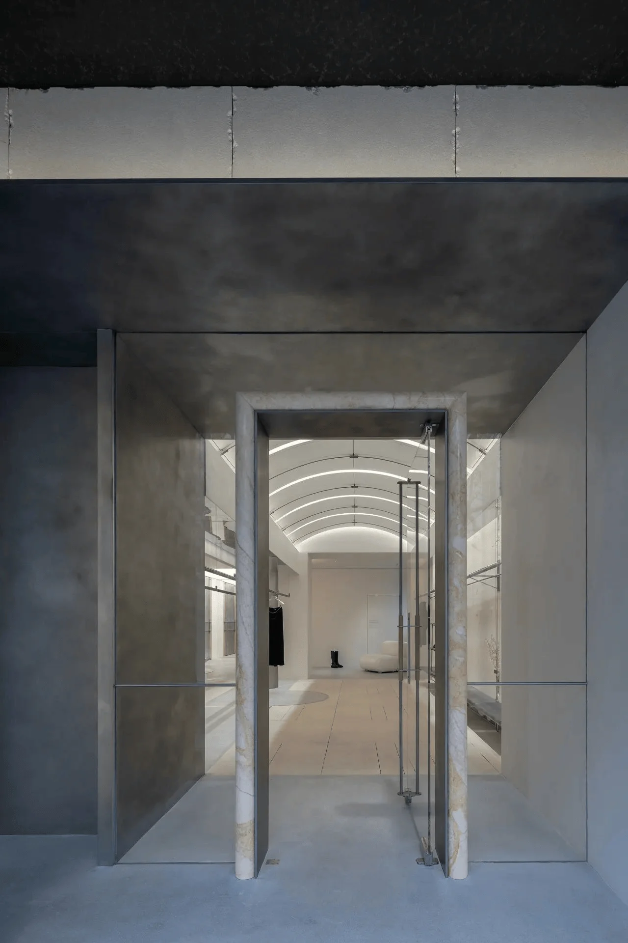
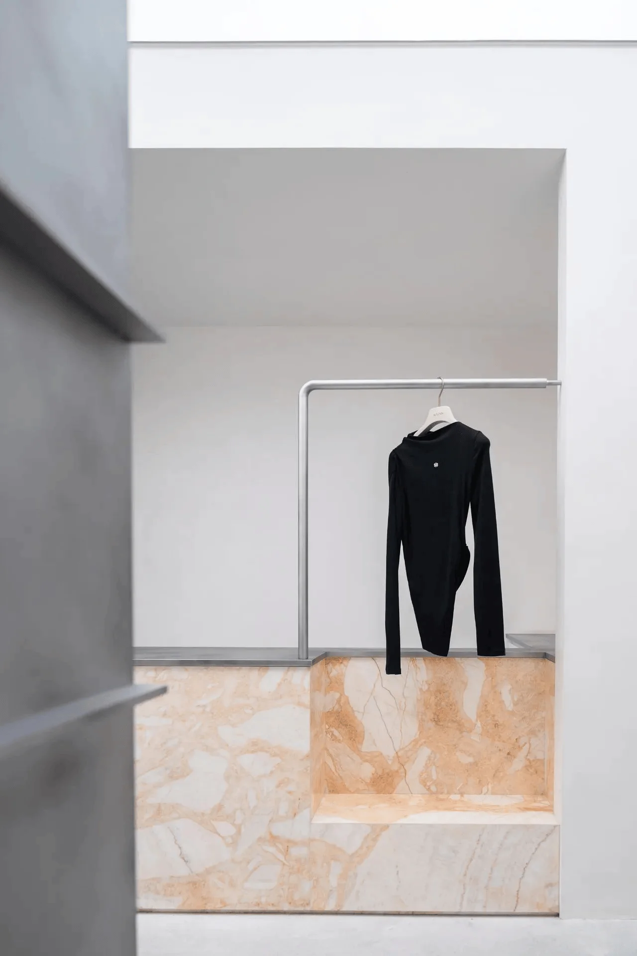
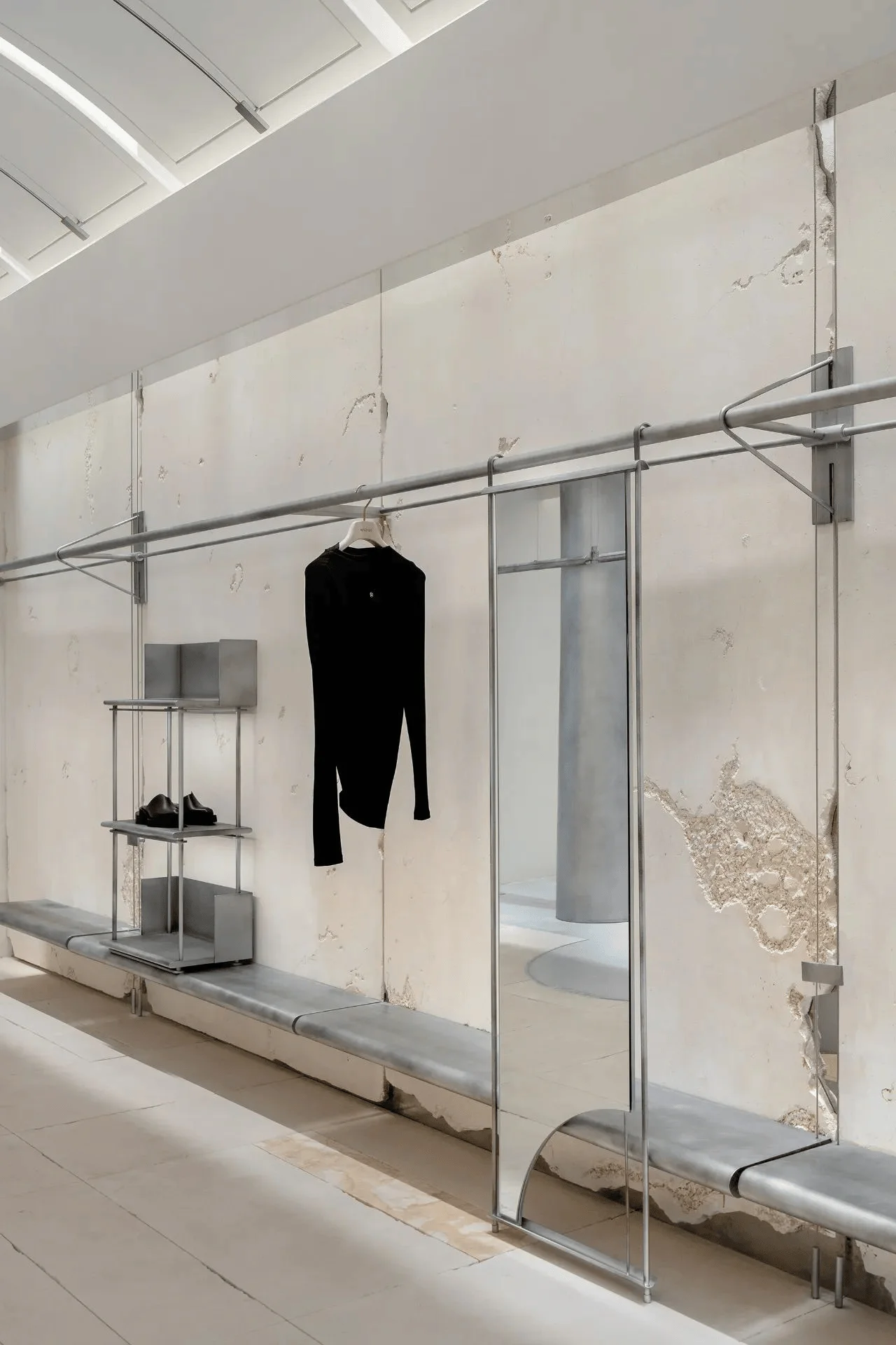
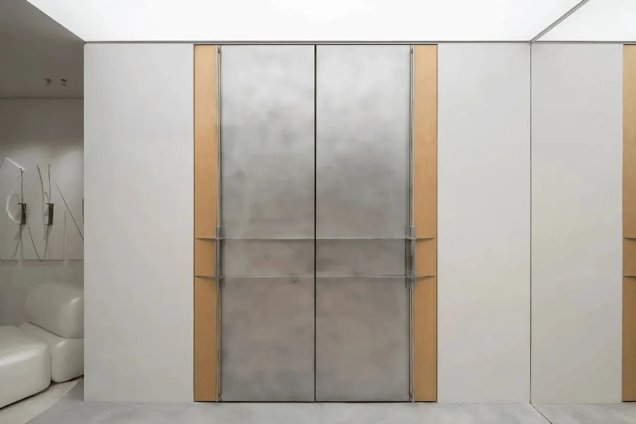
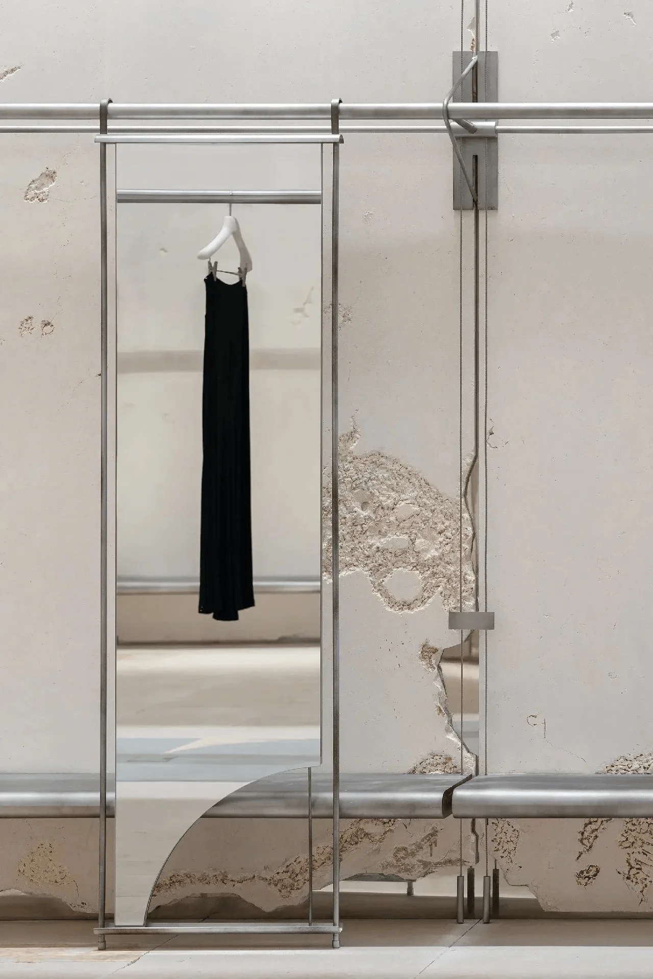
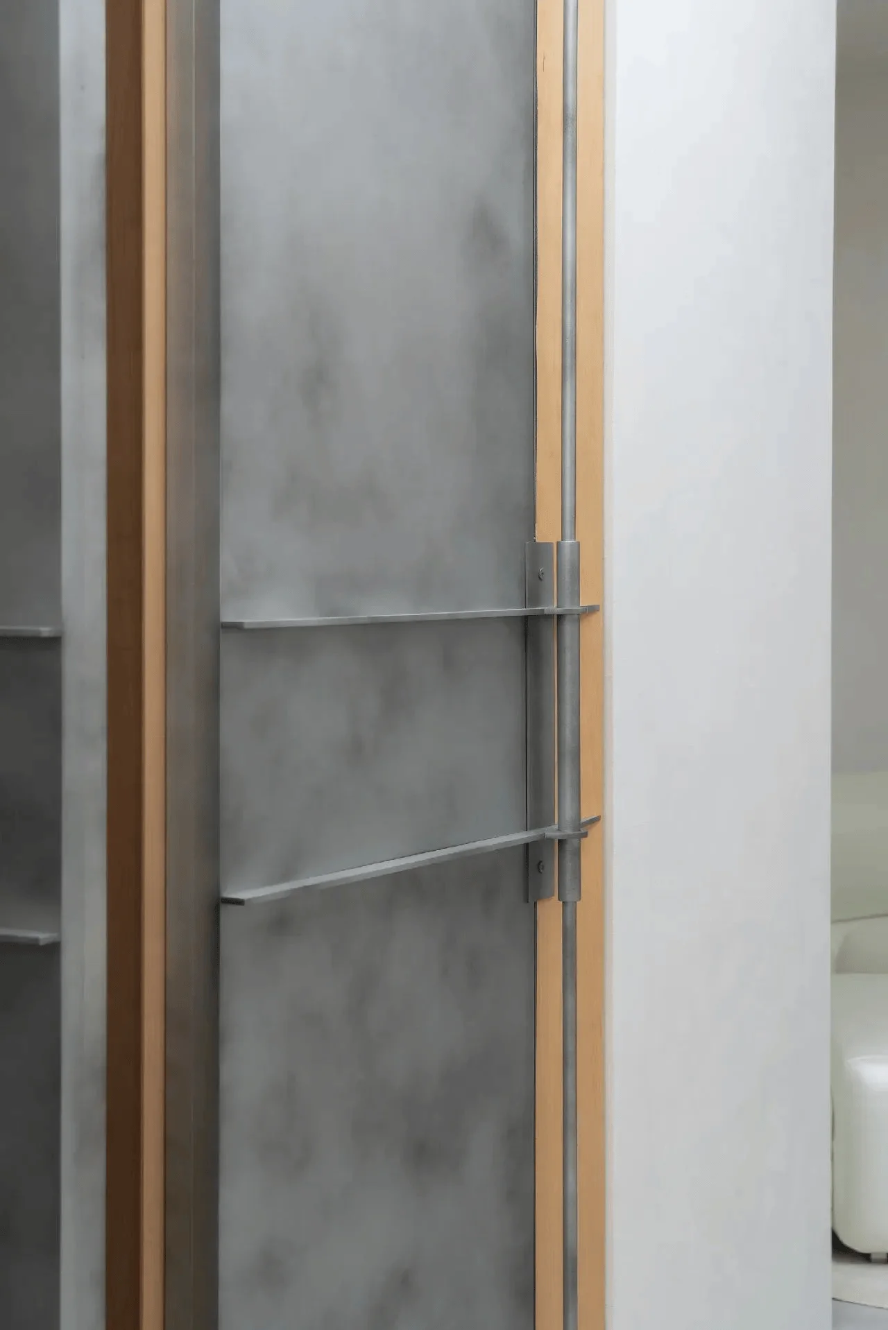
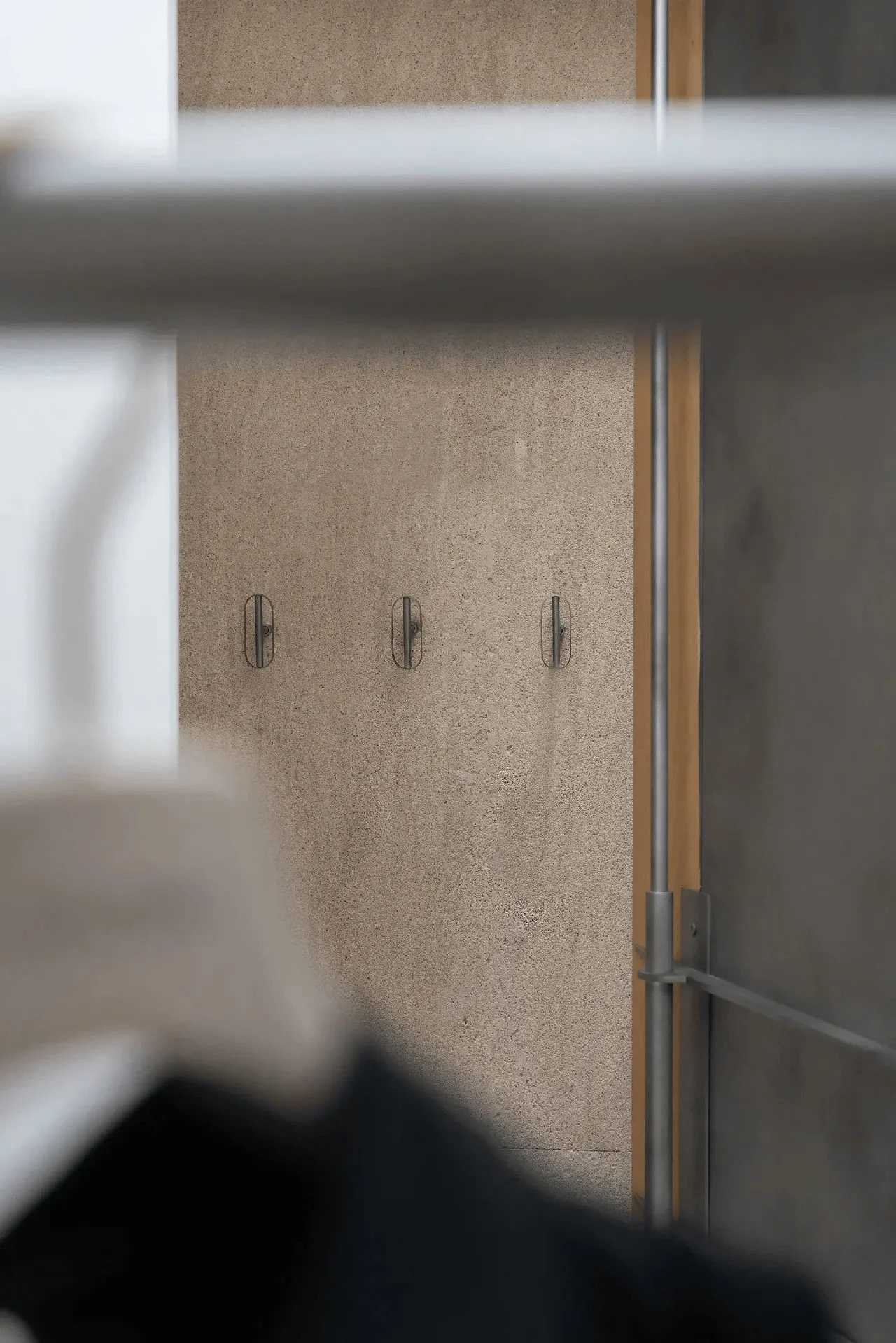
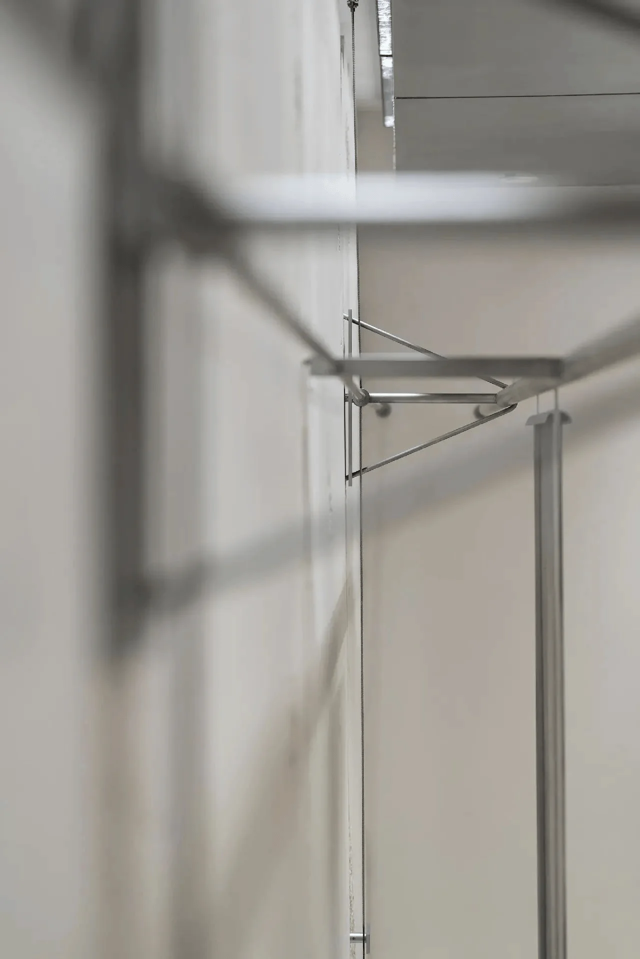
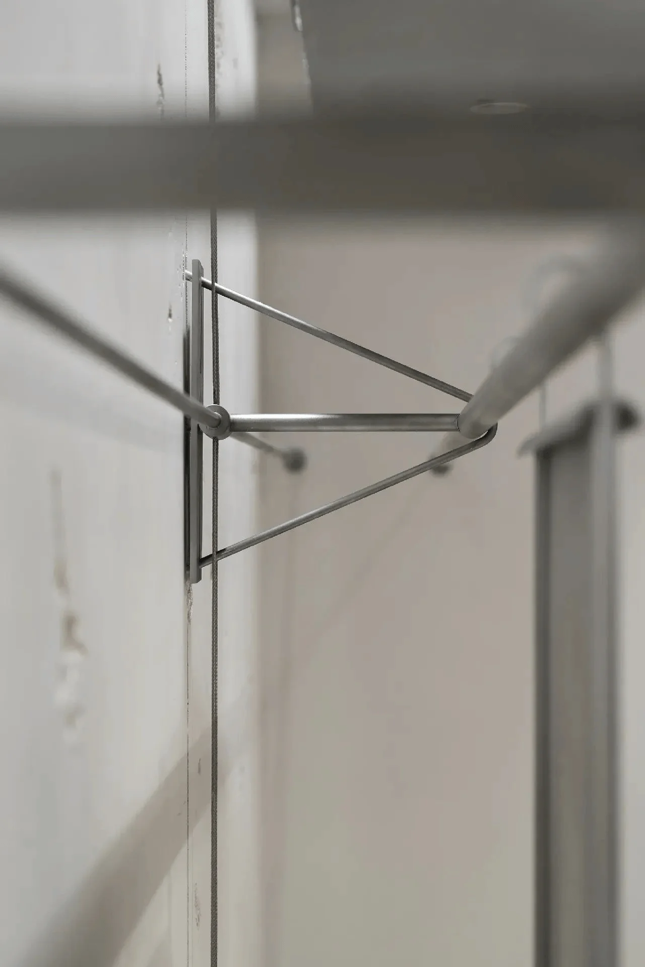
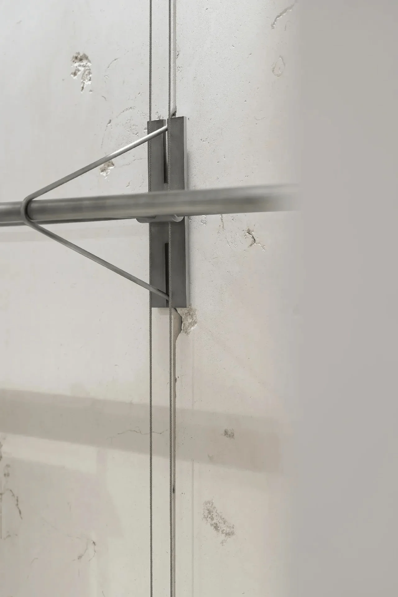
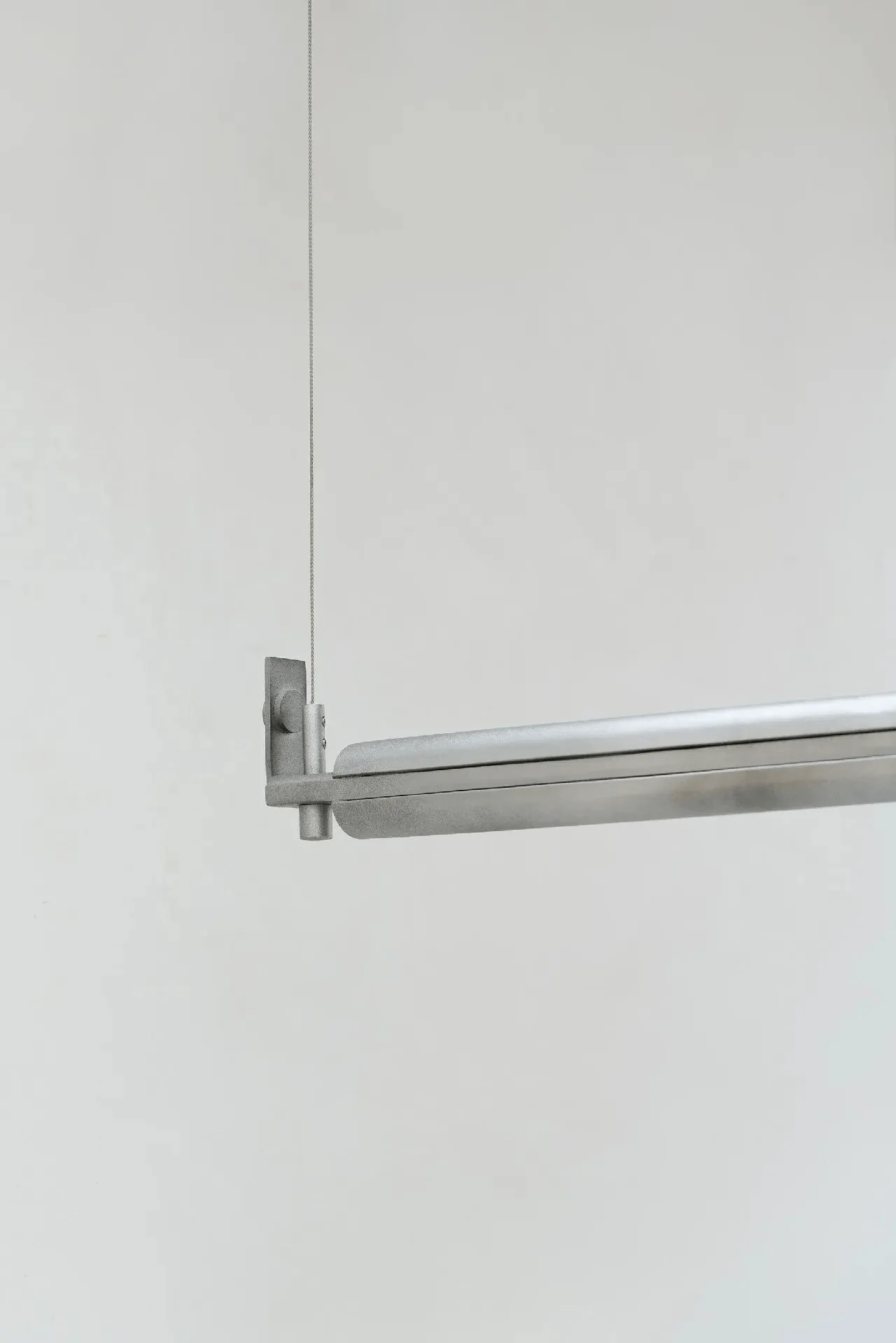
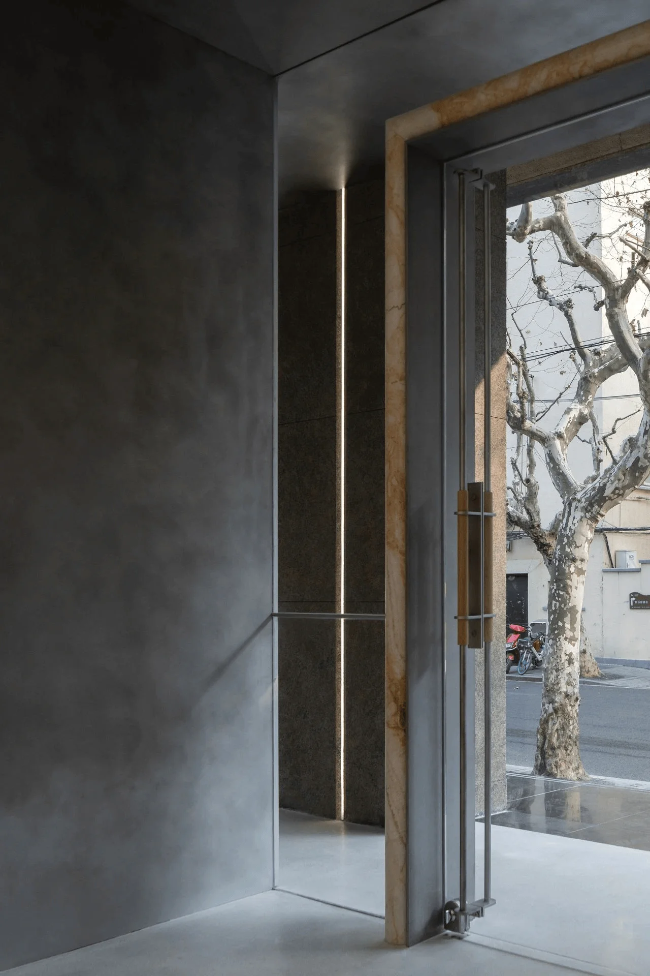
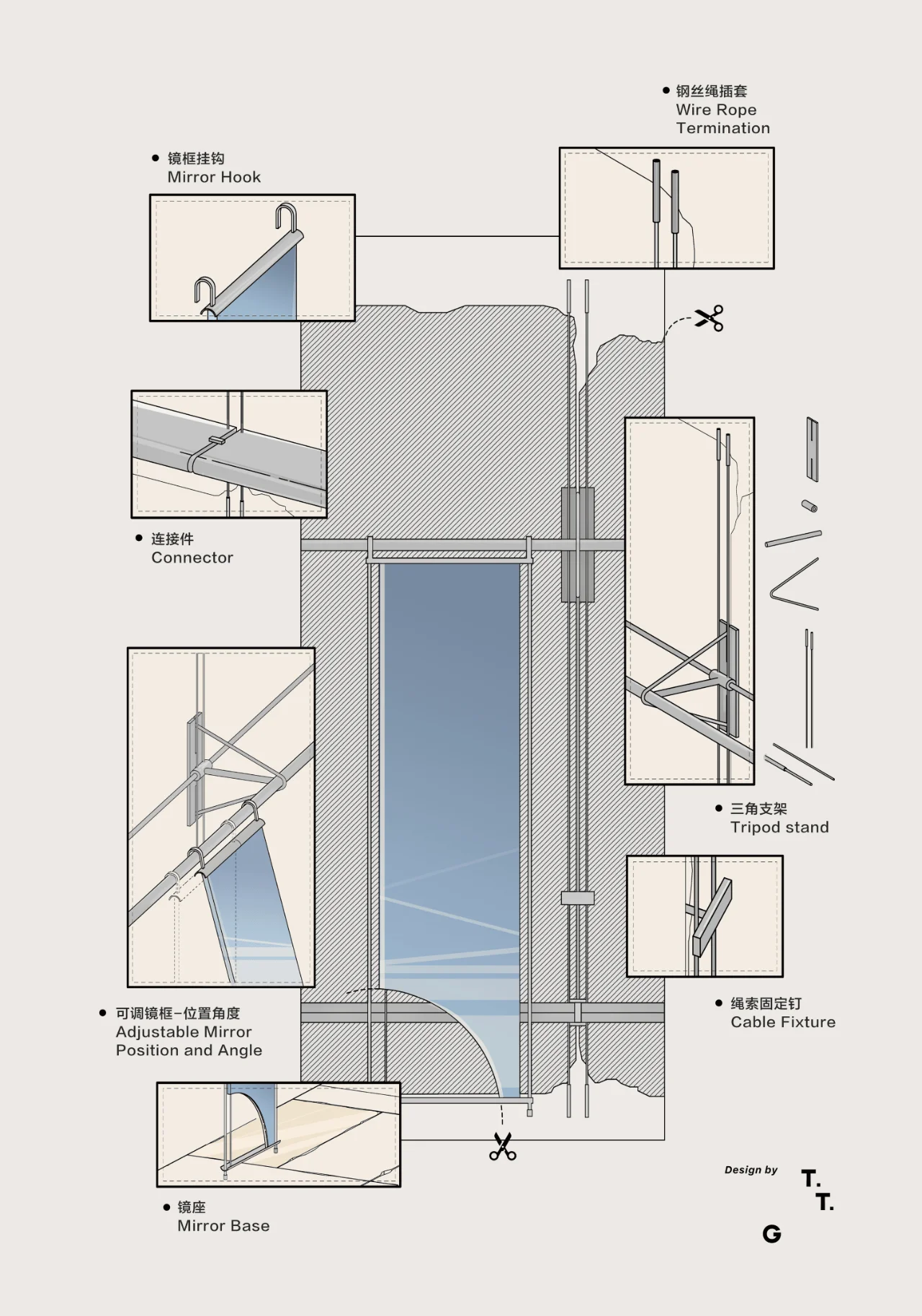
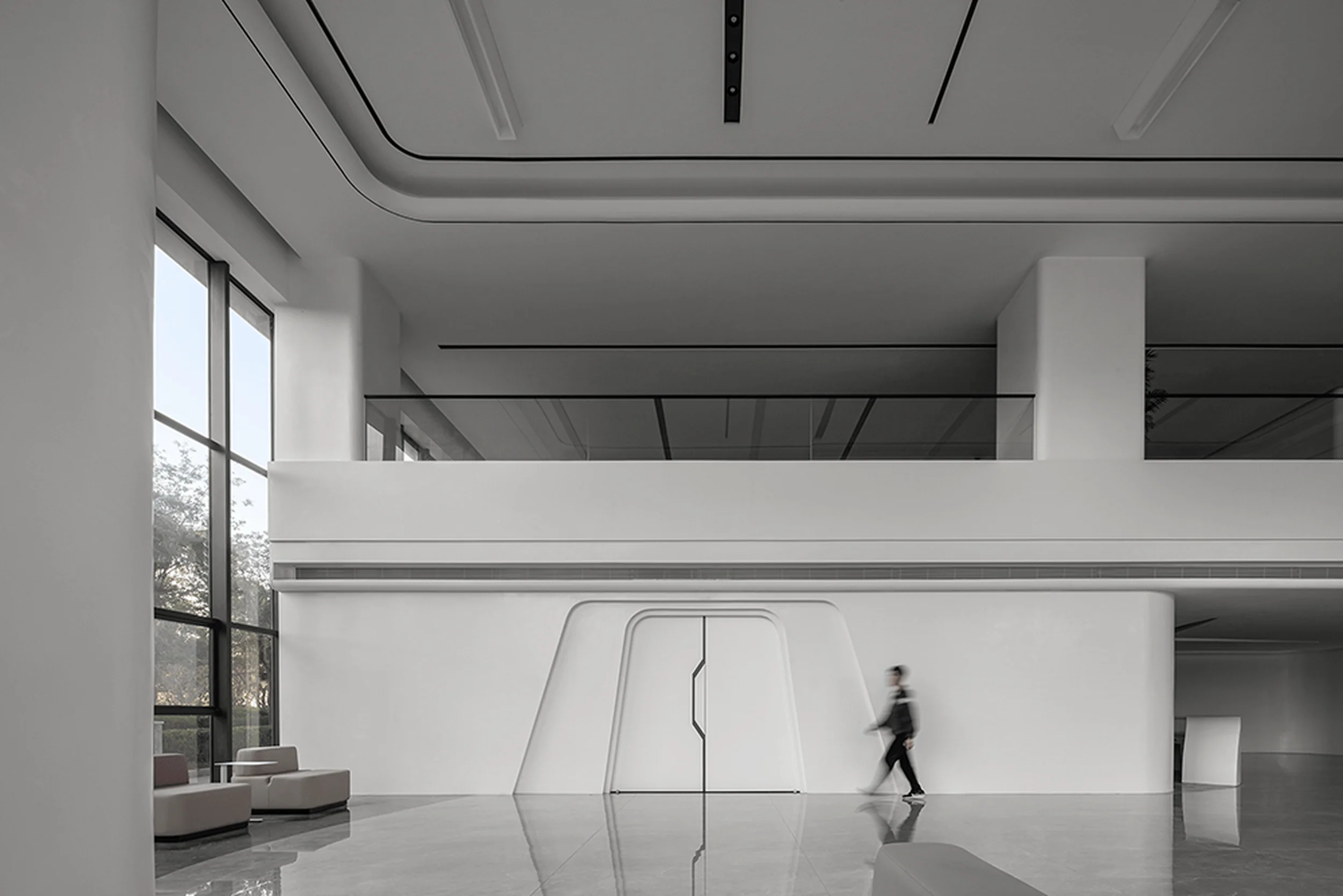
The store’s design is rich in symbolic details that reinforce the brand’s philosophy and commitment to innovative commercial architecture design. Metal stools on the stairs feature inward-folding edges that resemble the texture of pattern paper. The curved stone doorframe at the entrance reflects the motion of cutting fabric, while the door handle’s intricate structure evokes the action of threading a sewing machine. These subtle details demonstrate a thoughtful exploration of the brand’s spirit, enhancing the overall experience within this unique example of commercial architecture design.
Project Information:
Project Type: Flagship Store
Architect: TIME TO GATHER
Project Year: 2021
Country: China
Photographer: TIME TO GATHER
Main Materials: Natural Stone, Metal, Terrazzo


