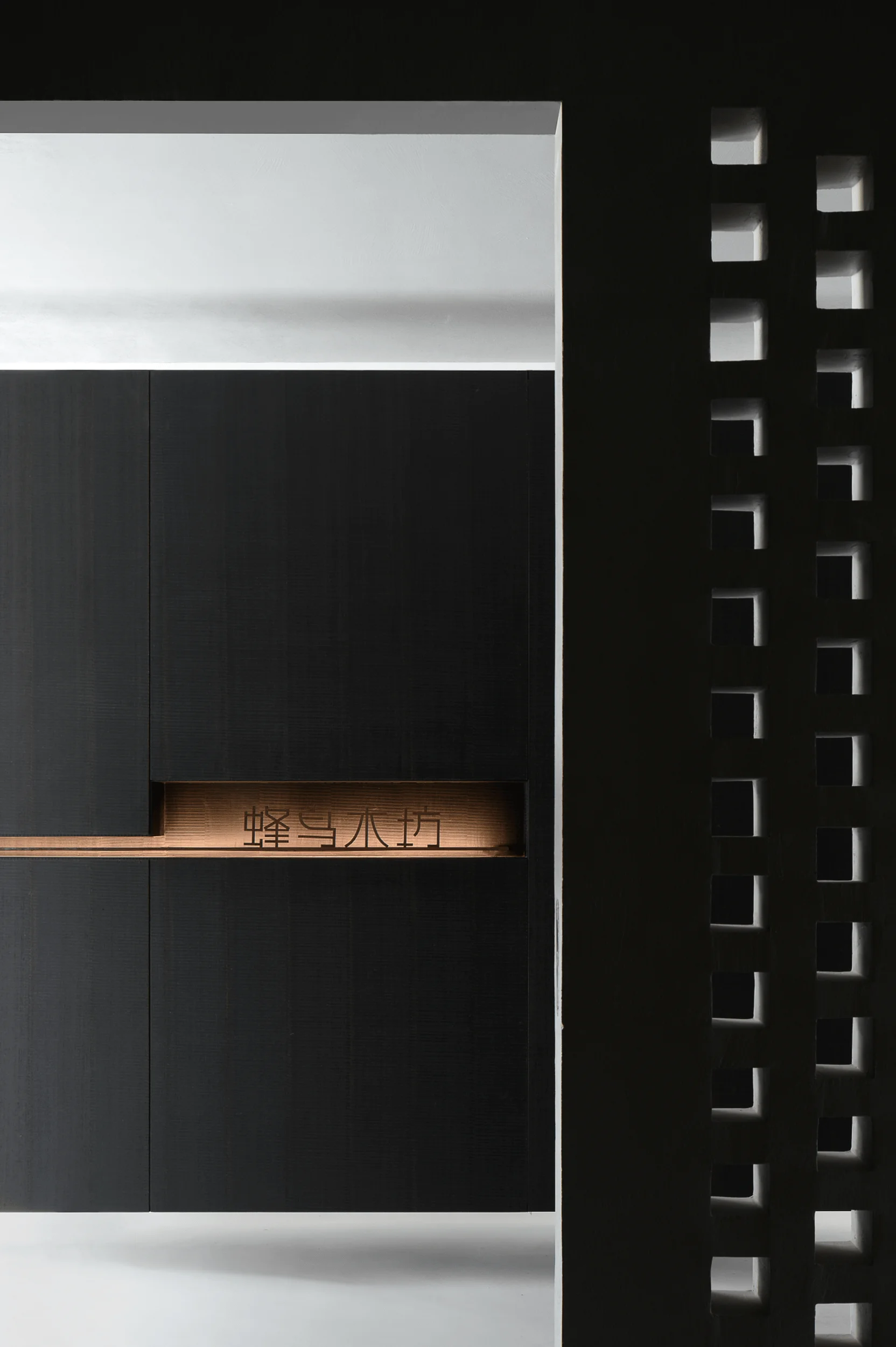
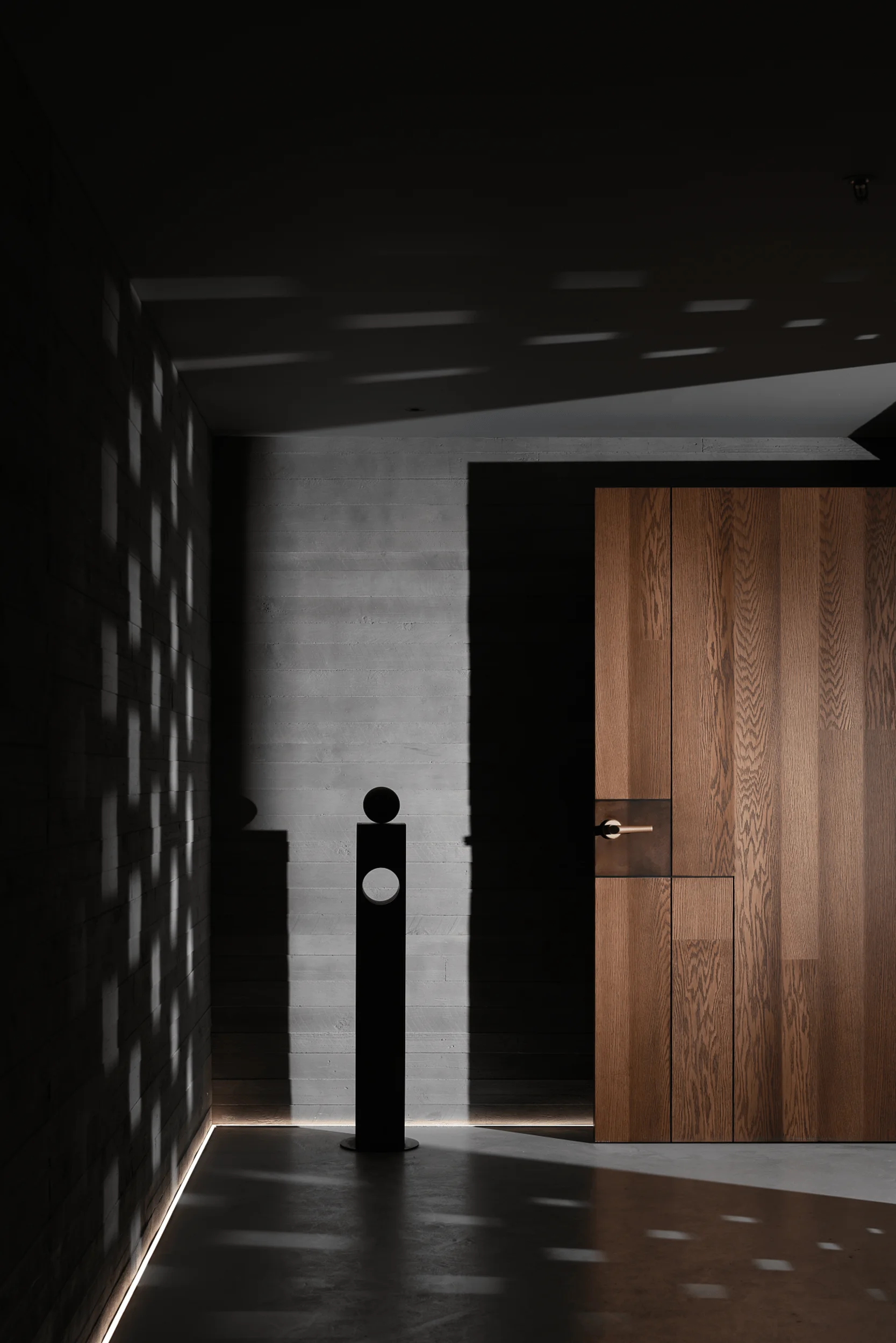
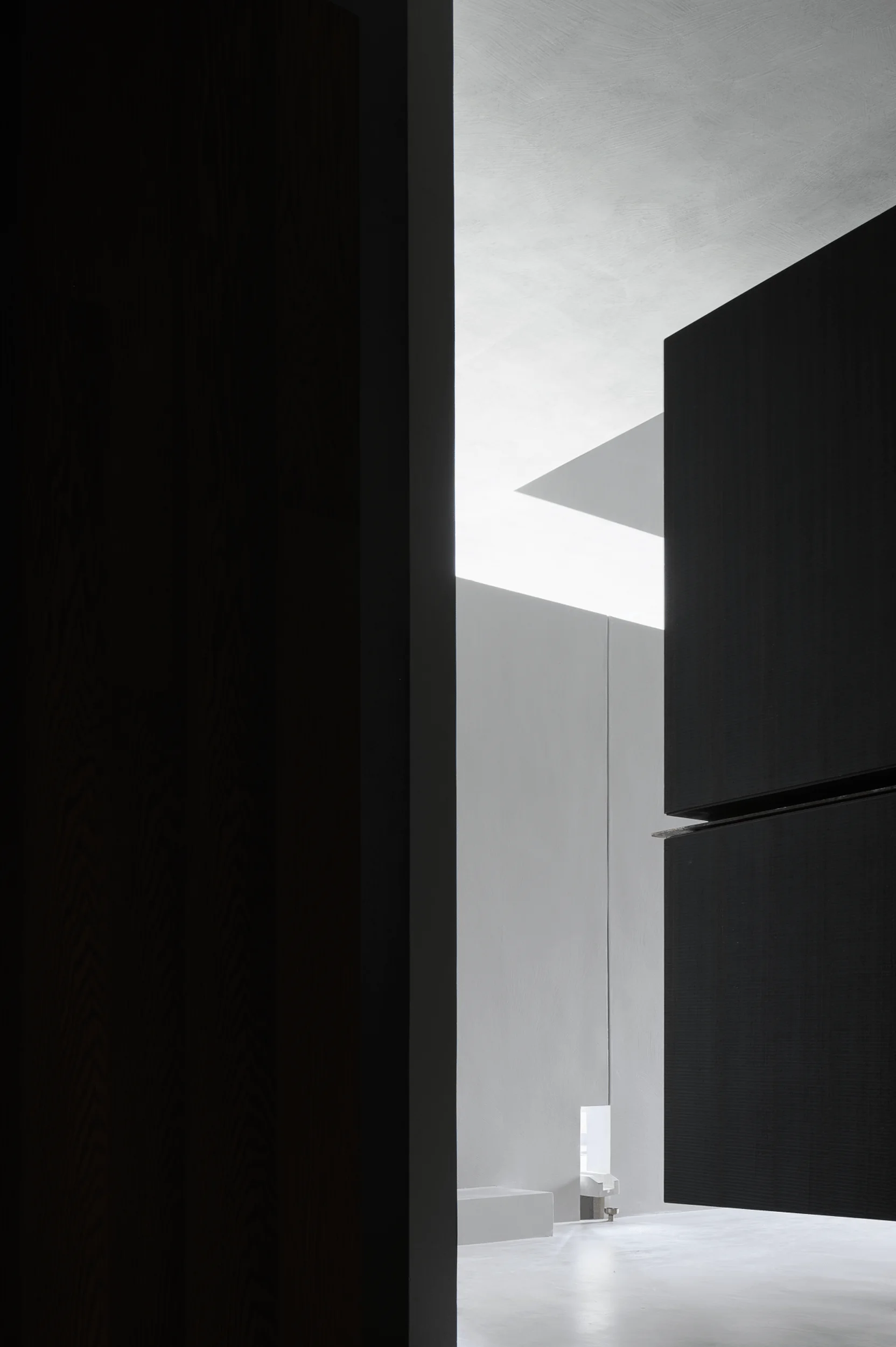
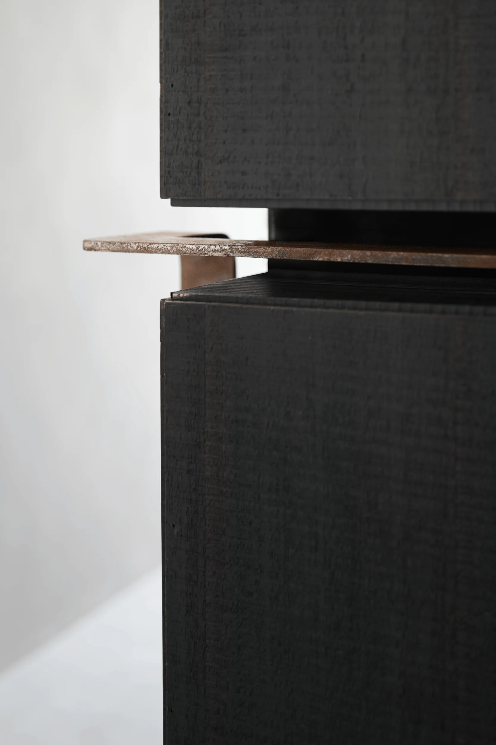
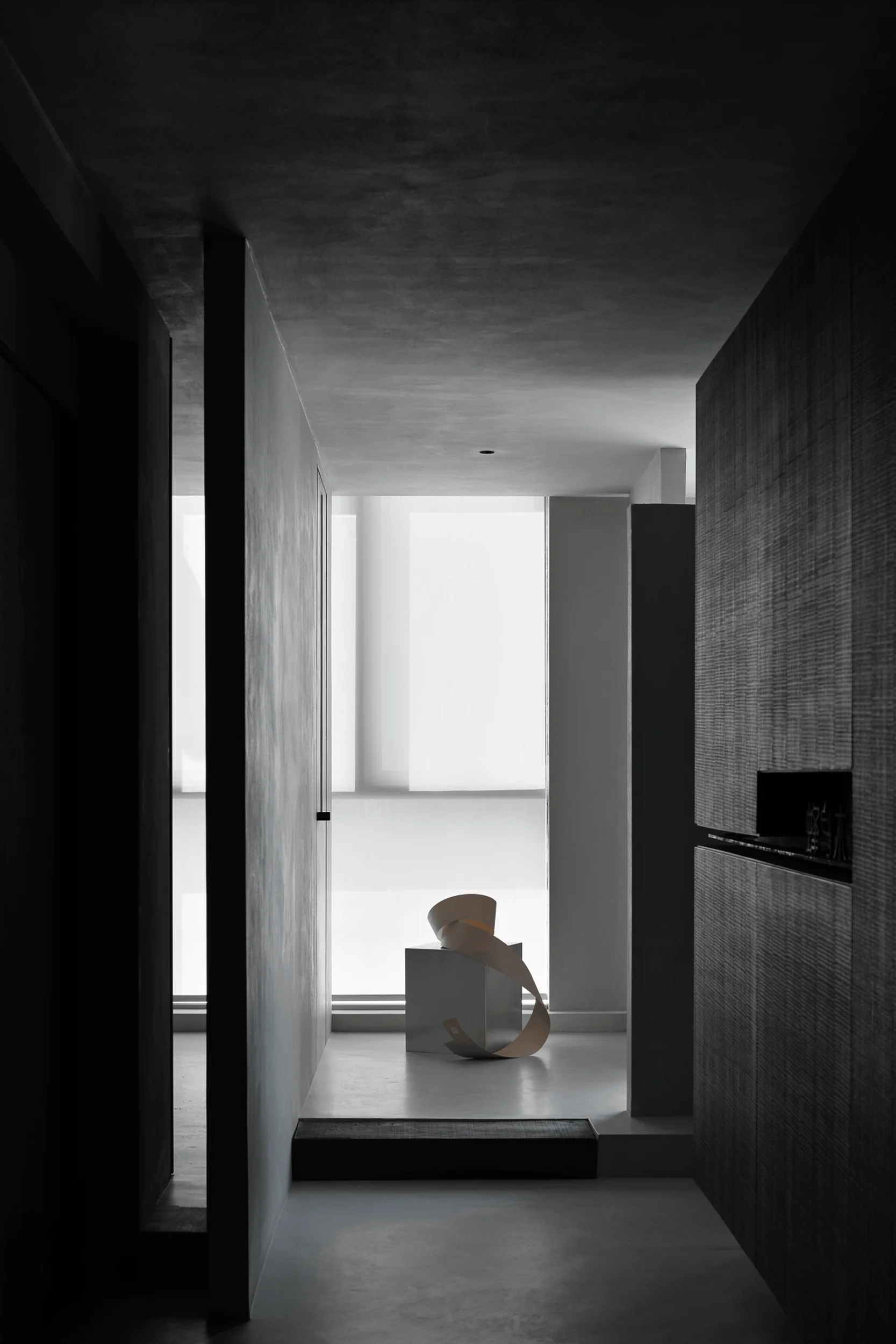
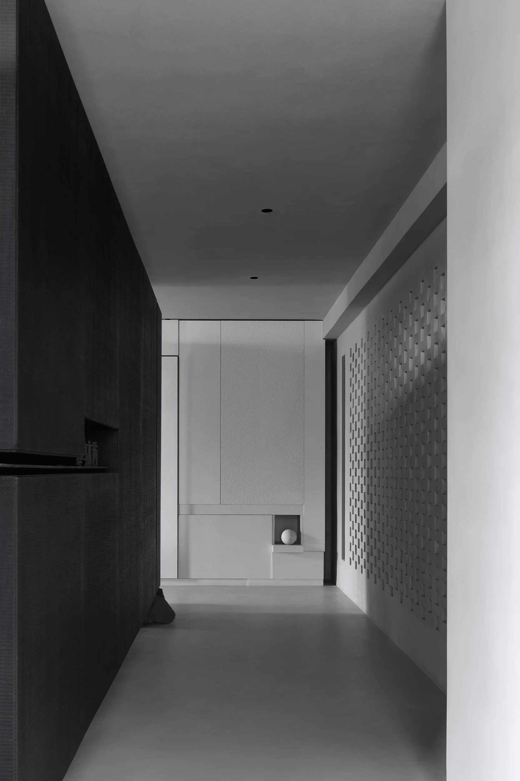
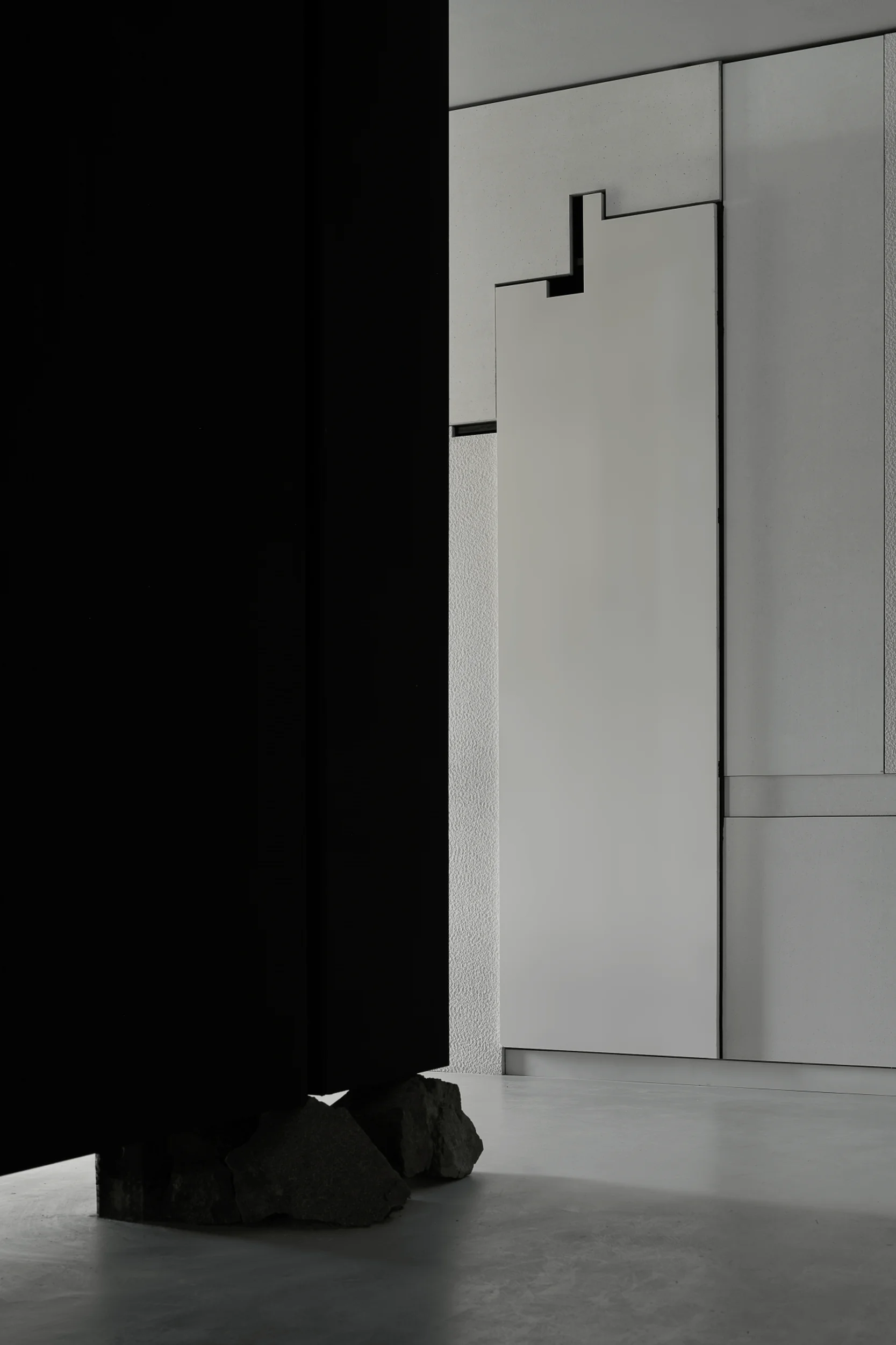
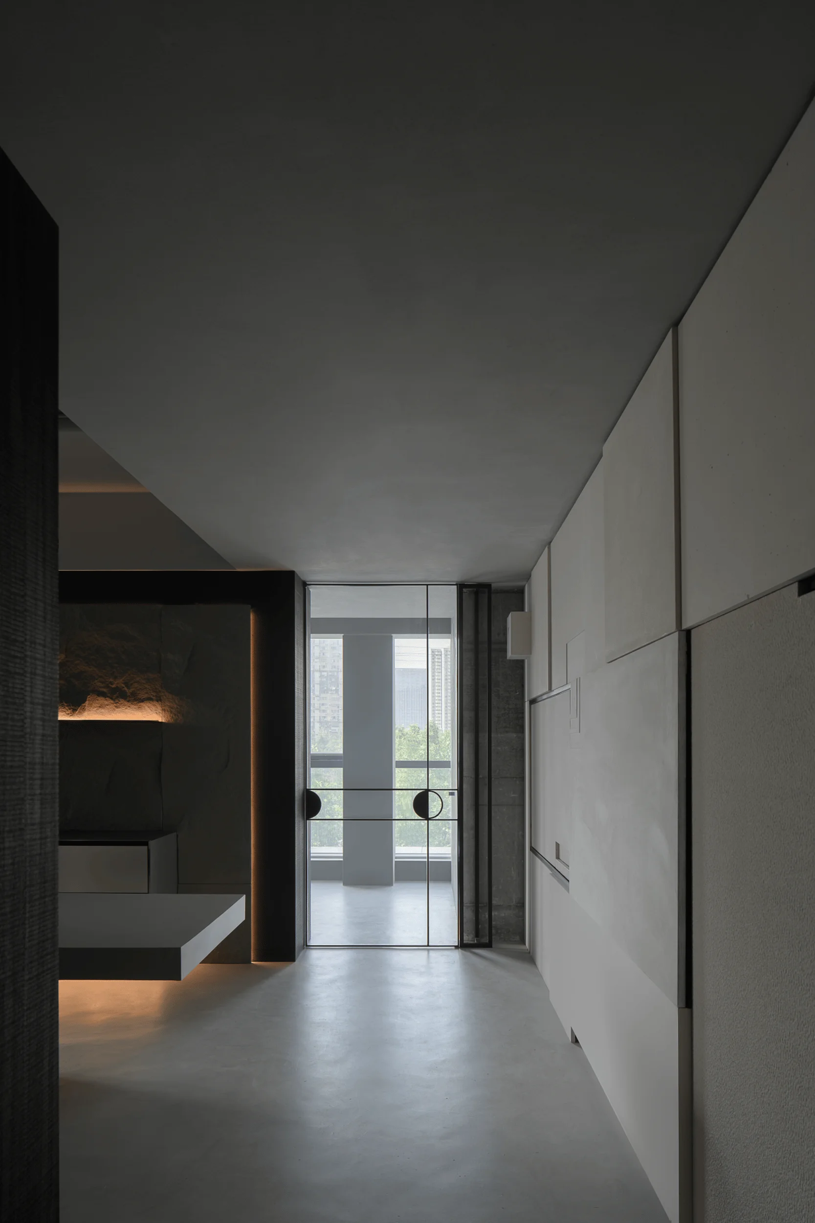
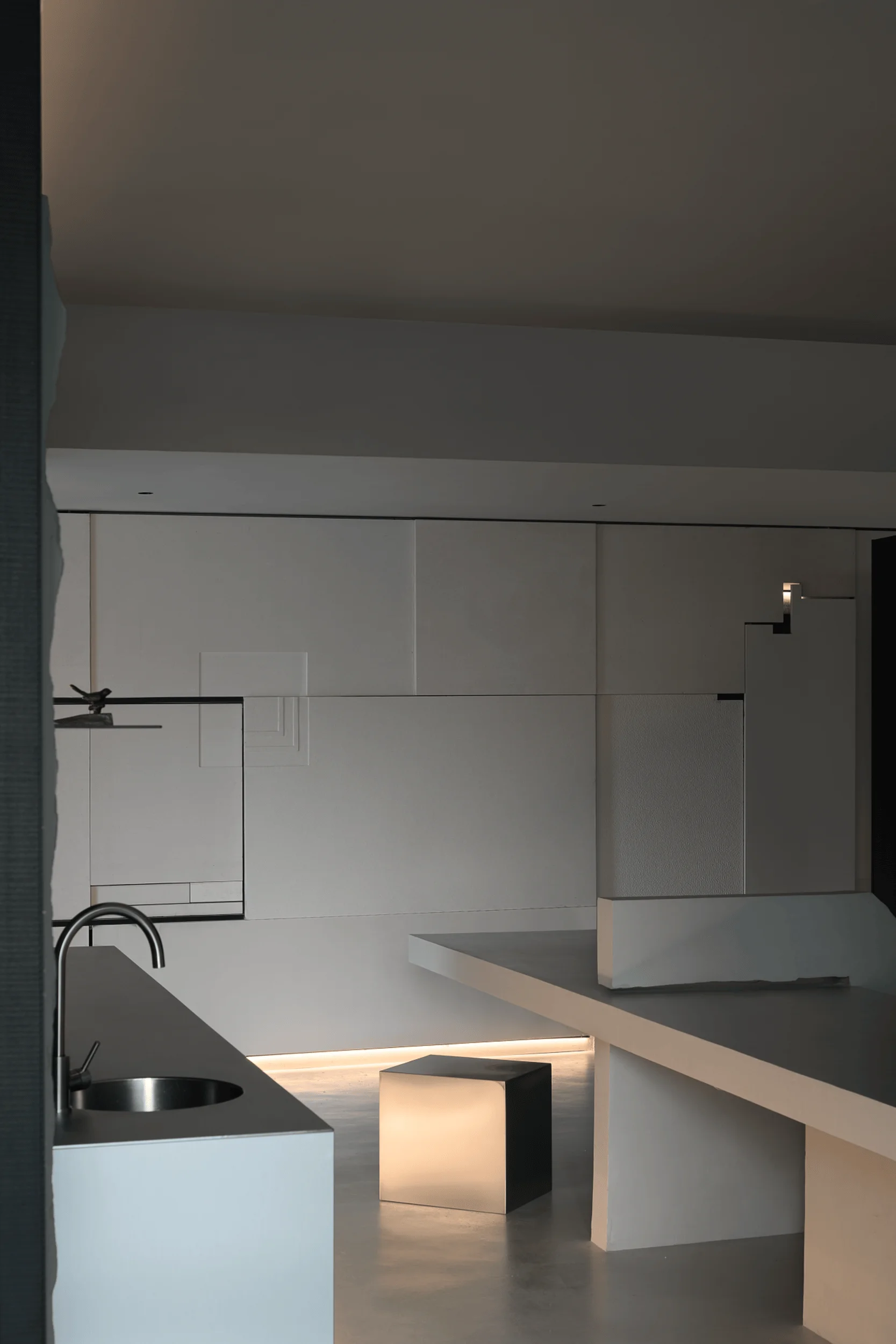
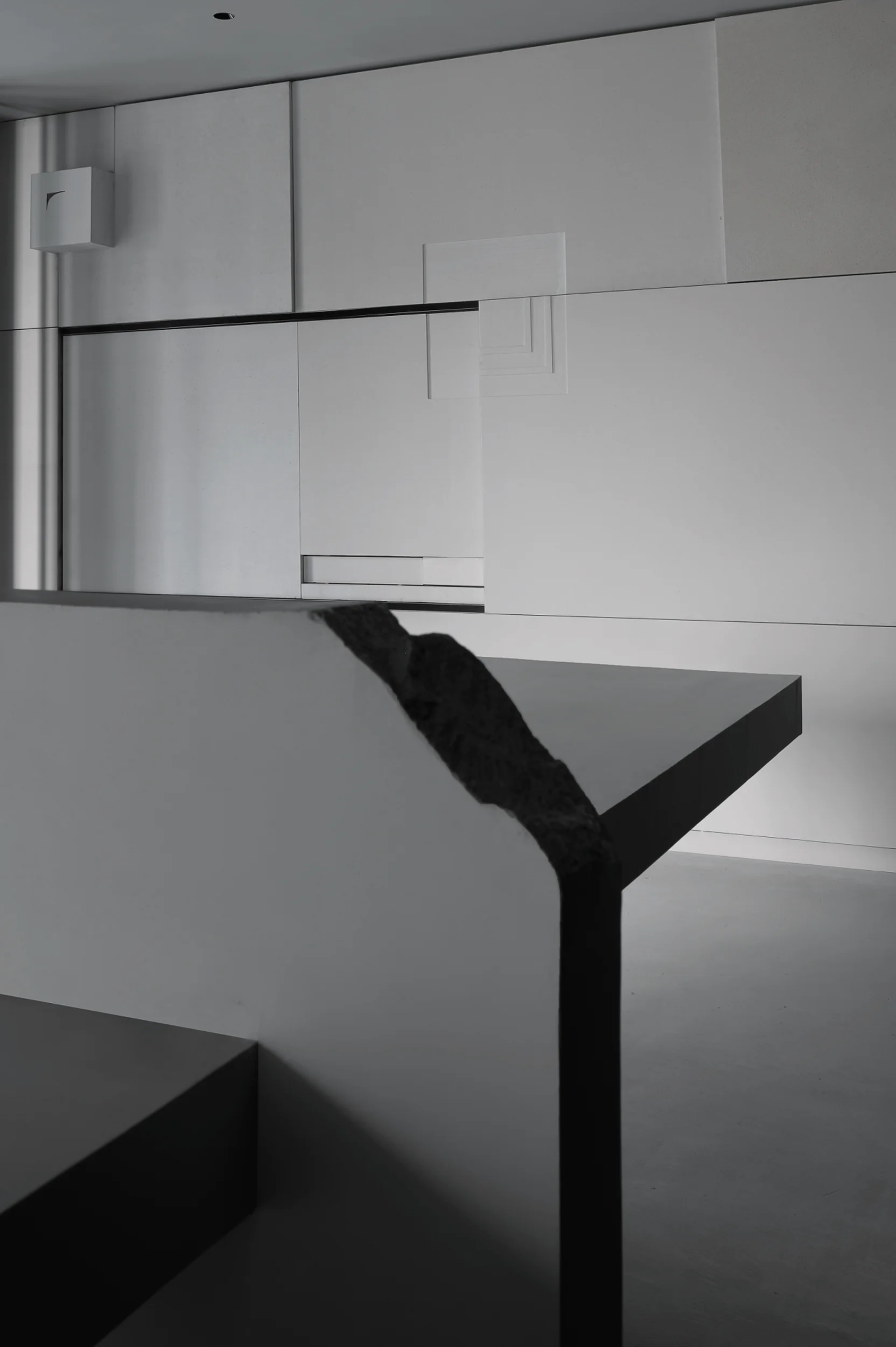
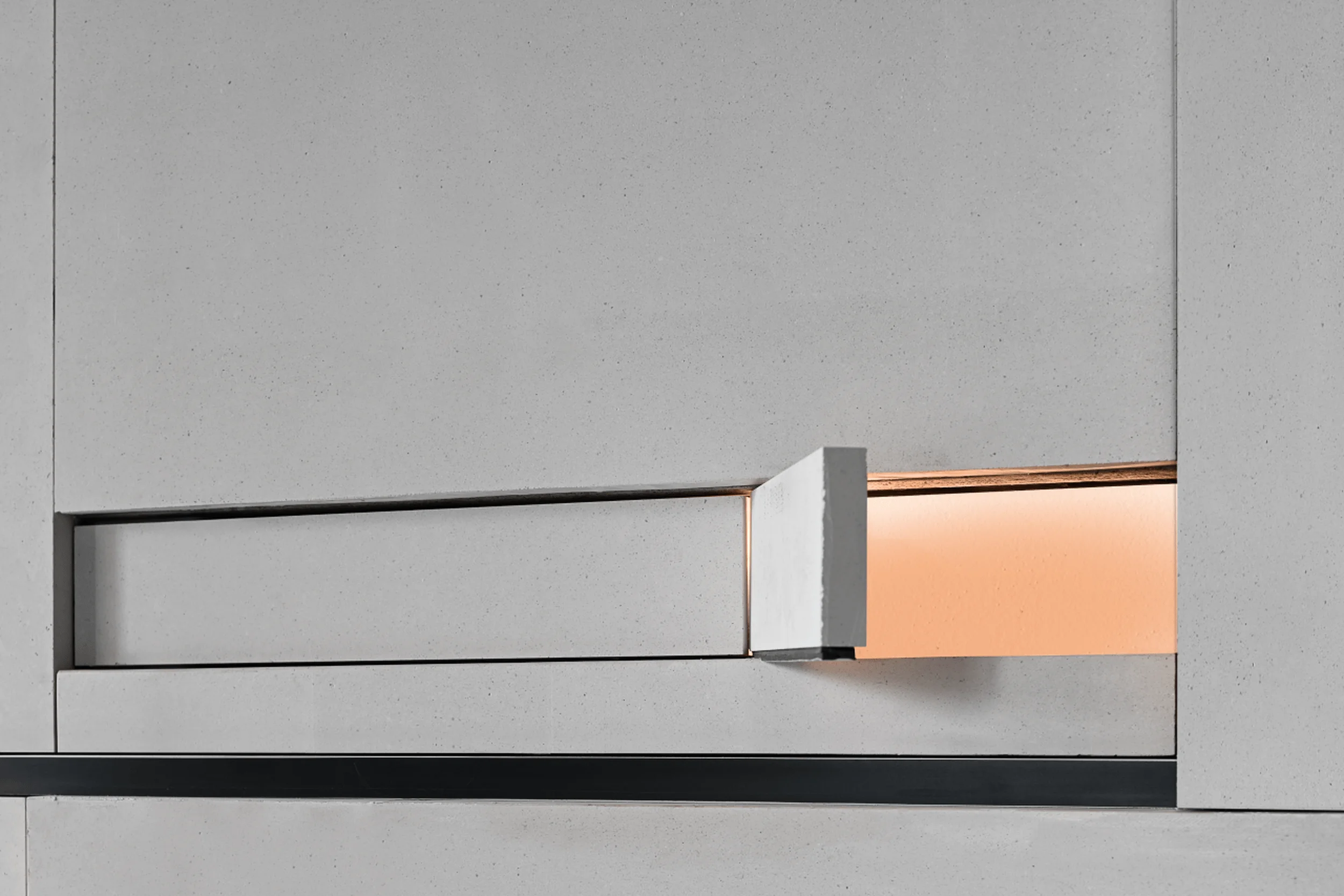
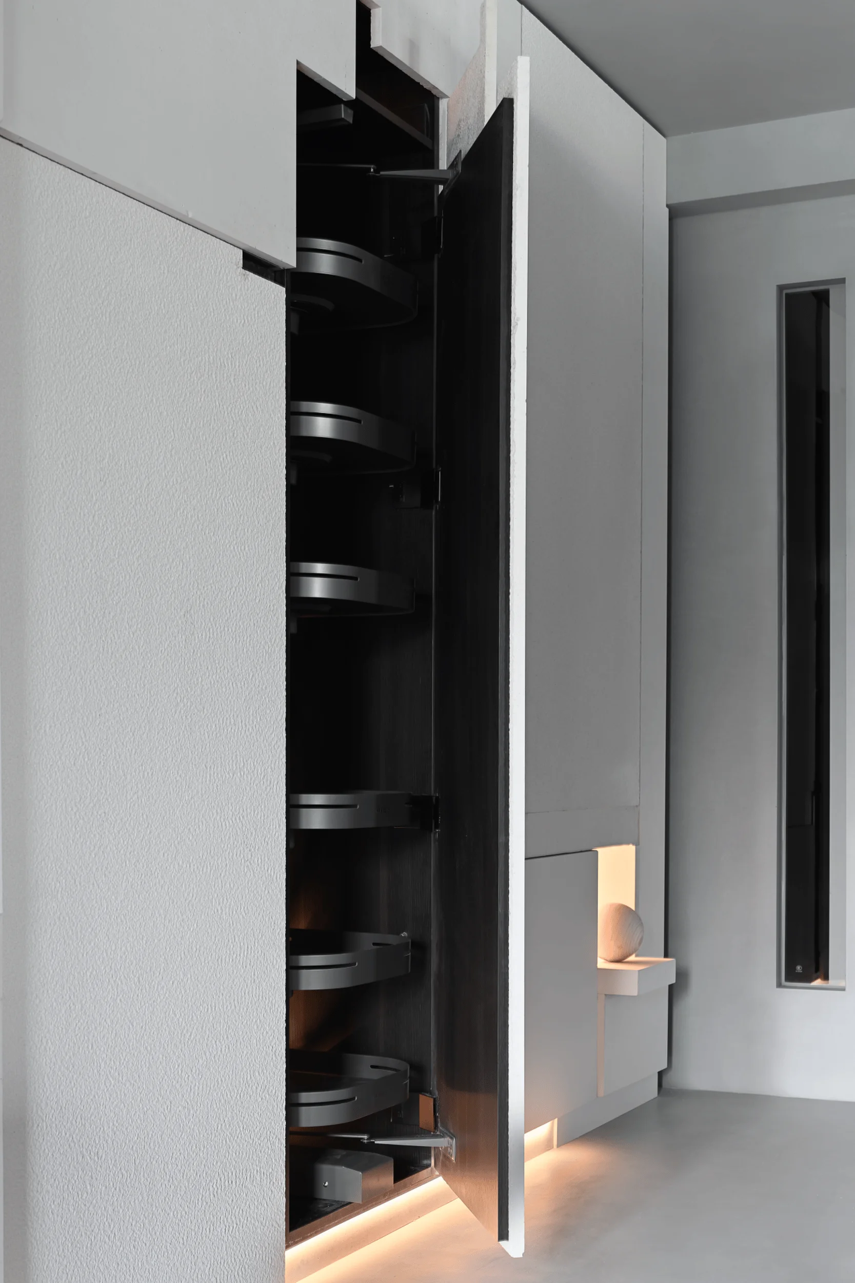
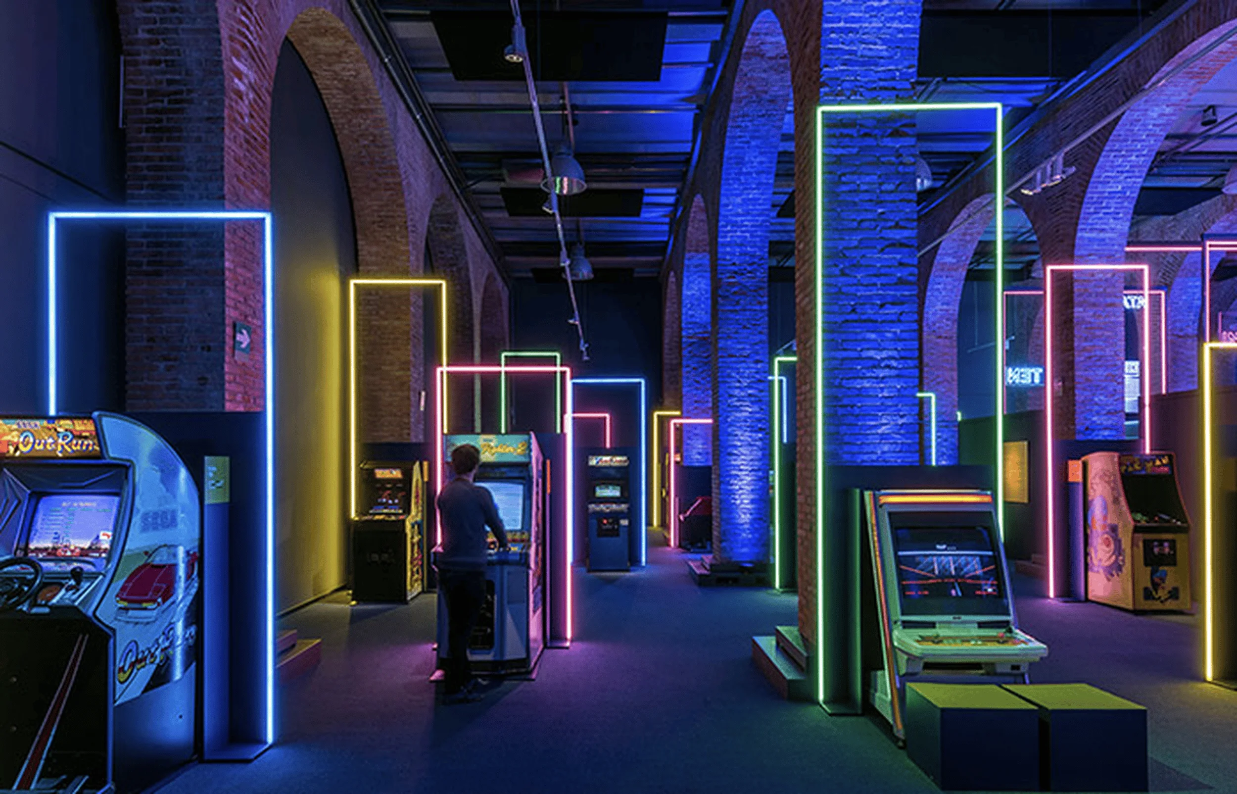
The Hummingbird Wood Workshop in China seamlessly blends technology and tradition in its exhibition space design, creating a captivating experience for visitors.
Contents
Project Background
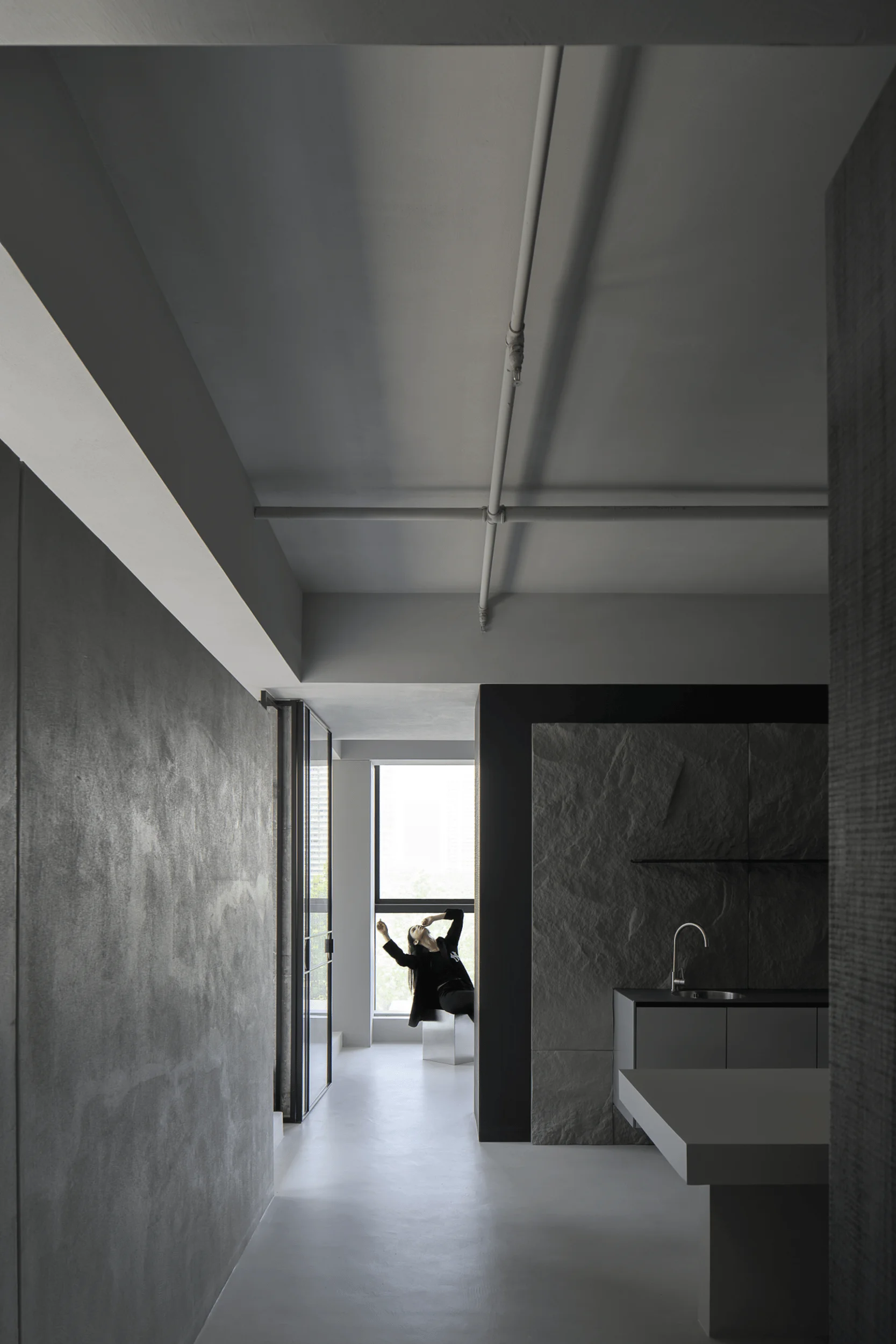
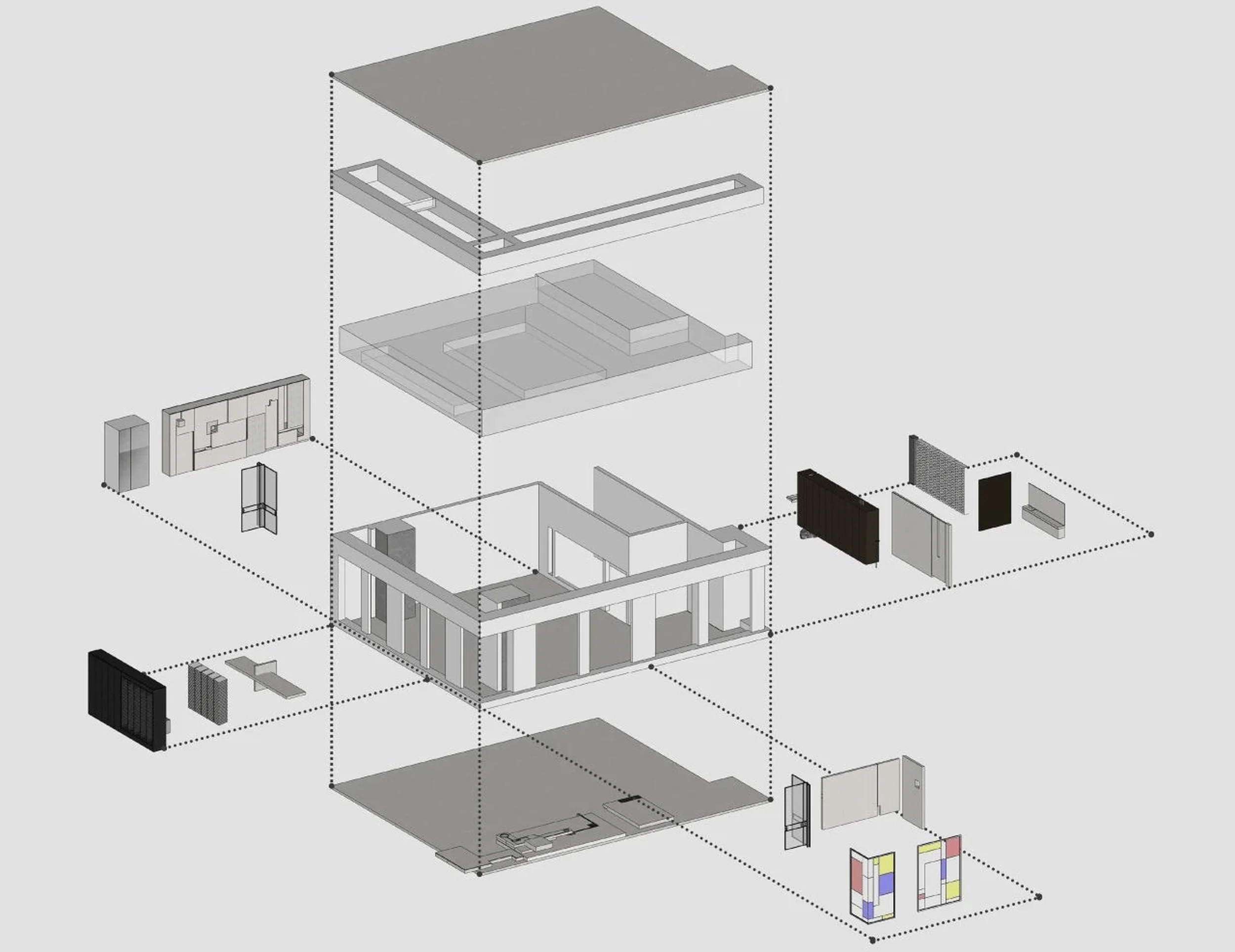
Hummingbird Wood Workshop, a high-end custom woodwork brand focusing on home spaces, originated from an exploration into the essence of wood. They advocate for the rational aesthetics of functionalism and aim to create a unique woodwork exhibition hall through rigorous construction logic. Located in Zhongjiao Center, Hefei, China, the 180 square meter exhibition hall showcases the brand’s commitment to innovative design and craftsmanship. The project was designed by 1890.STUDIO, a design studio based in Hefei. The design team, led by Xia Chenglong and assisted by Zhu Aiting, utilized a combination of materials such as microcement, new wood plastic, iron and steel parts, and plain stone to achieve their vision. The Hummingbird Wood Workshop exhibition space design stands as a testament to the power of blending technology and tradition in creating a captivating and functional environment. exhibition space design, minimalist interior, functionalism
Design Concept and Objectives
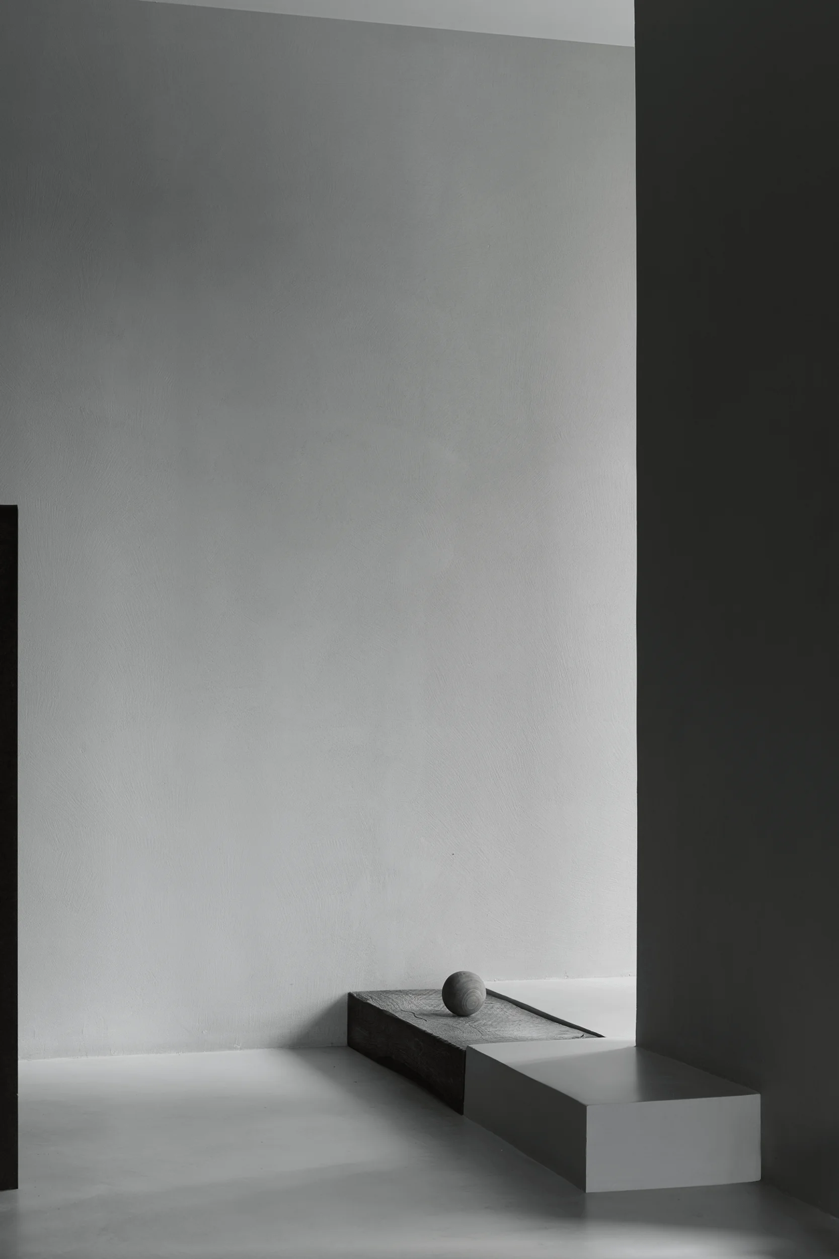
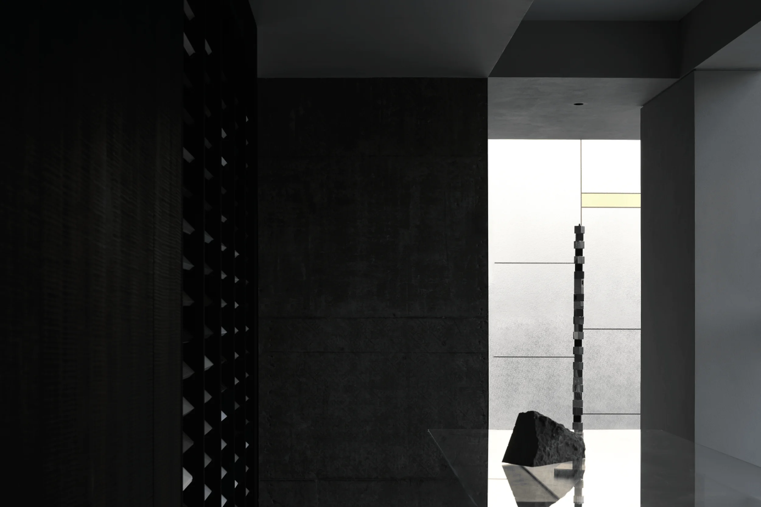
The design team’s primary objective was to create a space that reflects the brand’s philosophy of rational aesthetics and functionalism. They drew inspiration from Carlo Scarpa’s approach to exhibition design, where exhibits become integral parts of the space, impossible to rearrange or move. Even the ethereal light is treated as a detail of the art space, highlighting the importance of meticulous craftsmanship. This concept is evident in the use of microcement, new wood plastic, iron and steel parts, and plain stone, which contribute to the overall aesthetic and functionality of the space. exhibition space design, minimalist interior, functionalism
Functional Layout and Spatial Planning
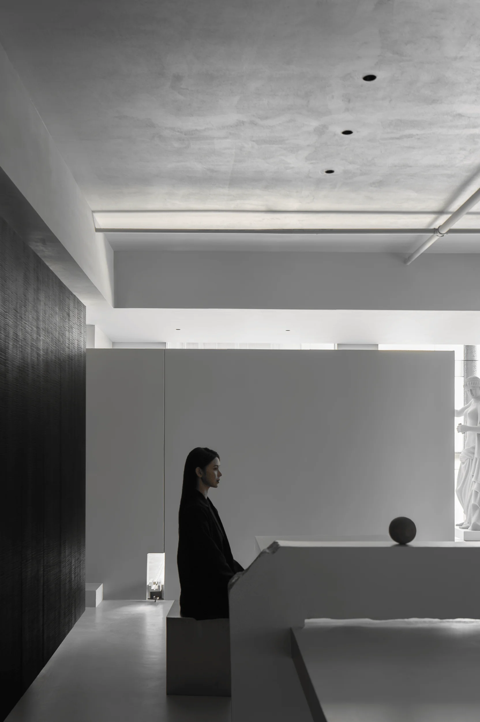
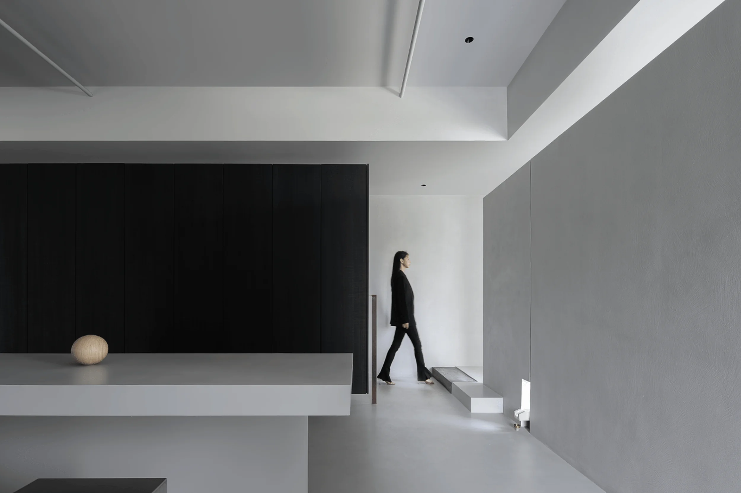
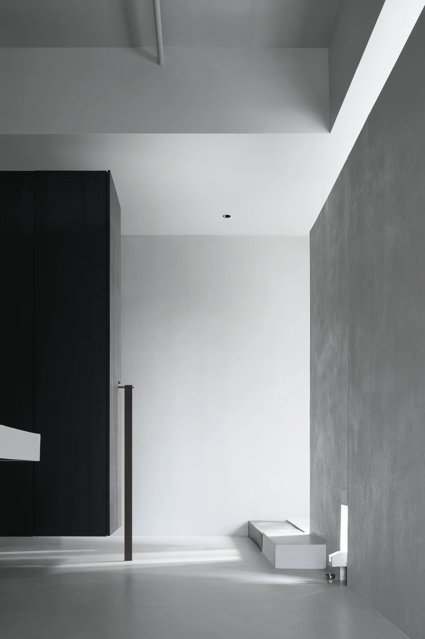
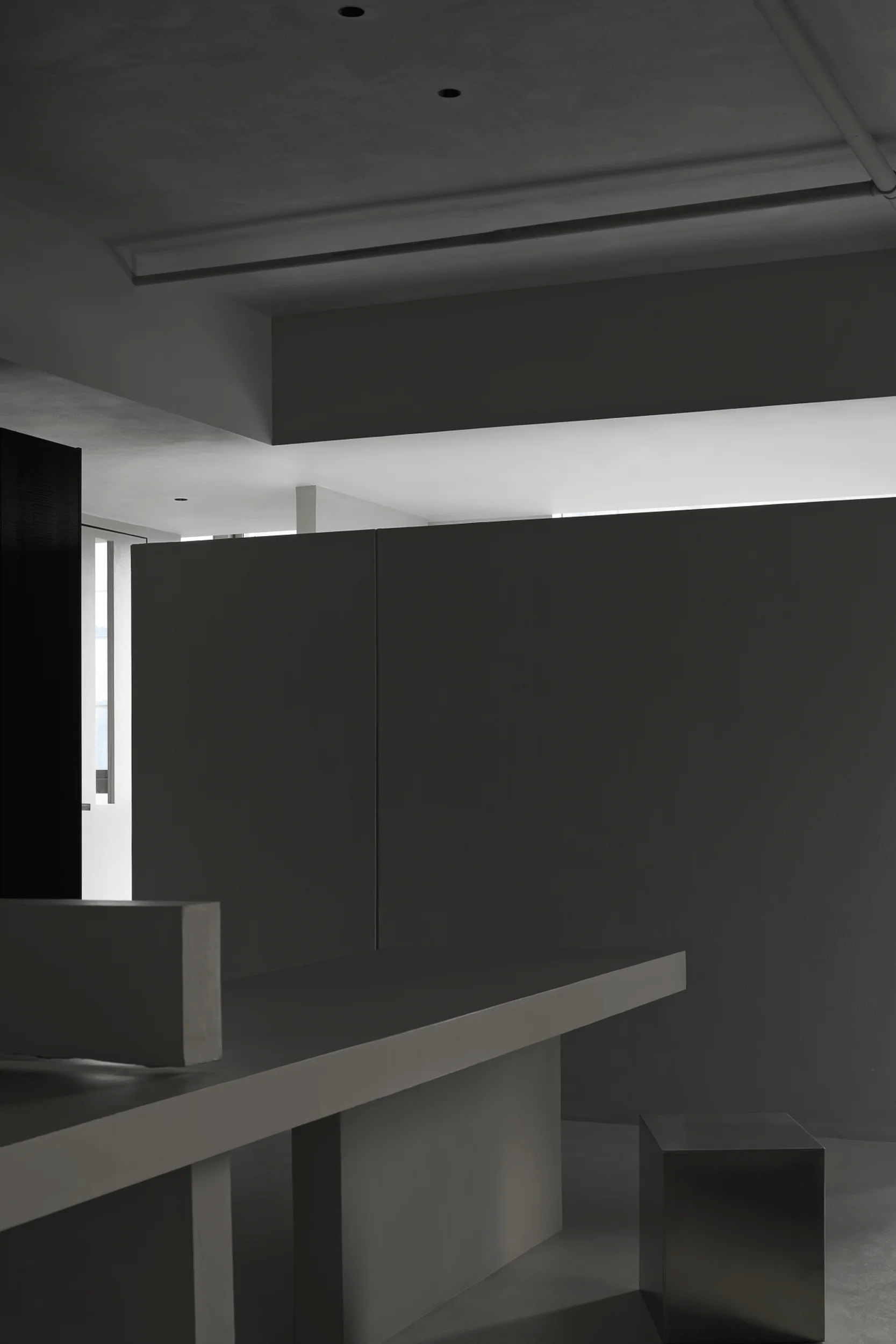
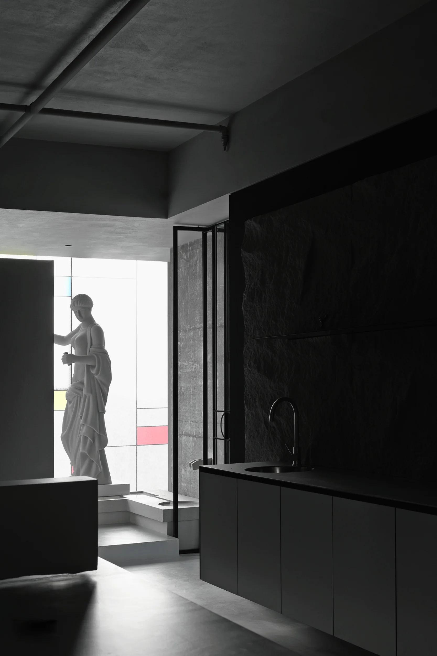
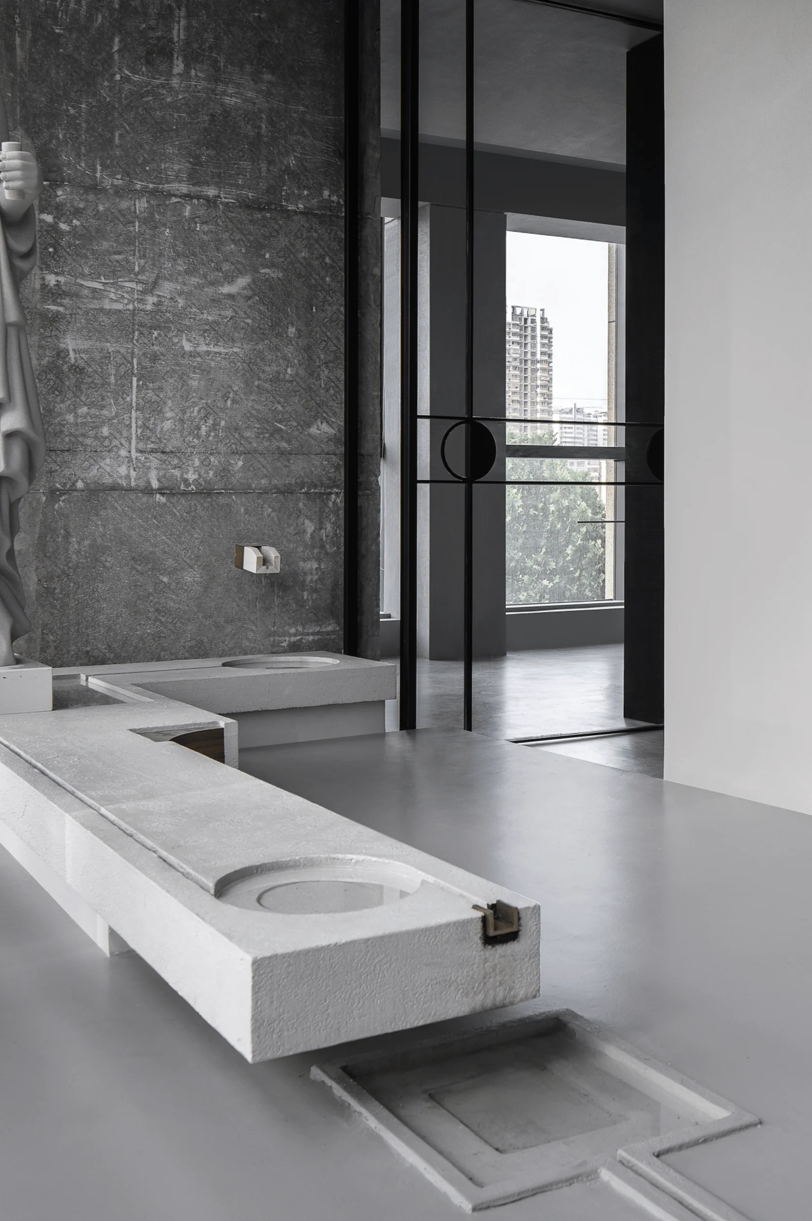
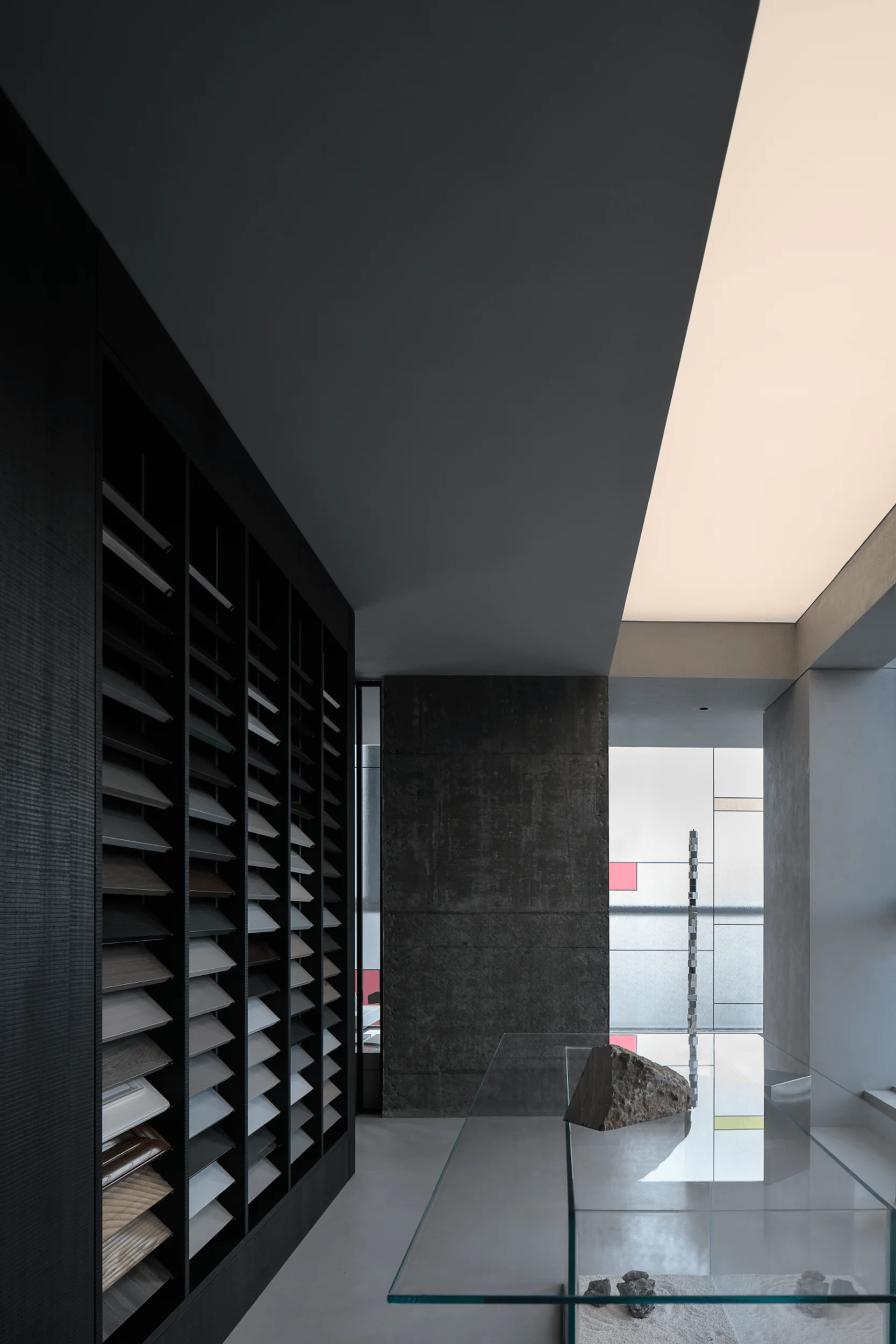
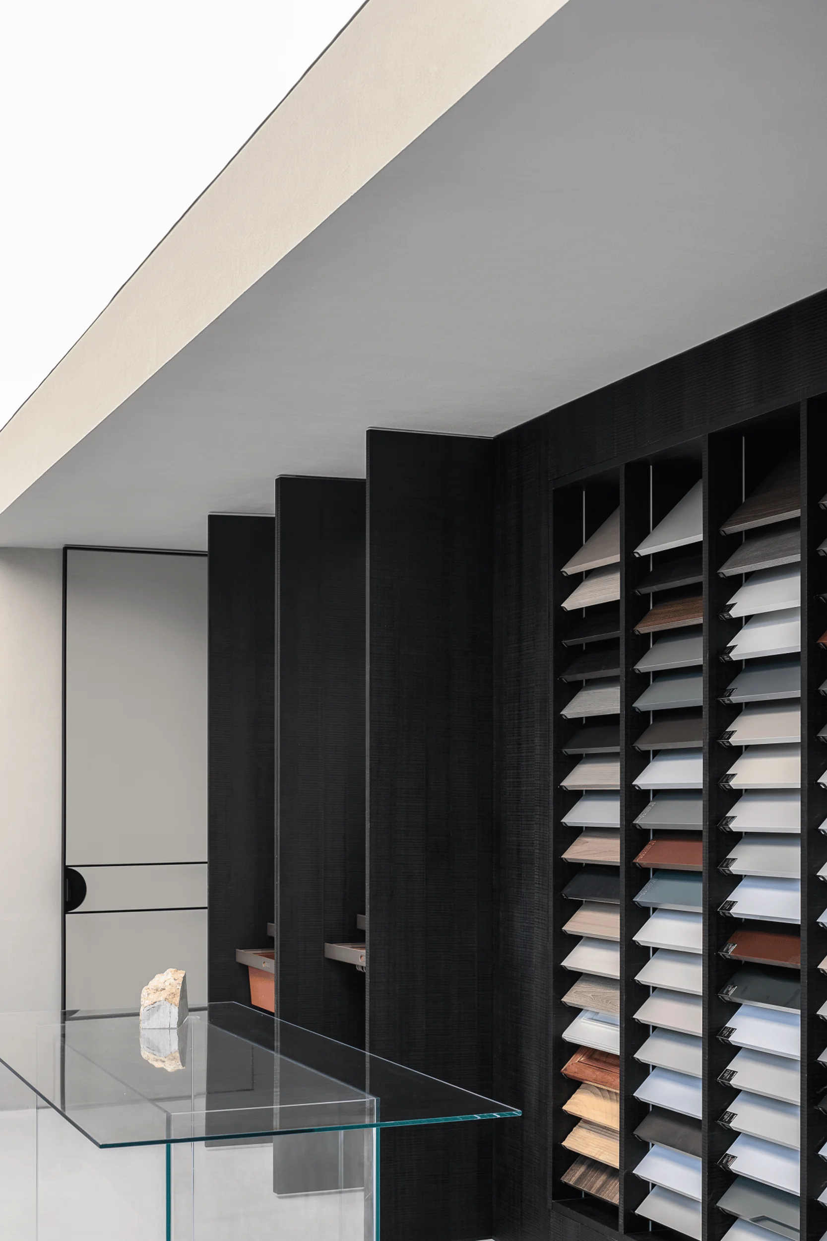
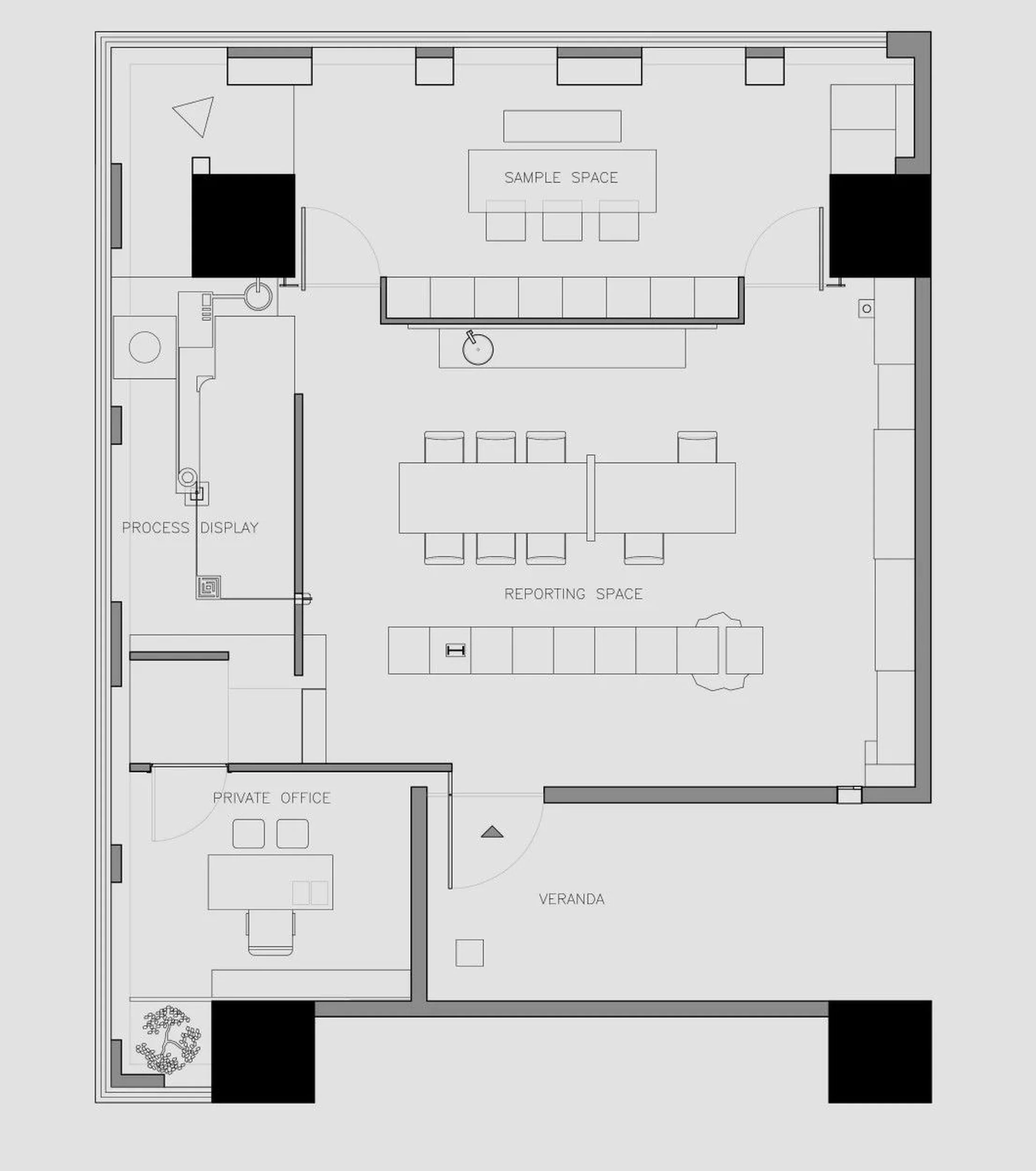
The exhibition hall is organized around a central long table, creating a circular flow that enhances the browsing and experiential aspects of the space. The suspended wooden cabinets and metal rods, alongside the contrast between the delicate flooring and rugged pedals, emphasize the integration of technology and tradition, a key element of the brand’s identity. The aisle to the left leads to the office area without disrupting the flow of the exhibition space. The aisle to the right opens up the space, providing a sense of lightness and airiness. exhibition space design, minimalist interior, functionalism
Exterior Design and Aesthetics
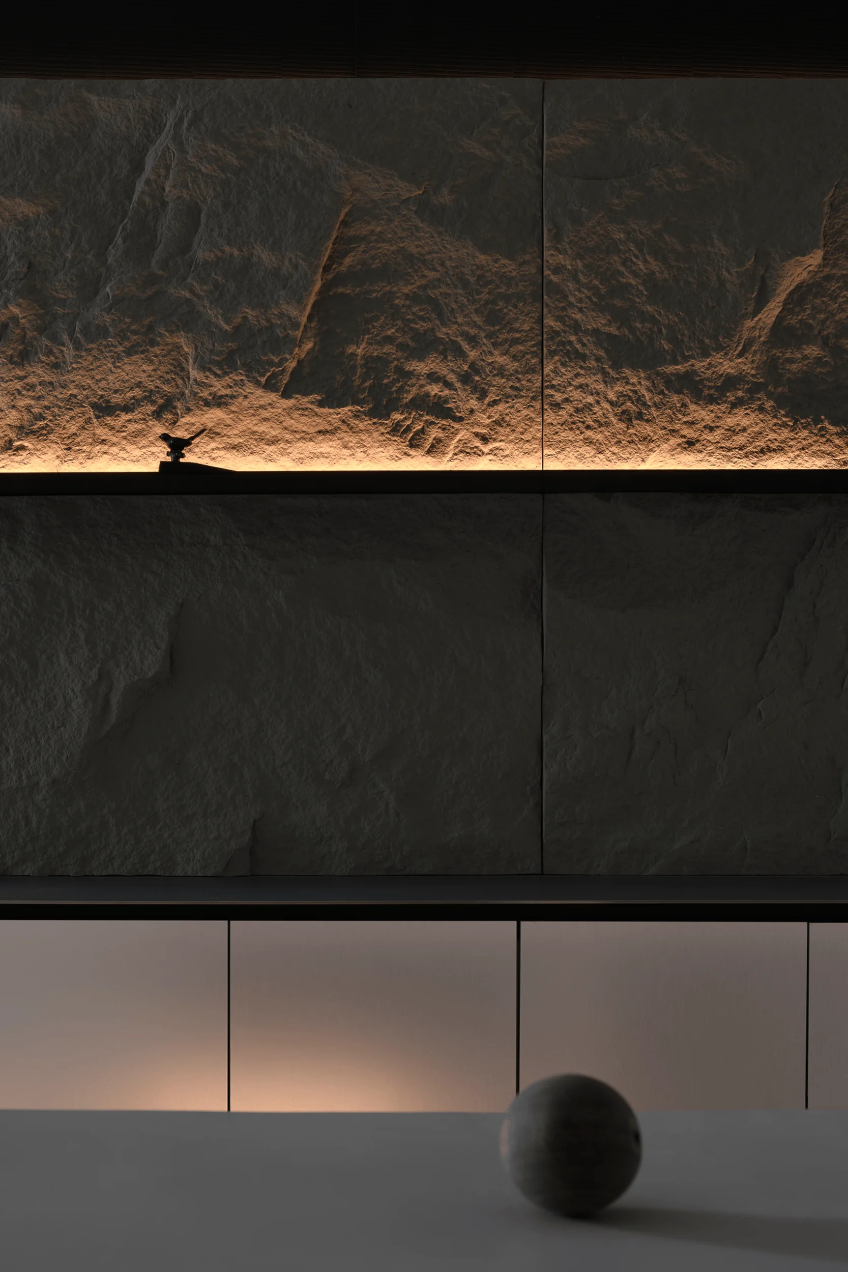
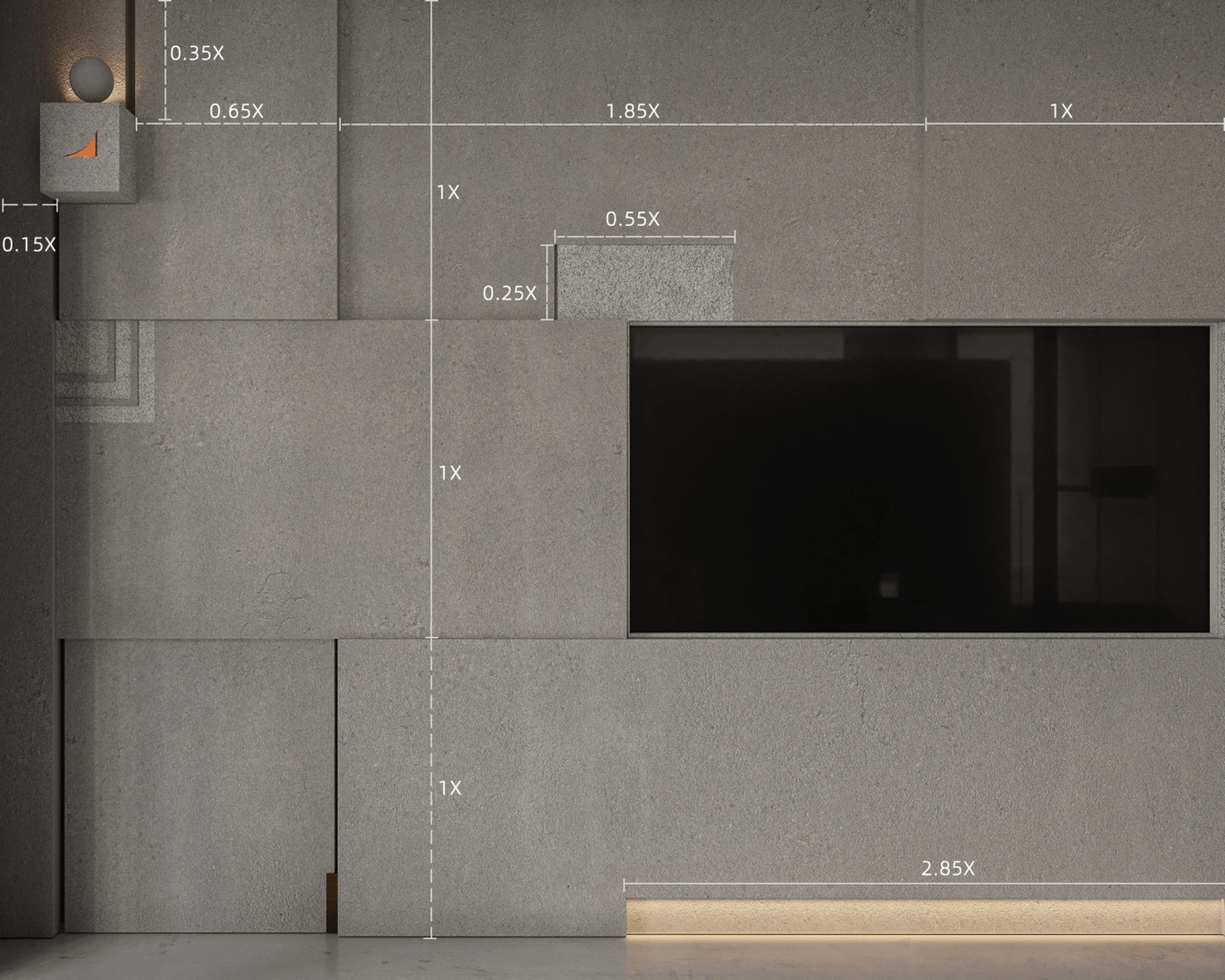
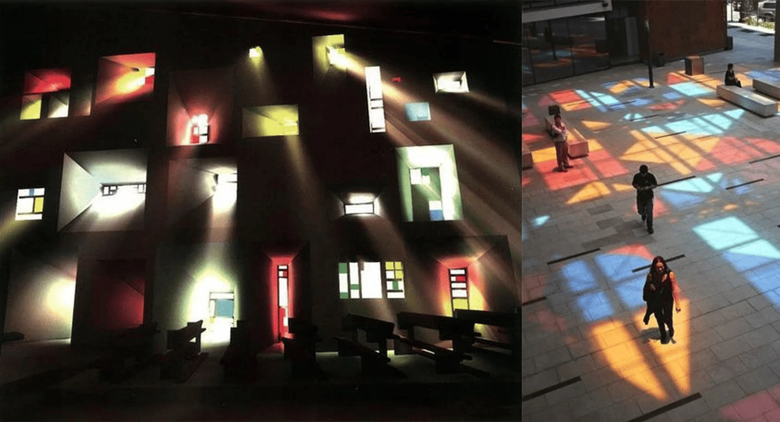
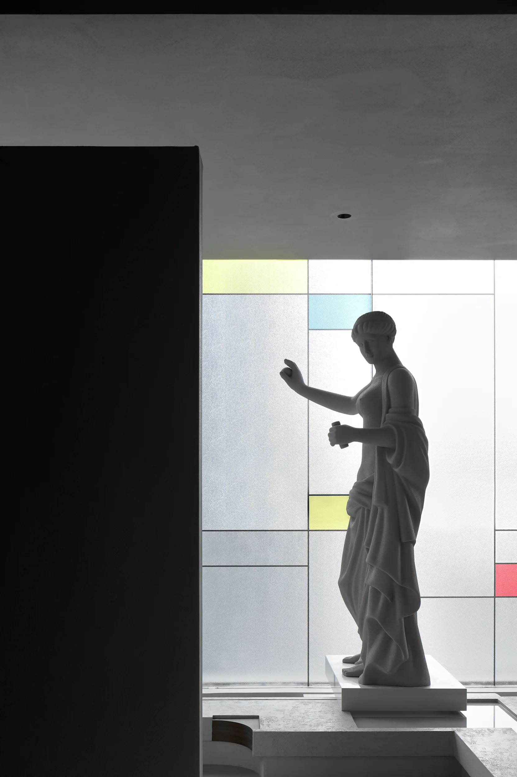
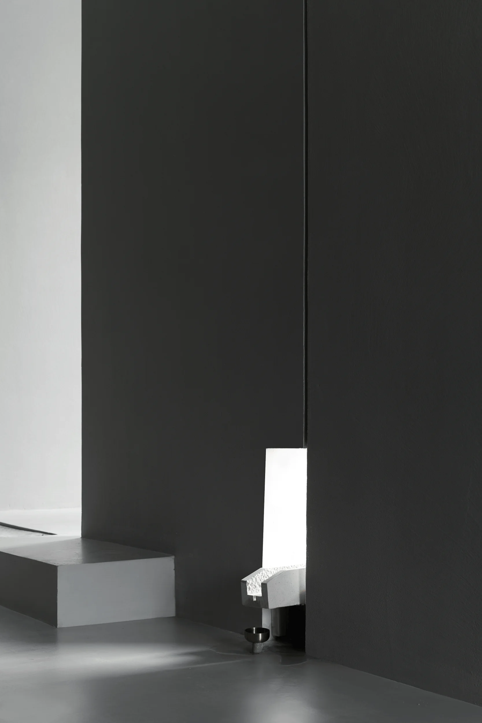
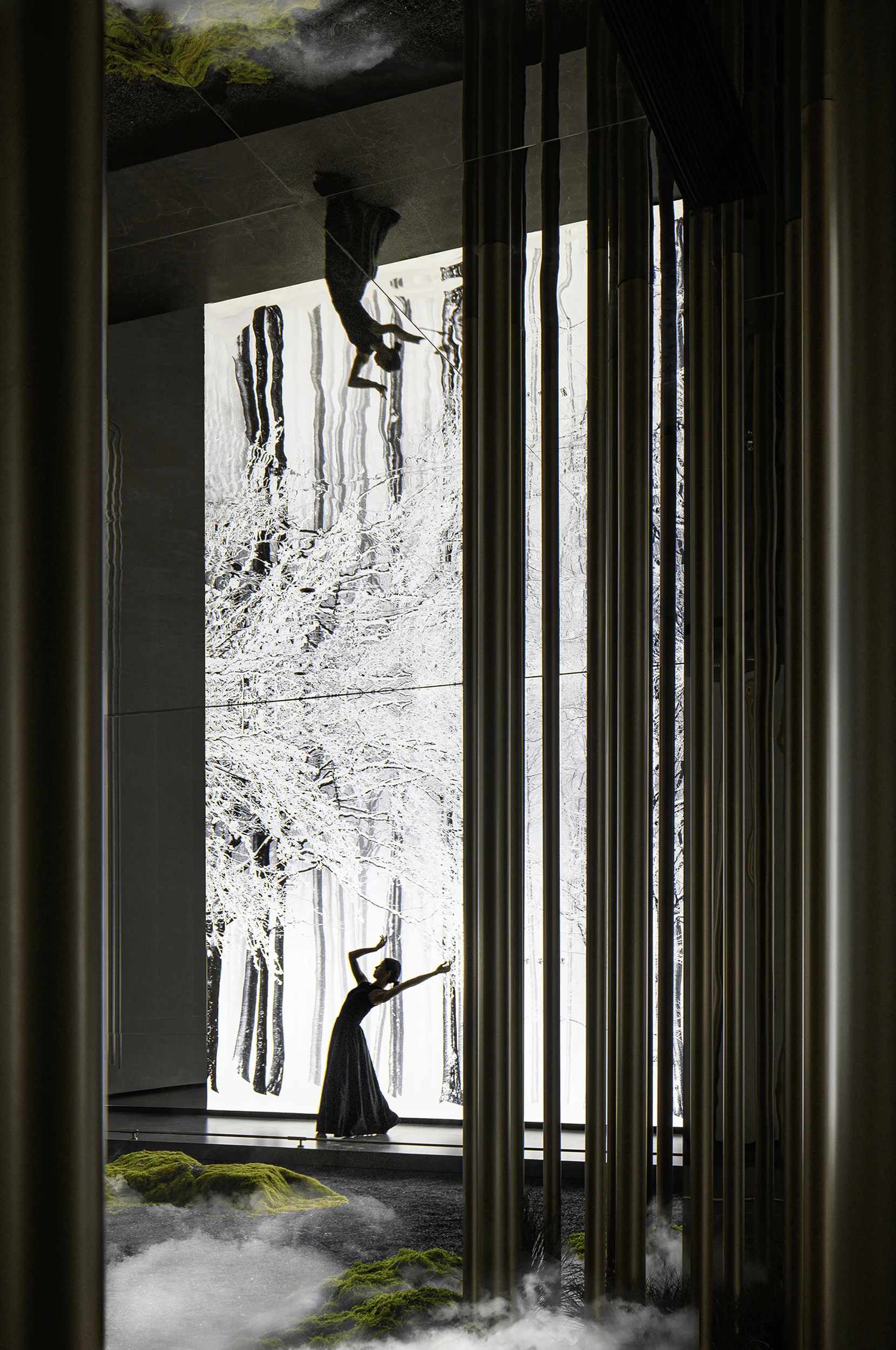
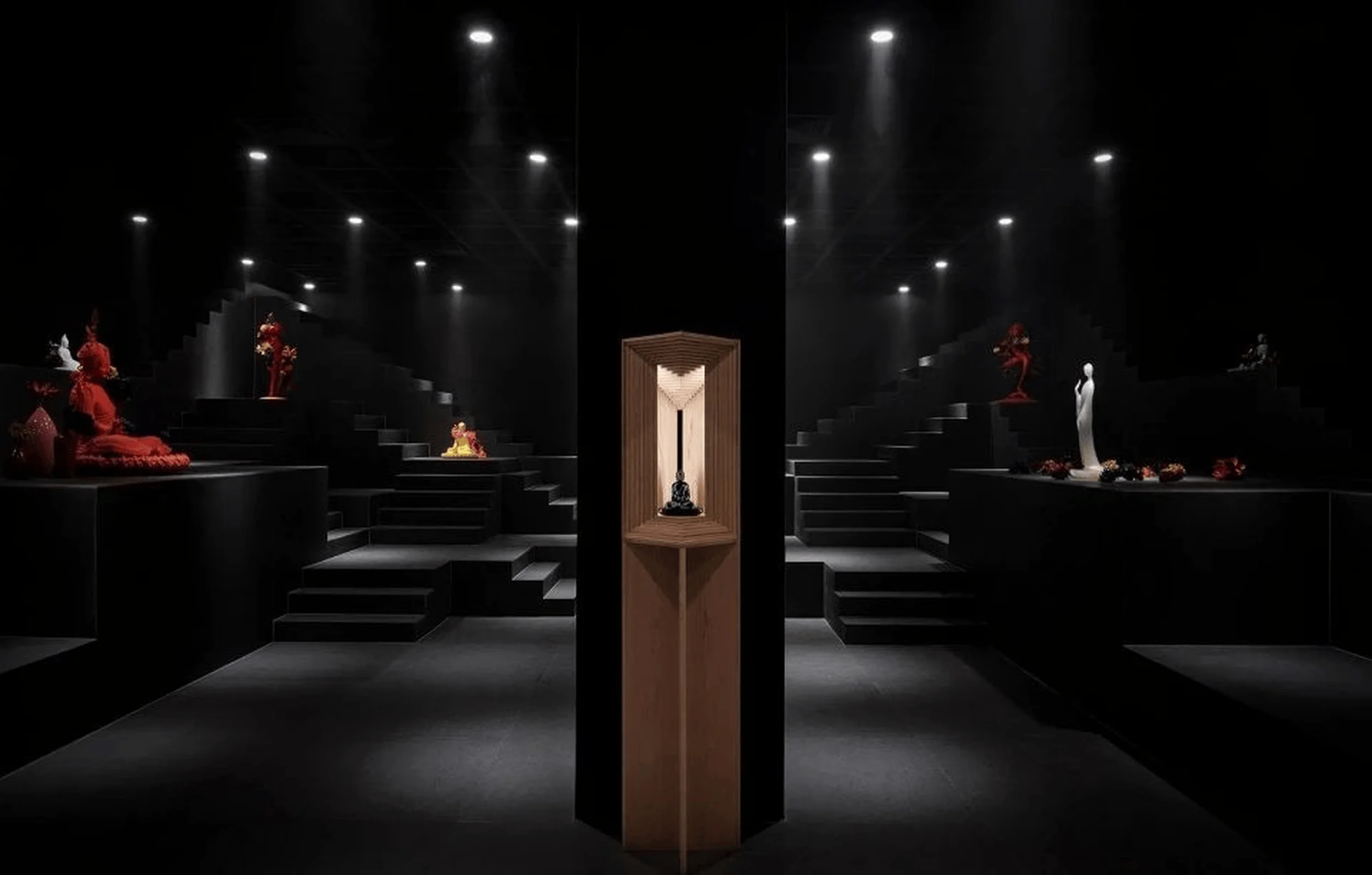
The design team sought to create a harmonious blend of Western classical and modern aesthetics. The use of Western classical sculpture, particularly its adherence to the golden ratio, aligns with the brand’s pursuit of restrained beauty. This is juxtaposed with elements inspired by Le Corbusier’s Ronchamp Chapel, as seen in the play of light and shadow throughout the space. The subtle interplay of light and the flowing water features add a touch of gentle sensibility to the otherwise rational and robust space. exhibition space design, minimalist interior, functionalism
Technology, Sustainability and Social Impact
While the project information does not explicitly mention specific technologies or sustainability measures, the choice of materials and the emphasis on functionality suggest a commitment to creating a durable and efficient space. The use of microcement, known for its durability and low maintenance, aligns with sustainable design principles. Moreover, the exhibition hall serves as a platform for promoting the brand’s philosophy and craftsmanship, potentially influencing the local design community and fostering a greater appreciation for the use of wood in interior spaces. exhibition space design, minimalist interior, functionalism
Conclusion
The Hummingbird Wood Workshop exhibition space design successfully embodies the brand’s core values of rational aesthetics, functionalism, and the seamless integration of technology and tradition. The meticulously crafted space, with its attention to detail and harmonious blend of materials, provides a captivating and immersive experience for visitors. By incorporating elements of Western classical and modern design, the exhibition hall stands as a testament to the brand’s commitment to innovation and its dedication to creating unique and meaningful spaces. exhibition space design, minimalist interior, functionalism
Project Information:
Project Type: Exhibition Space Design
Architect: 1890.STUDIO
Area: 180m²
Project Year: Not specified
Project Location: China
Main Materials: Microcement, New Wood Plastic, Iron and Steel Parts, Plain Stone
Photographer: 1890.STUDIO


