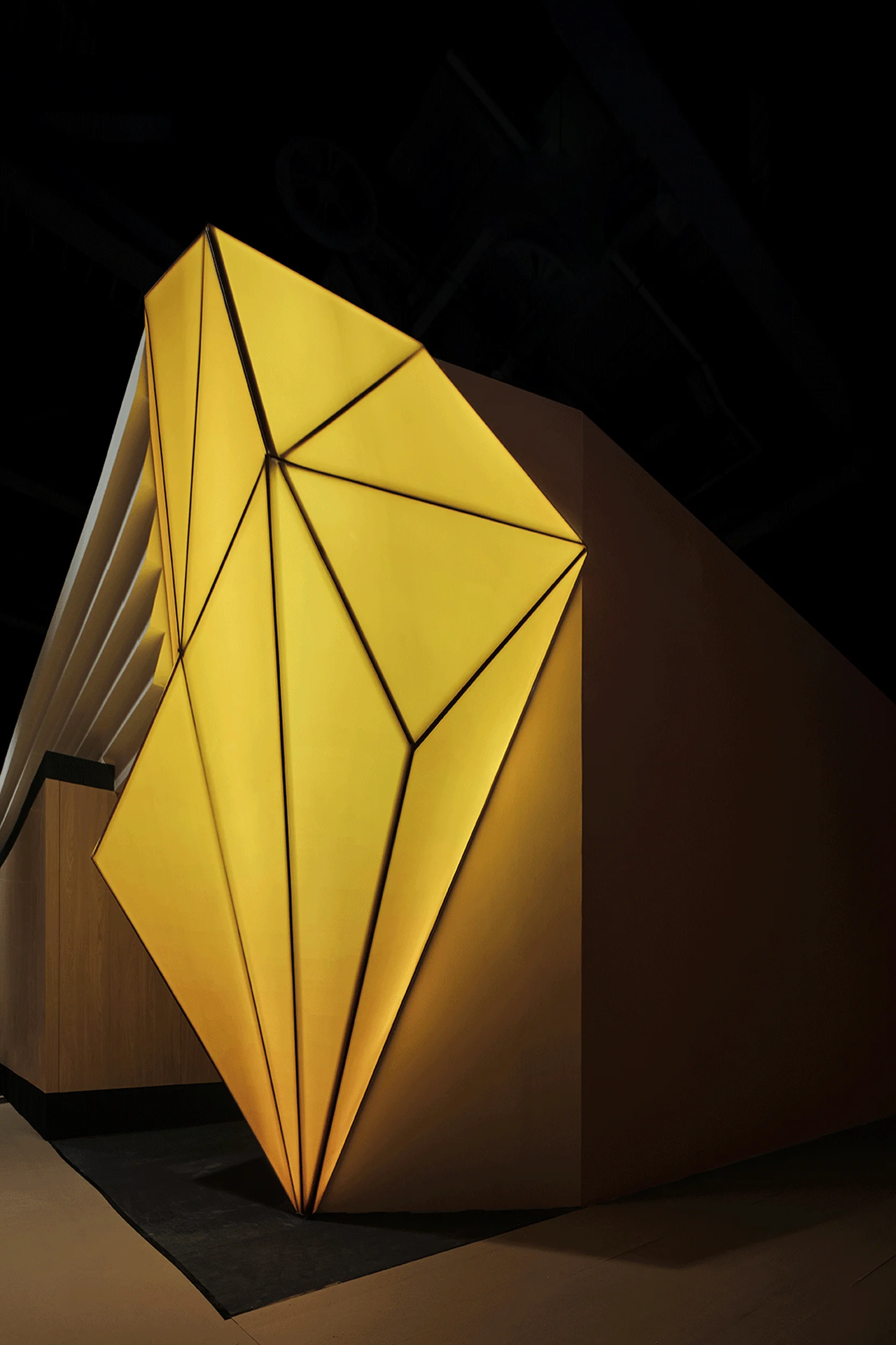
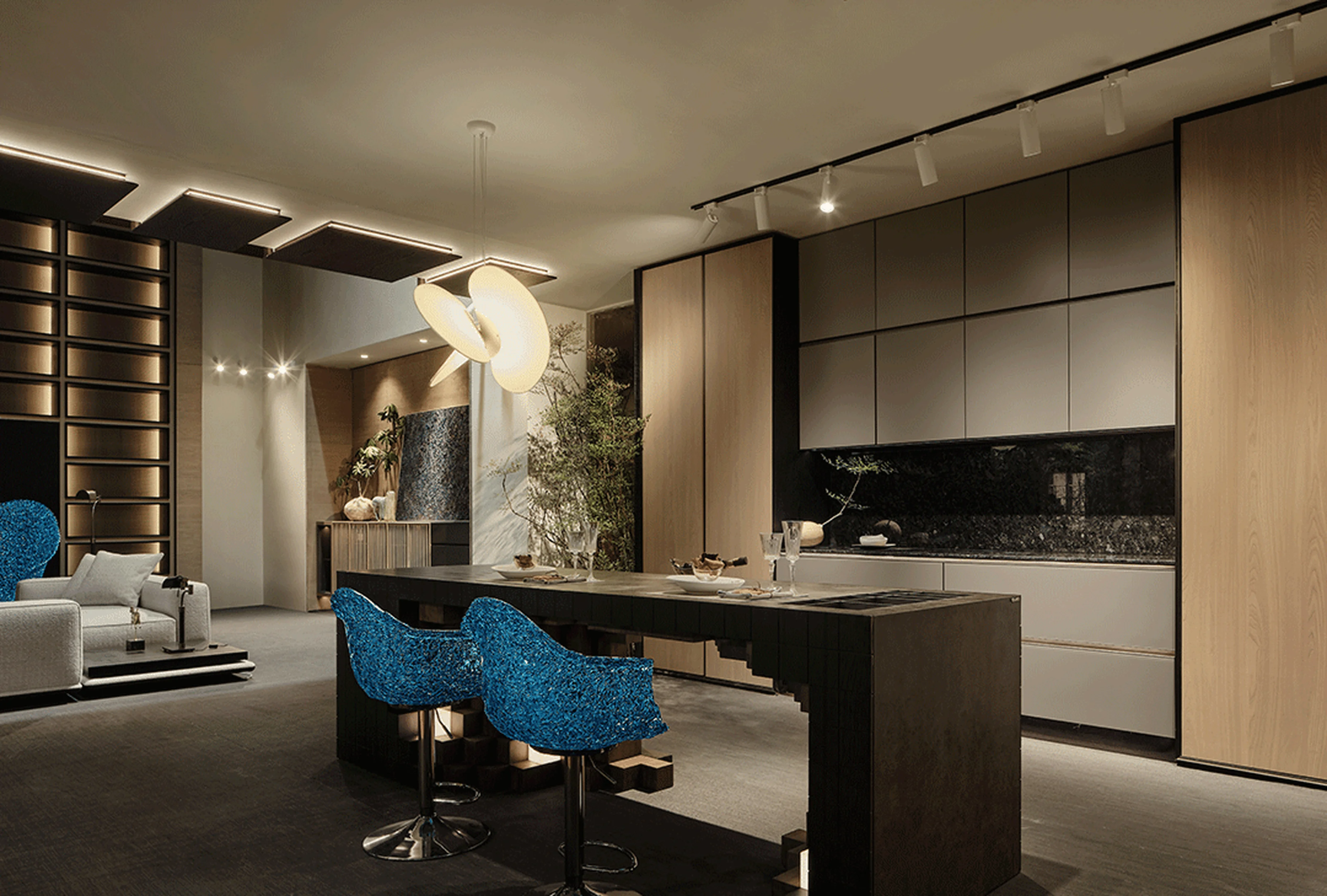
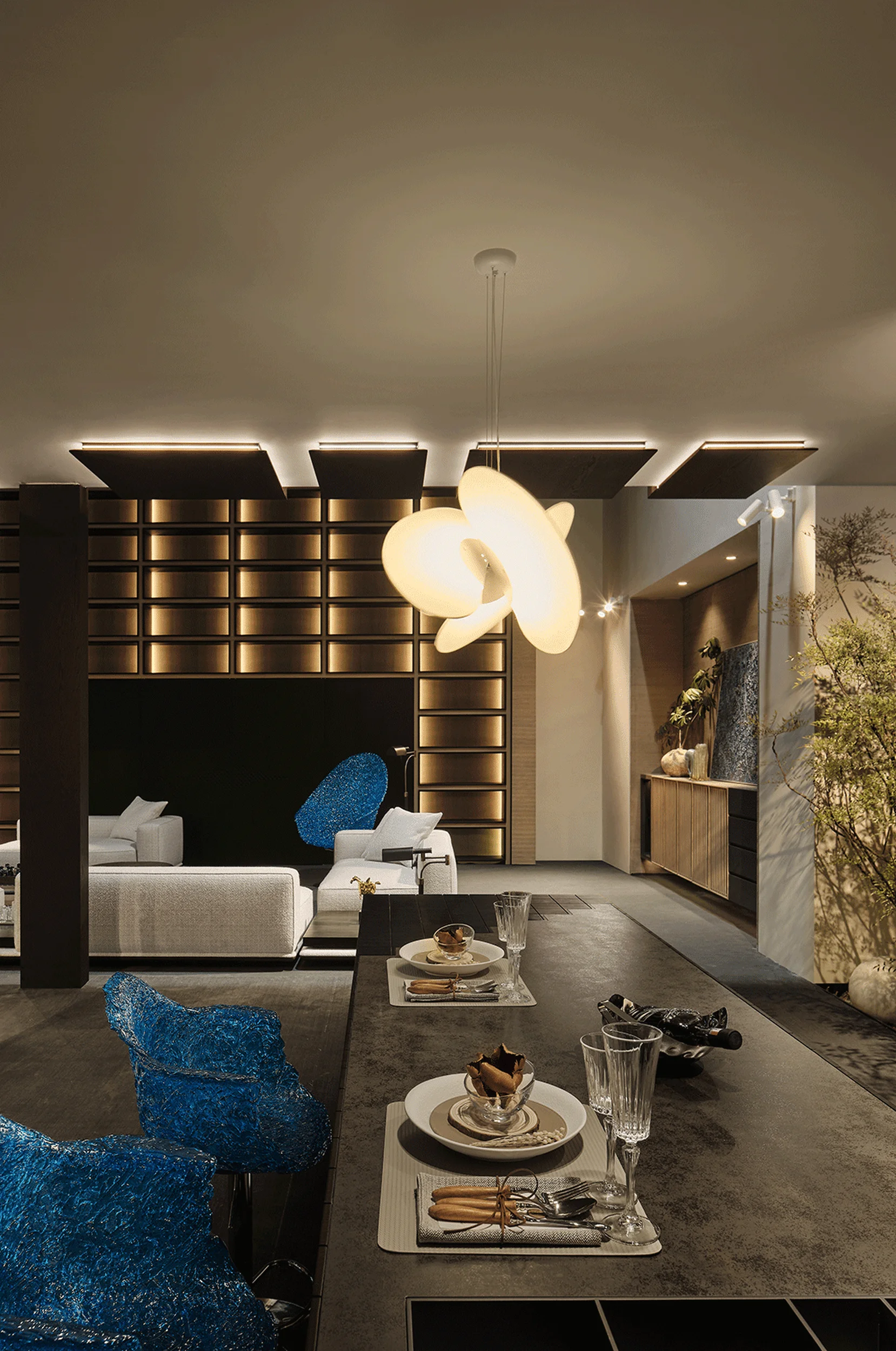
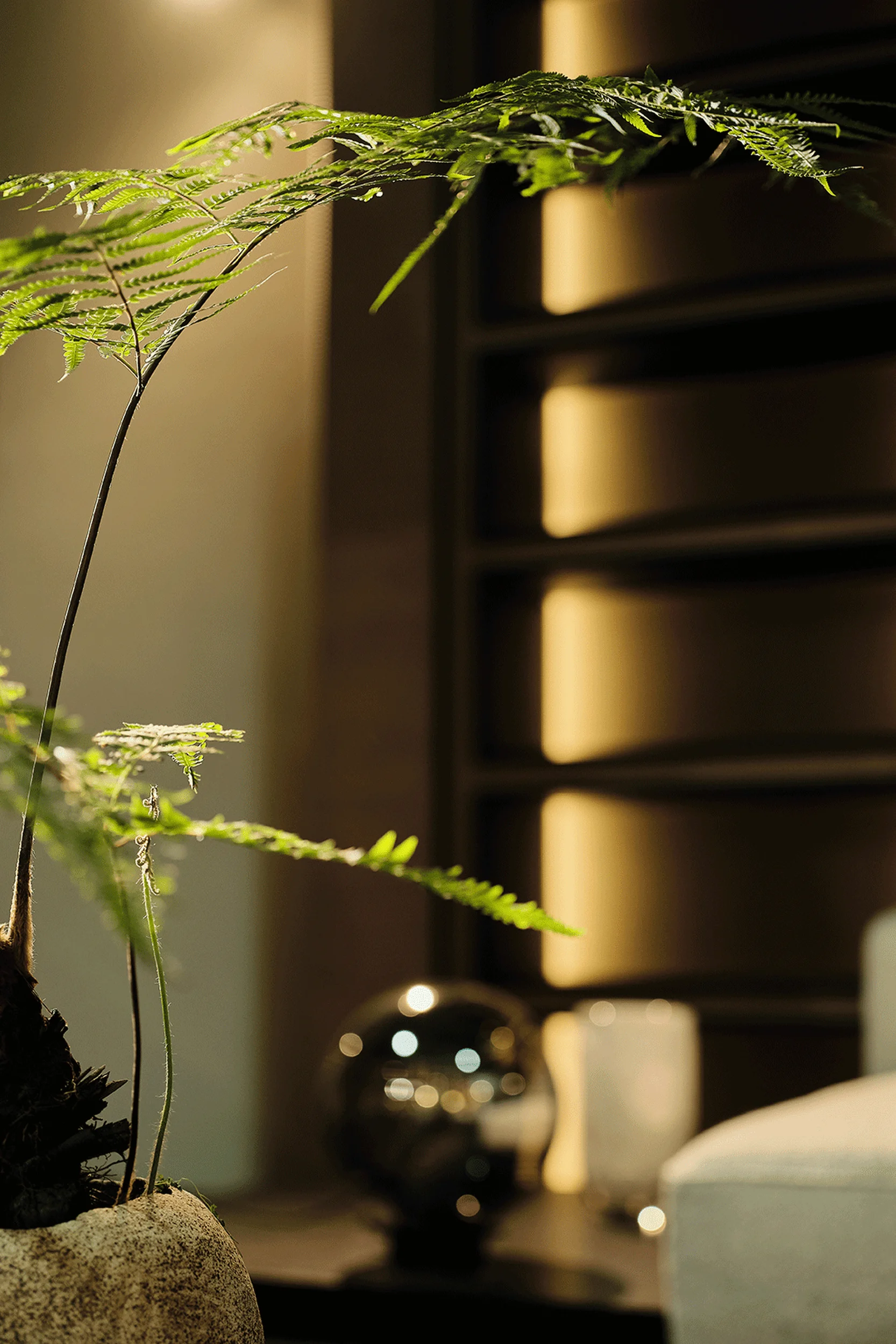
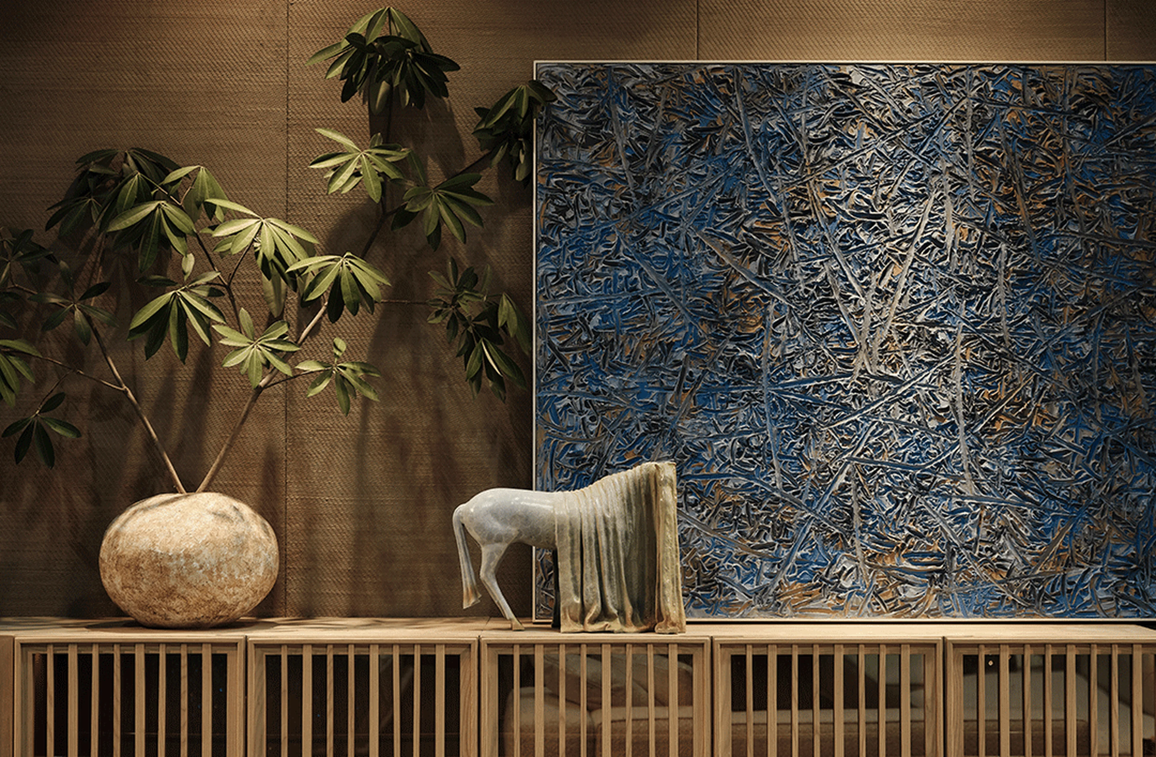
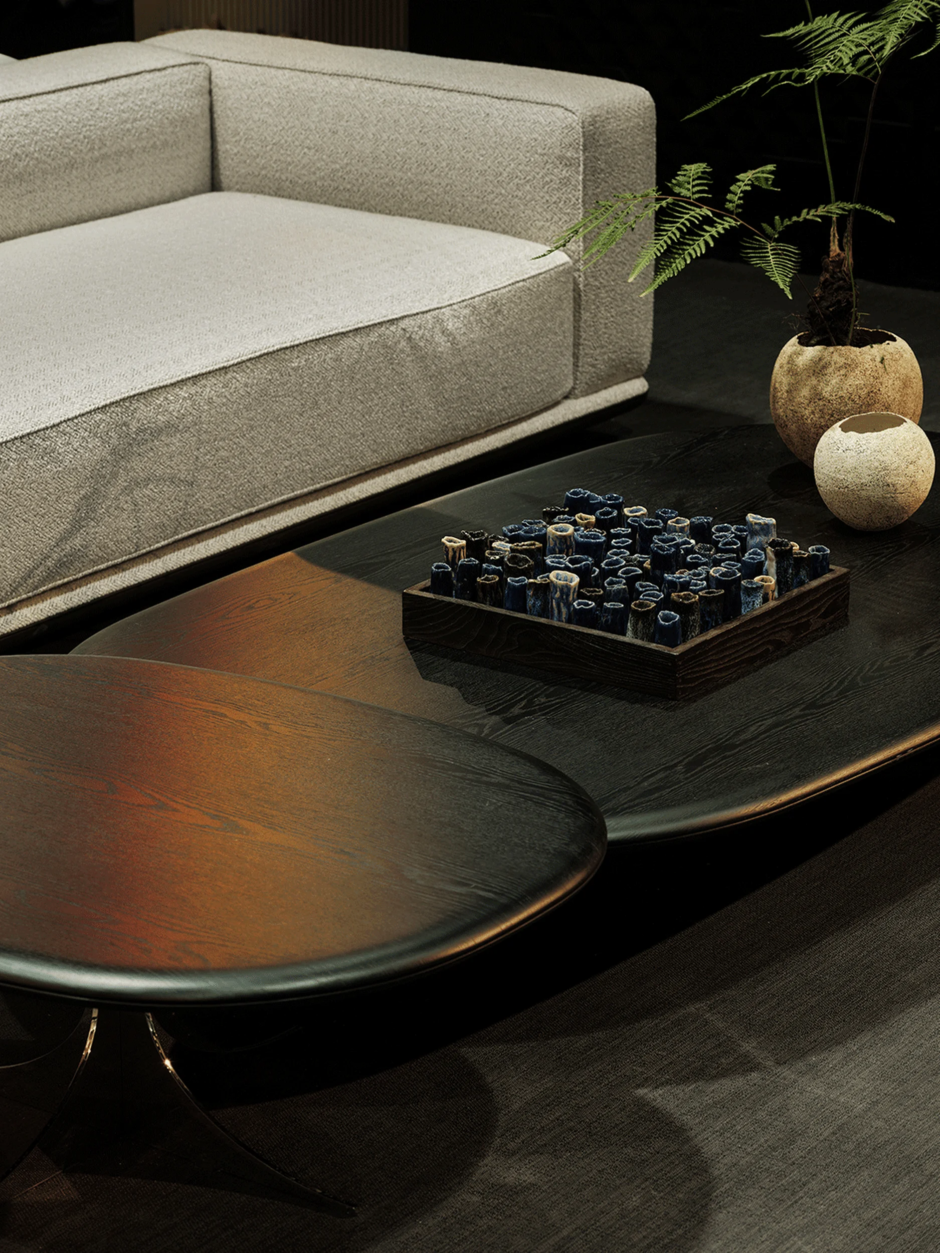
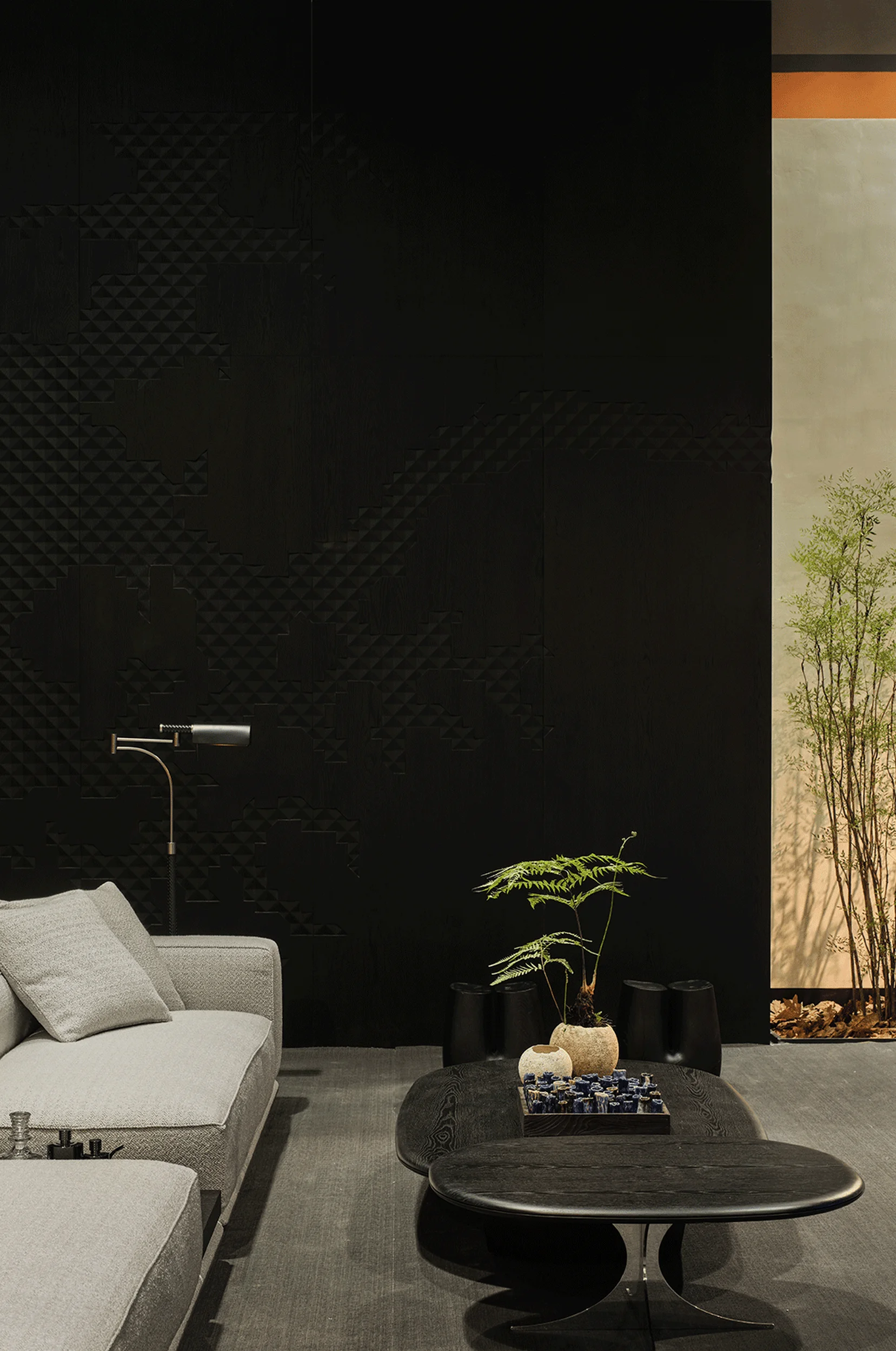
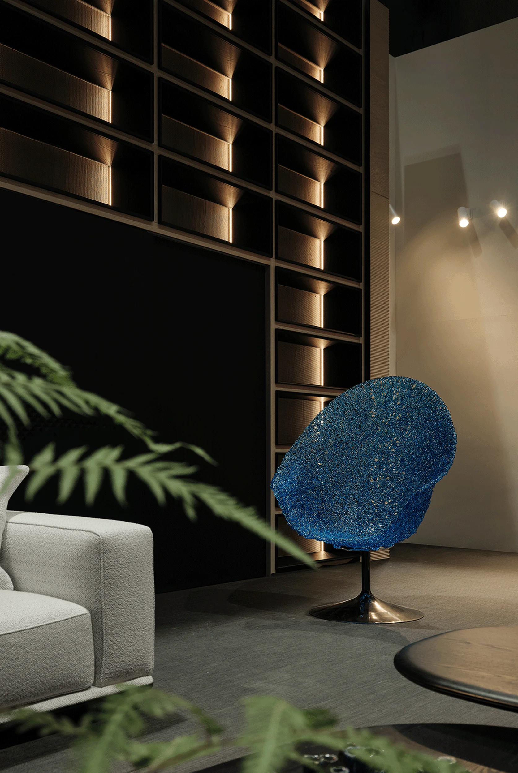
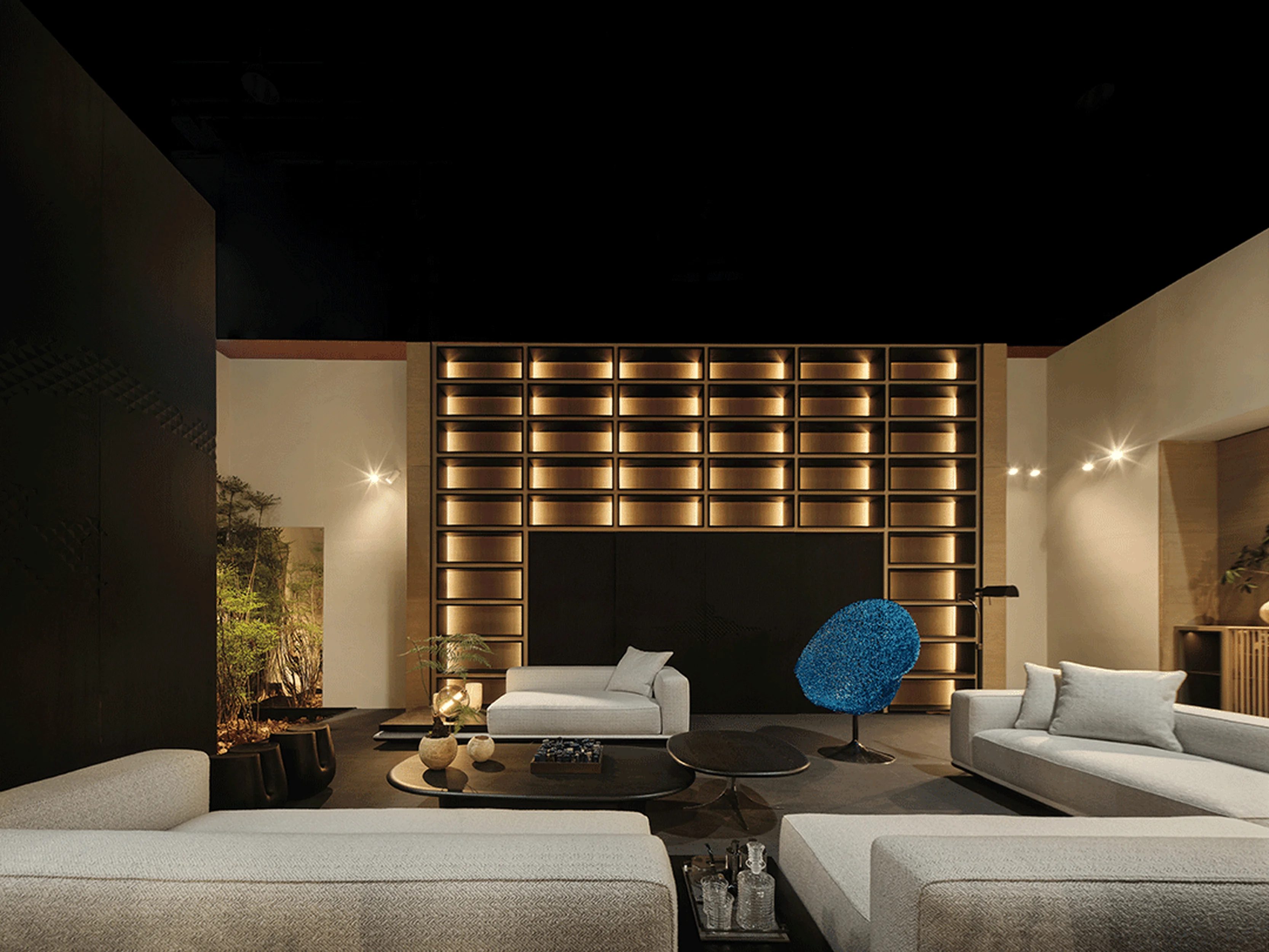
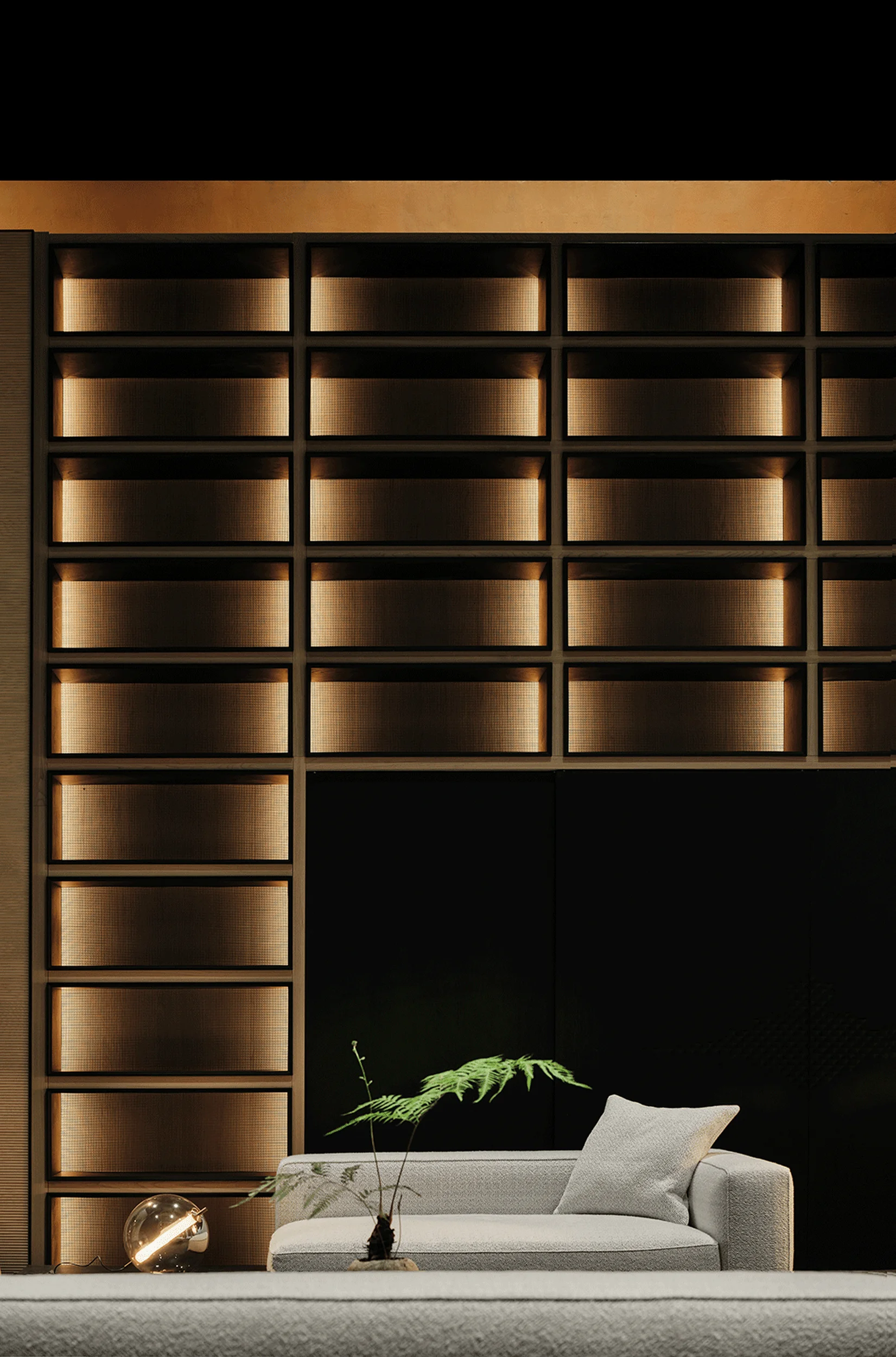
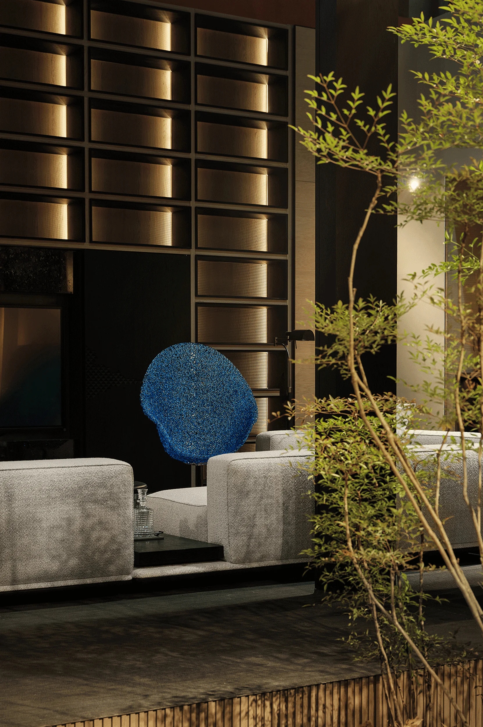
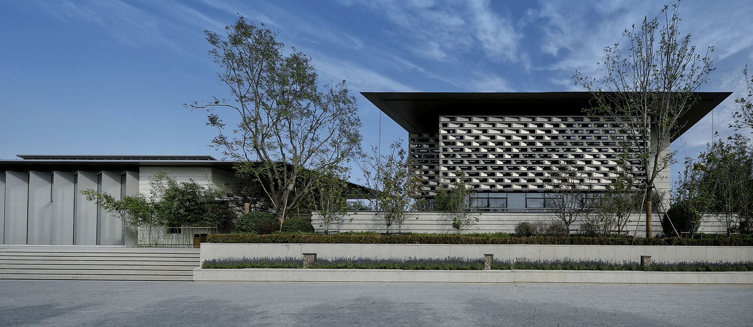
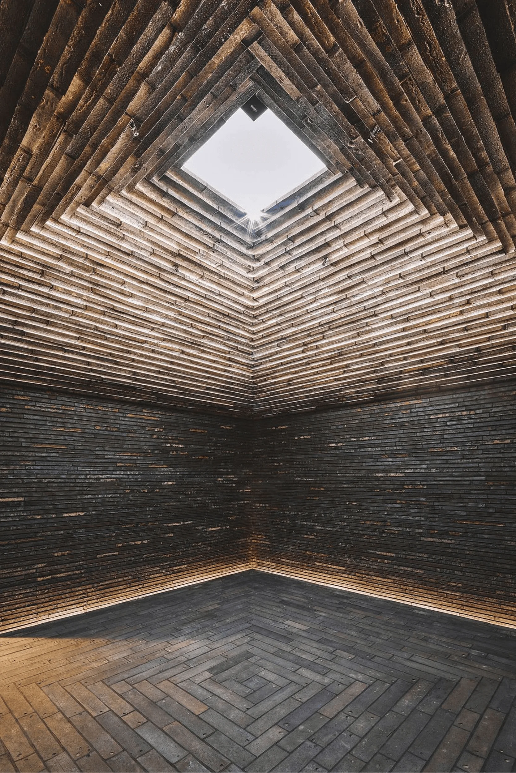
Guangzhou Design Week exhibition hall project features product and space design, using Song dynasty aesthetics.
Contents
Project Background: A Unique Design Challenge
This project marks the sixth collaboration with the same client, but with a unique twist. Instead of a conventional exhibition space, it aimed to design both a temporary display for Guangzhou Design Week and a permanent exhibition hall. Furthermore, the project extended beyond spatial design, encompassing product development – a new territory for the design studio. Balancing space and product design, two distinct disciplines, posed a significant challenge. The challenge was to determine which would take precedence and how to establish a cohesive conceptual foundation for both aspects. This project showcases how to design the space around the product, while maintaining a consistent aesthetic and narrative. tag: product and space design, exhibition design, design week, Song Dynasty aesthetics.
Design Concept: Inspired by the Brand’s Essence
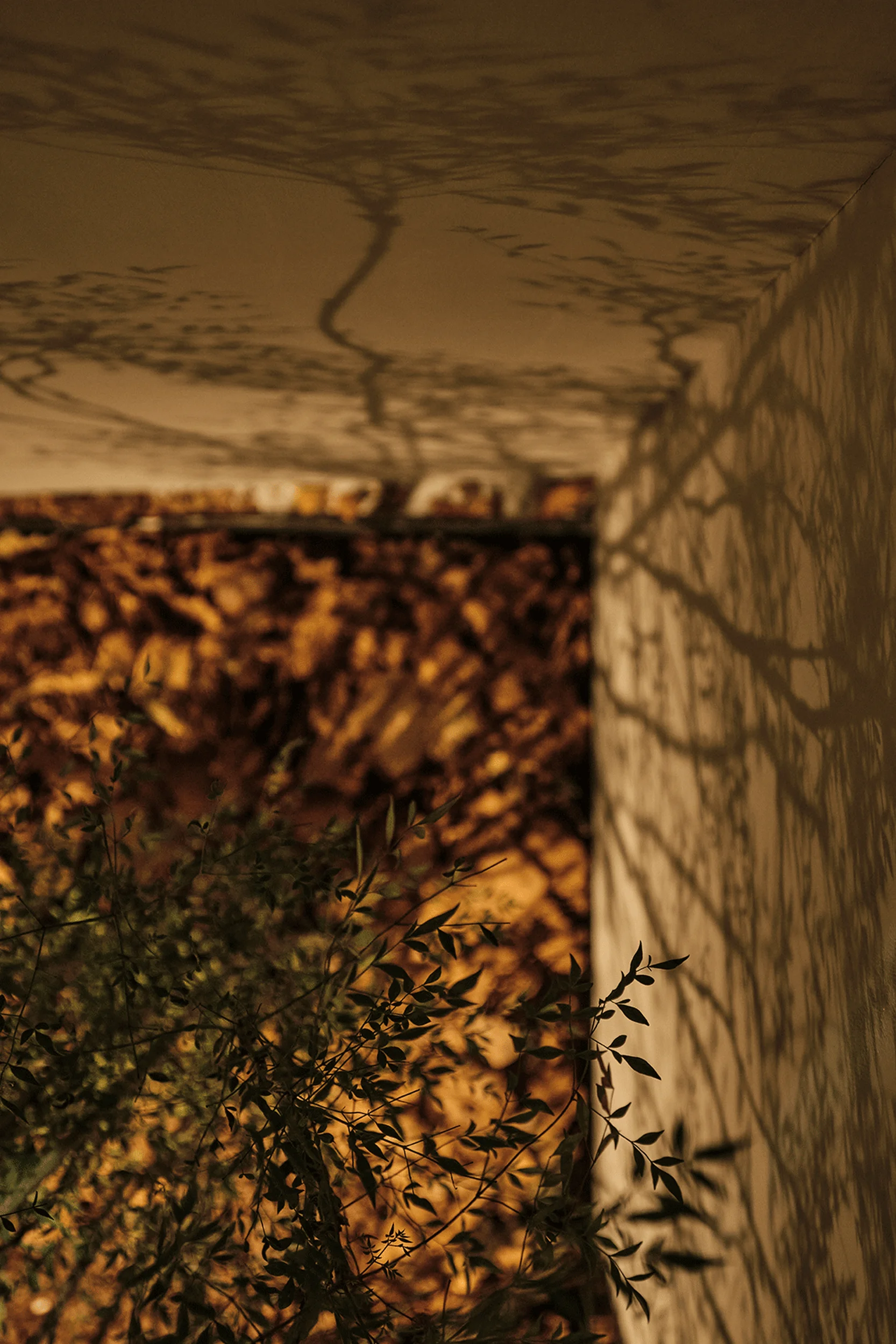
The design concept emerged directly from the brand name itself. “Amber Forest” was meant to convey the concepts of “珀 (po): the resin of a tree, transformed by time into treasure” and “森 (sen): the cycle of decay and renewal in the forest.” This was the core message the brand aimed to communicate in its inaugural launch and first product line. The design team envisioned a post-rain mountain landscape – a vast expanse of trees bathed in sunlight, where light and shadow intertwined, leaves dappled, amber hues enveloped the scene, and raindrops refracted a rainbow of colours. This idyllic scenario resonated with the core message of the brand. The image conveyed the process of a product from birth to maturity, perfectly embodying the concepts of time and regeneration, which perfectly aligns with the brand’s concept. tag: brand concept, design inspiration, Amber Forest brand, Guangzhou Design Week, cultural design.
Product-Centric Space Design
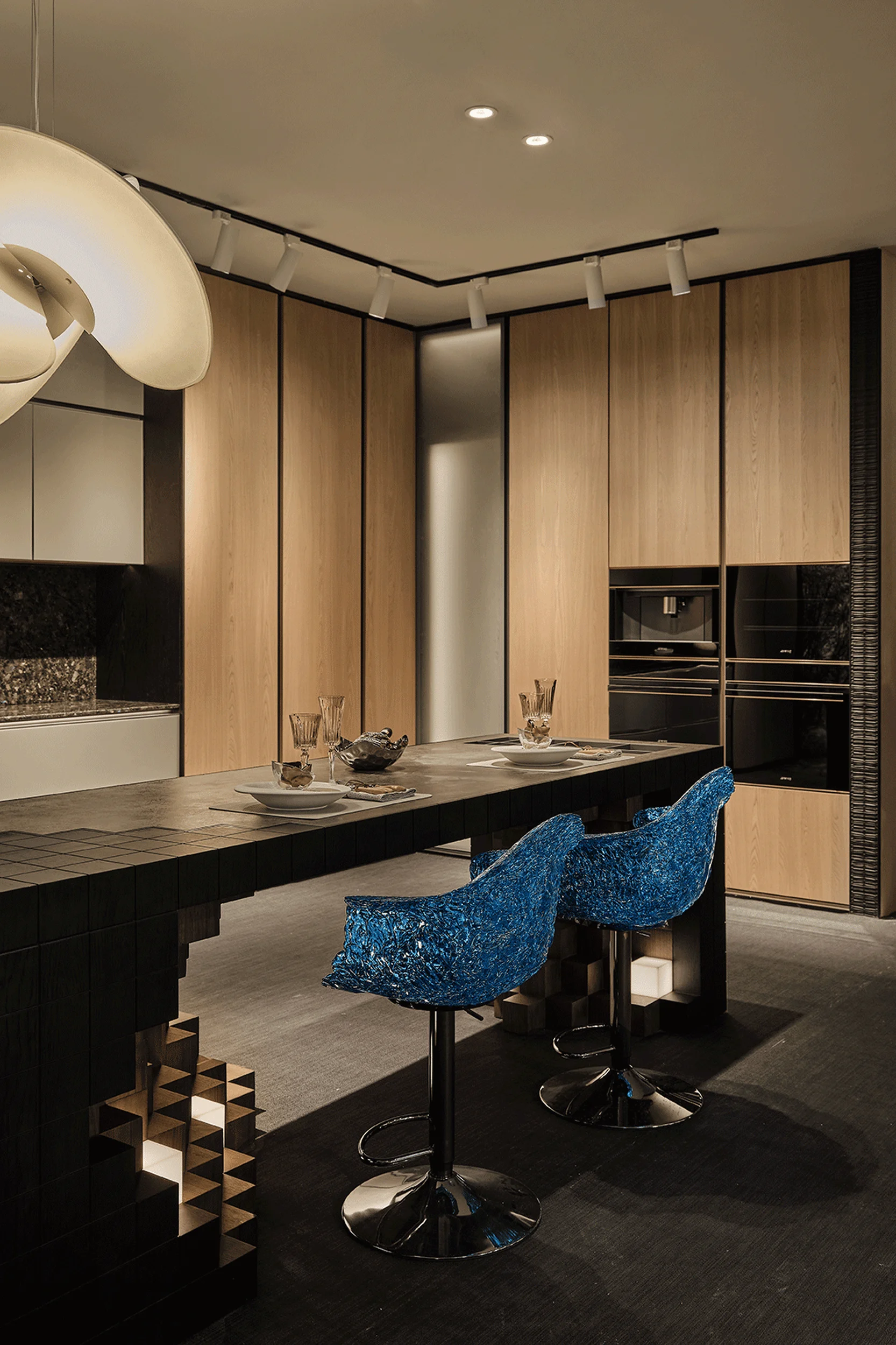
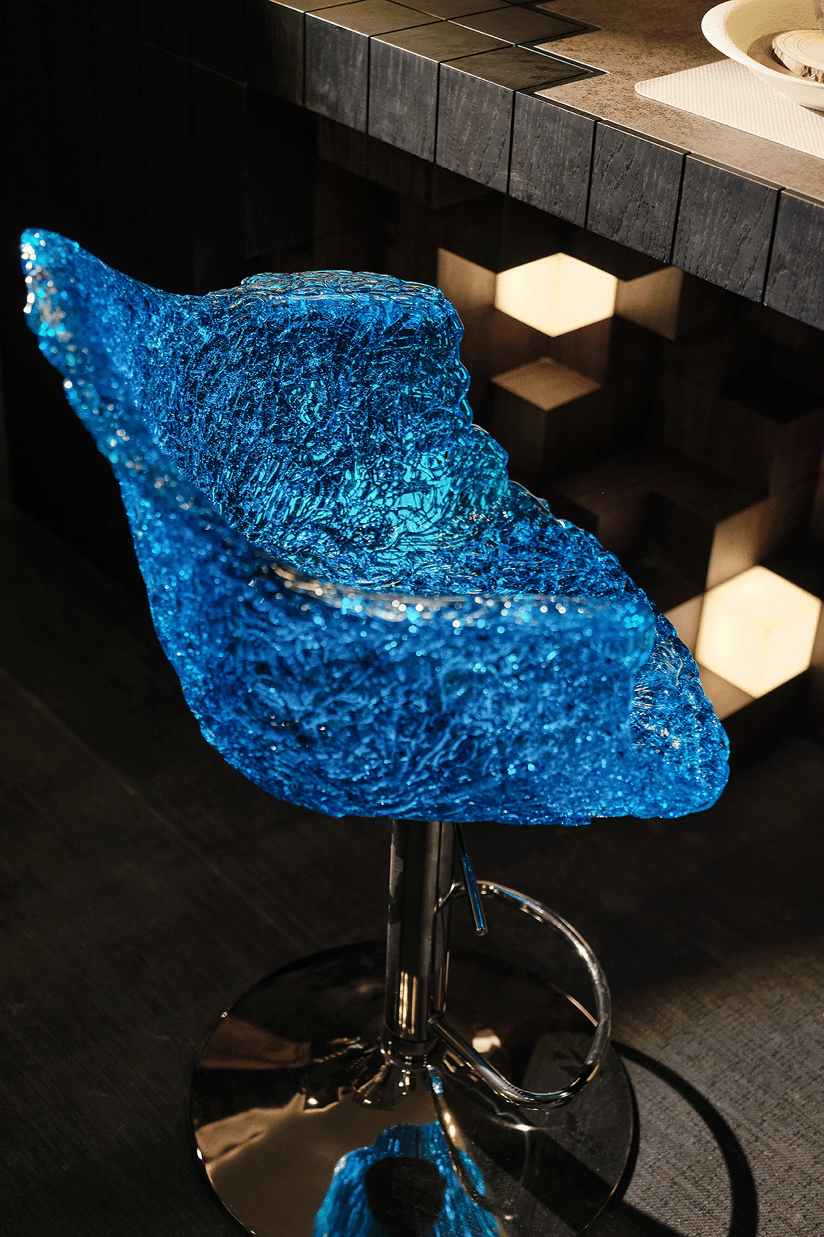
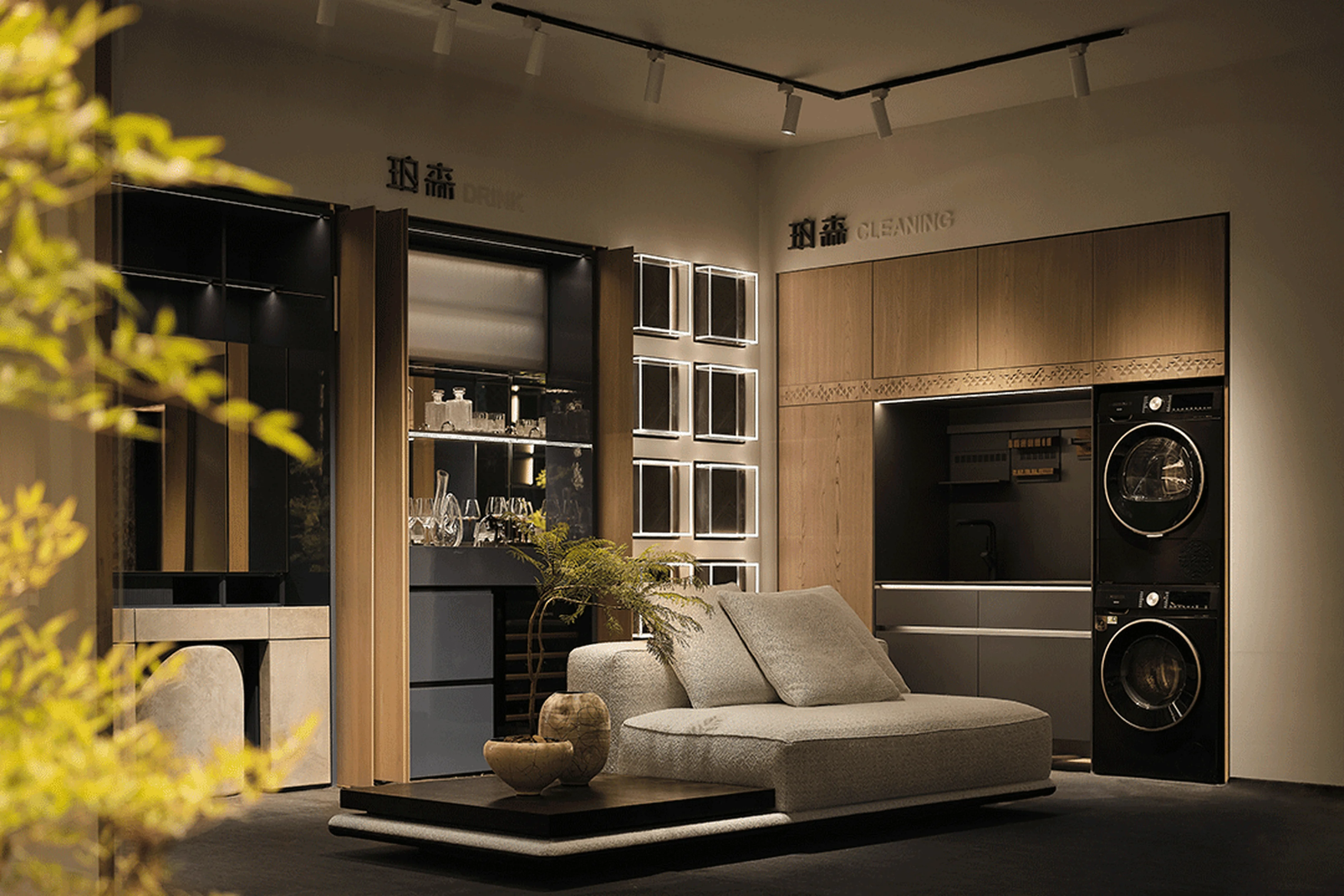
Before embarking on the design process, the team confronted a fundamental question: was the priority to create a space for a product or a product within a space? Traditional exhibition hall designs usually prioritize spatial frameworks, with products adapting afterward. However, this project required the studio to manage both aspects. Product development is a lengthy process, encompassing stages from defining product direction to gathering data, tracing cultural origins, selecting materials, analyzing product categories, discussing design details, and conducting sample and testing phases. Brand owners often allocate 18 months or more for new product development. However, this project faced a more constrained timeline – only six months until launch – further pressuring the product development timeline. This pushed the designers to prioritize product design first, rather than the space. The project team chose to prioritize product design as the driving force, foregoing the typical spatial designer’s approach. The goal was to deliver a seamless and immersive living experience rather than merely showcasing a visually striking space. tag: product design, Guangzhou Design Week exhibition hall, space design, cultural design, interior design.
Cultural Roots in the Space
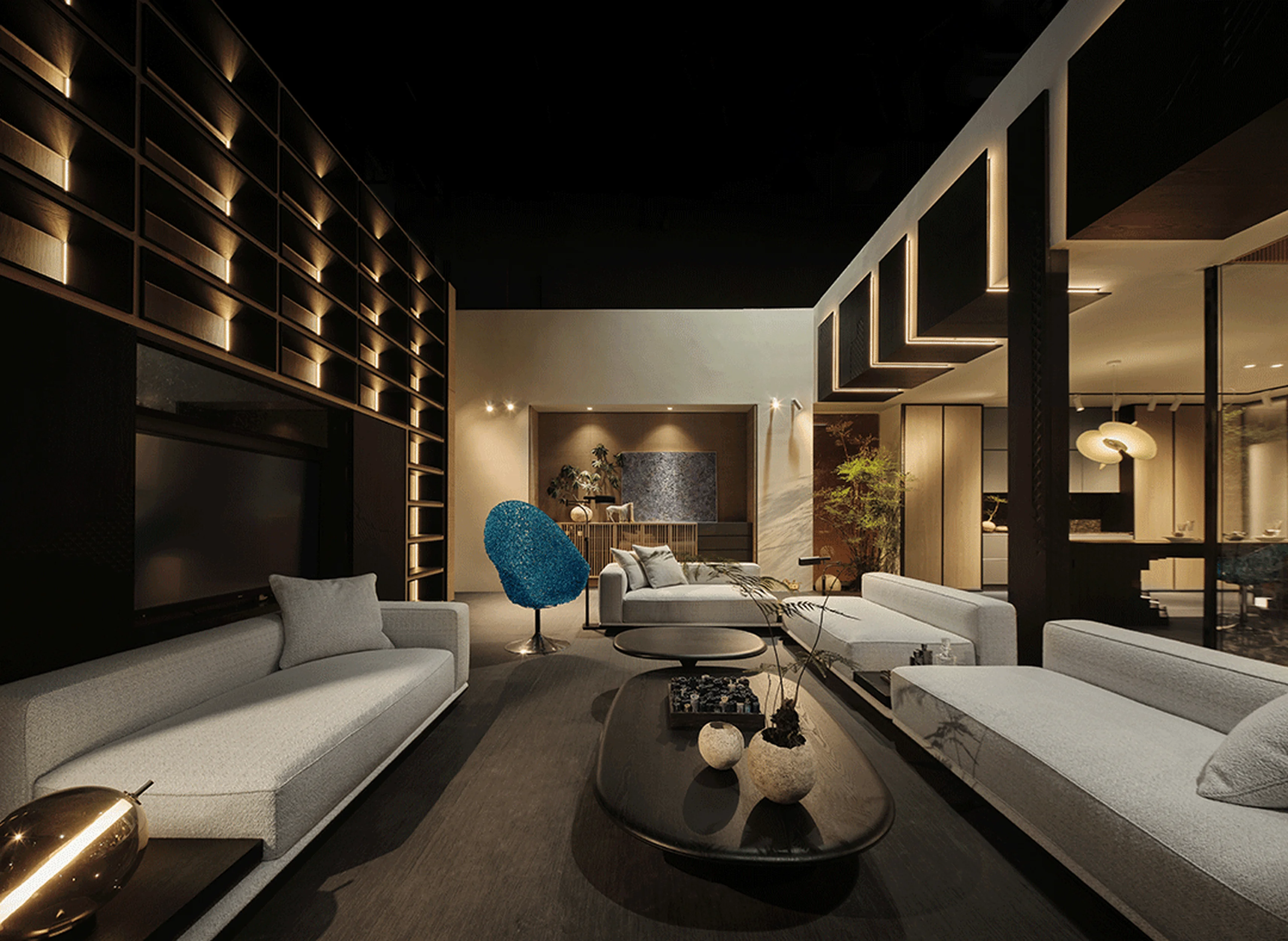
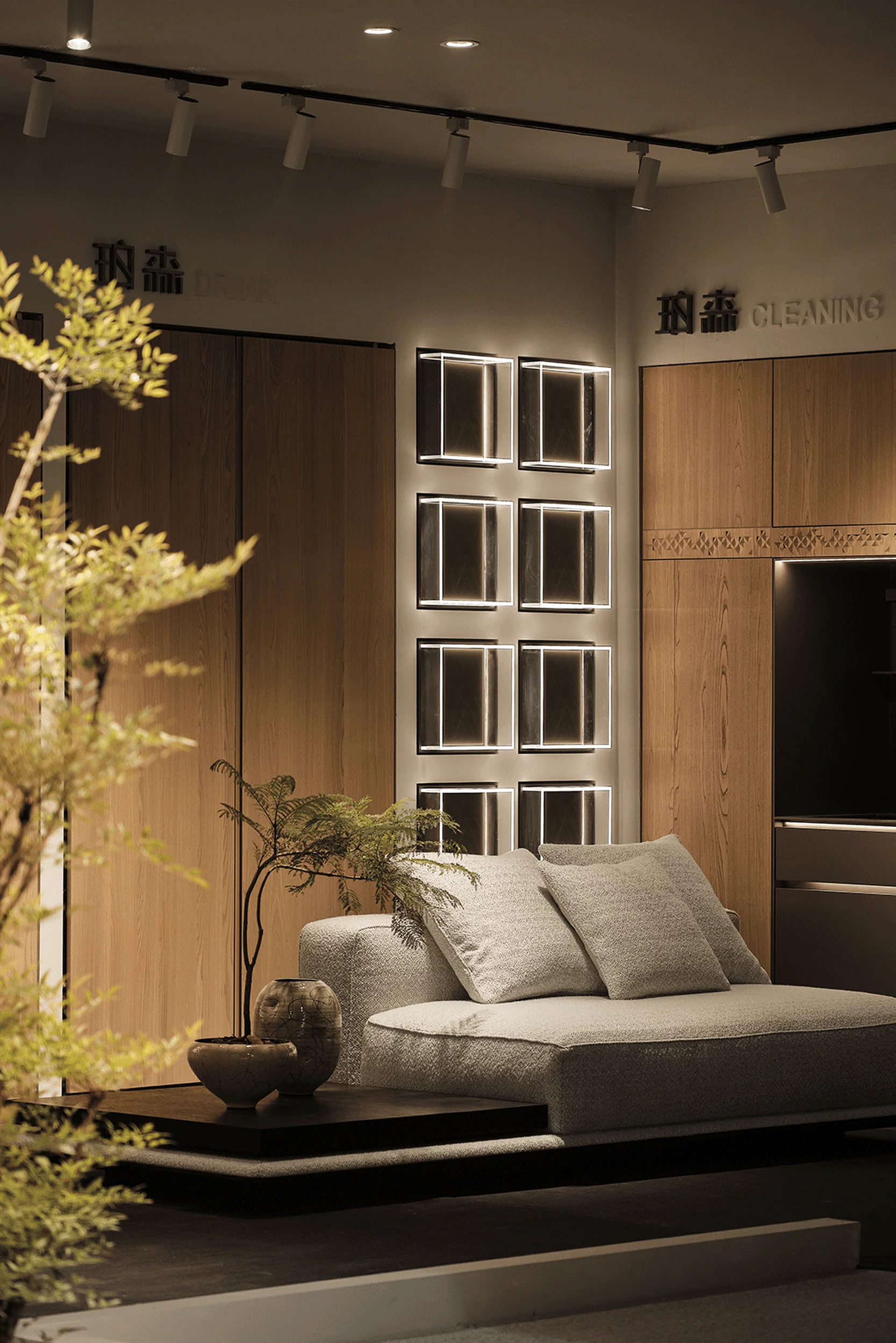
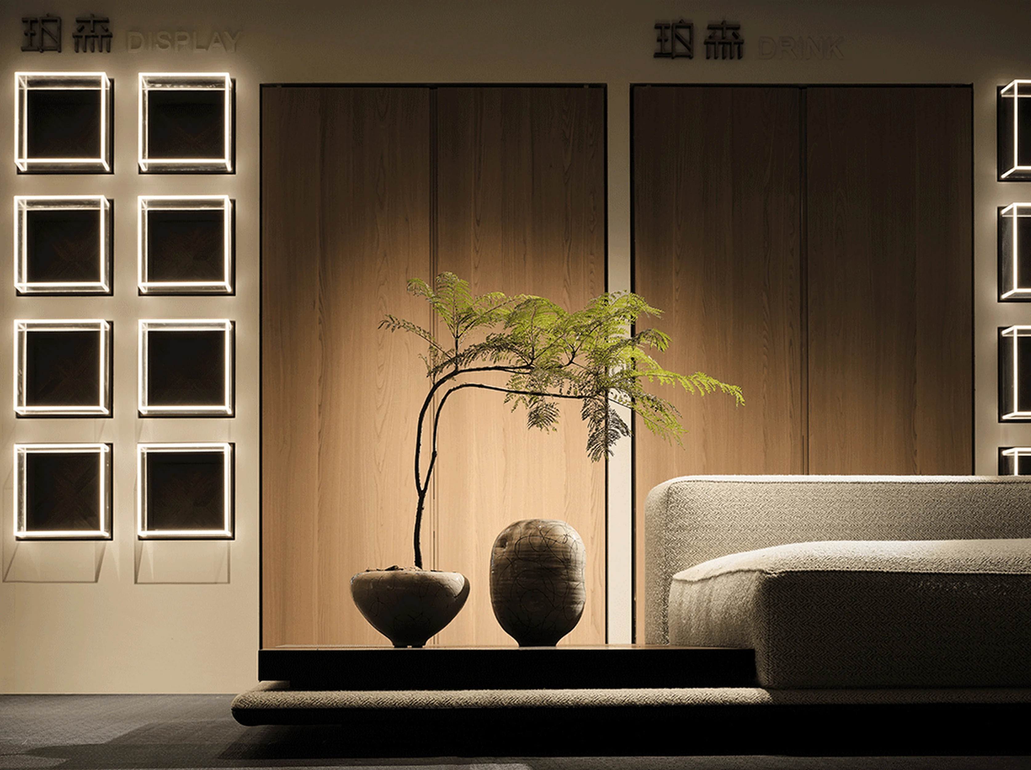
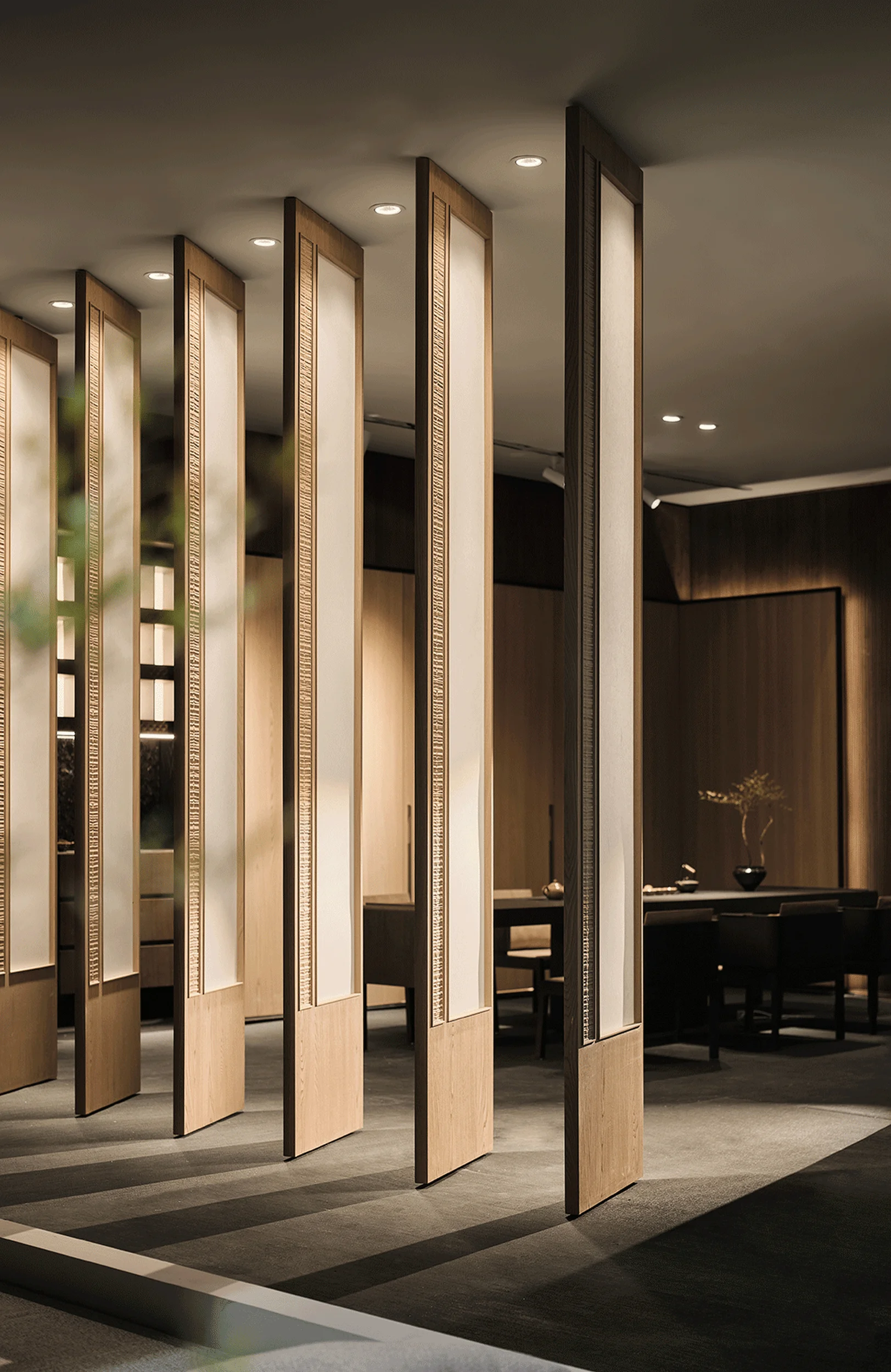
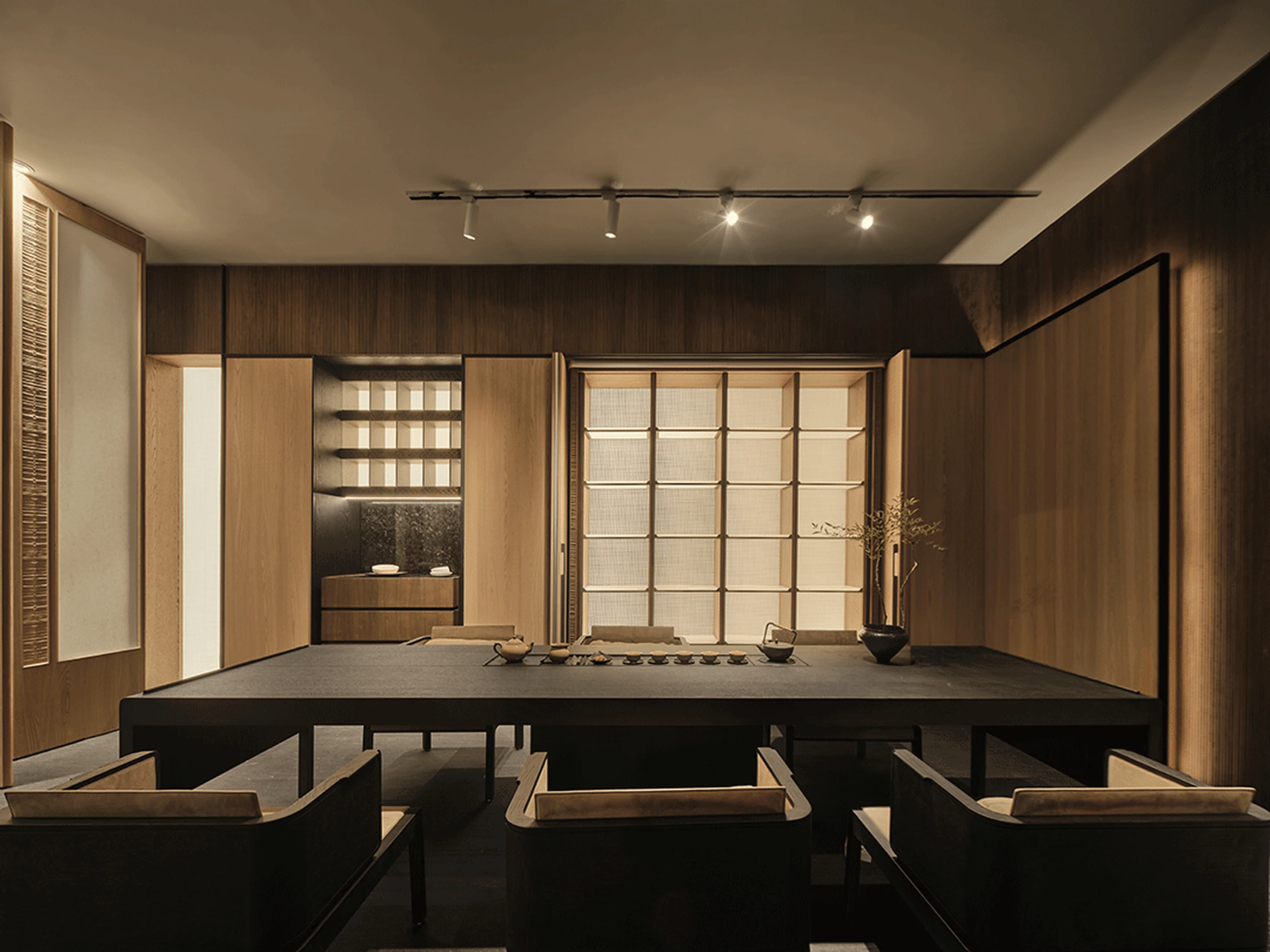
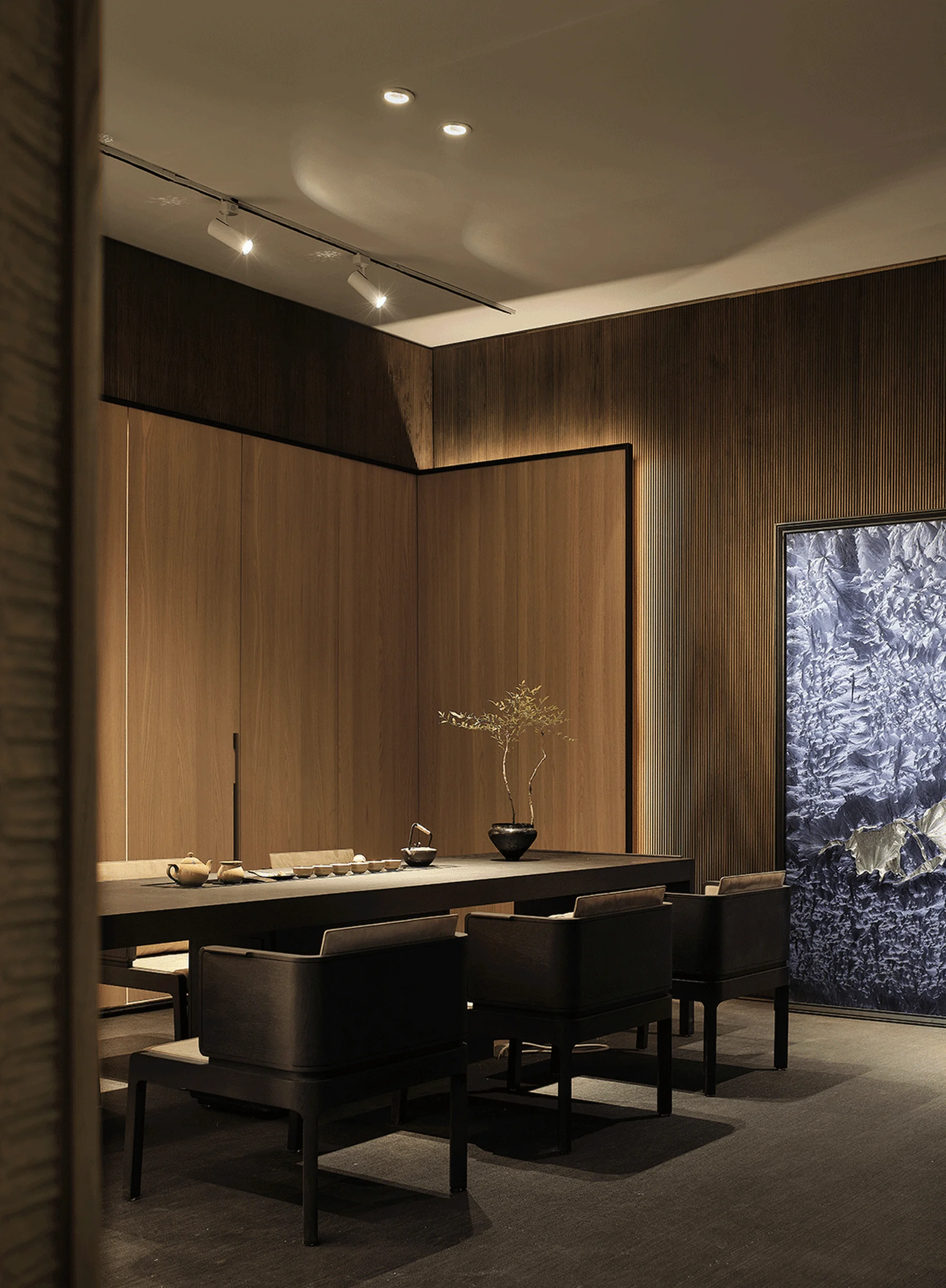
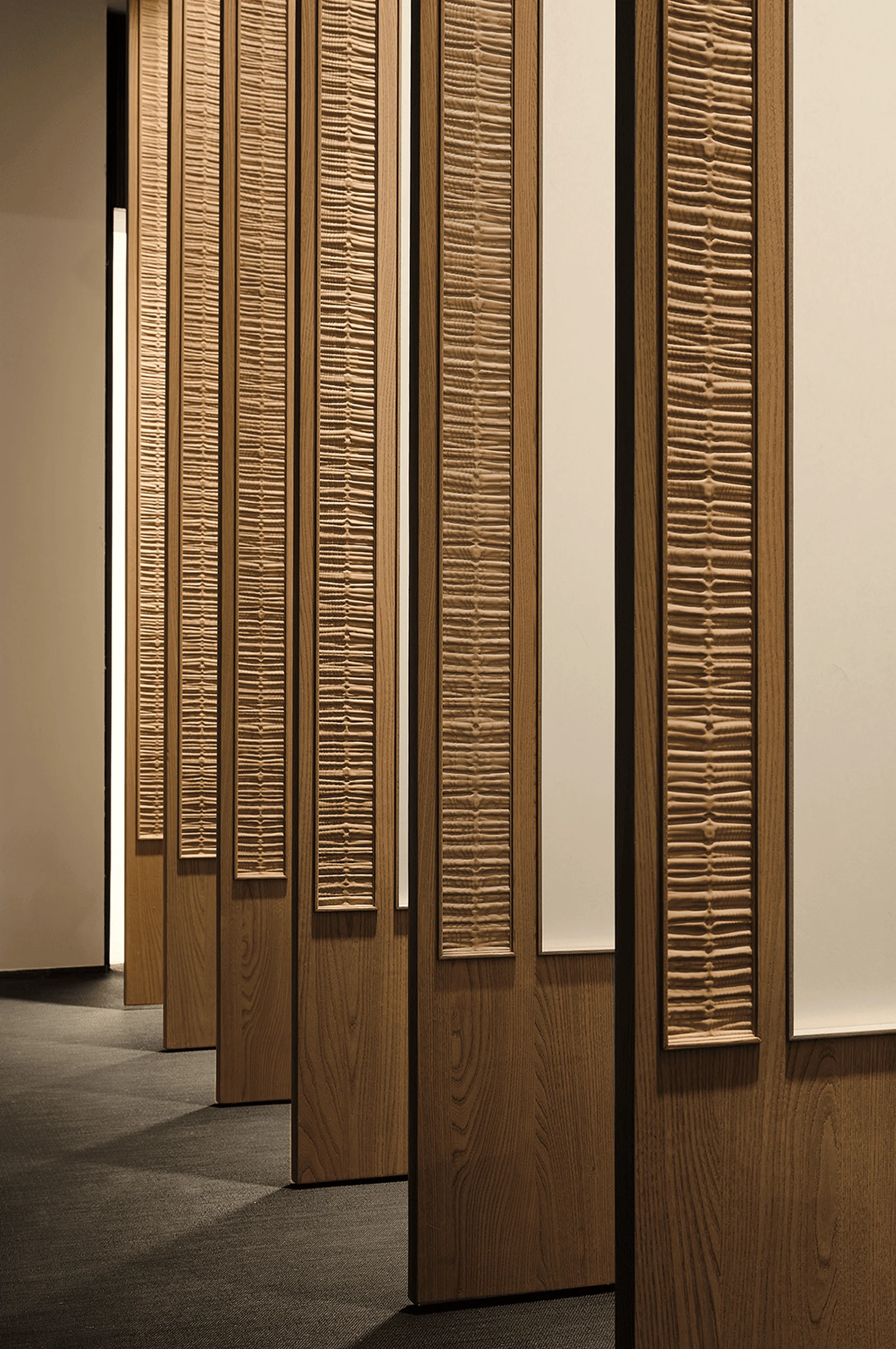
Since the project focused on product-centric spatial design, the space’s cultural character stemmed from the product’s inherent cultural attributes. From the outset, the team collaborated with the client to establish the brand’s research approach and cultural identity. The goal was to create products that responded to contemporary lifestyle needs, avoided trend-chasing, and paid homage to both advanced techniques and the essence of Chinese culture. The challenge was to avoid creating products that were simply a mere imitation of traditional aesthetics or a superficial reflection of cultural identity. The brand’s products drew inspiration from the aesthetic sensibilities and elements of the Song Dynasty in China. Instead of encompassing the broader scope of the Song Dynasty, which covers nearly three centuries, the design team opted to focus on the characteristics of the architectural style of Southern Song-era Jiangnan residences. The design team focused on the cultural identity of Song Dynasty residential aesthetics to infuse the space with a sense of authenticity and historical context. The design sought to create a space that was both modern and timeless, echoing the cultural values of the past. tag: Song Dynasty aesthetics, cultural heritage, interior design, exhibition space design, product design.
Spatial Harmony and Nature’s Embrace
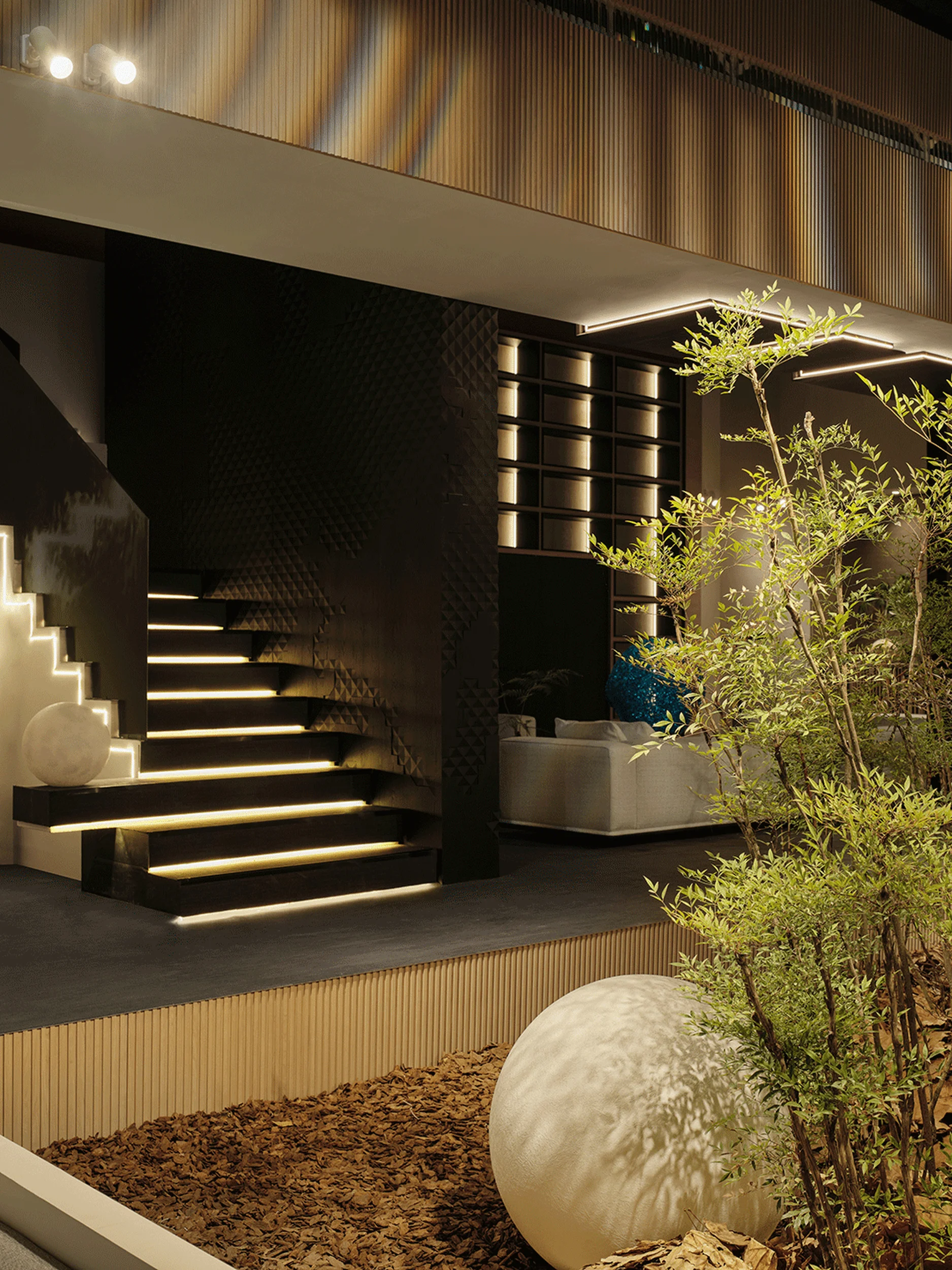
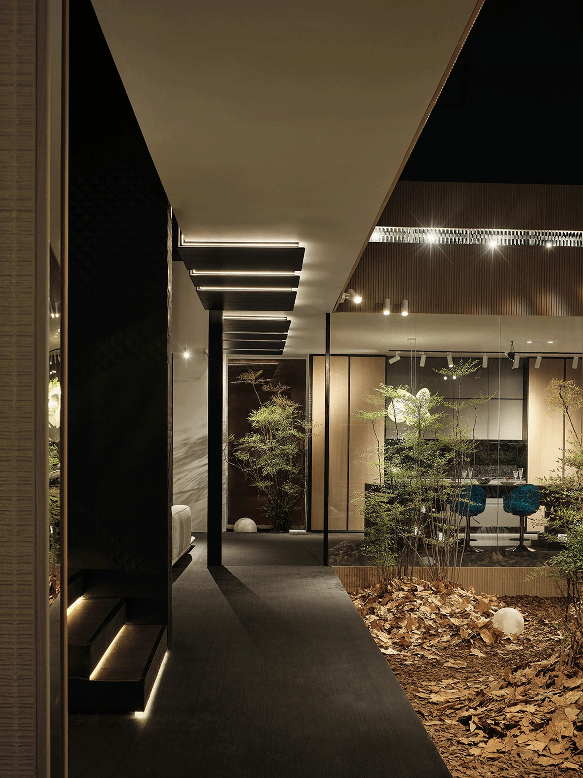
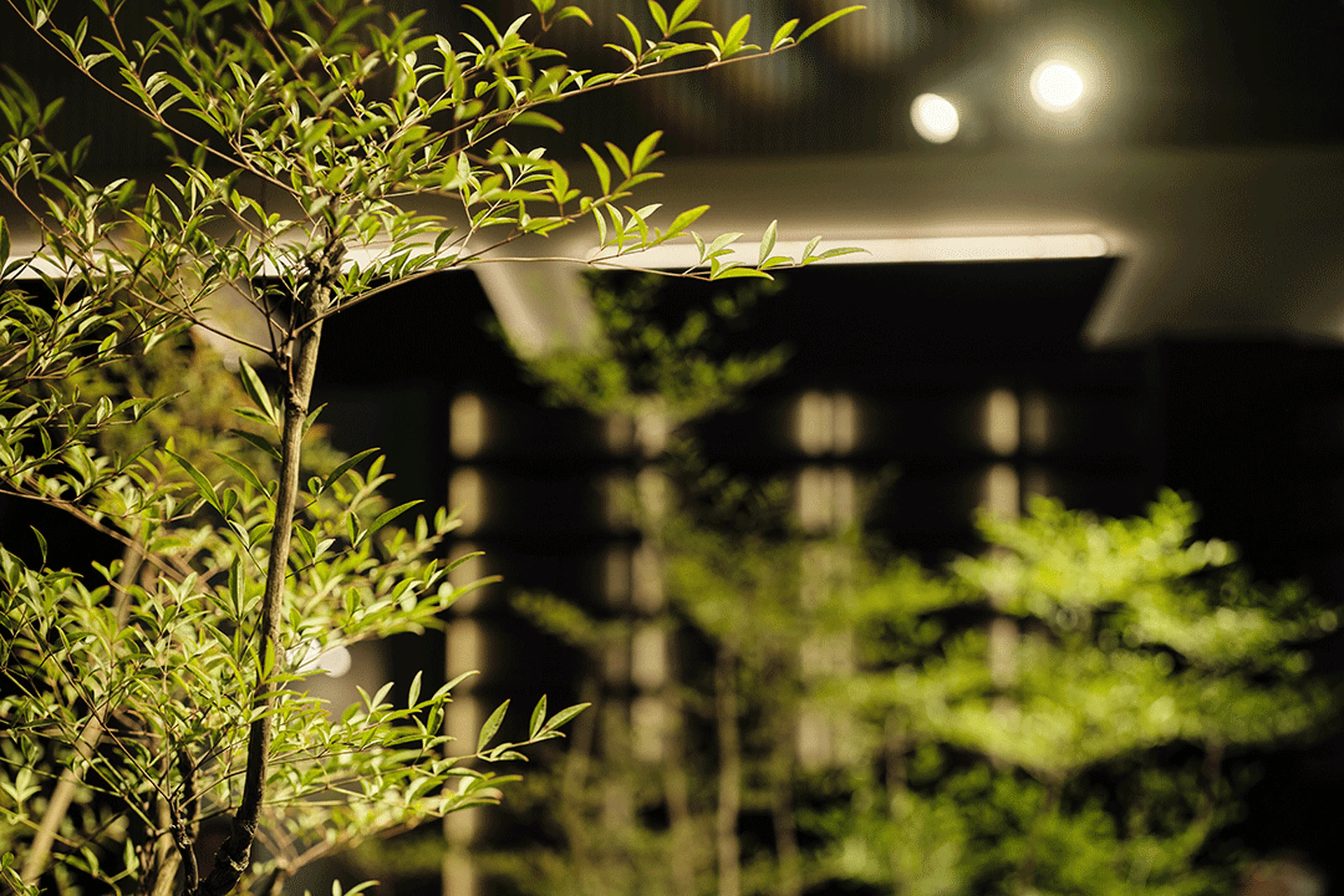
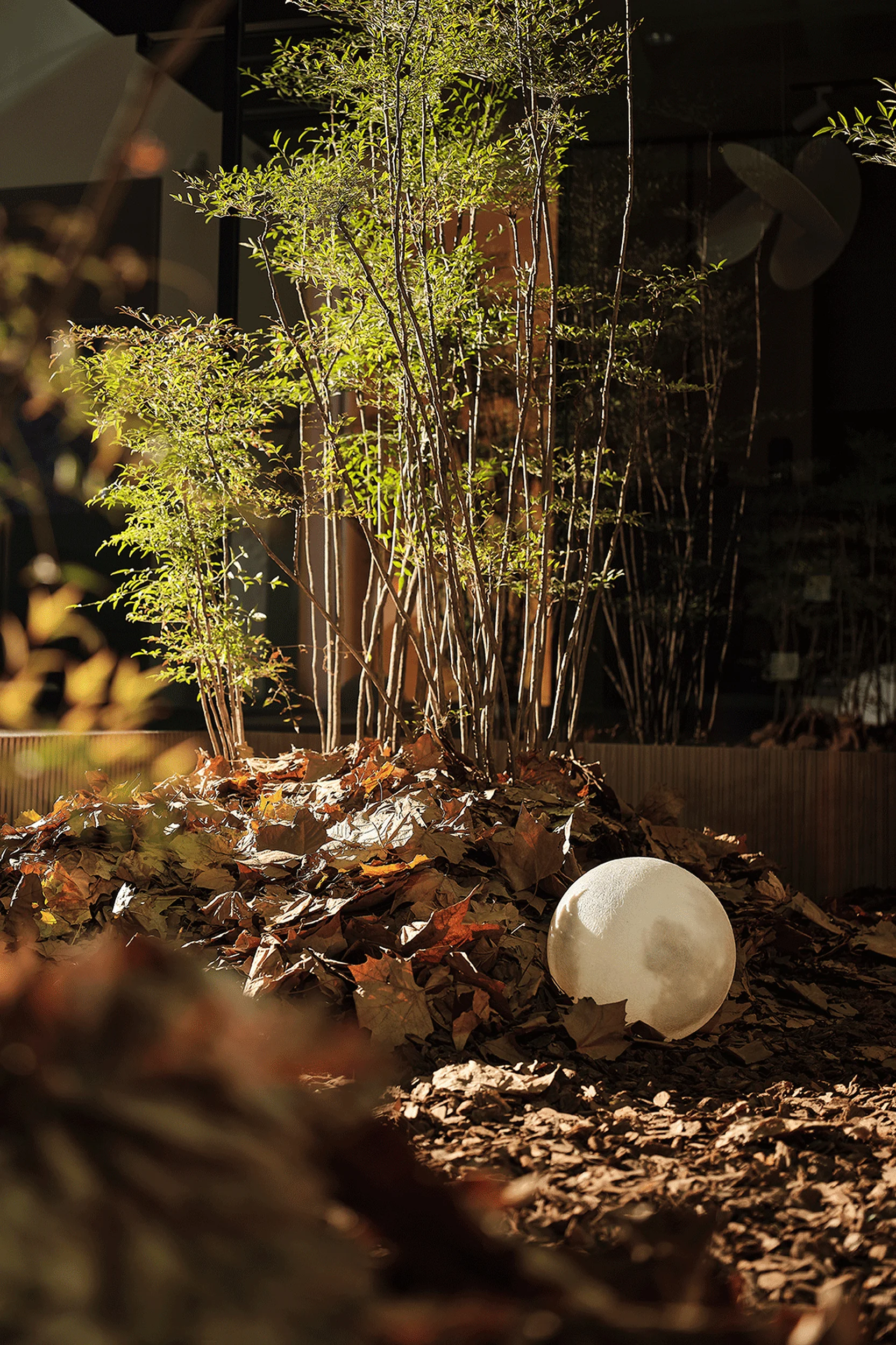
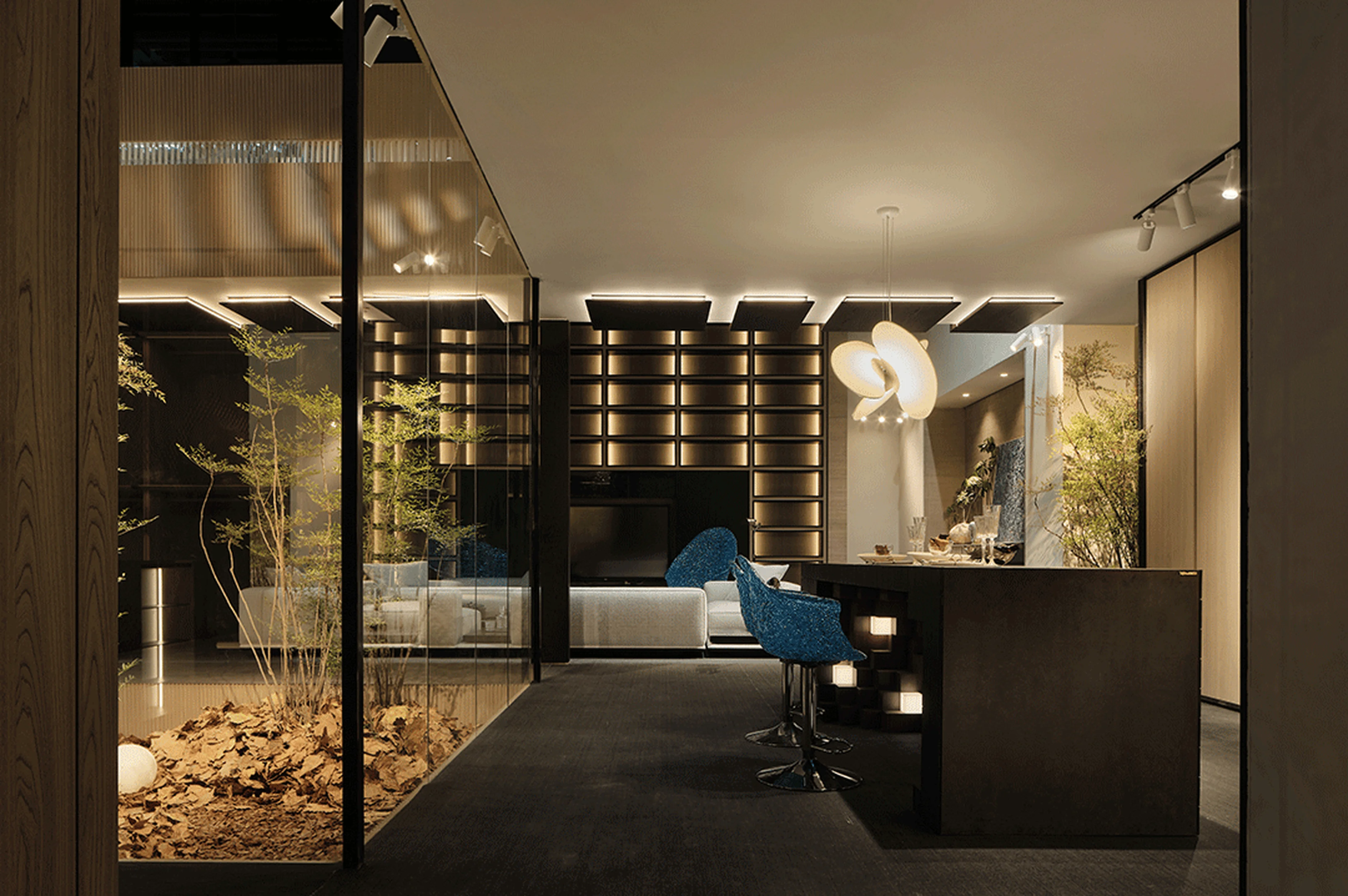
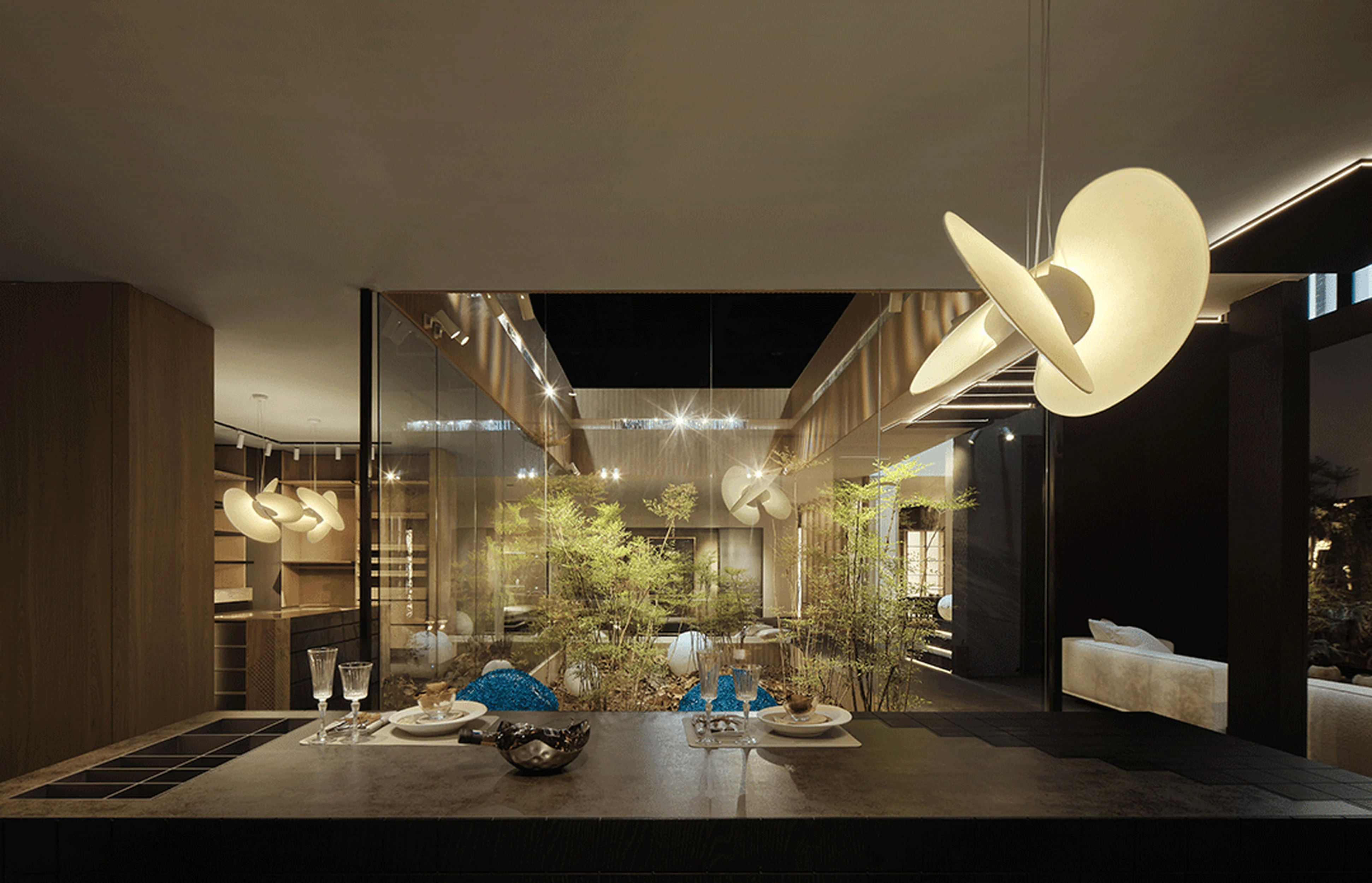
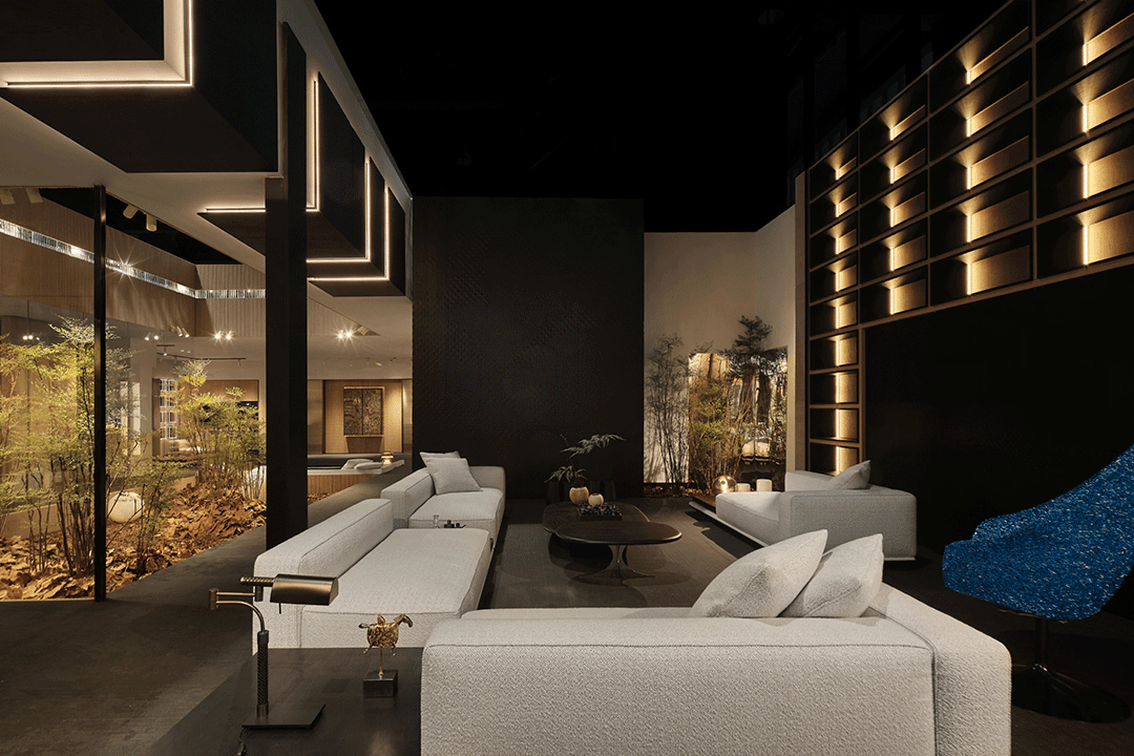
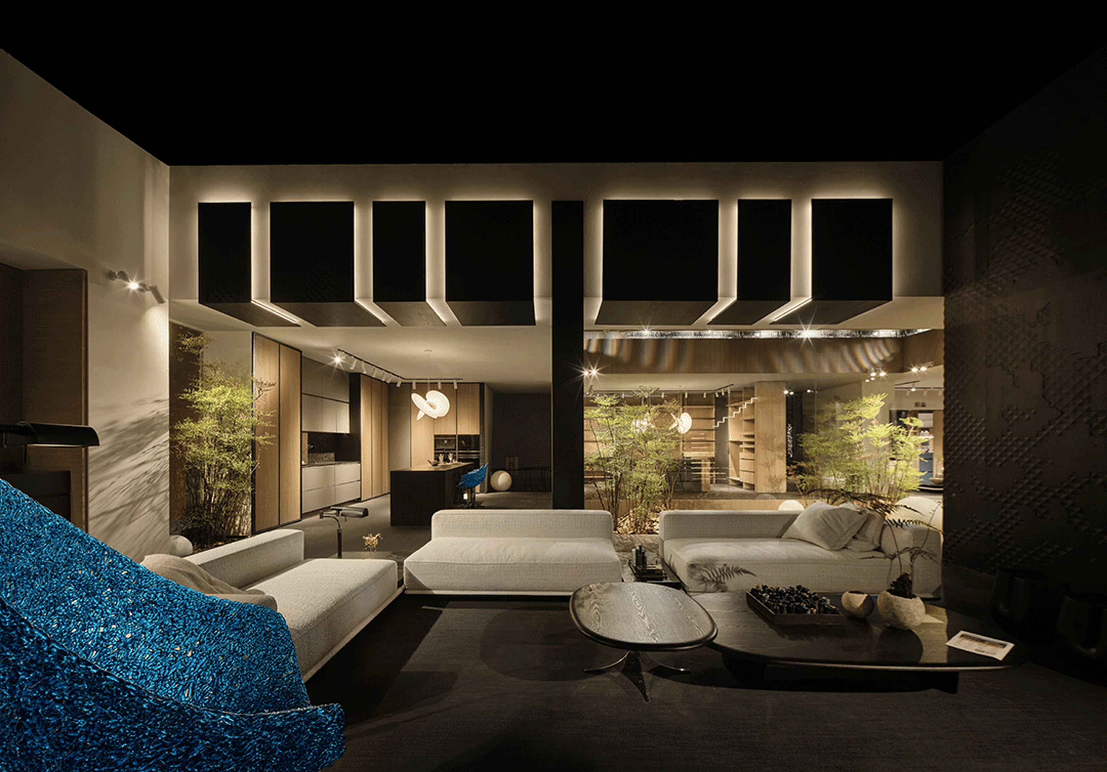
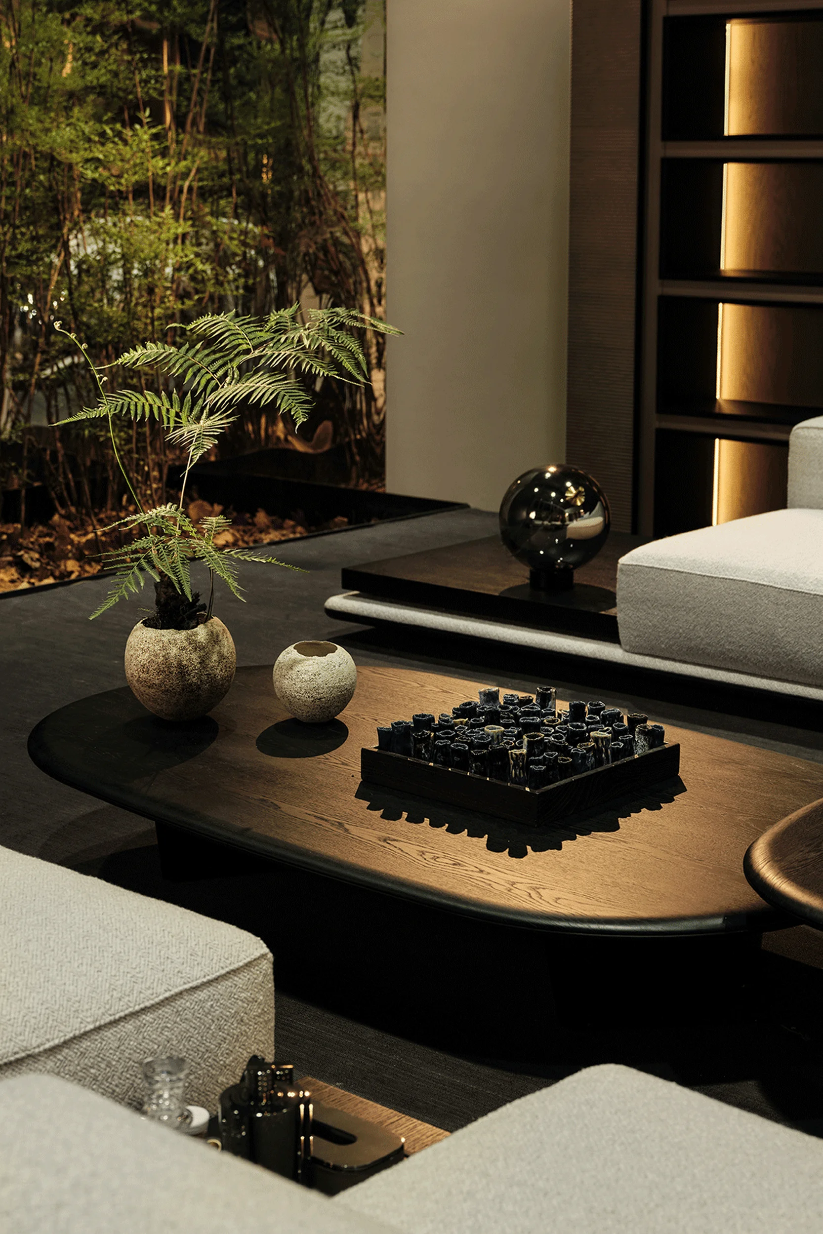
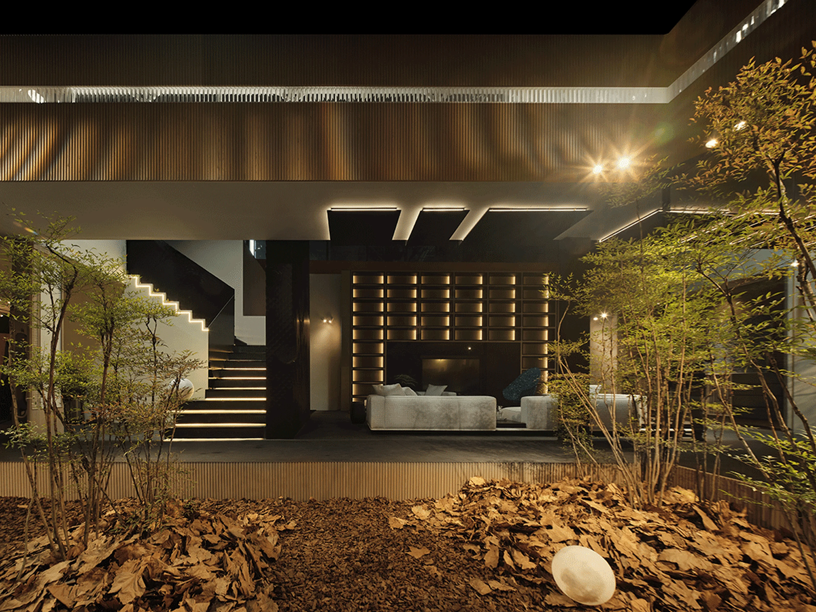
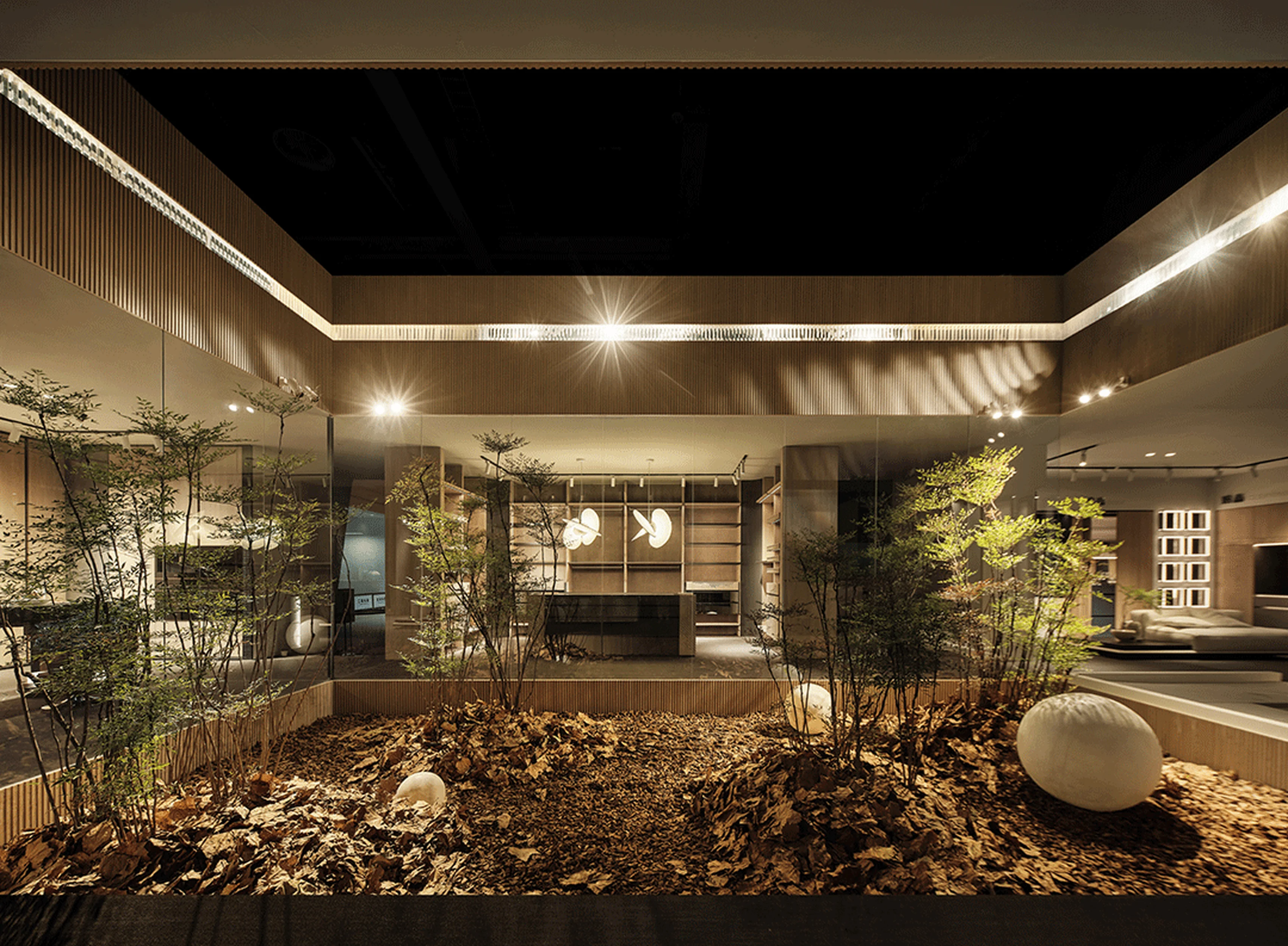
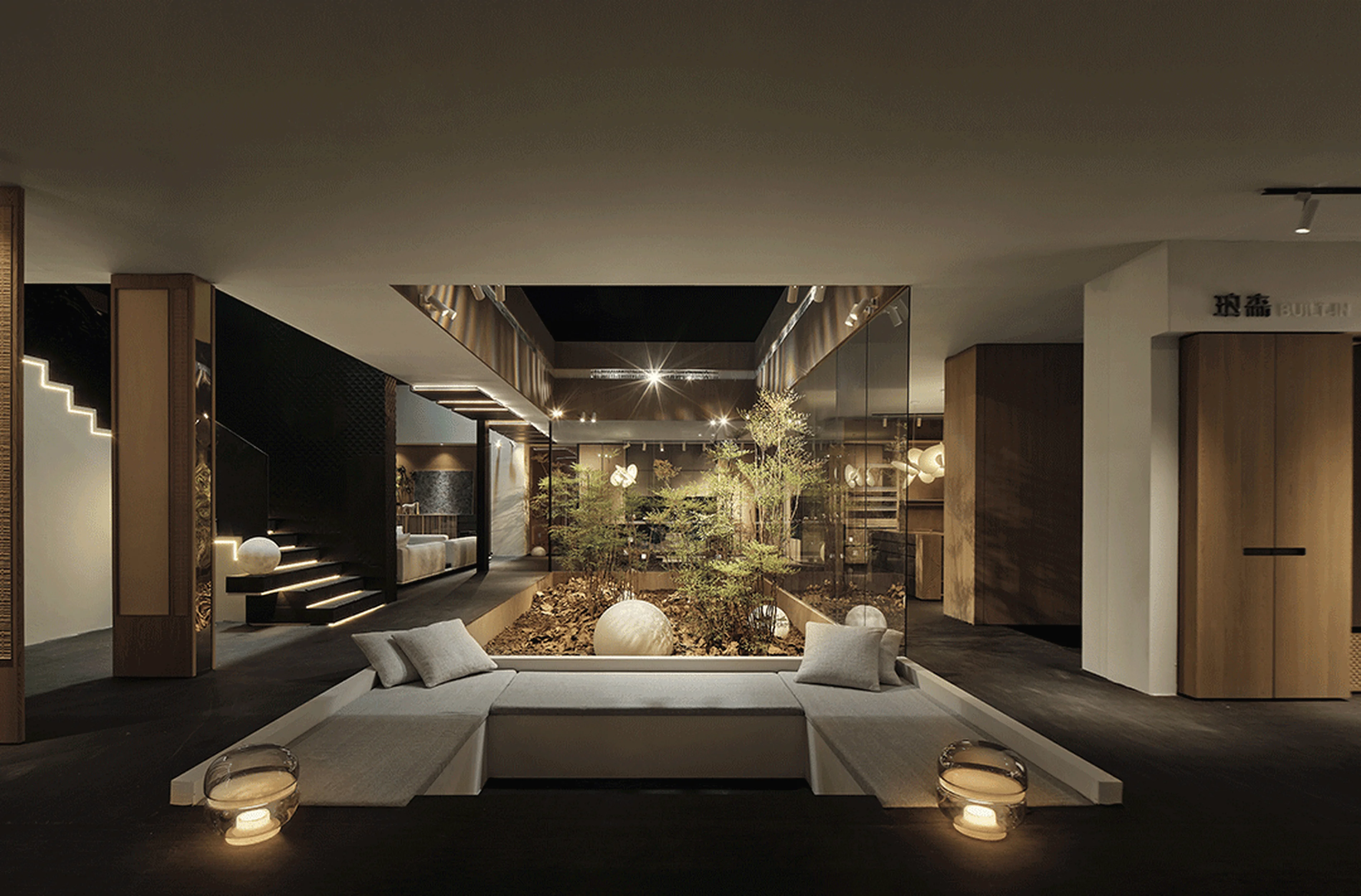
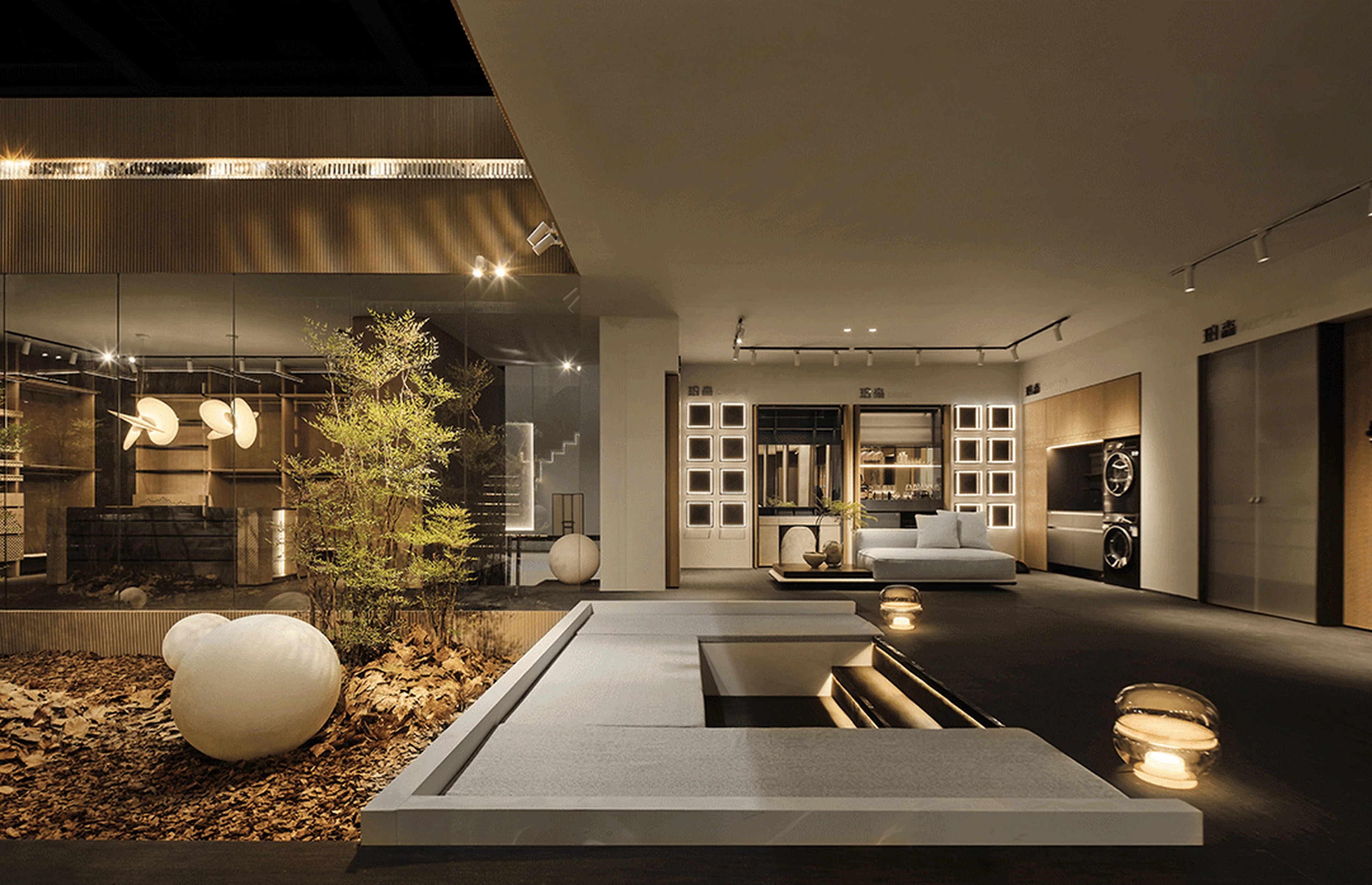
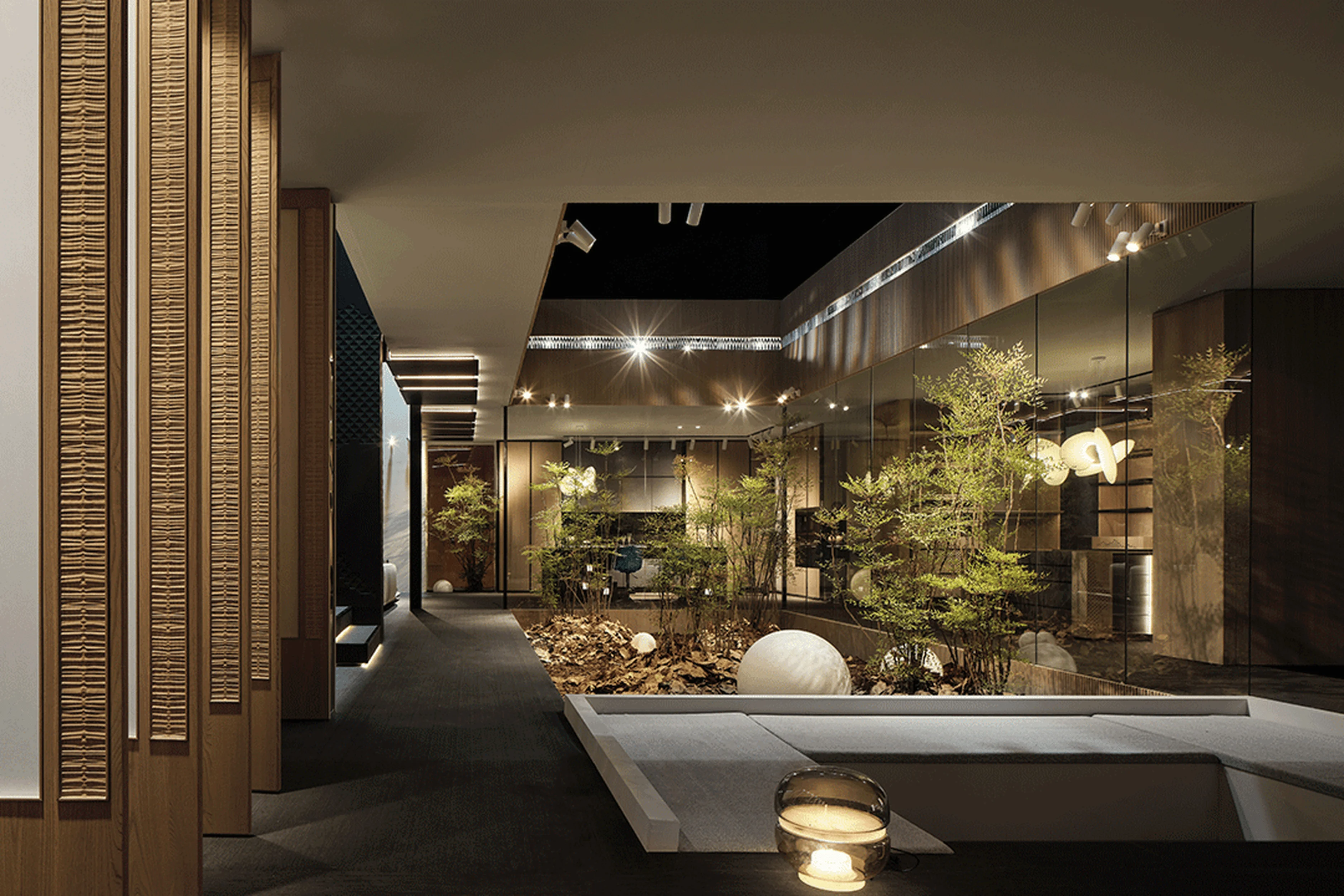
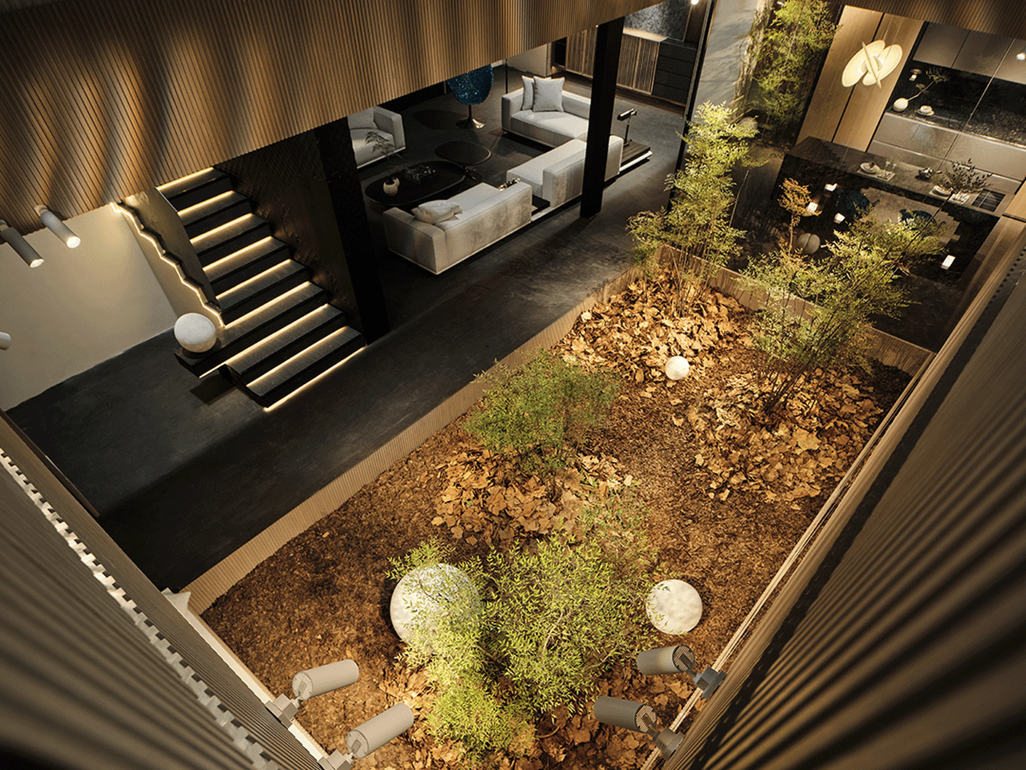
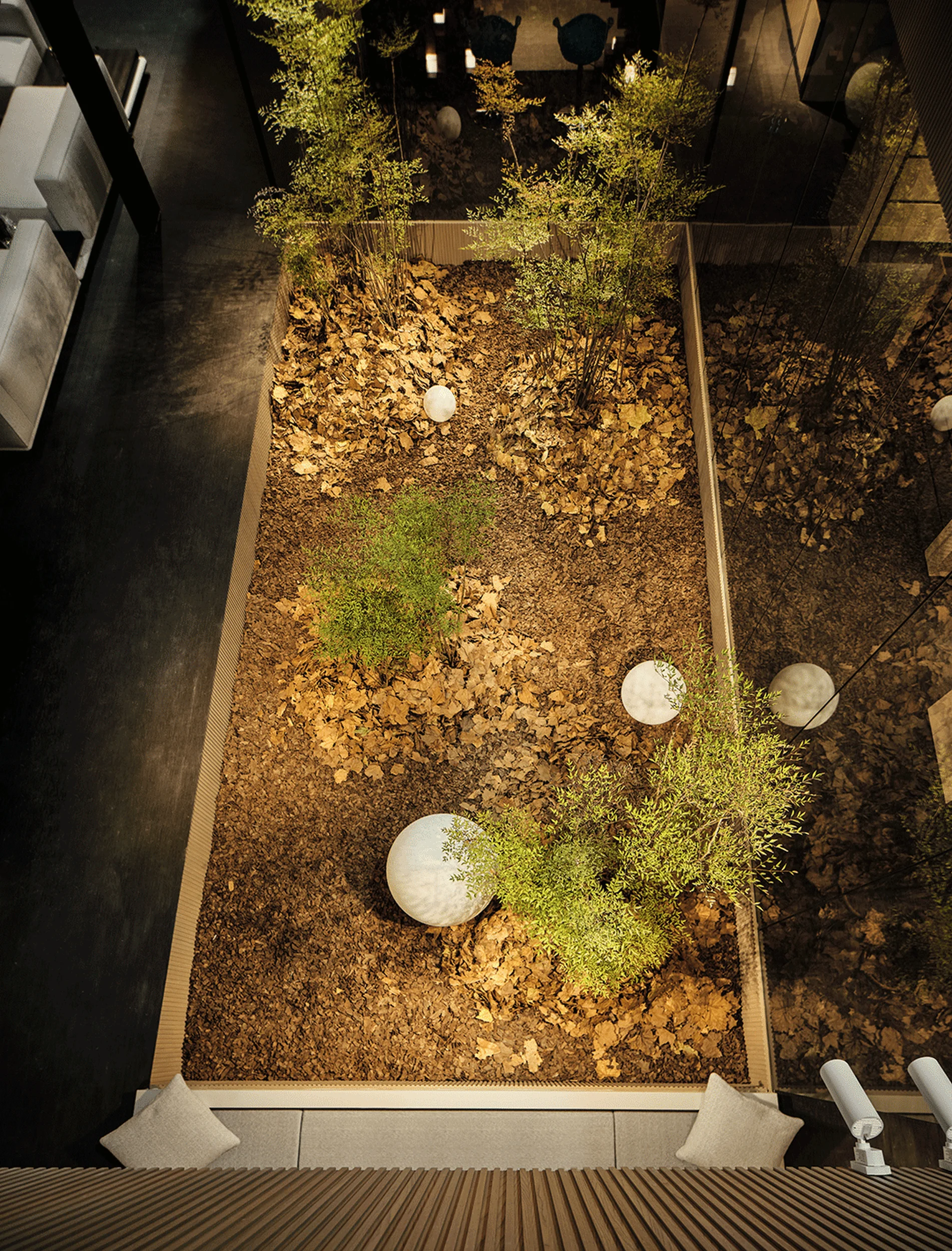
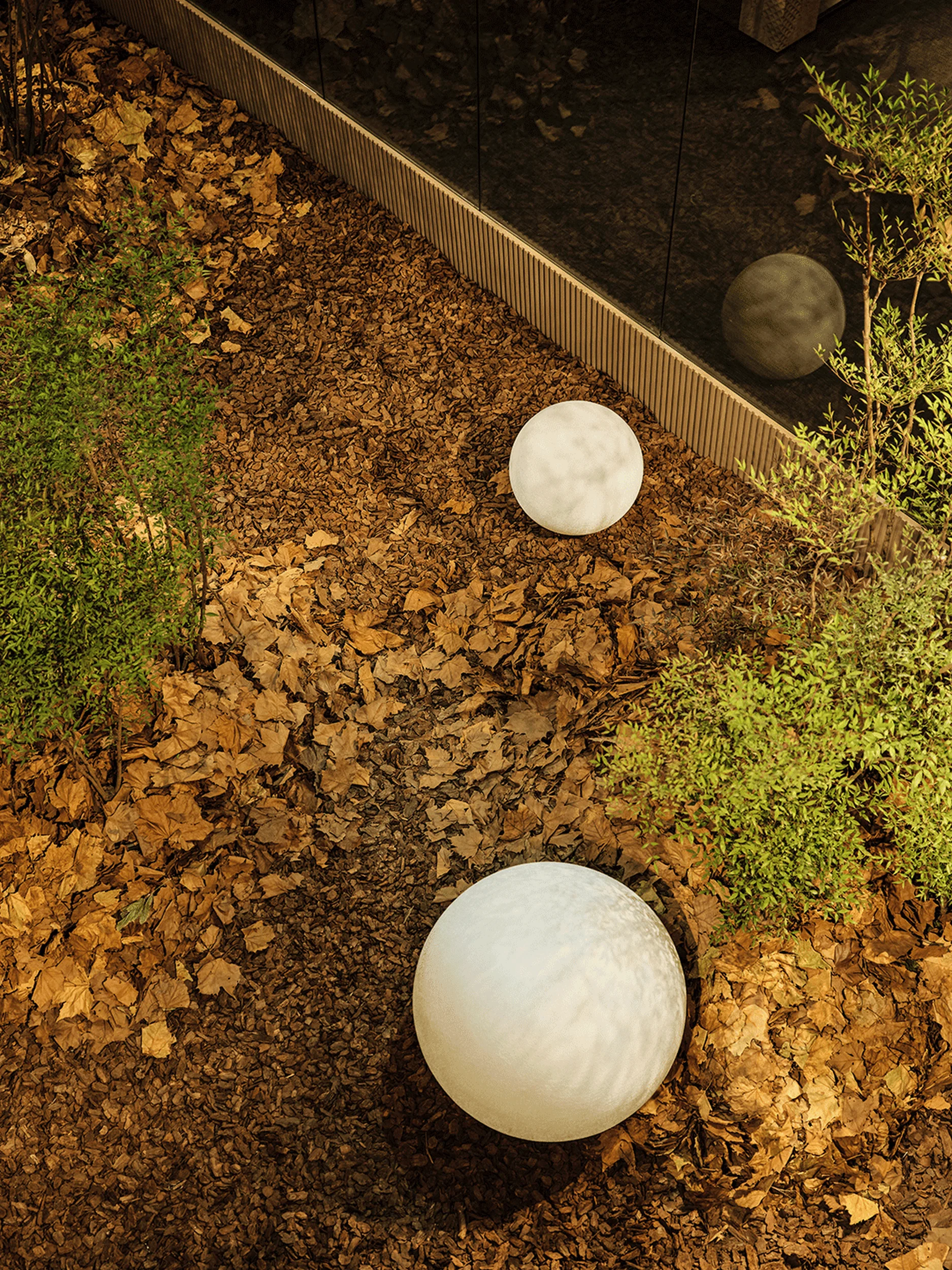
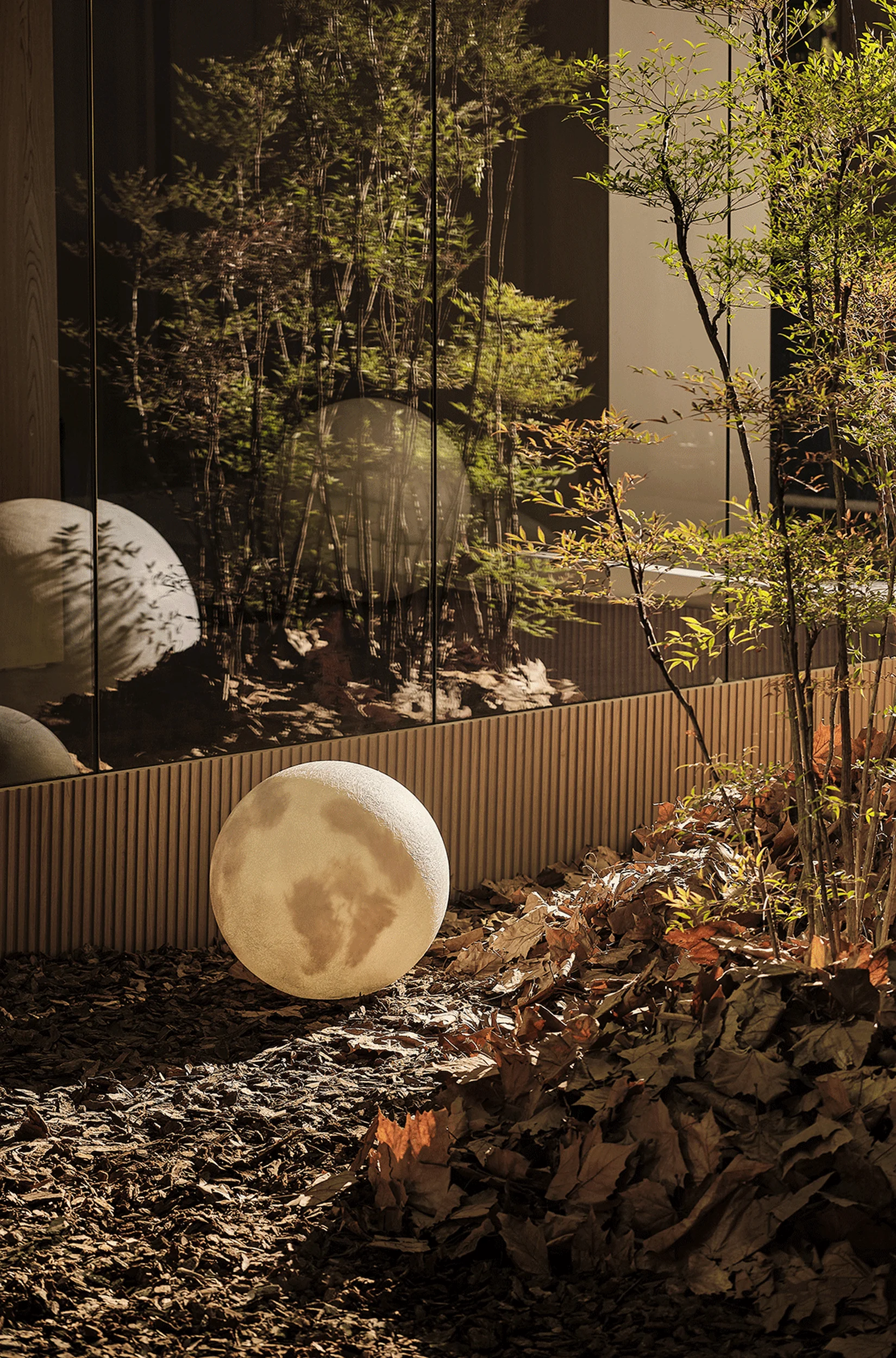
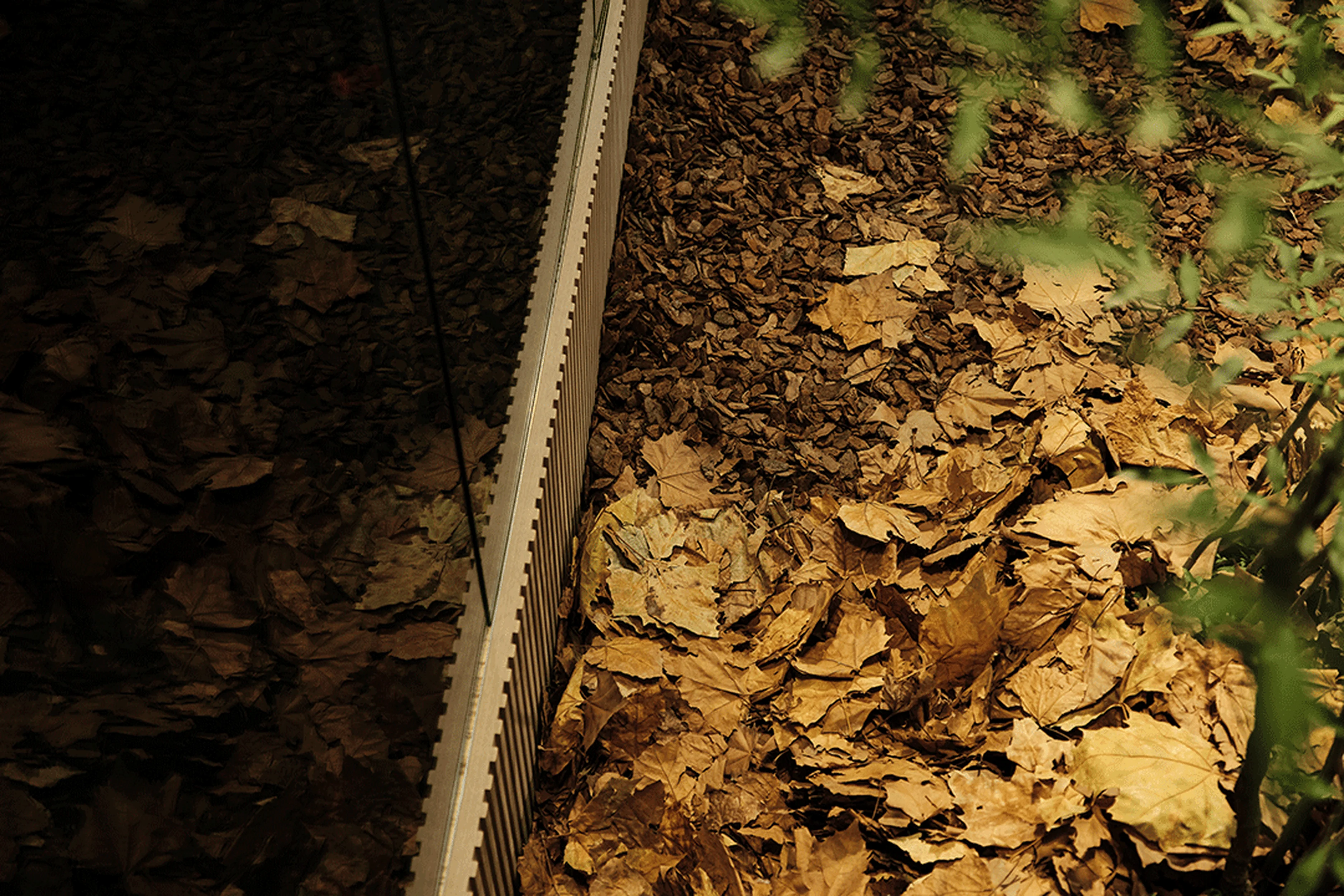
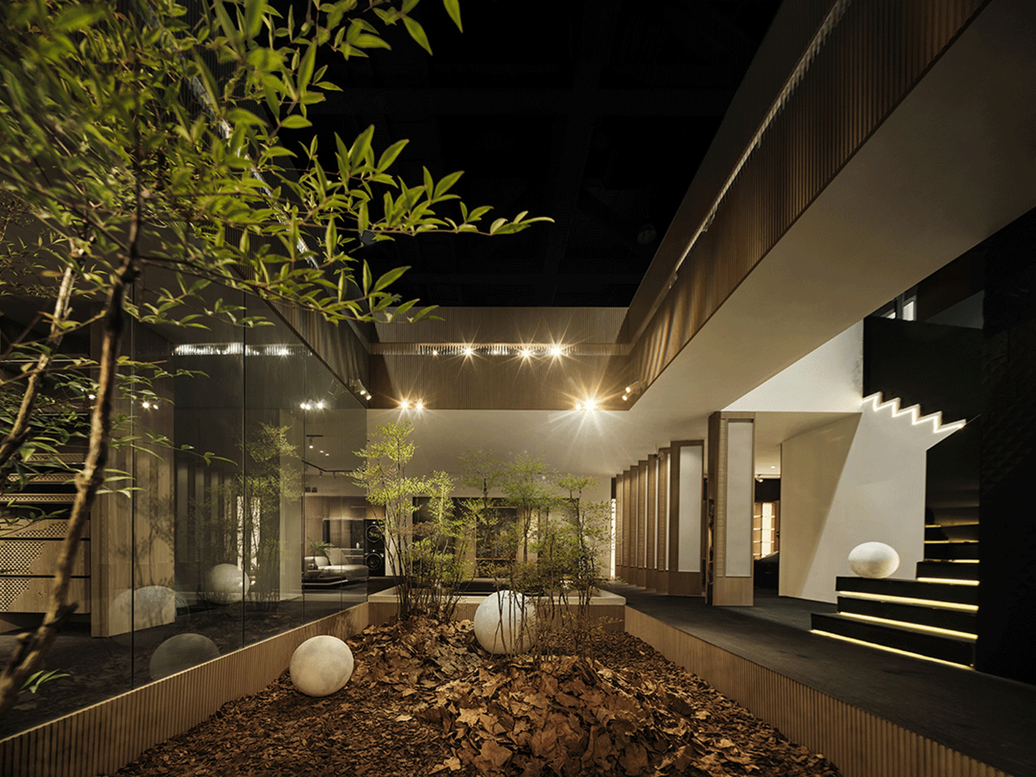
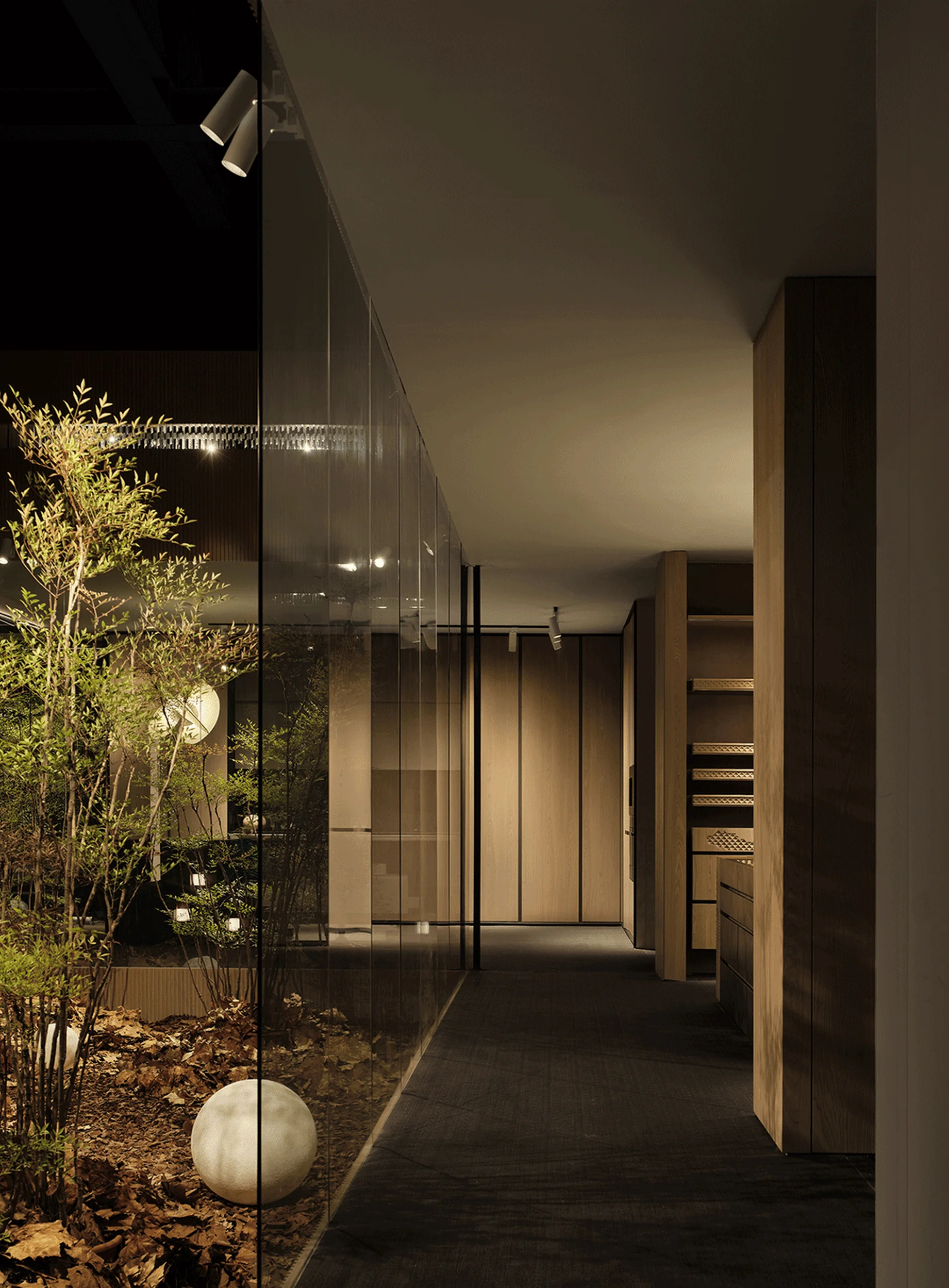
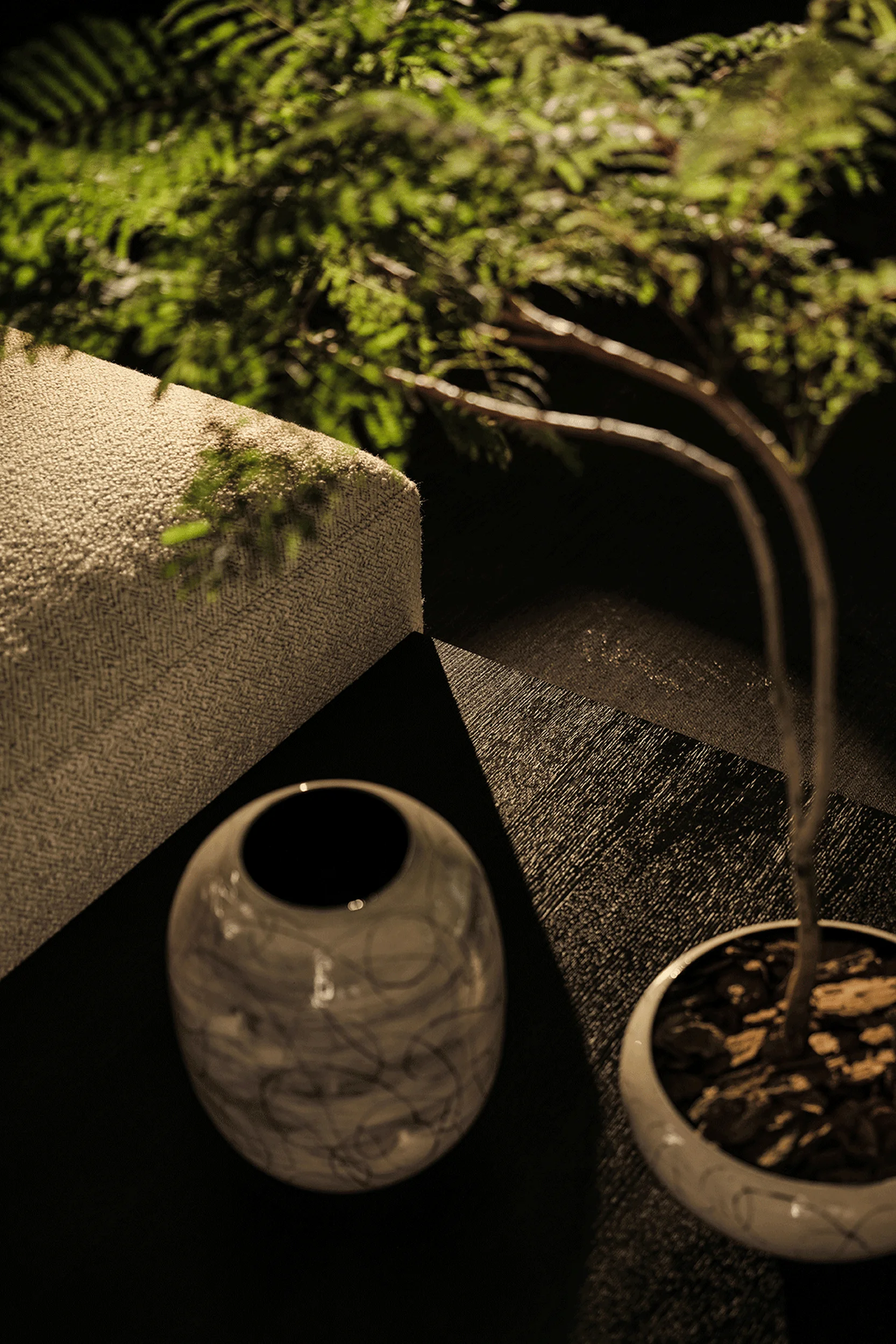
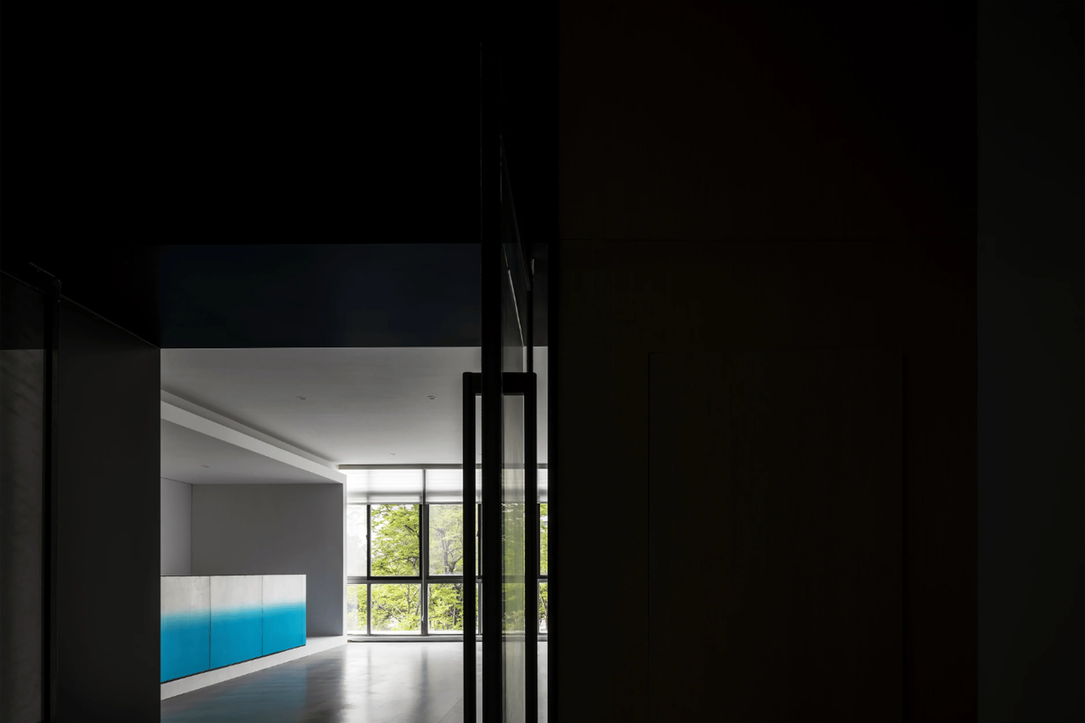
The design team sought to create a space where the indoor and outdoor worlds seamlessly blended. The heart of the design is a 50-square-meter sunken courtyard in the center of the exhibition space. Lush, diverse plantings of Nandina domestica were strategically placed throughout the courtyard. Mature trees, vibrant young shoots, and delicate reddish-pink berries created a layered texture and visual dynamism. The natural elements were meant to serve as a reminder of the beauty and resilience of nature. As the project took place during late autumn, a beautiful scene of fallen French sycamore leaves that are common in Southern China was recreated, symbolizing the passage of seasons and a vibrant interplay of decay and renewal. The courtyard created a space where the indoors and outdoors meet. Every element is carefully considered so that the natural world can be experienced from various perspectives. In the design of the exhibition hall, there are numerous instances where the natural world interacts with the interior. tag: landscape design, indoor garden design, Guangzhou Design Week exhibition, exhibition space, spatial experience.
Spatial Order and Circulation
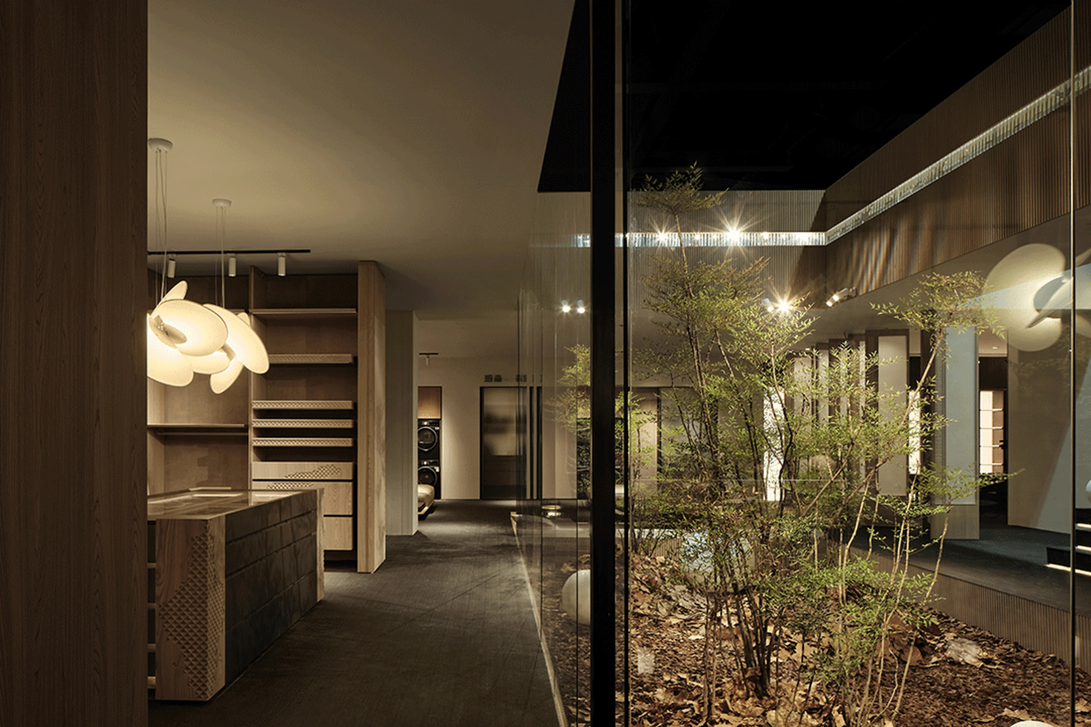
The sunken courtyard’s design is a tribute to the architectural concepts of Song-era Jiangnan residences, and it also serves as a pivotal traffic hub within the exhibition space. The courtyard is encircled by a continuous pathway that connects different functional zones. This circular flow not only guides the movement of visitors but also orchestrates the transition between areas in a rhythmic manner. The exhibition hall’s spatial design prioritizes visitor experience. The single-direction circulation path, particularly valuable for high-traffic events, alleviates congestion. The open courtyard further expands the physical distance between people in different directions. The three-sided, floor-to-ceiling glass walls of the courtyard enhance spatial continuity and share the surrounding scenery while simultaneously minimizing noise disruptions. The natural element of the courtyard also provides a sense of calm in the otherwise busy exhibit. These design choices create a harmonious environment that promotes a sense of tranquility and encourages a more focused interaction with the products on display. tag: exhibition design layout, visitor experience, space flow, human-centric design, interior design.
Balancing Tradition and Modernity
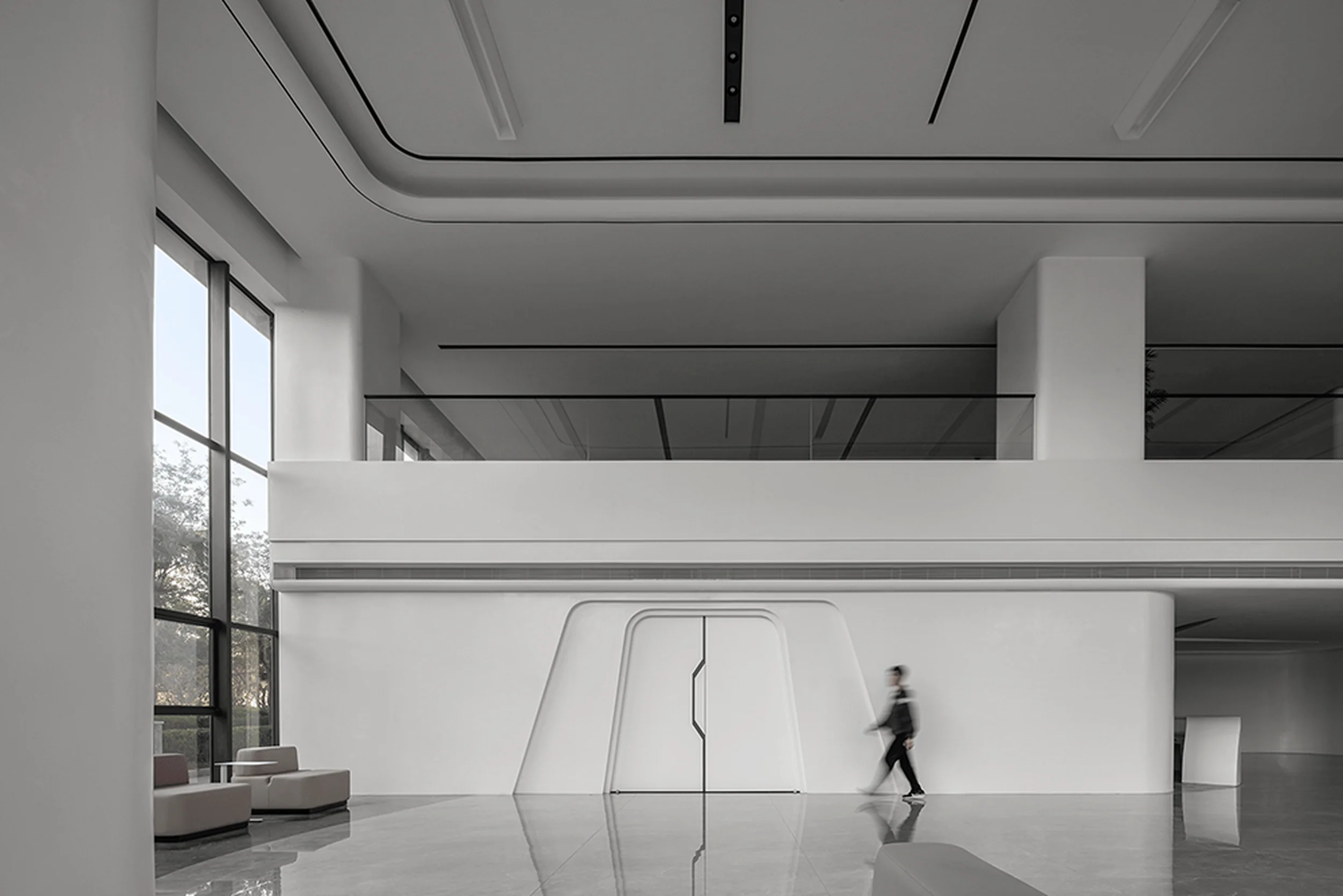
The exhibition hall space is designed to be a platform to showcase products, for a contemporary consumer base. Therefore, carefully balancing classical elements with modern design principles was paramount. The team recognized the potential for any project that incorporates traditional culture to fall into the trap of stylistic imitation or superficial reproductions. In their view, people’s needs and preferences are the product of both conscious and unconscious forces. One force is overt and arises from changes in our material circumstances and living habits, shaping spatial needs. This can be categorized as a short-term, temporal change. The second force is subtle and deeply rooted in our genes, daily encounters, cultural education, aesthetic development, and spiritual pursuits. It resists immediate change due to shifts in our material environment, representing a longer-term influence on our spiritual domain. The team found a harmonious balance between these forces by selectively incorporating elements of Song Dynasty architecture while simultaneously leveraging contemporary design trends, ensuring that the exhibition space was both elegant and functional. It embraced the current popular design trends of contemporary interior design and created spaces that seamlessly integrated function with aesthetics. tag: contemporary interior design, design trends, cultural preservation, exhibition design, space design.
Construction and Management Considerations
Given the limited timeframe for the Guangzhou Design Week exhibition, the project team prioritized practicality, cost-effectiveness, and risk management. While prioritizing the visual appeal and overall ambiance of the space, the design team also had to consider factors such as ease of installation, cost control, and adaptability. The materials used were chosen to be cost-effective and readily available. The incorporation of readily available elements, like fallen sycamore leaves and pine bark, not only provided a natural and aesthetic ambiance but also decreased costs while streamlining the construction process. The design team effectively integrated design and practicality, creating a solution that met the project’s specific requirements and ensured the exhibition’s success. tag: exhibition design, project management, construction process, cost control, design optimization.
Project Information:
Project Type: Exhibition Design
Architect: Weiyang Creative Space Design
Area: 320 sqm
Year: 2023
Country: China
Photographer: Ingallery


