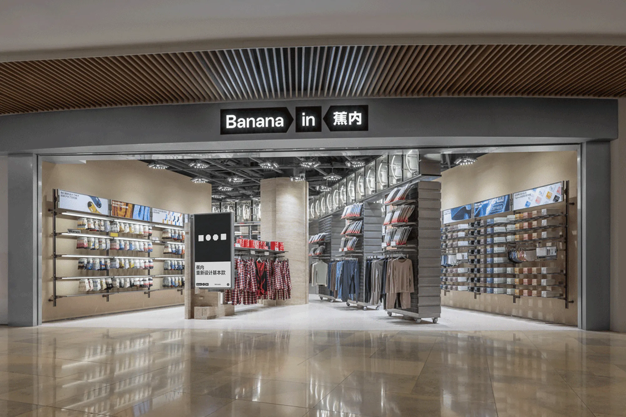
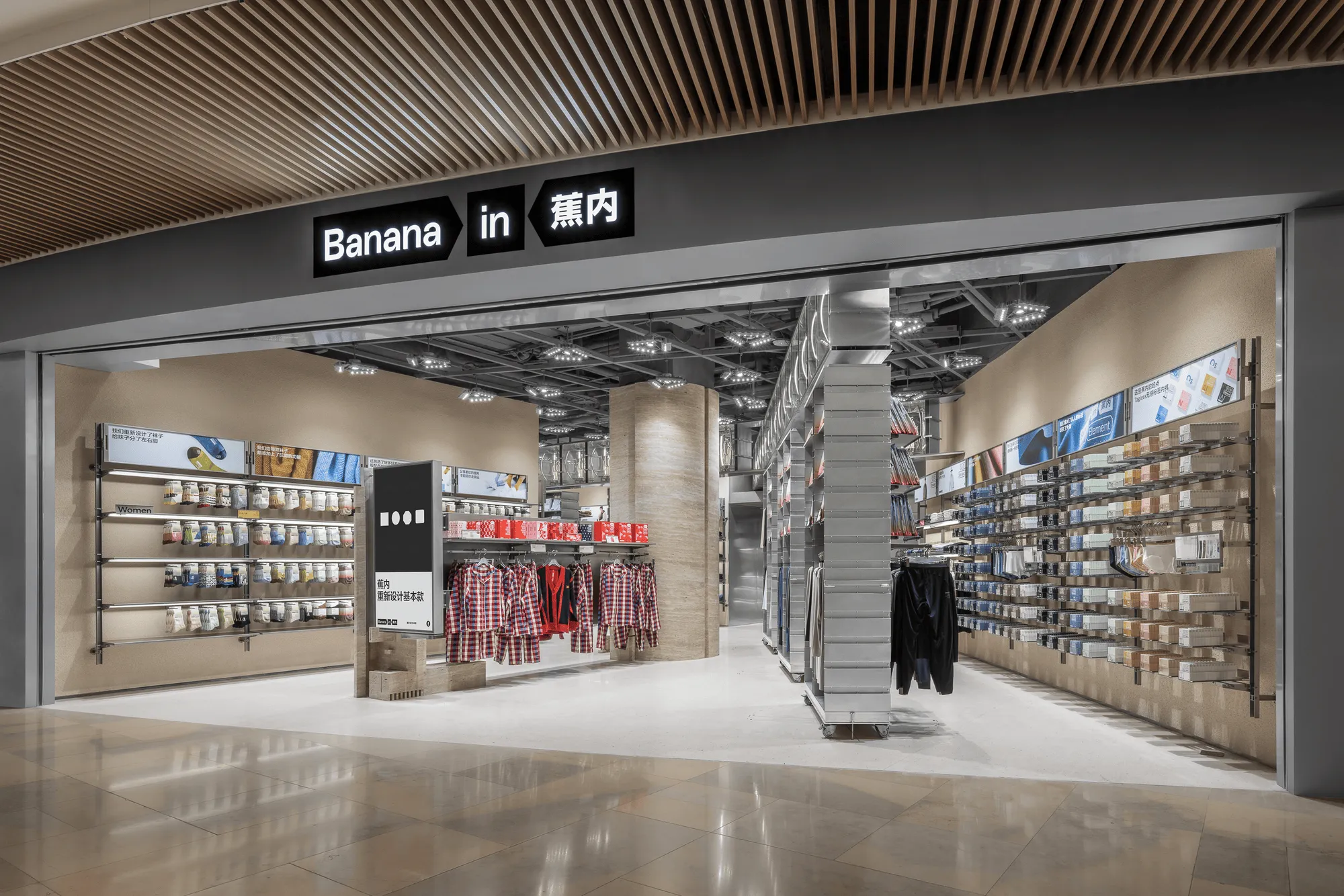
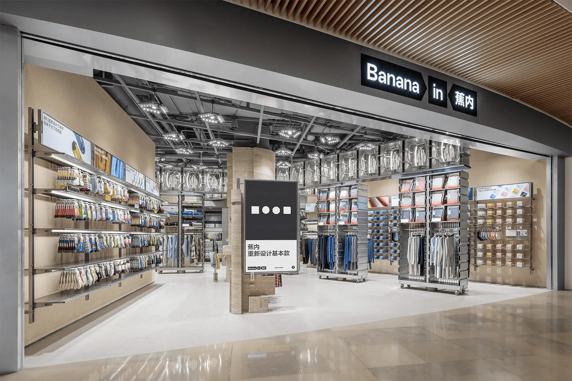
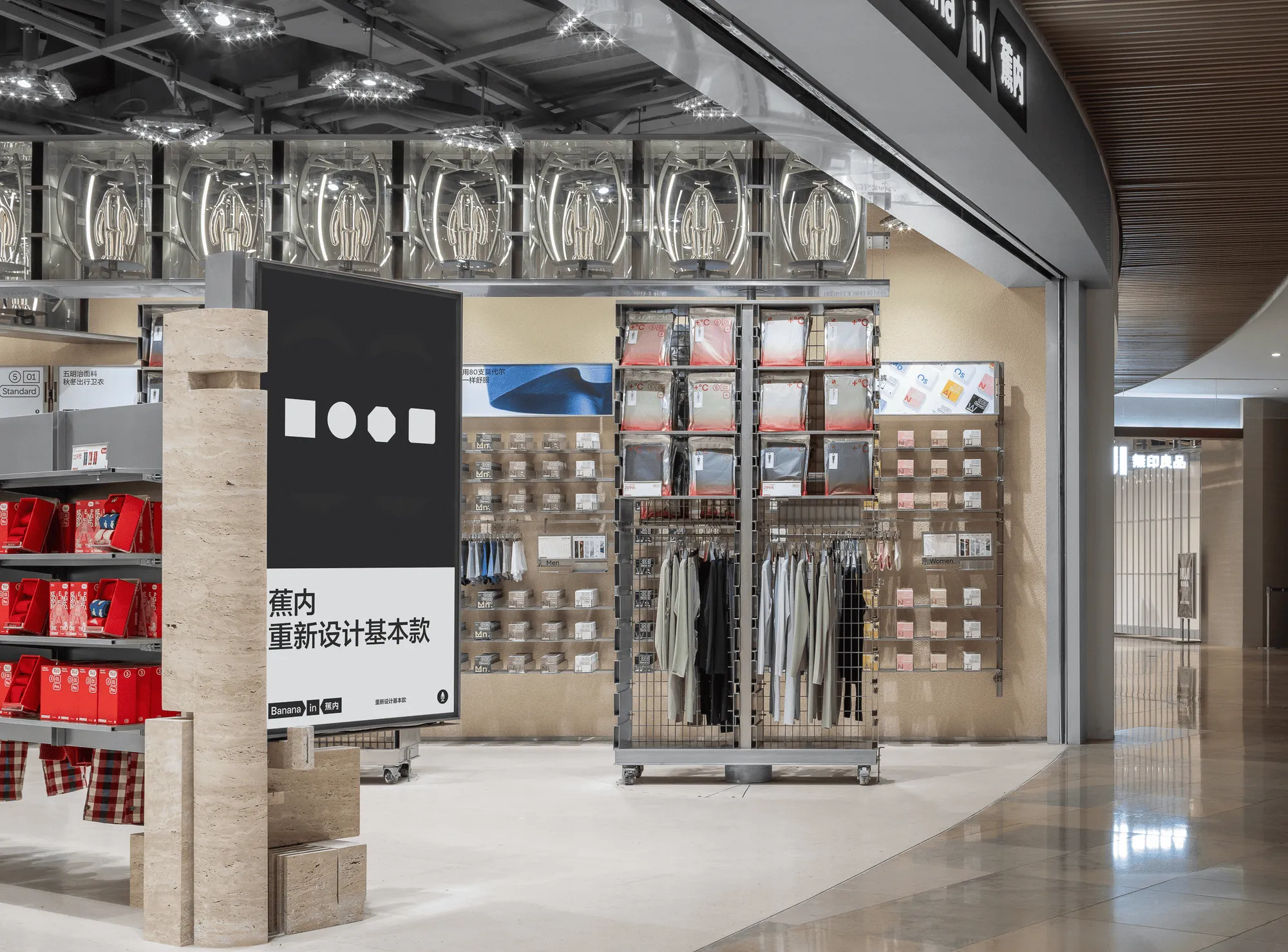
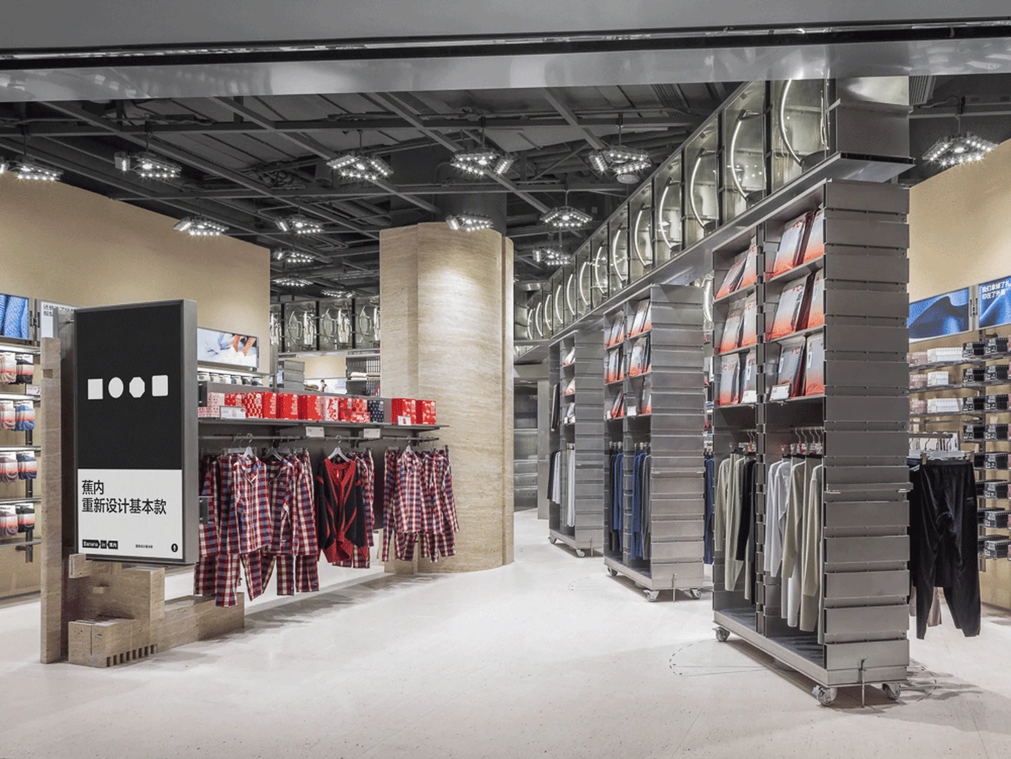
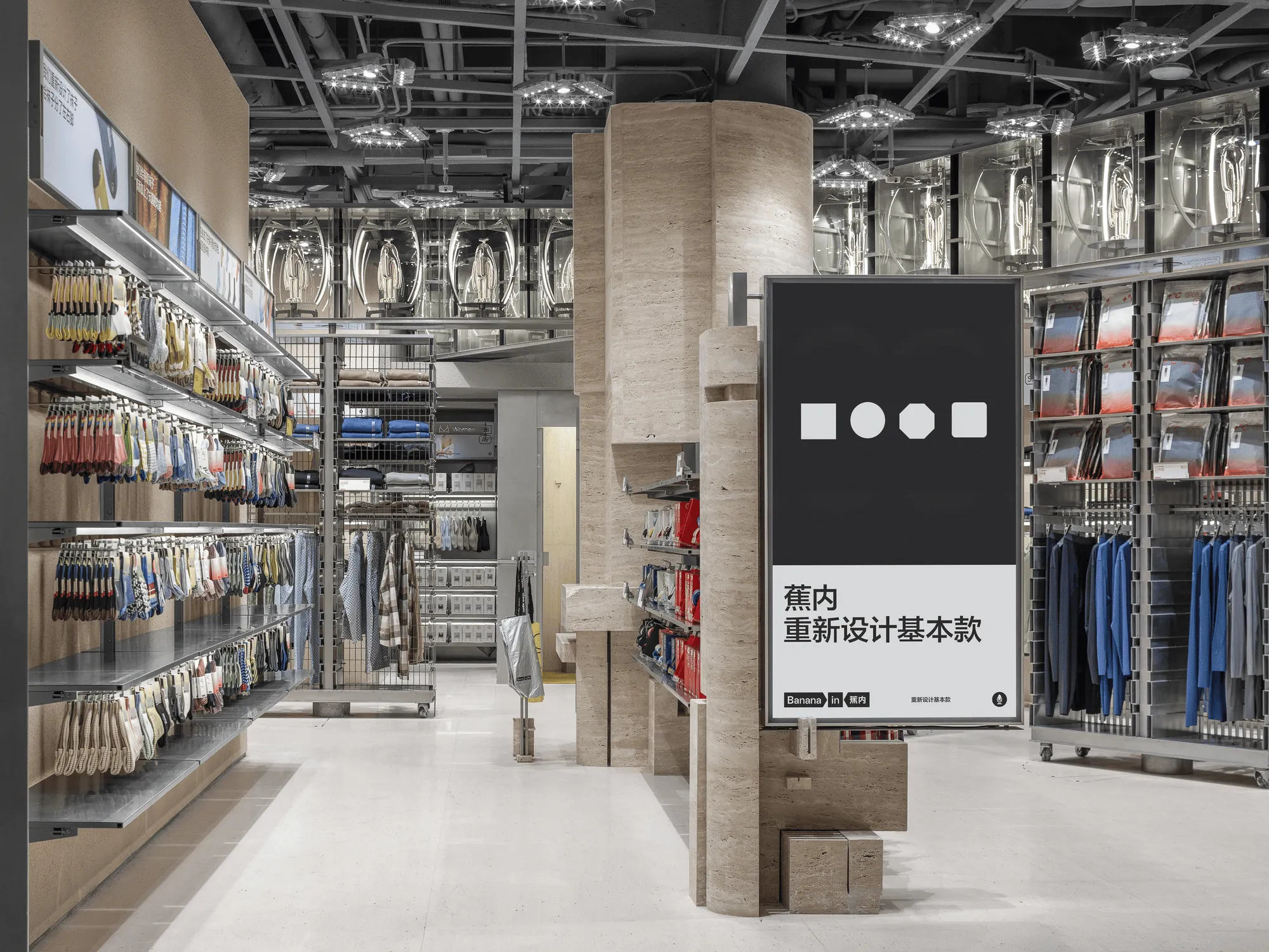
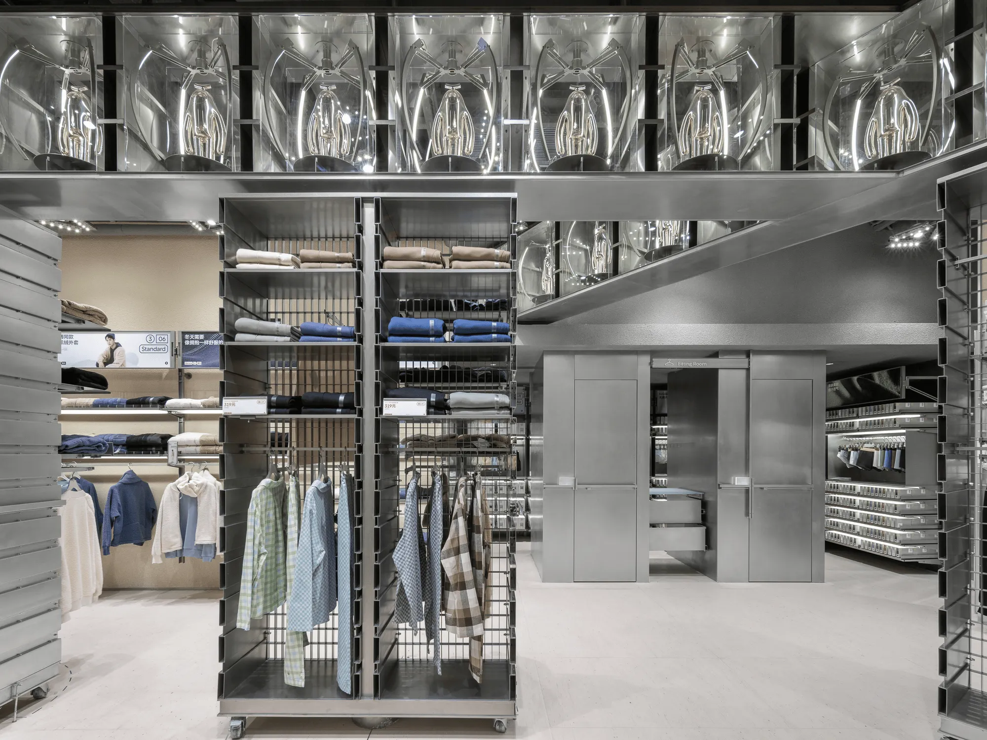
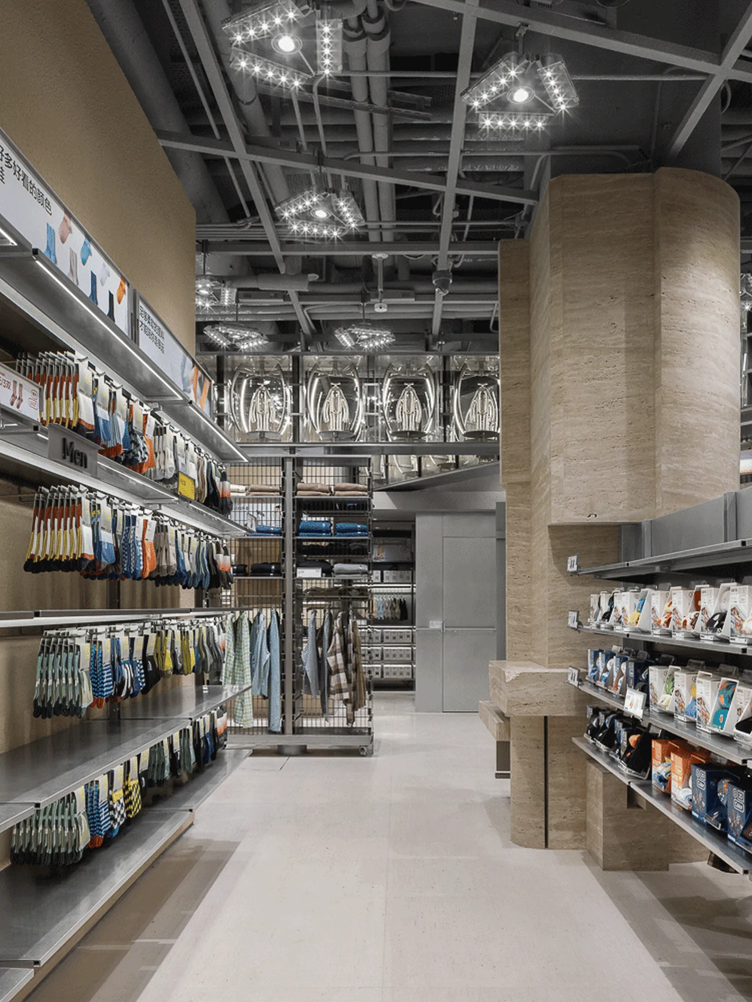
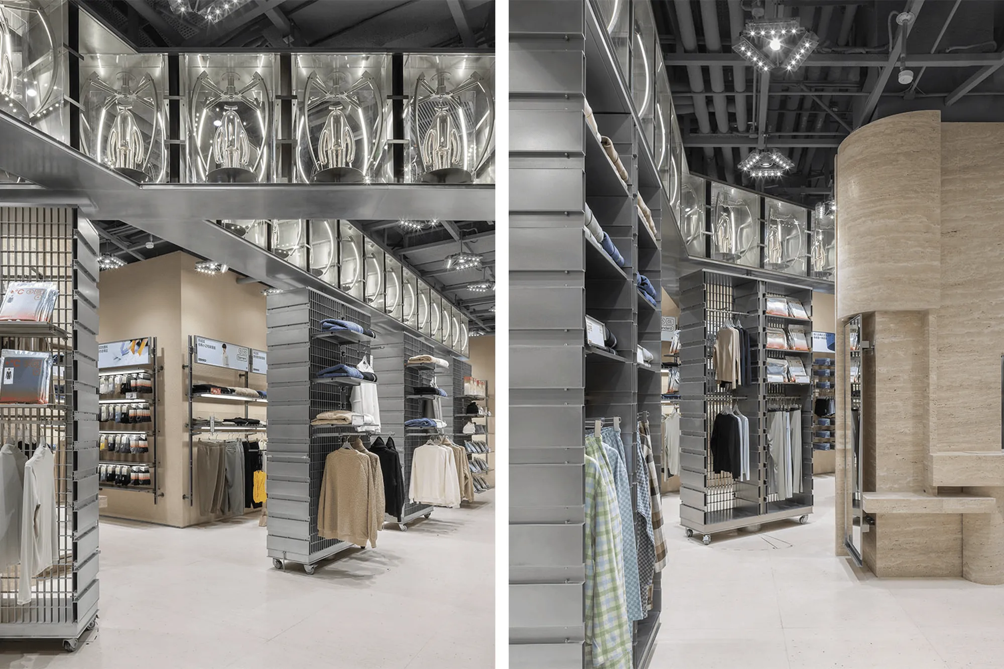
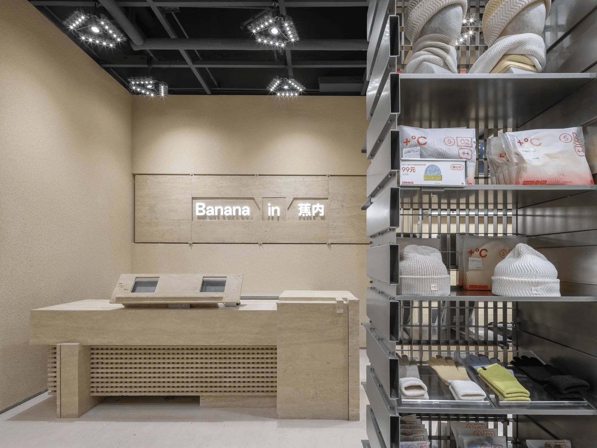
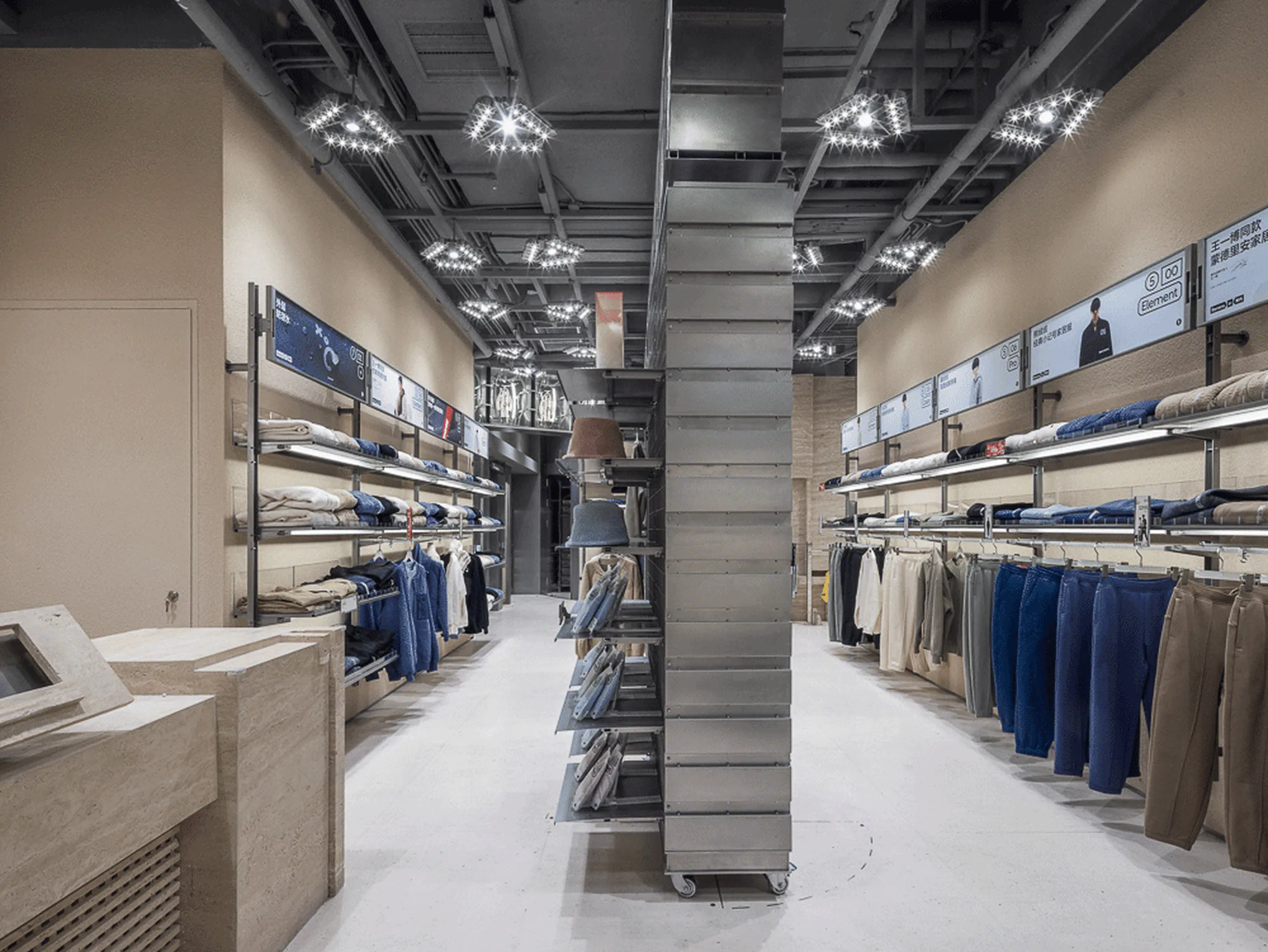
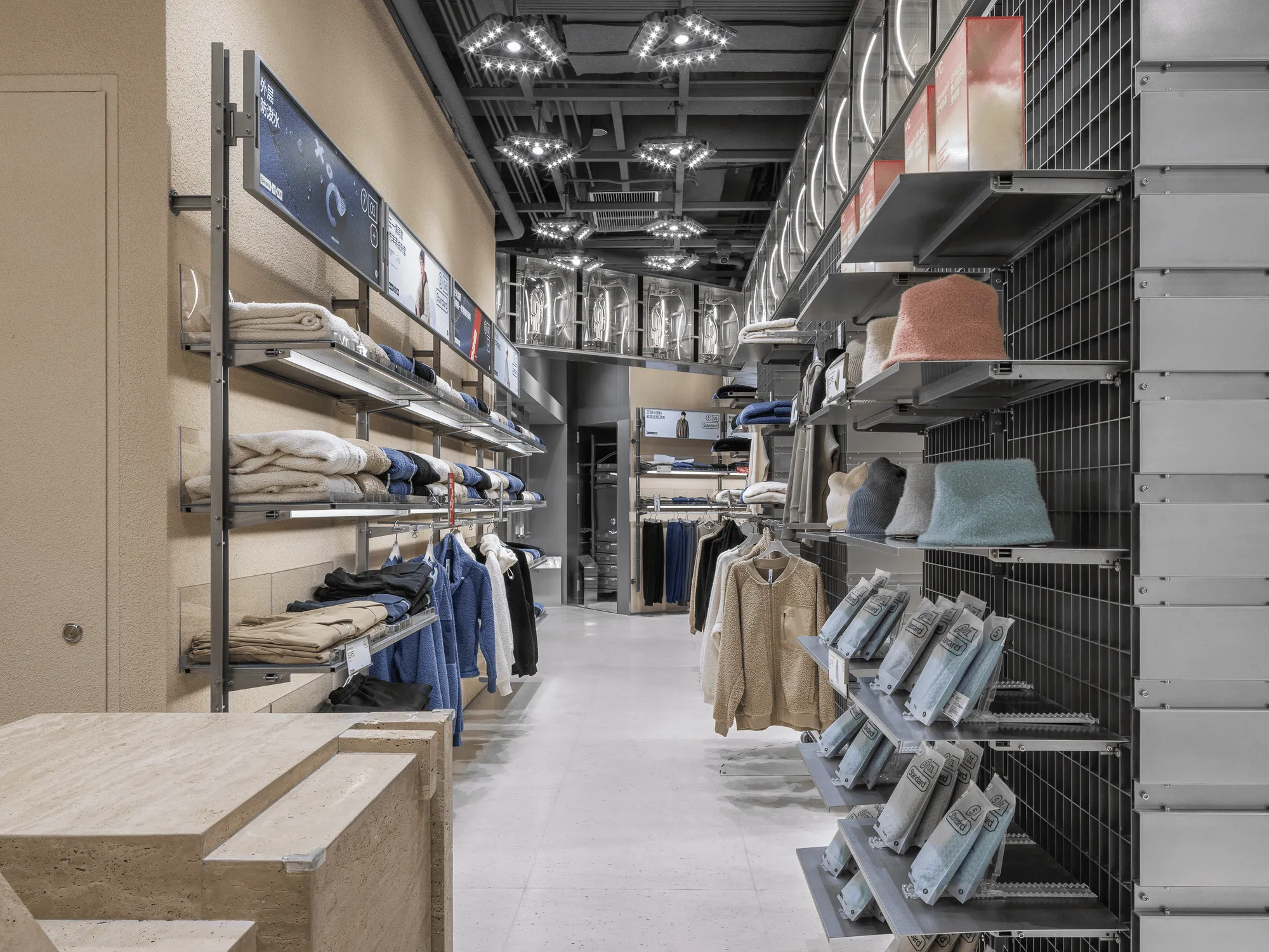
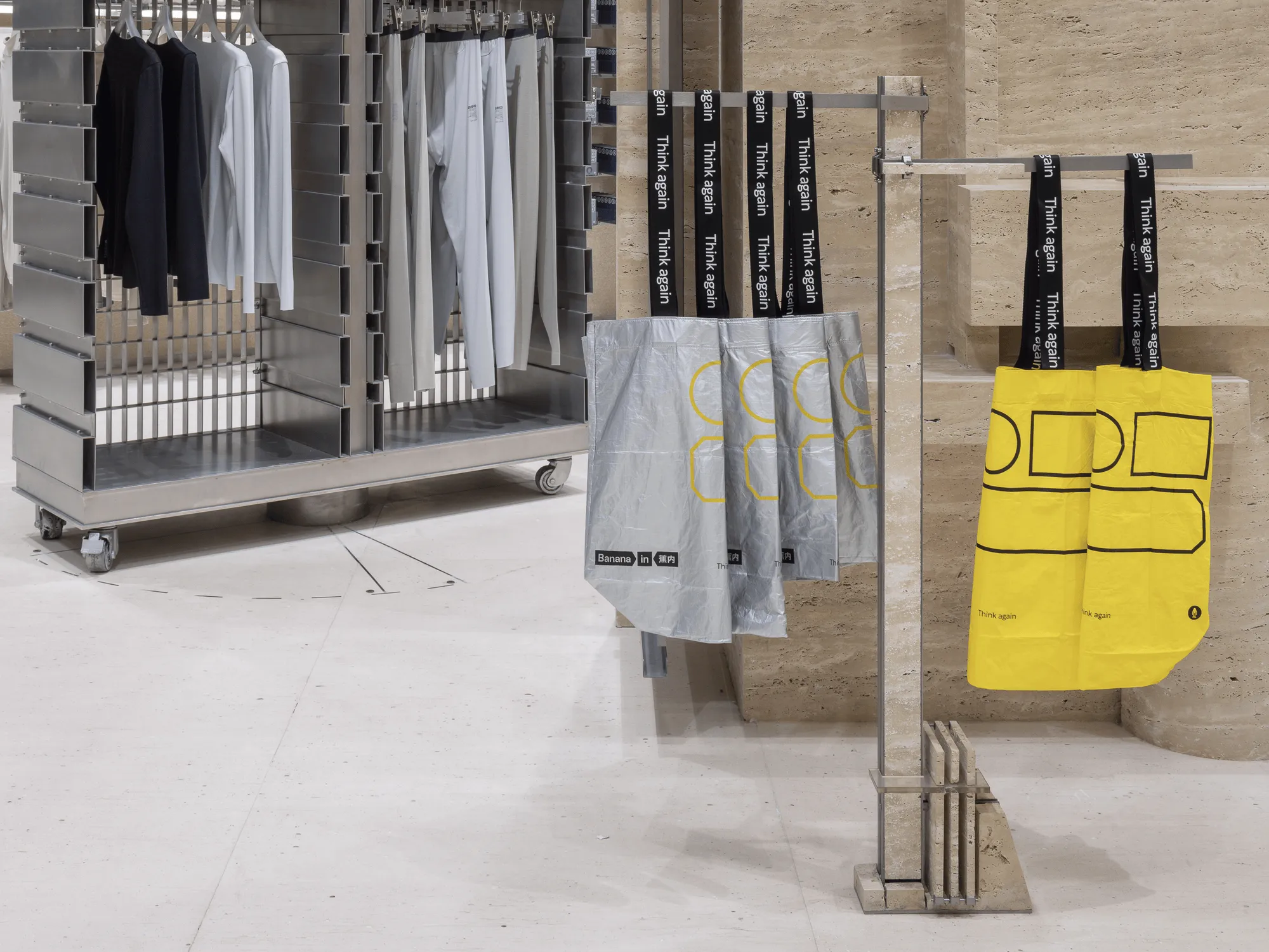
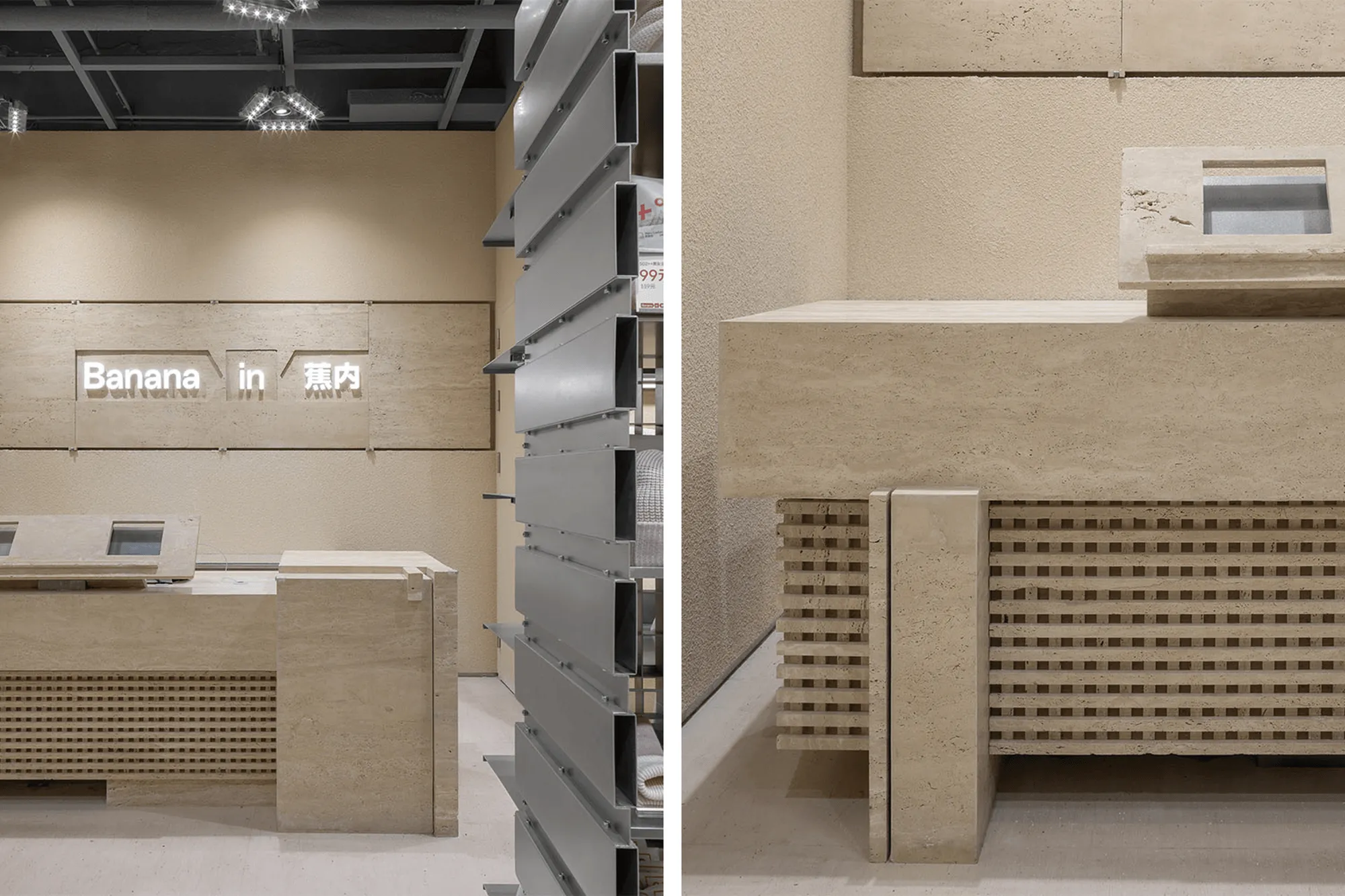
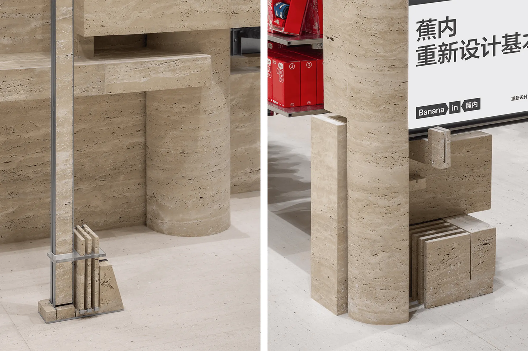
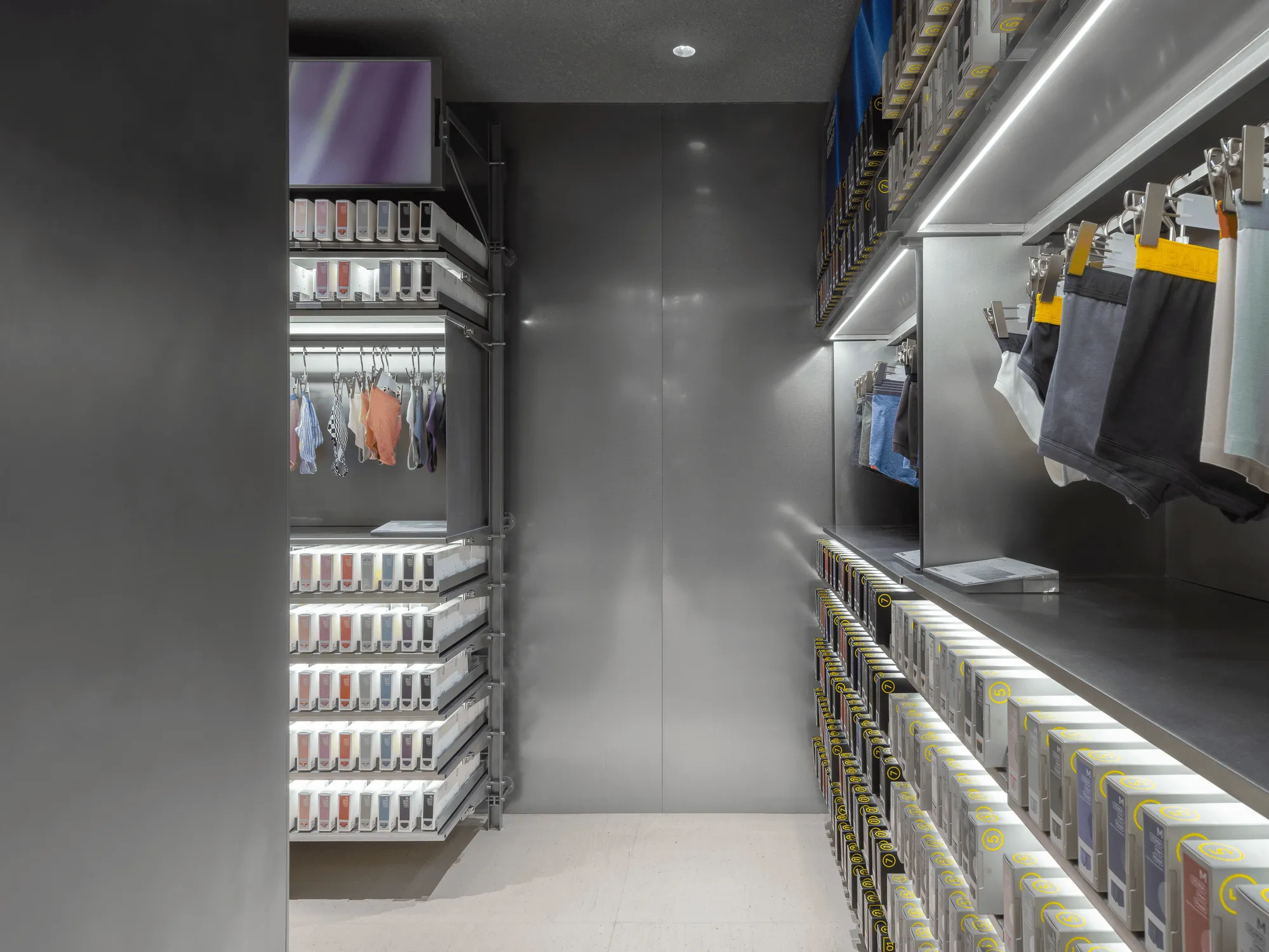
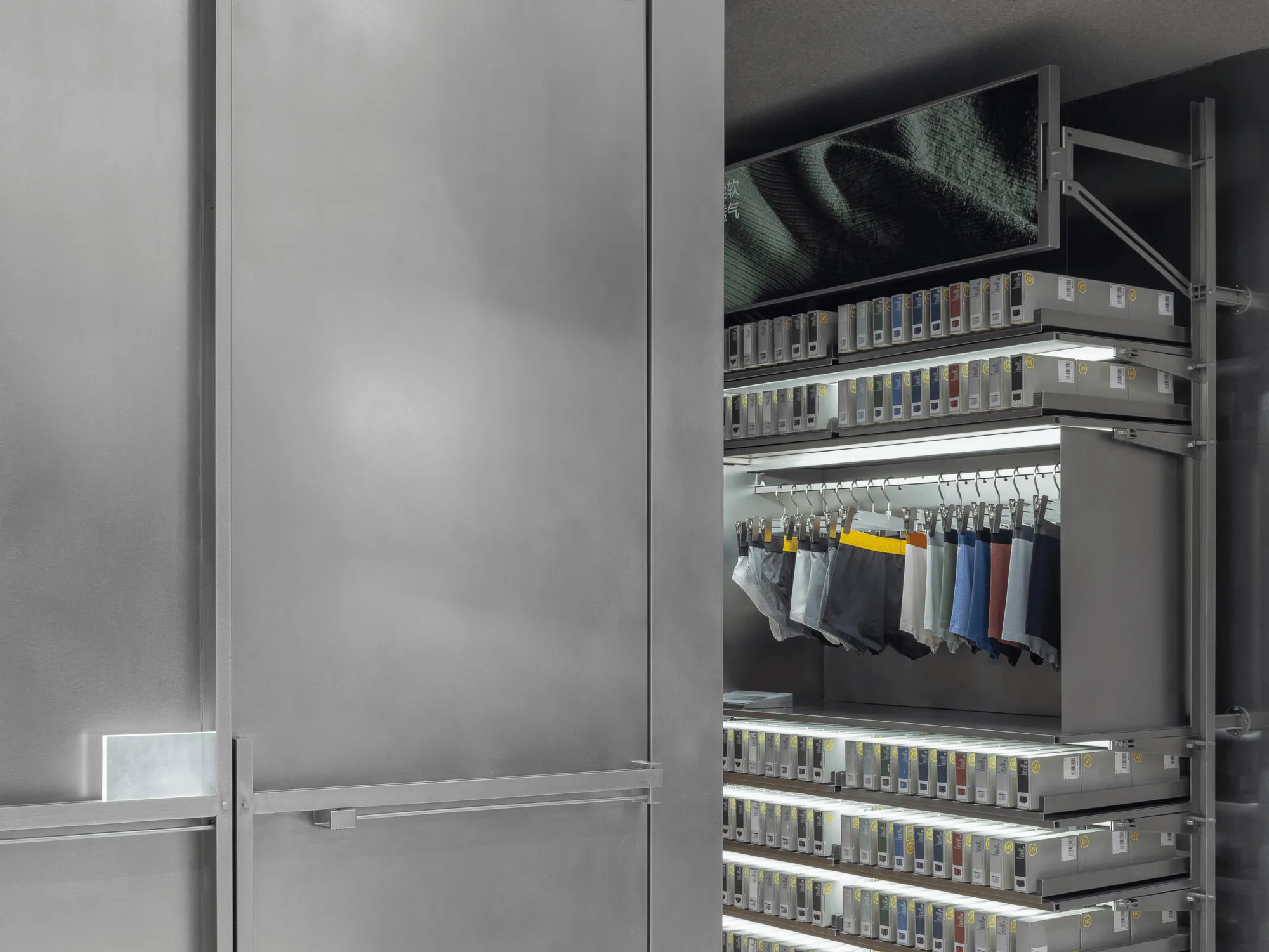
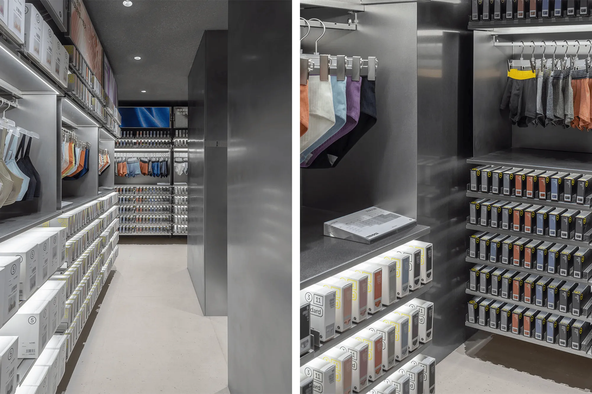
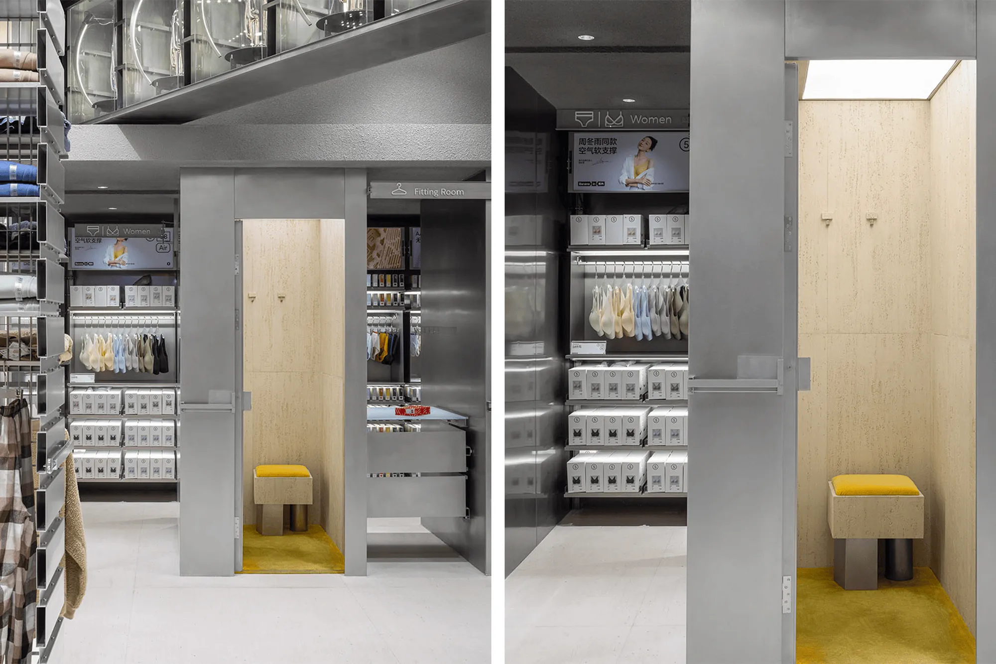
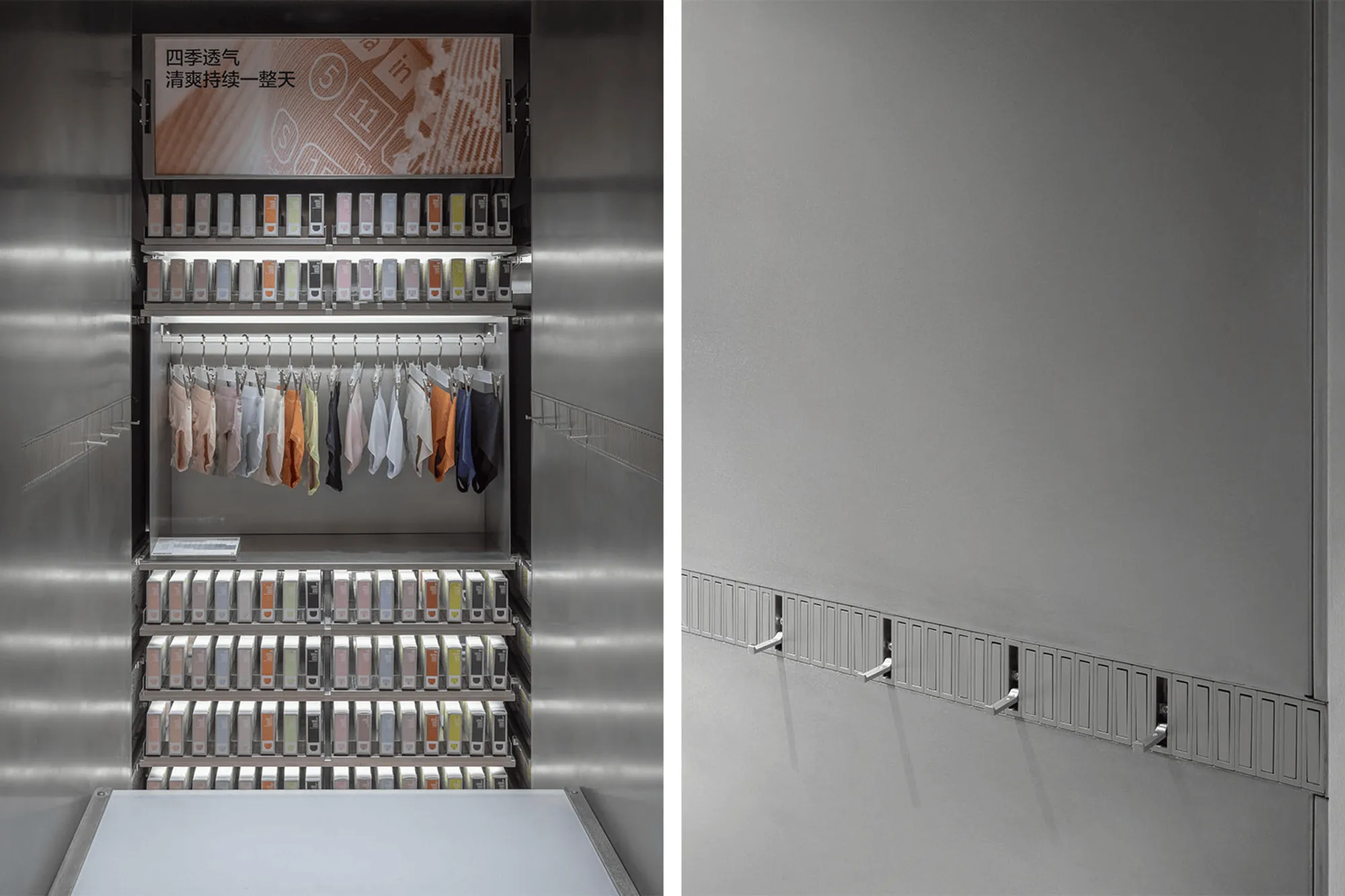
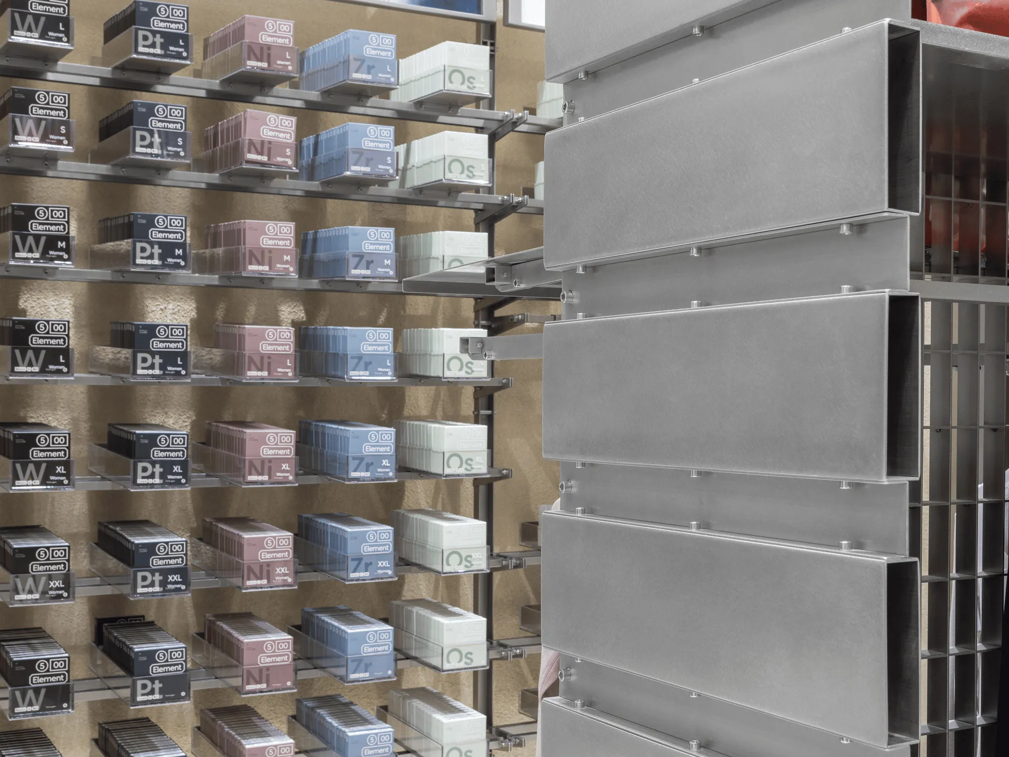
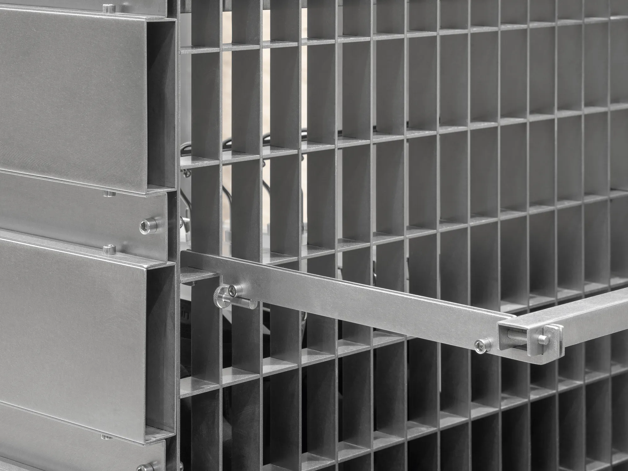
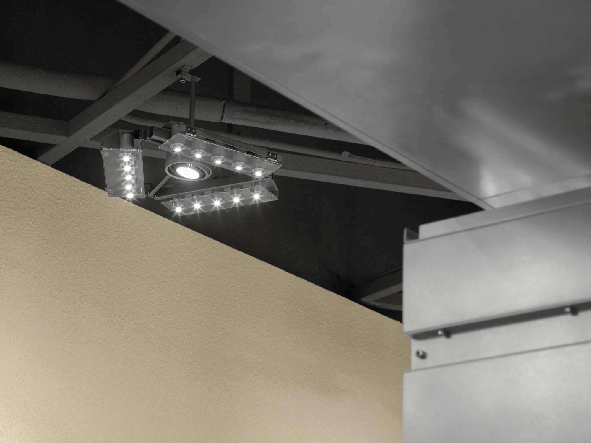
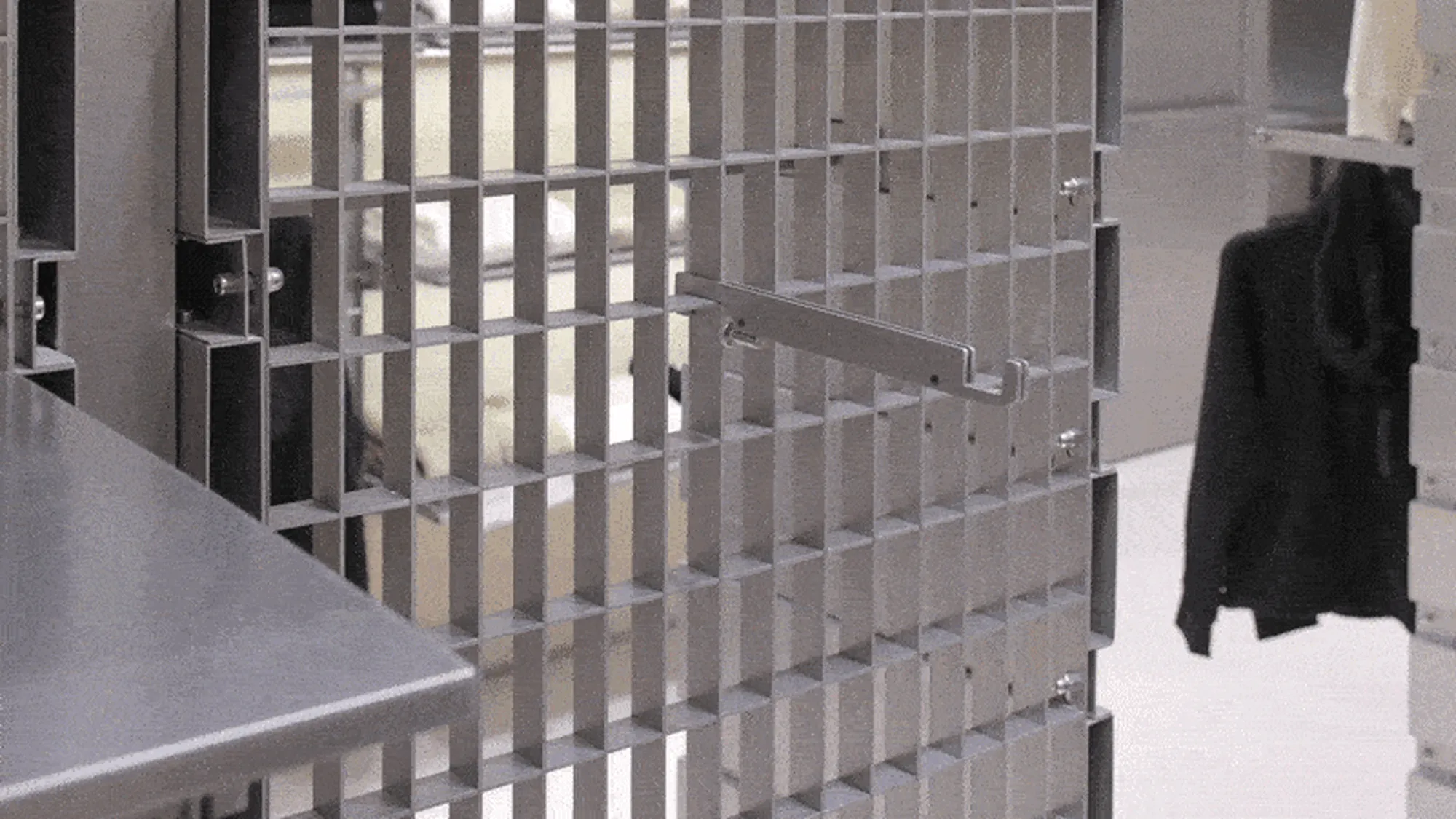
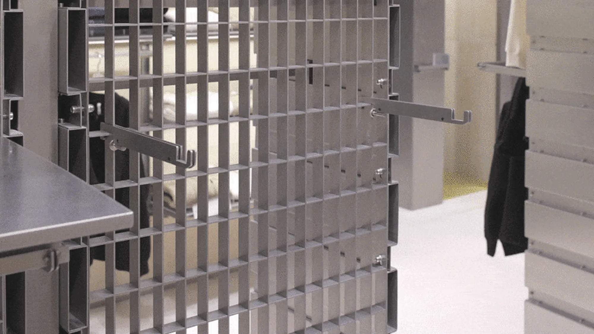
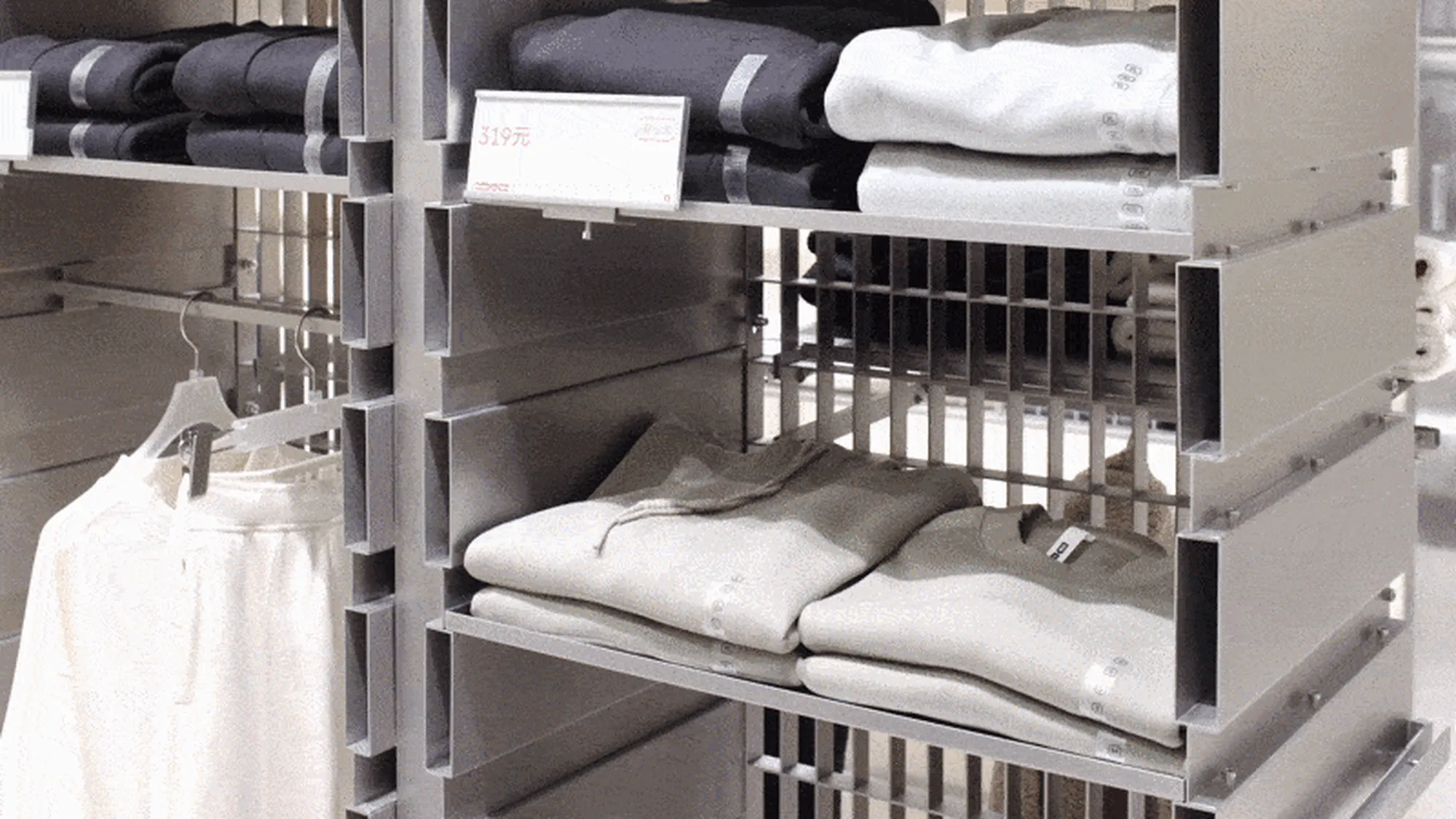
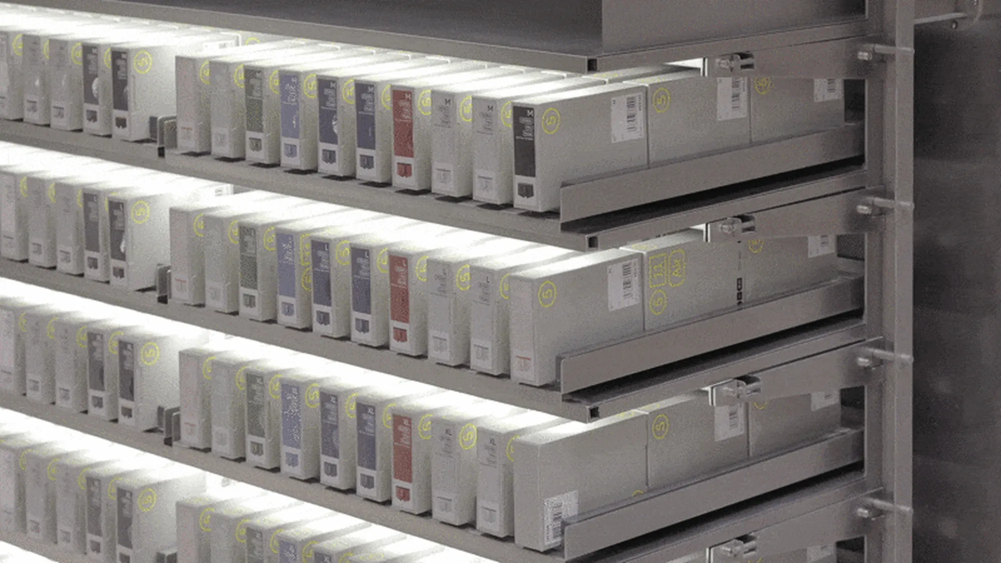
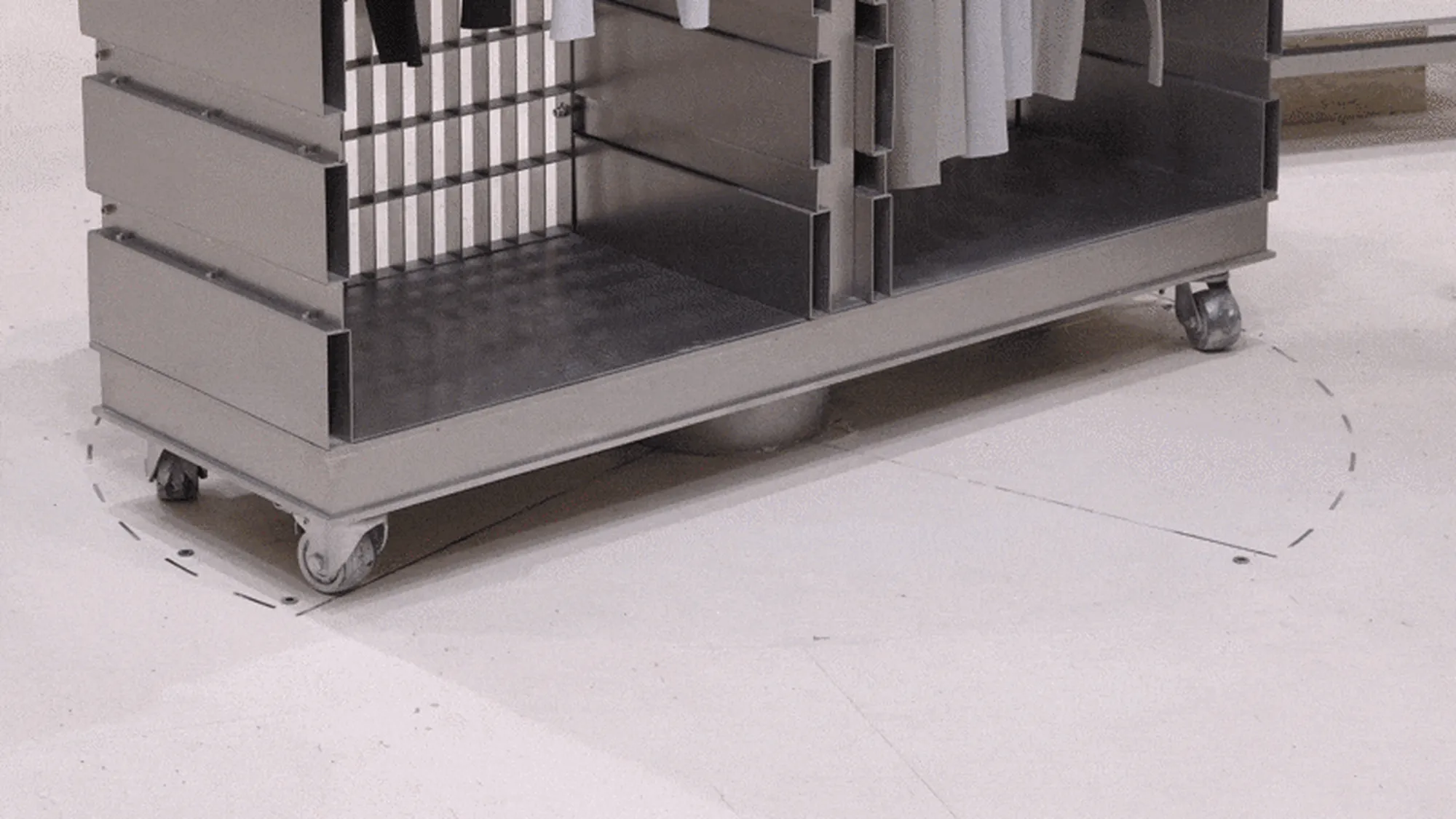
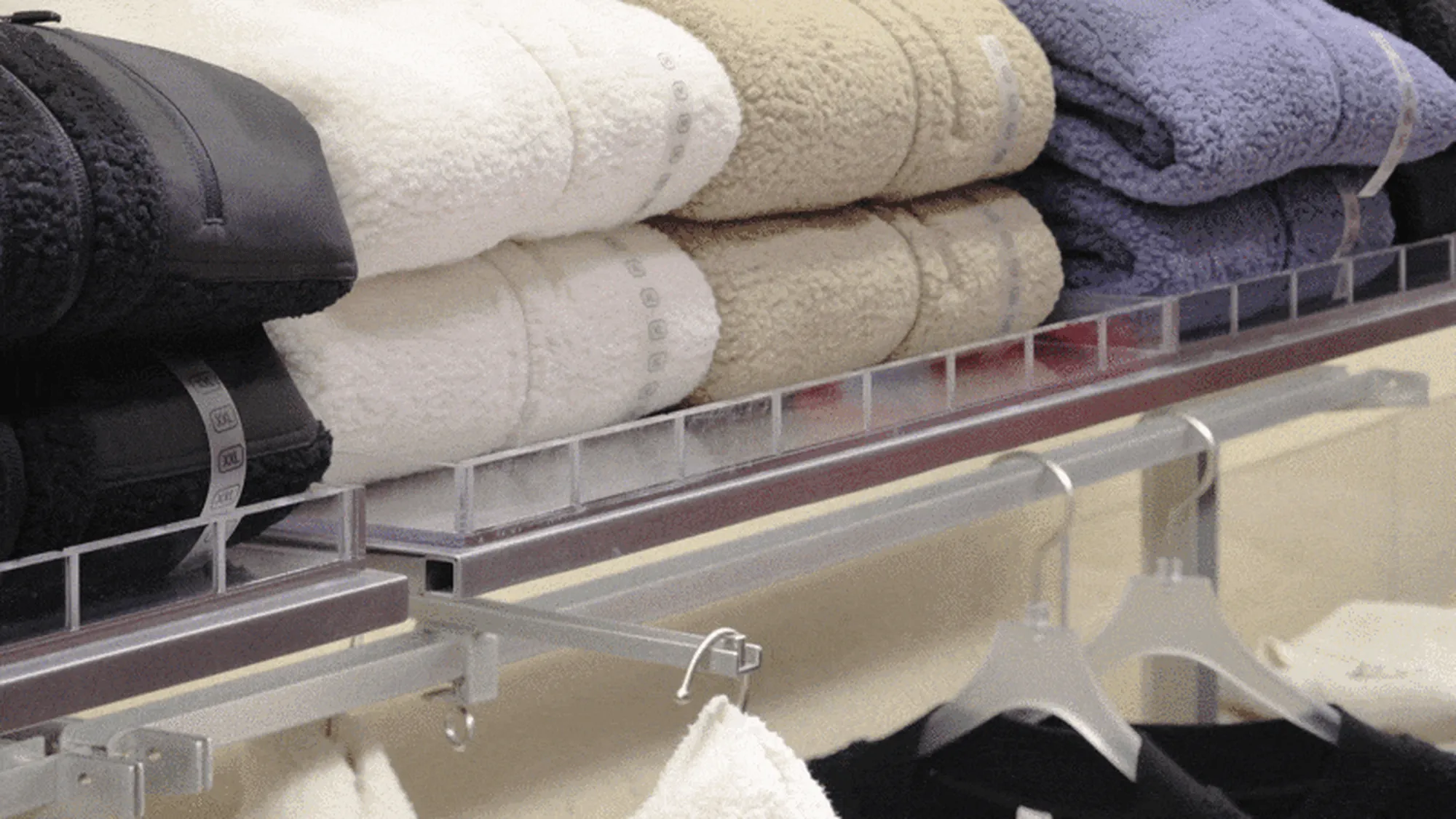
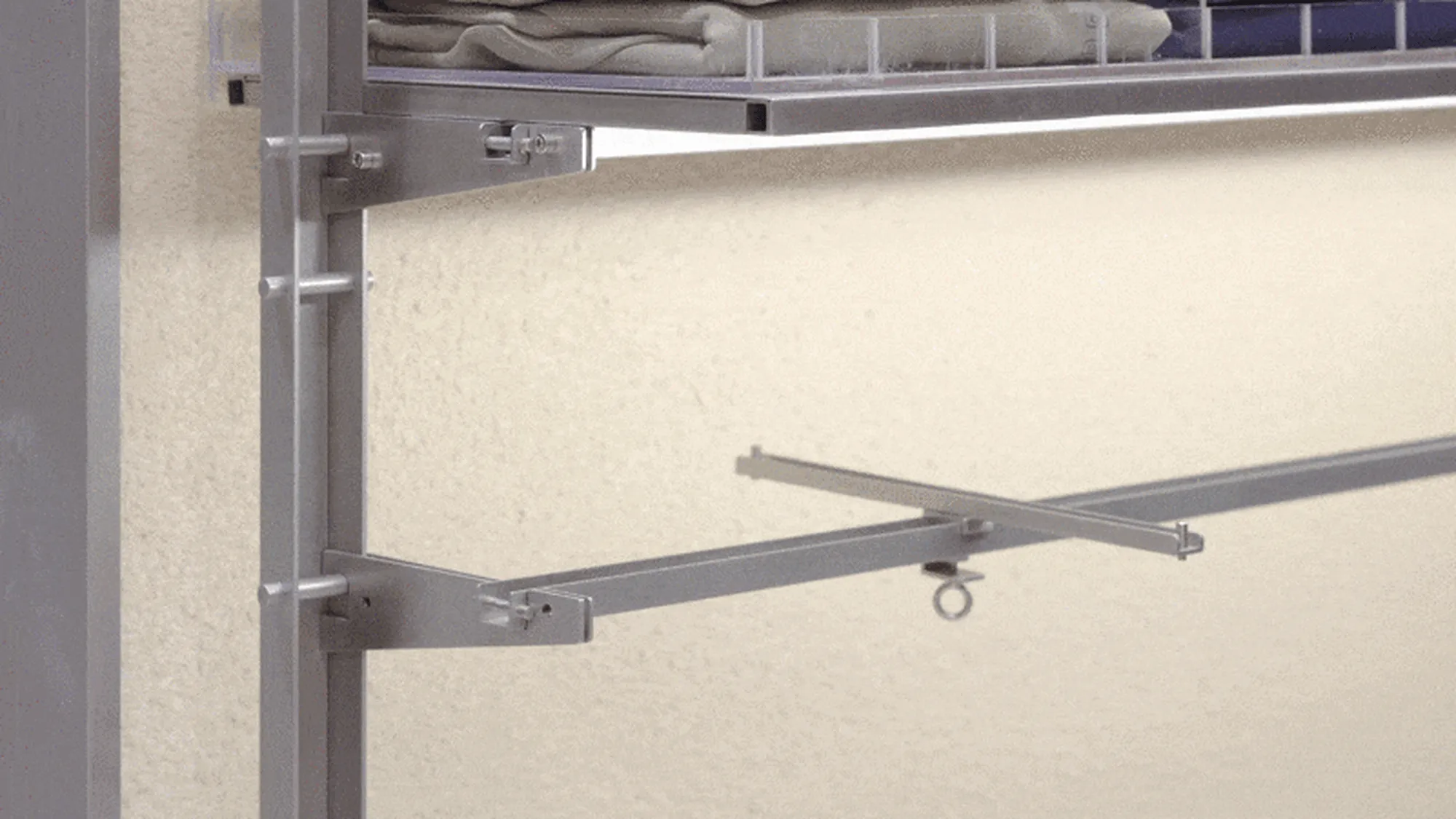
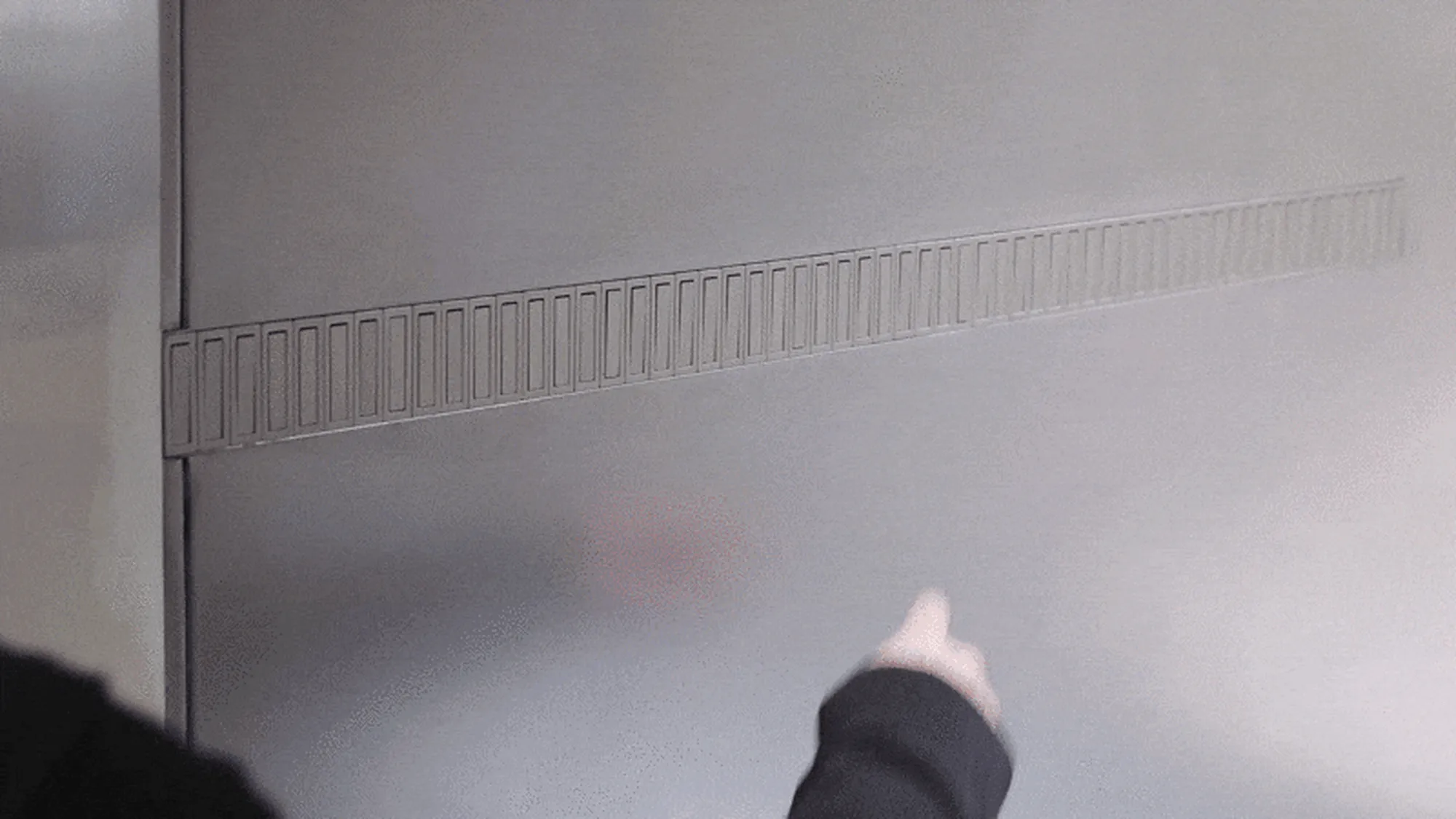
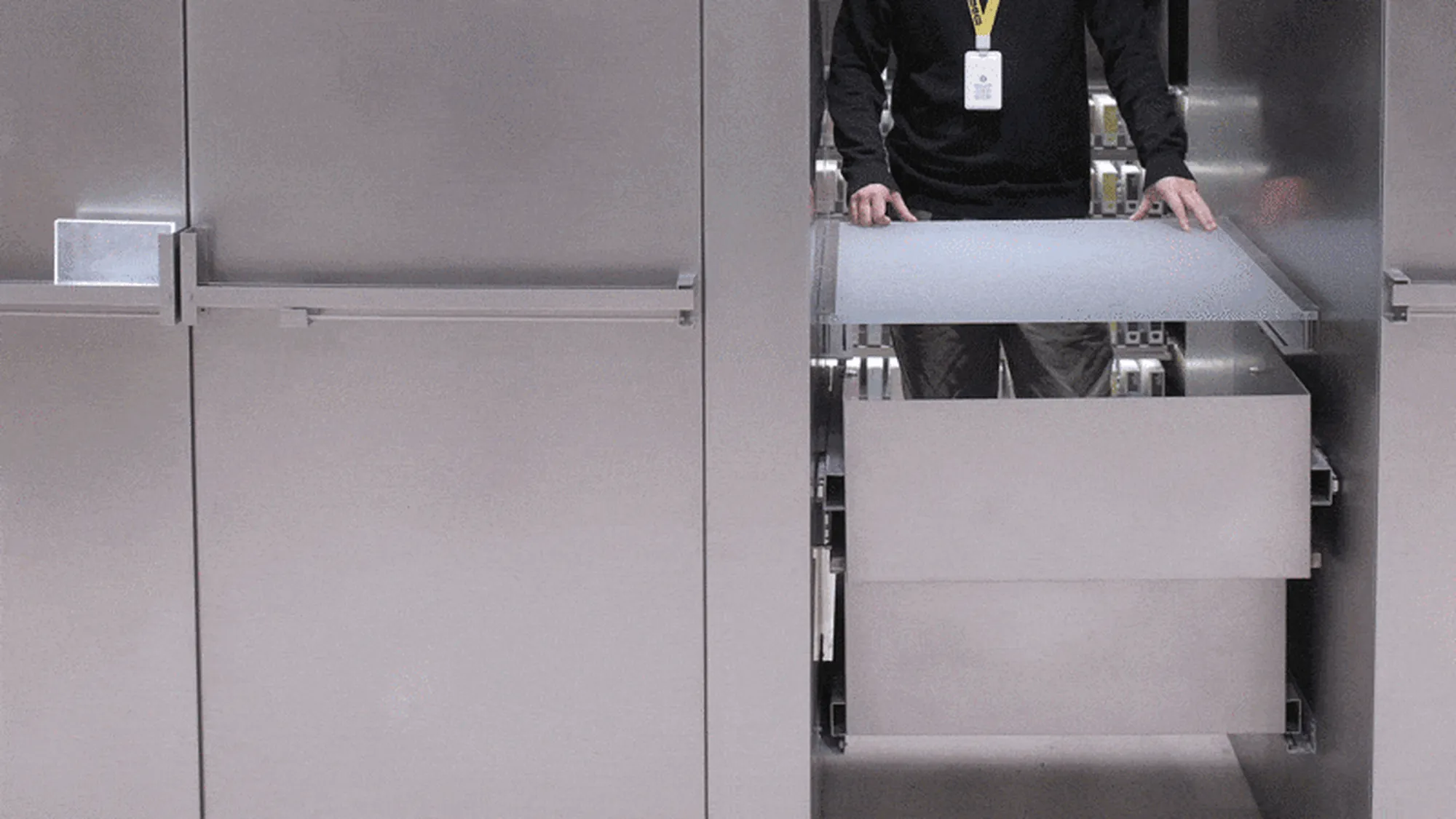
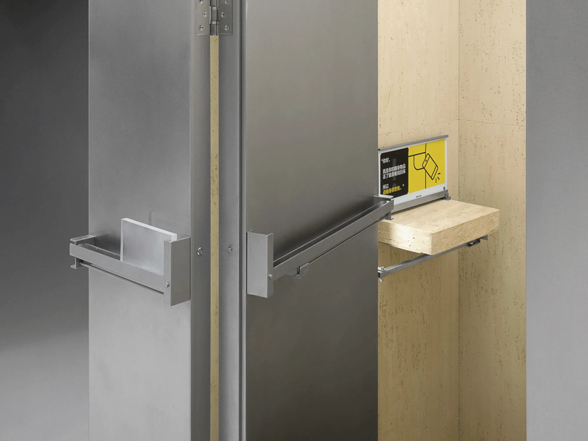
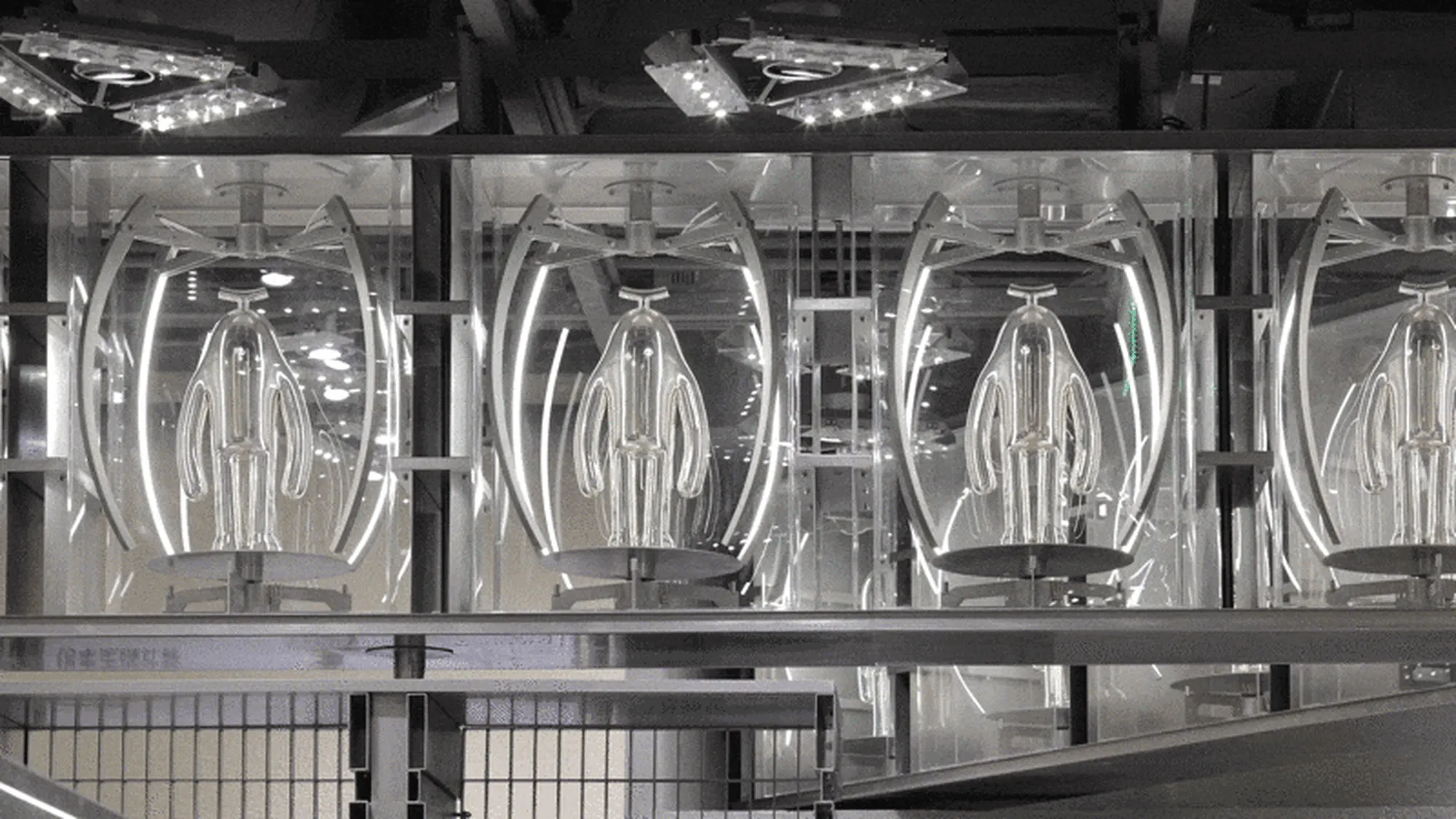
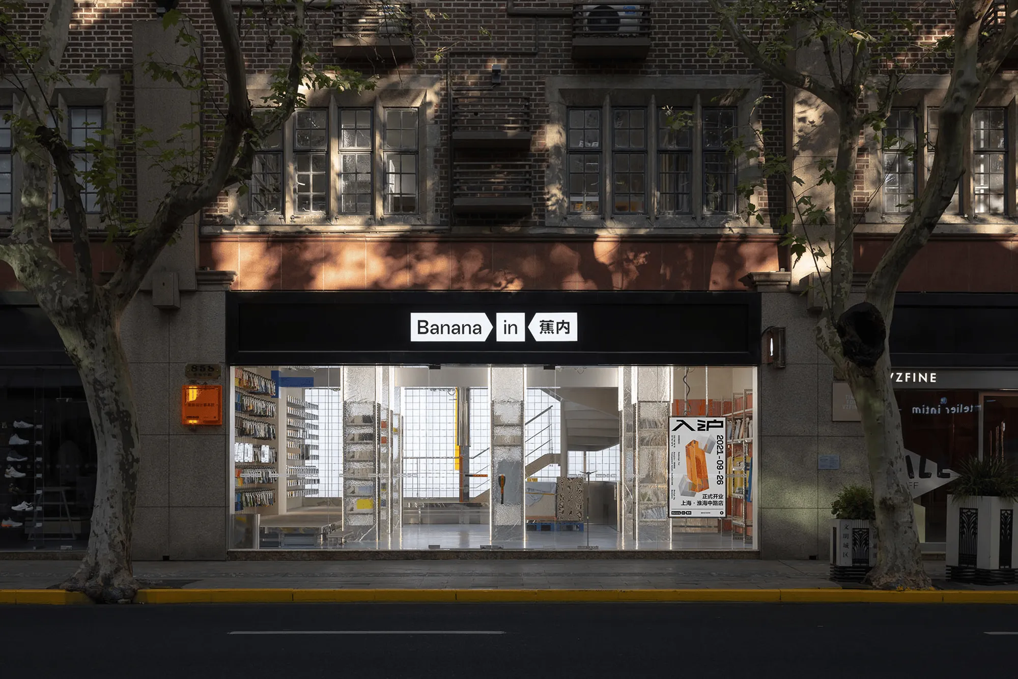
Some Thoughts believes that brand display and designer’s creativity expression are not necessarily opposites. When designers face the operational needs of the brand, the displayed products can also be understood as ‘decorative materials,’ and the designed profiles become a certain specification. By stacking up the specifications, the correlation between the parts and the display of products are integrated. In this orderly and systematic specification, the flexibility and richness required by brand retail are met.
Some Thoughts believes that brand display and designer’s creativity expression are not necessarily opposites. When designers face the operational needs of the brand, the displayed products can also be understood as ‘decorative materials,’ and the designed profiles become a certain specification. By stacking up the specifications, the correlation between the parts and the display of products are integrated. In this orderly and systematic specification, the flexibility and richness required by brand retail are met.
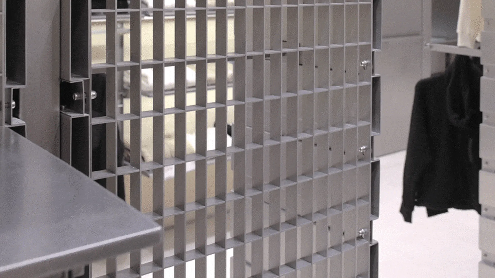
When designing this project, we intersected two straight lines, which divided the space into six repeating units. Its front and back are two different switching models, which provide the optimal display scheme for seasonal products through angle rotation. We hope to achieve effective interaction between the public, the venue, and the display with the simplest unit and the least intervention in the space.
Shifting the focus of work from the overall spatial order to the small order between parts, a new design form is constructed by superimposing the small order. The correlation between the parts maintains a strict order, but from the perspective of space, there is no order to be found. In the synergy that contains various contradictions, a venue with a certain acceptance ability, similar to a ‘community’, has emerged.
From the dimensions of time and function, metal is used as a component, its strength and toughness support the existence of functionality and efficiency. Products and display components are combined, and through corresponding synergy, a flexible normality is sought.
Project Information:
Project Name: Bananain Concept Store (Kerry Centre Store)
Project Type: Commercial Space, Retail Space, New Retail Space, Brand Concept Store, Super IP, Brand Store, Bananain Concept Store
Project Address: No. 21, SB1 Floor, South Area, Kerry Centre, No. 1218, Yan’an Middle Road, Jing’an District, Shanghai
Per Capita Consumption: 400 yuan/person
Design Company: Some Thoughts
Lead Designer: Li Jingze
Design Team: Liu Jinwei, Jin Qiang
Construction Company: Shanghai Jinpeng Construction Engineering Co., Ltd. (Hard Decoration + Props)
Space Area: 90 square meters
Main Materials: Texture paint, irregular stainless steel, U-shaped steel, stainless steel grille, cave stone, microporous cement board
Photography Copyright: SFAP
Project Owner: Jiangxi Bananain Technology Co., Ltd.


