Minimalist design and micro-cement application in Beijing showroom.
Contents
Introduction: A Prelude of Space
This 120sqm micro-cement showroom in Beijing showcases the essence of minimalist design. The designers, from NOTHING DESIGN, utilize a symmetrical layout as a foundation, employing materials, colors, and volume structures to achieve a harmonious balance. The space avoids the typical rigid display methods of commercial showrooms, allowing the micro-cement to seamlessly integrate into each scene, creating a deeper relationship with the environment. #minimalistdesignshowroom #microcementshowroom #interiordesignbeijing
Entrance Hall: Minimalist Gray and Artistic Touch
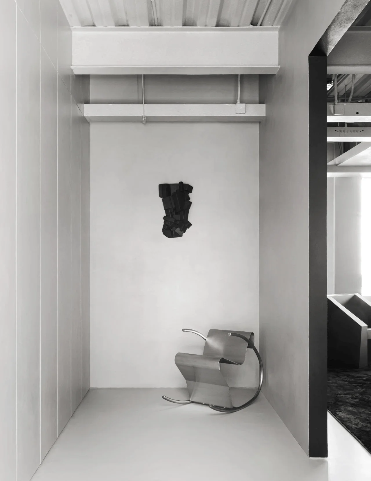
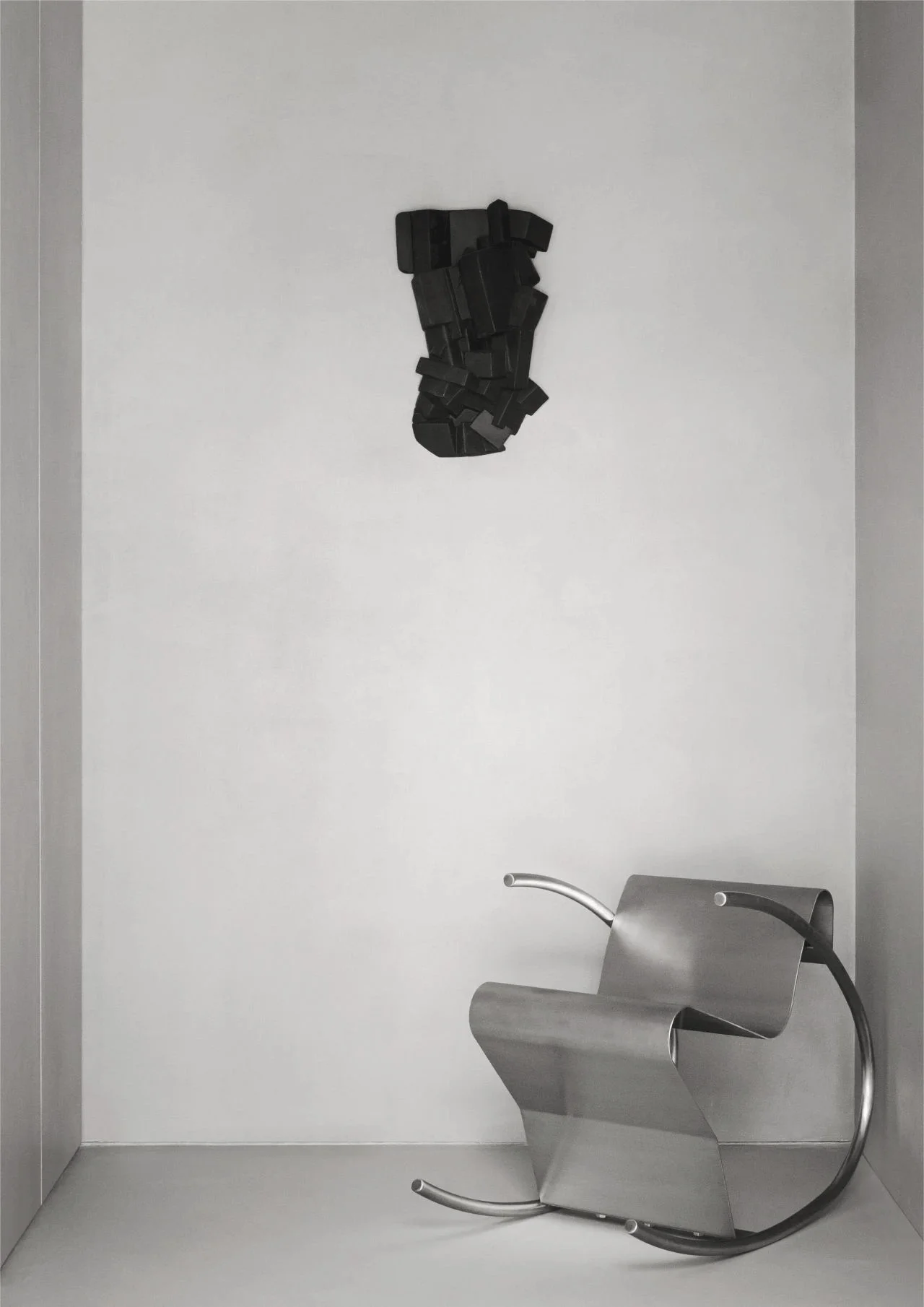
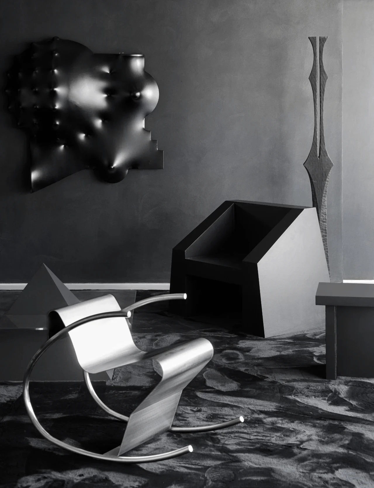
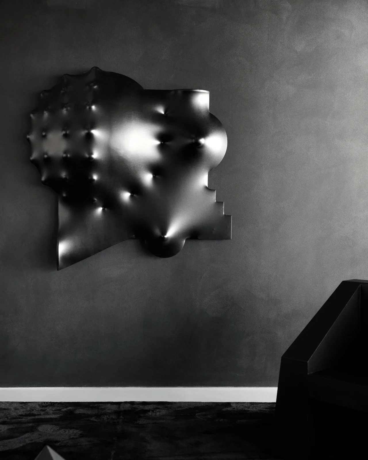
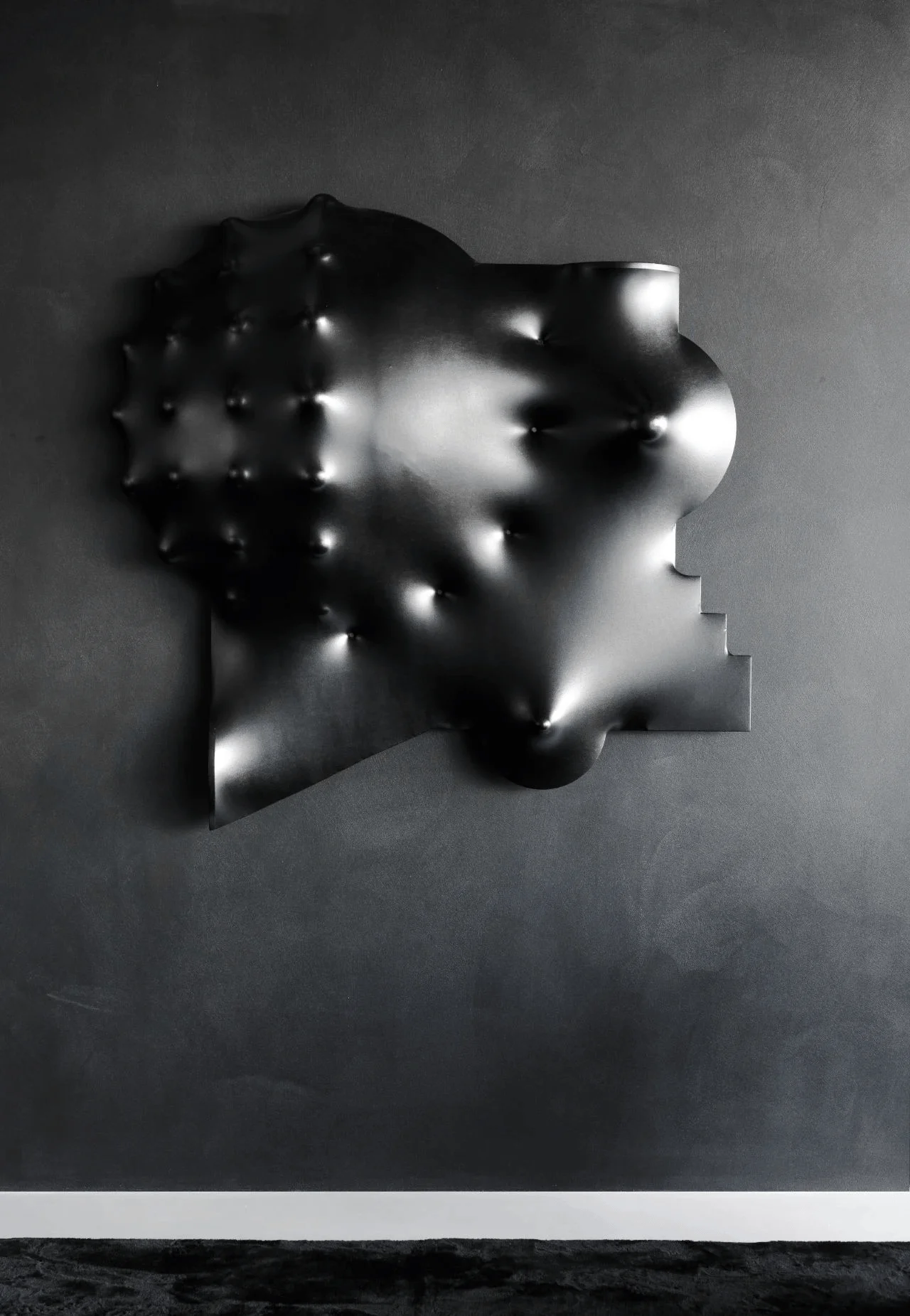
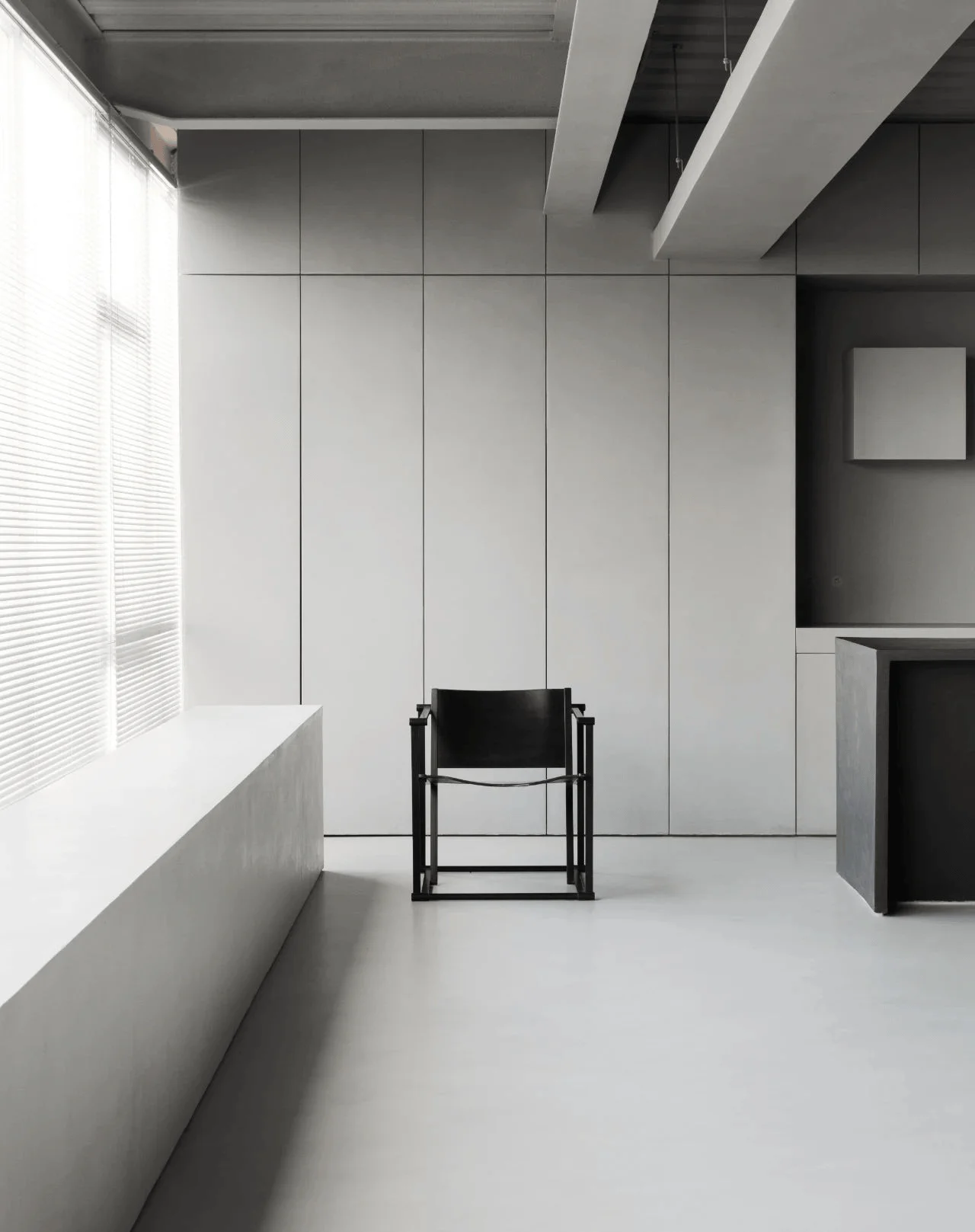
The entrance hall sets the tone for the showroom with a minimalist gray palette. The designers maintain the original open layout, adding a subtle residential entrance feel with a semi-separated area. This creates a transition into the main space while maintaining visual connectivity. The grey tones and micro-cement walls and floors create a focused and elevated ambiance, highlighting the aesthetic and material qualities. A curved metal armchair introduces a soft contrast to the rigid materials. A black, irregular geometric installation adds an avant-garde artistic element. #minimalistenhancement #artisticinteriordesign #graytonesandmicrocement
Main Space: Black and Geometric Harmony
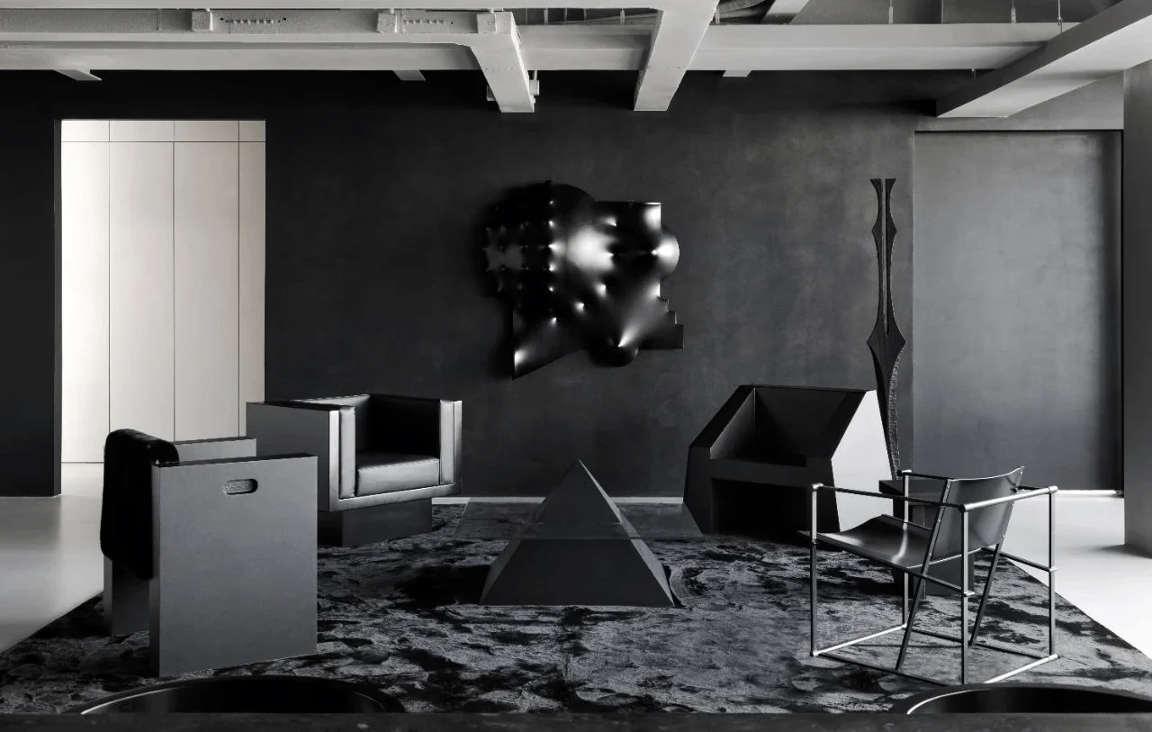
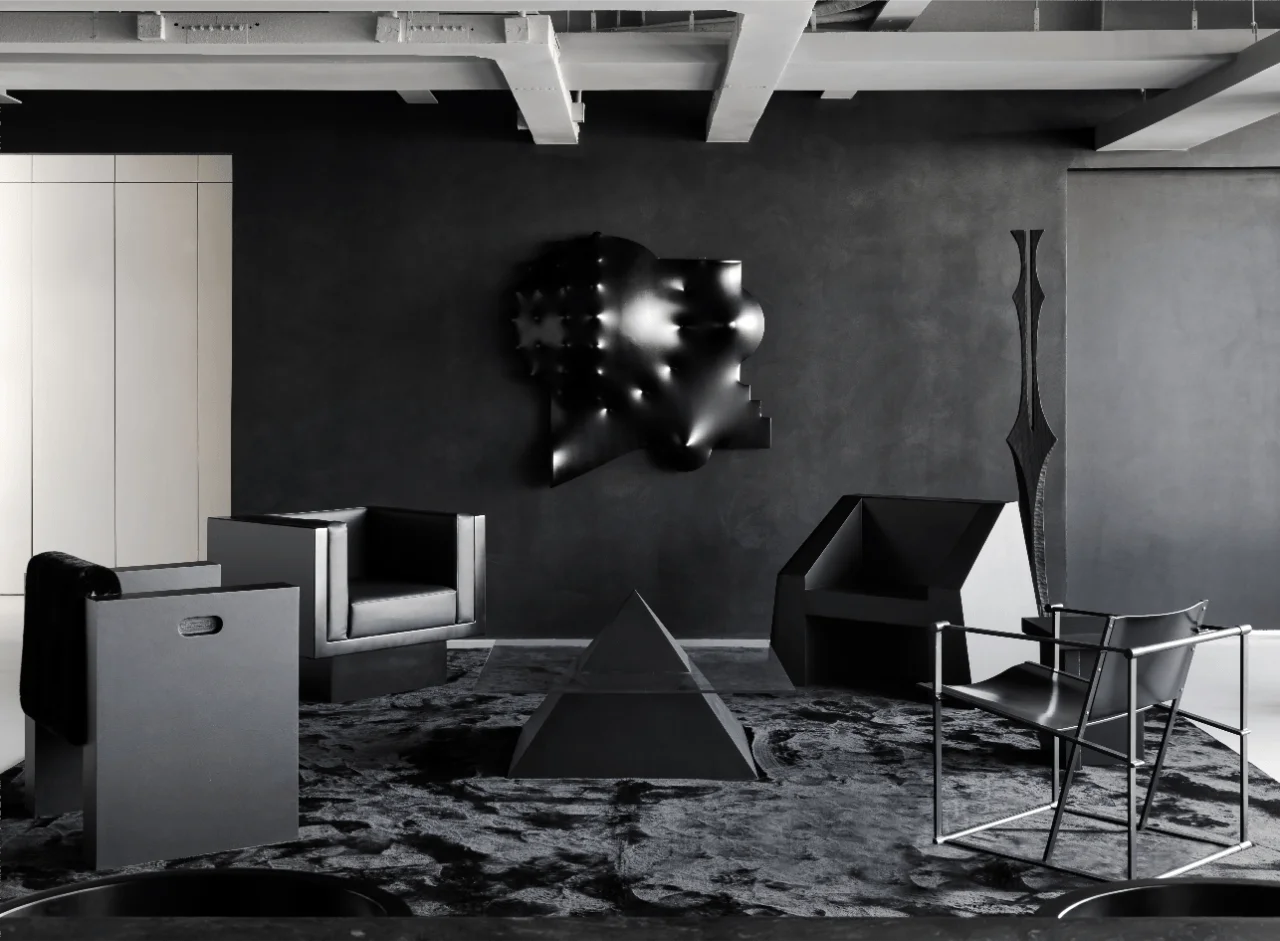
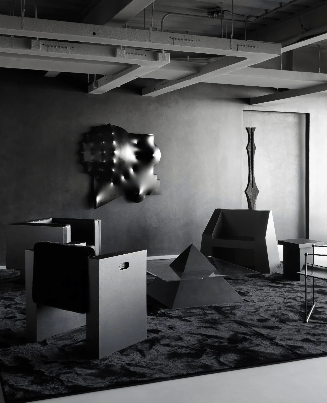
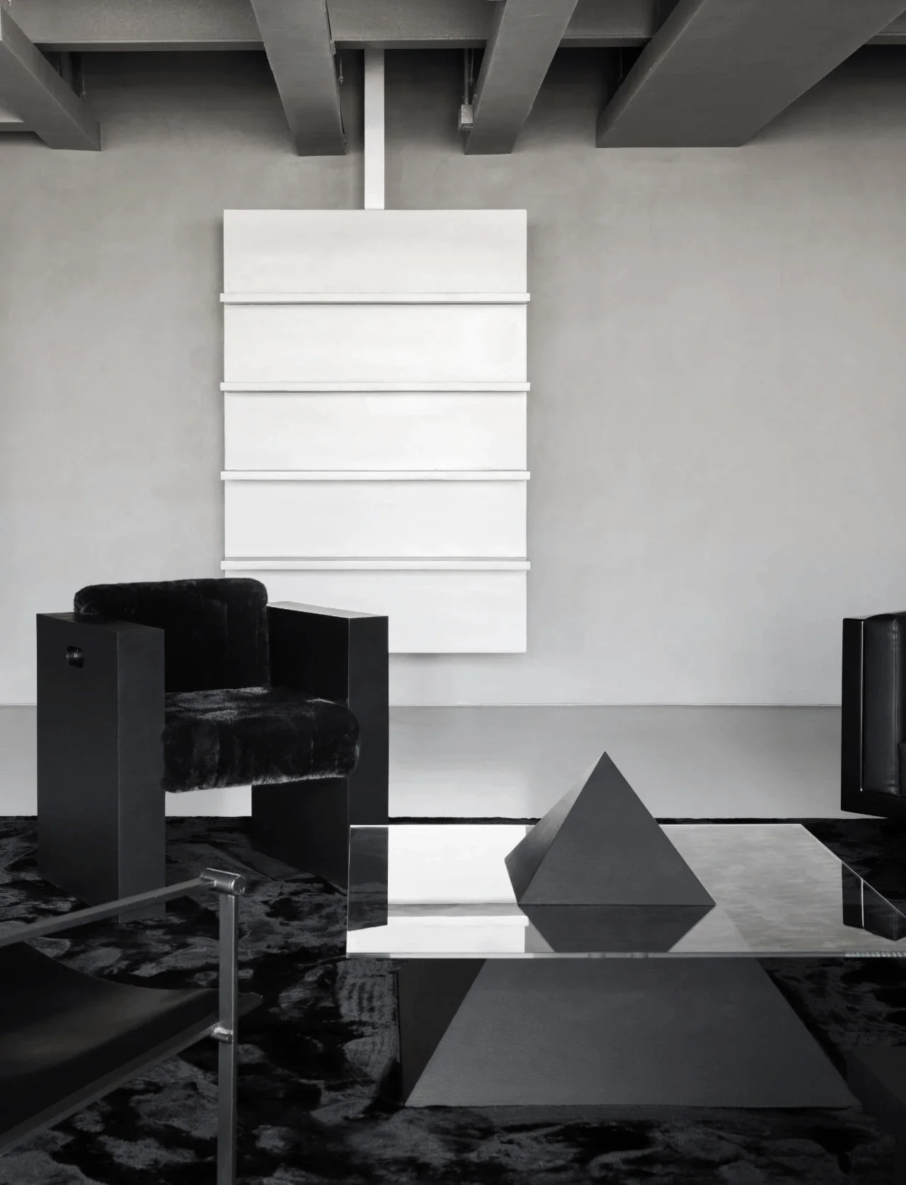
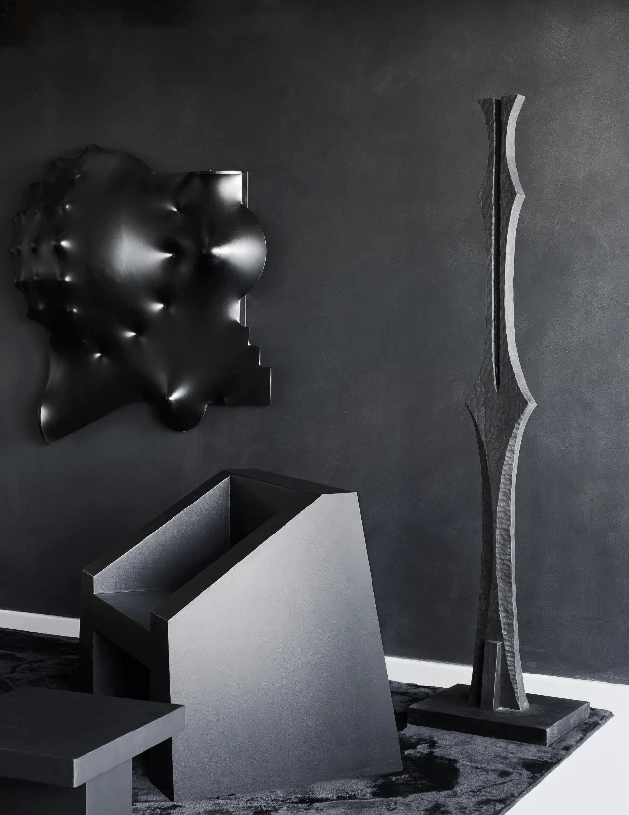
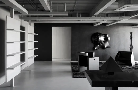
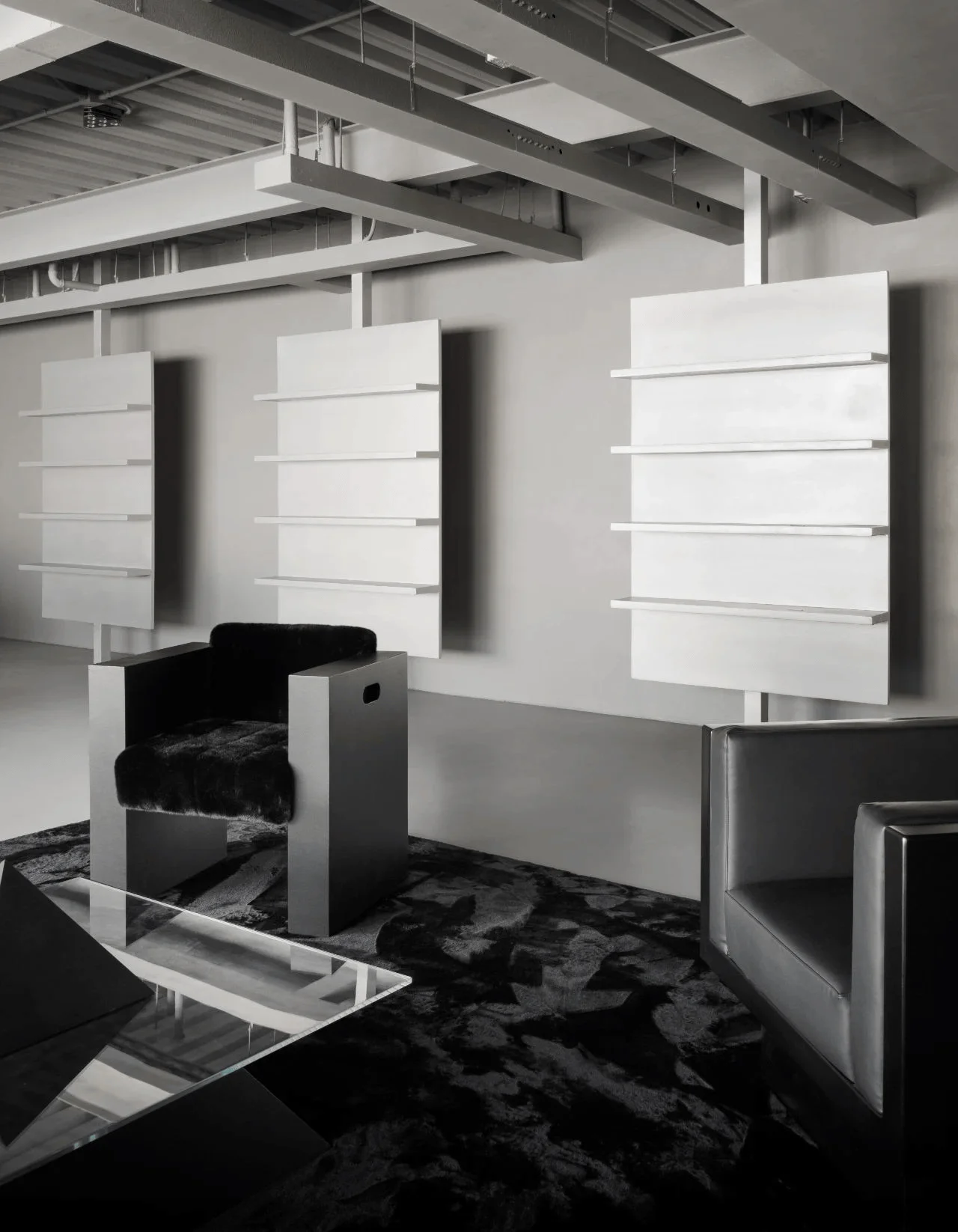
The main showroom space explores the power of black as a design element. The space is designed with a flowing layout, employing a subdued black-grey palette to enhance the brand’s aesthetic. Each functional area is interconnected by color and geometric forms. The brand’s micro-cement is extensively used on walls and floors. Within the seating area, different black chairs with unique characteristics create a captivating focal point. There’s a designer’s own chair, a tribute to Radboud van Beekum, and other sculptural chairs, reflecting diverse material and form elements. The triangular coffee table, resembling a pyramid, features a glass top, enhancing the aesthetic appeal and providing a distinct material contrast. The 3D sculptural wall installation enhances the geometric and material composition of the space. #geometricinteriordesign #blackinteriors #microcementapplication
Product Display: Rigorous Order and Visual Symmetry
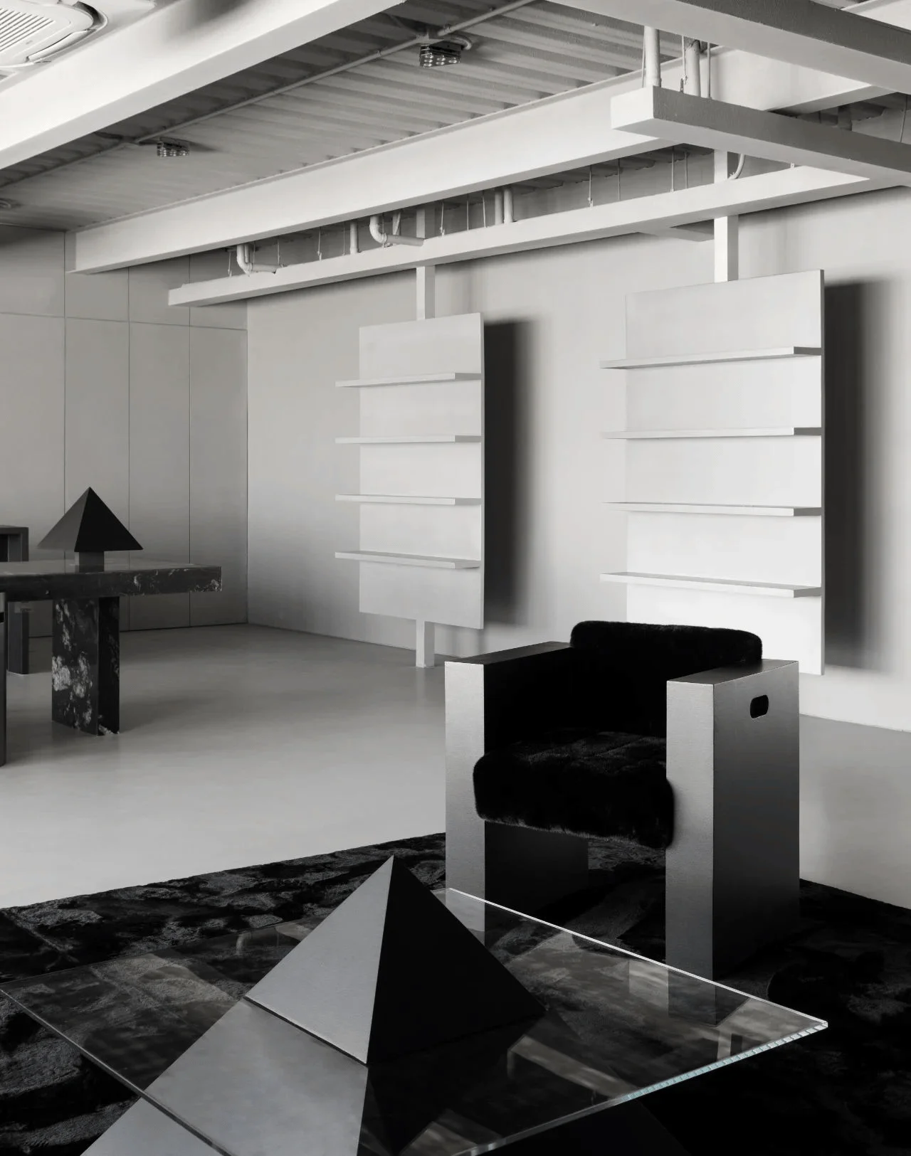
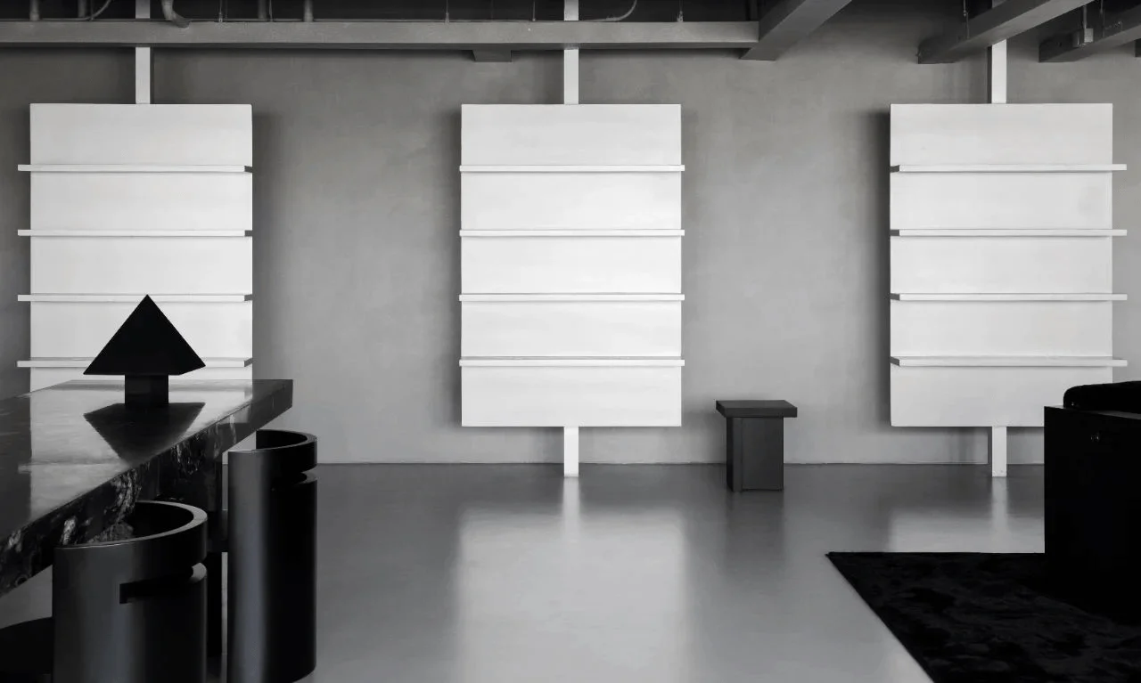
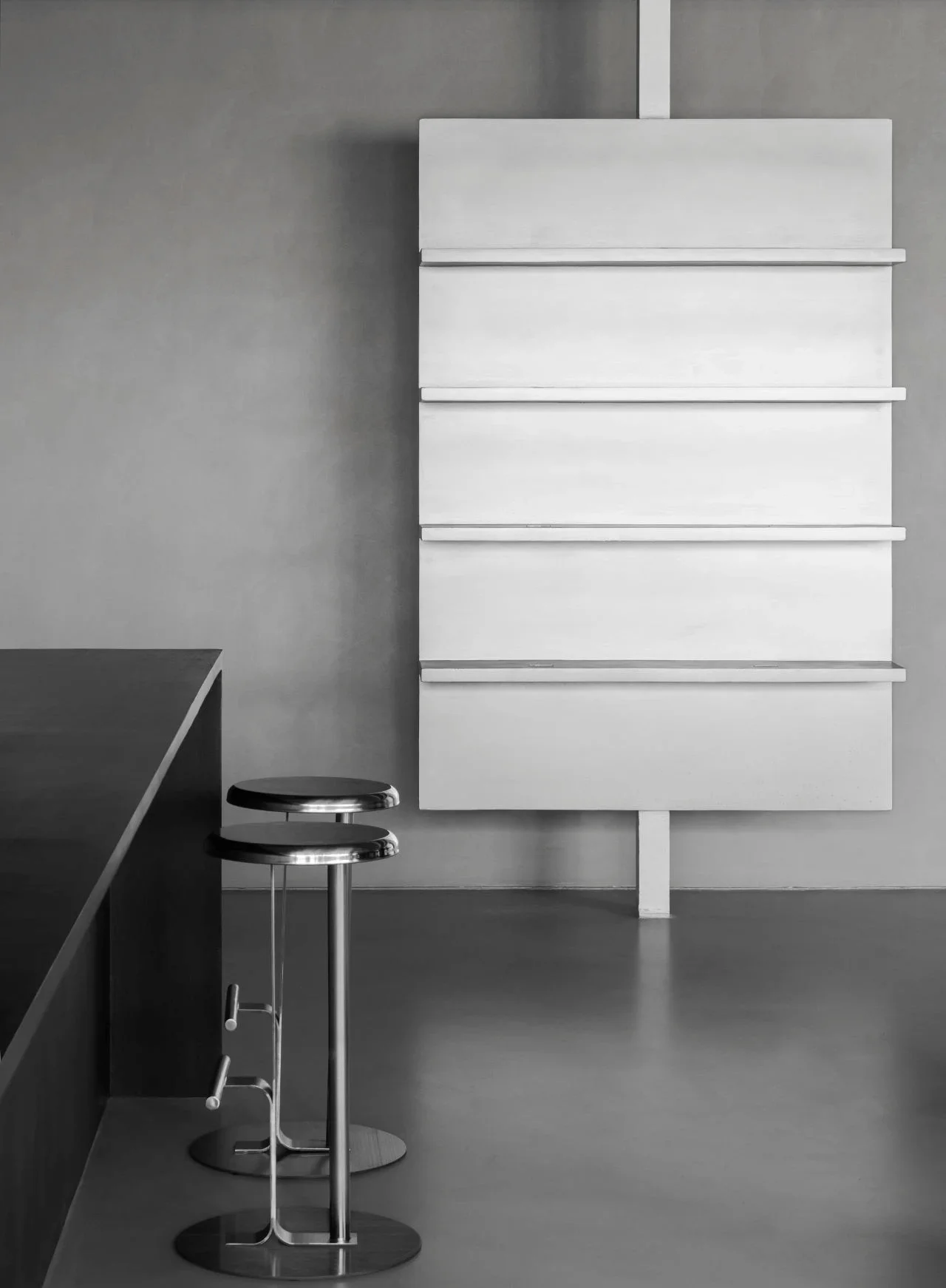
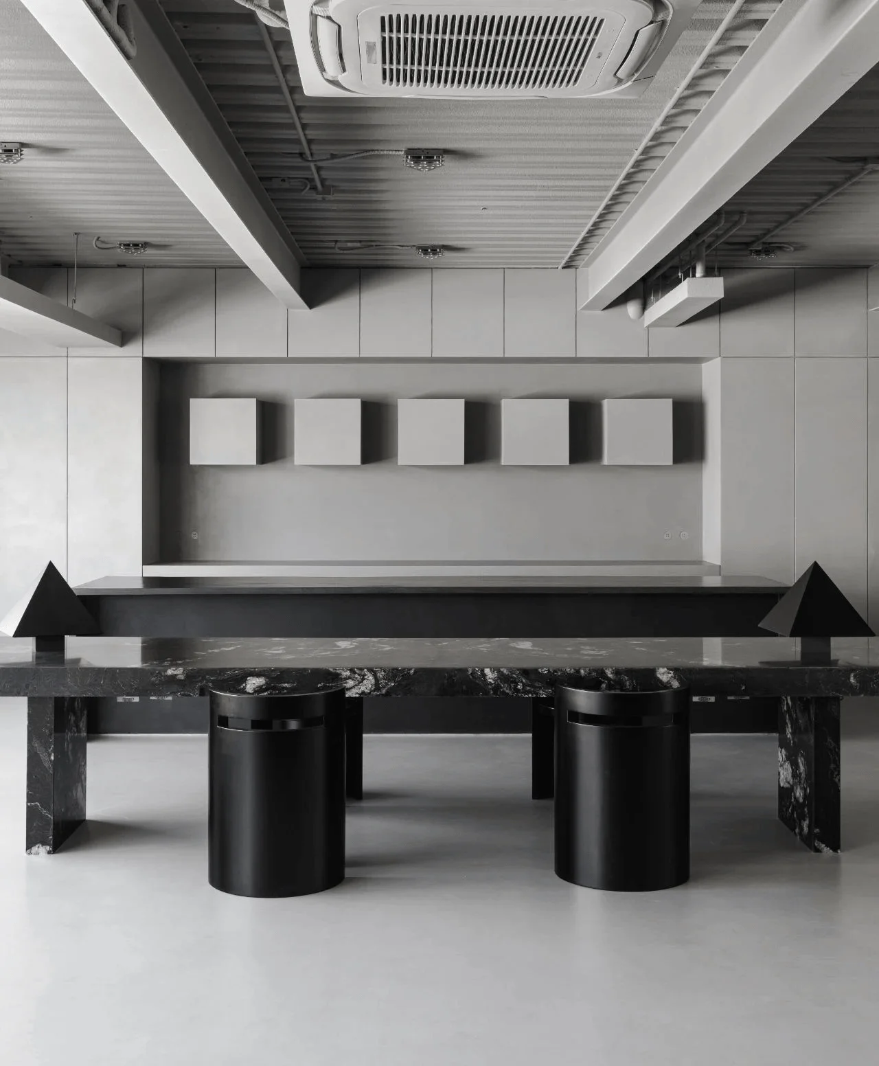
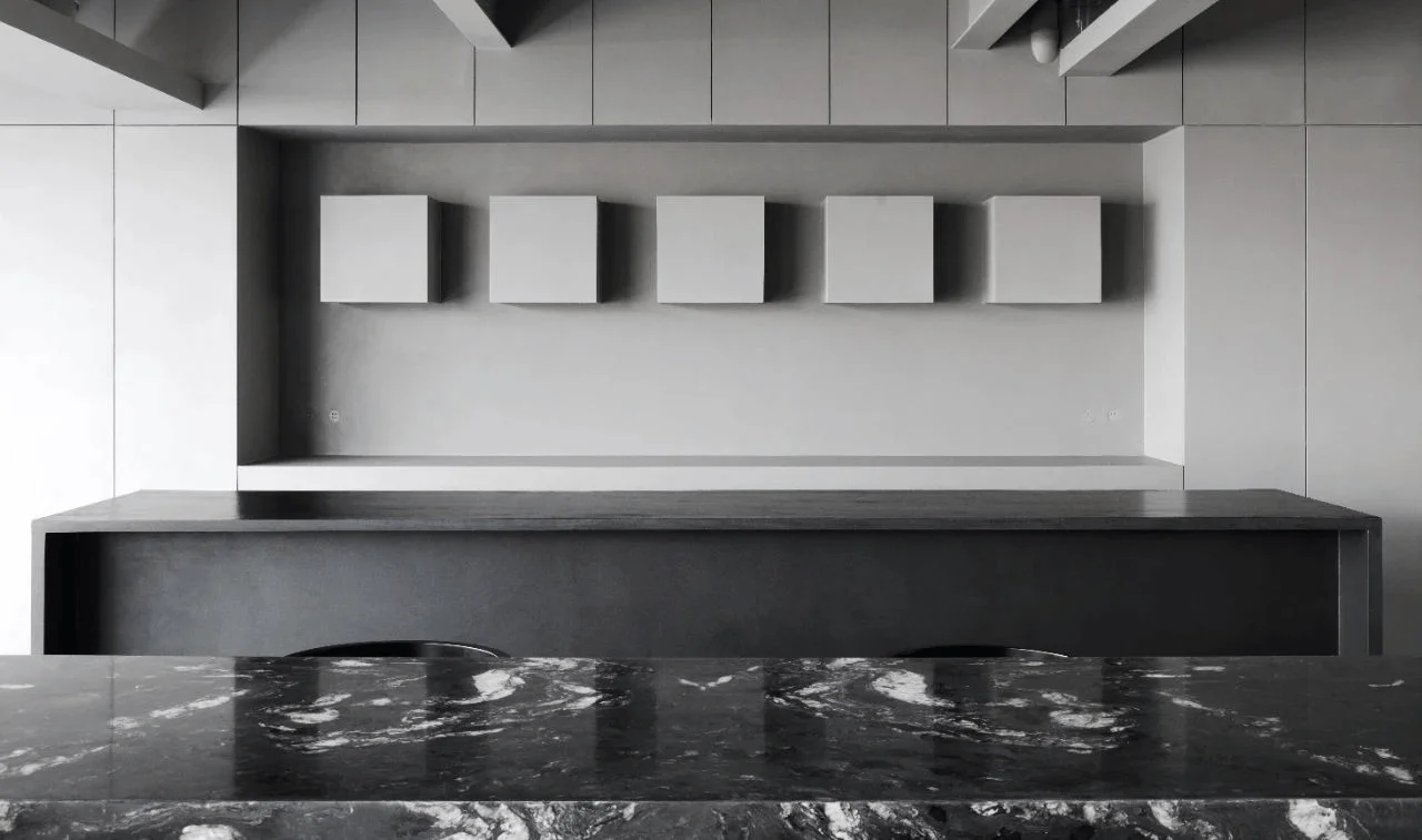
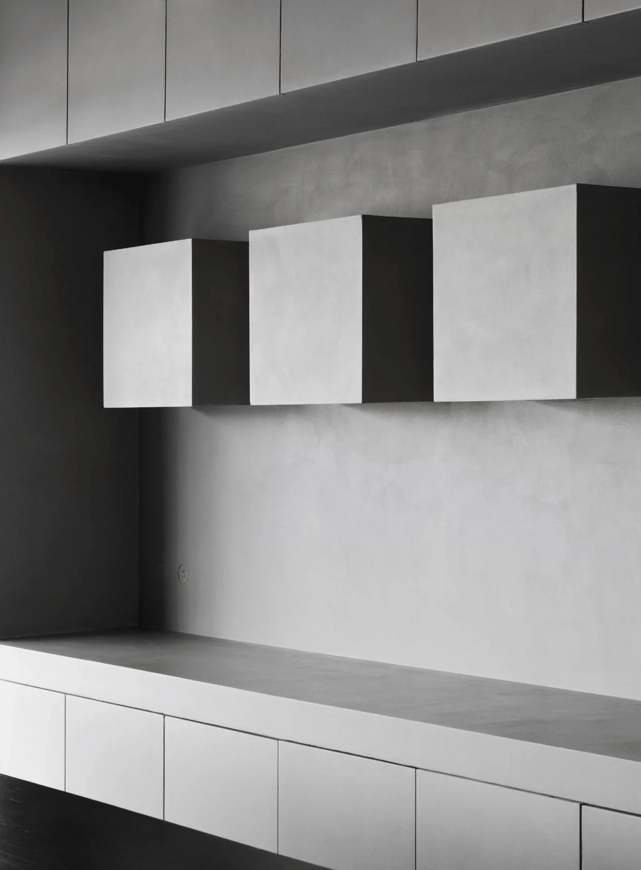
The showroom’s design prioritizes visual balance with the use of geometric forms. On both sides of the space, the designers incorporate three independent floating shelves to showcase the micro-cement products. These shelves, built with simple lines, feature a metal-coated finish for a subtle texture. The shelves’ suspension and alignment create a visually engaging design. The use of the micro-cement across the walls and within the design elements allows the material’s qualities to shine through, contributing to the design’s overall cohesive look. #microcementproductdisplay #visualsymmetry #floatingdesignshelves
Experience and Function: Scene-Based Approach
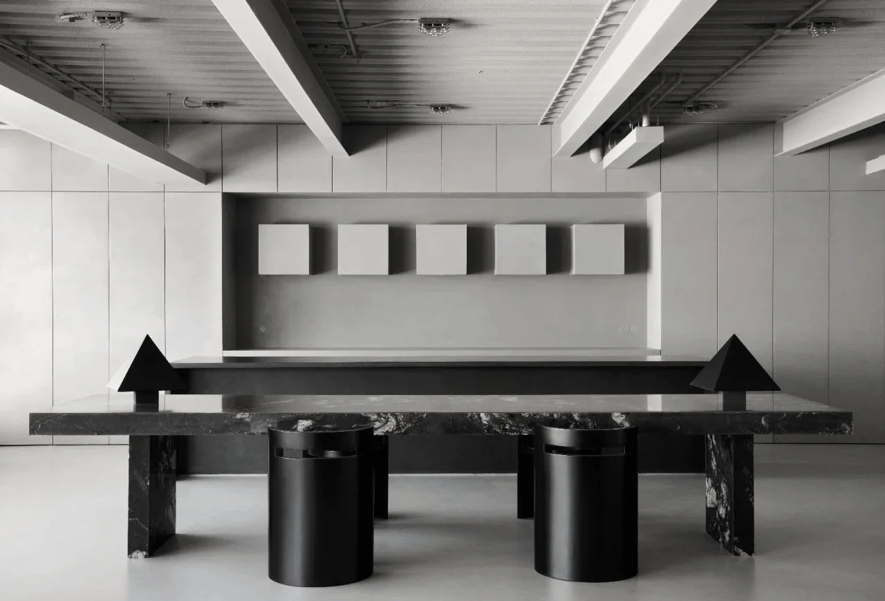
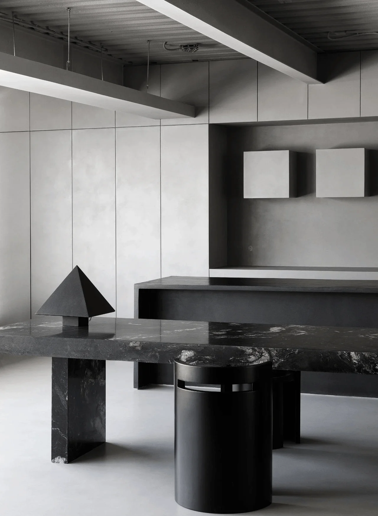
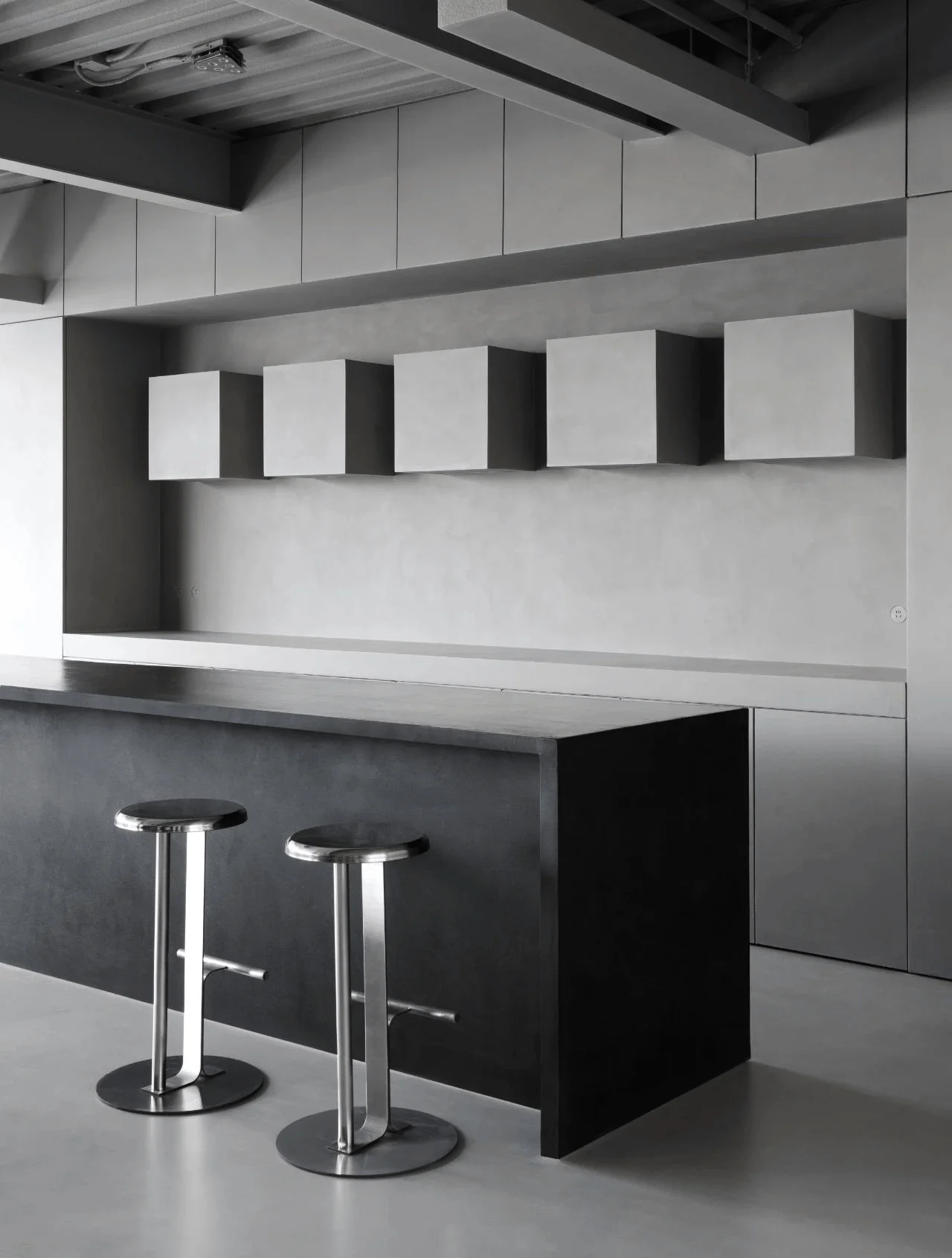
The designers embrace a functional and experiential approach to the showroom’s design. It aims to provide a realistic and immersive experience of how the products could be utilized in a residential setting. The layout follows a typical residential flow: entrance, living room, and dining kitchen. The dining and kitchen area is designed with a symmetrical layout and a sense of tranquility. A black marble table, known as “Cosmic Cloud,” serves as a focal point, featuring a unique swirling pattern. Custom-designed triangular table lamps, coated in micro-cement, create a visual contrast and connection with the other triangular elements in the space. The kitchen area features a micro-cement-coated black island and gray micro-cement cabinets, again creating a visually connected space. #experientialdesign #functionalandscene #residentialflow
Details and Integration: Subtle Elements
The space also incorporates well-integrated, subtle details, including flush-mounted sockets and a low display area near the window, allowing natural light to showcase the micro-cement samples. These elements highlight the attention to detail and commitment to seamless integration within the design. The showroom is a testament to the beauty of simplicity, order, and balanced visual impacts, presenting micro-cement in a unique and sophisticated way. #integrateddetails #seamlessdesign #naturallightexperience
Project Information:
Project Type: Commercial Space
Architect: NOTHING DESIGN
Designer: Liu Chang
Location: Beijing, China
Area: 120sqm
Year: 2024
Materials: Micro-cement, Metal, Glass, Marble
Photographer: Not provided


