Carrie.Li Gelato shop design emphasizes natural materials and a warm atmosphere, reflecting the brand’s philosophy of providing joyful gelato experiences.
Contents
Project Background and Brand Identity
The Carrie.Li Gelato shop is a new venture that aims to bring the joy of premium, naturally made gelato to its customers. The design by wooom studio is grounded in the brand’s core values and philosophy, centered around the concept of ‘Gelato’ and the unique identity of ‘Carrie.Li’. The brand’s slogan, ‘Gelato made with natural, high-quality ingredients, every bite is a sweet and carefree joy,’ emphasizes the emphasis on natural materials and the lighthearted enjoyment of gelato. This translates into a design theme that evokes a warm, inviting, and refreshing ambiance. The gelato shop design embodies the brand’s personality by crafting a space that feels as comfortable and refreshing as a summer breeze. This is a prime example of retail design and brand identity alignment.
tag: gelato shop design china, retail design and brand identity, chinese gelato shop design
Facade and Entrance Design
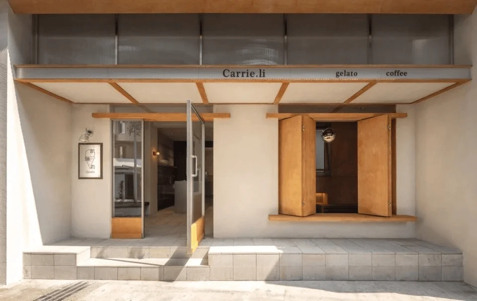
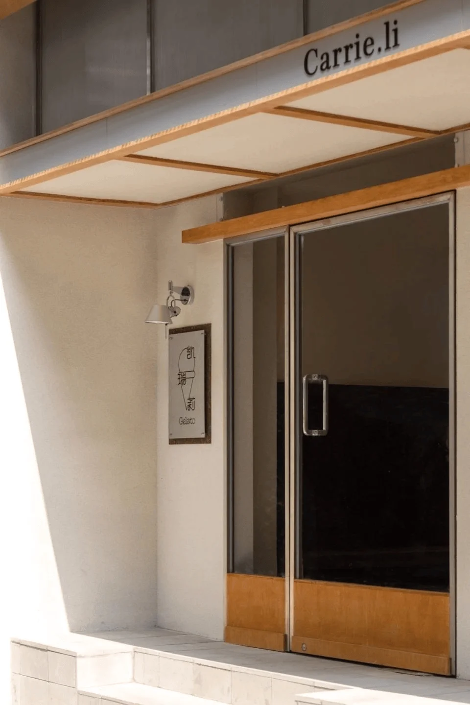
The shop’s facade plays a critical role in establishing the brand’s image and creating a welcoming first impression. The designers opted for a Japanese-style storefront, perfectly capturing Carrie.Li’s friendly and approachable brand personality. The warm and inviting facade fosters a sense of connection with potential customers. The designers opted for a more minimalist approach to the fascia, deviating from the traditional weighty and intricate style. This design choice is an excellent example of using facade design to reinforce a brand’s unique style. Furthermore, the use of light stone slabs seamlessly transitioning from the exterior to the interior creates a harmonious and visually appealing spatial flow.
tag: japanese style storefront, facade design for retail, light stone facade design
Interior Color Palette and Material Selection
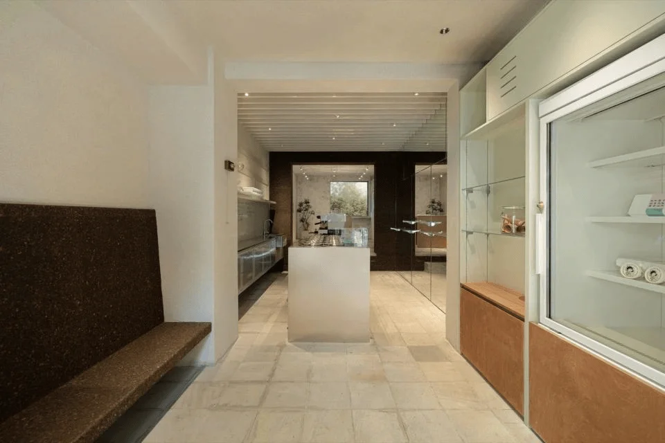
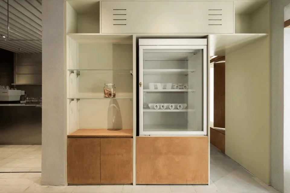
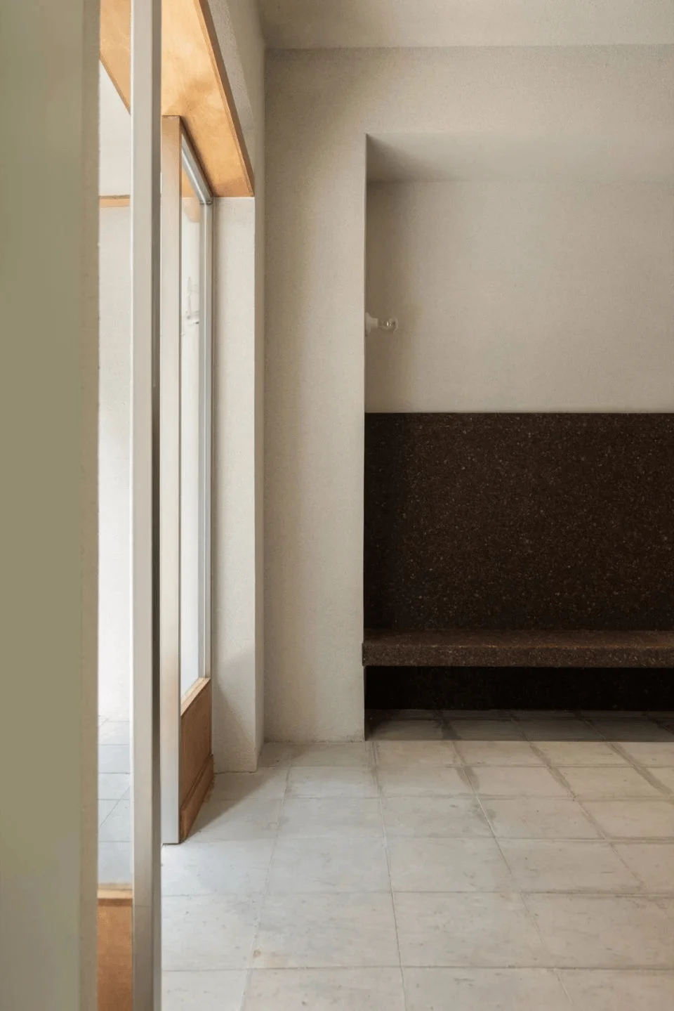
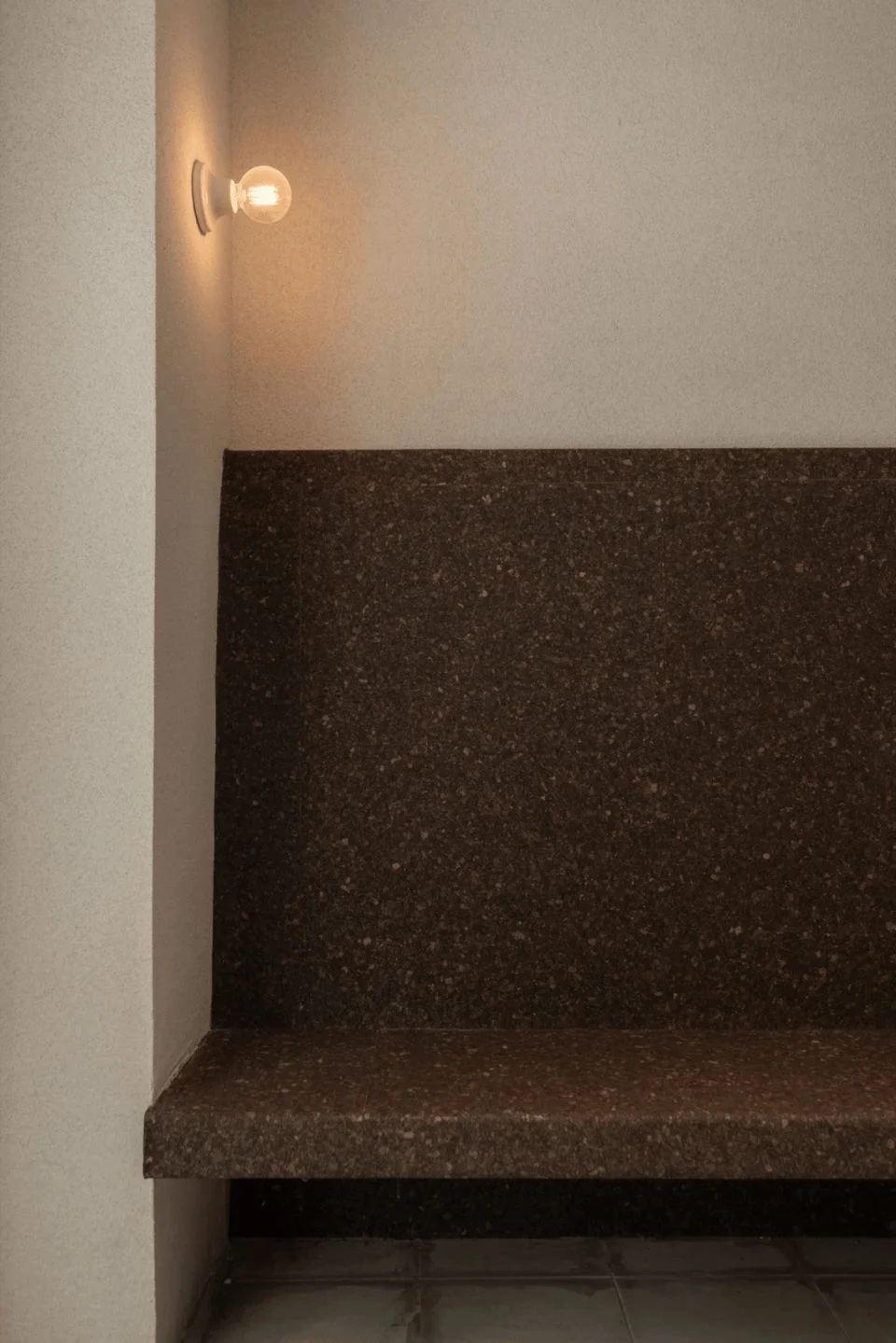
The interior color scheme is inspired by the gelato experience, creating a unique visual journey for visitors. The entrance area is predominantly a calming gray-white, accentuated with a refreshing ‘mint chocolate’ color scheme. The mint green cabinetry adds a touch of natural vibrancy and freshness. The combination of chocolate brown and cork panels offers a distinct and charming aesthetic, conveying a sense of both rustic charm and playfulness. The cork boards, with their natural textures and softness, enhance the comfort of the seating areas while adding a touch of Carrie.Li’s playful and childlike aesthetic. This ‘chocolate’ hue extends to the end of the space, creating a cohesive visual narrative that unifies the space. The color palette used in this design is not just a choice, but is used to reinforce brand experience.
tag: interior color palette for gelato shop, material selection in retail design, cork board interior design
Gelato Counter and Visual Expansion
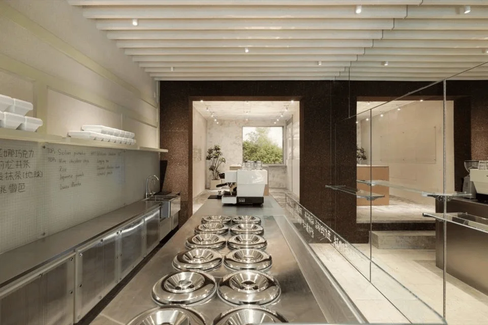
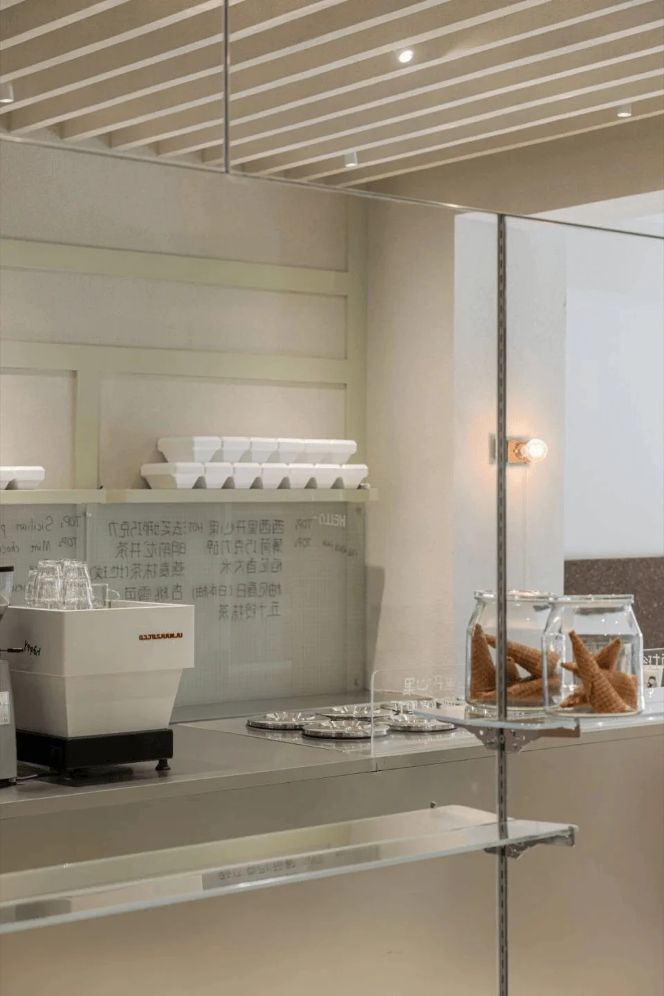
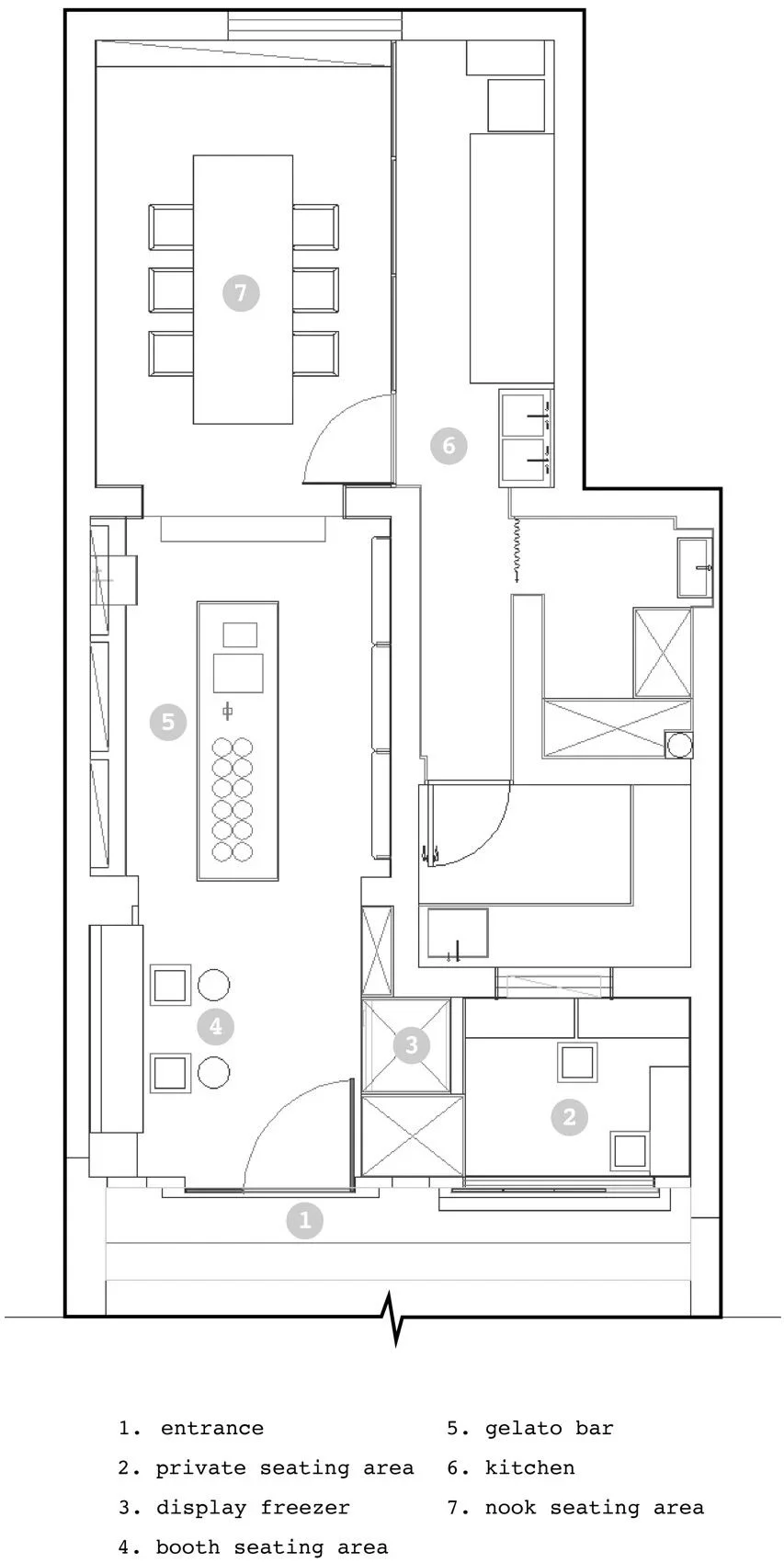
The Gelato counter is the focal point of the space, where product display and customer interaction take center stage. Ample space was allocated to the counter, but the elongated space presented a challenge of appearing cramped. To counteract this, a full-height mirror wall was incorporated into the design. This mirrored wall expands the perceived space horizontally, effectively eliminating the feeling of constraint. Moreover, the mirror’s functionality is enhanced by the integration of a hanging system, transforming it into a practical design element, while also creating an open and airy ambiance.
tag: gelato counter design, visual expansion in interior design, mirror wall design for retail
Gelato Teaching Laboratory
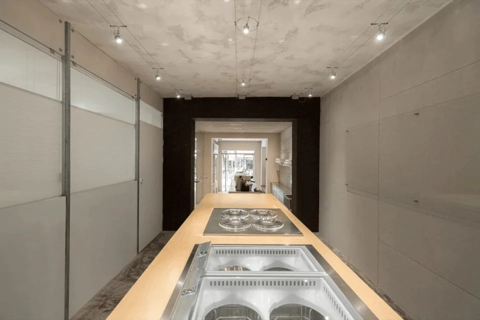
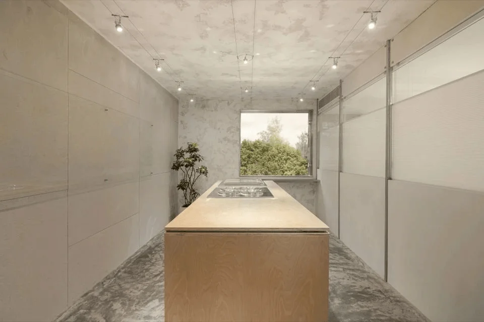
Carrie expressed a desire to provide customers with an opportunity to witness the Gelato making process. Consequently, a ‘Gelato Teaching Laboratory’ was designed at the rear of the shop. The raw, unprocessed exposed plaster walls, the untreated ceiling and floor finishes, the distinct wood-grain countertops, and the simple white shelves all contribute to the ‘laboratory’ aesthetic. Whiteboard paint, glass panels, and honeycomb blinds are integrated into the design as essential teaching tools, further enhancing this laboratory atmosphere. To maintain the desired sense of openness and comfort, considering the ceiling height, the design team opted for small linear track spotlights, rather than large light fixtures. This consideration ensured that the space doesn’t feel overly cramped or low.
tag: gelato making space design, interior design of teaching lab, lighting design for retail
Private Seating Area and Design Details
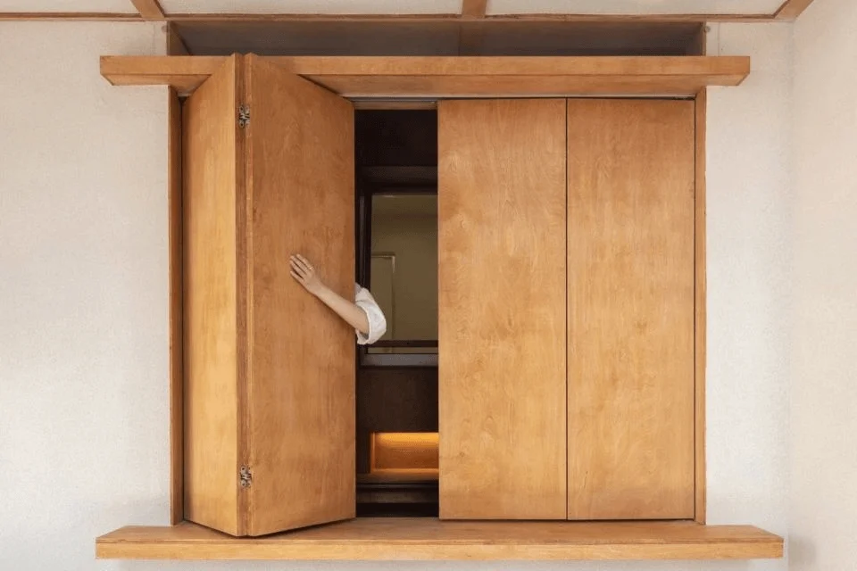
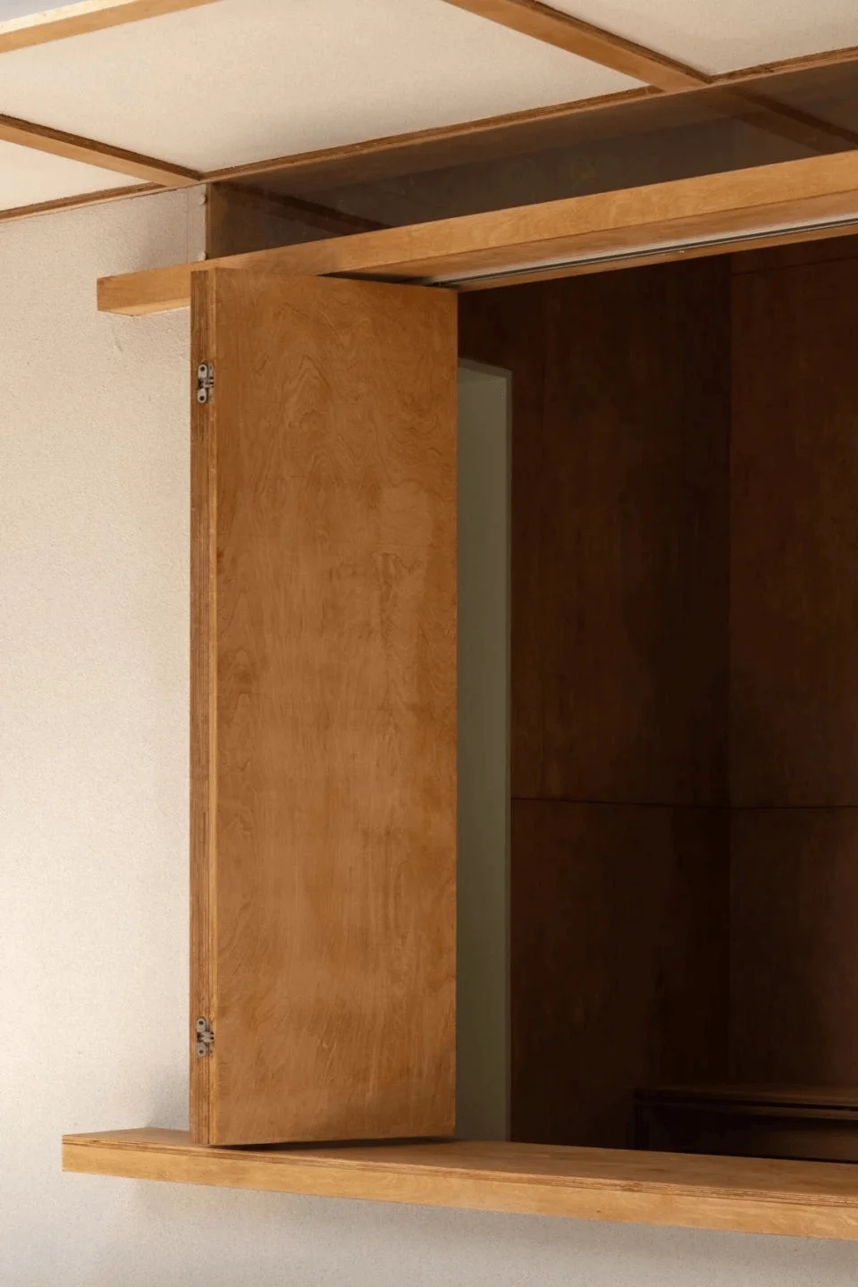
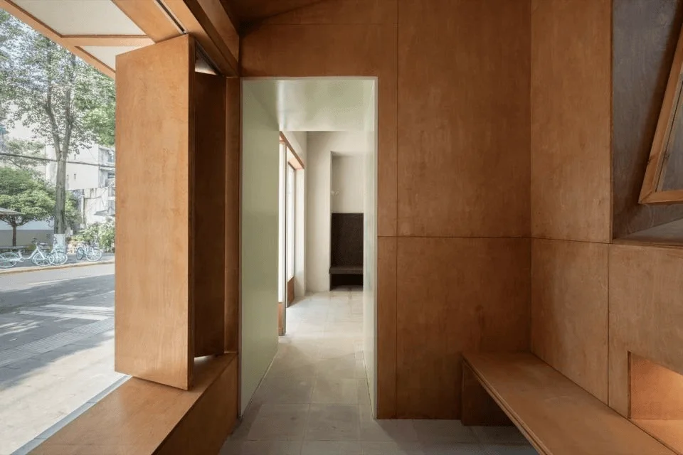
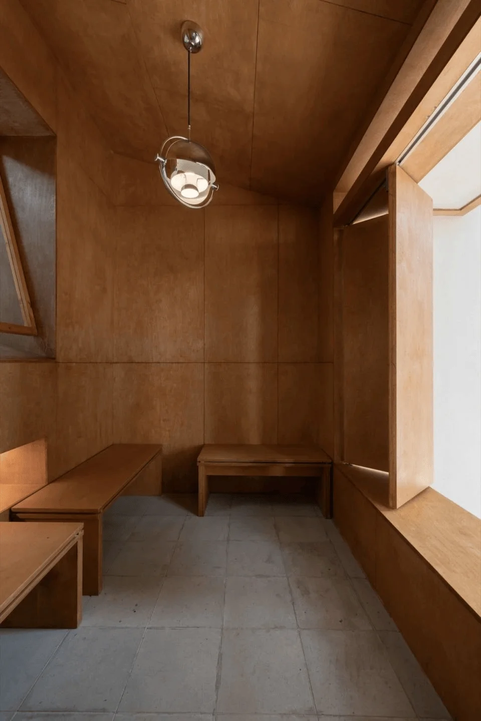
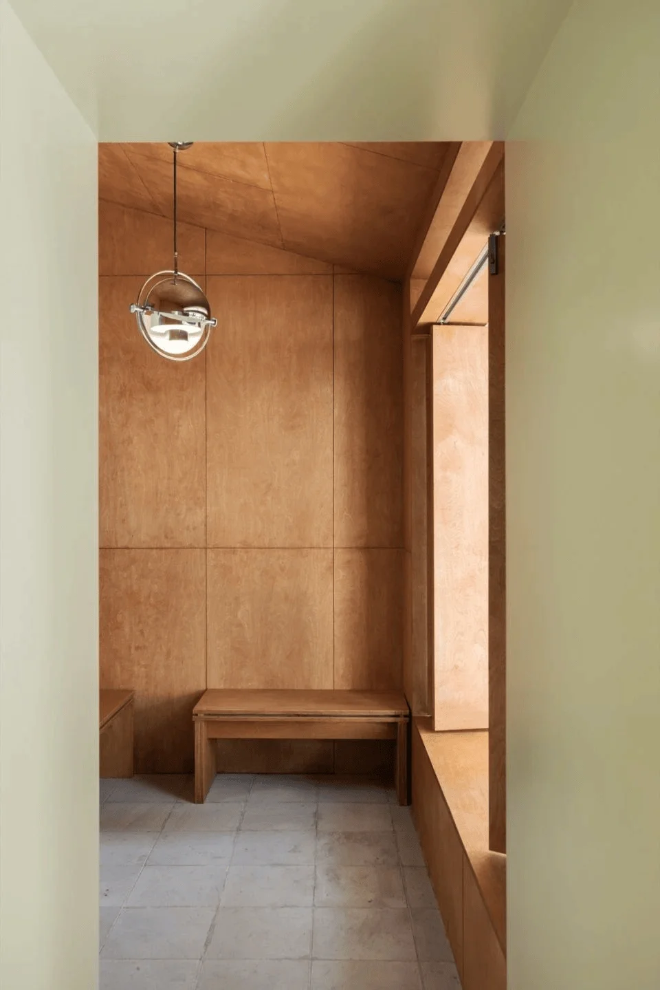
Located at the right-hand entrance, a small private room is thoughtfully separated from the main space. The wooden finish provides a warm and natural feel, perfect for customers who desire a tranquil space to enjoy their gelato. This is an example of private room design to create intimate customer experiences. The angled ceiling and the unique pendant lighting add a modern touch and create visual interest. The sliding window design enhances the natural light and sense of openness. The windowsill’s clever extension creates a small built-in seat that serves as both a comfortable spot to relax and enjoy the views, while also introducing a sense of dynamism. The window connecting the kitchen allows patrons to witness the Gelato-making process, offering a behind-the-scenes look at the craftsmanship.
tag: private seating area design, retail space interior design details, sliding window design for interior
Conclusion
The Carrie.Li Gelato shop in Chengdu, China, is a successful example of how design can elevate a brand’s identity and create a compelling customer experience. The design seamlessly incorporates the core elements of the ‘Carrie.Li’ brand and the ‘Gelato’ concept into a cohesive and visually stunning space. The result is a shop that feels both refreshing and warm, inviting customers to enjoy their gelato in a comfortable, inviting atmosphere. Wooom studio’s design for Carrie.Li demonstrates how thoughtful consideration of brand values and customer experience can create a lasting impression and provide a compelling space to enhance the brand experience.
tag: gelato shop design trends, successful retail design examples, brand experience through interior design
Project Information:
Project Type: Restaurant Space Design
Architect: wooom studio
Area: 77.3 ㎡
Year: 2024
Country: China
Materials: Marine Board, Cork Board, Sun Board, Acrylic
Photographer: Ji Guang


