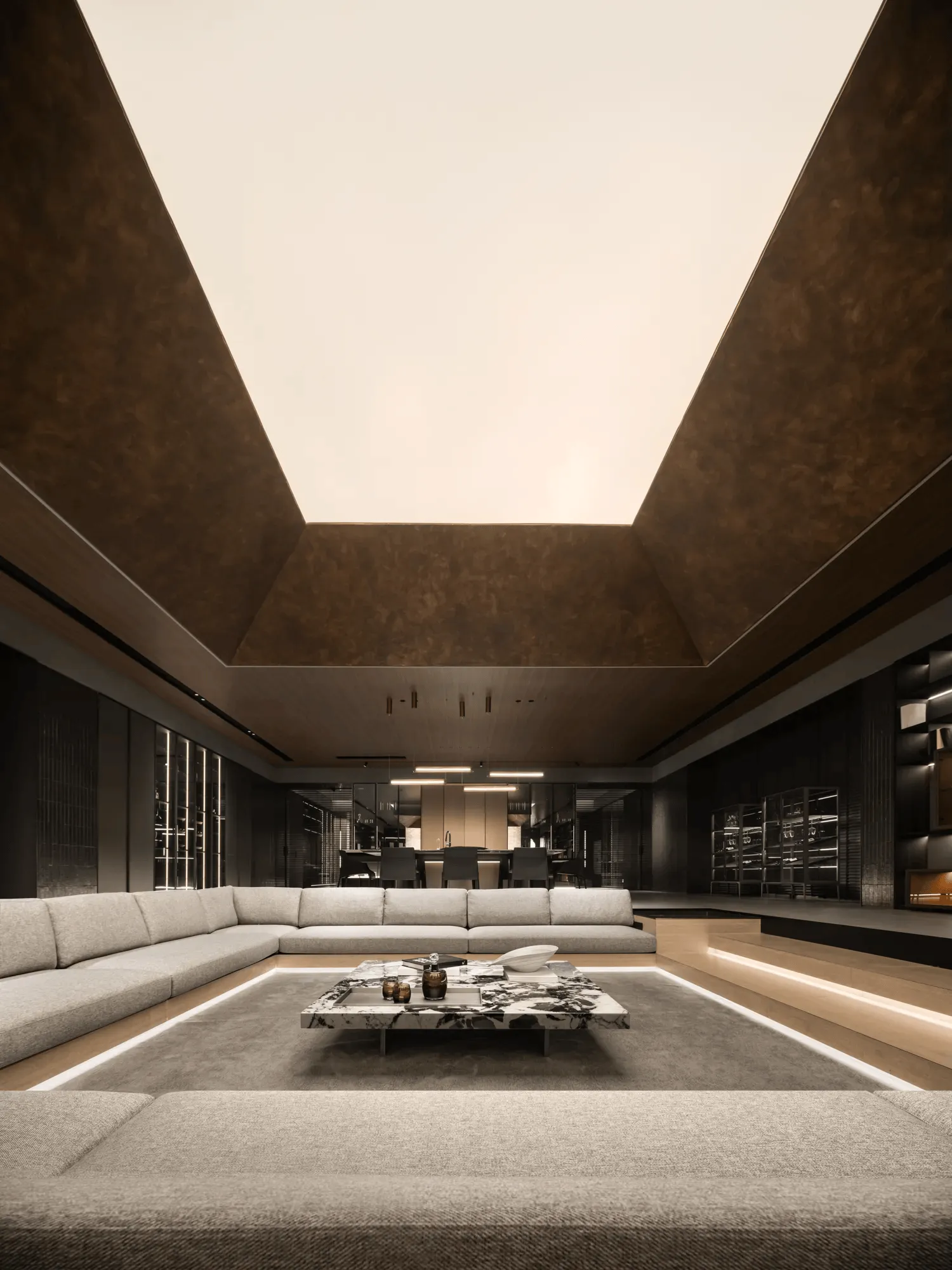
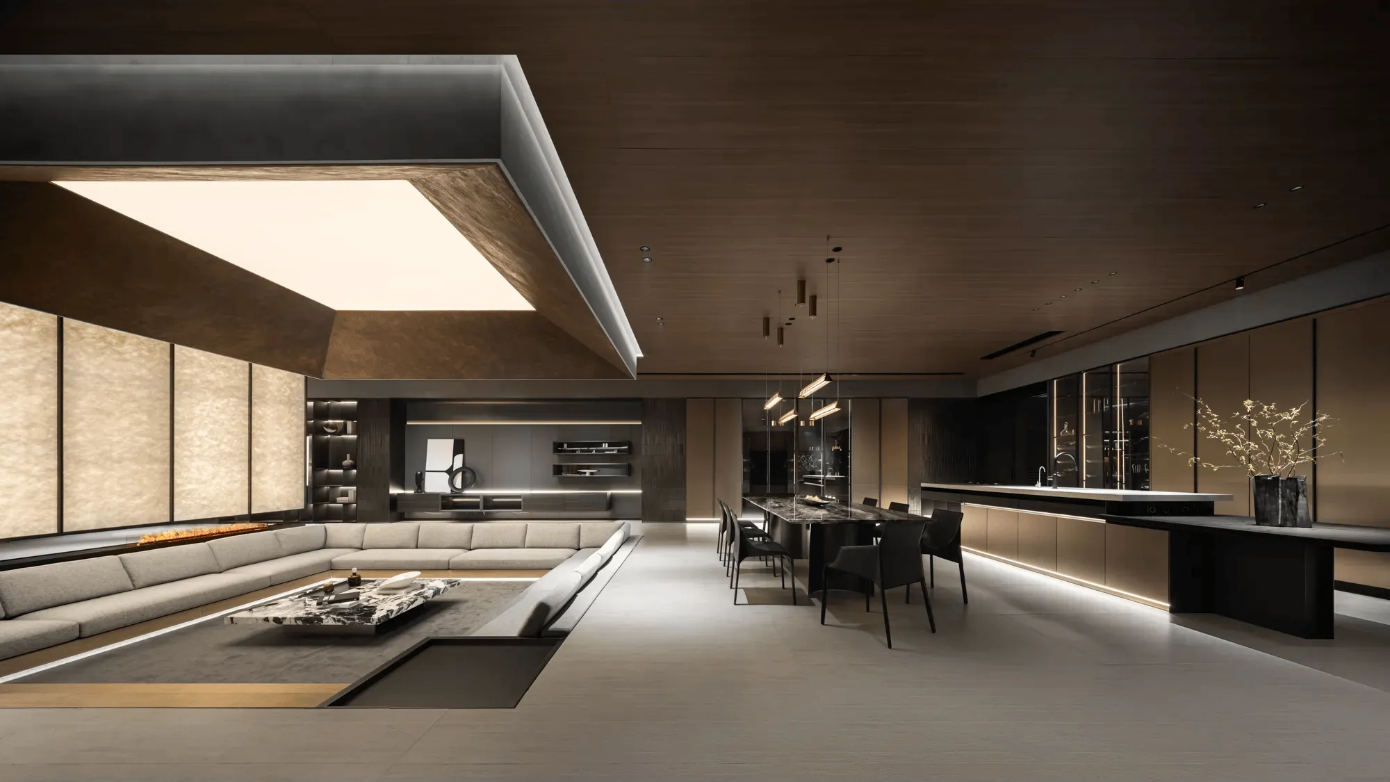
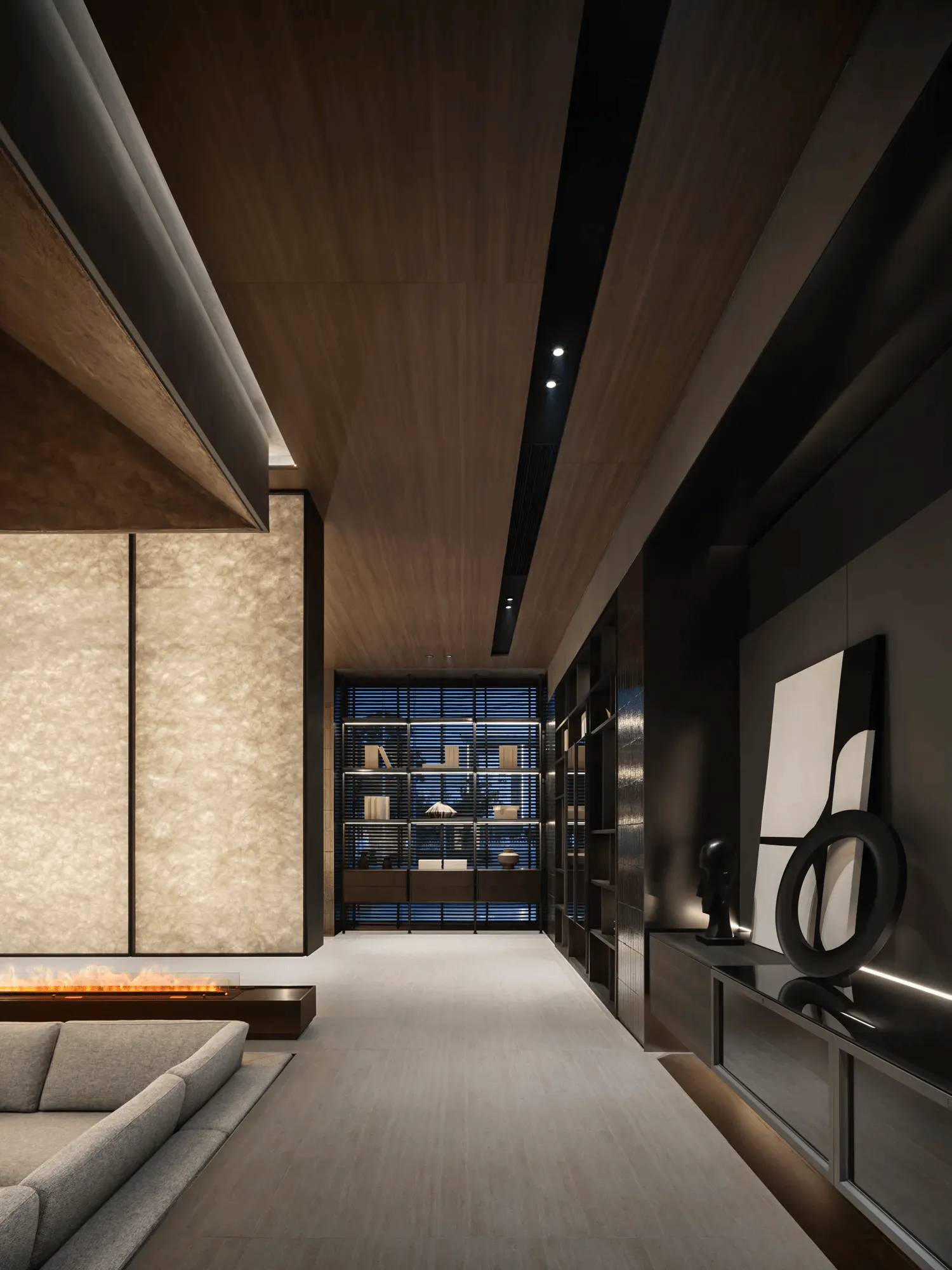
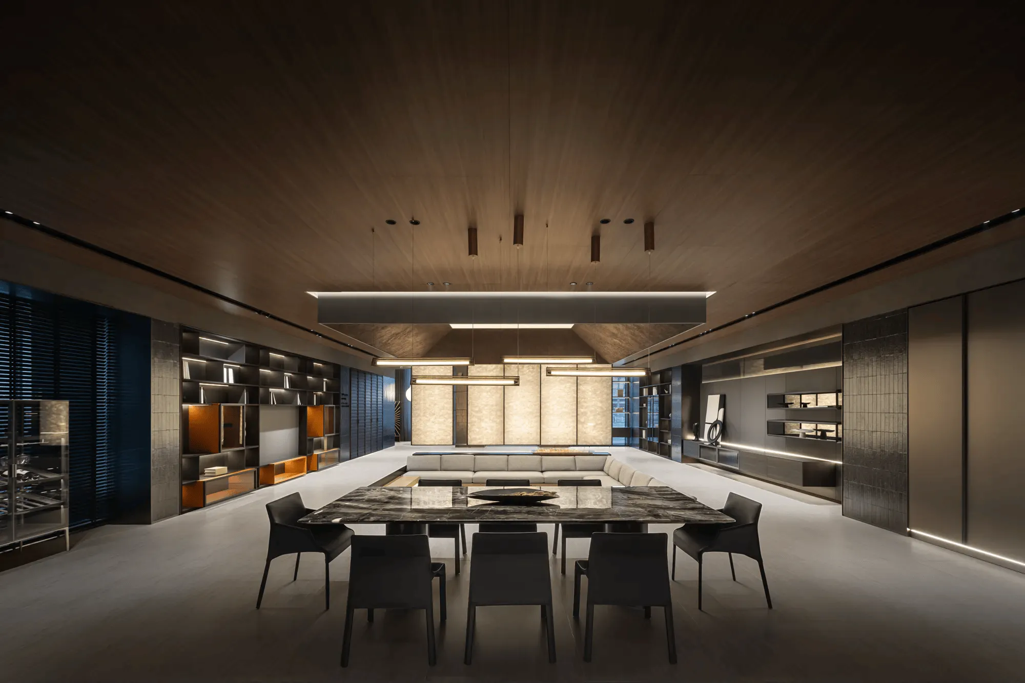
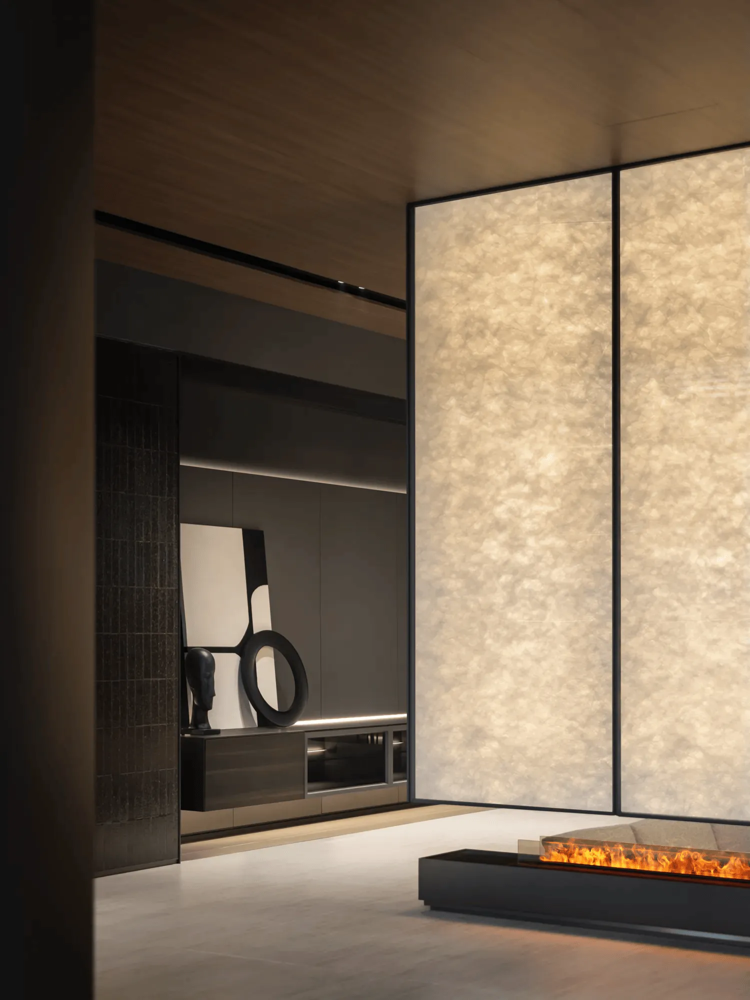
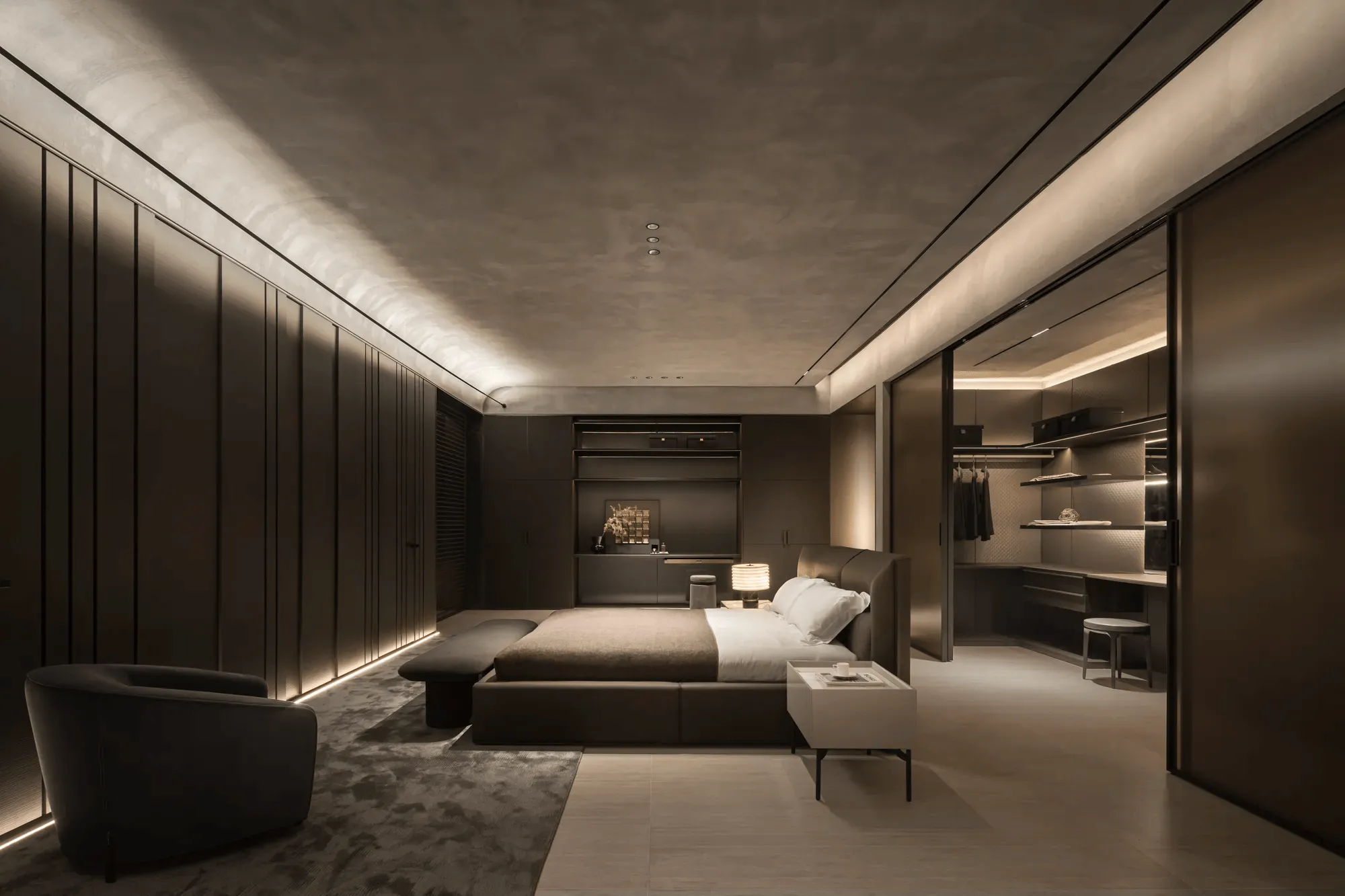
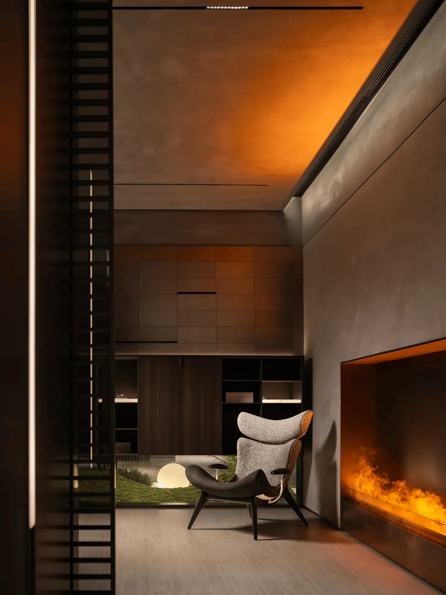
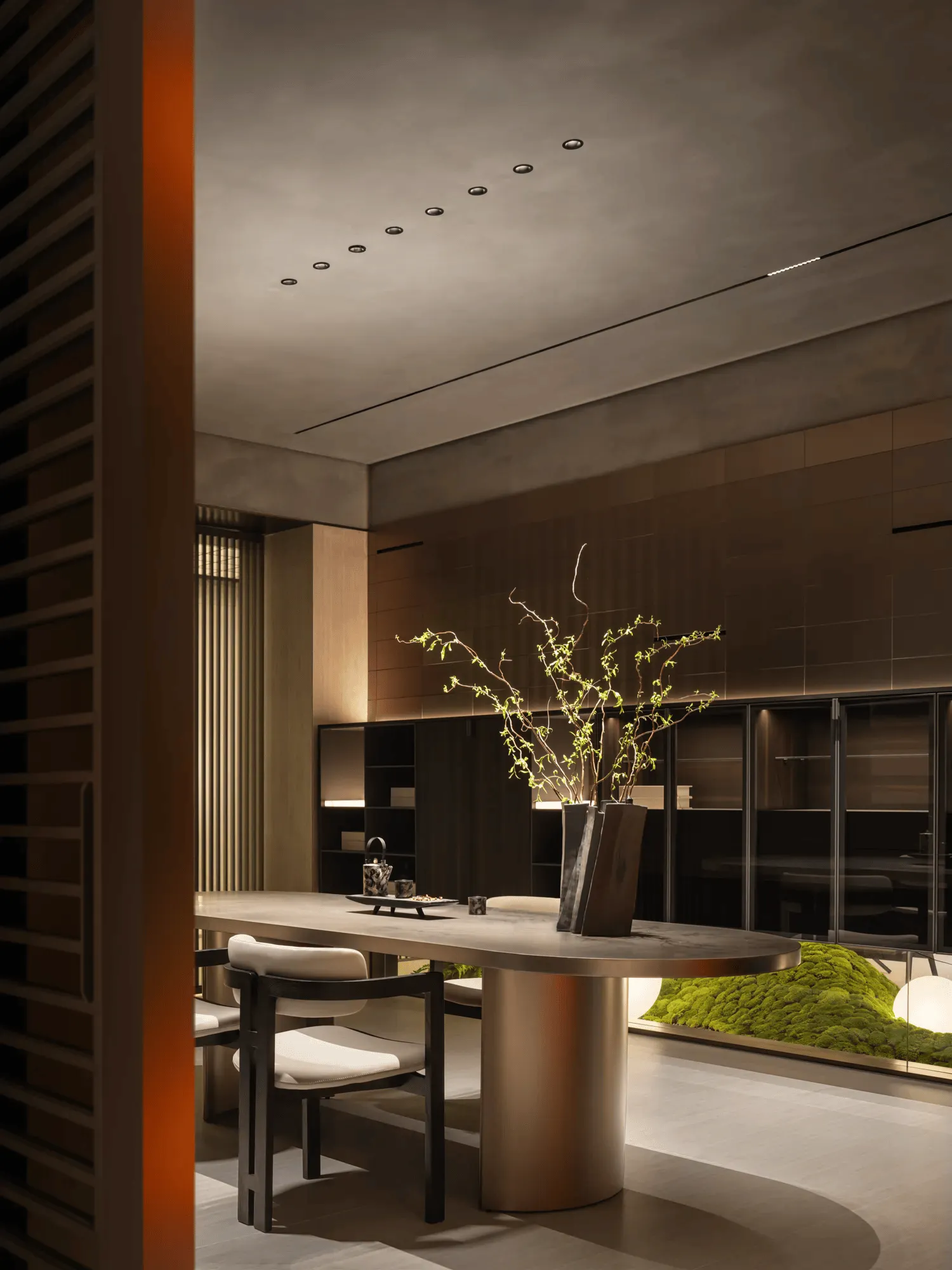
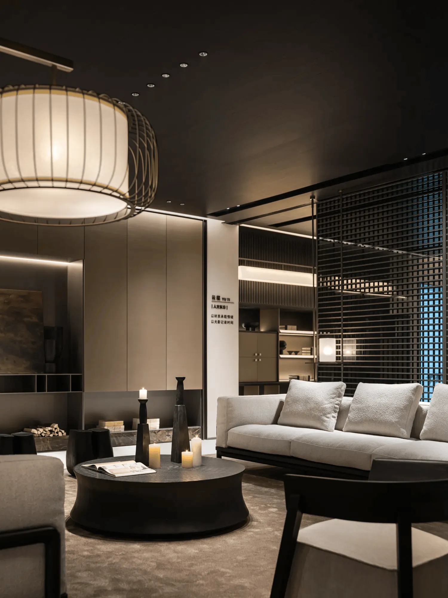
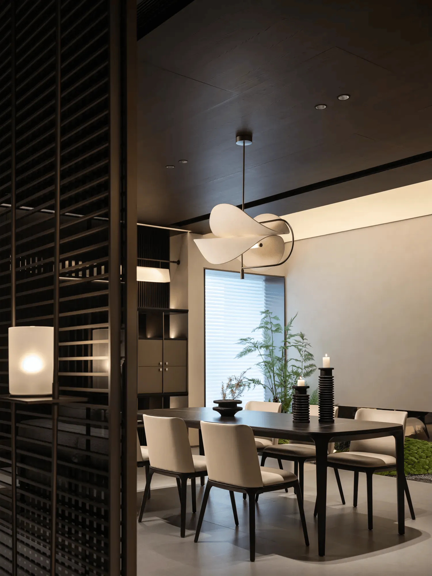
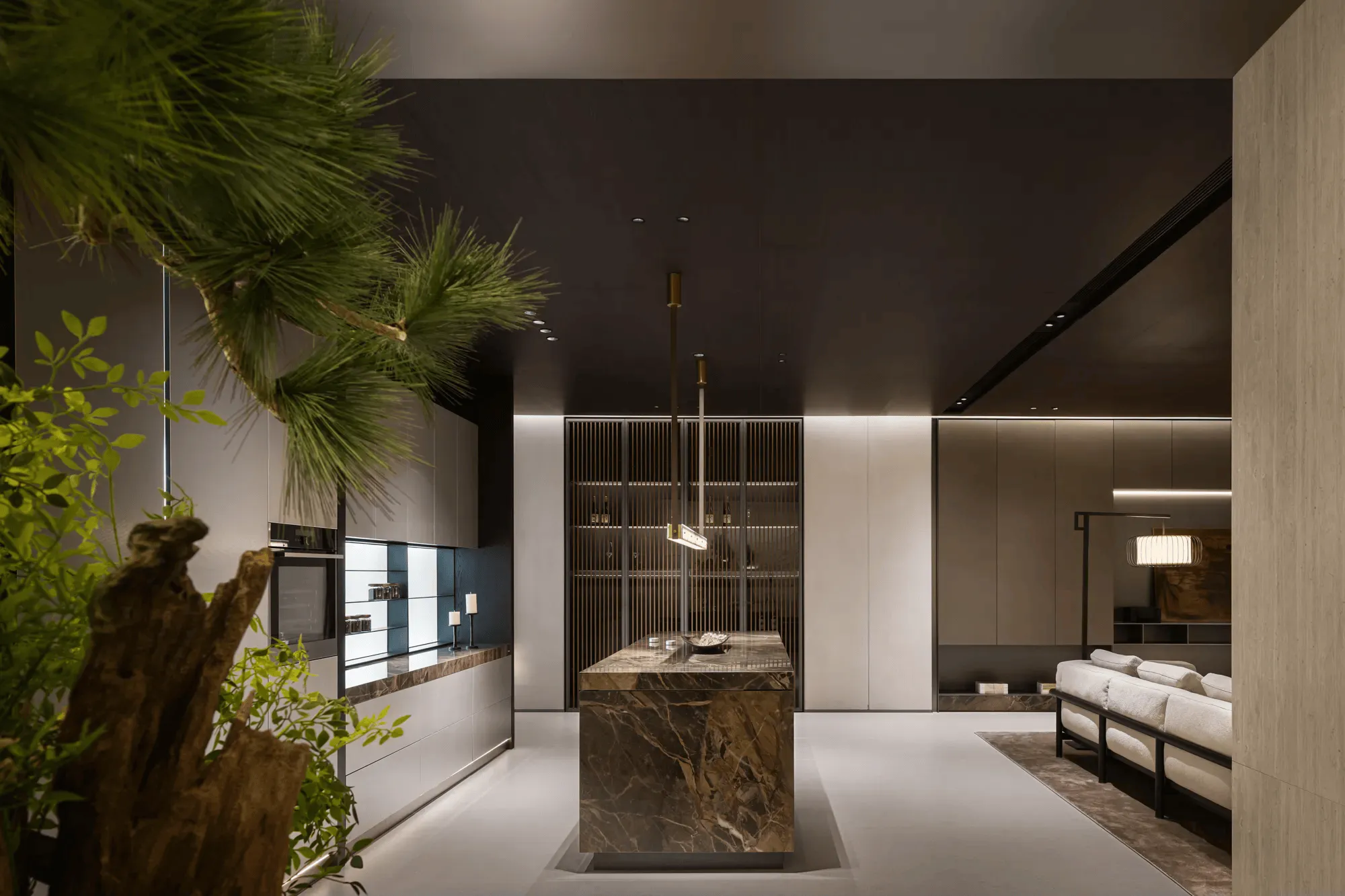
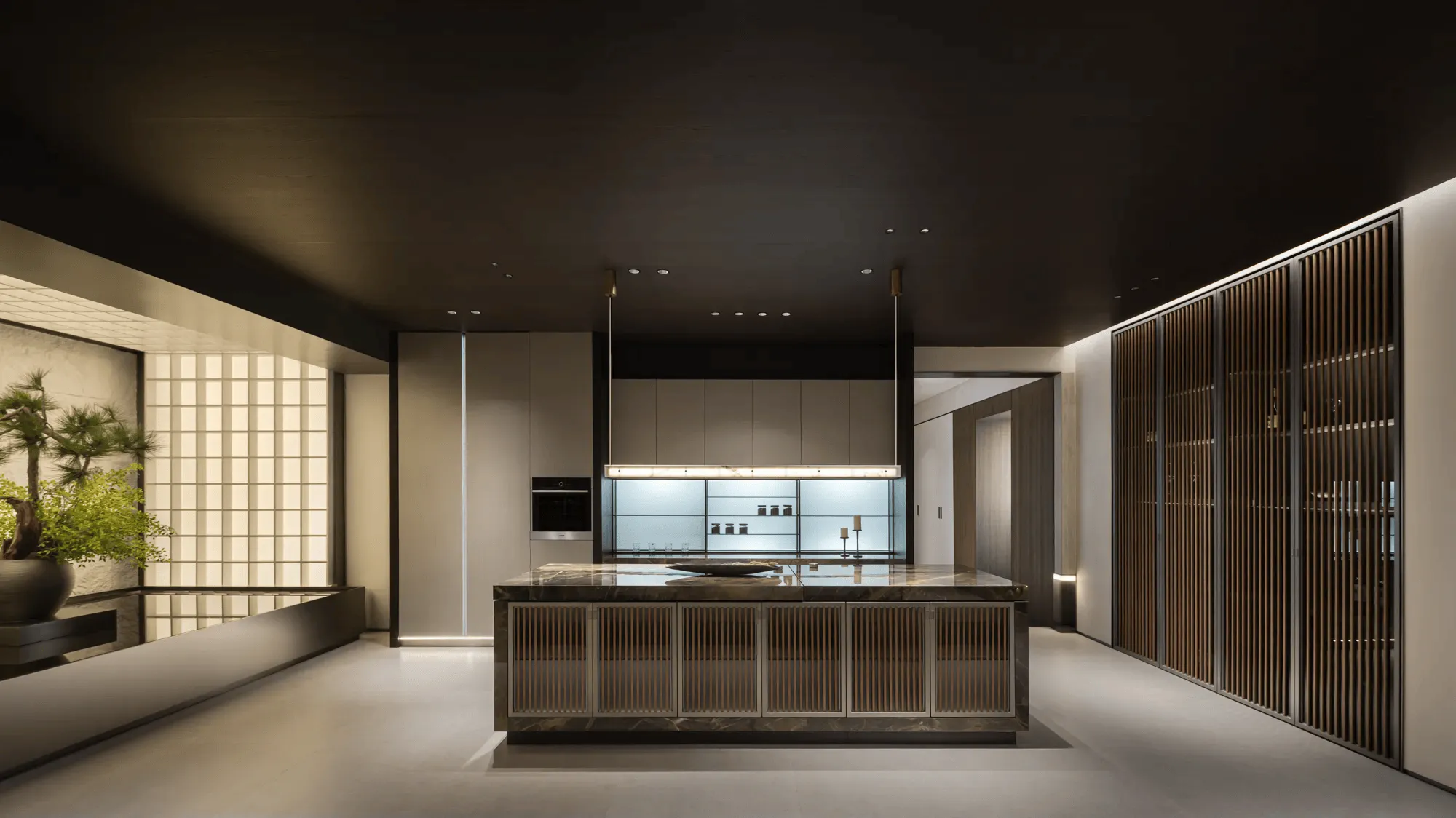
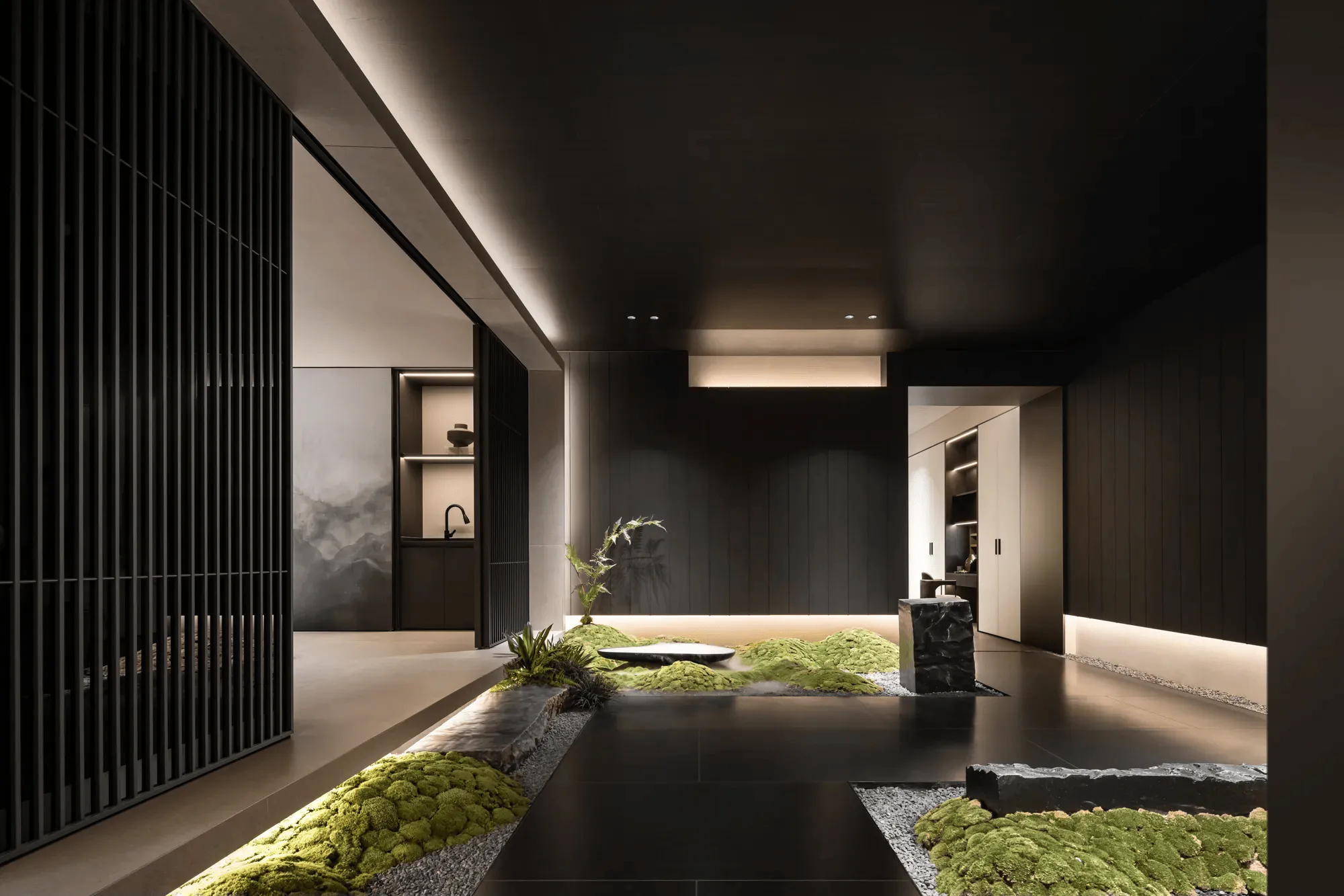
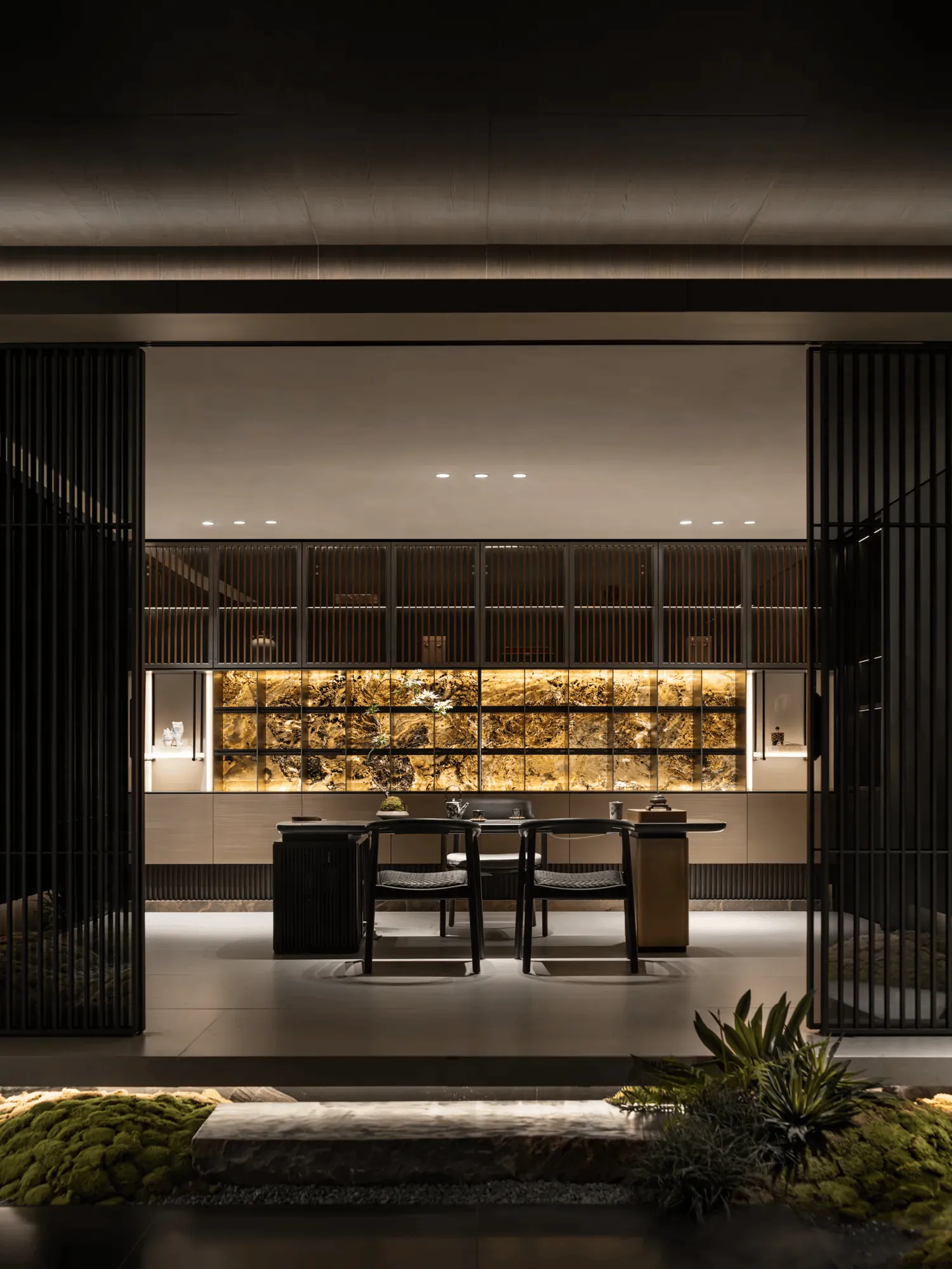
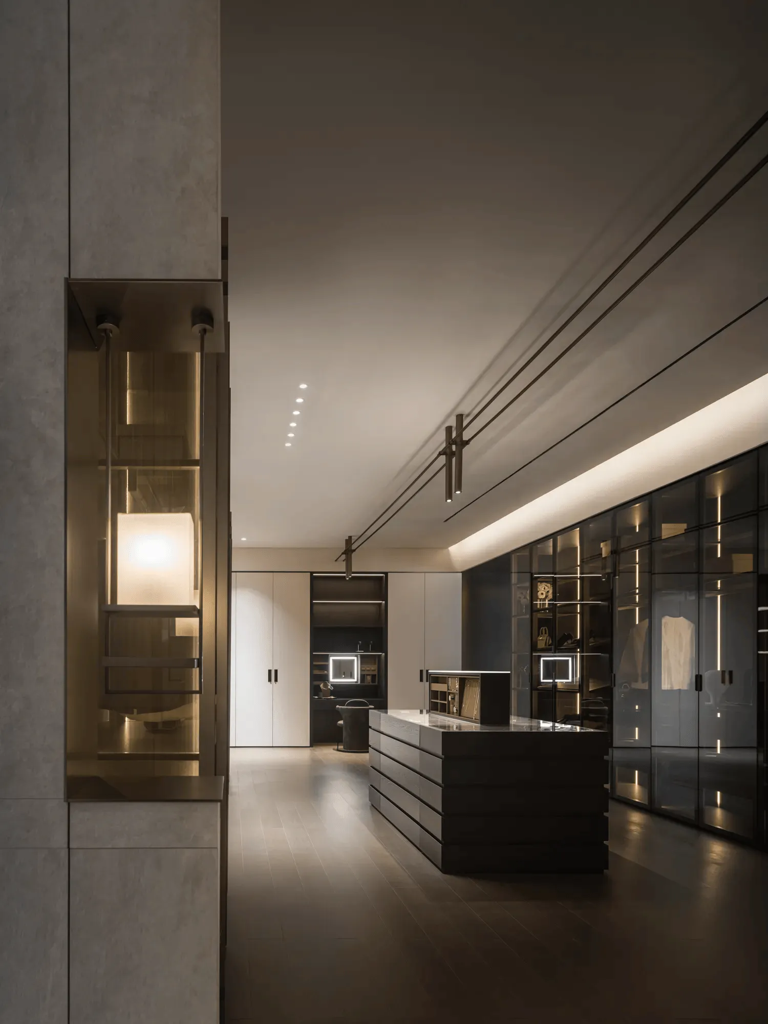
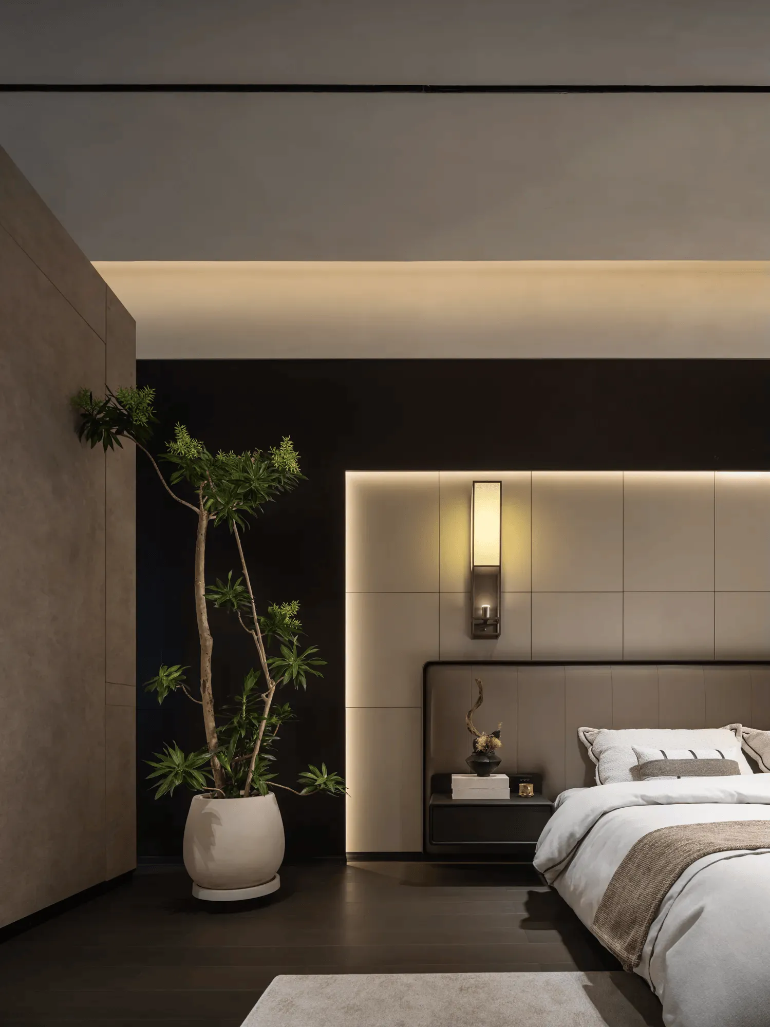
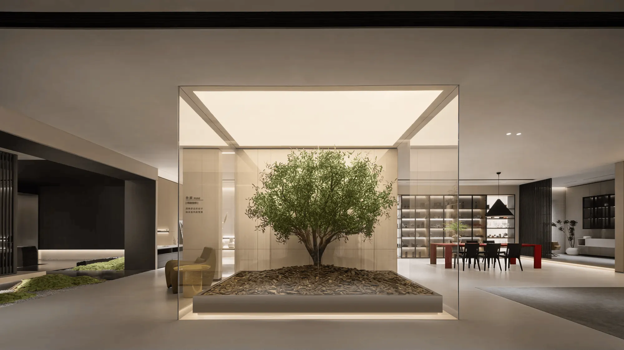
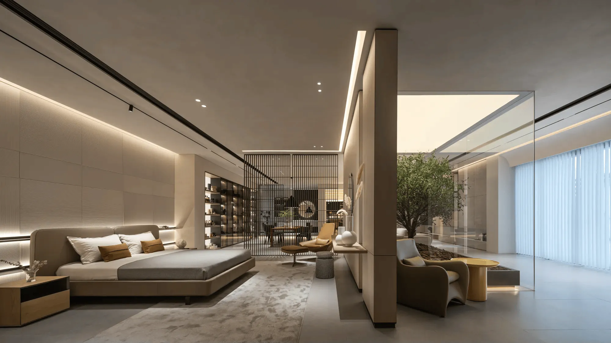
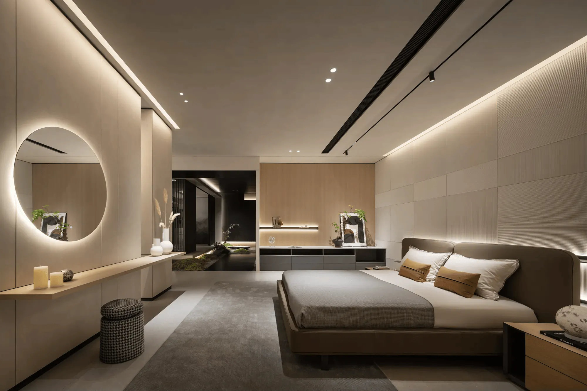
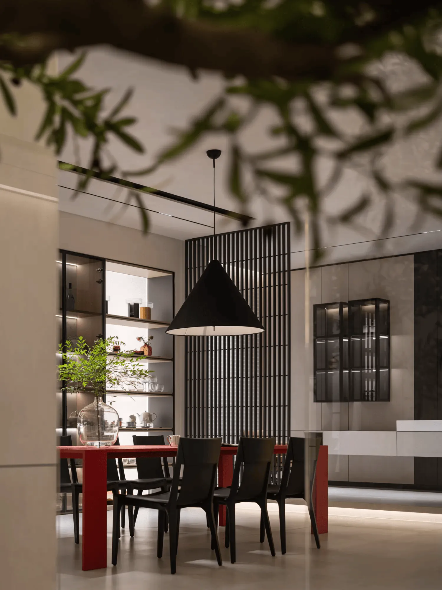
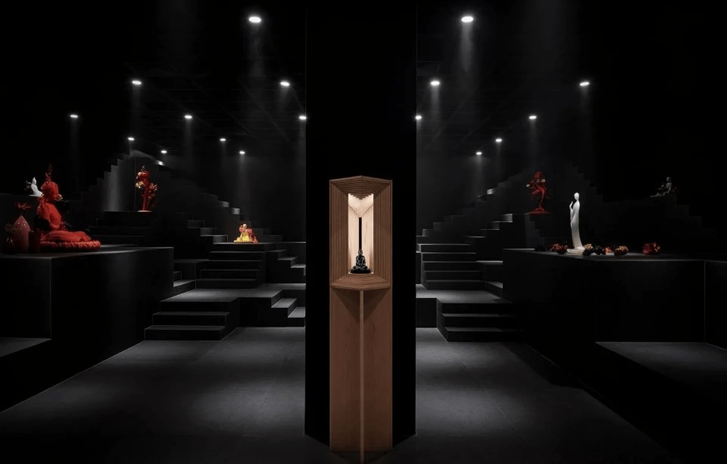
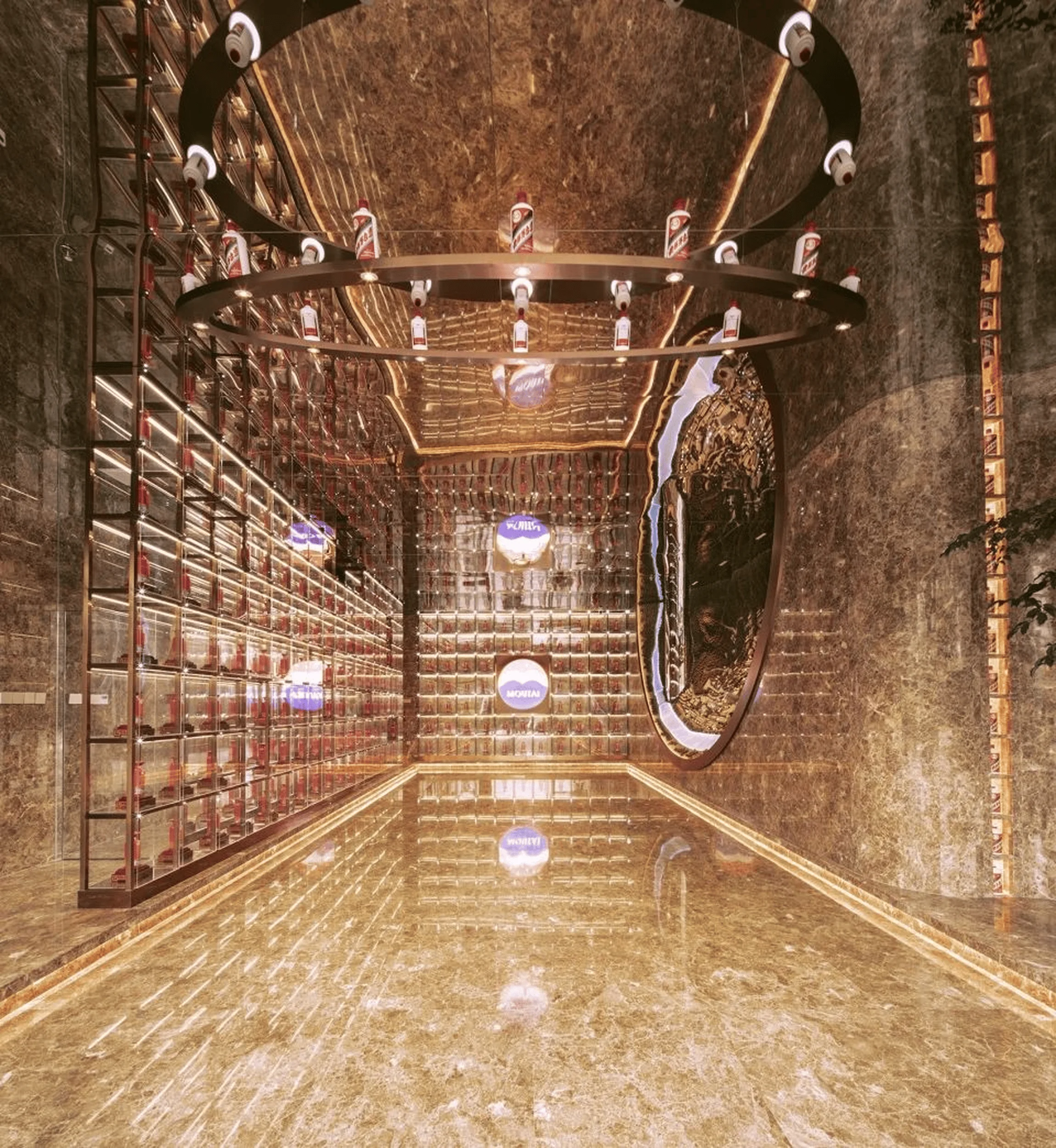
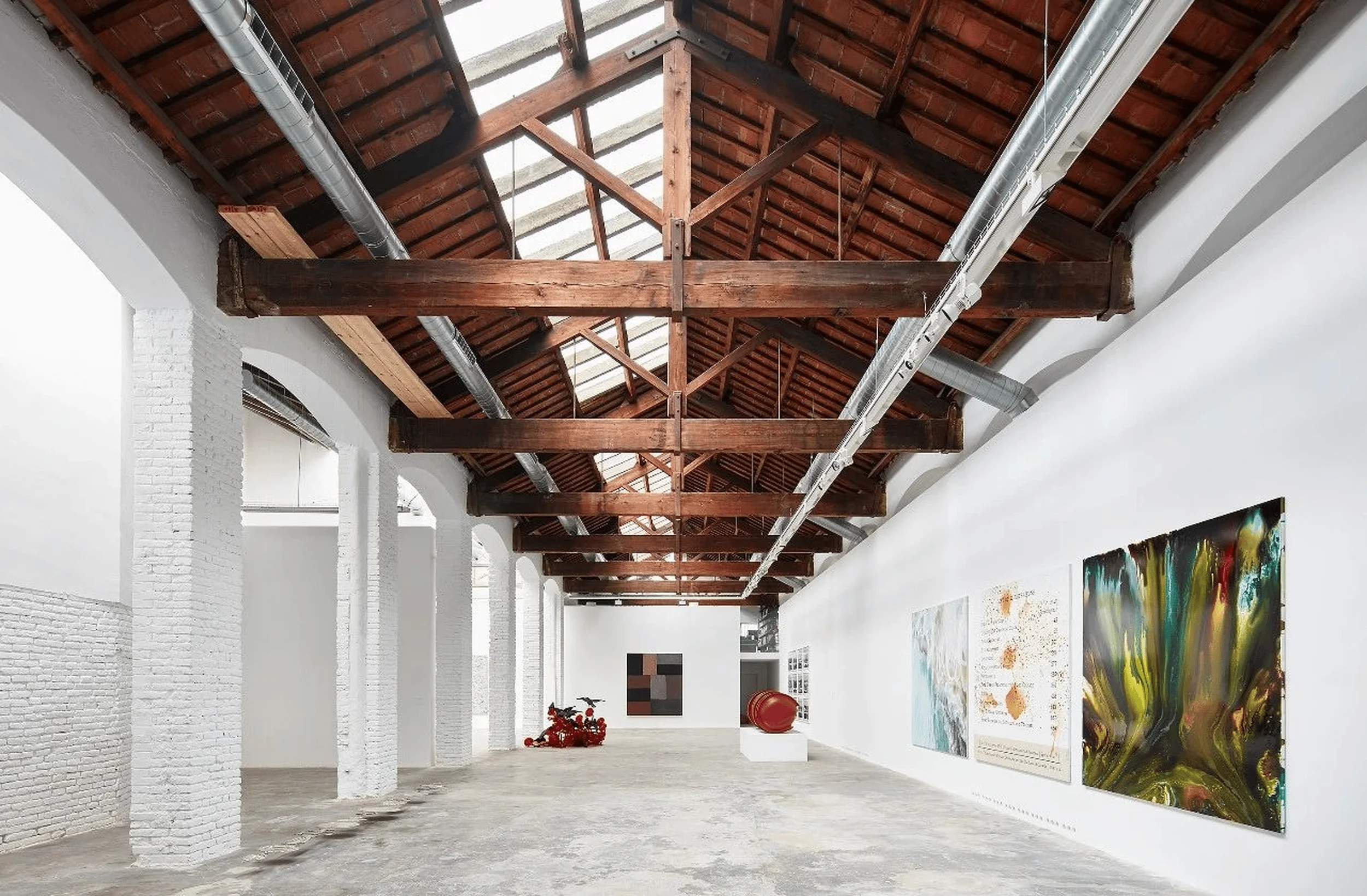
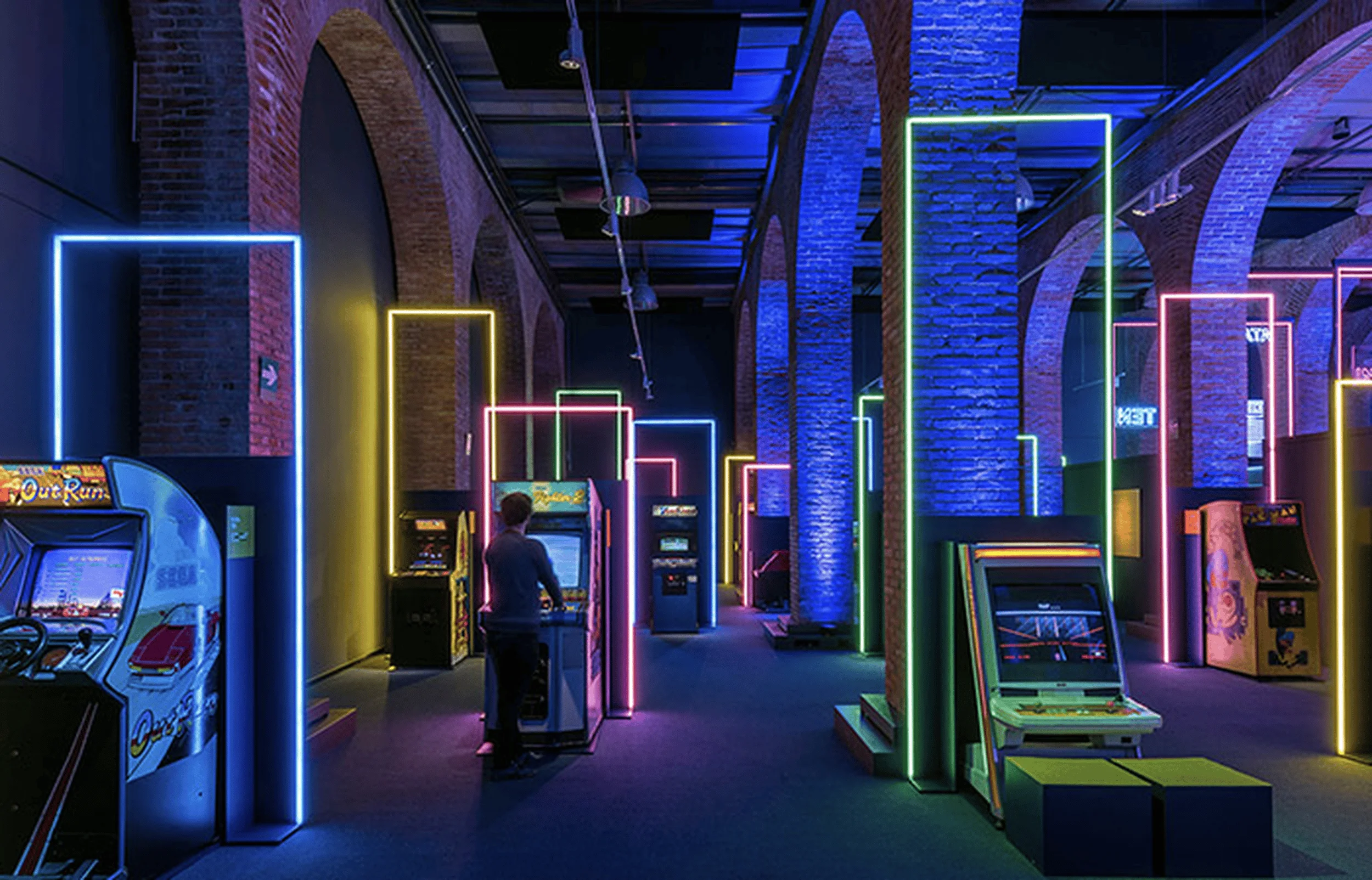
The Deloni Aesthetic Customization Exhibition Hall in Xuzhou, China, masterfully blends Italian classicism with Oriental Zen, creating a harmonious space that embodies minimalist design and innovative architectural techniques.
Contents
Project Background and Design Goals
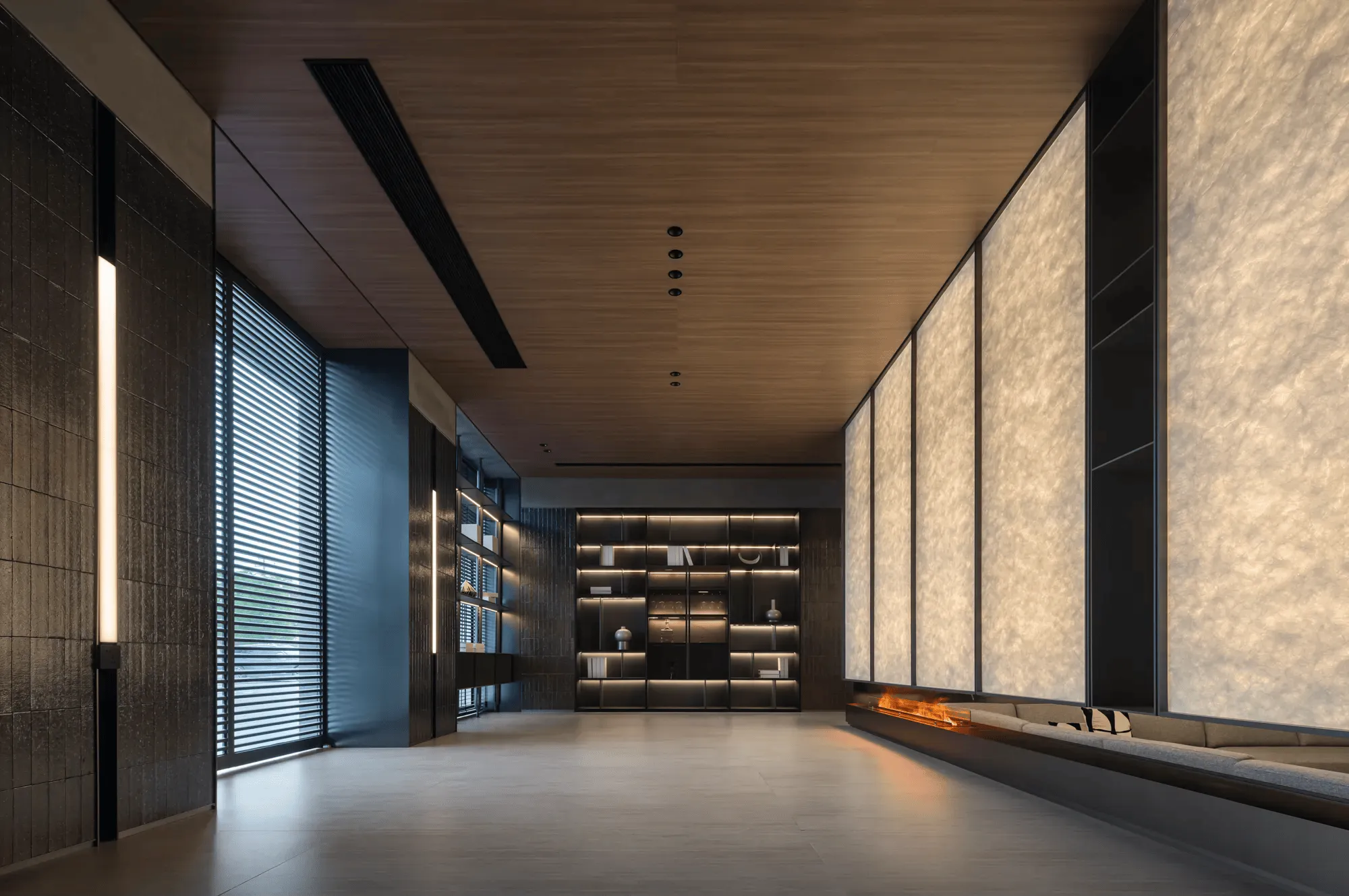
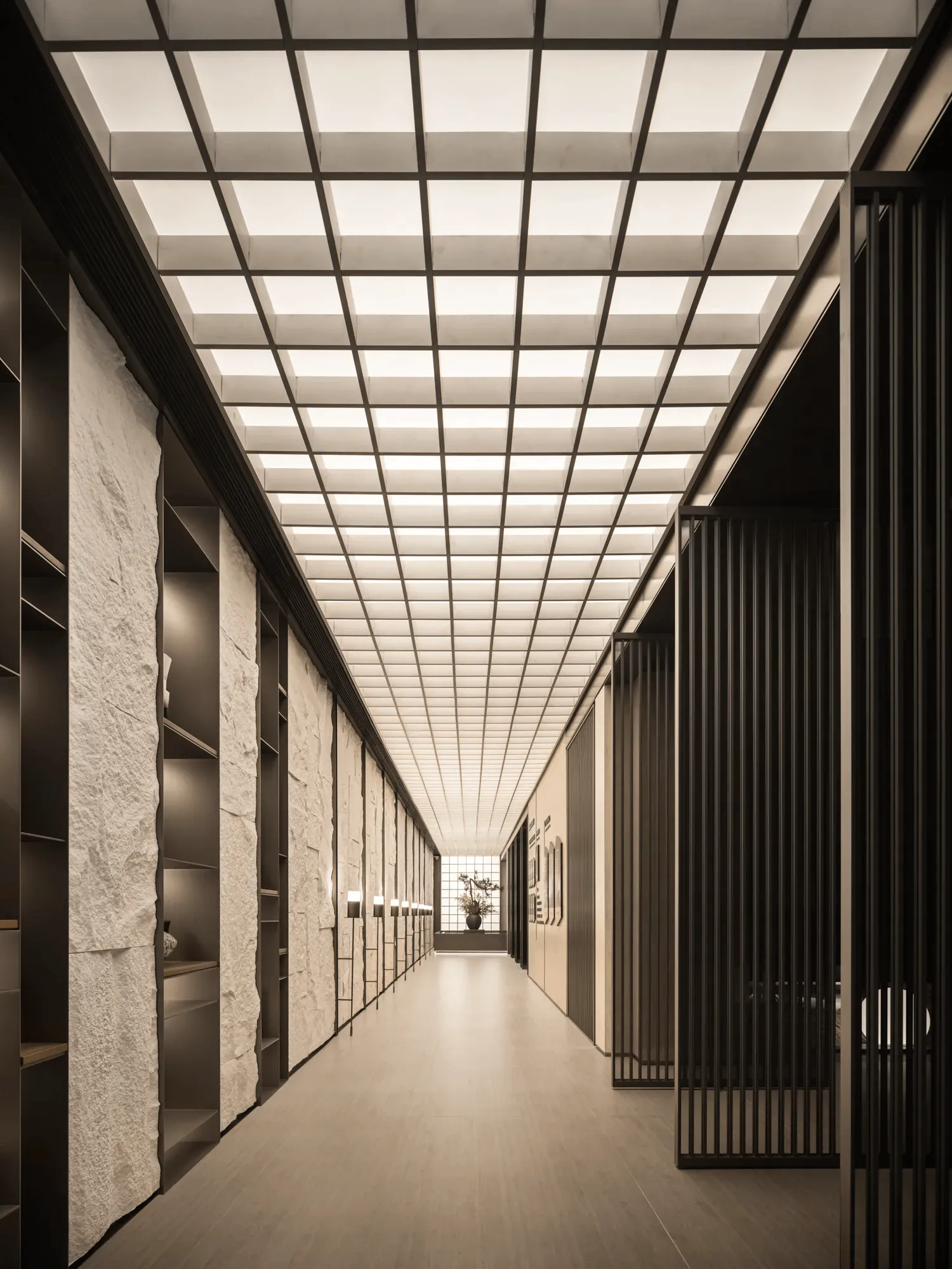
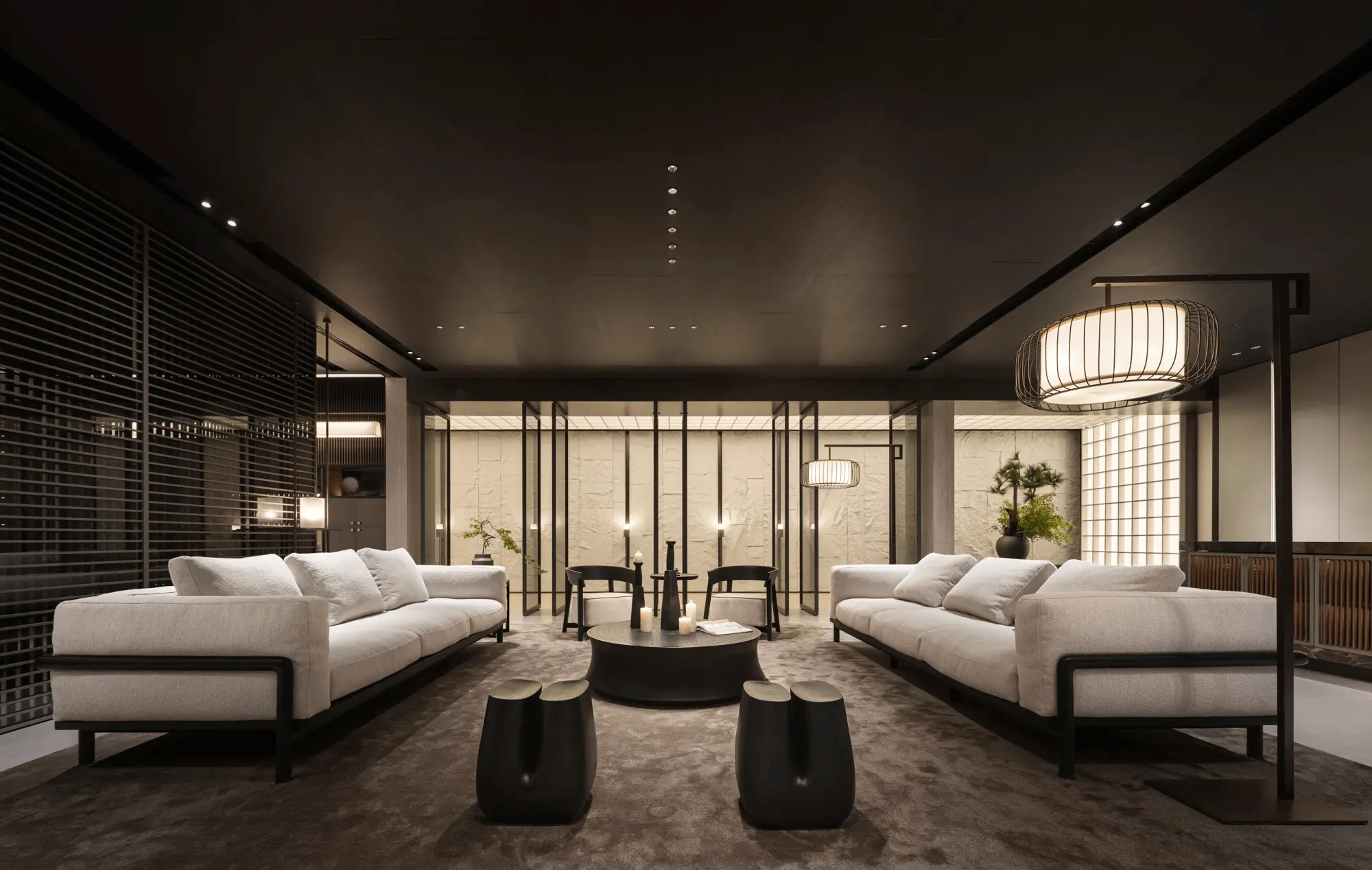
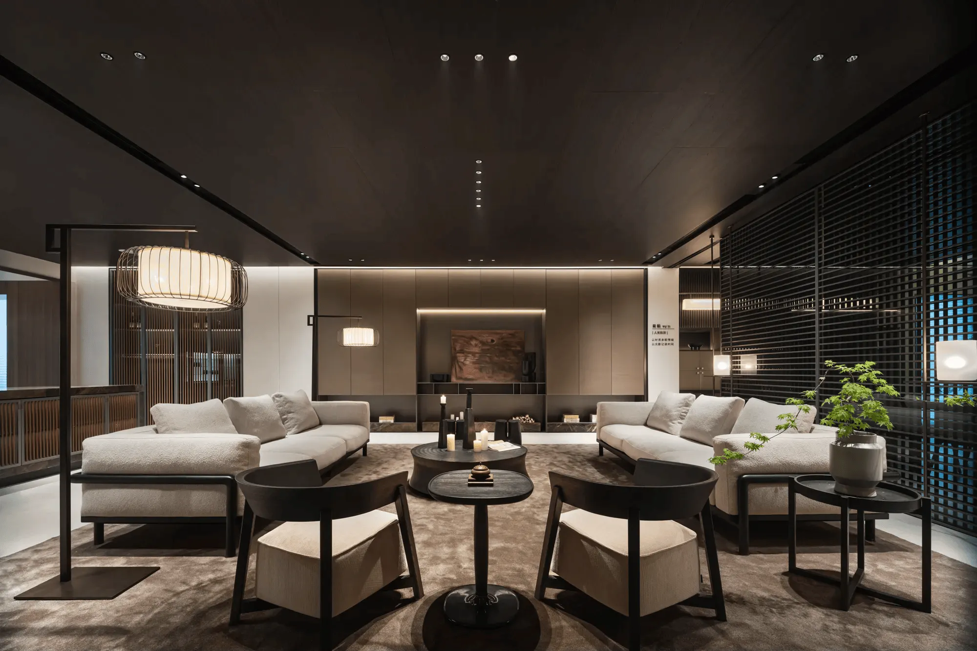
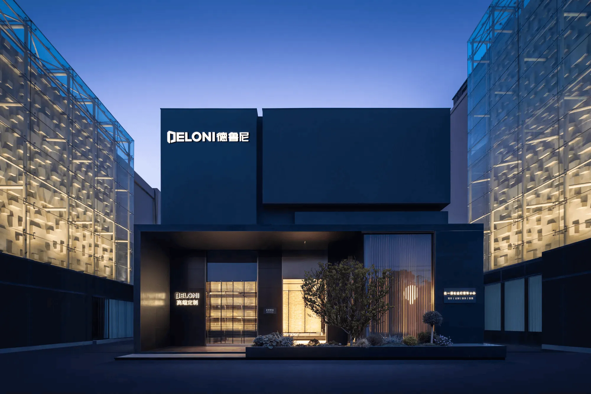
The Deloni Aesthetic Customization Exhibition Hall, a brainchild of CJ Studio under the direction of Tang Zhonghan, is situated in Xuzhou, China. Spanning an expansive 1500 square meters, the exhibition hall showcases Deloni’s commitment to bespoke aesthetics through three distinct design series: SKYLINE, YUN TI, and PURE. The hall is designed as a long, rectangular space measuring 100 meters by 15 meters, with the layout meticulously planned to facilitate a seamless visitor experience. The design goal was to create a space that transcends mere product display, offering visitors an immersive journey into Deloni’s design philosophy and capabilities, harmonizing minimalist design with architectural techniques.
SKYLINE: Embracing Italian Classicism
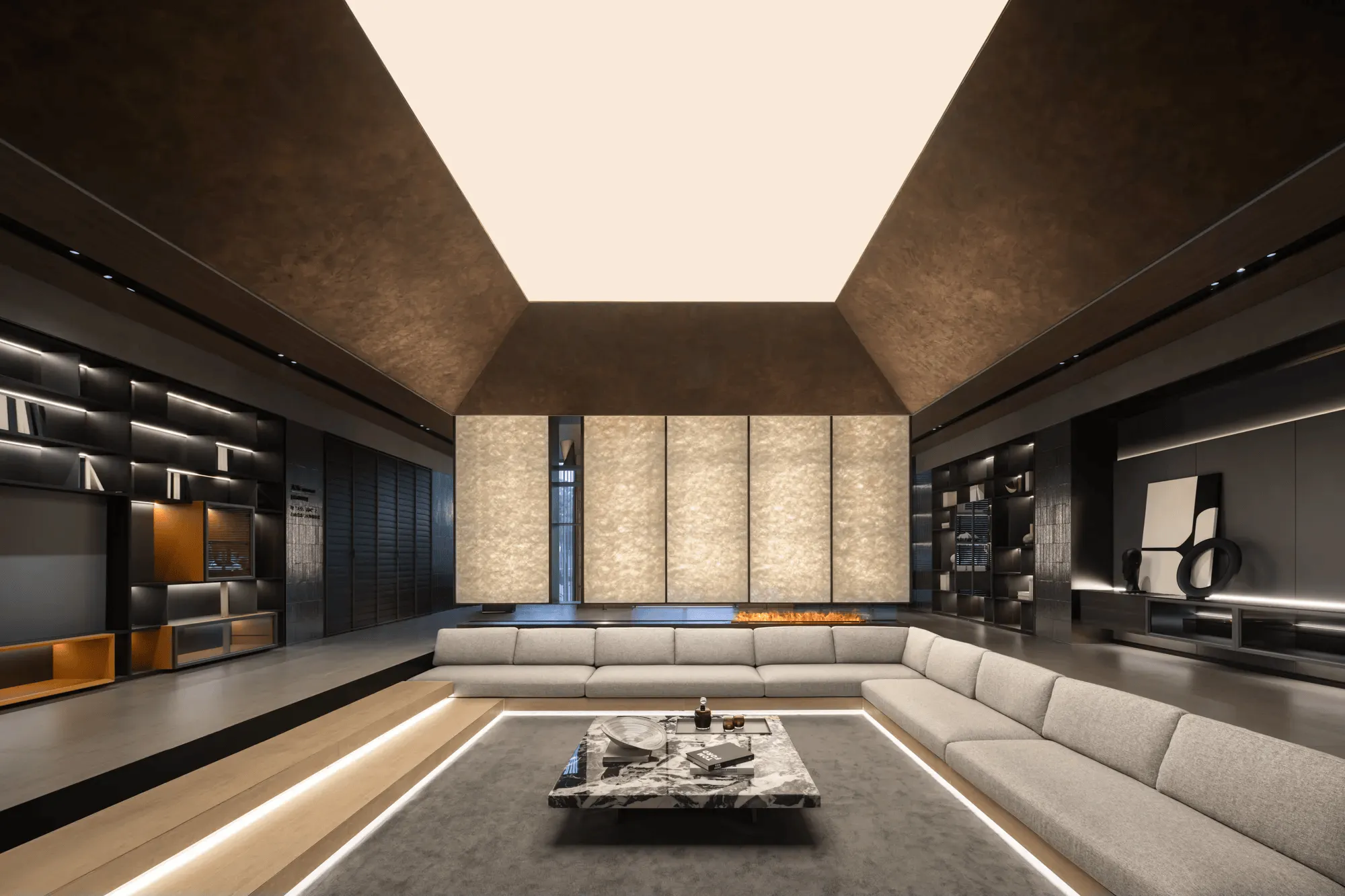
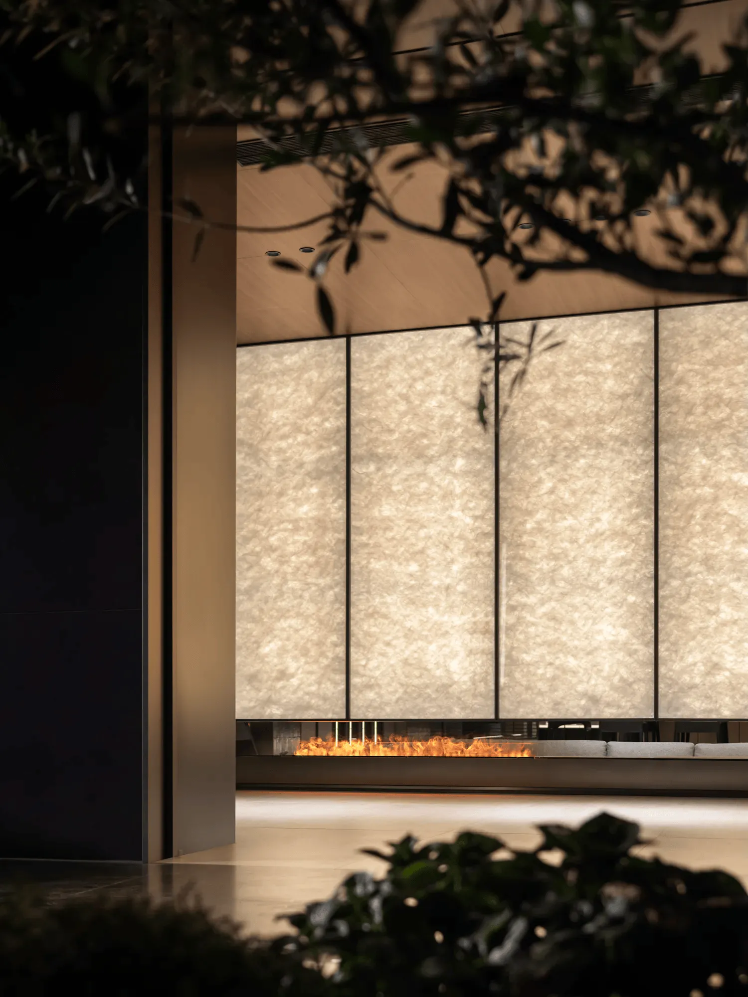
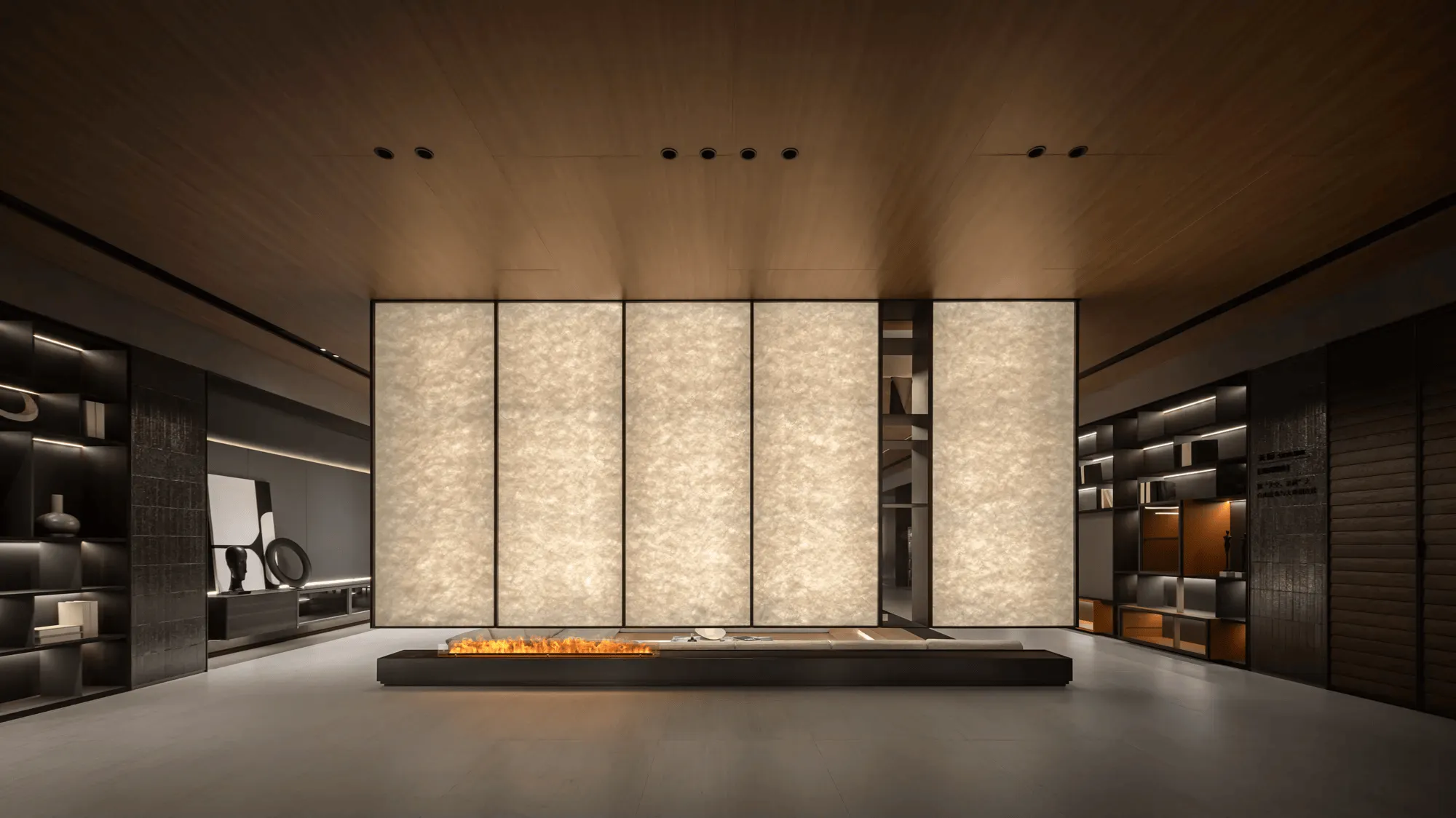
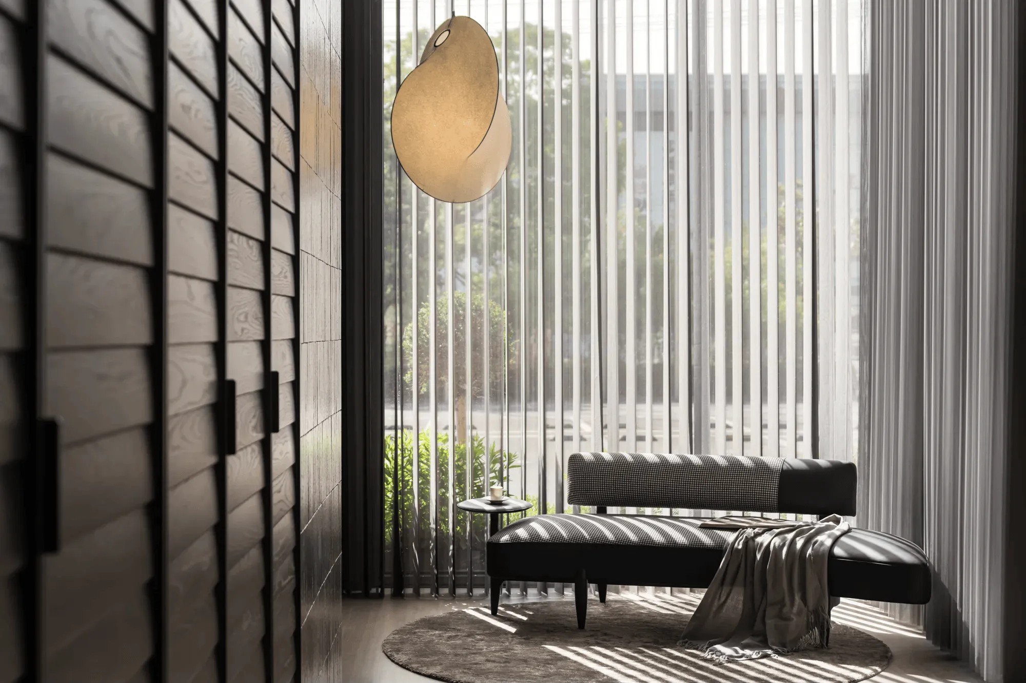
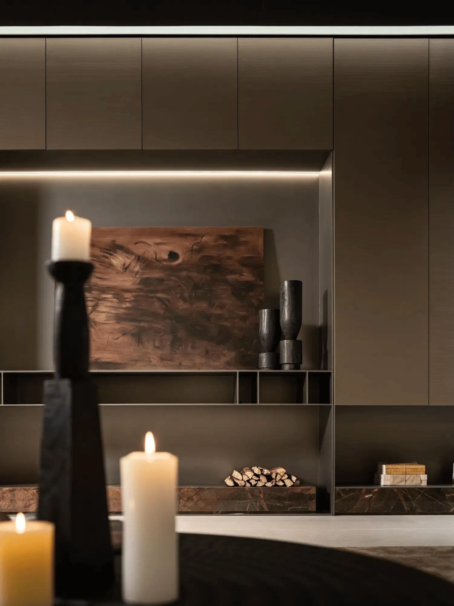
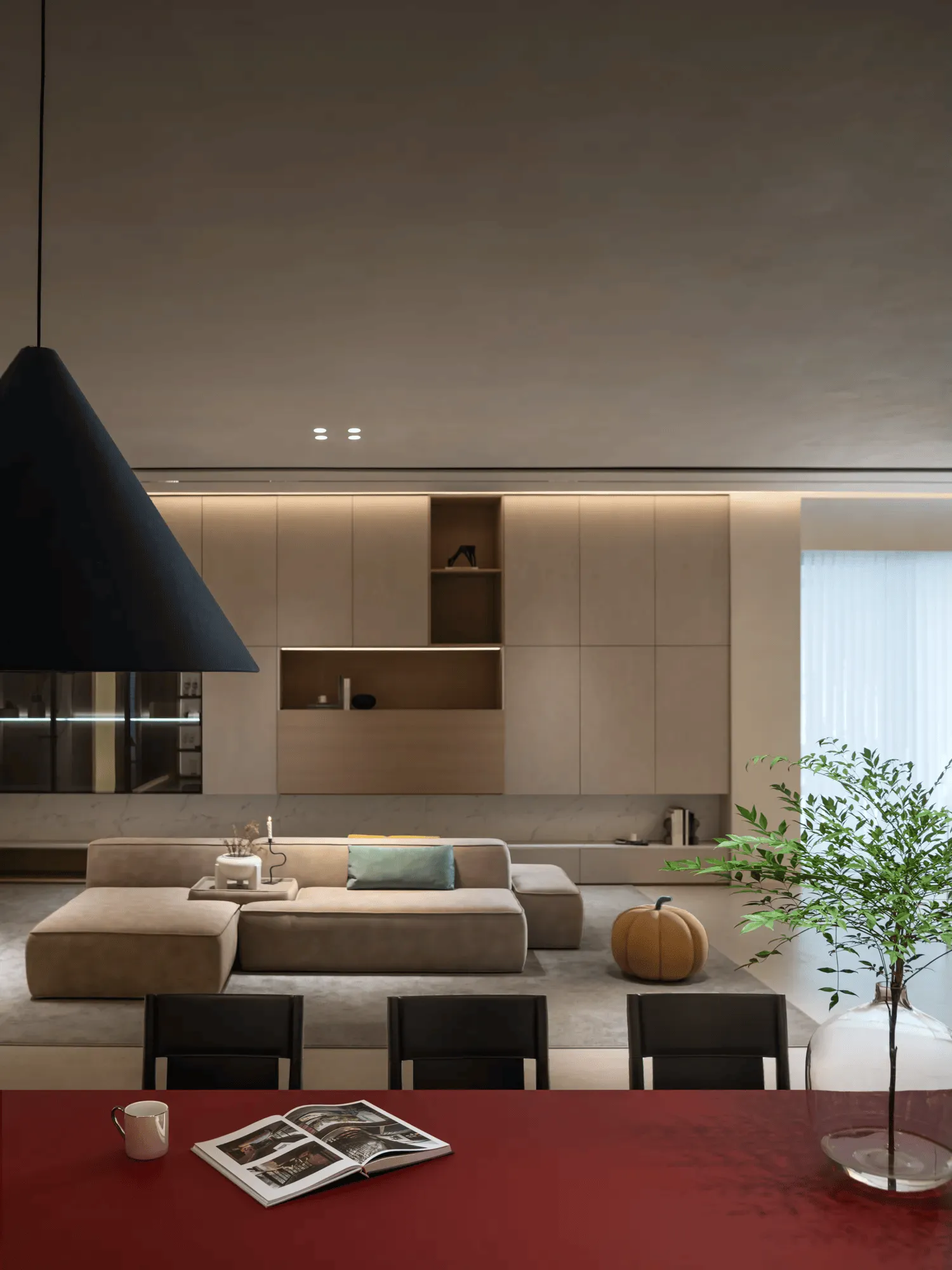
The SKYLINE series, occupying 400 square meters, exudes Italian classicism through the artful use of wood veneer, lacquer finishes, and strategically placed Dupont paper overhangs. This combination creates a sense of warmth and sophistication, inviting visitors to transition from the bustling exterior to a serene and visually captivating interior. The sunken living room, juxtaposed against the ceiling design, adds a playful element to the space, showcasing the potential for contrast within a minimalist aesthetic. Metallic tiles, wood veneers, art paints, and Dupont paper serve as vessels of time, each material whispering a different story and evoking a unique emotion.
YUN TI: Exploring Humanistic Orientalism
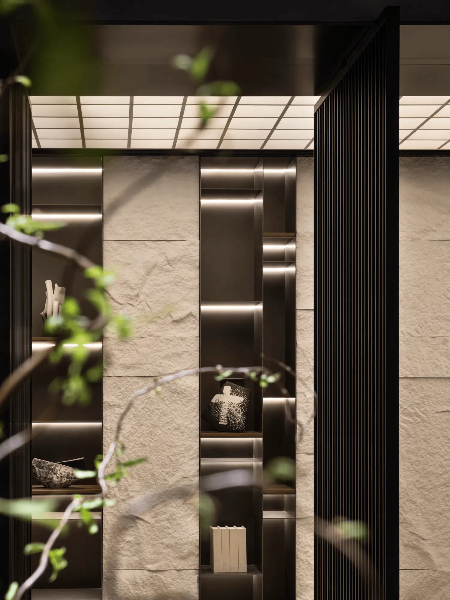
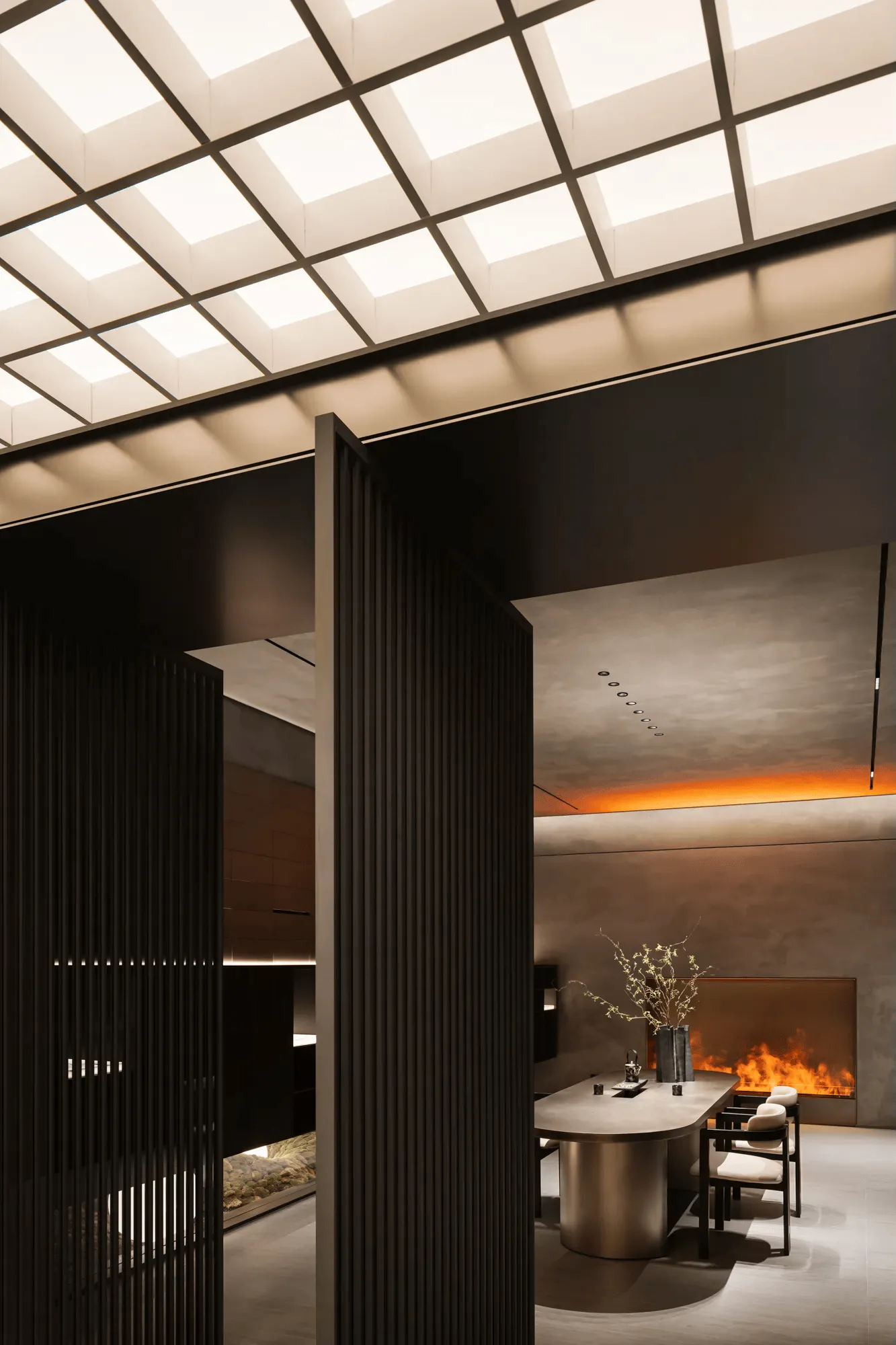
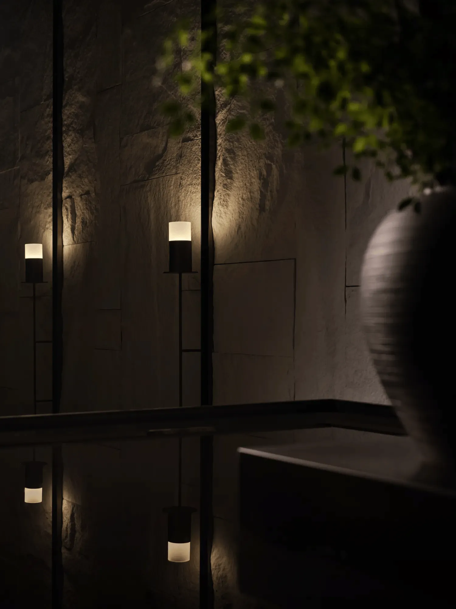
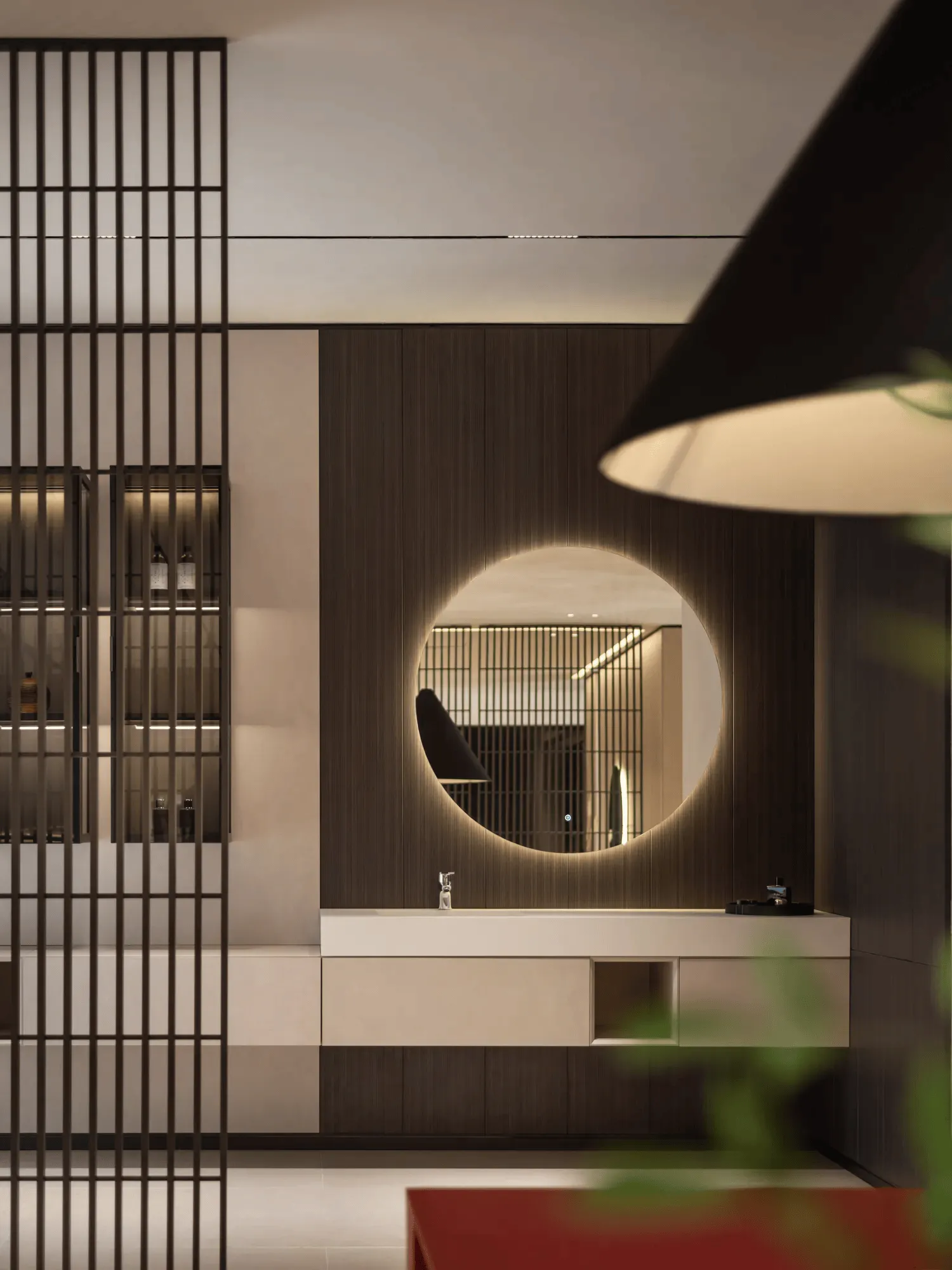
YUN TI, also spanning 400 square meters, draws inspiration from Oriental Zen and humanistic traditions. The space utilizes natural materials like rubble stone, bespoke lighting fixtures, and soft membrane lighting to create a calming and contemplative atmosphere. Eastern elements like grilles, water features, and carefully curated floral arrangements punctuate the space, creating a journey of discovery for visitors as they move through the hall. The design philosophy hinges on the concept of ‘Oriental garden,’ integrating light, shadow, order, and Zen principles to craft a poetic space where nature and humanism resonate. The integration of Eastern and Western design concepts, including themes of warmth, virtual and solid, weaving, and splash-ink landscapes, results in a refreshing and unique visual experience.
PURE: Minimalist Design and Natural Materials
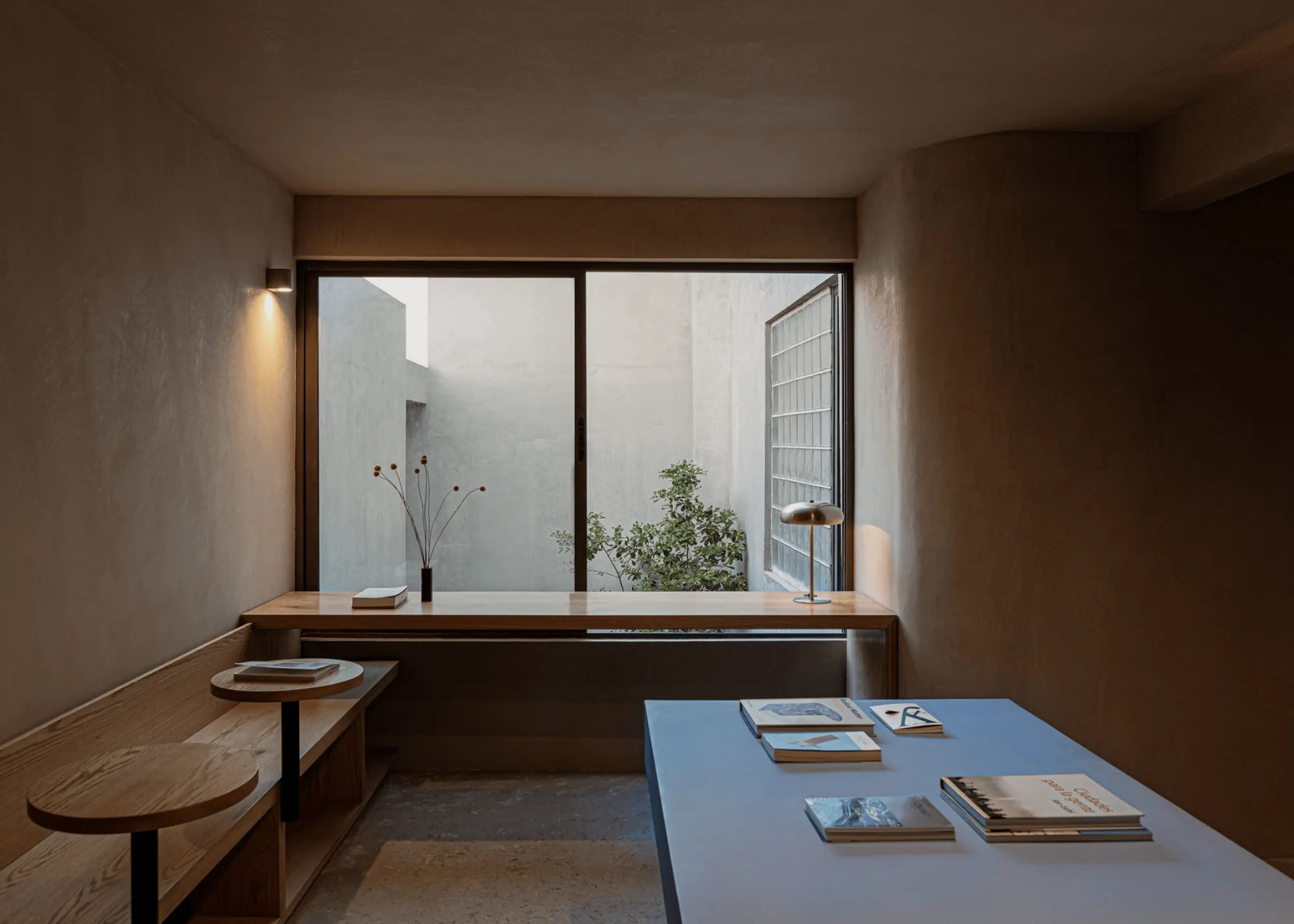
The PURE series, covering 200 square meters, epitomizes minimalist design with its restrained aesthetic and neutral color palette. The use of natural wood tones and organic textures creates a serene and inviting atmosphere. A touch of green evokes a sense of natural harmony, emphasizing the connection between the built environment and the natural world. The simplicity of materials and design fosters a sense of calm and tranquility, inviting visitors to appreciate the inherent beauty of nature and the power of minimalist aesthetics.
Soft Decoration Design Leisure Area and Spatial Planning
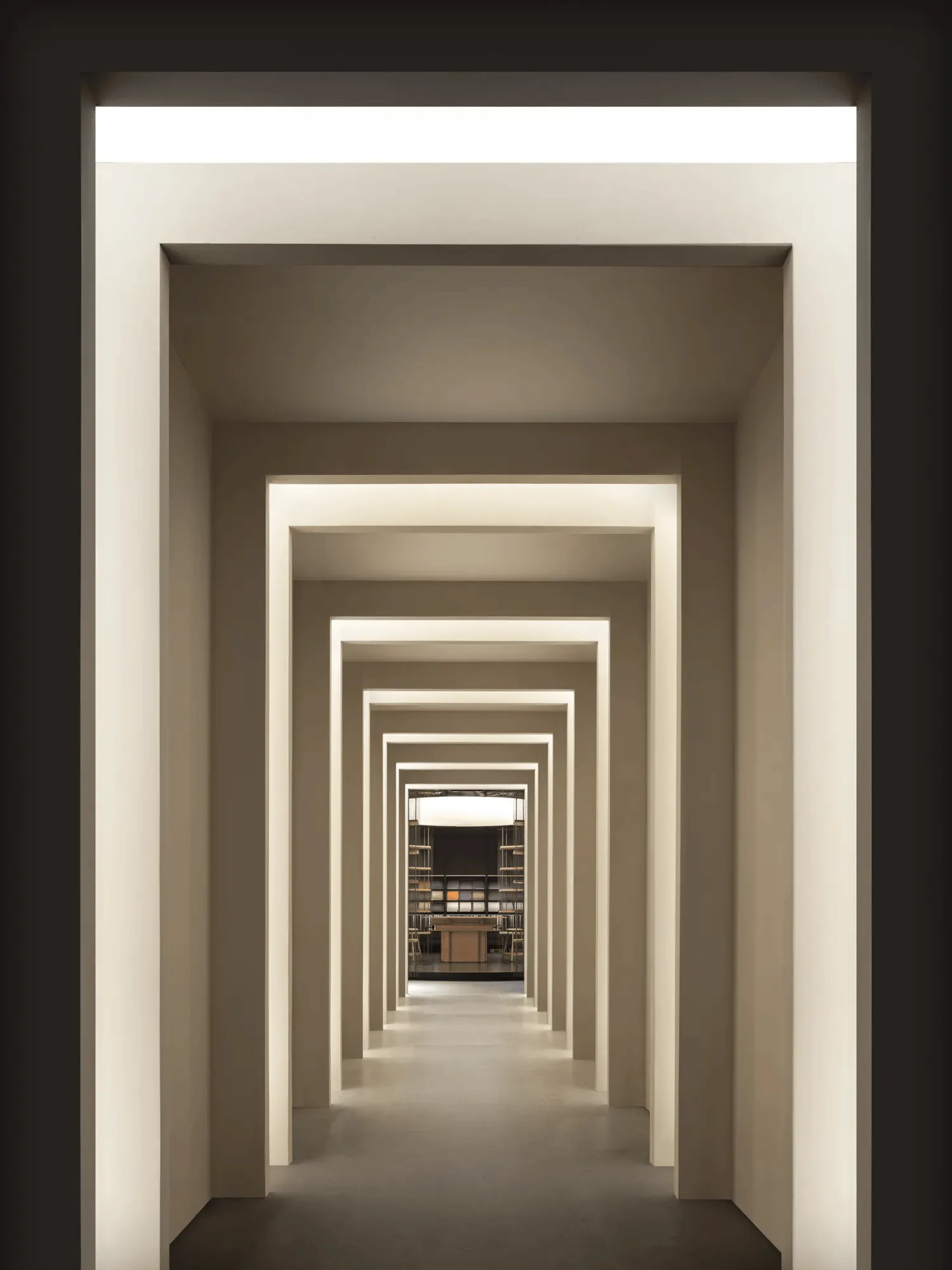
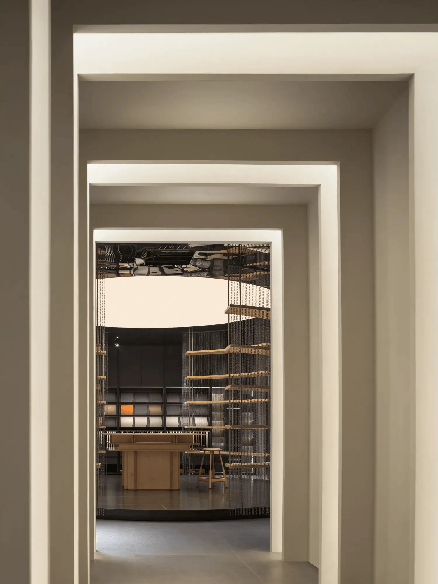
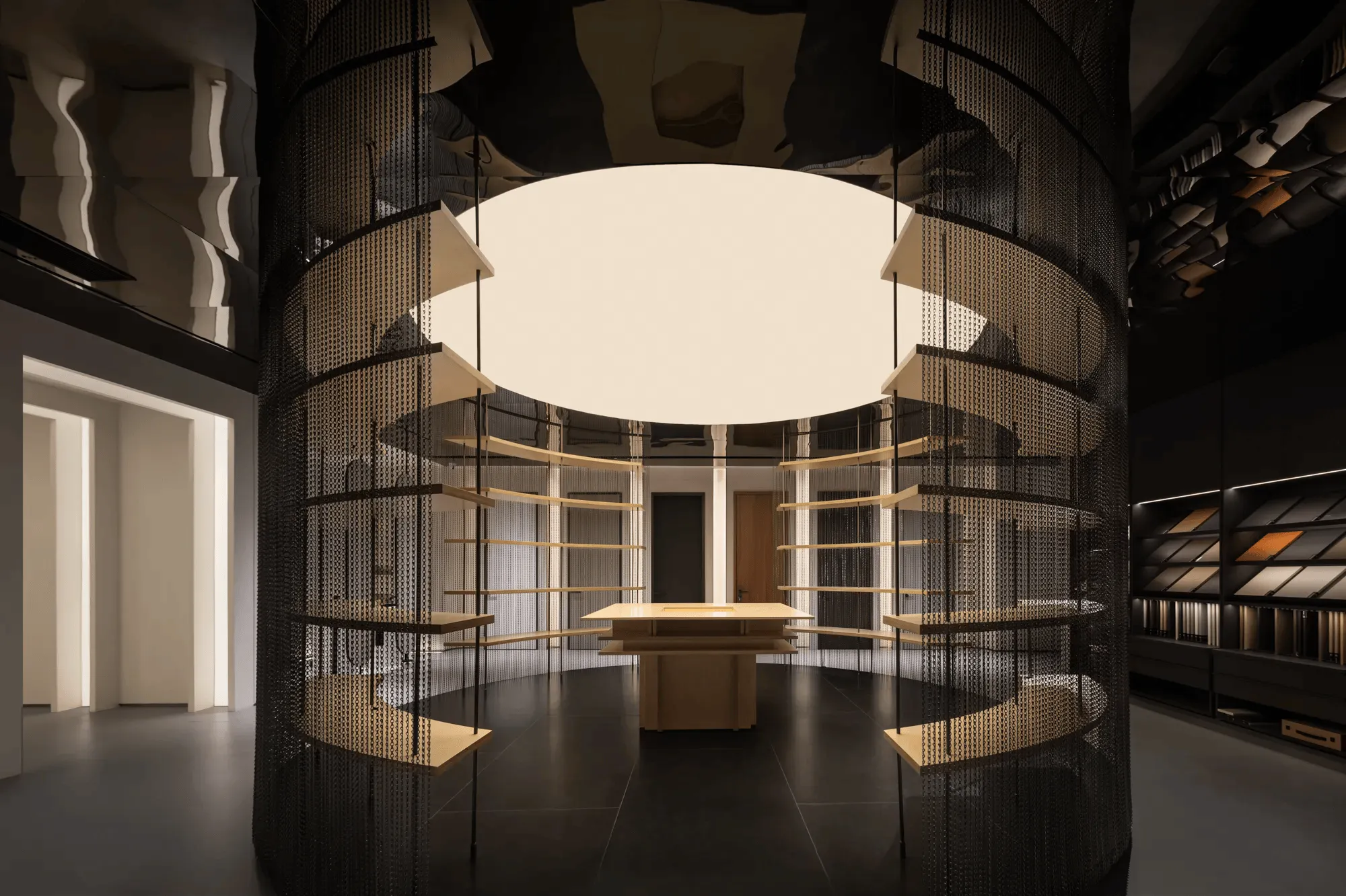
The 500-square-meter Soft Decoration Design Leisure Area serves as a testament to Deloni’s ability to integrate product design seamlessly into living spaces. The space showcases how Deloni’s furniture and design elements can enhance the functionality and aesthetic appeal of a home. A ‘time-space corridor’ leads visitors through the area, culminating in a circular material selection space that showcases the brand’s evolution and commitment to quality. This space allows designers to explore different materials and textures, fostering creativity and inspiring new design ideas. The exhibition hall’s layout incorporates the concept of ‘sheet walls’ and symmetrical design, creating interconnected yet distinct areas for each series. The use of gray space between product displays enhances the visual flow and encourages a sense of discovery as visitors navigate the hall.
Project Information:
Architects: CJ Studio
Area: 1500 m²
Project Year: 2023
Project Location: Xuzhou, China
Lead Architects: Tang Zhonghan
Photographs: Fan Mirror Space Photography
Project Type: Exhibition Center
Main Materials: Wood veneer, lacquer finishes, Dupont paper, rubble stone, metallic tiles, art paints, grilles, soft membrane lighting, wood louvers
Category: Interior Design
Children_Category: Commercial Space Interiors Design


