This project is located in a high-rise old house in Chaoyang District, Beijing, with windows facing east, providing a spacious view and good lighting. The owner is a sunny and handsome 90s single girl with neat short hair, clean clothes, and clear eyes. On the day of the interview, when she stood in the messy scene, she looked out of place. Before we delved into the conversation, we already guessed what kind of space she wanted. Sometimes, a person’s aura conveys subtle messages—people and space, matching temperaments lead to harmony. With basic professional etiquette, we took the initiative to understand the owner’s every request. She said, the house is not big, she wanted it to be bright, most importantly, there needs to be a large bookshelf in the living room. The bathroom could be without a shower, but it must have a bathtub. Friends will come over occasionally, and they might stay overnight, so there should be a simple retractable guest bed. Based on the owner’s needs and the site conditions, we initially identified the main problems in each functional area before the renovation.
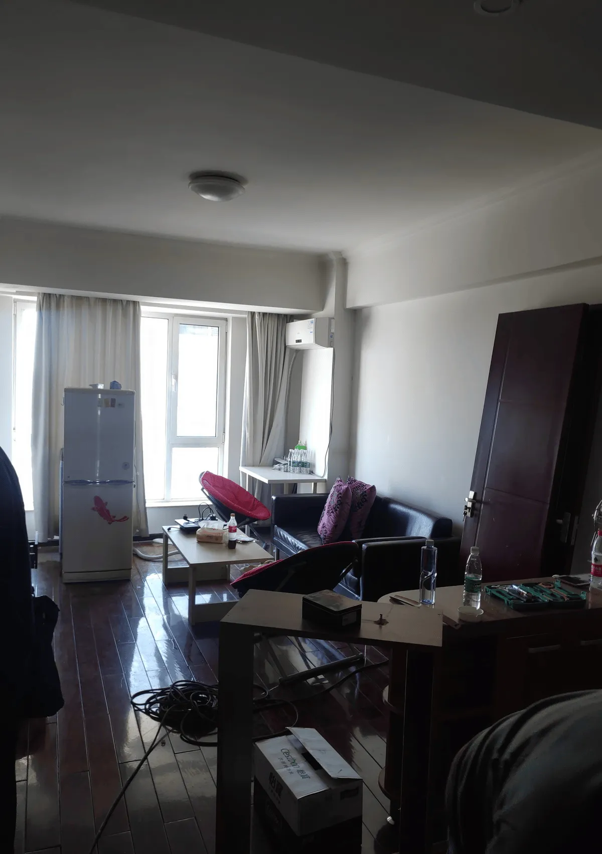
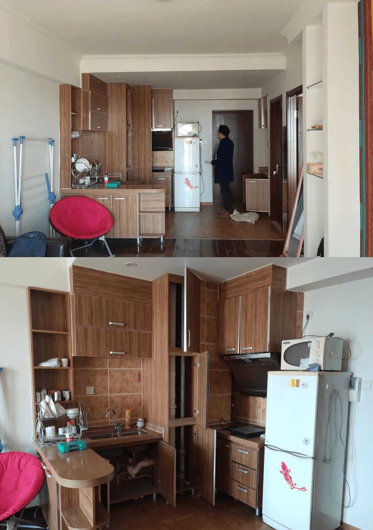
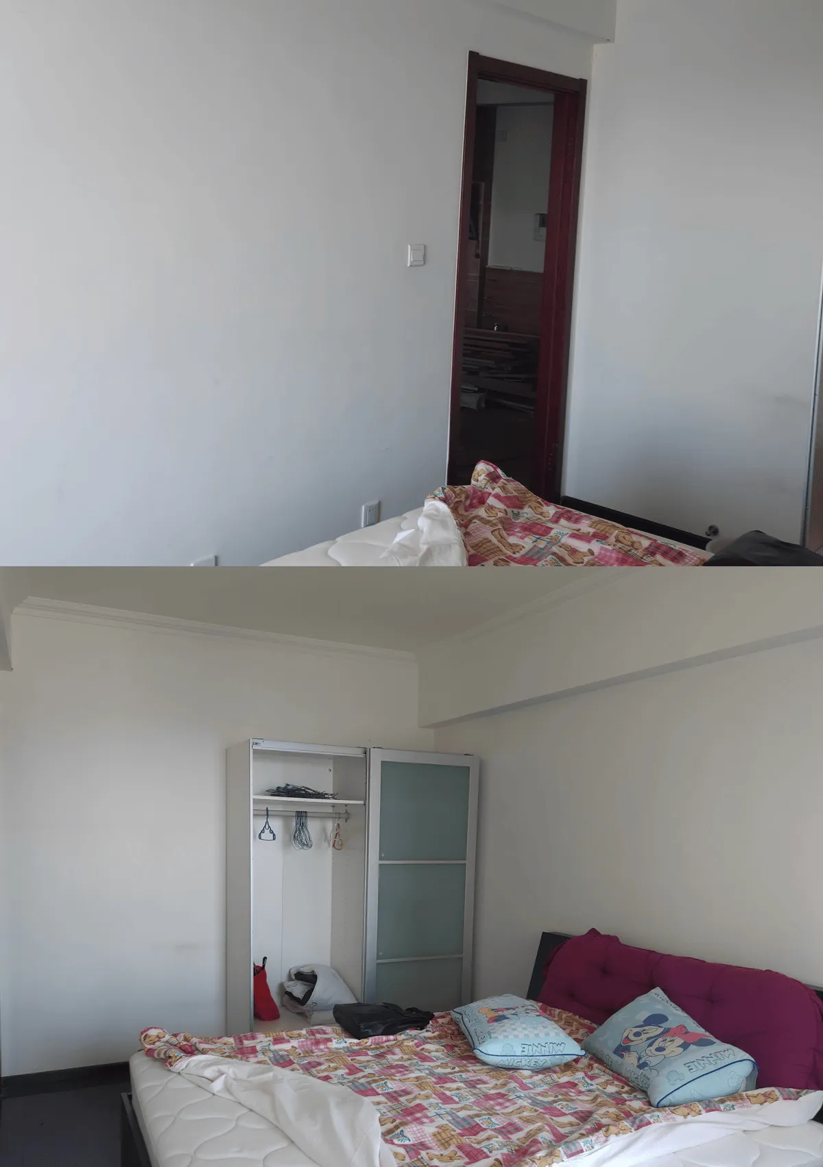
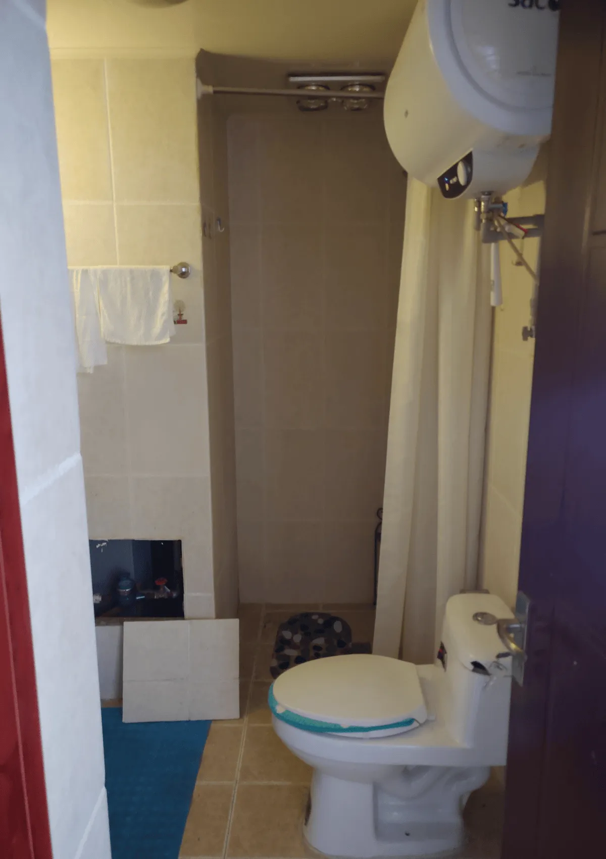
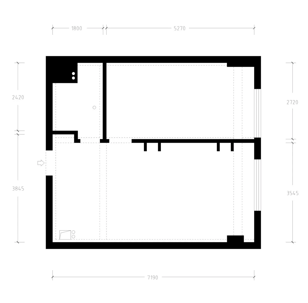
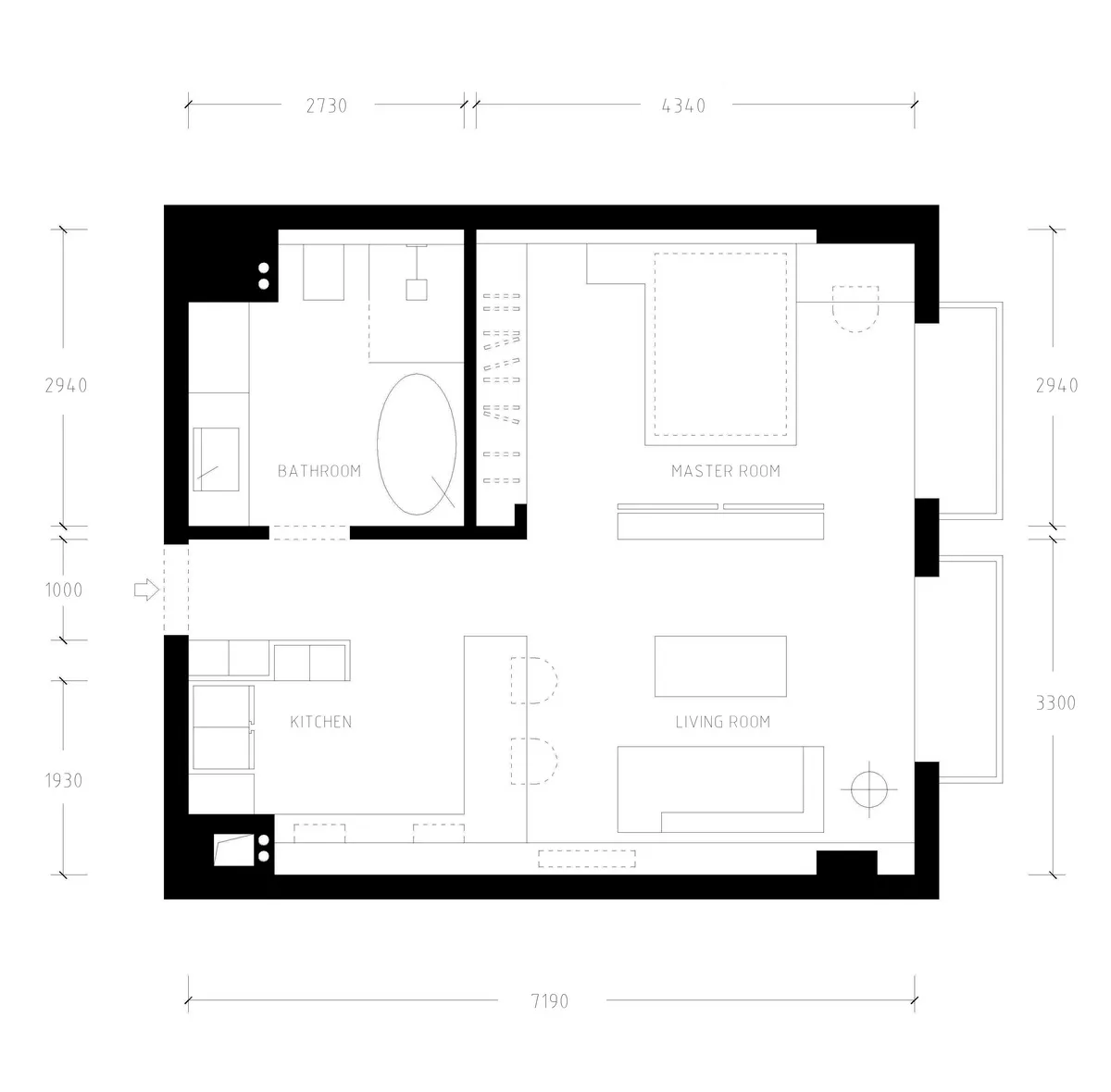
Before the renovation, the living room lacked storage cabinets, objects were randomly placed, the original decoration style lacked aesthetics, the color scheme was too dark, and the facilities were already old. The kitchen was connected to the entrance area and was opposite the shoe cabinet and bathroom. The boundaries were unclear, the relationship between movement, stillness, cleanliness, and dirtiness was ambiguous, and there was an awkward feeling of having to pass through the kitchen to enter the living room after entering the house. The bedroom door opened directly to the side of the wardrobe, not only depressing the view, but the wardrobe couldn’t be made larger, further leading to insufficient storage. The bathroom was narrow to begin with, and after being occupied by the shoe cabinet at the entrance, it became even more cramped. The functional planning was poor, with a toilet sitting on the floor at the entrance, making the traffic flow inconvenient. There was a water heater hanging above, oppressive and unbearable. The various wall corners squeezed the space, various dead corners accumulated dirt, the storage design was unreasonable, and items were scattered everywhere. It was already tight, let alone adding a bathtub. Of course, more than just the above problems needed to be solved. In order to maximize the space and match the owner’s temperament, with the owner’s consent, we created a targeted questionnaire. From the basic information of the building to the owner’s values, and from how many books and shoes the owner has to their body’s ten control部位尺寸数据, hobbies, and so on. Based on these questionnaire data and our analysis, we gradually formulated space temperament types, plane functional planning, color matching, material and craft use, electromechanical terminal point positions, natural light and artificial lighting, storage, ergonomics, intelligent systems, and other in-depth design schemes. Ultimately, we completed the renovation of this project with a highly cost-effective budget.
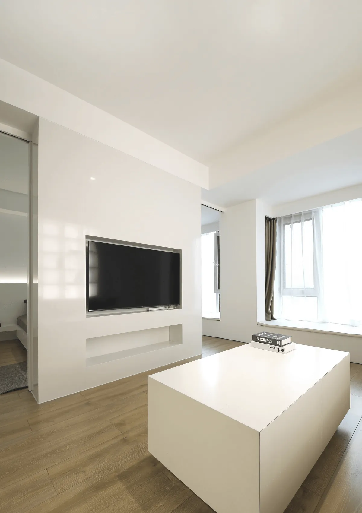
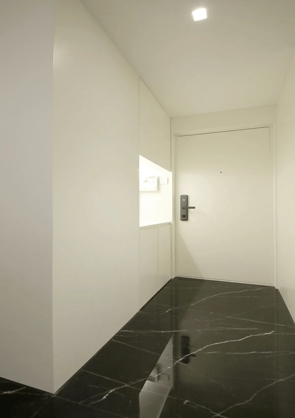
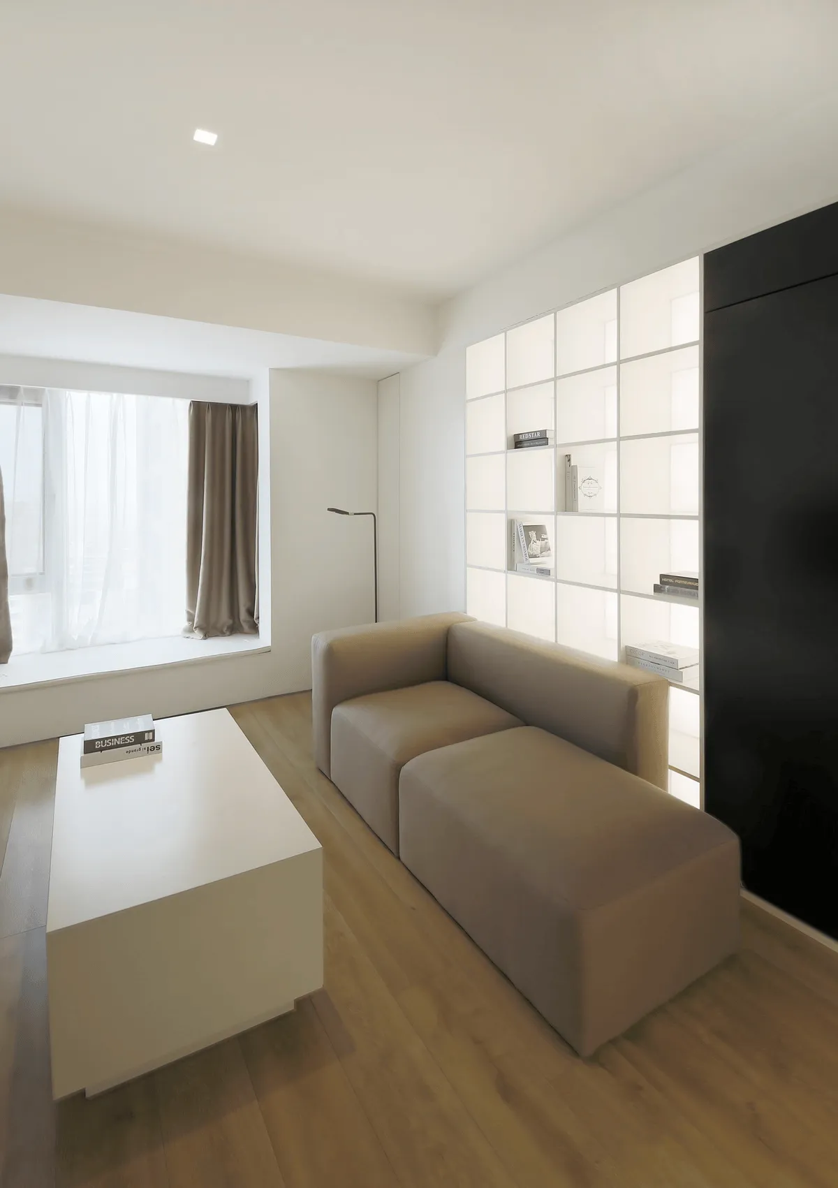
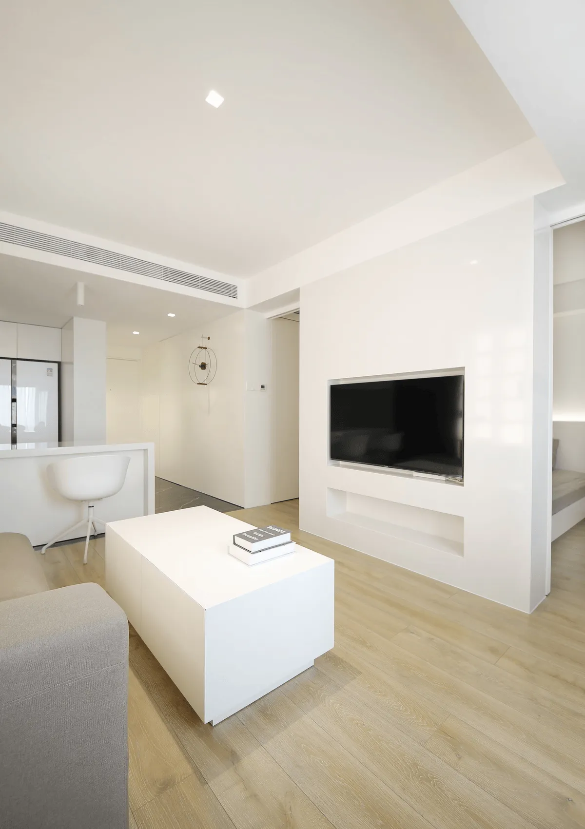
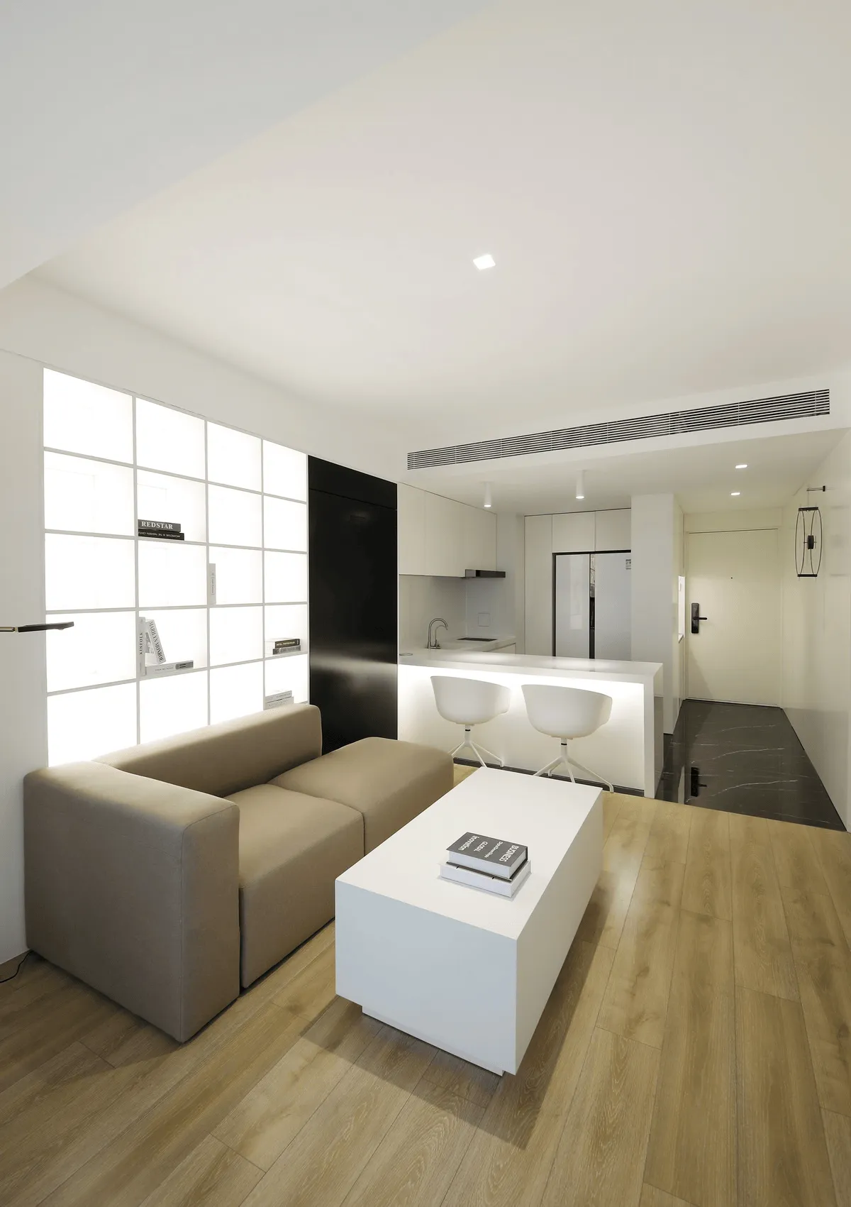
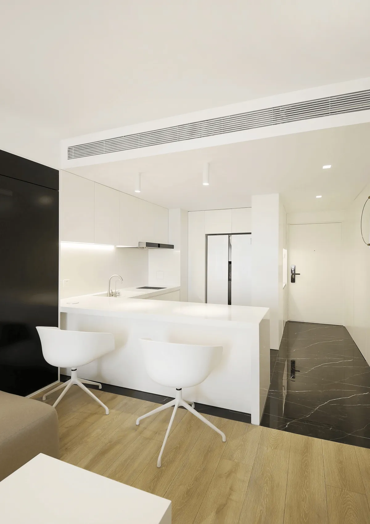
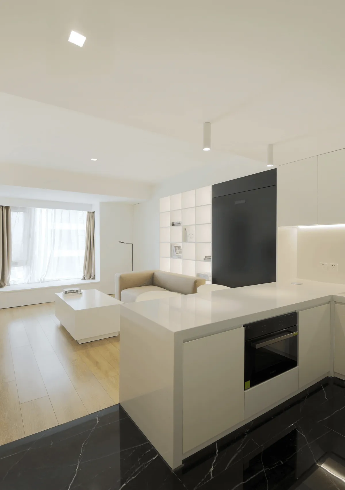
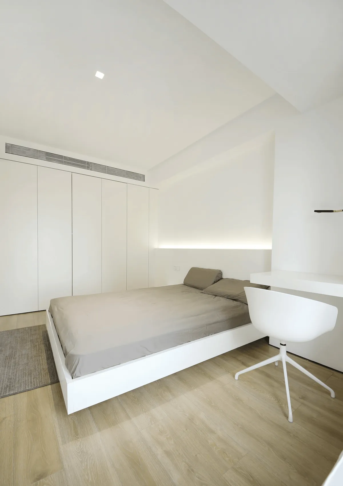
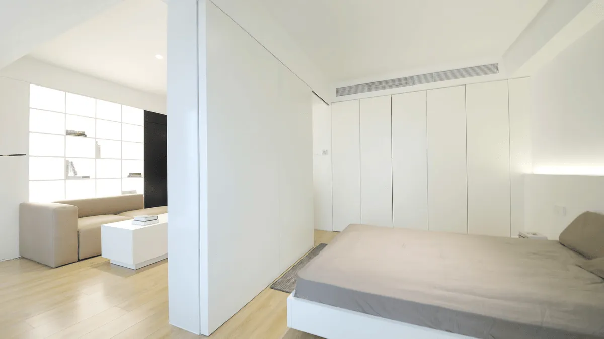
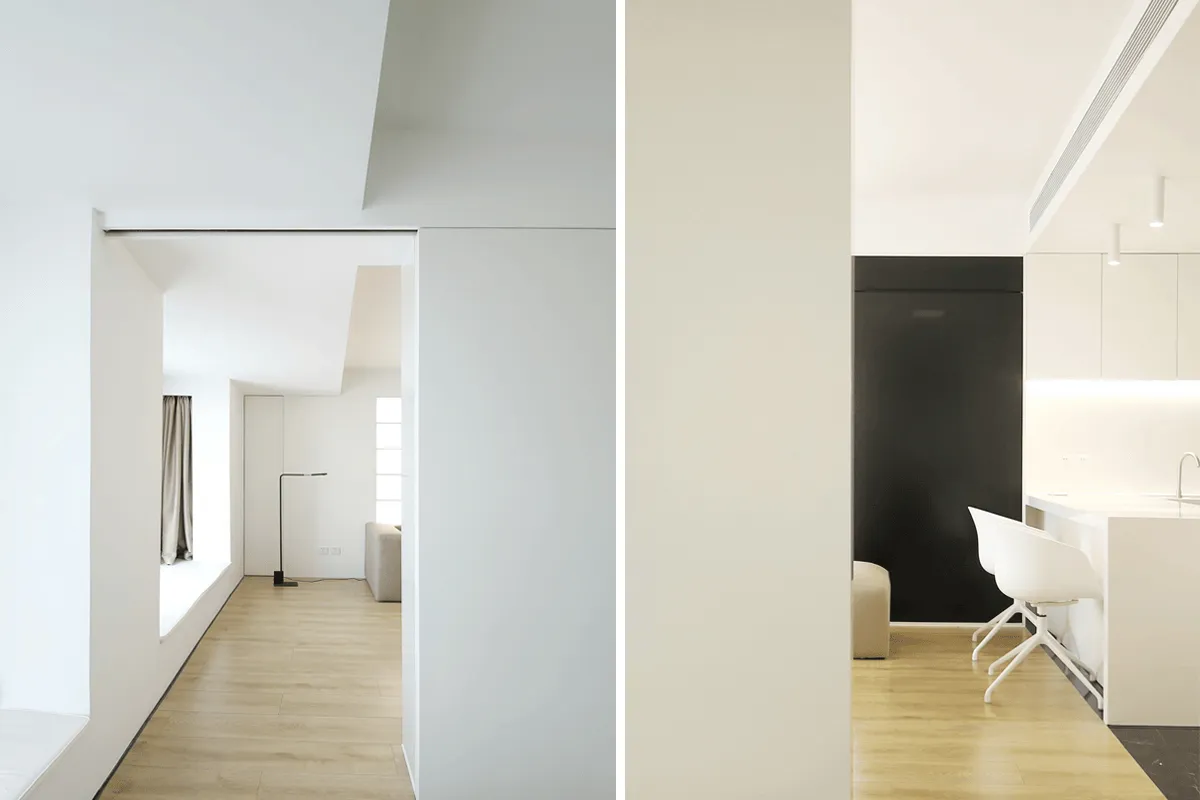
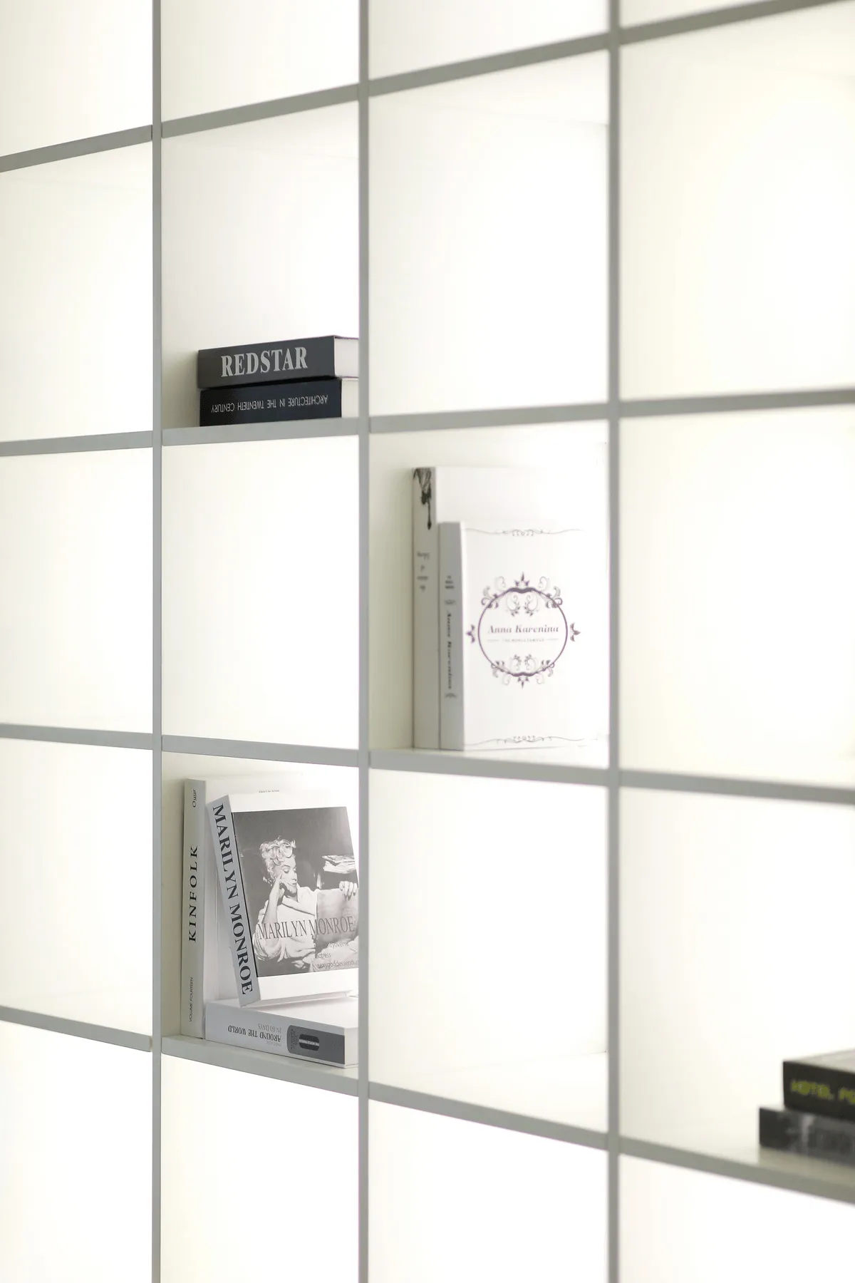
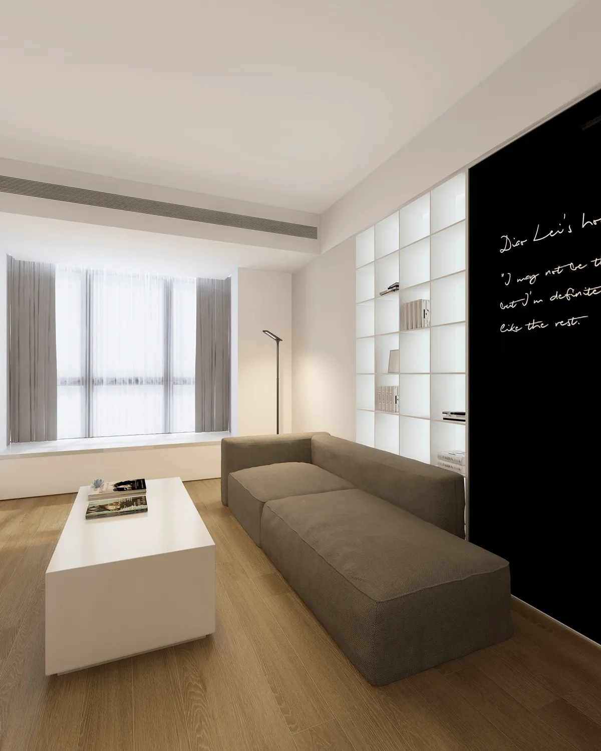
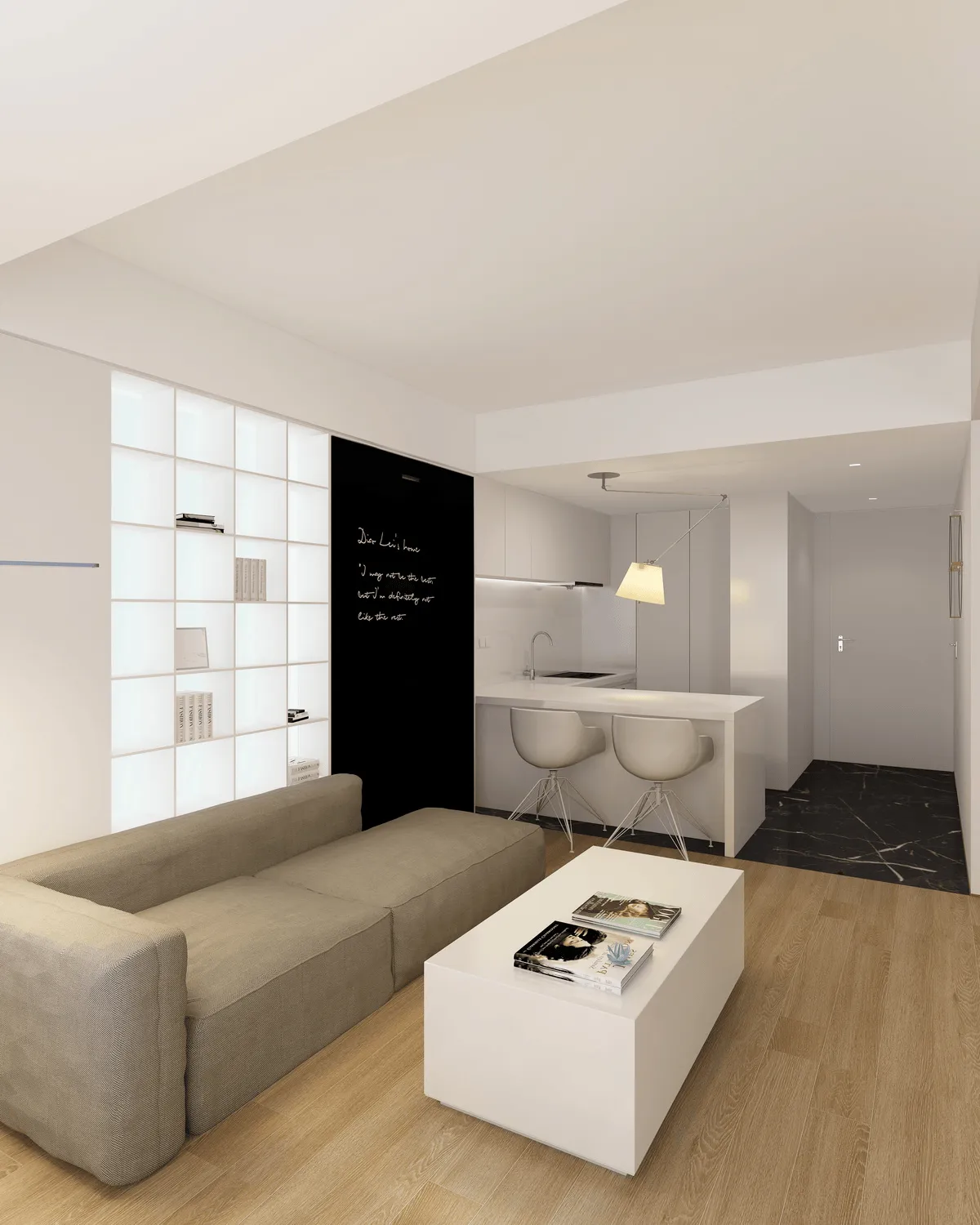
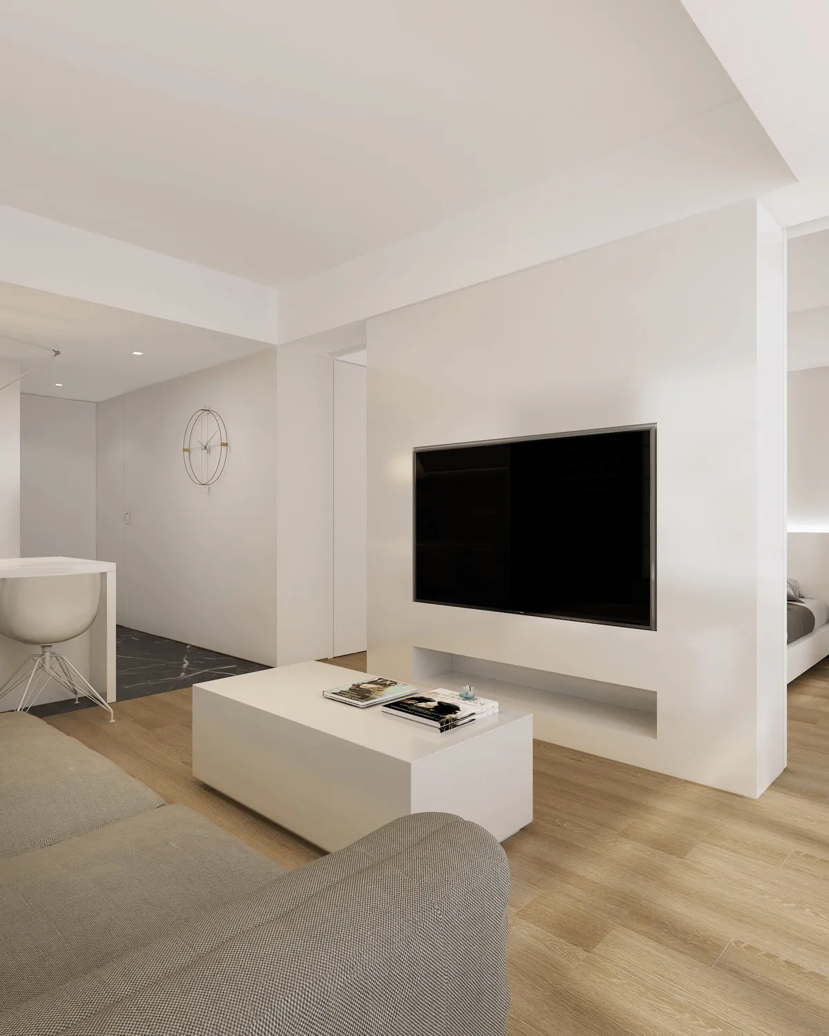
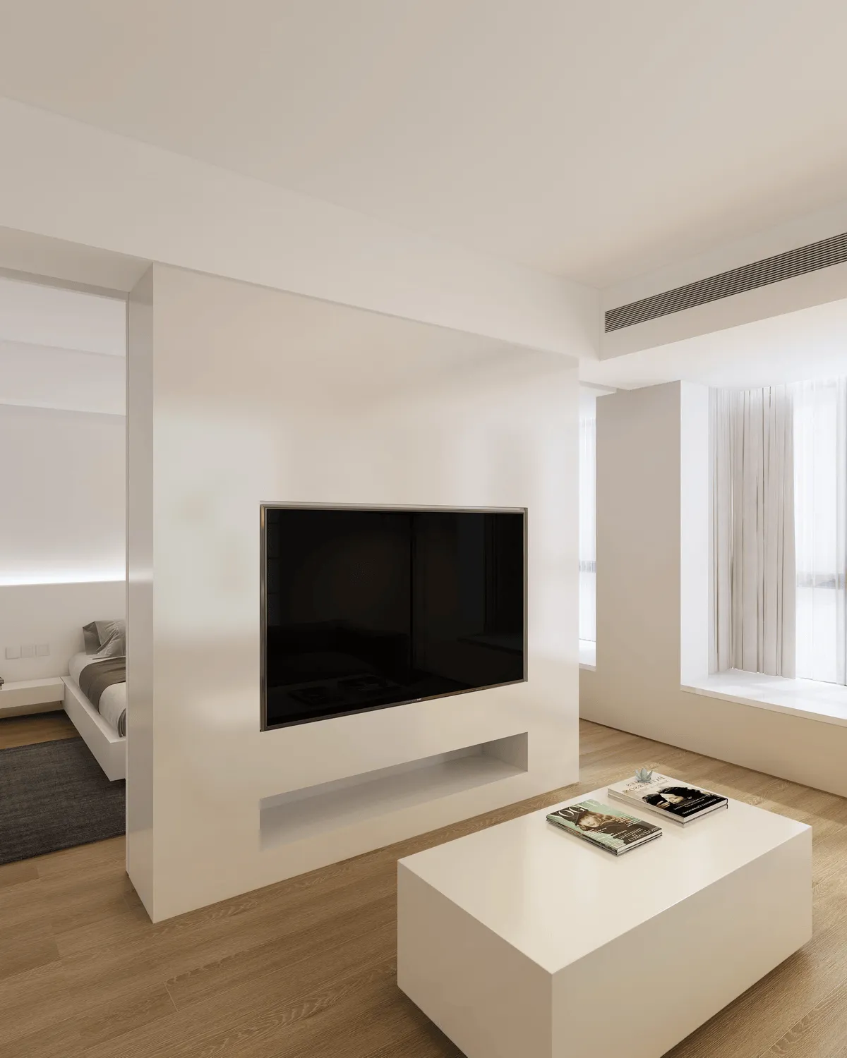
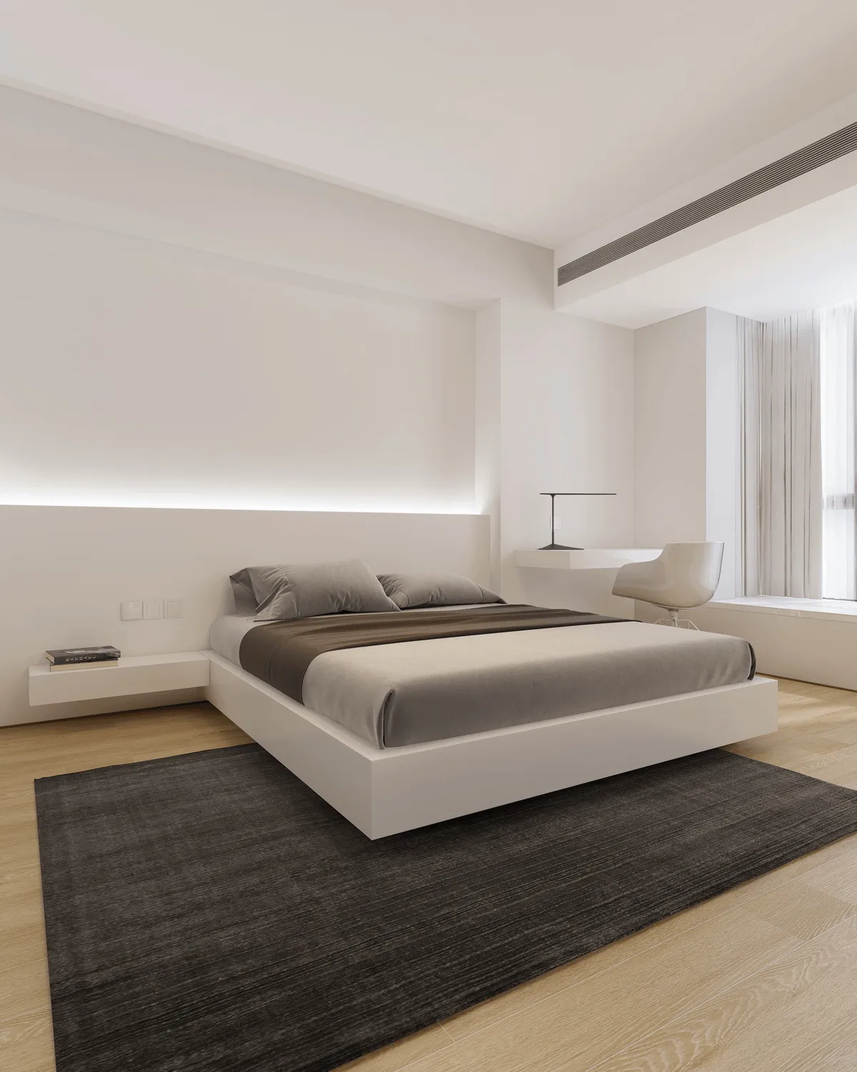
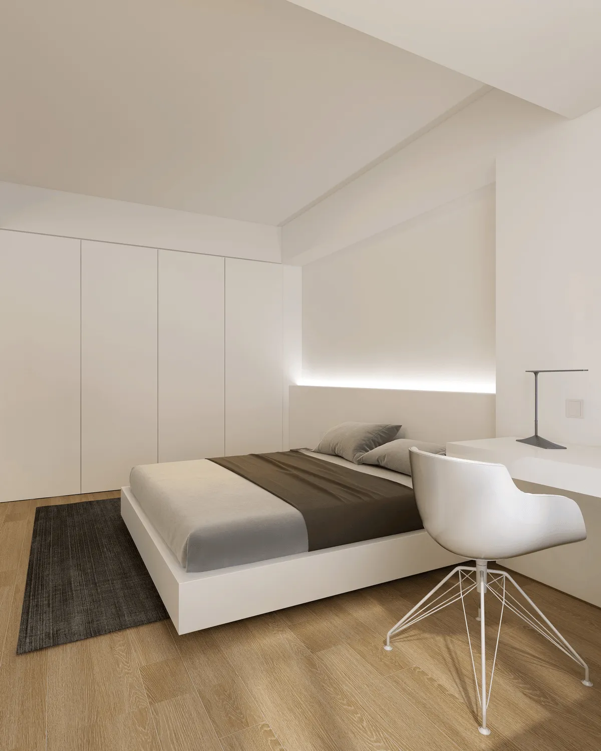
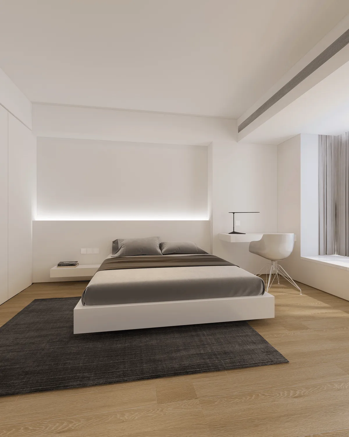
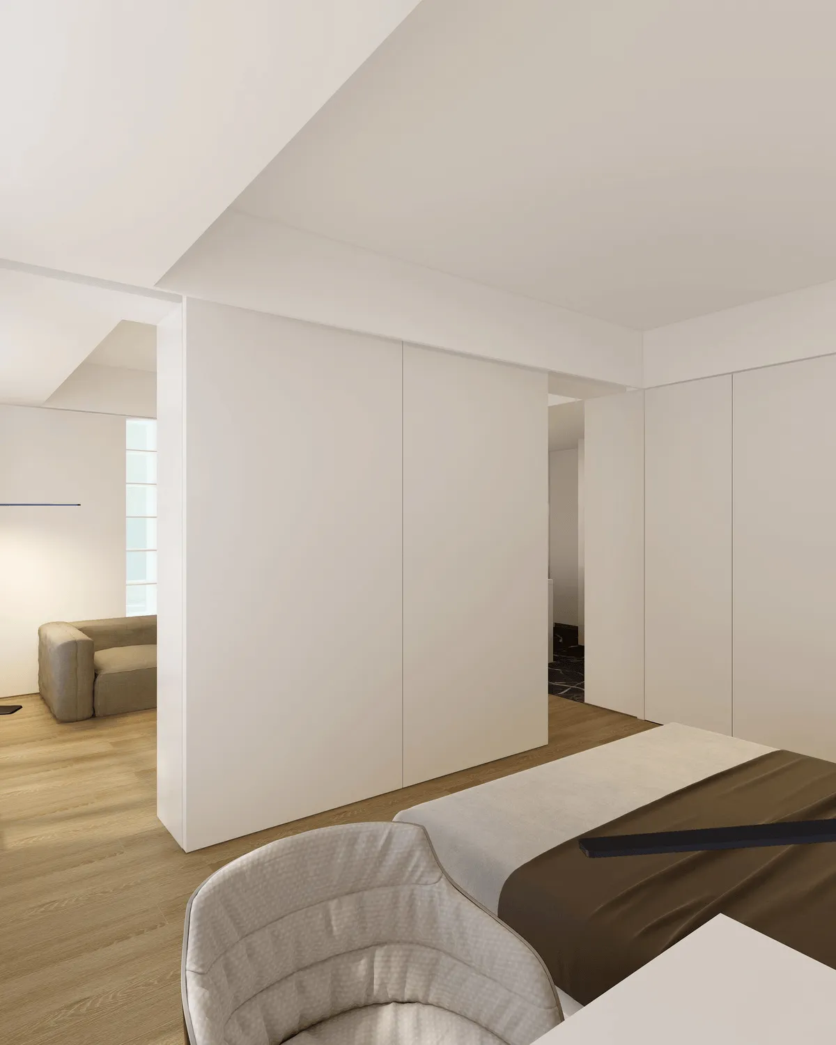
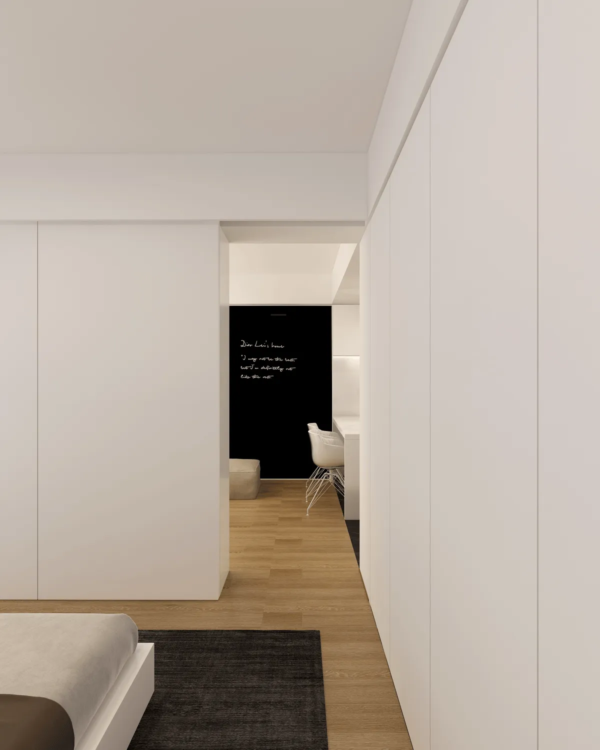
After the renovation, we added an entrance hall based on the original structure, separating the kitchen and bathroom, solving the previous ambiguous boundaries between dirty and clean areas. The fashionable backlit bookshelf in the living room met the client’s needs for a bookshelf. The large area of light color made the space more bright. The owner said that friends come over occasionally and might stay overnight, so there needs to be a simple retractable guest bed. The black wall-mounted bed can solve the owner’s need for storage and does not take up floor space. To further utilize the space, the wall panel is designed as a magnetic blackboard wall, allowing for graffiti and photo posting. When friends visit, it can be lowered to form an enclosed corner sofa with the sofa. The air conditioning air outlet equipment is designed on the kitchen ceiling, maximizing the living room ceiling height. The bedroom has a double sliding door design, which can not only ensure the privacy of the bedroom while sleeping, but also open the bedroom to make the space more open. The double sliding door not only serves as the bedroom door, but also serves as the sliding door of the storage shelf behind the TV wall. The original plan for the sliding door track was a hidden design, but due to the beam above, we insisted on humanization first. The coffee table is designed with two large drawers to further increase storage. The kitchen uses half of the shoe cabinet to make a cabinet, increasing storage while blocking the bathroom door. The bathroom door is designed as a hidden door, further weakening the conflict between the kitchen and bathroom. The bar design solves the problem of dining and also adds more life scenarios to the space. The bedroom has a floating bed design, increasing the transparency and agility of the space. By moving the bedroom door, the original problem of the wardrobe not being able to be made larger is solved. The top of the wardrobe is difficult for people to reach, so it is made into an air outlet, not wasting a single bit of space.
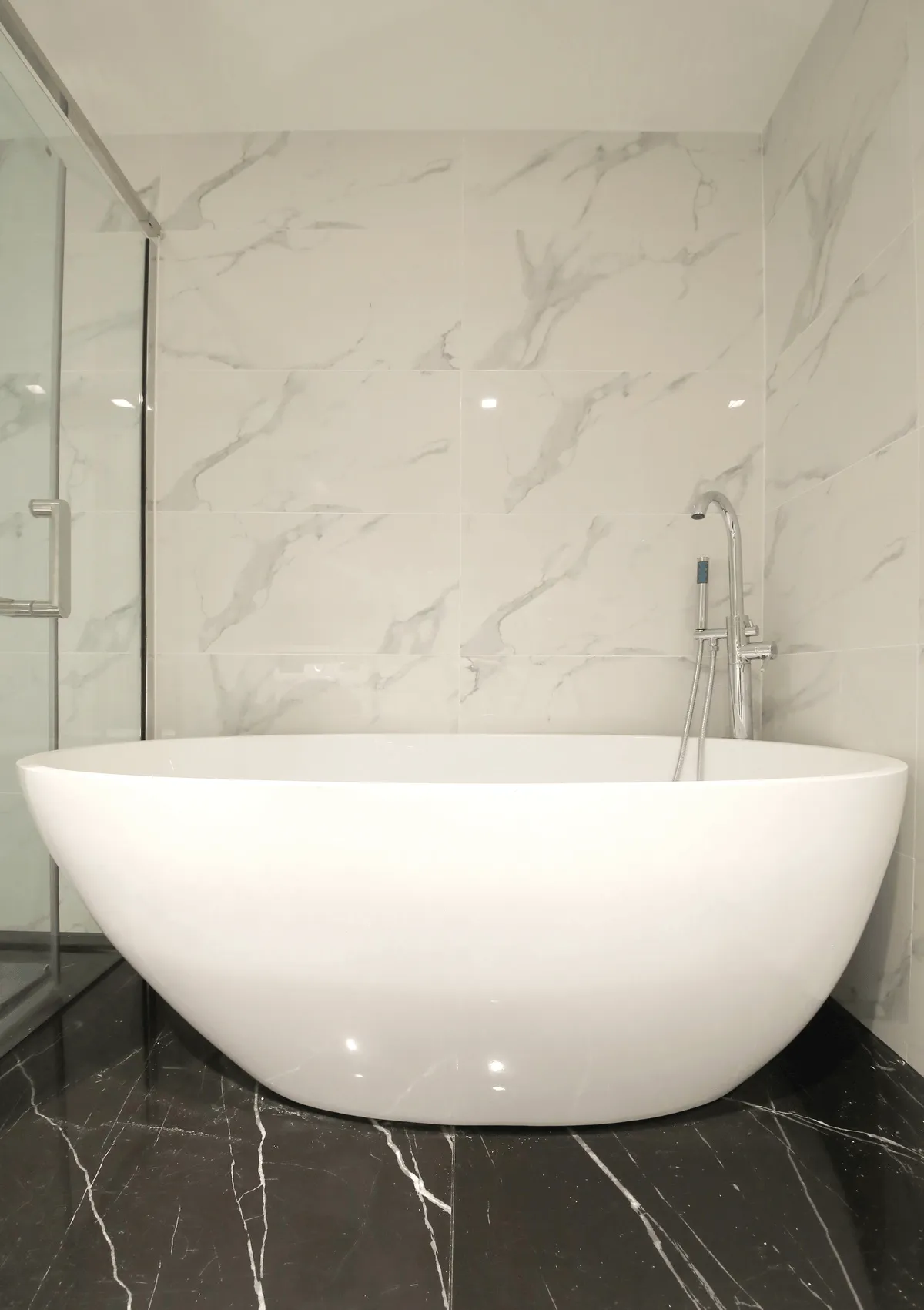
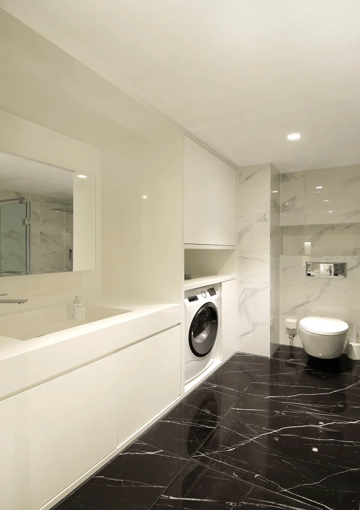
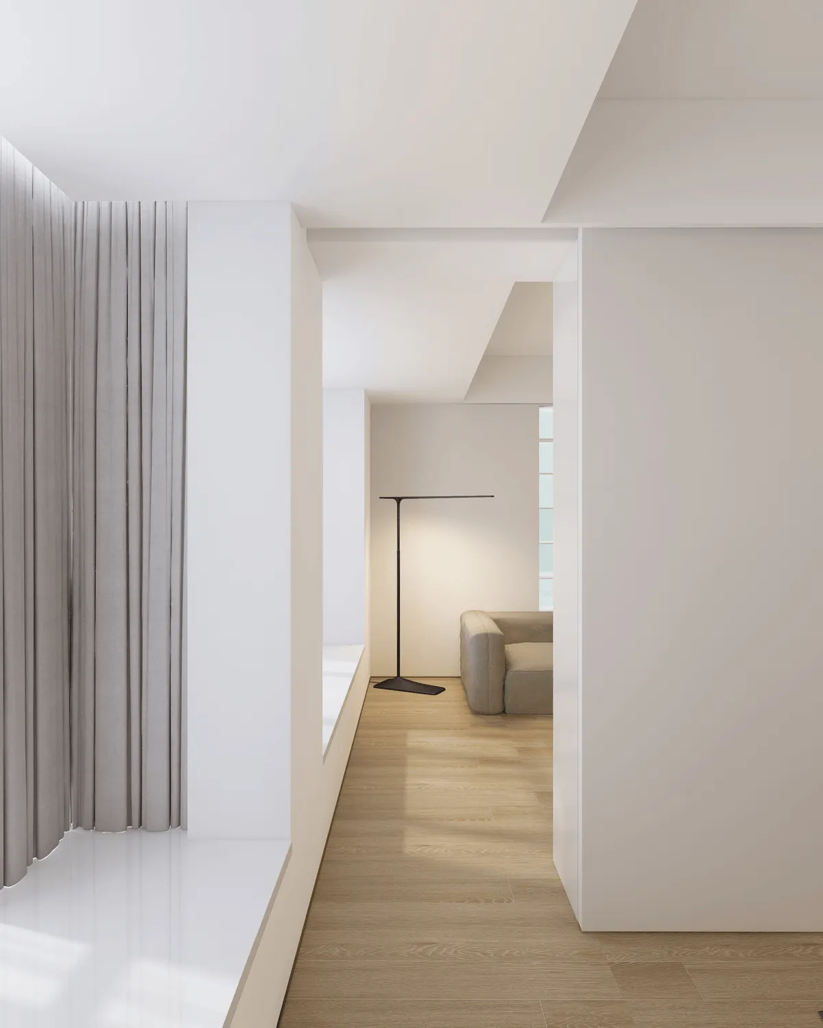
The bedroom and living room share space, providing a spacious view. The traffic flow forms a loop, flexible and smooth, and the space is full of interest. Between the living room bookshelf and the floor lamp is a structural column. The gap between the column and the outer wall is also made into a storage cabinet. The top of the bookshelf, the top of the wall-mounted bed, places that are difficult for people to reach, are used for central air conditioning pipe lines, still not wasting a single bit of space. The bathtub is one of the owner’s important needs. How could we not satisfy it? The owner said that the space could be without a shower if it was really limited, but how could we bear to? Even if you don’t shower, in the dry Beijing, it can be used as a drying room. In the original structure, the toilet was dominant, although the difficulty of moving it was extremely high, we will still find ways to solve it no matter how difficult it is. The artificial stone and waterproof door panel-made bathroom storage cabinet, no matter how many bottles and cans, you don’t have to worry about not having a place to put them. The original structure’s door-pressing water heater has been hidden in the hanging cabinet, no need to worry about seeing ugly pipes. In order to be able to inspect the lights behind the translucent panel of the bookshelf, the translucent panel is not a single piece, but each piece is individually customized and can be removed individually. No matter how difficult the process is, we can’t compromise. Every renovation work can only show a glimpse of the whole picture. There are many design and construction problems and thoughts that are difficult to express.
Project Information:
Project Name: Diao Lei’s HOME
Project Location: Chaoyang District, Beijing
Indoor Area: 46m²
Design Unit: Wu Ming Creative Alliance
Lead Designer: Cai Hu
Participating Designers: Wang Jun, Peng Ke, Wang Shirun
Construction Unit: Taiyuan Dingfeng Home


