Lawrys The Prime Rib Shanghai embraces modern design to enhance the classic American dining experience.
Contents
Project Background and Concept
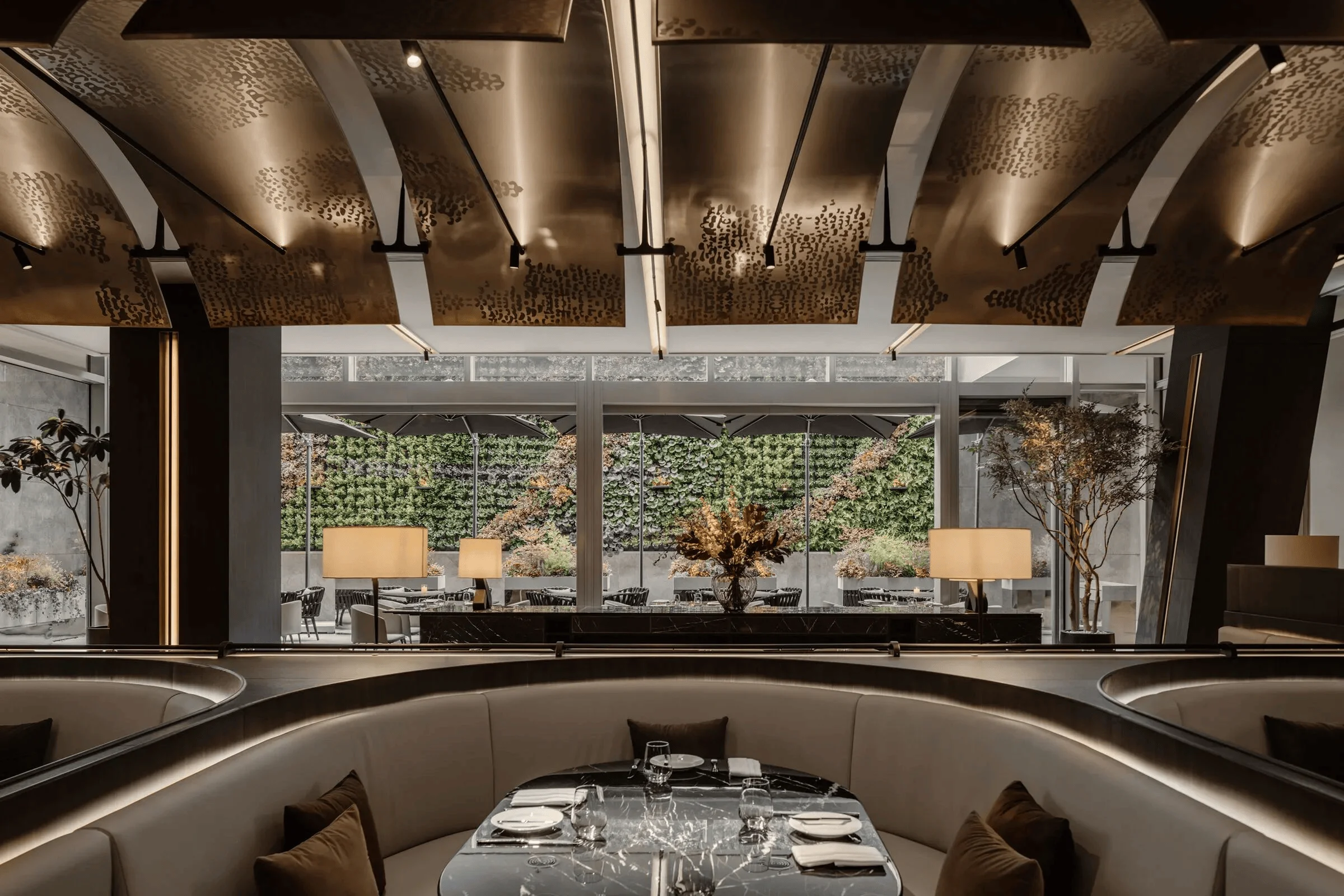
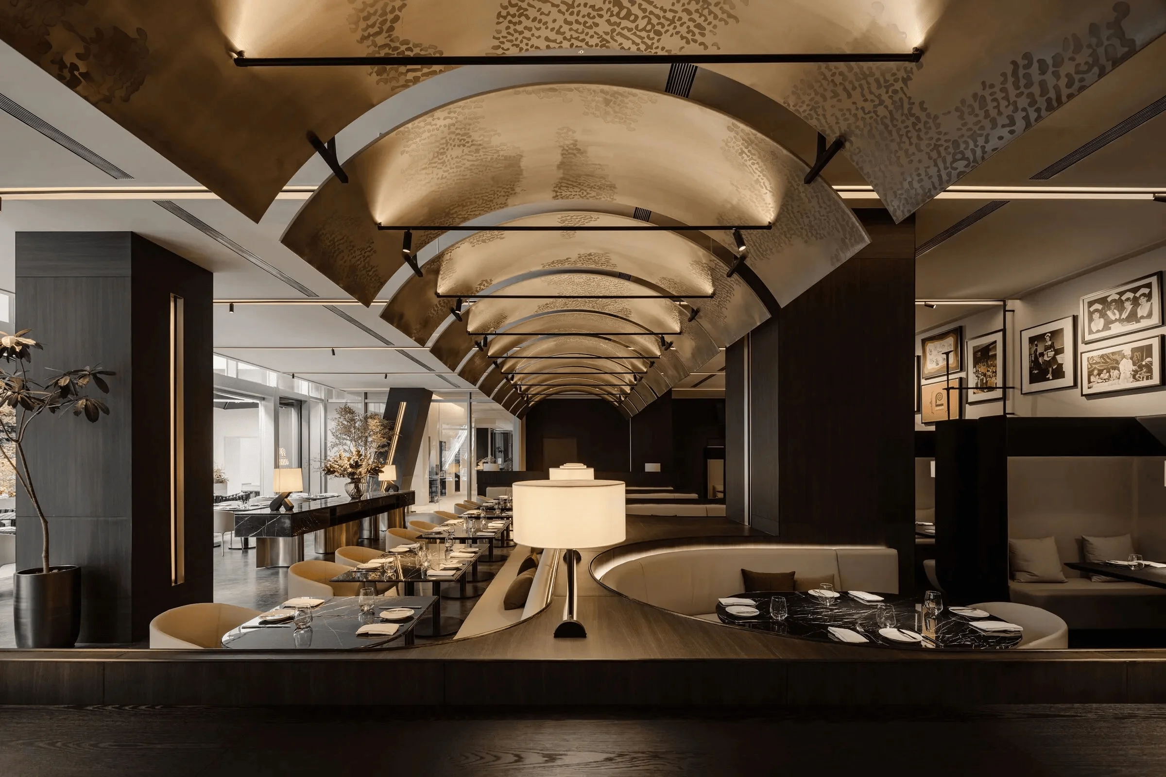
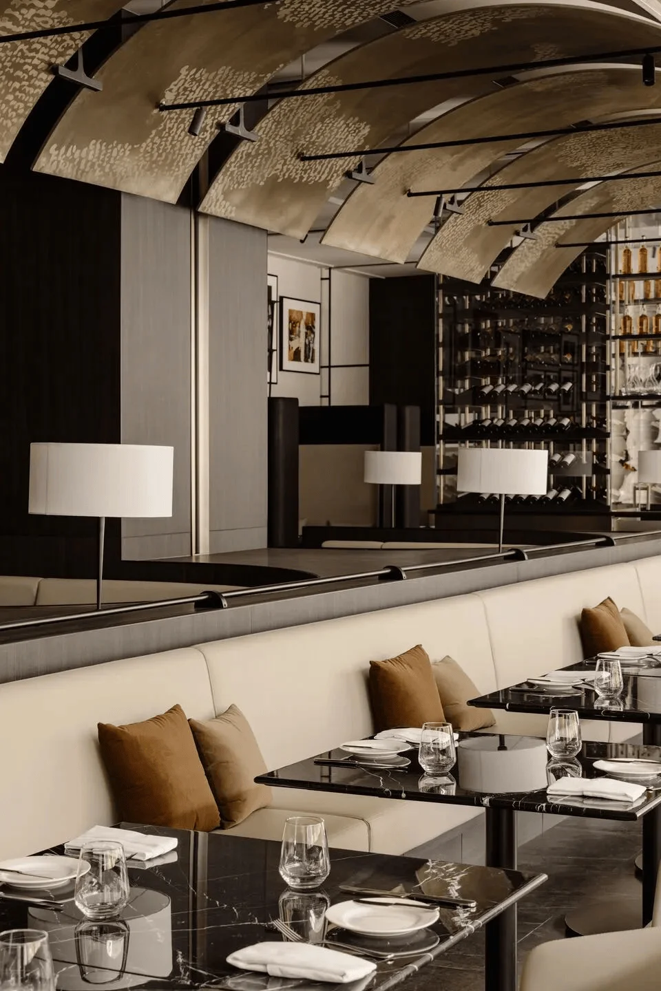
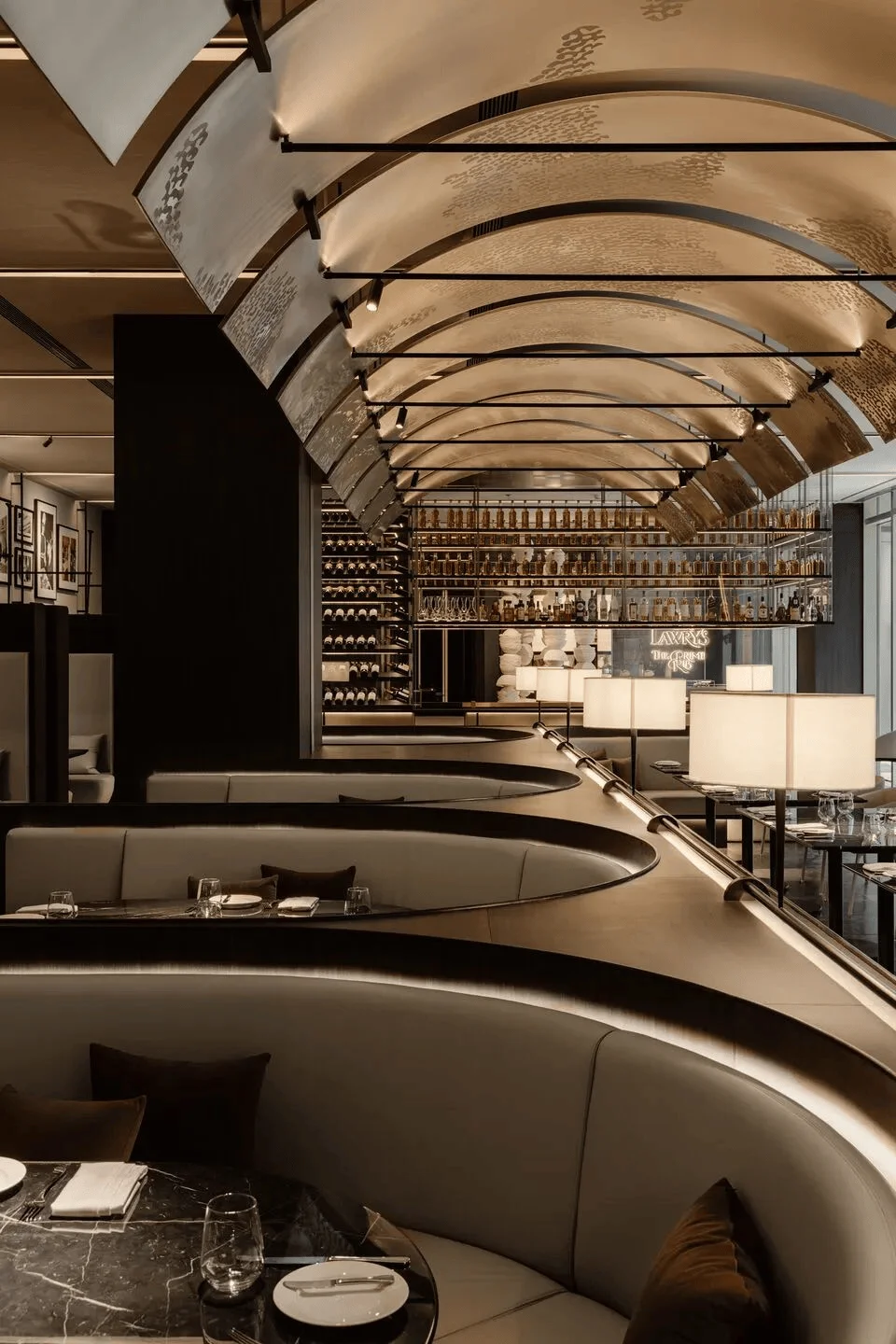
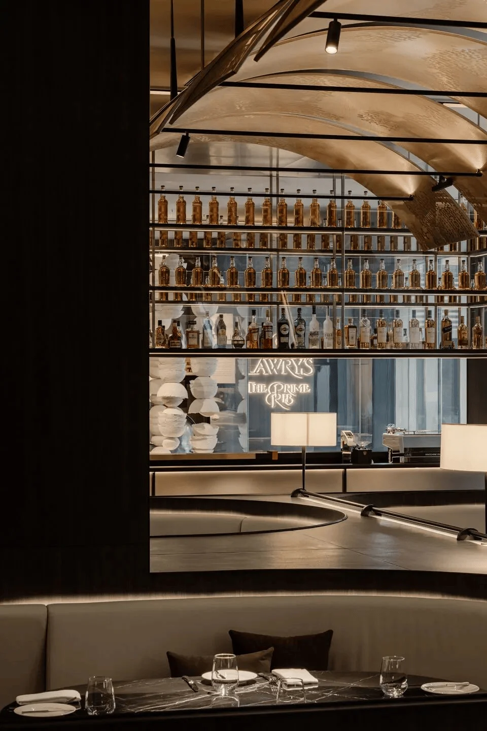
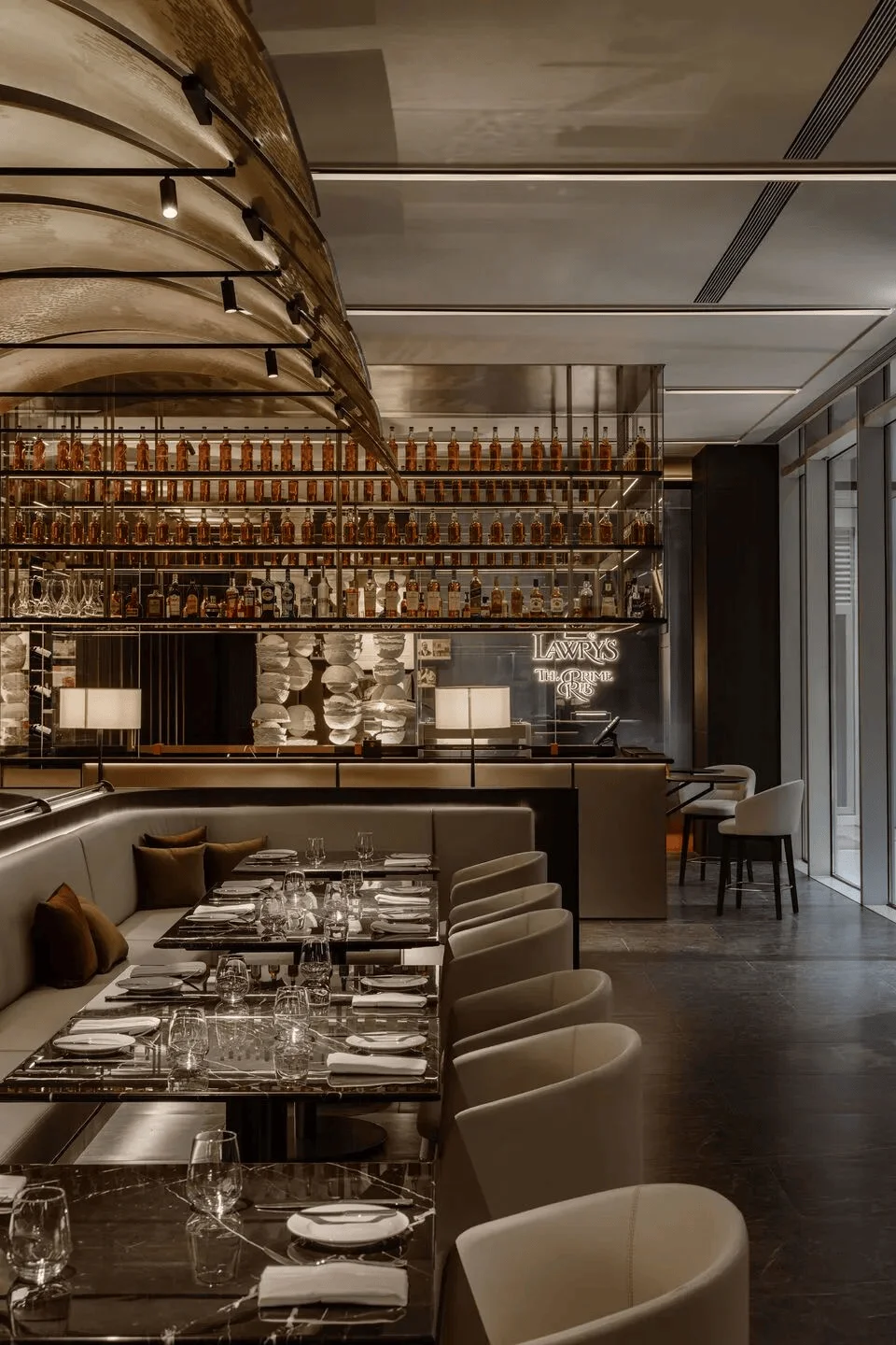
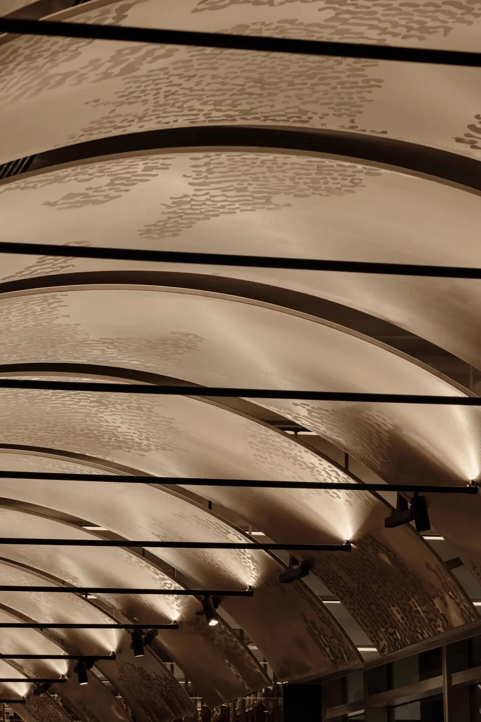
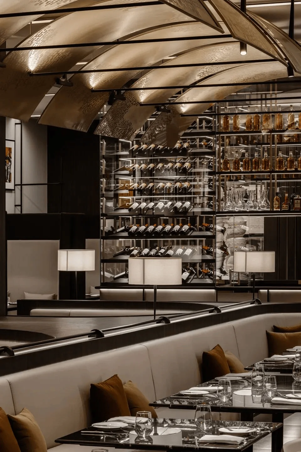
RooMoo Design Studio has recently completed the interior design of Lawrys The Prime Rib Shanghai, a restaurant that aimed to marry its classic upscale American ambiance with modern design elements to resonate with Shanghai’s discerning clientele. The design’s core concept revolves around the restaurant’s famed roasted prime ribs, visualized through a series of champagne brass curved metal arches that form a tunnel-like structure, showcasing the signature silver cart’s movement. This innovative approach creates a captivating and immersive dining atmosphere. Shanghai restaurant interior design that incorporates modern aesthetics into the traditional American culinary experience is increasingly popular. The design successfully caters to the demands of the target audience and effectively reflects the brand’s identity.
Highlighting History and Heritage
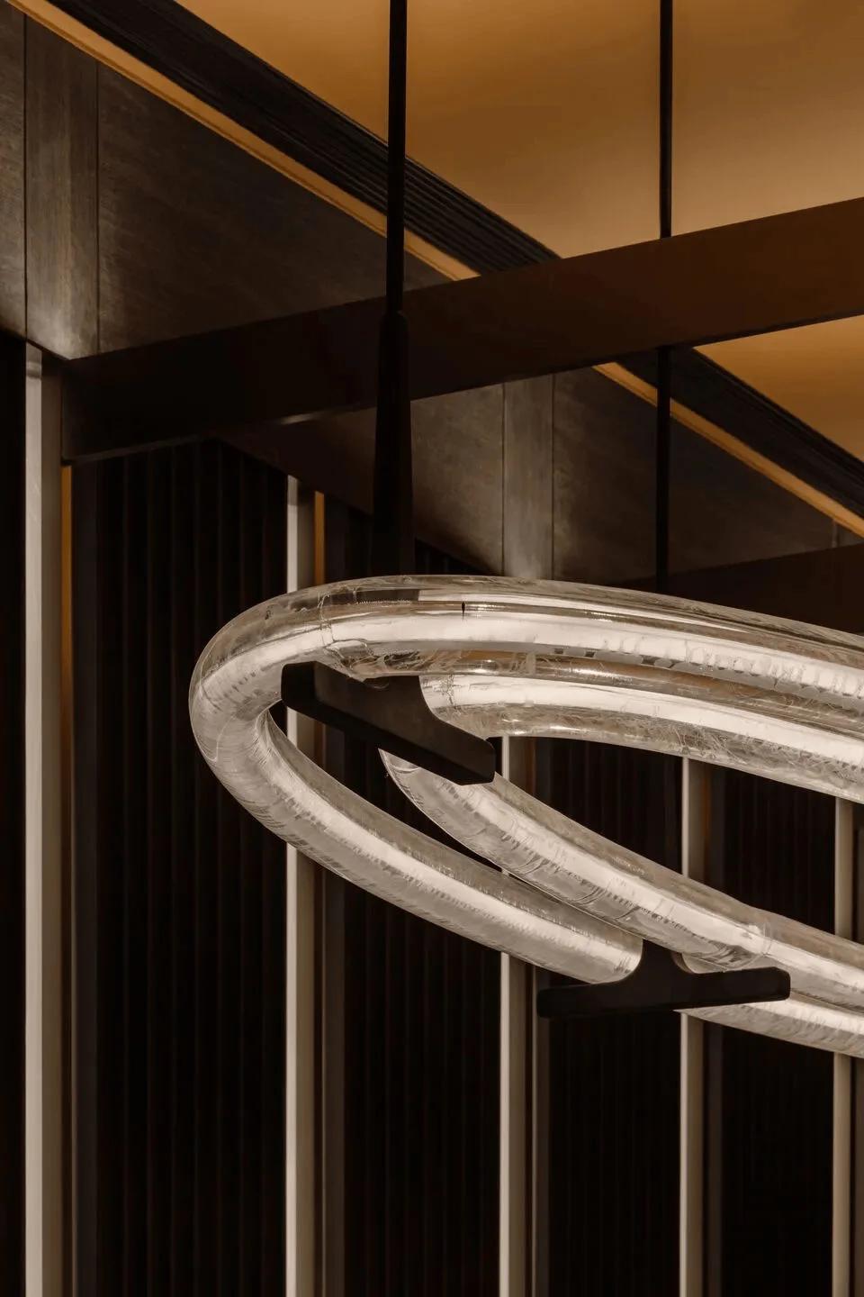
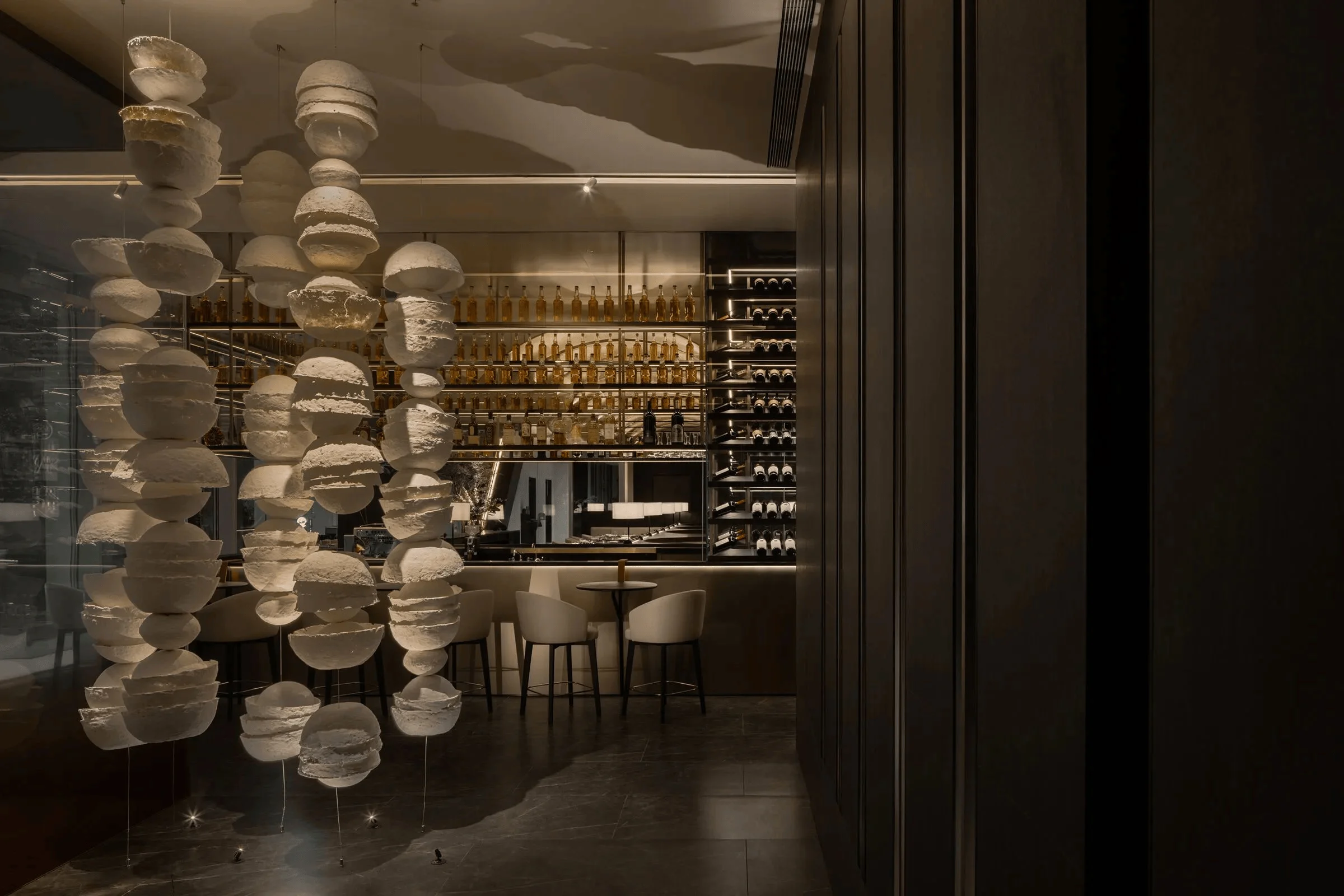
To accentuate Lawrys’ 80-year history, the design seamlessly integrates elements that symbolize the passage of time. Pickaxe-inspired decorations, including suspended lighting and the central room structures, are incorporated to infuse the ambiance with a sense of craftsmanship and heritage. This detail not only adds a touch of historical context but also elevates the overall design with unique elements, solidifying the brand’s longstanding presence in the culinary world. The design effectively creates a narrative of the restaurant’s history and seamlessly integrates elements that enhance the visitor’s dining experience. Incorporating historical elements into interior design is a trend that’s gaining traction, particularly in the hospitality sector.
Creating a Seamless Indoor-Outdoor Flow
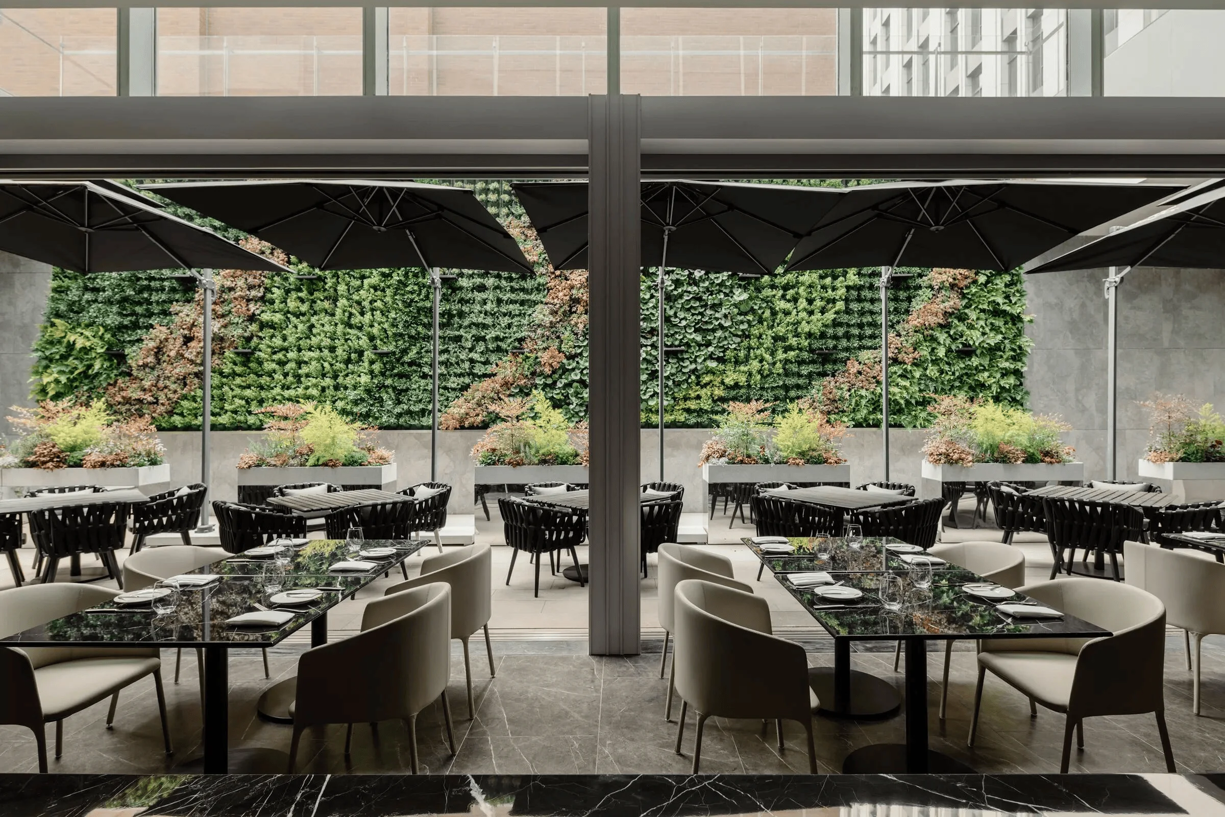
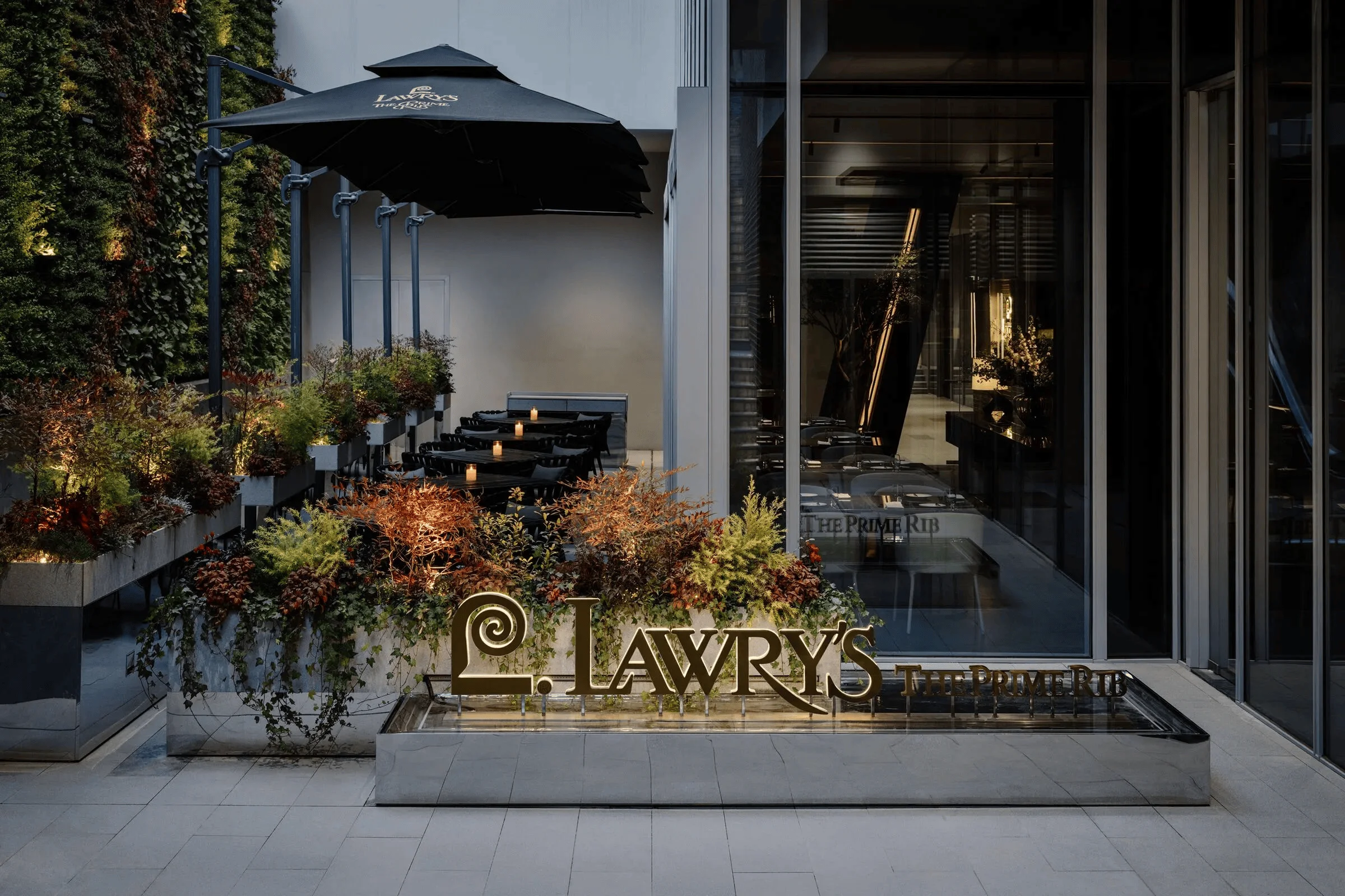
Despite being situated in a basement, the Lawrys Shanghai restaurant enjoys the benefits of an outdoor atmosphere. The open-plan space upstairs allows for natural sunlight to illuminate the interior, creating a vibrant and welcoming environment. The small terrace in front of the restaurant is adorned with a green wall, enhancing the outdoor dining experience and creating a stunning visual backdrop. This carefully considered design element brings nature into the dining space, enhancing the overall experience. Furthermore, every seat within the restaurant is designed to offer a view of the beautiful greenery, promoting a sense of tranquility and connection with the natural world. Integrating elements of biophilic design into interior spaces is increasingly becoming a trend, with designers emphasizing the importance of natural light and vegetation in enhancing the ambiance of a space.
Flexible Seating and VIP Areas
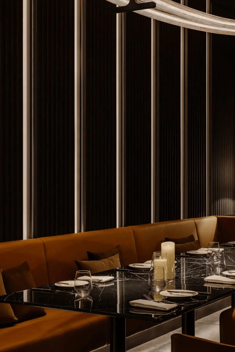
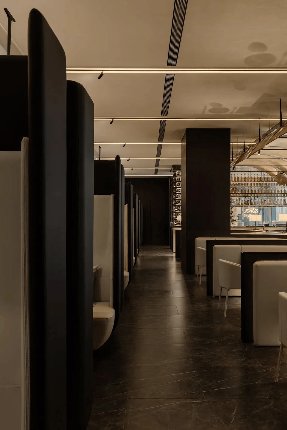
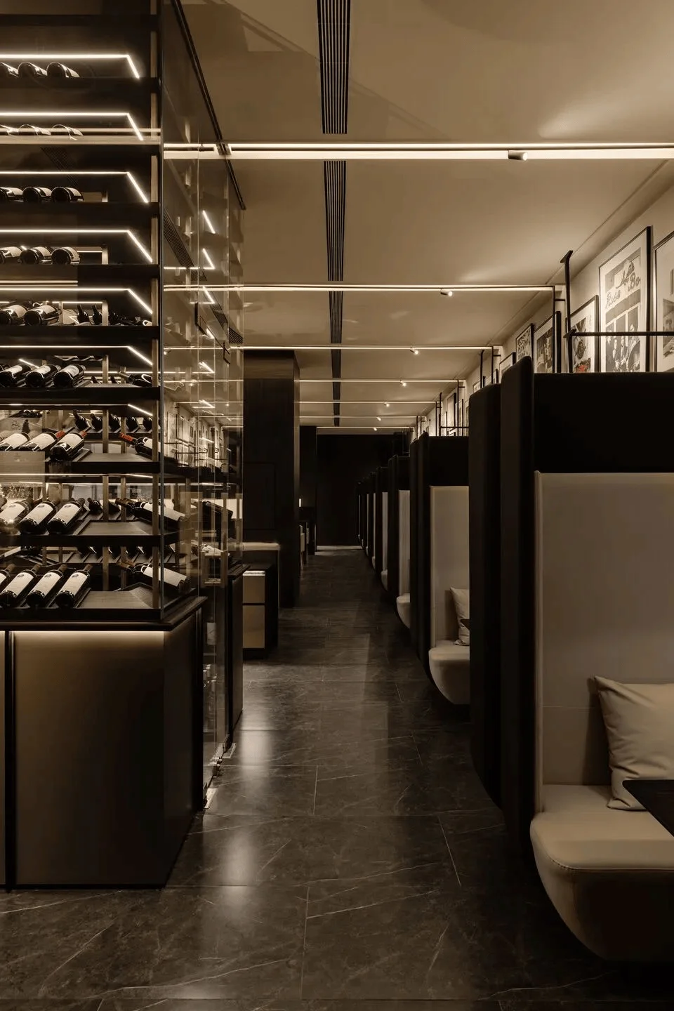
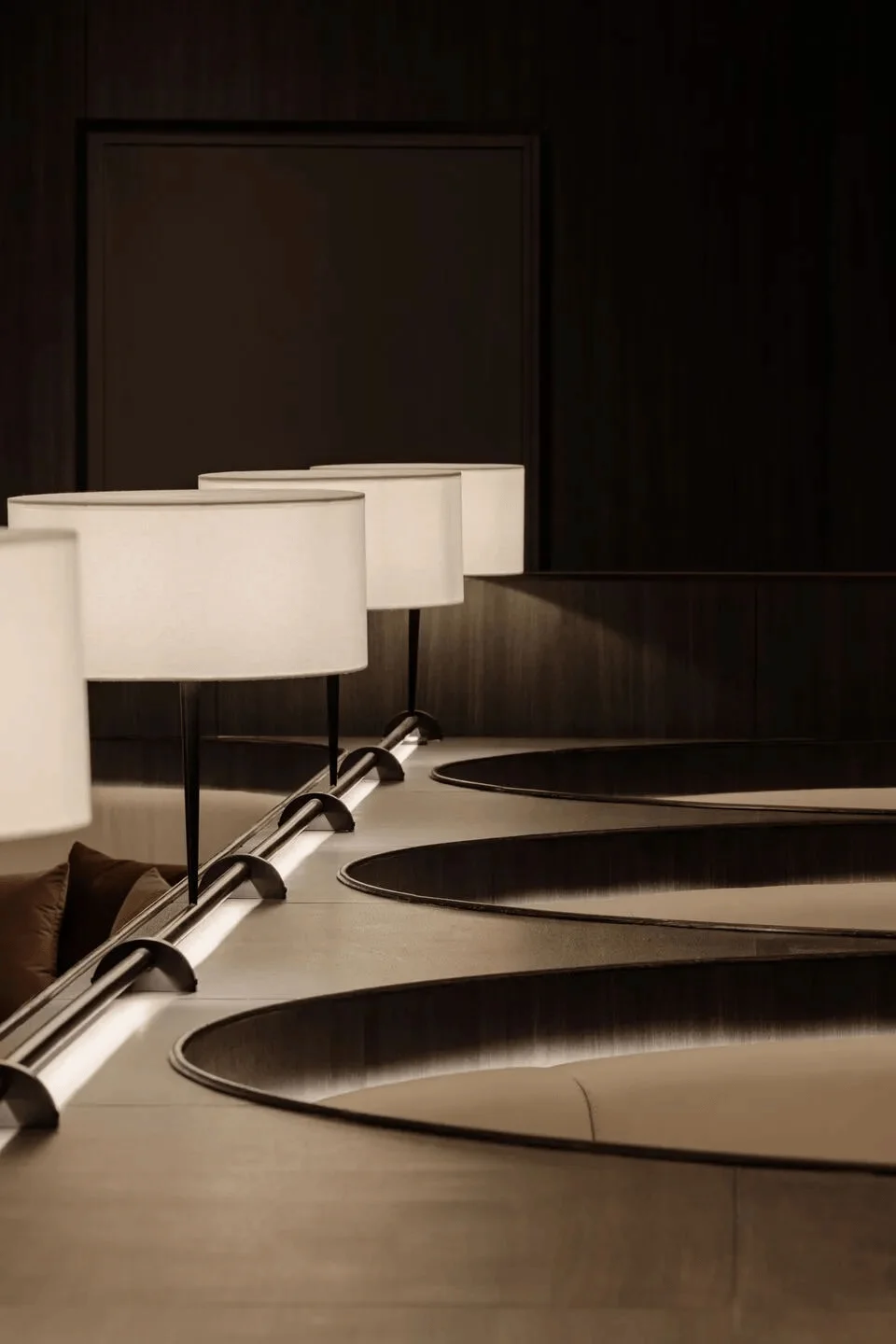
The seating arrangements within the restaurant are a combination of flexibility and comfort, catering to a diverse clientele. There are flexible arrangements near the facade, fixed U-shaped sofa banquets in the middle of the room, and specially customized high-backed booth seats. These arrangements aim to foster a sense of intimacy and maximize the layout, allowing for diverse social dynamics. This design choice also reflects the need for a variety of seating arrangements that cater to different dining experiences. The restaurant’s interior design elements create a diverse and welcoming space for a variety of diners. The use of bespoke furniture and attention to detail in the seating arrangement are also key features of this design approach. Creating a variety of seating configurations within a restaurant is becoming increasingly important in today’s design landscape.
Entrance and Bar Area
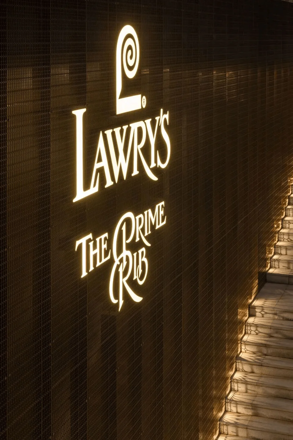
Upon arrival, customers are greeted with a grand entrance featuring a tall wall adorned with custom-made champagne-colored metal mesh, bearing the Lawrys logo. Upon descending to the basement level, a small water feature embellished with greenery and the restaurant’s logo greets guests, providing a welcoming first impression. A red gradient glass box serves as a transition point between the entrance and the main dining area, subtly separating and highlighting the space. The design of this area incorporates a visual journey, subtly guiding guests into the dining experience. The incorporation of water features into interior spaces is a popular trend, adding a sense of tranquility and sophistication to the ambiance. Also opposite the reception area, guests are treated to artwork created by RooMoo Design Studio, a tribute to Lawrys’ 80 years of culinary excellence. This artistic touch enhances the dining experience and provides a cultural context to the restaurant’s legacy.
Bar and Wine Cellar Integration
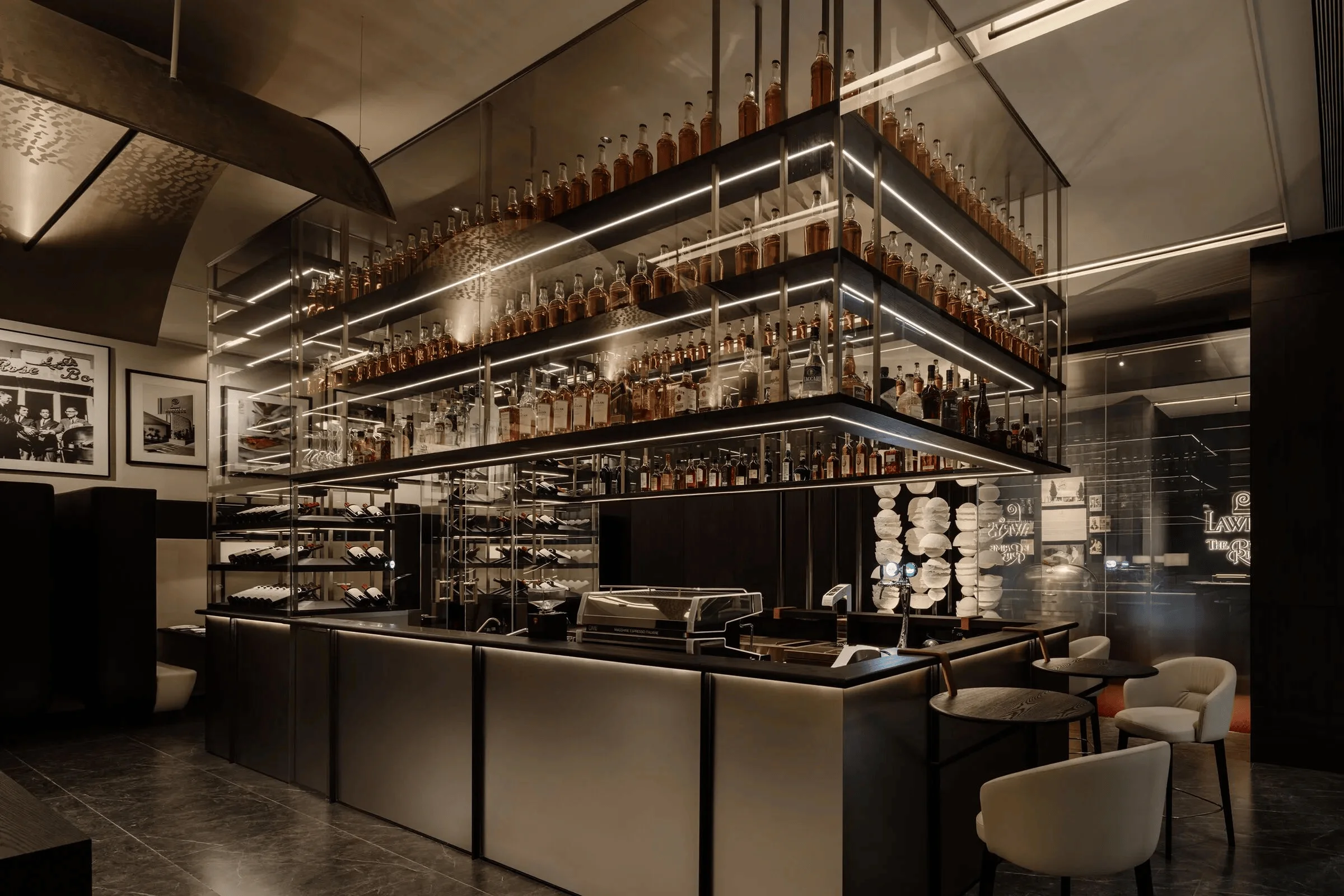
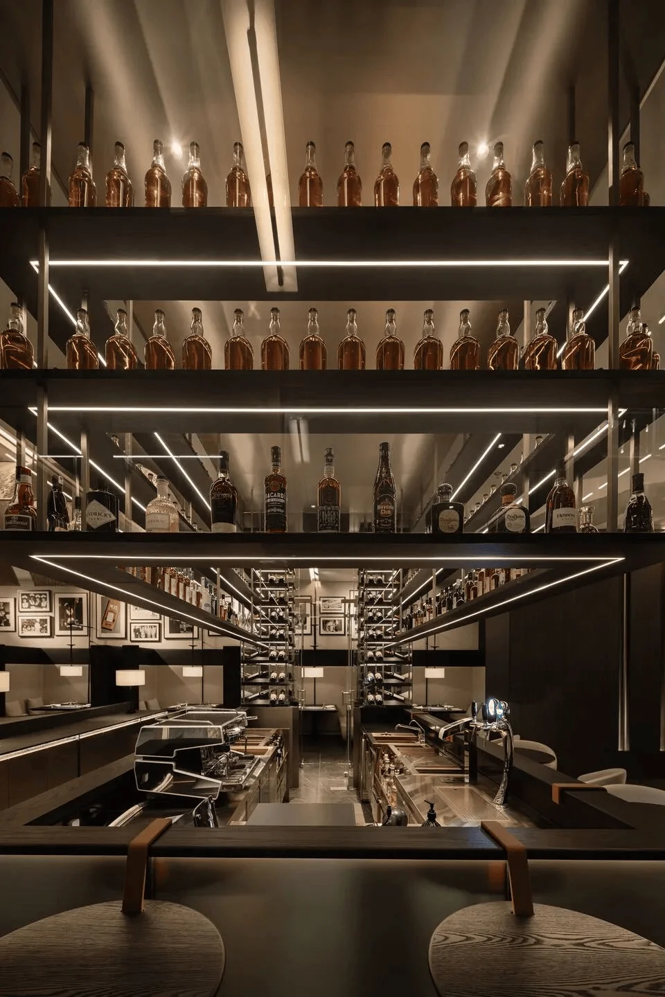
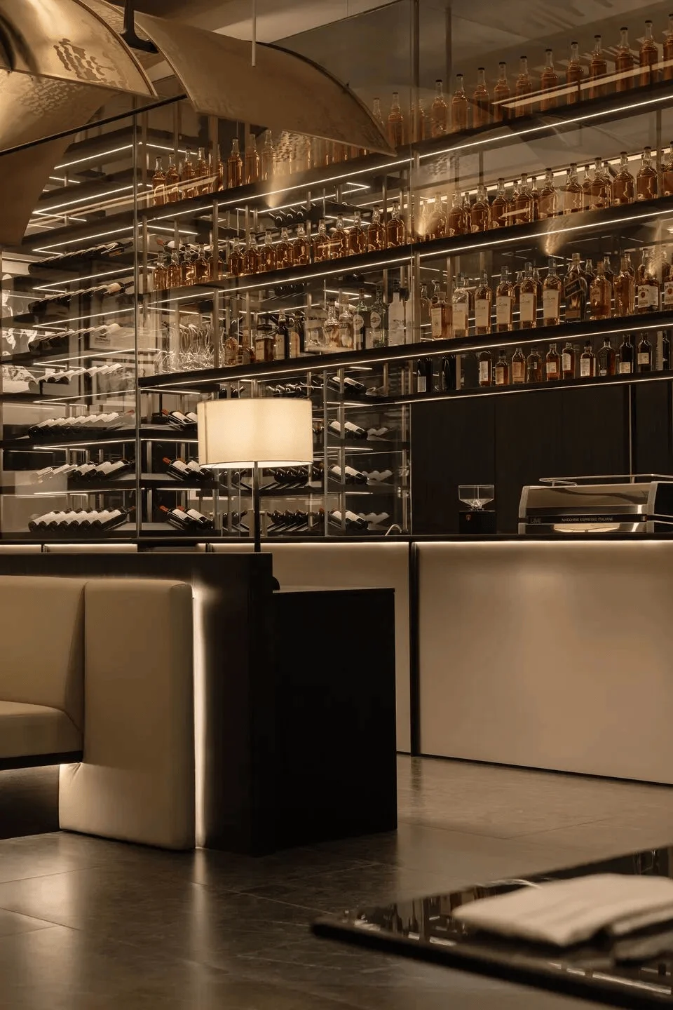
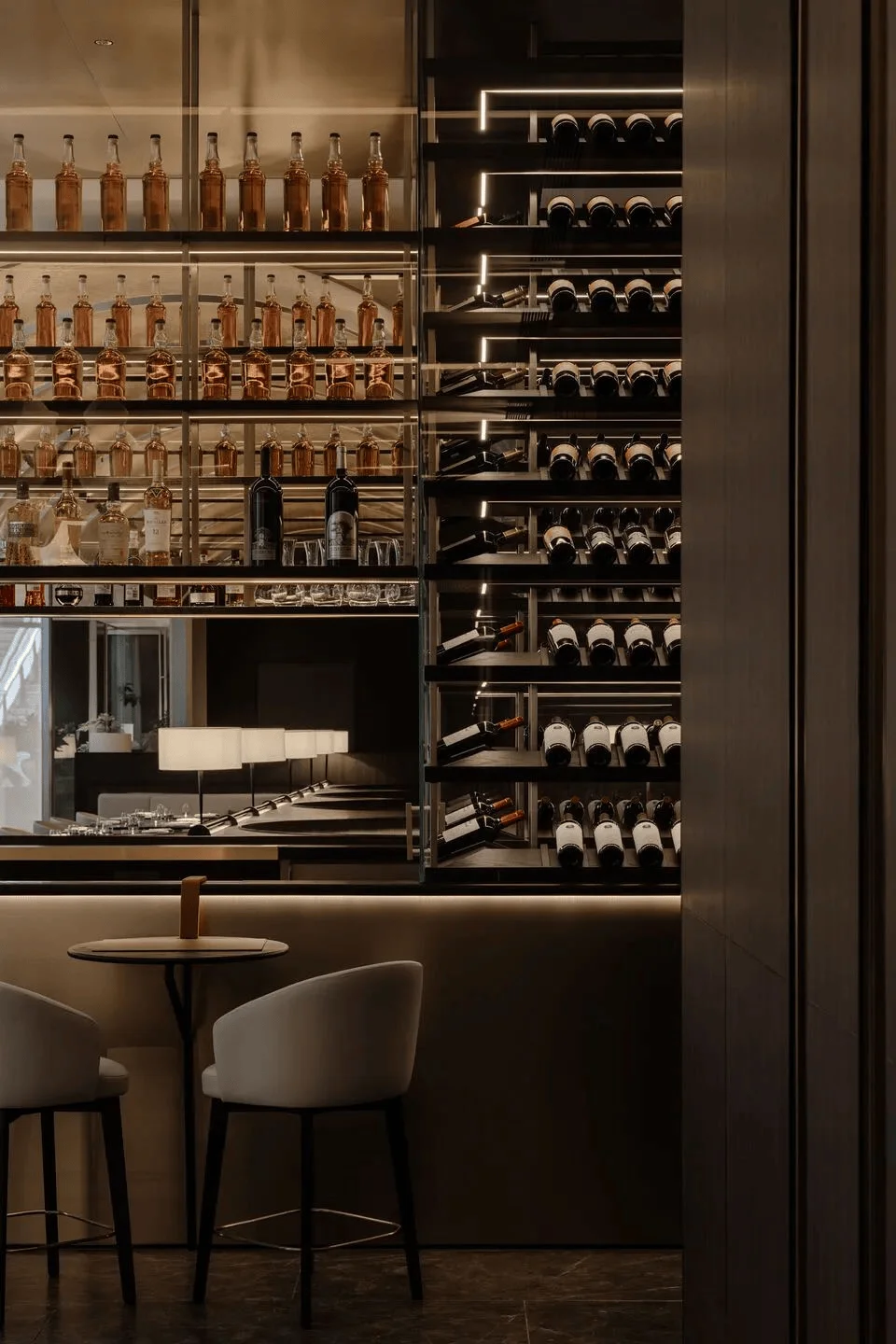
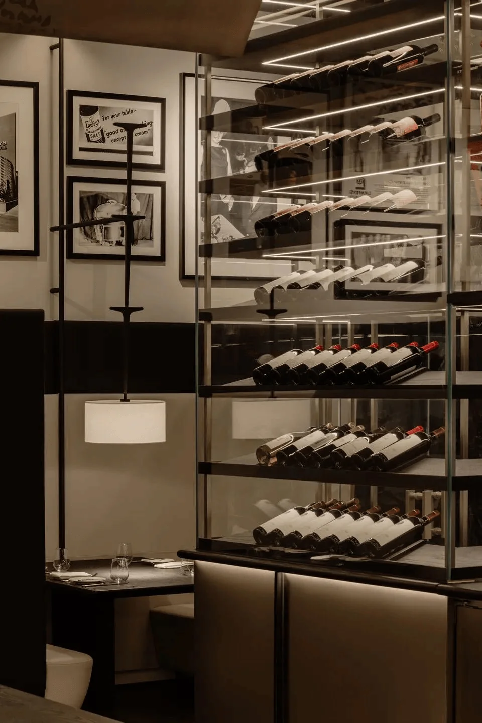
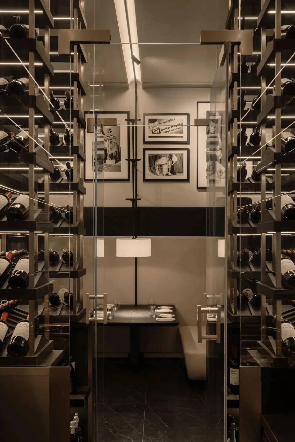
A simple glass partition seamlessly connects the bar area with the wine cellar, welcoming guests to the restaurant and serving as a transition point between the reception and dining areas. This open concept allows for visual connectivity and enhances the sense of space. The dedicated tables around the bar offer a unique, more engaging experience for patrons to enjoy drinks and socialize, fostering a lively atmosphere. The integration of bar and wine cellar into the main dining area reflects a growing trend in contemporary restaurant design. Providing dedicated areas within a restaurant for casual dining and social interaction is a key consideration for designers, improving the overall user experience.
Private Dining Experience
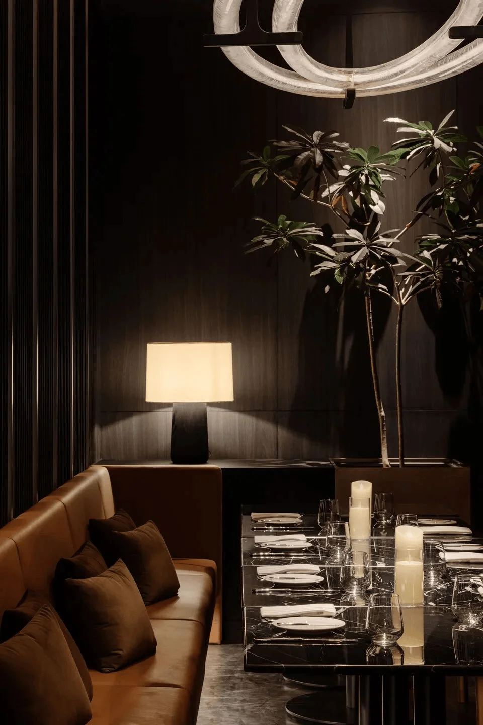
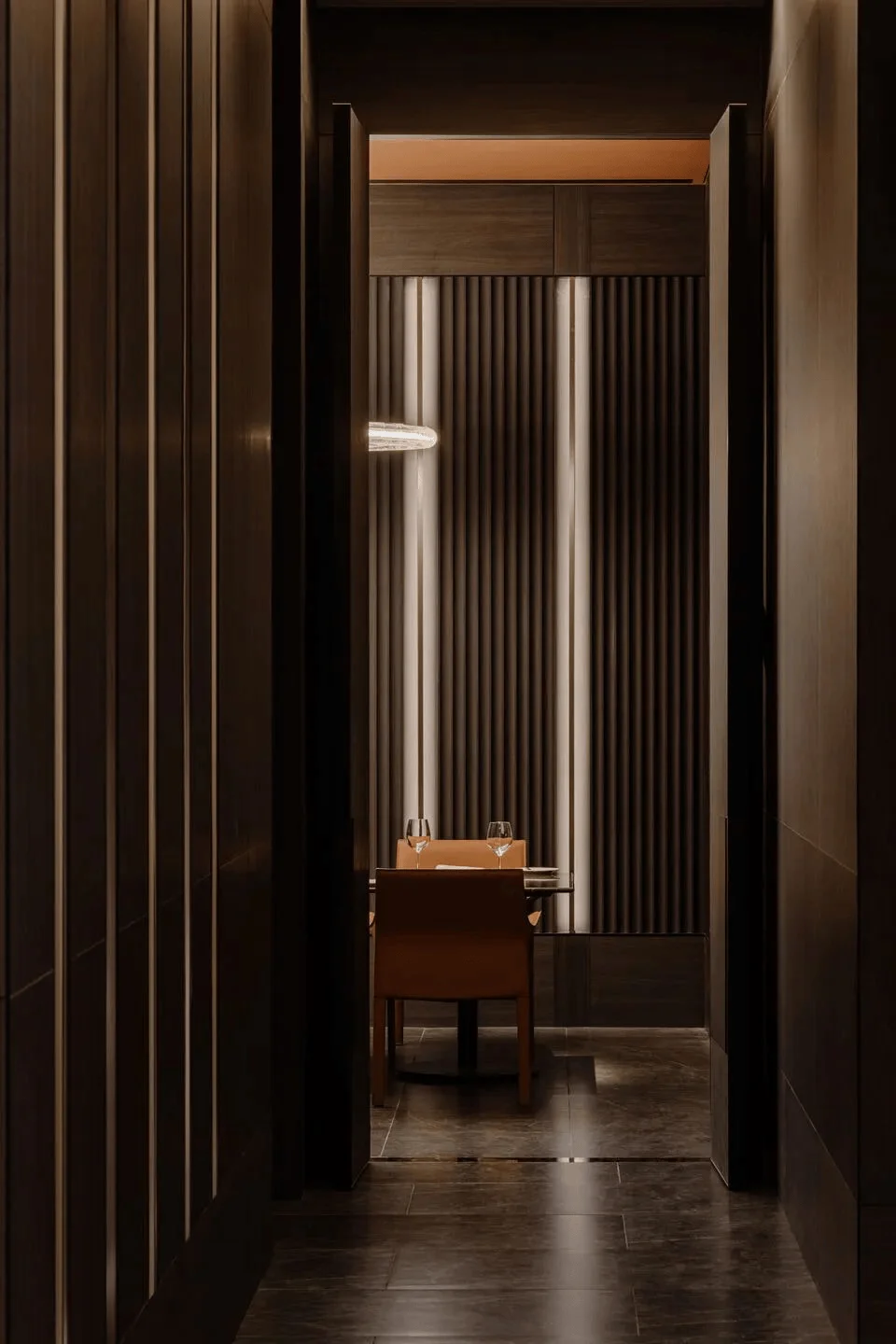
The three VIP rooms feature rectangular arches and metal beams that hang from the ceiling, extending onto the walls to create a unique pattern and decor. LED strip lights embedded within the beams create elegant lighting that enhances the ambiance of the ceiling and walls. This use of lighting to create a sense of depth and visual interest is a key aspect of the design. The design and layout of VIP rooms within a restaurant are becoming increasingly important, with patrons increasingly valuing the privacy and exclusivity that they offer. The first and second VIP rooms are fitted with sliding door systems, offering the flexibility to divide the space as needed, catering to different group sizes and maintaining guest privacy. This flexibility ensures that the space can be customized to each guest’s specific needs and preferences, further enhancing the dining experience.
Luxury and Comfort in the Washroom
The washroom design incorporates luxurious red marble, complementing the rich color palette associated with the meat-focused menu. Paired with metal accents, the washroom provides a luxurious and comfortable experience, seamlessly aligning with the overall design aesthetics of the restaurant. The color and material selections for the washroom are critical for creating a harmonious and holistic experience for visitors. A well-designed washroom can significantly improve a customer’s perception of the quality and attention to detail in a restaurant. Integrating luxurious materials into washroom design is a growing trend, enhancing the overall experience for visitors. The washroom design is crucial as it complements the overall aesthetic of the space and communicates the brand’s identity.
Project Information:
Project Type: Restaurant
Architect: RooMoo Design Studio
Area: Indoor interior total area: 437.00㎡; outdoor interior total area: 272.00㎡
Year: 2023
Country: China
Main Materials: Champagne brass, Metal, Marble
Photographer: Wen Studio


