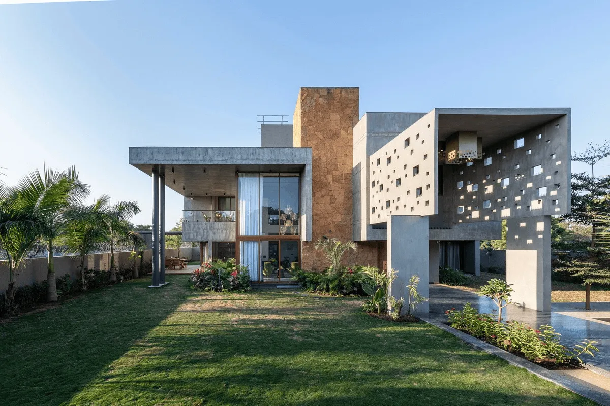
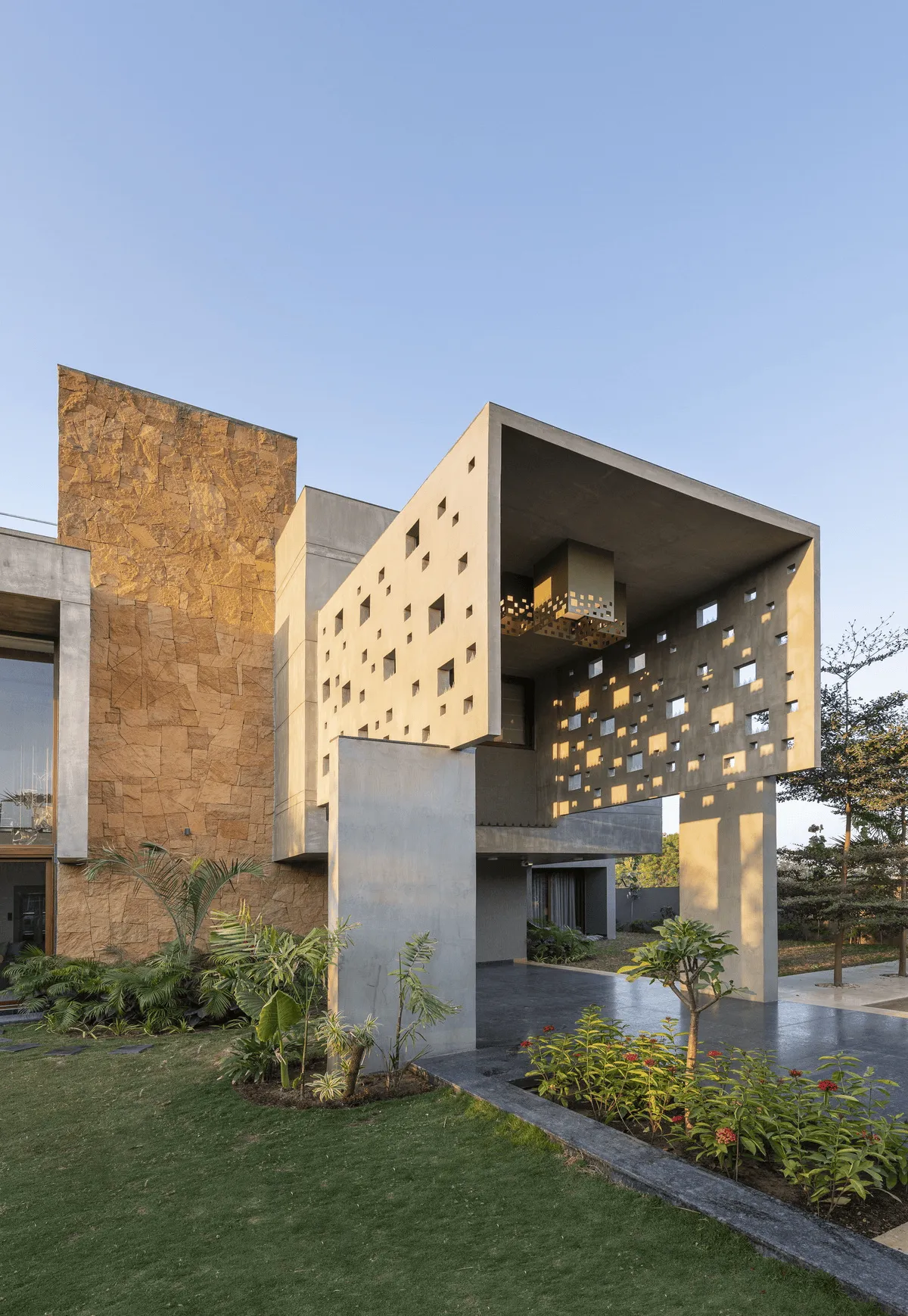
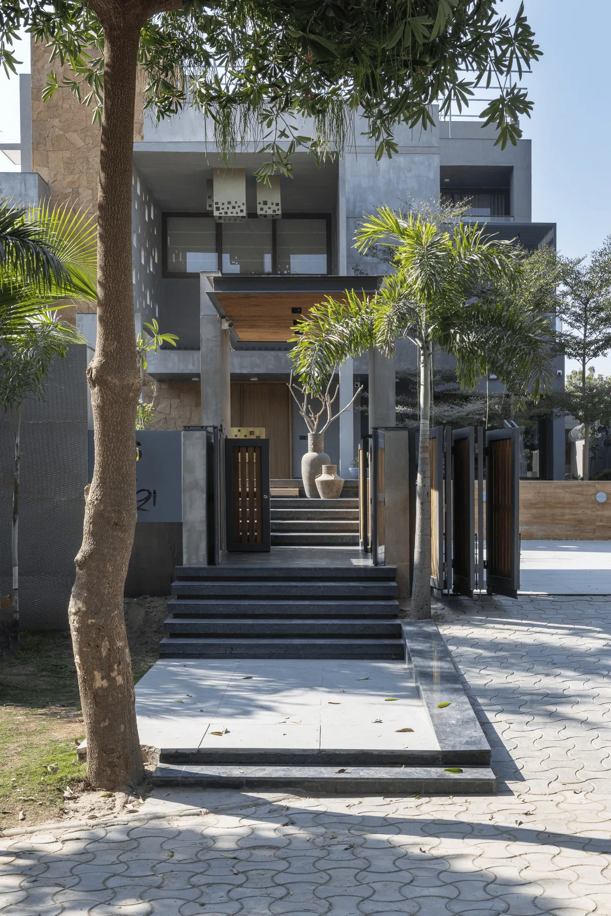
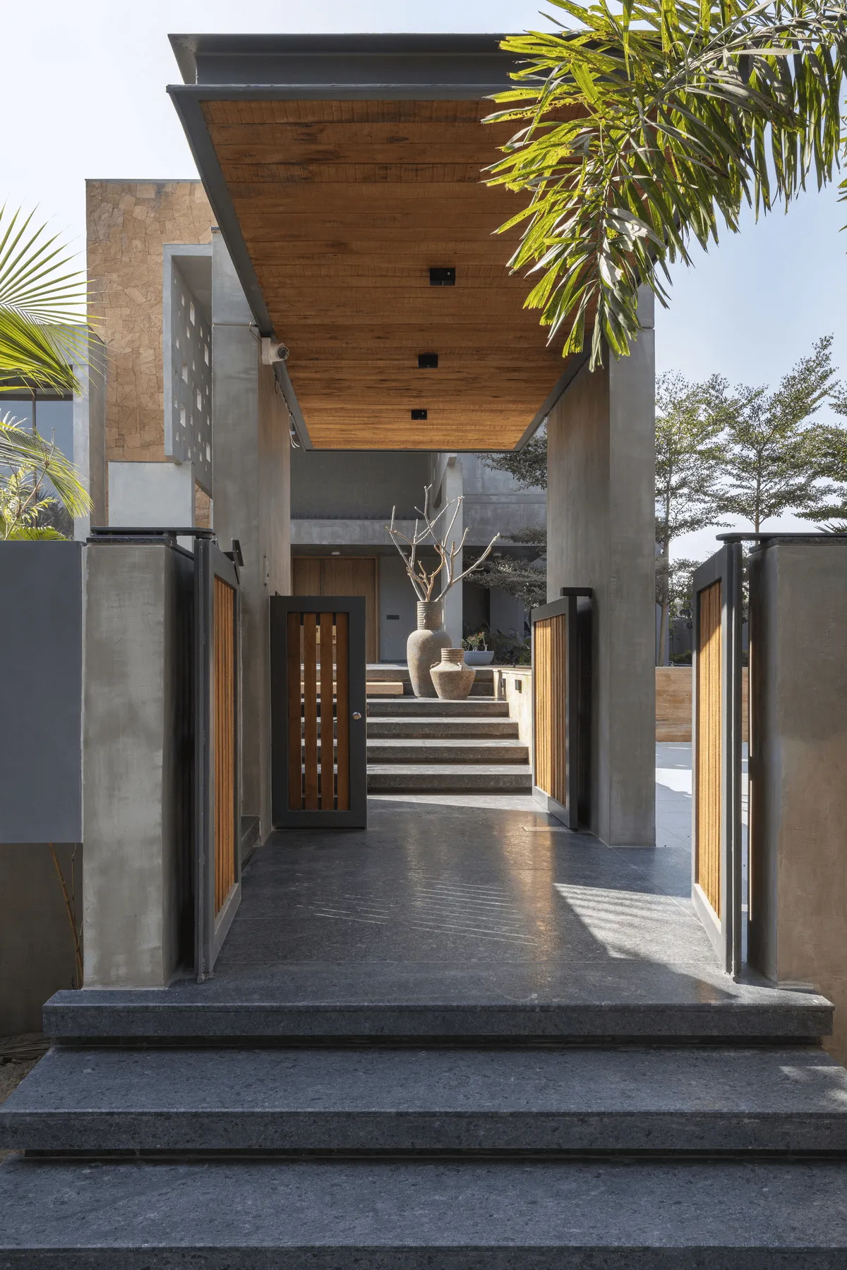
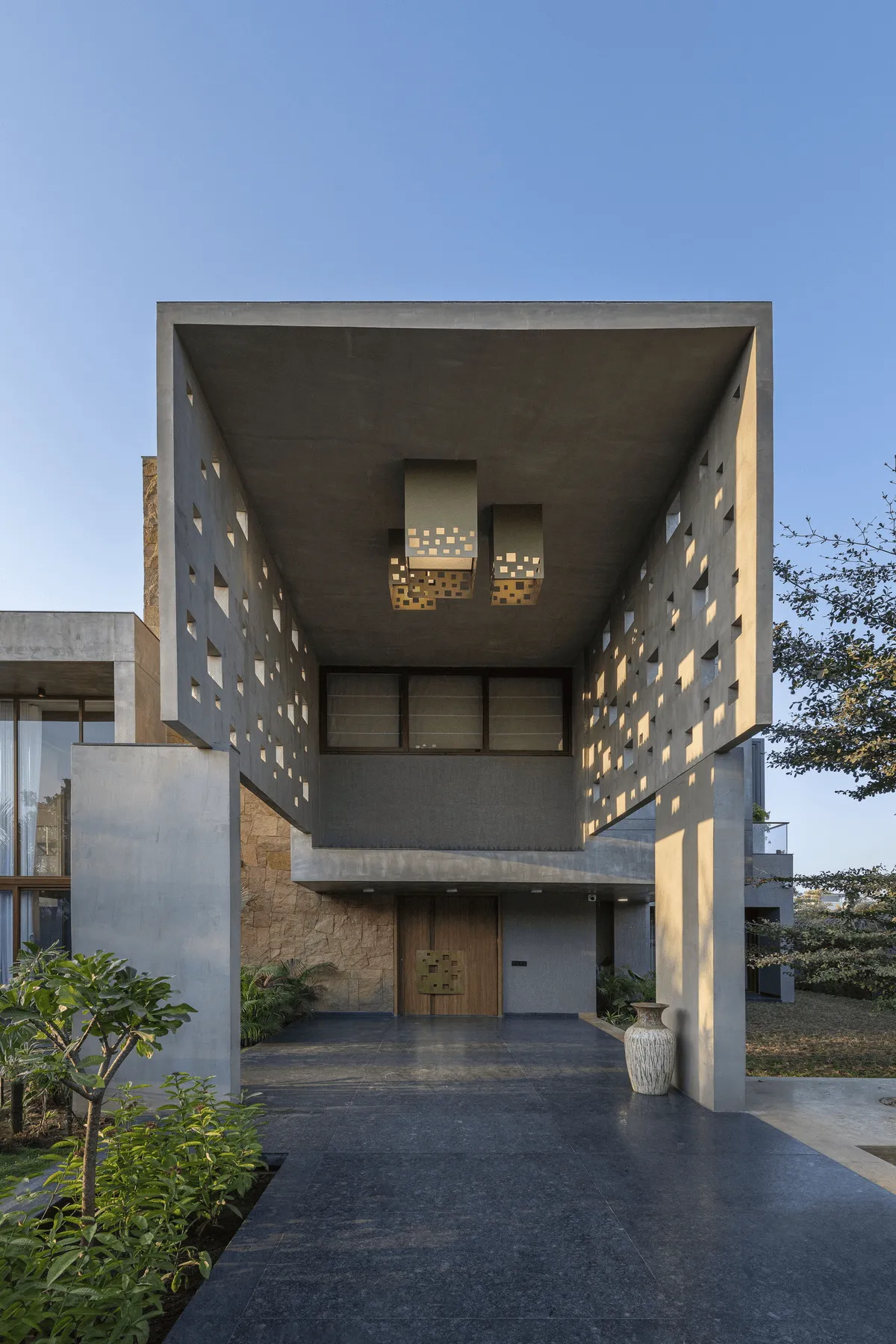
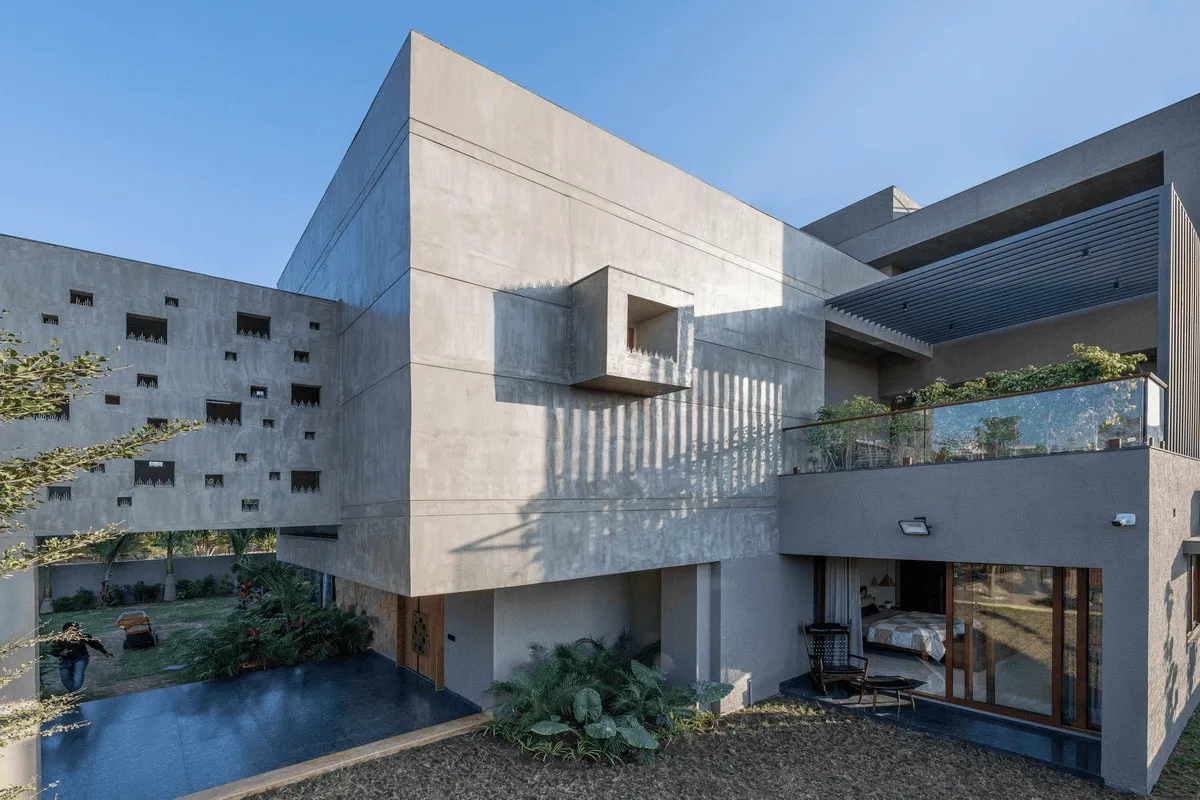
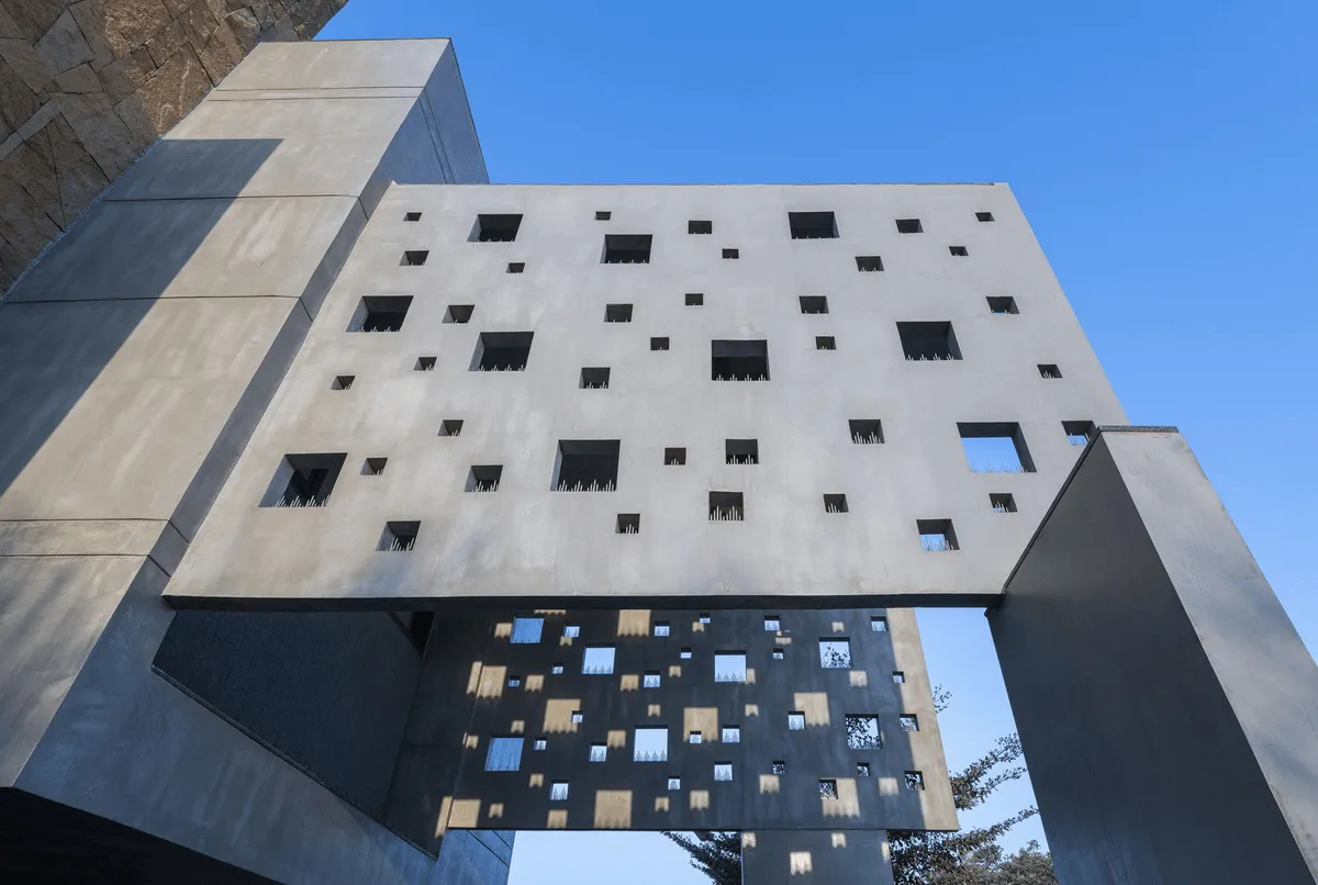
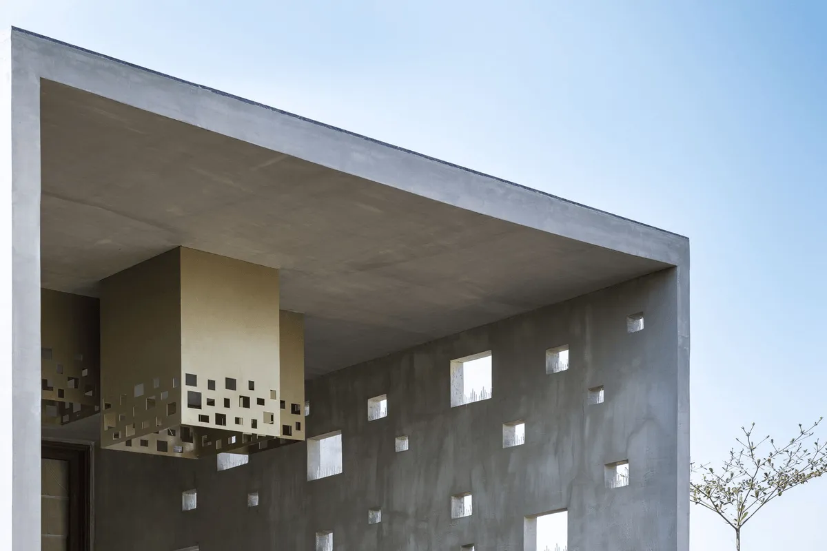
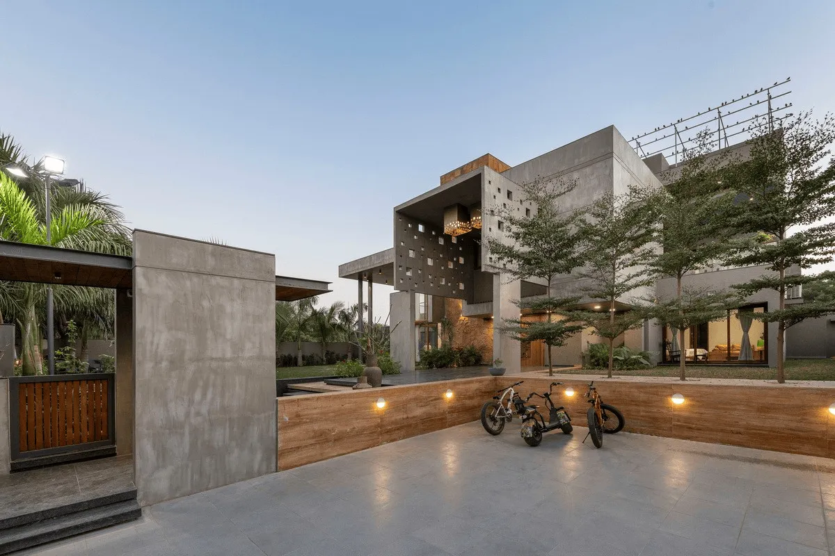
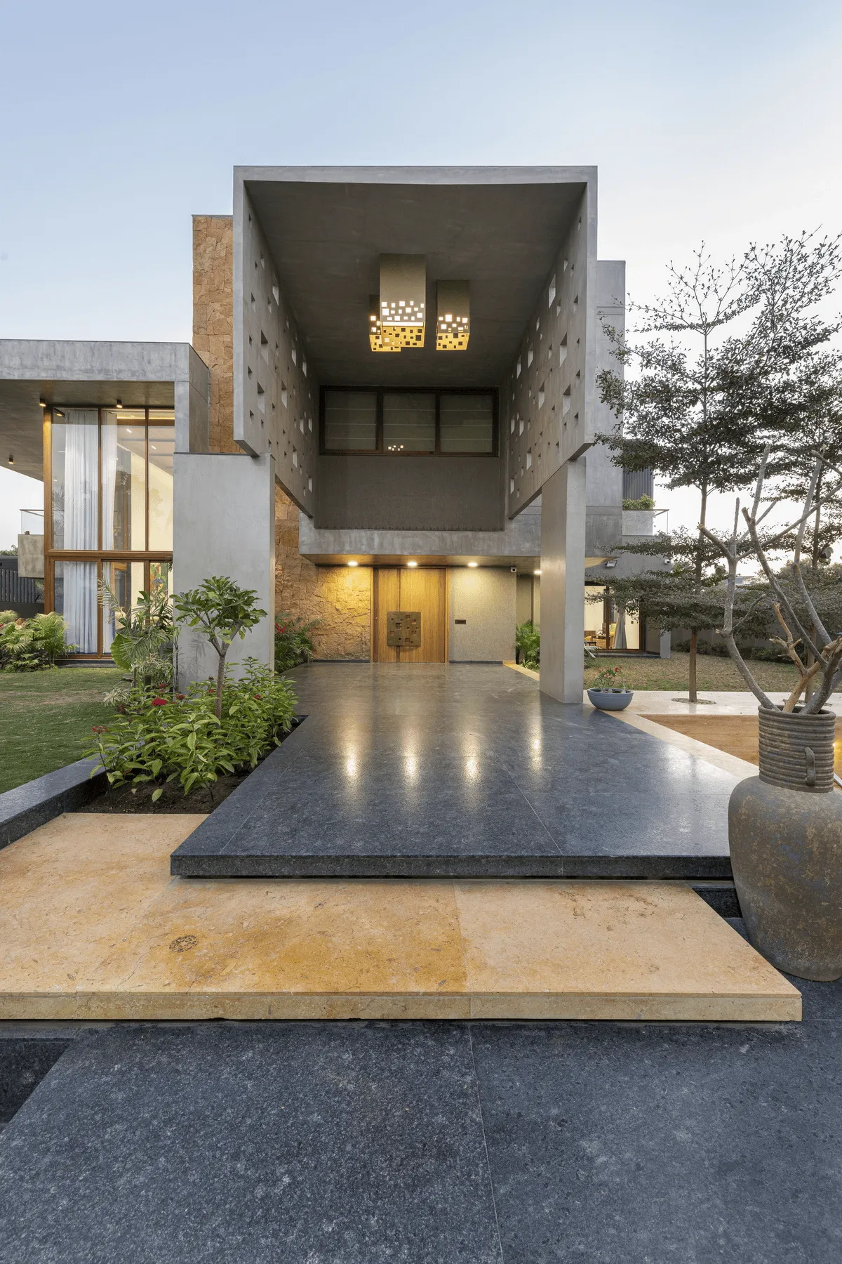
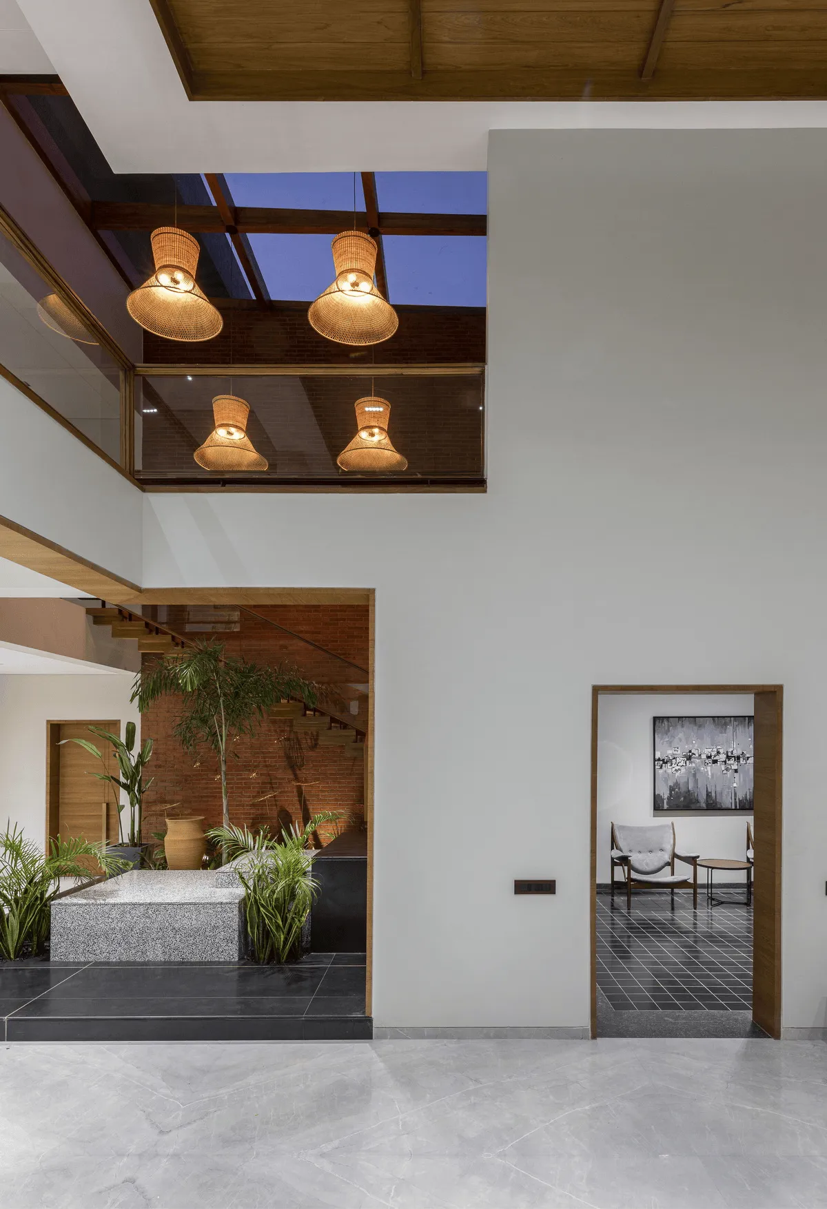
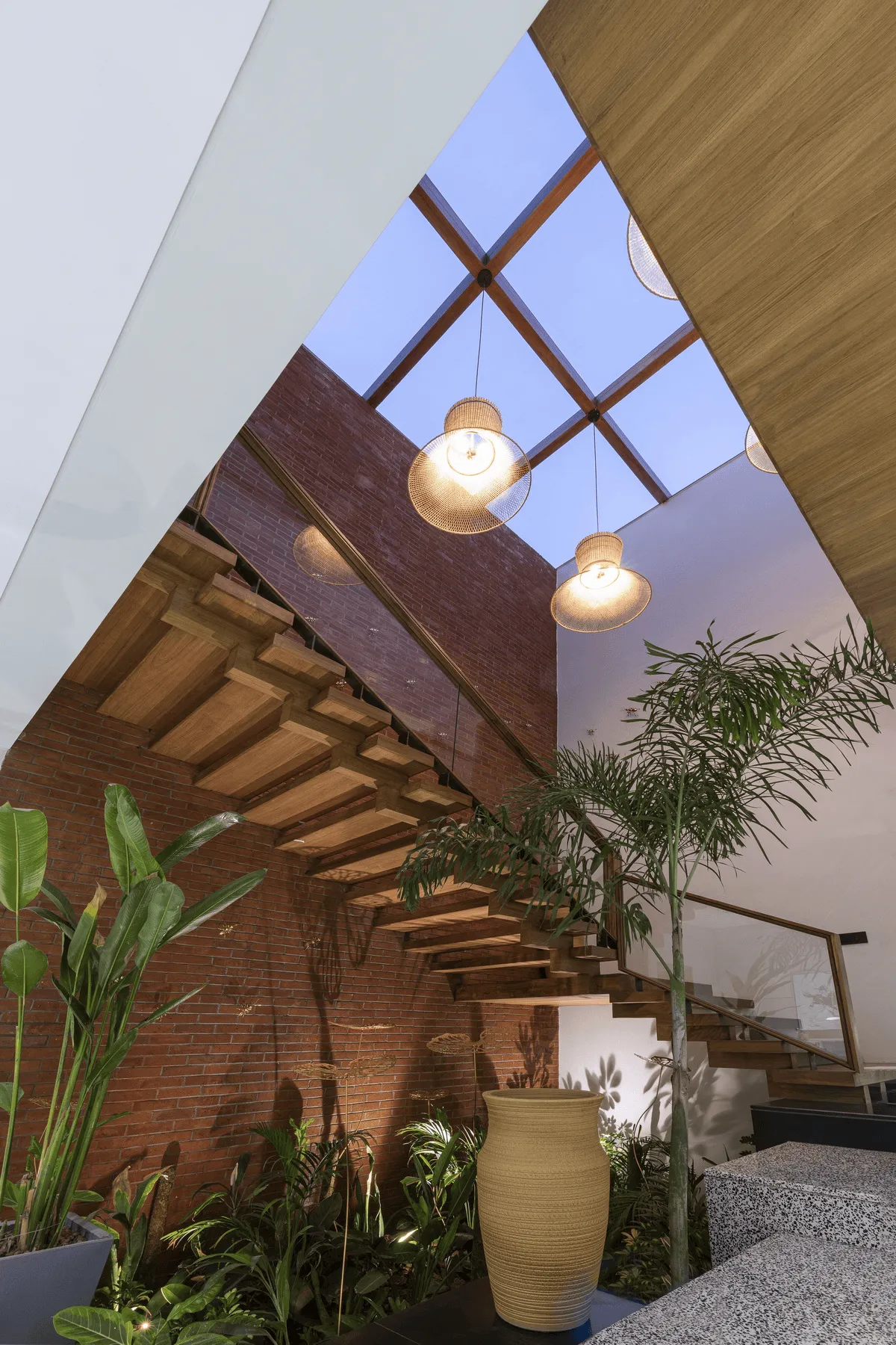
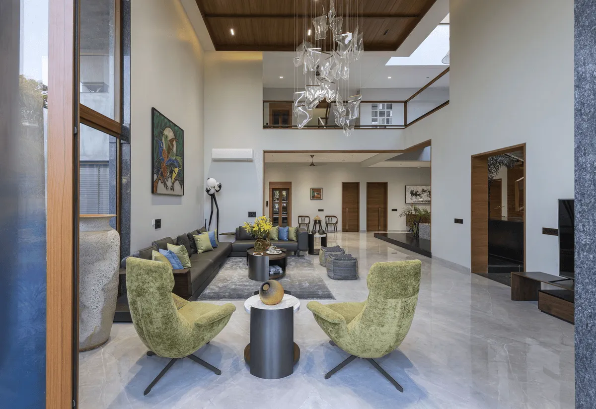
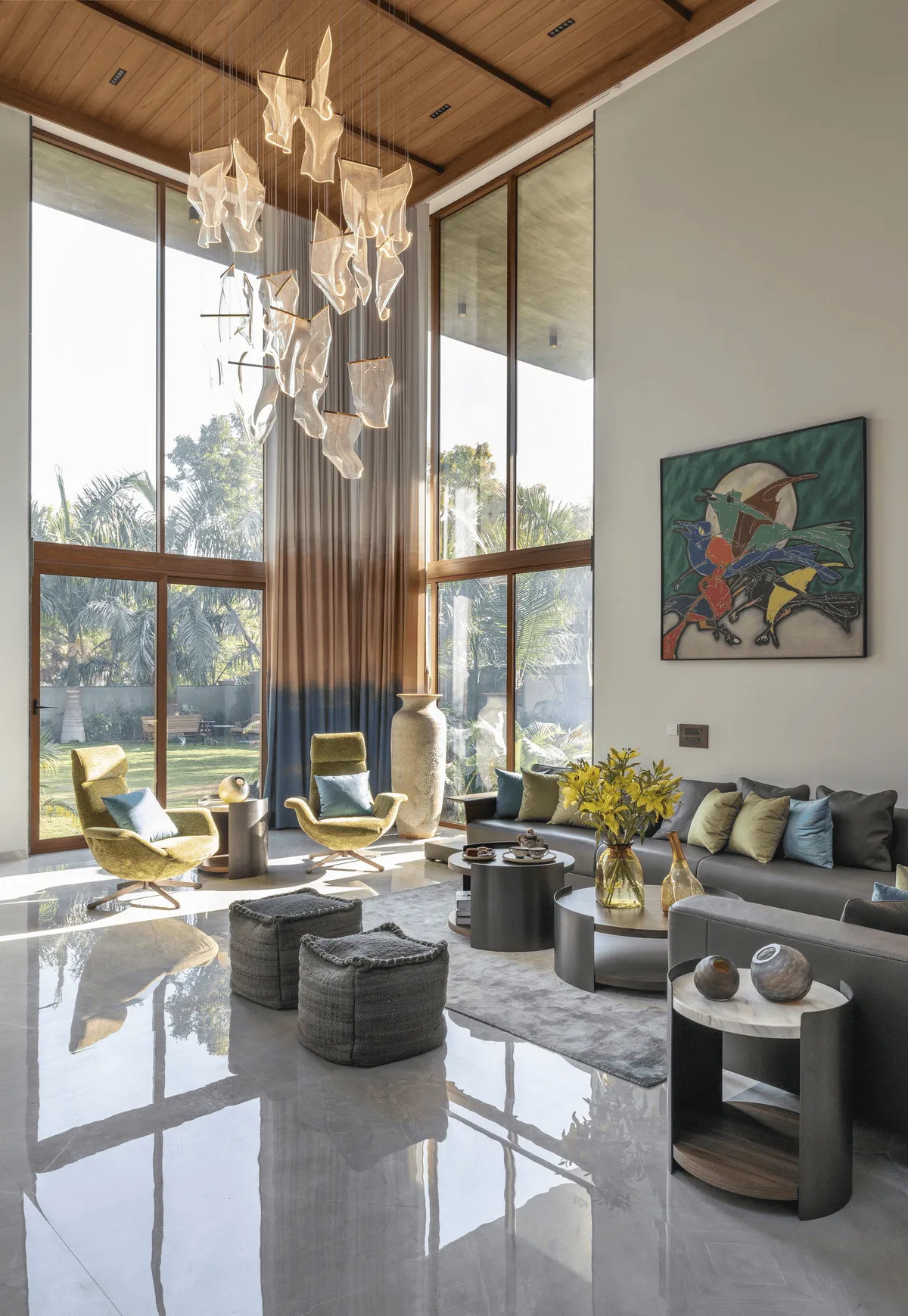
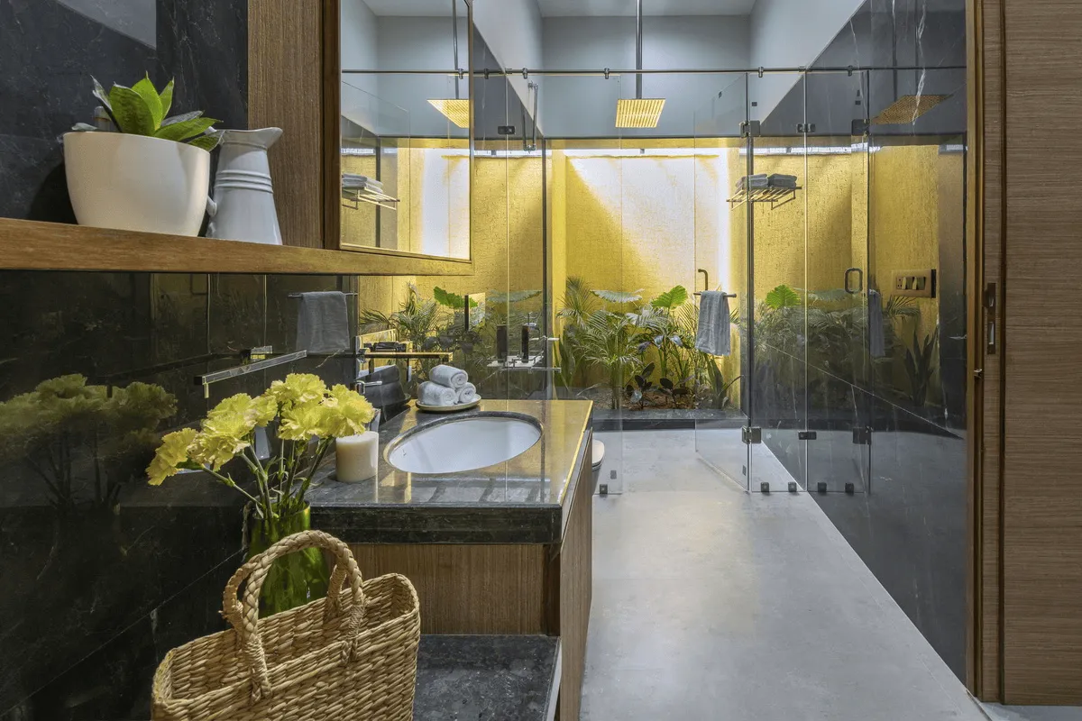
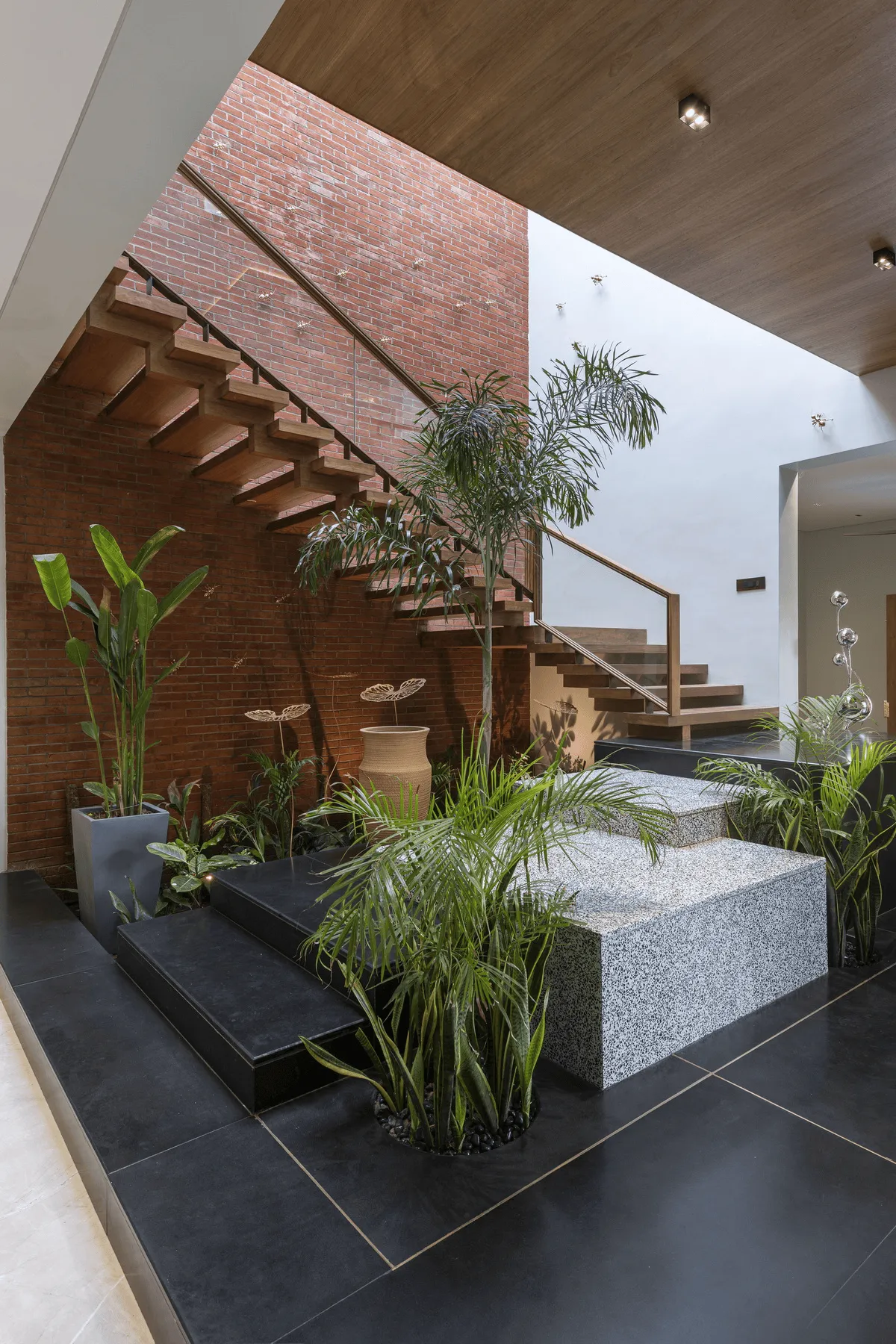
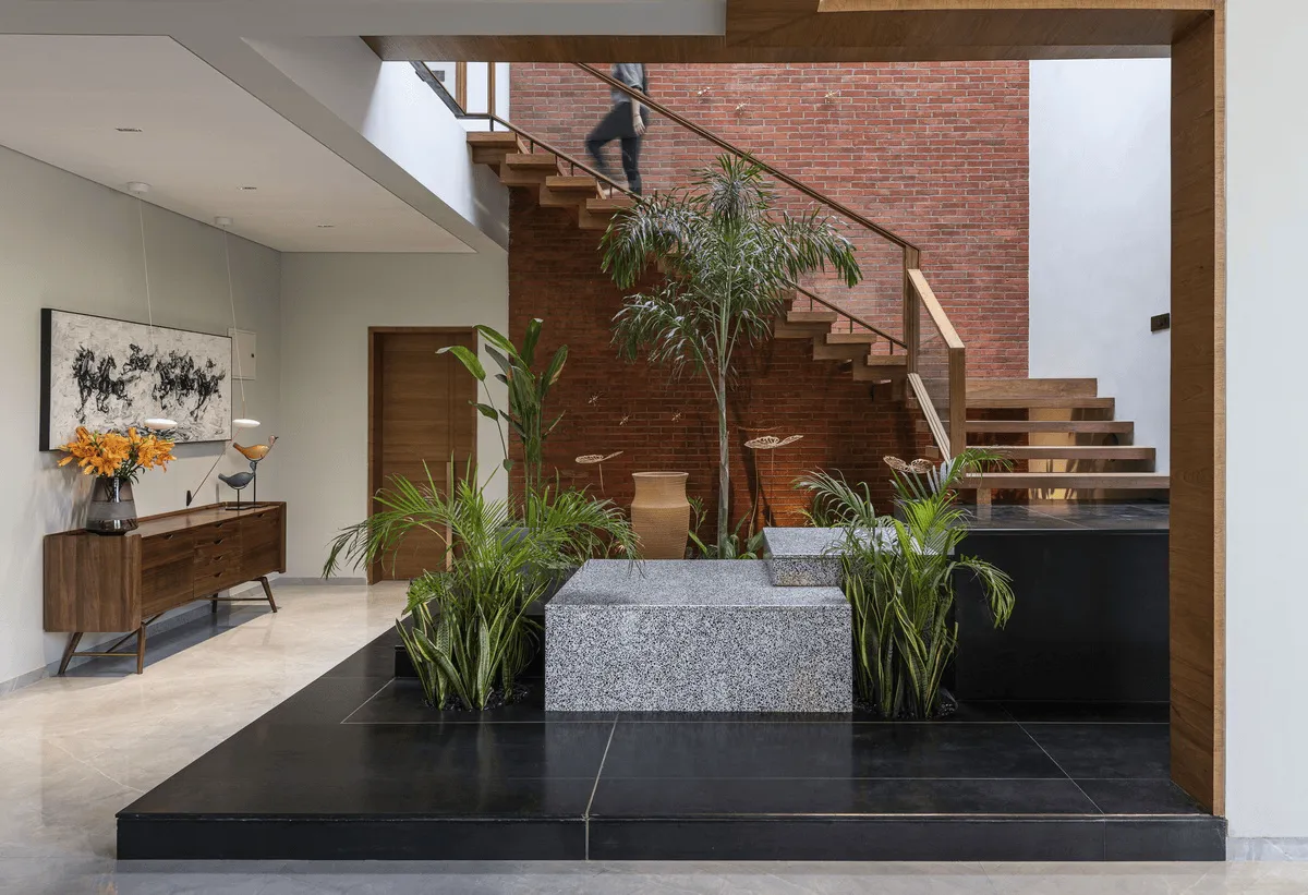
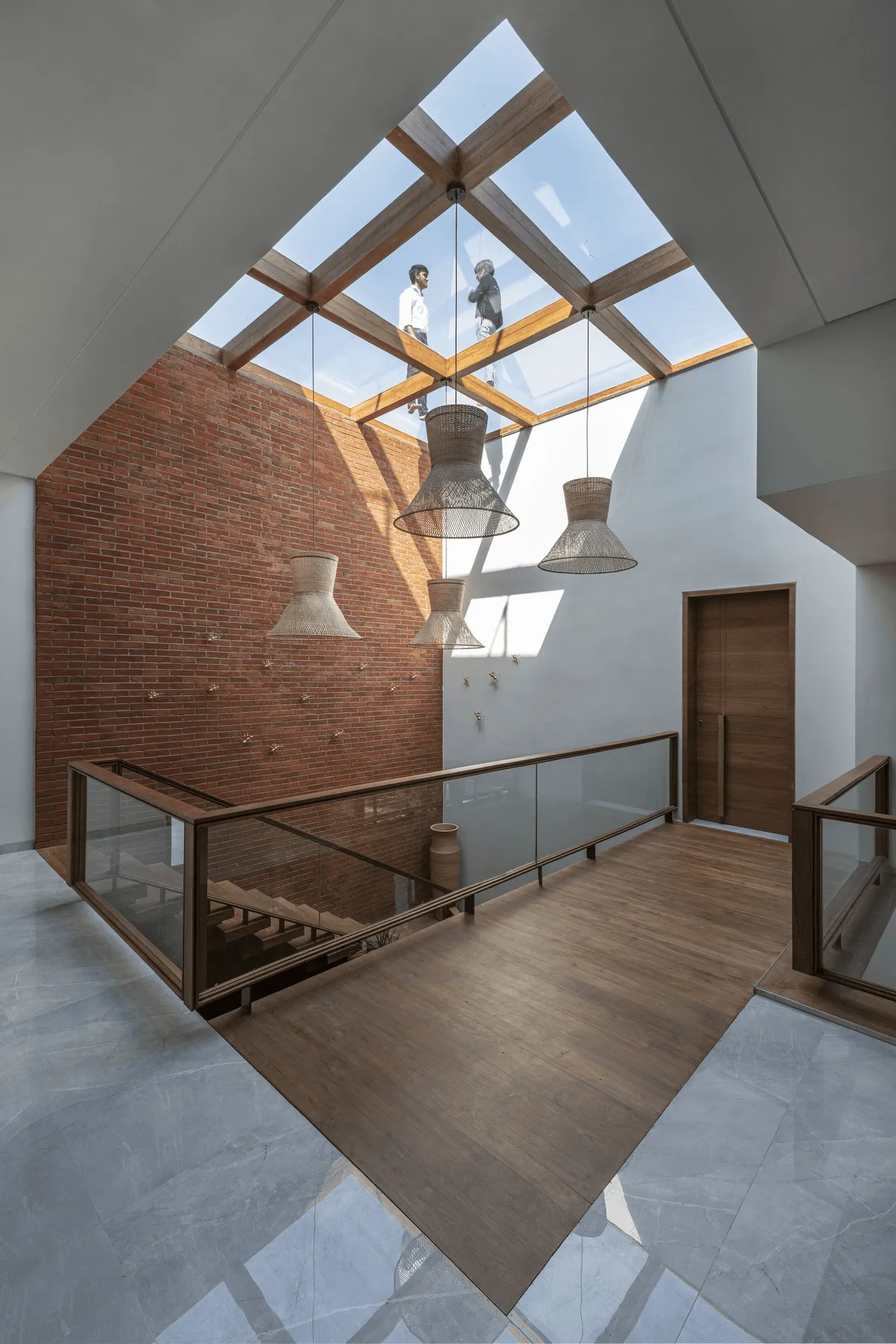
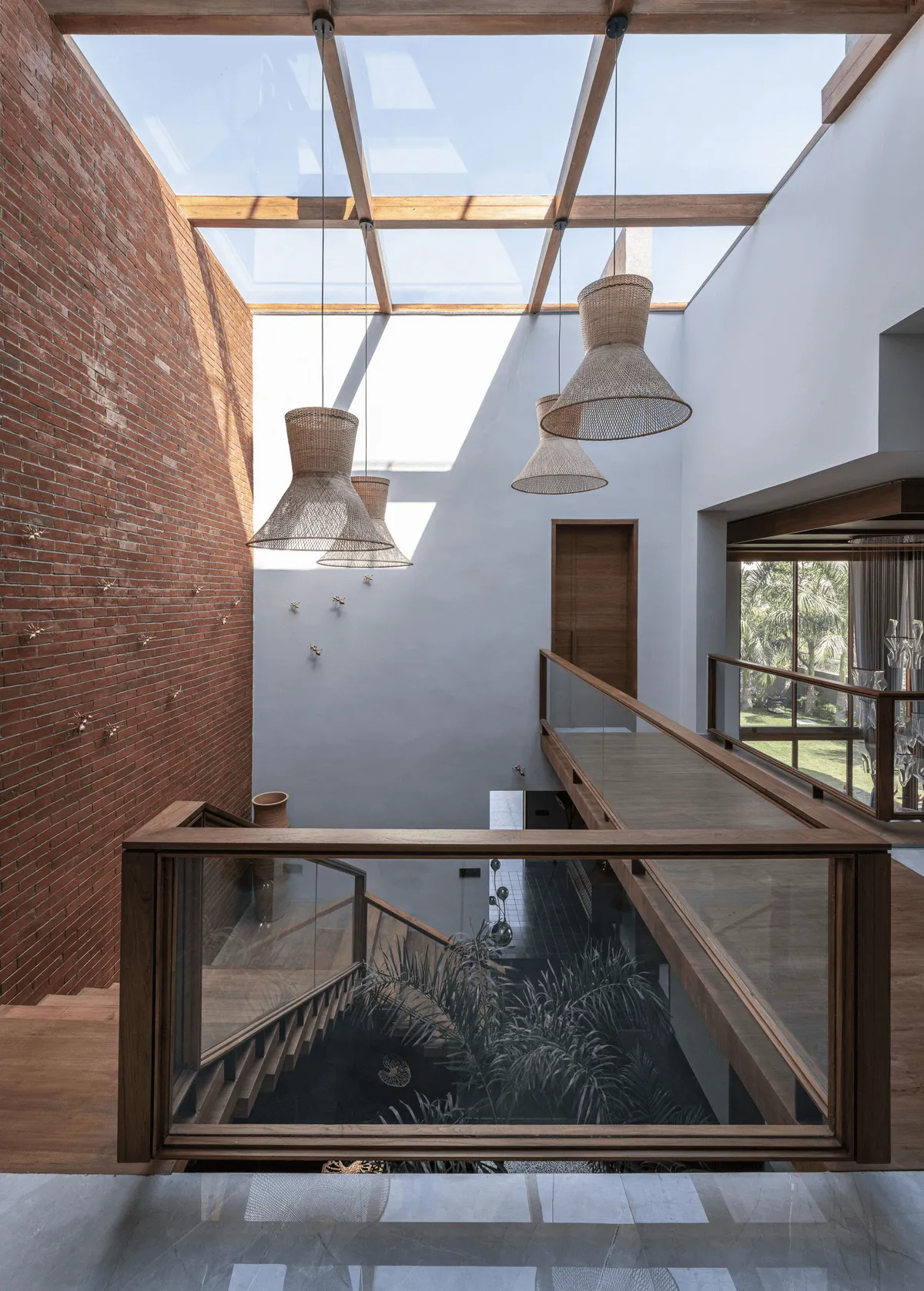
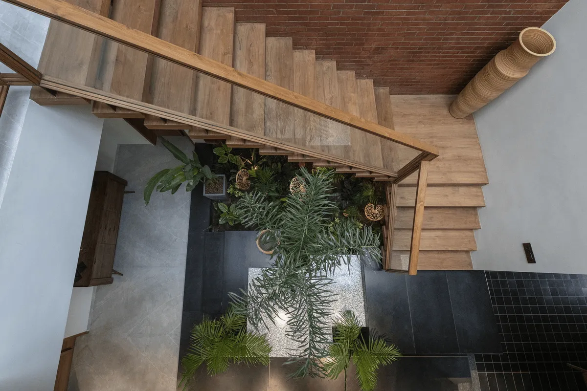
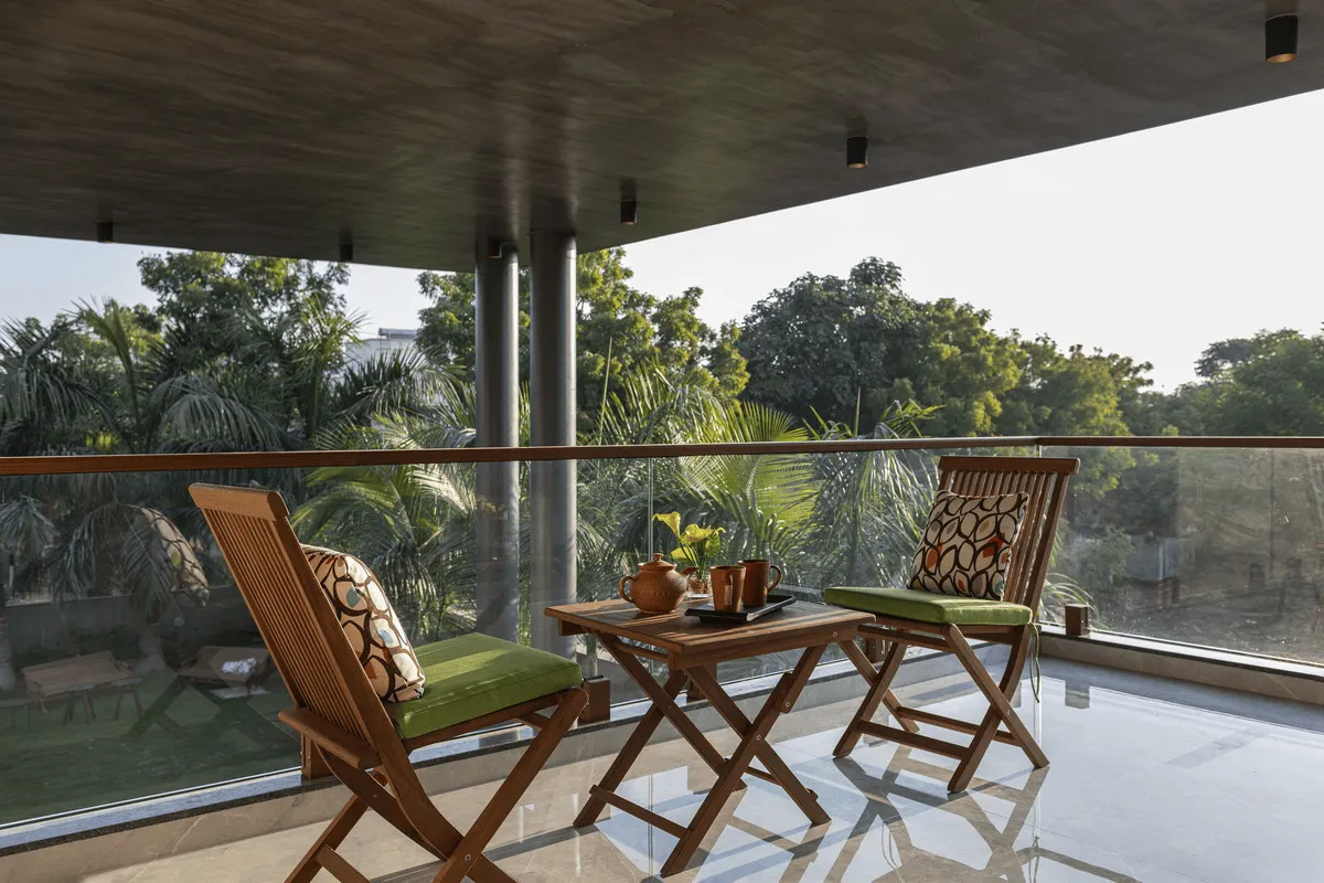
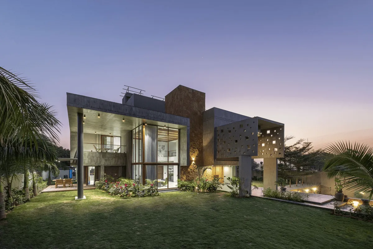
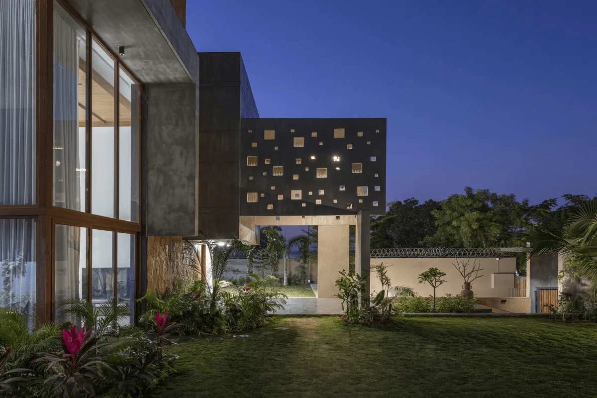
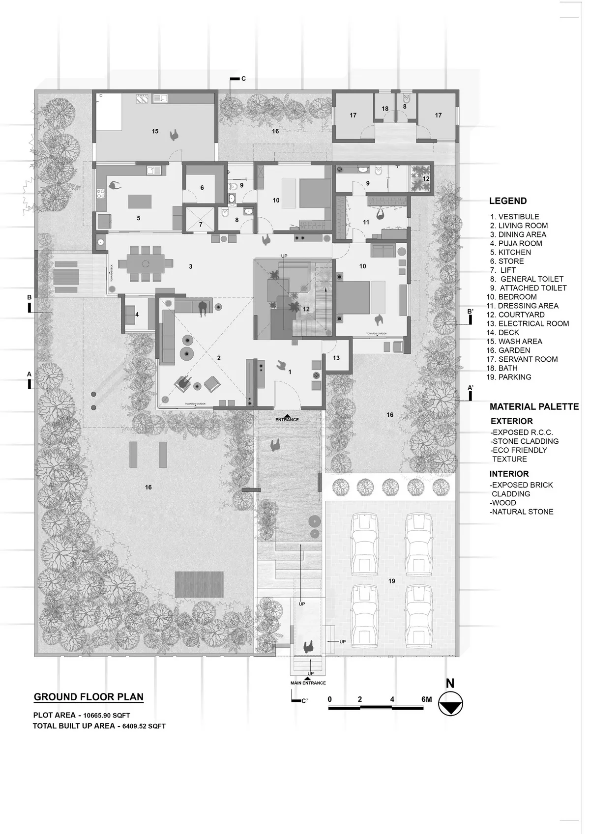
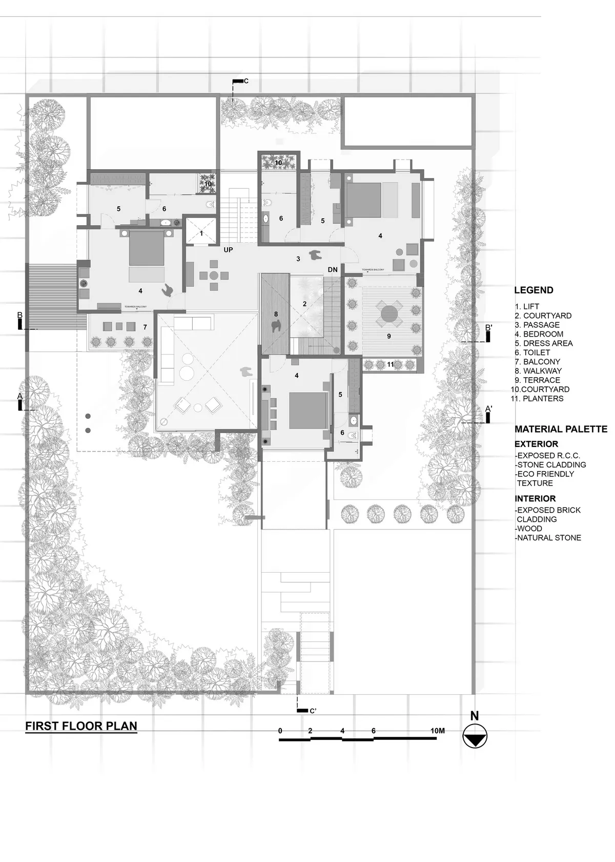
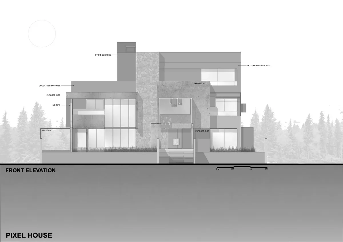
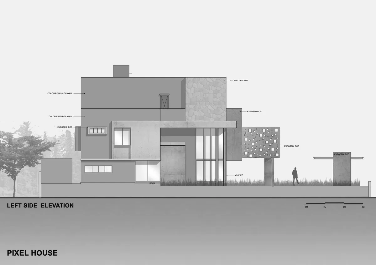
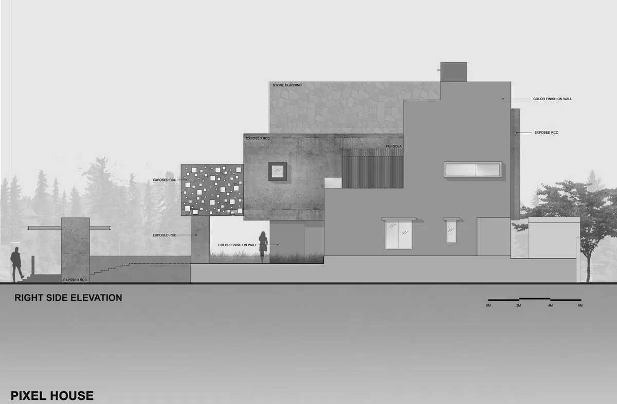
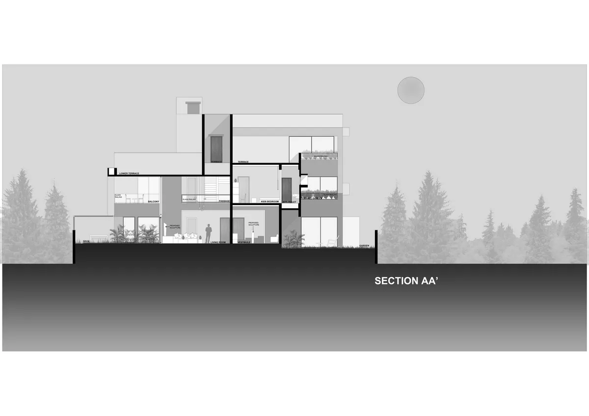
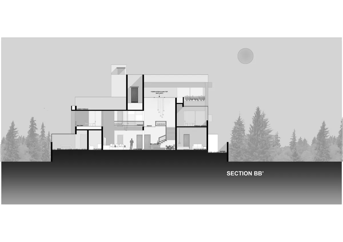
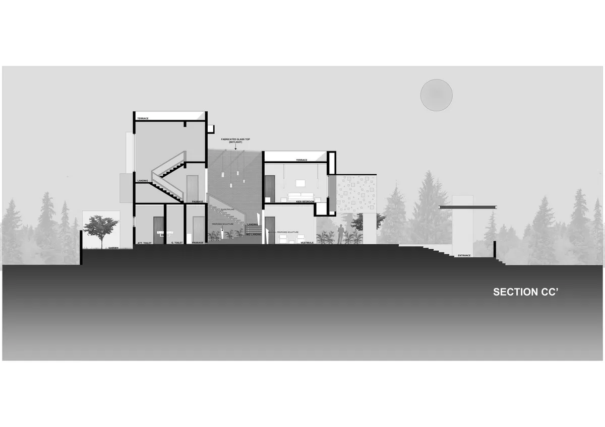
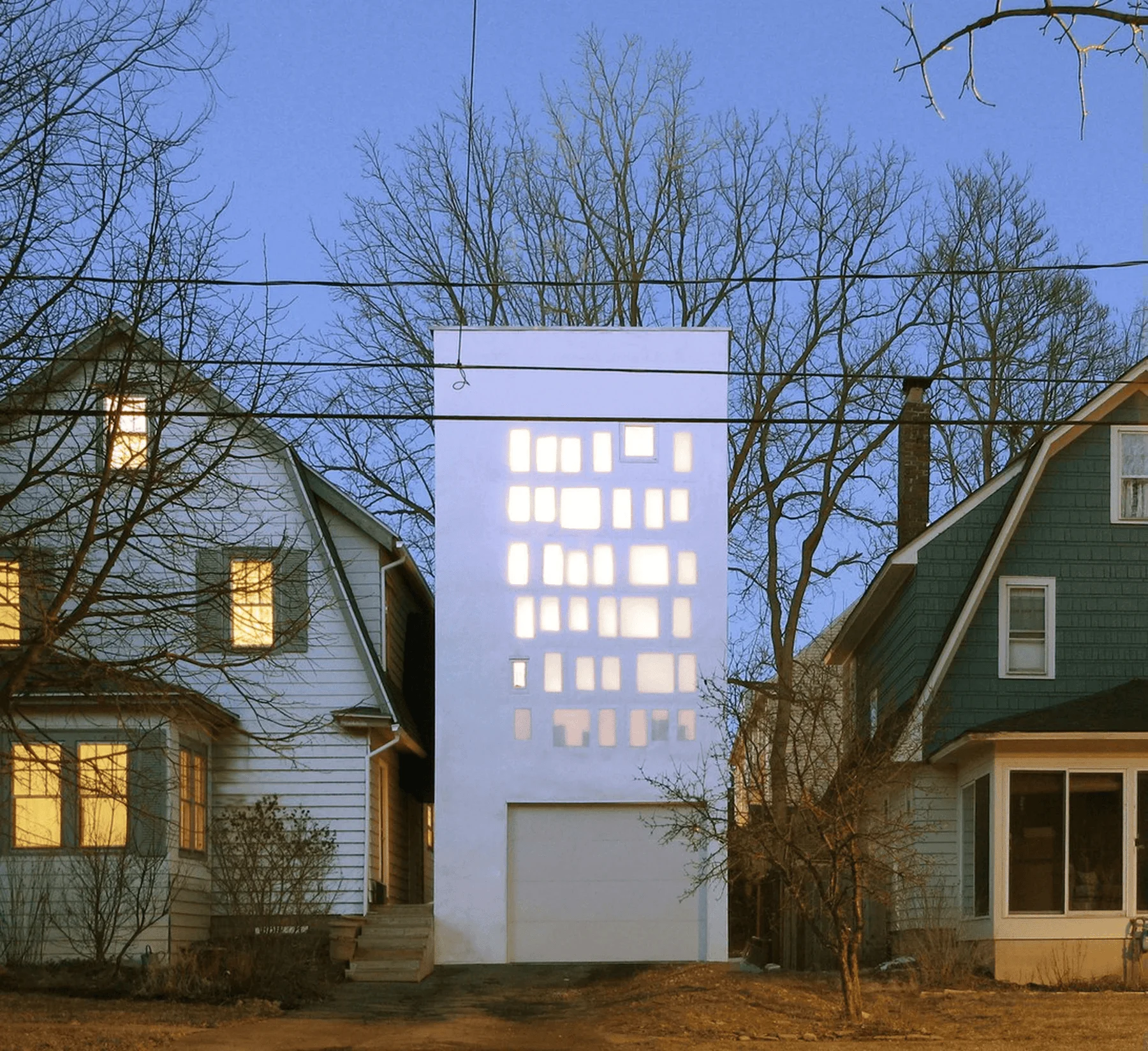
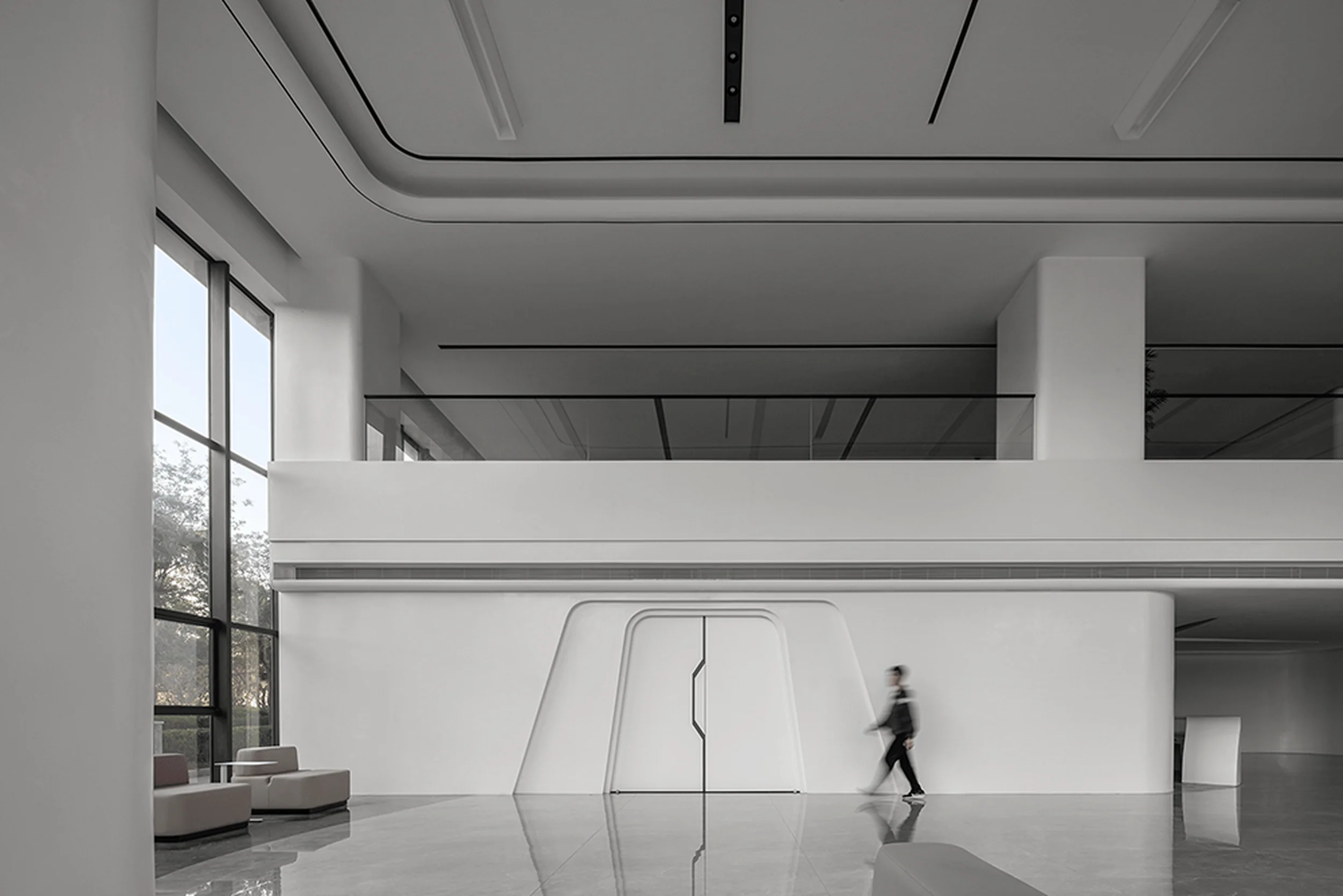
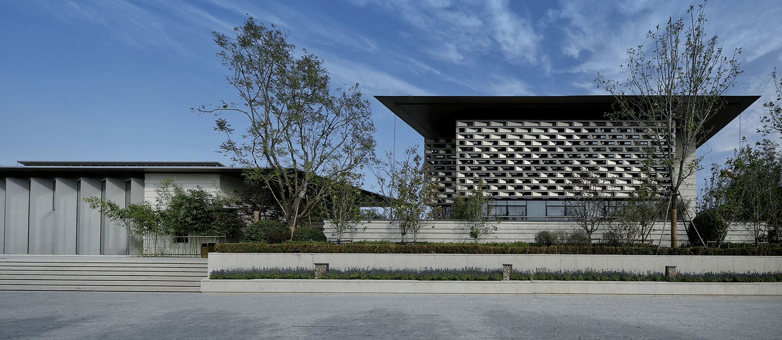
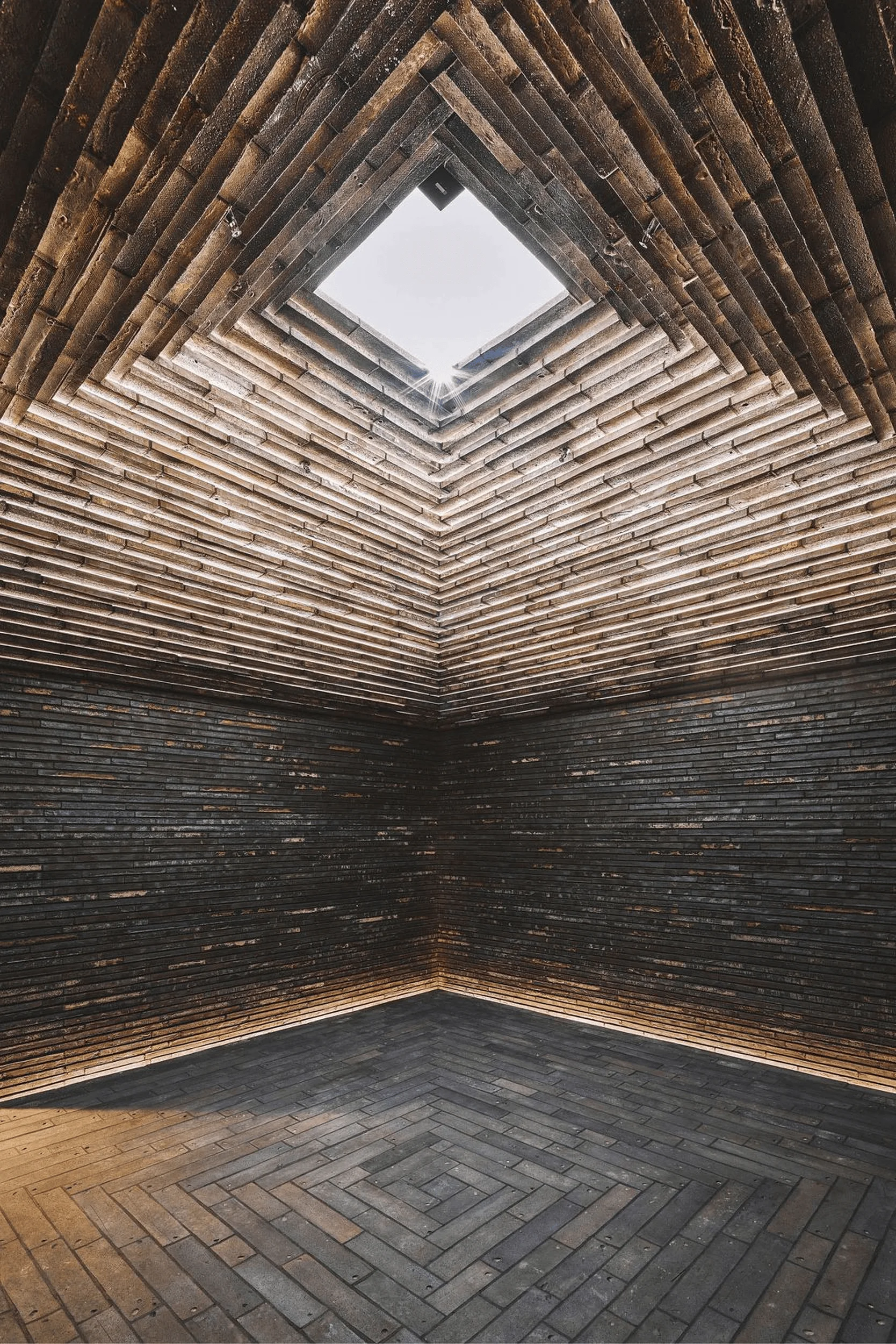
The Pixel House is a residence designed for a multi-generational family, where the opposing demands of individual privacy and family cohesion were the driving forces behind the villa’s conceptual design and development. The large family, consisting of three couples and two children, required the creation of secluded and private spaces alongside shared areas suitable for gatherings of varying sizes. Design inspiration can come from unexpected sources, and for this project, the inspiration was drawn from the most basic building block of a digital image: the pixel. However, the concept remains rooted in nature, as the house is designed to embrace the natural environment through its landscape, orientation, and form. To create a subtle facade and appropriate privacy and separation, the building is designed as a series of receding stacked volumes, creating a stepped form. This staggered arrangement, in addition to creating zones for smaller gatherings, also gave the design team the opportunity to extend the garden internally. The application strategy of building materials respects this “geometricity”, with large expanses of natural stone, exposed concrete, and paint used on the exterior, which also helps maintain thermal balance. The building’s form explores the notion of sheltered balconies, overhangs, and spaces nested within spaces, allowing every room to face the front (north) garden, a response to the region’s hot and arid climate. The end result is a residence that is both gently extroverted yet maintains an appropriate sense of privacy. The pixelated concept is most evident in the main entrance, which is topped by a canopy of exposed concrete, pierced by a series of square openings of varying sizes. Reflecting this effect are the massive custom MS lights suspended within the canopy. The entire structural assembly at the entrance creates a sense of arrival that is reinforced by the play of light and shadow throughout the day. Through the seamless orchestration of volumes, the interior creates a spatial experience that is satisfying from the inside out. Entering, you first encounter a foyer/hall – a simple, elegant space that encapsulates the design story. Visitors are then “released” into the main volume, where the most prominent feature is the stairwell, ascending along a wall of exposed brick, topped by a skylight. The stepped form of the building’s exterior is mirrored here in a miniaturized way, in the form of a series of stepped planters that add a sense of safety to the railing-less stairs. The upward path becomes a delight as the stacked planters beckon you to touch them, mirroring a pleasant sensation of walking through a garden. As with the exterior, the material expression of the interiors is minimalist and aligned with the natural direction: stone, wood, and exposed brick paired with minimalist whitewash create a classic spatial finish, then adorned with a combination of contemporary furniture, art, and accessories to create an atmosphere of modern living.
Project Information:


