SPOON HOUSE, a retail space design for ‘nospoonofood’ in Hefei, China, employs vibrant colors and industrial elements to create a lively and playful atmosphere.
Contents
Project Background and Brand Identity
The project, SPOON HOUSE, is the second retail space designed for the independent brand “nospoonofood” located in Hefei, China. Situated within the ‘He Chai 1912’ cultural and creative park, the space aims to transcend a typical retail environment, instead serving as a vibrant community hub for young, trend-conscious individuals in the city. The brand sought to leverage design to challenge perceptions of Hefei and introduce a fresh, forward-thinking aesthetic to its local community, embodying the brand’s “nospoonofood” philosophy of embracing a dynamic and playful approach to lifestyle. Retail space design with vibrant colors and industrial elements, like SPOON HOUSE, are becoming increasingly popular.
Design Concept and Objectives
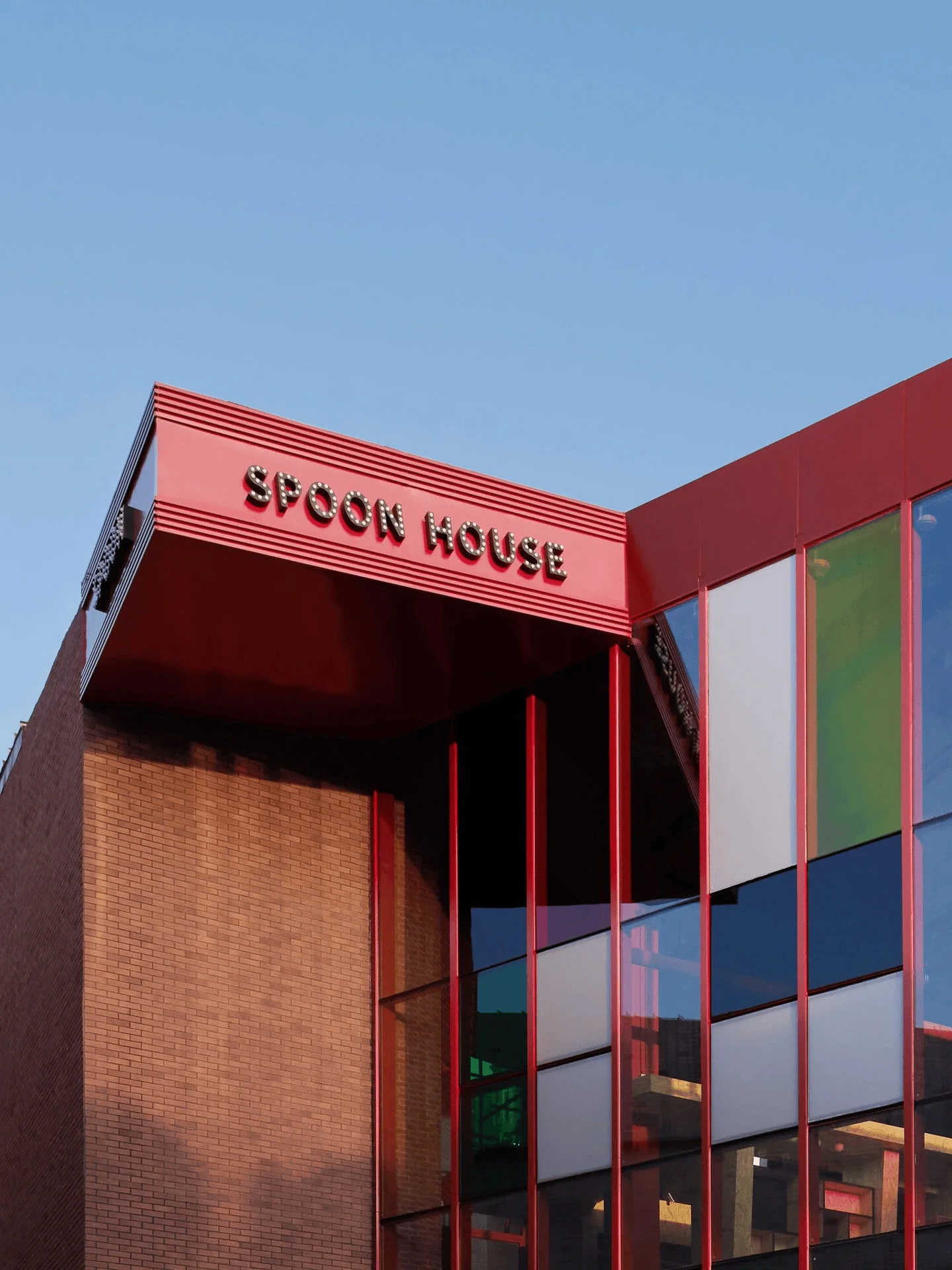
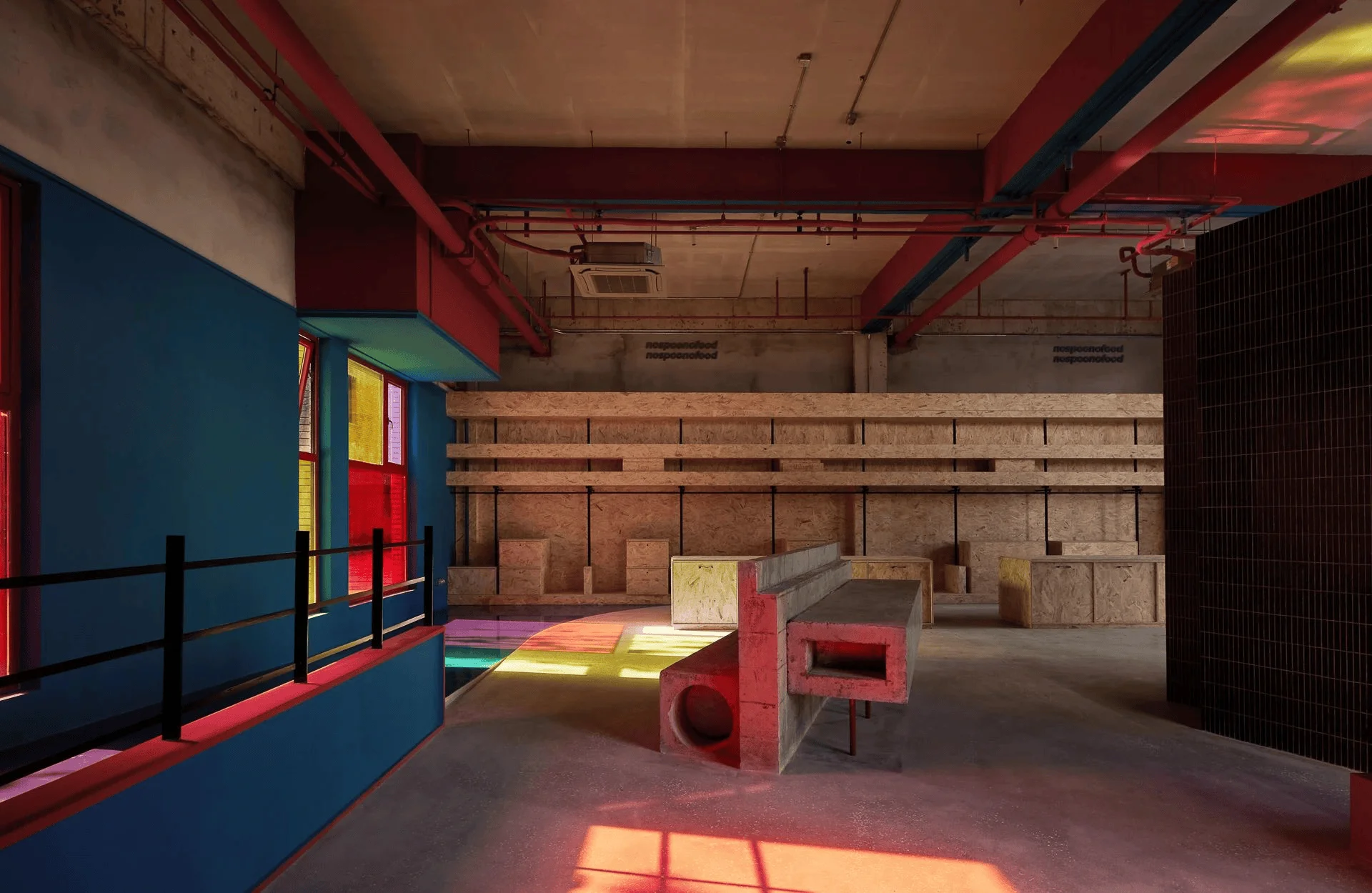
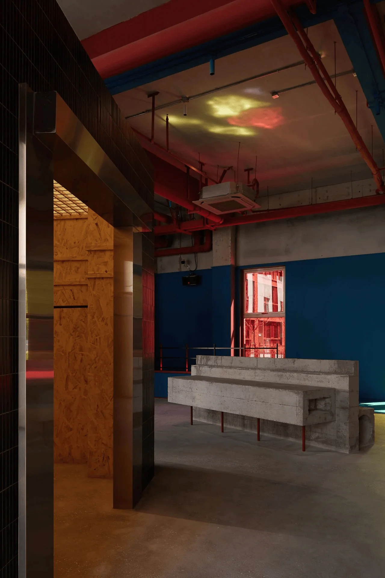
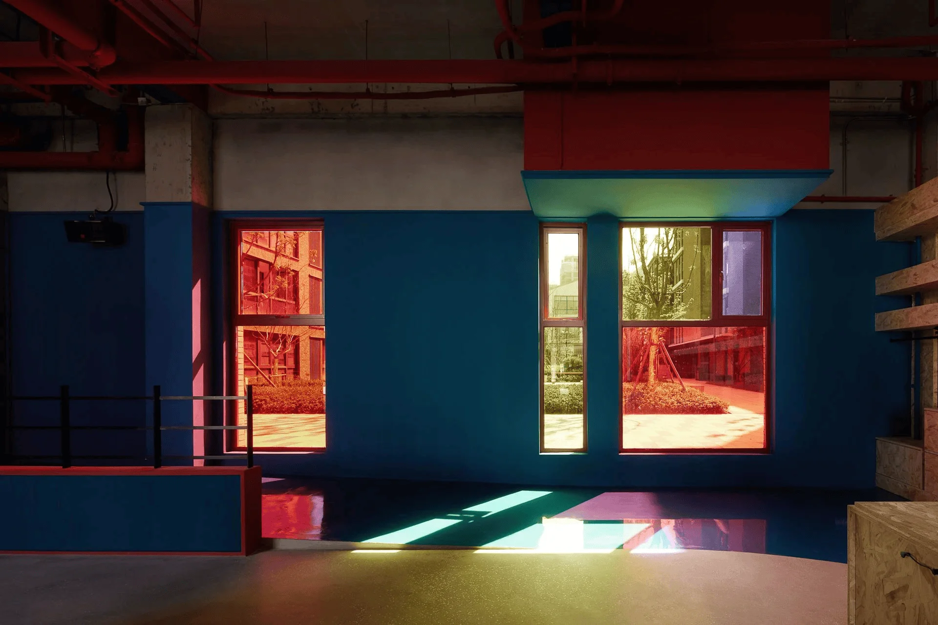
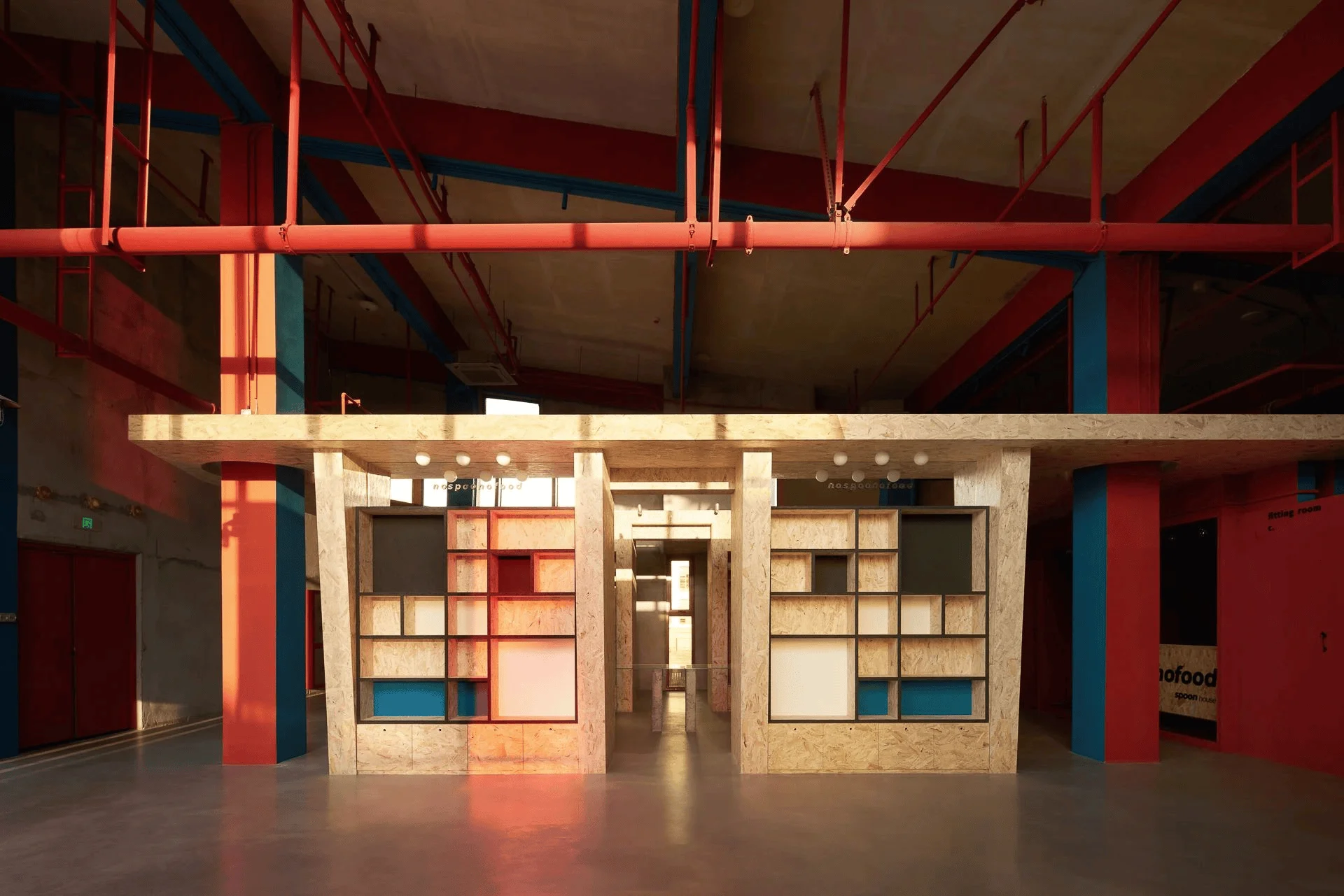
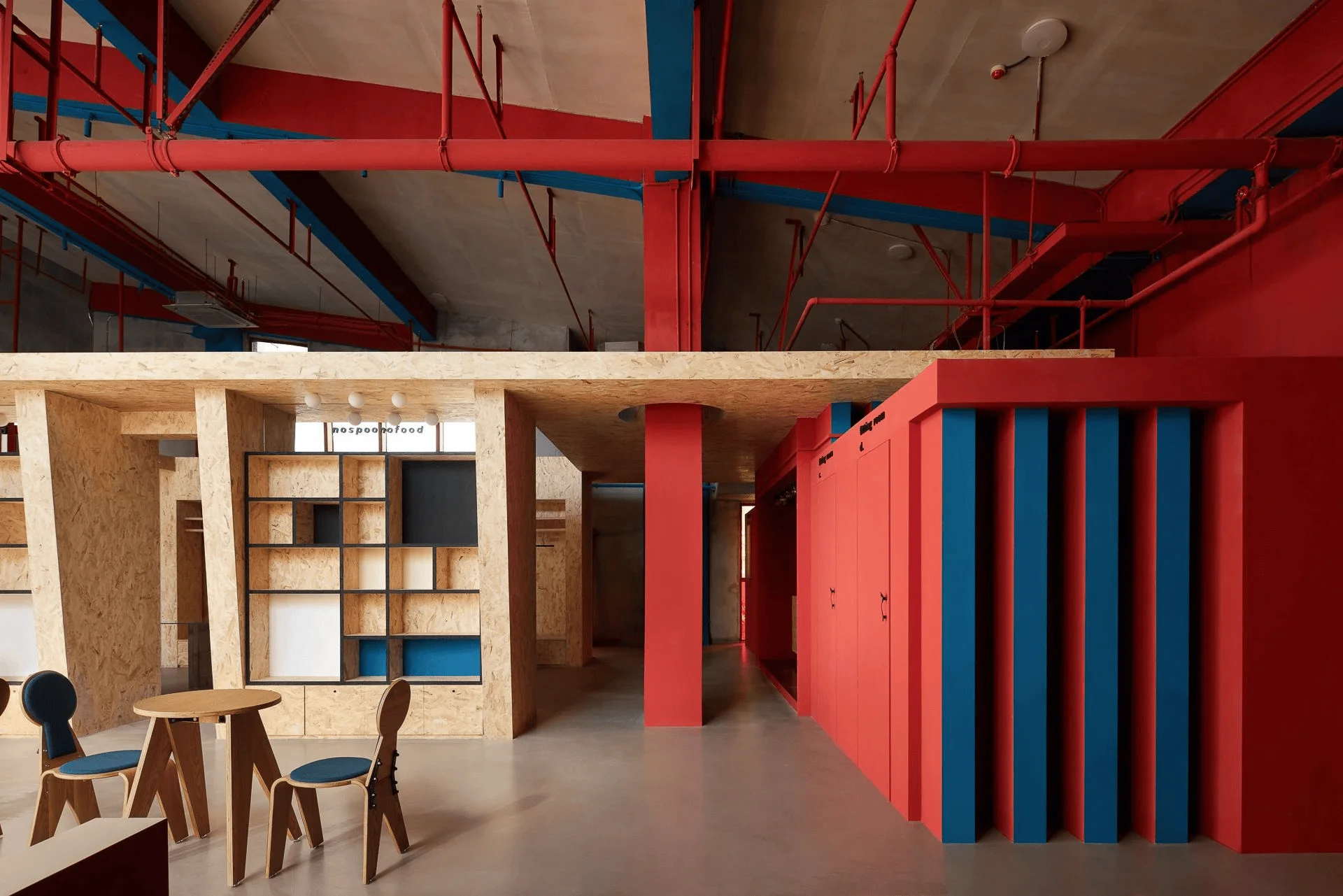
The original building, an old factory with red brick and steel structures, exhibited a somewhat bland and austere character. To revitalize this existing space while staying true to its heritage, the designers opted for a colour-focused approach, leveraging the potential of the existing structure and exterior glass facade. The design concept aimed to create a dynamic and visually engaging environment that resonated with the brand’s personality and attracted a youthful demographic. The design team sought to revitalize the space through a playful use of colour and material, enhancing the customer experience while promoting the brand’s identity through innovative design elements. Retail space design featuring colour-blocking and a bold aesthetic like SPOON HOUSE, adds depth to the design and is an interesting way to show the brand’s personality.
Functional Layout and Space Planning
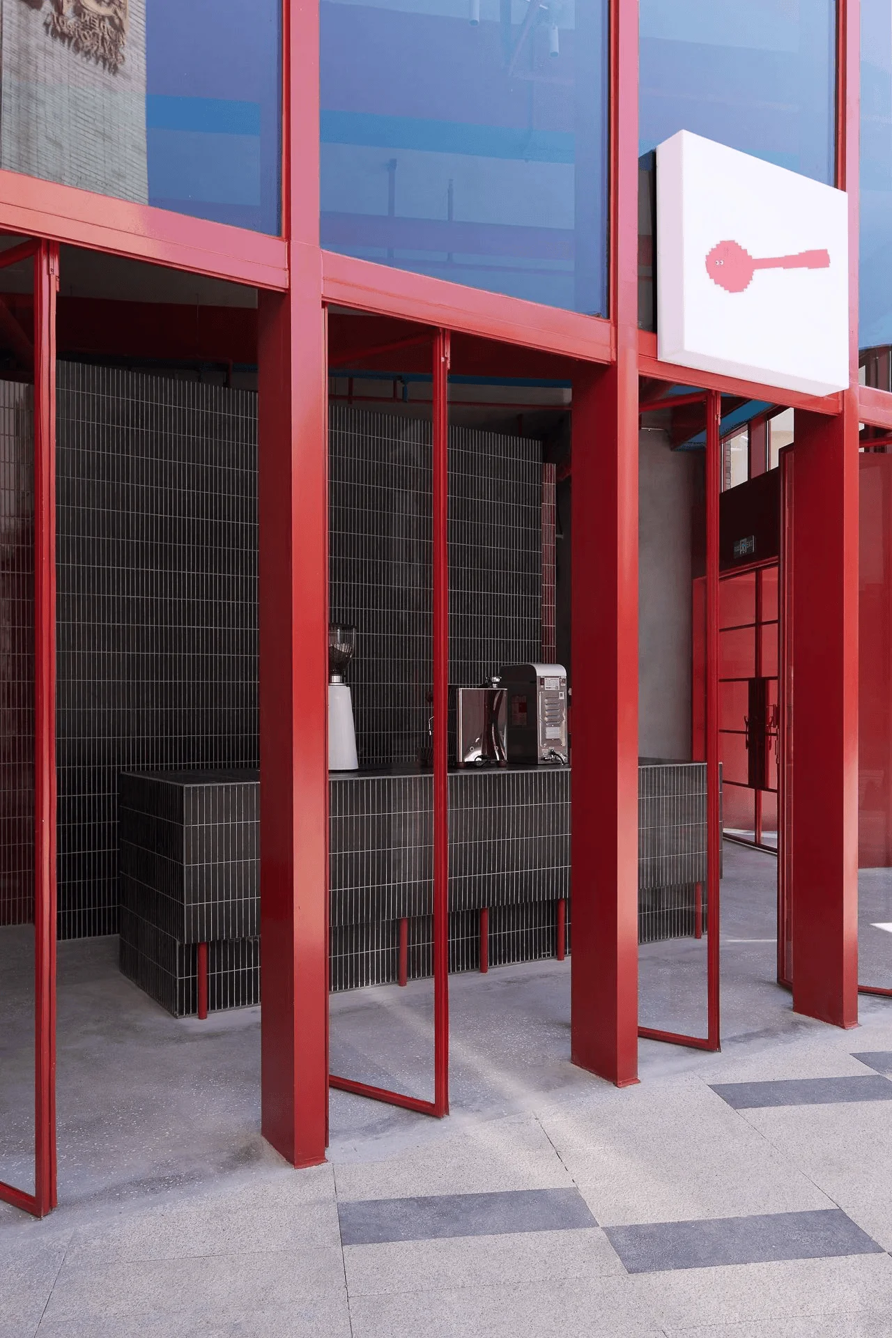
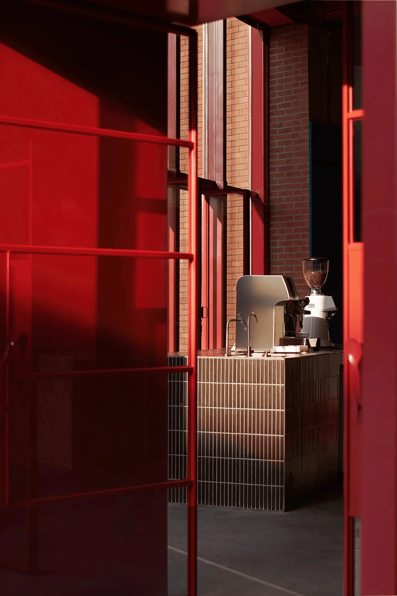
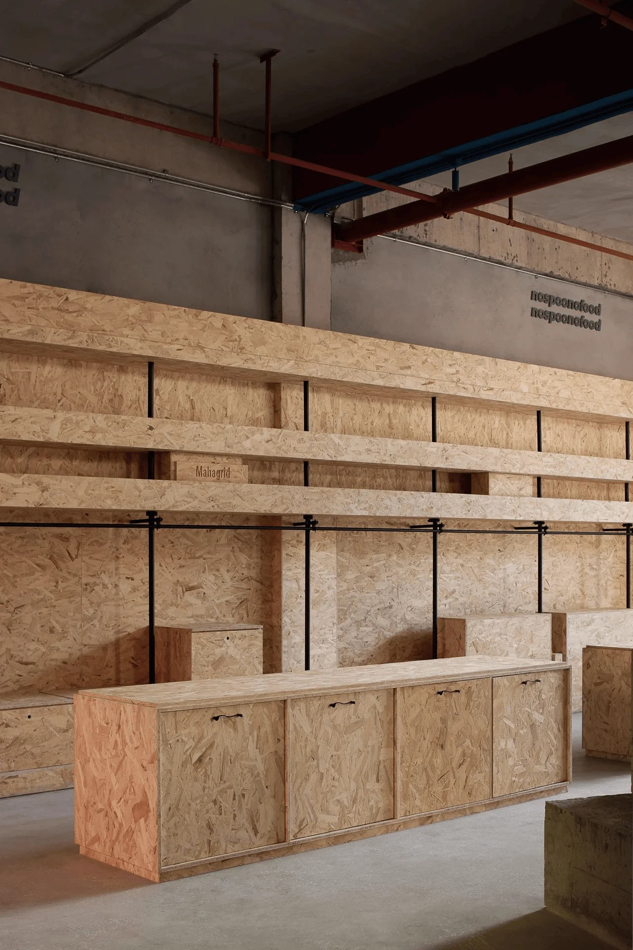
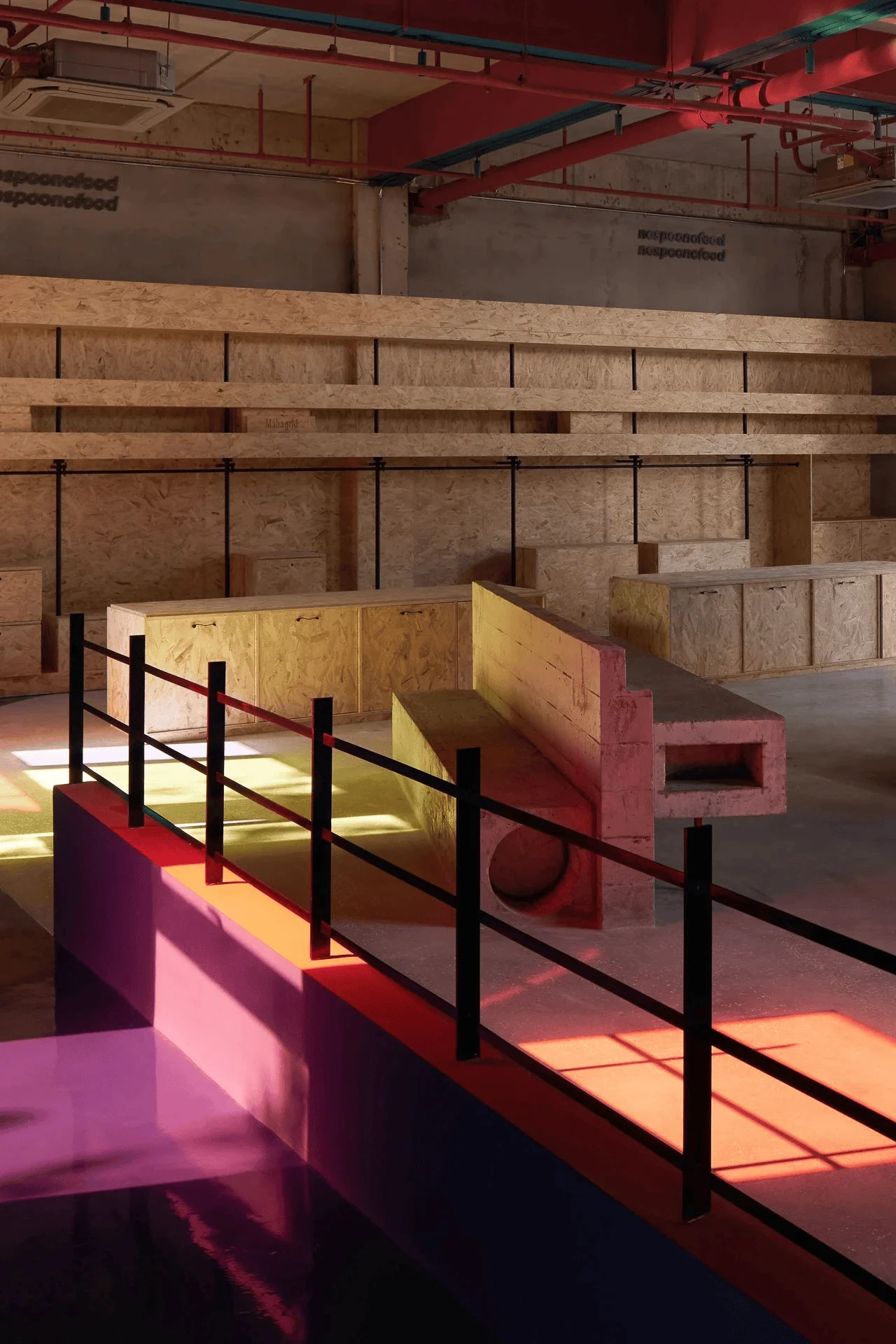
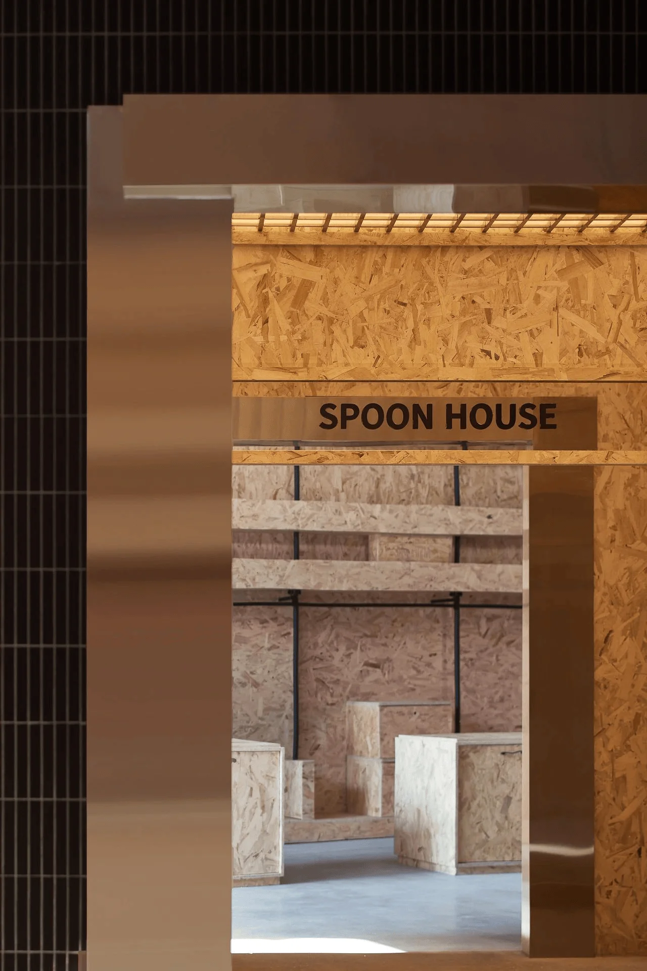
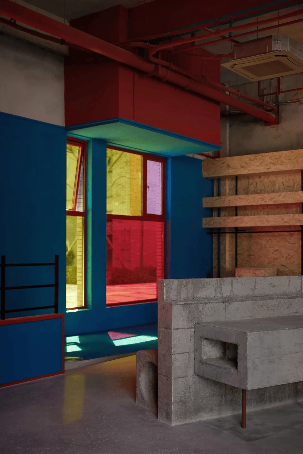
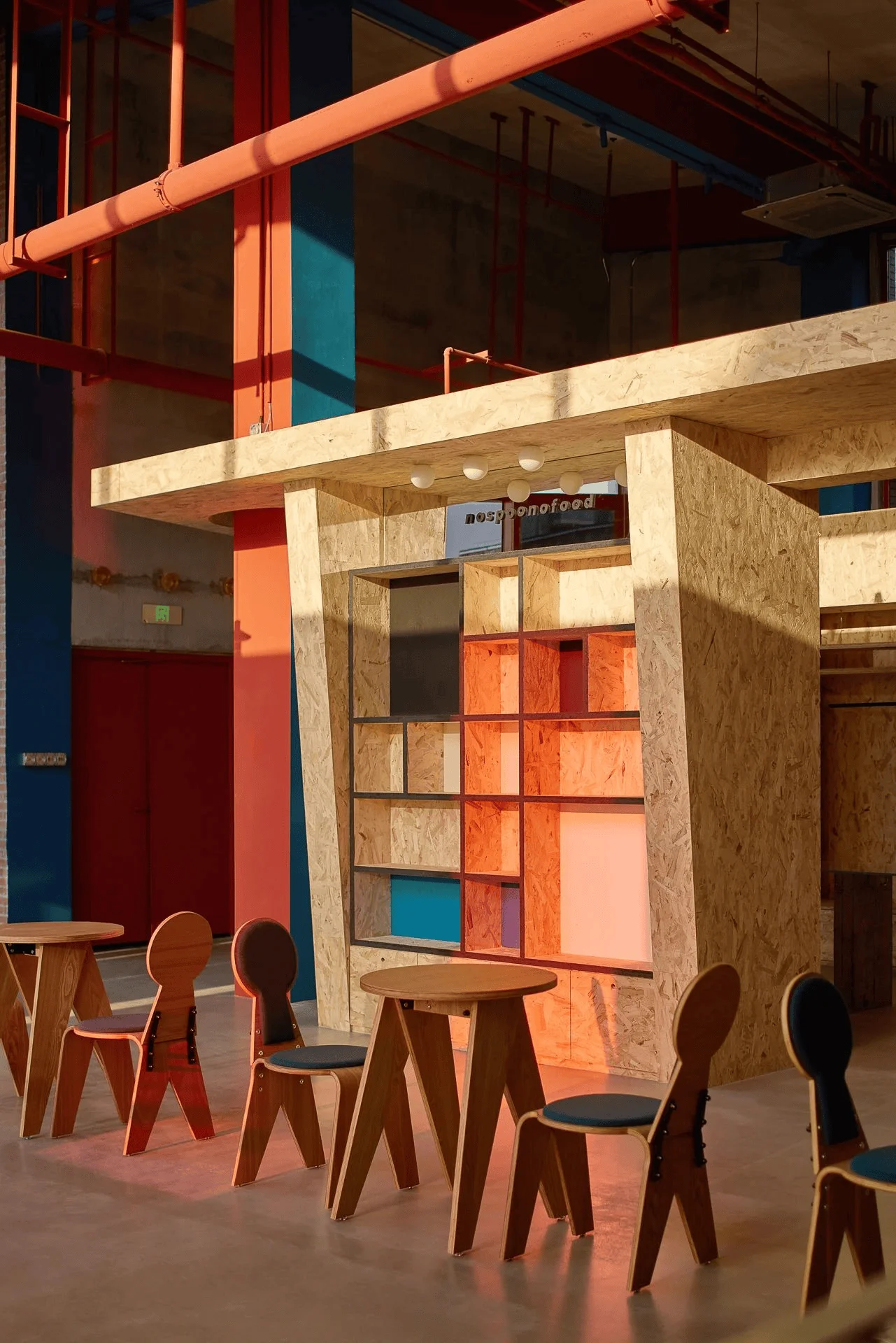
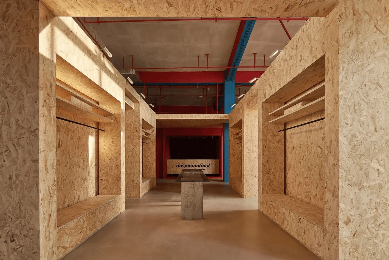
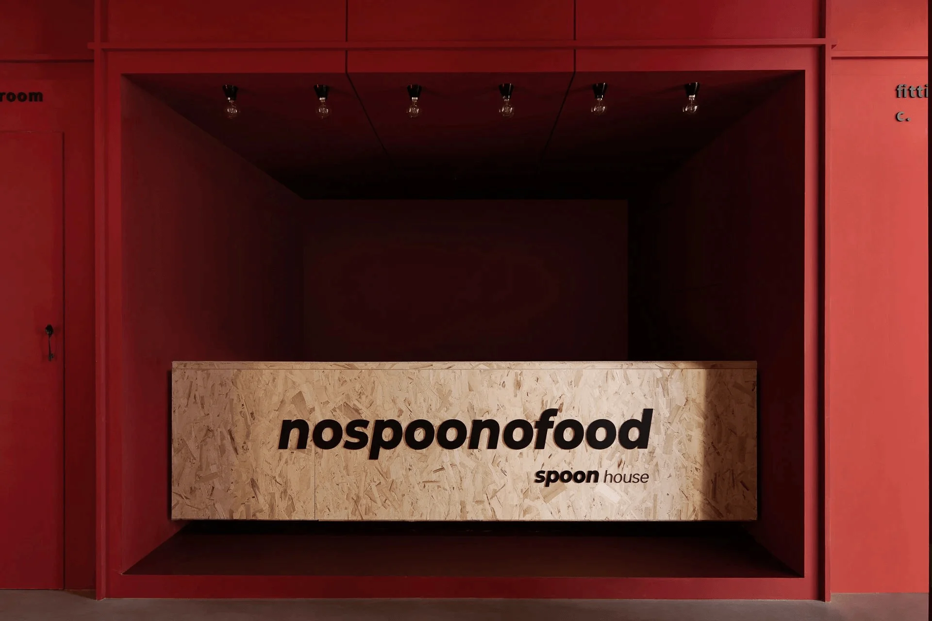
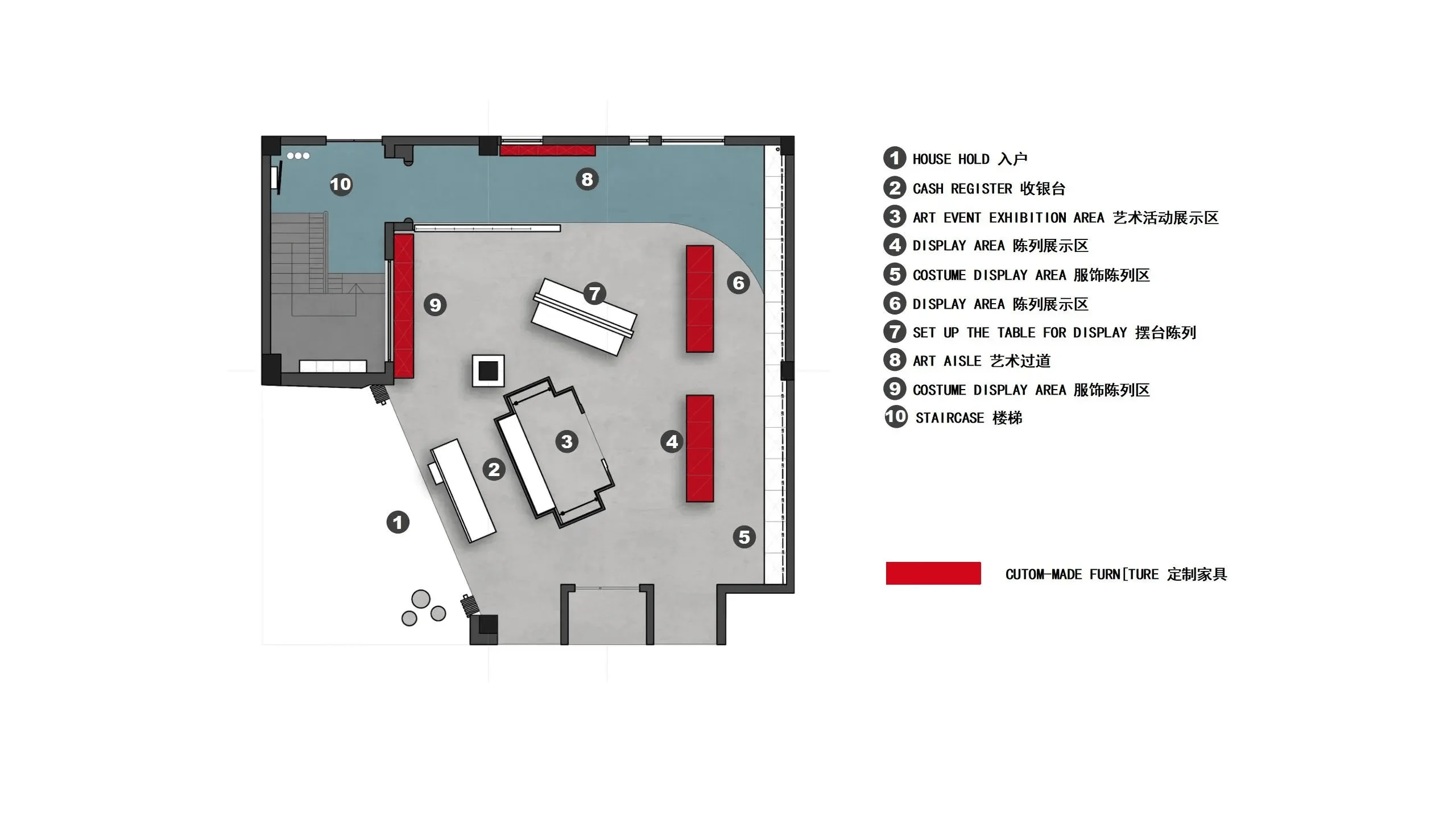
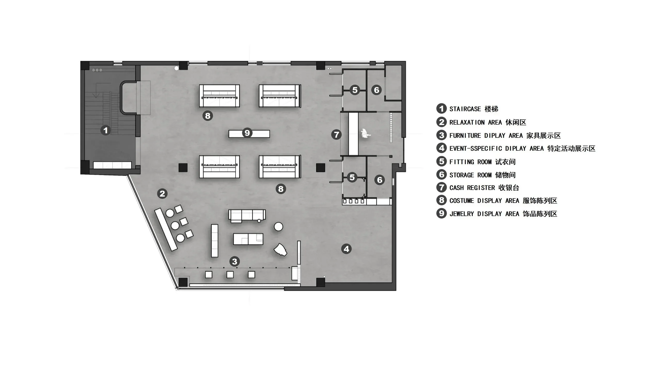
The space was divided into two floors. The ground floor primarily featured the coffee area and clothing display sections, while the second floor was dedicated to a lifestyle section. The coffee area was designed with a minimalist approach, focusing on functionality and maintaining a laid-back vibe. The clothing section incorporated a warm aesthetic, using OSB (Oriented Strand Board) for storage units, which helped soften the space while allowing the garments to take center stage. Flexibility was prioritized through the use of movable units for product displays and branding elements. The designers utilized a ‘box-in-box’ design approach, drawing inspiration from architect Georges Candilis’ experimental prefabricated housing, which fostered a sense of intimacy within the open and dynamic space. This concept is evident in the retail space design with a mix of open and enclosed areas, creating a unique shopping experience within the store.
Exterior Design and Aesthetics
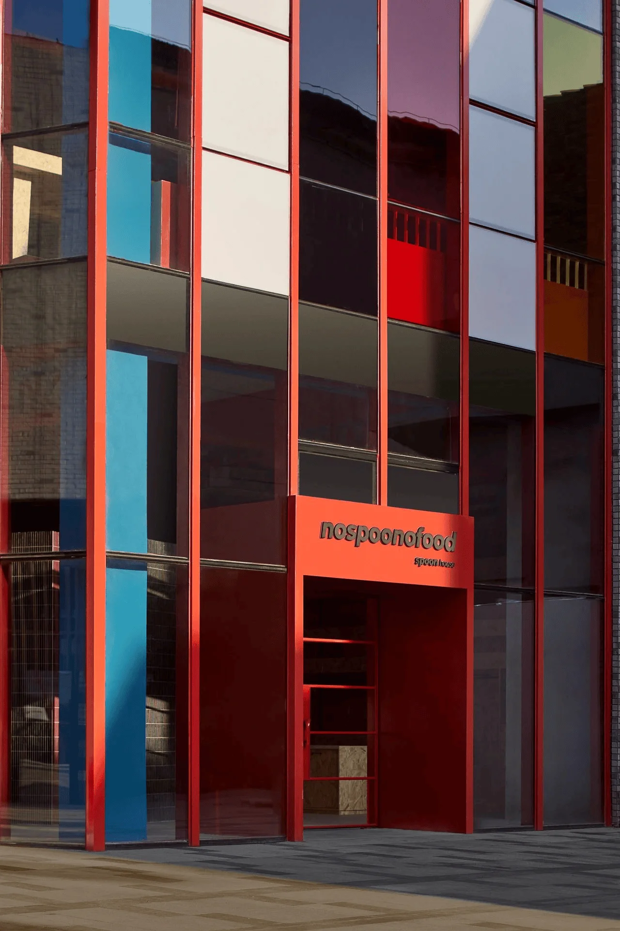
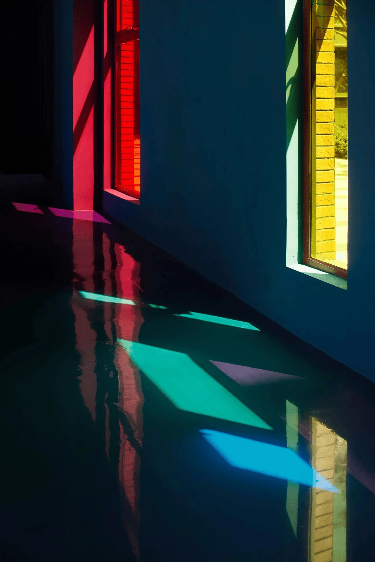
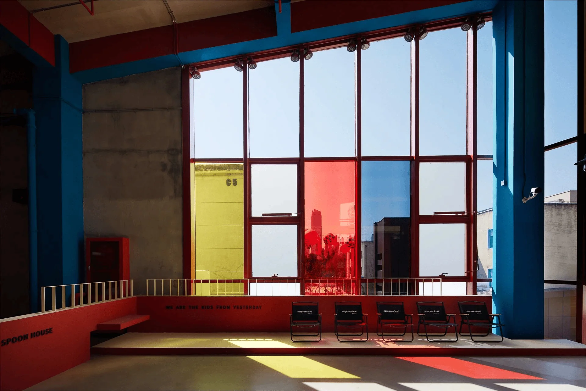
The exterior glass facade, divided into a grid of rectangular segments, played a crucial role in the design. The designers creatively repurposed this existing element, employing vibrant glass films in red, yellow, and blue to transform the building’s exterior. This bold use of colour created a dynamic and eye-catching façade that revitalized the exterior. The layout of the windows was based on the Golden Ratio, a concept from mathematics, enhancing the visual appeal of the exterior. The choice to retain the original red brick and expand upon it with accentuating hues of red helped establish a unified aesthetic. This particular use of color and form create a visual impact on the exterior design of the store, a key element of the retail space design.
Materiality and Sustainable Practices
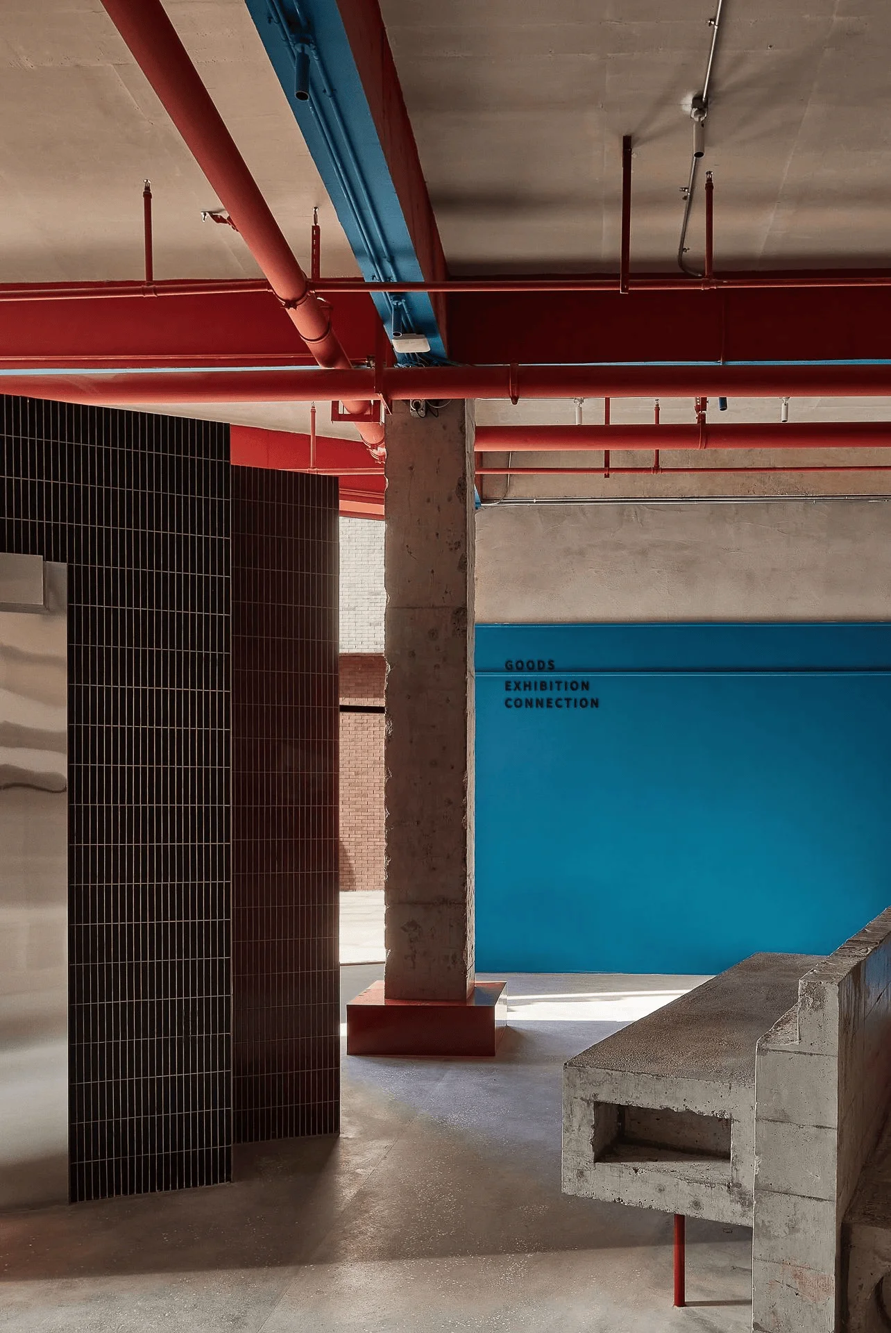
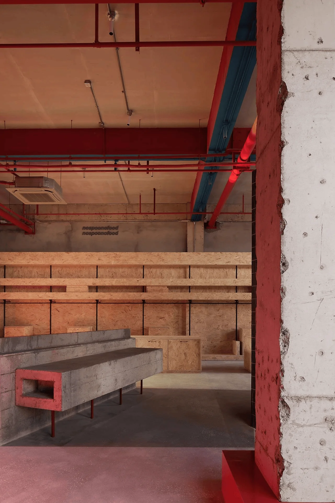
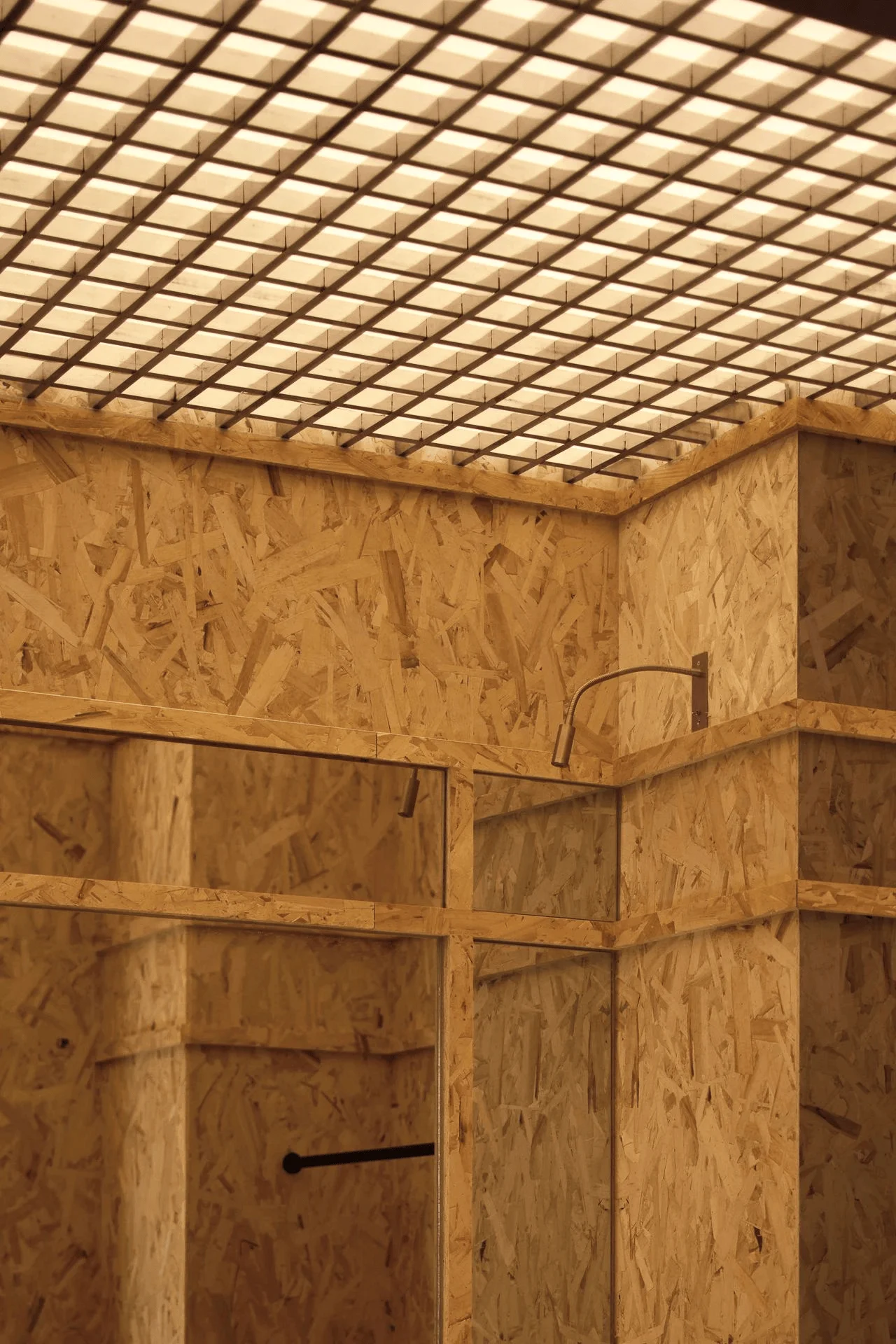
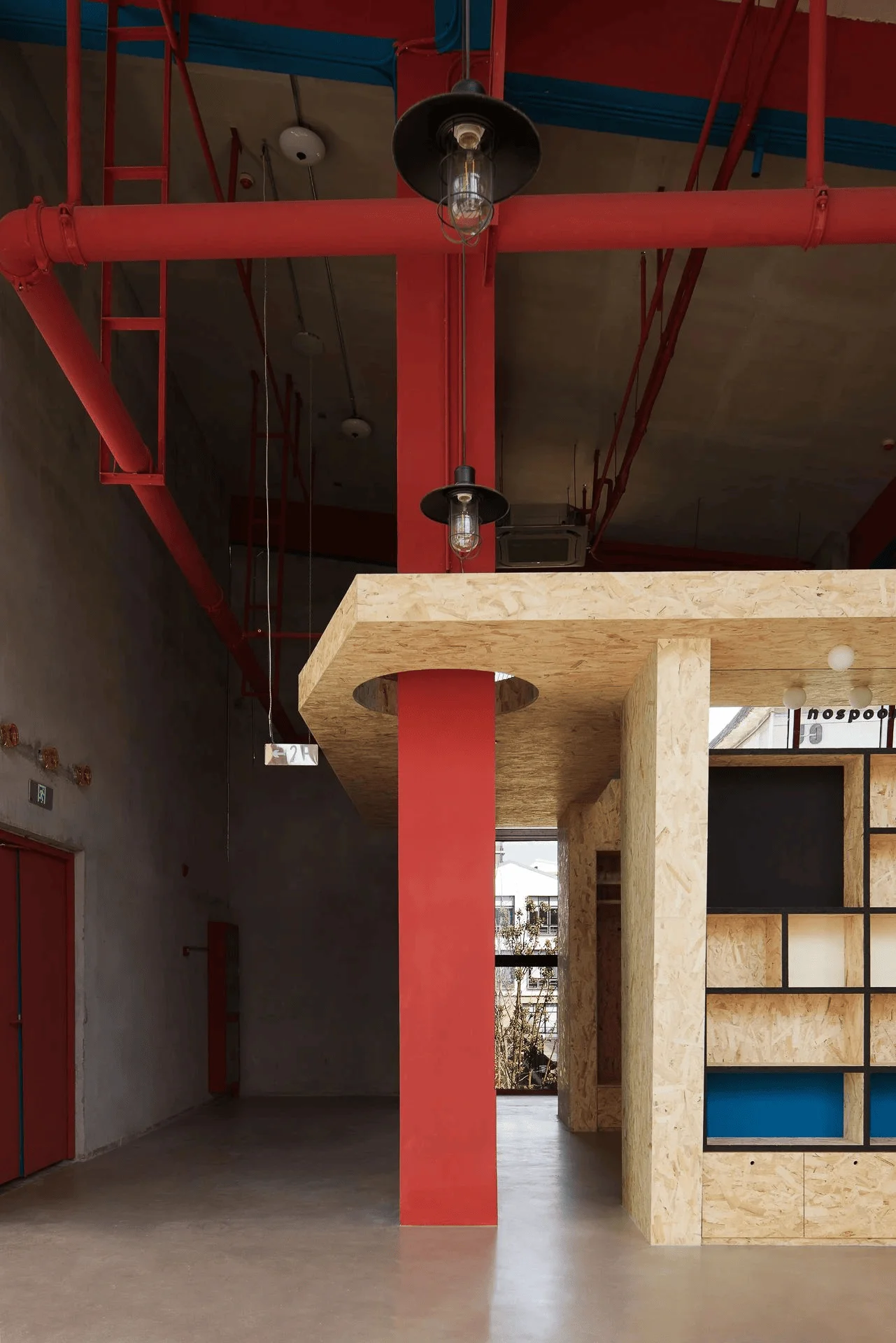
The materials chosen were simple yet impactful. Red bricks, a defining feature of the original structure, formed the foundation of the colour palette. Concrete, exposed brick, and OSB were predominantly used. The interior design approach focused on revealing the raw textures of materials, rather than obscuring them with layers of finishes, which is a key part of the retail space design. Materials such as OSB boards were used for shelving units and structural features, adding to the industrial aesthetic. This approach highlighted the natural characteristics of the building and its materials, creating a space that was both functional and aesthetically pleasing.
Technology and Integration
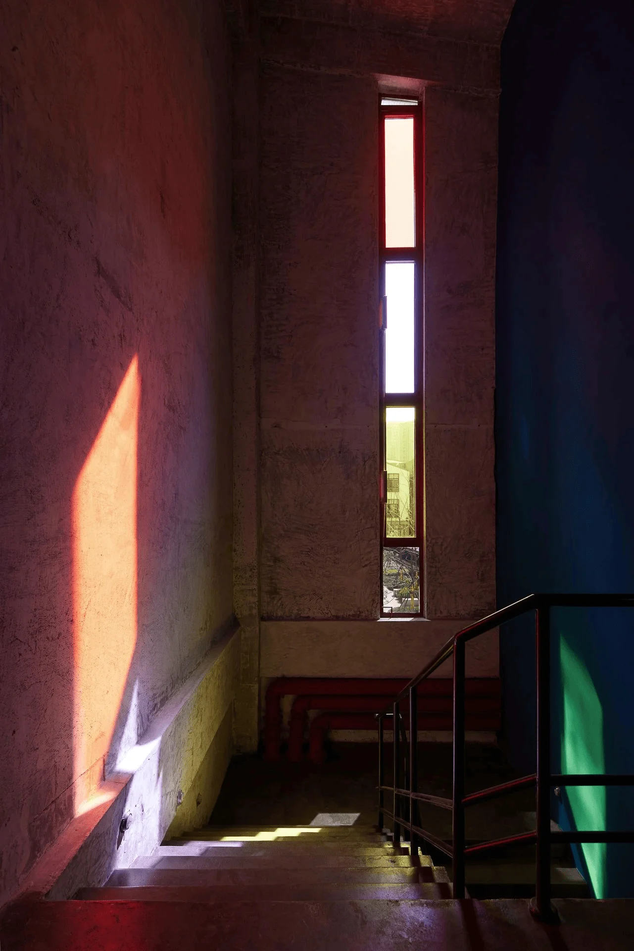
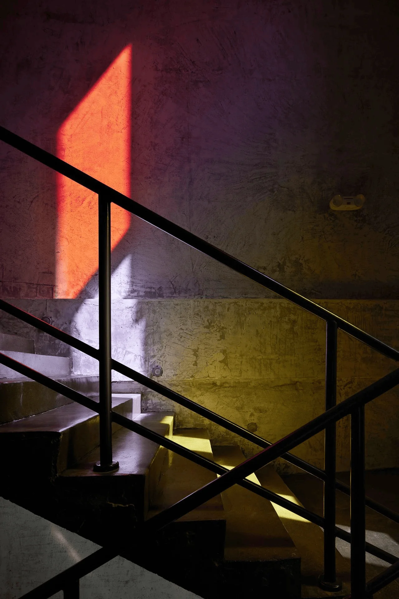
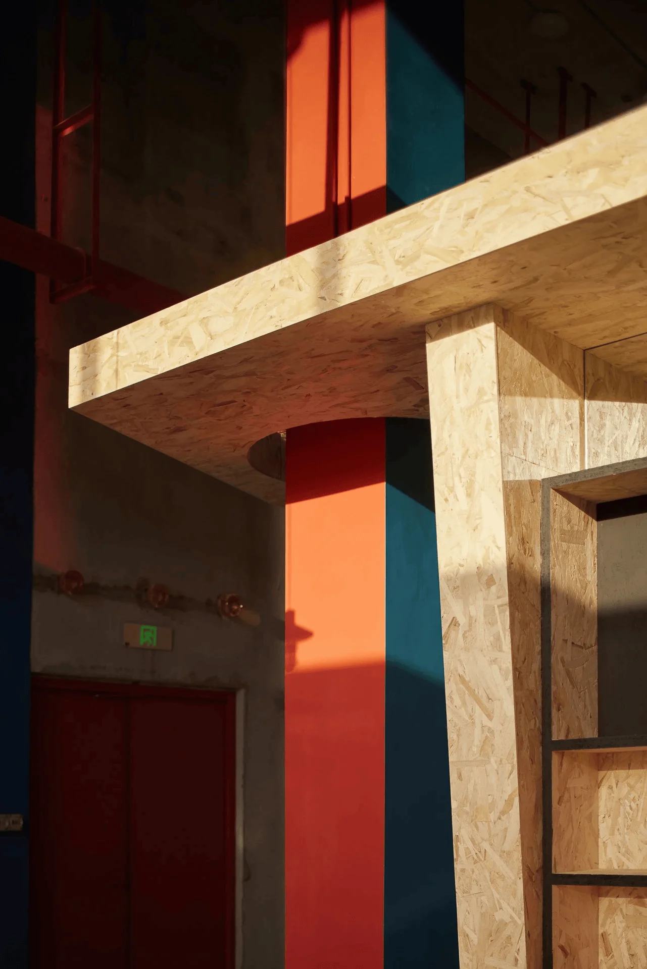
Lighting played a significant role in emphasizing the interplay of colour and light within the space. The design of the staircase leading to the second floor, inspired by the architectural approach of Tadao Ando, showcased the interaction of light and materials through a long, narrow window. As the afternoon sun streamed in, the coloured glass fragmented and projected its hues onto the staircase, creating a unique and dynamic visual effect. The integration of natural light enhanced the spatial experience and highlighted the textures of the interior materials. LED lights are incorporated within the space to give the desired ambiance during the nighttime, enhancing the retail space design.
Cultural and Social Impact
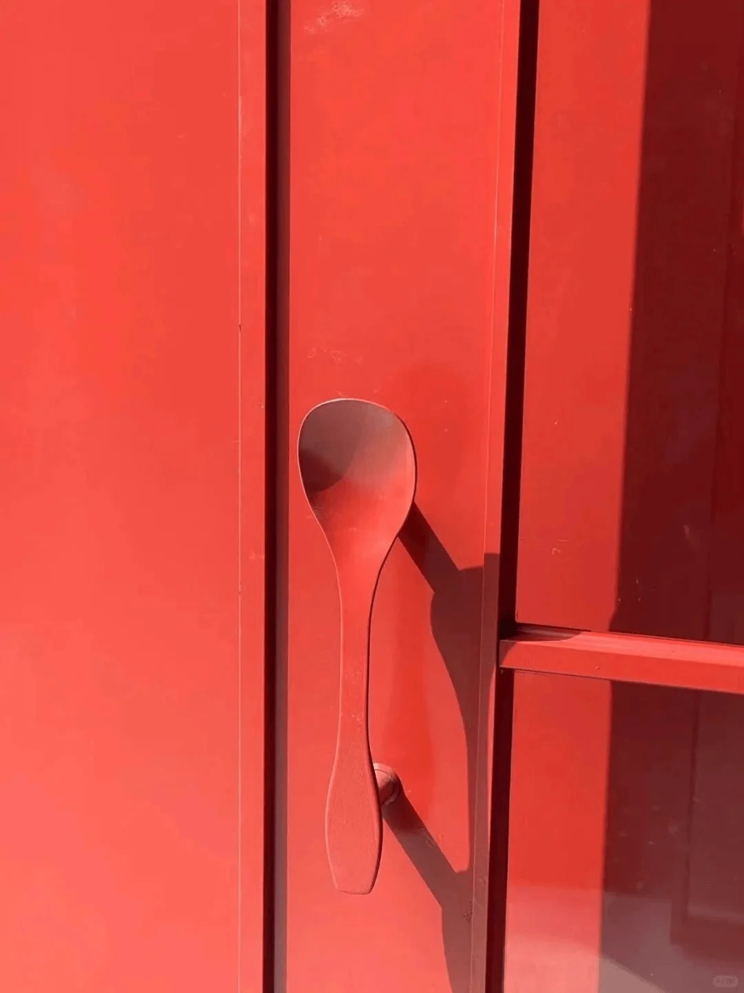
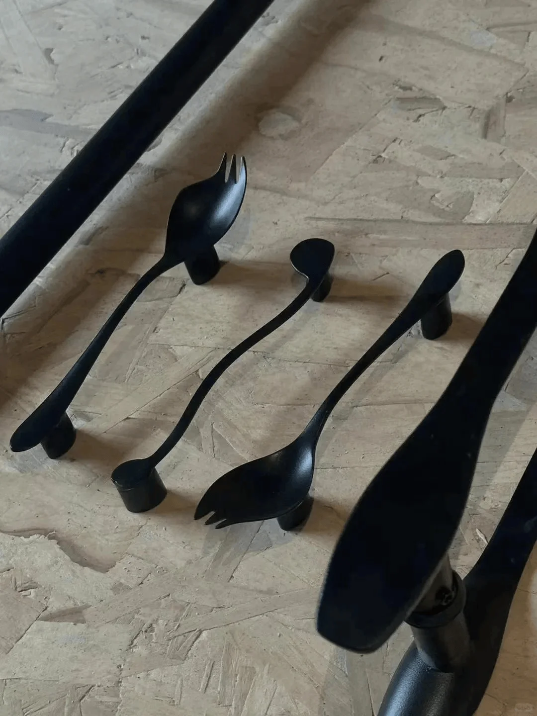
The concept of playfulness and lightheartedness was woven into the design through the use of spoon-shaped details. In the local dialect, a spoon is often associated with vanity and a playful disposition. The design team integrated this idea by transforming spoons into handles, display shelves, and other functional elements throughout the space. The use of spoons extends the brand’s aesthetic throughout the space in a fun and humorous way, which is a key element of the retail space design. This design strategy, in addition to the overall retail space design, helped enhance the brand’s presence and created an unforgettable shopping experience.
Construction Process and Management
The construction process respected the building’s history and structural integrity. Existing elements such as the brick walls, columns, and exposed pipes were retained and integrated into the design. Instead of covering up these existing features, the design team chose to celebrate them, using colour as a unifying element that harmonized the old with the new. This approach to retaining and showcasing original building features is a key part of the retail space design.
Post-Construction Evaluation and Feedback
SPOON HOUSE has successfully created a unique and engaging retail environment in Hefei. Its playful use of color, industrial aesthetics, and playful details has transformed the existing factory into a vibrant hub for the local community. The space is well-received by the local audience, especially young adults who appreciate the brand’s message and the lively atmosphere of the space. The success of SPOON HOUSE can be attributed to its unique design approach that aligns with the brand’s identity and targets a specific demographic. The incorporation of an event-specific display area also provides the brand with an opportunity to engage with the local community.
Conclusion
SPOON HOUSE showcases a unique retail space design approach that successfully marries vibrant colours with industrial aesthetics. The design team has skillfully integrated the building’s existing features with a playful and dynamic aesthetic, creating an environment that is both inviting and reflective of the brand’s personality. This project is a great example of how retail space design can be used to create a unique and memorable shopping experience and contribute to the revitalization of urban spaces. The project underscores the significance of embracing creativity and innovation in design, emphasizing that even seemingly ordinary spaces can be transformed into vibrant and functional environments that reflect a particular cultural identity and connect with a target audience. The creative use of colour and materials, along with a playful approach to design, elevate SPOON HOUSE to a successful and popular retail space.
Project Information:
Retail Space Design
QUANTUM SPACE
China
2021
426㎡
Red brick, concrete, OSB
N/A


