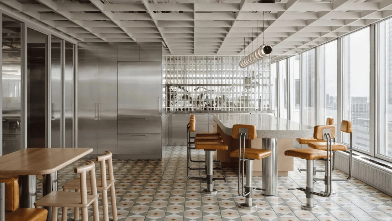
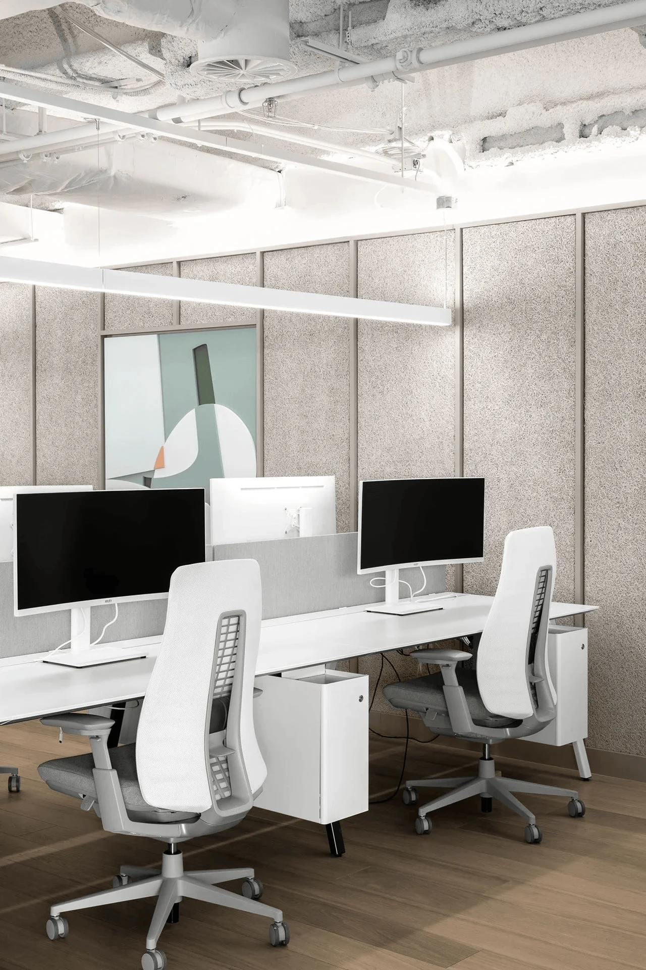
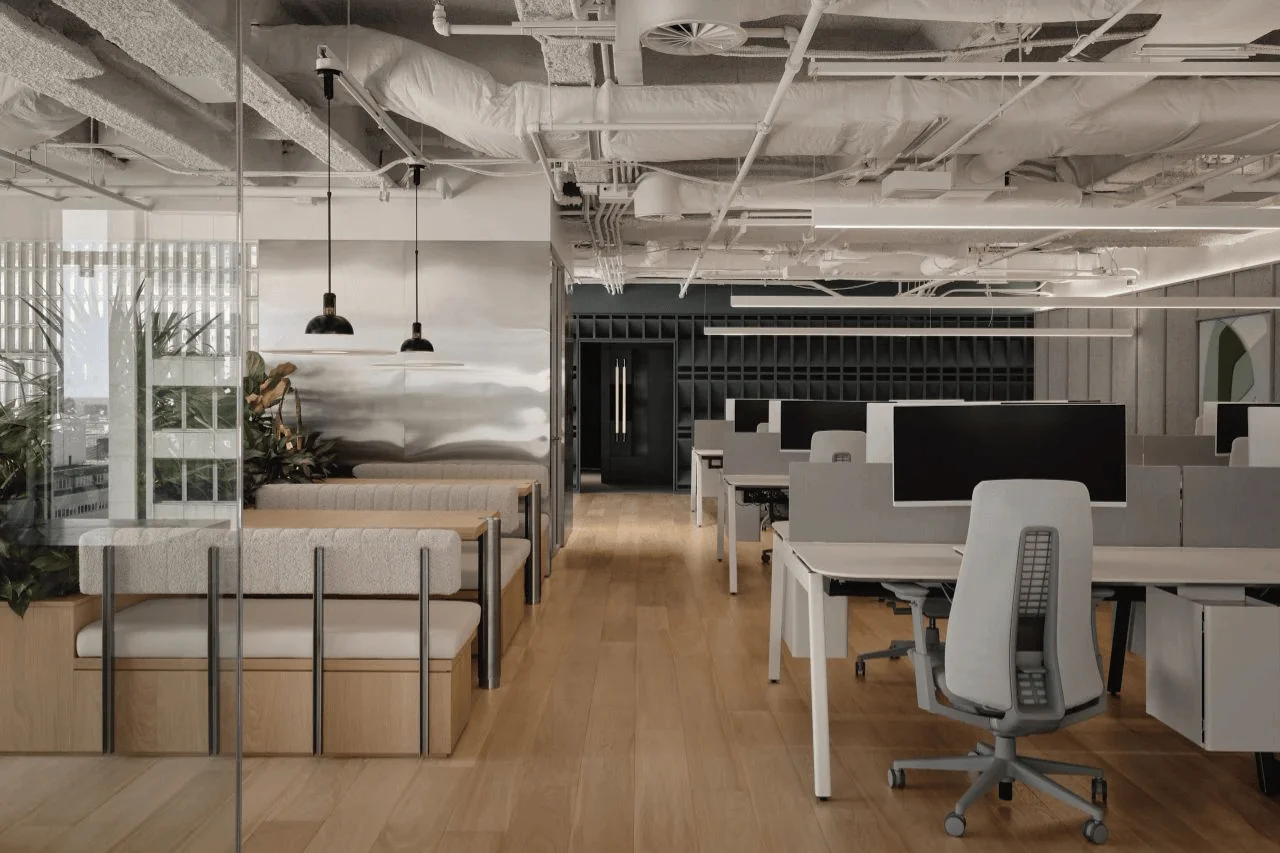
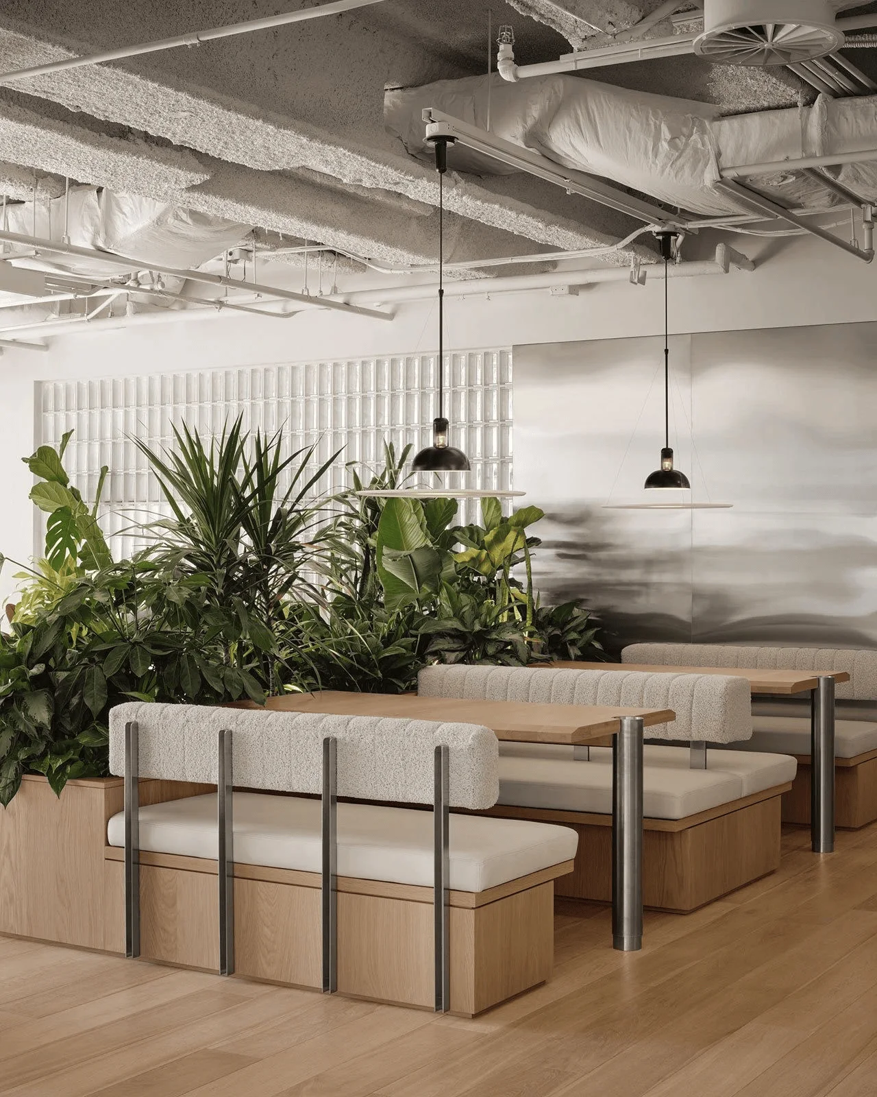
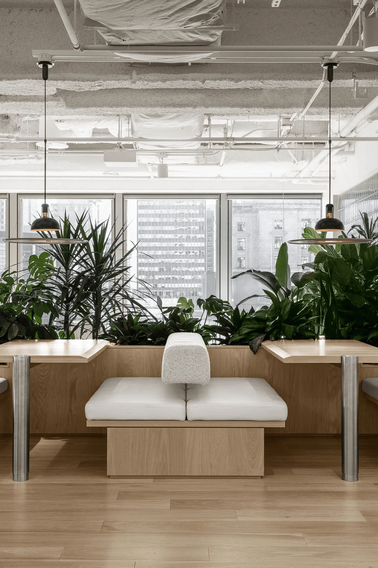
TEC ENERGY’s Montreal office showcases mid-century modern design with contemporary minimalism by MRDK.
Contents
Project Background and Context
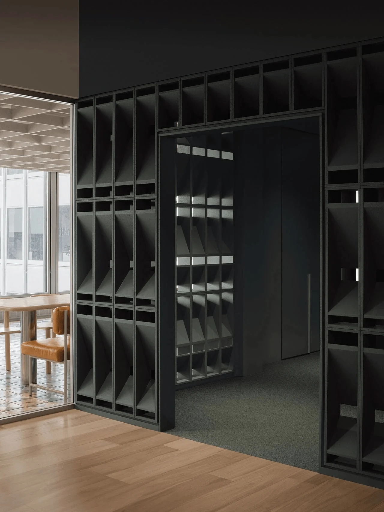
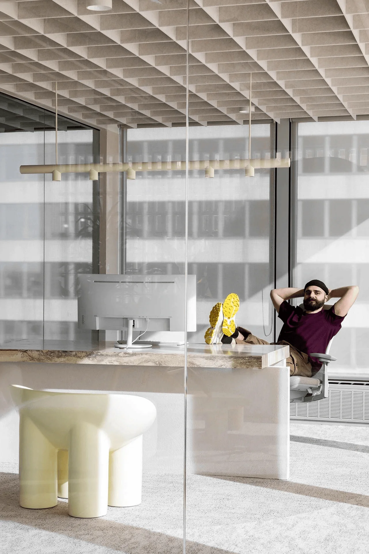
Located in the iconic Place Ville Marie tower in Montreal, Canada, TEC ENERGY, a data science company, has established a new office space. Designed by local architecture and design studio MRDK, the project aims to capture the essence of the building’s mid-century modern architecture while incorporating contemporary design principles. The 47-storey skyscraper, completed in 1962, was designed by renowned architects I. M. Pei and Henry N. Cobb, and the project seeks to honor this heritage through a minimalist aesthetic. This mid-century modern office design project is an excellent example of how to integrate historical context into contemporary workspace design. The project is tagged with #midcenturymoderndesign, #contemporaryminimalism, #workspacedesign, #officedesign, and #montrealofficedesign.
Design Concept and Objectives
MRDK’s approach to design is narrative-driven and rooted in a deep respect for the site and its history. They collaborate closely with clients, craftsmen, and materials to create unique and contextually relevant spaces. The design for TEC ENERGY sought to create an environment that reflected the company’s values and fostered a collaborative work culture. This approach is tagged with #designphilosophy, #collaborativeworkspace, and #montrealofficedesign. The design aimed for an atmosphere of effortless refinement, mirroring the essence of the landmark building and delivering a modern work environment with a strong emphasis on visual aesthetics and functionality. The project is tagged with #midcenturymoderndesign, #contemporaryminimalism, and #workspacedesign.
Layout and Spatial Planning
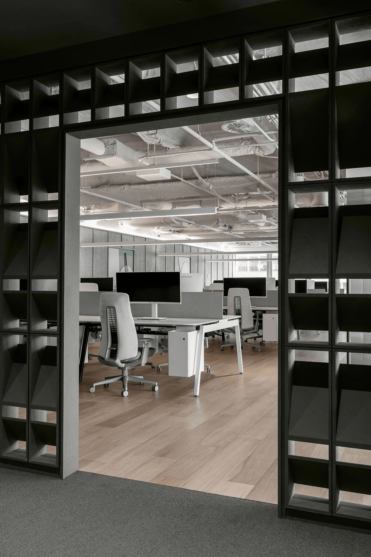
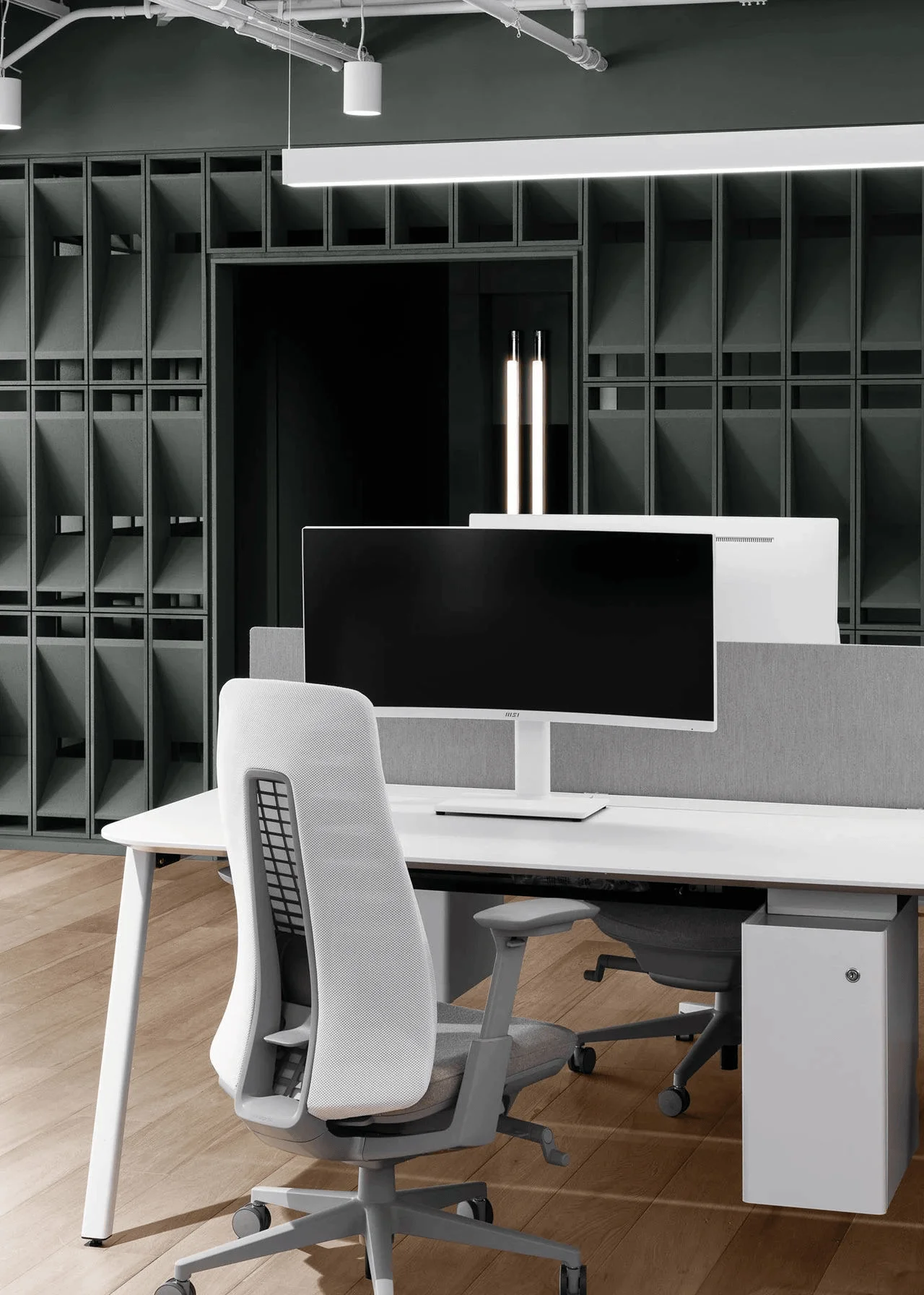
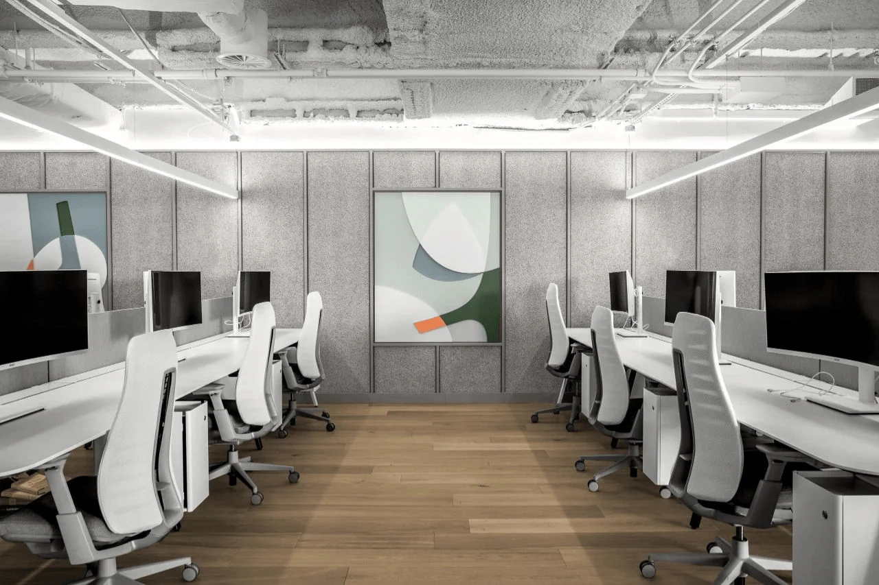
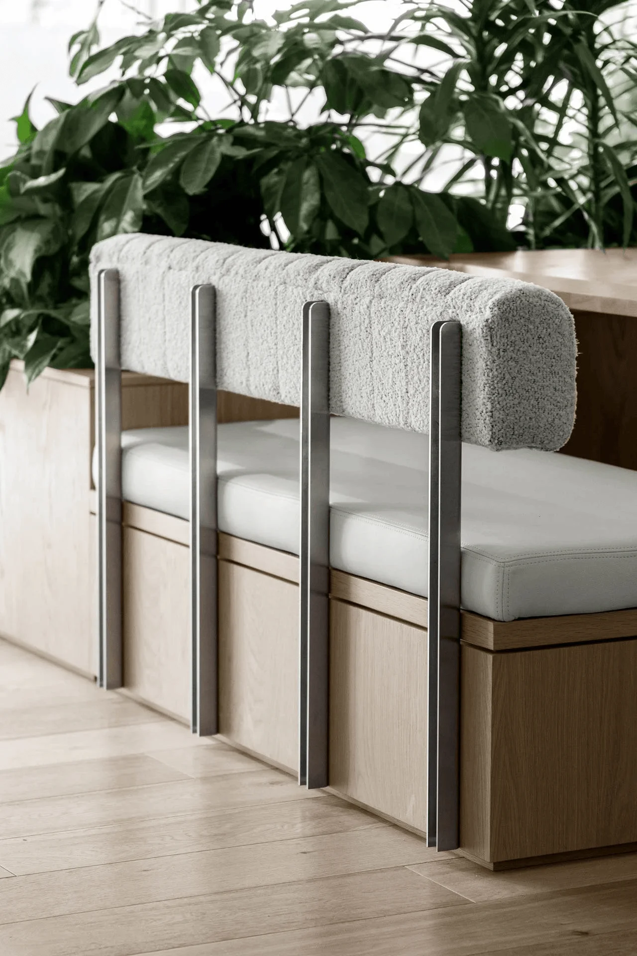
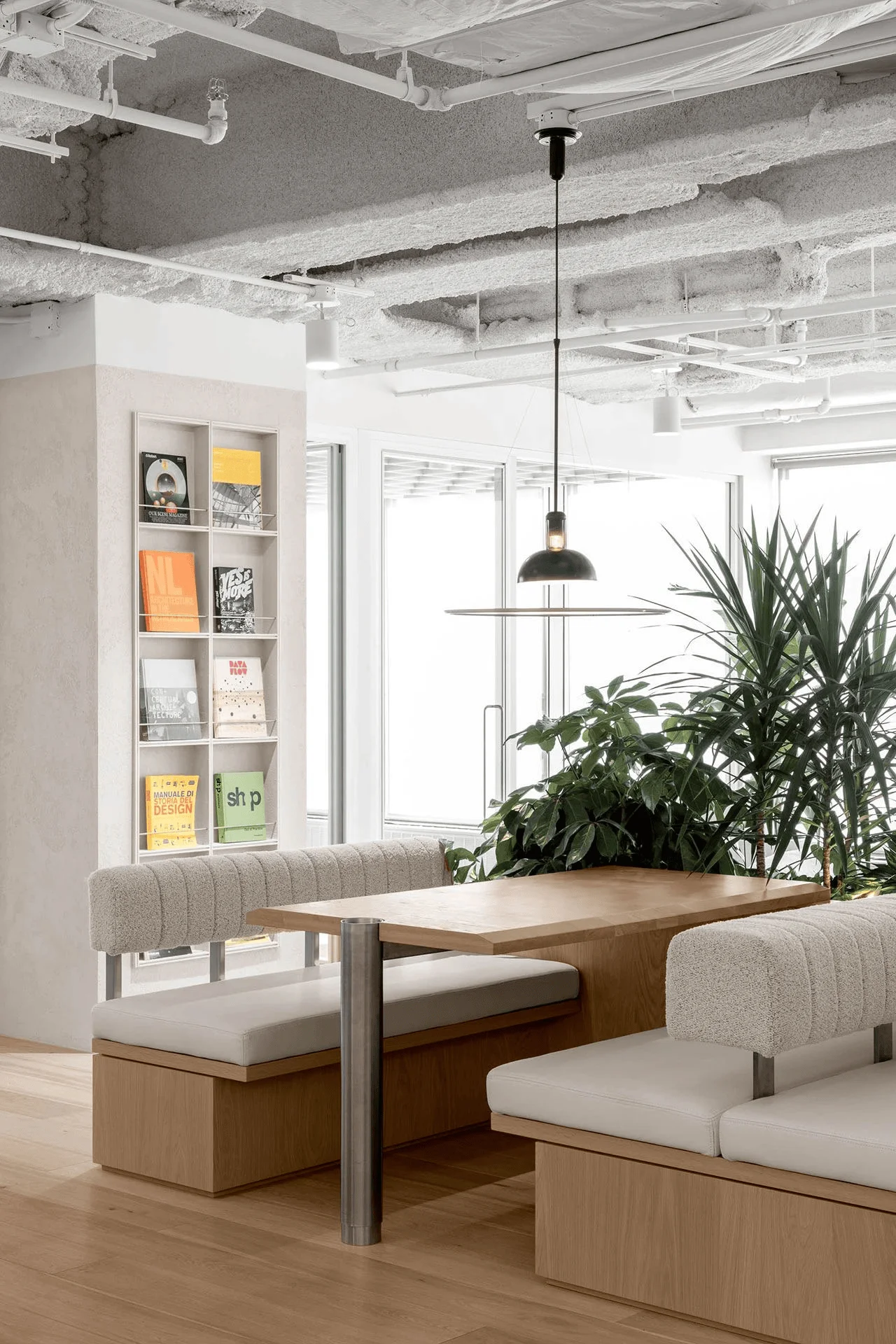
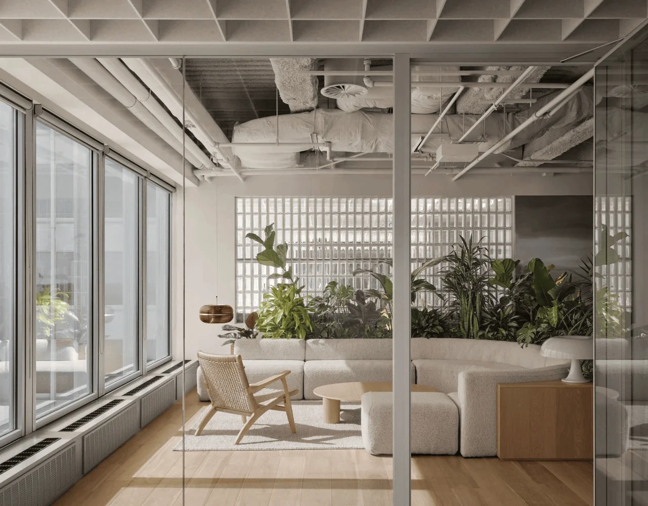
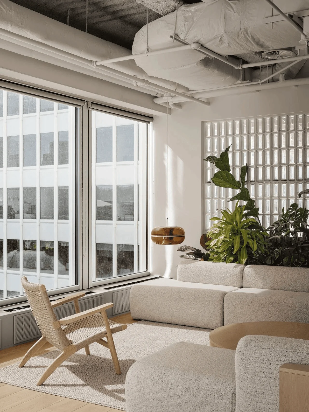
The office layout is designed to promote interaction and teamwork. Open-plan workstations encourage dialogue and collaboration among colleagues. A variety of breakout areas, including seating booths, a lounge nestled within a verdant space, and a phone booth, cater to diverse work styles and needs. These elements contribute to a dynamic and flexible workspace. The workspace promotes interaction through a variety of areas. This design approach is tagged with #openplanoffice, #breakoutarea, and #officedesign. The open-plan concept also ensures that natural light from the building’s glass facades is evenly distributed throughout the space, including the two private offices situated on the corner. The project is tagged with #naturallighting, #officedesign, and #montrealofficedesign.
Aesthetics and Materiality
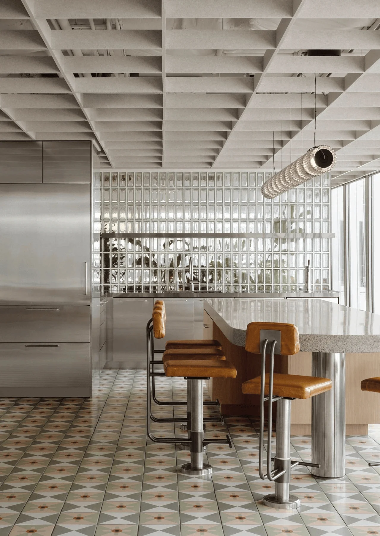
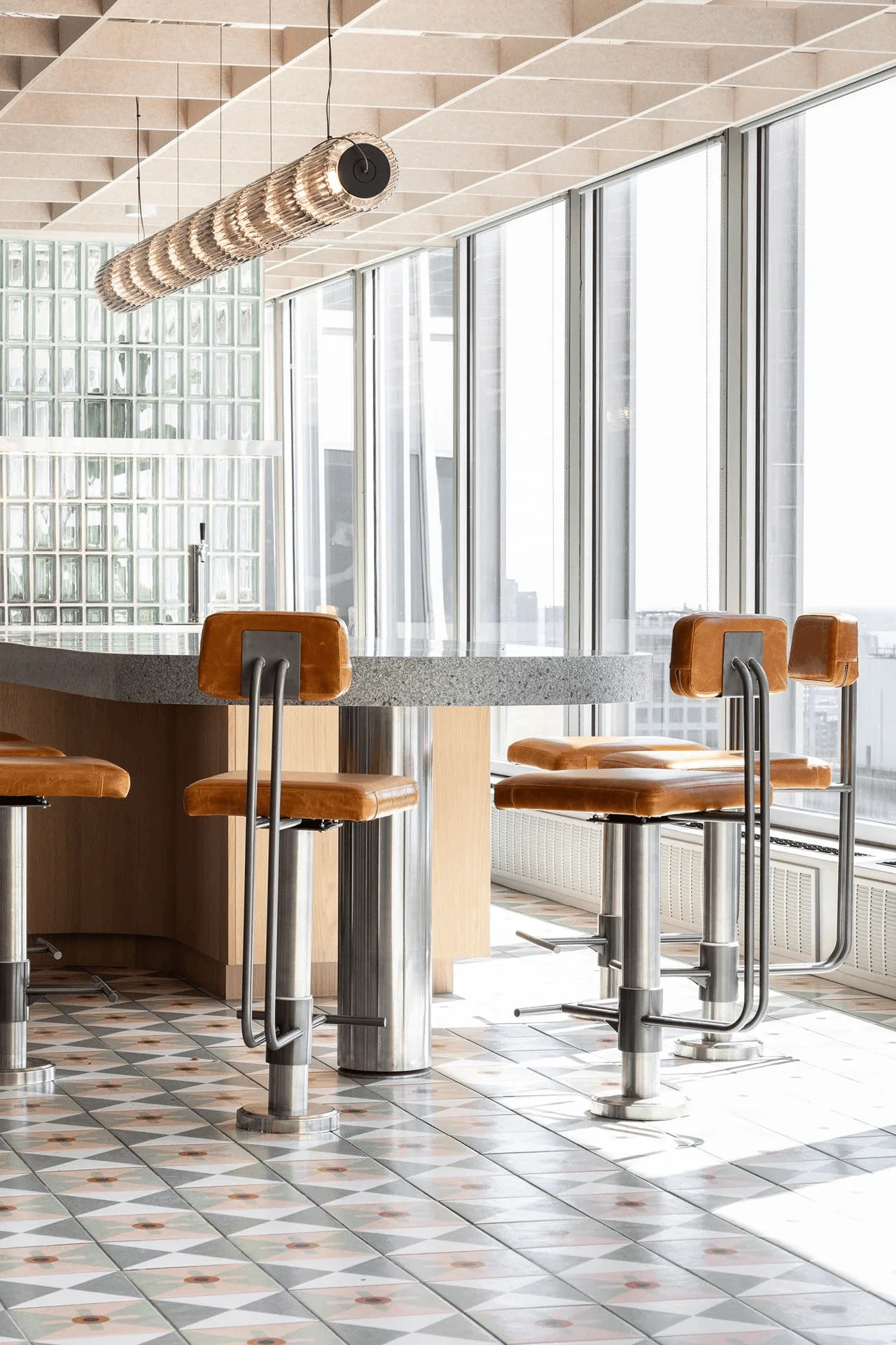
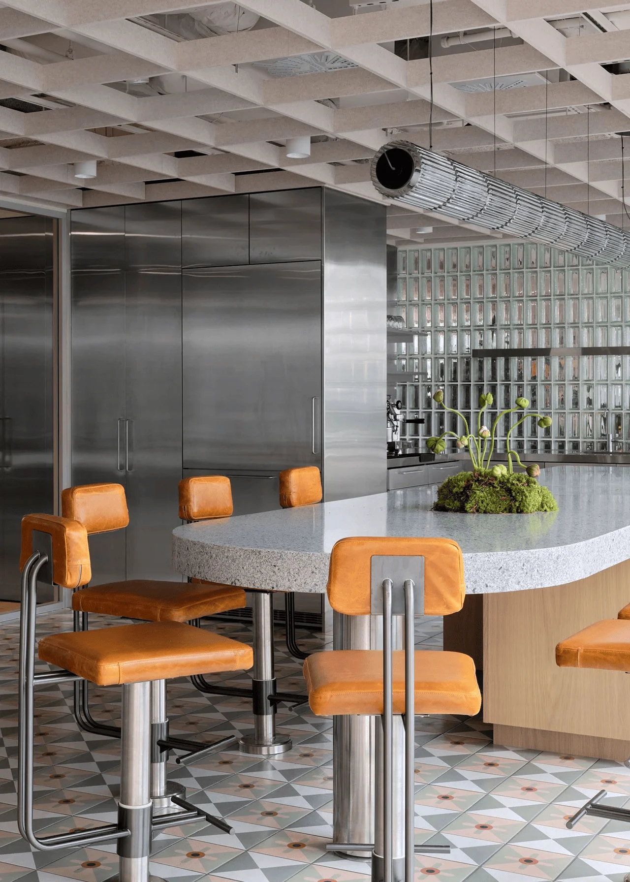
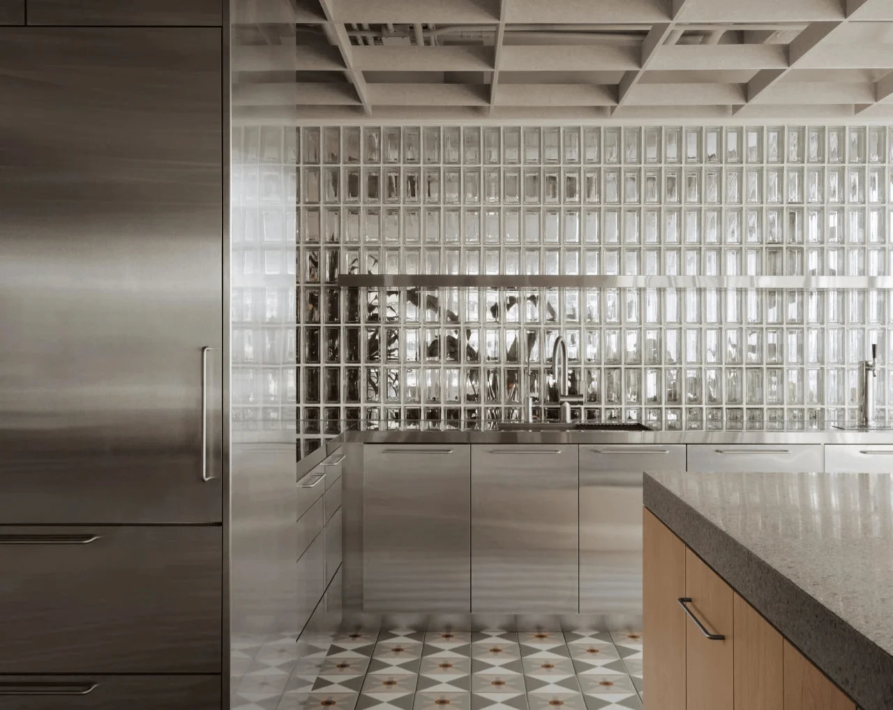
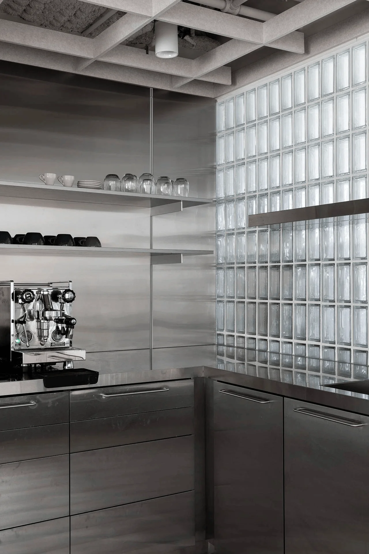
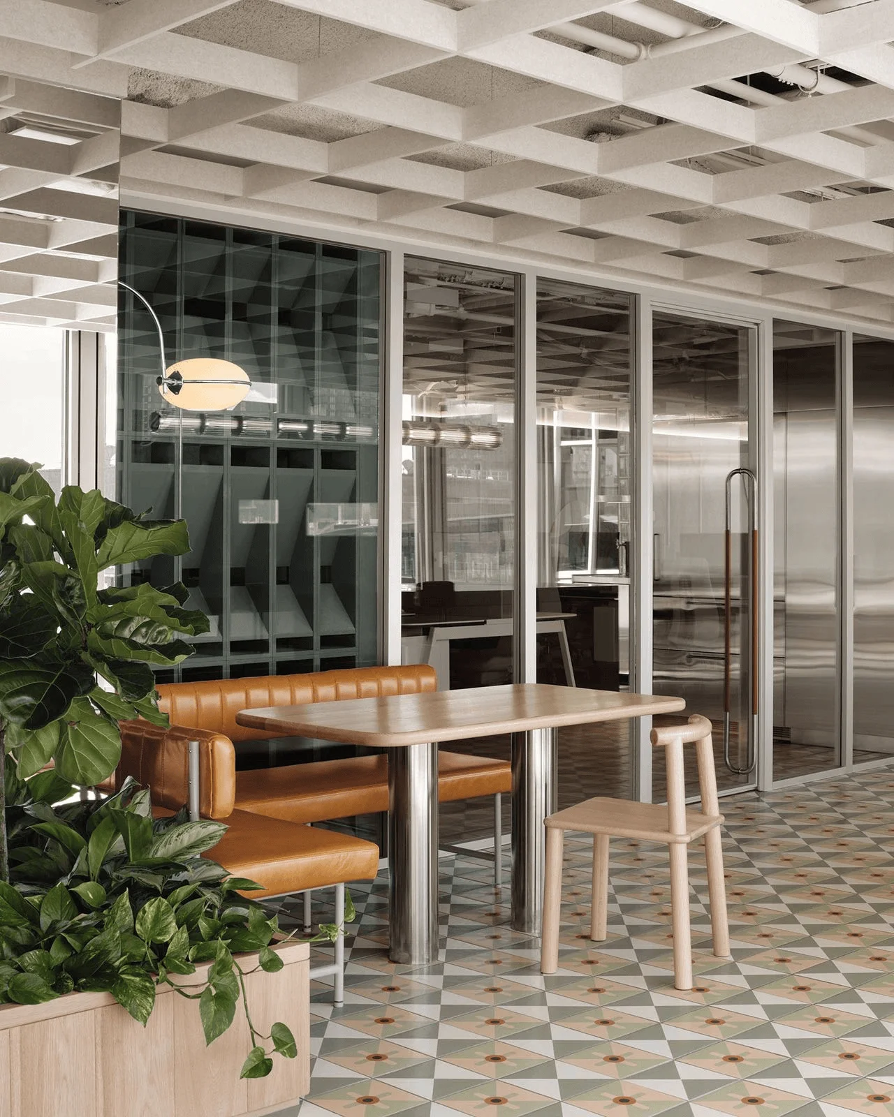
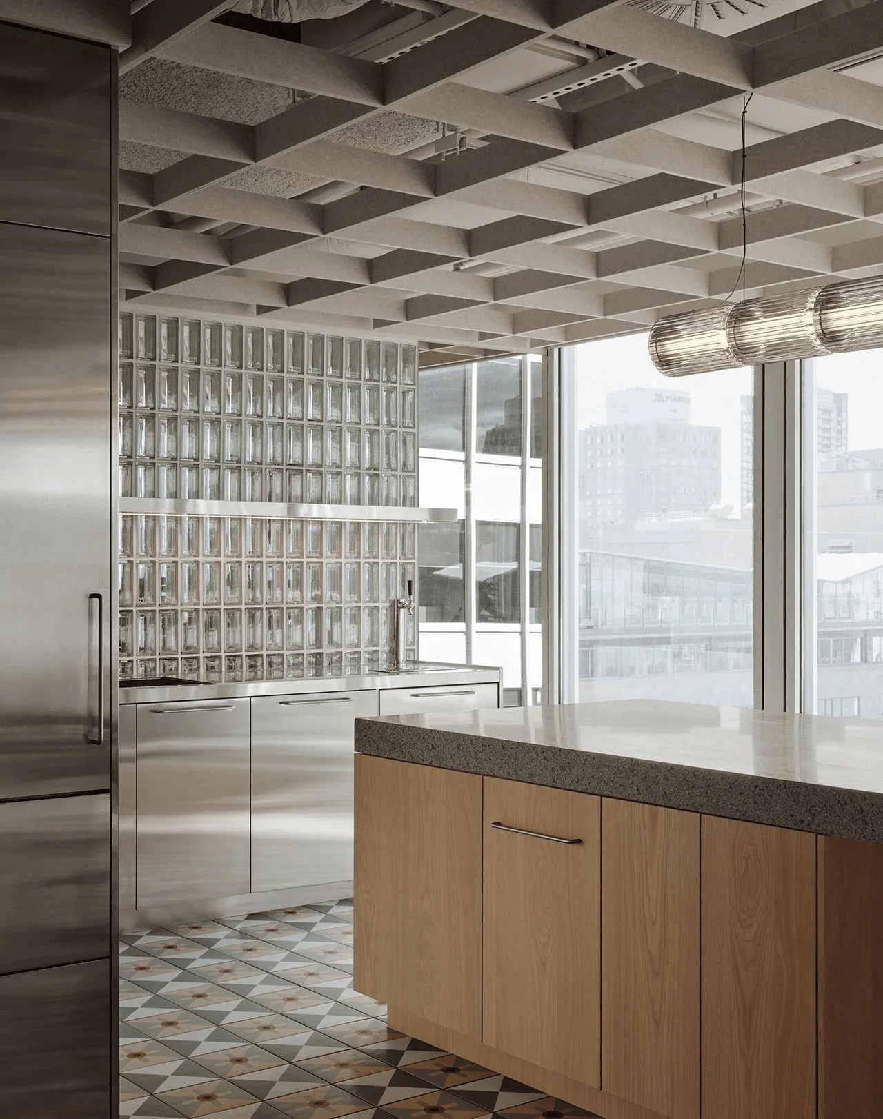
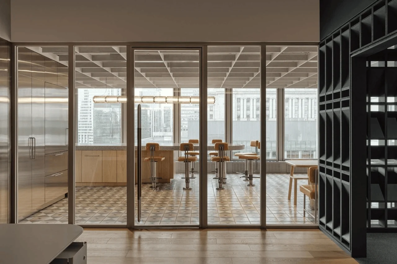
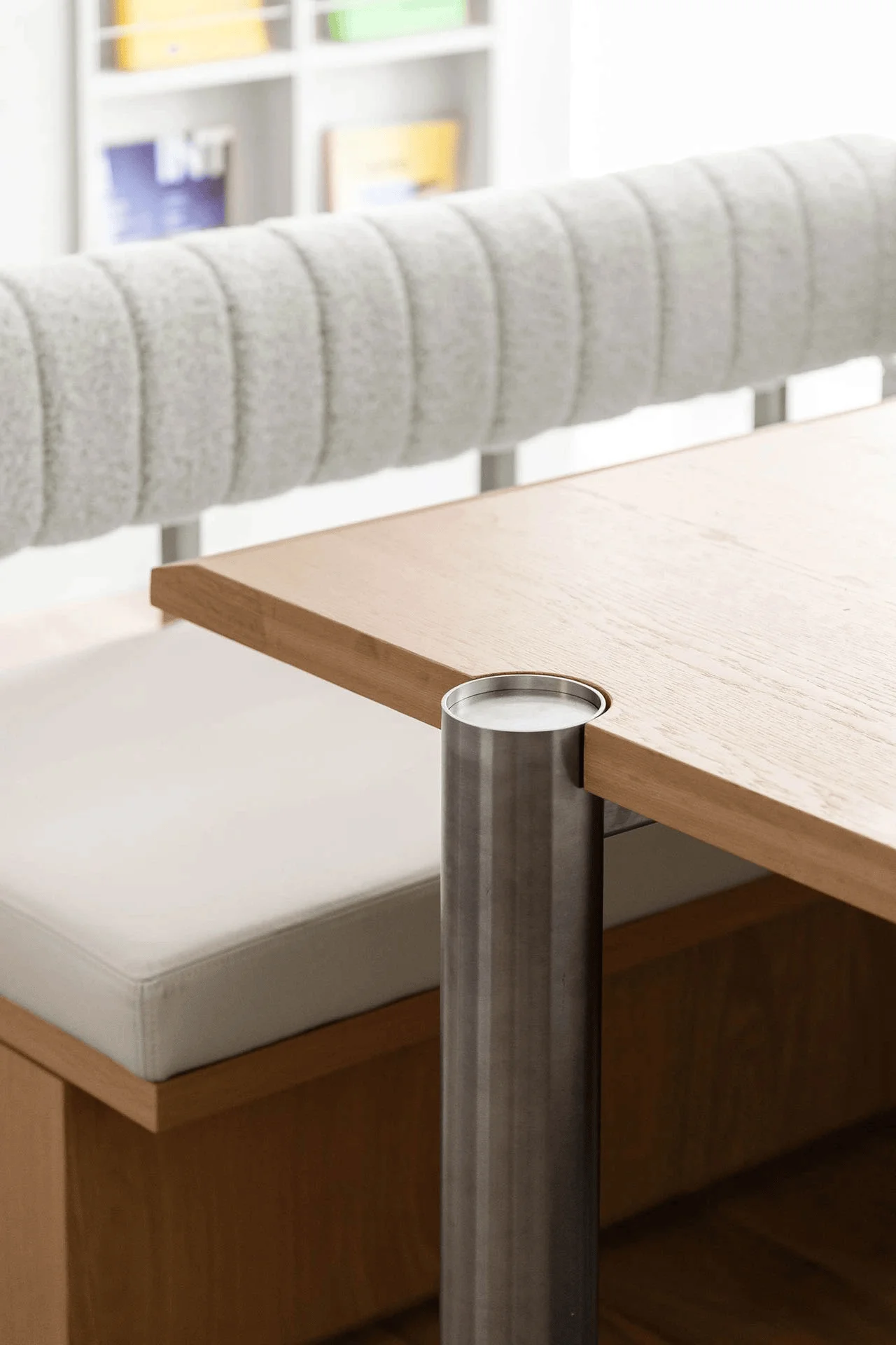
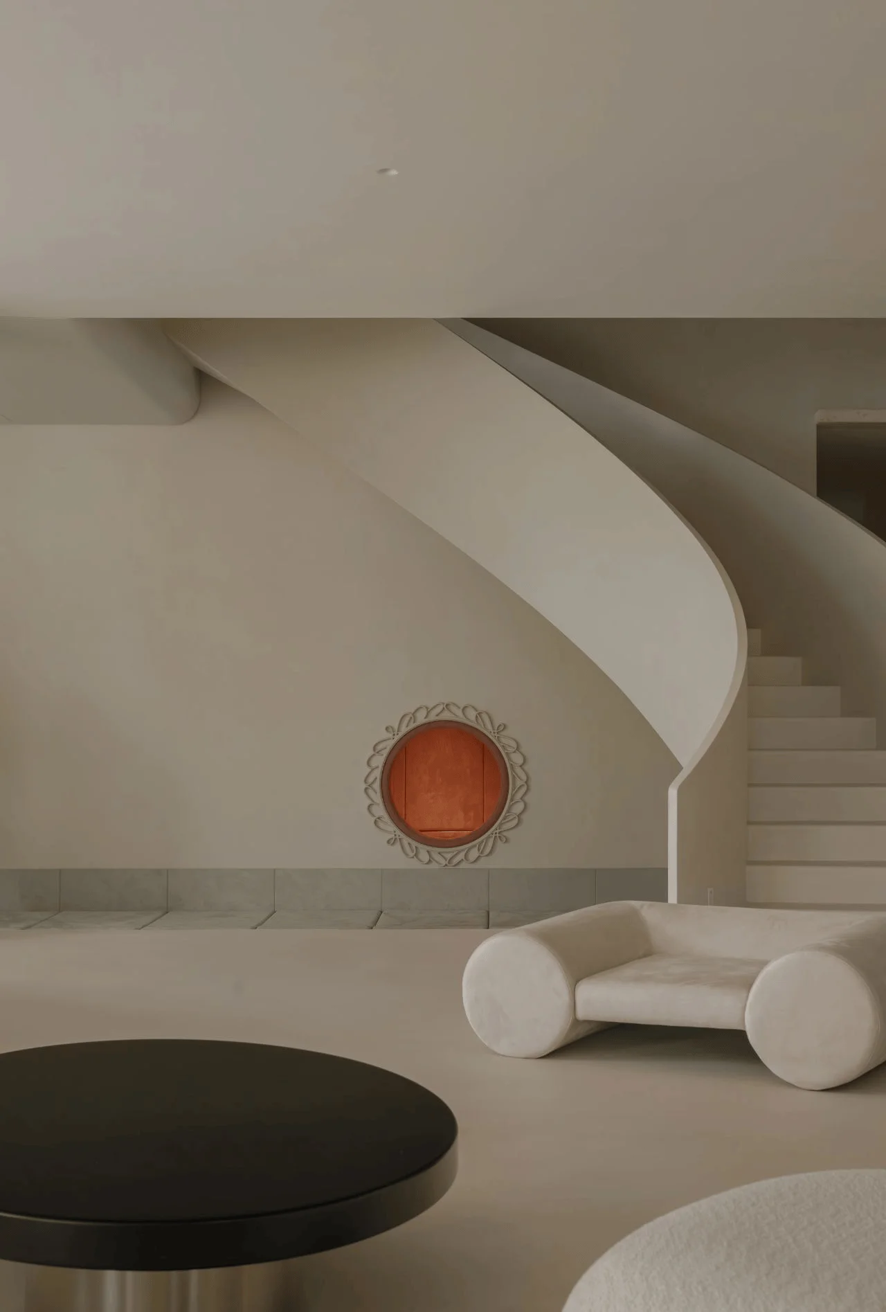
A muted palette of off-white, grey, and natural wood creates a sense of calm and elegance in the work areas. The incorporation of three abstract artworks by Caravane Studio, spelling out the company’s name, and the integration of greenery inject pops of color and vitality into the space. This curated selection of art and plants provides pops of color and adds a human touch to the otherwise minimalist aesthetic. This design approach is tagged with #minimalism, #colourpalette, #workspacedesign, and #officedesign. Bespoke sofas and seating booths add a contemporary touch of sophistication. The kitchen and dining area features a terrazzo counter complemented by burnt orange leather-upholstered stools and stainless-steel cabinetry, adding a touch of vintage industrial style to the overall aesthetic. The project is tagged with #midcenturymoderndesign, #contemporaryminimalism, and #officedesign.
Material Selection and Details
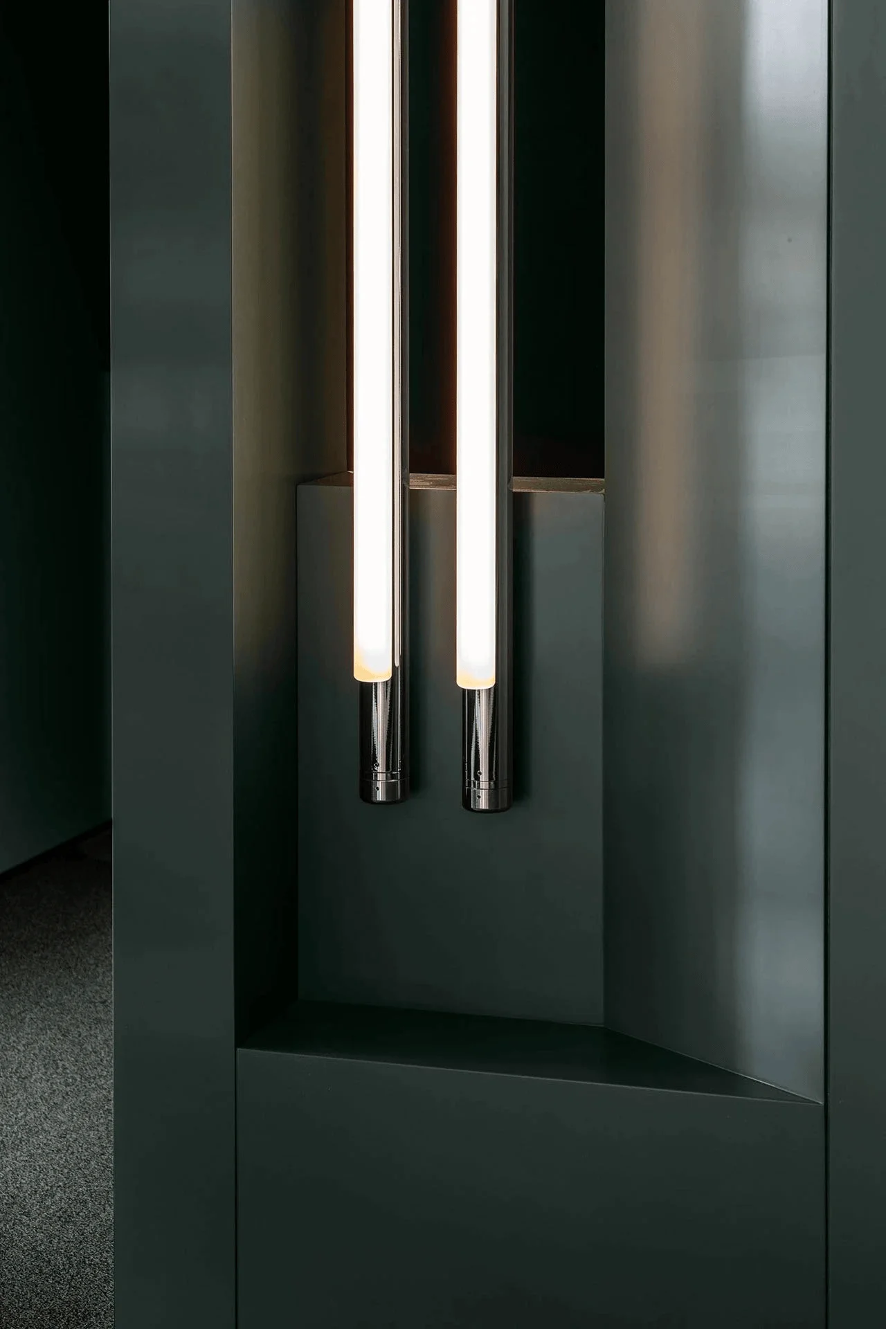
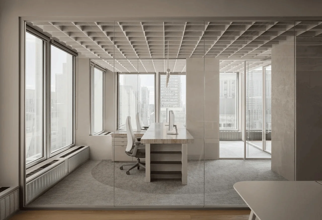
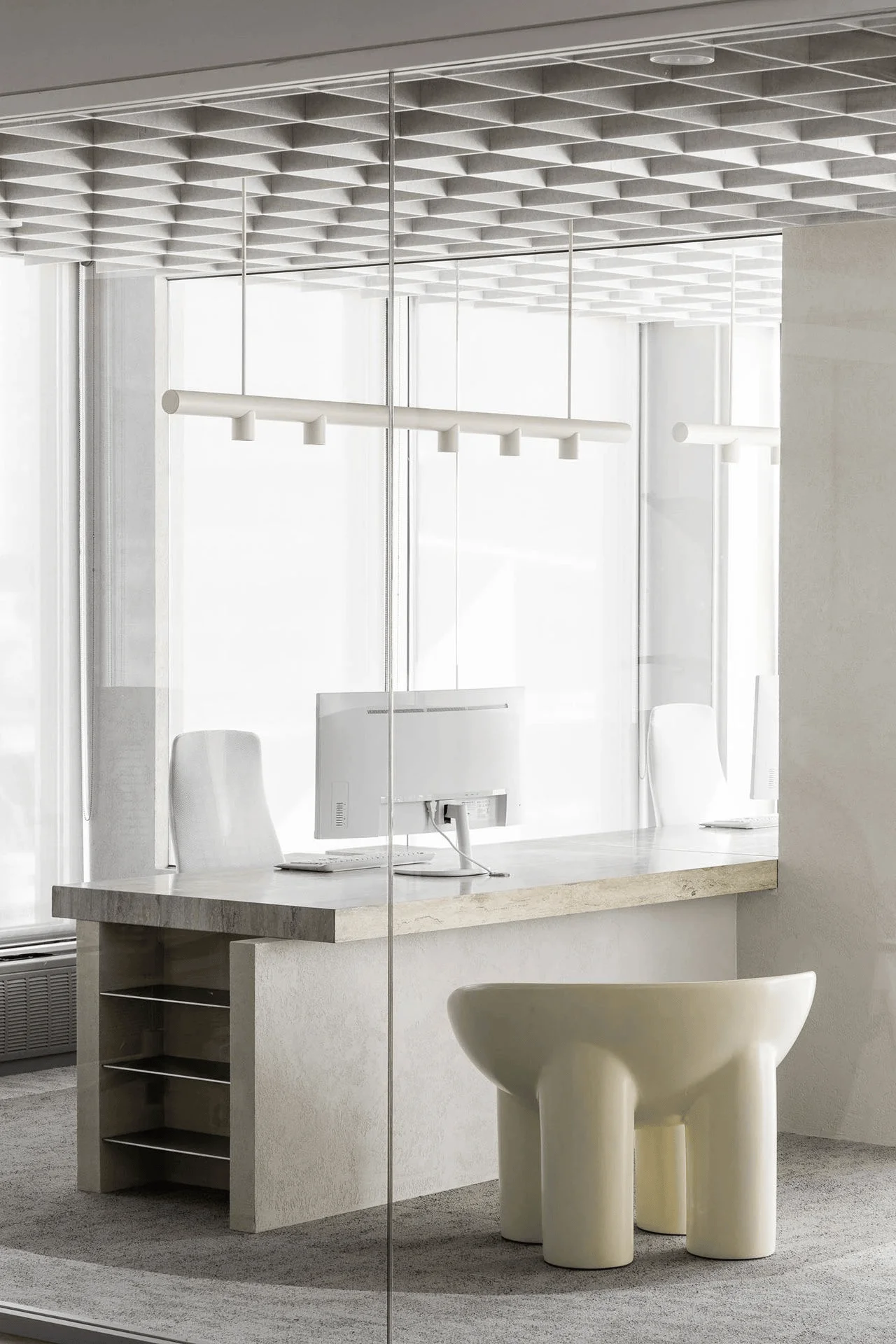
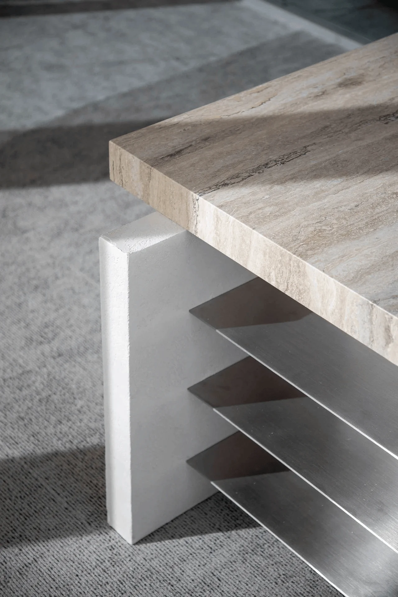
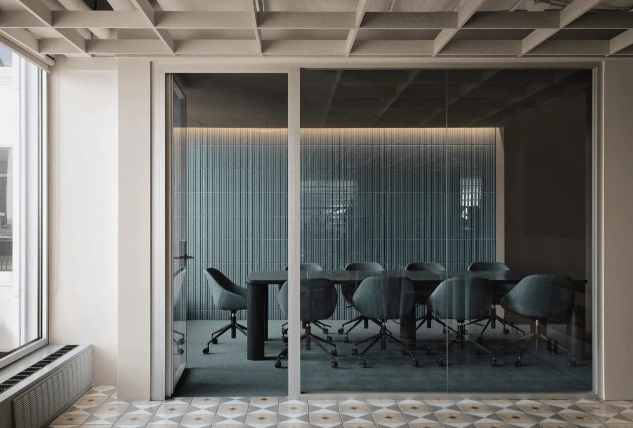
The use of travertine and aluminum in the private offices subtly echoes the building’s iconic identity and injects a sense of timeless elegance into the design. The kitchen and dining area’s decorative floor tiles by Mutina, stainless-steel cabinets, and burnt orange leather upholstery add a playful vibrancy that further enhances the space’s character. The selection of materials and finishes is carefully curated. This design approach is tagged with #materiality, #officedesign, #montrealofficedesign, and #workspacedesign. The project emphasizes the importance of selecting materials that are both functional and aesthetically pleasing, fostering a sense of harmony within the workspace. The project is tagged with #midcenturymoderndesign, #contemporaryminimalism, and #workspacedesign.
Acoustic Design and Integration
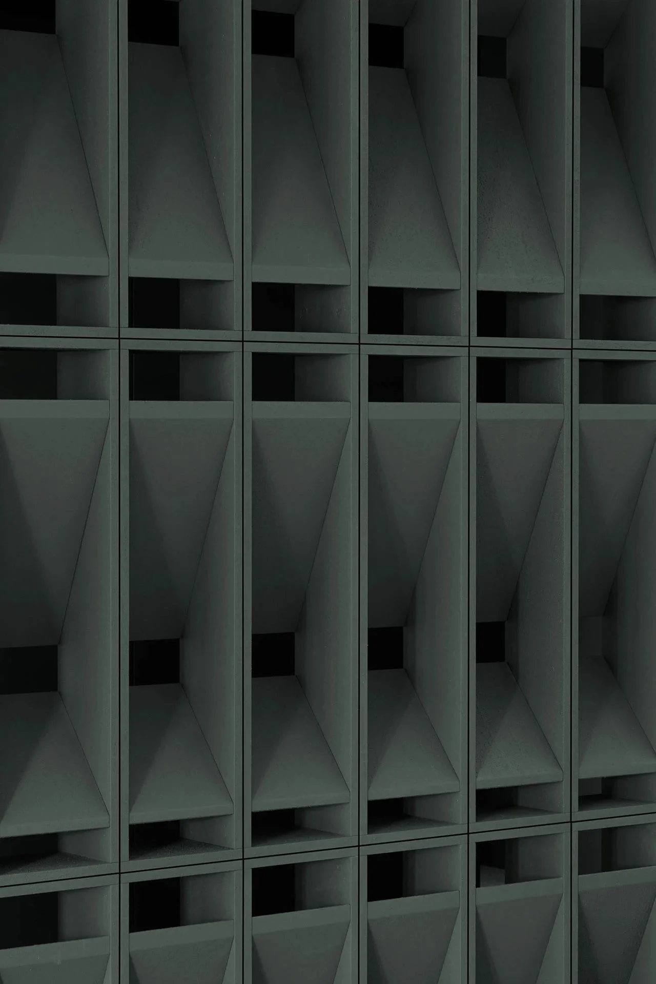
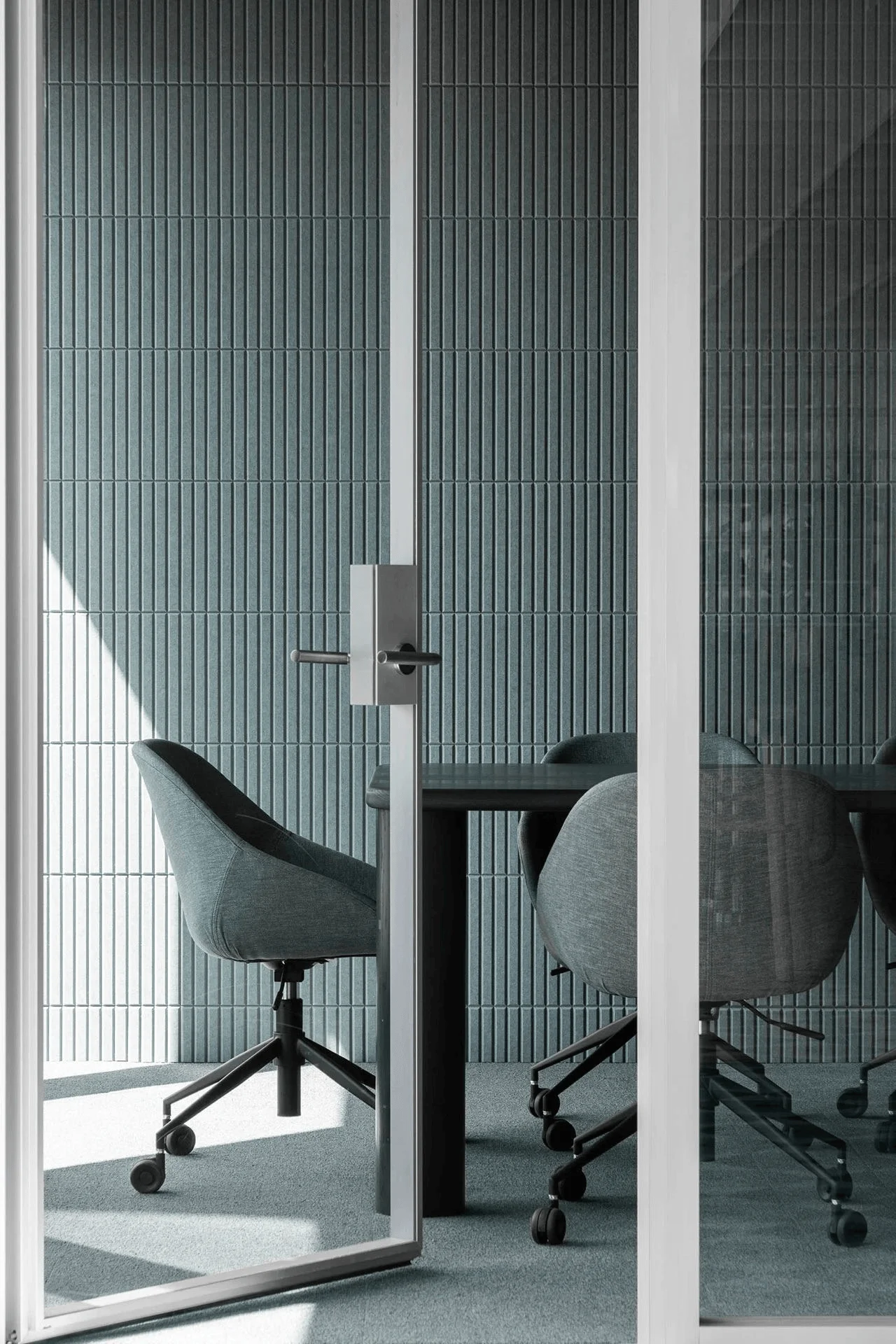
Acoustic considerations are crucial for a productive work environment. The design incorporates acoustic panels in the open-plan workstation area, while felt baffles in the private offices and the kitchen/dining area help to minimize ambient noise and conceal the exposed ceiling structure. This detailed attention to acoustic aspects ensures a quiet and focused workspace. The design approach is tagged with #acousticdesign, #workspacedesign, and #officedesign. This approach prioritizes the well-being of employees by providing a work environment that promotes focus and concentration. The project is tagged with #midcenturymoderndesign, #contemporaryminimalism, and #officedesign.
Project Information:
Office
MRDK
Canada
2023
Stainless steel, Travertine, Aluminum, Natural Wood, Terrazzo
Adrien Williams


