This modern Chinese architecture project reimagines the traditional academy typology with contemporary design elements.
Contents
Project Background and Design Concept
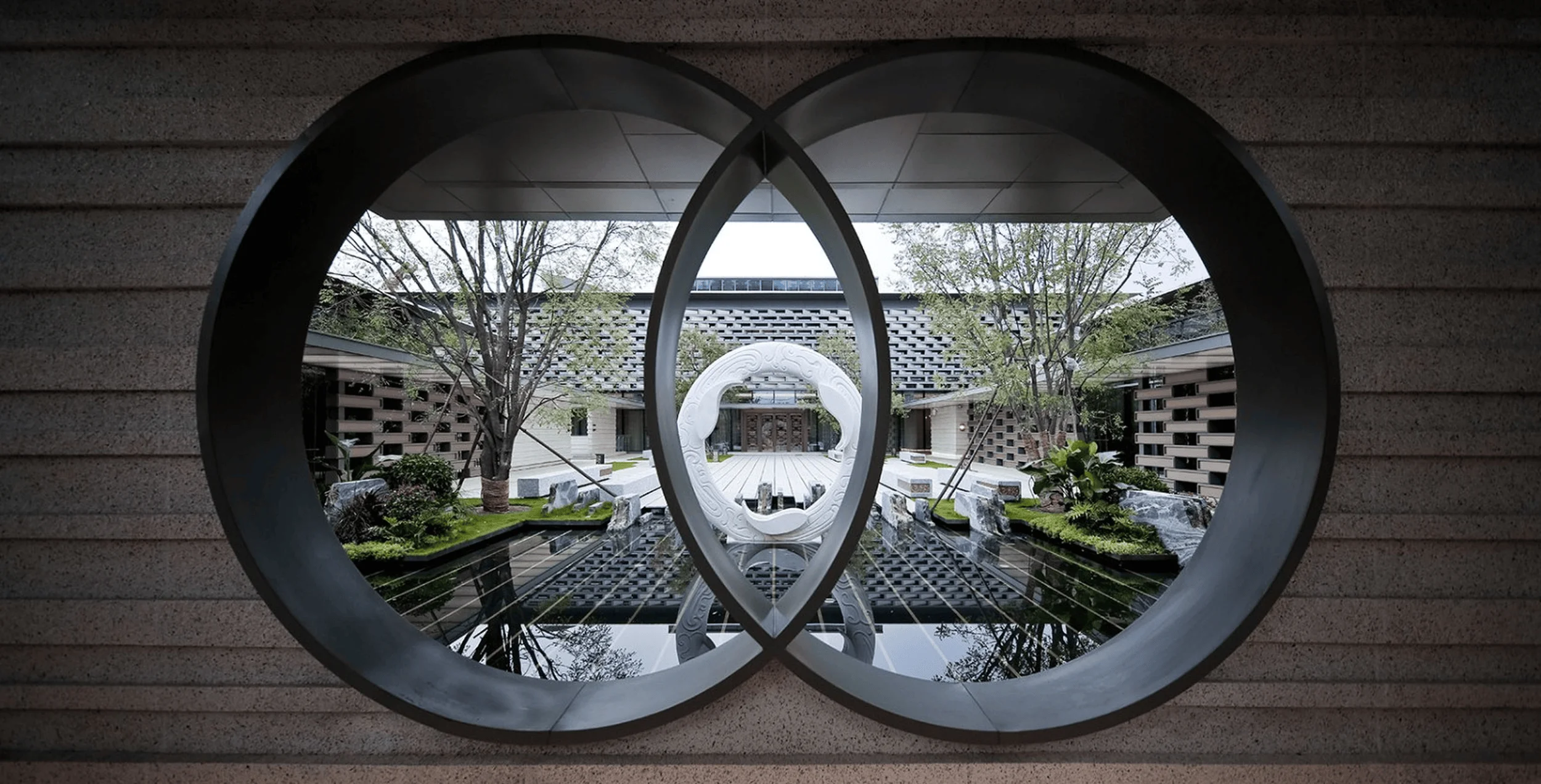
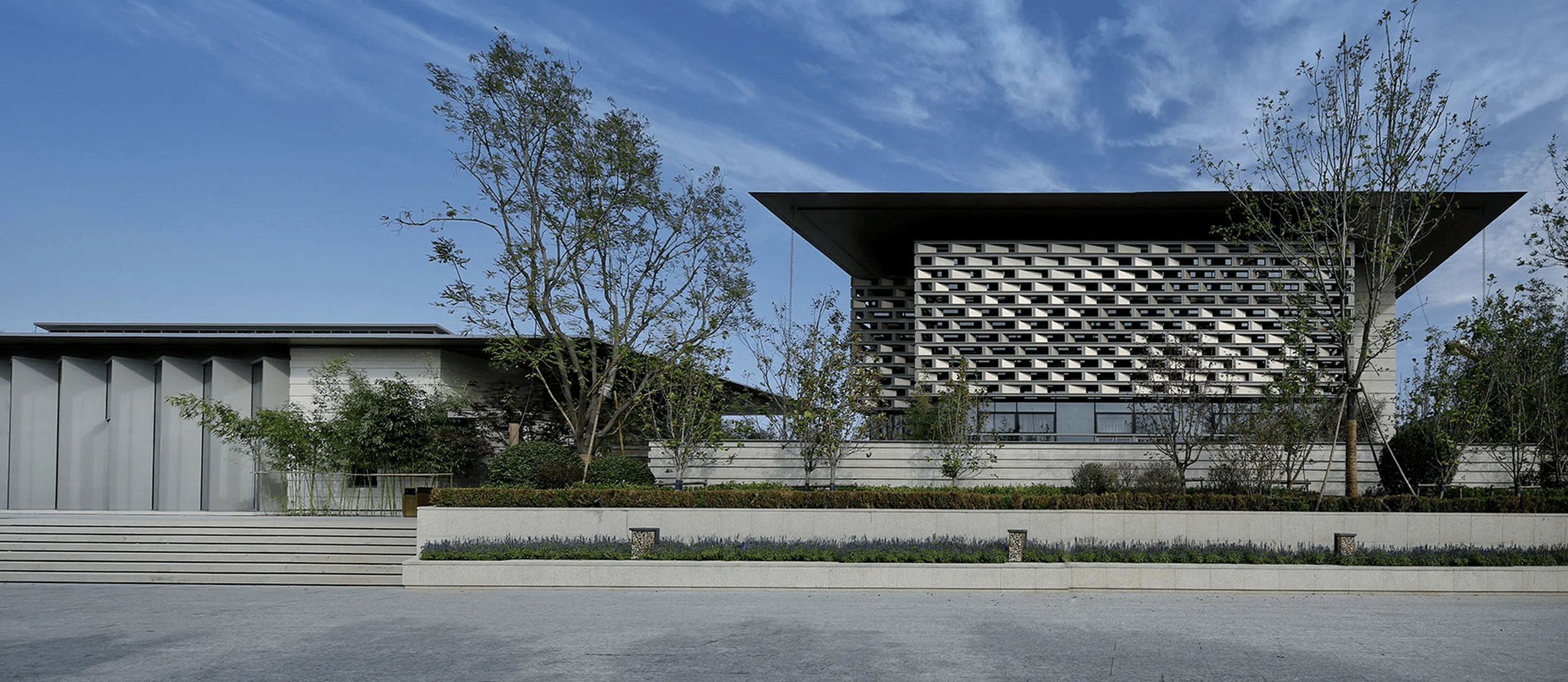
Nestled within Tianjin’s Haihe Education Park, adjacent to Nankai University and near the Maritime College, the Tianjin Luneng Taishan No.7 Courtyard Sales Center benefits from a rich educational and cultural context. Shanghai Nikken Sekkei embraced this unique setting, drawing inspiration from Tianjin’s local architectural heritage and the scholarly atmosphere of the surrounding institutions. The resulting design philosophy, termed “New Tianjin Academy Style,” aimed to create a space that resonates with cultural depth while showcasing the brand’s values. This approach is evident throughout the project, from the overall layout to the detailed material choices.
Architectural Form and Spatial Sequence
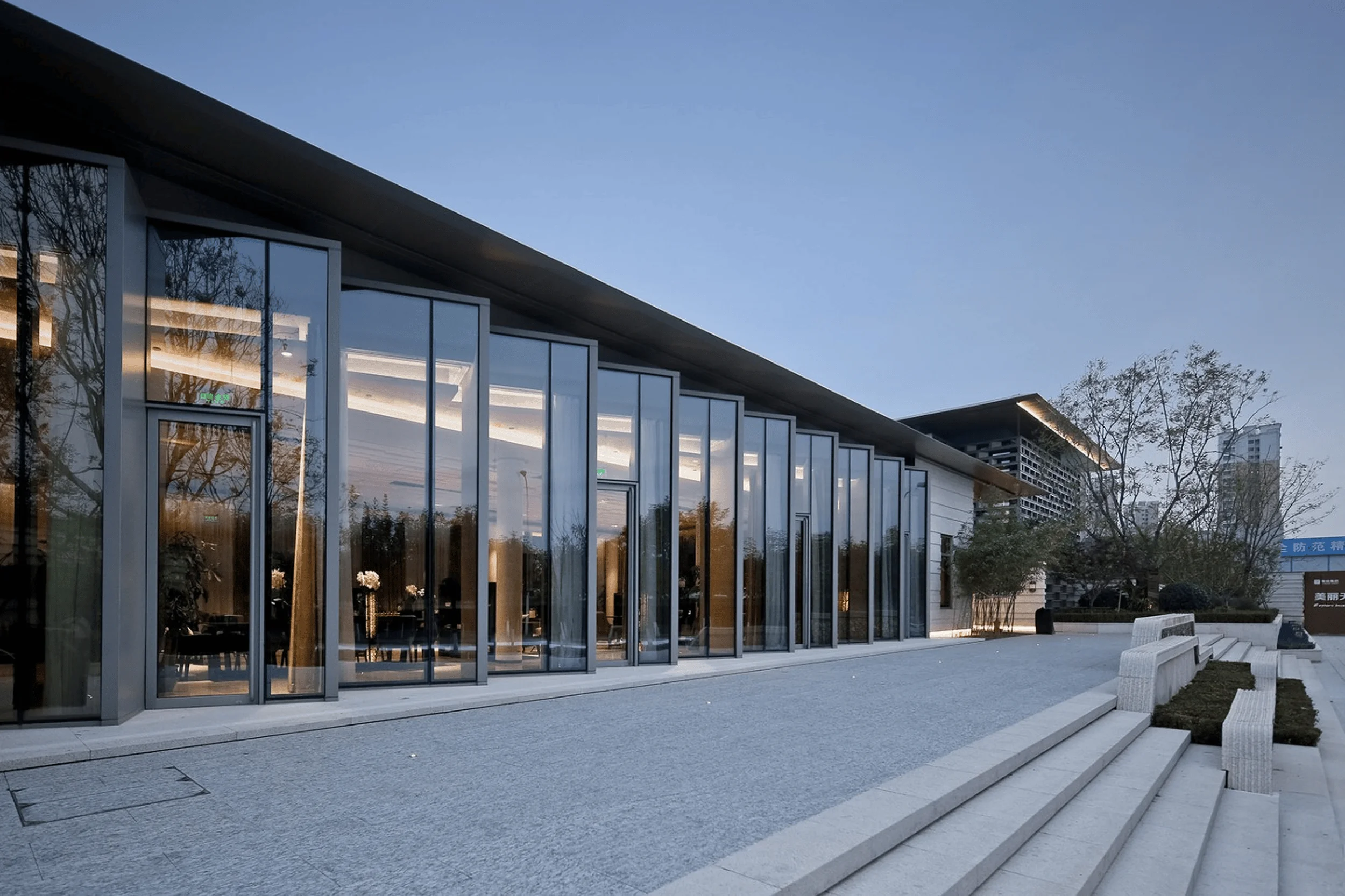
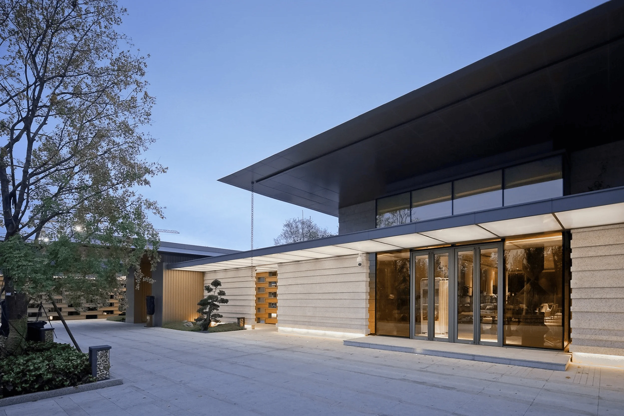
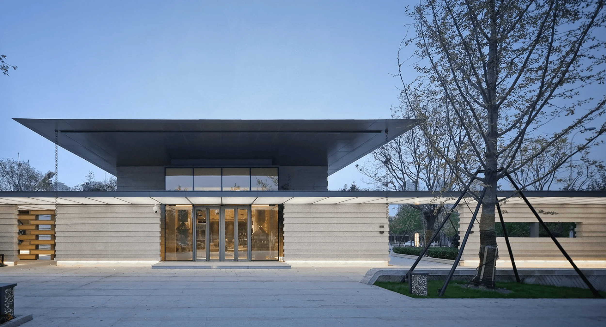
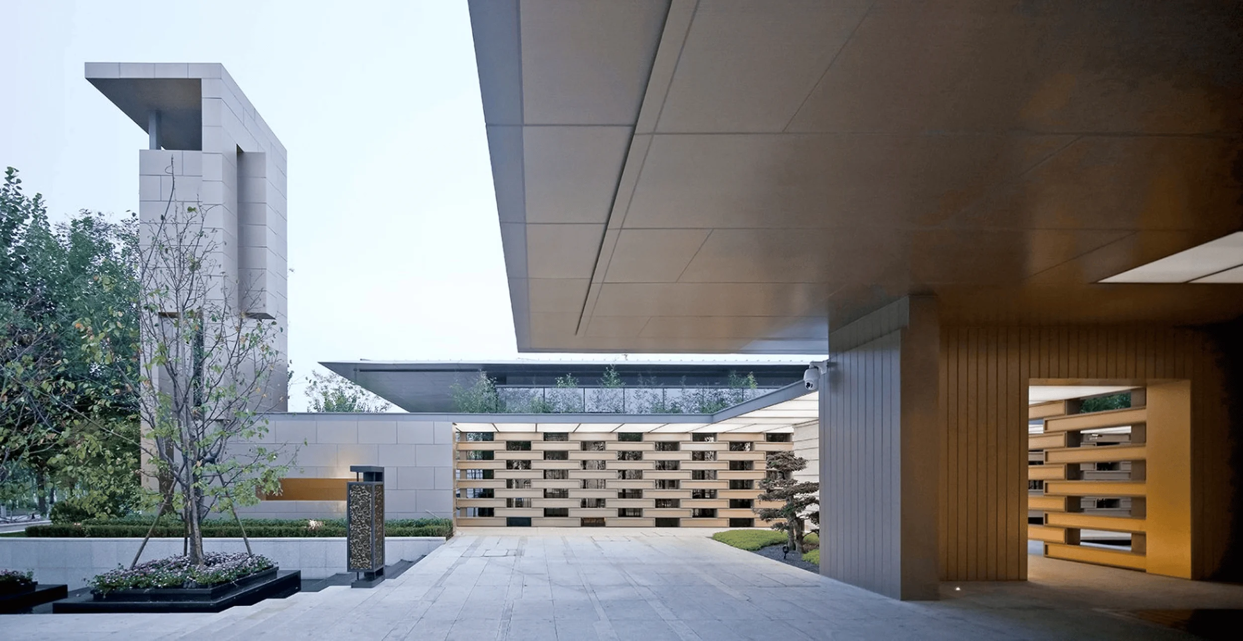
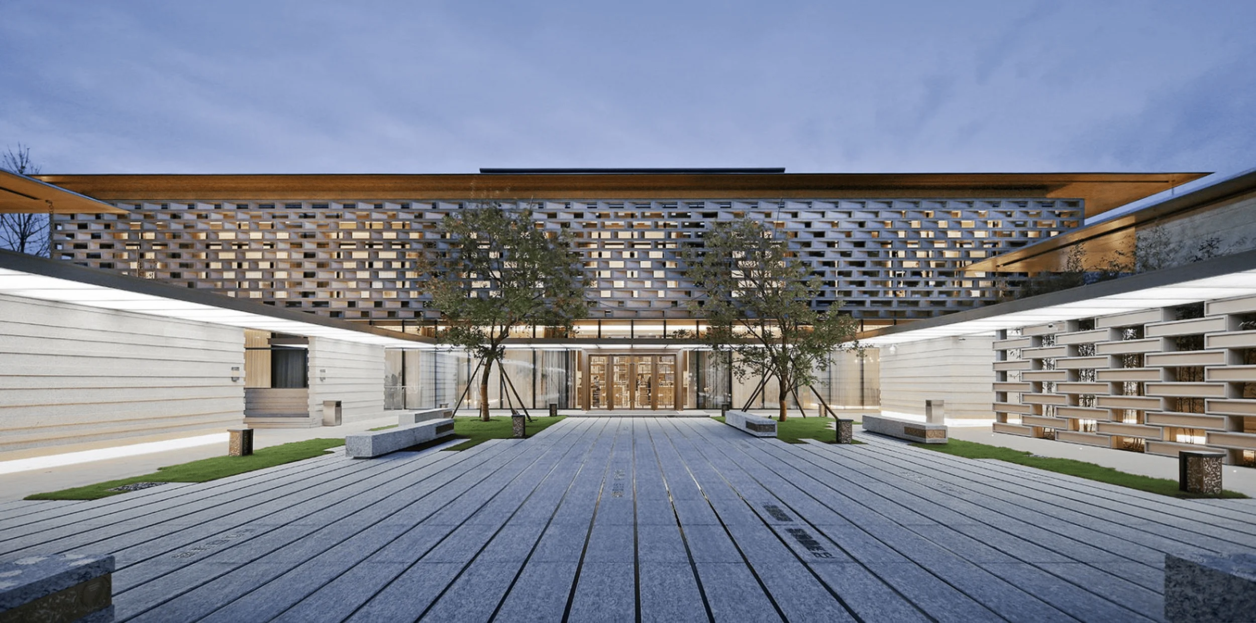
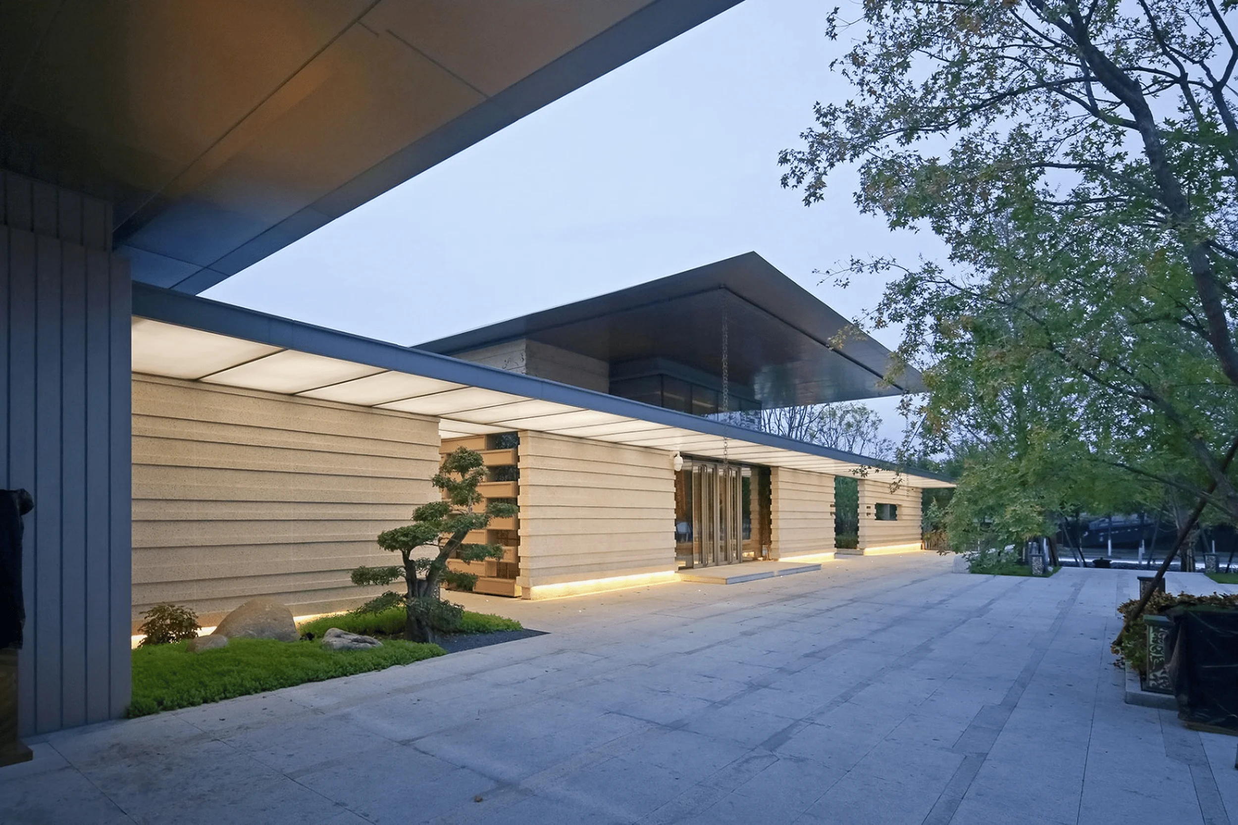
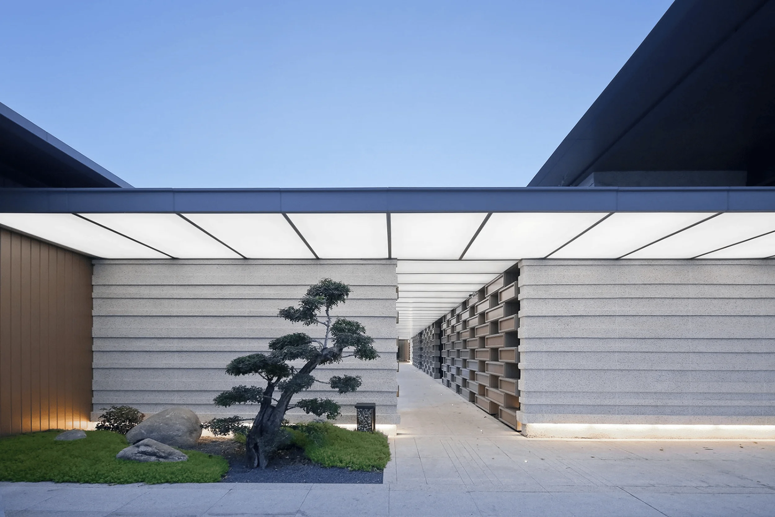
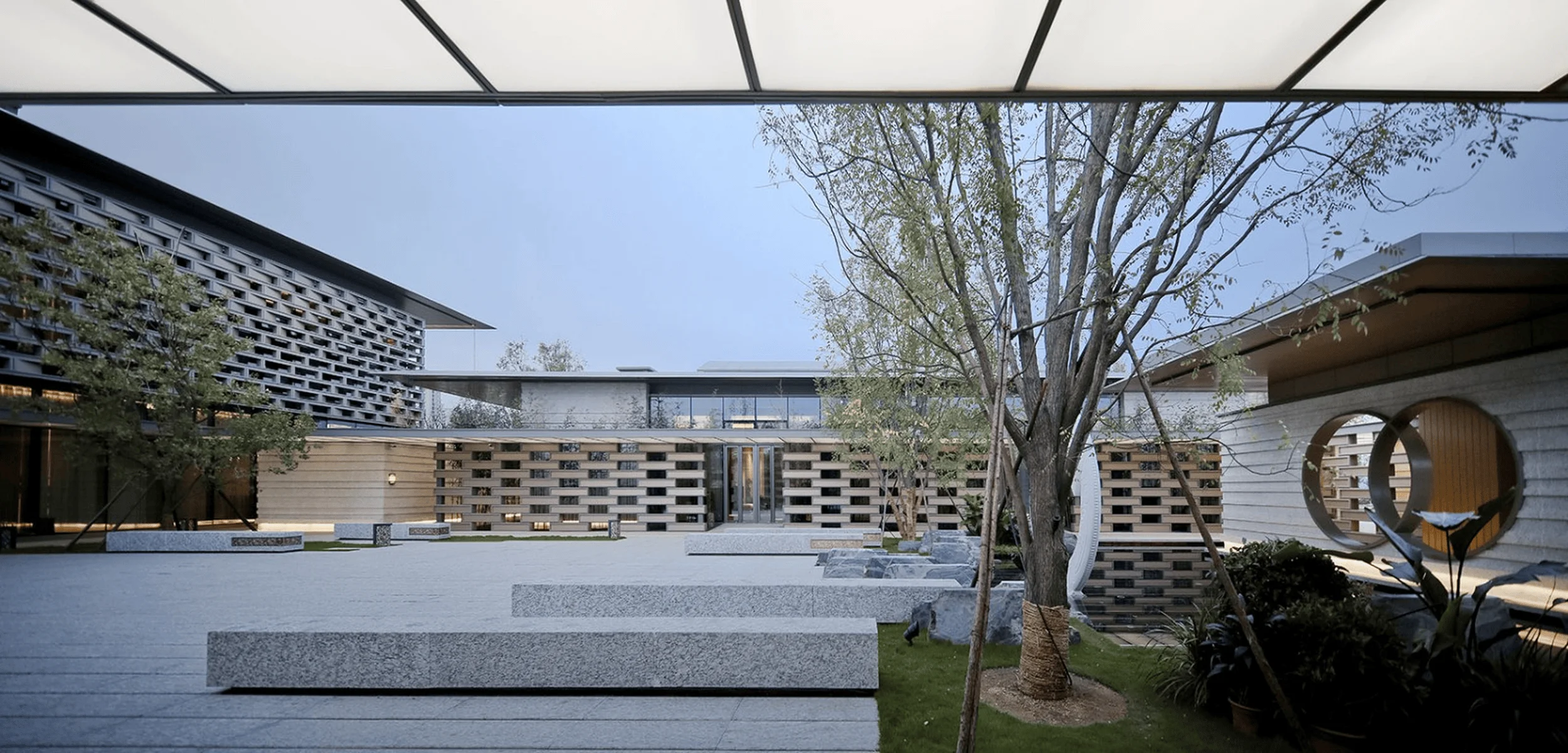
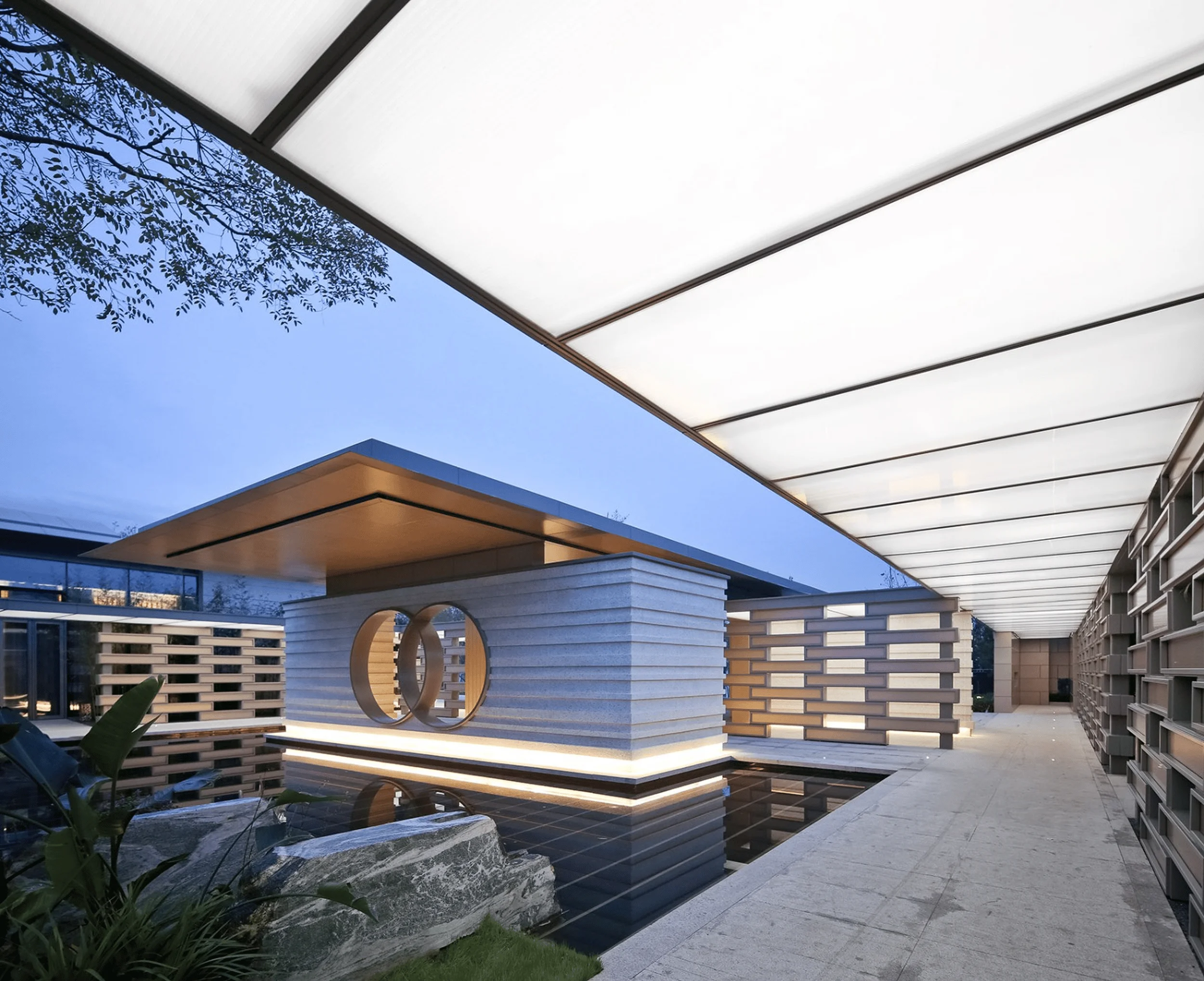
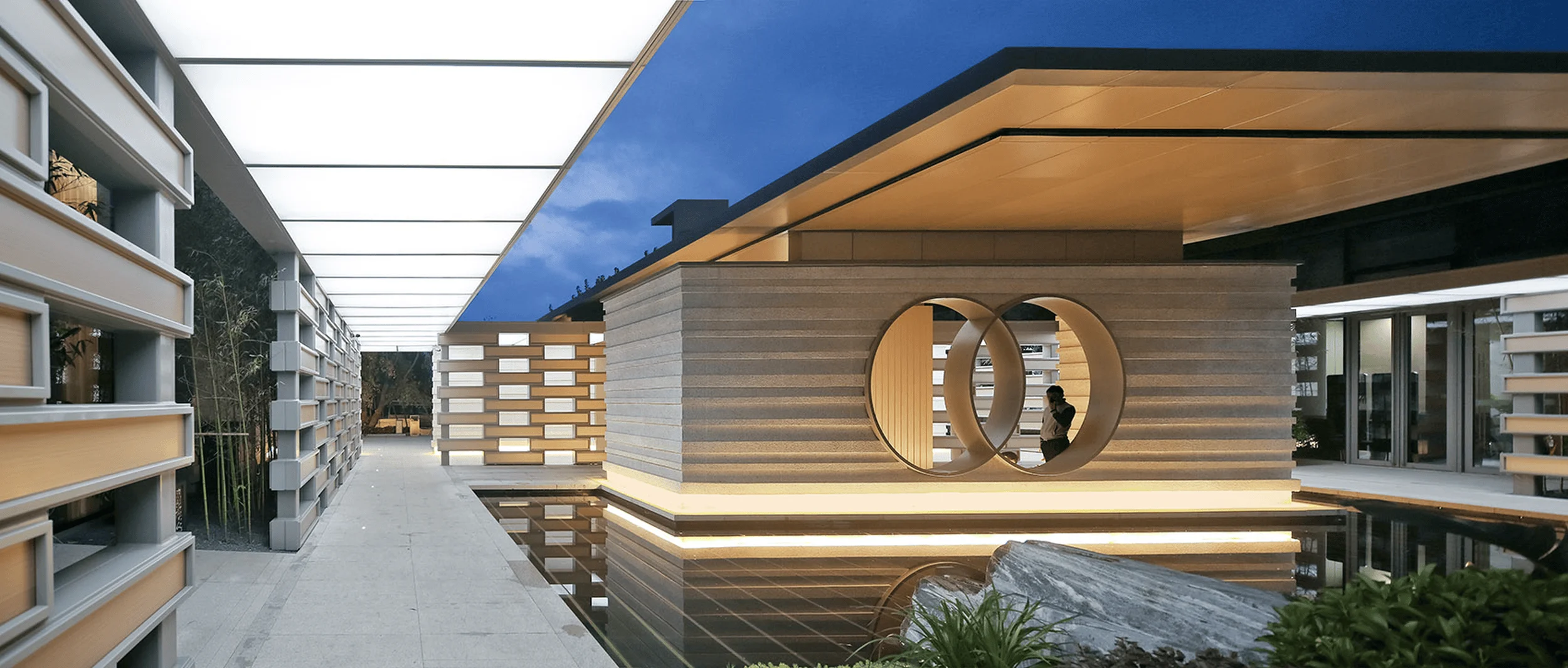
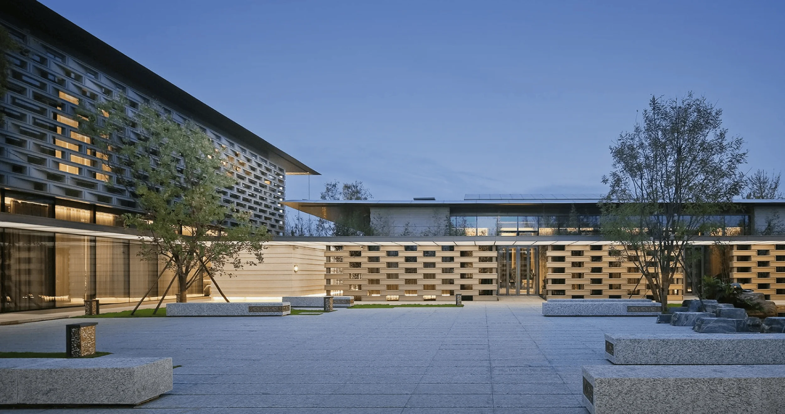
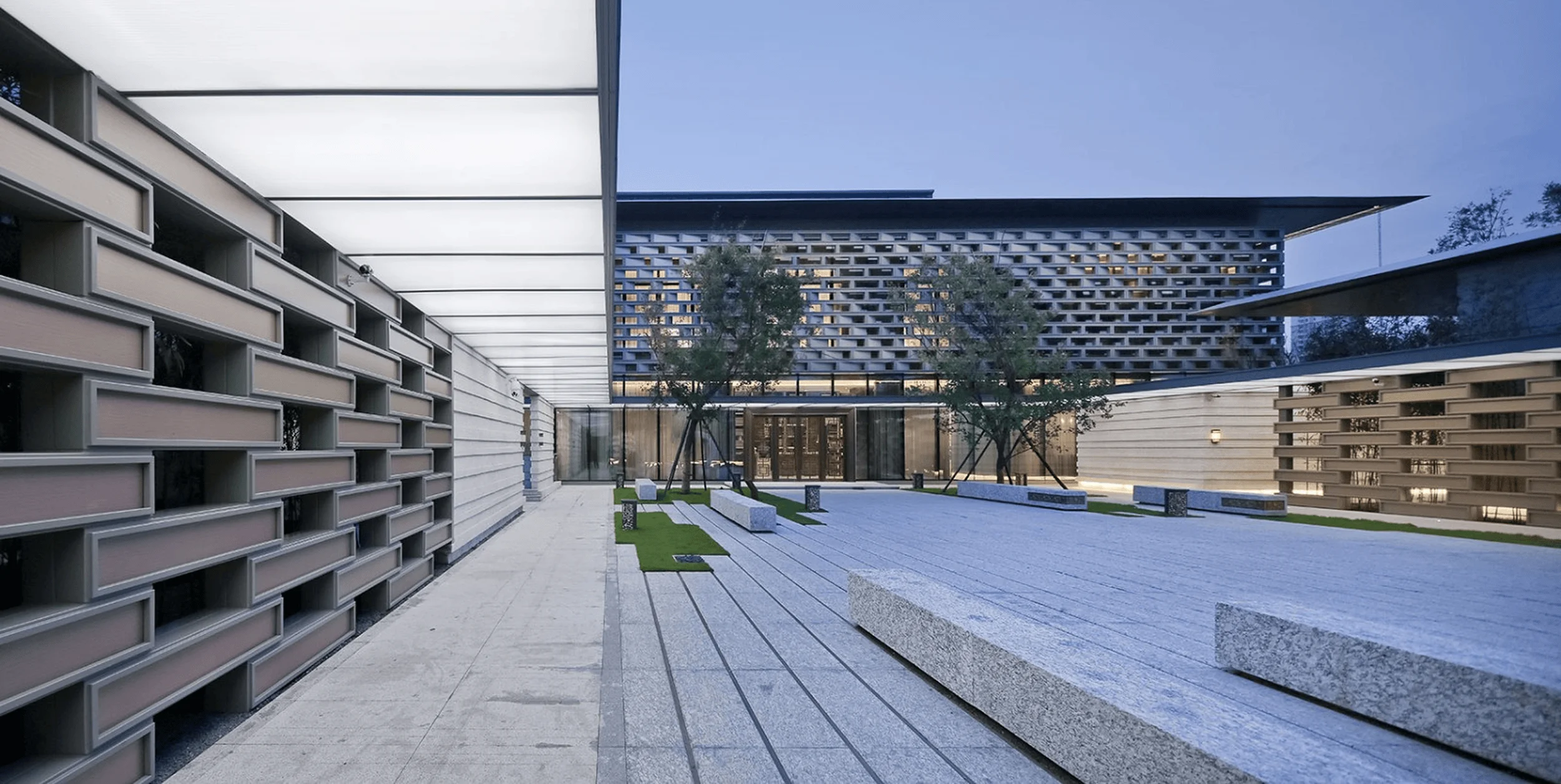
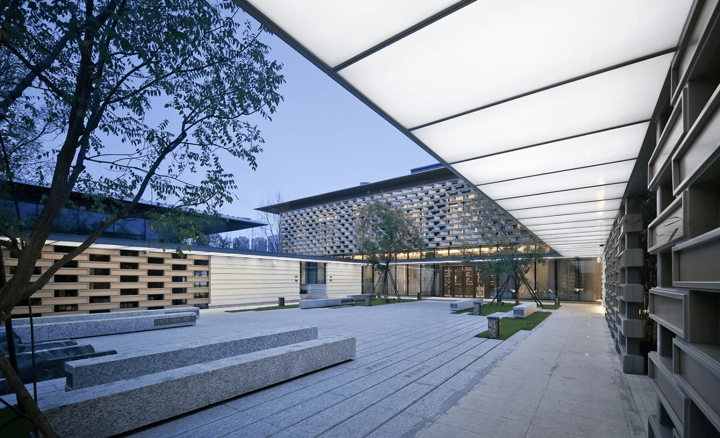
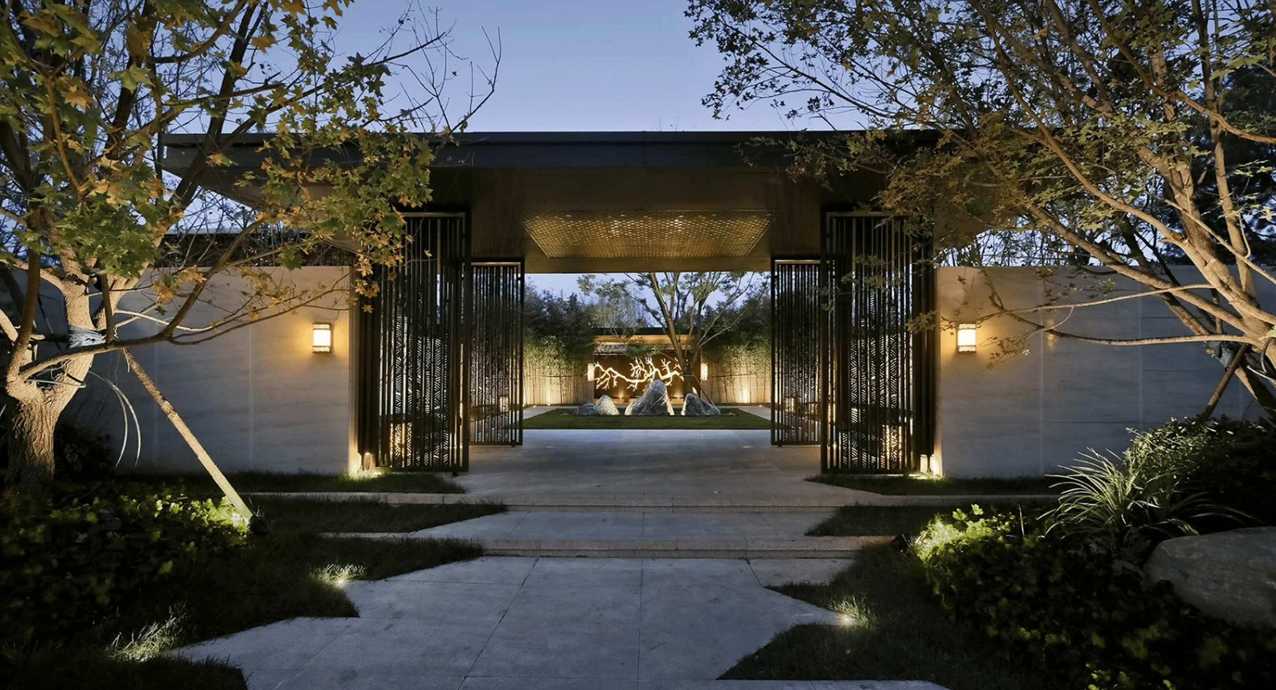
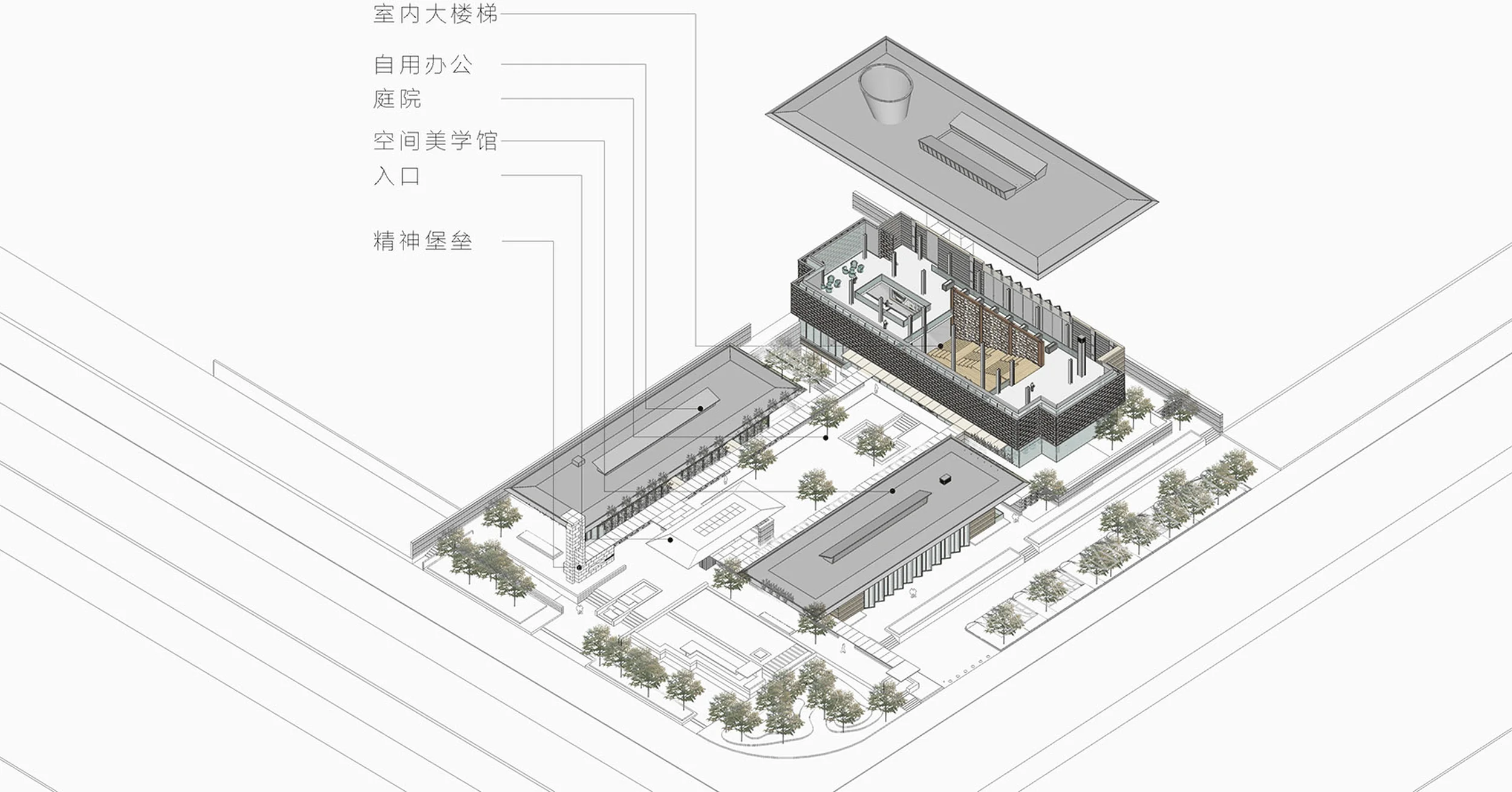
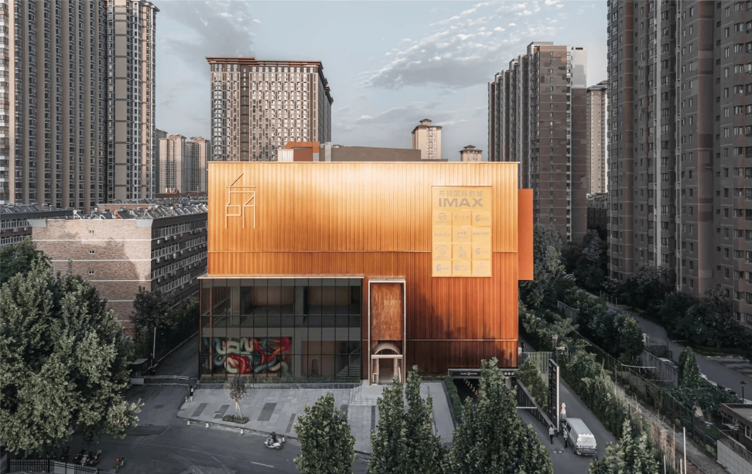
The architectural form is characterized by clean lines, expansive overhanging metal roofs, and a dynamic interplay of solid and void on the facade. These elements, crafted with modern materials and construction techniques, evoke a sense of lightness and fluidity, updating the traditional large-eaved roof for a contemporary audience. The design extracts the essence of traditional Chinese academy layouts, arranging three rectangular volumes of varying scales to enclose an introspective courtyard, fostering a sense of community within the larger development. The eastern volume, housing the main sales center, serves as the visual focal point, while the overall complex is modestly set back from the street, partially hidden behind landscaping and corridors. This approach creates a journey of discovery, inviting visitors to gradually enter the site and experience the unfolding sequence of spaces.
Facade Design and Materiality
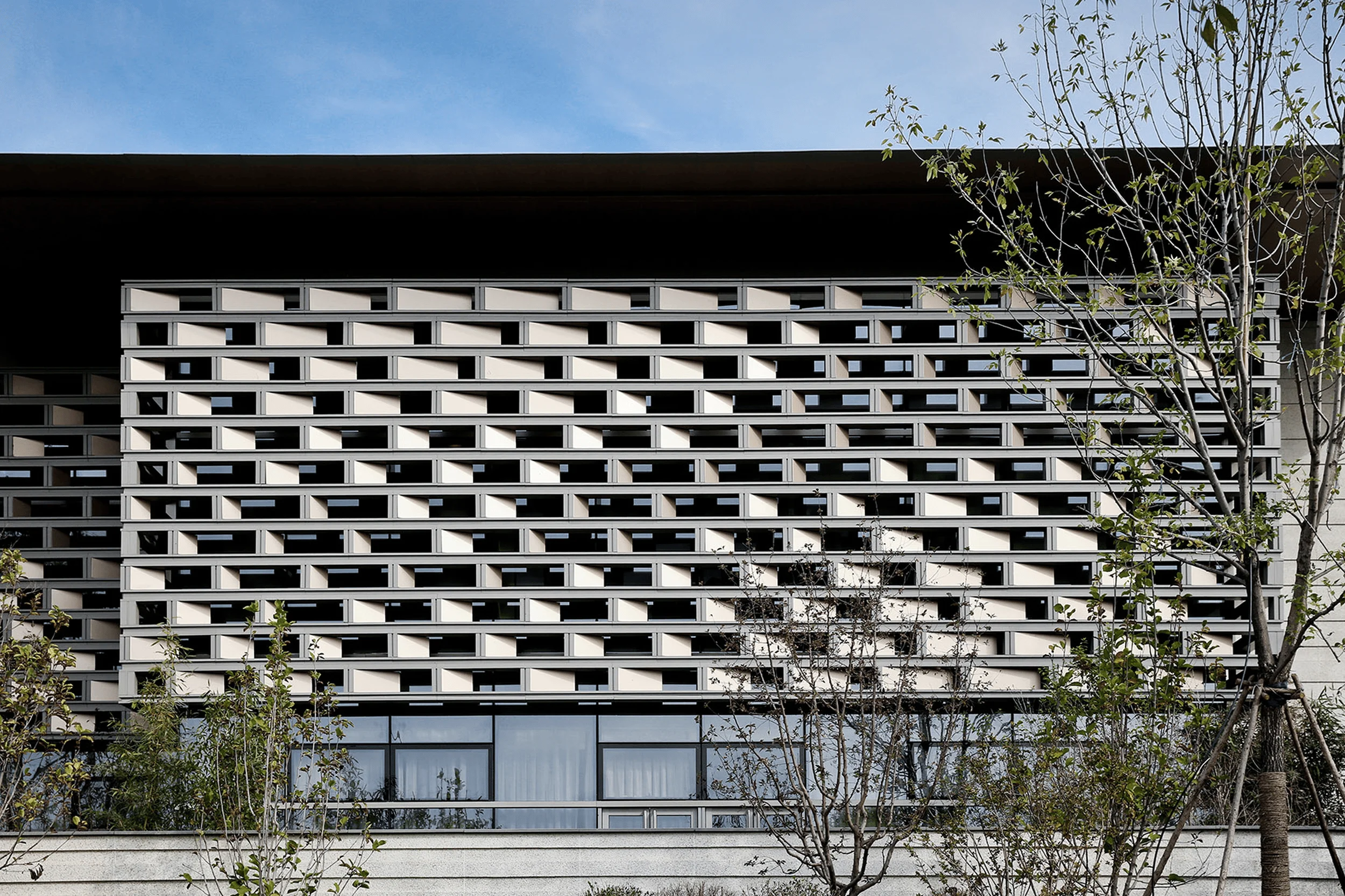
The east facade of the main building draws inspiration from Chinese landscape painting. Different modular metal tiles create a rhythmic pattern reminiscent of brushstrokes, forming an abstract representation of mountains and water. The interplay of light and shadow on these textured surfaces adds depth and visual interest, transforming the facade into a constantly shifting canvas. Warm gray aluminum panels and light yellow faux stone coatings establish the primary material palette, accented by bronze-colored aluminum details that create focal points and enrich the overall composition.
Interior Spaces and Key Features
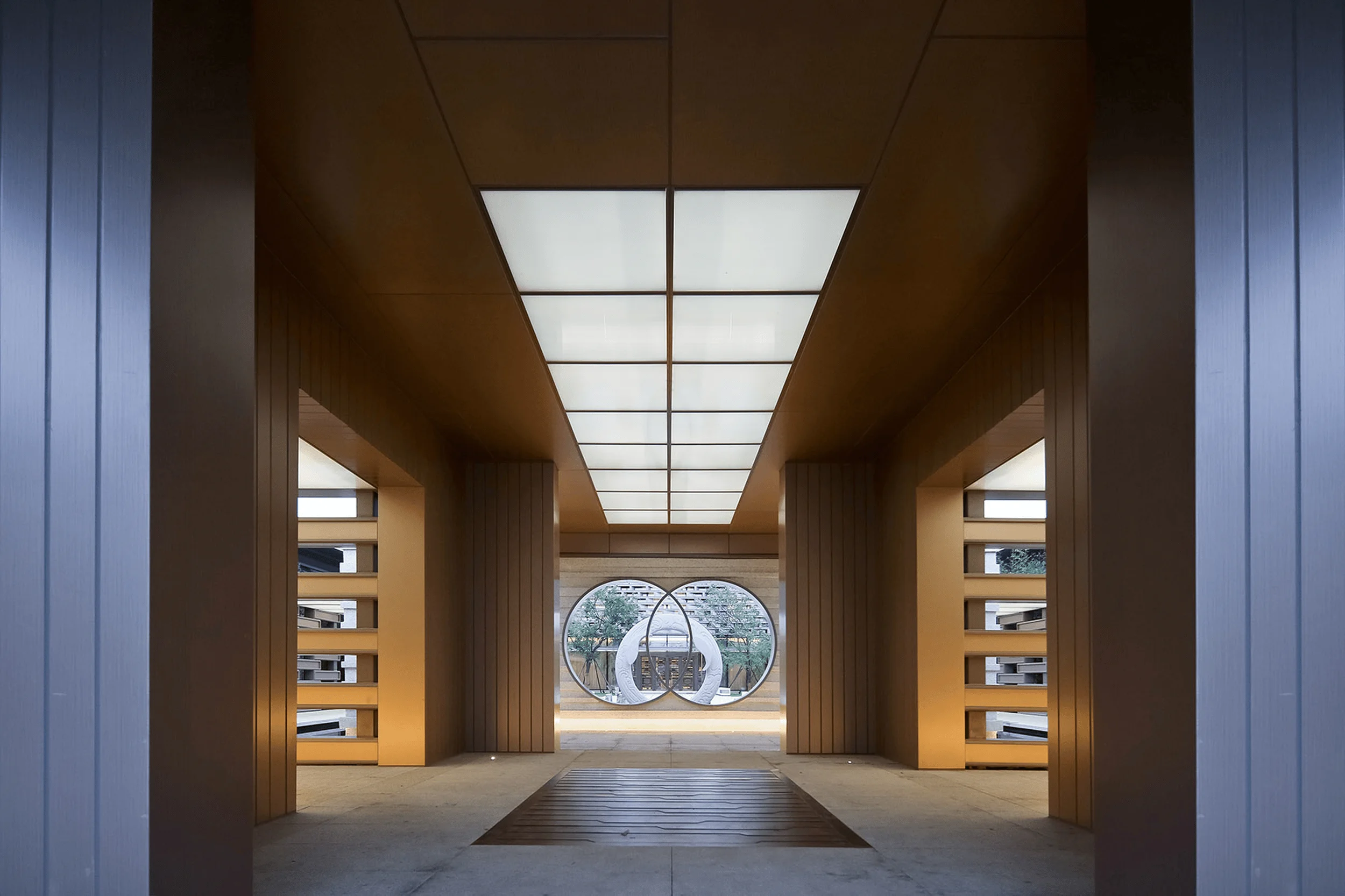
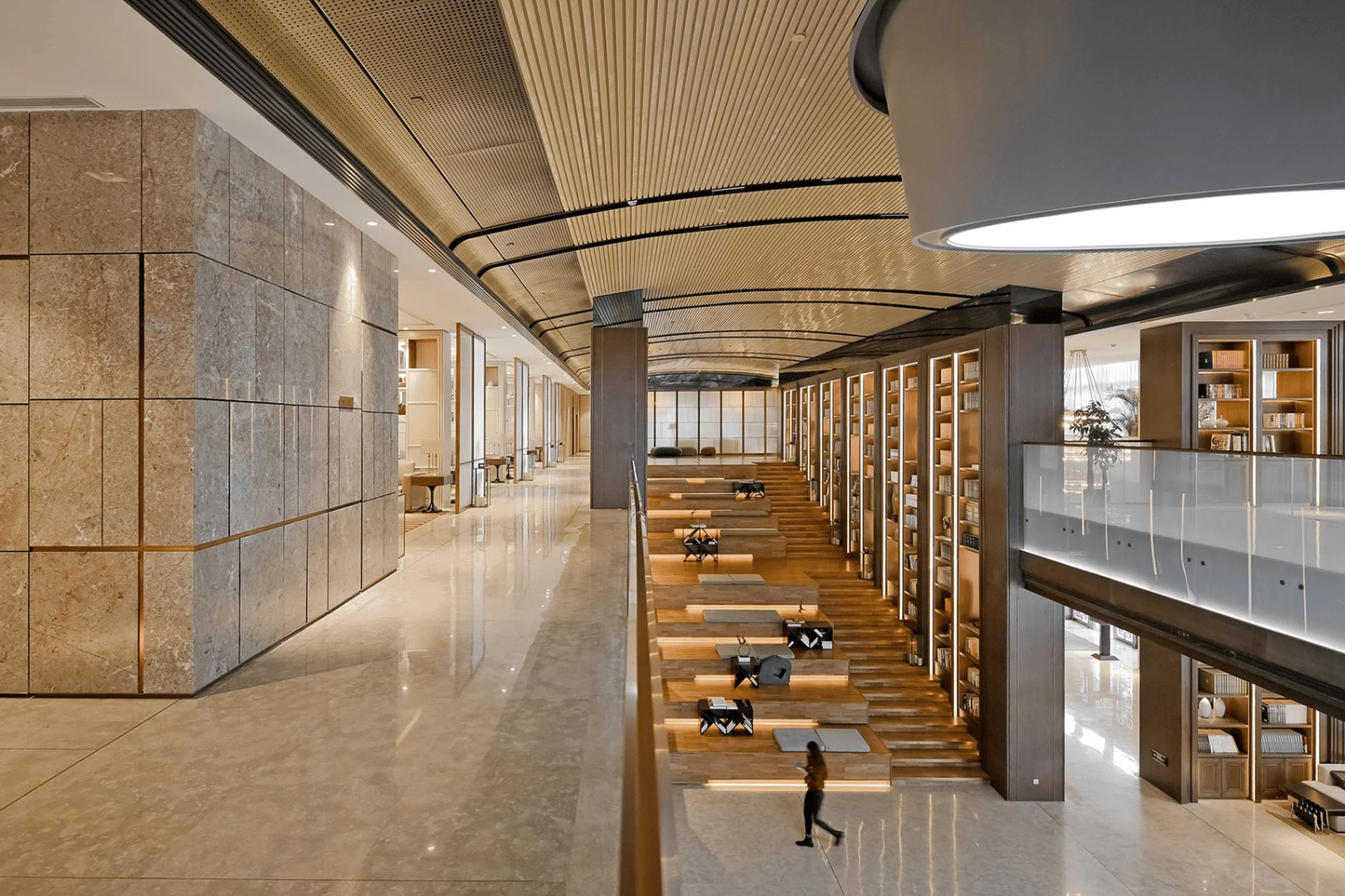
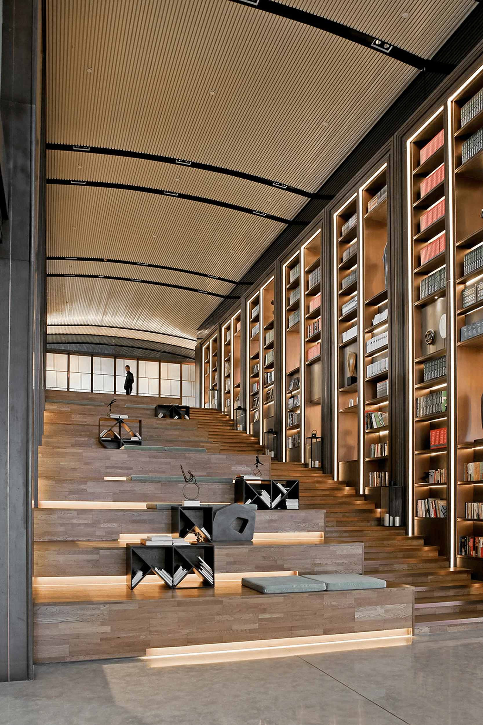
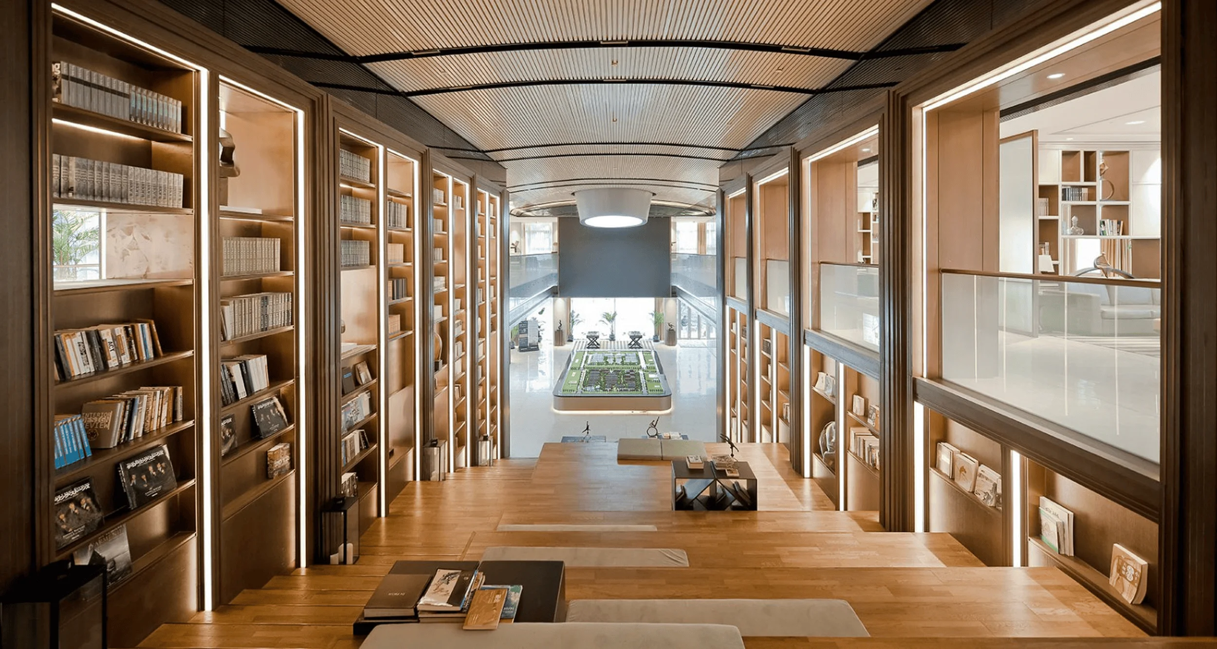
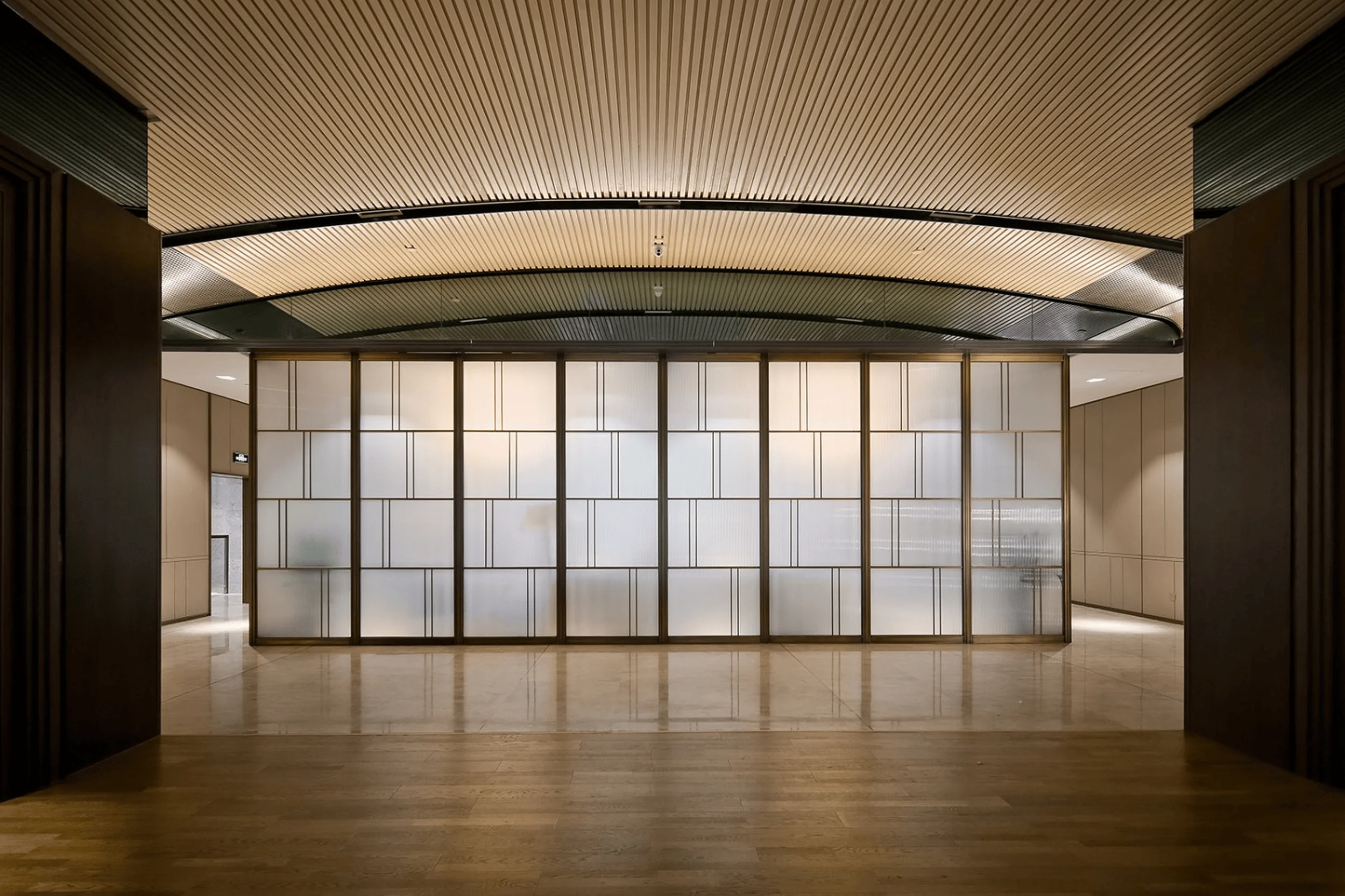
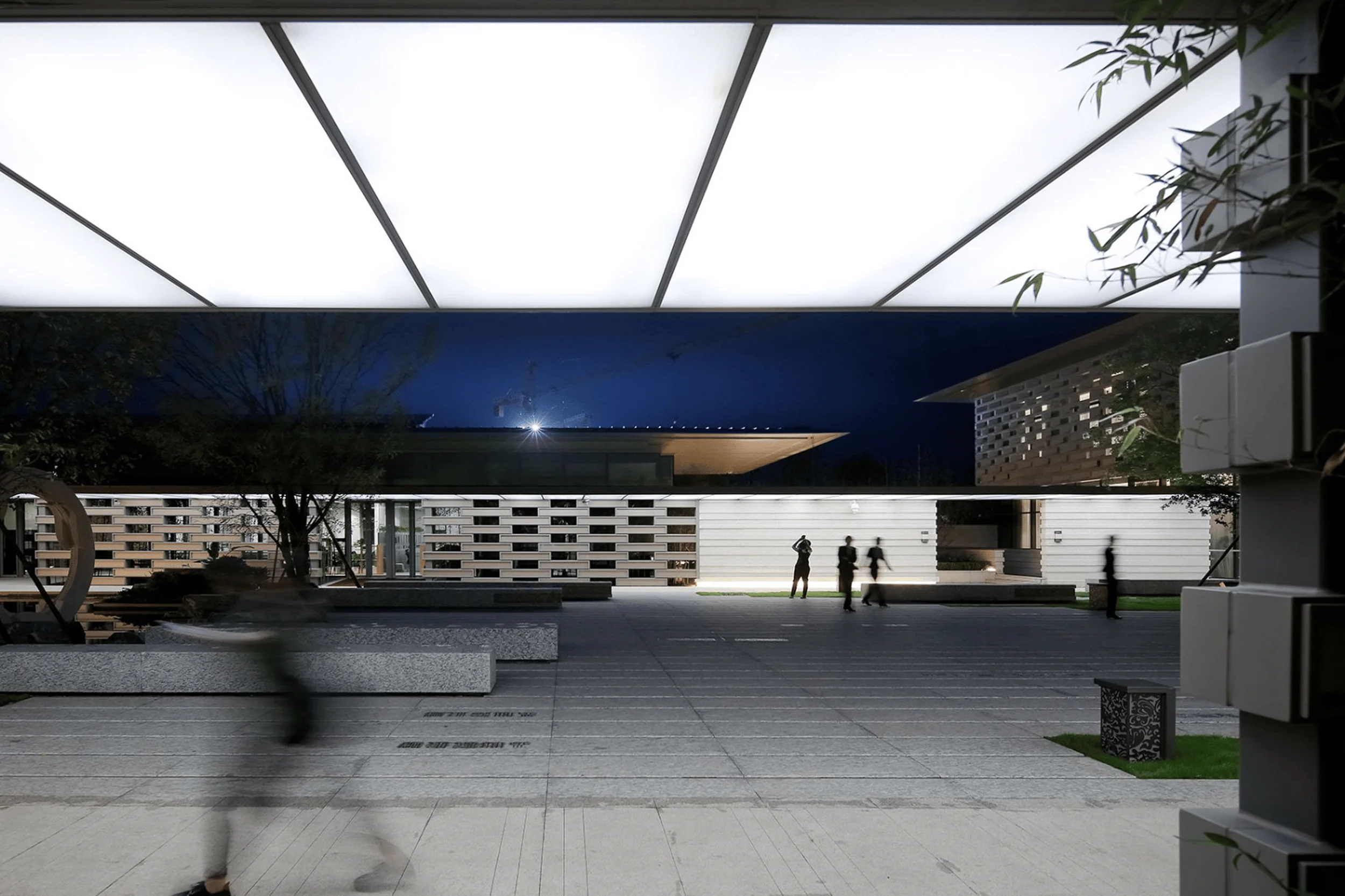
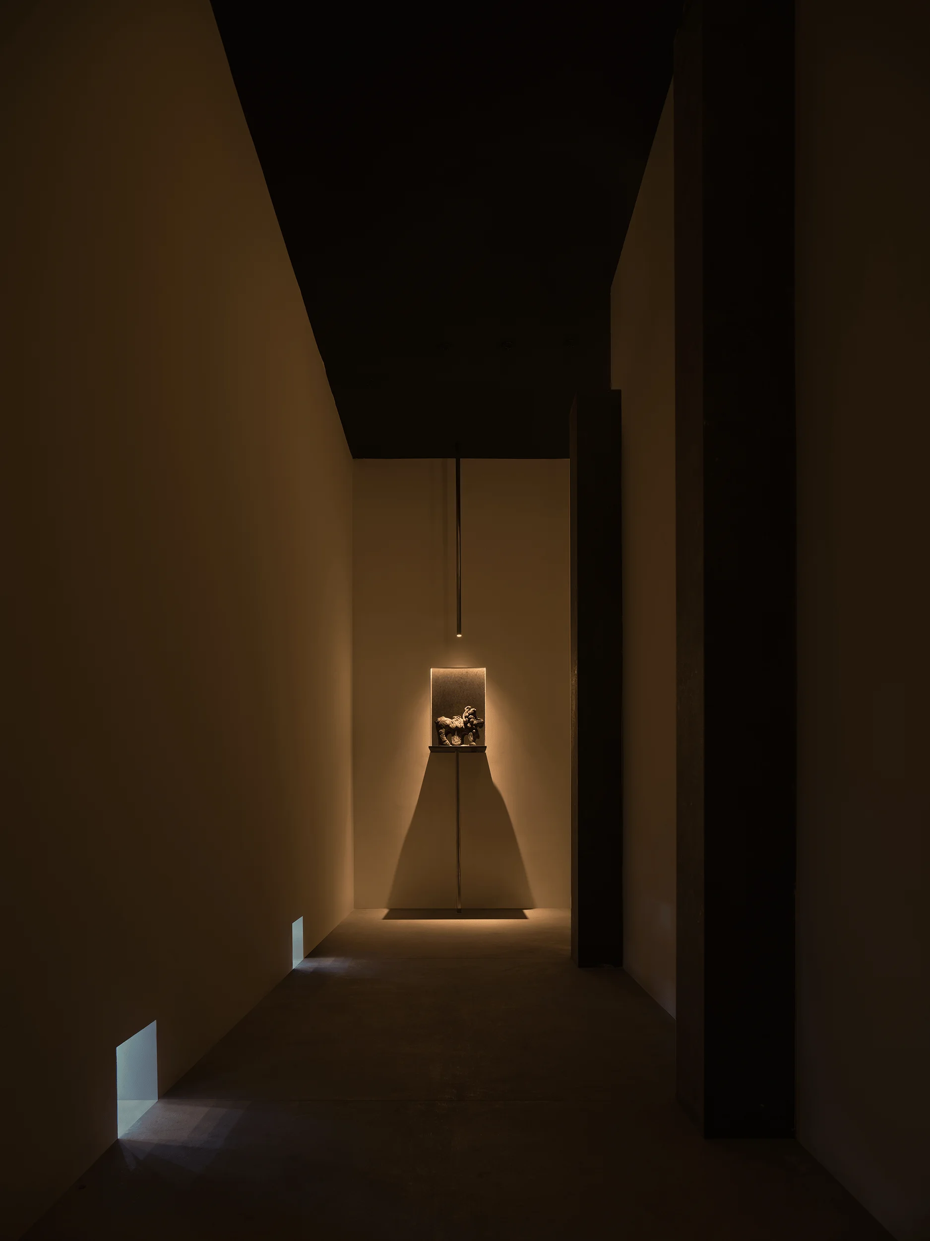
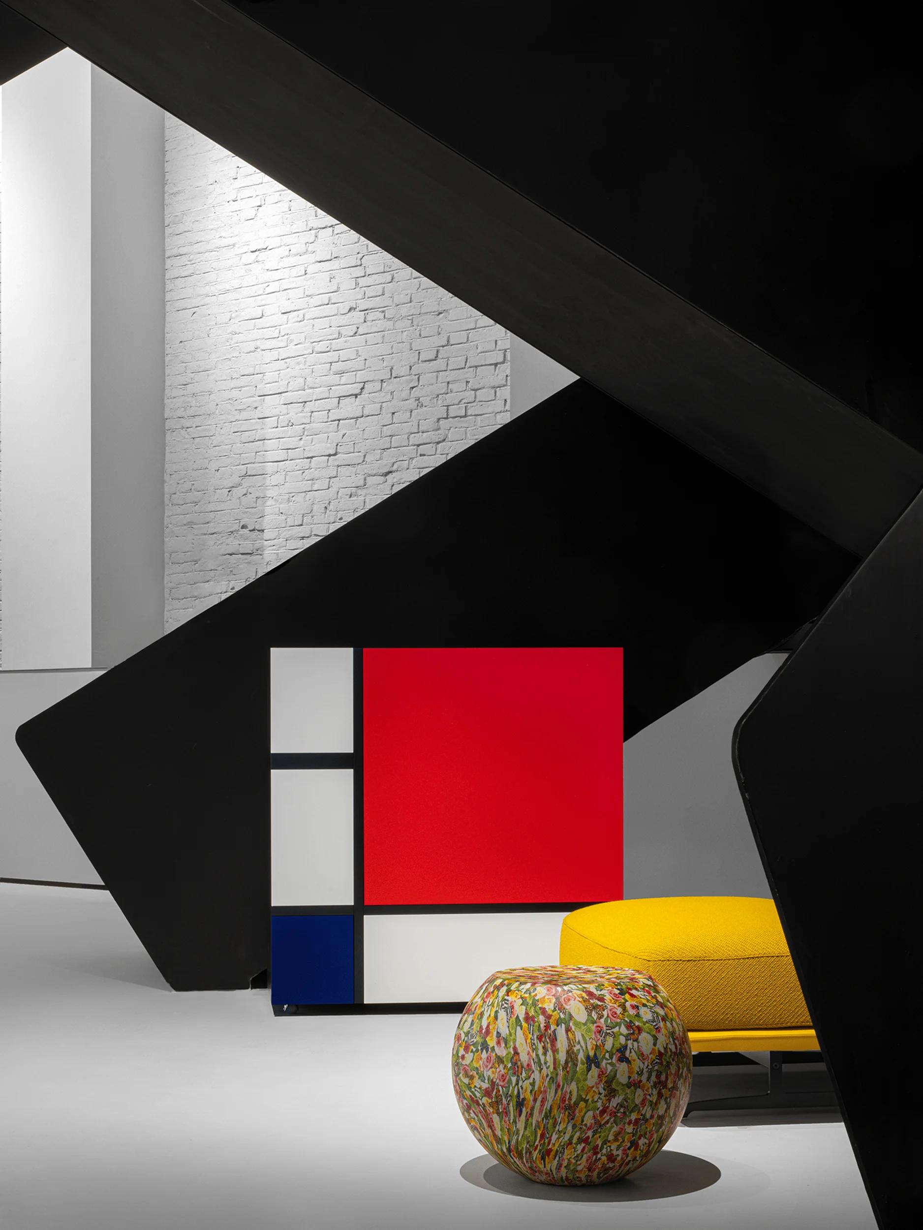
The interior continues the academy theme, centered around a grand, multifunctional staircase integrated with bookshelves. This central space connects the two levels while maximizing views of the surrounding landscape, creating a seamless flow between inside and out. Traditional architectural elements such as screen walls, pavilions, overhanging eaves, corridors, and courtyard walls further enhance the design, contributing to the tranquil atmosphere. Translucent materials and delicate metal accents in the corridor ceilings add a touch of elegance, especially when illuminated at night. The combination of materials reinforces the introspective and unassuming character of the “academy,” emphasizing the project’s focus on cultural resonance and modern Chinese architecture.
Project Information:
Project Type: Sales Center
Architect: Shanghai Nikken Sekkei
Area: 3000㎡
Project Year: 2016
Country: China
Main Materials: Stone paint, triple-glazed gray glass, warm gray aluminum panels, bronze-colored aluminum panels
Photographer: Shi Ran Architectural Photography


