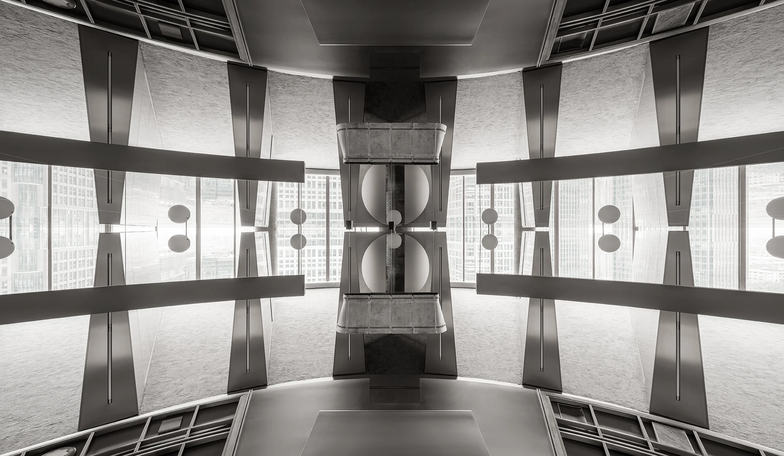
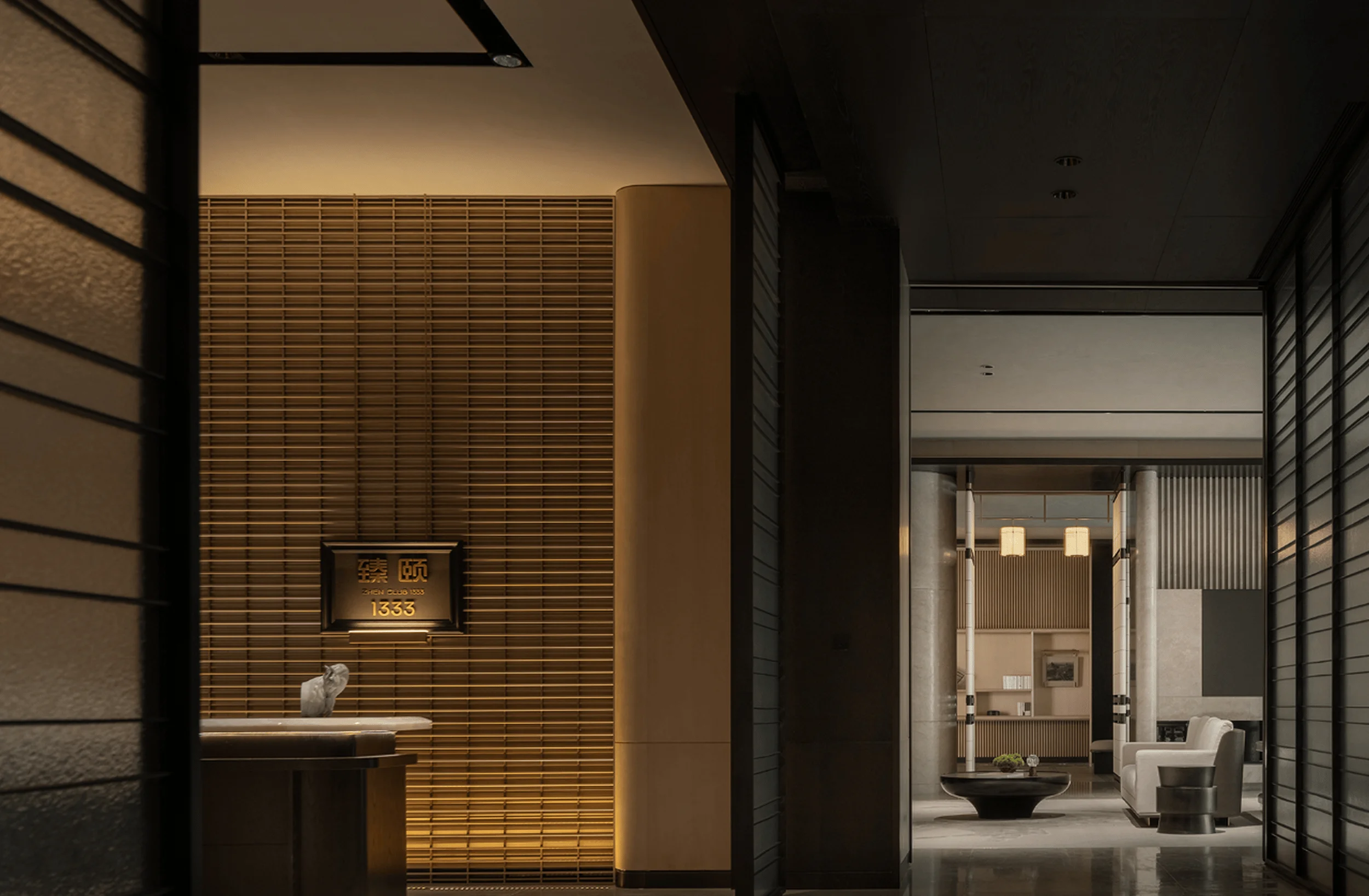
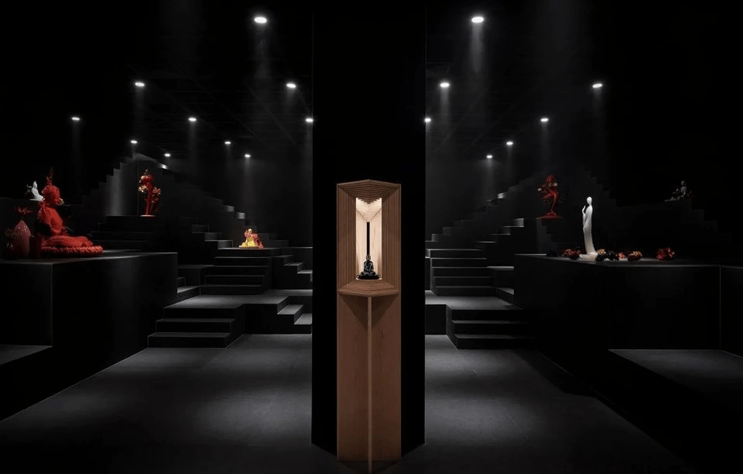
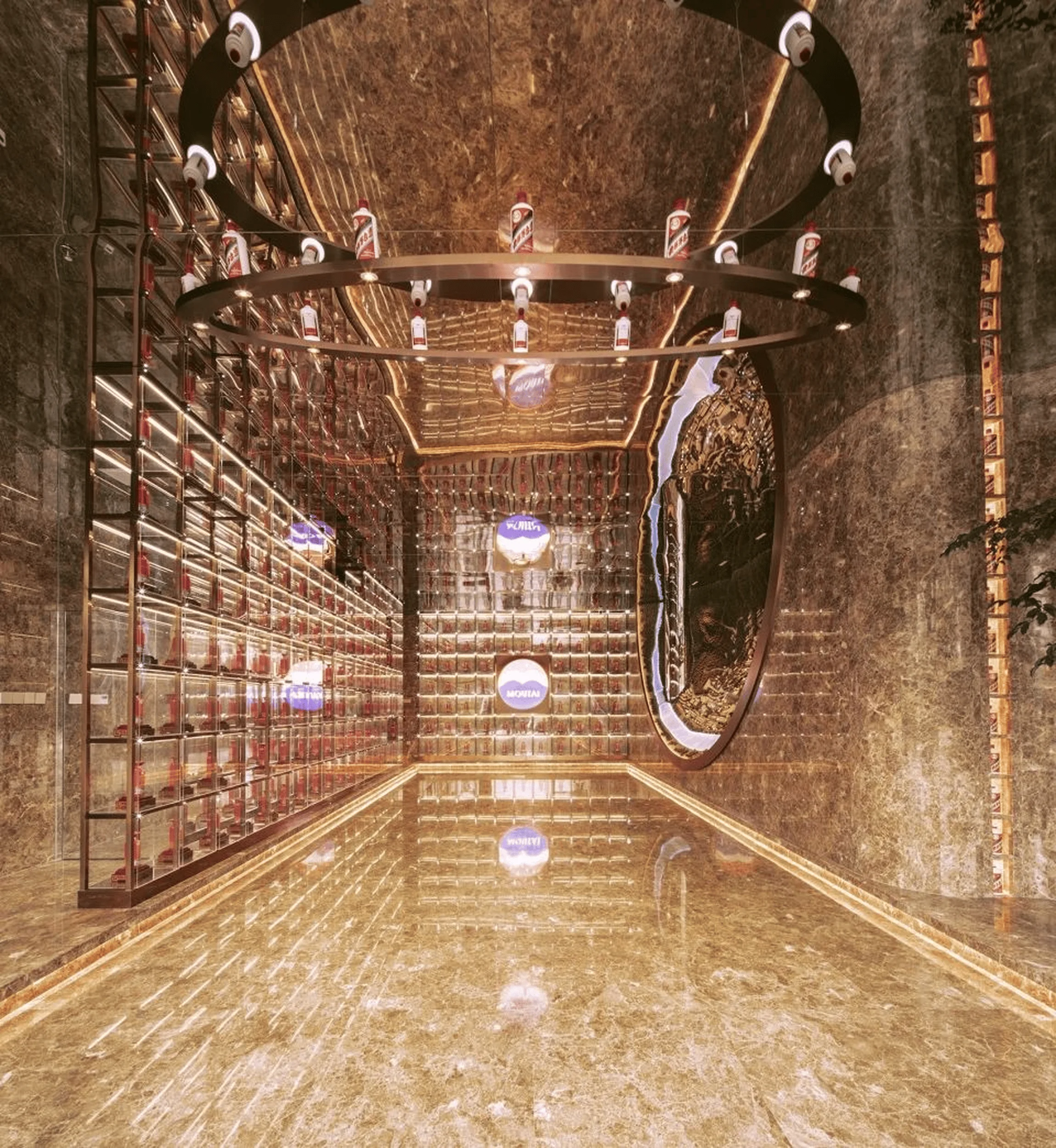
Minimalist showroom design with micro-cement in China.
Contents
Project Background and Design Concept
The Wanlei Micro-cement Showroom, a 120-square-meter space designed by NOTHING DESIGN in China, exemplifies a minimalist design approach centered around a symmetrical layout. The design explores the interplay between order and visual diversity, achieving a harmonious balance within the space. The showroom steers clear of conventional product display methods, instead integrating micro-cement as a design element seamlessly across diverse spatial settings, fostering a close relationship between the material and the environment. This project exemplifies the potential of minimalist interior design with micro-cement applications in China, blending form and function in an innovative way.
tag: minimalist showroom design with micro-cement, China micro-cement interior design, micro-cement application in commercial space
Entrance Foyer: A Transition into Minimalism
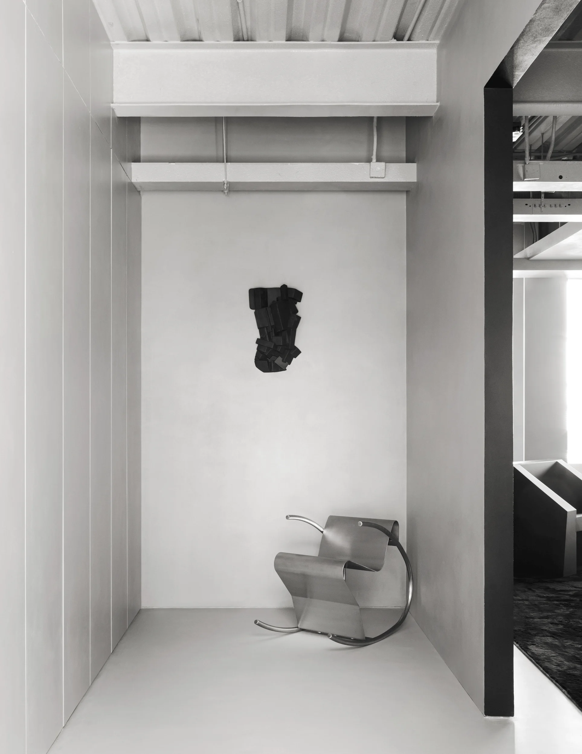
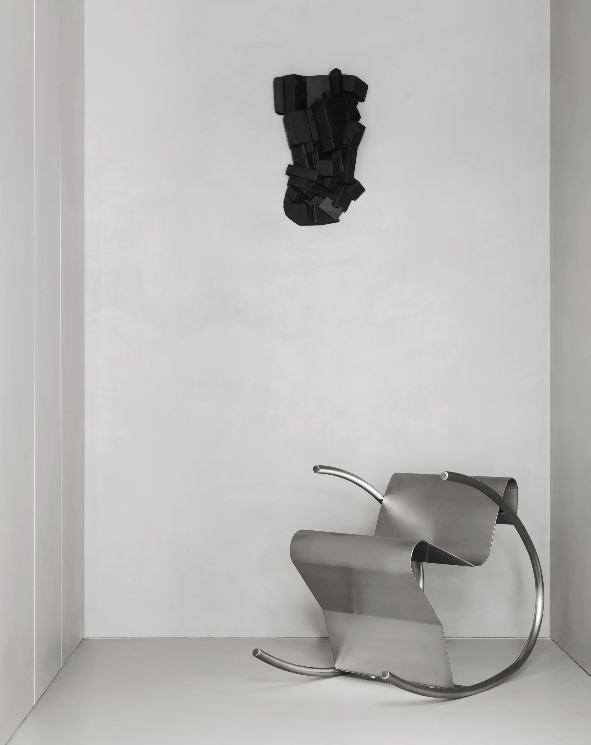
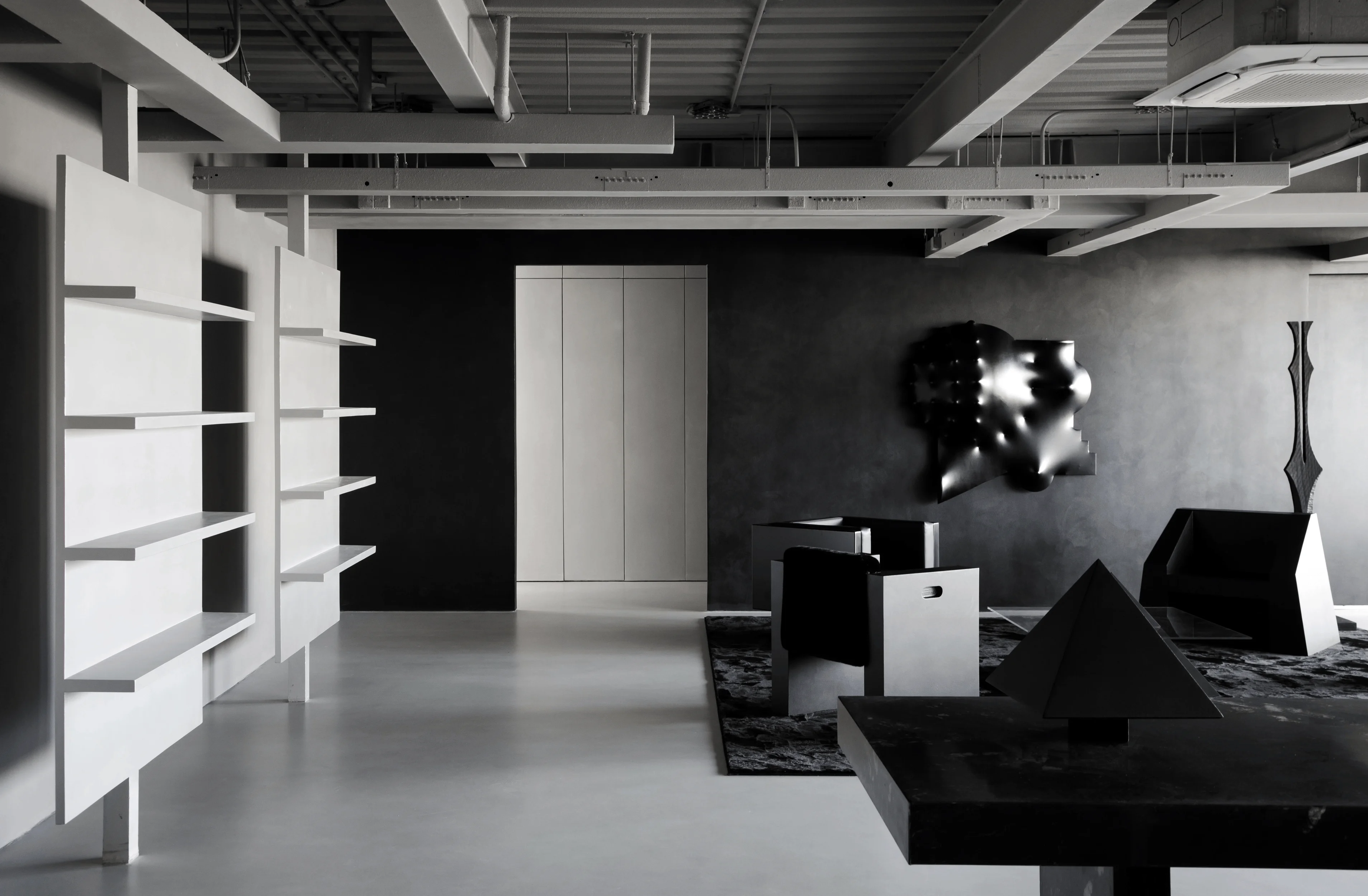
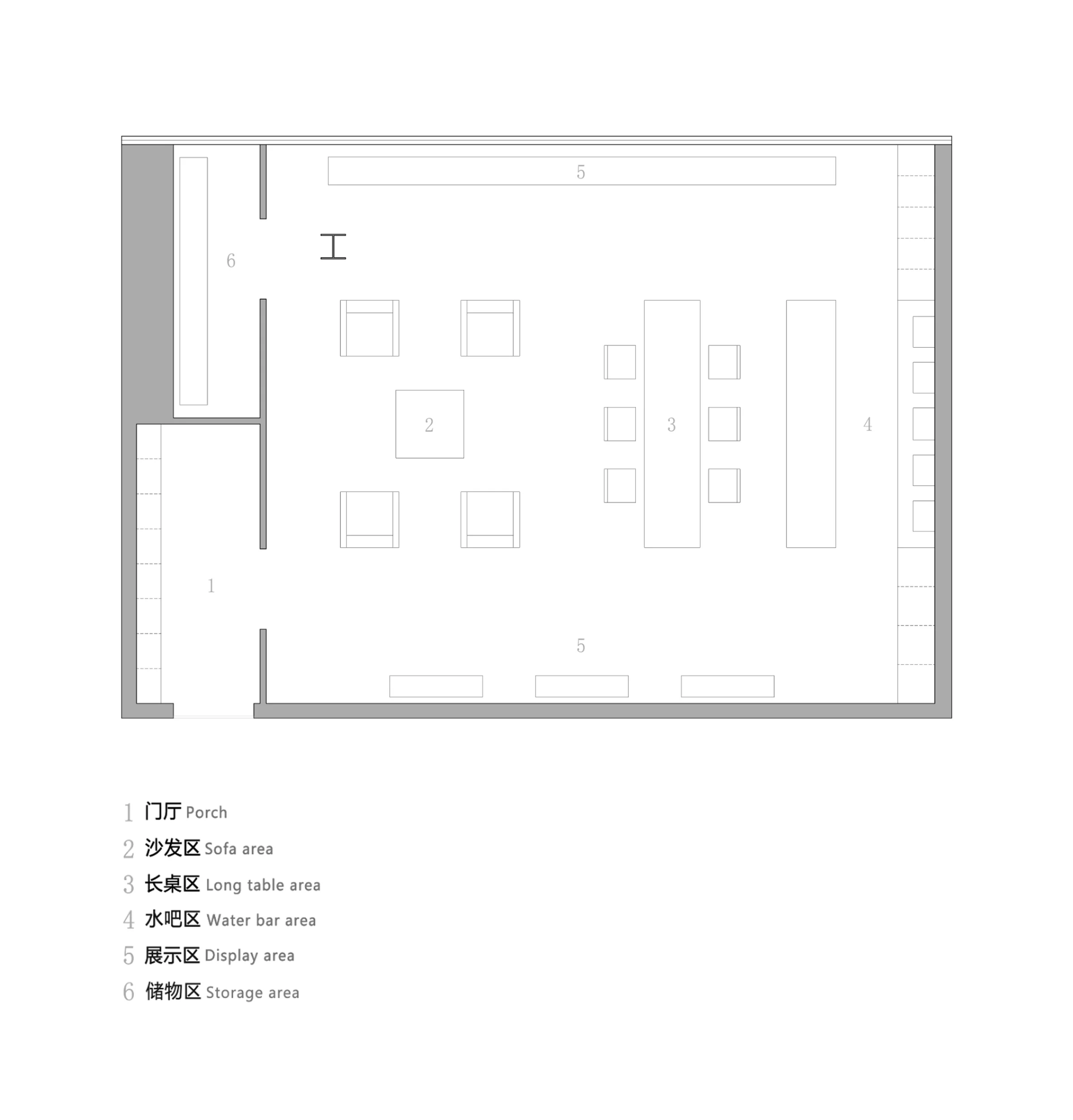
The entrance foyer sets the stage for the showroom’s minimalist aesthetic. It preserves the original space’s expansive, rectangular layout while creating a sense of transition through a subtly defined entryway, reminiscent of a residential foyer. Maintaining visual continuity, an open entrance connects the foyer to the main showroom, establishing a symmetrical relationship with the display areas within. This seamless flow contributes to the overall sense of fluidity and order within the minimalist interior design with micro-cement, emphasizing a clean and flexible layout.
tag: minimalist foyer design, micro-cement application in entrance, commercial space entrance design, micro-cement interior design
Main Showroom: Black and Geometry
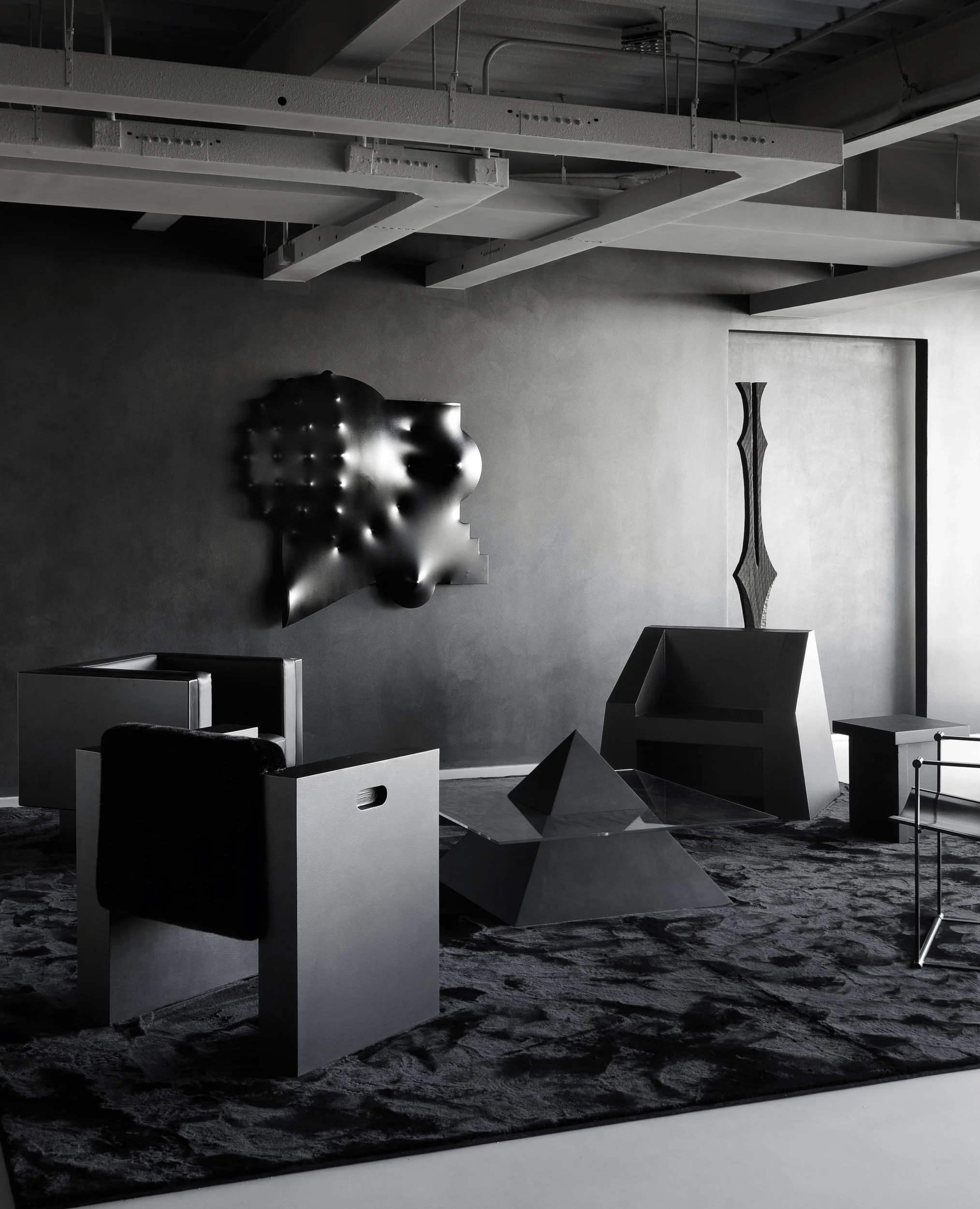
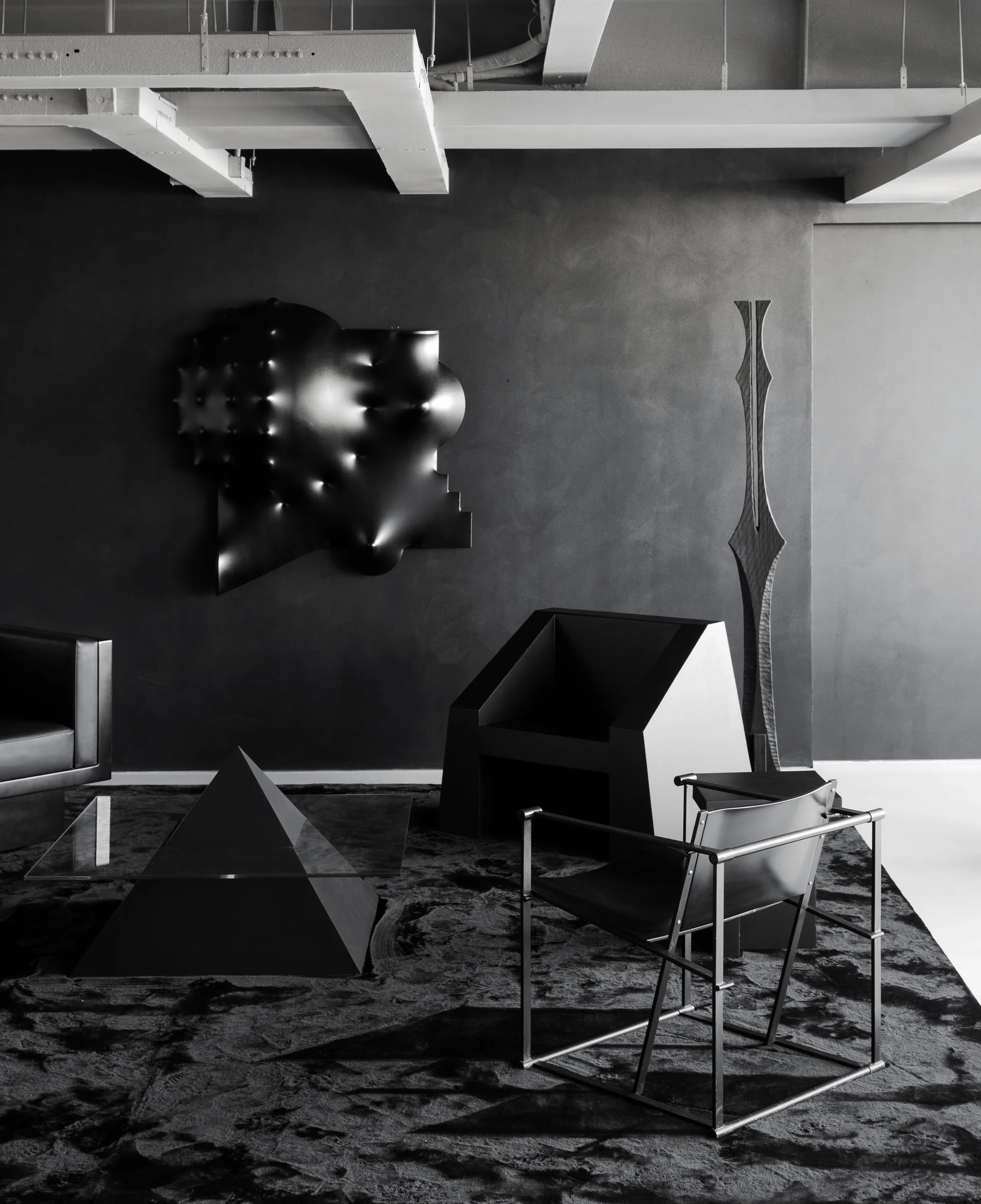
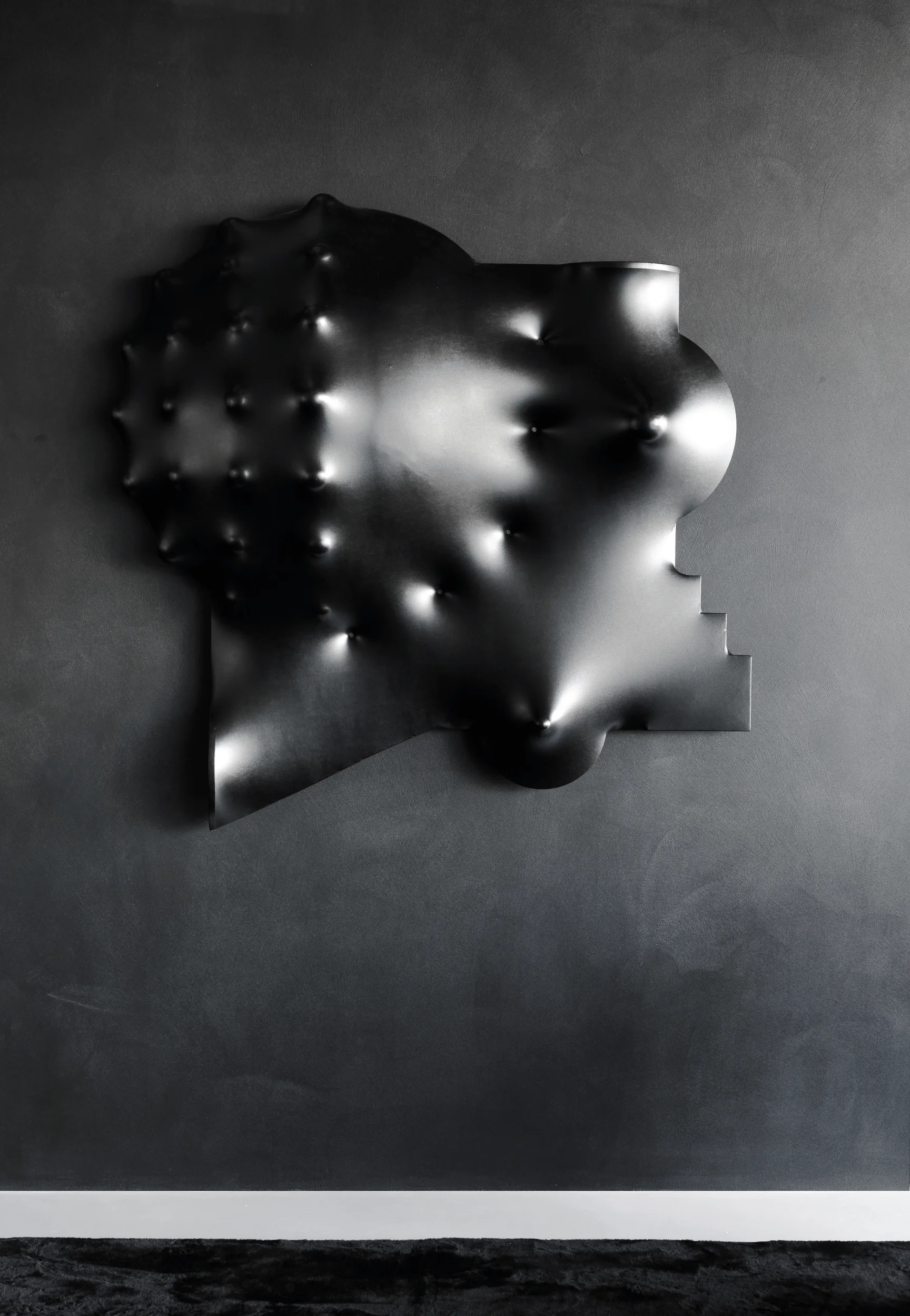
The main showroom adopts a dark and impactful palette to enhance the spatial visual tension. Predominantly using a black and gray tone, the space emanates a refined and artistic atmosphere, in line with the brand’s identity. Through the strategic use of color and geometric forms, a cohesive and interconnected experience is created. The micro-cement, the core element of the brand, is applied to the walls and floors, while samples appear in various formats throughout the different zones. This approach to using micro-cement interior design demonstrates the material’s versatility in different applications and scales within a commercial setting, showcasing its potential in different design contexts within a commercial space.
tag: commercial space design, micro-cement wall application, micro-cement floor application, black and gray interior design, geometric interior design
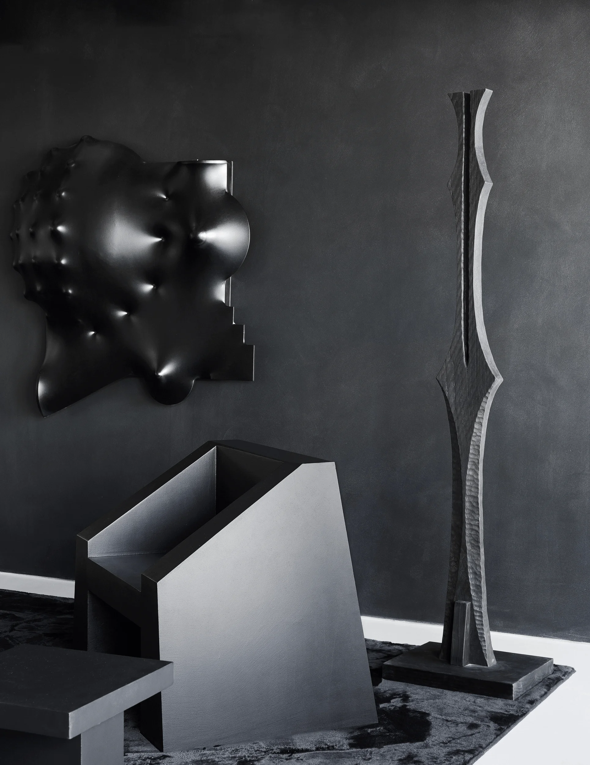
Sofa Area: Sculptures and Textures
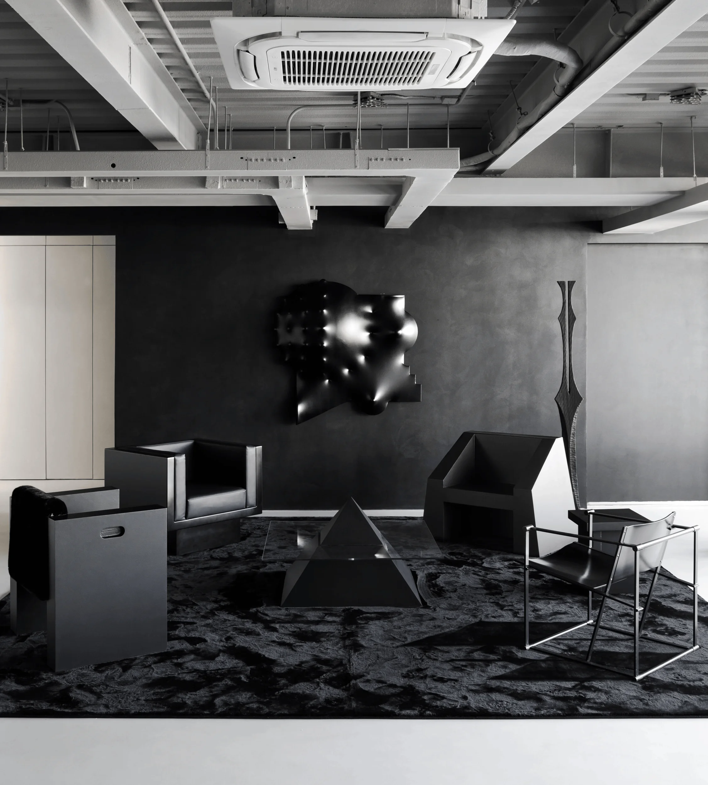
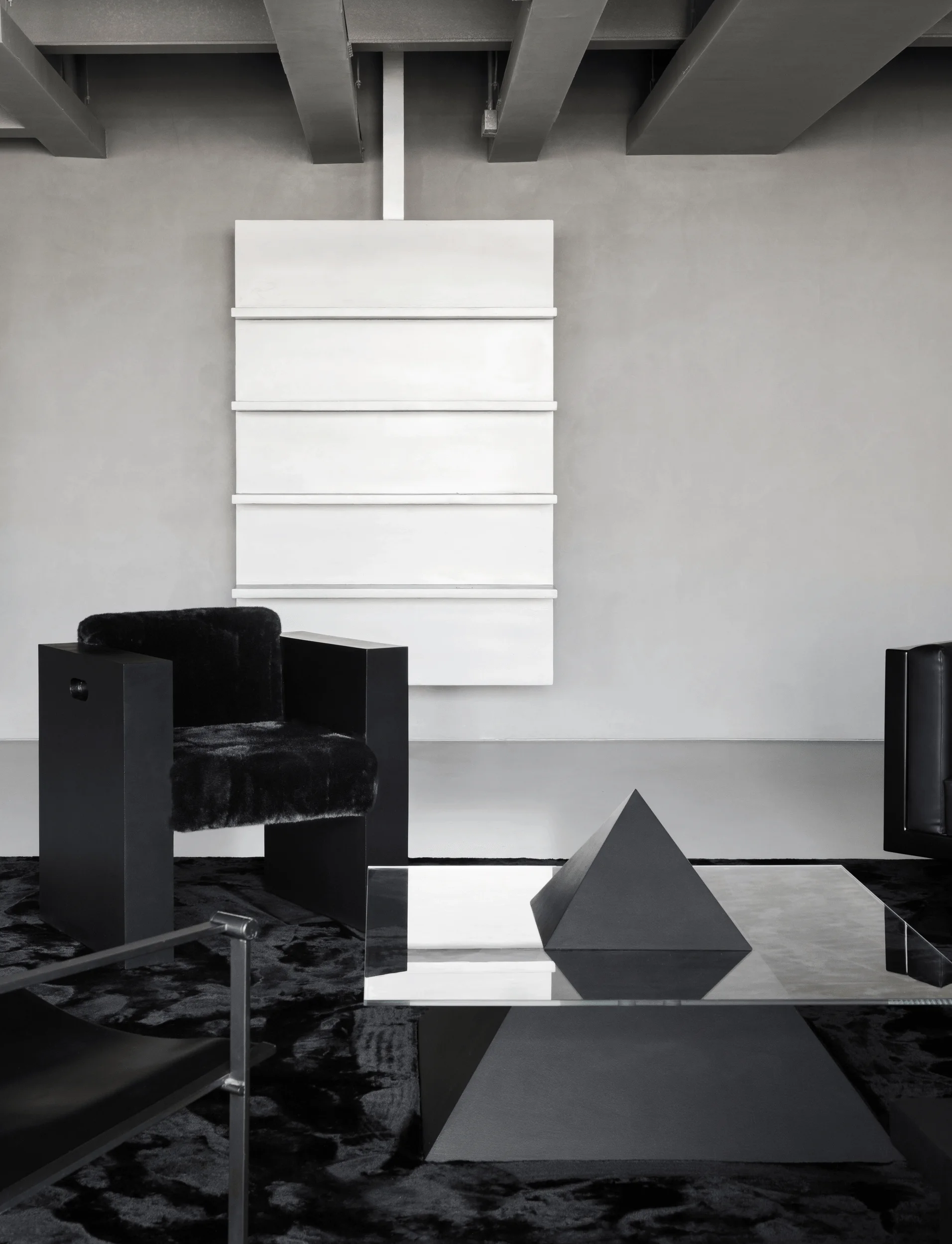
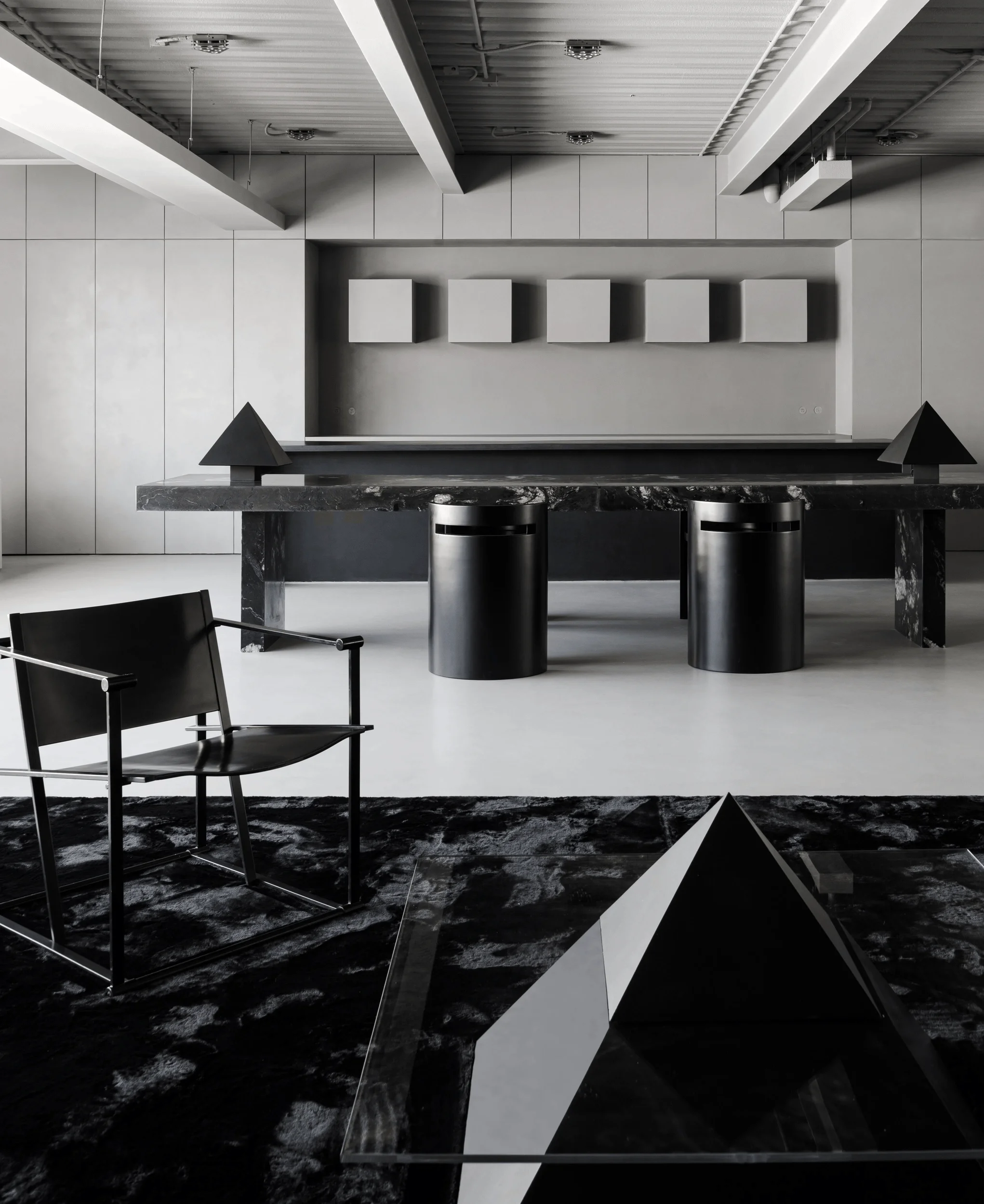
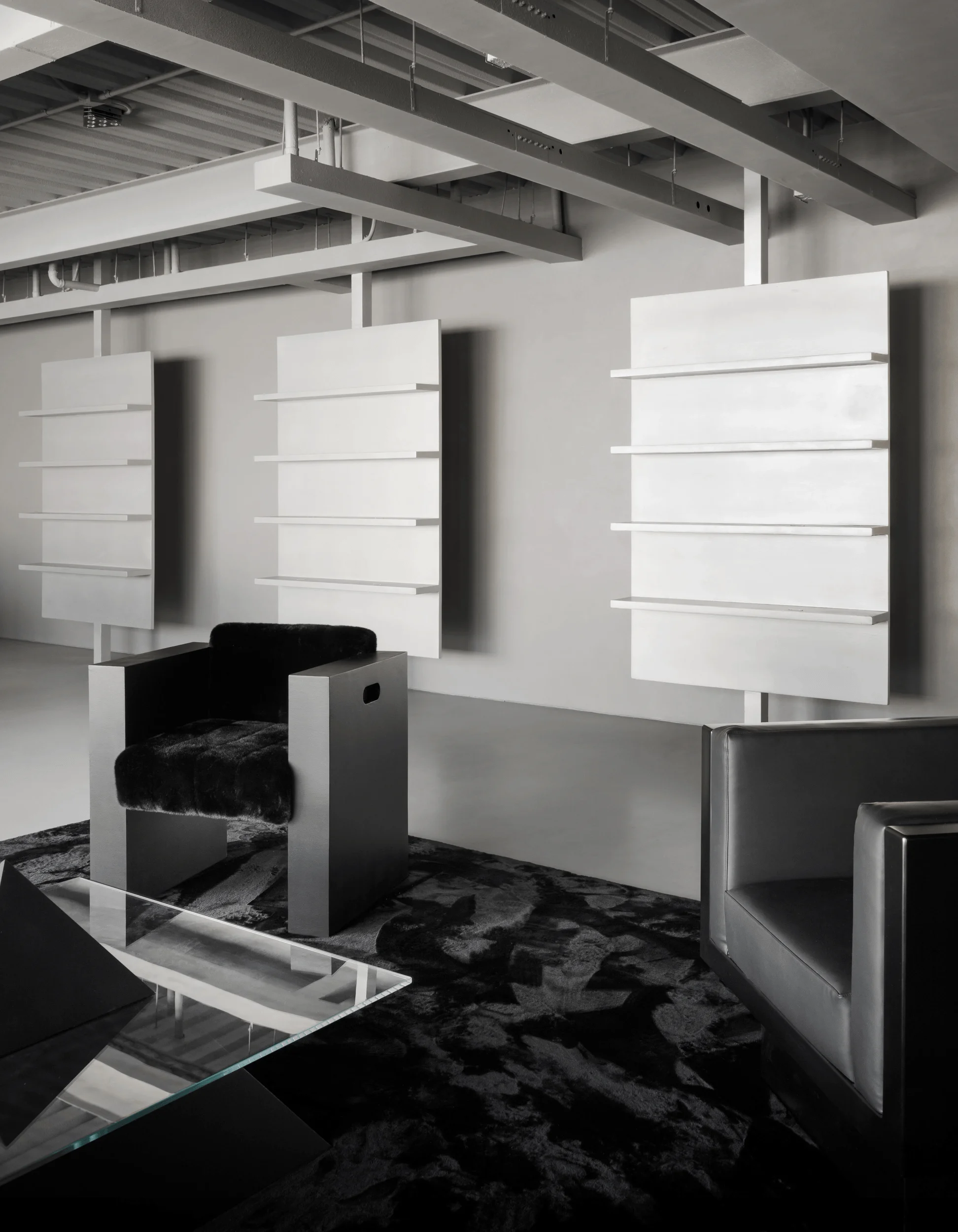
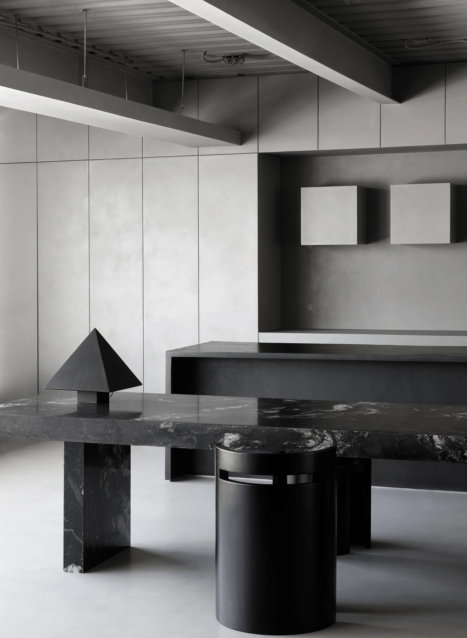
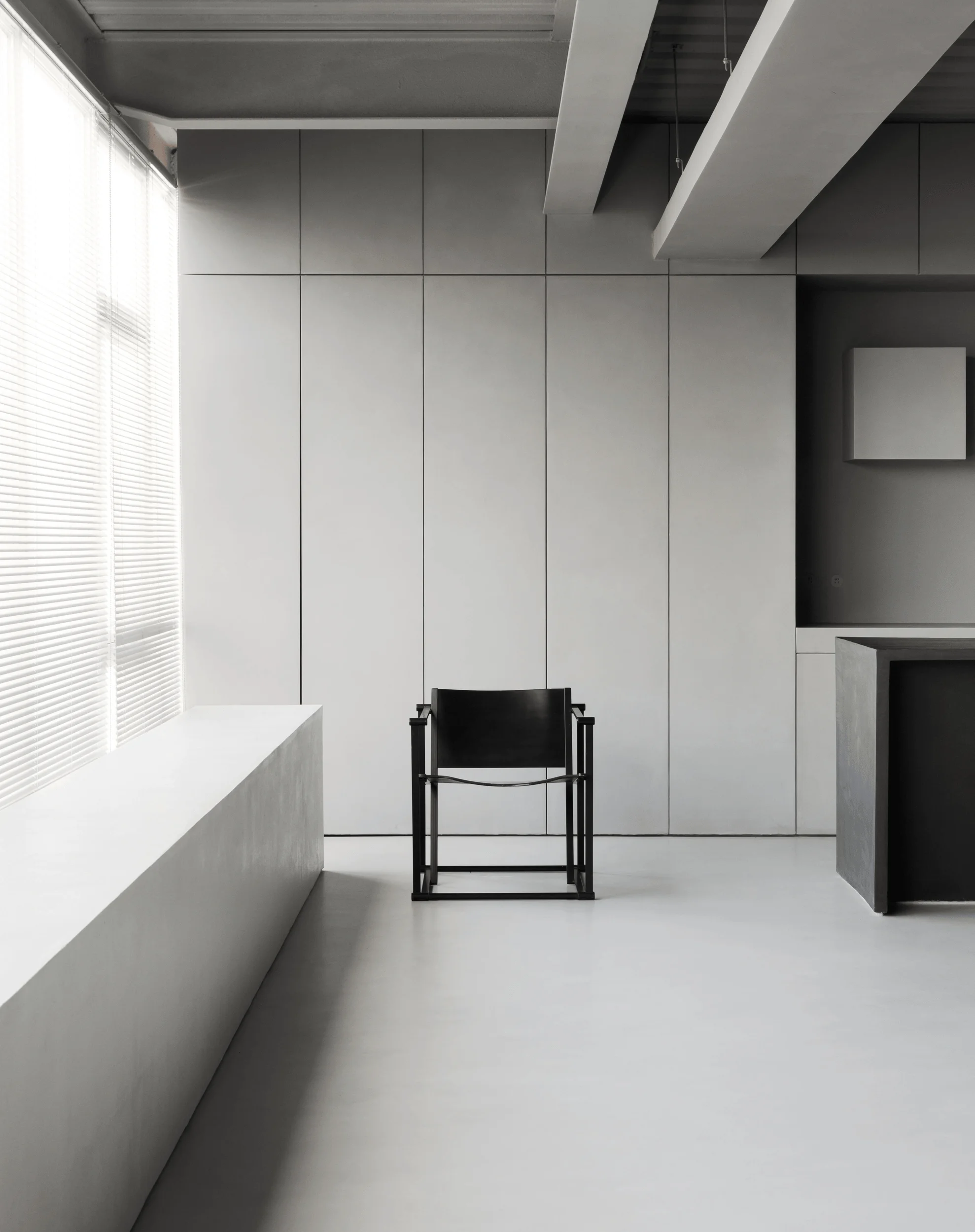
The sofa area features a bold, purely black visual impact. Within this monochromatic theme, varied geometric shapes and diverse materials introduce a layer of complexity and create an unconventional, surreal visual narrative. Four distinctively designed black chairs define the seating area, each with its unique identity. This demonstrates a focus on detail and a curated selection of design elements in the minimalist interior design with micro-cement. A custom-designed black leather armchair and a tribute to Dutch designer Radboud van Beekum’s signature block shapes, both with clean lines, showcase a careful balance of aesthetics and functionality. The presence of these various seating styles is an example of the design’s ability to integrate diverse elements while maintaining a cohesive aesthetic, contributing to the richness of a commercial space.
tag: sofa area design, micro-cement furniture application, geometric chair design, black leather chair, interior design with sculptural elements
Product Display Zones: Order and Symmetry
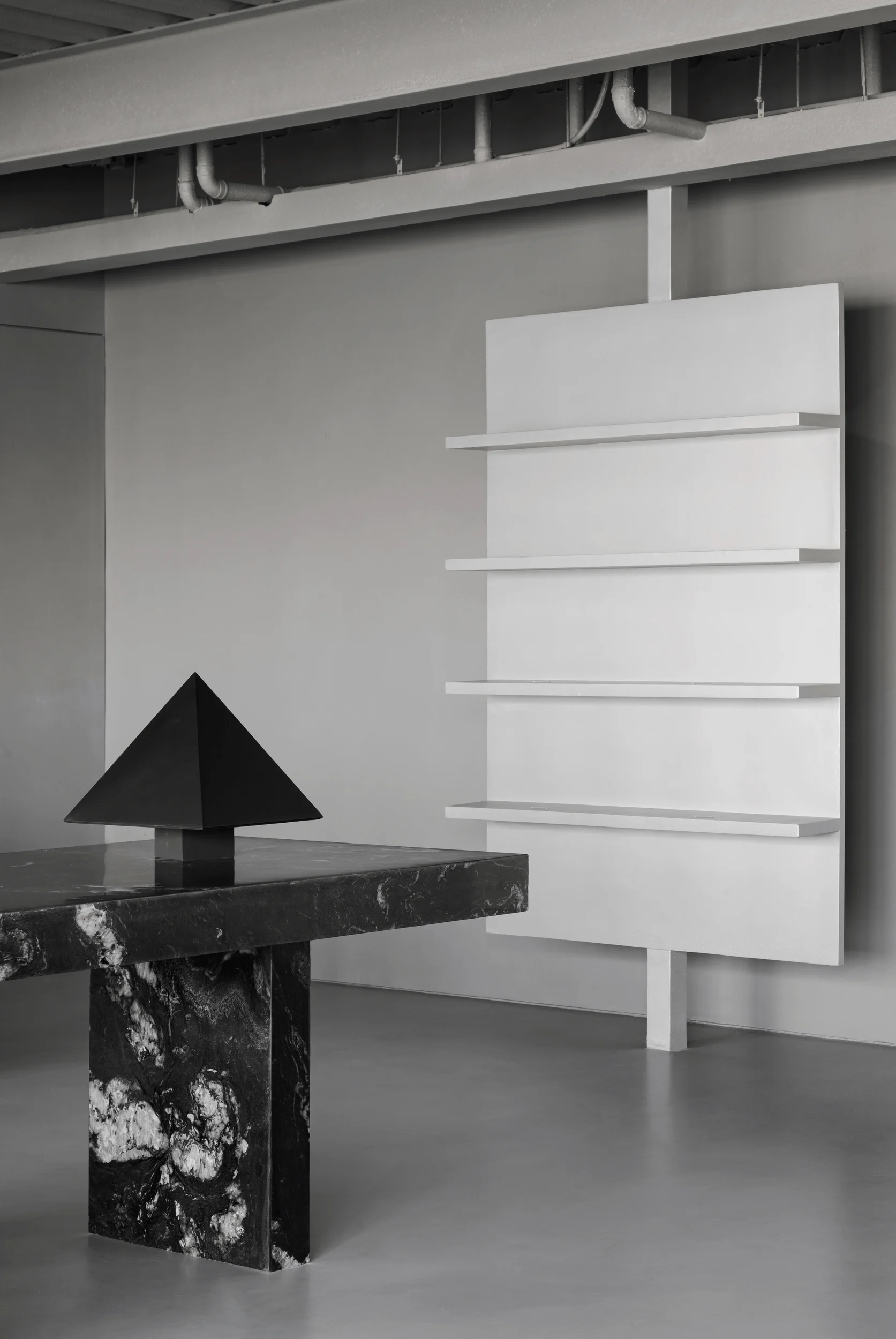
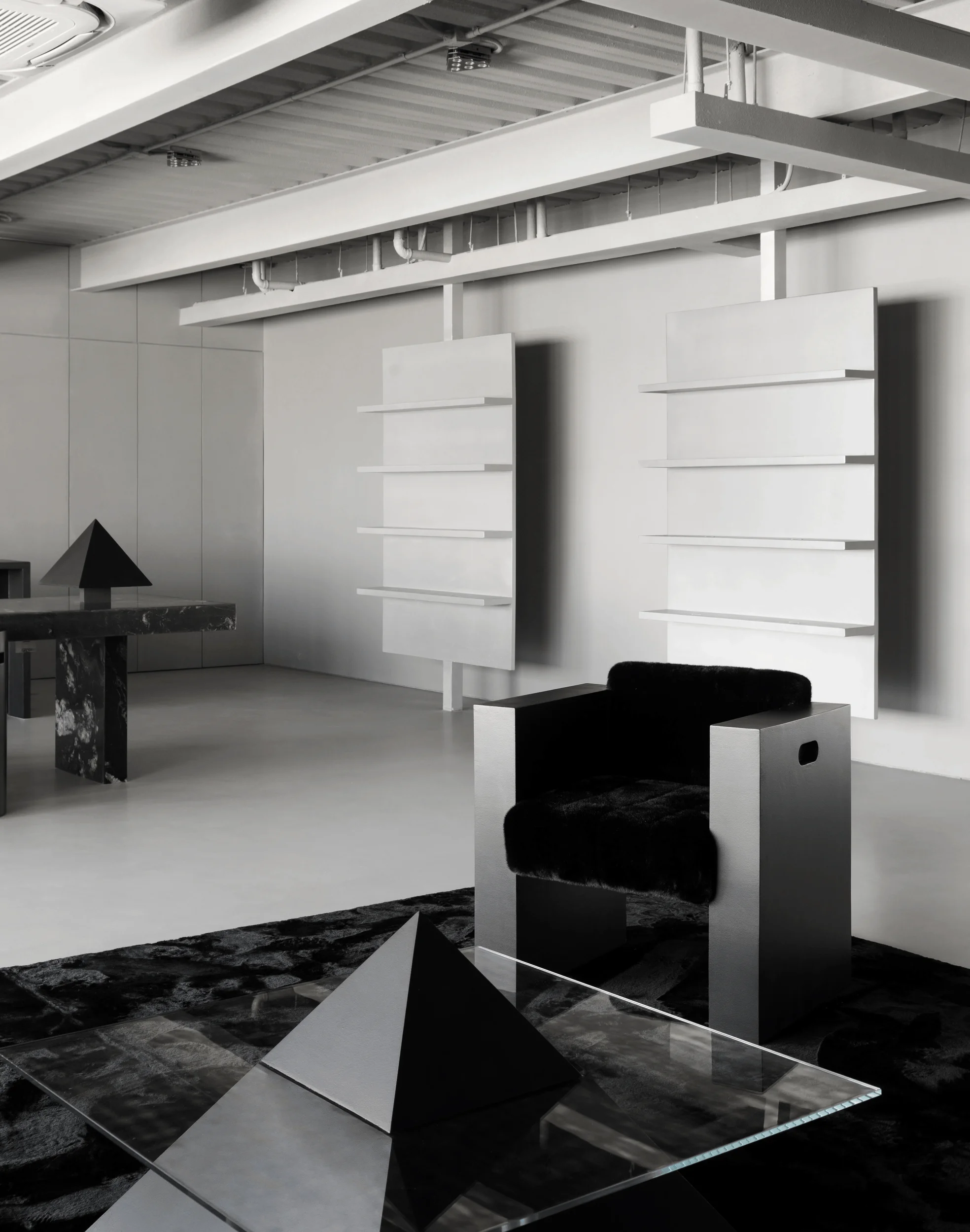
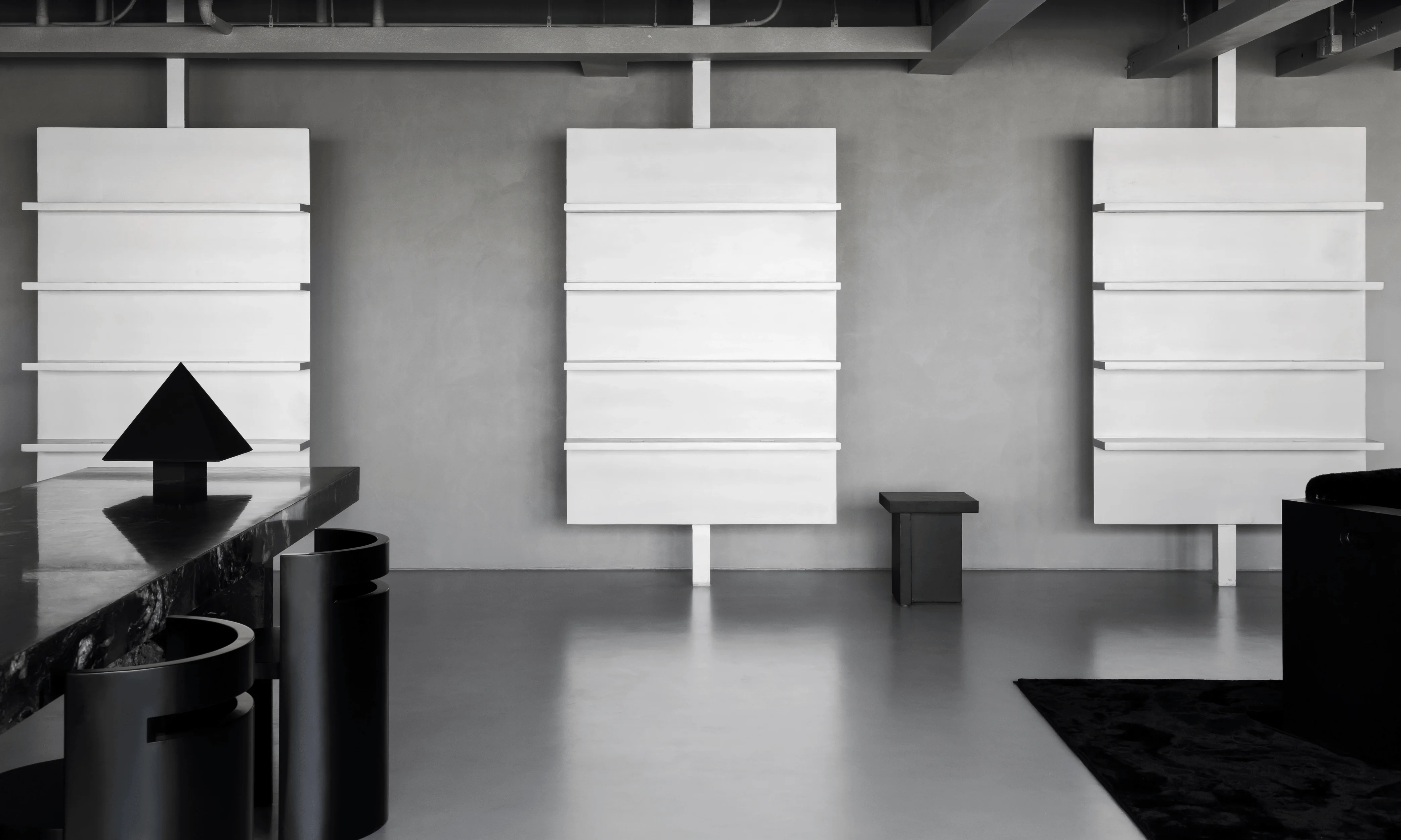
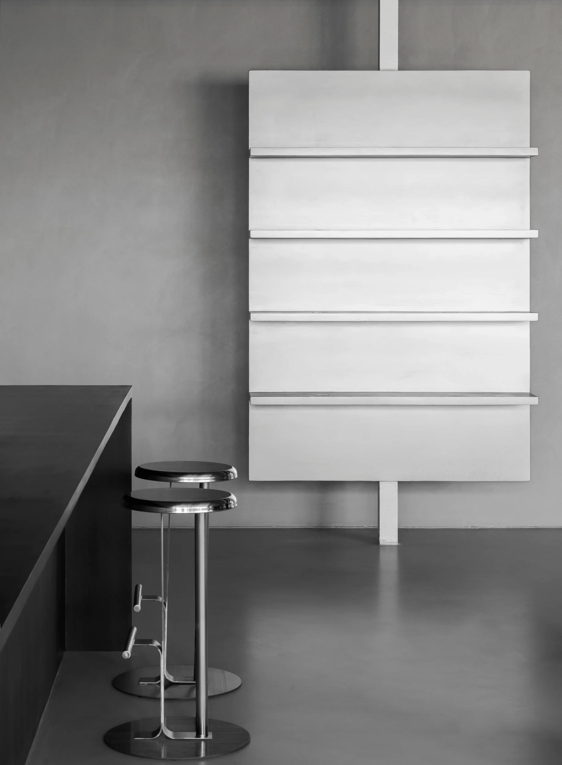
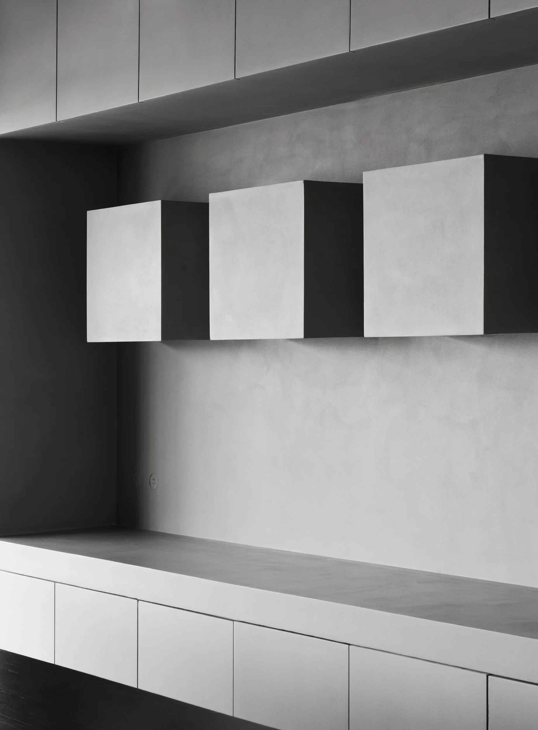
The showroom’s sides feature product display areas, specifically three sets of floating shelves near the entrance. In contrast to the sofa area’s dynamism, the display zone underscores a sense of order and strict symmetry through the repetition of large blocks. The shelves, characterized by rectangular back panels and straight shelves, retain a simple, almost primitive form. The slim supporting rods of the shelves allow for a suspended presentation, reducing the perceived heaviness of the structure. These rods also act as vertical lines, adding to the overall ordered feel of the space and contributing to the visual harmony within the minimalist interior design with micro-cement. The suspended shelves provide a clean and focused backdrop for the showcased items, allowing them to stand out in the context of the commercial space.
tag: product display design, micro-cement shelf design, geometric shelving unit, minimalist display strategy, commercial space display design
Consultation Area: A Universe of Stone and Light
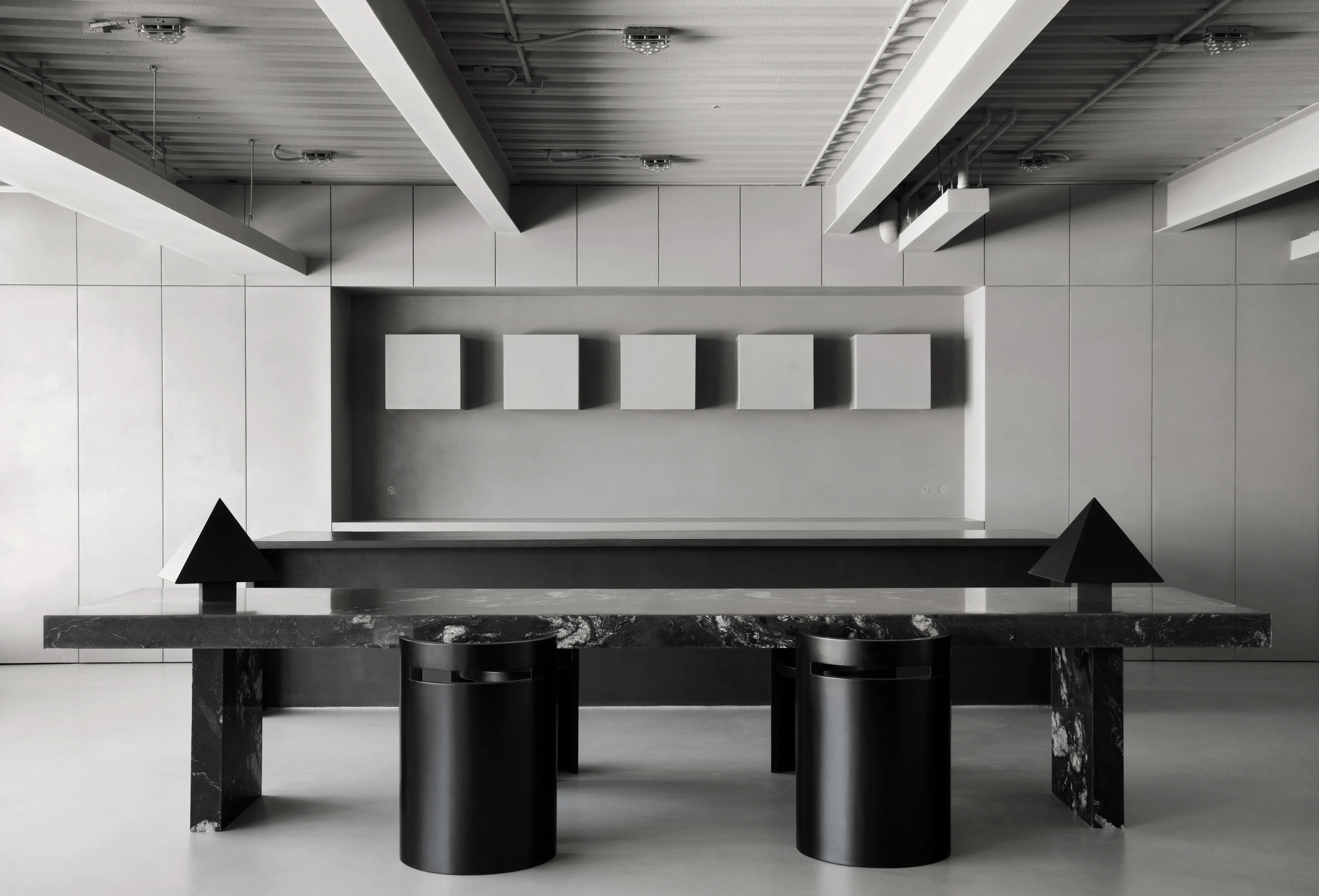
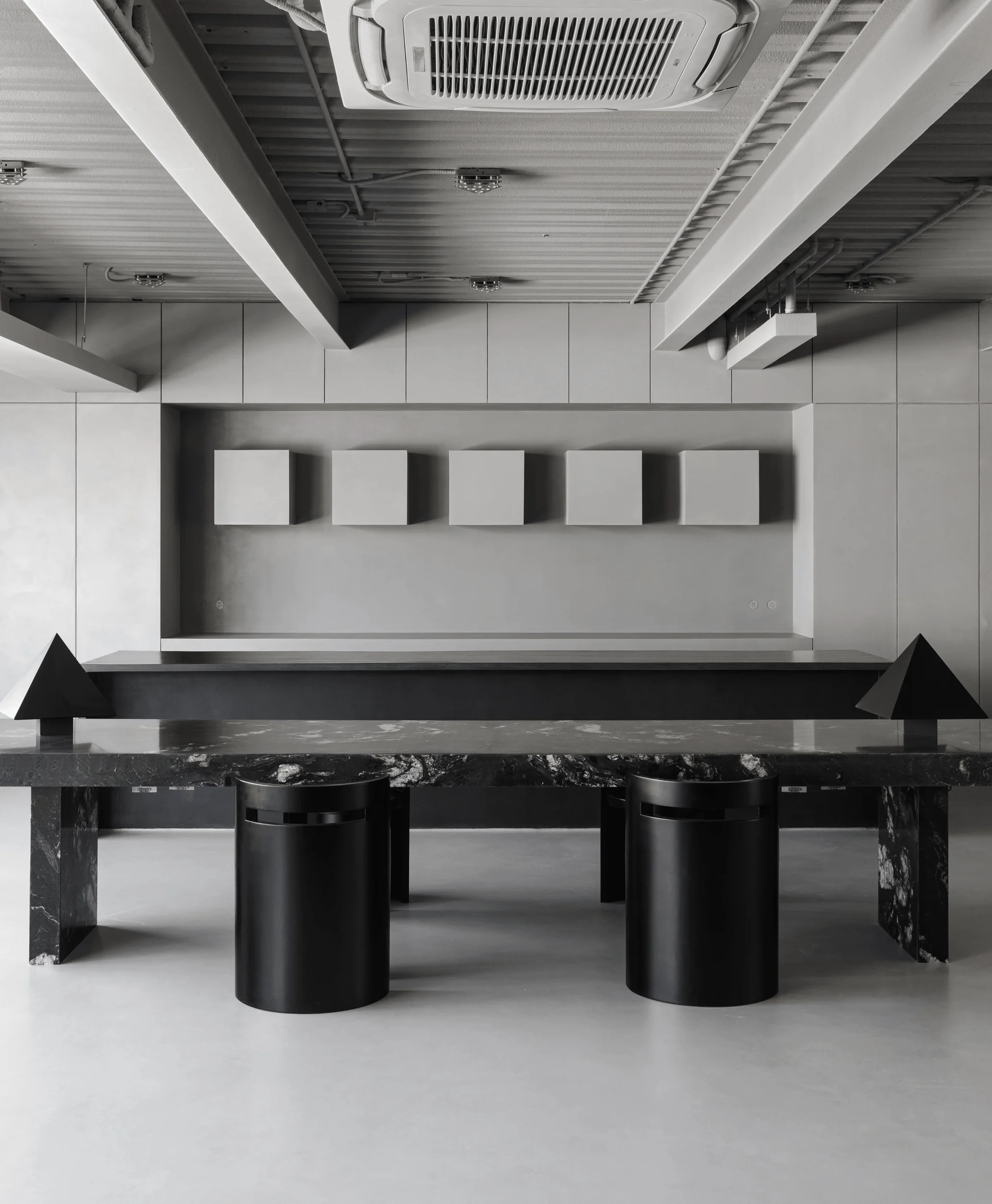
The consultation area, situated at the rear of the showroom, is reminiscent of a residential dining and kitchen space. It adopts a symmetrical composition and features a large, black marble table referred to as “CosmicStorm.” Its dark surface and white veining resemble a galaxy, adding a poetic touch to the minimalist interior design with micro-cement environment. Flanking the table are two custom-designed triangular table lamps coated in micro-cement, creating a contrast with the table’s sharp edges while maintaining a harmonious visual balance. These lamps serve as subtle visual cues, echoing the triangular coffee table in the sofa area, subtly linking the two zones in the commercial space.
tag: consultation area design, micro-cement table design, marble table application, industrial lighting design, black and white interior design
Kitchenette: A Blend of Industrial and Minimalism
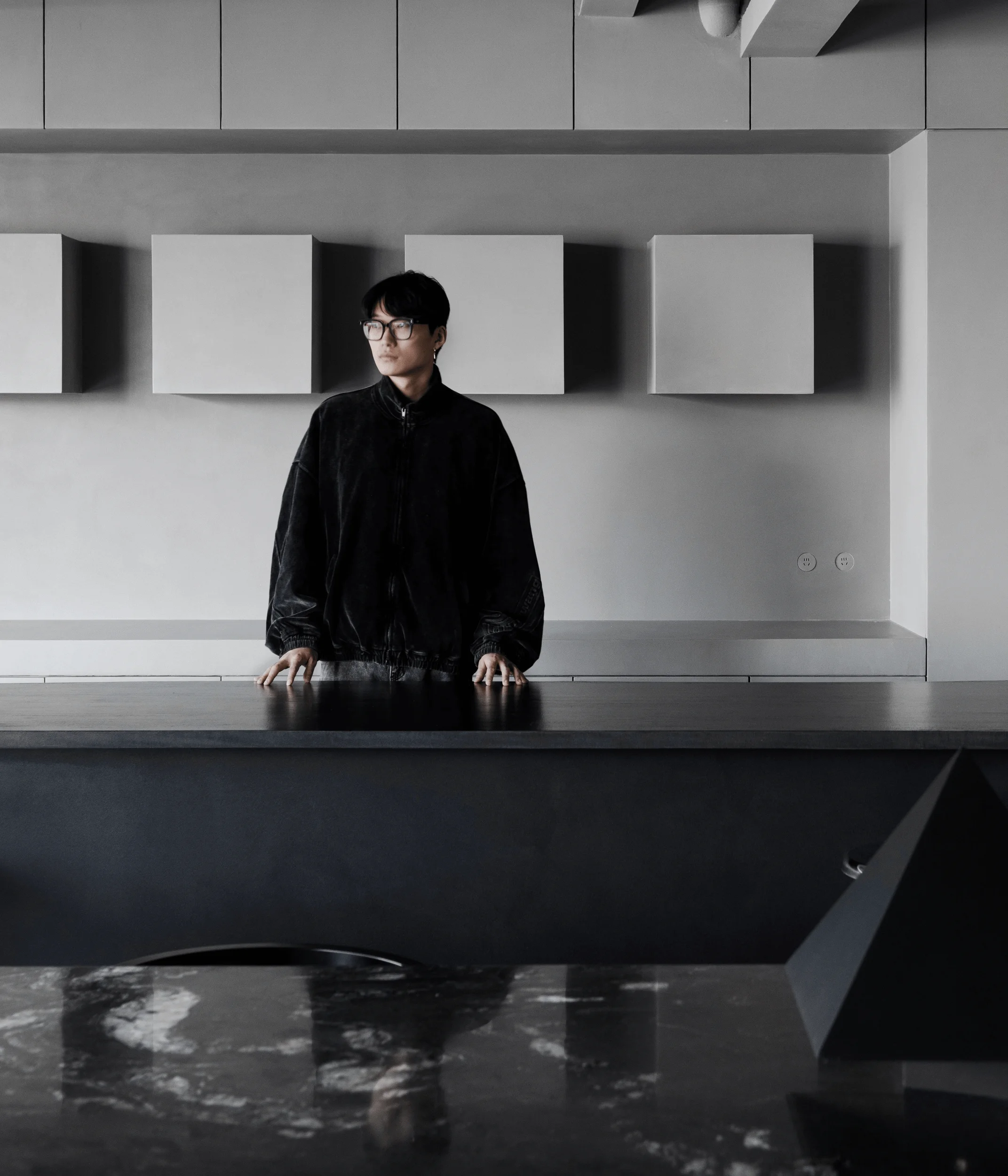
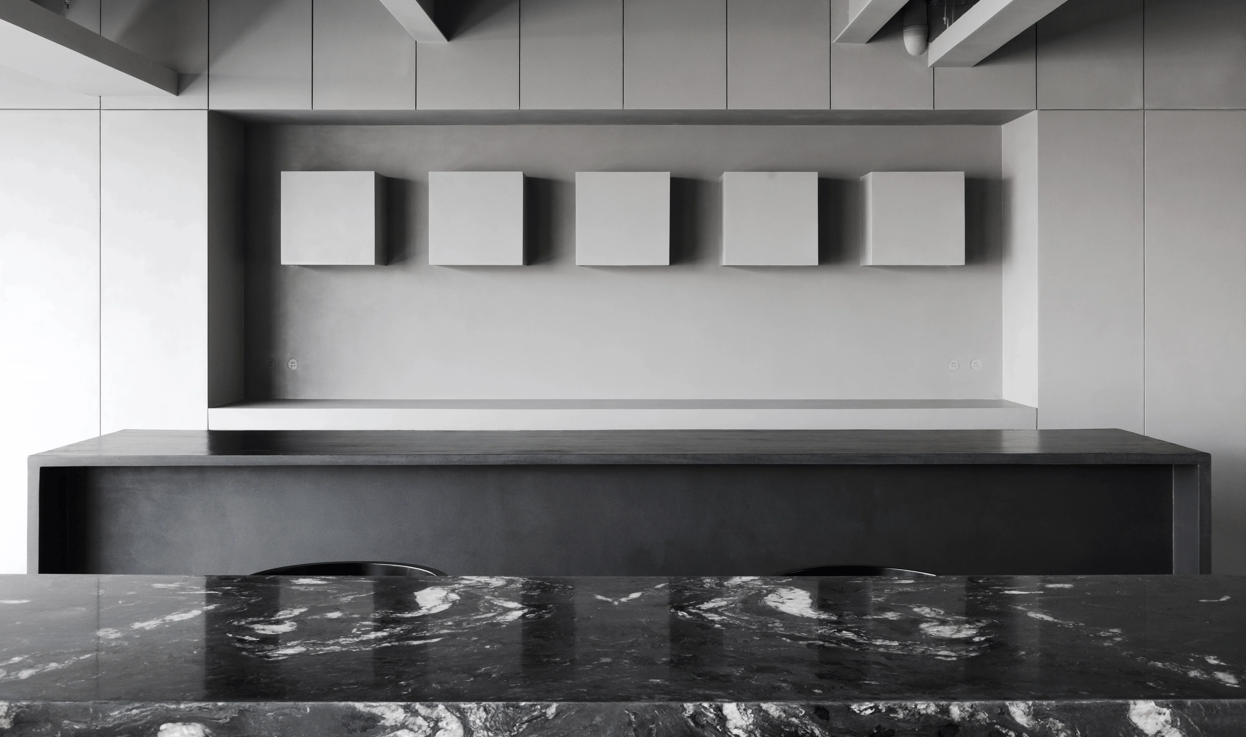
Adjacent to the table, the kitchenette maintains the same minimalist design aesthetic with micro-cement finishes. The black island counter matches the table in scale and form, exhibiting a highly ordered structure. The gray micro-cement cabinetry eliminates any visual clutter, emphasizing a focus on geometric order. The square wall-mounted cabinets break through the visual plane and introduce a sense of depth. The stainless-steel pendant lighting above the counter offers industrial and technological elements, adding a touch of the future to the minimalist interior design with micro-cement, grounding the space within a modern commercial context.
tag: kitchen area design, micro-cement kitchen application, minimalist kitchen design, stainless steel lighting design, commercial space kitchen design
Details and Functionality
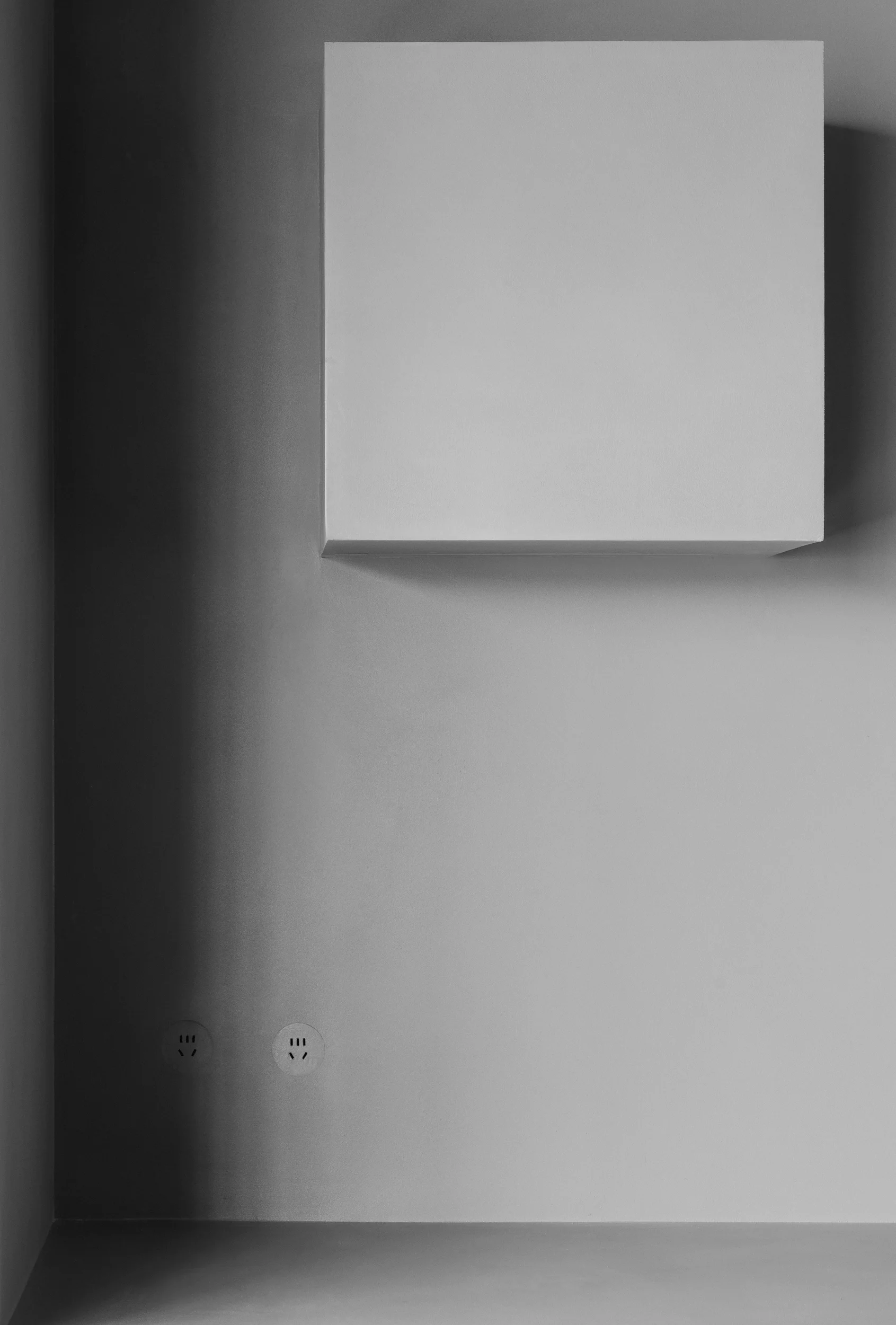
The space incorporates thoughtful details throughout. The recessed sockets on the sides of the cabinets, crafted from micro-cement, blend seamlessly with the walls, creating a streamlined effect. The window area features a low display platform where natural light highlights micro-cement samples, allowing for a clear understanding of the material’s characteristics. This window area contributes to a balanced integration of natural light and a focus on the primary material in the minimalist interior design with micro-cement. This space showcases the synergy between design and functionality in the commercial setting.
tag: micro-cement detailing, minimalist detailing, functional design, window display, commercial space design details
Project Information:
Project Type: Commercial Space
Architect: NOTHING DESIGN
Area: 120 sqm
Year: 2024
Country: China
Main Materials: Micro-cement, Metal, Marble
Photographer: Liu Chang


