Contents
Functional Layout & Spatial Planning: A Narrative of Flow
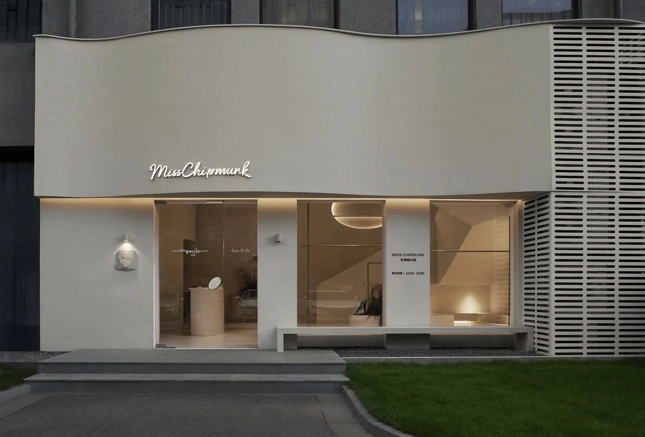
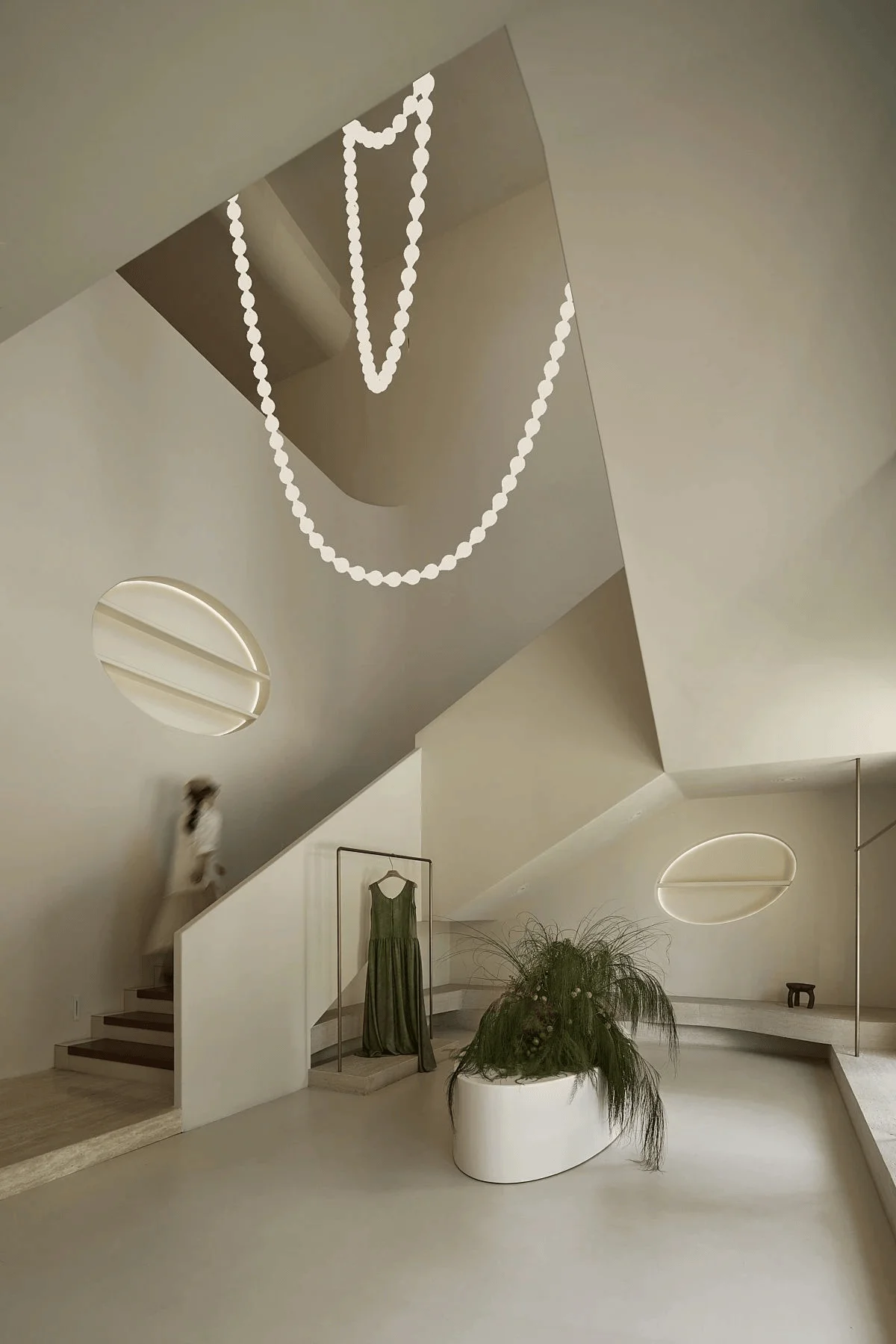
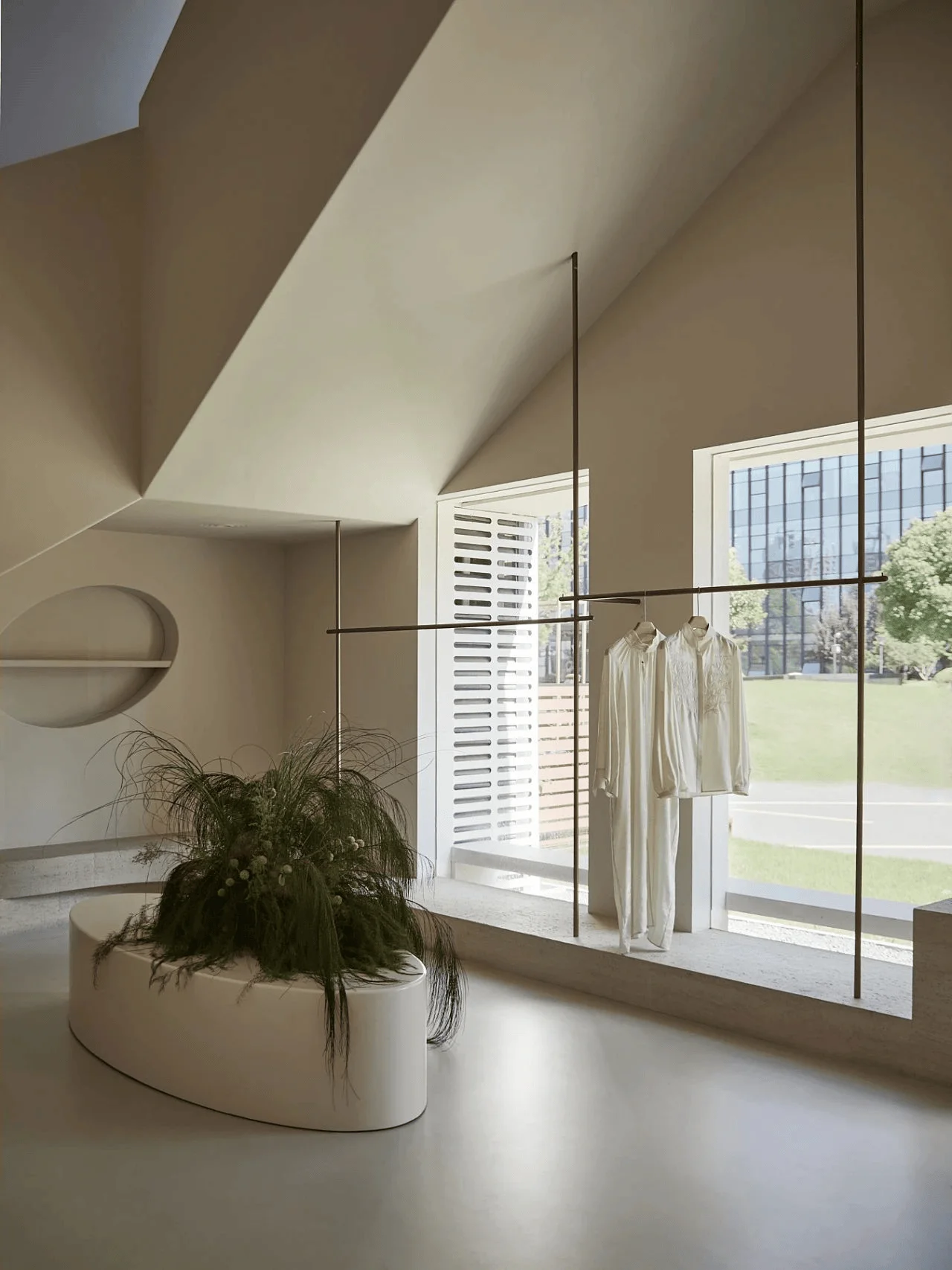
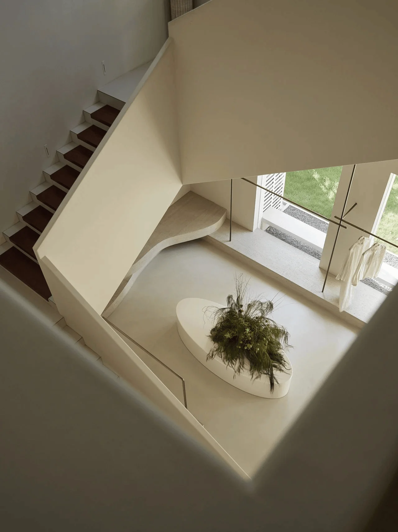
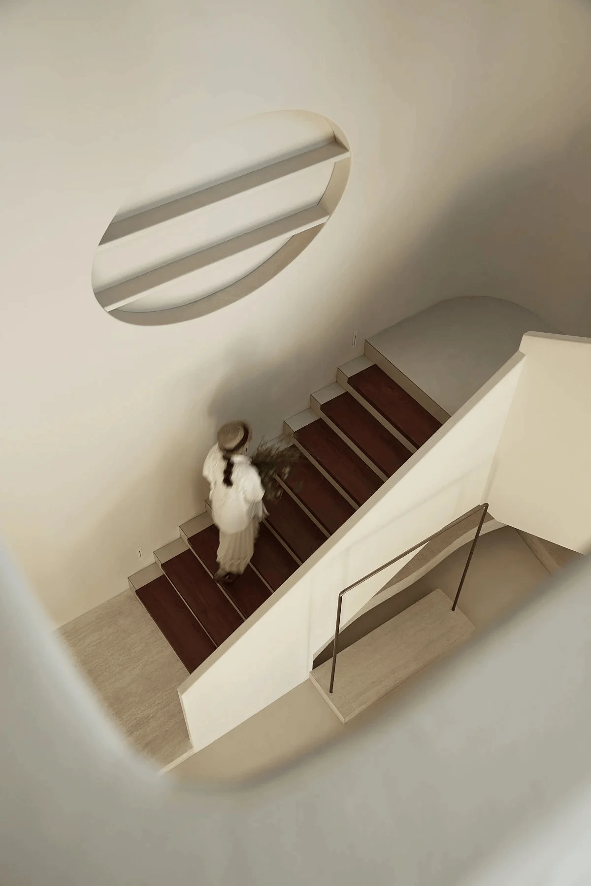
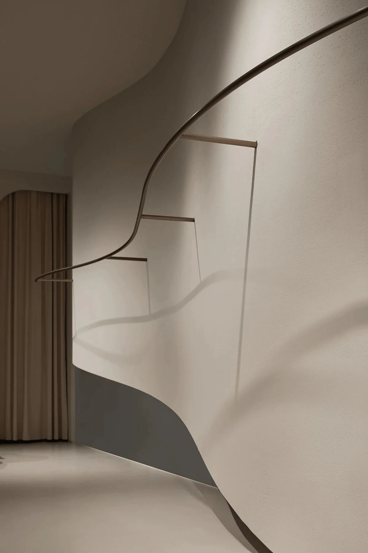
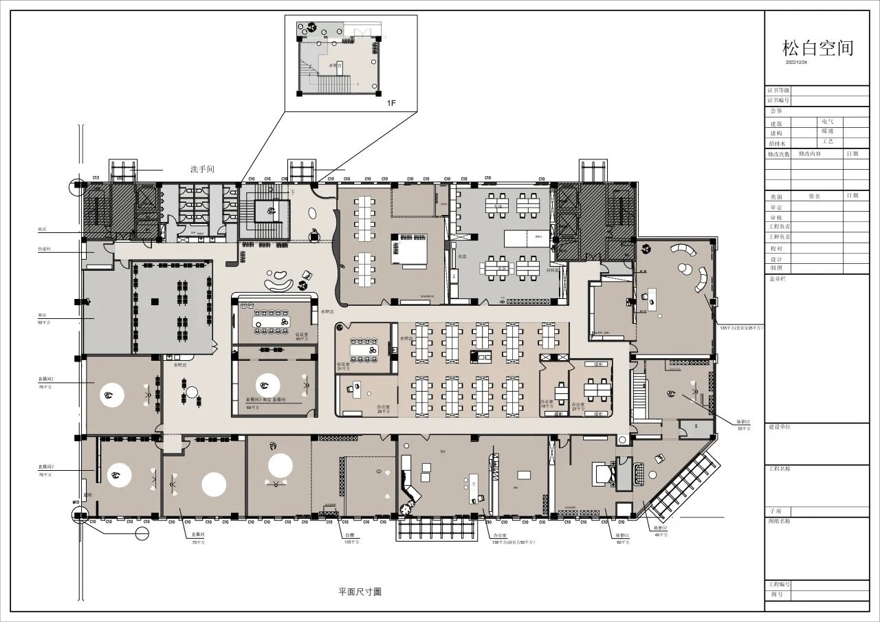
The ground floor acts as the initial encounter point for visitors, with expansive storefront windows drawing the outdoor cityscape and greenery into the space. The interior design of the ground floor acts as the entry point to Miss Chipmunk’s brand experience. This openness welcomes guests, creating a sense of transparency and inviting interaction with the brand. A gently curving staircase connects the floors, creating a dynamic visual experience as users navigate the space. Each floor functions as a chapter in a story, with the design of the interior spaces emphasizing this narrative. The curvilinear staircase is designed to engage the users and draw their attention to the different zones within the building, incorporating a playful aspect in the space. This curvilinear interior design is a key element of the project, highlighting the importance of spatial planning.
Exterior & Aesthetic Design: A Celebration of Curves
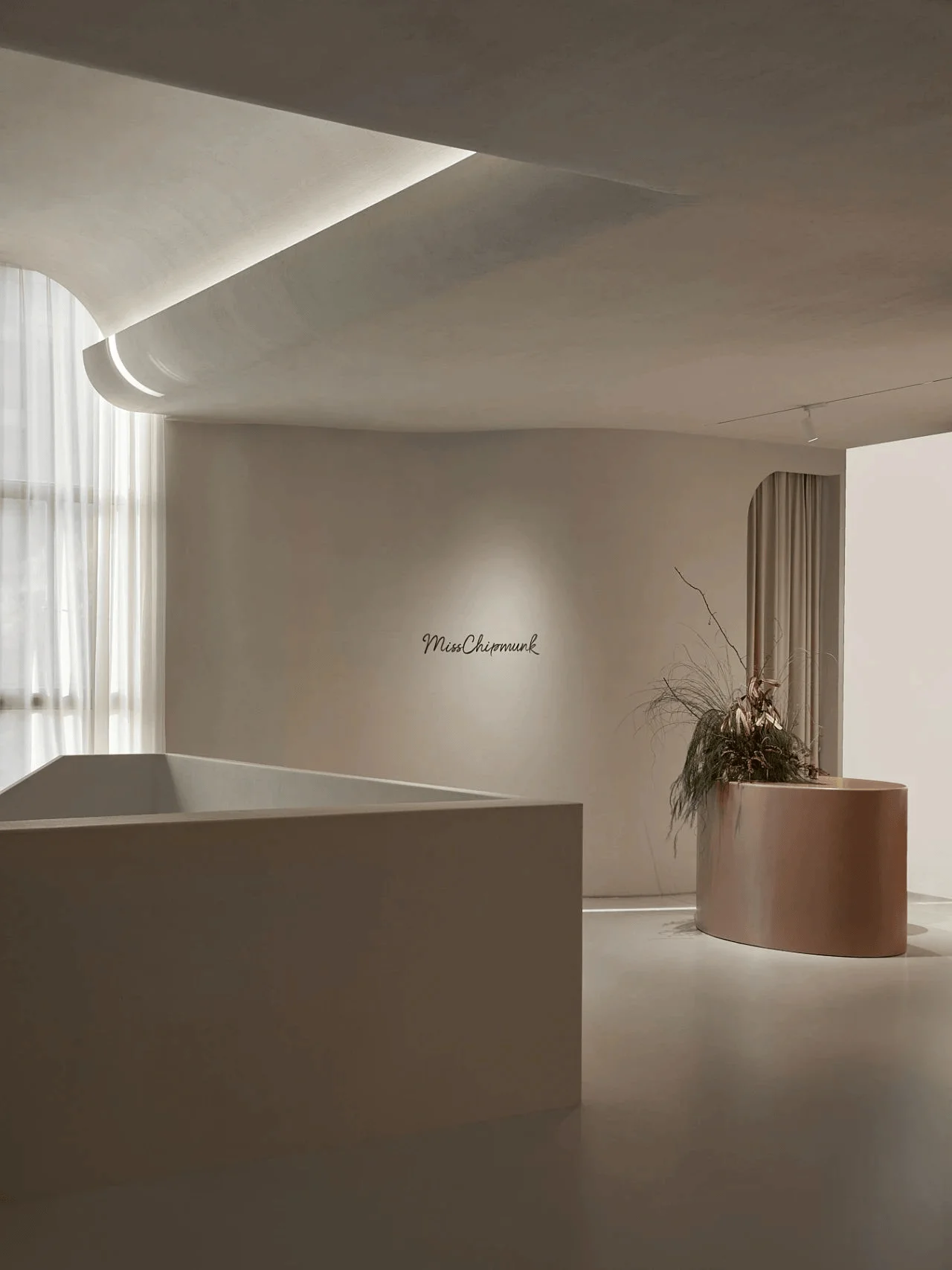
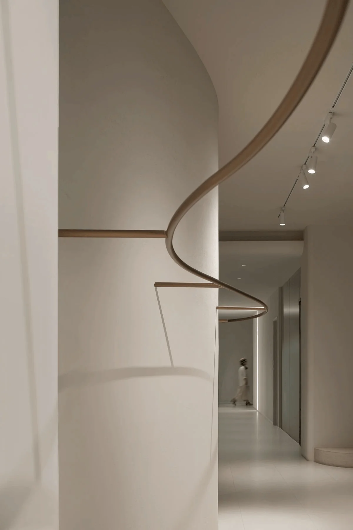
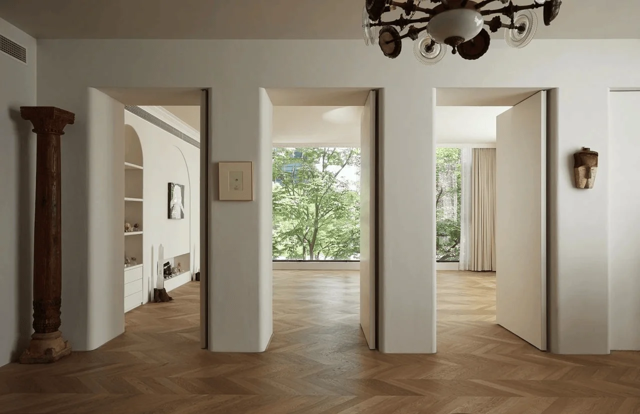
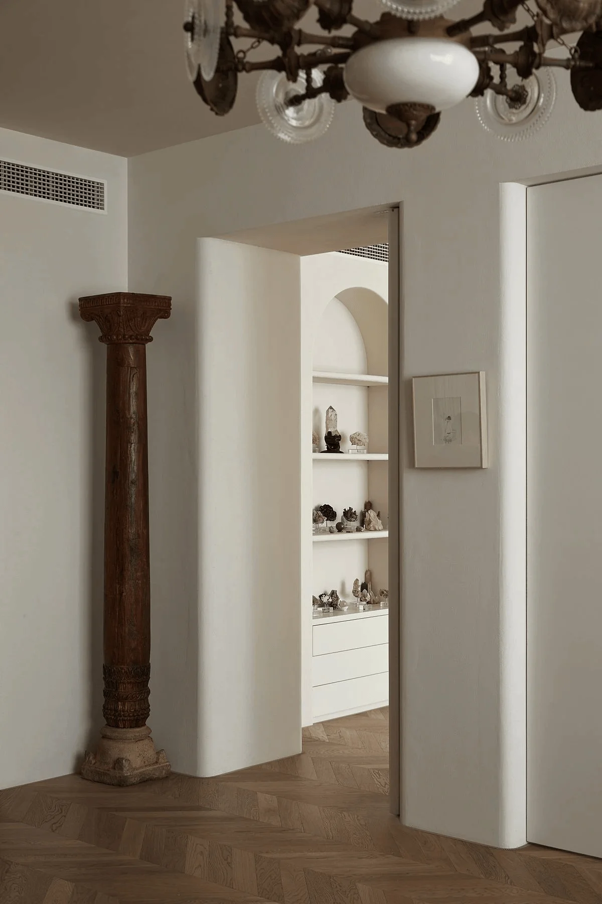
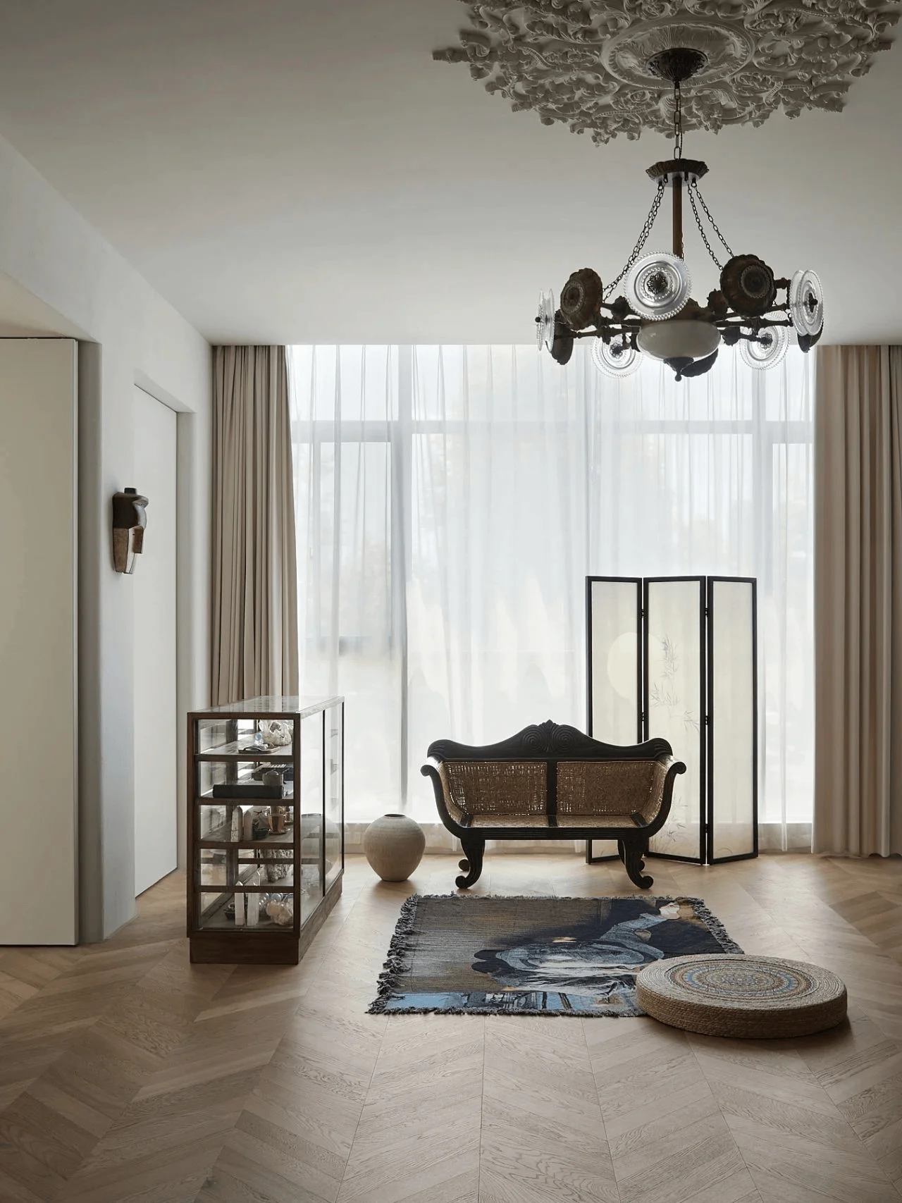
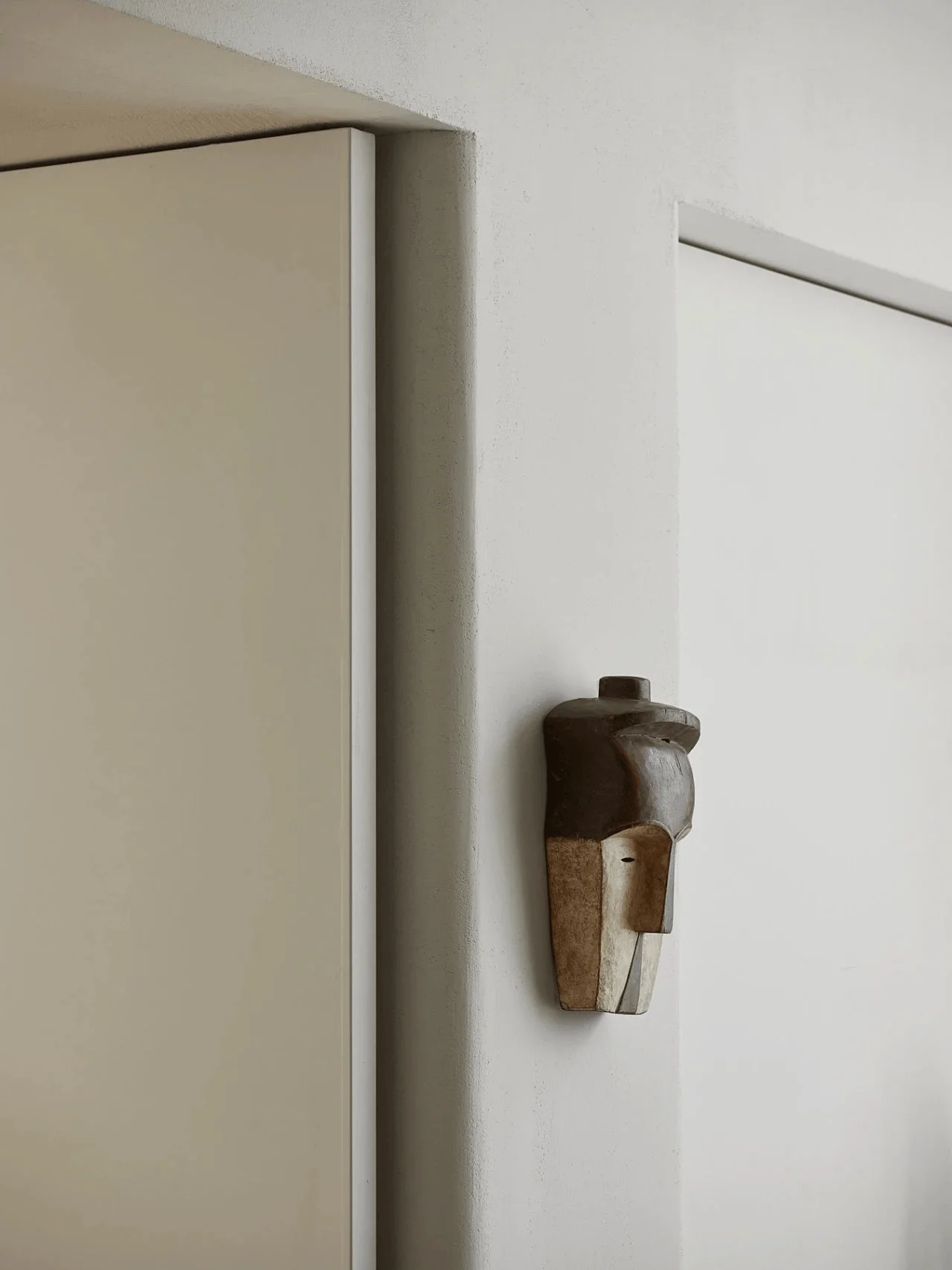
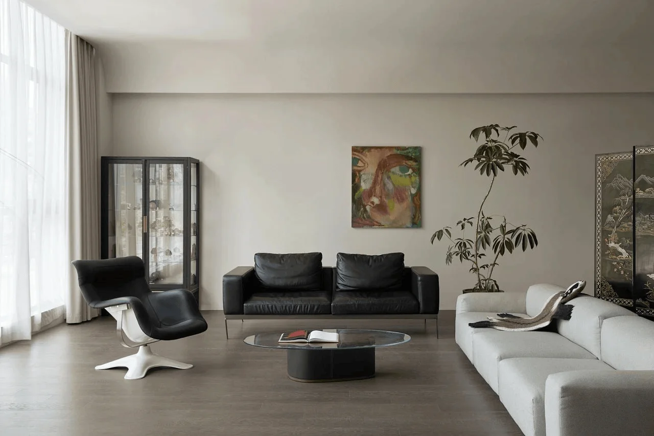
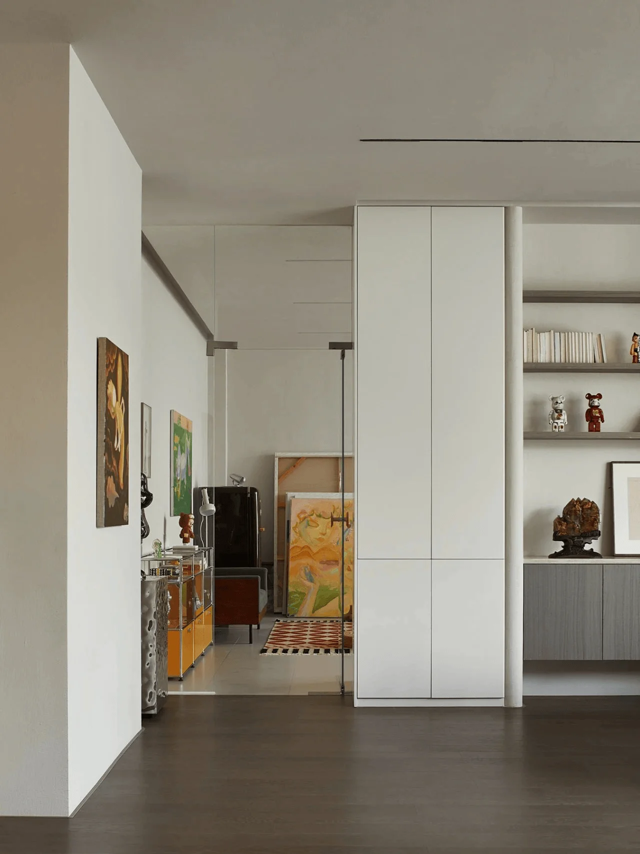
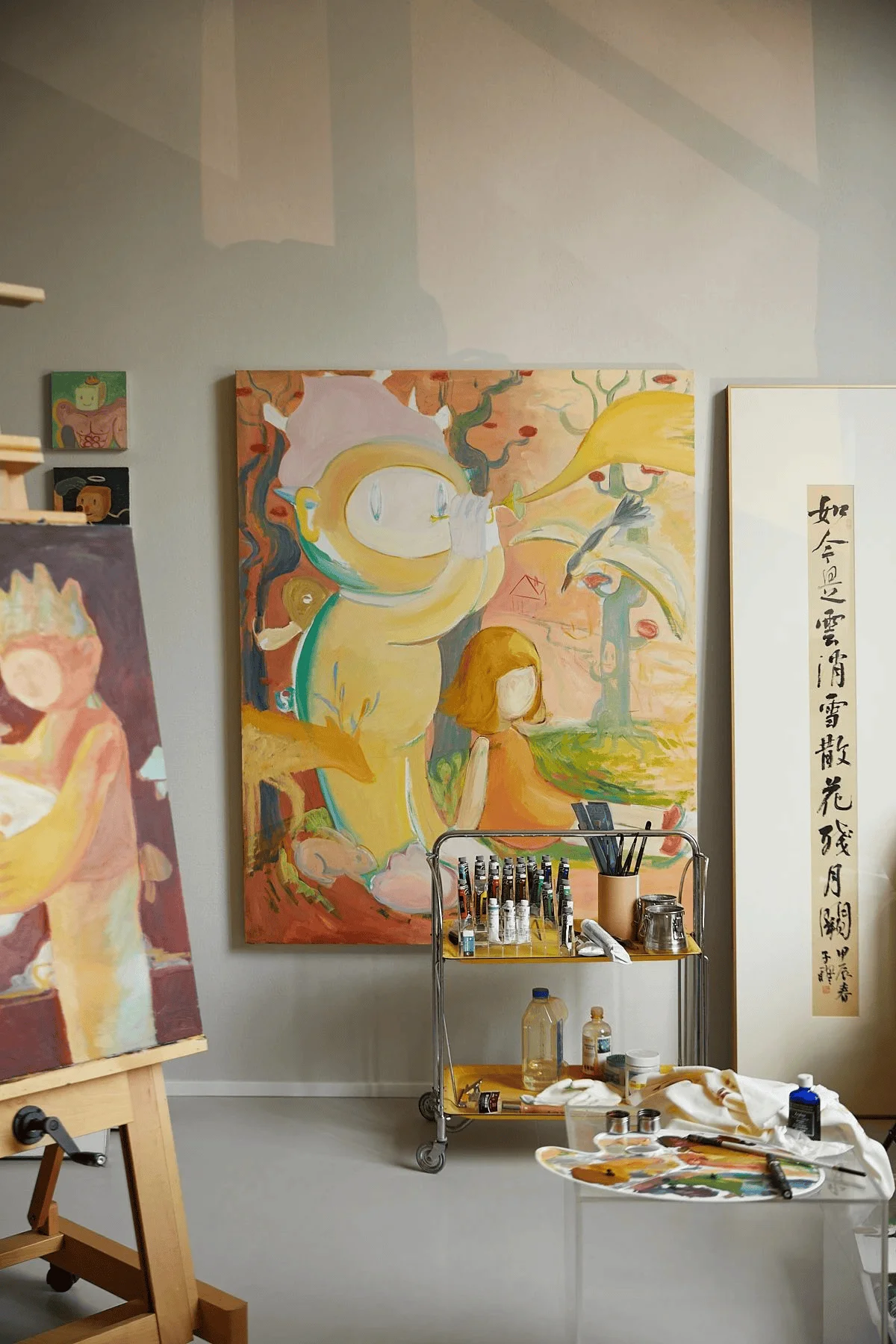
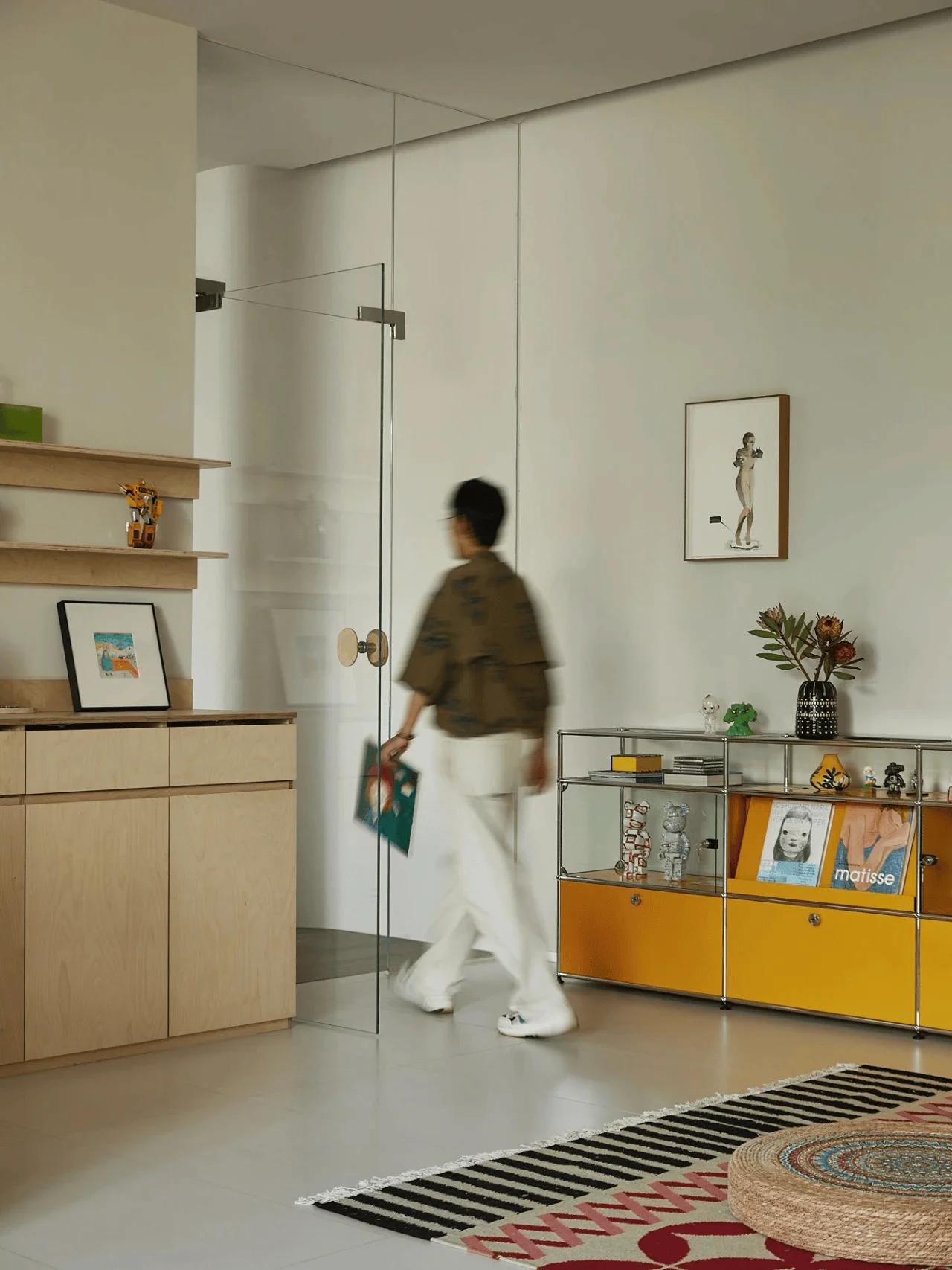
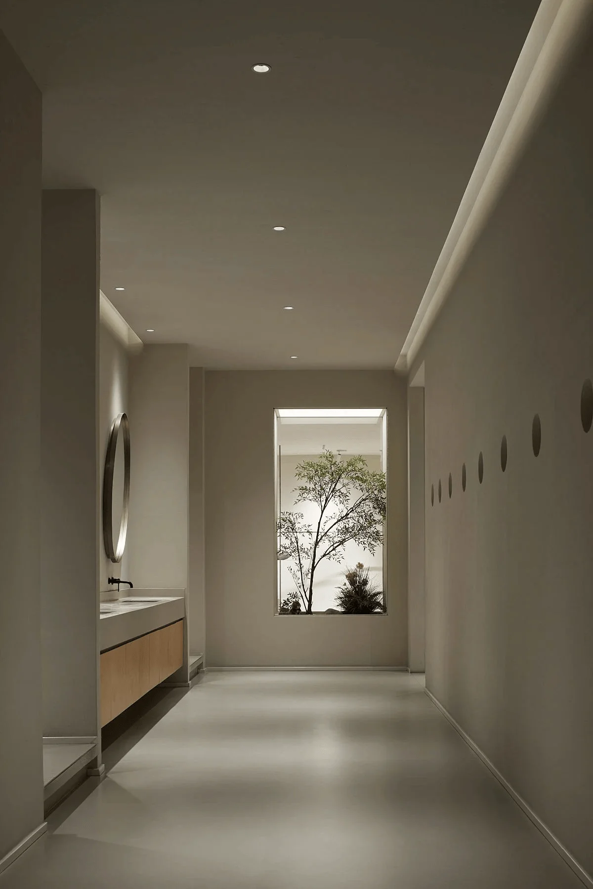
The curvilinear elements extend to the exterior design, subtly shaping the building’s form and establishing a unique presence within the urban context. The facade features clean lines and a neutral color palette, echoing the design language of the interior. The integration of natural light and the thoughtful selection of materials create an atmosphere of serenity and warmth. Curvilinear elements are incorporated into the lighting design, adding visual interest and highlighting the overall aesthetic of the space. The interior design is complemented by carefully curated artwork, vintage pieces, and contemporary art installations. The exterior design of the Miss Chipmunk office seamlessly blends with the surrounding urban environment, while also maintaining its distinct character through the use of curvilinear design elements.
Technical Details & Sustainability: Balancing Form and Function
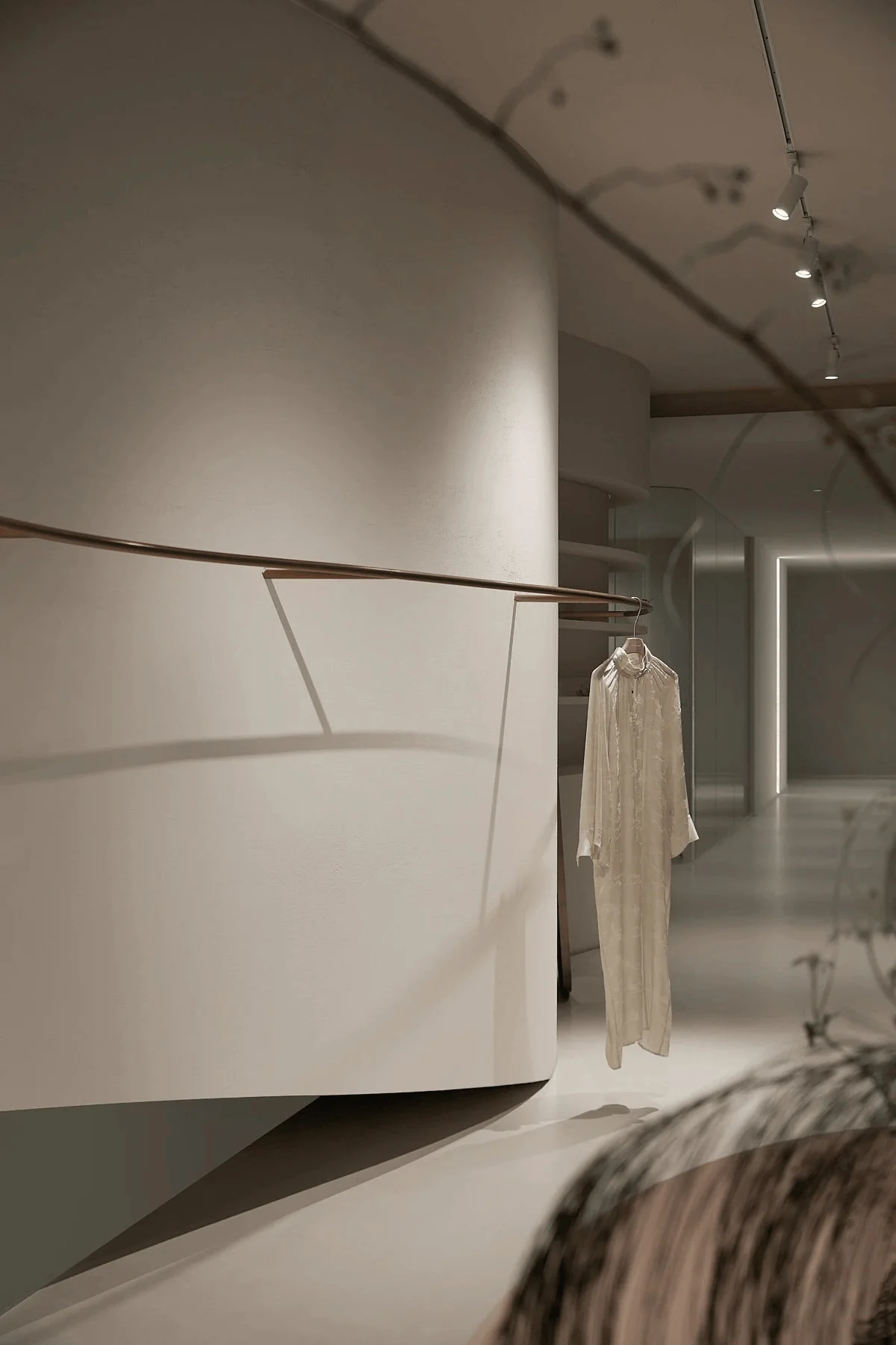
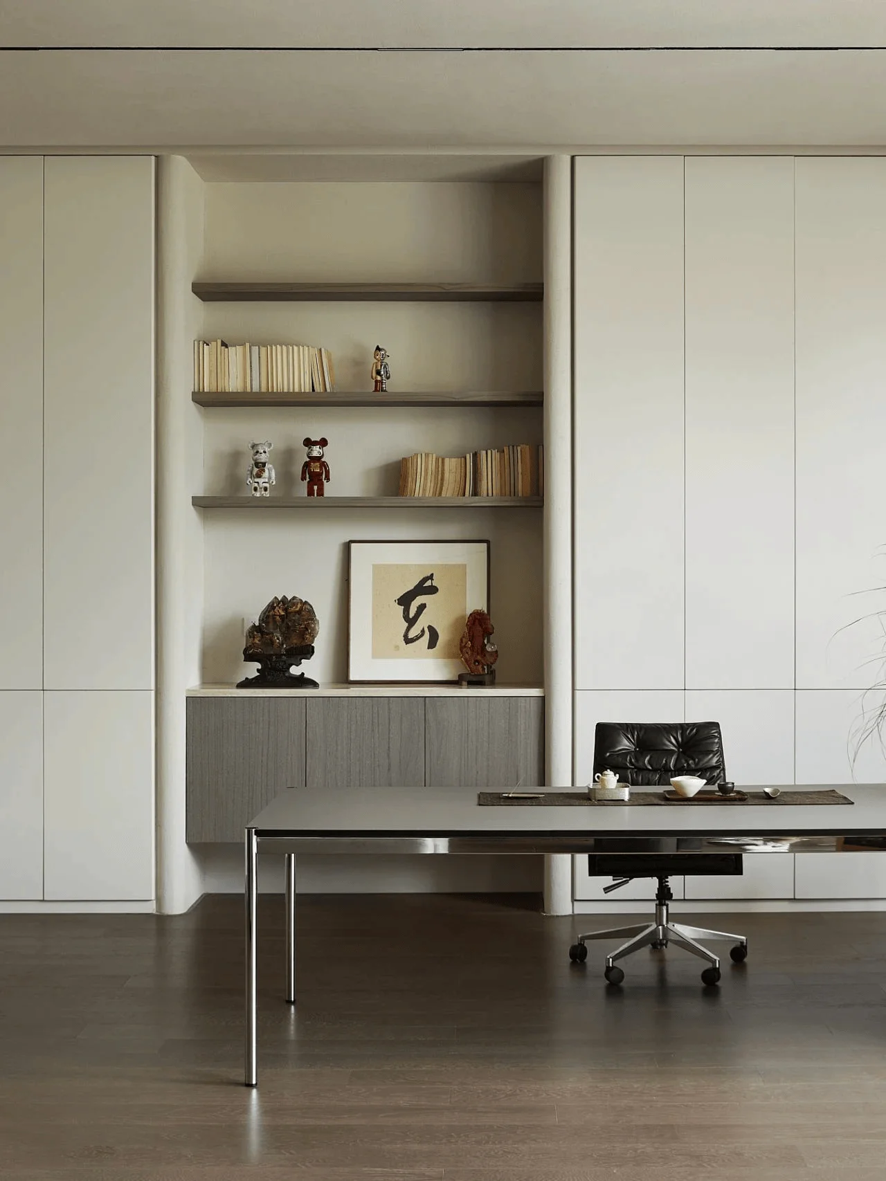
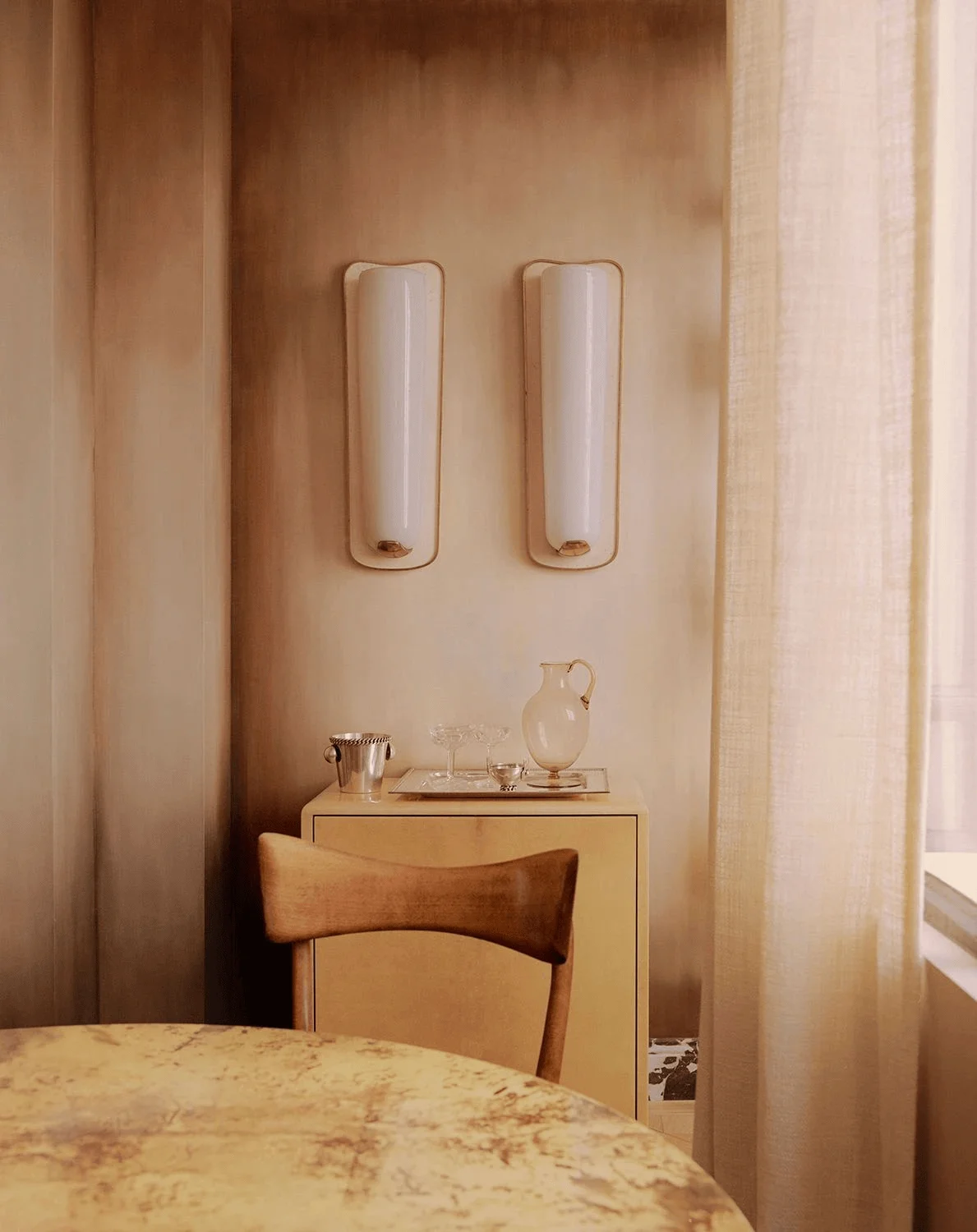
The design team meticulously considered the technical aspects of the project, ensuring functionality and durability. The material palette is carefully curated to achieve a balance between aesthetics and practicality. Materials include art paint and wood finishes. The selection of materials complements the overall curvilinear theme, incorporating warmth and texture into the environment. The design emphasizes the interplay between light and shadow, utilizing these elements to sculpt the space and enhance the overall spatial experience. Attention was paid to incorporating elements of natural light and ventilation, emphasizing sustainability and reducing environmental impact. These aspects are key to sustainable interior design and the integration of curvilinear principles. This consideration is particularly important in the context of creating a functional and sustainable commercial space.
Social and Cultural Impact: Fostering Community and Creativity
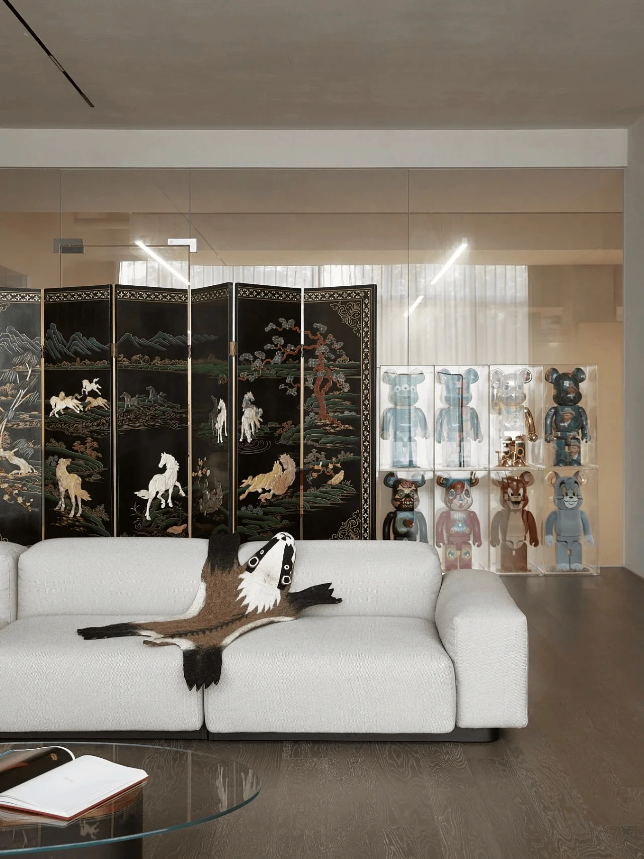
The curvilinear design creates a unique and inviting space that fosters a sense of community and creativity. It provides a platform for Miss Chipmunk to interact with its clientele and showcase its brand identity. The design facilitates both focused individual work and collaborative team efforts. The design showcases a modern interpretation of the brand’s concept, fusing a sense of nostalgia with a contemporary aesthetic. The integration of diverse cultural and historical elements elevates the space to a unique and inspiring destination. The curvilinear design and interior design of this space have become a statement for Miss Chipmunk’s brand and its values.
Construction Process and Management: Realizing the Curvilinear Vision
The construction phase was carefully managed to ensure the realization of the design vision. The unique curvilinear forms of the architecture and interior design posed specific challenges for the construction team. These challenges were overcome through meticulous planning and skilled craftsmanship. The design team worked closely with the construction team to ensure that the materials were used effectively to achieve the desired aesthetic and functionality. The integration of technology within the space was also carefully considered, ensuring a seamless user experience. The construction process emphasized a collaborative approach, with all stakeholders working together to achieve the project’s goals.
Post-Completion Evaluation and Feedback: A Space for Inspiration
The Miss Chipmunk office and showroom has been well-received, receiving positive feedback for its unique aesthetic and functional design. The interior design fosters a sense of creativity and tranquility that is well-suited for a fashion-focused company. The curvilinear design elements have created a unique spatial experience for employees and clients. The design creates a sense of unity between different areas and functions. The project has successfully demonstrated the potential of curvilinear design in commercial spaces, setting a benchmark for future projects in fashion and retail.
Conclusion: A Testament to Curvilinear Design
The Miss Chipmunk project exemplifies the power of curvilinear design in creating dynamic and engaging commercial spaces. Songbai Space’s design successfully marries creativity and functionality, resulting in a workspace that is both aesthetically pleasing and highly adaptable. The design successfully reflects Miss Chipmunk’s brand identity and ethos. The integration of curvilinear design principles within the interior design has produced a workspace that is both functional and inspiring. The project serves as an inspiration for future design projects that explore the potential of curvilinear forms and their application in diverse contexts. Curvilinear interior design and architecture are set to continue to make waves in the industry, shaping the spaces where we live, work, and play.
Project Information:
Project Type: Office Space and Fashion Showroom
Architects: Songbai Space
Area: 2000㎡
Year: 2024
Country: China
Main Materials: Art Paint/Wood Veneer
Photographer: Zhang Jianing
Copyright: Songbai Space


